
The staircase is the most architecturally significant element in any two-storey home and simultaneously the thing most homeowners finish building and immediately stop thinking about. It goes up. It comes down. People use it approximately forty times a day without registering a single detail about it. Meanwhile, it’s occupying the visual centre of the entire entryway and setting the tone for every room that leads off it — whether anyone’s paying attention or not.
What makes this particularly frustrating is that staircase design sits at the intersection of structure and decoration in a way that gives it disproportionate influence over how an interior feels. The balustrade material, the tread finish, the wall treatment alongside it, the lighting overhead — each decision compounds the others, producing either a cohesive composition that gives the entryway genuine character, or a collection of individually acceptable choices that somehow add up to something forgettable.
The staircase also presents one of the few genuine opportunities in residential design to make a bold architectural statement that’s completely justified by function. It has to be there. It has to be substantial. The only question is whether it does its structural job quietly and unremarkably, or whether it does that job while simultaneously being the most impressive thing in the house — and the gap between those two outcomes is almost entirely a matter of the decisions made during design rather than the budget spent during construction.
The Staircase Earns the Entryway — Or Undermines It
An entryway without a considered staircase is like a theatre lobby with a fire door where the stage should be. The staircase is the architecture, and everything else in the entryway is the decoration around it.
The Balustrade Sets the Design Register Instantly — Turned white spindles with a timber handrail say traditional. Black steel balusters with light oak treads say contemporary. Slim iron rods with dark stained newel posts say modern farmhouse. Glass panels say clean and minimalist. The balustrade is readable from across the room and establishes the design vocabulary that every other element in the entryway either speaks or contradicts — there is no neutral choice in this decision.
Tread and Riser Contrast Determines Visual Weight — White painted risers with dark wood treads create a graphic, high-contrast staircase that draws the eye and reads as architectural from a distance. Matching tread and riser in the same tone creates something that feels more continuous and calmer. The choice between these two approaches has more impact on how the staircase feels than almost any other single decision, and it costs nothing extra to make it deliberately.
The Wall Alongside the Stair Is Prime Real Estate — Most staircase walls get painted the same colour as the rest of the hallway and then ignored for the lifetime of the house. This is a missed opportunity on a significant scale. Whether treated with a statement runner of framed art, a mural, decorative moulding, or a wall treatment that would be too committing elsewhere in the house, the staircase wall is the one place where a bold decision is architecturally supported by the vertical plane rising beside it.
Lighting and Volume Change Everything
A staircase that looks perfectly adequate in daylight and completely disappears after dark has solved only half the design problem. The way a staircase is lit — and the ceiling height it rises through — determines its character in the hours when home life actually happens.
Double Height Volume Demands a Worthy Fixture — A staircase that rises through a double-height void creates a vertical space that a ceiling fixture designed for a normal room height will always look lost in. The chandelier, pendant, or lantern that occupies that void needs to be scaled to the space — genuinely large, hung at a height that reads correctly from both the ground floor and the upper landing, and interesting enough in its own right to justify the sight line it commands.
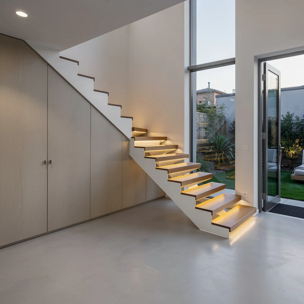
Step Lighting Turns a Staircase Into Architecture at Night — Recessed LED strips under each tread, riser-mounted spots, or concealed lighting at the base of the balustrade all produce an effect that daytime photography cannot capture but that makes the staircase feel designed in a way nothing else achieves after sunset. It also happens to be the most practical lighting decision possible, which is a rare combination of form and function that staircase design should exploit without hesitation.
Natural Light Is the Underused Variable — A window positioned to cast light across the staircase at different angles throughout the day does something no artificial light source can replicate — it makes the space feel alive and changing rather than statically lit. A landing window, a skylight above the stair void, or a tall slim opening in the staircase wall all create moments of natural drama that change with the season and the time of day.
The Details That Separate a Good Staircase From One Worth Talking About
Structural decisions determine whether a staircase is competent. Detail decisions determine whether it’s memorable. These are the specifics that guests notice without necessarily being able to name.
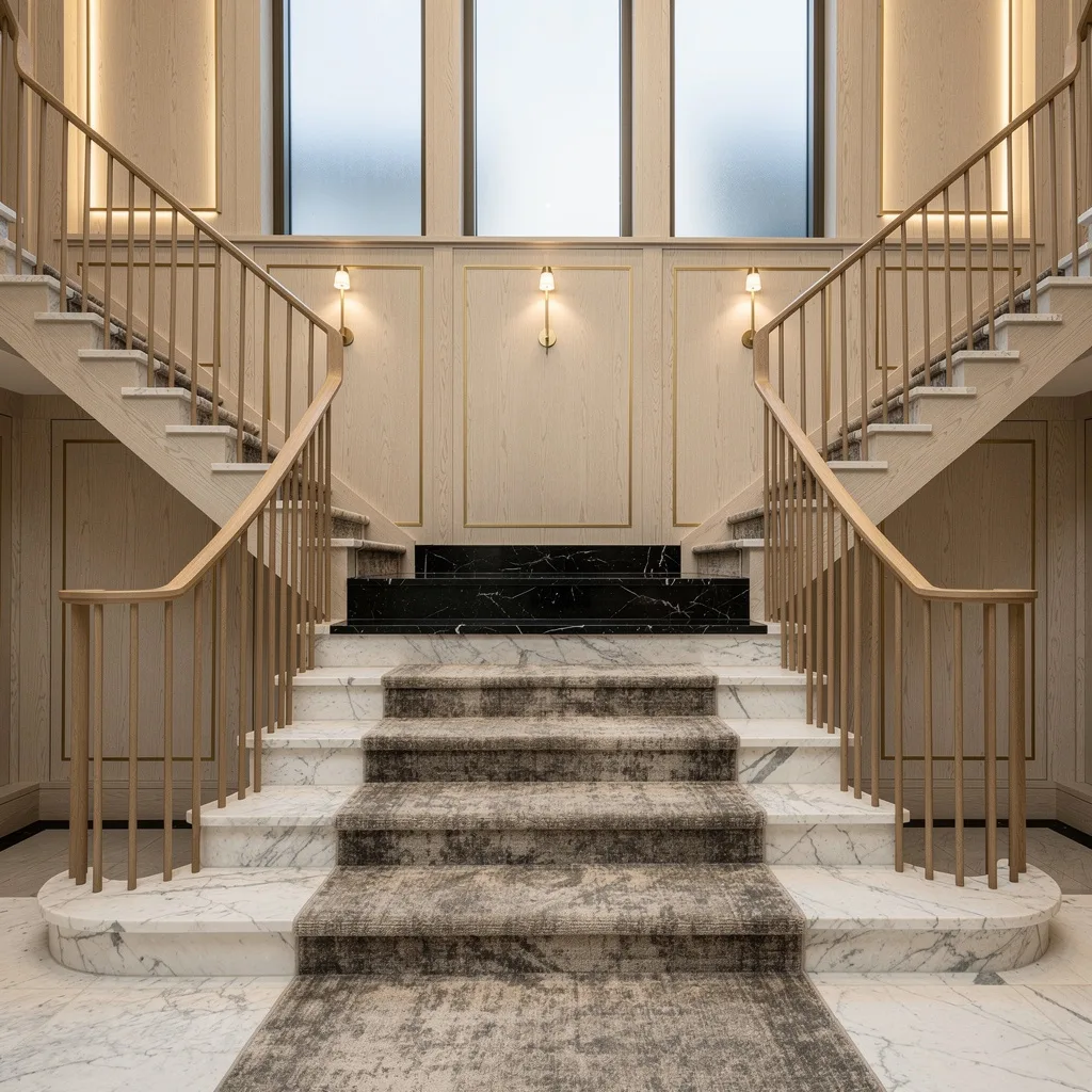
The Runner Is a Textile Statement, Not Just Protection — A stair runner introduces colour, pattern, and softness into what is otherwise a hard-material composition. It also muffles sound, protects the tread finish, and creates the kind of layered interior quality that distinguishes a home that’s been styled from one that’s just been furnished. Choosing the runner with the same seriousness as a principal rug — not whatever was on the remnant table — is the difference between a staircase that looks complete and one that looks almost finished.
Newel Post Design Signals Craftsmanship — The newel post is the most tactile and closely examined element of any traditional balustrade, and a well-proportioned, well-detailed newel post communicates a level of craftsmanship that the overall staircase then gets credit for. Conversely, a cheaply made or poorly proportioned newel undermines every other quality decision surrounding it. It is a small detail with an outsized effect on perceived quality.
Under-Stair Space Reveals Design Intelligence — What happens beneath the staircase tells you a great deal about whether the interior was designed or just built. A built-in library, a styled console table, concealed storage with flush doors, or a small seating nook all demonstrate that the architecture was thought about rather than simply constructed. An empty dusty void or a plastic storage unit says the opposite at considerable volume.
Entryway Staircase Ideas
The Curved Staircase That’s Waiting for the Rest of the Room to Catch Up
Posts from the designmyroom
community on Reddit
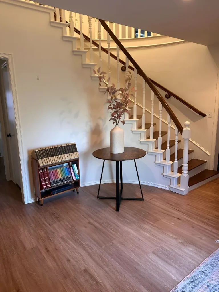
The bones here are genuinely excellent — a sweeping curved staircase with white-painted turned balusters, a rich walnut handrail, and generous treads that carry the curve all the way down to a wide landing — and the entryway around it is still figuring out what it wants to be. A round side table with a single vase of dried stems makes a reasonable attempt at filling the space the staircase creates, and the small bookshelf has clearly been positioned rather than placed, but both feel provisional against the architectural confidence of the stair itself. The pale wood-look flooring works, the white walls give the balustrade its contrast, and all the structural decisions are sound. What this entryway needs now is a piece of lighting scaled to the height, a wall treatment that acknowledges the curve beside it, and the removal of the bookcase in favour of something that earns the square footage more convincingly.
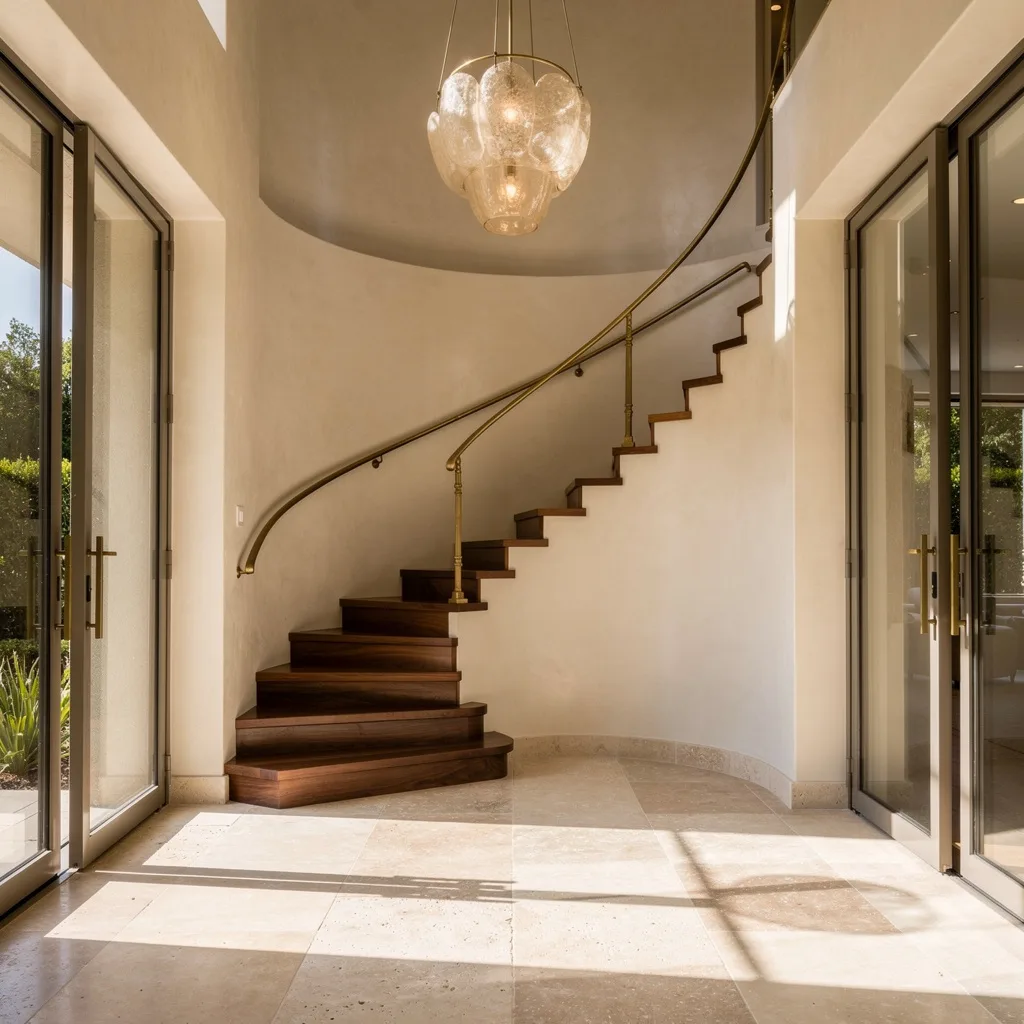
The Traditional Entryway That Understood Every Element Has to Earn Its Place
An ornate brass lantern chandelier hangs at exactly the right height in a double-height hallway, blue and white patterned stair runner flows the full width of each tread, a gilded mirror flanked by matching brass sconces decorates the landing wall, a floral-cushioned bench in painted grey provides seating below, and beadboard panelling covers every wall surface from skirting to ceiling. Nothing in this entryway was chosen carelessly and nothing is trying to be something it isn’t — it’s a traditional interior done with complete conviction and enough individual pieces of quality that the overall effect reads as genuinely considered rather than themed. The runner is doing the most work here, providing the pattern, colour, and textile warmth that prevents a monochromatic white-and-wood scheme from feeling cold, and the brass fixtures create a material thread that runs from floor level to ceiling height and ties everything into a single composed moment.
The Modern Farmhouse Staircase That Committed Fully to Its Contradictions
Dark walnut stained timber newel posts and handrails paired with slim black iron balusters, white painted risers creating the high-contrast tread effect, shiplap panelling on the staircase wall, and a neutral upholstered bench tucked under the upper flight with plants and a small framed mirror gallery styled above it — this is modern farmhouse done at a scale that justifies the style. The double return staircase configuration creates a genuine architectural moment in the entryway, and the dark stained timber at this weight and volume has enough presence to anchor a large double-height space without getting lost in it. The arm sconces mounted high on the vaulted wall add lighting at the right scale, and the coarser texture of the shiplap against the polished timber creates the material contrast that keeps this from reading as too smooth or too corporate.
The Open Oak Staircase That Turned Every Step Into a Display Opportunity
Warm honey-toned oak covers treads, risers, and the wide side fascia in a continuous wood envelope that makes the whole staircase read as a single sculptural object, and the wide open treads created by the generous box stair configuration have been styled with books, ceramic vessels, small plants, and objects arranged with the casual precision of someone who has done this a few times before. Black steel balusters with an oak handrail provide the balustrade, a large fiddle leaf fig catches light from the landing window behind it, and a minimal framed print on the adjacent wall and a ceramic vase at floor level complete the composition without overcrowding it. The stair-as-shelf idea works here specifically because the treads are wide enough to hold objects without looking cluttered, and the warm oak tone makes everything displayed on them look like it was chosen to be there.
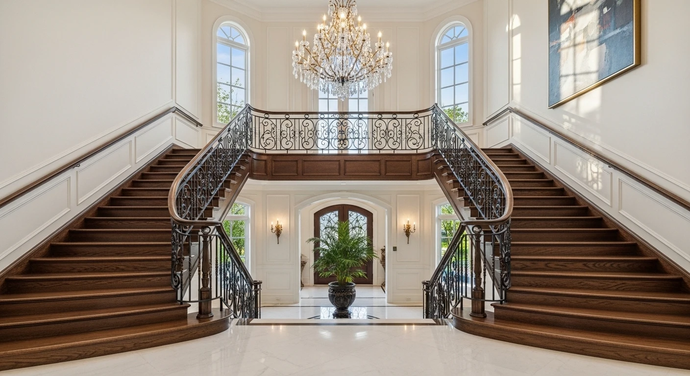
The Layered Entryway That Made a Crystal Chandelier Feel Completely At Home
Looking down from the upper landing, the entry below reveals panel moulding on every wall surface, a jute stair runner with a dark border, two round leather ottomans on a patterned rug, a leaning full-length mirror in a warm metal frame, a small gallery of framed pieces climbing the adjacent wall, a dark front door with sidelight, and a crystal drop chandelier hanging at a height that reads correctly from both levels simultaneously. The pale bleached oak balustrade with black iron balusters bridges the traditional moulded walls and the contemporary dark door in a way that feels resolved rather than compromised, and the warm amber throw and rust-toned cushions visible on the landing sofa above connect the upper and lower levels through colour in a way that makes the whole staircase feel like a continuous designed space rather than a transition between two separate rooms.
The Curved Staircase That Turned Its Wall Into a Work of Art
A hand-painted chinoiserie mural covers every surface of the curved staircase wall from floor to the arched window at the top — full-scale trees, trailing foliage, a classical figure, all rendered in the blue-green palette of an eighteenth-century folly — and the staircase rising through it in white-painted timber with a polished mahogany handrail and leopard-print runner becomes a theatrical piece rather than a functional structure. A round mahogany pedestal table centres the base of the curve with a blue and white Chinese vase arrangement, a glass and brass lantern hangs in the void between the stair and the window, and a single upholstered chair sits in the corner as if someone placed it there to watch the room rather than use it. The commitment required to cover a curved staircase wall in a custom mural of this scale is substantial, and the result makes every more restrained design choice on this list look like it’s playing it safe — which is exactly what it is.
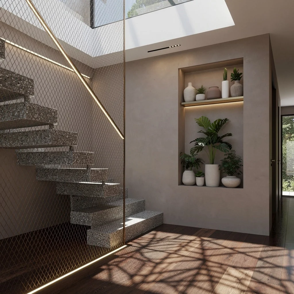
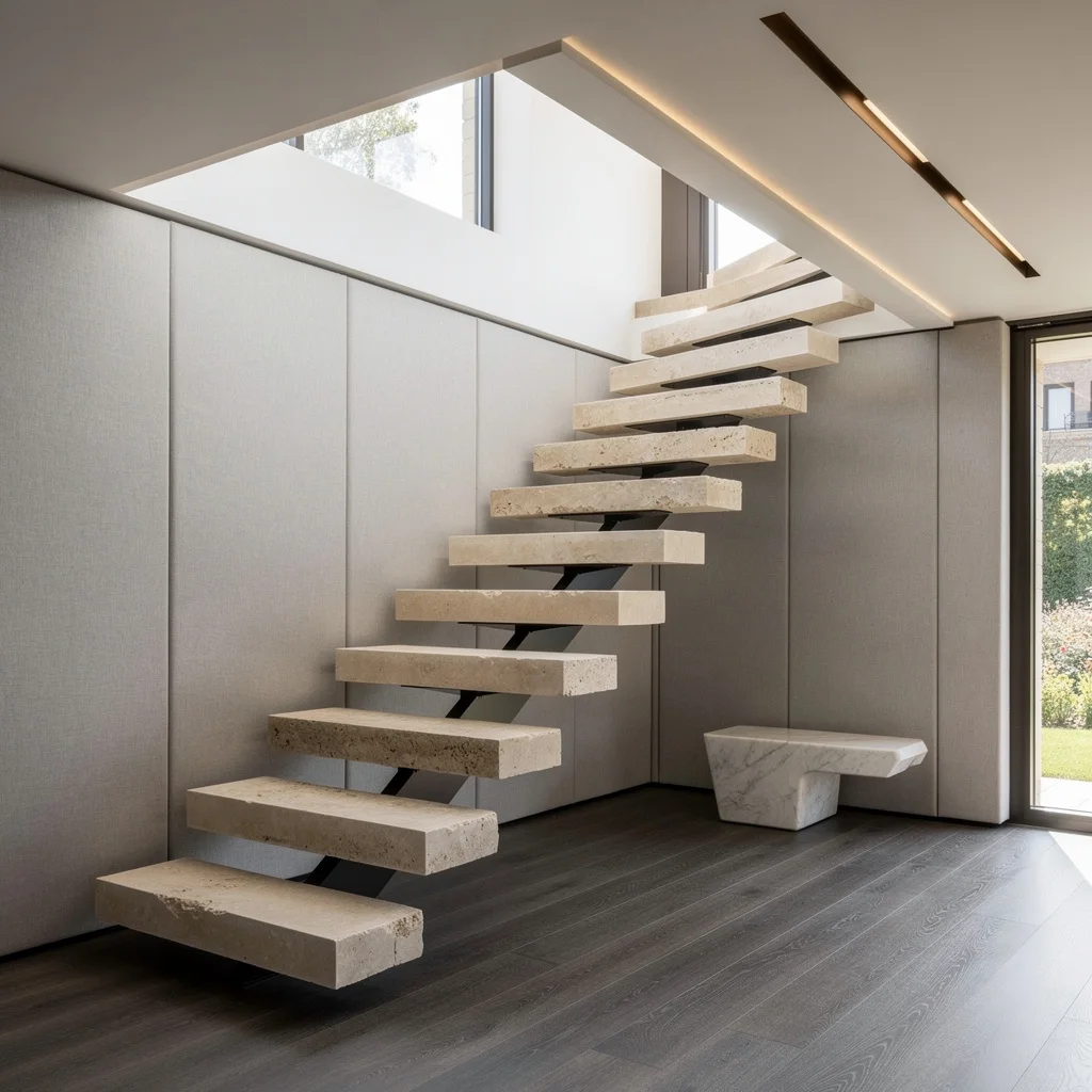
Go Full Zen: Float Your Stairs and Grow a Wall
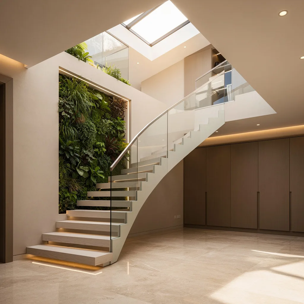
Obsessed with that calm, spa-level energy? You need a floating staircase and a statement vertical garden—because plants do more for you than cleaning the air. Start with chunky white oak treads and keep it modern with a glass balustrade (yes, lose the dusty spindles). Curve those steps around a niche stuffed with lush greenery to bring the outdoors in, and go big with a skylight overhead. Ditch all the entryway clutter and build custom walnut storage flushed against the wall. And for the love of design, layer in recessed LED lighting to keep everything looking clean and intentional. Pro tip: Always set storage behind flush cabinetry (no handles) to keep the look sleek—not suburban shoe-bin sad.
Make It Moody: Stone Steps and Nightclub Vibes
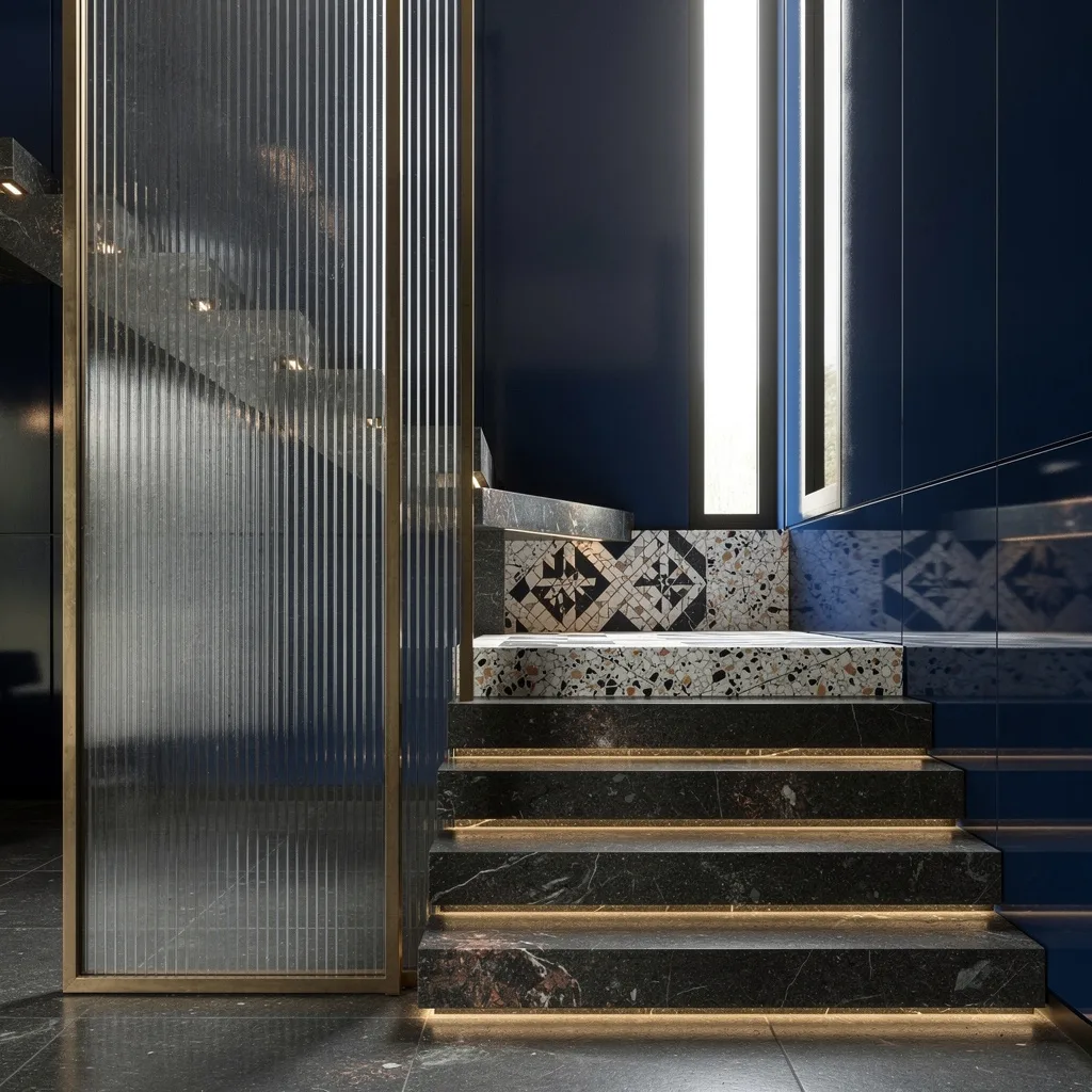
Want your house to gossip about itself after dark? Drama means limestone stairs and deep indigo lacquered walls—because forget plain white paint. Drop a bronze-framed fluted glass divider for that A-lister ‘who’s allowed in?’ feeling. Let terrazzo mosaics on the landing flex your taste, not your grandma’s. Hide soft uplighting under every step to make the whole staircase look like it’s levitating (Instagram will notice). Don’t forget a skinny vertical window to break up the shadows and show off those glossy surfaces. Pro tip: Only use glossy wall panels if you’re ready to wipe fingerprints daily. Yes, it’s worth it for the drama.
Mix Concrete and Oak: Yes, You Can Be Chic and Cozy
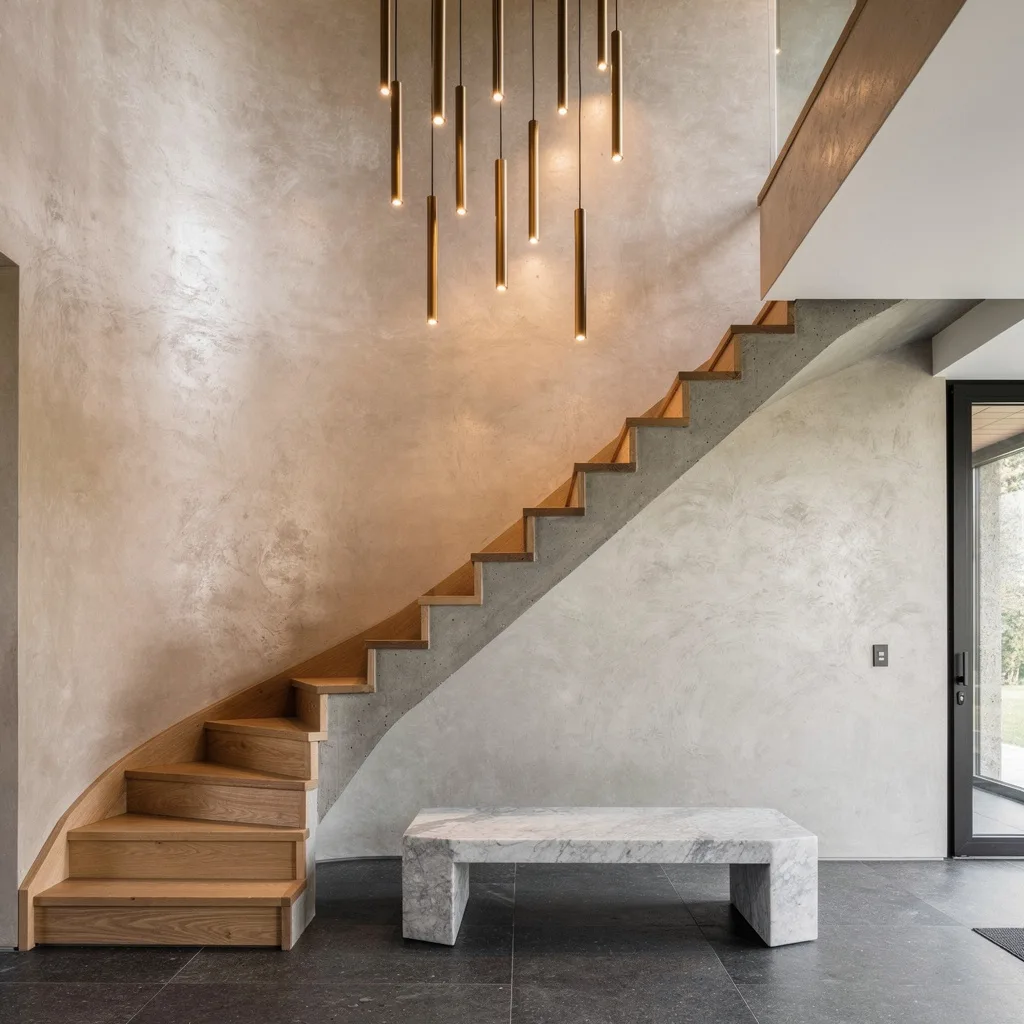
Hunting for that showroom look with actual soul? Pair precast concrete stairs with oak wraps for a touchable—not try-hard—entry. Cover a double-story wall in Venetian plaster for a sheen that says ‘custom’ but whispers ‘I’m not desperate.’ Light up the void with a wild custom chandelier—bronze tubes, the more dramatic the better. Stone flooring like honed basalt is your secret weapon; throw in a marble bench just to flex. Pro tip: Always cluster lighting vertically in the stairwell and hang it low or not at all—nothing says ‘awkward rental’ like a sad little sconce.
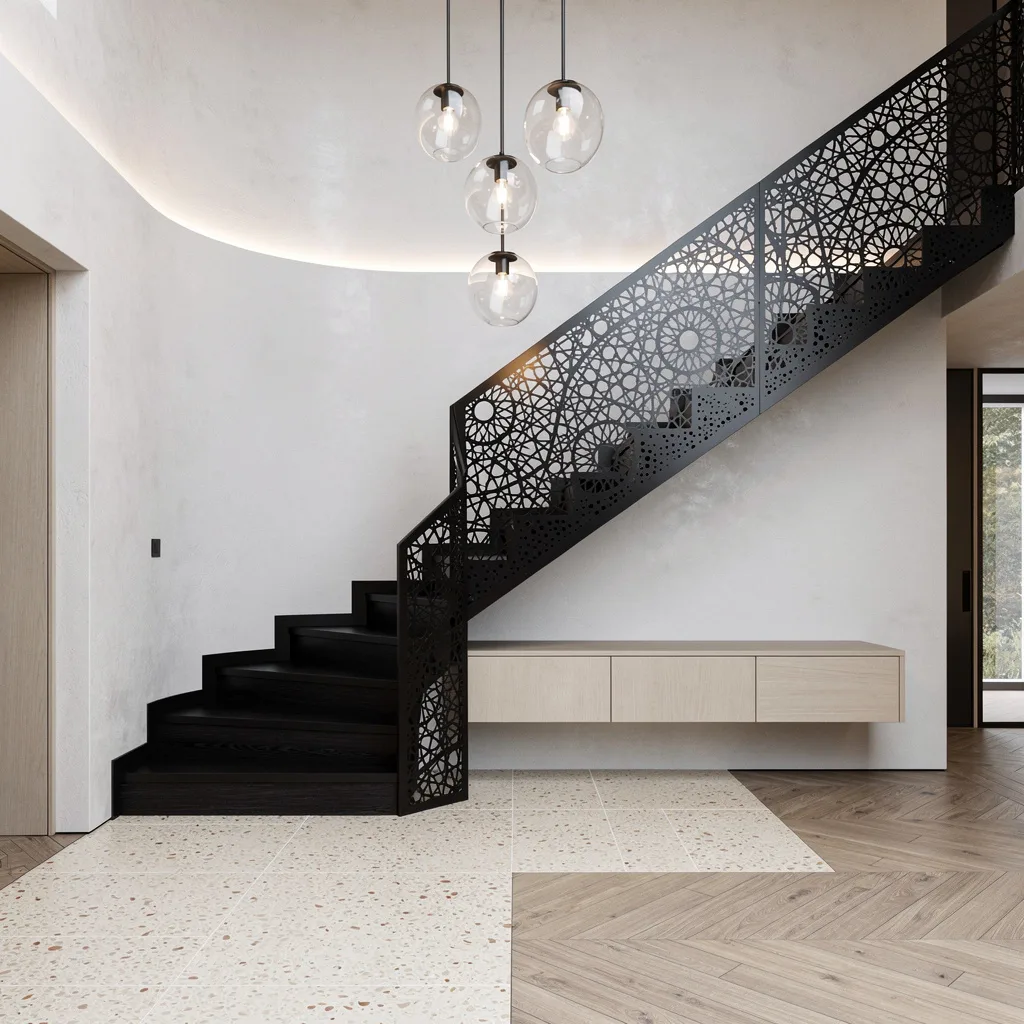
Spiral Stairs, Big Drama: Go Bold or Go Home
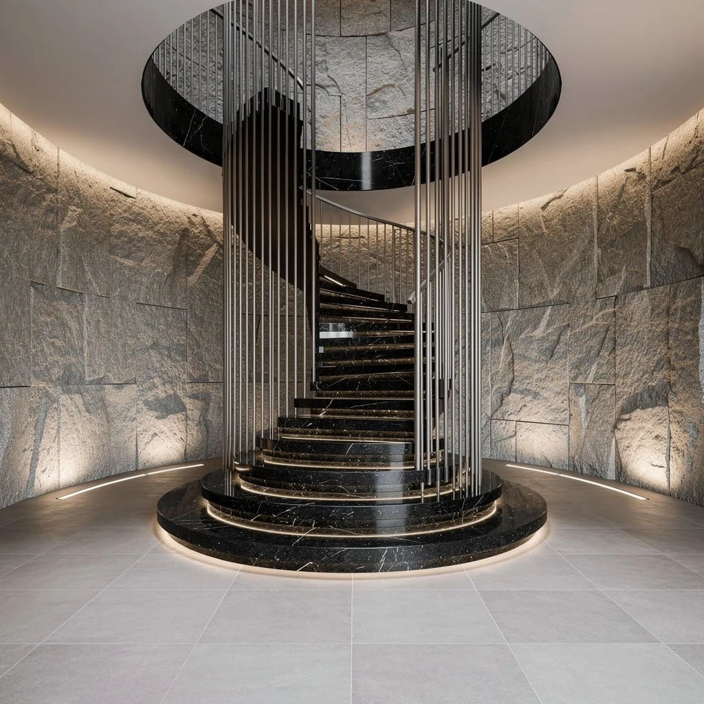
If you crave that ‘caught in an art gallery’ feeling, commit to a spiral staircase in black stone—nobody’s impressed with basic carpet. Wrap it up with a brushed stainless balustrade for that jewelry-grade detailing and back the whole setup with floor-to-ceiling textured stone. Want real atmosphere? Slot in integrated uplighting to sculpt those wall shadows like you paid actual money for ambiance. Extend big, soft-grey porcelain tiles onto every inch of your entry and tuck in linear floor lights at each riser. Pro tip: Use riser spotlights to keep staircase drama safely underfoot—no pretending you didn’t miss a step.
Walnut and Brass: Grown-Up Luxury Done Right
Channel silent-wealth energy with wide walnut treads and anchor your handrail in antiqued brass—go ahead, let your entry flex. Skip wimpy pendants and swing for blown-glass instead, dropped from a ridiculous double-height ceiling. Sandblasted Jerusalem stone underfoot adds richness; contrast it against matte walls for depth. Let those giant pivot doors frame your entrance like the opening scene of a painfully cool film. Pro tip: Always use stone with a matte or textured finish at the entry because high-finish floors will only highlight your muddy footprints (and we know you don’t take your shoes off).
Minimalist Flex: Terrazzo Steps and Mesh Walls
Minimal isn’t safe—it’s risky if you do it right. Stack a switchback stair with chunky terrazzo treads, run a wall of bronze mesh beside it, and admit that plain drywall is for boomers. Tuck linear LEDs anywhere you want grid-patterned drama at night—across your glossy dark oak floors if you’re smart. Build in a lit niche for minimalist pottery and some ‘yes I do Succulents’ greenery. Overhead, drop in an oversized skylight so every detail actually gets noticed. Pro tip: Always opt for built-in wall cutouts to display objects—freestanding shelves crowd the vibe and your nerves.
Gallery-Ready Moves: White Steel, Ash, and Microcement
Talk about a clean entrance—this look comes for your clutter and your dusty corners. Use folded white steel stringers to support engineered wood treads (honey tones only). Add step lights along the way for those golden hour selfies; bonus points if you install tall glass to look into your chic courtyard. Choose microcement flooring for one continuous, perfectly smooth expanse underfoot. Hide your mess in a built-in light ash unit that aligns with every grain. Pro tip: Keep walls ultra-matte and pale for actual gallery vibes and forget accent walls—try harder with your materials.
Bifurcated Glam: Calacatta, Slim Oak, and Frosted Drama
When you want your entry to feel royal (without looking like a lobby), split that staircase. Use honed Calacatta marble for risers, contrast with slim oak balusters, and set a black granite landing right in the middle—because symmetry breaks hearts. Panel your walls in rift-cut white oak with flashed brass insets. Wall-washer lights should highlight every little molding—don’t skip the lighting, ever. Overdo it with a gargantuan wool runner in mottled tones for a soft (but not grandma) finish. Pro tip: Only use frosted windows for daylight; clear glass here is just an invitation for peeping Toms.
Quiet Luxe: Limestone Slabs and Architectural Silence
Stop sleeping on quiet luxury. Go for thick limestone slabs hung on a steel spine for a floating effect; anything less feels like an afterthought. Match your wall in overscale, silk-textured acoustic panels—so your ‘I’m home’ doesn’t echo through the neighborhood. Oak floors in deep gray won’t show dirt, and they anchor all that quiet glamour. Recess a bronze linear light in the ceiling (no visible fixtures, ever), and finish with a sculptural white marble bench. Pro tip: Always oversize your entry seating; small benches are for panic rooms, not foyers.
Split-Level Swag: Larch, Matte Black, and Herringbone Floors
Ready for the coolest split-level flex? Grab the darkest larch you can find for the stairs, add a laser-cut black steel screen, and call your minimalist friend to witness the rebirth of cool. Limewash the walls ultra-white for light bounce and hang a three-story glass pendant overhead—drama, but make it floating. Mix cream terrazzo with herringbone wood underfoot to keep things from looking like a dentist’s office. Add a slim floating console in pale ash: keys belong in style, not a plastic bowl. Pro tip: Always cluster your pendant lighting at varying heights—one lonely bulb is just a construction mistake.
Sculptural Meets Soft: Travertine Treads and Blush Stucco
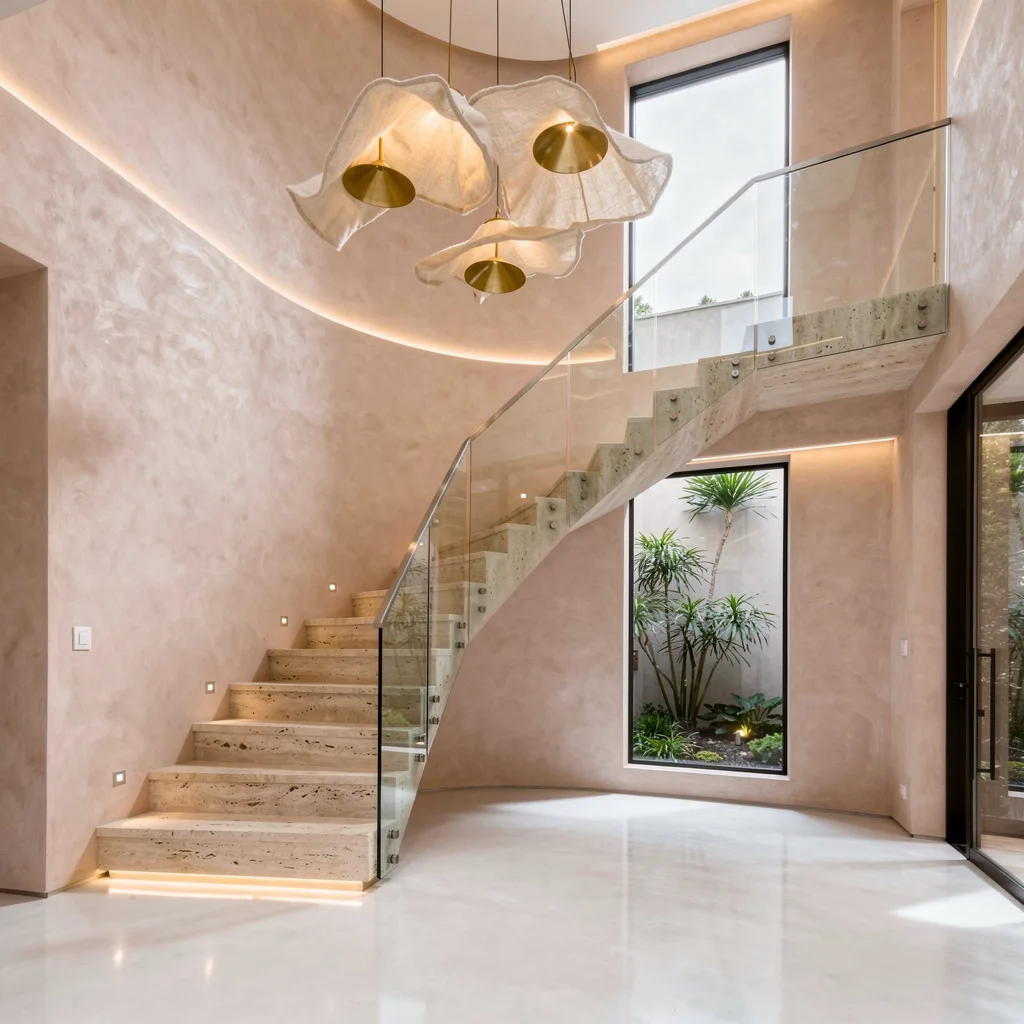
You want airy with a little bit of ‘whoa’? Set travertine treads right into a blush stucco wall and let a frameless glass guardrail keep your sightlines clean. Slot in a double-height skinny window for a private garden view—go on, let the neighbors be jealous. Top the floor with microcement for a minimalist cloud feeling, and never let floor transitions kill your flow. Hide LED cove lighting at the baseboards, and float a bonkers linen-and-brass mobile above for movement. Pro tip: Always pair architectural stairs with sculptural lighting—anything less is a design crime.
Textured and Lit: Walnut, Steel, and 3D Panels
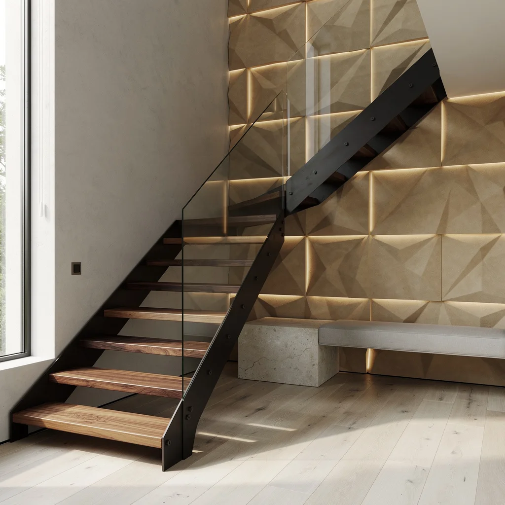
Bored with bland? Float steel stairs with chunky walnut treads and line your feature wall in powdery, three-dimensional plasterwork. Build in LED strips to flicker dramatic shadow across those shapes—go for less, not more, with your object count. Stretch white oak planks across the floor for warmth and symmetry. Slot in a limestone bench and keep it slim; benches that eat entry space are for chain hotels. Flood the area with vertical natural light—you don’t want your staircase hidden in darkness. Pro tip: Always coordinate your entry’s architectural lighting with actual daylight so colors don’t turn sad and weird.
Final Thoughts
A staircase that stops people is not necessarily more expensive than one they walk past without looking at. It’s more considered — it made stronger decisions about materials, about contrast, about the lighting that frames it and the wall treatment that surrounds it, and it followed those decisions through rather than softening them into something inoffensive.
The entryways here that leave the strongest impression share the quality of treating the staircase as a designed object rather than a construction element — something that deserves the same creative attention as any principal room in the house, because it occupies the most visible position in the entire interior and creates the first impression that everything else in the house either lives up to or falls short of.
Get the staircase right and the whole house benefits from the confidence it projects. Treat it as infrastructure and it will do its job reliably and unremarkably for the life of the building — which is a significant waste of the best architectural opportunity most homes will ever have.