
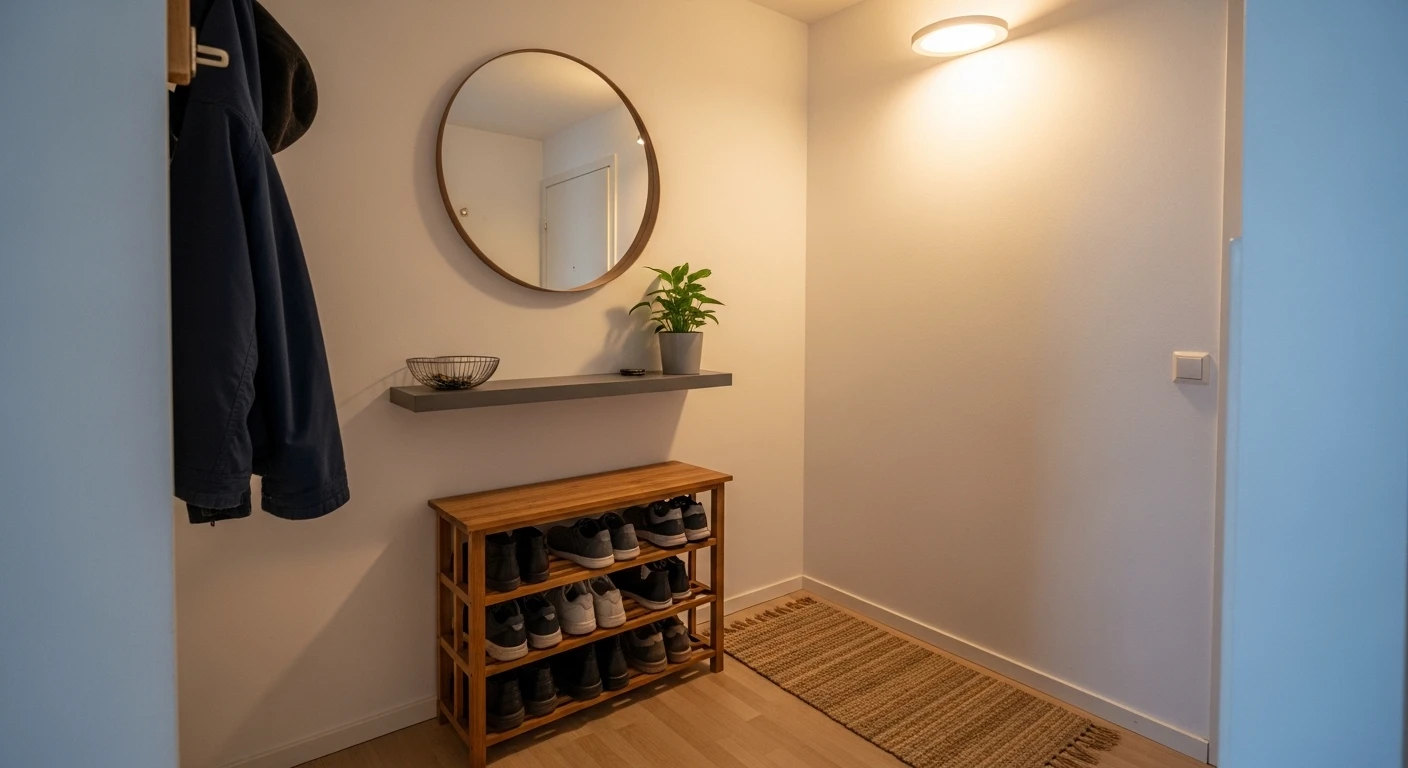
The entryway gets the worst of both worlds in most homes — it’s too small to justify serious spending, and too visible to ignore entirely. So it sits in a permanent state of financial limbo, receiving the items that didn’t quite work elsewhere, the hooks that came with the house, and a rug that was on clearance for reasons that became obvious once it was unrolled. The result is a space that works in the most literal sense and impresses in absolutely no sense whatsoever.
What makes budget entryways particularly sad is that the space is genuinely tiny, which means it should be the easiest room in the house to transform for very little money. A coat of paint, a second-hand bench, a mirror from a charity shop in the right frame — these are not expensive interventions. They just require the willingness to treat a small, transitional space as worthy of actual thought rather than the design equivalent of a shrug.
The entryways that look expensive on a modest outlay share one quality: every decision was made deliberately rather than by default. The wall colour was chosen, not inherited. The bench was positioned, not placed. The hooks were selected, not grabbed. That level of intentionality costs nothing and produces results that consistently look more considered than spaces where twice the money went in twice as accidentally.
Why Budget Entryways Fail Before a Single Item Is Purchased
The money isn’t usually the problem. The approach is. Most budget entryway makeovers fail because they start with shopping rather than planning, which produces a collection of individually reasonable items that somehow don’t cohere into anything worth looking at.
Without a Direction, Every Purchase Is a Guess — Walking into a home goods store with a budget and no clear aesthetic direction produces exactly the kind of entryway that looks like it was assembled during a sale. Deciding first whether the space should feel warm and organic, clean and contemporary, or characterful and eclectic — and committing to that direction before spending a penny — is the decision that makes everything else coherent rather than coincidental.
The Floor and Walls Are the Most Impactful Budget Spend — A striking rug on a plain floor transforms the entry’s first impression for considerably less than any furniture purchase. A painted wall in a considered colour costs almost nothing and changes everything about how the space feels. These are the two highest-return budget interventions available and the ones most consistently overlooked in favour of decorative objects that get bought first and arranged unconvincingly afterwards.
Second-Hand Is a Strategy, Not a Compromise — The antique chest with a marble top, the ornate gold mirror, the church pew bench — none of these require new-purchase prices to exist in an entryway. Charity shops, estate sales, and online marketplaces are where budget entryways find the pieces that give them the kind of character money alone cannot buy from a retail shelf.
The Decisions That Cost Nothing and Change Everything
Before anything gets purchased, painted, or installed, the decisions that require only attention rather than budget should be made — because they determine whether money spent subsequently goes toward something resolved or something that’s still figuring itself out.
Declutter First, Decorate Second — An entryway containing objects that don’t belong there will look cluttered regardless of how good the furniture is. The first intervention in any budget entryway transformation is removing everything that shouldn’t be there permanently — the items in transit, the things put down in 2023 that never moved, the objects that belong somewhere else in the house and simply never got there. What’s left is the actual starting point.
Hooks Are Infrastructure, Not Decoration — The hook situation in most entryways is an afterthought that becomes a daily frustration — too few hooks, positioned at the wrong height, in a finish that doesn’t connect to anything else in the space. Budget hooks that are consistently placed and appropriately positioned work better than expensive hooks installed carelessly, and the difference between a hook arrangement that looks deliberate and one that looks random is measurement, not money.
Lighting Is the Upgrade Most Budgets Ignore — Swapping a builder-grade ceiling fixture for something with actual character costs less than most decorative accessories and produces a more significant atmospheric change than almost any other single intervention. The light fitting is looked at every time anyone enters or leaves and sets the tone for everything beneath it. Treating it as a fixture that came with the house rather than a design decision that can be changed is how entryways stay looking like they came with the house.
Making Small Budgets Work Hardest in Small Spaces
The entryway is rarely large, which means budget stretches further here than in any other room. A small investment in the right place produces a disproportionate return because the space is compact enough that every good decision is visible from every angle simultaneously.
One Statement Piece Does More Than Several Medium Ones — A budget divided among multiple medium-quality items produces a collection. The same budget directed primarily toward one strong piece — an oversized mirror, a characterful console, an exceptional rug — and supplemented with inexpensive supporting elements produces a composition. The singular investment gets noticed; the collection just fills the space.
Paint Is the Most Efficient Budget Entryway Tool Available — A feature wall in a colour that would feel too committing in a larger room works perfectly in a small entry because the limited square footage keeps the drama proportionate. Dark colours make small entries feel intentional rather than cramped when the choice is made confidently. A painted arch framing a bench, a coloured door interior, a two-tone wall treatment — all of these are paint decisions that cost very little and communicate considerable design thought.
Plants Earn Their Place in Entry Budgets — A large, healthy plant in the right scale for the entry does the work of several decorative accessories for the ongoing cost of occasional watering. Fiddle leaf figs, rubber plants, and large-leafed tropicals provide height, organic texture, and the quality of something living that no inanimate object can replicate. They also get better over time rather than looking progressively more dated, which is a return on investment that most decorative purchases cannot match.
Entryway Ideas on a Budget
The Archway Entry That Let the Architecture Do the Heavy Lifting
Our entryway
by u/Interesting-Mood1665 in InteriorDesign
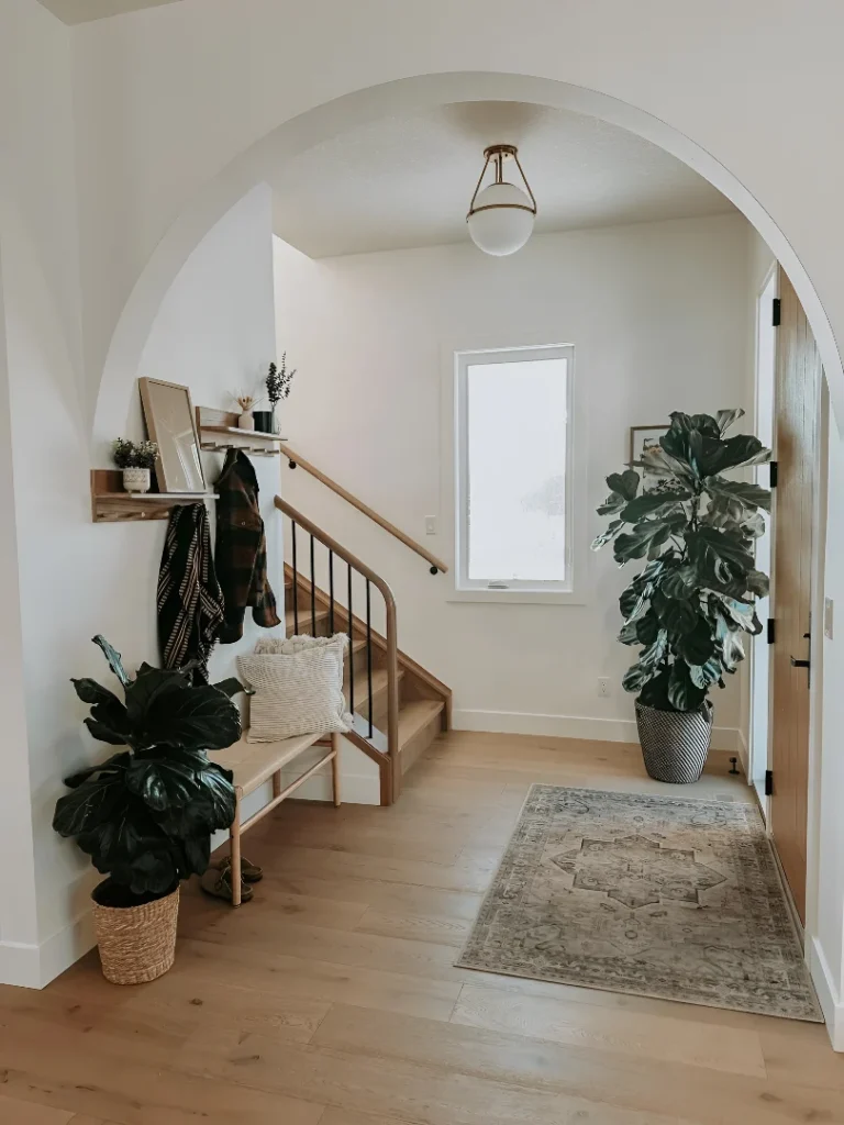
A rendered archway separating the entry from the staircase hall is the kind of architectural feature that costs nothing to inherit and everything to install from scratch — and this entry understood that completely, keeping every decorating decision appropriately restrained so the arch remains the star. A slim natural timber bench with a linen cushion sits against the wall with a small floating shelf above carrying minimal objects, a fiddle leaf fig in a woven basket at floor level matches another large-leafed plant positioned at the arch’s far side, and a vintage-style rug in warm tones grounds the pale oak floor beneath. A gold-toned globe flush mount above handles the lighting without fuss. The whole thing cost a fraction of what it implies because the arch was already there and someone had the intelligence to notice it.
The Living Wall Entry That Made Botany the Budget
Floor-to-ceiling living plant wall covering an entire entry panel from bench height to ceiling, lit by recessed spotlights and composed of pothos, philodendrons, ferns and variegated trailing varieties in enough density to obscure the mounting structure entirely — this is the budget intervention that looks like it cost significantly more than it did because plants are inexpensive individually and spectacular collectively. A simple light timber shoe storage bench with an upholstered seat runs the base, a small timber stool beside the glazed door holds a cut flower vase, and the ribbed glass sidelight floods everything with diffused natural light. The investment here is patience as much as money — a living wall at this density takes several growing seasons to achieve, which means starting early costs less than buying it fully established from a specialist supplier.
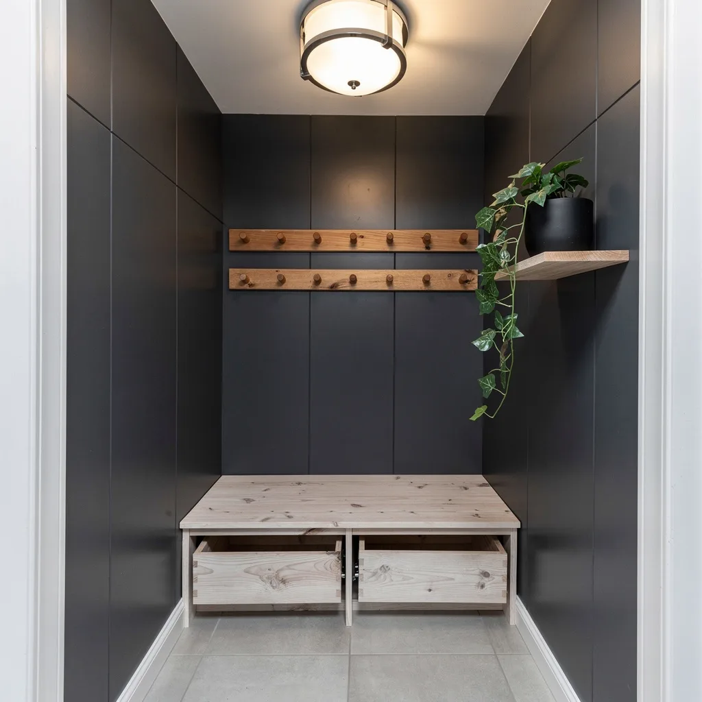
The Shiplap and Hook Wall That Made Function Look Deliberate
White vertical shiplap panelling runs the full wall beneath the staircase, and a diamond-pattern iron hook rack is centred above a natural timber bench in a configuration that looks custom-designed for the space without being anything of the sort. Layered cushions in black, white, and olive textiles sit on the bench alongside a plaid throw folded casually over one end, a pair of boots sits on the floor below with the unselfconscious quality of objects that belong exactly where they are, and a wicker basket carries the overflow. The glimpsed round mirror in warm timber on the adjacent wall and the painted black console visible beyond it suggest an entry that has been consistently considered rather than pulled together for a photograph. Every material here is inexpensive; the result reads as anything but.
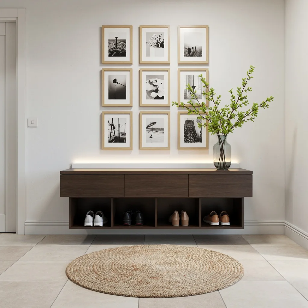
The Collected Entry That Understood Thrifting Is a Superpower
Botanical print wallpaper on one wall, grey abstract texture treatment on the adjacent wall, a wooden open-shelf console with drawers carrying fruit bowls, a marble cake stand, wicker baskets at every tier level, and above the beadboard half-wall a shelf displaying a collection of gold-framed mirrors in graduated sizes alongside small plants and a terracotta wreath — this entry is operating entirely on the principle that collected things with a shared tonal language look curated regardless of where they came from or what each individual piece cost. The brass wall clock, the wicker basket arrangements, the checked floor tile visible at the entry zone — all of it reads as intentional because it all speaks the same warm, organic, slightly nostalgic dialect. Almost nothing here is new and the whole composition is better for it.
The Antique Chest Entry That Played a Long Game
A substantial dark walnut chest of drawers with a grey-veined marble top serves as the entry console, and placed against grey-white wainscoting walls with a gold and black ornate mirror above it, the combination reads as considerably more expensive than it cost because the chest itself almost certainly came from a house clearance or antique market rather than a furniture retailer. A black table lamp with gold base, a tall black ceramic vase with cosmos stems, a stack of art books — the styling is restrained enough to let the chest and mirror carry the composition. The deep burgundy and navy Persian rug over warm hardwood flooring and the blue-painted panelled door flooding light from outside complete a scene that communicates old money through objects that cost contemporary-budget money to acquire if the right shops are visited with any regularity.
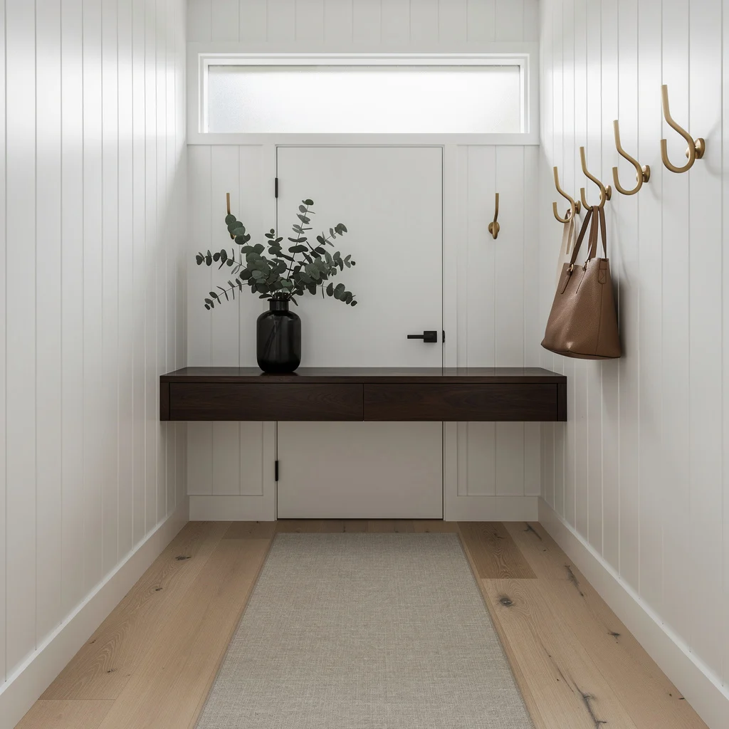
The Board and Batten Welcome Wall That Cost a Weekend
White board and batten panelling covers the full wall behind a live-edge timber bench on angled mid-century legs, and the combination of that panelling and that bench is so effective at implying considered design that everything else in the arrangement is almost secondary. A metal “welcome” script sign centred on the wall, iron hooks in a diamond geometric arrangement carrying bags, a wreath, and a plaid scarf, a pendant Edison bulb on a black cord providing the only light source, and a jute rug at the floor complete an entry that is emphatically warm, deliberately informal, and clearly loved. The board and batten is a DIY paint and timber project requiring a weekend and basic tools. The bench is the kind of piece that appears on marketplace apps with alarming frequency. Together they make a space that looks like it took months to achieve and cost considerably less.
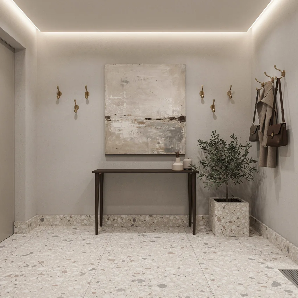
Go Matte Black Or Go Home
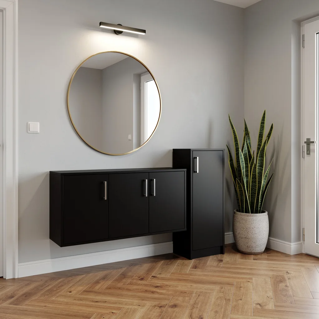
If you want your entry to scream ‘I’ve got game,’ it’s all about contrasts: dark, sleek surfaces with light, warm floors. Slap up a matte black wall-mounted console—don’t cheap out, use MDF and stick on brushed nickel handles for grown-up polish. Throw a gold-framed round mirror above it, so your lighting gets doubled by reflection. Pale grey walls: yes, they actually make the space feel bigger and clean. Shoe cabinet? Make sure it matches the console or you’ll regret it. Pro tip—tall snake plant equals instant cool, but only if you drop it in a chunky textured planter. Bad lighting kills a mood, so swap out your ceiling fixture for flush-mount LEDs and pretend you paid an electrician twice as much.
Layer With White, Wood & Cushions—Lux For Less
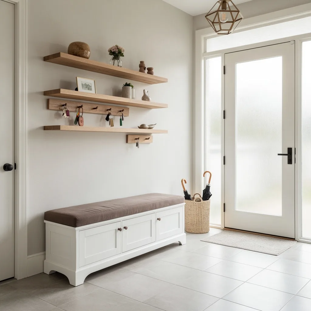
If you’re craving airy vibes but your entry is the size of Harry Potter’s bedroom, you need to own storage and layering. Build a bench from white-painted wood—don’t even think about buying a flimsy prefab—and top it with the softest taupe cushion you can find. Install staggered oak shelves for keys and cute clutter; stagger them, because symmetry is boring. Frosted glass sidelights pump up the daylight, and you need a geometric bronze pendant overhead—nothing basic, trust. Floor? Porcelain tiles are clean and cheap. Dump a woven basket next to the bench for umbrellas (or random junk). Here’s the pro tip: Stack decorative objects, never line them up like soldiers—layering > rigidity.
Hack Terrazzo Sophistication (Without Your Grandma’s Tiles)
Want it sophisticated but living on ramen? Fake luxury by using pale terrazzo-like finishes—save money, go terrazzo-patterned vinyl or tile. Paint the walls minimalist greige (snoozy name, killer look). Add a dark walnut console so the contrast is sharp, and slap a huge muted abstract canvas above it—bonus points if you thrift it and just reframe. LED ceiling strips deliver indirect glow, not interrogation-room horror. Brass wall hooks are your coat solution; space them evenly or wall chaos ensues. Finish strong with a cube planter in olive tones. Styling rule: If your entry isn’t glowing, you did the lighting wrong—hide your LEDs, never let the strips show.
Faux Stone Drama That Doesn’t Scream ‘Basement’
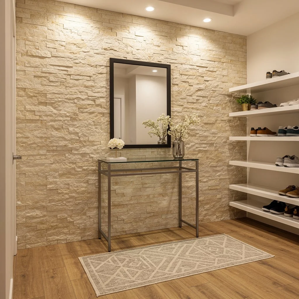
Craving crisp, modern drama, but don’t want actual stone dust in the air? Peel-and-stick faux stone panels get the job done (especially if you avoid anything shiny). Powder-coated steel and glass console brings industrial edge, but keep it slim so you don’t trip over your own style. Go for a rectangular mirror with a black frame—if you round it off, you lose the vibe. Runner with muted geometrics over honey laminate—must have, or your floor will look like a hospital waiting room. White floating shelves = more shoes, more flair. Pro tip: Always spotlight your dramatic wall; recessed spotlights aren’t optional—they make your stone actually pop.
Float Your Storage—Shelves Aren’t Just For Nerds
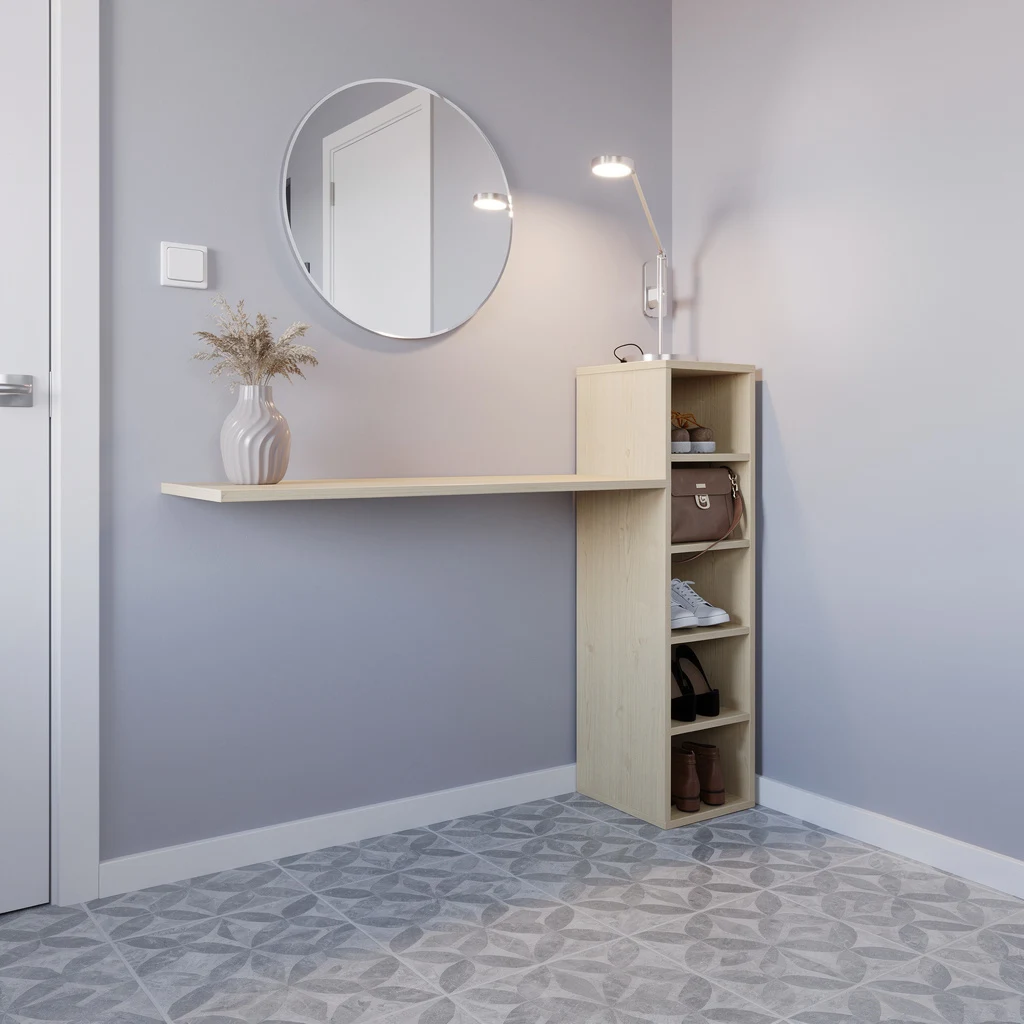
If your entry is basically a hallway, you need to float everything. Install a pale birch shelf for catch-all stuff, then match it to a vertical shoe cubby: never mismatch your woods or people will wonder if you’re colorblind. Paint walls in washable satin lilac-grey—don’t fear color, it’s not just for toddlers or aging rock stars. Add a frameless round mirror because frames are so last decade. Adjustable LED lamps nail the ‘I actually thought about lighting’ look. Stick patterned adhesive vinyl tiles on the floor, cool greys only—and please, don’t try to match them to the wall. Sculptural vase with dried foliage? One per shelf, otherwise it’s grandma’s house. Pro tip: Always keep surfaces clear—clutter kills floating magic.
Reclaimed Wood, But Don’t Let It Look ‘Barn’
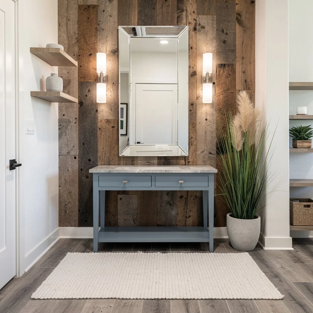
You want eco-chic, not actual farm vibes. Reclaimed wood accent wall sets it off, but only use crisp white paint for the rest so it actually looks intentional. Powder-blue console with stone-effect laminate is your ticket to budget designer—don’t buy anything shiny. Mirror with beveled edges: necessary, gives extra dimension. Linear frosted sconces make lighting soft, not scary. Wide-plank vinyl flooring with off-white woven rug grounds everything; don’t skip the rug, unless you love cold feet and scuffed floors. Open minimalist shelves are for decor only, tall faux grass in concrete-look pots—yes, fake it. Styling tip: Mix real and faux plants for visual interest; never use only one type, or it looks lazy.
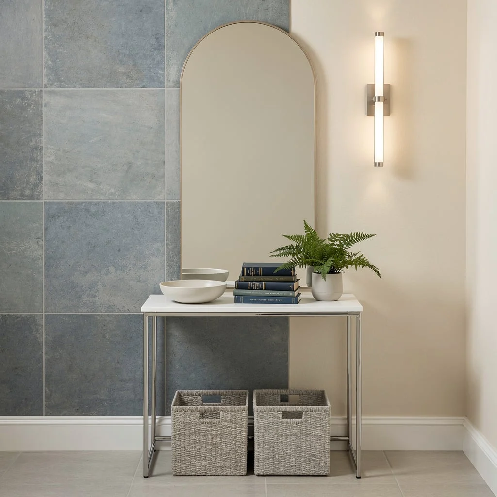
Graphite Walls + Hidden Storage = Narrow Entry Power
Tiny entry? Go moody. Stick peel-and-stick graphite panels on the walls for instant drama. Choose whitewashed pine for your bench—hidden pull-out drawers hide the mess and keep you from tripping. Throw light grey ceramic tiles on the floor and call it a day. Install floating wood hooks above the bench—uneven spacing for visual interest. Contemporary flush-mount fixture? Must be diffused…no bulbs allowed. Corner shelf for trailing ivy (use a matte black pot, because gloss is cringe). Pro styling rule—always tuck your storage below eye level so the entry feels bigger. Skip zero personality—moody colors amp up the chic.
Art Walls Aren’t Just For Museums (Gallery Entry FTW)
Want your entry to actually say something? Go for a vertical gallery wall—monochrome prints, slim natural wood frames, stacked above a floating espresso laminate console. LED strip lighting sets off the art, but don’t blast everything like you’re in a dentist’s office. Big ceramic tiles in light tones on the floor stop the space from looking dungeon-y, and a round textured jute rug pulls the zone together without costing three paychecks. Open cubby shelving lets you show off your sneaker collection (or hide them, your call). Tall glass vase jammed with green branches is the ‘look smart’ trick. Pro tip: Always hang art at eye level—too high and it looks like you’re hiding water stains.
Wallpaper Is Back—But Don’t Screw Up The Pattern
If your entry needs a vibe download fast, peel-and-stick geometric wallpaper in taupe and cream will rescue you. Go floating marble-effect shelf—not actual marble, unless you’re rich. Sage green wall cabinet pops, but keep it compact or you’ll block the door. Drum pendant in white keeps it fresh without blinding. Go dark oak laminate floors for contrast, don’t settle for anything fake-red. Wire basket under the shelf: the rule is, don’t let junk spill all over. Vertical mirror near the door for checks—skinny, never wide. Tiny ceramic sculpture for curated flair. Real pro tip? Never wallpaper a wall with too many doors or windows; big pattern, big payoff only on uninterrupted walls.
Stick-On Paneling—Minimal, But Not Basic
Shoot for minimal, but skip basic. Matte stick-on white panels are the cheat code for texture—don’t leave your walls naked. Contrast it with a floating dark walnut console; nothing screams ‘entry’ more than a spot for keys and phone. Hang matte brass hooks for jackets and bags, spaced out like you mean it. Light oak engineered planks on the floor are essential—if you can see every footprint, you did it wrong. Pop a muted linen runner down the walkway, stone color only (not your grandma’s floral). Black-tinted glass vase with eucalyptus is the high-end touch people will Instagram. Pro tip: Always pick one color to repeat three times—cohesion is not a myth.
Statement Tile—Don’t Fear Color Pops
Forget boring entry floors—large-format tile in blue-grey sets the tone for drama. Warm ivory walls balance out the chill so you don’t end up with a cave. White console with chrome legs is your friend: it gives space, not clutter. Go tall, arched mirror for depth—rectangle mirrors are snooze. Slim vertical wall lamp in brushed nickel is the only answer if you hate shadows. Console styling? Stack hardcover books (don’t show paperback, it kills the vibe), minimalist bowl for keys, and a small potted fern for life. Matte woven baskets under the console are storage gold—only buy two, not five. Pro tip: Mirrored surfaces always go opposite a light source—double the light, double the style.
Two-Tone Walls—Anchor, Then Float Your Style
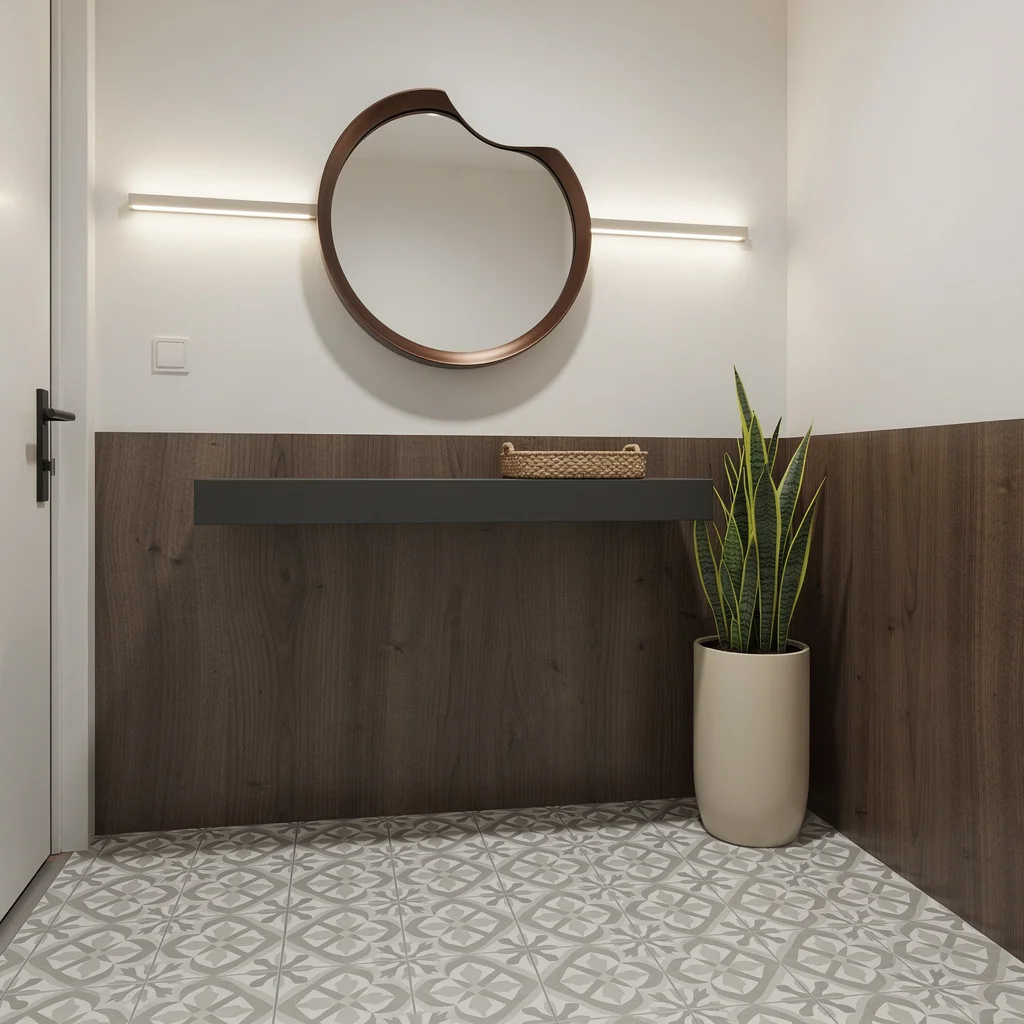
Ready for creative genius that doesn’t cost your soul? Use peel-and-stick walnut panels on the lower wall, crisp off-white above—two tones = instant designer clout. Use a floating matte charcoal shelf, and make it echo the walnut shade so you don’t trigger design chaos. Sculptural round mirror in deep bronze is a must; flat frames are for quitters. LED wall bar gives ambient lighting—never let your entry be dark unless you run a dungeon. Cheap patterned encaustic-look vinyl tiles do wonders for the floor—statement, not stress. Tall cream planter for a snake plant next to the door is the finishing flex. Woven tray for keys and sunglasses so you don’t lose them—styling rule: always group by shape, not color.
Final Thoughts
Budget entryway transformations succeed or fail on the same question every design project ultimately comes down to — whether the decisions were made deliberately or by default. The money available is almost never the determining factor in whether the result looks considered, because the spaces on this list that look the most put-together are frequently the ones where the least was spent and the most was thought.
The arch that gets left alone to do its own work. The living wall built incrementally over two seasons. The antique chest found at the right moment in the right shop. The board and batten wall installed over a weekend with paint left over from another project. None of these are expensive moves — all of them required someone to look at the space and decide what it should be before doing anything to it.
A budget doesn’t prevent a good entryway. Spending without direction does. Decide what you want it to feel like, identify the one or two moves that will create that feeling most efficiently, and put the available money there rather than spreading it thinly across everything. The entry that looks designed almost always cost less than the one that looks expensive — it just started with a plan instead of a shopping cart.