
The mudroom gets walked past, wiped down, apologised for, and occasionally photographed from an angle that hides the boot situation. It is the room that receives every person, every pet, every wet coat, every sports bag, and every pair of shoes that has ever entered your house — and in return for this extraordinary service, it typically gets whatever storage was left over after every other room in the house had been properly considered. The result is a space doing an enormous job with precisely the resources of someone who was told at the last minute they were expected to host a dinner party.
What makes this particularly inexcusable is that the mudroom’s functional requirements are actually straightforward to solve. Somewhere to hang things. Somewhere to sit. Somewhere to store shoes. A floor that handles whatever comes in from outside without looking destroyed by February. None of these are architectural puzzles. They’re a list of known requirements that simply need to be met deliberately rather than approximately, and the gap between a mudroom that works properly and one that merely exists is almost always a gap in decision-making rather than a gap in budget.
The mudrooms that people genuinely want — the ones that make guests pause and say something complimentary about a utility room, which is a sentence that should theoretically be impossible — all share the quality of having been designed rather than installed. The cabinetry colour was chosen, not defaulted. The bench was sized to the wall, not bought off a shelf and pushed against it. The basket situation was resolved rather than added to. That level of intentionality is the only ingredient separating the mudrooms on this list from the ones currently being apologised for across the country.
The Mudroom Has One Job and It’s Not the One Most People Give It
The widespread belief that a mudroom’s primary job is storage is how mudrooms end up looking like organised supply closets rather than designed rooms. Storage is how the mudroom does its job. The actual job is intercepting the chaos of daily household life before it reaches the rest of the house — and that’s a different brief.
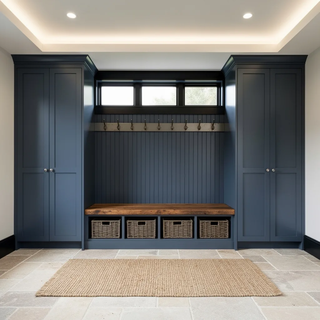
The Chaos Has to Have Somewhere to Go — Every mudroom that fails does so because the household’s actual daily output of coats, bags, shoes, and miscellaneous items exceeds the storage capacity designed for it. The system needs to be sized to the household’s real behaviour, not an optimistic version of it. That means more hooks than you think you need, more shoe storage than currently seems necessary, and closed storage for everything that doesn’t look good sitting out.
The Floor Material Is Not a Decorative Decision — Every material choice that looks great in a kitchen photo shoot and performs badly under daily mudroom conditions is a decision that will look increasingly bad for the life of the house. Herringbone tile, checkerboard stone, slate — all of these work in mudrooms precisely because they handle grit, moisture, and heavy traffic while contributing to the room’s design rather than simply tolerating its function.
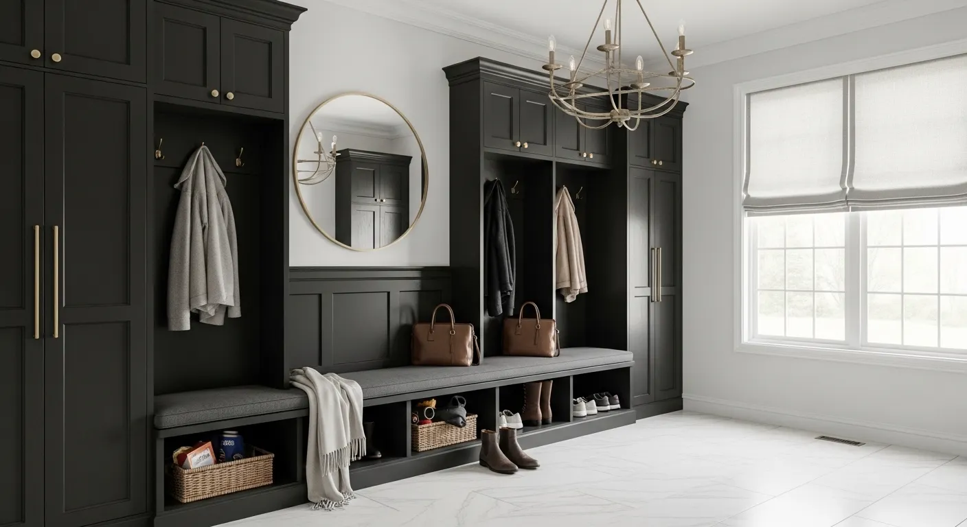
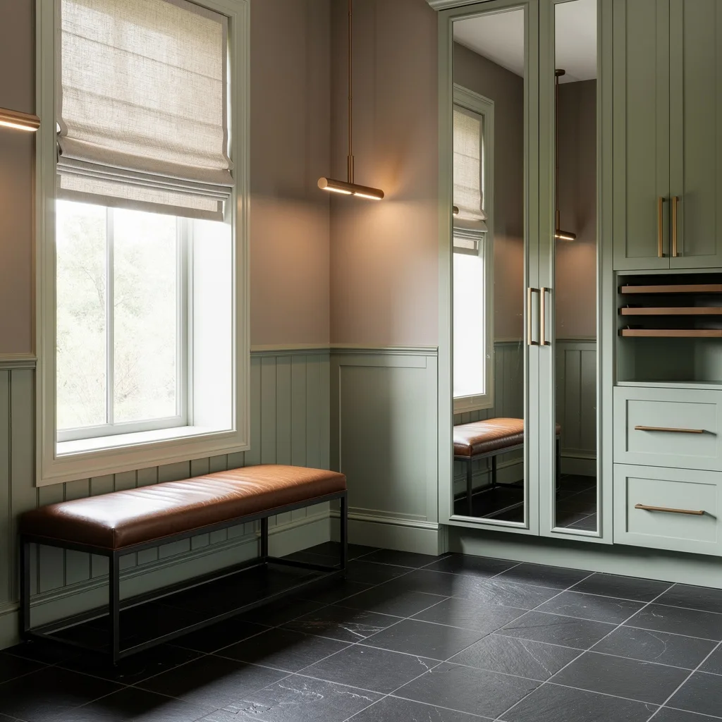
The Bench Is Infrastructure, Not Furniture — A mudroom without a bench is a mudroom where shoes get removed standing on one leg, bags get dumped on the floor, and children develop inexplicable balance issues every school morning. The bench is where the room’s practical logic begins, and it needs to be long enough, sturdy enough, and positioned well enough to actually be used rather than just occupied by decorative cushions and the occasional hat.
Why Mudroom Cabinetry Decisions Deserve Kitchen-Level Attention
The cabinetry in most mudrooms receives approximately one-tenth of the consideration given to kitchen cabinetry despite serving a harder-working space in more demanding conditions. This is a proportion problem that produces mudrooms whose storage systems fail faster, look worse, and require replacement sooner than anything treated with genuine design intention from the start.
Colour Communicates Before Function Does — A cabinetry colour chosen with the same seriousness as any other significant finish decision transforms the mudroom from a utility installation into a room with a point of view. Sage green, storm blue, teal-grey — these colours communicate that the mudroom was designed rather than assembled, and they make every wicker basket, every cushion, and every hook look like it was chosen rather than grabbed from a hardware store.
Full-Height Cabinetry Changes the Space Permanently — The difference between cabinetry that runs to ceiling height and cabinetry that stops at a standard height is the difference between a room that looks built-in and a room that looks furnished. The shelf of dust and random items that accumulates above standard-height mudroom cabinets is not an inevitability of the format — it’s the consequence of not building the cabinetry all the way up, and eliminating it costs almost nothing in planning terms.
Open and Closed Storage Need a Ratio — All closed storage produces a mudroom that functions well and shows nothing. All open storage produces a mudroom that shows everything, including everything that should have been hidden. The right ratio depends on how disciplined the household is about putting things away, which is a realistic assessment most mudroom designs skip in favour of optimism, and regret at some point in the following six months.
The Details That Make a Mudroom Feel Finished Rather Than Functional
A mudroom can have excellent storage, a solid bench, and a durable floor and still feel like a utility room rather than a designed space if the finishing details haven’t been considered with the same intention applied to the larger decisions.
Hardware Is the Punctuation of the Cabinetry Sentence — Brass cup pulls, matte black bar handles, antique bronze knobs — the hardware finish runs across every cabinet door and drawer in the room and creates a material thread that either ties the composition together or introduces a note of discord visible every single time the space is used. Hardware chosen to relate to the hooks, the sconce, and any other metal in the space creates cohesion that elevates the entire room above its individual components.
Cushion Fabric Needs to Survive Contact With Reality — A bench cushion in a mudroom will encounter damp coats, muddy bags placed temporarily, and the full weight of whatever a household deposits on available surfaces during the busiest transitions of the day. A fabric chosen primarily for its appearance over its durability will show the evidence of these encounters within weeks. Performance fabrics that look well considered are widely available and considerably more honest about what the mudroom actually is.
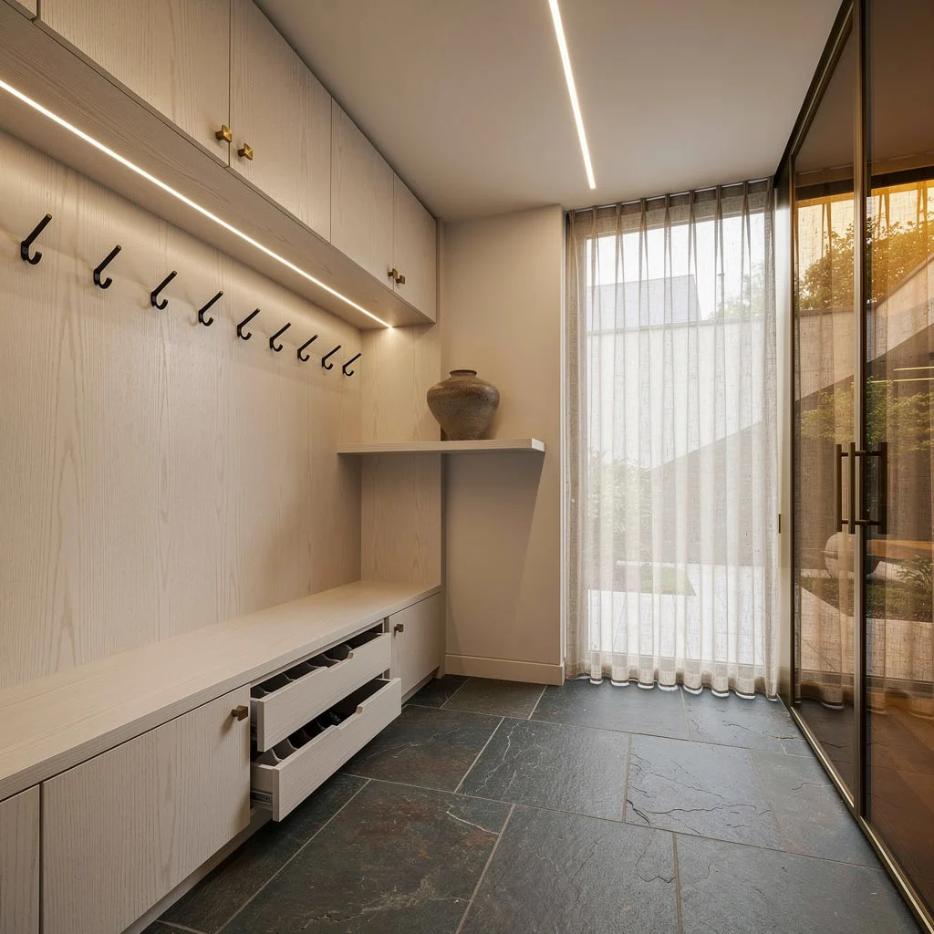
The Overhead Light Sets the Entire Atmosphere — Most mudrooms operate under whatever ceiling fixture was roughed in during construction and never reconsidered, which means most mudrooms are lit like utility spaces regardless of how good the cabinetry is. A pendant with genuine character, a pair of flush-mount fixtures with considered form, or even recessed lighting positioned to flatter the cabinetry rather than simply illuminate the floor changes the entire room’s atmosphere for a cost that represents a small fraction of the overall mudroom investment.
Entryway Mudroom Ideas
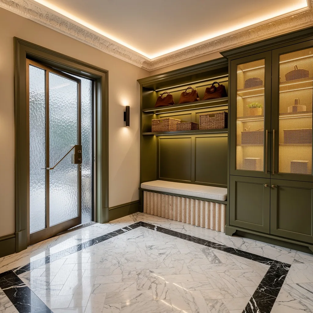
The White Built-In That Proved Neutral Can Still Mean Business
Full-height white shaker cabinetry with bar pull hardware in brushed gold runs floor to ceiling, creating a complete storage wall that feels custom-built rather than assembled, with a timber bench seat spanning the lower section over mesh-front drawers that provide ventilation for shoes while keeping them contained. A large wicker market basket at floor level holds an umbrella and a watering can alongside wellington boots with the casualness of things that belong exactly where they are, green striped linen cushions on the bench add the only colour note in an otherwise creamy white composition, and a glass sidelight beside the door floods the whole space with natural light that makes the herringbone tile floor glow. The straw hat hanging from a single hook between cabinet panels is the detail that makes this feel lived in rather than staged, which is the quality that separates mudrooms people actually use from ones people photograph and then tiptoe around.
The Oak Panel System That Made Minimalism Actually Work
Mudroom
by u/darryljenks in ScandinavianInterior
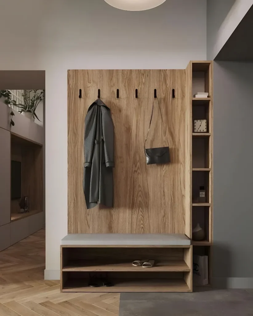
A large-format warm oak panel with pronounced natural grain covers the full wall height and width, mounting six evenly spaced black cylindrical hooks at a height that actually accommodates adult coat lengths, with a matching oak bench unit below providing an upholstered grey seat, open shoe storage beneath, and a vertical shelving tower to one side holding a clock, a ceramic vessel, a fragrance bottle, and nothing else. The herringbone oak floor continues from the room beyond, the pale grey walls on either side allow the timber panel to read as a designed feature rather than a piece of furniture pushed against a wall, and the globe pendant overhead provides soft ambient light that makes the whole composition feel warm at every hour. What this setup demonstrates is that a mudroom doesn’t need wall-to-wall cabinetry to be functional and designed — one well-made, well-positioned panel unit with the right hook height and the right open shelf ratio solves the functional brief with considerably more visual restraint.
The Sage Mudroom That Understood Abundance and Organisation Are Not Opposites
Dusty sage cabinetry with moulded door panels runs full height on one wall with open upper shelving holding wicker baskets, framed botanical prints tucked into the nook above the bench add the kind of personal detail that prevents a built-in from feeling corporate, and the bench itself is upholstered in a ticking stripe with wicker baskets stored in the open cubbies below for shoes and seasonal accessories. A full-size olive tree in a terracotta wicker basket and a pot of white chrysanthemums bring the outdoors in beside the glazed door, and the black and white harlequin stone tile floor provides the geometric foundation the organic planting and warm cabinetry need to read as a composition rather than a collection. The light that falls across the floor from the glazed door turns the tile into a shifting pattern throughout the day, which is the kind of incidental drama that well-chosen floor materials provide without any ongoing effort.
The English Cottage Mudroom That Turned a Utility Function Into a Character Study
Sage-painted beadboard cabinetry with brass knobs, three matching wicker baskets lined up on the shelf above, brass mushroom hooks running the back panel at precisely the right height for working clothes and country coats, a ticking-stripe bench cushion with plaid and striped pillows, wicker baskets below for shoe storage, cut flowers in a white vase on the adjacent cabinet top, and a terrazzo-effect harlequin floor in charcoal and cream — this mudroom is operating entirely within the English country house aesthetic and doing so without a single element that hasn’t earned its place. The aged timber door with wrought iron hardware visible to the left, garden planting pressing against the window to the right, and the general sense that this room has always looked this way and always will create an atmosphere that no amount of contemporary precision can replicate. It works because every choice reinforces a single coherent vision rather than gesturing toward several simultaneously.
The Steel-Blue Mudroom That Made Storage Look Like Furniture
Deep slate-blue built-in cabinetry with gold hardware fills the full back wall, providing closed upper cabinets, open shelving for wicker baskets, and a full-length padded bench in ticking stripe above three drawers with substantial gold pulls — the whole unit has the quality of furniture that grew into the wall rather than cabinetry that was installed after the fact. A vintage-style wall sconce with amber bulb provides warm atmospheric light beside the tall glazed door, a black wrought iron umbrella stand holds one umbrella with appropriate restraint, wellington boots are lined up on the stone tile floor with the matter-of-fact tidiness of things returned to their place, and an olive tree in a terracotta pot connects the interior to what’s visible through the door glass. The travertine floor tile running from the threshold to the far wall keeps the entire space grounded in warmth against the cool blue of the cabinetry, and the relationship between those two tones is the decision that makes everything else in the room feel intentional.
The Teal Cottage Entry That Had the Confidence to Commit Completely
Deep teal-blue painted cabinetry and beadboard panelling fill the entire visible wall surface, with gold-tone double hooks mounted at practical height holding a wicker basket bag and a coat, a striped bench cushion providing the seat, wicker baskets tucked into open cubbies below for shoes, additional wicker storage at floor level, an olive tree in a large wicker basket claiming its corner, and a black and white checkerboard stone floor completing the composition with the kind of pattern that anchors every colour placed above it. The glazed door at the end with its brass hardware lets in the street light through panes that reflect the teal cabinetry back into the room, doubling the colour’s presence and giving the narrow entry more visual depth than its dimensions would suggest. Green wellington boots at the door are the most honest detail in the room — a mudroom that actually handles mudroom life rather than one performing the idea of it.
Channel Spa Vibes with Bluestone and Bronze
If you crave a mudroom that screams ‘Yes, I’m wealth-adjacent,’ you need to break up with builder-grade nonsense and get strategic. Start with seamless Belgian bluestone floors—they’re forgiving to grime and look expensive on purpose. Demand custom rift-cut white oak cabinetry (vertical grain, not basic horizontal), with an integrated bench so you actually put on shoes like a civilized human. Insist on black powder-coated hooks (minimal, not overcrowded) and stash chaos in hidden shoe drawers. Splash bronze-tinted glass wall-to-wall, but filter sun with sheer flax linen—direct light is for rookies. Toss one sculptural ceramic vessel on a floating shelf—two is just greedy. And for the love of subtlety, let matte patinated brass hardware do the flexing. Pro tip: Always run LED strip lights in the ceiling, no moody lamps—so the drama is architectural, not accidental.
Concrete and Terrazzo: The Chill, Adult Way
Sick of your entryway looking like a teenager’s locker room? Go full grown-up with muted terrazzo tiles (oversized, obviously) grounded by beefy, wall-to-wall walnut millwork featuring soft-close everything. Anchor the space with a floating concrete bench and call in black steel pegs for legit accessory duty—enough with the awkward hooks. Frame your daylight with vertical slot windows, so you get geometric shadows and zero prying neighbor eyes. Plaster your walls in ultra-flat, off-white lime and add a single statement planter—your plants need a welcome, too. The non-negotiable? Drop elegant coffered ceilings above with strategic downlights to show you mean (minimalist) business.
Go Luxe with Marble Floor Drama
Ready to break up with boring entryways? Claim the power of marble—basket-weave Calacatta and contrasting Saint Laurent borders, no apologies. Paint your cabinetry deep olive—if you want plain white, get out now—and demand inlaid reed glass for doors, because what’s the point of custom if you aren’t showing off? Stick a fluted travertine bench underneath RUNS of illuminated shelving, not just a sad cubby. Stock only leather catch-alls and rattan baskets to avoid the plastic bin shame spiral. Wrap the ceiling with indirect cove lighting to show off your crown molding, not your dust. The boss move? Install a bronze-framed pivot door with artisan textured glass for entrance drama—and always pick a sconce with actual style, not those dinky hallway fixtures.
Scandi Style, But Make It Actually Inviting
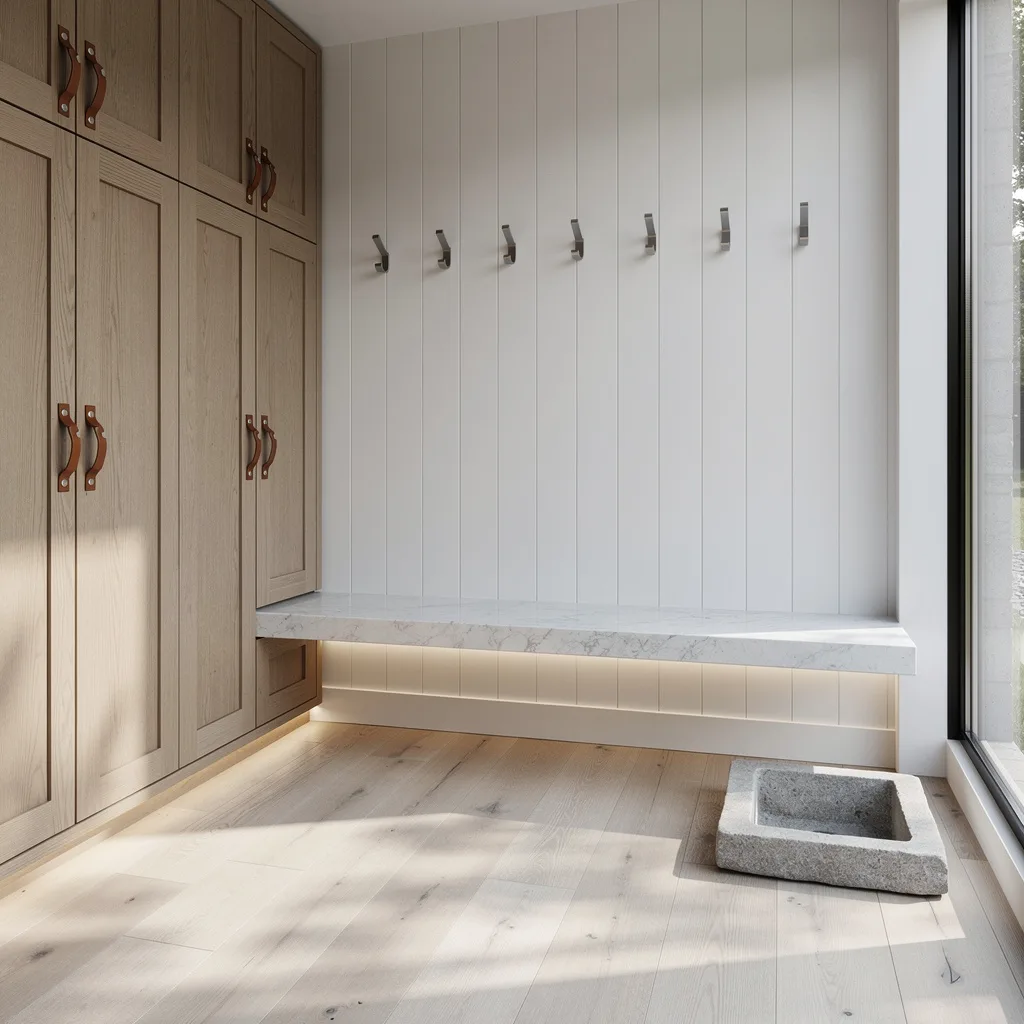
Cut the cottagecore clutter and channel Scandinavian restraint with wide-plank ash underfoot and vertical white shiplap walls—keep it bright but never sterile. Demand oak storage lockers with leather straps for handles—if your handles aren’t tactile, you’re missing the plot. Go long with a floating quartzite bench and sneak in LED edge lighting for that “I-have-my-life-together” glow. Hold the clutter with a laser-straight row of steel wall hooks and install a sidelight window that floods, not dribbles, light. Plop a chunky stone catch basin on the floor (remember, one-and-done minimalism wins here). Pro tip: Overstyle nothing—too many ‘accents’ and you’re in farmhouse cosplay territory.
Monochrome Mudroom for the Art Snob
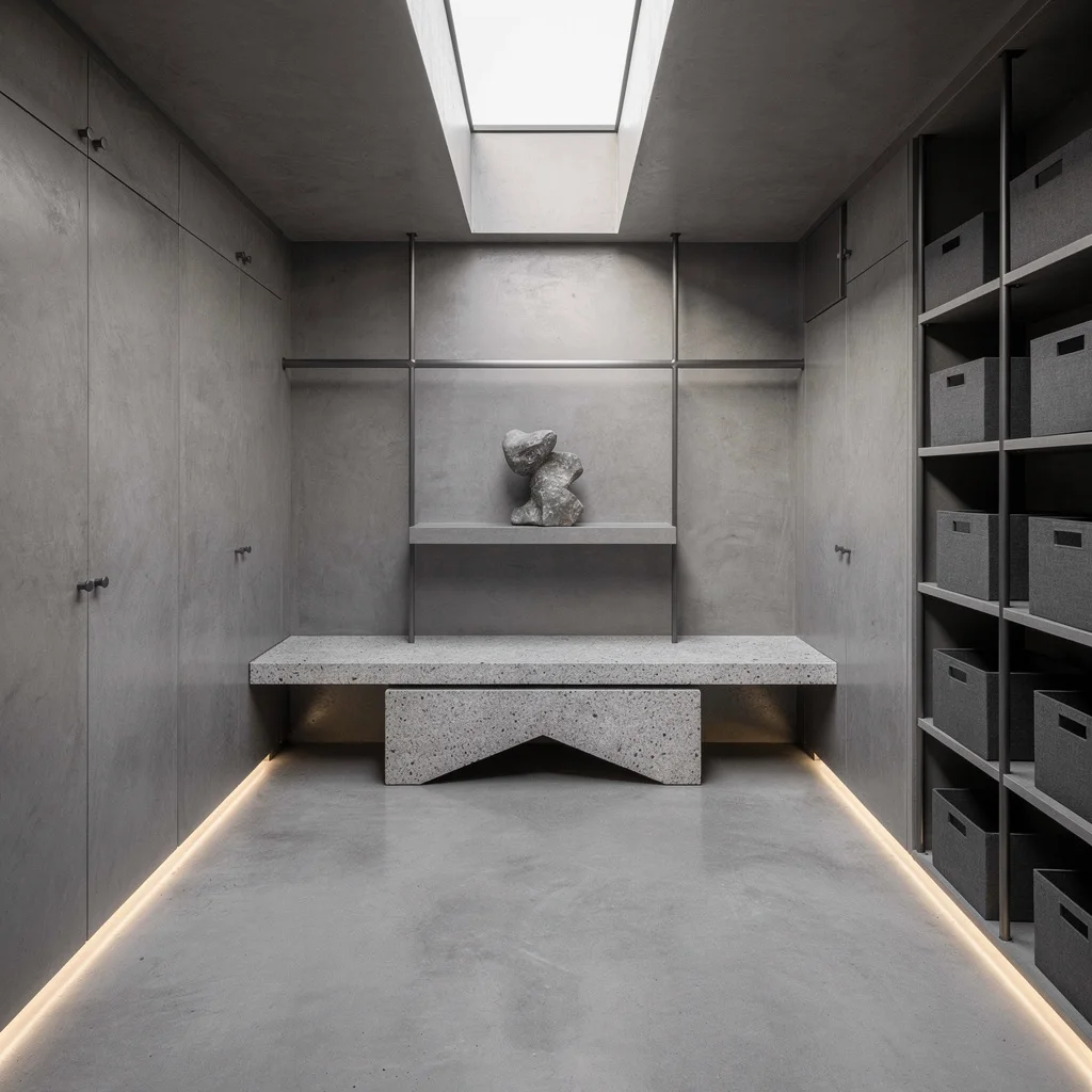
Ready to stunt on your arty friends? Make your mudroom a gallery with seamless concrete floors and built-in polished plaster walls—all in greyscale, because color is for the weak. Carve out a geometric granite niche bench and float storage bins in perfect cubes—aim for ‘organized’ not ‘kindergarten cubbies.’ Keep rails slim and gunmetal, and throw moody perimeter LEDs at floor level. Slice a skinny skylight overhead so you’re hit with natural light (and a dose of daily self-admiration). Plop a single abstract stone sculpture on a cantilevered shelf—show restraint; it’s not a yard sale. Rule: If you’re adding art, lose the clutter—gallery vibes only work with clear surfaces.
Flood the Entry with Light, Not Basic Boredom
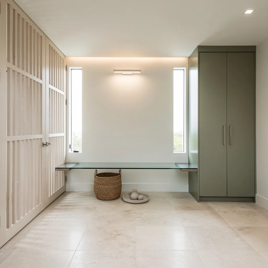
Who told you mudrooms have to be dingy? Prove them wrong with monster travertine tiles and white oak slatted screens that say ‘no shoes beyond this point.’ Demand cabinetry in matte sage, team it with touch-latch doors so you’re not yanking anything open. Float a glass and stone bench (yes, cantilever or bust) and keep the light relentless—vertical slot windows are your secret weapon. Finish with a wall-flush architectural fixture for overhead light. Style with a solitary, oversized woven basket and a ceramic tray—nothing else. Pro move: Add cove lights to soften everything. If you feel compelled to add tchotchkes, stop yourself. Less is actually more.
Classic Meets Cool: Eucalyptus Cabinet Crush
Sick of farmhouse knockdowns and uninspired slate? Drop dark charcoal slate floors, mix in wainscoted taupe walls, and dare to paint your cabinetry in sophisticated eucalyptus (not drab green—get the shade right). Throw in a custom bench framed with steel and finished in luxe leather upholstery. Elongate your daylight with a tailored linen Roman shade—never those sad plastic blinds. Hang a bronze linear pendant for an elevated glow, then work in slim vertical mirrors between cabinets—the cheapest contractor trick for stretching space. Accessorize only with bronze handles and a minimal wall-mounted mail sorter. Final commandment: Don’t let open shelving turn into your junk drawer in disguise.
Farmhouse, But Make It Rich
Miss the cozy vibe but can’t handle the same old shiplap? Stone cold Belgian limestone underfoot is a must, custom shaker cabinetry needs to be storm blue—no generic greys allowed—and a reclaimed chestnut bench will flex actual taste, not fake rustic. Hang all your stuff on antiqued pewter peg rails because hooks shouldn’t look like kindergarten junk. Jam woven baskets under the bench for actual storage (your clutter doesn’t deserve visibility). Cap your light with transom windows in matte black trim, then throw down a jute runner for texture that isn’t screaming ‘potato sack.’ The sharp trick? Conceal uplighting to make every detail legit glowy—not just ‘lit.’
Sleek City Entry for Urban Legends
You want mudroom envy? Lay down seamless basalt floors—dirt disappears, drama remains. Install pivoting walnut veneer cabinet doors and float matte travertine benches with slick underlighting. Ditch basic hooks for brushed steel—just enough linear action, zero farmhouse. Slide in frosted glass shelves for bonus storage that doesn’t scream ‘utility.’ Along the wall, alternate slot lighting like you’re in a chi-chi gallery. Add one (and only one!) oversized ceramic tray for actual catch-all power. Complete with a slim bronze-framed mirror—daylight multiplies like magic. Styling hack: Only the essentials belong in sight; stash the rest so you don’t look like a hoarder.
Mirror Magic in Mellow Neutrals
Tired of dark dungeons? Lay quartz terrazzo flooring—soft speckle only, 80’s flashbacks not allowed. Design custom cabinetry in putty lacquer (yes, cream shades can be chic) and float an oak bench with ribbed bottoms for bonus texture. Frame the whole thing in tall, backlit bronze-tinted mirror panels—because who doesn’t love catching a selfie mid-jacket grab? Fill open shelving only with felt catchalls and stone trays; banish plastic at all costs. Add a black pivot door (smoked glass, obviously) for “don’t look at me” privacy. Designer secret: Keep architectural lighting flush and always avoid pendants shaped like anything found in a preschool.
Art Gallery for Your Boots
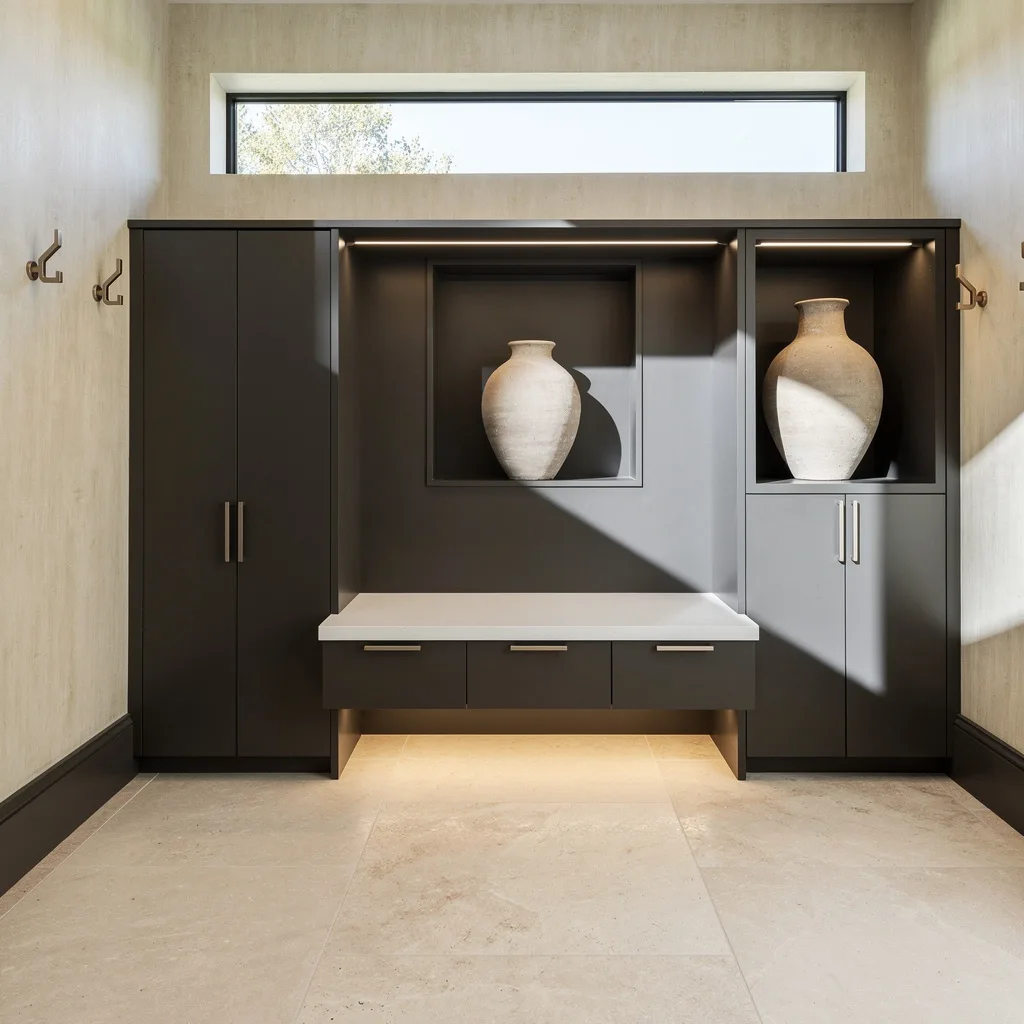
Dying to humblebrag to your guests? Lime-wash those walls the softest creamy shade, plop down sectioned limestone slabs, and demand graphite-toned cabinetry with silent, recessed pulls. Float a Corian bench and backlight it from below—nobody needs to see dust-bunnies. Stretch daylight with a high transom window so you get killer shadow-play, not sunburnt coats. Insert massive vases in custom wall niches—just enough to look curated, not like you robbed a Pottery Barn. Mount sleek nickel hooks to finish. Always keep the hooks in a straight line—crooked equals chaos, and chaos is not chic.
Final Thoughts
Mudrooms earn their keep or fail to do so based entirely on whether the storage matches the household’s real daily behaviour, and every other design decision builds from there. The cabinetry colour, the bench dimensions, the hook count, the floor material — all of these deserve genuine consideration rather than the default settings most mudrooms receive because someone ran out of design energy by the time they reached the back of the house.
The spaces here that succeed do so because they were treated as rooms with identities rather than utility installations with storage requirements. The cabinetry has colour with conviction. The floor has a pattern worth looking at. The hardware connects to the hooks connects to the light fitting in a material conversation that shows the room was considered as a whole rather than assembled from separate decisions made on different days.
A mudroom that works properly is not a luxury — it’s the practical foundation that keeps the chaos of daily life from spreading into every other room in the house. Getting it right is not about spending more money. It’s about spending the same level of design attention on the hardest-working room in the house that’s routinely given to the rooms that never have to deal with a wet dog at six in the morning.