
Nobody warns you when you buy a house that the entryway is where your design confidence goes to die. You spend weeks agonizing over kitchen countertops and bedroom paint swatches, and then you walk into your own front door and just… stop. Hang a mirror. Maybe a hook rack. Call it done. The entryway becomes the room that taste forgot, and every single person who visits you experiences that failure in real time before they’ve even taken off their shoes.
The real tragedy isn’t the neglect—it’s the excuse-making that follows. “It’s just a transitional space.” “People don’t spend time there.” “I’ll fix it eventually.” Meanwhile, eventually keeps not coming, and your entryway continues its career as the most anticlimactic opening act in residential history.
What nobody tells you is that entryway walls are genuinely the easiest place in your home to go dramatic, get interesting, and make something that stops people in their tracks—because the canvas is small, the consequences are low, and the impact is immediate. A single bold wall in a compact entry will do more for your home’s overall impression than repainting your entire living room in a color you found on a mood board at 2am.
Whether you’re working with a soaring double-height foyer or a corridor so narrow that two people have to negotiate passing each other, these ideas will drag your entryway out of its beige mediocrity and into something that actually deserves to be the first thing people see.
Stop Treating Your Entry Like a Waiting Room
Your entryway wall is doing the hardest job in your house—forming every single first impression—and most of you are sending it out there completely unprepared.
First impressions have no mercy — Guests decide how they feel about your home within seconds of stepping inside. Your entry wall is the entire audition, and right now a lot of them are bombing it spectacularly.
Boldness has nowhere to go wrong here — Unlike a living room where one dramatic choice has to coexist with furniture, lighting, rugs, and three other design decisions, your entryway wall is a contained experiment. Go wild. If it doesn’t work, it’s one wall.
Function should look like it’s not even trying — The best entryway walls solve real problems—creating storage, bouncing light, making narrow spaces feel deliberate—while looking like they were assembled effortlessly. The effort is the secret you keep.
The Assumptions You Need to Drop Before You Start
Conventional entryway wisdom is mostly fear dressed up as advice. Here’s what you can safely ignore.
Neutrals aren’t sophisticated, they’re just unfinished — A beige entryway doesn’t read as elegant transition space. It reads as someone who ran out of ideas and decided to call it minimalism.
One strong concept beats three timid ones every single time — A wall with a single bold idea executed with full commitment will always outperform a wall trying to balance a mirror, some hooks, a small shelf, and three pieces of art that have nothing to say to each other.
Your entry is allowed to have a personality — Not “clean and welcoming.” Not “bright and airy.” An actual personality. Something that tells people who you are before you’ve even come downstairs to greet them.
Entryway Wall Ideas Worth Stealing
Dark Paneling That Makes Beige Walls Cry
Help me pick an entryway table for this wall
by u/holydickbirds in HomeDecorating
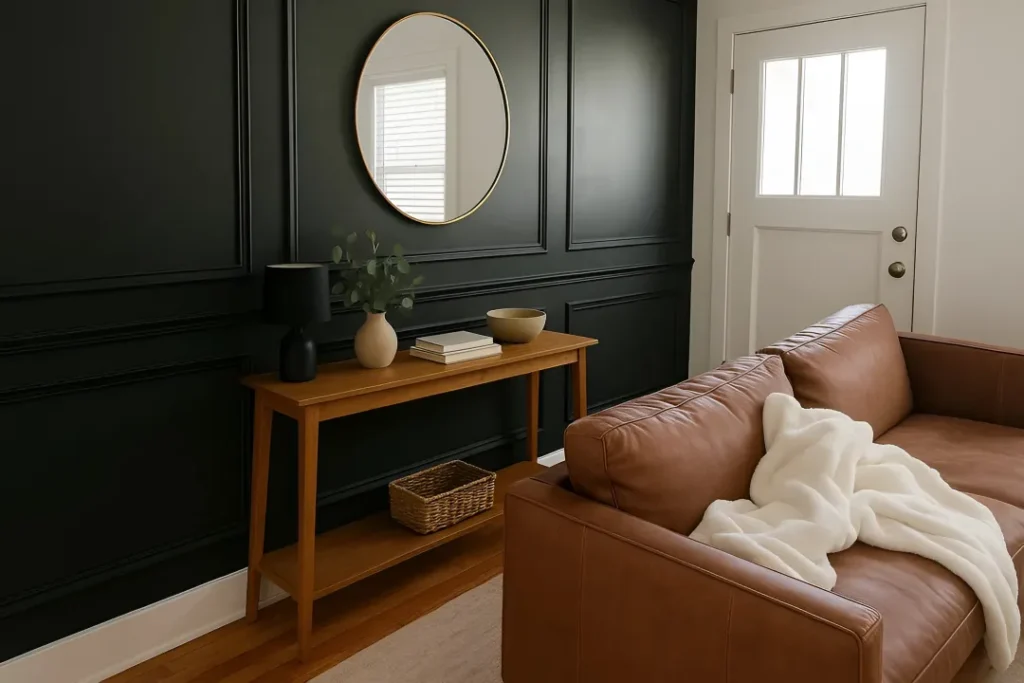
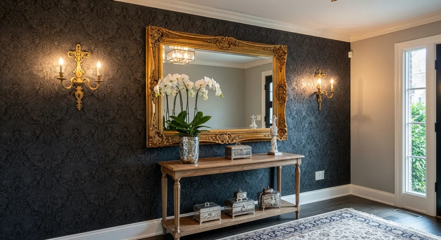
If you’ve been sleeping on dark moody paneling, consider this your wake-up call delivered at full volume. Classic wainscoting—something your grandmother probably had in dusty white—gets cranked all the way up to deep charcoal or near-black and suddenly it stops being traditional and starts being a moment. The trick is pairing that dramatic wall with warm wood tones: a honey-toned oak console grounds the darkness without neutralizing it, and a round brass-rimmed mirror bounces just enough light to stop the whole thing from feeling like a waiting room at a gothic law firm. A black cylindrical lamp, a neutral ceramic vase, a single branch of eucalyptus—that’s it, that’s your entire accessory budget, put everything else away. If you’re tempted to add a gallery wall, a seasonal wreath, or literally anything else to this look, sit with that temptation until it passes.
Floor-to-Ceiling White Paneling for People Who Know Quiet Can Still Be Loud
Going all-white is not the coward’s choice—if, and this is a massive if, you do it with genuine architectural conviction and absolutely zero apology. Double-height board-and-batten paneling in warm cream, running uninterrupted from baseboards to ceiling, is not playing it safe. It is architectural drama in a single color, and it requires considerably more confidence to pull off than most people give it credit for. The secret weapon is scale: an oversized ceramic planter housing a full-sized Japanese maple is the kind of styling decision that makes interior designers quietly emotional. An octagonal dark-stained console, a sculptural little stool, a single brass wall sconce—each piece doing something interesting, none of them competing. The patterned stair runner is the one wild card that works precisely because everything surrounding it is disciplined enough to give it room.
Capsule Mirrors on Fluted Panels Because Art Deco Never Actually Left
This is the look for people who’ve always wanted their entryway to feel like stepping into an exclusive hotel lobby circa 1930s Paris—except you live in a semi-detached and the postman just saw you in your dressing gown. Fluted white wall panels serve as the base, giving the wall a rhythmic vertical energy before a single mirror gets involved. Then you arrange a composition of mixed arch-and-circle mirrors in dark bronze frames—no two at exactly the same height, because symmetry here would strangle the drama entirely—and suddenly the wall develops a whole personality of its own. A deeply saturated red boucle bench grounds the look with a shot of color that should not work as well as it does, and gold-toned accessories complete the jewel-box effect. The butterfly artwork reflecting back through the mirrors is the detail that makes the whole thing feel intentional rather than assembled, and the backlit LED edges are not optional—do not skip them and then wonder why yours looks flat.
Sunny Floral Wallpaper for People Done Pretending They Like Minimalism
Bold yellow floral wallpaper running across every single wall without stopping or apologizing at the corners is the design equivalent of committing to a bit completely and watching it land with the audience. The pattern does all the heavy lifting so your furniture doesn’t have to; a slim dark-wood console with tapered legs keeps things traditional enough to feel intentional rather than chaotic, while a deep navy barrel chair drops in contrast without starting a fight with the walls. A jute rug underneath gives everything just enough earthy texture to keep the space from floating away into full cottagecore territory. One round gold mirror, one vase of fresh tulips, done—if you’re already reaching for more accessories you have fundamentally misunderstood the assignment. The wallpaper is the decor. The wallpaper has always been the decor. Trust it and step away.
Oversized Feather Mural with a Marble Console: Drama That Remembered to Stay Classy
This is your formal permission to skip every conventional framed print you’ve ever considered and make the entire wall the art instead. A large-scale feather mural in blush, ivory, and soft grey creates a sweeping backdrop that makes people stop walking mid-stride and just look for a moment—which is the exact reaction your entryway should be generating. A sleek marble-topped console with a slim gold frame underneath is the ideal supporting cast: present, luxurious, and completely uninterested in competing for attention. Two matching bouclé cube ottomans tucked beneath keep things practical without breaking the visual softness. A round mirror above, a single vase of pampas grass deliberately loose and imperfect—the wavy black-and-cream border panel running vertically on one side is what separates this from a pretty mural into an actually designed space, adding graphic structure that makes the whole composition feel considered rather than just printed and hung. The gold door hardware catching light at the edge? That is the finishing detail that tells everyone something intentional is happening here.
Go Fluted or Go Home: Vertical Oak Luxe
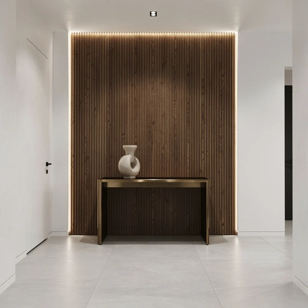
Ready to drop jaws the second that door swings open? You need vertically fluted oak panels stretching from floor to ceiling—this isn’t your realtor’s fake wood paneling. Use real, high-quality oak and run it uninterrupted for full drama effect. Add linear LED uplighting behind the flutes for that expensive shadow play—if your lighting isn’t making texture pop, why bother? Finish with massive pale grey porcelain tiles underfoot, keep adjacent walls white as printer paper, and toss a glam bronze console in front—bonus points for a sculptural vase. Trim anything cluttery; let wood grain and subtle light be your silent flex. Don’t forget: all lighting should be warm white, and yes, your trim needs to match that crisp vibe. Never go matchy-matchy on metals—bronze for furniture, something simpler for hardware. If your entry doesn’t feel minimal but rich enough to make your friends wonder how much you secretly make, you did it wrong.
Get Wavy with Creamy Stone Mosaic
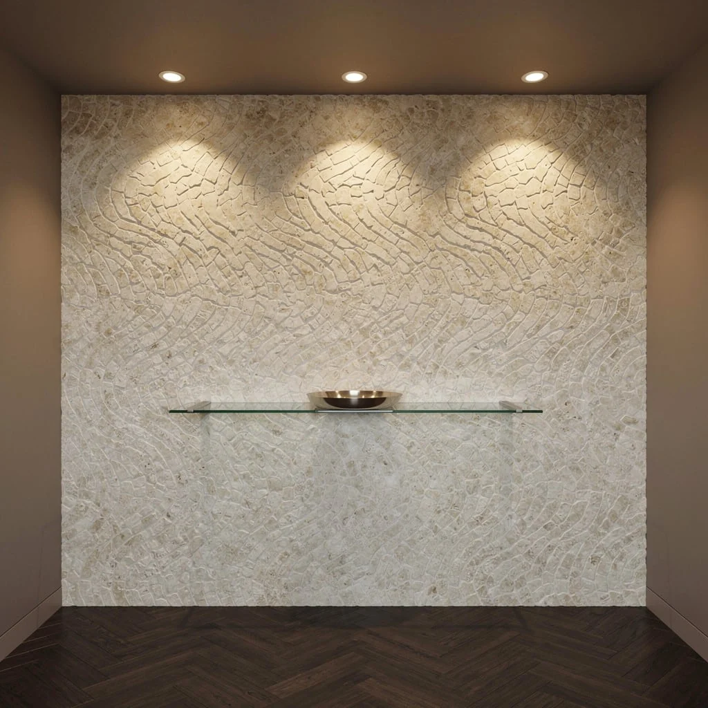
If spa-like calm and bougie hotel vibes suddenly had a baby, you’d get creamy organic stone mosaics in an entryway—and yes, the pattern needs to ripple, not look like a bad Tetris game. Install stone mosaic tiles in an undulating horizontal or vertical pattern. Wall must be cleaned and leveled first; this isn’t a DIY for your cousin with no eye for detail. Float a slim glass shelf about waist height; keep it visually light—literally one brushed nickel tray, nothing else. Set dark herringbone oak floors underneath for severe contrast, and top everything off with a taupe ceiling. Pro tip: Graze your accent wall with recessed spotlights from above, not direct bulbs—emphasize depth and shadow, not your uneven grout. Absolutely no clutter or extra décor; this look is all about subtle flex and sculpted silence. If you add a family photo, the design gods revoke your chic card—immediately.
Navy Lacquer Walls for Drama Nerds
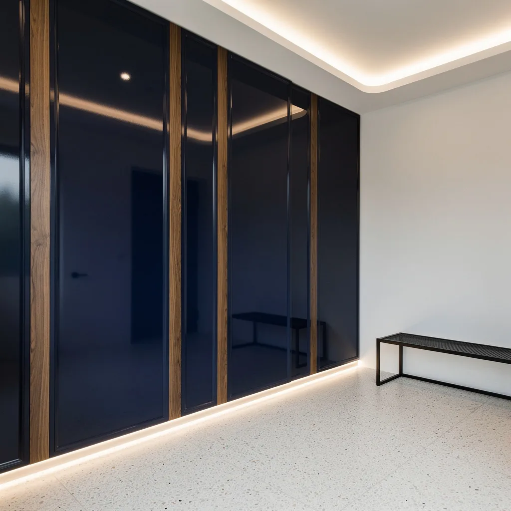
If you’re addicted to high-gloss and can’t keep your paws off bold colors, drench your entry wall in glossy navy lacquer panels, bevel those edges for insultingly sharp lines, then thread slim strips of walnut in between to stop it looking cheap. Lay pale terrazzo on the floor—bonus points for zero visible seams. Hide LED strips at floor level to make the navy walls look even deeper and richer after dark. Go minimalist everywhere else: crisp white walls, cove-lit ceiling, black metal bench. Here’s your styling rule—do not crowd up this look with chunky furniture or more than one art piece. The wall is the main event, so keep your accessories nearly invisible. Don’t bring down the luxe with shiny hardware—matte black or nothing.
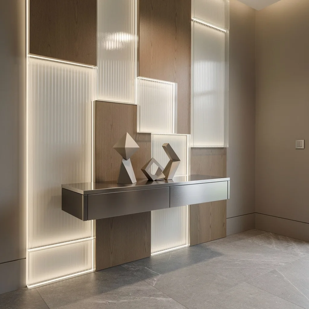
Reflect on This: Hexagonal Mirrors & Brass Flex
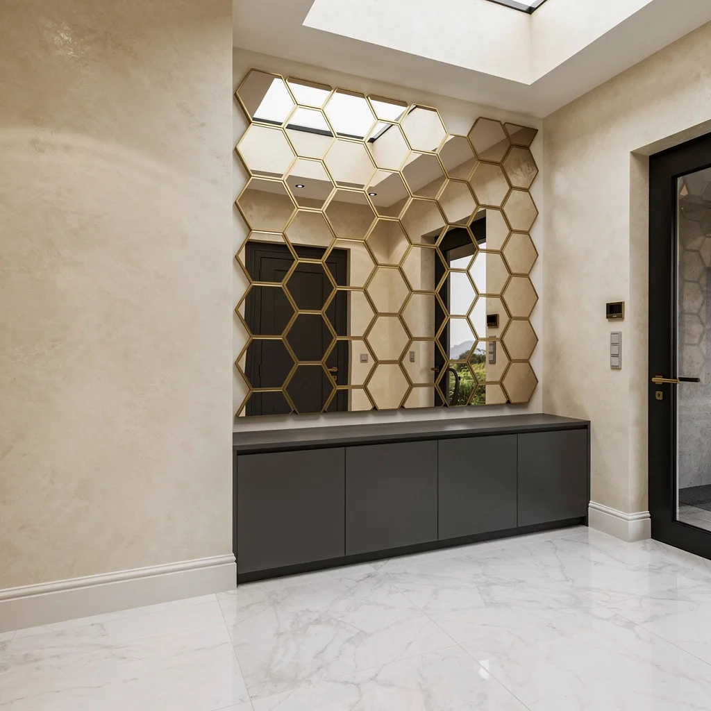
You want instant drama and max light bounce? Line your wall with giant hexagonal mirror tiles (yes, oversized or bust), outline every single tile with a delicate brushed brass trim, and watch as even your dark entry glows up. Use polished marble on the floor to enhance all that reflectivity, and Venetian plaster in a subtle ivory shade for the neighboring walls, or you’re just sabotaging yourself. Tuck a matte charcoal shoe cabinet flush to the wall, but keep everything else clear—no piles of shoes or rogue baskets, you’re not living in an episode of ‘Hoarders.’ Lighting rules: Soft ambient is key, avoid point-source spots that’ll glare out guests. Remember, smears and dust kill this look, so clean those mirrors weekly—fingerprints are illegal now. Let the geometry be the focus; resist the urge to add more patterns anywhere else.
Textured Zen: Sandblasted Travertine Brickwork
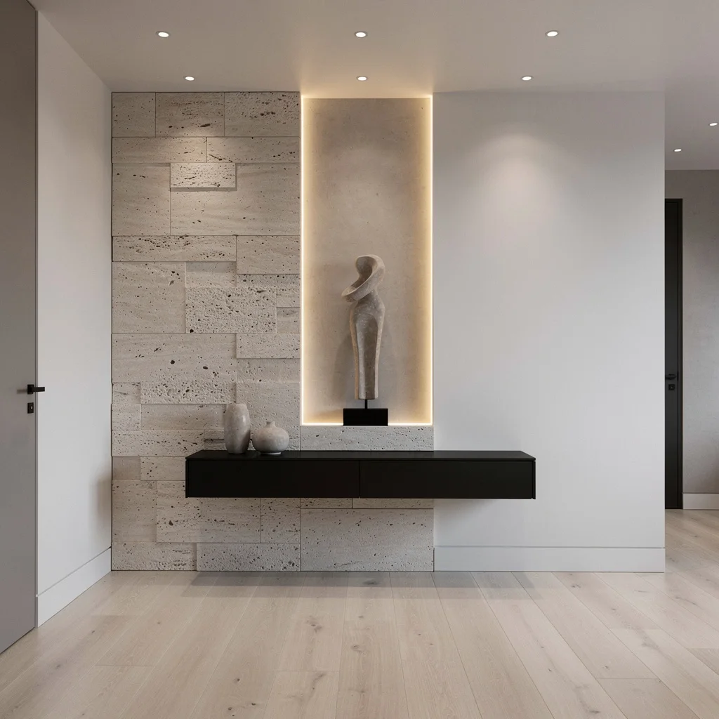
If you crave texture but less ’90s Subway Tile, go sandblasted travertine in big oversized bricks and stagger them up your wall. Don’t be basic—get a vertical niche cut right into the stone, light it up with a hidden warm LED so your minimalist sculpture finally gets its spotlight moment. Lay pale engineered oak on the floor so your stone doesn’t feel too cold and harsh, keep walls white, and pop spotlights into the ceiling (mini versions only, track lights aren’t invited to this party). Mount a thin matte black shelf under the niche; no more, no less. Rule: Never crowd the shelf with junk mail or keys—this wall is a shrine to tactile luxury, not chaos. If you feel like touching it every time you walk by, congrats, you nailed it.
Art Wall on Steroids: Hand-Painted Ceramic Chevron
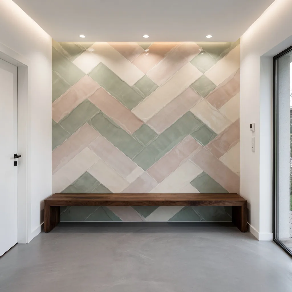
Ready for the mural wall that finally isn’t a sticker from the dollar store? Get massive, artisanal ceramic tiles painted in soft sage, blush, and cream—not school-project bright. Lay them out in a loose chevron formation for maximum movement. Hit the wall with ambient wall washers so the color gradients come alive at night and you don’t end up with a paint-by-number vibe. Hit your floors with smooth matte grey microcement (trust, this makes those colors pop). Flank the visual chaos with a made-for-this walnut bench—nothing heavy, just sleek wood. Hook: Never over-style—no coat piles, no rainbow baskets. Let the wall be your show-off moment. For real polish, match any visible trim with tones from your tiles. If your entry doesn’t look at least a bit like a cool ceramics gallery, you need to swap out something busy. Go artful, not accidental.
Copper & Black for Stealth Wealth
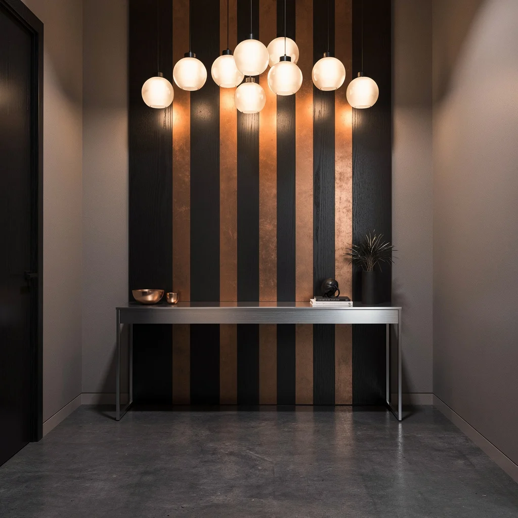
Stop pretending your entry doesn’t need some heavy metal vibes. Go full throttle with vertical strips of burnished copper, interspersed with matte black wood slats—yeah, rhythm is mandatory. Lay deep grey polished concrete underfoot to ground the whole shot. Go for a low, ultra-modern brushed steel console—no chunky antiques allowed. Hang frosted glass globe pendants overhead for a soft glow; avoid those cheesy Edison bulbs, you’re not in a fake speakeasy. Taupe walls all around, nothing distracting. Key advice: Polish copper regularly or it’ll just get orange and patchy. If there’s a single home accessory not working this look—swap it or lose it. Minimalist, metallic, and moody: if your mother-in-law doesn’t complain about the ‘cold’ vibe, you didn’t go bold enough.
High-Key Drama: Bookmatched Carrara Marble
Want the space to feel like high-roller heaven? Clad your feature wall with giant slabs of bookmatched Carrara marble—those veins had better line up or you just wasted your money, sorry. Install concealed LED wall-washers up top to give that stone a soft, all-over Hollywood glow. Stretch oiled European oak planks across the floor, keep adjacent walls a muted dove grey, and make your shelf clear glass—anything heavier, and you’re killing the marble drama. Note: Don’t you dare set faux plants or clutter here. Rule: Marble is boss, you’re just supporting cast. Regularly squeegee and polish. If you can’t get your guests to gasp and ask if it’s real, you need to try again.
Horizontal Flex: Bleached Ash + Espresso Wood Layering
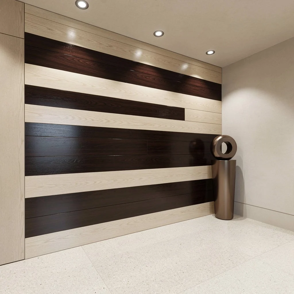
Tired of vertical everything? Time to run wide with alternating horizontal planks—one a ghostly bleached ash, the other a high-gloss espresso for full-on contrast (no, two similar shades isn’t bold—commit). Highlight the wall with recessed spotlights overhead; let the stripes take the attention, not some busy lighting. Cue pale terrazzo underfoot for a slick finish, and smoothed plaster on the sides. Drop a chunky but minimalist bronze planter with an arty sculpture at one end—avoid any fake greenery, it spoils the vibe. Rule: Always align your wall power outlets with a stripe, not the seam, for that designer look. Don’t let the look get sterile with matchy-matchy finishes everywhere—plenty of contrast or bust.
Emerald Velvet & Brass: For Max Luxe
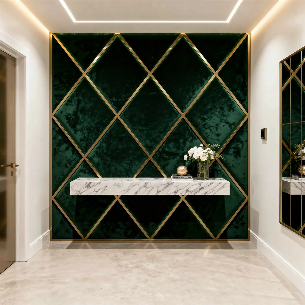
If you want your entry to scream high-fashion runway—not rental beige—wrap those walls in diamond-panel velvet, rich emerald ONLY, no knockoff green. Frame each plush shape with slim brushed brass strips for serious glow. Hide LED strips in the ceiling so the velvet throws off texture, not glare. Hit the floor with silky-smooth ivory-hued concrete to keep the sass going. Mount a marble shelf high enough not to get whacked by bags, and keep your decor strictly sculptural. Rule: Resist the urge to add gold-framed mirrors—let the brass lines work solo. If touching your wall doesn’t elicit a gasp, go upgrade your fabric.
Ribbed Glass x Walnut: Chill But Brilliant
Want a space that whispers ‘I have taste’ with zero effort? Go for staggered ribbed glass panels—it’s retro but never kitsch—broken up with slabs of matte walnut so you stay modern and grounded. Outline the whole thing with perimeter LEDs for next-level shadow play. Underfoot, lay natural stone in a moody grey; paint other walls a smooth putty tone, you’re not a hermit crab. Float a clean-lined brushed steel console and keep your accessories abstract; swerve anything cute or themed. Rule: Never display messy books or flimsy ceramics here; go sturdy, geometric, and intentional. The less you fuss, the more it slaps.
Future Mood: Matte Black Slate and Backlit Acrylic
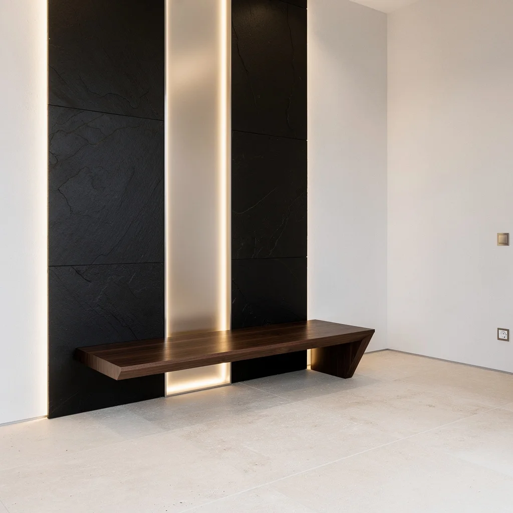
Tired of pretending you don’t love a spaceship vibe? Just lean in: Mix fat planes of matte black slate with vertical strips of backlit frosted acrylic, and let those embedded lights set a soft, modern mood for anyone who steps inside. Pale limestone tiles keep your floor calm, while blinding white microcement on other walls makes the black really spark. Add a sharp, floating walnut bench—detour around anything with chunky legs or rattan. Rule: Make your acrylic lighting dimmable; trust, you want moody (not hospital bright) at night. Last tip: never put art on this wall—let the lines do all the work. Forget ‘statement’—you’re making an entrance.
Final Thoughts
An entryway wall worth remembering has nothing to do with budget and everything to do with commitment. The spaces that stop people mid-step are the ones where someone picked a direction—dark and architectural, texture-led and warm, pattern-forward and unapologetic—and followed it through completely without losing nerve at the last moment and adding something beige to “balance” it.
The entries that people compliment, photograph, and bring up later at dinner are always the ones built on conviction. Moody paneling that owns its darkness. Wallpaper that covers every inch and makes no apologies for it. A mural so considered it makes the whole house feel like it was designed by someone who actually knew what they were doing. These spaces earn their reactions because someone made a real decision and lived with it, rather than hedging every choice until the room had no point of view left.
Your entryway is the opening statement your home makes to every person who walks through the door. It deserves more than a mirror you bought because it was on sale and a hook rack that came in a three-pack. Make it say something worth hearing.