
Your entryway console table is currently holding a stack of unopened mail, three keys that don’t open anything you can identify, and a candle you bought two years ago and lit exactly once. Congratulations—you’ve turned the most visible surface in your home into a flat filing system with delusions of grandeur.
The console table had one job. One. And somewhere between “I’ll style it properly this weekend” and actual life happening, it became the dumping ground that greets every single person who walks through your front door. Your guests aren’t judging you, but your console table absolutely is.
Here’s what nobody admits out loud: a well-styled console table does more for the overall feeling of a home than almost any other single piece of furniture. It’s the first thing with any real presence when you enter a space—at eye level, in full view, with nowhere to hide. Get it right and the whole house feels intentional. Get it wrong and even your expensive sofa in the next room can’t save you.
The good news is that “getting it right” doesn’t require a stylist, a massive budget, or a complete furniture overhaul. It requires understanding what actually makes a console table setup work—and then having the discipline to stop adding things to it once you get there.
Your Console Table Is Lying About What It Can Do
Most people treat their console table like a surface that exists to hold objects. It’s actually doing something far more important than that, and until you understand what, you’ll keep getting mediocre results.
It anchors the entire entry — A console table without intentional styling doesn’t just look bare, it makes the whole space feel unresolved. Everything around it—the wall, the floor, the lighting—takes its cue from what’s happening on that table.
It tells people what kind of home they’ve walked into — Before anyone sees your living room or kitchen, they’ve already clocked your console table. It’s your home’s opening argument, and right now a lot of them are losing on the first sentence.
Styling it isn’t decorating, it’s editing — The difference between a console that looks curated and one that looks cluttered is almost always subtraction, not addition. Every object needs a reason to be there that isn’t “I didn’t know where else to put it.”
What You’re Actually Getting Wrong
The mistakes people make with console tables are remarkably consistent, which means they’re also remarkably fixable.
Treating height like an afterthought — A flat row of same-height objects on a console table is the visual equivalent of a monotone voice. You need variation—something tall, something low, something that breaks the horizontal line entirely—or the whole setup reads as furniture store display, not home.
Matching everything within an inch of its life — Perfectly coordinated accessories don’t look expensive, they look like you bought a set. Interesting console tables mix materials, finishes, and eras in a way that feels collected rather than purchased.
Ignoring what’s above and below — The mirror or art above the table and whatever lives on the shelf below are part of the same composition. Styling the tabletop in isolation while neglecting those zones is like doing your makeup without checking the full look in the mirror.
Entryway Console Table Ideas Worth Stealing
Acrylic Legs & Velvet Walls:
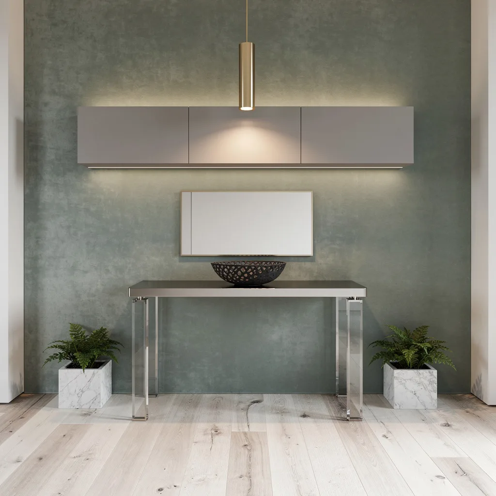
Cringe at stuffy antiques? Then make your entry way smarter with clear acrylic console legs and a slick nickel surface. Throw it all up against a wall covered in lush sage velvet—none of this sad, flat paint nonsense—and hang a dangly brass pendant overhead to spotlight your (finally) good taste. Slide a floating matte gray cabinet up top, blast under-cabinet LEDs, and drop a black stone bowl for drama. Cap it off with a minimal mirror and a marble planter full of plant life—not plastic, please. Pro tip: Cabinets above the table = clutter disappears. Amaze yourself.
The Industrial Plant Shelf That’s Actually Doing Something Useful
Entryway console table becomes my plant shelf. Fake plant on the right XD
by u/wangzrpi in houseplants
Most console tables have the styling ambition of a side table that got too big for itself, but this walnut-and-black-steel setup sidesteps that problem entirely by making plants the entire point. The staggered shelf structure built into the table frame gives every plant its own level—an orchid up top in a grey ceramic, a ZZ plant in a deep green pot, and a trio of smaller varieties tucked into the lower shelves like a very organized little greenhouse. The blank white wall behind it is not a mistake; it’s the smartest decision in the room, because competing wallpaper or art would kill the organic looseness that makes this work. A tall statement plant in a woven basket beside the table extends the composition without crowding the surface. If you’re the type who kills plants, commit to one excellent fake and surround it with real ones—nobody will check, and the vibe holds.
Chunky Oak Console with Autumn Styling That Makes Seasonality Look Intentional
There’s a version of seasonal decorating that looks like someone raided a craft store the day after a holiday, and then there’s this—where the whole setup feels like it was always going to look exactly this way in autumn. A solid, thick-legged oak console in a warm honey stain is the anchor, substantial enough that no amount of styling can make it look fragile. The round black-framed mirror behind it is large enough to do real work bouncing light around, while a textural ceramic lamp, a moody landscape print leaned casually against the mirror, dried pampas in a matte black bowl, slim brass candlesticks, and a rough-hewn stone vase with dried branches create a composition that feels abundant without tipping into chaos. Two matching upholstered ottomans tucked underneath do the practical work of seating while keeping the lower half of the setup visually clean. The amber throw draped over one ottoman is either deliberate genius or a happy accident—either way, leave it exactly there.
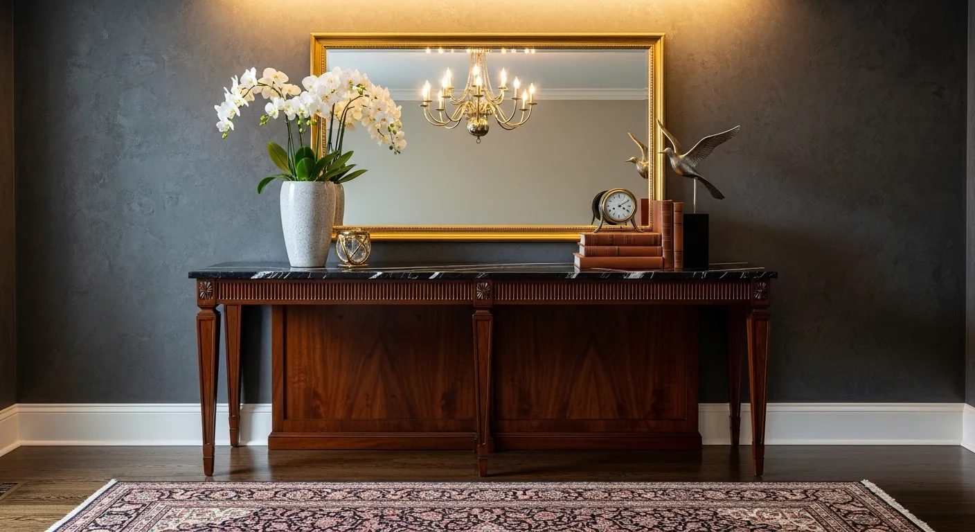
Ornate Gold Mirror Over a Black Console:
This setup has the audacity to put a heavily gilded baroque mirror in the same room as a sleek black console with cane-front drawers, and the fact that it works is frankly offensive to people who spent years being told not to mix periods. The mirror is enormous, carved, gold, and completely unapologetic about all of it—the kind of piece that makes guests ask where you found it while secretly hoping it was expensive. Against crisp white walls, the drama is contained enough to feel sophisticated rather than theatrical. The black console underneath it plays the straight man perfectly: clean lines, brass hardware, two drawers that presumably contain things you actually need. A large-leafed plant in a matte black pot gives the tabletop its one moment of organic life, a small sculptural lamp adds warmth, and a leather box on the lower shelf keeps the composition grounded. The checkerboard stone floor and gold lantern pendant overhead complete a look that has no business being this cohesive.
Curved Walnut Sideboard with Dark Botanical Wallpaper:
The sideboard that shows up here is genuinely beautiful on its own—rounded ends, warm walnut grain, brass hardware—but the decision that elevates it from “nice furniture” to “actual design moment” is the dark charcoal botanical wallpaper covering every inch of wall behind it. Most people would have chickened out and gone with a lighter option, a single accent wall, something “less risky.” Those people’s entries are forgettable. The dark, pattern-heavy wallpaper creates a jewel-box backdrop that makes the warm wood tones glow in a way they simply couldn’t against pale paint, and the layered lighting—an arched brass-framed mirror with a chandelier-style fixture mounted directly on it, flanked by two frosted glass sconces—turns the whole setup into something that belongs in a magazine rather than a hallway. One lush, overflowing floral arrangement in deep jewel tones is all the tabletop needs; a small pleated lamp and a bowl of fruit keep it feeling lived-in rather than staged.
Arch Mirror and Brass Sconces:
The setup that everyone thinks they want but consistently under-executes looks exactly like this—and the reason most versions fail where this one succeeds comes down to commitment at every layer. A solid wood console in a warm walnut finish provides the base, simple enough in profile that it doesn’t compete with anything above it. The large arch-top mirror with a thin brass frame is the move that earns its keep; the shape adds softness that a rectangle would kill, and the scale means it’s doing serious work reflecting both light and the art pieces leaned behind the tabletop objects. Twin brass wall sconces flanking the setup provide warm, even light that no overhead fixture can replicate in an entryway. A tall textured ceramic vase with leafy branches, a sculptural wooden object, a tall brass candleholder—each piece chosen for shape as much as surface. Two cube ottomans underneath in cream boucle deliver seating without visual noise. The wainscoting behind it all ties the whole composition back to the architecture, which is the detail that separates styled from designed.
Painted Black Dresser Doing Its Best Console Table Impression
Nobody said your entryway furniture had to be purchased from the console table section of anywhere, and this setup makes that case more convincingly than any mood board could. A three-drawer dresser painted in a deep matte black with original brass knob hardware is functioning as a console table, and it is thriving in the role—because it has drawers, actual drawers, which means everything that would otherwise live on the surface in a pile of shame is now inside a drawer living its best hidden life. A round mirror with a warm-toned frame leans against the wall rather than being formally hung, creating casualness that the dark paint and bold flowers could have lost if everything were too precise. A white ceramic vase overflowing with white blooms and greenery brings freshness against all that black, a small framed botanical print adds a collected quality, and a patterned lamp with a brass base introduces the warmth the dark dresser needs to avoid feeling cold. The small black bowl tucked beside the flowers is the detail that shows someone actually thought about this rather than just placing things and hoping for the best.
Sculpted Walnut & Slick Marble:
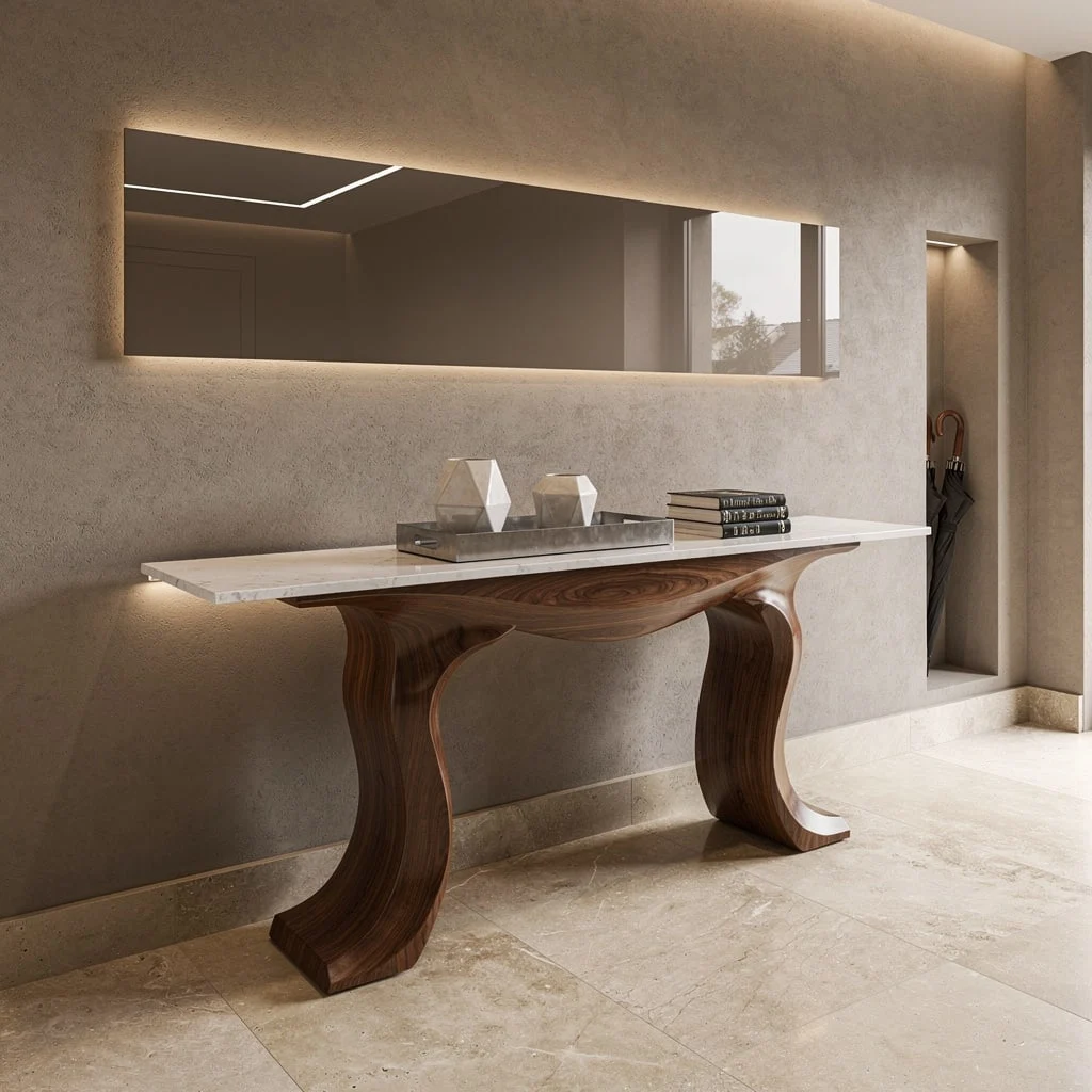
Go bold or go home—seriously. If you’re craving architect vibes, stop piddling around with safe choices. Snap up a console table that mixes sculptural walnut with a seamless white marble top. Park it in front of a textured taupe plaster wall (yes, get messy—bring on the trowel) and silently smirk each time the concealed LED uplighting throws the perfect glow. Want to seem sophisticated with zero effort? Toss a smoked glass panel above, and watch daylight perform magic tricks. Drop a tray with geometric ceramics and stacked art books for that curated ‘not even trying’ look, plus a wall niche to stash those tragic umbrellas. Major rule: Don’t leave that tabletop empty—hello, boring.
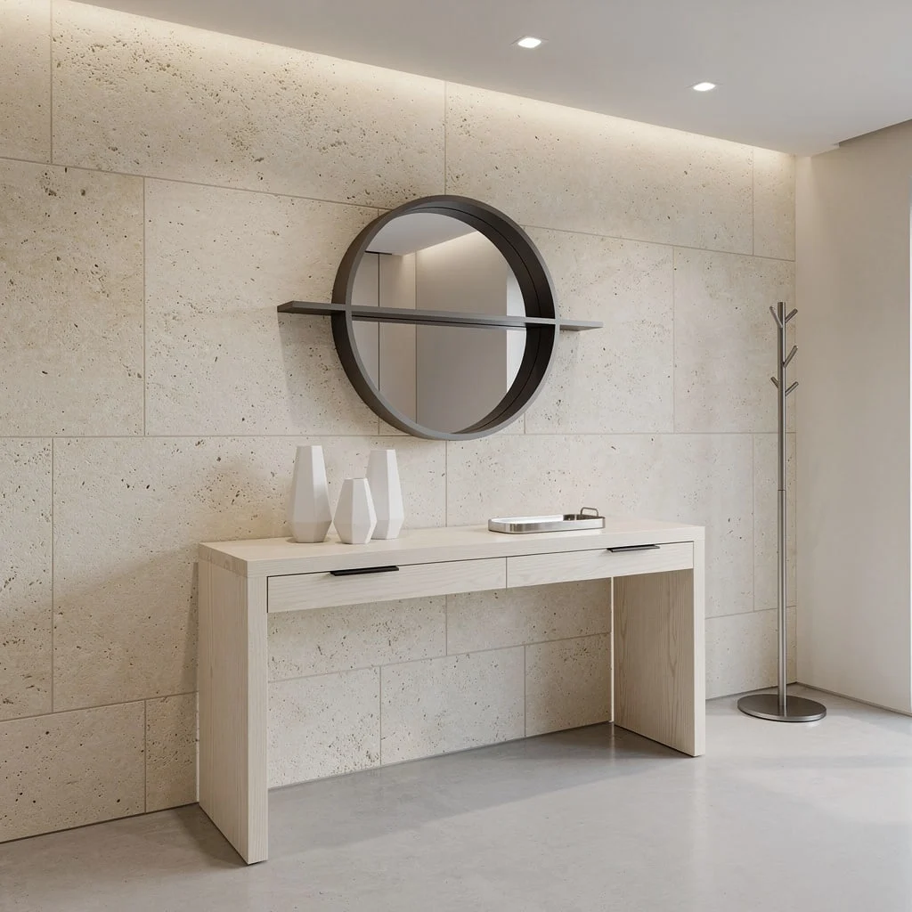
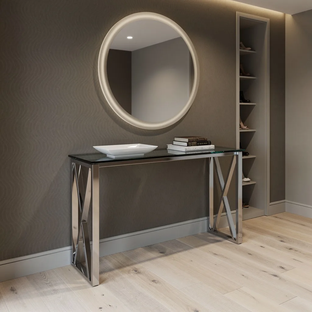
Limestone Legs & Maple Slats:
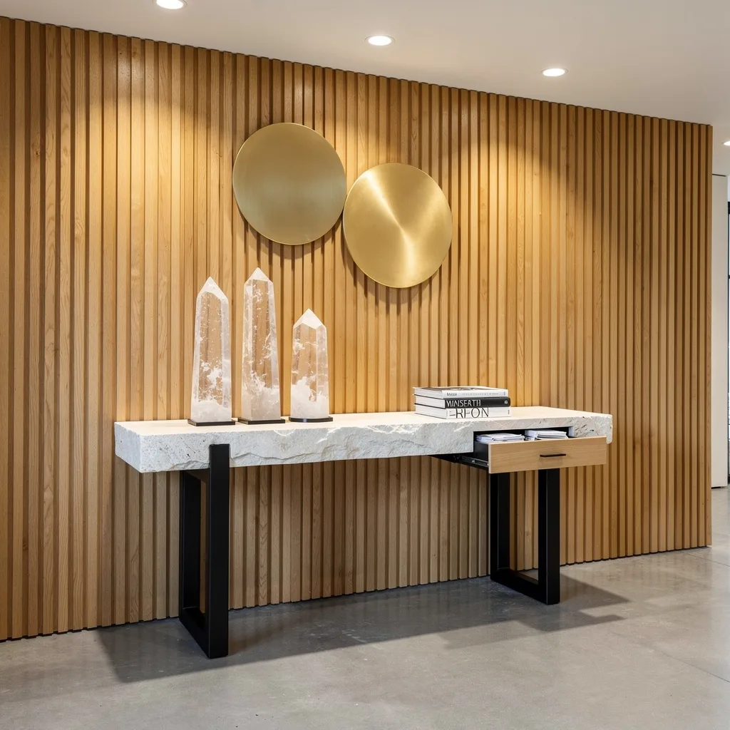
Ready to trick people into thinking you hired a designer? Start with a hand-chiseled limestone console on beefy blackened steel legs—the more handmade-looking, the better. Run vertical maple wall slats for texture that makes drywall jealous, and hit those with targeted overhead spots for light play. Spin your styling by stacking massive crystal obelisks and monochrome art books—drama, but sophisticated. Don’t forget the small built-in drawer for mail, because piles on the table scream ‘college apartment.’ Golden accent discs above? Not optional. Stick to odd numbers for tabletop objects—always looks intentional.
Curved Oak & Etched Glass: Fake Effortless Elegance
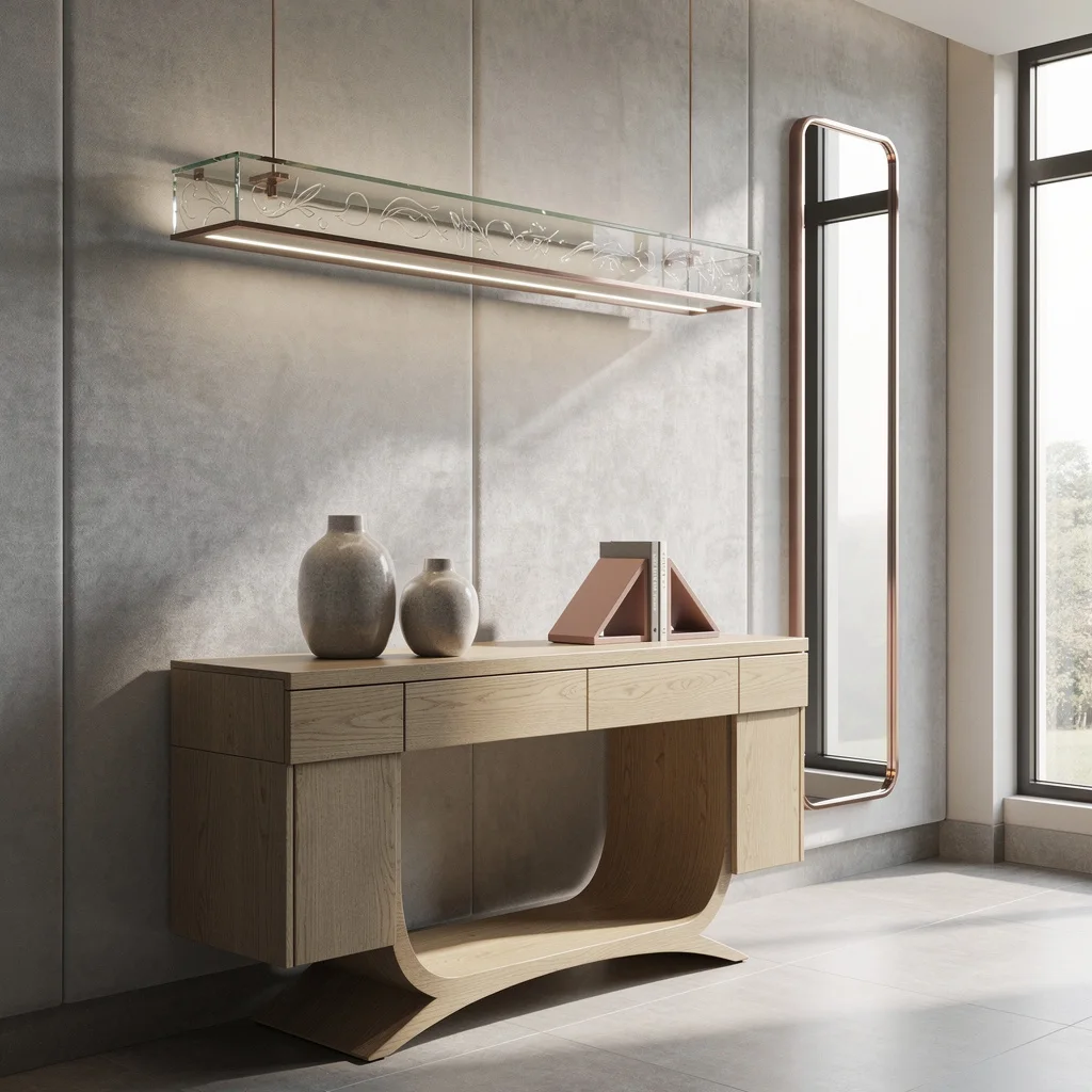
Let’s be honest—storage is sexy if you do it right. Grab a light oak console table with curved sides and sneaky compartments to boot. Sink this beauty against a pale gray suede-paneled wall, and fine, leave the big box lighting behind. Drop in etched glass LED shelves overhead and you’ll literally light up the conversation (and your vases). Add some high-gloss ceramics, a geometric bookend, and anchor a slender rose gold-framed mirror nearby, which stretches the space and feeds your ego. Rule: Mirrors always get vertical if you want taller vibes—horizontal makes you look short. You’ve been warned.
Black Satin, Sandblasted Stone, and Olive Walls—Moody, but in a Good Way
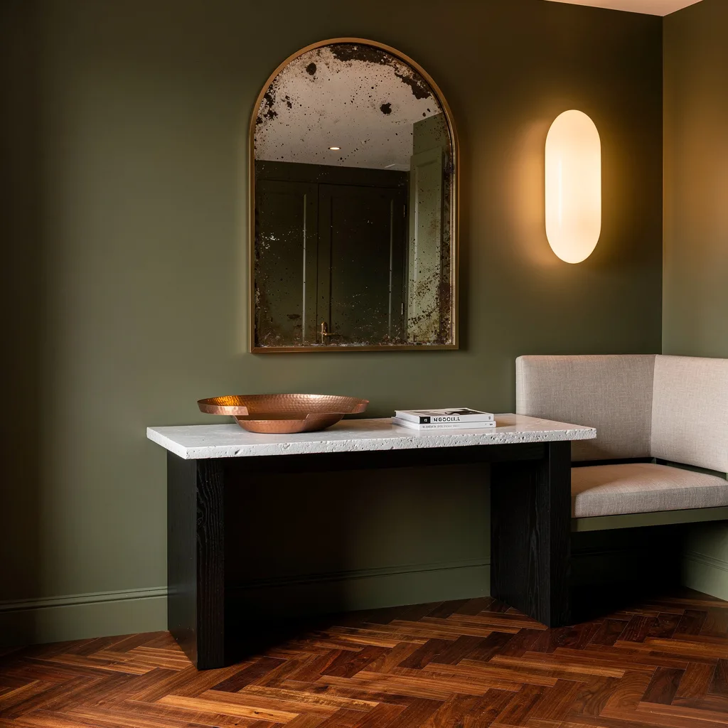
Ready to strike the perfect ‘moody but welcoming’ balance? Grab a black satin-stained timber console topped with sandblasted white stone for texture wars. Drench your wall in matte olive paint—don’t you dare pick safe neutrals—and hang a massive oval sconce for that soft ‘blessed by candlelight’ glow. Lay down chevron walnut underfoot, slip an antique mirror into an arched niche above, and place a hammered copper tray plus a stack of design mags for smart-people aesthetic. End with a nearby linen-upholstered bench. Styling hack: Keep your lamp off-center—it’s avant-garde, not off-kilter.
Brushed Brass & Silk Walls: Go Full Bling Without Regret
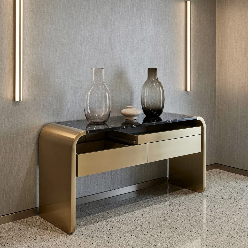
Time to admit it: drama is fun. Grab a rounded-corner brushed brass console topped with black granite and back it with silver-grey silk wallpaper because sometimes more is more. Keep lighting sharp with twin vertical LED strips (no wimpy sconces here) and go all-in on polished terrazzo—bonus points if the flecks match your metals. Slam two oversized blown glass vases up top, alternate clear and smoky for edge, then tuck a low ceramic centerpiece in for contrast. Get sneaky with hidden push-to-open drawers. Final move: Never repeat your metals directly—let the shapes and tones play off each other or it screams ‘bad furniture showroom.’
White Oak Waterfall & Limestone: Make Minimalism Look Pricey
Sick of clutter? Waterfall-edge white oak is your new BFF for that minimalist-but-expensive aura. Rinse the wall in creamy limestone panels and drop in LED strips to cast a soft glow—no harsh downlights, please. Roll out pale polished concrete for that gallery floor moment. Above, hang a circular gunmetal shelf mirroring the table’s lines, and add white ceramics and a metallic tray to keep things curated but not cold. Lean a matte black coat rack nearby for actual utility. Commandment: Minimal objects need bold shapes—don’t bother with tiny tchotchkes, go big or hide them.
Smoked Glass, Chrome, and That Luxe Wave Wall: Level Up Your Luxe
Feeling bougie? Time to commit. Get a thick smoked-glass console slap on polished chrome legs. Set it against a taupe wave-textured wall—pattern is required—and rim that baby with cove lighting for living-in-a-hotel energy. Drop some wide-plank bleached ash underfoot for chill Scandi feels, then cap it with a round frosted-edge mirror hung above. Style your tabletop with an angular porcelain tray and actual books (not fake ones), and work in a slim vertical shoe niche so no pileups happen. Secret sauce: Cove lighting must be dimmer-adjustable—control the drama, don’t let it control you.
Oiled Walnut, Venetian Plaster, and Modern Lines—Stay Classic, Stay Cool
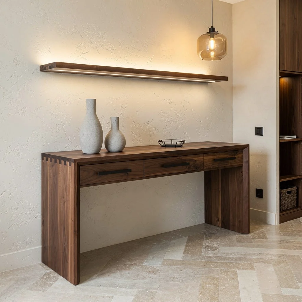
Tired of chasing trends? Reclaim classic cool with a hand-oiled walnut console paired with matte black handles—you know, the kind that don’t show fingerprints. Slap it down against a stormy Venetian plaster wall (rich texture or bust), and suspend a warm-glow glass pendant for golden-hour effects all day long. Chevron limestone floors? Yes, that’s sophistication. Cap with a floating walnut shelf up top, paper the table with stone vases and a geometric tray, and slip a hidden storage niche beside. Lifesaver: Echo your wood tone in the accessories—a clashing walnut against cherry ruin the whole vibe.
Midnight Blue Steel & Marble: The Grand Entrance You Deserve
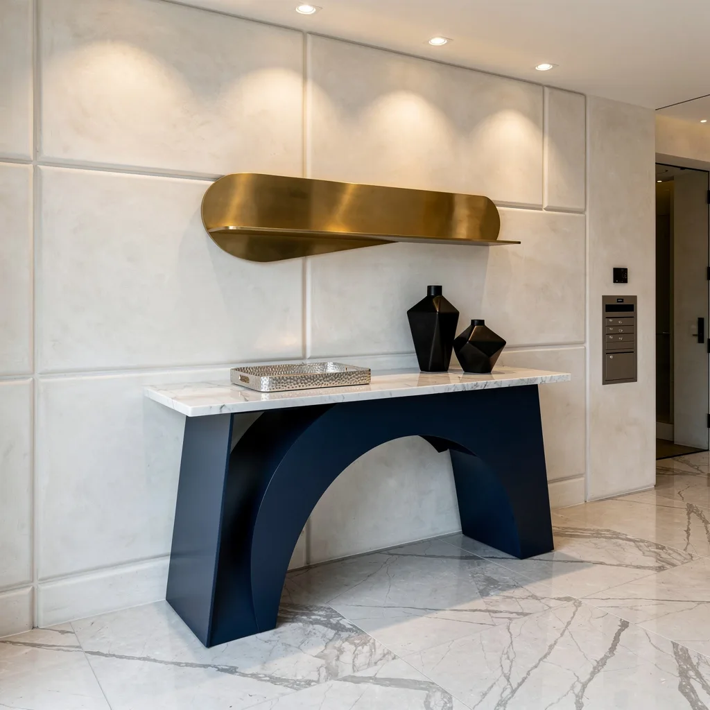
Ready to impress even your most judgmental friend? Anchor your entry with a sculptural midnight blue steel base table capped in seamless Calacatta marble. Line the backdrop with oversized off-white plaster panels and target with adjustable downlights because this isn’t amateur hour. Plant fat porcelain tiles underfoot for a modern, silver-veined touch, then offset a polished brass shelf above the console for avant-garde vibes. Stack a hammered silver tray and sharp black ceramic vases up top—geometry is the goal. Rule: Asymmetric styling always looks intentional, never messy—but only if you commit. Don’t chicken out halfway.
Final Thoughts
A console table that looks genuinely good isn’t the result of buying the right objects—it’s the result of understanding how those objects relate to each other, to the space around them, and to the furniture they’re sitting on. The setups that make people stop and look are built on restraint more than abundance, on contrast more than coordination, and on the confidence to leave space where space needs to be left.
The most common mistake isn’t bad taste. It’s indecision dressed up as decoration—adding one more thing because you’re not sure the current arrangement is working, when what it actually needs is for you to remove something and commit to what’s left. Your console table doesn’t need more on it. It needs better on it, and those are very different problems with very different solutions.
Get the foundation right—the right table for the space, the right mirror or art above it, lighting that does actual work—and the styling almost handles itself. Get those fundamentals wrong and no amount of carefully chosen accessories will rescue it. Start with the bones, then stop fussing quite so much with everything else.