
At some point, someone decided that entryways don’t count. Not really. They’re just the space you pass through on the way to the rooms that actually matter—so why bother? Slap down a doormat, hang a coat hook from a hardware store three-pack, and call the whole thing done. This is the prevailing philosophy, and it explains why walking into most homes feels like being deposited into a holding area before the real experience begins.
The entryway sets the emotional temperature of your entire home before a single other room gets a chance to weigh in. It’s the space that tells guests whether someone with actual opinions lives here or whether every design decision was quietly outsourced to “safe” and “inoffensive.” And yet it gets treated like the appetizer nobody ordered—present, technically, but not something anyone put much thought into.
Modern entryway design has completely abandoned the idea that this space needs to be neutral, transitional, or self-effacing. The best ones have personality so specific and confidence so unapologetic that they make the living room work harder just to keep up. Dark and dramatic, warm and layered, sleekly architectural, or deliberately collected—every one of these approaches has more going for it than the beige-mat-and-mirror combo that currently greets approximately seventy percent of the population when they walk through their own front door.
These ideas cover the full range—from the intentionally moody to the architecturally precise—and every single one of them will make your entryway the room people actually remember.
Why Your Entryway Keeps Disappointing You
The problem usually isn’t taste. It isn’t budget. It’s a fundamental misunderstanding of what an entryway is supposed to accomplish and what stops it from getting there.
It needs a concept, not just contents — Dropping furniture into an entryway without a unifying idea produces a space that feels like it’s still being decided. The entries that work have a point of view—one clear direction executed with consistency—and you can feel that clarity the second you walk in.
Lighting is doing more work than you realize — Entryways often have the worst lighting in the house: a single overhead fixture providing flat, unflattering illumination that makes even beautiful materials look institutional. The mood of the space lives almost entirely in how it’s lit, and fixing that alone transforms a mediocre entry into something worth experiencing.
Layering beats matching — The impulse to coordinate everything in an entryway—same finish, same tone, same era—produces spaces that feel assembled rather than inhabited. The most interesting entries mix something old with something new, something rough with something refined, something expected with something that has absolutely no business being there and works anyway.
The Entryway Rules You’ve Outgrown
Some of the most reliable advice about entryway design is also the most reliable way to guarantee yours looks exactly like everyone else’s.
“Keep it light so it feels bigger” — A dark entryway that’s designed with intention feels infinitely more interesting than a pale one that’s just trying to avoid commitment. Size is not the goal. Experience is the goal. These are different things.
“Keep it clutter-free and minimal” — Minimal is a design language, not a default. An entryway stripped of personality in the name of cleanliness isn’t minimal—it’s empty. There’s a difference, and it shows.
“Make sure it flows with the rest of the house” — The entry doesn’t owe the living room anything. Some of the most memorable homes have entryways that set up contrast rather than continuity, creating a threshold moment that makes arriving somewhere feel like it actually means something.
Modern Entryway Ideas That Actually Deliver
Dark Walls, String Lights, and the Audacity to Make a Cabin Moody
My downstairs living room, kitchen, entry way, music room and bathroom
by u/kam27889 in CozyPlaces
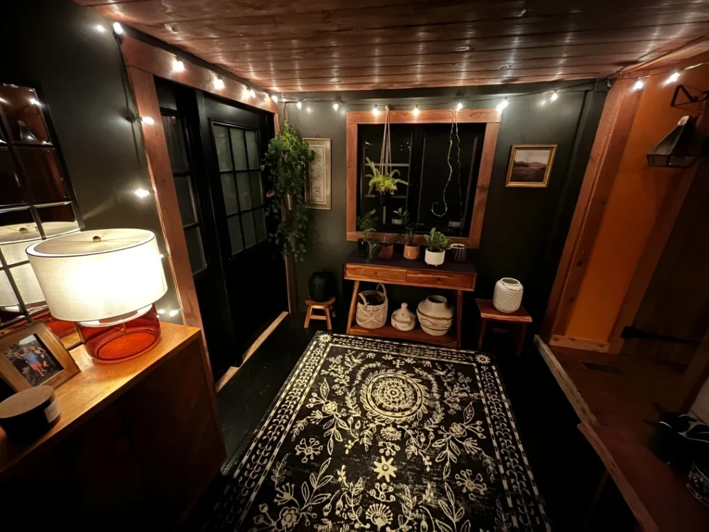
This is the entryway that knows exactly what it is and refuses to apologize for any of it. Near-black walls with warm cedar ceiling and window trim create a cocoon effect that most designers would tell you to avoid in a small space—and they would be wrong, because the result here is rich and enveloping rather than oppressive. String lights strung along the ceiling perimeter do something that no recessed fixture can replicate: they make the darkness feel intentional and inhabited rather than just dark. A mid-century wood console holds a collection of plants in varying textures and heights, a macramé hanging planter fills the window, woven baskets and ceramic vessels sit on the lower shelf, and a bold black-and-cream medallion rug anchors the floor. The amber glass lamp on the left adds a shot of warm color that the space earns because everything around it is restrained enough to let it land. This is a space assembled by someone who decided what they liked and committed completely, which is why it works.
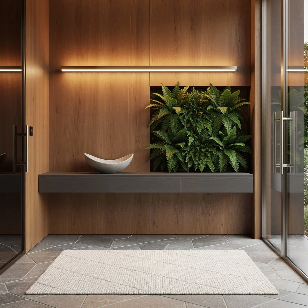
Sculptural Wood Console with an Organic Mirror That Broke the Rulebook
Someone handed this entryway a rulebook about mirror shapes and it immediately filed it in the bin, which is the correct response. A wavy, irregular-edged mirror in a warm dark frame hangs against large-format textured tile in a sandy, handmade finish—the kind of wall surface that looks like it was made by a person rather than manufactured by a machine, and is more interesting for it. The console underneath is all rounded edges and chunky cylindrical legs in natural oak, deliberately sculptural rather than purely functional. The tabletop styling is restrained without being spare: a ribbed black lamp, a stack of books in warm tones, two small matte vases in black and sand, and a large textured ceramic with loose greenery providing the one moment of organic life the whole setup needs. A geometric jute rug grounds everything and adds the one layer of pattern the space can handle without it becoming competitive. Nothing here was chosen to be safe, and the difference between this and a generic entry is entirely down to that.
Oak Slat Wall with Built-In Bookcase:
The problem most entryways have is that they try to be a passageway. This one decided to be a destination, and the results are quietly extraordinary. Vertical oak slat panels run the full height of the wall, creating warmth and rhythm that immediately signals you’ve entered somewhere considered. The genuinely clever move is integrating a full-height bookcase directly into the slat system—shelves lined with books and objects, lit from within, making the entry feel like the beginning of a library rather than a holding zone before the actual house begins. A slim console with hairpin-style legs in warm brass sits against the slats, a round mirror above it reflecting the cove-lit ceiling back into the space. A grey upholstered bench connects the console to the bookcase, providing seating that also serves as a visual bridge between the two elements. Polished marble-look flooring ties everything together with a level of finish that earns the architectural ambition of everything above it.
Floor-Length Arch Mirror on a Charred Wood Console:
Most people choose mirrors that are politely sized and hung at conventional heights, which is exactly why most entryways feel like they’re waiting for something to happen. This setup skips polite entirely: a full floor-to-ceiling arch mirror in a slim black frame leans directly against the wall, its scale so dominant that every other choice in the space has to organize itself around it. The charred black wood console in front of it is equally uncompromising—dark, heavy, textural—grounded by a deliberately rustic raw wood bench that provides the one moment of lightness the composition needs so it doesn’t collapse into itself. A large white ceramic vase with sparse yellow branches gives the tabletop its height; a small framed print and a matte black bowl provide the detail work. The room beyond reflects back through the mirror and effectively doubles the perceived space without a single pale wall or light color in sight. This is what happens when scale is treated as a design decision rather than a constraint.
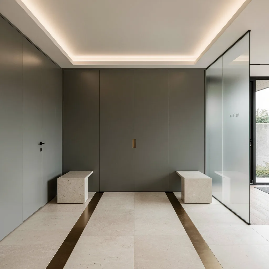
Taupe Corridor with Marble Floors and Hidden Everything
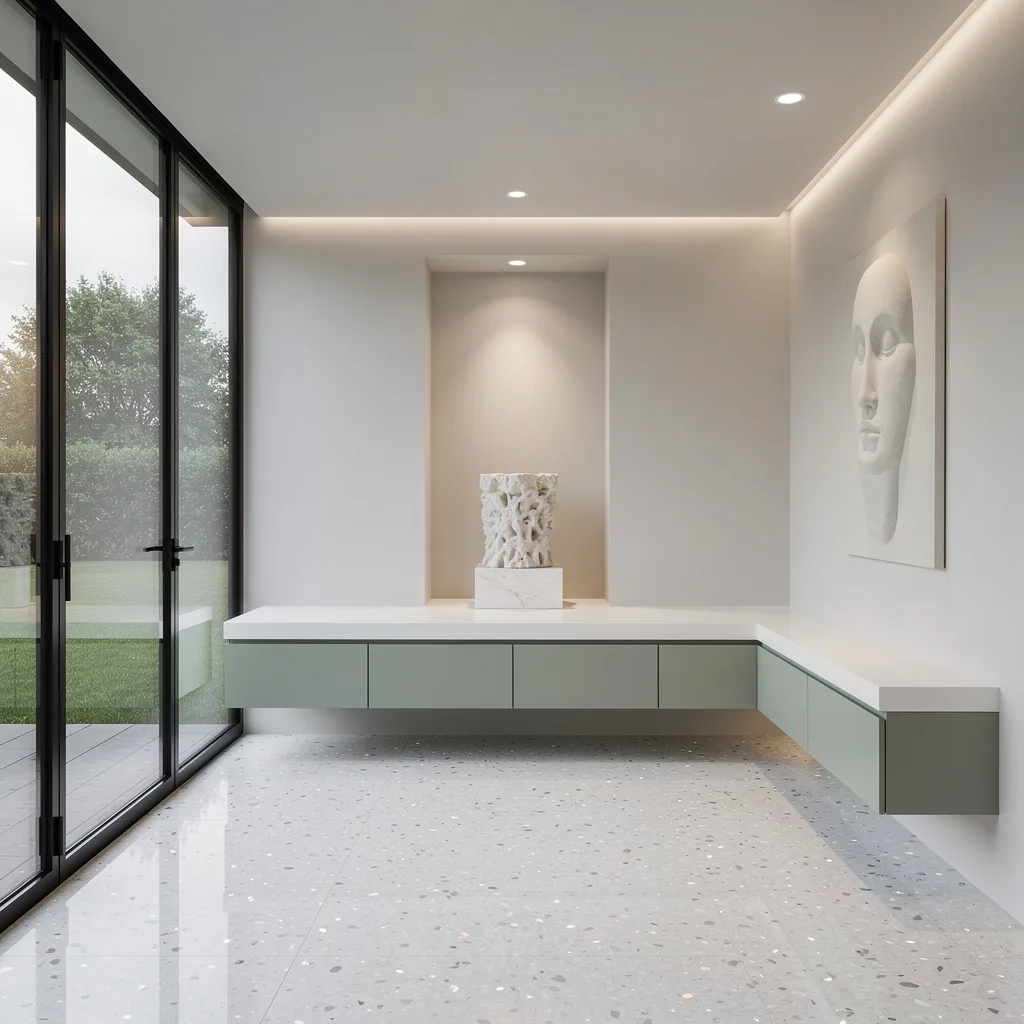
The entryway that looks like it was designed by someone who considers chaos a personal affront—and means it as a compliment. Every surface in this corridor works together toward a single goal: the elimination of visual noise. Warm taupe walls in a smooth matte finish, large-format marble floors with white and gold veining, a floating walnut shelf so minimal it barely registers until you notice how good it looks, and a tall backlit mirror that turns an ordinary wall into something cinematic. The right side delivers the practical infrastructure with complete aesthetic discipline: a built-in bench in the same warm tone as the walls, dark slat panels with matte hooks, and a continuous LED strip along the ceiling edge that bathes the whole corridor in light that flatters every material it touches. The designer bags and heels visible in the corner are doing more styling work than most people’s entire accessory collections, but the point stands—when a space is this resolved, even incidental objects look deliberate.
Dark Green Paneling with a Wood Door That Makes the Case for Commitment
There is a version of dark entryway design that feels gloomy and unfinished, and then there’s this—where the darkness is so thoroughly committed to that it loops back around to cozy and correct. Deep forest green paint covers walls, ceiling, trim, and every surface that would have otherwise been white, and the effect is not oppressive. It’s enveloping. The honey-toned wood front door against all that dark green is the contrast moment the whole space is built around, glowing warm against the deep background in a way it absolutely could not if the walls were pale. A solid wood slatted bench sits against one wall with a single linen cushion and a loose bunch of dried blooms for the one soft note in an otherwise architectural setup. A vintage Persian runner in deep reds and navy adds pattern without breaking the mood, a simple globe sconce provides just enough light to navigate by, and a pendant overhead gives the ceiling its moment. The woven basket beside the door is either the most casual object in the room or a carefully chosen counterpoint to everything formal around it—either way, leave it exactly where it is.
Go Vertical: Teak Panels & Geometric Floors, Baby
If you want to walk into instant warmth without looking like you raided grandma’s cabin, start with vertical teak panels—they cocoon your entry, making it way less office lobby. Next, slap down oversized geometric limestone tiles that demand attention underfoot. Mount a floating matte charcoal oak console beneath a killer LED wall sconce, tossing in a minimalist bowl on top (for keys, not random junk). Clear glass pivot doors? Do it—bonus if you integrate a symmetrical fern planter for indoor-outdoor cred. Never skip polished nickel hardware, and if you’re mirror-phobic, get over it: a thin smoked mirror opposite the entrance fakes depth. Don’t forget a cream woven wool rug. Rule: Console height should be 32–36″; anything lower screams, ‘I have given up.’
Double-Height Drama: Travertine, Brass, & Floating Stairs
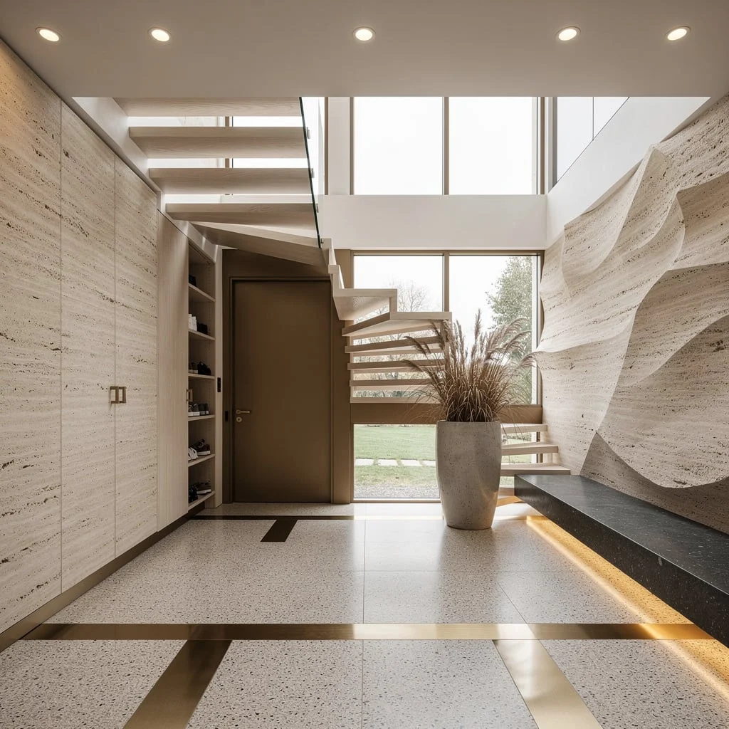
Stop dreaming small. If you crave drama, crank it up with double-height sculpted travertine walls flanking an asymmetrical cantilevered staircase in white oak (open risers, obviously—closed treads are for quitters). Get a bronze front door and match it with slim cabinetry hiding shoe piles, so you look tidy without effort. Nail triple-glazed clerestory windows for daylight, place a single concrete planter with dried grasses to show you know the difference between decor and a jungle. Install a basalt stone bench along one side and let recessed ceiling lights work magic, reflecting off custom brushed brass inlays in your terrazzo floor. Pro tip: If your bench isn’t at least 48″ long, you’re cheating the look—stretch it out.
Make a Statement: Granite, Fluted Walnut, and Dynamic Lighting
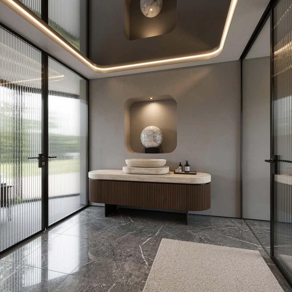
If you want your entry to announce itself, slap honed granite slabs on the floor—bigger is better, so lose the tile squares. Add ribbed reeded glass panels for privacy and daylight diffusion, and never settle for boring walls. Grab a fluted walnut console and stack an oval travertine vessel for essentials; it’s called style, not storage. No excuse for bland lighting: mirrored ceiling coves with perimeter LEDs give you that Instagram-ready glow. Plaster walls need to be soft grey, and don’t skip an asymmetric inset niche with a marble sphere under a directional spot. Keep your hardware minimal and add a boucle runner for tactile swagger. Rule: Always match runner width to console length—mismatched rugs are rookie mistakes.
Textural Oasis: Limewashed Brick & Caramel Resin Bench
If you’re tired of sterile entries, start with limewashed brick laid horizontally—soothing, textured, and not trying too hard. Don’t cringe at curves; a floating caramel resin bench kills that flat-pack vibe. Light it up with a hand-cast resin pendant that glows amber, not neon. Pebbled terrazzo floors add subtle movement, and an off-white lacquer slab door sets the tone. Yes, you need hidden flush cabinetry for all the clutter; vertical moss green tiles around a frosted sidelight keep your privacy and your design cred. Pro tip: Keep pendant height at least 7 feet from floor—unless you want guests ducking for cover.
Compact Luxe: Arched Brass Ceilings & Marble Everywhere
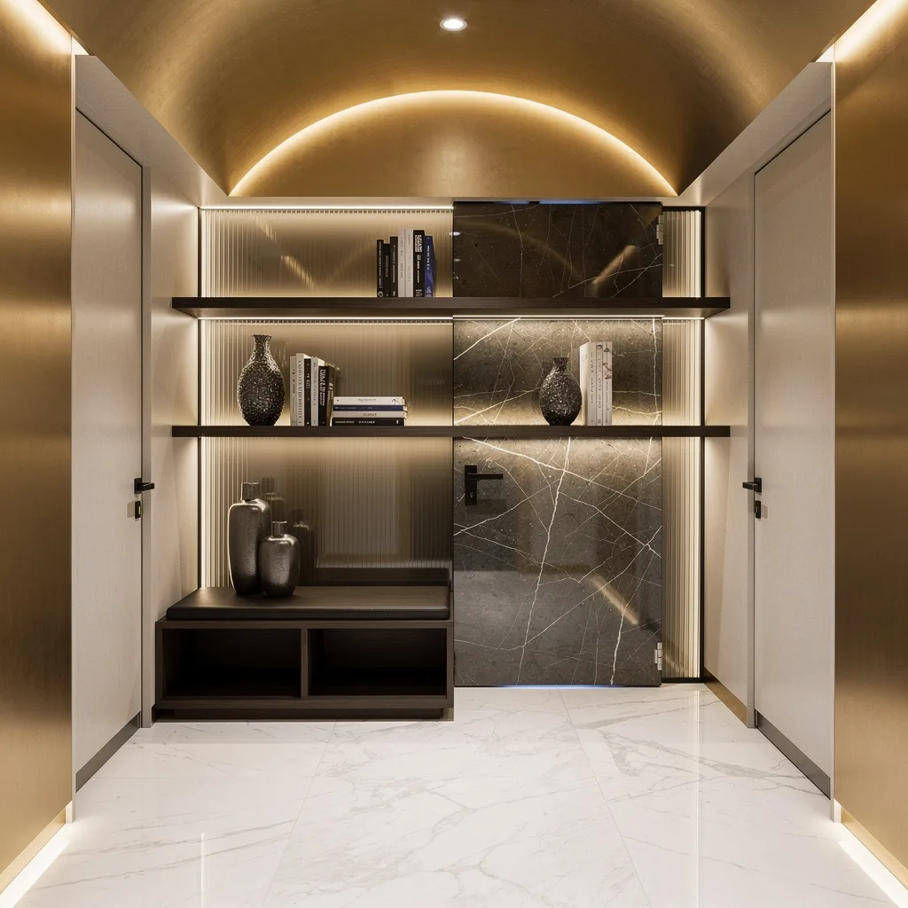
Stop whining about small spaces; with an arched brushed brass ceiling and symmetrical polished marble floors, you can fake luxury in any shoebox. Toss in a dark walnut cubby for seating—built-in beats random stools every time. Dedicate a floating linear shelf for book stacks and designer vases, and make sure it sits under a backlit ribbed glass panel so it actually pops. A custom frameless pivot door with smoked quartzite is non-negotiable if you want entry bragging rights. Lights need to be subtle, integrated, and never glaring. Pro tip: Always repeat brass accents, but not in every detail, unless you want to blind your guests.
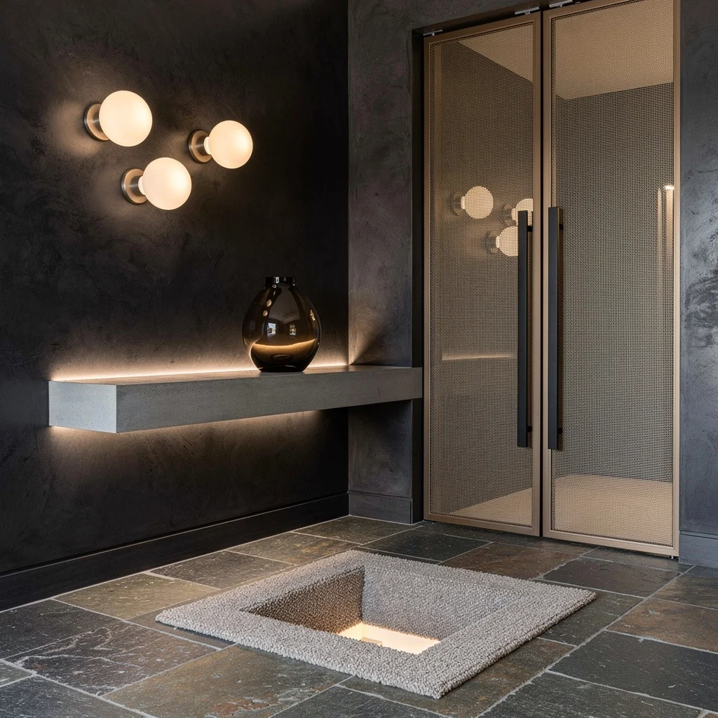
Concrete Cool: Microcement Walls, Matte Ash Bench, Slot Windows
If concrete chic is your aspiration, go all out with smooth microcement walls, then drop a floating matte black ash bench for contrast (not those wobbly racks). Slot windows floor to ceiling let the light in, so you never need ring lights for selfies. Go muted taupe with large tile flooring; neutral, yes, but not snooze-worthy. Hide your junk in a monochrome wall unit with fluted white lacquer doors—seamless storage only. Install a disc-shaped matte aluminum pendant for ambience: no oversized chandeliers, ever. Rule: Slot windows should be at least 12″ wide for a real architectural punch.
Gallery Vibes: Curtain Wall, Sage Cabinets, & Alabaster Plinth
If your goal is making guests feel like they’re entering a penthouse art gallery, start with a black steel curtain wall and ultra-clear glass—daylight immersion required. Polished white terrazzo floors with mother-of-pearl chips bounce light like crazy, making your shoes shine and your mood excellent. Floating matte sage storage delivers subtle color, and you need a seamless white corian surface, no excuses. Carve out a central niche for an alabaster plinth (display anything; impress everyone), light it from above. Add recessed up-lighting around the perimeter, and a faceless wall relief—abstract is always king. Pro tip: Don’t overfill the space; one niche, one art piece, max.
Moody Luxe: Charcoal Plaster & Schist Pavers
Stop pretending pale walls are sophisticated; go moody with charcoal Venetian plaster and oversized sand-blasted schist pavers for real texture. A long cantilevered concrete shelf in your entry isn’t just cool; integrated LED uplights make it look even richer. Show off with a hand-blown smoked glass vessel—random pottery doesn’t cut it here. Your pivot door needs muted bronze mesh, paired with slim matte black vertical pulls. Add a sunken mat well in boucle to define the entrance, and punctuate your walls with opal disc sconces for light that flatters everybody. Rule: Mat well must span the door width; tiny mats scream ‘apartment rental.’
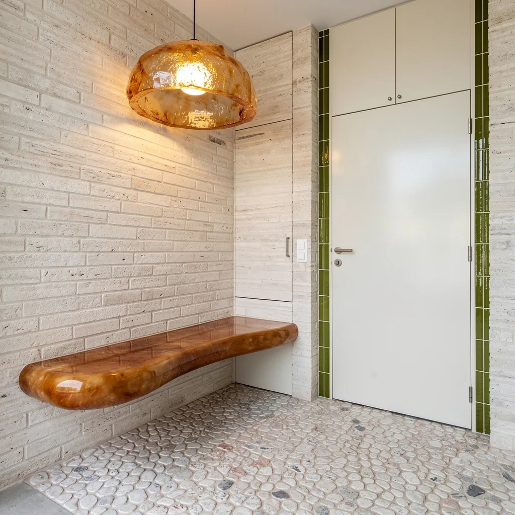
Euro Refinement: Oak Walls & Herringbone Stone Floors
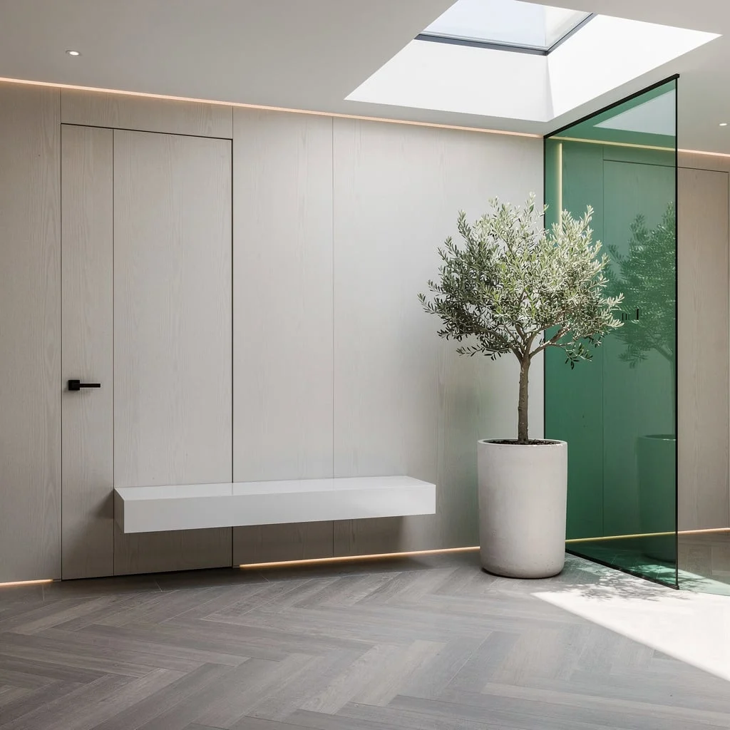
If you want entryway sophistication without stuffiness, clad your walls in seamless European white oak and stick with a hidden micro-groove door—visible hinges are cringe. Install wide plank driftwood-grey herringbone stone floors, not laminate knockoffs. A matte white lacquer bench should float in front of a green tinted glass divider, perfect for keeping the area separate but not boxed-in. Natural daylight is your friend—narrow rooflights add drama. Go with a low-maintenance olive tree in pale concrete; nothing says ‘I tried’ like dead plants. Concealed perimeter LEDs—always. Pro tip: Never put bench legs on herringbone; floating wins.
Organic Flow: Curves, Rose Cabinets & Gold Orbitals
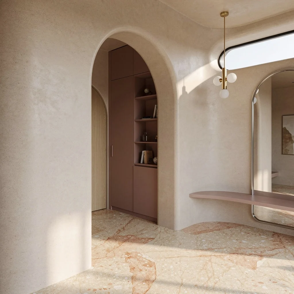
Craving soft lines and organic vibes? Go sculptural with curved microcement walls in sand tones (no boxy corners, please). Use poured terrazzo floors with embedded veining for movement; avoid anything too speckled unless you love chaos. Install a full-height arched oak pivot door and echo that arch with a skinny-brushed chrome mirror. Hide your junk behind dusty rose integrated cabinets—daily essentials stay out of sight, out of mind. Hang a minimalist three-bulb gold orbital pendant to punctuate the space, and let sunlight from a slot window showcase your color palette. Rule: Mirror width should never exceed doorway width—keep proportions tight.
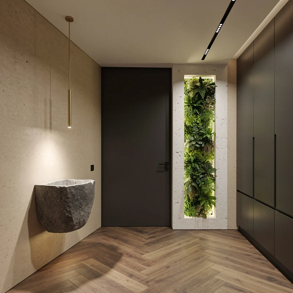
Eucalyptus Zen: Matte Wood, Creamy Limestone, & Custom Storage
Want a calm, zen entry that doesn’t bore? Go for smoked eucalyptus panels in ultra-matte finish—leave the gloss for kitchens. Use creamy limestone slabs with bronze linear inlays to make your floors interesting—not slippery. Drop rectilinear stone plinths for seating or display; nothing beats multi-purpose. Elevate your ceiling (not your ego) with floating shadowlines and indirect LEDs. Flank your entry with extra-clear acid-etched glass panels for soft light diffusion. Style adaptive storage behind touch-latch panels—if you’re opening doors with handles, you missed the memo. Rule: Use no more than two bronze inlay stripes—overkill is for amateurs.
Architectural Freshness: Chevron Floors & Green Walls, All In
Don’t settle for bland. Install raked almond concrete walls for architectural edge, then use chevron fumed oak on floors—don’t let anyone tell you straight planks are enough. Anchor your entry with a monolithic wall-mounted stone catchall, spotlighted under a slender matte brass linear pendant. Opposite your pivot door, flaunt an illuminated vertical green wall in white limestone niche: real plants, fake confidence. Minimalist dark anthracite cabinets go flush, hiding everything except your taste. Track lights and custom shadow-gap ceiling finish the look. Rule: Green wall must be professionally installed—DIY disasters show.
Final Thoughts
A modern entryway that actually works isn’t modern because it has marble floors or integrated LEDs or a pivot door with invisible hinges. It’s modern because someone made deliberate choices about what the space should feel like and then followed through on every decision until the whole thing held together as something coherent.
The entries worth copying from this list are worth copying because they each understood their own identity: the moody cabin that leaned into darkness instead of fighting it, the taupe corridor that eliminated noise instead of just reducing it, the arch-mirror setup that used scale as its entire argument. None of them are trying to appeal to everyone. They’re each trying to do one thing extremely well, and that singularity of purpose is what makes them memorable rather than merely acceptable.
Your entryway doesn’t need to be larger, lighter, or more neutral. It needs to know what it is. Pick a direction, build toward it with every choice you make, and stop second-guessing yourself into beige. The homes people remember walked through the door with a point of view, and yours should too.