
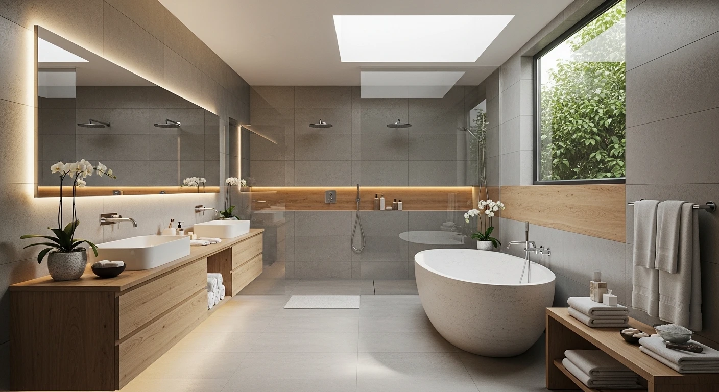
Somewhere along the way, everyone agreed that bathrooms should be beige. Or grey. Or that particular shade of greige that means nothing and offends no one and makes the room feel like a waiting area for a dentist who values neutrality above all else.
Nobody made this rule official. It just happened. And now entire bathroom renovation budgets get spent on rooms that are technically fine and completely forgettable.
Color in a bathroom is not a risk. It is a decision. The same decision that separates a bathroom people remember from one they politely compliment and immediately forget. The right color scheme doesn’t just change the walls — it changes the entire emotional register of the space. How it feels at seven in the morning. How it photographs. How it makes you feel about the room you’re in every single day.
Palette Generator
Lock in your favorites and spin the rest. Can you discover all 5 designer-approved combinations from the article?
Why Bathrooms Default to Neutral and Why That’s Cowardly
Fear of resale value is the most common excuse. The second most common is not knowing where to stop once color enters the room. Both are solvable problems. Resale value is affected far more by quality of materials and condition of fixtures than by wall color. And knowing where to stop is simply a matter of deciding which surface leads and which surfaces follow — one bold choice executed confidently reads as designed, while three competing bold choices read as unresolved.
The Single Color Rule That Makes Everything Work
Pick one color that leads. Everything else either matches it in tone, contrasts it in value, or disappears into neutral. A bathroom with one strong color and disciplined material choices around it looks intentional. A bathroom with three strong colors looks like a renovation that ran out of direction halfway through.
Dark Colors Don’t Make Bathrooms Feel Smaller
They make them feel more enclosed — which in a bathroom is not a problem. It is a feature. A bathroom is one of the few rooms in a home where enclosure is desirable. Dark walls make the space feel deliberate and private. Combined with the right lighting, they make materials like marble and chrome look dramatically better than they ever do against beige.
The Death of Beige
Why your bathroom is forgettable, and how to make a decision.
Master Bathroom Color Scheme Ideas
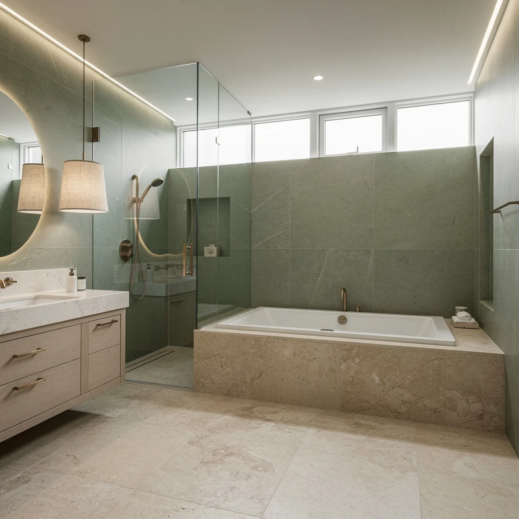
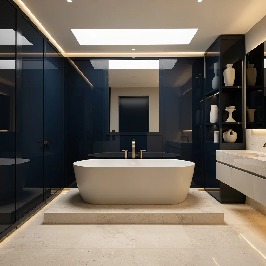
Full Grey Marble With Black Steel:
Clad every surface — floor, walls, shower enclosure — in large-format grey marble porcelain with consistent veining direction throughout. The colour here is the stone itself: cool blue-grey tones with white and charcoal variation doing all the decorative work without a single additional hue.
Frame the shower enclosure in matte black steel — the contrast between the cool marble and the hard black frame is the entire colour relationship. Float a white gloss vanity with a single white vessel basin and mount a large circular backlit mirror above it. Recessed ceiling downlights on a warm setting.
Two beige bath mats on the floor for the only warm note in an otherwise cool palette. The grey marble bathroom works because the material has enough inherent variation to function as its own colour scheme — the job of every other decision is simply not to interrupt it.
Terracotta Upper, Black Marble Lower:
Divide the wall horizontally. Upper zone in large-format terracotta-toned tiles — warm, earthy, matte. Lower zone and floor in large-format black marble porcelain with white veining. The meeting line between the two surfaces is the design moment — it should be clean and deliberate, not softened with a border.
Float a fluted black vanity at the transition point with a matte black vessel basin and brushed copper tap fittings. A large circular backlit mirror in warm amber light above — the warm glow amplifies the terracotta and makes the black marble look richer. An open-frame copper shower rail system with a ceiling rain head against the black marble shower wall. A recessed niche in the shower wall with a thin brass shelf.
Black wall-hung toilet. The copper fixtures are the only warm metal in the room and they tie the terracotta wall directly to the vanity zone, making the split palette read as a single coherent decision rather than two separate rooms sharing a wall.
Deep Burgundy Lacquer Paneling:
Paint every surface — walls, ceiling, and all architectural paneling — in the same deep burgundy lacquer finish. Not matte. Lacquer. The reflective quality of a lacquered surface changes entirely under candlelight and makes a bathroom feel more like a jewel box than a functional room. Install traditional raised panel molding on the walls before painting so the lacquer has architecture to catch and reflect.
A marble console sink in white Carrara — the white marble against the burgundy creates the most important contrast in the room. Chrome cross-head taps and exposed chrome pipework below the basin. A heavily framed decorative mirror with an ornate silver surround and a sculptural light fitting at its top.
Two slim silver candlestick sconces flanking the mirror at face height. Fresh cut flowers in a simple silver vase on the basin surface — the only object on any surface. This color requires total commitment. A half-hearted burgundy bathroom is a failed one. Go all the way in and it becomes the most memorable room in the house.
Soft Lilac With White Marble and Brushed Gold:
Paint all walls, ceiling, and joinery in a consistent soft lilac — the exact tone matters enormously here. It should read as sophisticated rather than juvenile, which means it needs grey undertones rather than pink ones. Clad the shower enclosure floor to ceiling in large-format white marble with subtle grey veining and frame it with a frameless glass door and brushed gold hardware.
Float the vanity in the same lilac as the walls — when joinery matches walls, the room reads as larger and more considered. Top the vanity with a white marble counter and an undermount basin, and fit brushed gold bridge faucets. Open lower shelving in gold-framed rails for folded towels in matching lilac.
A large gold-framed mirror above the vanity with warm-toned wall sconces either side. A large tropical plant in a simple pot on the floor — the green cuts through the purple in the same way a complementary color always does, and suddenly the whole room snaps into focus.
Teal Walls, Dark Vanity, and Plants as the Third Color:
Paint every wall in a saturated teal — not the washed-out version, the one that looks like deep water and means it. Let it run onto the ceiling if the ceiling is low enough to benefit. Float a dark espresso vanity with a stone-look counter and a white undermount basin fitted with matte black tap hardware. A large full-width mirror above the vanity that reflects the teal back on itself and makes the room feel deeper than it is.
Install a frameless glass shower enclosure against the teal wall with a ceiling rain head and mosaic tile floor inside the shower pan. Hang a trailing plant in a woven basket from the ceiling near the mirror — the cascading green against the teal wall creates a depth that no artwork could achieve. Edison bulb pendant lights on black cord above the vanity for warm task light.
A large framed botanical print in black and white between the vanity and the shower. Dark shag bath mat on the floor. The teal is not a feature wall decision — it is a whole-room commitment, and that total commitment is exactly why it works.
Go Gold or Go Home: Champagne & Marble Luxe
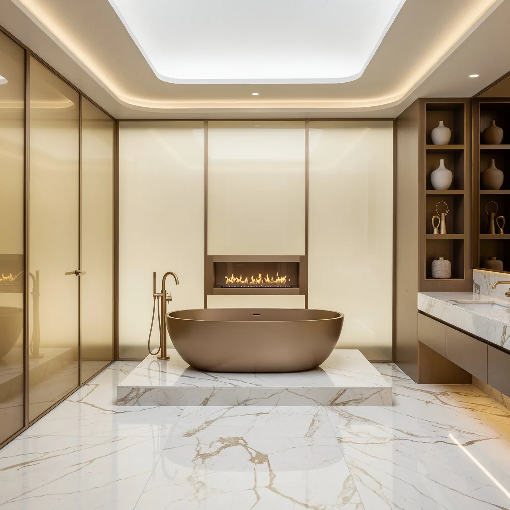
Want to look like you shower in a five-star hotel every day? Ditch muddy earth tones and drown your space in champagne gold. Cover your floors and lowered tub platform with white marble featuring subtle gold veins—no tacky swirls, please. Install full-height translucent glass panels in pale gold and use brushed gold fixtures everywhere, even the faucet. For drama, add a linear gas fireplace (if you’re not scared of commitment). Style soft cove LED lighting around ceilings and vanities. Always pick faceless ceramic vessels for shelf styling—nothing ruins the vibe like telegraphing your taste with branded bottles.
Urban Drama: Charcoal, Blue & Gloss Perfection
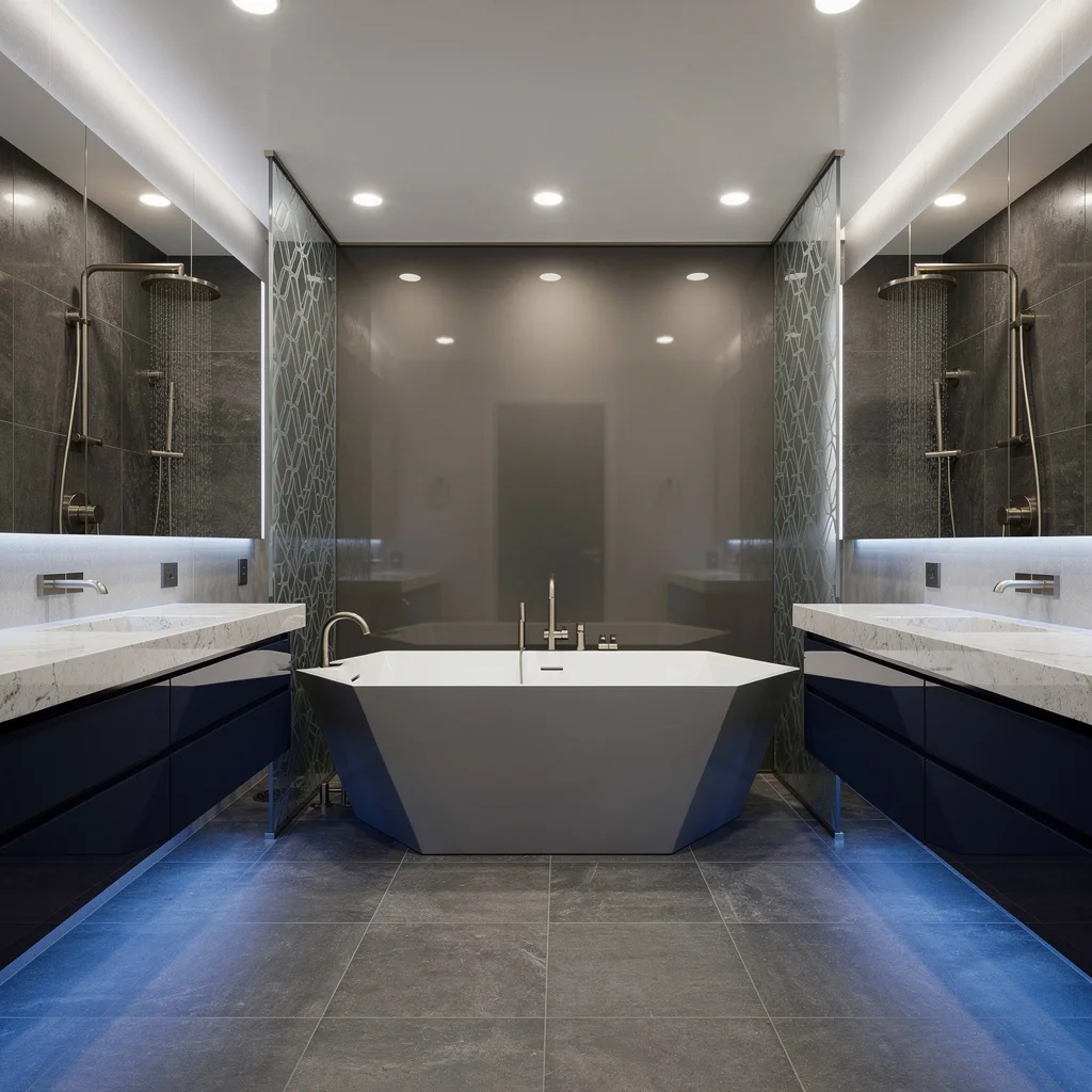
If you’re allergic to boring, lean hard into charcoal porcelain tiles paired with matte dove gray walls and midnight blue cabinets. Install underlit floating quartz vanities and let a seamless mirror run the length of the wall—otherwise, what’s the point of pretending your bathroom is bigger? Set up an angular soaking tub backed by smoked glass for major edge, and separate twin rain showers with patterned glass dividers. Chrome accents and blue LEDs? Yes, if you want urban clubs vibes minus the sticky floors. Rule: Never let the dark tile stop at eye-level—run it floor to ceiling for proper drama.
Earthy Hues Only: Terracotta & Blush Taupe
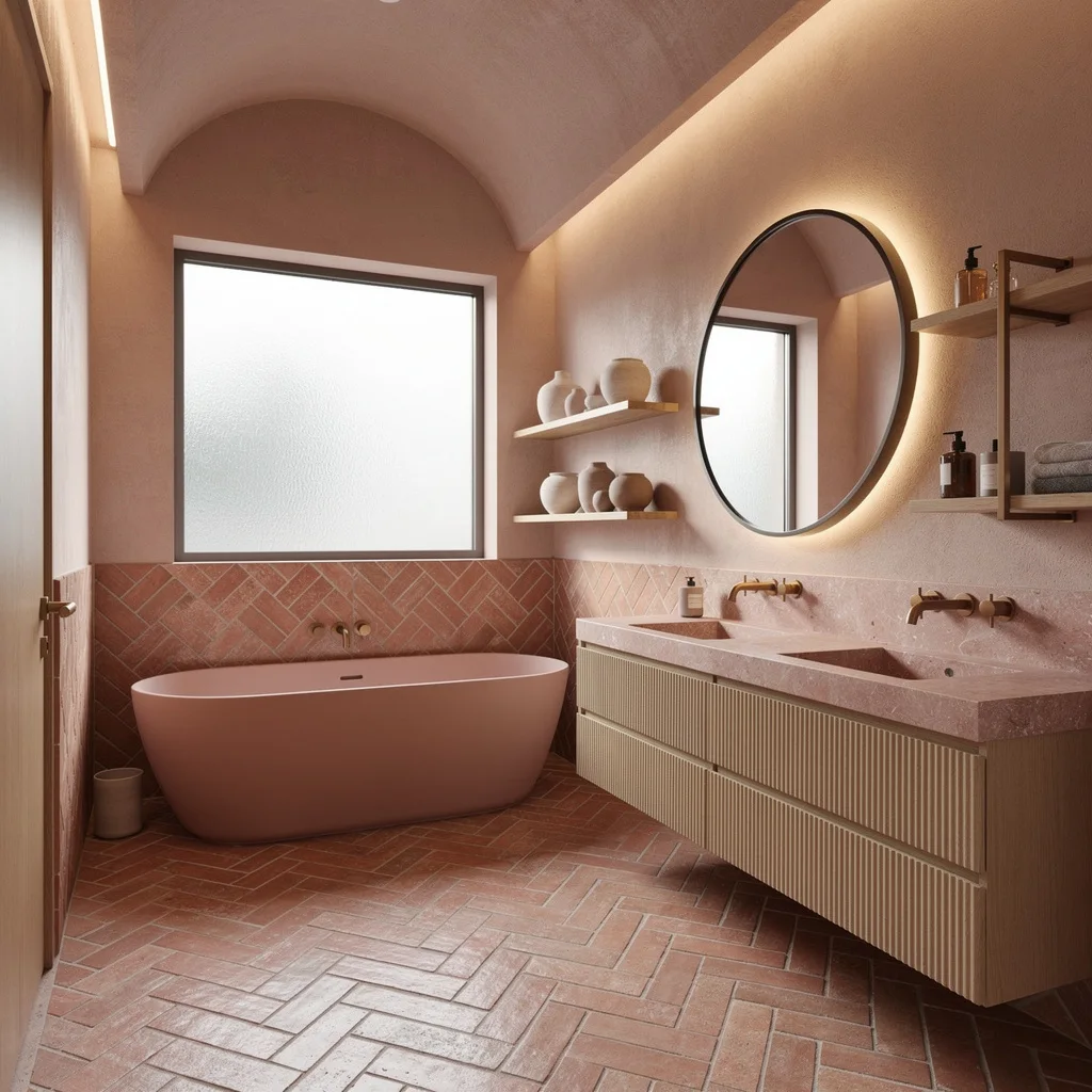
Get over generic ‘neutral’—you’re not a waiting room. Lay handmade terracotta herringbone tiles across the floor and up your main accent wall, then slap a matte pink tub right in front; zero regrets. Use fluted pale oak drawers and rose-tinted stone for your double vanity; anything glossy or laminate is banished. Warm indirect lighting in your arched ceiling will upgrade the vibe instantly, and bronze taps and backlit mirrors add crucial warmth. Keep shelves minimal, pottery muted, and let your window be obscure glass for ultimate zen. Never use actual terra cotta pots—leave gardening outside.
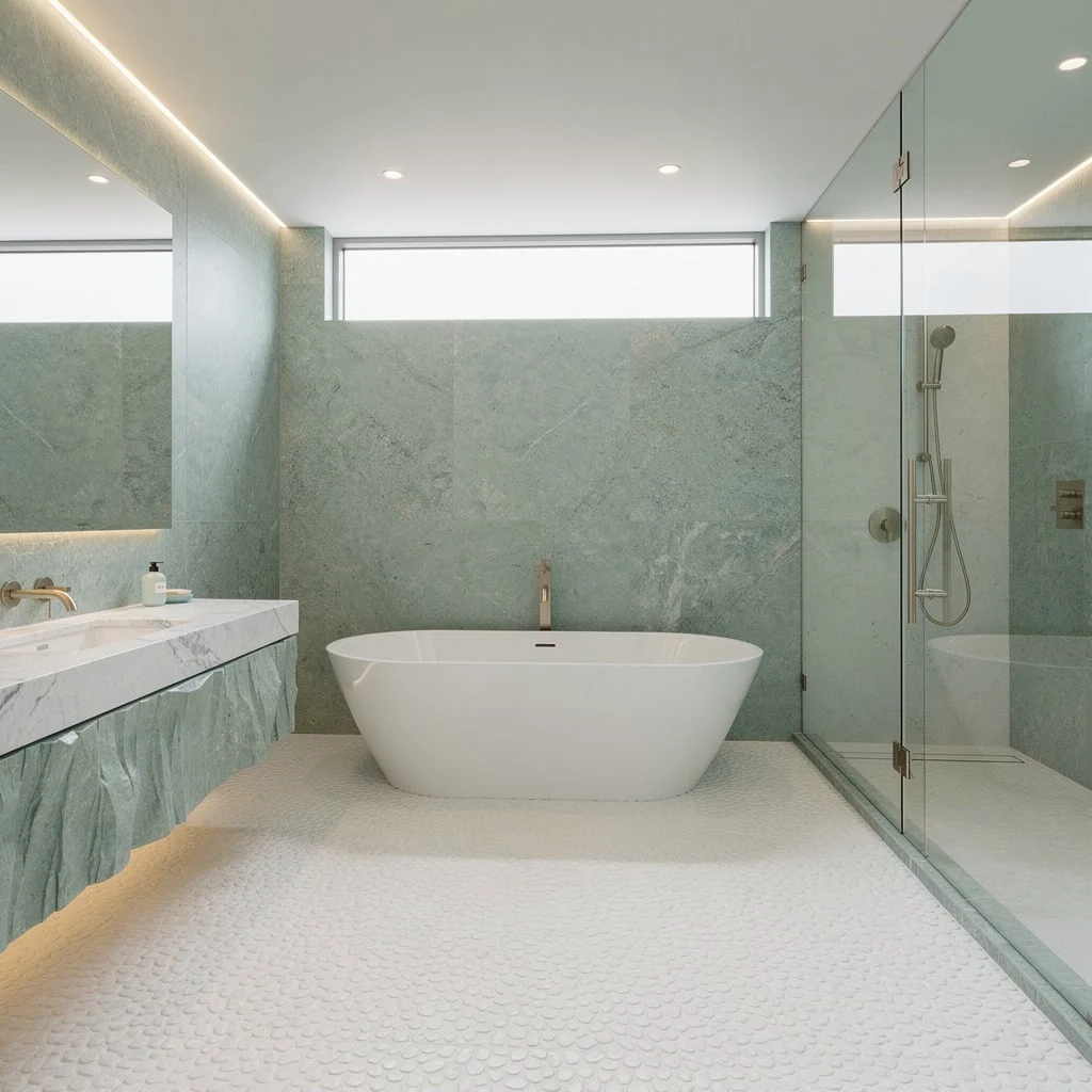
Sage Sophistication: Green, Stone, and Brass—Duh
Obsessed with calm but want something fancier than ‘spa’? Cover your walls with large-format porcelain slabs in muted sage—don’t let anyone talk you into mint. Use fossil limestone for your floors, then add a seamless floor-to-ceiling glass shower enclosure with perimeter lighting so the whole space feels like a meditation retreat. Float your vanity in whitewashed oak and finish with patinated brass hardware. Hang linen pendant shades for softness. Always go oversized for your soaking tub and set it in stone; small tubs scream rental, big tubs scream ‘I made it.’ Build clerestory windows to keep it tranquil, never basic.
Contrast Is King: Black Herringbone & White Terrazzo
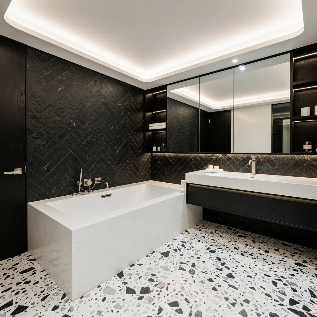
If you crave drama, stop settling for mid-tone mush. Use black herringbone stone panels for your accent wall, then flood the floor with white terrazzo laced with shards of charcoal and silver. Mount a white quartz tub on a platform, ring it with a floating black oak vanity, and throw in brushed stainless steel fixtures for some cool factor. The sink should be linear and trough-style—no basic bowls allowed. Add hidden LED strips in shelf niches and mirror walls to bounce light. Never let the ceiling stay boring; use soft white coves to keep your bold look crisp AND inviting. Basic bathrooms never win.
Emerald Glam: Green Marble & Copper Flash
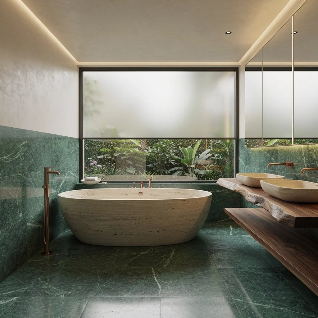
Nature lovers, but make it expensive. Cover walls halfway up in large emerald marble tiles, then polish off the upper walls with smooth ivory plaster. Gleaming copper fixtures beside a travertine tub? That’s how you flex. Float a live-edge walnut vanity and double up on vessel sinks—extra points if the window’s frosted and full-width for garden privacy. Line everything with ambient cove and mirror-integrated lighting. Don’t let the green get muddy; keep your marble pattern sharp. Rule: Only pair copper with green or ivory, never with chrome or steel; mixed metals have their place, but bath time isn’t one.
Blush’n’Modern: Oyster Gray & Geometric Perfection
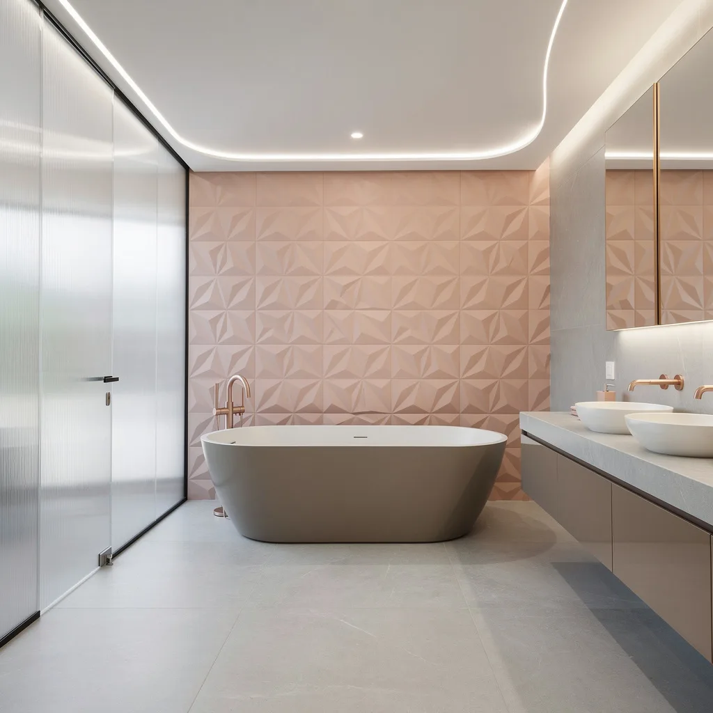
Ready to quit boring? Cover your floor in wide, matte oyster gray tiles, and put geometric blush-pink 3D tiles on the feature wall for instant tactile vibes. Sculpted tubs deserve center stage—go for a freestanding option. Use high-gloss taupe cabinetry and quartz basins with faceless finishes; anything with a busy pattern is out. Rose gold hardware is legit, but only if you keep the color palette soft—don’t let blush fight with anything loud. Frost floor-to-ceiling glass for privacy, not darkness. Always outline the ceiling with recessed LED ribbon lighting; it’s how you fake that designer-level look on a mortal’s budget.
Midnight Gallery: Navy Glass & Ivory Everything
Craving artsy drama? Go for giant navy glass panels across every wall and drop creamy limestone on the floors and vanity tops. Set your soaking tub on a plinth for architectural cred, framing it with strip lighting to amp the mood. Use brushed nickel taps and sculpted ivory storage until you feel like you’re in a European gallery—yes, storage can be style. Throw up a massive frameless mirror; skinny mirrors are banned. Always keep shelf decor abstract and minimal; if you have thirty perfume bottles, hide them. Lighting should be concealed and linear—never ‘cute’, always bold.
Celadon Chill: Pearl White & Spa Energy
Want that heavenly spa effect? Layer textured celadon porcelain up the walls and install a floating marble vanity with cascading waterfall sides to announce ‘I have taste.’ Keep floors pebbled pearl white and carry them into the shower for visual flow—nothing ruins luxury like choppy tile transitions. Use glass enclosures with brushed platinum hardware; skip chrome unless you’re still stuck on nineties nostalgia. A luminous white acrylic tub under a clerestory window is basically required. Line all architectural edges with LED strips. Rule: Never let your lighting get too yellow—cool white is what nails the clean vibe.
Graphite Masterclass: Sand, Walnut, and Bronze Bling
Ready for bold, grown-up style? Install matte graphite wall panels and creamy sand-colored limestone floors for instant contrast. Put a rainfall shower in a frameless graphite glass box and trim the niche with glowing bronze LEDs. Freestanding tub should be sand-hued—no boring white. Go long on your walnut floating vanity and integrate seamless sinks; bronze hardware only, please. Recessed ceiling lights are mandatory, and linear windows are how you land golden sunlight for warmth. Never match your faucet to your shower handle unless it’s bronze; mixed hardware screams lazy, not luxe.
Caramel Comfort: Greige, Oak & Champagne Gold
Want cozy but not basic? Paint your walls in muted greige and create a caramel marble feature wall for instant warmth. Go loud on flooring by laying oversized light oak tiles—tiny planks are for cheap flips. Matte white freestanding tub gives contrast. Double vanity should be fluted caramel wood topped with cream quartz for texture, no glossy surfaces allowed. Suspend vertical glass pendants to visually stretch the space, and stick to brushed champagne gold fixtures. Always go for wide, tinted mirrors; if your ‘mirror selfie’ doesn’t look like a showroom, you’re doing something wrong. Hide harsh lighting with cove illumination.
Hint of Drama: Stormy Lavender & Ivory Fantasy
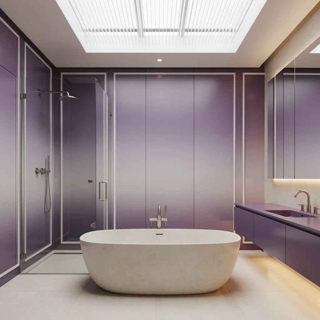
Tired of boring but scared of color? Take a risk and cloak your walls in satin-finish lavender porcelain panels, lining the edges with matte ivory trims for drama. Your shower enclosure must be frameless with an ombré effect—it’s called layering, get with it. Oval tub in soft ivory stone, matching floating vanity in lacquered lilac, and nickel fixtures for understated shimmer. Under-cabinet LEDs are for flexing those color shifts. Never let your skylight go standard—pick ribbed translucent for ultimate daylight diffusion. Rule: Keep accessories minimal, otherwise lavender turns from chic to granny in five seconds flat.
The Color Decision Is a Confidence Decision
Every bold bathroom color scheme on this list required someone to look at the tile samples, look at the paint swatches, and choose the one that made them slightly nervous. That nervousness is the signal. It means the choice is interesting enough to be worth making.
Safe color choices don’t make bad bathrooms. They make forgettable ones. And a forgettable bathroom is a waste of a renovation budget, a waste of good materials, and a waste of a room you spend real time in every single day.
Pick the color that makes you slightly nervous. Execute it with total discipline. The bathroom that results will be the one people remember.