
Beige has a reputation problem it doesn’t deserve. Somewhere between the beige carpets of the 1990s and the greige obsession of the 2010s, the colour became shorthand for people who couldn’t make a decision. Safe. Inoffensive. Forgettable.
These twenty kitchens would like a word.
Beige is not one colour. It is a family — warm sand, pale linen, toasted almond, soft greige, creamy bone — and depending on what you pair it with, it reads completely differently. Beige with black granite and chevron tile is polished and glamorous. Beige with forest green uppers and zellige is earthy and considered. Beige with burgundy and veined marble is dramatic enough to make you question every other kitchen you’ve ever thought you liked.
The version of beige that got a bad reputation was beige without contrast, beige without commitment, beige by default. The version in these images is beige as a deliberate foundation — a warm neutral that lets the countertops, the hardware, the accent colour, and the tile do their work without competing.
This is the blog for anyone who has scrolled past beige cabinets because they assumed there was nothing interesting happening there. Something interesting is happening.
The Colour Pairings That Decide Everything
Beige cabinets are not a colour scheme. They are the beginning of one. What you pair them with determines whether the kitchen reads as warm and grounded, cool and sophisticated, moody and rich, or fresh and airy. The cabinet colour sets the temperature. Everything else decides the character.
The Hardware Choice Is Never Neutral
Hardware on beige cabinets is a design decision with more leverage than most people give it. Brass and unlacquered gold push the kitchen warm and give beige a richness it wouldn’t have alone — the pairing reads as collected and organic rather than matched. Brushed nickel and chrome push it cooler and more contemporary. Matte black creates the sharpest contrast and reads as the most modern of the three.
The profile of the hardware matters as much as the finish. A slim bar pull on a flat-front cabinet is a completely different statement than a round knob on a shaker door, even in the same metal finish. Decide the hardware before you decide anything else. It tells you which version of beige you’re building.
Countertops Set the Register
A pale honed marble countertop on beige cabinets keeps the whole kitchen in the same quiet family of tones — the result is serene and cohesive, with all the visual interest coming from texture and material rather than contrast. A black granite or dark soapstone countertop introduces strong contrast and makes the beige feel deliberate and grounded rather than cautious. A warm butcher block countertop brings the kitchen down to earth and gives it a kitchen-that-actually-cooks quality that stone sometimes loses.
Choose the countertop by deciding what the kitchen should feel like from across the room. The countertop is the single most visible horizontal surface when you walk in. It sets the register before anyone looks at the cabinetry.
The Accent Colour Arrives Last
Beige cabinets accept accent colours that almost no other base colour handles as gracefully. Navy works. Forest green works. Burgundy and deep wine work. Even dusty rose and soft terracotta work. The reason is that beige is a warm neutral — it reads as a natural companion to earthy, saturated tones that would overwhelm a white or grey kitchen.
The rule is: one accent colour, applied consistently. Upper cabinets in one colour, lowers in another. Island in a contrasting colour. Or a coloured backsplash that echoes the accent. The accent should appear in at least two places in the kitchen — once in the architecture and once in the styling or seating — so it reads as intentional rather than accidental.
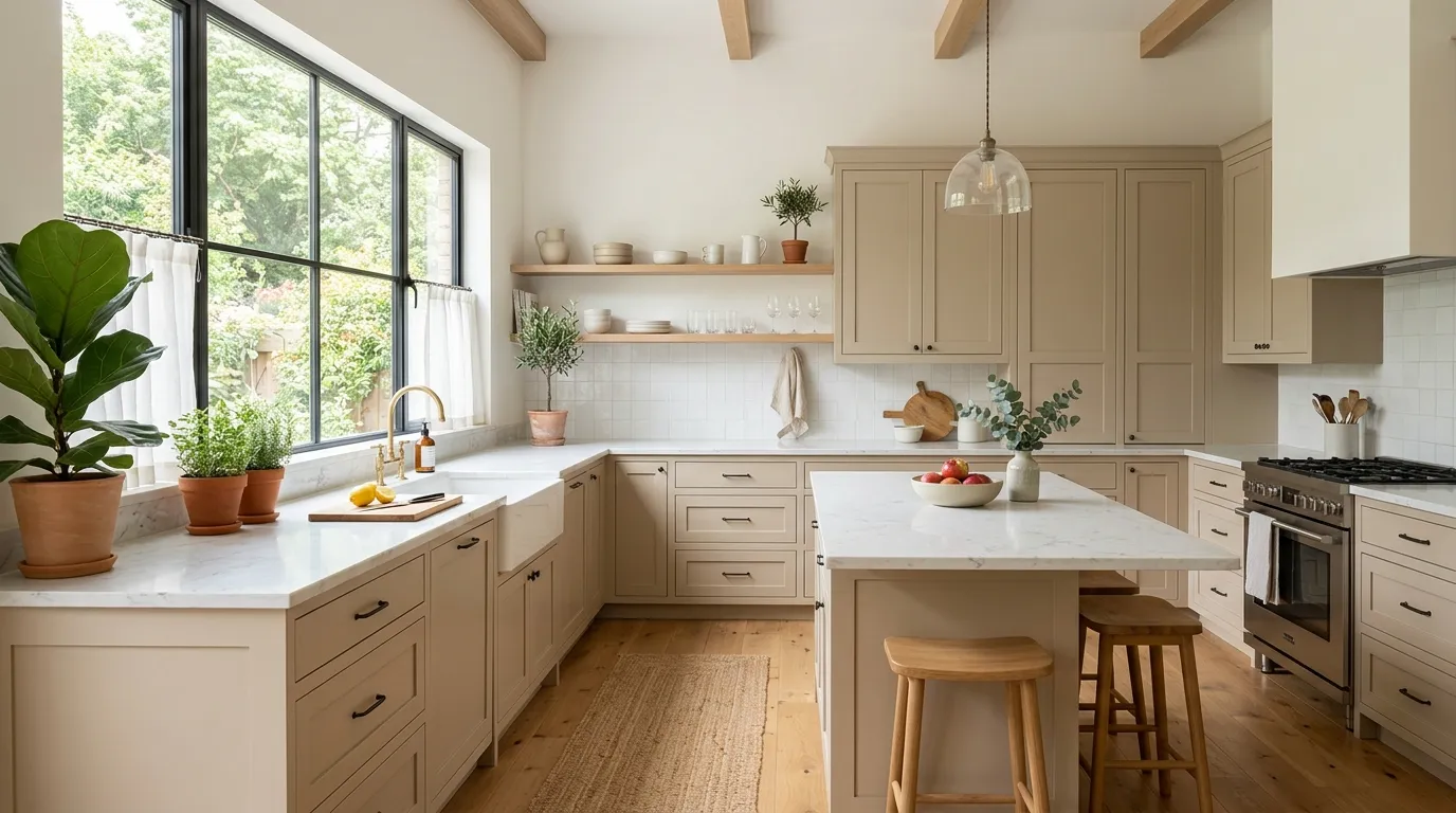
Beige Kitchen Cabinet Ideas
Art Deco Champagne and Black
Paint all cabinetry in a warm champagne or pale gold-beige — one step warmer than cream, with enough yellow undertone to read as luxurious rather than flat. Apply a raised herringbone or chevron profile to the cabinet door fronts in the same paint finish, so the surface has shadow and dimension without introducing a second colour. Specify brass hardware throughout: bridge-style faucets, round knob pulls, and bar handles all in a polished unlacquered brass.
Choose a black granite or very dark stone countertop — the contrast between the pale champagne cabinets and the near-black surface is the engine of this design. Install a chevron backsplash tile in a tone-on-tone cream or ivory, running vertically to pick up the direction of the cabinet door profile. Hang glass pendant lights with clear cylindrical shades above the island to keep the upper half of the kitchen transparent. This kitchen reads as jewellery-box luxury, not farmhouse warmth.
Lavender and Beige Jewel Kitchen
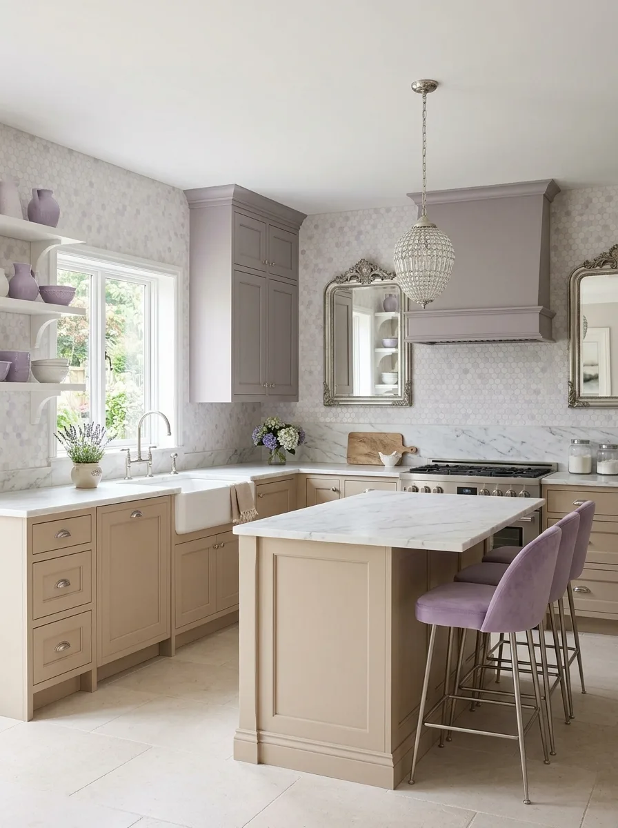
Paint the range hood and upper cabinetry in a soft lavender-grey — a purple so muted it reads as mauve in shadow and dusty lilac in natural light. Keep the lower cabinets and island in a warm pale beige or barely-there greige. Use polished chrome or brushed silver hardware throughout — the cool metal finish connects with the cool-toned upper cabinets and prevents the brass that would otherwise be the default choice.
Install a marble mosaic tile backsplash — small hexagonal or arabesque tiles in a white and grey marble, running from the counter up to the underside of the uppers. Choose a white Carrara marble countertop with a clean, minimal edge. Hang a beaded chandelier-style pendant above the island — not industrial, not modern, but an ornate light fitting with clear crystals or small glass drops that scatter light across the marble countertop.
Mount ornate silver-framed mirrors on the cooking wall as architectural decorative elements rather than functional mirrors. Use lavender velvet or soft purple upholstered bar stools at the island. Style the open shelves with soft lilac ceramic vases, white pottery, and a small bunch of fresh lavender in a white pitcher at the window. Add a white marble mortar and pestle near the gas range. This kitchen is feminine without apology and distinctive without trying.
Sand Dune Minimalist
Specify flat-front cabinets in a warm sand or greige — no frame, no inset, no profile detail, just a clean flush door with an integrated push-to-open mechanism or a single thin bar handle. Run the same tone on both uppers and lowers with no break. Use the same tone or a slightly lighter version on the island sides. The result is a kitchen that reads as a single sculptural mass rather than a collection of individual cabinet units.
Install a stone slab backsplash in a slightly lighter tone to the cabinets — a honed travertine or a matte limestone panel — so the surface change registers without introducing colour contrast. Choose a brass gooseneck tap as the only warm metal in the space. Add one sculptural element to the island surface: a tall white textural vase with dried flowering branches, oversized enough to read from across the room. Everything else stays clear. This kitchen depends entirely on proportion and restraint.
Cream and Sage Garden Kitchen
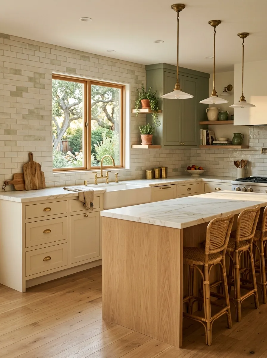
Paint lower cabinets in a warm creamy beige and upper cabinets in a muted sage or olive green — the two colours should sit in the same warm family without being close enough to read as matching. The green upper cabinets carry the energy. The cream lowers anchor it. Use brass hardware on both — cup pulls on the lowers, small knobs on the uppers — so the metal finish bridges the two colours.
Install a handmade cream or ivory subway tile as the backsplash, running the full length of the kitchen including across the range alcove. Add floating shelves in a natural oak or pine finish at one section of the upper cabinetry — this break in the upper cabinet run allows greenery, ceramics, and natural objects to enter the kitchen without being hidden behind doors. Choose a white marble countertop and a natural oak island base with a matching marble top for the prep surface.
Hang schoolhouse-style or flat-shade pendants in aged brass or antique brass above the island. Stack rattan bar stools at the island seating. Position a farmhouse sink under the garden-facing window and keep the surrounding counter clear enough to hold a plant and a wooden board. This kitchen looks like it grew in a kitchen garden.
Greige and Dark Walnut Globe Kitchen
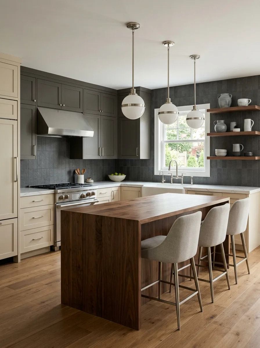
Paint the perimeter cabinets in a cool greige — a beige that reads slightly grey in shade, slightly warm in direct light — and build the island from a solid walnut butcher block top with a neutral painted base that matches the perimeter. The walnut introduces the only warm, organic material in the kitchen, and it concentrates all of that warmth at the most used surface in the room.
Install dark charcoal zellige or matte square tile as the backsplash — a tone that reads as near-black and creates a strong contrast behind the perimeter countertops. Use globe pendant lights on brushed nickel rods above the island and let the warm bulb glow contrast with the cool grey tile behind them. Choose brushed nickel or polished nickel hardware throughout for consistency with the pendant finish.
Add open shelves in a warm walnut or dark-stained oak at one end of the kitchen, styled entirely in white and grey ceramics. The walnut of the island top and the shelf tone should match closely enough to read as the same material decision appearing twice. Keep the floor in a natural wide-plank hardwood — it provides the warmth at ground level that the greige walls and charcoal tile deliberately withhold higher up.
Navy Upper Beige Lower
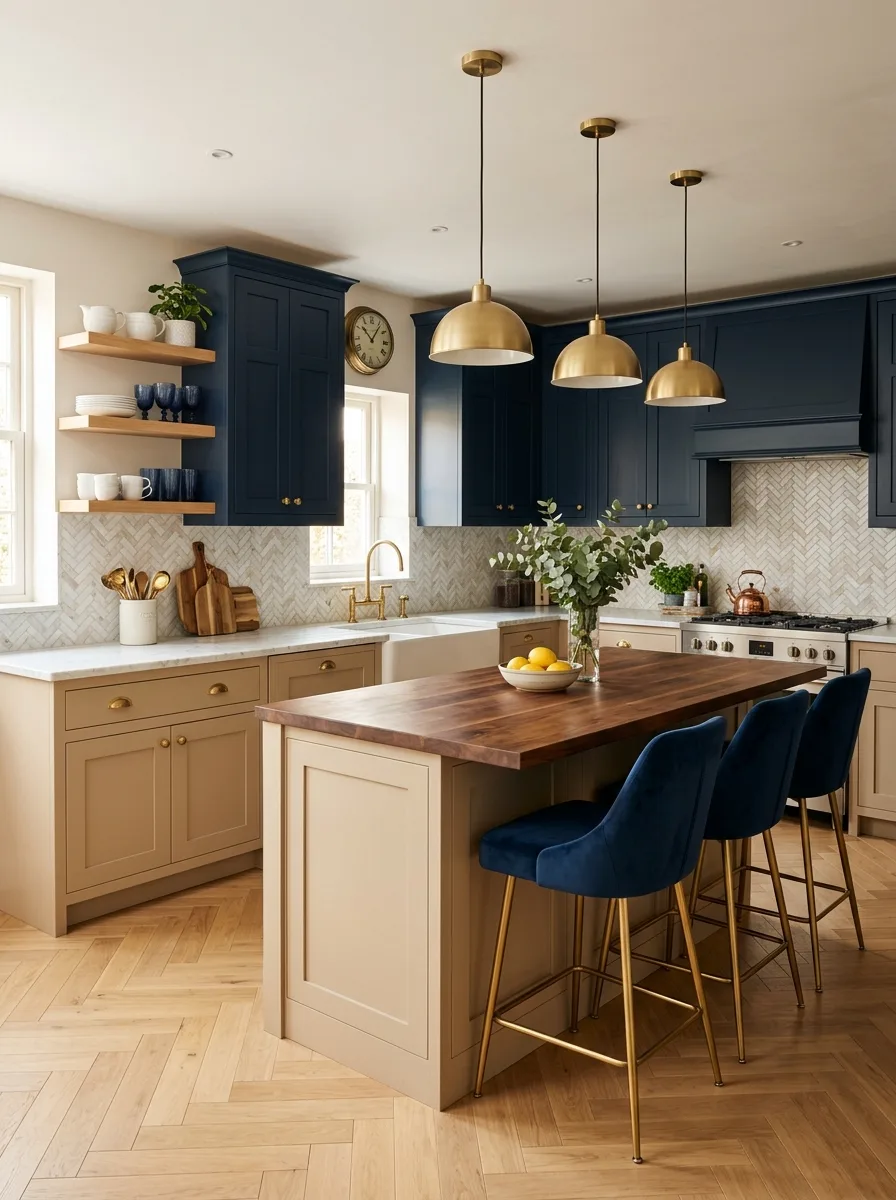
Paint the upper cabinets in a full, saturated navy — not a faded or greyed navy, but a proper deep blue with enough richness to read as colour rather than muted — and paint the lowers in a warm beige that sits in the yellow-cream family. The contrast ratio between the two cabinet colours should be high enough that the eye immediately reads the room as a two-tone design. Navy and warm beige is one of the oldest British kitchen colour combinations in existence. It is not tired because it keeps working.
Install a marble herringbone tile backsplash in a cream and white tone that bridges the upper and lower cabinet colours visually. Choose aged brass hardware on both cabinet levels. Run a butcher block countertop on the island in a warm medium-tone wood. Hang brass dome pendants — the warmer and more aged the brass, the better — above the island in a cluster of three. Use a herringbone parquet floor in a light oak to complete the traditional geometry.
Style the open shelves above the sink run with a collected mixture of blue and white ceramics, white ironstone, and natural wood pieces. The shelving styling should lean deliberate rather than casual — this is a kitchen with a point of view, and the shelves should reflect it.
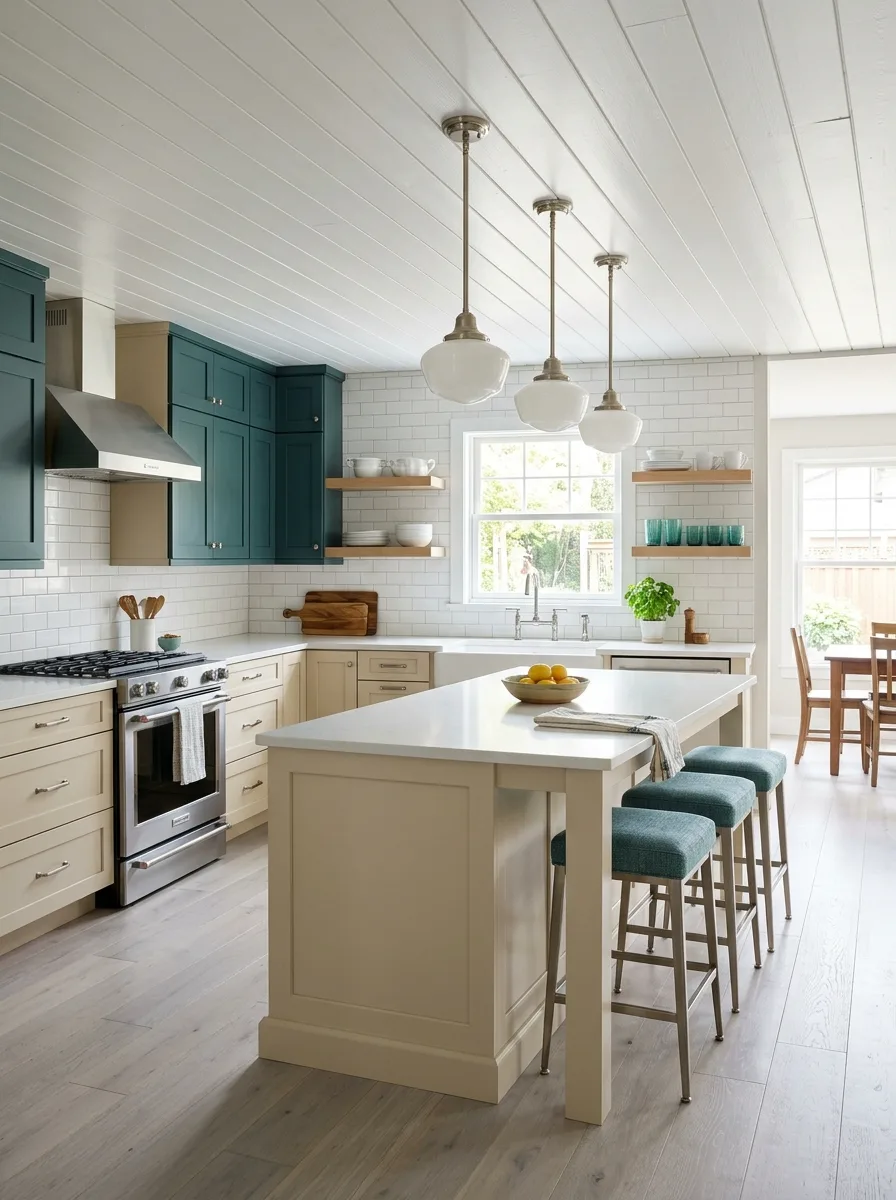
Dark Forest and Linen Shaker
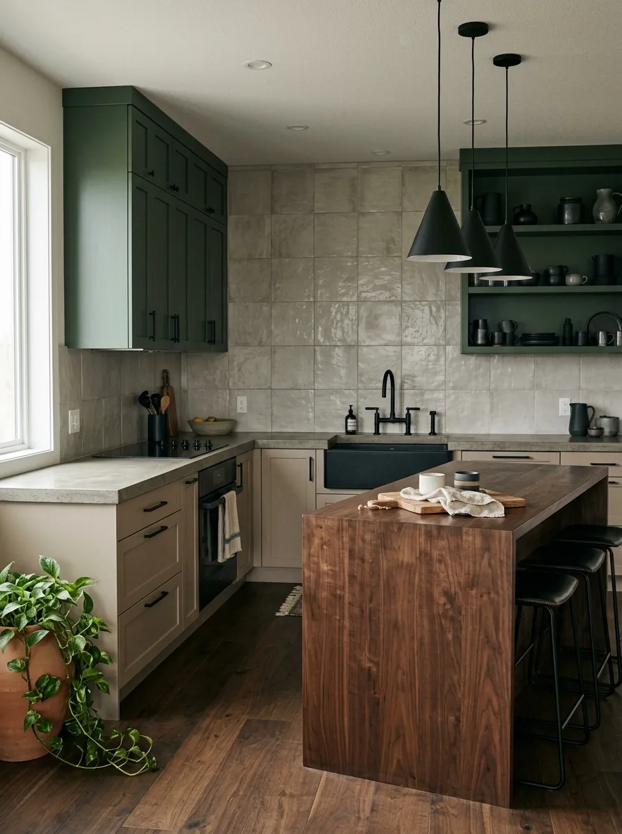
Paint the upper cabinets in a deep forest or olive green — saturated enough to read as a strong colour decision from across the room — and the lower cabinets in a light greige or linen beige. Use matte black hardware throughout: flat bar pulls on the lowers, small block-style knobs on the uppers. The all-matte-black hardware is the connective tissue between the two very different cabinet tones.
Install large-format zellige or handmade wall tiles in a muted warm grey for the backsplash — running floor to ceiling on the cooking wall rather than stopping at the base of the upper cabinets, so the tile becomes a full-height architectural element rather than a splash protection strip. Choose a poured concrete or honed stone countertop in a light warm grey. Run the same tone on the island top.
Build open shelving on the green wall with brackets in matte black, styled exclusively with dark ceramics — matte black stoneware, dark green glazed pieces, dark amber glass. The shelves should look curated and intentional. Use dark walnut bar stools with black upholstered seats. Add a trailing pothos or devil’s ivy in a terracotta pot at the corner where the green meets the window light. This kitchen is serious and settled. It knows exactly what it is.
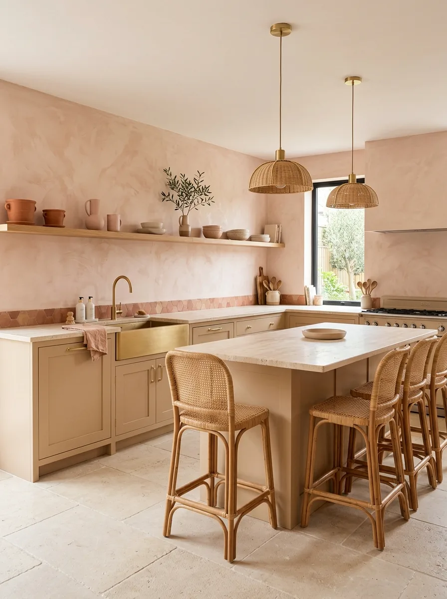
Blush and Warm Stone
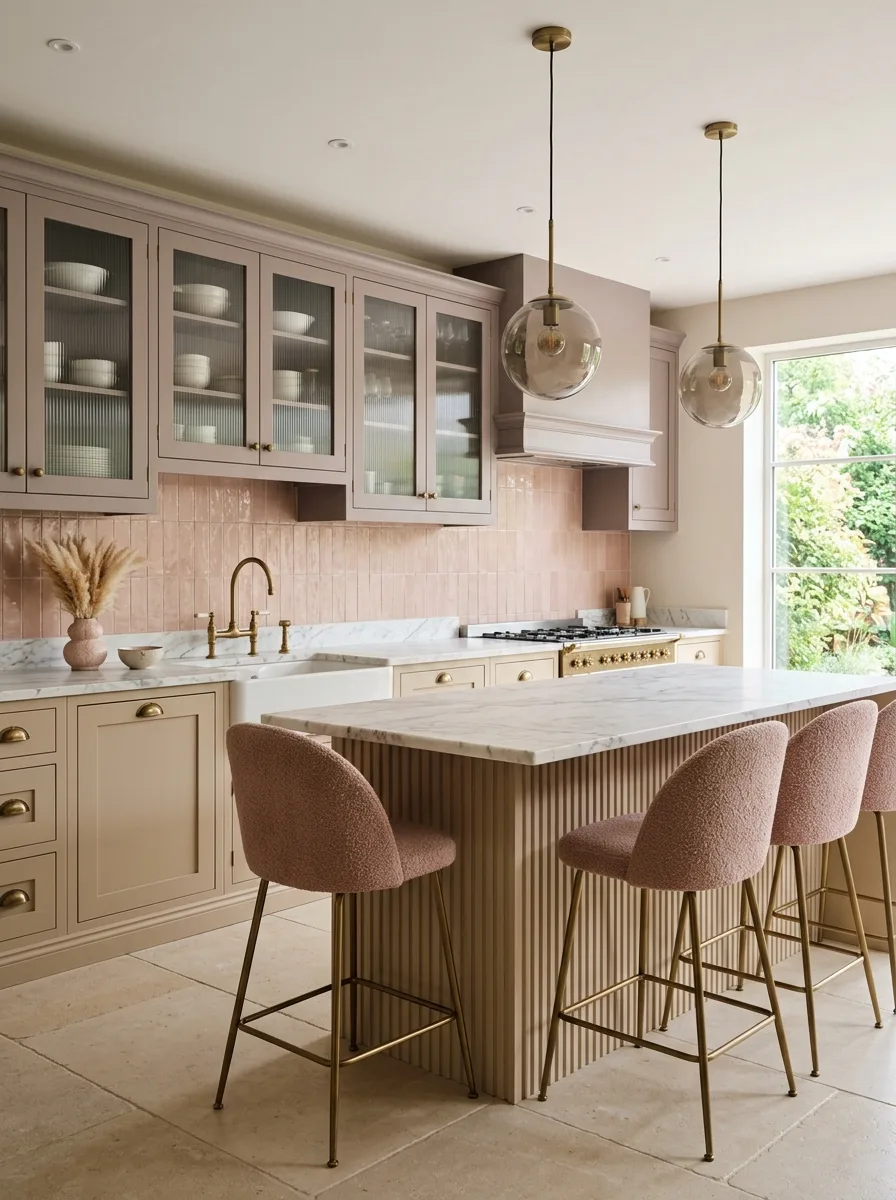
Paint all cabinetry in a soft dusty pink-beige — a tone that is recognisably pink in warm light and reads as warm beige in cool light. The ambiguity is the point. Use fluted or reeded panels on the island face to add surface texture to what would otherwise be a very quiet, tonal kitchen. Run ribbed glass on the upper cabinet doors to reveal the shelving inside without fully exposing it. Choose aged brass hardware throughout — the warm metal against the blush cabinetry is the warmth source this kitchen depends on.
Install vertical stacked tiles in a soft dusty pink or blush tone as the backsplash — the tiles should be a shade or two more saturated than the cabinet colour so they read as a backsplash rather than a continuation of the cabinetry. Choose a white Carrara or marble-effect countertop. Hang smoked glass globe pendants above the island — they catch the light warmly without adding a strong colour.
Use large-format limestone or travertine floor tiles. Style the ribbed glass upper cabinets with all-white ceramics — no other colour visible through the glass. Place a single vase of dried pampas grass on the counter near the sink. This kitchen is quiet in a way that takes some nerve to commit to. Commit to it.
Terracotta Zellige and Cream

Paint the cabinetry in a clean soft cream or very pale butter tone — light enough to recede against the backsplash and floor but warm enough not to read as white. Install terracotta zellige tiles as the backsplash running floor to ceiling on both the cooking wall and the window wall — each tile slightly different in colour from its neighbour, ranging from pale terracotta through to deep burnt orange. The variation in the zellige tile surface across the entire wall is the thing that makes this kitchen.
Choose a copper farmhouse sink and copper faucet — the only kitchen on this list that earns a copper sink without qualification. The copper reads as a natural continuation of the terracotta tile colour family. Build the island from natural live-edge walnut or a solid butcher block in a warm amber tone and run it without an overhang — a simple thick slab that functions as both prep and serving surface. Add rattan bar stools in a dark honey tone.
Hang copper pendant lights above the island — hammered copper dome shades in two or three sizes. Style the open shelves with terracotta pots, amber glass, and warm clay ceramics. Use terracotta hexagonal floor tiles. This kitchen commits to one colour family — terracotta, amber, copper, warm wood — and refuses to introduce anything outside it.
Powder Blue Cottage Kitchen
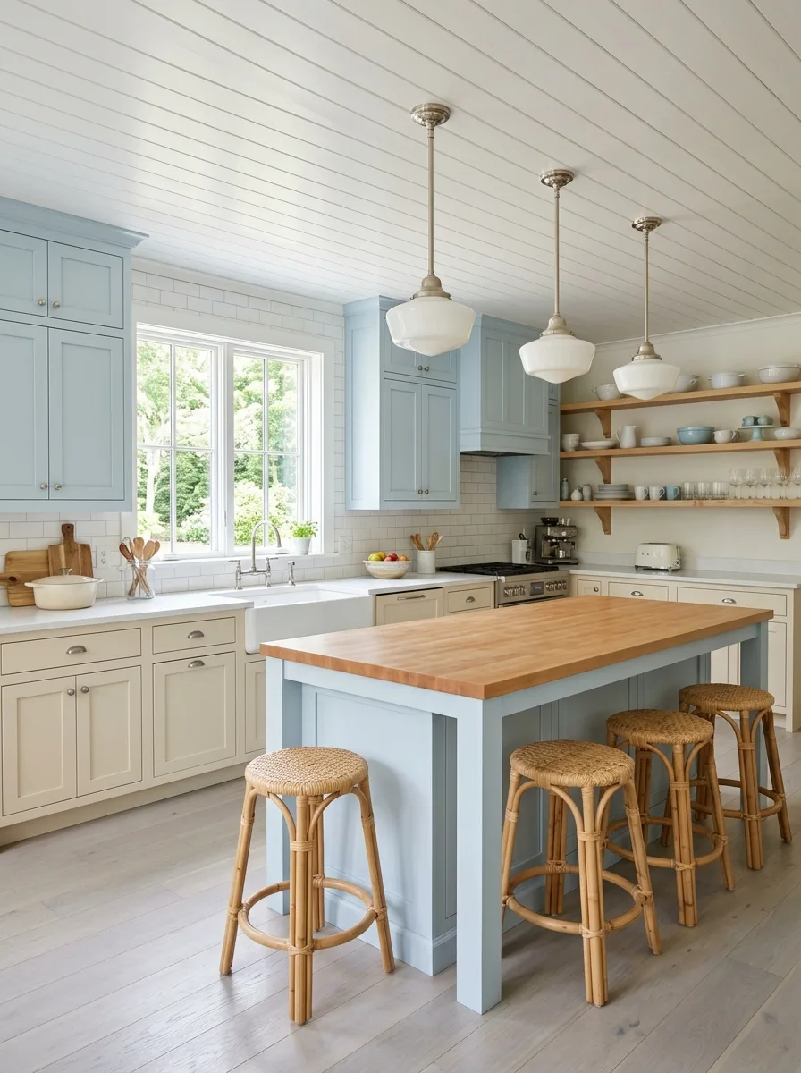
Paint the upper cabinets and range hood in a soft powder blue — a clear, slightly faded blue that reads as nostalgic without being saccharine — and keep the lower cabinets and island in a warm off-white or cream beige. The blue and cream combination has its roots in Scandinavian and coastal cottage design, and it still works because the two colours are warm-family complements rather than stark contrasts.
Install a white subway tile backsplash in a standard brick-lay pattern and run it from counter height to the base of the upper cabinets only, not full height — this keeps the backsplash as a clean functional element rather than a design feature. Choose a butcher block countertop in a light, golden maple tone for warmth against the blue and white. Use nickel or polished chrome hardware — small cup pulls or dome knobs — to keep the finish cool and consistent with the cabinet palette.
Hang schoolhouse pendant lights in white with nickel fixtures above the island. Use natural rattan bar stools. Run a whitewashed or pale blonde hardwood floor throughout. Style the open shelves with white and blue ceramics, occasional wooden pieces, and clear glass. Keep the kitchen looking well used: a wooden bread board propped against the tile, a small pot of herbs on the windowsill, a tea towel folded over the oven rail. This kitchen doesn’t try to look like a showroom.
Warm Plaster Rose Kitchen
Render the kitchen walls above the cabinetry in a warm tadelakt or mineral plaster — a material that is applied wet and burnished to a smooth finish that shows variation in tone and a subtle waxy sheen. The plaster colour should be in the pale rose or blush family — not paint, not wallpaper, but a genuine applied plaster finish that develops its own texture and depth over time. Everything else — cabinetry, island — should sit in a warm nude or pale sand beige.
Run a short strip of diamond-pattern terracotta or dusty pink encaustic tile as the only tile in the kitchen — just the immediate backsplash section behind the sink, not full-height. The small tile band against the plaster wall introduces a geometric element without competing with the surface finish above it. Choose a brushed gold or antique brass farmhouse sink and a matching curved faucet. Hang rattan dome pendant lights in pairs above the island.
Use large-format limestone or tumbled travertine on the floor. Style the open shelf with a single run of ceramics in warm rose and nude tones — a pink ceramic mug, a terracotta pot, a beige stoneware bowl. Add an olive tree in a large aged pot near the window. The whole kitchen should feel like it is lit by warm afternoon light even at nine in the morning.
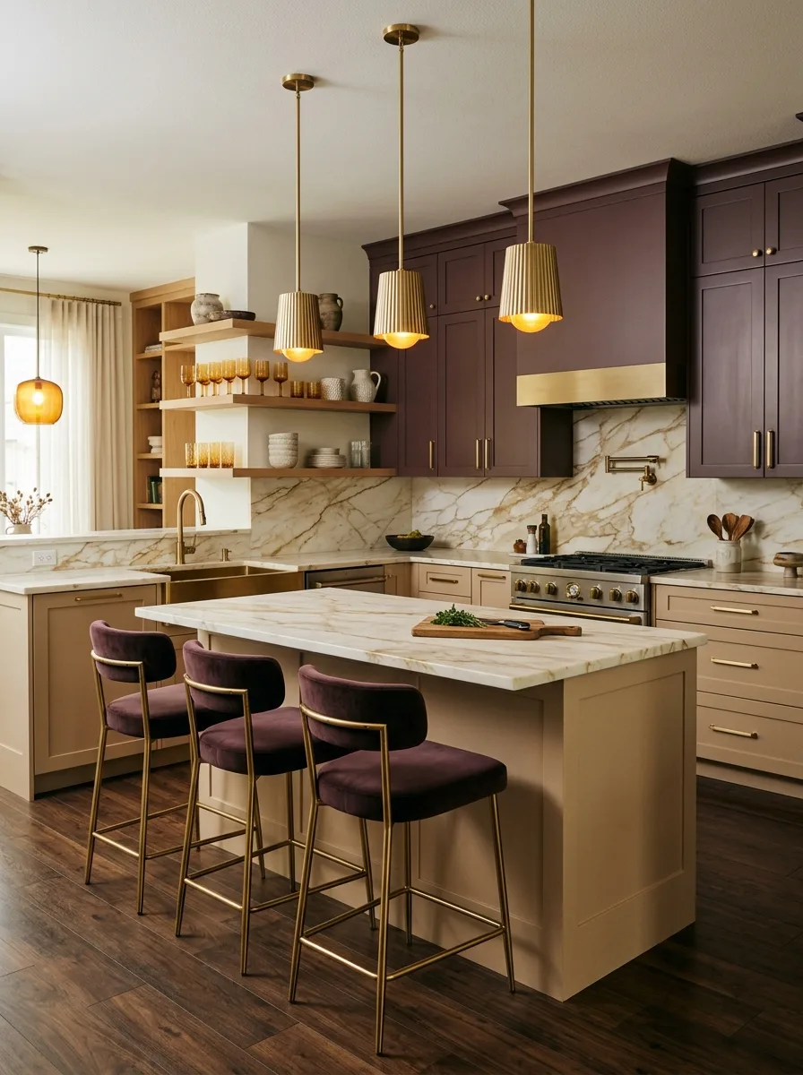
Burgundy Crown and Cream Base
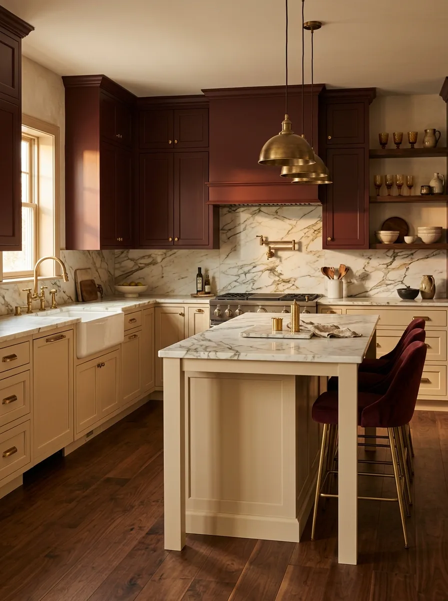
Paint the upper cabinets in a deep burgundy or claret — a red so saturated with blue and brown that it reads as almost wine-dark rather than red. Keep the lower cabinets in a classic cream shaker profile. Install a full marble slab backsplash behind the range alcove — choose a marble with gold and burgundy veining that echoes the upper cabinet colour. The backsplash slab and the upper cabinet colour should be unmistakably related.
Use aged brass hardware throughout — pot filler, bridge faucet, pendant lights, cabinet pulls. Choose a honed or antique-finish white marble countertop with visible movement. Run dark hardwood floors in a rich, warm stain. Add a pair of burgundy velvet bar stools at the island for the only soft textile in the room.
Style the open shelving in amber and warm glass — amber-tinted drinking glasses, honey-coloured ceramic pitchers, aged copper pieces. The warm amber styling against the burgundy upper cabinets creates a rich, jewel-like quality that no neutral styling palette could achieve. This kitchen is not designed for people who want to be comfortable. It is designed for people who want to walk into their kitchen and feel something.
Black and Bleached Wood Island Kitchen
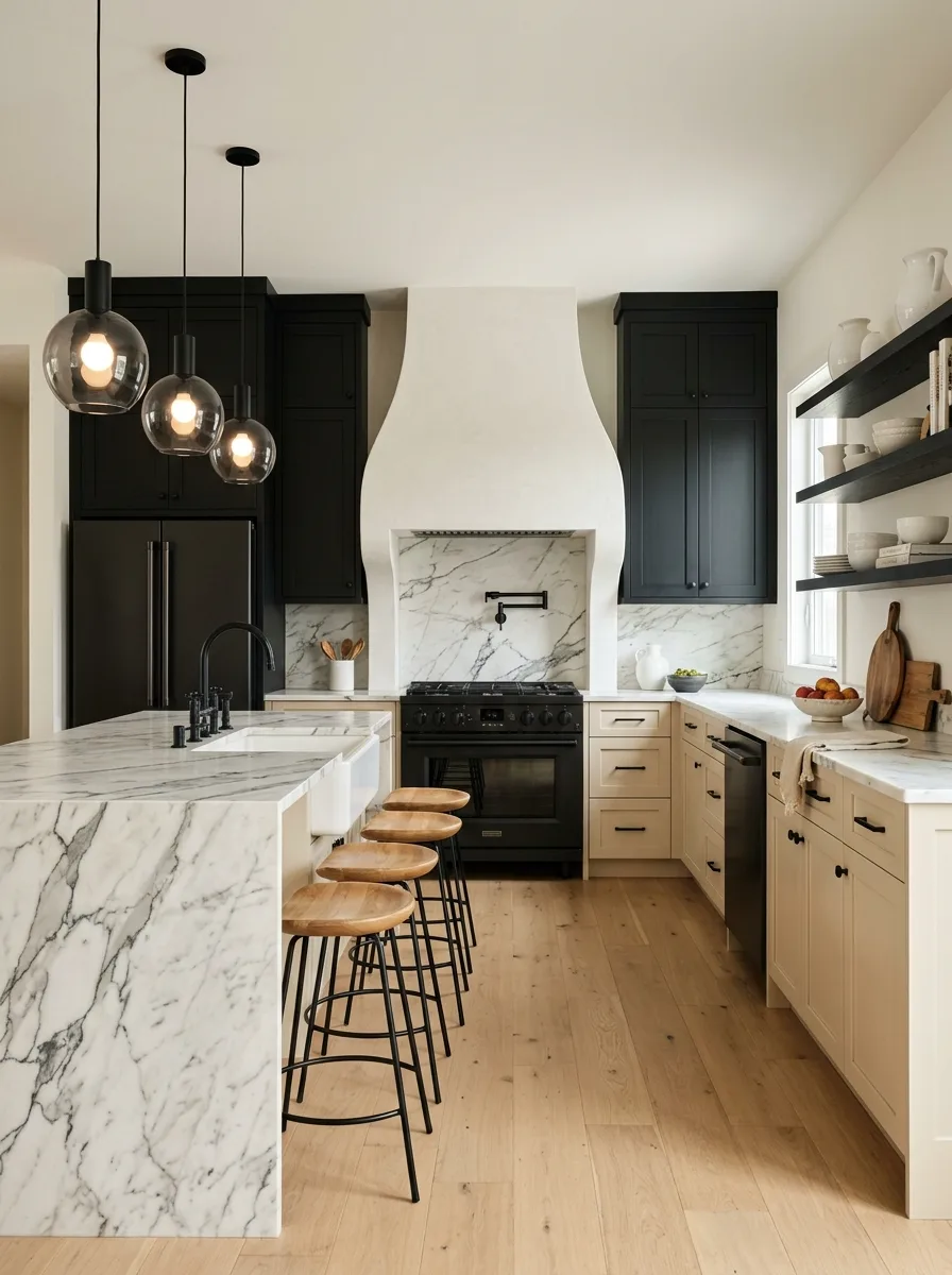
Paint the upper cabinets floor to ceiling in a matte black or very dark charcoal. Leave the lower perimeter cabinets in a warm cream or linen beige — inset shaker doors with matte black hardware throughout. Run a white-plastered or white-rendered sculptural range hood as the centrepiece of the cooking wall — a curved, arching form that breaks the flat geometry of the black cabinets around it. The white hood against the black cabinets is the design contrast this kitchen is built on.
Build the island from a bleached or light natural oak — flat-slab front with no profile detail — and top it with a thick slab of dramatic Calacatta marble, a veined stone with strong grey-and-black movement. The marble island countertop should read from across the room. Hang smoked glass globe pendants on matte black stems above the island. Use matte black hardware on every surface.
Run open shelves in dark-stained oak on the bright wall with white natural light — style them in whites and creams only, no colour. Use light wide-plank hardwood floors throughout to stop the dark upper cabinets from making the room feel heavy at the top. This kitchen is a study in deliberate contrast: black against bleached wood, white plaster against dark metal, graphic marble against blank surfaces.
Sage Shelf Collector Kitchen
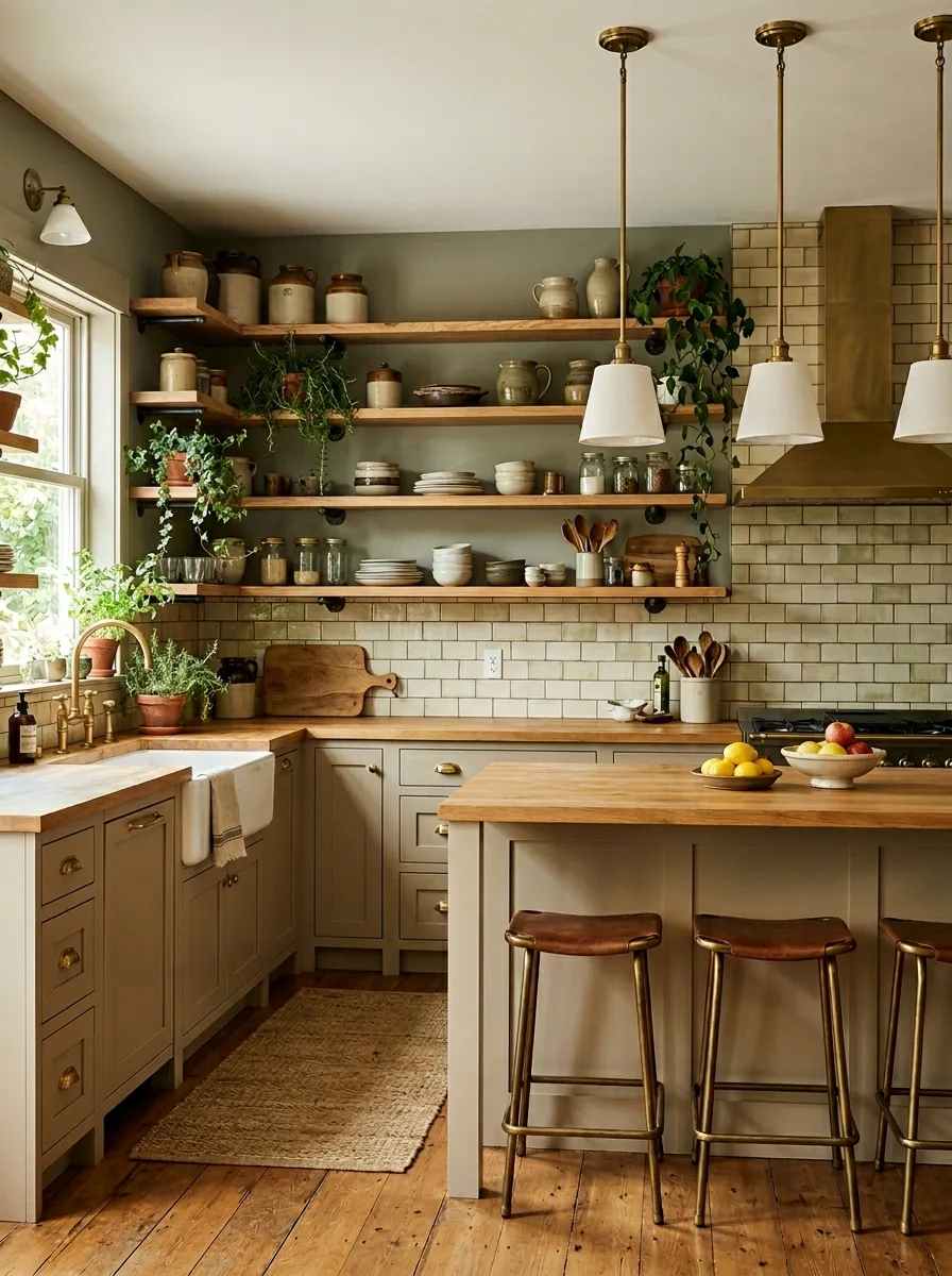
Paint the kitchen walls and cabinetry in the same warm sage-olive — a yellow-leaning green with enough grey in it to read as sophisticated rather than earthy. Apply the colour to the walls above and below the cabinetry, not just to the cabinet doors, so the whole kitchen reads as a single coloured volume rather than a room with green cabinets in it. Use brass hardware throughout.
Run three or four open oak shelves on the wall above the perimeter counters rather than upper cabinets. Style these shelves as a genuine pantry display — stoneware crocks, glass jars of dry goods, stacked plates, hanging bundles of dried herbs, trailing plant cuttings in small vases. The shelving styling should look collected over years rather than arranged for a photoshoot. A kitchen does not need to be styled. It needs to be lived in and that living needs to show.
Install a handmade subway tile backsplash in a slightly yellowed or antique cream tone — zellige or Moroccan subway works here because the handmade variation reads as warm and artisanal against the otherwise matte-painted kitchen. Choose a butcher block countertop throughout. Run a brass range hood above the cooker. Use wide-plank reclaimed oak floors, slightly bowed and uneven underfoot. This kitchen is honest about what it is.
Plum Upper Cream Lower
Paint the upper cabinets in a muted plum or dusty mauve — a purple that has been pulled toward brown and grey until it reads as sophisticated rather than sweet. Keep the lower cabinets in a warm beige or pale caramel. Use brushed gold hardware throughout. Install a large marble slab backsplash with gold and warm veining running the full height of the cooking wall.
Hang gold ribbed pendant lights above the island — the ribbed or fluted profile on the pendant echoes the cabinet door detail and ties the upper and lower sections of the kitchen together through form rather than colour. Choose a white or cream marble island countertop with a flat-flush profile. Add open floating shelves in natural oak at one section, styled in amber glassware and neutral ceramics.
Use dark hardwood floors in a rich, warm tone. Place deep plum velvet bar stools at the island — the fabric should match the upper cabinet colour closely enough to read as intentional. This kitchen is confident about its colour. It should be.
Teal Island Cream Kitchen
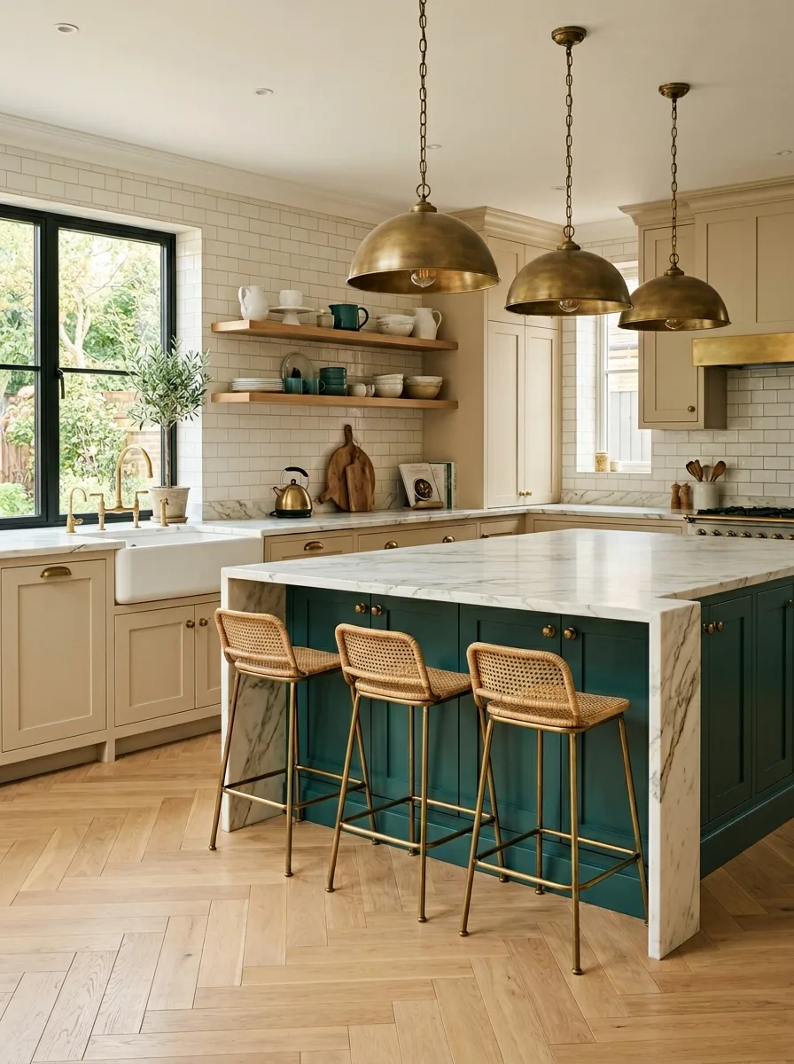
Paint the perimeter cabinets in a soft warm cream or pale parchment and specify the island in a deep teal — a green-blue with enough depth to read as a strong colour choice from the doorway. The contrast between the neutral perimeter and the coloured island is the whole design. Keep the perimeter absolutely simple — shaker doors, white marble countertops, white subway tile backsplash — so the island can carry all the visual interest.
Choose a thick white marble or Calacatta stone countertop for the island and waterfall it down one end face so the stone reads as a structural material rather than just a surface. Use rattan bar stools with brass-leg frames. Hang three oversized brass dome pendants in a row above the island — the pendants should be substantial and warm, not delicate.
Run a herringbone oak parquet floor throughout. Use black framed windows wherever possible — the black frame and the teal island sit in the same dark cool register and the contrast with the cream cabinetry works in both places. Style the perimeter open shelving in whites and greens only — no warmer tones that would pull the eye away from the island.
Shiplap Teal and Cream Coastal
Paint the upper cabinets and range hood in a deep teal — a blue-green with enough navy in it to read as substantial rather than fresh or tropical. Leave the lower cabinets and island in a warm cream or off-white. Run a white shiplap tongue-and-groove ceiling to bring the coastal quality into the architecture rather than the styling. Install a white subway tile backsplash running full height behind the range alcove.
Hang three schoolhouse-style pendant lights on brushed nickel stems above the island — the classic shade profile against the teal upper cabinets and white shiplap ceiling is a combination that reads as intelligent simplicity rather than design by committee. Choose a white quartz countertop on the perimeter and the island. Use light blonde or whitewashed hardwood floors.
Add open natural oak shelves on the back wall and style them with teal glass accent pieces, white ceramics, and a few wooden serving boards. The teal glass elements on the shelves should pick up and distribute the upper cabinet colour across the room so the teal doesn’t read as confined to the upper zone only. Use teal-cushioned stools — square, upholstered, low-backed — at the island. This kitchen is cheerful and honest about being cheerful, which is harder to pull off than it sounds.
Country House Copper Pot Kitchen
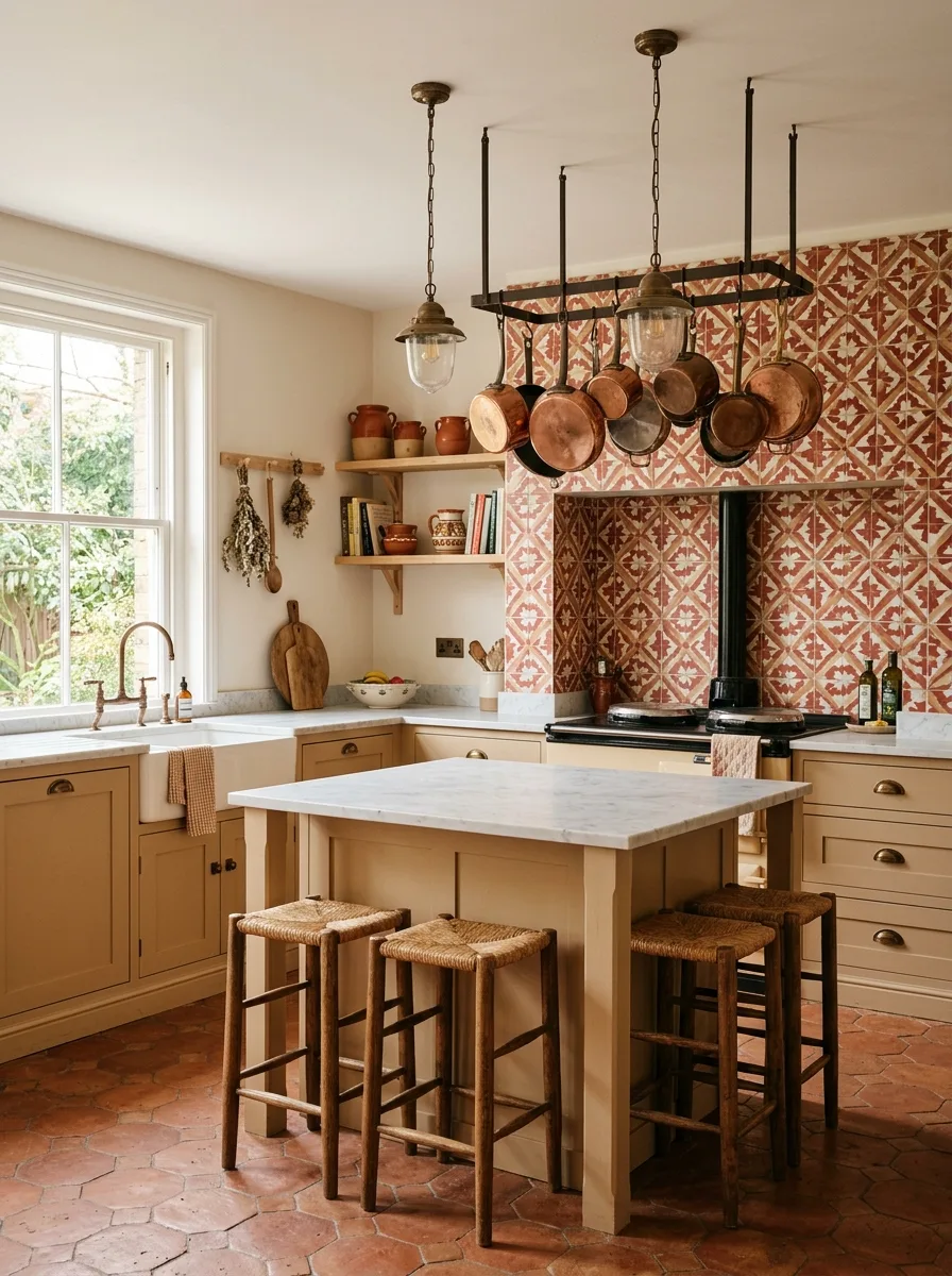
Paint the cabinetry in a classic warm butter yellow-beige — a tone that sits between cream and antique gold, warm enough to read as coloured in natural light but not so yellow that it calls attention to itself. Use aged brass cup pulls and drawer knobs throughout. Build a ceiling-hung pot rack from a rectangular black iron frame suspended on chains or rods above the island, and hang copper pots and pans from it — the copper above the warm cabinetry below is the visual story of the whole room.
Install a terracotta or red cement-encaustic pattern tile as the primary kitchen wall covering — not just the backsplash but the full cooking wall. Choose a pattern with enough visual movement to read across the room but not so detailed that it overwhelms the cabinetry below it. Install an Aga or range-style cooker in black as the centre of the cooking wall.
Choose a white or cream marble island countertop and a farmhouse sink in the same cream tone. Run terracotta hex tiles on the floor. Hang globe industrial pendants with amber bulbs from the pot rack frame. Style the open shelves with terracotta pots, copper-lidded storage jars, cookbook stacks, and bundles of dried herbs hung from a peg rail near the window. This kitchen lives in the room like furniture.
What Every Beige Kitchen on This List Already Knows
The question that doesn’t get asked often enough when designing a kitchen is: what is the kitchen for?
Not functionally — everyone knows it’s for cooking. But atmospherically. Is it for morning coffee before anyone else wakes up? For Sunday cooking that takes all afternoon? For entertaining in a way that blurs the line between the kitchen and the rest of the party?
Beige is the cabinet colour that doesn’t answer that question on your behalf. White does — it says efficient and clean. Navy does — it says formal and serious. Forest green does — it says grounded and a little romantic. Beige says: tell me what you want and I’ll make room for it.
The best beige kitchens on this list didn’t start with beige. They started with a texture, a material, a mood, a colour they wanted to pair it with — and then they found the right version of beige to make that combination work. The cabinets were the last decision, not the first. And they are, as a result, exactly right.
That’s the thing about beige. It’s not a neutral. It’s a foundation.