
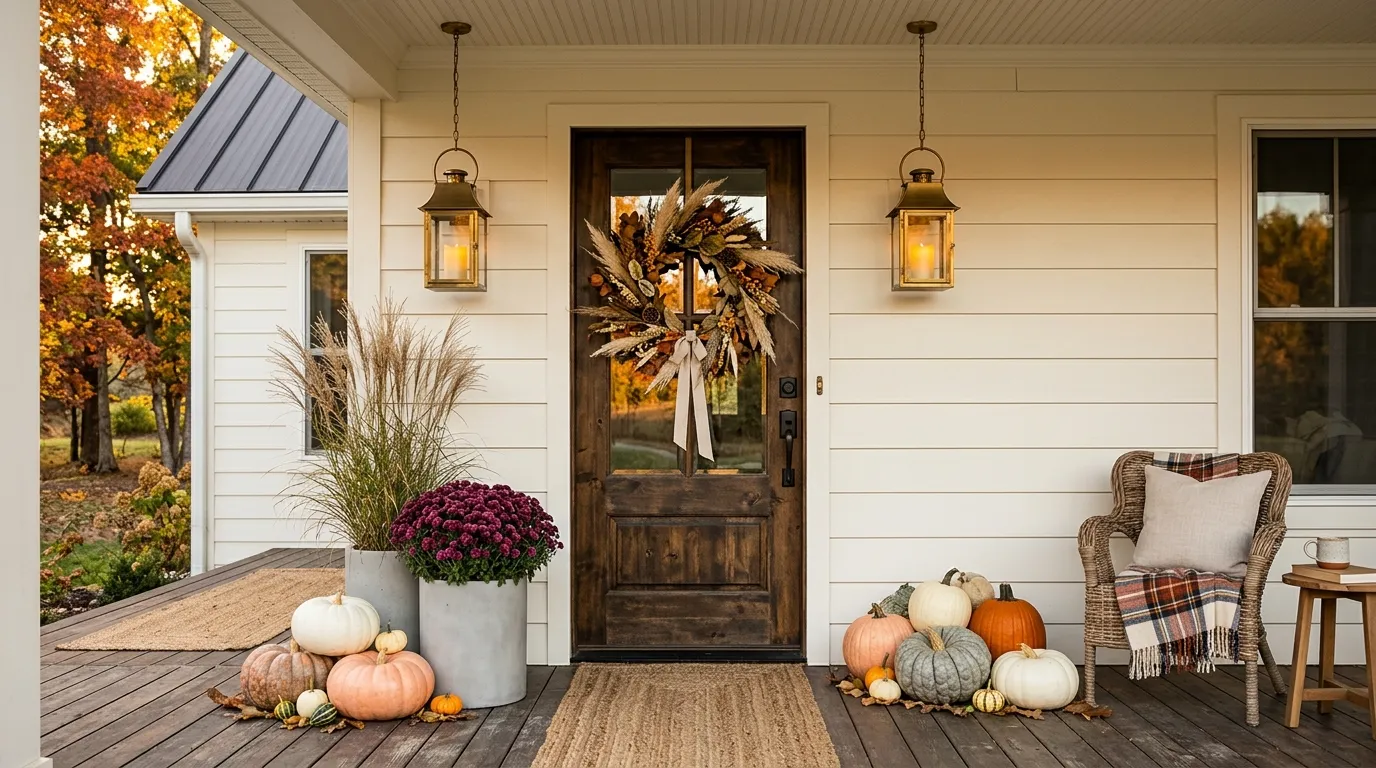
Fall decorating gets messy fast when every seasonal idea ends up on the same porch.
Too many pumpkins, too many signs, too many orange accents, and suddenly the front entrance looks more like a crowded seasonal display than a place people actually use. The problem isn’t that you need more decorations. It’s that most fall front porch decor doesn’t have a clear visual plan.
The best porches use a few strong ideas, then repeat their colors and textures in smart places. A large planter can anchor one side. A wreath can pull the eye toward the door. A basket can add texture without taking over the walkway. Even a single black lantern can make pale pumpkins look more intentional.
That’s the approach behind these fall front porch decor ideas. You’ll find practical ways to work with small porches, steps, seating areas, pumpkins, flowers, lighting, and natural materials without turning the entrance into a cluttered display.
Fall Front Porch Decor Ideas
Create a Cozy Nook
If you genuinely enjoy sitting outside while it is freezing, this is for you. A pile of blankets and candles creates the illusion that you actually use your porch for anything other than avoiding solicitors.
Don’t bother with expensive outdoor furniture if you aren’t going to maintain it. A simple chair, a small table, and enough string lights to blind your neighbors will do the heavy lifting for your aesthetic goals.
Keep the light level low if you want to hide the fact that you haven’t swept the leaves in weeks. It is all about curating a mood that suggests you have a busy, whimsical life rather than just a hobby of scrolling through decor apps.
Frame the Door With Oversized Fall Planters
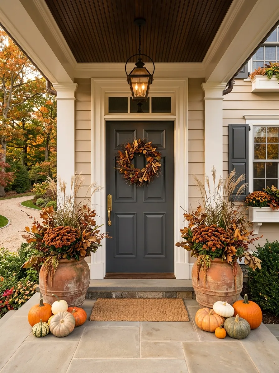
Small pots can disappear beside a large front door.
Oversized planters solve that problem immediately. Place one on each side of the entrance, then fill them with mums, ornamental grasses, leafy branches, or a mix of seasonal greenery.
The goal isn’t to create two identical flower arrangements. It’s to give the doorway enough visual weight that it feels finished from the street.
Choose tall containers when the porch feels visually flat.
For a wider entry, use fuller plants. For a narrow porch, choose a taller, slimmer planter so the walkway stays open.
Embrace Excessive Outdoor Lighting
There is a fine line between a welcoming porch and looking like an airport landing strip, so proceed with caution. Wrapping every column in fairy lights is a classic choice if you want to annoy the neighbors or simply hide the peeling paint on your siding.
Place lanterns at varying heights to make it look like you put actual thought into the layout instead of just dragging boxes out of the attic. The goal is to make the space glow enough that people forget to look at the dead grass.
If you are going to scatter fake leaves everywhere, try to make it look like they fell there by accident. Perfectly placed foliage is a dead giveaway that you care way too much about what strangers think of your entryway.
Layer Neutral Pumpkins Around the Front Door
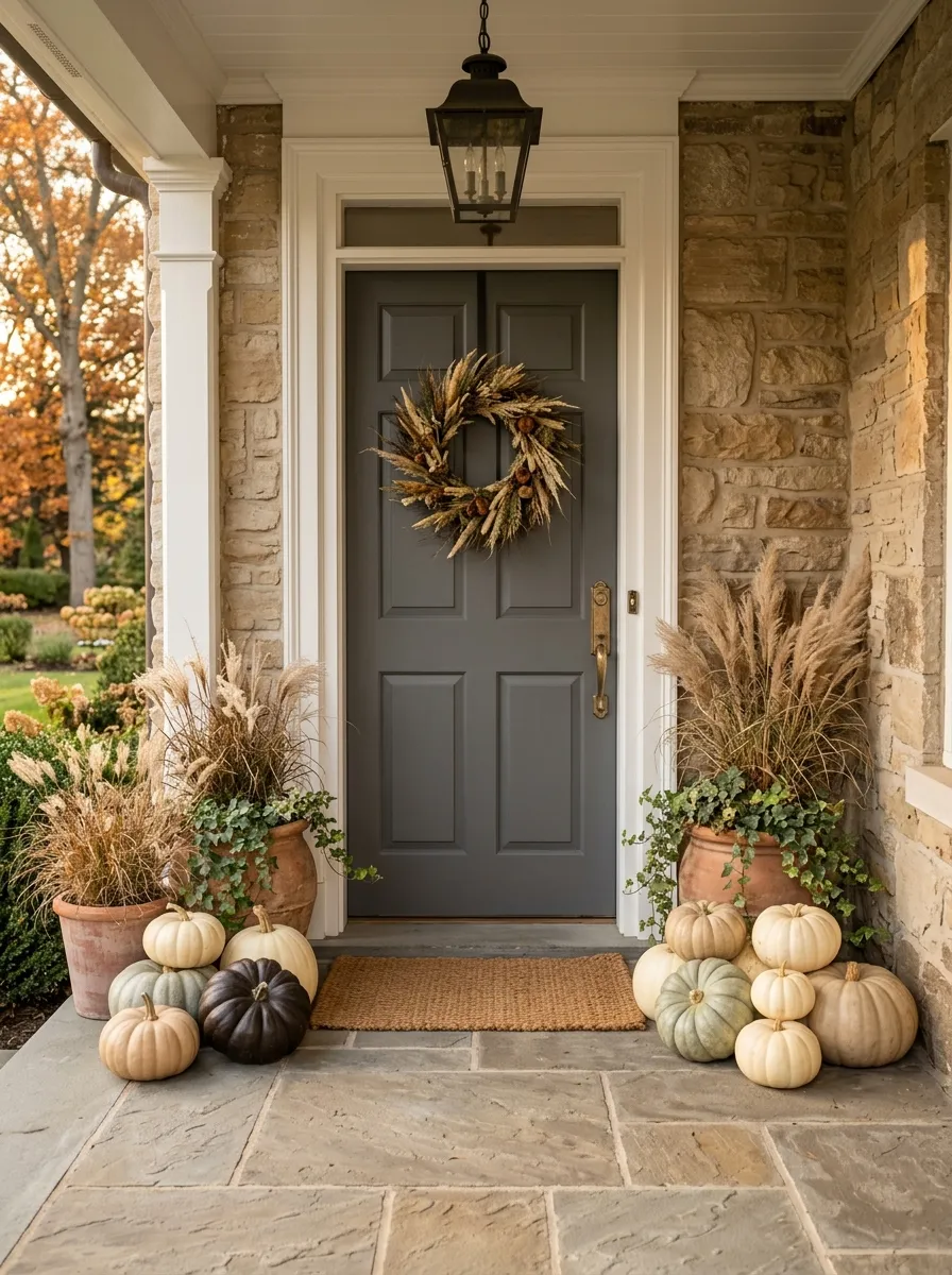
Not every pumpkin needs to be orange.
Cream, white, muted green, and pale tan pumpkins give you the fall shape without making the porch feel overly bright. Stack a few different sizes near the doorway, then bring in one darker element for contrast.
A common mistake is spreading individual pumpkins everywhere.
Instead, build small clusters. Put two or three together near a planter, then leave the next area open.
That grouping makes even inexpensive decorations look more intentional because the eye reads them as one composition instead of a collection of random objects.
CLUSTER
OPEN SPACE
CLUSTER
Go All In on Foliage
If you cannot commit to a permanent decor theme, just throw a bunch of dried leaves and sticks at the front door. It is the cheapest way to make your house look seasonal while putting in the absolute minimum effort.
Place the greenery in a way that suggests a woodland creature just exploded on your welcome mat. If you want it to look intentional, add a single, overly dramatic wreath to the door so people know you at least attempted a theme.
Don’t worry about the symmetry of your plants. Real life is messy and full of dead twigs, so embrace the chaos and act like this was your artistic vision all along.
Hang a Fuller Wreath Above the Door
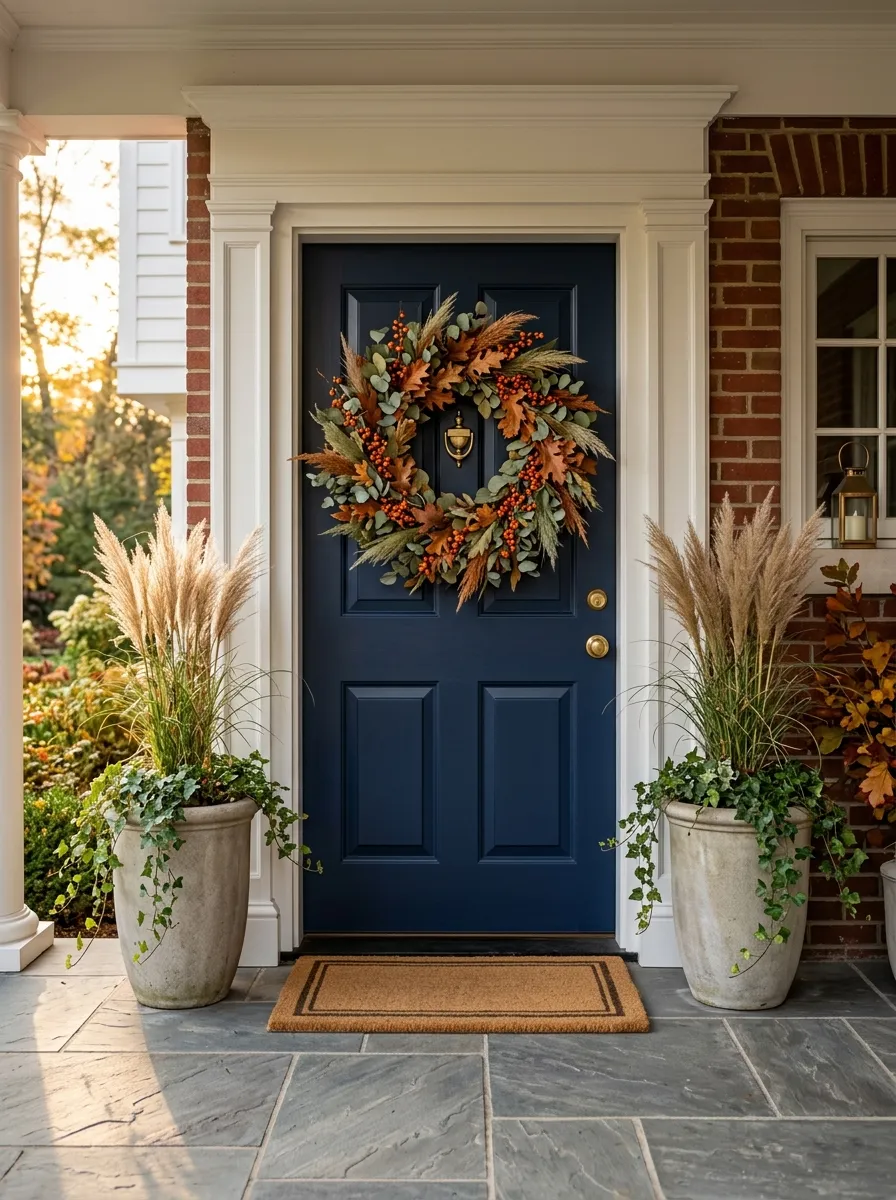
A tiny wreath can disappear completely on a large front door.
Choose a wreath with enough diameter and texture to hold its own from the street. Dried leaves, grasses, eucalyptus, berries, twigs, and muted fall foliage all work well without requiring a pile of extra decorations.
Keep the wreath slightly simpler if the door itself has strong detail.
The wreath should finish the door, not cover it.
If your entrance already has large planters, choose a wreath with lighter visual weight. If the doorway feels plain, a fuller wreath can become the main seasonal statement.
Style a Seasonal Corner
A single chair placed near the door screams that you want people to think you read books outside. You don’t have to actually sit there, of course, because the point of porch decor is purely performative.
Add a throw blanket and a wreath to provide that touch of domestic perfection that makes your neighbors feel inadequate. It is the adult equivalent of a student project where you hope the teacher doesn’t look too closely at the details.
If the chair looks a bit lonely, add a side table for your imaginary cup of coffee. The goal is to make your porch look like the cover of a magazine, regardless of whether or not you can actually tolerate the crisp air for more than five minutes.
Put a Fall Rug Under the Main Entry
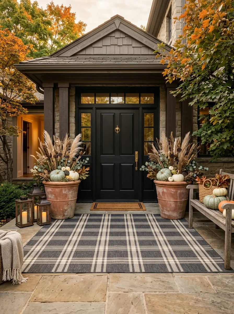
The floor is part of the composition, and a seasonal rug can connect everything above it.
Choose a rug with a restrained pattern rather than one covered in large pumpkins, leaves, and words. The rug should support the other decorations instead of becoming another focal point.
A muted plaid, stripe, geometric pattern, or subtle autumn motif gives the entry a finished base.
Keep the rug large enough to anchor the doorway.
A tiny mat floating several inches away from everything else makes the porch feel disconnected. The right size visually ties the door, planters, and surrounding floor together.
Add a Hanging Swing
A macramé swing is perfect for those who want their porch to look like an overpriced vacation rental. It is a fantastic way to take up half your porch space while ensuring no one can actually walk to the front door comfortably.
Throw a few burnt-orange pillows on there to really lean into the seasonal desperation. It is not about comfort; it is about making sure the delivery driver knows you are a person of taste and refined fall sensibilities.
If you are worried about the swing looking too pristine, just let a few dead leaves settle into the crevices. Nothing says autumnal charm quite like organic debris decorating your high-maintenance furniture.
Mix Mums With Ornamental Grasses
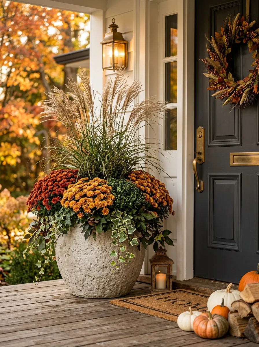
Flowers alone can make a porch arrangement feel too round and low.
Add ornamental grasses or tall foliage to break up that shape. The upright stems create movement above the mums and help a container arrangement look fuller without adding another pile of decorations.
Start with the taller element first.
Then place mums lower around the base so the flowers don’t hide the grasses.
This is one of the easiest ways to make a basic planter look professionally arranged.
Use a neutral container if the flowers are bright. Let the plants provide the color instead of adding another colorful pot.
Repeat One Fall Color Across the Porch
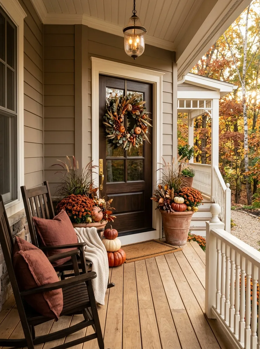
A porch looks more intentional when one seasonal color appears in several places.
Choose rust, deep burgundy, muted mustard, olive, or another color that already works with your door and exterior. Then repeat it in small doses.
A rust pillow can connect to rust-colored flowers. A burgundy wreath detail can connect to a planter. The repetition doesn’t need to be exact.
Think visual echoes, not matching sets.
This works especially well when the porch contains several different materials. Repeated color gives all those materials something in common.
Place a Tall Lantern Beside a Pumpkin Cluster
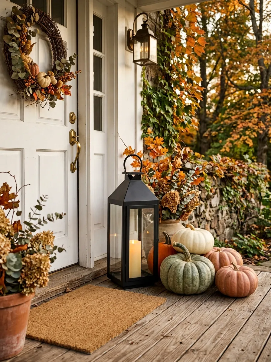
Pumpkins are low and rounded. Lanterns are tall and structured.
That contrast is exactly why the combination works.
Set one lantern beside a small pumpkin cluster instead of surrounding the pumpkins with several accessories. The lantern gives the arrangement height and creates a clean vertical line.
One tall piece can do more than five small decorations.
Choose a lantern large enough to be visible from the walkway, especially if the porch has a wide entry or high ceiling. Keep its finish consistent with other hardware when possible.
Create a Monochromatic Pumpkin Display
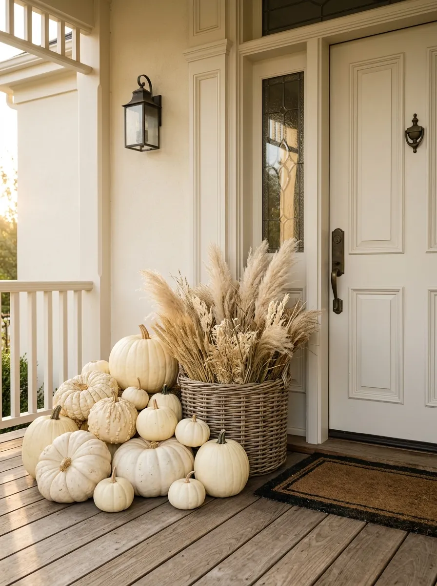
A pumpkin display doesn’t need orange, white, green, and every other fall color at once.
Pick one main pumpkin color and let shape and texture create the variety. A group of cream pumpkins can look far richer when you mix smooth pumpkins with ribbed ones, then add a weathered basket or dried stems.
Keep the cluster close to the entry instead of spreading it across the porch.
The trick is variation without color chaos. Different sizes make the arrangement feel collected, while one restrained color keeps everything visually connected.
This approach works especially well on porches that already have patterned rugs, colorful flowers, or a strong front door.
Large + small
Smooth + ribbed
Pumpkin + natural fiber
Add a Vintage Bench Under the Porch Wall
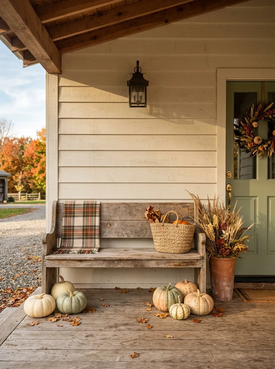
An empty porch wall is often the perfect place for a narrow bench.
Choose an aged wood bench, painted farmhouse bench, or simple metal seat and keep the styling low. A folded plaid blanket, one basket, and a few pumpkins are enough. Don’t turn the bench into a storage shelf.
The bench gives the porch a horizontal line, which balances tall planters and doorway decorations.
Keep the seat usable.
That means leaving enough room to sit down without knocking over pumpkins or moving three decorative pillows first. A porch looks more convincing when the furniture actually works like furniture.
Use Hay Bales as a Base, Not the Main Attraction
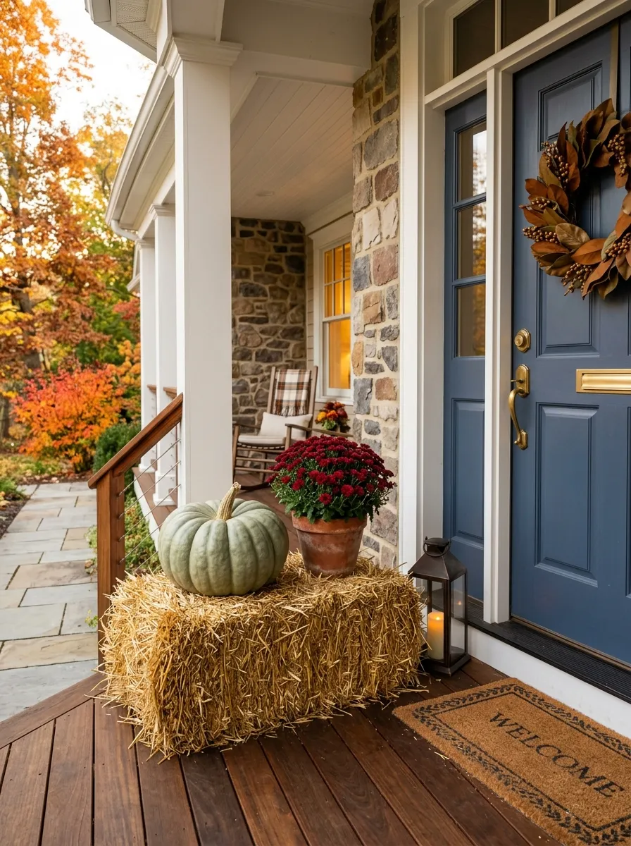
Hay bales can make a fall porch feel festive fast, but stacking several of them around the entry usually overwhelms the space.
Use one bale as a platform instead. Put a large pumpkin, basket, or planter on top and let the hay texture stay visible underneath.
This works best when the bale supports something with a stronger shape.
Think of it as furniture for your decorations, not the decoration itself.
Keep hay away from the direct path through the door and avoid placing it where loose straw will constantly get kicked across the entry.
Paint a Wooden Welcome Sign in a Deep Fall Shade
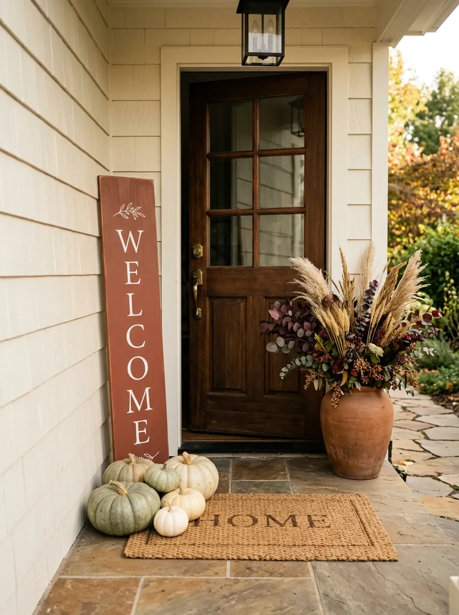
A welcome sign doesn’t need a giant message or complicated lettering.
Choose a narrow wooden board and give it a deep brown, muted rust, charcoal, or other autumn-friendly finish. Keep the lettering simple and large enough to read from the walkway.
Place the sign against a wall, beside a planter, or behind a small pumpkin cluster.
Make the sign part of the composition, not a separate announcement.
If the porch already has a busy wreath and patterned rug, keep the sign plain. If everything else is quiet, the sign can carry slightly more visual weight.
Pair Rust-Colored Mums With Greenery
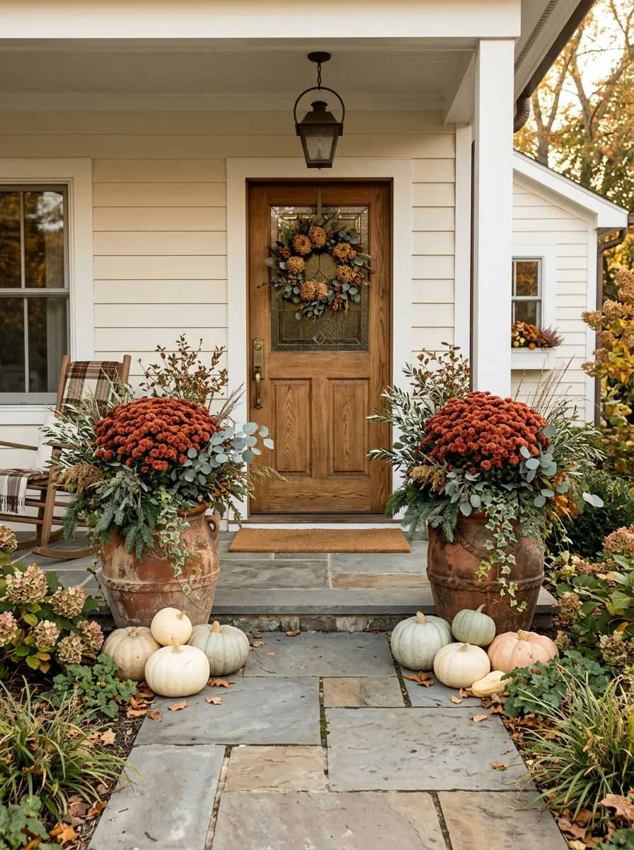
Rust-colored mums are already strong enough to carry the seasonal color.
Instead of surrounding them with more orange decorations, pair them with muted greenery. Olive branches, eucalyptus, evergreen foliage, or simple leafy stems keep the display grounded.
Place the mums in a substantial container and add greenery at different heights.
The strongest combination is warm color against a quiet natural base.
If the flowers are bright, keep the nearby pumpkins neutral. If the mums are muted, you can bring in a little more rust or brown through the containers and accessories.
Make the Steps Part of the Decor
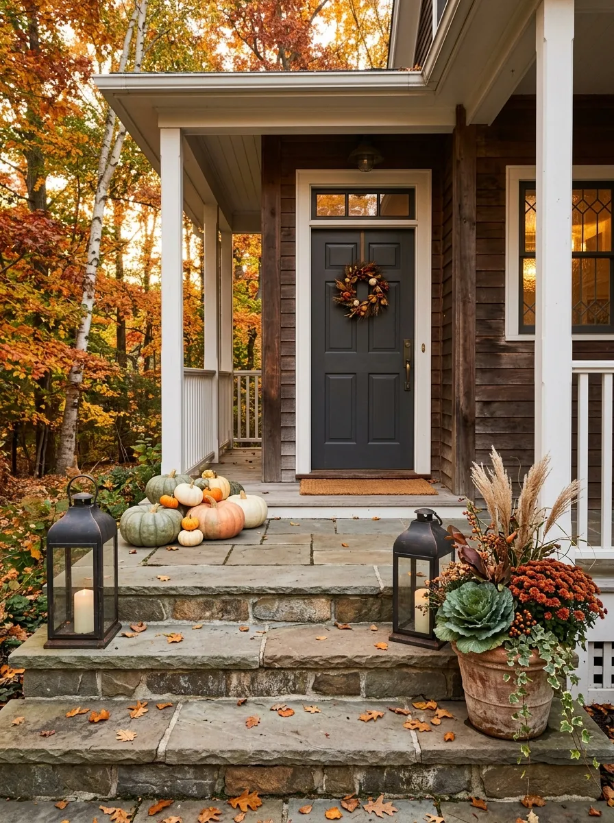
The steps are easy to ignore, but they’re one of the first things visitors see.
Instead of putting every decoration beside the door, spread a few pieces down the steps. Use one planter on a lower step, a pumpkin cluster on another, or a lantern near the edge where it won’t interfere with walking.
The trick is spacing.
Don’t decorate every step. Leave clear gaps so the eye can follow the path toward the door.
For narrow stairs, keep everything close to one side. Wide steps can handle a little more layering, but the walking line should always stay obvious.
Use a Black Lantern for a Stronger Contrast
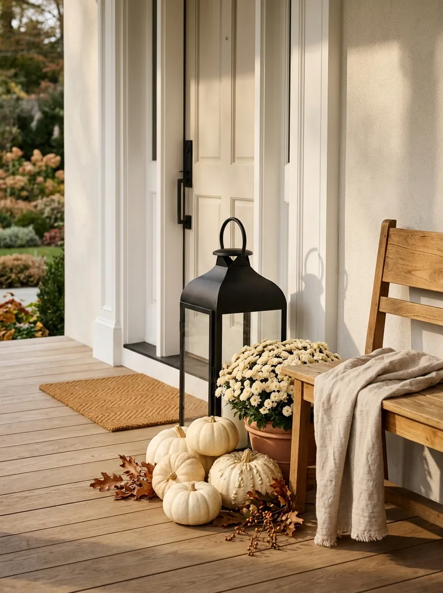
Black is useful on a fall porch because it gives softer seasonal colors something to push against.
Place a black lantern beside pale pumpkins, cream mums, a natural wood bench, or a light-colored door. The dark frame creates a crisp outline that keeps the arrangement from blending together.
You don’t need several black accents. One substantial lantern can do the job.
Think contrast before color.
If your porch already has lots of brown wood and orange pumpkins, a black lantern gives the display a sharper edge without introducing another seasonal color.
Layer a Plaid Throw Over a Porch Chair
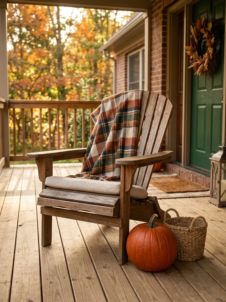
A porch chair shouldn’t become a pile of seasonal accessories.
Start with the chair itself. Then add one plaid throw, folded or loosely draped over the back. If the chair has a cushion, keep its pattern quieter so the plaid doesn’t compete with it.
Place a small basket or pumpkin beside the chair instead of covering the seat with decorations.
The chair should still look usable.
That little detail makes the porch feel lived in rather than staged for a photograph. It also adds a soft textile layer to all the hard surfaces around the entry.
Create a Small Pumpkin Trail Toward the Doo
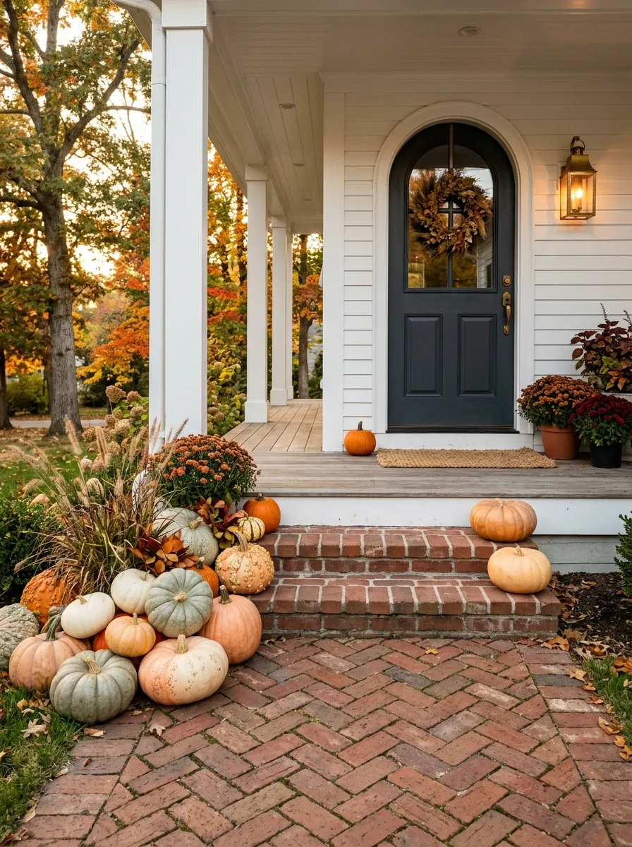
A few pumpkins placed along the path can make the entrance feel connected to the rest of the porch.
Don’t create a straight line. Instead, group pumpkins in small clusters that gradually lead the eye toward the door. Start with a slightly larger group farther from the entrance and reduce the scale as you approach it.
This gives the porch a sense of movement without filling the walkway.
Keep the center of the path open.
The pumpkins should sit along the edge where they’re visible but won’t get kicked every time someone walks inside.
Add Dried Branches for Height Without More Color
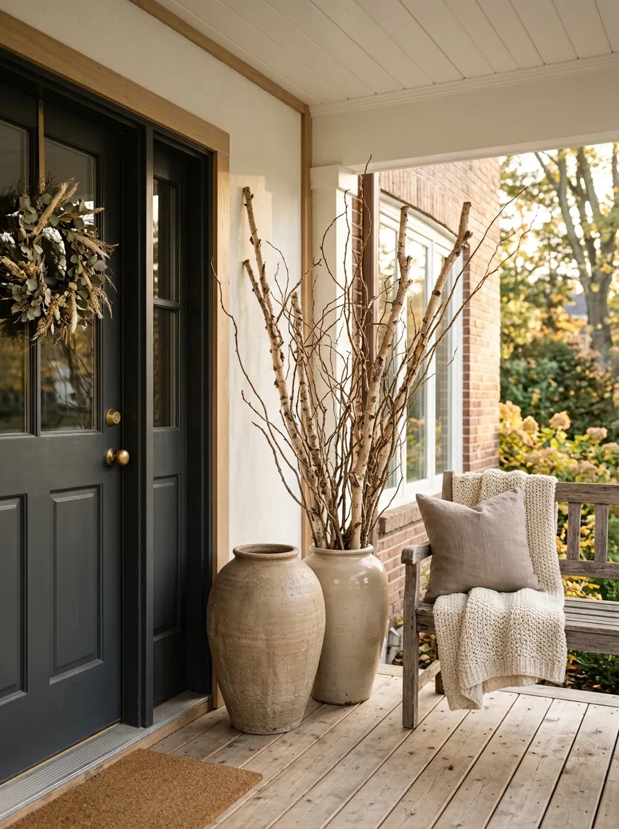
Sometimes a porch doesn’t need another pumpkin or flower. It needs height.
Tall dried branches can fill an empty corner while keeping the color palette restrained. Put them in a large ceramic pot, stone container, or woven basket and let the branches spread naturally above the arrangement.
This is especially useful on porches where bright seasonal colors already dominate.
Use branches when the display feels short, not when it feels empty.
A few tall stems can change the proportions of the whole entry without adding another cluster of objects at floor level.
Use Copper or Aged Metal for Small Accents
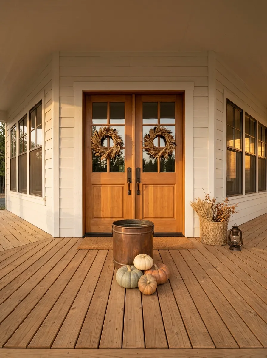
Fall porches already have plenty of soft textures. A little aged metal gives them definition.
Use a copper planter, weathered metal bucket, antique-style lantern, or small metal stool as one supporting piece. The finish should look slightly worn rather than shiny and new.
Keep metal in a supporting role.
Pair it with pumpkins, dried branches, wood, or woven textures so the porch doesn’t start feeling cold. One aged metal piece can bridge the gap between rustic and polished without adding another color family.
If your porch already has black fixtures, aged bronze or dark metal will usually sit more naturally than bright copper.
Style a Narrow Porch Without Blocking the Walkway
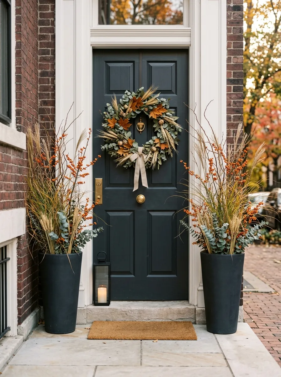
A narrow porch doesn’t need fewer ideas. It needs smarter placement.
Keep the center of the entry completely open and push decorations toward the wall, door frame, or outer edge. Tall planters can work well because they use vertical space without taking up much floor area.
Skip wide benches, oversized clusters, and deep baskets if they make the walking path feel cramped.
For a narrow porch, think upward before outward.
A wreath, hanging basket, tall planter, slim lantern, or vertical sign gives you seasonal detail without turning the entry into an obstacle course.
Build a Harvest Basket Display Beside the Door
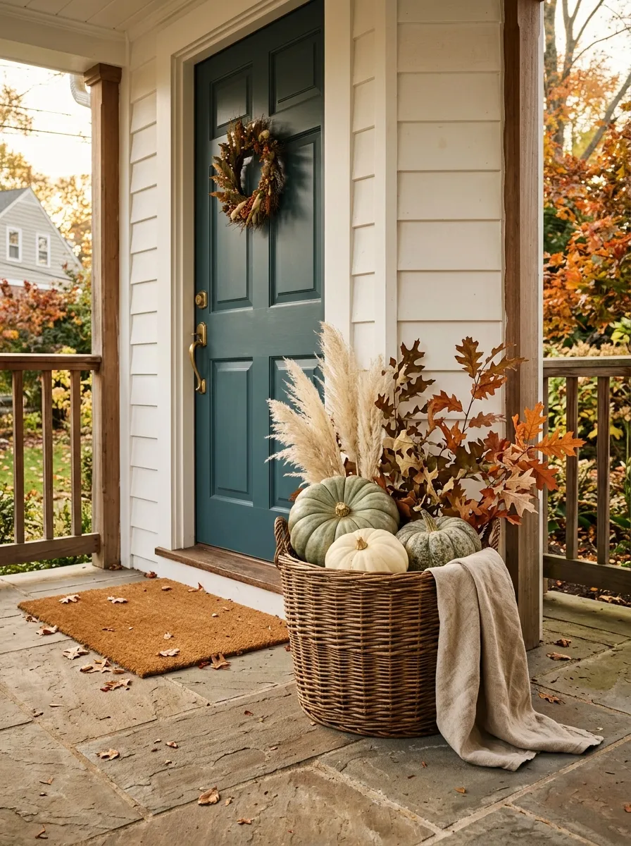
A large basket gives you an easy way to combine several fall textures without scattering them across the porch.
Start with a sturdy woven basket. Add a few pumpkins, dried grasses, leafy branches, or a folded textile. Keep the arrangement loose enough that each material can still be seen.
The basket should sit slightly off-center beside the doorway or under a bench.
Don’t fill it to the rim. Leaving some open space makes the display look intentional rather than stuffed.
A natural basket also works well when your porch already has painted furniture or darker metal accents because it brings warmth back into the mix.
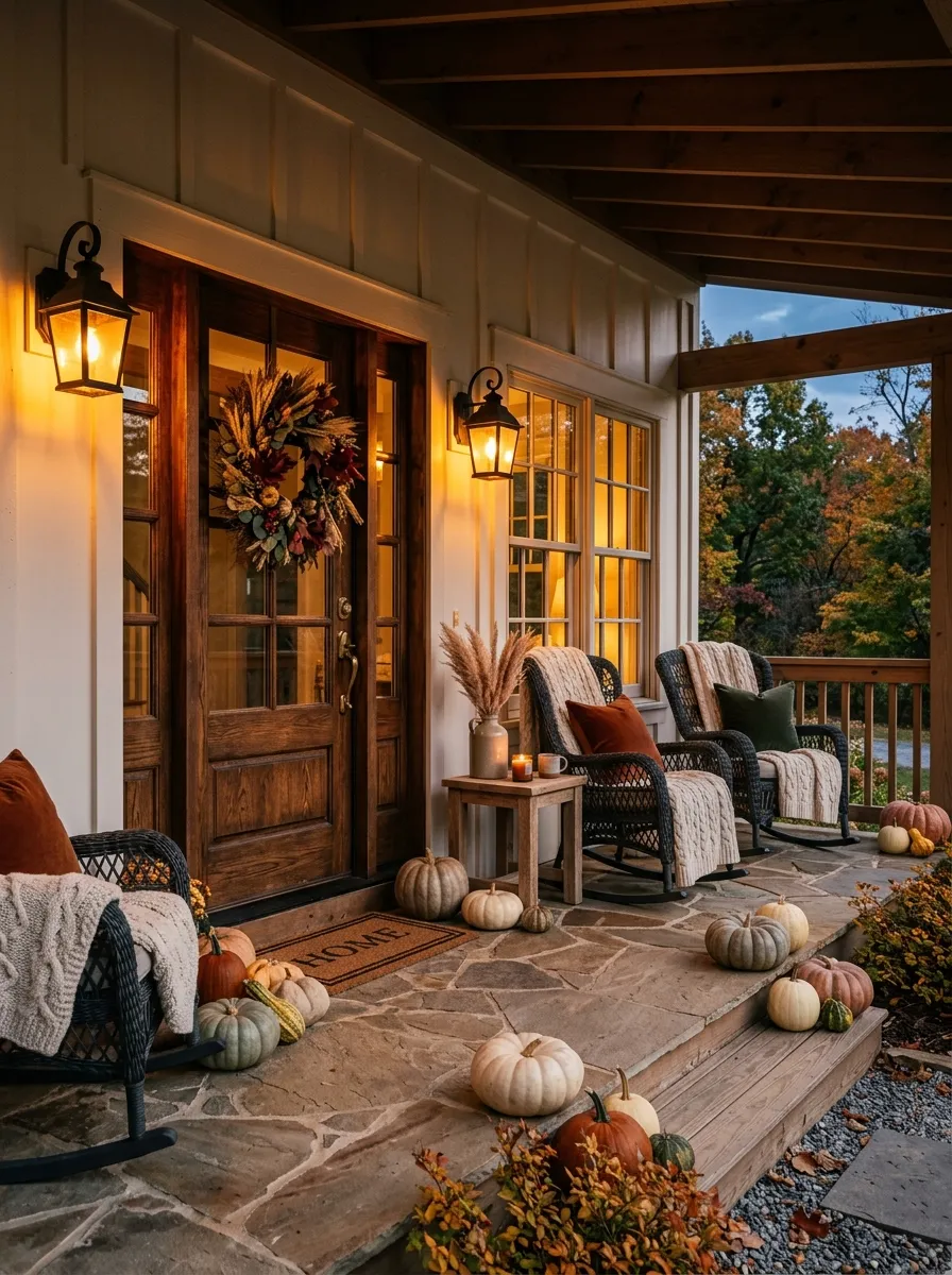
Finish the Porch With Warm Evening Lighting
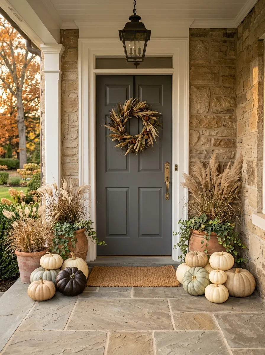
A porch that looks good during daylight can lose all its detail after sunset.
Add warm lighting where it helps the eye understand the entry. Lanterns near the steps, a soft fixture beside the door, or subtle lighting around a seating area can make the seasonal layers easier to see after dark.
Don’t light every object separately.
Light the areas you want people to notice first.
Keep the brightest point near the entrance, then let the light soften as it moves outward. That creates a natural visual path from the walkway to the door.
Keep One Area Intentionally Empty
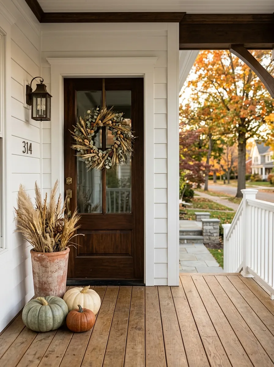
This is the move most decorated porches miss.
You don’t have to fill every corner just because it’s fall. Leaving one wall, one section of railing, or one stretch of floor empty gives the decorated areas room to breathe.
Look at the porch from the street before adding anything else. If you can clearly identify the wreath, planters, and main seasonal display, you’re already doing enough.
Empty space is part of the design.
If one area looks quiet but the rest feels crowded, resist the urge to fill it. The contrast is what makes the stronger pieces stand out.
A restrained porch usually looks more expensive than one packed with seasonal decorations.
Swap Bright Bulbs For Warm Amber Lighting
Bright white light bulbs destroy a cozy atmosphere in seconds. It doesn’t matter how much heavy velvet or raw wood you layer into the room; if the lighting looks like a hospital waiting room, the vibe is dead.
Unscrew your bright LEDs immediately. Replace them with warm, amber-tinted bulbs in all your table and floor lamps.
The deep orange glow completely changes how the shadows fall in the room, creating an instant, heavy warmth that totally redefines your space after dark.
Kelvin Scale Rule
Check the box before you buy. You only want bulbs listed at 2700K or lower for autumn.
Let Trailing Plants Mingle With Fall Vines
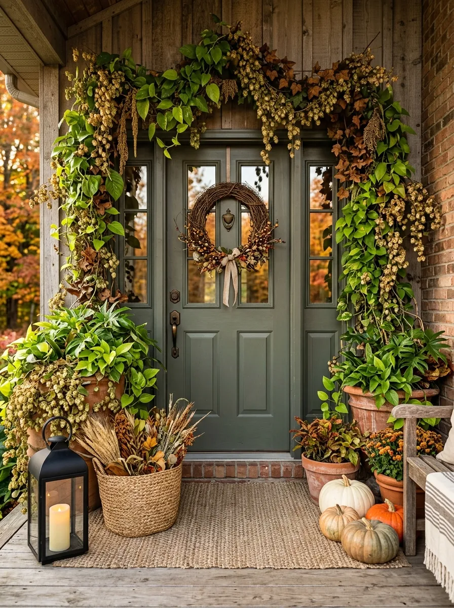
You don’t need to put your summer houseplants away to make room for autumn decor. A stark, dead room feels sad, not cozy. Keep your heavy, trailing pothos and philodendrons exactly where they are.
Just weave a few strands of dried hops or brown artificial ivy directly into the living vines.
The mix of deep, vibrant green with crusty, dried brown creates an incredibly lush, overgrown boho look that completely bridges the gap between summer and fall.
The Overgrown Blend
Merge living plants with dried stems for massive texture.
Small Details That Make Fall Porch Decor Look More Intentional
The strongest fall porches aren’t necessarily the ones with the most decorations. They’re the ones where each piece has a job.
A large planter establishes height. A rug anchors the doorway. A lantern adds contrast. A basket introduces texture. A wreath gives the eye somewhere to land.
That’s why repeating the same few ideas in smarter ways works better than buying another box of seasonal decorations every year.
Let Scale Do Some of the Work
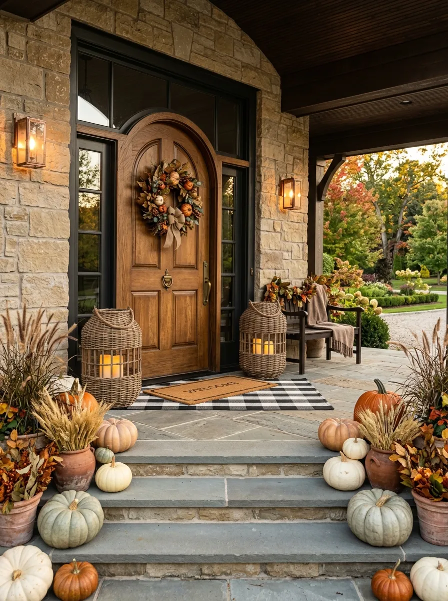
Small decorations disappear when they’re placed beside a large doorway, wide steps, or tall exterior walls.
Use a few oversized pieces to establish the main structure, then fill in with smaller accents.
This keeps the porch readable from a distance and interesting up close.
Use Texture to Replace Excess Color
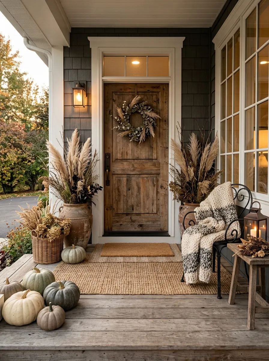
Wood, woven fibers, dried branches, metal, pumpkins, foliage, and textiles can all create visual variety without requiring another bright color.
That gives you more flexibility to build a rich fall display without making the porch look busy.
Decorate for the View From the Street
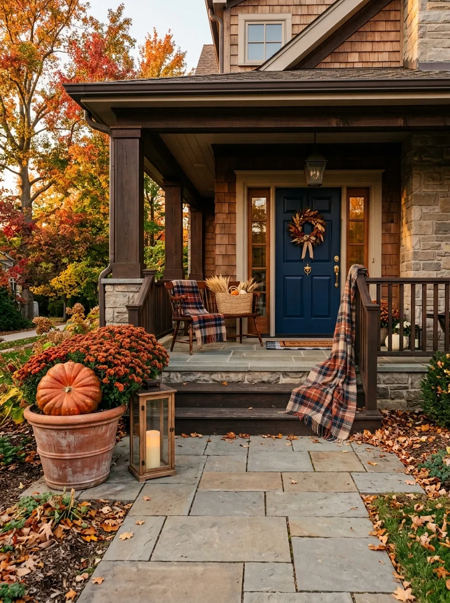
Walk several steps away from the porch and look back.
That’s the view that matters most.
You should be able to identify the doorway, main seasonal feature, and walking path almost immediately. If everything blends together, remove a few pieces or create more space between the clusters.
The goal isn’t maximum decoration. It’s a front entrance that looks intentional before anyone even reaches the door.
How to Choose the Right Fall Front Porch Decor Ideas for Your Home
Start with the pieces you already own.
If you have a strong front door, build around it. If the porch has beautiful steps, use them as part of the arrangement. If the space is narrow, prioritize vertical elements. If there’s a large seating area, use textiles and baskets to make that area part of the seasonal story.
Pick the ones that solve an actual problem on your porch. That’s what keeps fall decorating from turning into clutter.
Conclusion
The best fall front porch decor doesn’t come from filling every available corner. It comes from choosing a few strong pieces, giving them enough space, and repeating colors and textures in a way that makes the whole entrance feel connected.
Start with the front door, establish your largest shapes, then add smaller seasonal details around them. Keep the walkway clear, use contrast where the porch feels flat, and leave some empty space when the display starts looking crowded.
A porch doesn’t need more decorations just because it’s fall. It needs better placement.
Save this list for the next time you want to refresh your porch for the season without starting from scratch.