
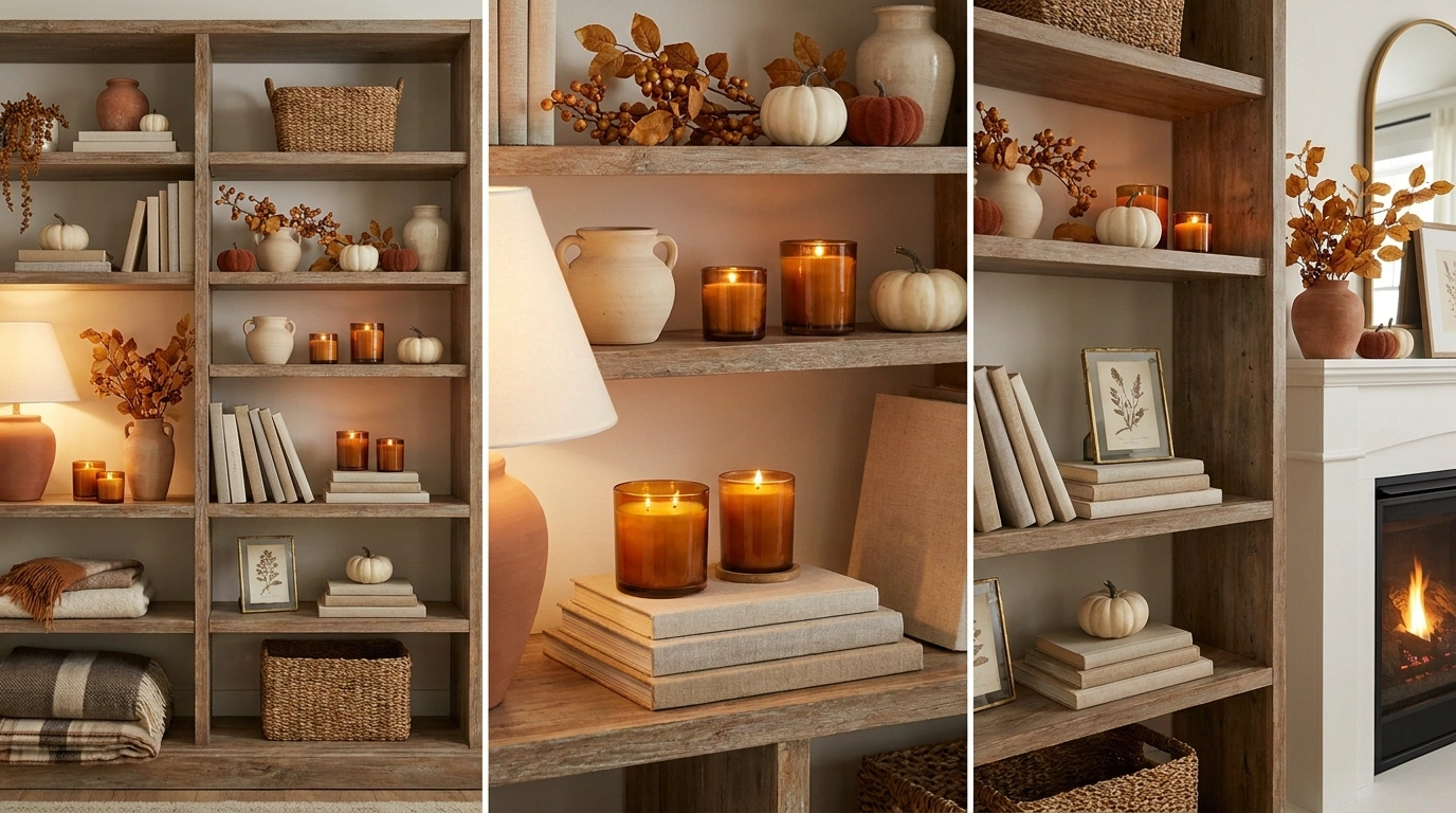
A fall shelf can have plenty of pumpkins, books, candles, and dried leaves and still look unfinished. The usual problem is not the decorations themselves. It is the lack of a clear visual relationship between them. When every object is treated like an individual accent, the shelf starts to look crowded instead of collected.
The most convincing autumn shelves work as complete scenes. Color repeats across the arrangement. Tall pieces create movement while heavier objects anchor the lower line. Rough pottery sits beside smoother materials, warm wood gives pale ceramics some depth, and seasonal accents appear in places that guide the eye instead of filling every empty spot.
A Fall Shelf Should Feel Like One Composition
The difference between a decorated shelf and a convincing seasonal shelf often comes down to relationships. Tall pieces should have room to breathe. Small objects need stronger neighbors. Similar colors can be spread across the arrangement instead of sitting in one obvious cluster.
A useful fall display also leaves some quiet space. Every inch doesn’t need something sitting on it.
The strongest arrangements usually have:
Fall Shelf Decor Ideas
Layered Built-In Fall Shelves With Vintage Frames and Warm Wood
This built-in display leans heavily into layered charm, combining rich wooden shelving with shiplap backing for an instantly lived-in autumn feel. Framed botanical prints and old photographs are staggered across the tiers, creating depth against the light background while books and small ceramic pumpkins anchor the corners.
The secret to making this arrangement work lies in varying heights and textures. Sleek brass frames sit alongside rustic wicker accents and glossy amber leaves, ensuring the display feels thoughtfully curated rather than overwhelming.
Balance is everything when styling multiple shelves. Distribute heavier elements like stacked books and dark pottery evenly across both levels, then fill the gaps with trailing foliage to tie the entire composition together.
Warm Collected Shelf With Amber Glass, Old Books, and Burnt Orange Foliage
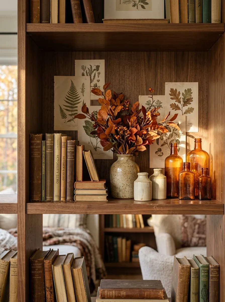
This shelf feels like it has been assembled over years rather than decorated for one season. A warm wood surface anchors stacks of worn books, while amber glass catches the light between small ceramic vessels and a loose arrangement of burnt orange branches. A few faded botanical prints sit behind the objects, giving the back of the shelf some depth.
The mix works because the colors repeat without becoming too obvious. Amber, walnut, rust, and faded cream appear in different parts of the composition, so the eye moves naturally across the display.
The key is restraint. Keep the books and vintage-style pieces slightly imperfect. Too many matching objects would erase the collected character.
Quiet Neutral Autumn Shelves With Textural Dried Florals
A soft, monochromatic approach brings effortless autumn calm to these built-in shelves. Pale cream and tan tones dominate the space, letting delicate dried hydrangeas, woven baskets, and muted velvet pumpkins take center stage without a single bright orange element in sight.
Texture does all the heavy lifting in this minimal setup. Smooth ceramic urns contrast against rough wicker and fluted pottery, while warm wood tones and understated landscape artwork ground the gentle color scheme.
The real trick to nailing this look is keeping negative space intentional. Allowing room around each object lets the eye rest, making the curated collection feel light, breathable, and deeply sophisticated for the new season.
Creamy Neutral Fall Shelf With Rust Linen and Natural Wood
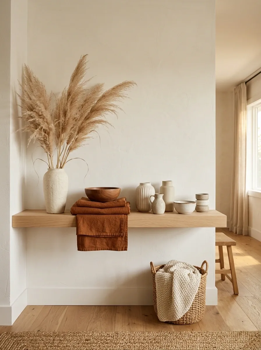
Not every autumn shelf needs pumpkins and saturated orange. This softer composition uses pale oak, creamy stoneware, folded rust linen, dried grasses, and a handful of warm neutral objects. The shelf itself almost disappears because the colors around it stay close in value.
That quiet palette gives texture more importance. A rough ceramic vase feels noticeable beside smooth wood, while the loose linen adds softness without introducing another strong color.
This direction works especially well in rooms already filled with beige, ivory, light wood, or warm white. The autumn feeling comes from the materials and muted rust accents rather than obvious seasonal symbols.
One detail keeps the arrangement from looking flat: the tallest dried grasses rise above the shelf while the lower section stays comparatively low and calm.
Rustic Autumn Peg Shelf Styled With Leaves, Towels, and Charm
This peg rail shelf proves that functional kitchen storage can easily transition into seasonal decor. A simple wooden ledge holds framed landscape art and an amber glass bottle, while the pegs below showcase textured tea towels, a mini broom, and a sweet hanging basket filled with pinecones and foliage.
The entire vignette succeeds because of the tactile mix of materials. Smooth cotton linens sit next to rustic woven fibers and dried leaves, creating an inviting, tactile layer that feels entirely appropriate for crisp autumn days.
Lean into everyday utility to get this look just right. Suspending practical items like kitchen brushes or small brooms among your seasonal elements keeps the styling grounded and prevents the space from looking overly staged.
Moody Charcoal Shelf With Copper, Walnut, and Deep Autumn Foliage
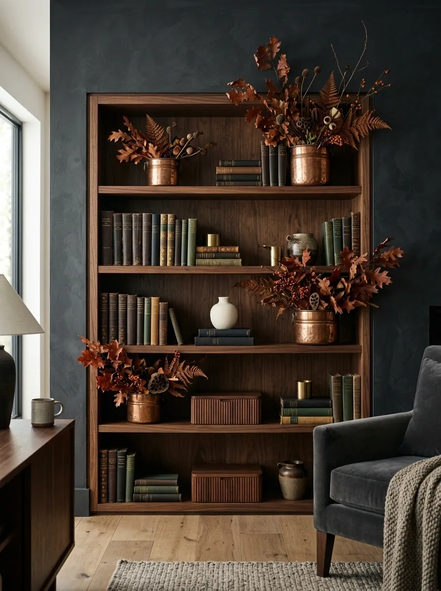
This is the dramatic option, built around a dark charcoal backdrop that makes every warm object feel richer. Walnut boxes and books sit alongside aged copper vessels, while deep rust foliage spreads upward rather than outward. A small ivory ceramic piece prevents the entire arrangement from becoming visually heavy.
The strongest feature is the contrast between the dark background and the warm reflective surfaces. Copper catches small amounts of light, while walnut gives the shelf a quieter depth.
This composition needs lighting that can actually reach the objects. A dim room with no directional light will flatten the copper and swallow the darker foliage. Keep the rest of the surrounding decor relatively calm so the shelf has room to carry the mood.
Cozy Kitchen Fall Display With Dried Florals and Cutting Boards
Kitchen counters and shelving get an instant autumn upgrade with this warm, textural arrangement. A massive wooden vase overflows with a lush mix of dried stems and muted branches, standing proudly beside stacked cutting boards, vintage cookbooks, and a softly glowing candle.
The composition works seamlessly because it blends everyday kitchen essentials with seasonal warmth. Rich wooden tones, creamy ceramics, and soft brown hues repeat throughout the space, creating a cohesive visual flow from top to bottom.
Pay attention to scale when building a kitchen display like this one. Pairing a tall, statement-making floral arrangement with low horizontal elements like books and a candle tray creates the dynamic movement needed for a professionally styled look.
Traditional Farmhouse Shelf With Crockery, Plaid, and Muted Pumpkins
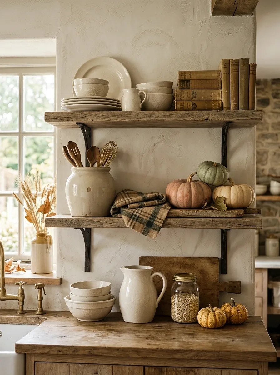
A traditional farmhouse shelf benefits from recognizable materials, but the finished composition should still feel edited. This version combines cream crockery, aged wood, faded plaid fabric, small muted pumpkins, and a few practical kitchen pieces. Nothing looks overly precious.
The shelf feels especially convincing when the pieces have different shapes. A rounded crock beside a rectangular stack of books creates visual tension, while the plaid introduces a soft pattern between mostly solid surfaces.
Muted pumpkins work better here than bright orange ones because the rest of the palette is intentionally weathered. Cream, tan, brown, faded green, and dusty orange keep the display connected.
The farmhouse character comes from the mix of useful and decorative objects. A shelf made entirely from ornaments would lose that sense of everyday life.
Organic Modern Shelf With Stoneware, Olive Branches, and Soft Terracotta
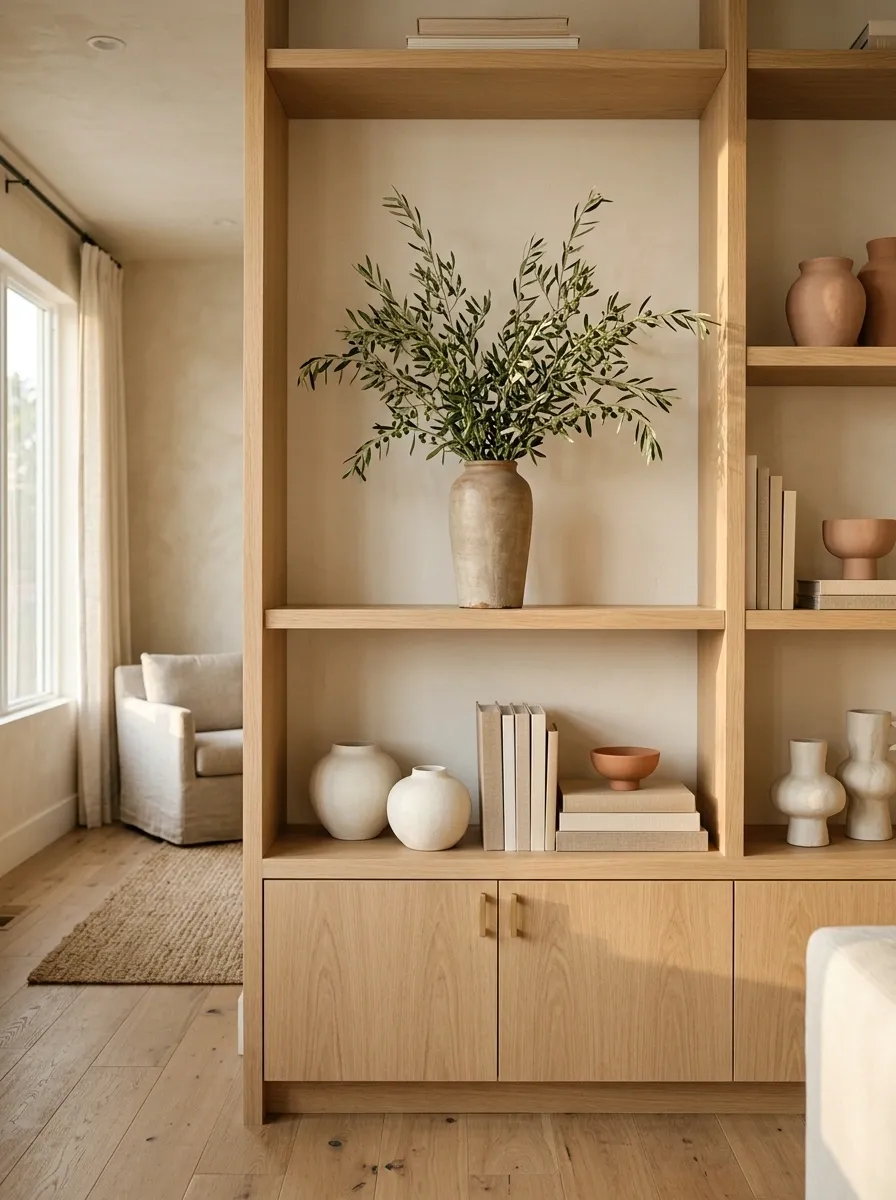
The fifth concept strips fall styling down to its most natural ingredients. Pale stoneware, soft terracotta, light wood, and olive branches create a calm composition with very little visual clutter. The objects feel sculptural rather than decorative.
A tall branch arrangement creates the vertical movement, while rounded stoneware keeps the lower portion grounded. Terracotta appears in only a few places, which gives the autumn color more importance.
The composition works because the shapes are doing as much work as the colors. Rounded vessels sit against straighter books and shelf edges, while the irregular branches soften the architectural lines.
This is a strong direction for a modern room where a traditional collection of pumpkins and signs would feel too busy.
Vintage Cottage Shelf With Floral China and a Tiny Autumn Still Life
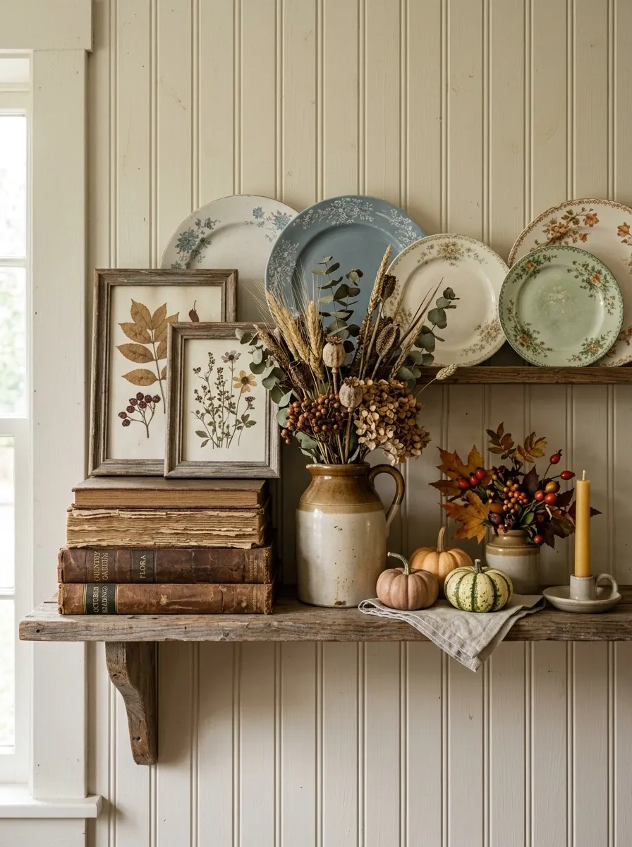
This shelf has the slightly imperfect charm of a cottage collected over time. Floral china leans against the wall behind faded botanical prints, while a small stack of old books anchors one side. Tiny pumpkins, a weathered ceramic jug, and a loose bundle of dried stems fill the gaps without making the shelf feel packed.
The color story stays soft: cream, dusty blue, faded green, warm brown, and muted orange. Nothing is overly saturated.
The composition works because the delicate pieces are balanced by heavier objects. The old books and ceramic jug give the arrangement enough visual weight to keep the floral china from feeling fussy. Keep the smallest seasonal pieces together as a little still life rather than scattering them across the entire shelf.
Minimal Black-and-Cream Shelf With One Dramatic Fall Arrangement
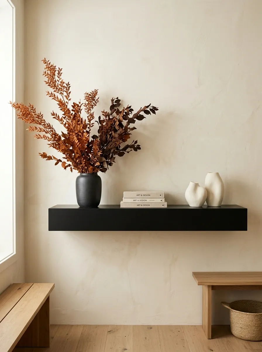
Here, restraint is the entire point. A matte black shelf runs against a warm cream wall, holding only a few substantial objects. Two ivory ceramic forms sit on one side, a slim stack of books occupies the middle, and one oversized arrangement of rusty branches rises dramatically from a simple dark vessel.
The orange foliage becomes memorable because nothing else competes with it.
This isn’t minimalism achieved by removing random objects. The proportions have been chosen carefully so the empty wall and shelf surface become part of the composition. The surrounding room should stay visually quiet, especially around the shelf.
The strongest version uses one large seasonal gesture instead of ten tiny ones. That makes the shelf feel intentional rather than unfinished.
Rustic Cabin Shelf With Firewood Tones, Leather, and Dried Leaves
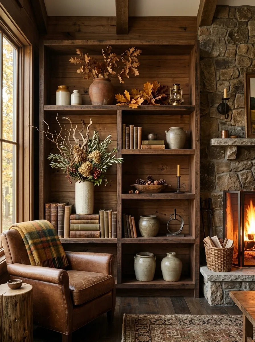
A rustic cabin version needs more than a handful of orange decorations. This composition builds the mood through dark timber, leather-bound books, aged ceramic, dried leaves, and warm directional lighting. The shelf feels connected to the room because the materials repeat what would naturally surround it.
A low leather-bound stack anchors one end. A tall ceramic vessel and dried branches provide height at the opposite side, while smaller objects bridge the difference between them. The palette stays grounded in walnut, tobacco brown, ochre, cream, and dry olive.
This style benefits from visible texture. Smooth, brand-new finishes would make the display feel more decorative than rustic. Slightly worn surfaces give the whole arrangement its character.
Elegant Transitional Shelf With Brass, Ivory Ceramics, and Muted Rust
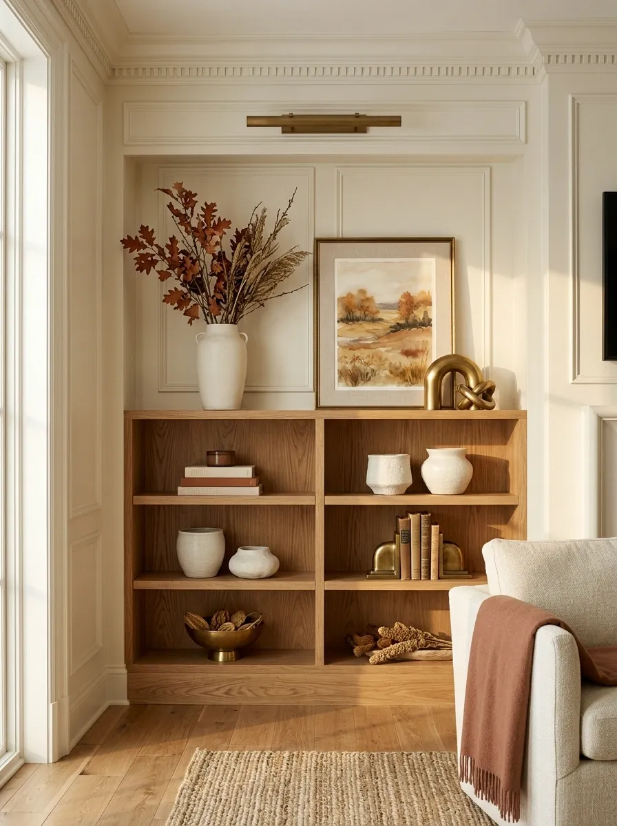
This composition sits between traditional and contemporary. The backdrop is clean and architectural, while antique brass, ivory ceramics, framed artwork, and muted rust branches soften the sharper lines. The result feels polished without becoming formal.
The arrangement uses a loose sense of symmetry rather than exact matching. A tall vessel on one end is balanced by framed artwork and brass forms on the other. Ivory pieces provide repetition across the shelf, while rust foliage introduces the seasonal note.
This look is especially effective beside classic millwork, warm wood flooring, or neutral upholstery. Avoid adding too many small decorative objects. The transitional character depends on the larger forms remaining easy to read.
Small Apartment Shelf With Compact Layered Fall Styling
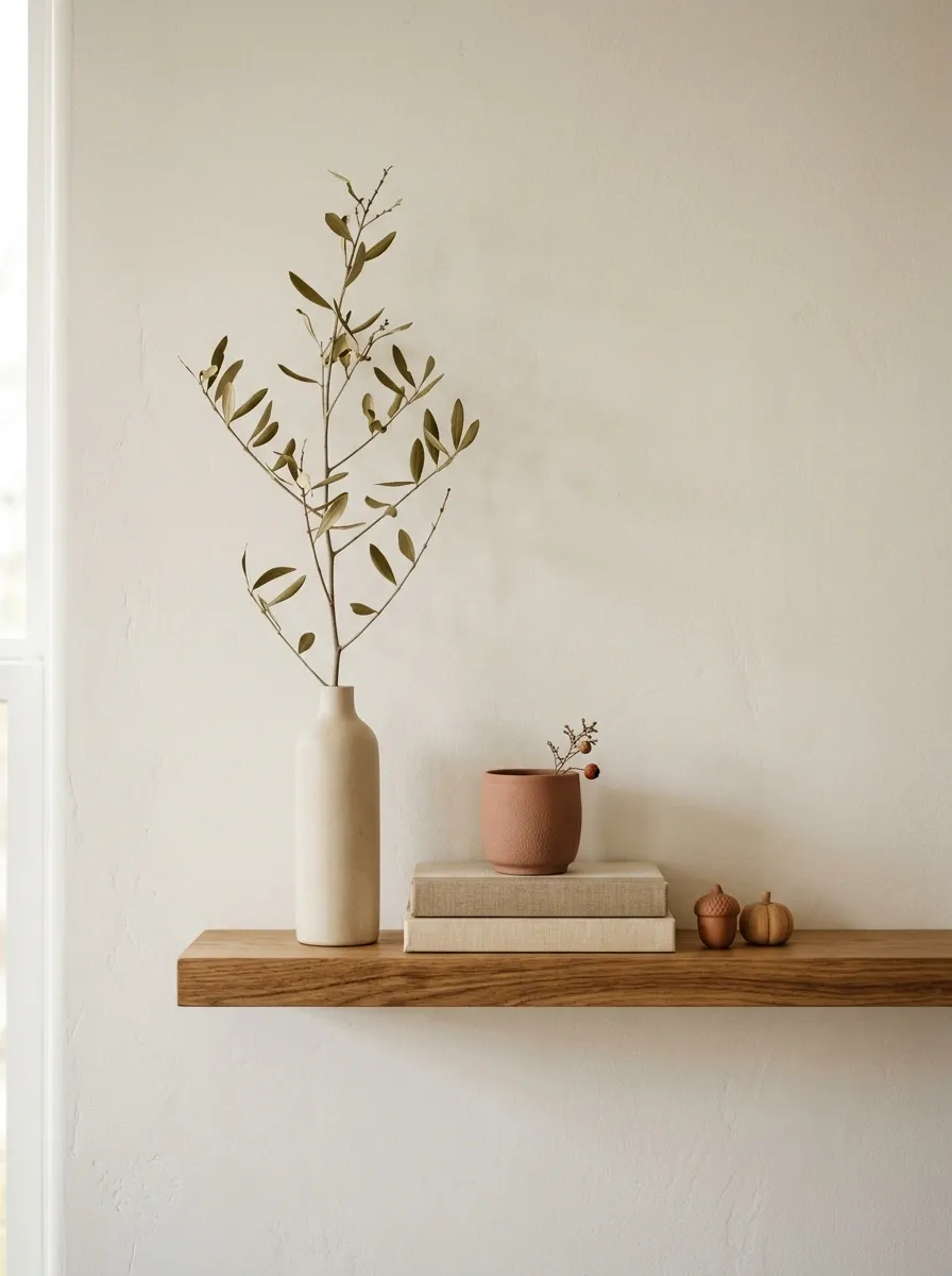
A narrow apartment shelf can’t carry the same amount of visual weight as a deep built-in. This arrangement solves that limitation by concentrating the strongest elements into a small footprint. A vertical branch arrangement occupies the upper zone, while two short stacks of books, a compact ceramic vessel, and a pair of tiny seasonal objects fill the lower line.
The palette stays simple: warm white, oak, dusty terracotta, and muted olive.
Nothing sticks far beyond the shelf edge, and there is enough open wall behind the arrangement to keep the small space from feeling crowded. The vertical branches make the display feel taller without requiring more shelf depth.
This is a good example of a complete design changing because of the architecture around it, rather than simply shrinking a larger display.
Earthy Southwestern Shelf With Clay Pottery and Dried Grasses
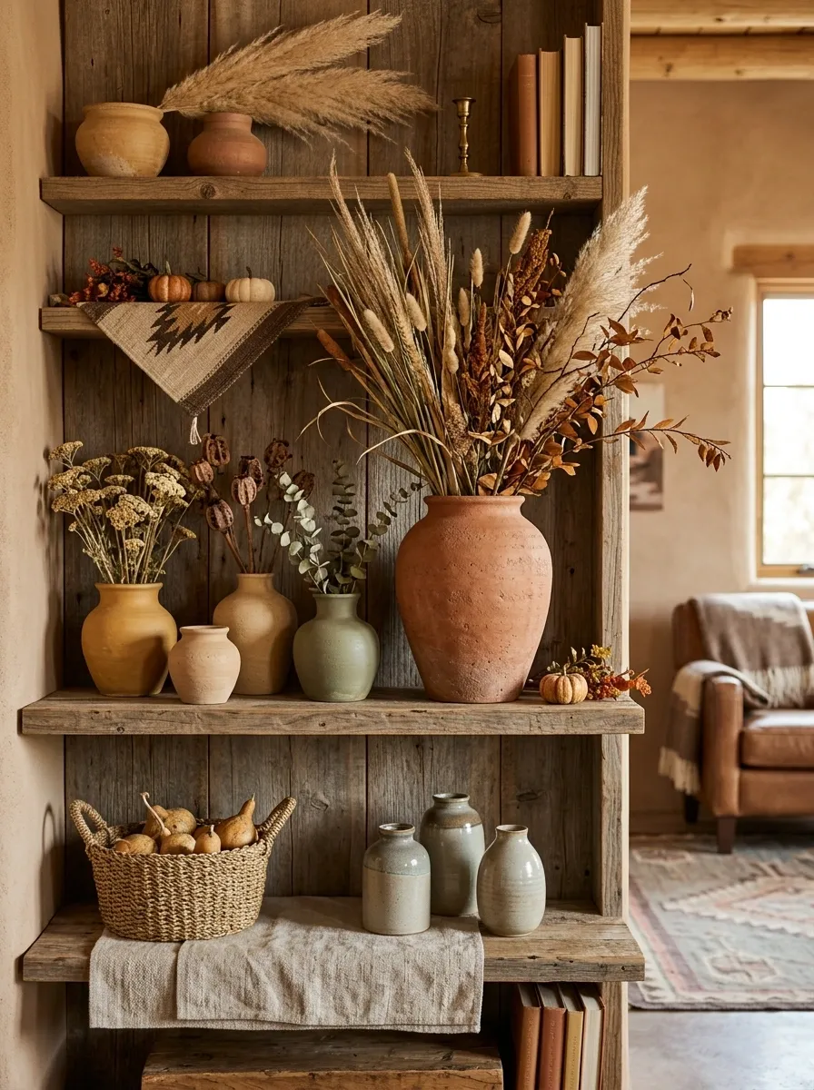
This shelf brings fall indoors through sun-baked materials instead of classic harvest decor. Terracotta vessels, pale clay pottery, woven texture, weathered wood, and tall dried grasses create a warm Southwestern composition that feels connected to the landscape.
The palette stays close to sand, ochre, clay, muted brown, and dusty olive. That restraint is important. Bright orange pumpkins would pull the shelf toward a more traditional autumn look and weaken the desert-inspired character.
A large clay vessel provides the visual anchor while smaller pottery pieces step down in height around it. The dried grasses add movement above the shelf, breaking up the heavier horizontal forms.
A natural wood backdrop makes the composition even stronger, particularly when the rest of the room already contains leather, linen, or woven materials.
Dark Academia Fall Shelf With Leather Books and Antique Frames
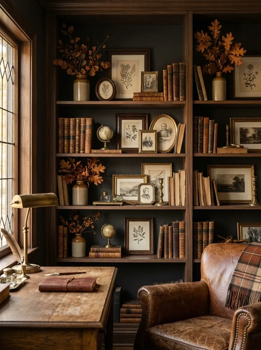
This version makes the shelf feel more like a private study than a seasonal display. Dark walnut, leather-bound books, antique-style frames, tarnished brass, and deep autumn foliage create a scholarly composition with a distinctly late-fall mood.
The books provide the strongest horizontal weight. Above them, framed artwork creates depth while a small brass object catches isolated points of light. Deep brown and nearly black surfaces dominate, with muted rust appearing only in the foliage.
The arrangement becomes more convincing when the artwork looks slightly aged rather than perfectly pristine. Mixing frame shapes also helps. A single oversized frame would make the display feel more formal, while several small pieces create the layered quality associated with old studies.
Keep the lighting warm and directional so the darker materials still reveal their texture.
Soft Country Shelf With Gingham, Creamware, and Tiny Pumpkins
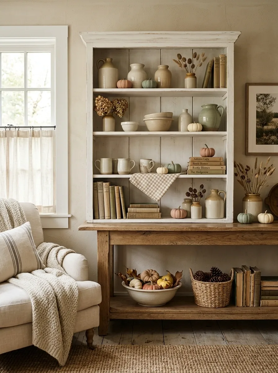
This composition takes a gentler route through autumn. Creamware, faded gingham, handmade pottery, small pumpkins, and natural stems create an understated country look. The seasonal layer is there, but nothing shouts for attention.
The color palette is intentionally quiet. Cream, warm beige, dusty green, and pale terracotta create a softer country look than a traditional orange-and-black fall display.
The gingham works best as a small supporting note rather than the main event. A folded piece beneath a vessel or tucked between books adds pattern without making the shelf look themed.
The little pumpkins are important because of their scale. Large statement pumpkins would overpower the delicate crockery. Keeping them small makes them read as part of the composition rather than holiday props.
Modern Organic Shelf With Sculptural Vases and Bare Branches
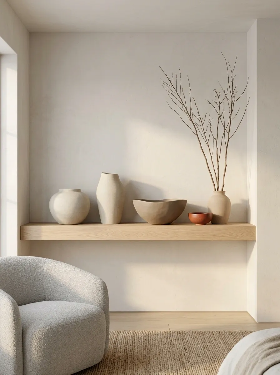
This is the most architectural design in the collection so far. Instead of relying on obvious fall decorations, it uses sculptural ceramics, pale oak, plaster-like finishes, and bare branches to suggest the season through shape and natural texture.
Large curved vessels create the primary forms. A few tall branches rise above them, bringing movement to an otherwise quiet horizontal shelf. The color range stays close to limestone, oatmeal, pale wood, and warm taupe, with only a restrained trace of terracotta.
The arrangement feels strongest when objects have room around them. Crowding the shelf would erase the sculptural quality of the individual pieces.
This direction works especially well in modern rooms where clean architecture and natural materials already do most of the visual work.
Layered White Shelf With Sepia Art and Burnt Orange Accents
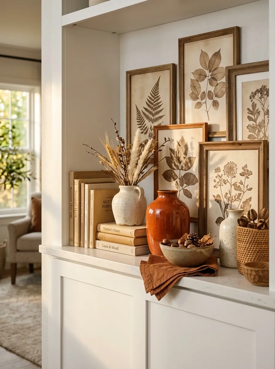
A white shelf can easily become flat when everything on it is the same pale color. This composition avoids that problem by layering sepia artwork, warm books, ivory pottery, linen textures, and a few deliberate burnt orange accents against the light background.
The artwork provides the visual depth. Instead of leaning every piece forward at the same angle, the frames overlap slightly behind the objects, creating a layered backdrop.
Burnt orange appears in only a few places, but those repetitions are enough to establish the fall connection. A rust-colored vessel echoes a small textile detail farther along the shelf, while the rest remains cream, tan, and sepia.
The result feels seasonal without changing the room’s existing neutral identity.
Cozy Reading Nook Shelf With Books, Candlelight, and Autumn Foliage
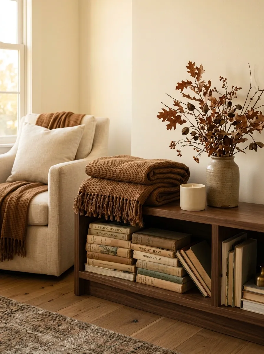
This shelf feels tied to a real corner of the home rather than decorated in isolation. Books form the foundation, with a soft stack of throws or folded textiles nearby, a simple ceramic candle vessel, and a loose arrangement of autumn foliage providing the seasonal color.
The composition is intentionally lower and wider than the previous designs. That makes it feel relaxed and connected to a reading chair or small sitting area. Warm cream, walnut, tobacco brown, and muted rust keep the palette comfortable without relying on bright orange.
The foliage should remain loose rather than perfectly arranged. A few uneven branches make the shelf feel lived in, especially beside well-used books and softly textured fabrics.
Vintage European-Inspired Shelf With Olive Green and Faded Rust
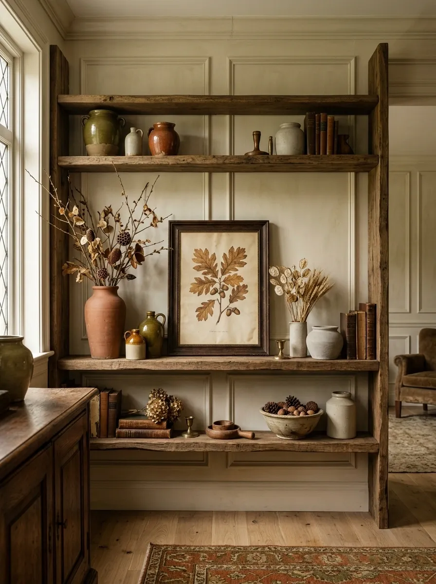
This shelf borrows from old European interiors through aged pottery, botanical artwork, faded colors, and slightly imperfect materials. Olive green becomes the quiet foundation while faded rust appears in small pieces throughout the composition.
Nothing needs to look brand new. The charm comes from variation in surface and age: glazed pottery beside chalky ceramic, an old-looking frame beside a smooth vessel, and natural stems beside painted objects.
The palette feels autumnal without relying on obvious harvest symbols. Olive softens the rust, while creamy stone and warm wood prevent the darker tones from becoming too heavy.
This style works particularly well in rooms with traditional trim, old wood furniture, or patterned rugs because the shelf can echo those details without copying them.
Black Floating Shelf With Sculptural White Pottery and Golden Leaves
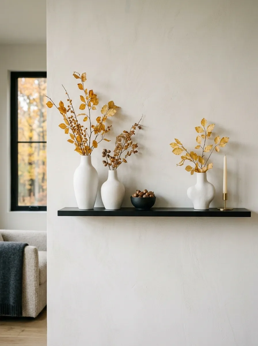
This arrangement is deliberately graphic. A slim black floating shelf sits against a pale wall, creating a strong horizontal line beneath sculptural white pottery and a few delicate golden branches. The contrast gives even simple objects a strong architectural presence.
Rather than filling the shelf, the composition uses three main visual groups. Rounded white forms soften the hard shelf line, while the tall branches pull the eye upward. Small warm metallic details connect the golden foliage to the rest of the display.
This works especially well when the room already has black window frames, dark hardware, or other linear architectural elements. Repeating the black elsewhere prevents the shelf from feeling like a disconnected accent.
Warm Minimalist Shelf With Three Large Autumn Statements
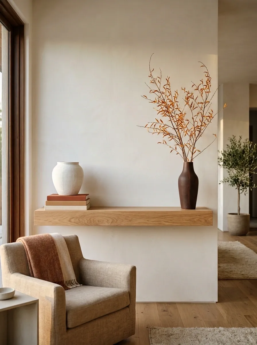
This shelf proves that a small number of large objects can create a stronger composition than a long line of tiny decorations. Three statements carry the entire design: a substantial ceramic vessel, a stack of warm-toned books, and a broad autumn branch arrangement.
The palette is simple, using warm white, walnut, muted rust, and soft caramel. The three objects are separated enough that each remains readable, but they share enough color and material warmth to feel related.
The middle of the shelf stays especially quiet. That open space creates a pause between the heavier groups and keeps the arrangement from looking like a display crowded with accessories.
This approach suits modern homes where clean lines and limited visual clutter are already part of the room’s character.
Traditional Symmetrical Shelf With Candlesticks, Artwork, and Pumpkins
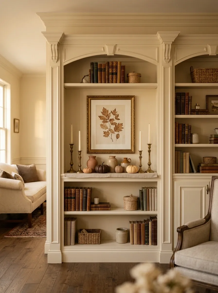
A more formal home can carry autumn styling beautifully when the shelf follows the room’s existing sense of order. This design uses symmetry as the foundation, with matching candlesticks on either side of framed artwork and small muted pumpkins creating the seasonal layer below.
The symmetry makes the shelf feel composed immediately, but the objects don’t need to match perfectly beyond the main anchors. Slight differences in ceramics and artwork keep the display from becoming overly rigid.
Warm cream, aged brass, muted orange, and deep brown create a classic fall palette that works with traditional furniture and architectural details.
The important distinction is scale. The central artwork should remain visually dominant, while the seasonal pieces support it rather than competing with it.
Moody Green Shelf With Brass Details and Burnished Orange Accents
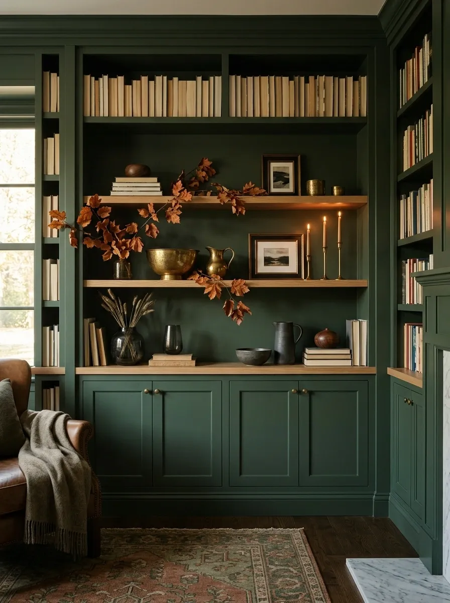
Deep green gives this shelf a richer autumn character without relying on the usual orange-heavy palette. A dark painted backdrop sets the mood, while aged brass vessels, walnut-toned objects, smoky glass, and a few burnished orange leaves create layers of warmth.
The orange is intentionally darker and browner than a pumpkin orange. That small shift keeps the composition sophisticated and works especially well with olive, forest, or mossy green surroundings.
Brass should appear in several small places rather than one oversized metallic centerpiece. A vessel, picture frame, or candleholder can catch light while the wood and foliage provide the quieter background.
The finished effect is dramatic, but it still feels grounded because the materials have plenty of visual warmth.
Handmade Artisan Shelf With Woven Baskets and Imperfect Ceramics
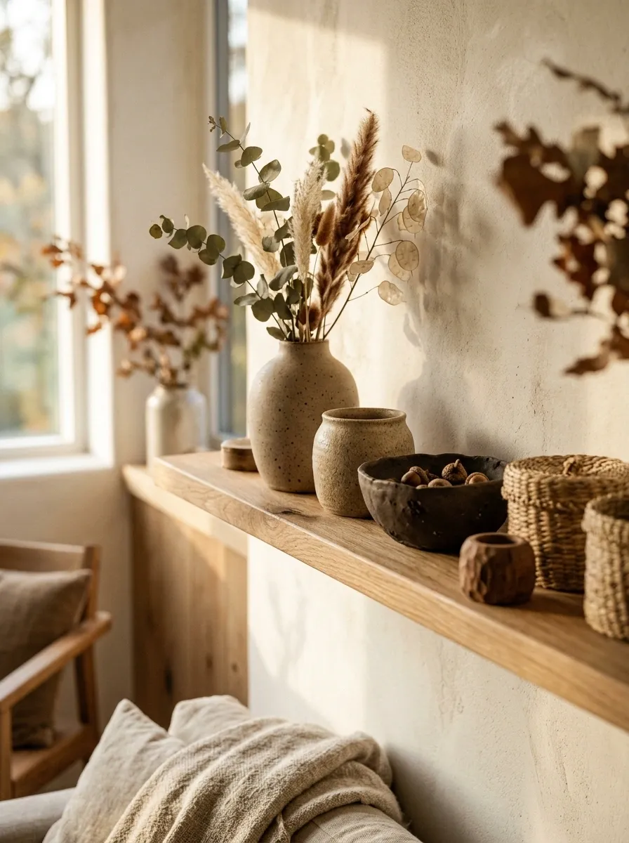
This shelf feels intentionally handmade. Instead of polished matching pieces, it combines irregular stoneware, small woven baskets, raw wood, dried stems, and objects with slightly different shapes. The autumn palette stays earthy, with clay, oat, tobacco, faded green, and natural fiber tones.
The charm comes from variation. One ceramic vessel can be slightly wider than another. A basket can have a visible woven pattern while the pottery stays matte and simple. Those subtle differences make the shelf feel collected from real sources rather than purchased as a matching set.
The seasonal feeling comes from the materials and warm palette, so obvious fall symbols aren’t necessary.
Leave a little asymmetry in the arrangement. The imperfect balance is part of the concept.
Family-Friendly Fall Shelf With Simple Books, Ceramic Pumpkins, and Soft Textiles
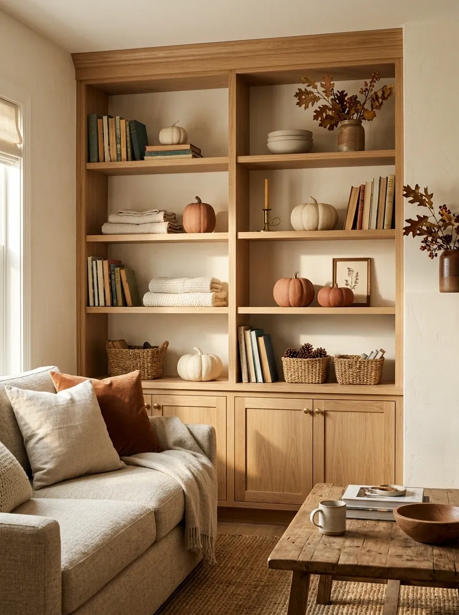
A seasonal shelf in a busy family room needs to look good without becoming a fragile display. This composition uses sturdy ceramic pumpkins, well-used books, soft folded textiles, and a few low-profile decorative objects. Nothing tall or delicate sits where it can easily be knocked over.
The styling stays warm but approachable. Cream, oatmeal, muted orange, and soft brown connect the shelf to everyday furniture and fabrics.
The books give the display a practical purpose, while the textiles soften the harder ceramic forms. Seasonal pieces remain concentrated in small groups, making the shelf easy to understand visually.
This is less about creating a precious autumn vignette and more about building a finished seasonal corner that can exist alongside daily life.
Late-Fall Shelf With Dried Botanicals, Cranberry, and Aged Wood
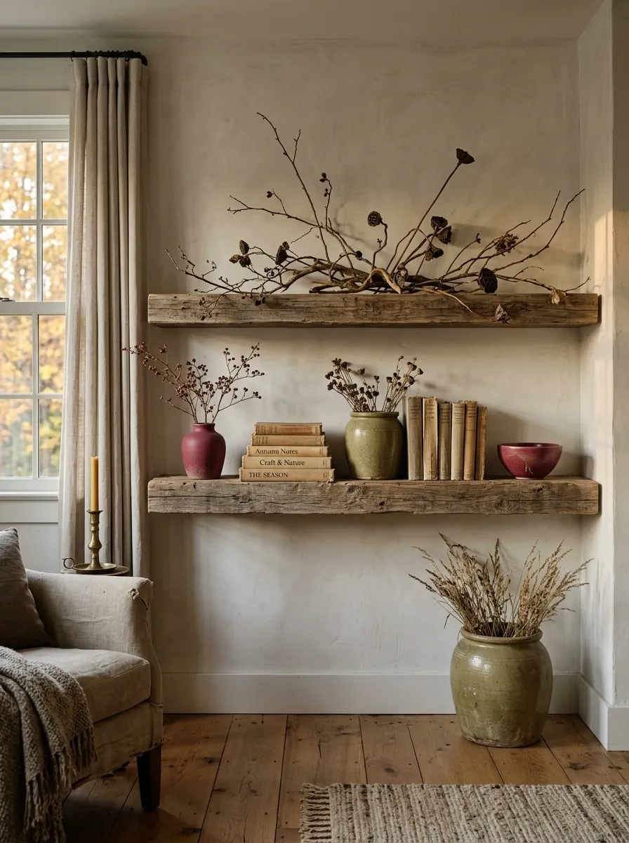
The color story changes noticeably here. Instead of the fresh orange and golden tones associated with early fall, the shelf moves toward cranberry, dried brown, faded olive, and weathered wood.
Aged wood creates the foundation. Dried botanicals spread upward in loose, irregular branches, while cranberry-colored objects appear in two or three locations to create a subtle visual rhythm. Aged ceramic and old-looking paper tones fill the spaces between them.
This design feels closer to the final weeks of autumn, when the landscape itself has become quieter and deeper in color.
Keep the branches slightly sparse. Dense foliage would push the display back toward a bright harvest look.
Refined Neutral Fall Shelf With Stone, Linen, Walnut, and One Burnt Orange Accent
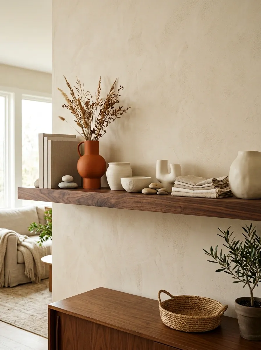
The final concept is deliberately restrained. Pale stone, warm linen, walnut, ivory ceramics, and a single burnt orange object create a sophisticated autumn shelf without making the season the loudest thing in the room.
The walnut gives the pale materials enough contrast to remain visible, while linen softens the harder stone and ceramic surfaces. The burnt orange accent is small but strategically placed where the eye naturally moves across the shelf.
Nothing needs to match exactly. The consistency comes from the material family and controlled palette.
This design works particularly well when the room already has a refined neutral scheme. Instead of competing with that foundation, autumn becomes a subtle layer that can be removed or changed as the season moves on.
Choosing the Right Fall Shelf Direction
The strongest shelf doesn’t necessarily copy the room around it. It belongs to the room.
A dark walnut shelf can handle richer colors and heavier materials. A pale floating shelf often benefits from fewer objects and stronger contrast. Traditional rooms can carry symmetry and antique finishes, while modern rooms usually benefit from larger shapes and more negative space.
The most useful question is not which individual decoration looks best. It is which complete composition feels believable in the space already there.
Choose the visual direction first. Then look for objects that support that direction.
A shelf becomes much easier to style once the overall story is clear.
Final Thoughts
Good autumn shelving is less about collecting seasonal objects and more about deciding what the finished scene should feel like. A warm vintage display, a quiet neutral arrangement, a dark academic shelf, a rustic cabin composition, and a sculptural modern look can all communicate fall without sharing the same objects or palette.
The strongest results usually come from repeating a few materials and colors while allowing the shapes and scale to vary. That gives the shelf enough continuity to feel intentional without making it look like a matching set.
Start with the composition that best fits the room, then build the details around it. Save the references that come closest to the atmosphere and materials already present in the space.
Save these fall shelf ideas now so the best styling direction is ready when it’s time to decorate.