
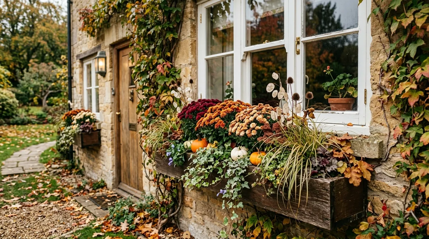
The easiest way to ruin a window box is to treat it like a place to dump every fall decoration you happen to own.
A few pumpkins here, some orange flowers there, a trailing plant hanging over the edge, maybe a sign for good measure. Individually, none of those things is terrible. Together, they can look strangely busy, especially when the window, siding, brick, and planter are all fighting for attention.
A better approach is to decide what the finished arrangement is supposed to feel like before choosing the individual pieces. Maybe it’s warm and traditional. Maybe it’s quiet and woodland-inspired. Maybe it’s clean enough to suit a modern facade. The planting should have a point of view.
That’s what makes a window box worth saving. You can see the relationship between the container, the plants, the colors, the height, the texture, and the house around it. These finished fall window box ideas take that approach, with each arrangement built as a complete visual composition rather than a pile of seasonal extras.
What Makes a Fall Window Box Look Finished Instead of Random?
Start With a Color Story
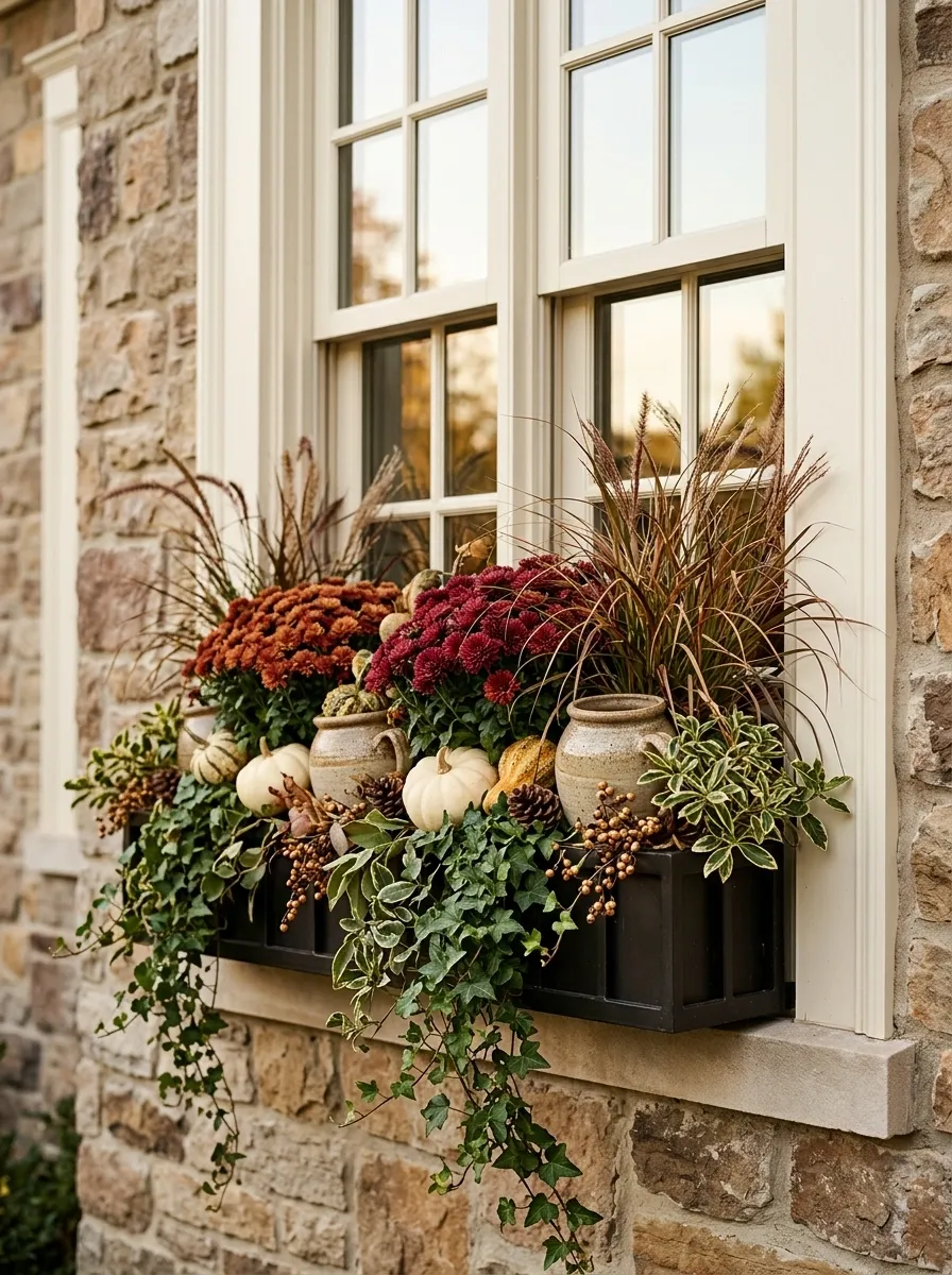
A strong window box usually has one dominant color family, one supporting tone, and a quieter neutral or green to keep everything from competing. Rust, burgundy, cream, bronze, and deep green give you plenty to work with without turning the arrangement into a rainbow of autumn.
Build the Composition in Layers
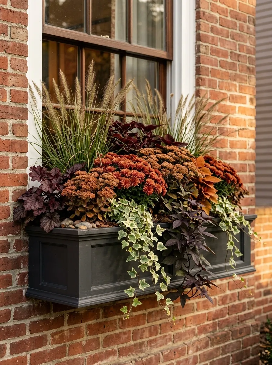
The best boxes don’t read as one flat row of flowers. Taller elements establish the back, fuller planting creates the middle, and trailing foliage softens the front edge. That change in height gives the arrangement depth and keeps the window box interesting from the street.
Match the Box to the House
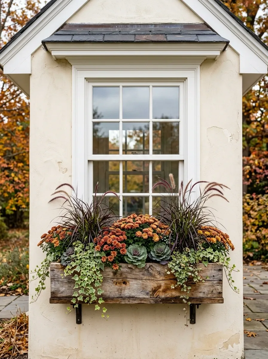
The planter is part of the composition. A weathered wood box can look exactly right beneath a cottage window and strangely rustic on a sharp contemporary facade. The materials of the box, the planting, and the architecture should feel like they belong in the same conversation.
Finished Fall Window Box Designs Worth Saving Ideas
Textured Autumn Display
This look brings together an abundance of seasonal details without ever feeling cluttered. A pale wooden window box hosts a mix of warm autumn foliage, delicate pampas grass, and a scattering of white and orange pumpkins.
The crisp white pumpkins pop against the rustic wooden box and dark surrounding shutters, keeping the palette balanced. Feather-like grasses add height and gentle movement right in front of the glasspanes.
Everything is arranged to feel intentional and layered. The key is mixing different heights and textures so the eye has plenty to take in without getting overwhelmed by a single color.
Rust Mums With Trailing Ivy
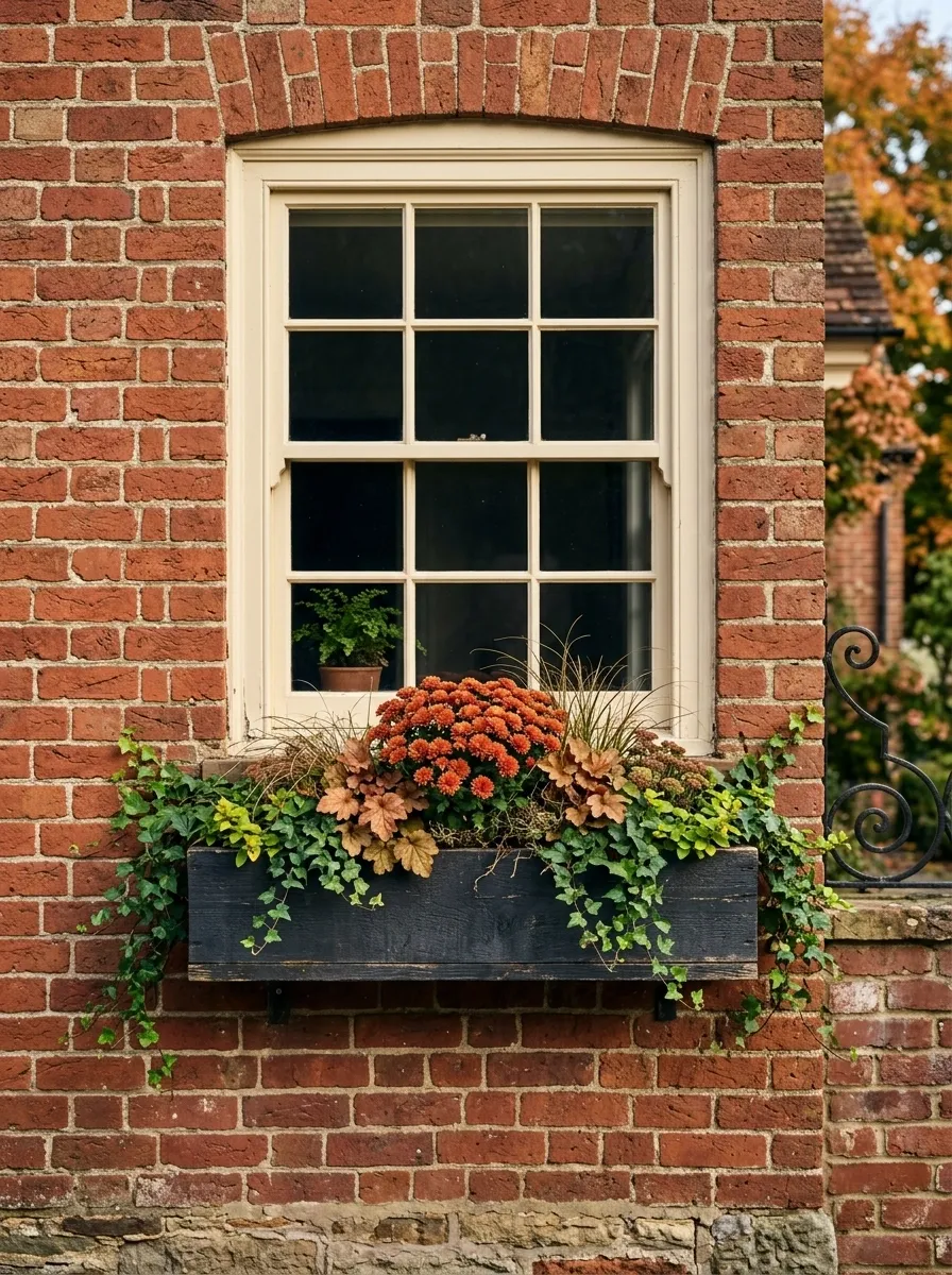
This is the classic autumn window box, but the difference is restraint. Burnt-orange chrysanthemums fill the center while deep green ivy spills gently over the front edge. Bronze-toned foliage adds a little variation without competing with the flowers.
A weathered charcoal box gives the warm colors something dark to sit against, while a traditional brick facade makes the whole arrangement feel established rather than freshly assembled. Keep the window itself visually quiet. White or warm cream trim is enough.
The useful part of this composition is its balance. The flowers provide the seasonal color, the ivy creates movement, and the box anchors everything. There isn’t a random pumpkin fighting for attention.
Moody Nighttime Glow
Turn your window box into an evening focal point by framing the entire opening with warm fairy lights and autumn leaf garlands. Deep green foliage and trailing vines anchor the dark container below.
Small gourds tucked into the rich greenery add a classic harvest touch while blending seamlessly into the darker color palette. The twinkling lights cast a soft, inviting glow against the evening glass.
This setup proves that autumn decor can transition beautifully from day to night. The cascading ivy softens the edges of the box while the twinkling leaves create a magical atmosphere right outside your window.
Burgundy Foliage and Cream Flowers
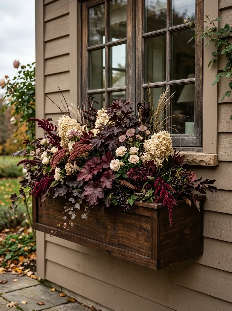
Orange doesn’t have to be the star of every autumn arrangement. This version leans into burgundy leaves, cream-colored flowers, dusty rose touches, and dark wood for a softer, moodier result.
The cream flowers keep the darker foliage from becoming heavy, while the burgundy establishes the autumn connection without shouting about it. A deep brown or walnut-toned planter works especially well against warm neutral siding.
I’d keep the surrounding decor minimal here. The planting already has enough depth through color and texture. Adding pumpkins, signs, lanterns, and extra ornaments would flatten the composition instead of improving it.
Classic Harvest Window Box
Sometimes the most traditional combination creates the biggest impact. Bright orange pumpkins sit proudly among lush trailing greenery and warm-toned textured grasses inside a rustic wooden planter.
Flanked by charming vintage-style lanterns, the entire arrangement frames the multi-pane window with a welcoming farmhouse feel. The rich green foliage provides a crisp contrast to the vibrant orange fruit.
It is an effortless way to celebrate the harvest season while keeping the architectural features of your home visible. The symmetry of the lanterns brings a polished finish to an otherwise natural display.
Pumpkin Market Box
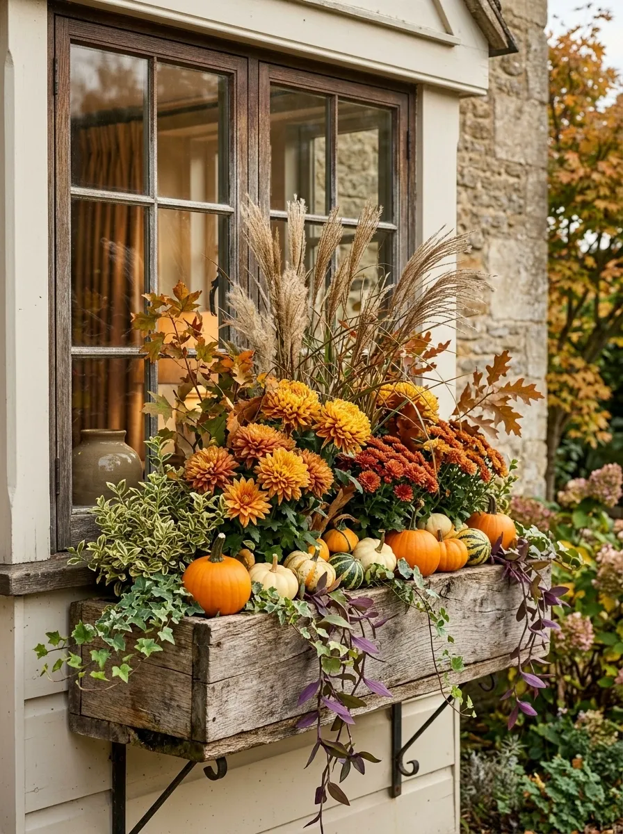
This one goes all in on harvest season, but it still needs structure. Compact orange pumpkins sit low in the arrangement while golden mums rise behind them. Trailing greenery softens the front edge, and a few dried grasses add height without making the box look stiff.
A natural wood or galvanized planter works because both materials reinforce the market-garden feeling. Keep the pumpkins small enough that they support the planting rather than swallowing it.
The trick is repetition. Use several related warm tones instead of grabbing every shade of orange available. The window remains visible, the planting has a clear center, and the seasonal accents look integrated rather than scattered.
Minimalist Autumn Greenery
For a cleaner, more understated approach, focus primarily on structure and foliage rather than heavy seasonal props. Deep green boxwood spheres sit neatly inside a crisp white window box accompanied by simple orange pumpkins.
Flanked by striking black shutters, the bright white container creates a sharp, clean contrast that stands out against a neutral exterior. A few trailing ivy sprigs soften the structured lines.
This arrangement relies heavily on geometric shapes and restrained color choices. It delivers an unmistakably autumnal feel while maintaining a sleek, modern aesthetic that looks pulled together all season long.
Soft White and Sage Cottage Box
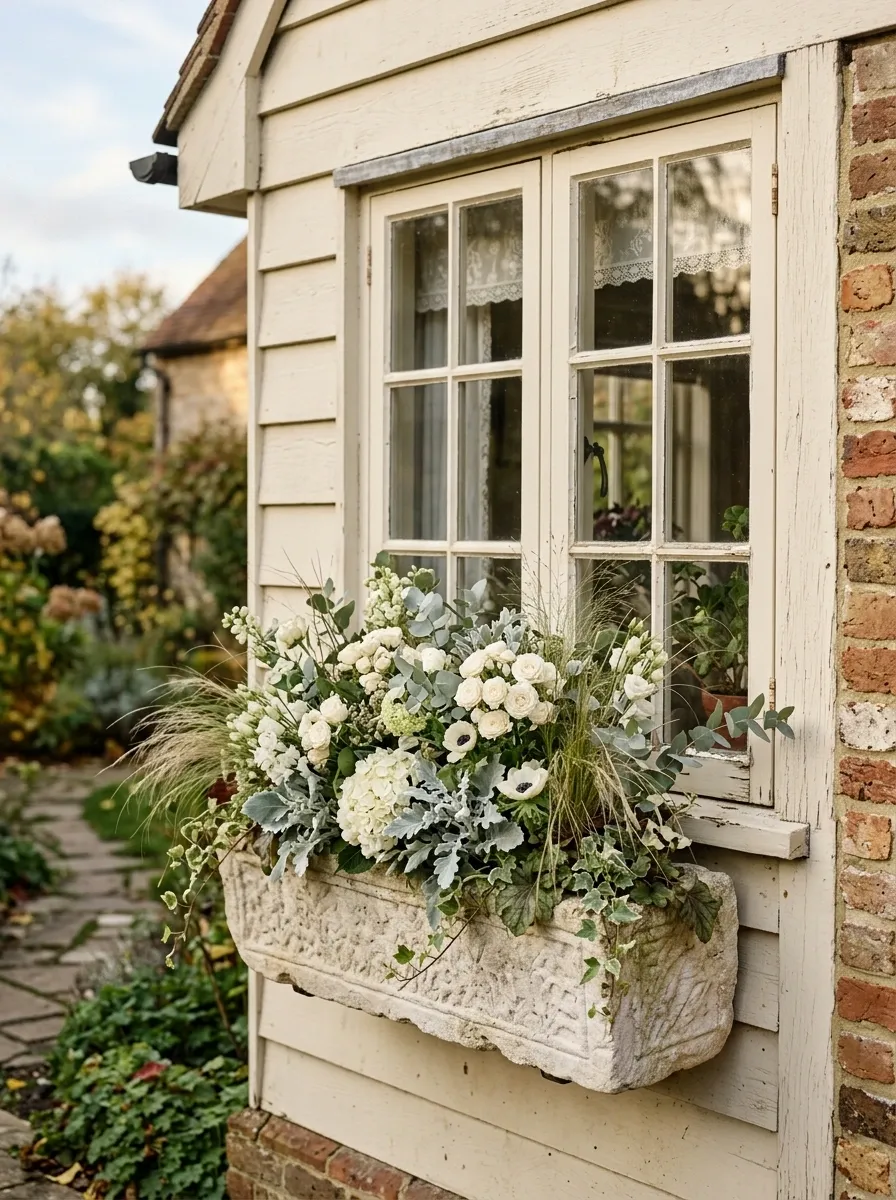
This arrangement proves that an autumn window box doesn’t need to look like autumn exploded on it. Ivory flowers, silvery foliage, sage greens, muted grasses, and a pale weathered planter create a quieter seasonal composition.
It works especially well against a cottage facade with cream paint, old brick, or pale stone. The colors are soft enough that the architecture can remain visible, which is exactly why the arrangement feels more sophisticated than a louder orange-heavy display.
The texture does the work here. Fine grasses, rounded flowers, and soft leaves create enough variation without relying on decorative objects. I’d resist adding bright orange accents. They’d pull the design away from the calm palette that makes it interesting.
Ghost Pumpkin Romance
Switch things up with a monochrome approach using ivory pumpkins, delicate white daisies, and towering golden wheat grass. A wonderfully weathered white planter ties the romantic, rustic palette together.
The soft white gourds look right at home nestled among bundles of dried grasses and bright white blooms. Against a vintage window frame, the entire composition feels soft, airy, and effortlessly chic.
This design proves you do not need bright orange to make a seasonal statement. The varied heights of the wheat and the rounded shapes of the pumpkins create a visually pleasing display that feels calm and elegant.
Black Box With Copper and Burgundy Planting
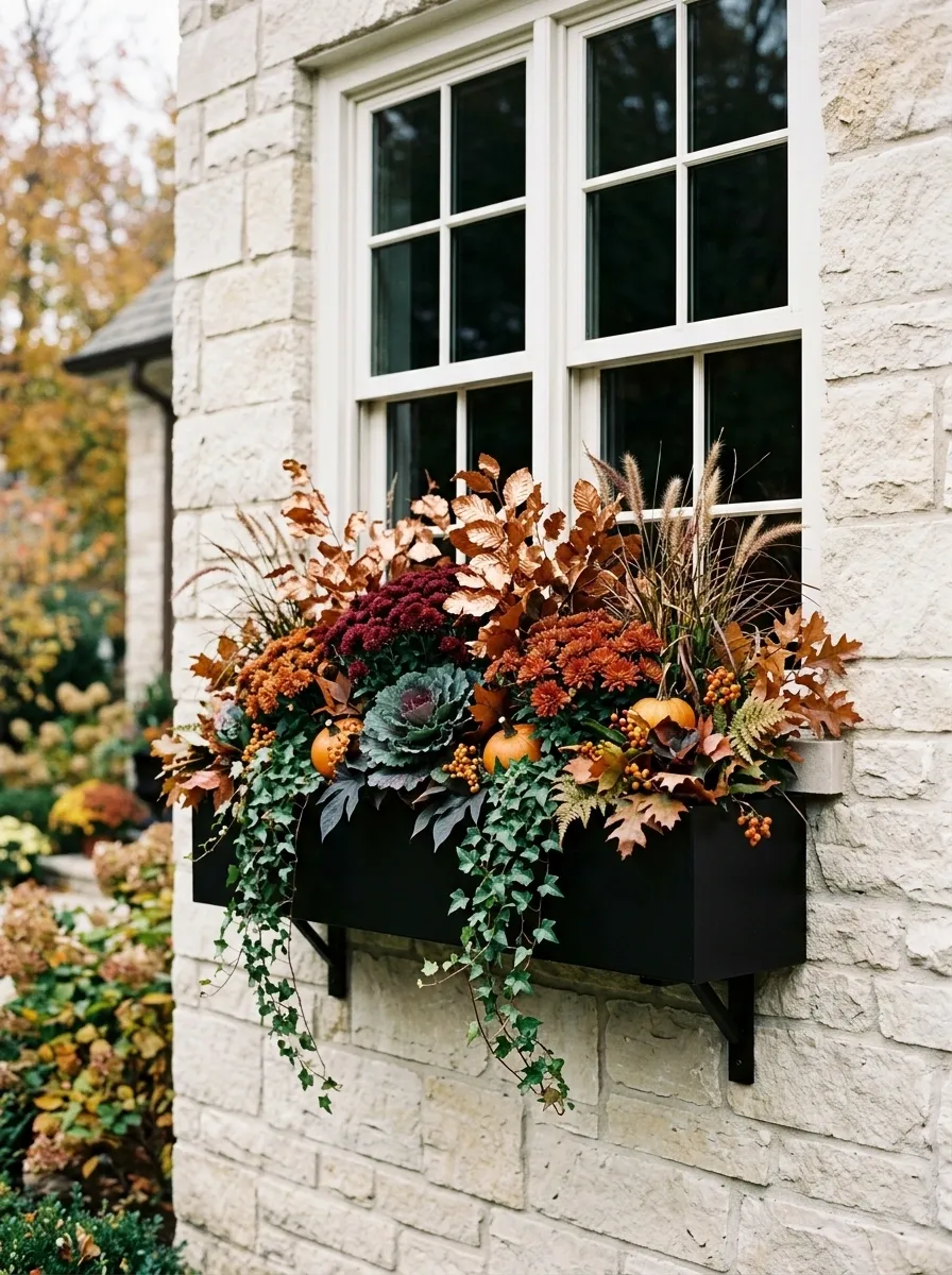
For a facade that can handle stronger contrast, this composition has much more architectural weight. A matte black window box frames copper-toned foliage, burgundy mums, and dark trailing greenery against a pale exterior.
The black container creates a strong horizontal line beneath the window, while the warmer foliage prevents the arrangement from feeling severe. Burgundy adds depth, and the pale wall gives every darker element room to register.
This works because the visual hierarchy is obvious. The box provides the structure, the copper foliage creates the dominant color movement, and the burgundy flowers act as the darker focal points.
Don’t add bright yellow flowers here. They would break the controlled palette and turn a sharp arrangement into a crowded one.
Woodland Window Box With Ferns and Grasses
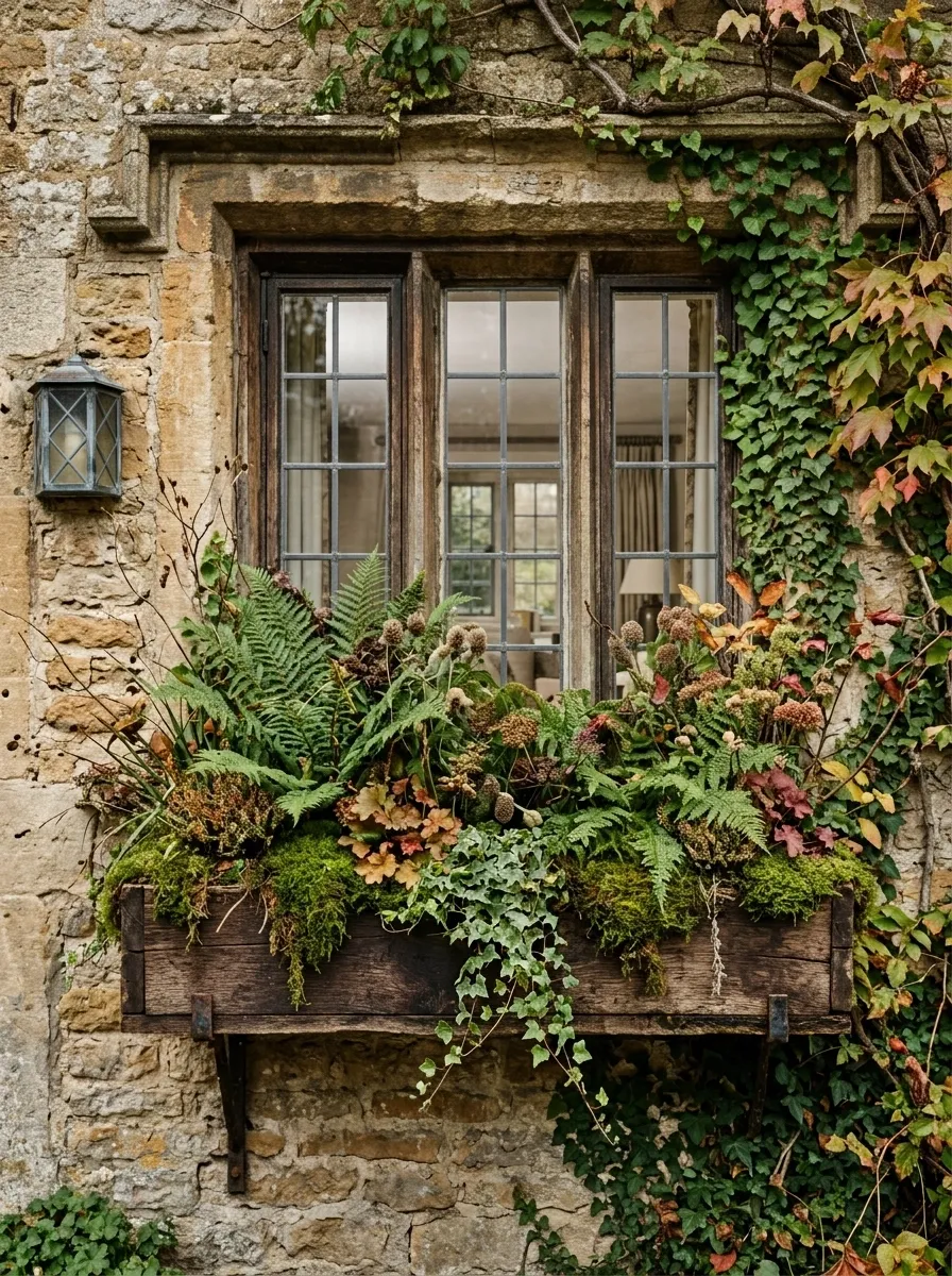
Forget the usual orange-heavy formula for a minute. This arrangement takes its cues from the forest floor, using deep green ferns, fine grasses, seed heads, mossy textures, and just enough rust-colored foliage to keep the season visible.
The planting should feel loose rather than perfectly packed. Taller grasses rise toward the back while ferns and softer leaves occupy the middle. A few trailing stems break the hard line of the planter.
This direction suits stone, weathered brick, and older cottages especially well. The materials already have texture, so the planting should echo that rather than compete with it. Keep the flowers secondary. The foliage is the point.
Golden Yellow Traditional Box
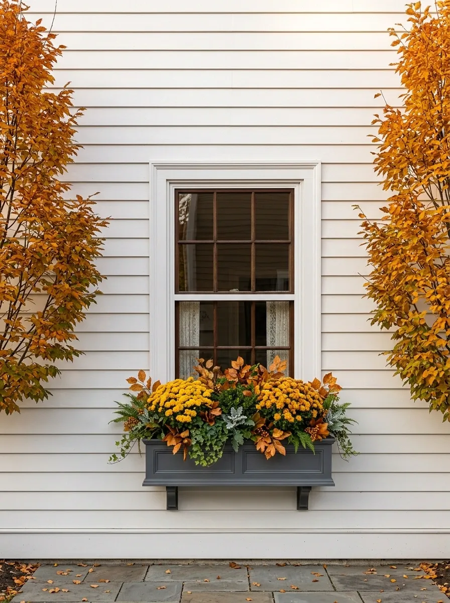
This is the cheerful version of fall, with golden yellow mums, rich green foliage, warm leaves, and a traditional painted planter beneath a classic multi-pane window.
The arrangement works because the color story stays simple. Yellow carries the seasonal message, green provides the visual break, and the planter ties the composition back to the house. A cream, white, or warm gray facade gives the colors plenty of room.
Keep the height fairly controlled here. A traditional window box looks stronger when the flowers follow the proportions of the window instead of trying to become a giant bouquet.
There is nothing wrong with a classic look. The problem is usually adding too many little extras until the classic composition disappears.
Farmhouse Galvanized Box With Harvest Layers
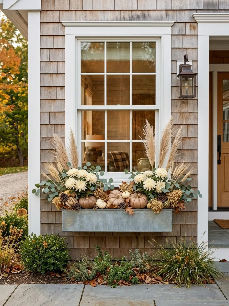
A galvanized planter brings a cooler material into an otherwise warm autumn scene, which is exactly why this combination works. Cream mums, soft green foliage, dried grasses, small gourds, and muted brown accents create a relaxed farmhouse composition.
The metal container keeps the arrangement from becoming too rustic. That little bit of contrast matters. Without it, the wood, gourds, foliage, and flowers can start looking like a themed display instead of a finished window.
Let the grasses rise slightly above the flowers, then keep the gourds low and grouped rather than scattered. The result should look layered from the sidewalk and still leave a clean view of the window.
Moody Plum and Charcoal Arrangement
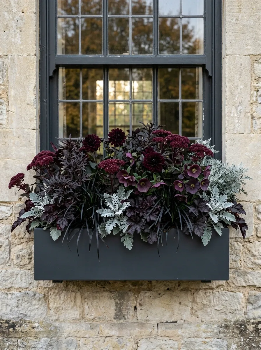
Autumn can be dark and elegant without becoming gloomy. Here, plum-colored flowers sit among almost-black foliage, dusty silver leaves, and a charcoal planter.
The combination is especially strong against pale limestone, light stucco, or warm gray siding. The background does enough work that the planting can stay visually dramatic without needing oversized decorative pieces.
Use different leaf shapes to create depth because the palette itself is relatively restrained. Rounded flowers, pointed foliage, and feathery textures prevent the composition from becoming a flat block of dark color.
This is a good example of letting contrast come from value and texture instead of throwing another color into the mix.
Minimal Evergreen and White Composition
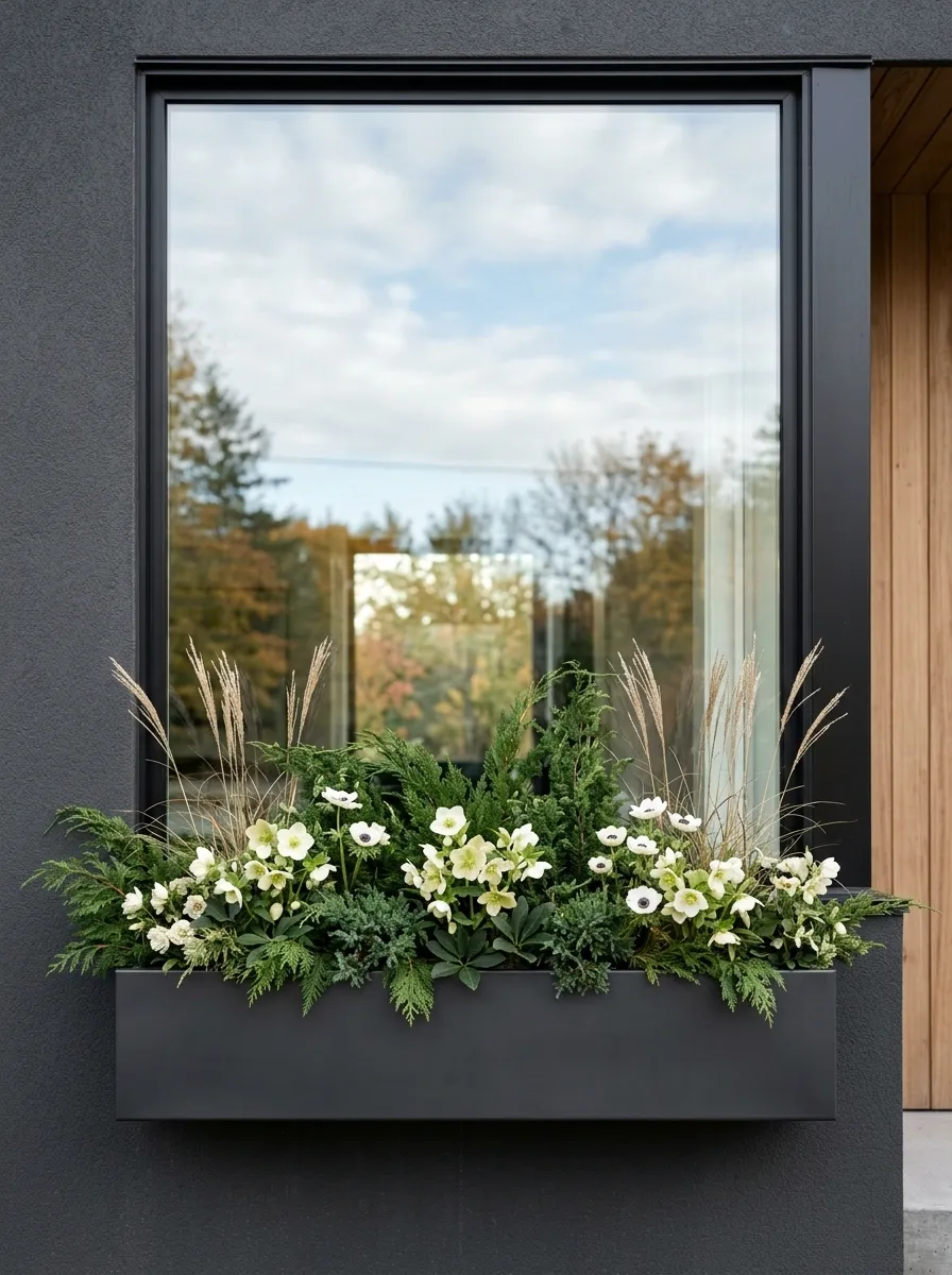
Not every fall box needs to announce the season from halfway down the street. This version uses evergreen foliage, pale flowers, muted grasses, and one or two understated autumn accents.
The composition is deliberately clean. Evergreen creates the structure, white or ivory flowers provide the lightest point, and dried grasses add a little movement above the main planting. A narrow modern planter keeps the whole arrangement looking architectural.
This works particularly well beneath large contemporary windows where a busy floral display would fight the clean lines. The restraint is the design.
Skip the collection of miniature pumpkins, signs, and ribbons. The whole point is that the arrangement feels seasonal without looking themed.
Terracotta and Burnt Orange Window Box
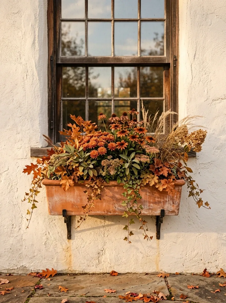
Terracotta tones make an autumn window box feel warmer without forcing it into the usual bright orange-and-yellow formula. This version combines copper-colored blooms, rust foliage, olive-green leaves, dried grasses, and a terracotta-toned planter.
The important relationship is between the planter and the planting. They share the same warm family, while the olive foliage breaks up the orange. Against cream stucco, pale stone, or warm white siding, the entire arrangement feels sun-baked and grounded.
Let the flowers stay slightly below the window’s strongest architectural lines. The box should frame the window, not compete with it.
European Townhouse Style With Clipped Greenery
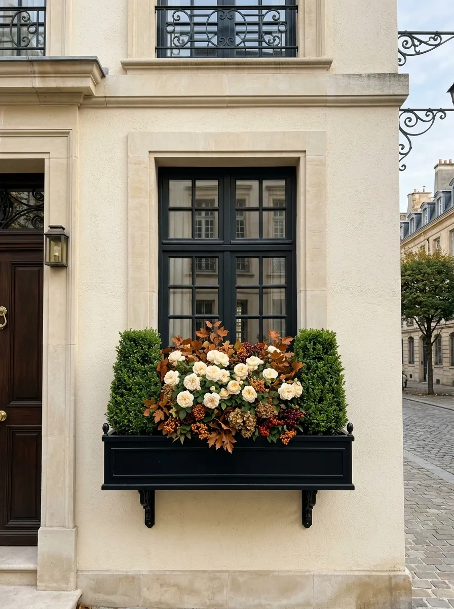
This arrangement is much more structured. Compact greenery forms a neat framework, cream flowers fill the middle, and small rust-toned accents bring in the season without breaking the formal rhythm.
The box works best beneath tall or narrow windows where symmetry already exists in the architecture. Instead of letting every plant reach in a different direction, keep the silhouette controlled. Repetition is doing more work here than variety.
A dark-painted or black planter strengthens the architectural feeling, while a pale facade provides enough contrast to keep the greenery crisp.
This is the version to choose when loose cottage planting would look out of place. The house already has order. The window box should respect it.
Cascading Sweet Potato Vine and Rust Mums
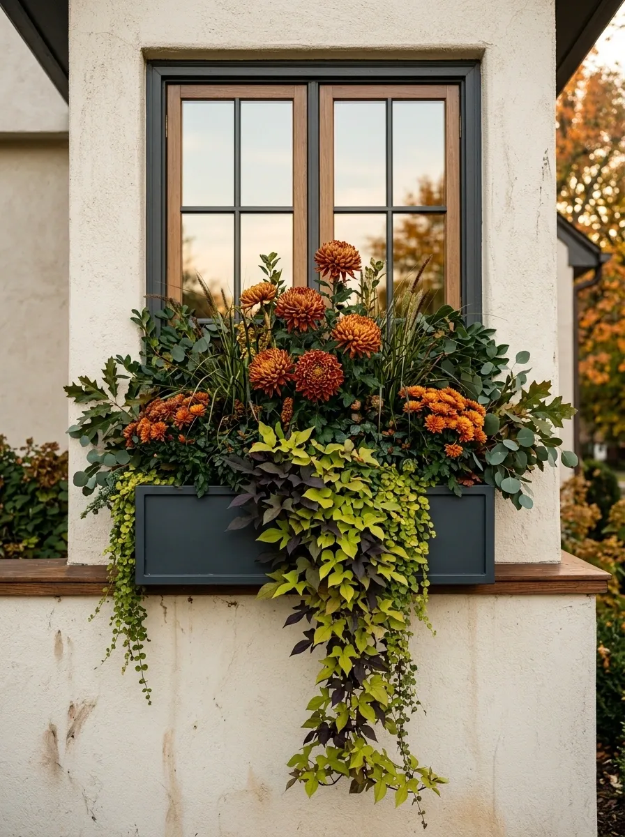
The strongest feature here is the movement. Rust-colored mums rise through the center while trailing foliage spills over the front edge and partially hides the planter.
That vertical-to-cascading relationship gives a plain window something to look at. The mums establish height, the foliage creates the downward movement, and the dark green leaves keep the orange from becoming too dominant.
A simple wood, black, or charcoal box works best because the planting already has enough visual motion. Against a light exterior, the contrast becomes especially clear.
Don’t fill every gap. Some negative space around the blooms helps the arrangement read as layered rather than stuffed.
Natural Wood Box With Dried Grass Movement
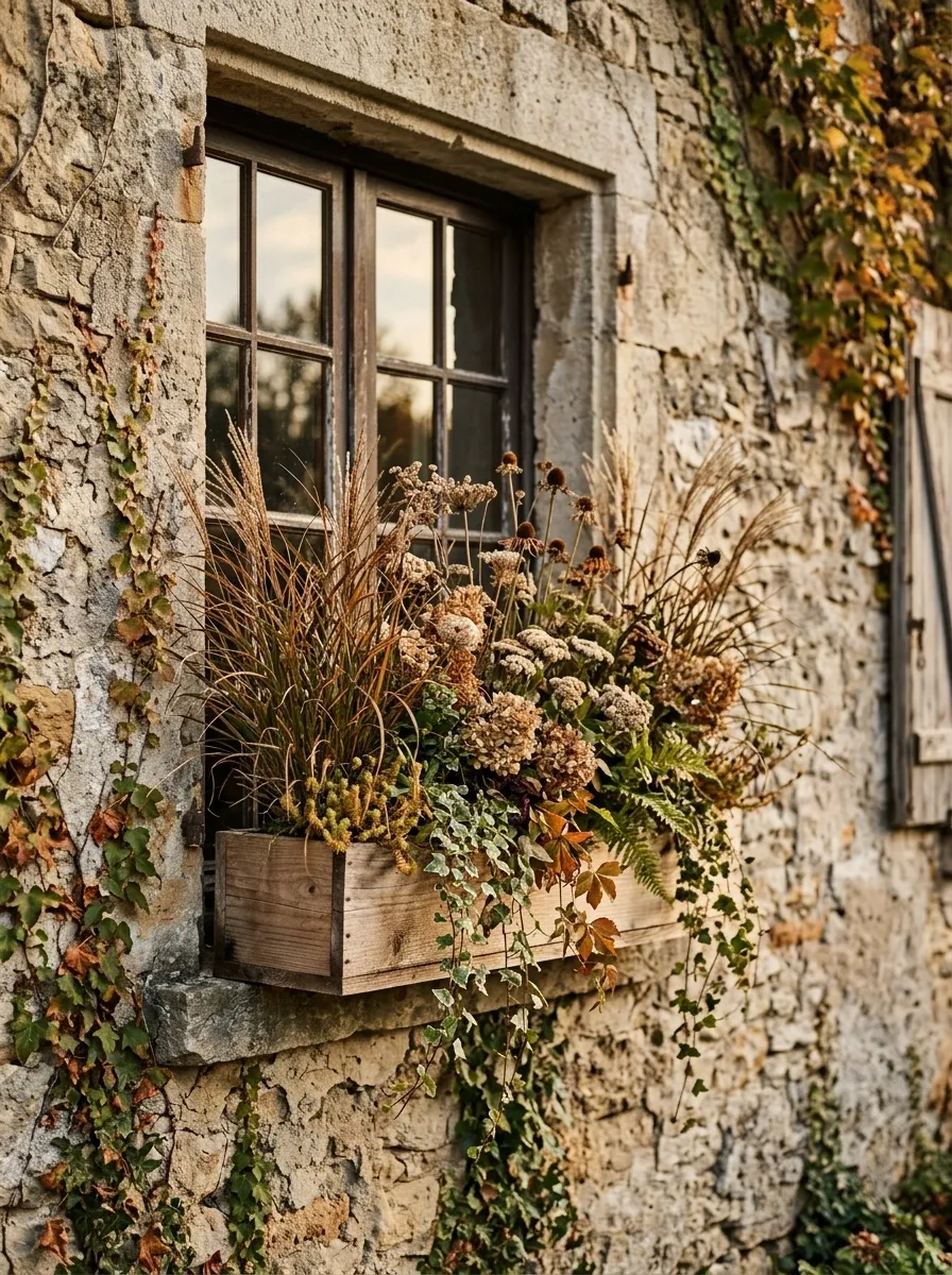
Here the season comes through texture more than flowers. A warm wooden planter holds bronze grasses, seed heads, muted blooms, and trailing foliage that moves naturally beyond the front edge.
The arrangement has a softer silhouette than the formal concepts earlier in the gallery. Nothing needs to be clipped into a perfect shape. The slightly irregular heights are what make it feel like a garden rather than a decorated container.
This direction fits cedar siding, natural stone, weathered brick, and other materials that already have visible texture. The wood box continues that language instead of introducing a polished or highly decorative finish.
Choose fewer flower colors and let the grasses provide the variation. Otherwise the loose structure can quickly become visual noise.
Deep Red and Burnished Gold Statement Box
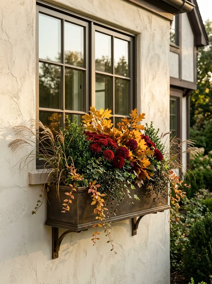
This one is meant to be seen. Deep red flowers, golden foliage, amber leaves, and dark green structure create a rich autumn composition that looks especially strong against pale stone or cream-colored walls.
The secret is keeping the colors concentrated. Red provides the visual weight, gold catches the light, and green keeps everything from becoming too hot. A dark planter acts as the final anchor.
Use the strongest colors toward the center and let the foliage extend naturally toward the edges. That gives the box a focal point instead of making the entire arrangement look equally loud.
This is one of the more dramatic choices in the collection, so the surrounding window decor should stay quiet. The planting has already taken the lead.
Small Window Box With Three-Level Structure
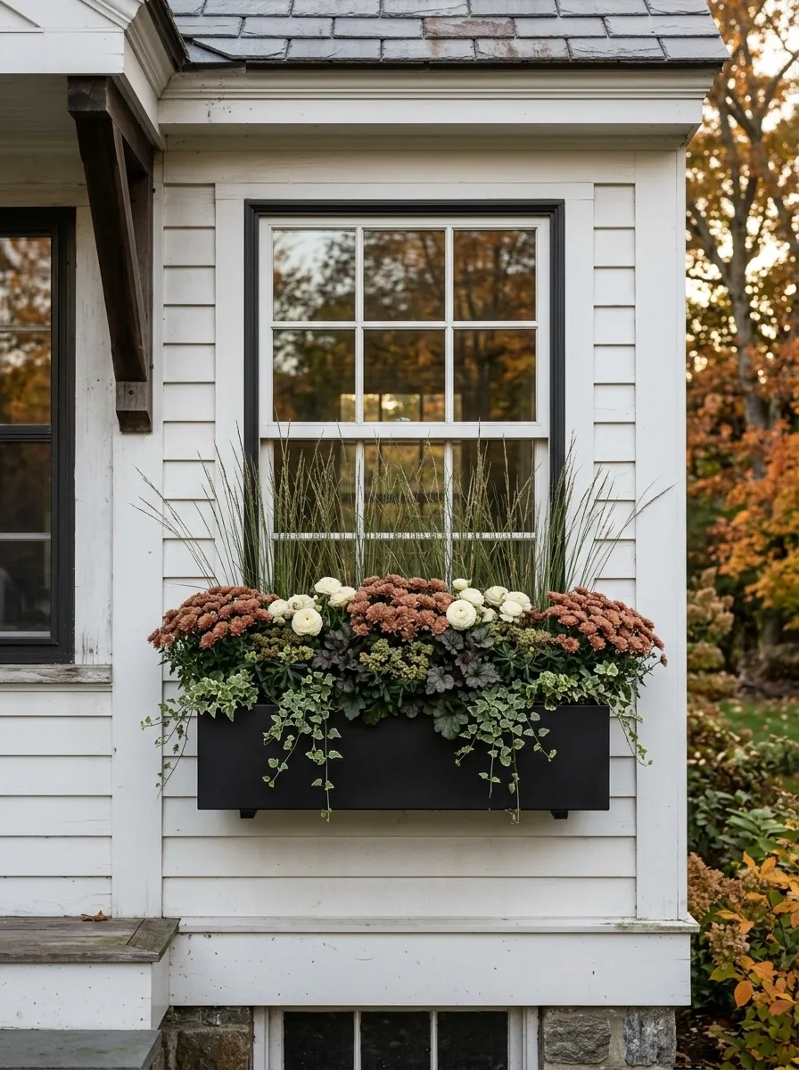
Small window boxes don’t need more plants. They need better structure.
This arrangement uses three clear layers: taller grasses rise at the back, compact flowers fill the middle, and trailing greenery drops toward the front. That simple height change creates depth without overcrowding the container.
Keep the palette tight, using muted rust, cream, and deep green. A narrow black or dark wood planter gives the arrangement a crisp edge and helps the small box feel substantial.
The key is leaving enough breathing room around each layer. Cramming twice as much foliage into a small box usually makes it look smaller, not fuller.
Soft Pink, Dusty Rose, and Olive Fall Box
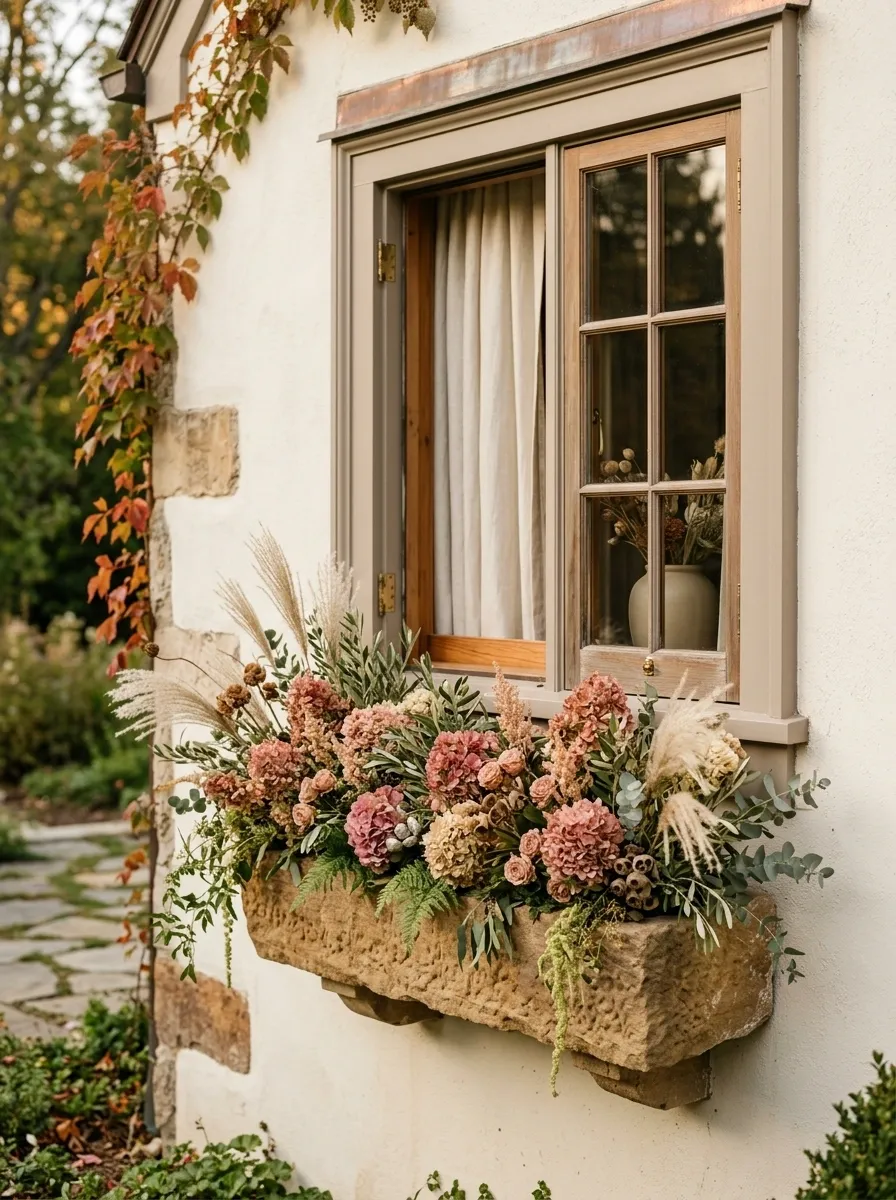
This is autumn without the expected orange.
Dusty pink flowers, muted rose tones, olive foliage, and pale grasses create a softer seasonal palette that feels especially good against warm white, taupe, or light gray exteriors. The planter can be natural wood or a muted stone tone so the colors remain the focus.
The olive foliage is important because it gives the pink shades a grounded counterpoint. Without that darker green, the arrangement could drift into spring territory.
Keep the flowers clustered in relaxed groups rather than scattering tiny patches everywhere. The composition should read as a few confident color masses from a distance.
It’s a clever option when you want the window to feel seasonal without making the house look decorated for one particular holiday.
Symmetrical Double-Window Composition
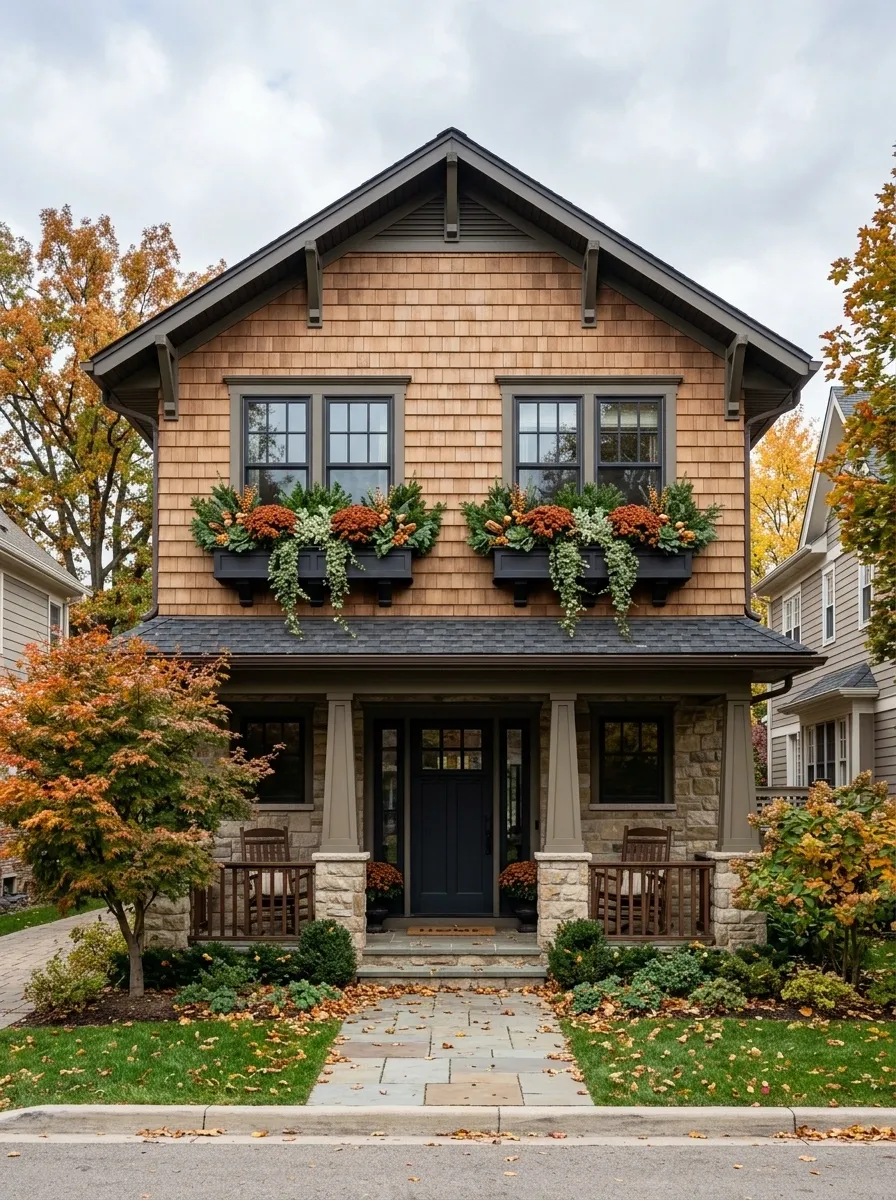
When two windows sit side by side, repeating one strong arrangement can look much better than designing each box separately.
These matching boxes use rust-colored mums, deep foliage, pale filler flowers, and trailing greenery in the same proportions. The repetition creates a visual rhythm that connects the two windows and makes the facade feel deliberately styled.
Keep the boxes identical in both planting density and color balance. Minor differences will look like mistakes from a distance.
A natural wood or dark-painted planter works well depending on the exterior. The important thing is that the boxes visually belong to the architecture rather than looking like two unrelated containers stuck beneath the windows.
Apartment Window Box With Modern Geometry
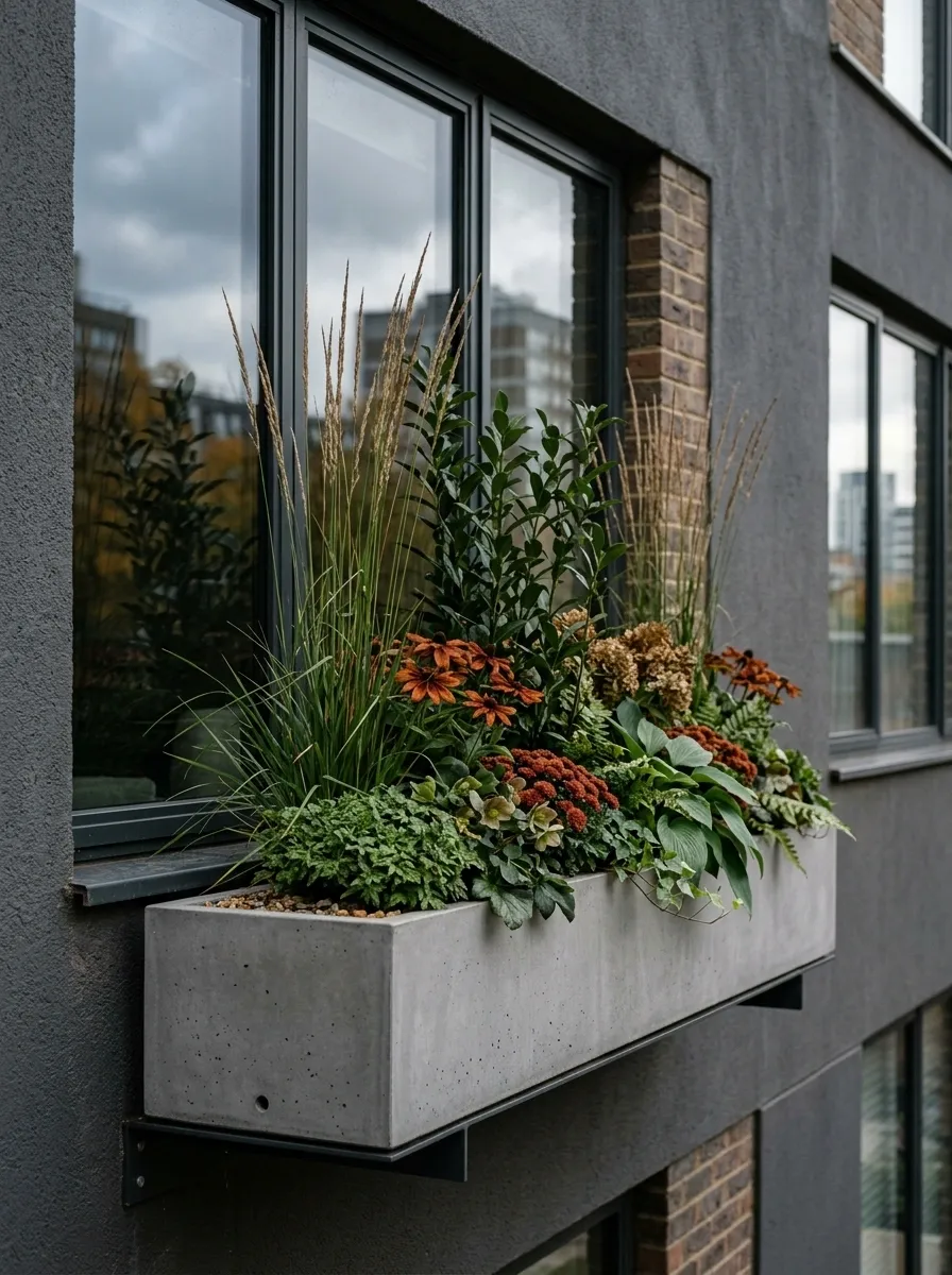
A modern facade needs a different kind of fall arrangement. Instead of a dense mound of flowers, this composition uses tightly grouped foliage, upright grasses, restrained rust blooms, and a few sculptural leaves inside a sleek planter.
The planting has clear shapes. Vertical grasses echo the straight lines of the window, while the fuller foliage creates a lower horizontal band. The orange flowers are used as accents rather than filling every available space.
A charcoal, black, or simple concrete-toned planter keeps the look architectural. The arrangement should feel edited, not empty.
This is where restraint actually makes the seasonal color stronger. A small amount of rust against a field of green and dark gray has more impact than twenty competing colors.
Cottage Garden Explosion
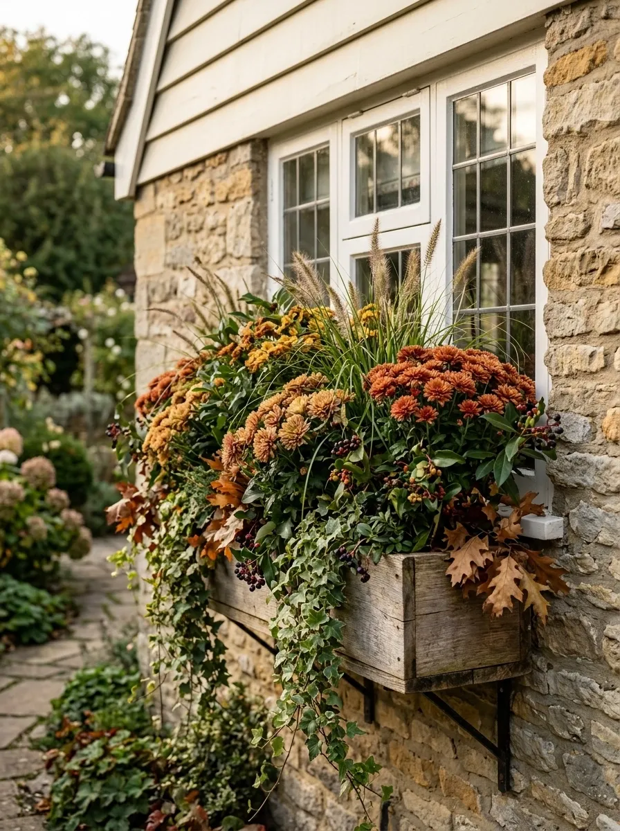
Subtle isn’t the only way to get fall right.
This arrangement is intentionally abundant, with mums, trailing vines, grasses, berries, and foliage packed into a fuller cottage-garden composition. The planting spills naturally over the edges and varies in height instead of forming a neat, controlled mound.
The reason it doesn’t become chaotic is the color discipline. Rust, muted gold, cream, brown, and deep green repeat throughout the arrangement, giving all those different textures a common language.
Use a weathered wood planter beneath stone, brick, or painted cottage siding. The architecture can handle the informality.
The important distinction is that abundance still needs hierarchy. Let one or two flower colors dominate, then use foliage and grasses to connect everything else.
White House With Burnt Orange and Green Contrast
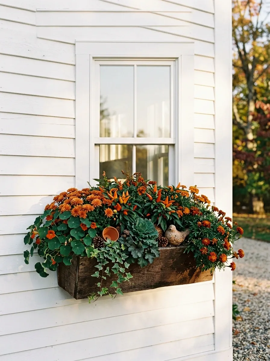
A crisp white facade gives autumn color plenty of room to work. This composition uses burnt-orange flowers, rich green foliage, natural wood tones, and small brown accents beneath a clean white window.
The palette is deliberately narrow. Orange supplies the seasonal color, green keeps it grounded, and the warm wood connects the planter to the softer tones in the planting. Because the house itself is simple, the box doesn’t need extra decoration.
The best part is the contrast between the sharp white architecture and the softer, slightly irregular planting. That tension keeps the arrangement from feeling too polished or too rustic.
I’d leave the window sill alone. The box has enough visual weight already.
Weathered Copper Box With Bronze Foliage
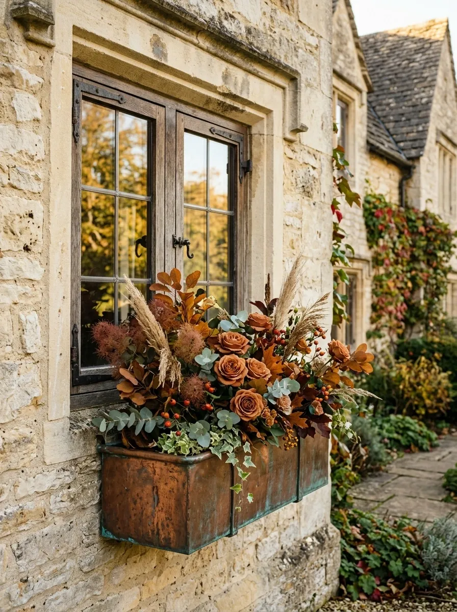
Here the container becomes part of the autumn palette instead of simply holding it. Aged copper tones pair with bronze foliage, rust flowers, soft green leaves, and dried grasses for a layered composition that feels almost monochromatic.
The appeal comes from subtle differences within the same warm family. Copper is slightly brighter, bronze is deeper, rust provides the floral color, and green gives the eye somewhere to rest.
This arrangement suits brick, cream stone, warm stucco, and other facades with earthy undertones. Let the planting remain slightly loose so the aged-metal effect doesn’t make the whole thing feel overly formal.
The design should look better as the materials weather. That’s the point.
Black-and-White House With Controlled Autumn Color
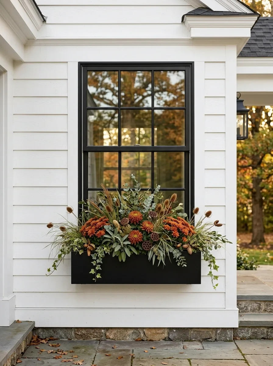
Black-and-white exteriors already have a strong visual language, so the window box shouldn’t try to overpower it. This version introduces autumn through a narrow ribbon of rust-colored mums, muted foliage, and warm brown accents.
The black trim gives the darker leaves a place to connect visually, while the white facade keeps the warm colors bright. A simple black planter continues the architectural lines without adding another finish.
Everything here is controlled. The planting is fuller in the middle, slightly lower toward the edges, and restrained enough that the window remains the main architectural feature.
This is a useful example of editing rather than decorating. The arrangement doesn’t need more. It needs the right amount.
Harvest Box With Gourds and Trailing Foliage
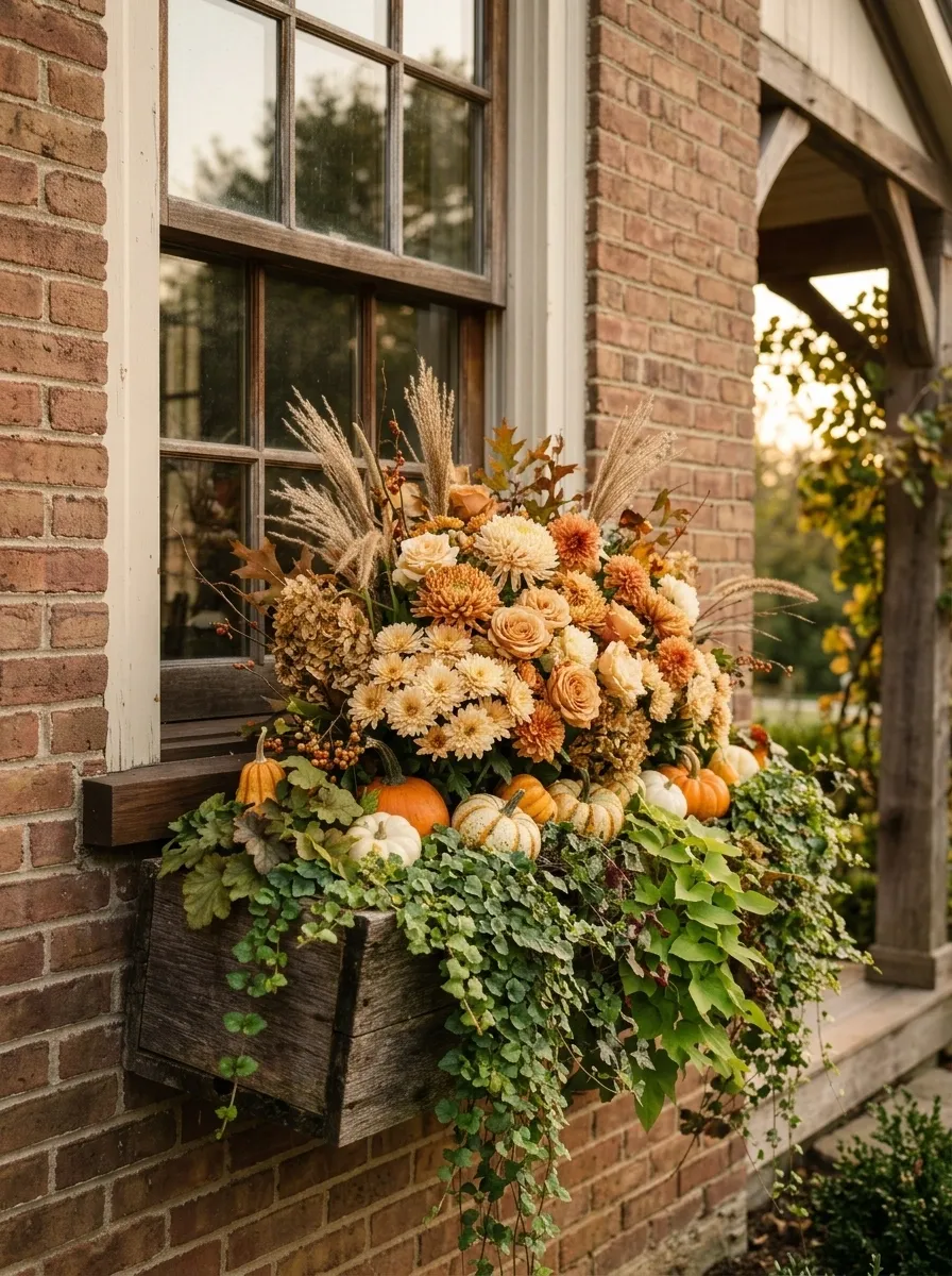
This is the more traditional harvest composition, but it stays visually organized. Cream and orange flowers rise through the center while small gourds sit low among cascading greenery and dried grasses.
Natural wood gives the container a warm base, and the trailing foliage helps blend the seasonal objects into the planting. The gourds should feel tucked into the composition rather than lined up across the front like decorations on a shelf.
The arrangement works especially well beneath porch windows, farmhouse facades, and warm-toned brick. There is enough texture to feel abundant, but the repeated color family keeps the display from looking chaotic.
The strongest version uses a few larger visual masses instead of dozens of tiny details.
Elegant Late-Fall Box With Evergreen and Bronze Texture
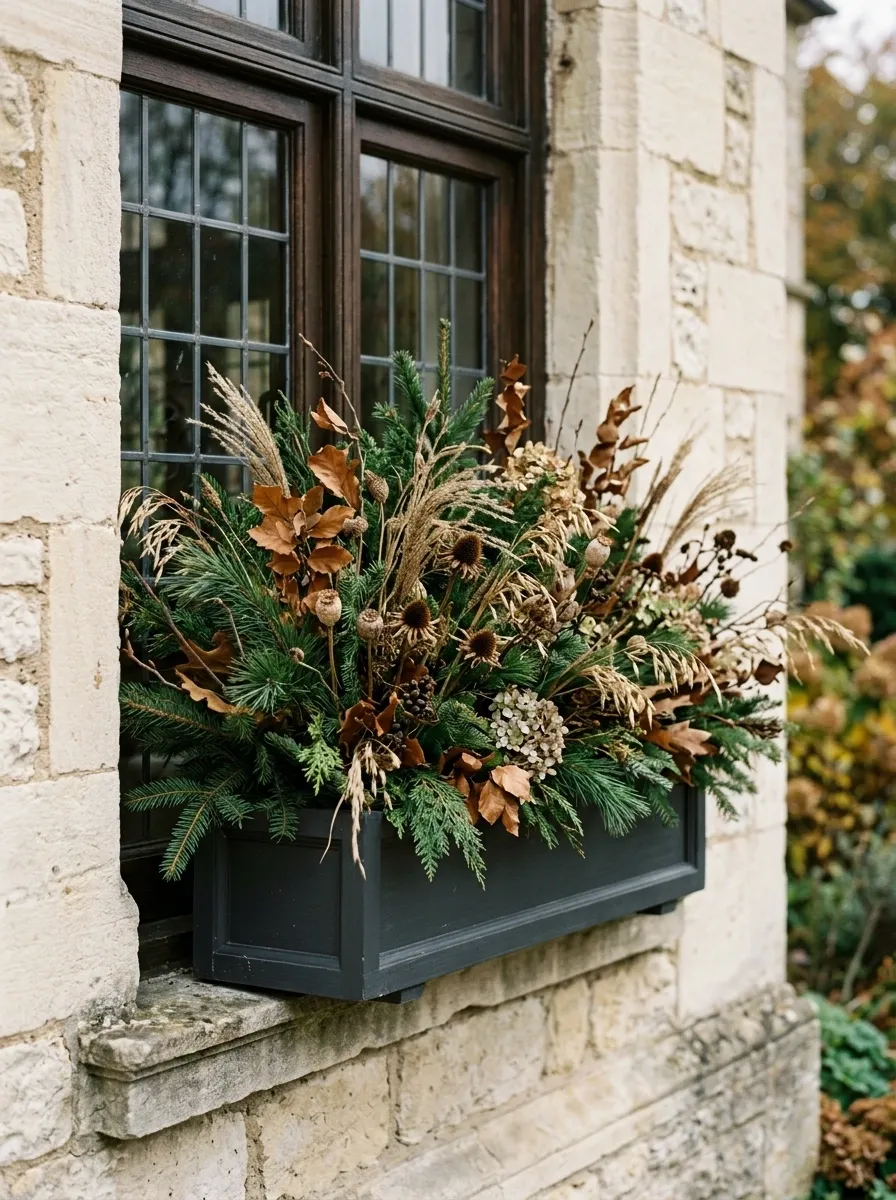
The final direction is quieter and more mature. Evergreen branches create the structure, bronze foliage supplies the autumn warmth, and dried seed heads add fine texture and movement. Muted flowers can be woven through the planting without becoming the main event.
This composition works especially well when you want the window box to transition deeper into the season without looking tied to one holiday. It doesn’t depend on bright pumpkins or a loud flower palette.
A dark wood or charcoal planter keeps the arrangement grounded, while cream, stone, or taupe architecture gives the bronze tones enough contrast.
The real strength is longevity. The design still makes sense once the first burst of fall color has passed.
Conclusion
The best fall window boxes aren’t the ones with the most decoration packed into them. They’re the ones where the pieces seem to have been chosen together.
That means looking at the house before choosing the planter, deciding on a color direction before buying flowers, and paying attention to the shape of the arrangement from a distance. A window box is small, but it still has structure, contrast, rhythm, and a focal point.
Start with the version that feels closest to your home’s architecture, then edit it instead of adding more. That’s usually where the design gets better.
Save the combinations that make you stop scrolling. Those are the references worth having when you’re standing in the garden center trying to remember what actually looked good.