
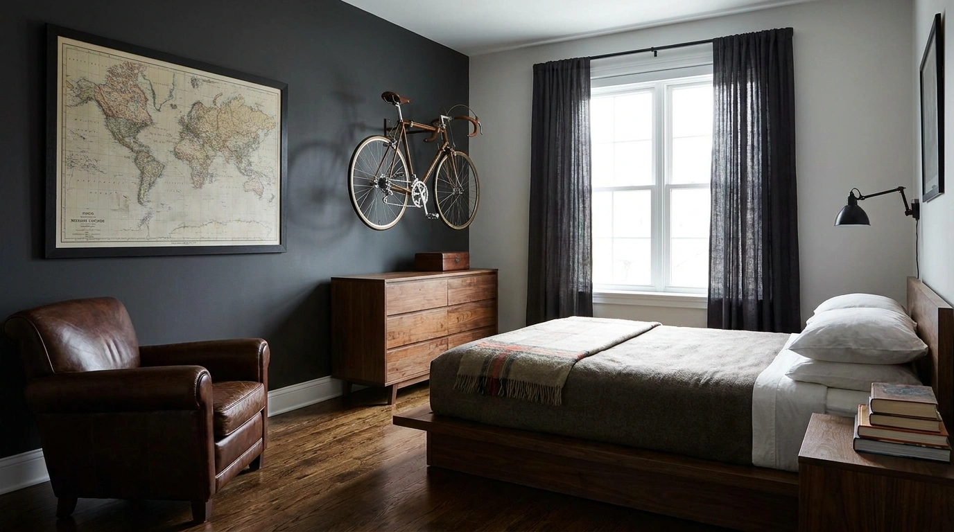
Most apartment “man caves” don’t need more stuff. They need better editing.
The fastest way to ruin the idea is to start shopping for everything that looks remotely masculine. Dark furniture. Sports signs. Gaming lights. A giant recliner. A bar cart. Then another shelf because apparently the first shelf wasn’t carrying enough emotional baggage. The room gets louder, but it doesn’t get better.
A good man cave feels comfortable before it feels themed. The sofa is deep enough to disappear into. The lighting looks good after sunset. The TV has a proper place instead of floating above a pile of electronics.
Wood, leather, metal, fabric, and darker colors give the room character without turning it into a showroom for one very committed personality trait.
An apartment can absolutely have that feeling, even without a spare basement or a giant bonus room. The trick is deciding what deserves space, what should stay hidden, and where the eye should land first.
Make the Apartment Feel Like a Man Cave
Build the Room Around One Main Comfort Zone
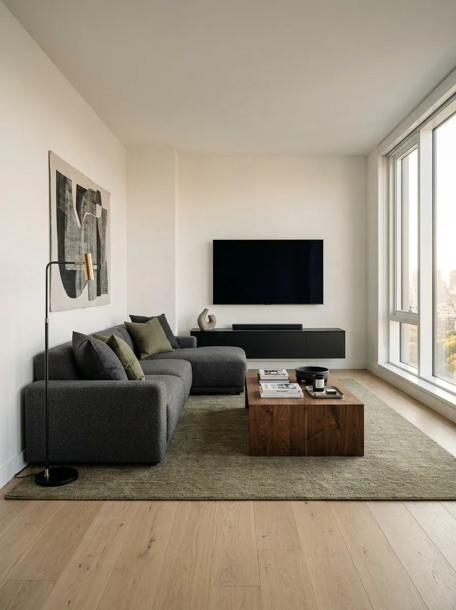
Start with the spot where everyone naturally wants to sit.
A sofa facing the TV is the obvious choice for a movie-heavy room. A lounge chair beside a game console works better when gaming is the main event. The point is to establish one visual headquarters before adding anything else.
Keep these pieces connected:
- Main seating
- TV or primary activity
- Small table within easy reach
- Clear walking path around the setup
Don’t scatter furniture against every wall just because the apartment has empty corners. Empty space is doing useful work here. It keeps the room looking larger and makes the main zone feel deliberate instead of accidental.
Give the TV Wall a Stronger Presence Without Filling It With Stuff
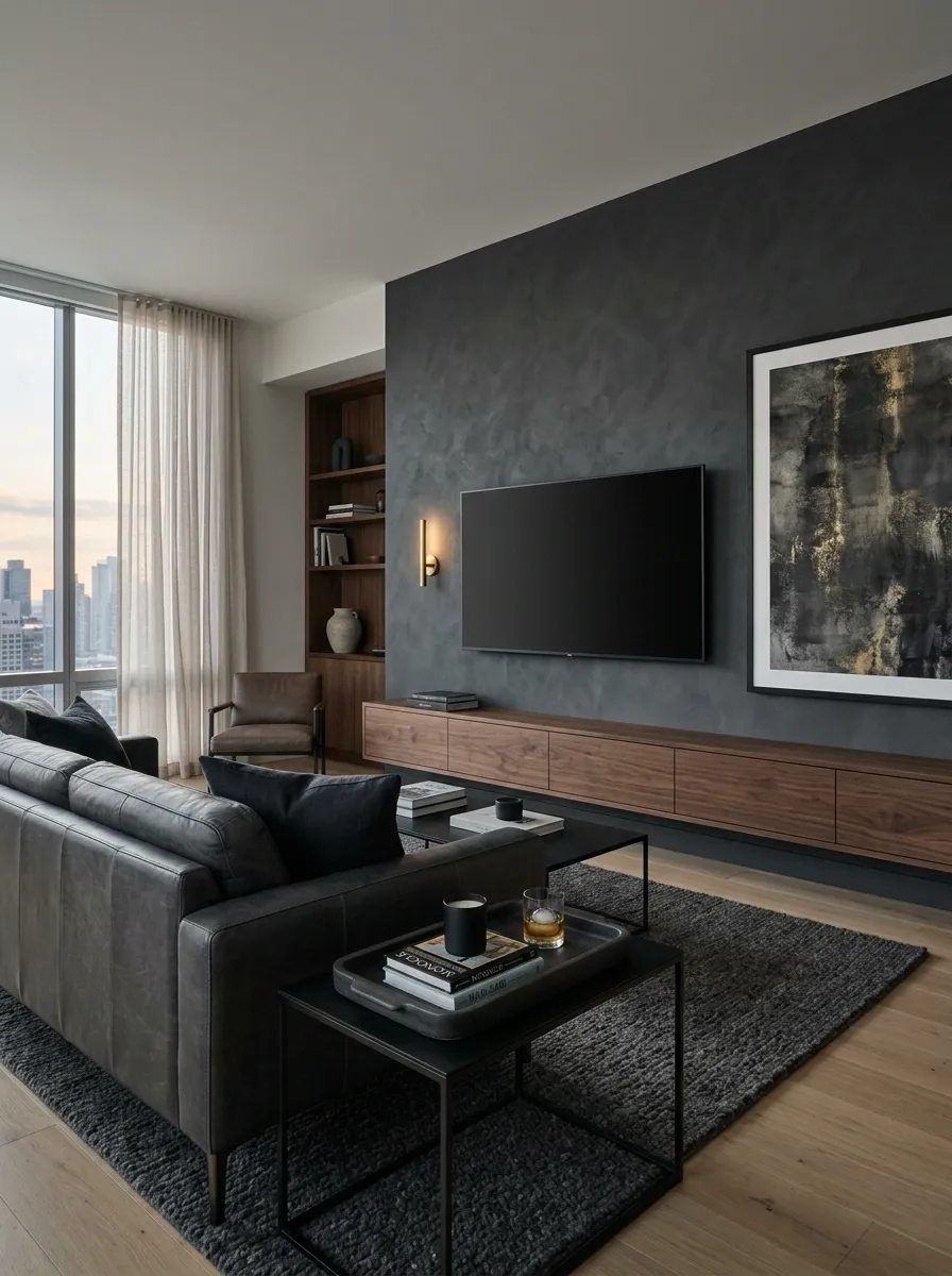
The TV should anchor the room, but it doesn’t need a wall full of gadgets screaming for attention.
A clean media console, one substantial art piece, or a textured wall treatment can give the screen more weight without creating visual noise. Keep the area underneath useful too. Controllers, remotes, headphones, and cables need somewhere to disappear.
Quick TV wall check:
- Screen sits at a comfortable viewing height
- Console is wider than the TV
- Most small electronics stay hidden
- One decorative element adds personality
- At least one section of wall stays visually quiet
A man cave doesn’t need to look busy to look finished. Quiet space around the TV actually makes the whole setup feel more expensive.
Use Darker Colors Where They Actually Improve the Room
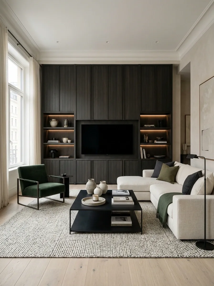
Dark paint isn’t the personality. Contrast is.
Instead of coating the entire apartment in charcoal and hoping for the best, use deeper shades where they make furniture and lighting look richer. A dark media wall, a deep green accent chair, or smoked wood cabinetry can do far more than four black walls.
Keep the darker color concentrated around one visual area, then balance it with lighter flooring, upholstery, or curtains. That contrast stops the room from feeling flat.
A little restraint matters here. The goal is moody, not “the landlord is going to ask questions about the security deposit.”
Swap the Generic Ceiling Light for Three Layers of Lighting
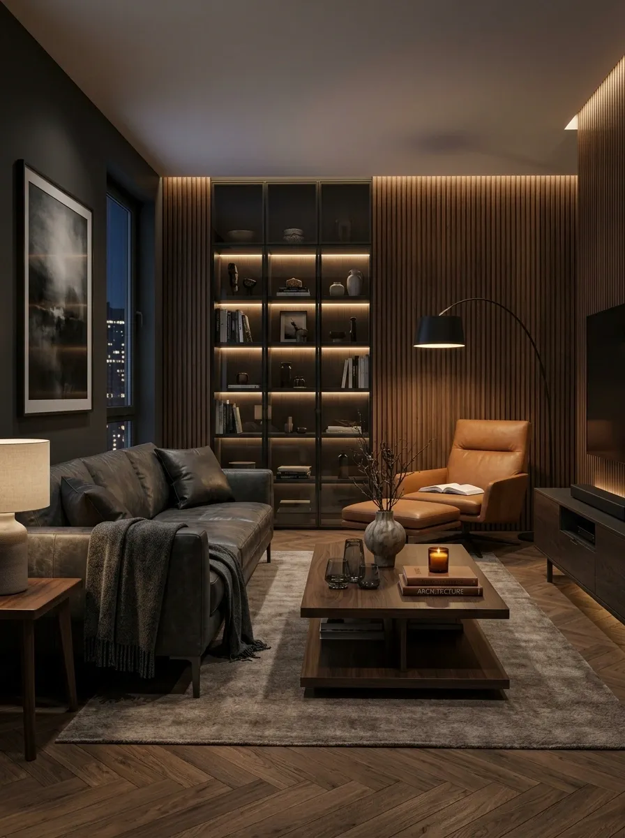
Kill the single bright ceiling light whenever the room is supposed to feel relaxed.
Use three light sources instead:
- Ambient: a floor lamp or shaded ceiling fixture for overall glow.
- Task: a desk lamp, reading lamp, or focused light beside a chair.
- Accent: a small lamp on the console, shelf, or bar area.
Keep the color temperature warm so the wood, upholstery, and dark finishes don’t look washed out. The room should still feel good after the TV is turned off.
That lonely ceiling bulb has done enough damage.
Choose One Sofa Big Enough for Friends but Right for the Apartment
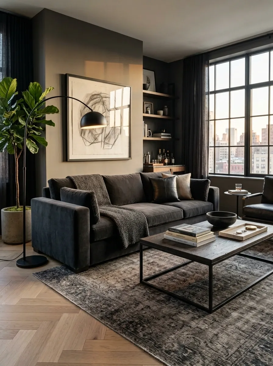
A man cave needs somewhere people can actually sit. That doesn’t mean the sofa should swallow half the apartment.
Measure the wall, measure the walkway, then choose the largest sofa that leaves comfortable circulation around it. Deep charcoal, warm brown, olive, or textured beige upholstery works especially well because the material carries visual weight without needing loud decoration.
Look for substantial arms, clean lines, and enough depth to lounge. A flimsy apartment sofa makes the room feel temporary. An oversized sectional makes it feel trapped.
The sweet spot is a sofa that looks generous from across the room and still leaves floor visible around it.
Turn an Awkward Corner Into a Dedicated Gaming Station
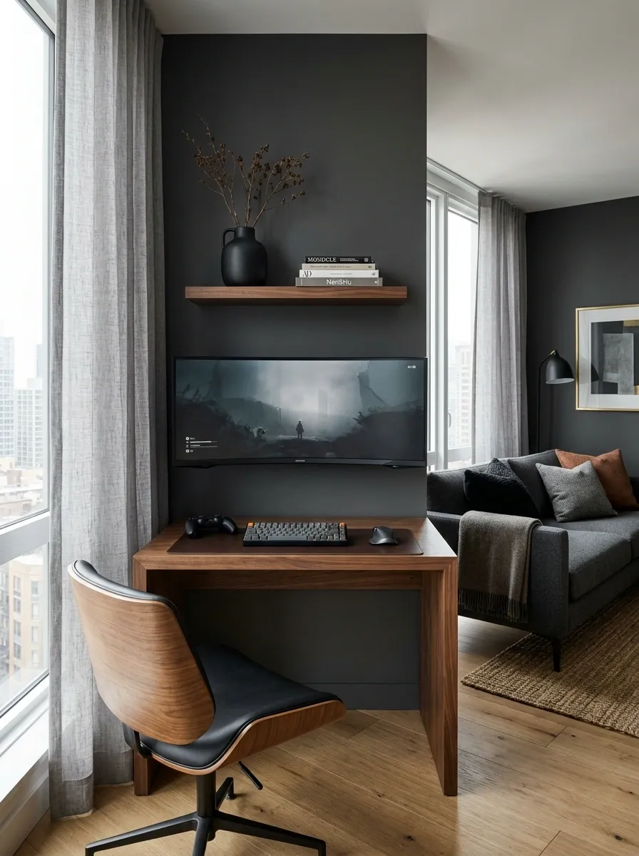
That useless little corner beside the window doesn’t need another plant apologizing for its existence.
Give it a job. A slim desk, wall-mounted monitor, compact chair, and a narrow shelf can create a real gaming zone without stealing the whole living room. Keep the desk depth modest so the chair doesn’t collide with the sofa every time someone walks past.
Run the cables along the back edge and under the desk, then keep the surface brutally simple. Monitor, keyboard, mouse, controller. That’s enough.
The gaming area should look like part of the room, not like the PC was dropped there during a power outage.
Mix Wood, Metal, and Leather Instead of Buying Matching Furniture
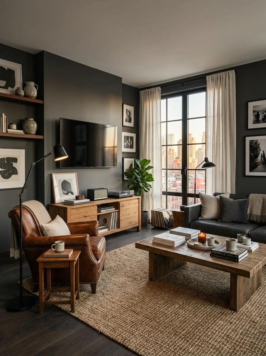
Matching furniture is doing nobody any favors.
A room feels richer when materials have different textures but still share the same visual weight. Pair a warm wood media console with a black metal lamp and a brown or charcoal leather chair. Add a woven rug or textured curtain so the harder surfaces don’t start looking like an electronics showroom.
Use this simple mix:
- Wood for warmth
- Metal for structure
- Leather for weight
- Fabric for softness
Keep the finishes related rather than identical. Slight variation makes the room look collected over time instead of purchased in one extremely nervous afternoon.
Keep the weight balanced.
Use One Oversized Piece of Wall Art Instead of Ten Tiny Prints
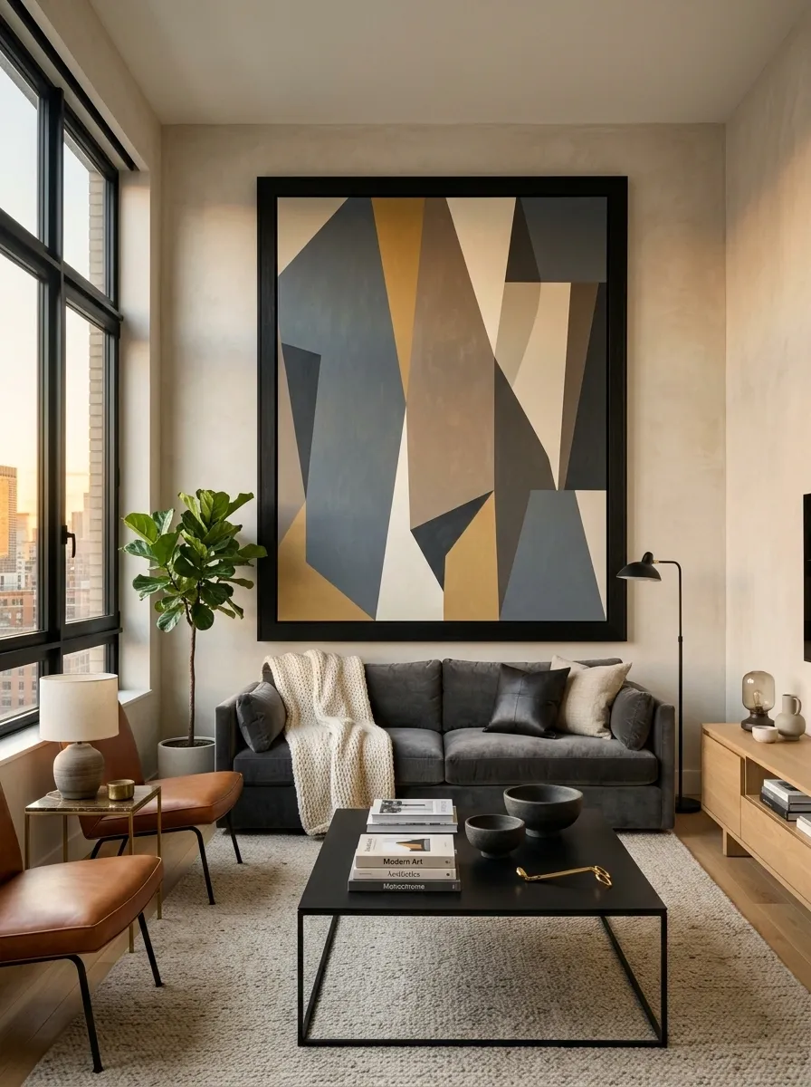
Tiny artwork makes a wall look like it’s still waiting for the rest of the furniture.
A single oversized print gives the room an immediate focal point and works especially well above a sofa, beside the TV, or over a console. Choose something with strong shapes or restrained colors that echo materials already in the room.
The frame matters too. Black works with metal finishes. Warm wood softens a darker room. A wide neutral frame keeps the artwork from competing with the TV.
Scale beats quantity here. One confident piece can make the wall feel finished before another decorative object even enters the room.
FOCAL PIECE
Hide Cables Before They Become Part of the Decor
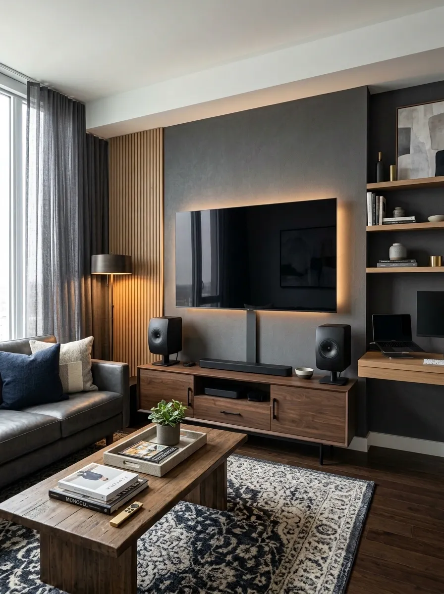
Nothing kills an otherwise polished man cave faster than a cable jungle.
Start at the wall and work downward. Use a cable raceway for visible runs, bundle wires underneath the desk or console, and keep power bricks out of open sight. A slim box can hide the extension lead while still keeping access easy.
Think of wiring as part of the architecture. It should disappear into the background.
Cable cleanup order:
- Route everything toward one hidden path.
- Separate power from loose accessory wires.
- Bundle the extras underneath furniture.
- Leave only the cables that actually need to be visible.
The room has enough black rectangles already. It doesn’t need a nest of black cords joining them.
Build a Movie Setup Around the Screen, Not Around the Gadgets
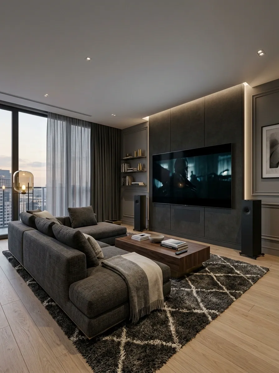
A good movie setup starts with sightlines, not a shopping spree.
Put the screen where it can be watched comfortably from the main seating position, then arrange everything else around that. Keep speakers from getting buried behind furniture, leave the coffee table low enough to avoid blocking the view, and avoid filling the wall with equipment.
The screen should dominate the room visually while everything else supports it. That makes the setup feel like a private cinema instead of a technology showroom.
And yes, the room can survive without twelve different devices glowing underneath the TV.
Add a Rug Large Enough to Connect the Whole Seating Area
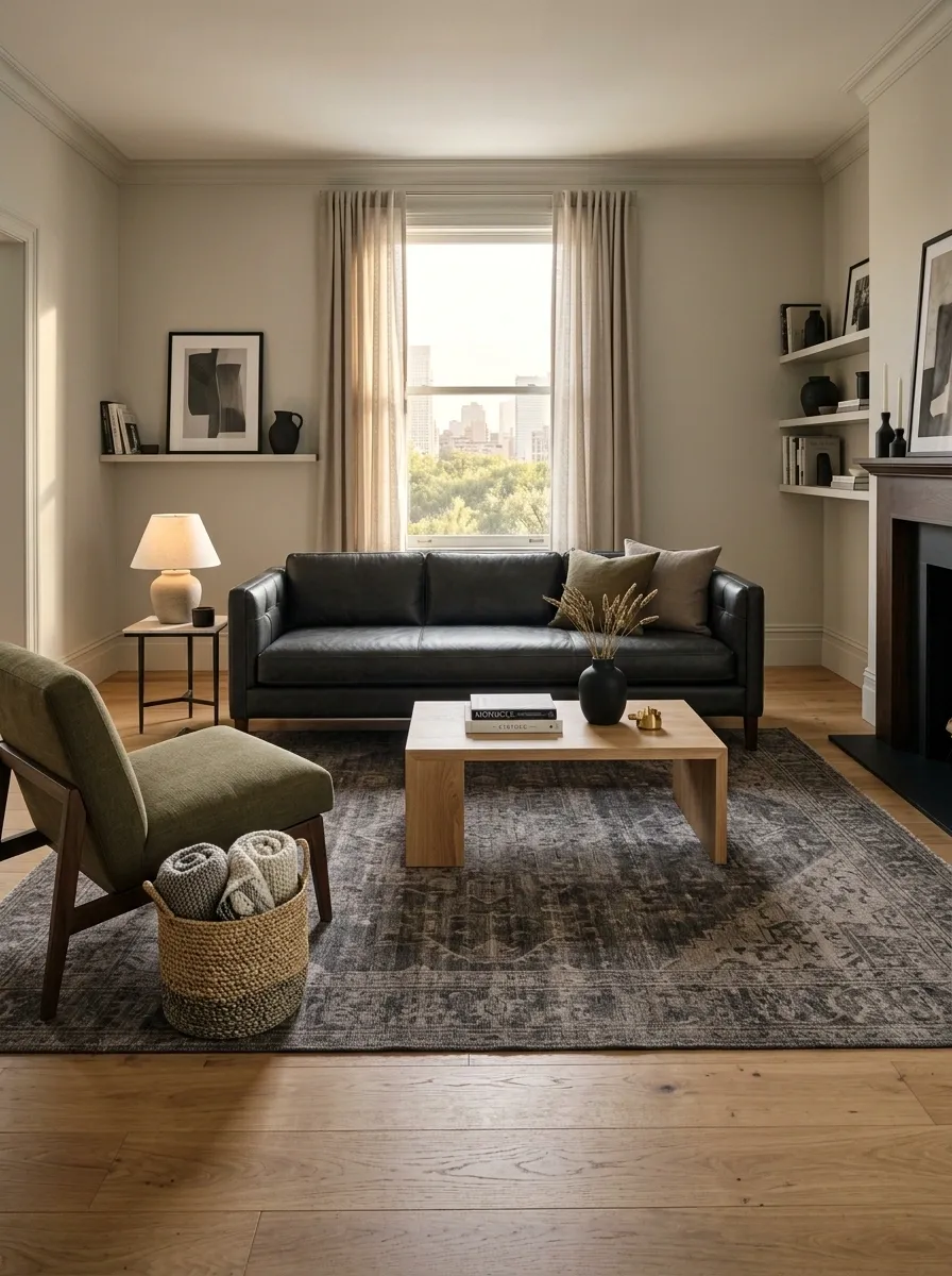
A tiny rug floating under the coffee table makes the furniture look like it got separated during shipping.
The rug should visually connect the sofa, coffee table, and any nearby chair. In a compact apartment, that connection is especially useful because it creates one clear zone without needing walls or room dividers.
Choose a low-pile rug in a muted pattern or solid texture. Charcoal, taupe, olive, cream, and faded geometric patterns work well with masculine materials.
Place at least the front portion of the main seating on the rug. Let the flooring remain visible around the outside so the room doesn’t feel boxed in.
Give Your Favorite Hobby One Deliberate Display Spot
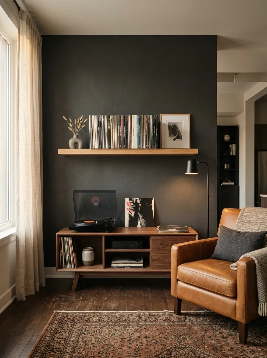
The best hobby displays look personal because they aren’t trying to prove anything.
Pick one collection, interest, or activity that actually matters and give it a proper home. A row of vinyl records can fill one shelf. Framed jerseys can occupy one wall. A few well-placed gaming collectibles can sit beside the console.
Edit harder than you decorate.
Leave empty space around the display so each piece can breathe. Mix objects with different heights rather than lining everything up like a retail shelf.
The goal isn’t to show every possession acquired since high school. It’s to create one corner that instantly tells people what the room is about.
One home.
Less clutter.
Make the Coffee Table Do More Than Hold a Remote
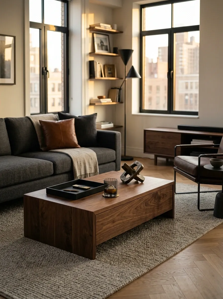
A good coffee table is the room’s landing pad.
Choose one with enough surface for drinks and snacks, but don’t turn it into a permanent electronics parking lot. Wood brings warmth beside darker furniture. Stone or stone-look finishes give the room more visual weight. A lower profile keeps the sightline open toward the TV.
Keep the styling brutally edited: one tray, one useful object, and one piece with texture or personality. Leave plenty of empty surface for actual use.
Because a beautiful coffee table covered in six remotes, unopened mail, and a charging cable isn’t really beautiful. It’s just occupied.
Bring in Black Metal Without Making the Room Feel Cold
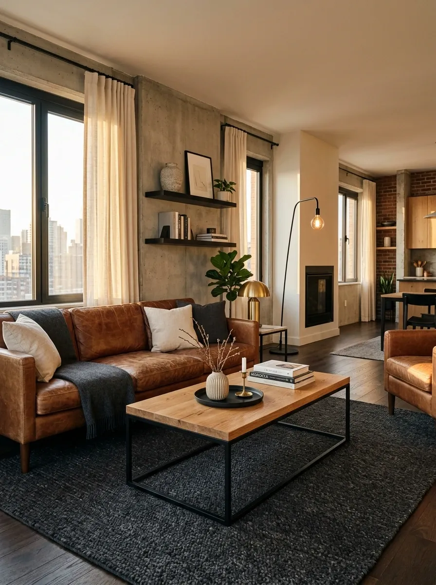
Black metal works because it gives the room structure. Too much of it, though, and the apartment starts looking like a furniture showroom designed by a locksmith.
Use it on smaller architectural pieces: a floor lamp, coffee table frame, shelving brackets, curtain rod, or side table base. Then soften those pieces with wood, woven fabric, leather, or a plush rug.
Keep the metal framework thin and the soft materials substantial.
That contrast is what makes the room feel masculine without becoming harsh. The goal is controlled visual weight, not a collection of objects that all look ready for a factory tour.
Create a Reading or Relaxation Seat Away From the TV
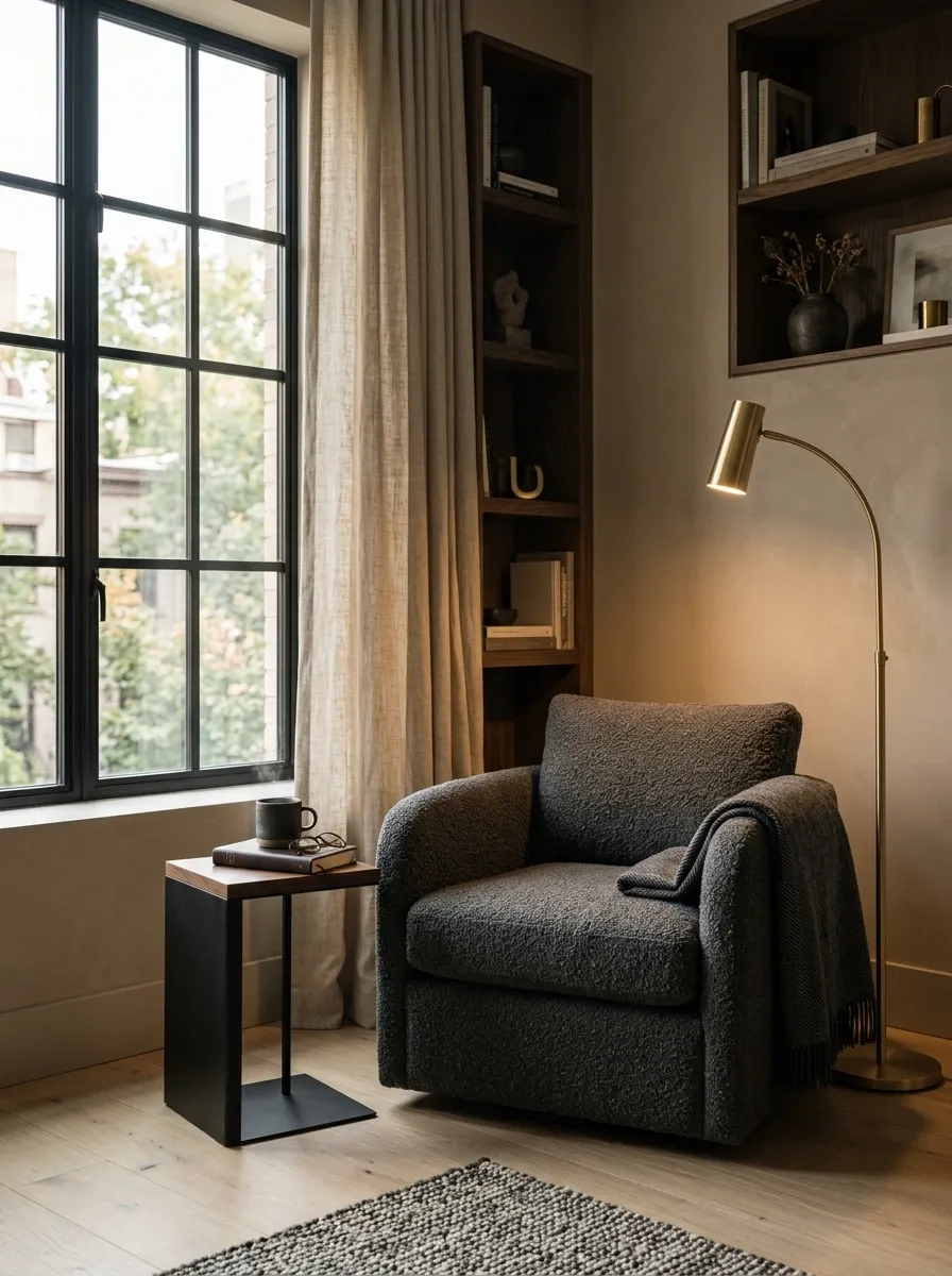
Not every square inch needs to face a screen.
A single lounge chair in a quieter corner gives the apartment a second purpose. Put it beside a floor lamp, add a tiny side table, and leave enough room for the chair to rotate or recline comfortably.
This works especially well near a window or in a corner that feels disconnected from the main entertainment zone.
Keep this area deliberately simple:
- One comfortable chair
- One useful table
- One warm lamp
- One small personal detail
It gives the room somewhere to breathe. Also, sometimes watching TV for four straight hours is not the sophisticated lifestyle statement people think it is.
Build a Gallery Wall Around Personal Interests, Not Random Prints
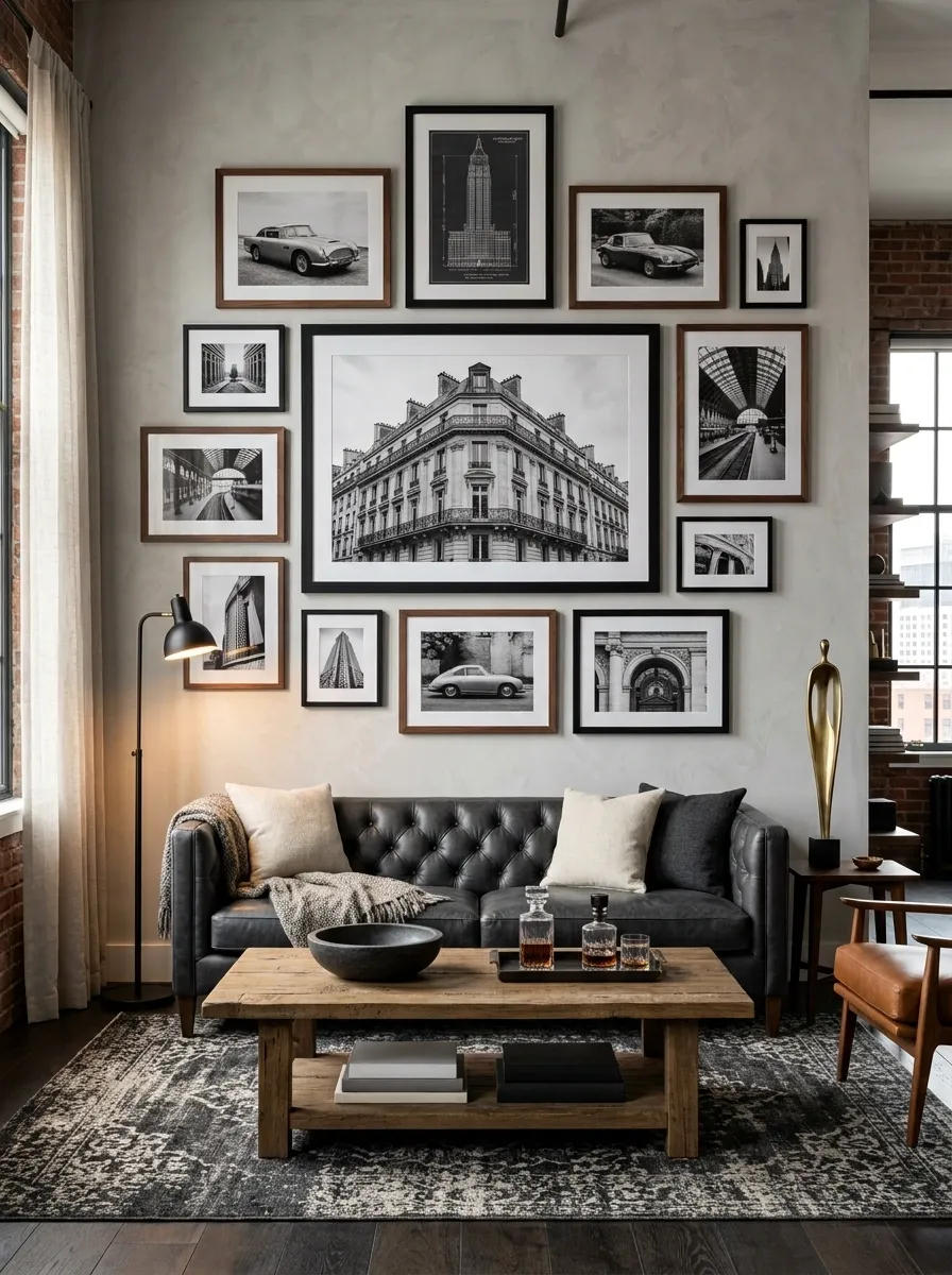
A gallery wall should tell one story.
Sports, music, travel, cars, gaming, photography, film, or vintage graphics can all work. The mistake is mixing every interest into one wall because there happens to be empty space.
Choose a single theme, then vary the frame sizes and artwork scale. Keep a consistent thread through the pieces, such as black frames, warm wood frames, or a repeated accent color.
Start with the largest piece and build around it.
That keeps the arrangement grounded instead of turning the wall into a chaotic collection of rectangles.
And no, every blank spot does not need a frame. The wall is allowed to have hobbies and oxygen.
Mixed scale.
Consistent frames.
Put the Desk in Its Own Visual Zone
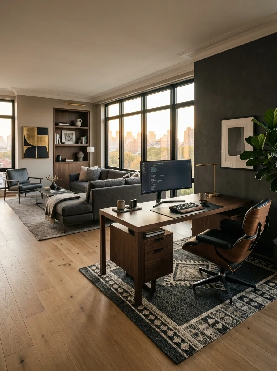
A work desk shouldn’t look like it wandered into the living room and decided to stay.
Give it a clear boundary through placement, a rug, a different wall color, or a narrow shelf nearby. The desk should face a purposeful direction rather than becoming another giant rectangle competing with the TV.
Keep the desktop lean. Monitor, lamp, keyboard, and the few things used every day are enough. Store paperwork and spare gear underneath.
The visual goal is simple: when sitting at the desk, the area feels like a workstation. When sitting on the sofa, it disappears into the room.
That’s how a one-room apartment gets multiple functions without looking like five different apartments are sharing rent.
Turn an Empty Entry Wall Into a Functional Landing Zone
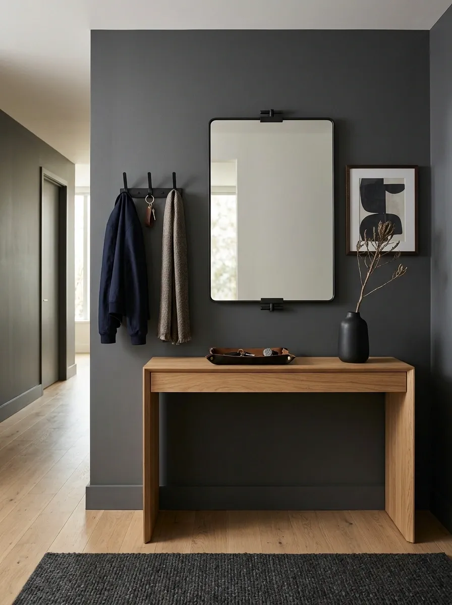
The entryway is easy to ignore because everyone is already thinking about the sofa.
Don’t.
A narrow console, wall hooks, a tray for keys, and a mirror can turn that dead strip of wall into one of the most useful parts of the apartment. Keep the profile slim so the entrance remains easy to walk through.
Use the area to reinforce the design language established in the living room. Black metal, warm wood, a dark framed mirror, or a small piece of artwork will make the apartment feel considered from the moment someone walks in.
Function first. Personality second. Clutter never.
Give Sports Gear a Proper Home Instead of Leaning It Against the Wall
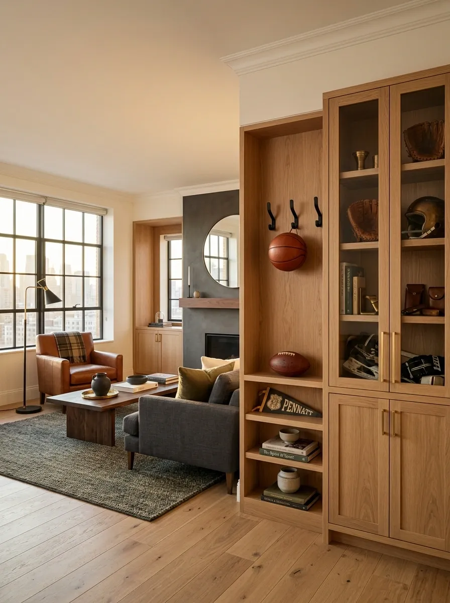
Sports gear becomes visual clutter the second it loses its designated spot.
A slim equipment rack, wall hooks, storage bench, or tall cabinet can keep basketballs, gloves, helmets, bats, or training equipment together without letting them spill into the living area.
Choose the storage method based on what gets used most. Daily gear deserves easy access. Seasonal equipment can disappear behind a door.
Keep the display intentional:
- One featured jersey can be framed
- Frequently used gear stays at hand
- Bulky equipment goes into closed storage
- Duplicate items don’t need shelf space
The apartment can show personality without looking like the garage lost its walls.
Use Warm Lamps to Make Electronics Feel Less Clinical at Night
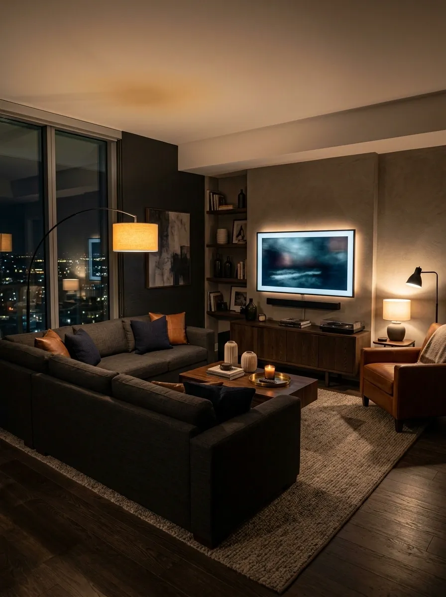
Screens already produce enough cold light. The rest of the apartment shouldn’t join them.
Place a warm floor lamp near the sofa, a small table lamp on the media console, and another light source near the secondary seating or desk. Keep some lights slightly behind furniture so the room gets pools of illumination rather than one flat wash.
This matters even more when the room contains a lot of black electronics. Warm light brings back the softness that screens take away.
At night, the goal isn’t brightness. It’s depth.
A darker room with several warm light sources will feel dramatically more inviting than a brightly lit room with twice the amount of decoration.
Let One Signature Chair Carry the Personality of the Room
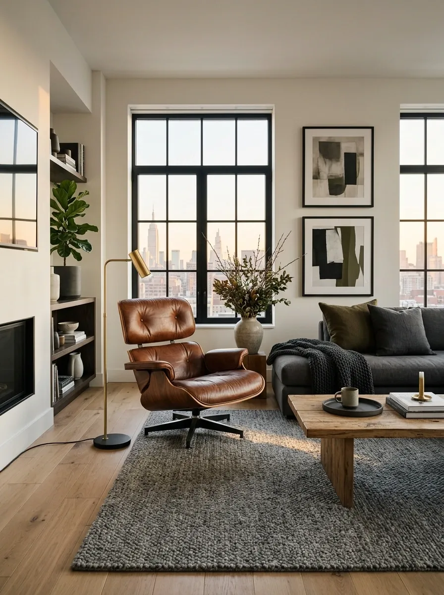
Sometimes the sofa is doing its job perfectly and the room still feels anonymous.
That’s when one serious chair earns its place.
Choose a shape with enough visual presence to stand apart from the sofa, such as a leather lounge chair, sculptural upholstered chair, or deep reading chair. Give it room around the sides instead of squeezing it between two pieces of furniture.
The chair should look intentional before anyone even sits in it.
A rich brown leather chair can warm up charcoal furniture. A deep olive chair can connect darker colors to lighter walls. A textured neutral chair can soften a room full of hard electronics.
One memorable chair beats three forgettable accent chairs every time.
Use Shelving to Display Collections Without Creating Clutter
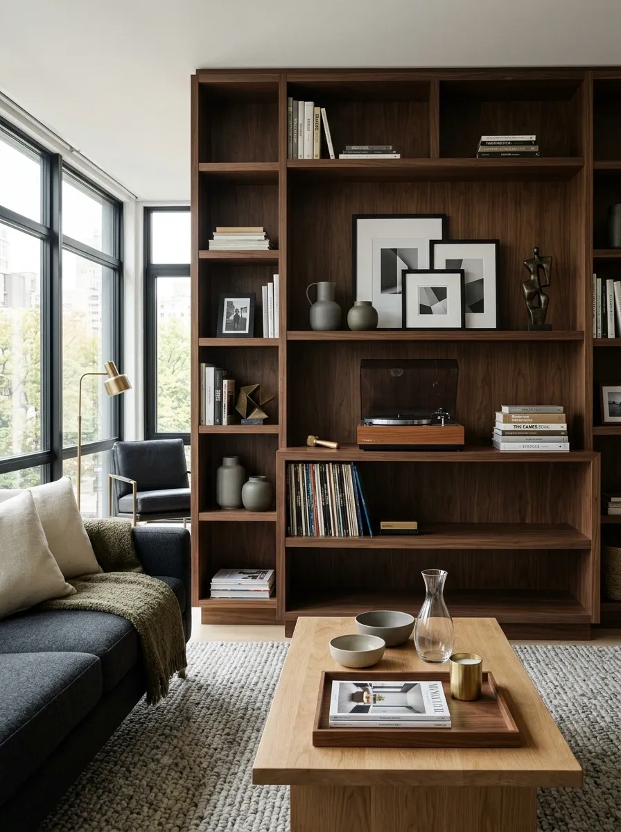
Shelves become ugly when every object gets equal billing.
Build visual hierarchy instead. Put the largest or most interesting pieces at different heights, leave some shelves partly empty, and group smaller objects rather than scattering them individually.
Books can sit beside a collectible. A framed photo can lean behind a smaller object. A record player can share a console with a few carefully chosen records. The display should have quiet areas between the interesting areas.
Try this shelf edit:
- Remove everything.
- Put back the largest pieces first.
- Add only a few smaller companions.
- Leave open space where the arrangement already feels balanced.
Empty shelf space isn’t wasted space. It’s what makes the stuff that’s actually worth keeping look better.
Make the Entire Apartment Feel Like One Connected Man Cave
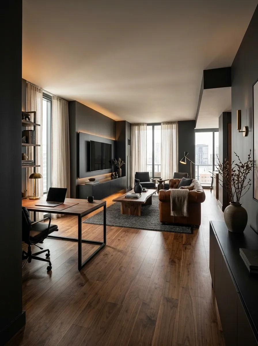
The biggest mistake is treating the living room as the man cave and every other room as unrelated territory.
Carry a few elements throughout the apartment instead. Repeat the same darker accent, similar wood tones, black hardware, warm lighting, or related textiles. The pieces don’t need to match. They just need to feel like they’re speaking the same visual language.
Use the strongest personality pieces where they matter most. Keep the quieter rooms simple enough to support them.
Think apartment-wide, not room-by-room.
That creates something much better than a themed room. It creates a home that feels masculine, comfortable, personal, and genuinely lived in.
And thankfully, none of this requires a neon sign saying MAN CAVE. The room should be able to introduce itself.
The Finished Look
A strong apartment man cave doesn’t come from buying more stereotypically masculine things. It comes from making better decisions about space, scale, lighting, materials, storage, and personality.
Start with the main comfort zone. Give the TV a proper visual anchor. Let wood warm up darker finishes. Keep cables and random gear out of sight. Give hobbies a defined place instead of turning every shelf into a museum. Then repeat the same visual language across the apartment so the whole place feels intentional.
The best version won’t look like a themed room someone assembled in one weekend. It’ll look like a real home that happens to have excellent taste, excellent seating, and absolutely no need for a neon sign explaining what room you’re in.
Save this list for the next furniture rearrange, apartment refresh, or moment when the living room starts looking suspiciously like a storage facility.