
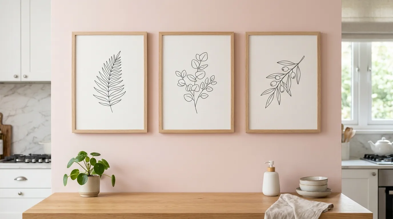
Most kitchens have a wall that’s doing nothing.
It’s not bad. It’s just blank. White paint, maybe a clock, the kind of nothing that disappears the second you stop looking at it directly.
That’s the wall this list is interested in. Not the cabinets, not the island, not the marble everyone photographs for the listing. The wall behind the stove. The wall behind the sink. The dead vertical space above the counter that nobody plans for, because plans are for cabinets and appliances, and walls are just where the cabinets get screwed in.
Twenty kitchens below disagree with that arrangement entirely. Each one took the wall everyone else ignores and made it the reason you’d walk into the room. None of them did it the same way twice, and none of them needed a full renovation budget to prove the point.
Why your kitchen wall is doing nothing
Most kitchen walls fail for the same handful of reasons. They’re not ugly. They’re just undecided, and undecided reads as boring from across the room.
The Builder-Grade Autopilot
Subway tile isn’t a bad material. It’s a default, and defaults are what happen when nobody makes an actual decision.
It got chosen because the show home had it, or the contractor suggested it, or three-by-six-inch tile felt like the safe answer to a question nobody wanted to think too hard about.
The problem isn’t the tile. It’s that an entire wall got filled with the visual equivalent of a shrug.
Every kitchen on this list made an actual decision about that wall. Some of those decisions took six weeks longer to install. All of them required someone to choose something on purpose.
Wall As Storage Backdrop
Open shelving gets installed, dishes get loaded onto it, and the wall behind the shelves gets treated as nothing more than the thing holding the brackets up.
That’s backwards. The wall is the part of the composition doing the most visual work. The shelves are furniture. The wall is the room.
A flat white wall behind open shelving means the shelves are competing with nothing, which sounds easy and looks empty. There’s no depth, no surface for light to catch, nothing for the eye to register before it lands on the bowls.
Too Matched to Notice
A kitchen where the walls, the cabinets, the counters, and the floor are all whispering the same neutral palette is not calm. It’s invisible.
Coordination isn’t the same as good design. A room needs at least one surface willing to disagree with everything around it, or the eye has nowhere to rest and nothing to remember.
Most of the kitchens that get forgotten the second you leave them made the mistake of agreeing with themselves on every single surface.
Kitchen Wall Ideas Worth Losing the Subway Tile For
Twenty walls, twenty completely different bets. None of them played it safe.
Forest Green Zellige Wall
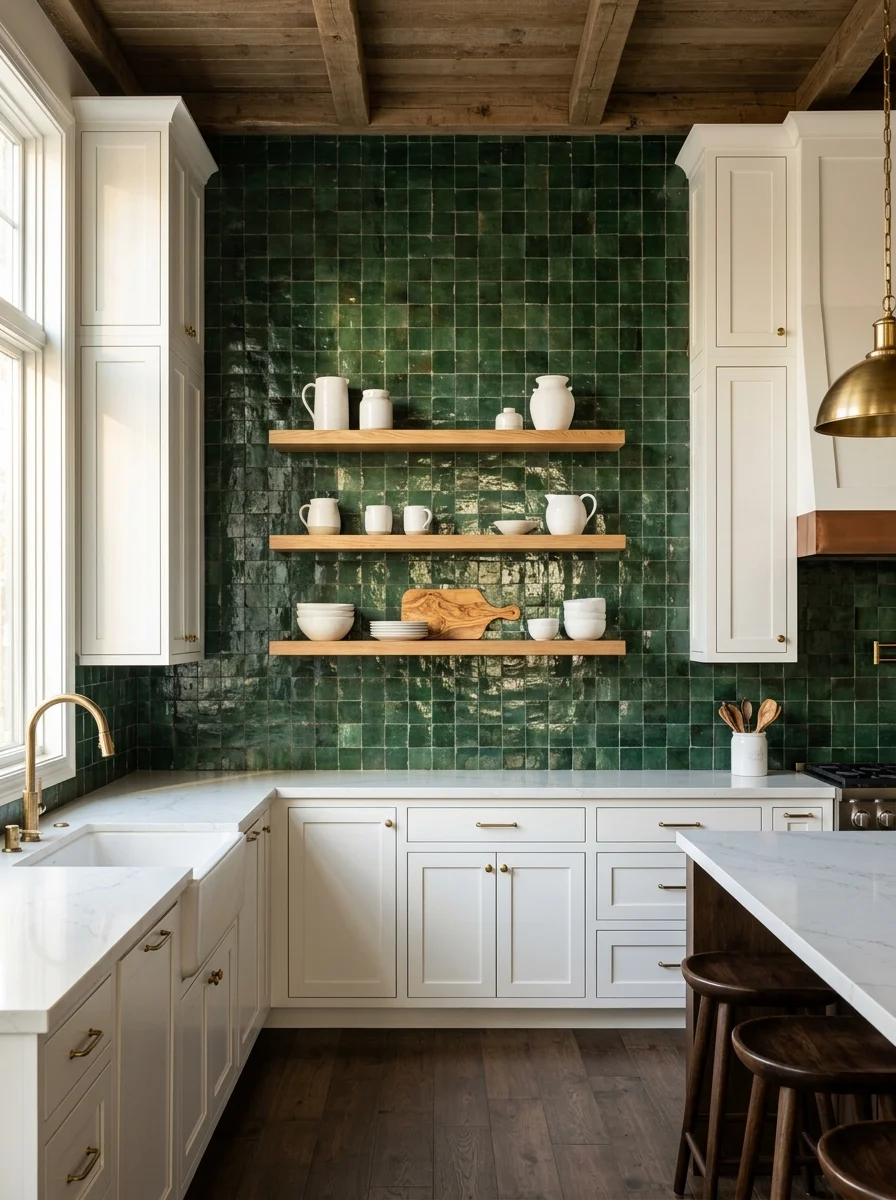
Pick a deep, glazed forest green zellige tile — the handmade kind with pooled glaze and slightly uneven edges, not a uniform ceramic in the same shade. The unevenness is the entire point. It’s what makes light bounce differently across the wall instead of sitting flat.
Run the tile floor to cabinet, covering a single full wall rather than a strip behind the stove. A small patch of zellige reads as an accent. A full wall reads as architecture.
Mount two or three floating wood shelves directly into the tile rather than building separate cabinetry around them. Keep the brackets simple and let the tile do the visual work behind a small, curated collection of stoneware.
Skip grout in a contrasting color. White or pale grout against this deep a green will read as a grid instead of a surface, and the whole effect depends on the tile reading as one continuous, glowing expanse.
Antiqued Mirror Tile Hood
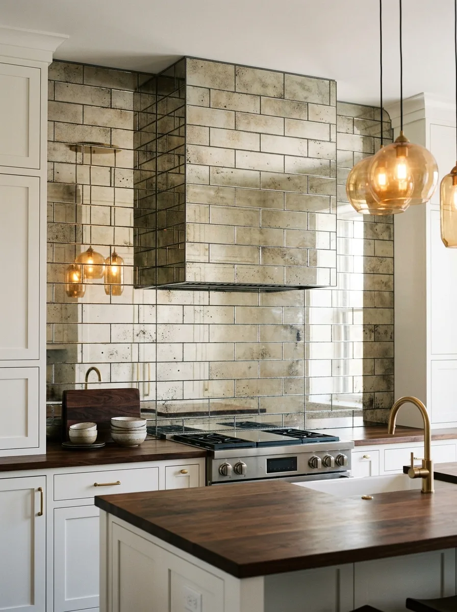
Source antiqued mirror tile — glass deliberately treated to look foxed, spotted, and decades old — in a small subway format, then run it floor to ceiling across both the hood and the surrounding backsplash as one continuous surface.
The antiquing is the part to get right. A clean, modern mirror tile here reads cold and a little try-hard. The imperfect, cloudy patina is what makes the surface feel collected rather than installed last Tuesday.
Pair it with warm brass fixtures and amber glass pendant lighting. The mirror tile will catch and multiply that warm light all day, which is the actual payoff of choosing reflective tile over a flat one.
Keep the surrounding cabinetry simple and pale. This wall is doing enough work reflecting the entire room back at itself — it doesn’t need competition from a busy cabinet color.
Backlit Onyx Slab Wall
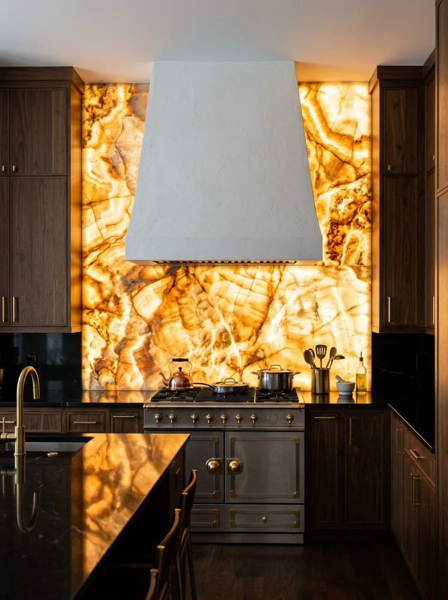
Choose a single dramatic slab of honey or amber onyx — the kind with visible veining and enough natural translucency to glow when lit from behind — and install it as one continuous backsplash rather than seaming multiple smaller pieces together.
Backlighting is non-negotiable here. Onyx looks like ordinary stone under regular light and looks like something else entirely with an LED panel mounted behind it. This needs to be planned with an electrician before the slab goes in, not added afterward.
Frame the slab with dark, plain cabinetry — walnut or another deep wood reads best — so the glowing stone has nothing competing with it for attention. A pale or busy cabinet finish will fight the slab instead of setting it off.
Keep the hood above it deliberately plain and matte. A heavily textured plaster hood in white or cream gives the glowing stone room to be the only dramatic element in the room.
Vintage Copper Pot Wall
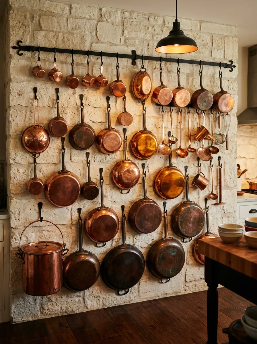
Mount a horizontal iron rail — or two, stacked — directly onto an exposed stone or whitewashed brick wall, using individual S-hooks rather than a single bar with fixed spacing. The irregular spacing is what lets the pots hang at different heights and depths.
Source mismatched vintage copper pots, pans, and ladles rather than a matching set. The patina differences between pieces — some bright, some darkened, some green with age — are what make the wall read as collected rather than purchased as a kit.
Layer pan sizes deliberately: largest pieces on the bottom rail, smaller pans and utensils filling the gaps above. Density matters here. A sparse copper wall looks unfinished; a packed one looks intentional.
Leave the wall material exposed rather than painted. Raw stone or brick behind aged copper does more work than any tile could, because the rough texture under the smooth metal is what sells the whole look.
Arched Backlit Plaster Niches
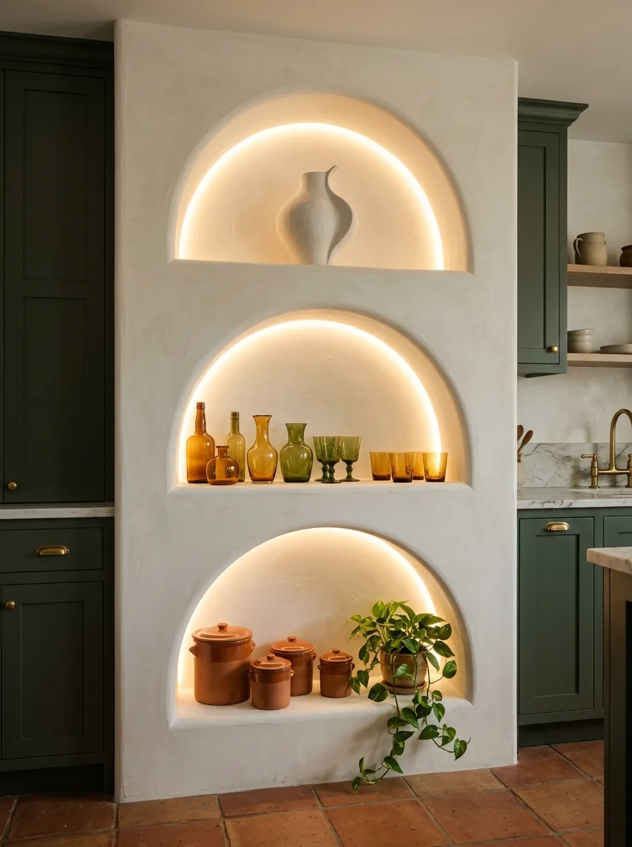
Carve — or have a contractor build out — three stacked arched recesses into a plastered wall, each one slightly smaller than the one above it, with depth sufficient to hold a single object or a small grouping.
Install warm LED strip lighting around the curved edge of each niche before the final plaster coat goes on. The light needs to wash up against the curve from behind, not shine forward from the front, or the arch shape disappears.
Style sparingly. One sculptural vase in the top niche, a small grouping of colored glass in the middle, a cluster of crocks and a trailing plant in the bottom. Each niche should hold noticeably less than feels natural — the glow is doing the visual work, not the objects.
Finish the surrounding wall in the same plaster as the niches themselves, in an unbroken expanse of warm white. Any visible seam between niche and wall breaks the illusion that the whole thing was carved from one material.
Hand-Painted Lemon Grove Mural
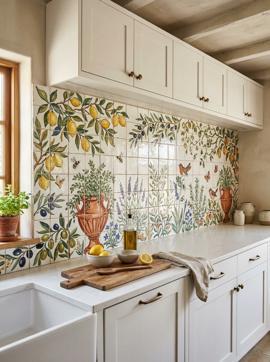
Commission — or source pre-painted — a hand-painted tile mural depicting a continuous garden scene: lemon branches, olive trees, lavender stalks, birds and bees worked across the grout lines so the image reads as one unbroken painting rather than repeating tiles.
Run the mural the full length of the counter, from window to corner, rather than as a small framed section. A mural this detailed needs room to actually tell a story, and a short run reads as a single decorative tile rather than a scene.
Keep the cabinetry plain and pale in a warm off-white. This is the one wall allowed to be this detailed, and it needs cabinetry quiet enough to let the painted scene stay the obvious focal point.
Style the counter below with real lemons, a terracotta urn, and a sprig of fresh herb in a small pot. Echoing the painted imagery with actual objects on the counter is what makes the whole wall feel inhabited rather than purely decorative.
Woven Fringe Wall Tapestry
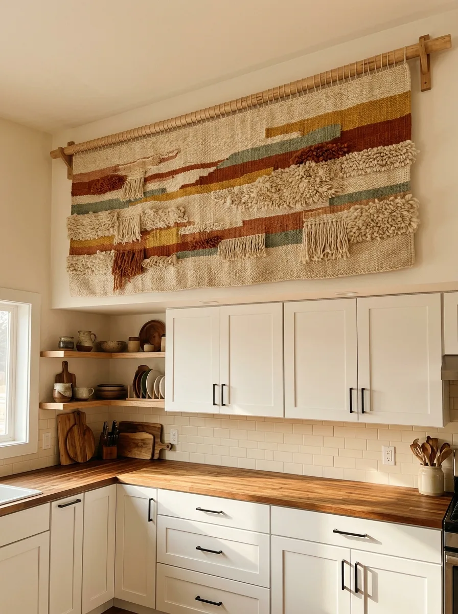
Hang a large handwoven textile — thick wool, mixed yarn weights, deliberate fringe and looped texture — from a simple wood dowel mounted on two wall brackets, positioned above the cabinetry rather than centered on an empty wall.
Choose a piece with a mix of flat-woven bands and raised, shaggy texture rather than a uniform flat weave. The textural contrast within the piece itself is what reads as handmade rather than mass-produced.
Pick a color story that pulls from the wood tones already in the kitchen — rust, ochre, sage, cream — so the tapestry feels connected to the room instead of dropped in from somewhere else.
Leave the wall around it bare. A textile this busy needs negative space on either side to read as art rather than clutter, so resist the urge to add shelving or hooks directly beside it.
Carved Moroccan Plaster Relief
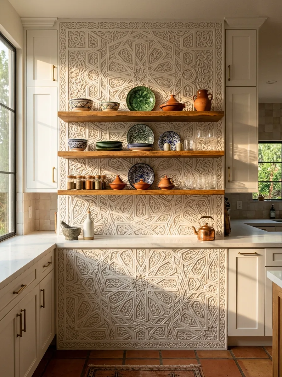
Have a plaster specialist hand-carve a geometric star pattern directly into a wet plaster wall, working the design across the full height rather than confining it to a small decorative panel.
This is a skilled trade, not a weekend project. The pattern needs to be carved while the plaster is still workable, which means it has to be planned and executed by someone who’s done it before — there’s no painting your way to this effect afterward.
Install floating wood shelves directly into the carved surface, positioned to interrupt the pattern rather than frame it cleanly. The relief should feel like it continues behind the shelves, not stop politely where the shelf begins.
Style the shelves with patterned ceramics — tagines, painted plates, glassware — that echo the geometry of the carving without matching it exactly. The goal is conversation between the flat pattern and the dimensional carving, not repetition.
Chalkboard Menu Wall
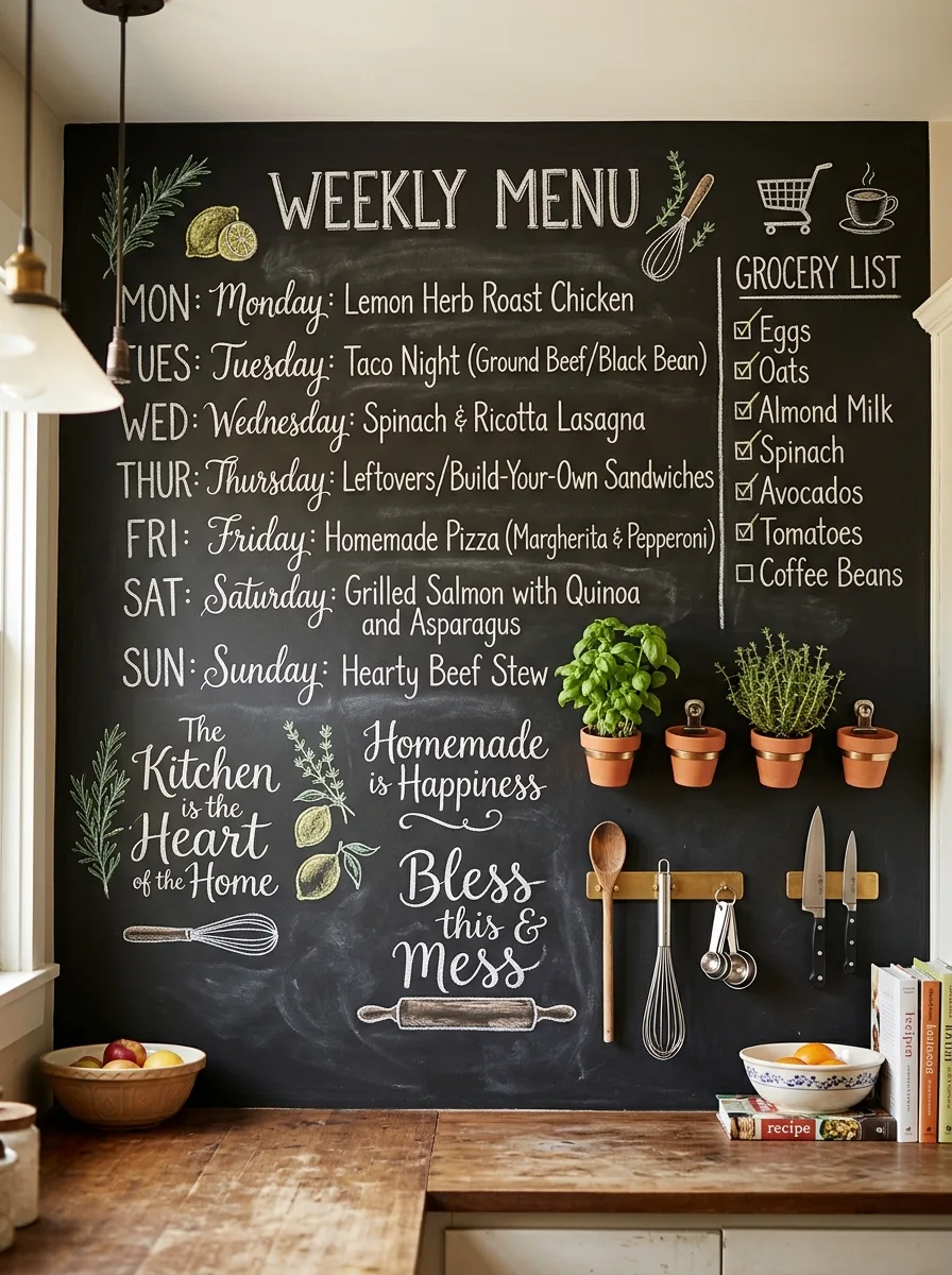
Paint or install an oversized chalkboard panel across a full wall — large enough to hold a weekly menu, a grocery list, and decorative lettering with room to spare, not a small café-style board that disappears against the wall.
Hand-letter the content rather than using stencils. Mixed type styles, a few small illustrated flourishes like a sprig or a whisk, and visibly human handwriting are what separate a charming chalkboard from a printed sign pretending to be one.
Mount small terracotta pots with fresh herbs directly onto the board’s surface using simple wall brackets, alongside a magnetic or hook-mounted strip for knives and frequently used tools. The wall needs to function as hard as it looks decorative.
Update the menu weekly, even imperfectly. A chalkboard with last month’s dinner plan still on it stops being charming and starts being a chore nobody finished. The smudges and rewrites are part of what makes it feel lived in.
Lime-Washed Terracotta Plaster
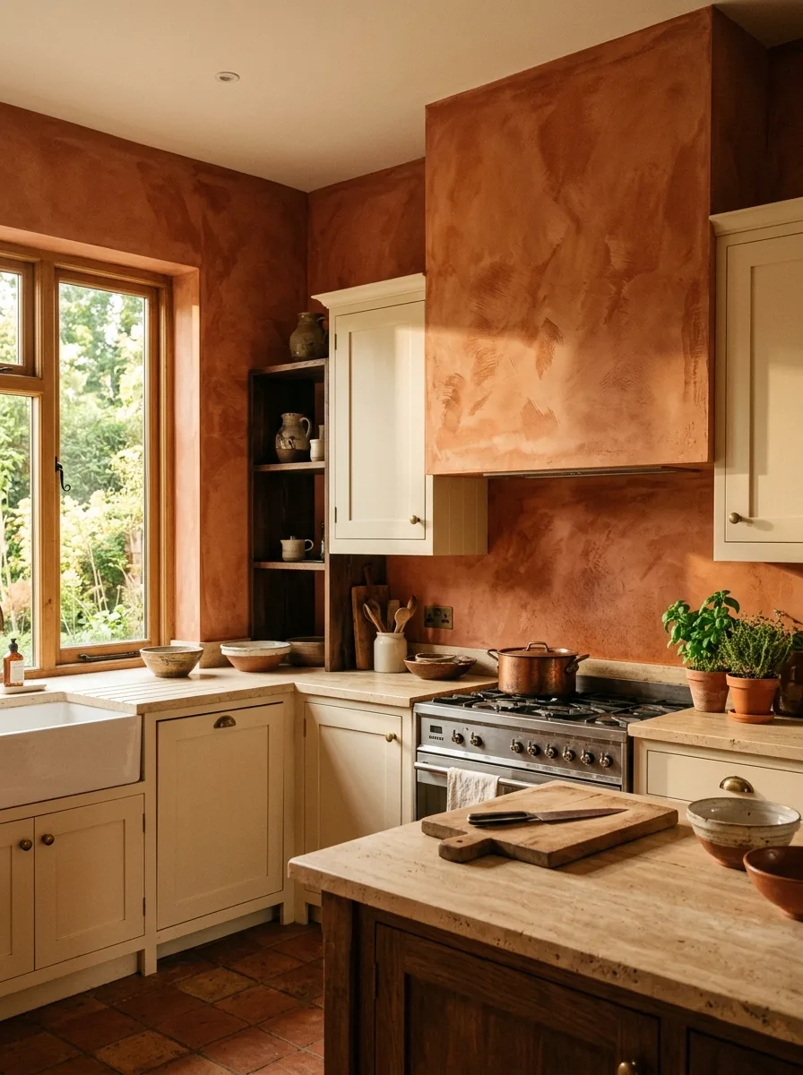
Apply a lime-wash plaster finish in a deep burnt-orange or terracotta tone across the full wall and range hood as one continuous surface, working the trowel in irregular, overlapping passes rather than smoothing it perfectly flat.
The texture variation is the entire effect. Lime wash should show streaks, cloudy patches, and faint brush marks where the pigment settled unevenly — a flawless, uniform application looks like paint and defeats the purpose of choosing plaster in the first place.
Carry the same tone up and over the range hood rather than stopping at the backsplash. Treating the hood as part of the wall, not a separate appliance, is what makes the whole corner feel like one sculpted mass instead of a tiled section with a metal box bolted on top.
Pair it with warm stone counters and simple cream cabinetry. This finish needs the rest of the kitchen to stay quiet and warm-toned, or the terracotta starts competing with itself instead of anchoring the room.
Full-Wall Kitchen Pegboard
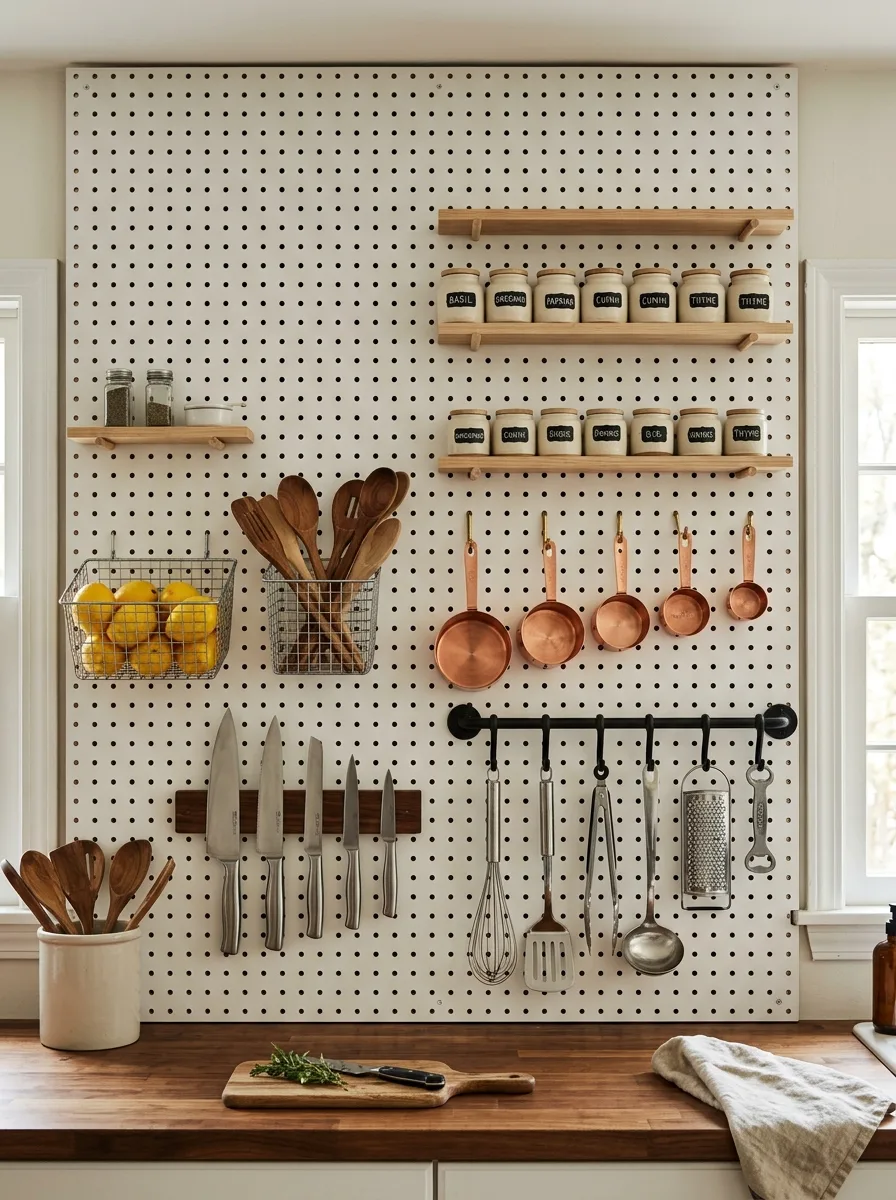
Install an oversized pegboard panel across the full wall above a work counter, using a wood or metal peg system rather than the thin hardware-store hooks that bend under real weight.
Mount narrow wood shelves directly into the pegboard for labeled spice jars, keeping the labeling handwritten or simply printed rather than decorative. This wall needs to function as a working station first — the visual appeal comes from everything having an obvious, accessible place.
Hang knives on a magnetic strip, utensils in a wire basket, and measuring tools directly on pegs rather than tucking them in drawers. The entire point of a pegboard wall is visibility — if the most-used tools aren’t the ones on display, the wall isn’t doing its job.
Leave breathing room between groupings. A pegboard crammed edge to edge with no negative space reads as cluttered instead of organized, so leave small gaps between the spice shelf, the knife strip, and the utensil hooks.
Moroccan Patchwork Mosaic Tile
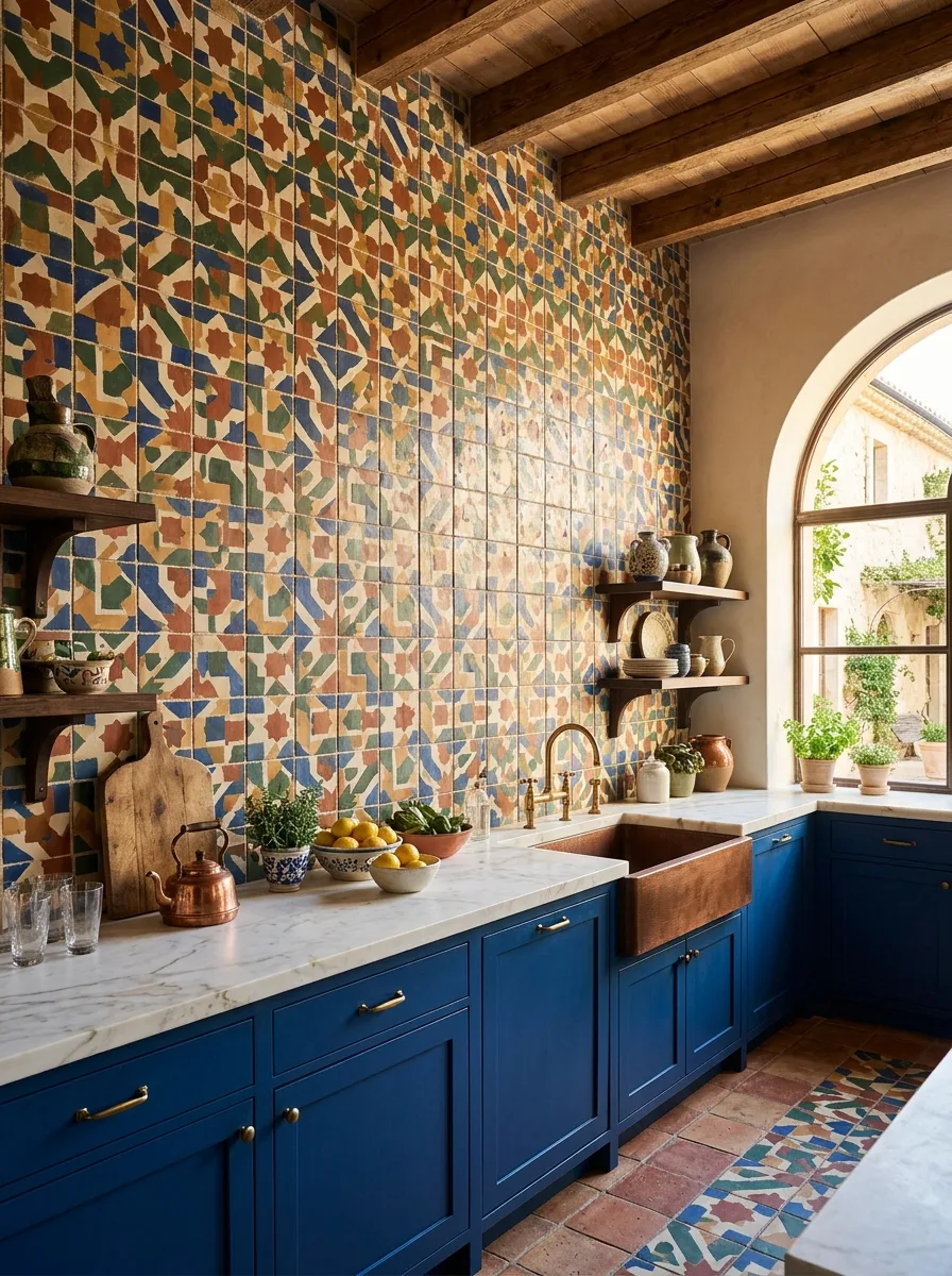
Source small-format zellige tile in several colorways — blue, ochre, terracotta, sage — and have it installed in an intentionally irregular patchwork rather than a repeating pattern, so no two adjacent sections read identically.
Run the tile floor to ceiling across the full wall, treating it as architecture rather than a backsplash strip. A patchwork this complex needs the scale of a full wall to read as a cohesive design instead of a busy accident.
Pair it with a single saturated cabinet color — a deep navy or cobalt works particularly well — rather than a neutral. The tile has so many colors competing already that a strong, singular cabinet tone gives the eye one stable thing to land on.
Echo the wall in a complementary but distinct patchwork pattern on the floor, using leftover or coordinating tile, so the two surfaces speak the same visual language without becoming one indistinguishable mass of pattern.
Backlit Wood Slat Wall
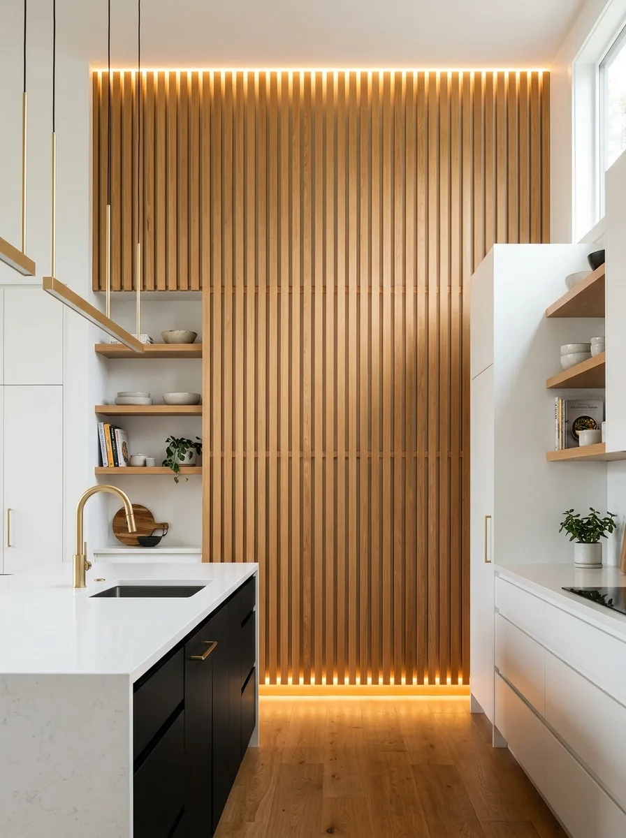
Install vertical wood slats — evenly spaced, same depth, same finish — across a full wall, running them floor to ceiling rather than stopping at counter height. The repetition of identical slats is what creates the rhythm; uneven spacing ruins the effect.
Recess warm LED strip lighting along the top and bottom edges of the slatted section, angled to wash up and down the wall rather than shining straight out. The light should appear to glow from behind the slats, not sit visibly in front of them.
Choose a warm wood tone — oak or walnut — against white or black cabinetry rather than matching the slats to the rest of the millwork. The contrast between the wood texture and the flat painted cabinets is what makes the slat wall read as a deliberate feature instead of more cabinetry.
Keep everything else in the kitchen minimal. This wall depends on negative space and clean lines around it; ornate hardware or busy countertops will compete with a feature that’s supposed to read as quiet and architectural.
Abstract Geometric Painted Mural
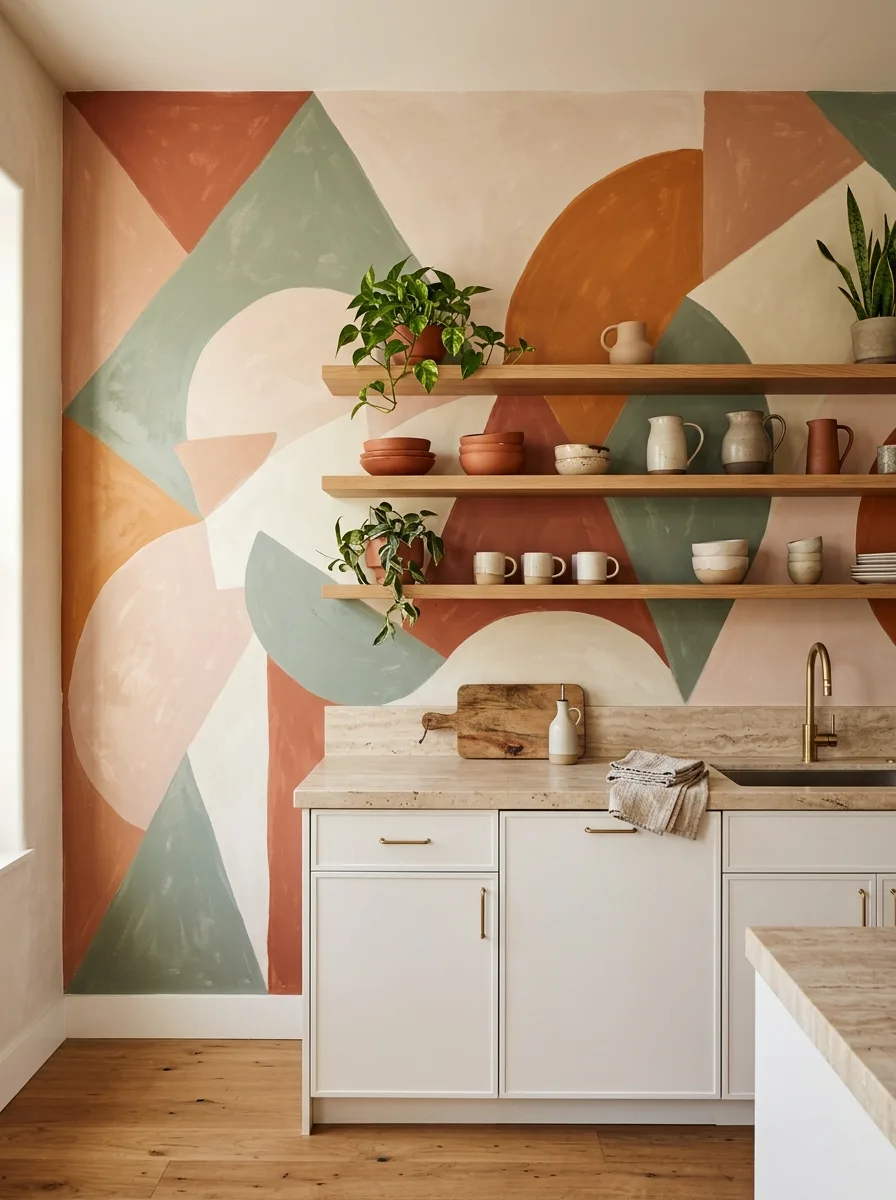
Paint a large-scale abstract composition directly onto the wall — overlapping circles, triangles, and arcs in a warm, muted palette of terracotta, sage, blush, and cream — working freehand or with large taped sections rather than a precise stenciled grid.
Scale the shapes to the wall, not to a piece of paper. The largest forms should span several feet; small, fussy shapes will read as wallpaper rather than a mural, and the whole point is scale that a printed pattern couldn’t replicate.
Install floating wood shelves over the painted surface and style them sparsely — a few plants, simple stoneware, nothing that visually competes with the mural’s color blocking. The wall is the art here; the shelf objects are just punctuation.
Match the countertop and lower cabinetry to the palest tone in the mural rather than introducing a new color. Pulling one shade directly from the painted wall keeps the whole kitchen feeling like a single considered palette instead of two separate decisions.
Hanging Dried Flower Ceiling
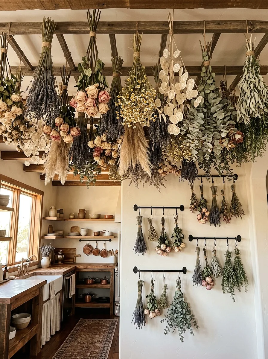
Install simple iron rods or hooks across exposed ceiling beams, then hang bundles of dried flowers and foliage — lavender, roses, pampas grass, eucalyptus — tied at the stem with twine, varying the bundle sizes so the ceiling reads as gathered rather than uniform.
Mix textures deliberately: feathery pampas against structured rose heads against trailing eucalyptus. A ceiling full of one single dried flower looks like a craft display; a mix of textures and heights looks like an actual harvest.
Extend the idea down one adjacent wall using horizontal iron rods with smaller bundles hung at varying lengths, so the ceiling installation doesn’t end abruptly at the wall junction but flows downward into it.
Let the flowers fade and dry further over time rather than replacing them constantly. Dried botanicals are meant to change color and texture as months pass — that slow shift is the appeal, not a flaw to fix.
Delft Blue Tile Mosaic
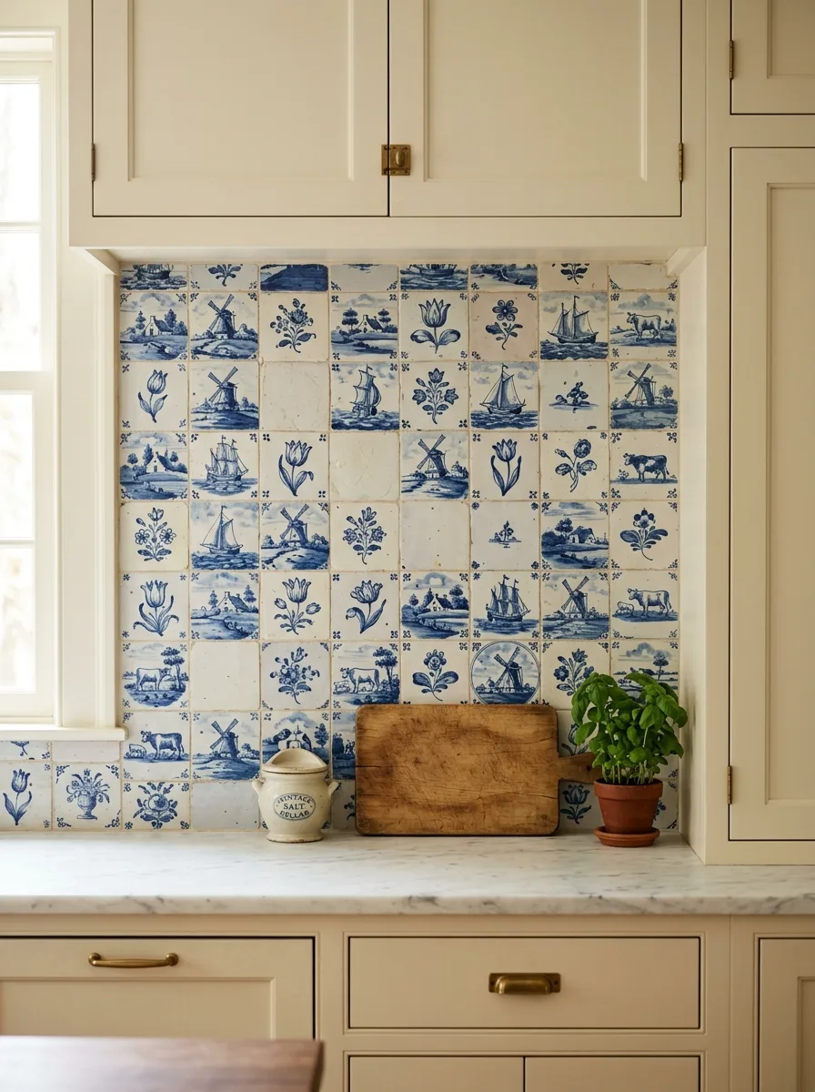
Source genuine or reproduction Delft tile — blue and white ceramic squares depicting windmills, tulips, ships, and farm animals — and install them in a deliberately uneven grid, allowing a handful of plain white tiles to interrupt the pattern at random.
Those blank interruptions matter more than they look like they should. A wall of edge-to-edge illustrated tile reads busy and overwhelming; scattered plain squares give the eye somewhere to rest between scenes.
Frame the installation within a recessed nook rather than running it the full length of the counter. Containing this much pattern within a defined boundary keeps it feeling like a curated collection instead of an entire room committed to one motif.
Keep the surrounding cabinetry in a soft, warm cream rather than stark white. Delft blue tends to look harsh against a cold white and considerably warmer against an off-white or buttery tone.
Vintage Plate Gallery Wall
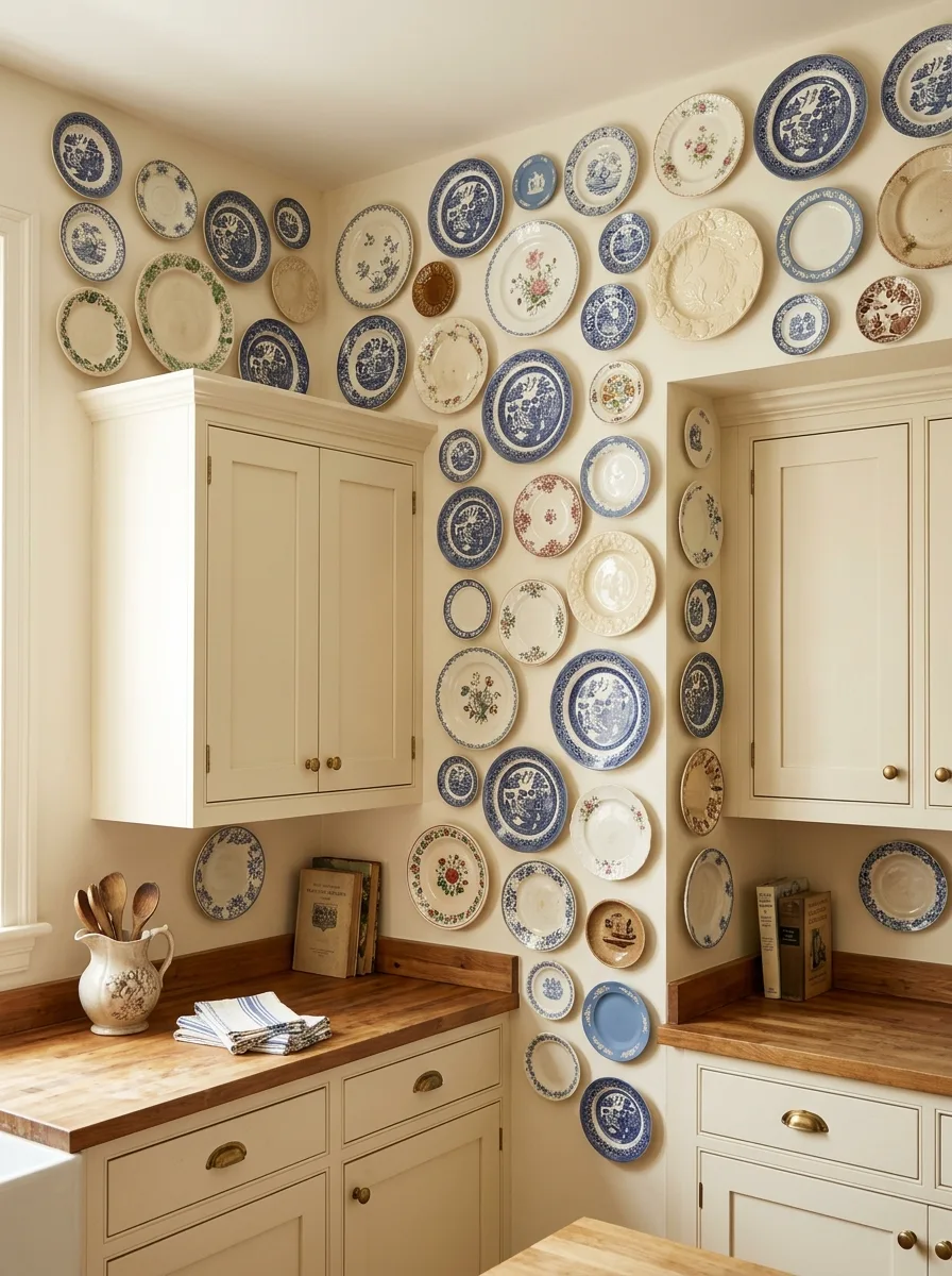
Collect a large number of mismatched vintage plates — transferware, willow pattern, floral, plain cream — and arrange them salon-style across the full wall, varying the sizes deliberately rather than grouping by size.
Plan the layout on the floor before hanging a single plate. A wall this dense needs the spacing worked out in advance, because moving nail holes after the fact is far more work than laying plates out on a rug first and photographing the arrangement from above.
Let the collection wrap around an architectural feature — a window edge, a cabinet corner — rather than confining it to one flat rectangle of wall. Plates that follow the actual shape of the room read as collected over years, not installed in an afternoon.
Mix in a few non-plate objects: an old book spine, a small painted plaque. A wall of plates and nothing else starts to look like a single-purpose display; a few unexpected objects keep it feeling like an actual collection.
Two-Tone Painted Shiplap
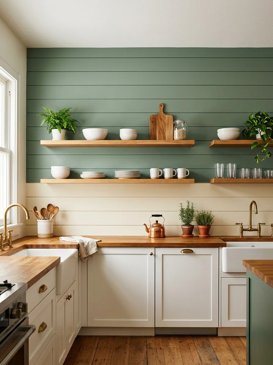
Install horizontal shiplap paneling across the full wall, then paint the upper portion a muted sage or olive green and the lower portion a warm cream, dividing the two tones at a clean horizontal line rather than blending them.
Choose the dividing line deliberately — just above counter height, or aligned with the bottom of the upper cabinetry — so the color break reads as architectural rather than arbitrary. A division that lines up with an existing structural element always looks more intentional than one that doesn’t.
Mount floating wood shelves directly over the painted line, letting them straddle both colors. The shelf becomes the visual anchor that ties the two tones together instead of just splitting the wall into two flat halves.
Keep the lower cabinetry in the same cream as the wall’s bottom half, so the color story reads as one continuous gesture from floor to ceiling rather than three separate decisions stacked on top of each other.
Sequined Wedding Blanket Wall
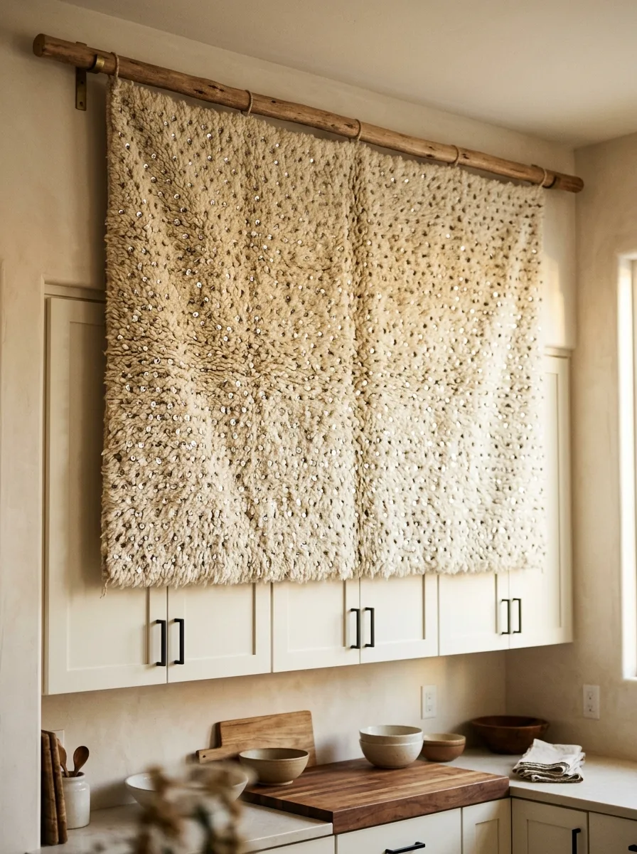
Source an authentic or well-made reproduction Moroccan wedding blanket — the fuzzy, cream-toned wool style flecked with hand-sewn sequins — and drape it over a simple wood dowel mounted on two wall brackets above the cabinetry.
Let the blanket hang with its natural texture intact rather than stretching or framing it flat. The shag and the sequin shimmer are what make this read as a textile with history, and pressing it flat under glass kills the entire effect.
Position it where afternoon light will hit it directly. The sequins are the whole point of this piece, and they only do their job when sunlight catches them and scatters it back across the room.
Keep the wall around the blanket completely bare and the cabinetry plain and pale. This is a textured, light-catching object that needs total visual silence around it to actually register as a feature rather than a forgotten throw.
Living Moss Wall Installation
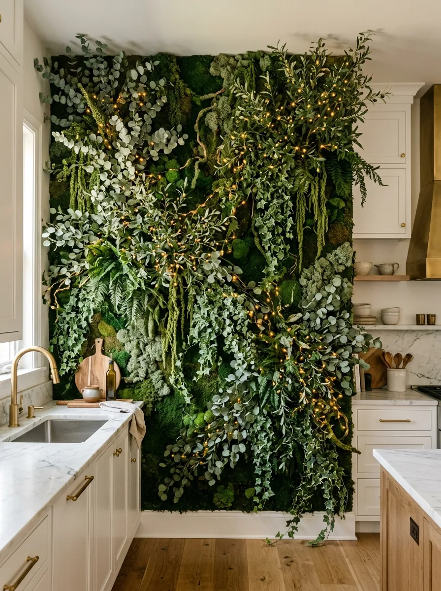
Build a vertical garden using preserved moss panels as the base layer, then layer in faux or preserved ferns, eucalyptus, and trailing ivy directly into the moss in clusters rather than evenly spaced rows.
Weave warm white fairy lights through the greenery while it’s being assembled, not after. Threading the lights in at the same time as the foliage means they end up tucked behind leaves rather than sitting visibly on top, which is what makes the glow look like it’s coming from within the wall itself.
Vary the depth of the planting. Some clusters should sit nearly flat against the moss base, others should project several inches out and trail downward past the counter edge. Flat, uniform depth is what makes a living wall look like a single green panel instead of an actual garden.
Position it where it gets some natural light, even with preserved materials. A living wall in a windowless corner reads as artificial no matter how good the materials are; one near a window catches enough natural light to look genuinely alive.
Final Thoughts
Every kitchen on this list made the same basic bet: that one wall, committed to fully, beats four walls that all agree to be inoffensive.
None of them needed an open floor plan or a six-figure renovation to make that bet pay off. A carved plaster relief and a chalkboard with a grocery list on it are not the same investment, and they’re not trying to impress the same person. What they share is conviction. Somebody looked at a blank wall and refused to let it stay blank.
That’s the actual lesson buried under the tile samples and the dried flower bundles. A kitchen doesn’t need every surface working hard. It needs one surface working on purpose, and the rest of the room willing to get out of its way.
Pick your wall. Decide what it’s made of before you decide what color it is. Then commit to it the way none of your neighbors’ kitchens ever did.