
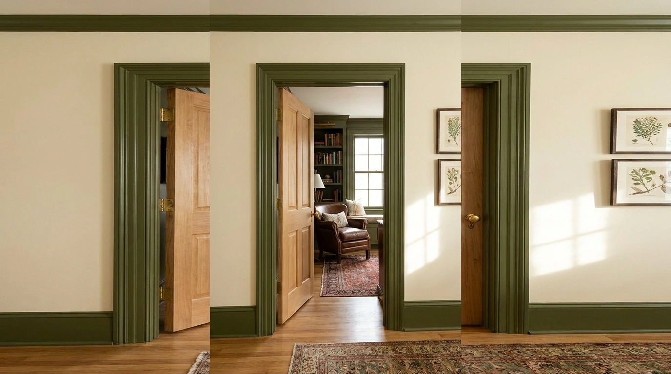
Door frames spend years being painted white out of habit. Some deserve a more interesting assignment.
A colored frame can sharpen an opening, connect neighboring rooms, or give an ordinary hallway a little character. It is a relatively small surface, so you can be bolder here than you might be across an entire wall.
First, decide what you are painting: the face of the trim, the inner reveal, or the whole opening. Those choices produce different effects.
Use a paint system appropriate to the existing material and finish, preserve door operation and hardware, and investigate old or unknown coatings before sanding or scraping. (EPA preparation guidance for older painted surfaces)
Frames That Supply the Color
Charcoal Around a Warm-White Opening
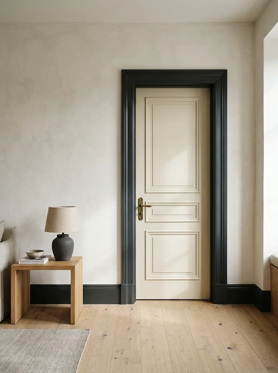
Charcoal gives a pale room a clear architectural edge without requiring black furniture everywhere.
Keep the wall white warm rather than icy, then repeat the dark tone in one small object nearby. A narrow picture frame or lamp base is enough. If the door is also dark, the opening becomes more substantial; a pale door keeps the frame itself more visible.
A dark outline, a light center
Warm-white wall · charcoal casing · one small dark echo
Oxblood Trim Against Muted Pink
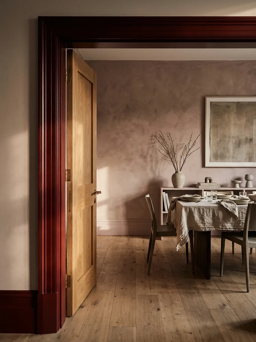
Oxblood gives a pink room depth without adding a completely unrelated color.
Try it around a dining-room or sitting-room doorway, with the door itself pale or timber-toned. Choose a pink with a little brown or gray in it. Bright candy pink creates a different mood, and the frame may start looking less like architectural detail and more like a very confident lipstick campaign.
| Main surface | Supporting finish |
|---|---|
| Muted pink wall | Oxblood frame |
| Pale or timber door | Small bronze detail |
Forest Green With Cream Walls
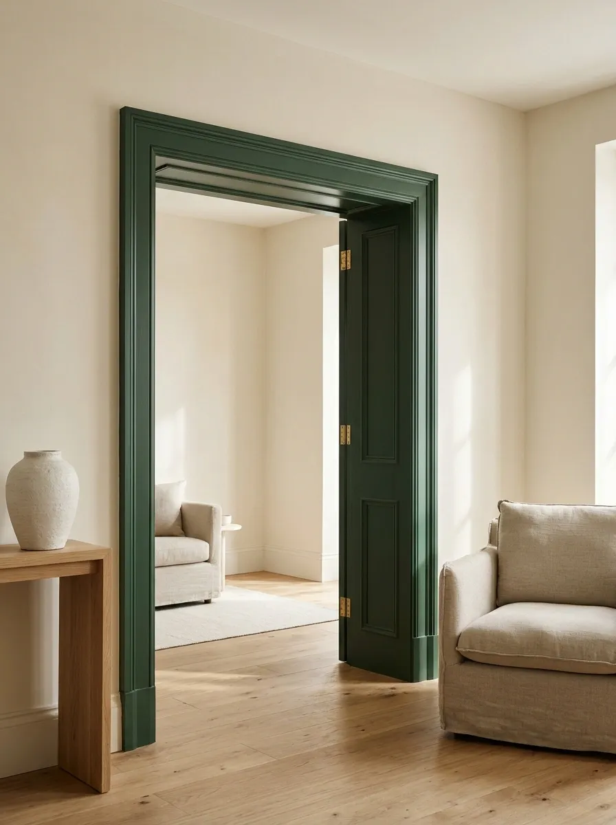
Forest green suits a frame with enough width to show its color clearly.
Use cream around it and let natural wood provide a third material. The green can connect with a curtain or cabinet elsewhere, but it does not need a matching decorative plant at every corner. Keep the opening crisp so the color reads as part of the building rather than a collection of accessories.
Keep the supporting palette simple: cream, wood, and one warm metal finish make reliable company for the green.
Cobalt Around an Otherwise Quiet Doorway
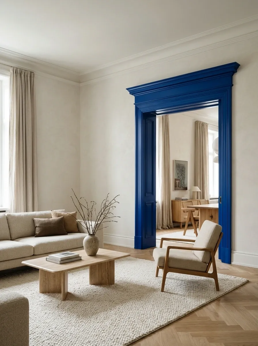
A cobalt frame makes an ordinary opening memorable. It is particularly effective when the surrounding room is restrained.
Paint a generous sample and view it from the adjoining room before committing. The frame is visible in more than one composition, which is part of its appeal and occasionally part of the problem. Keep nearby artwork from competing in exactly the same bright blue.
Let the opening carry the accent
Keep the adjacent wall and larger furniture relatively calm.
Butter Yellow on a Small Interior Frame
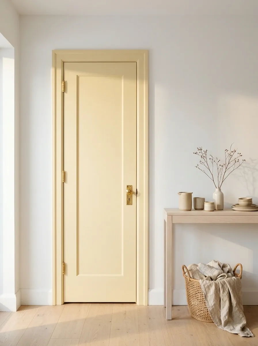
Butter yellow can add a gentle highlight to a white interior without making the whole room feel yellow.
Use a soft, creamy shade rather than a sharp lemon. It works well beside pale wood and warm neutrals, especially on a small opening where the frame can read as a cheerful detail. Compare the sample with the actual wall white; some combinations look pleasantly warm, while others look accidentally dingy.
Sample beside: the wall, the floor, and any nearby white cabinetry.
Tonal Approaches With Less Contrast
Frame and Wall in the Same Color
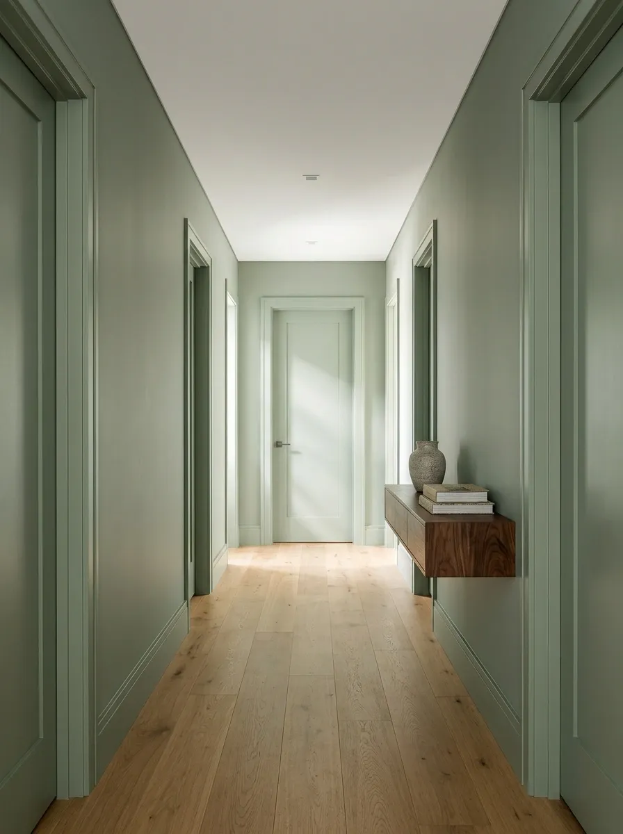
Painting the trim and wall together lets the shape remain while the color contrast recedes.
This can suit a hallway with several doors or a room where you want the furniture to lead. Keep paint specifications appropriate to each surface, even if the color matches. A unified appearance does not require using the identical product on plaster, timber, and metal.
The profile becomes the detail
A Frame Slightly Deeper Than the Wall
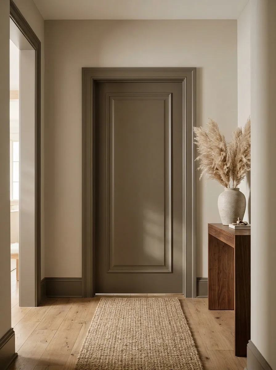
Choose a frame color with the same general undertone as the wall, but enough depth to outline the opening.
Mushroom walls with deeper taupe trim are a useful example. The contrast should be visible at room scale. If the two shades are almost indistinguishable, the result can look like a mismatched paint batch rather than a deliberate decision.
| Aim for | Avoid |
|---|---|
| Shared undertone | Similar colors that disagree subtly |
| Clear difference in depth | Accidental almost-matching |
| A sample viewed from a distance | Choosing from tiny chips alone |
A Pale Door Inside a Midtone Frame
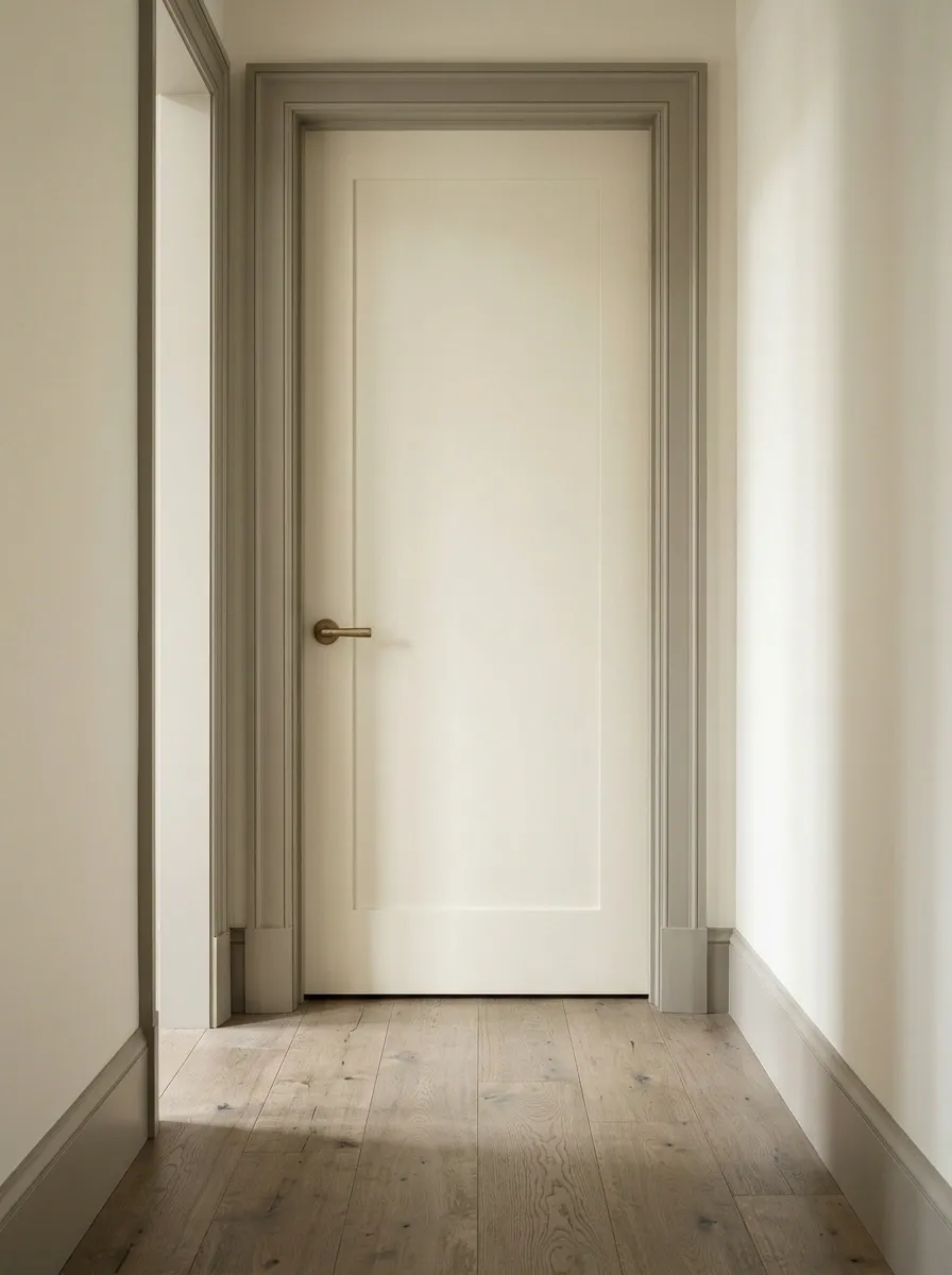
You can make an existing pale door feel more considered by giving it a midtone surround.
Try warm gray around cream, faded green around ivory, or tobacco around pale beige. The door stays visually light while the frame provides structure. Repeat the frame tone in a larger material nearby, such as the floor or furniture, rather than buying an accessory purely to justify it.
Useful for: a plain door that works perfectly well and has no need to be replaced for decorative reasons.
One Color With a Deliberate Sheen Difference
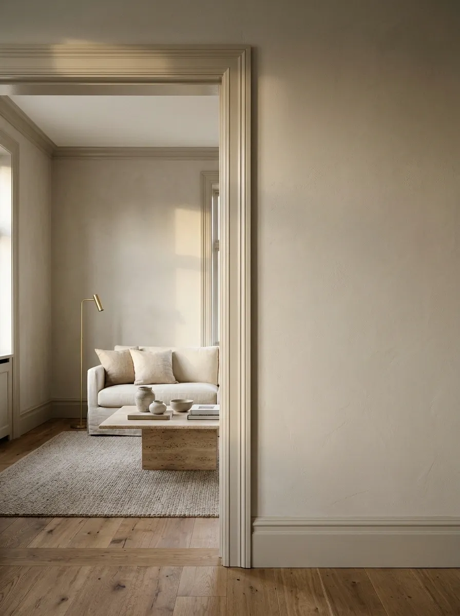
The same color can look different across a matte wall and a more reflective trim finish.
Use compatible products and test the completed combination. Sheen can reveal the frame profile without introducing another paint color, but it can also emphasize poor preparation. Keep the finish suitable for the surface and the wear it receives; higher shine is not a requirement for an interesting doorway.
Change how the light meets the surface
Painted Trim Around a Natural-Wood Door
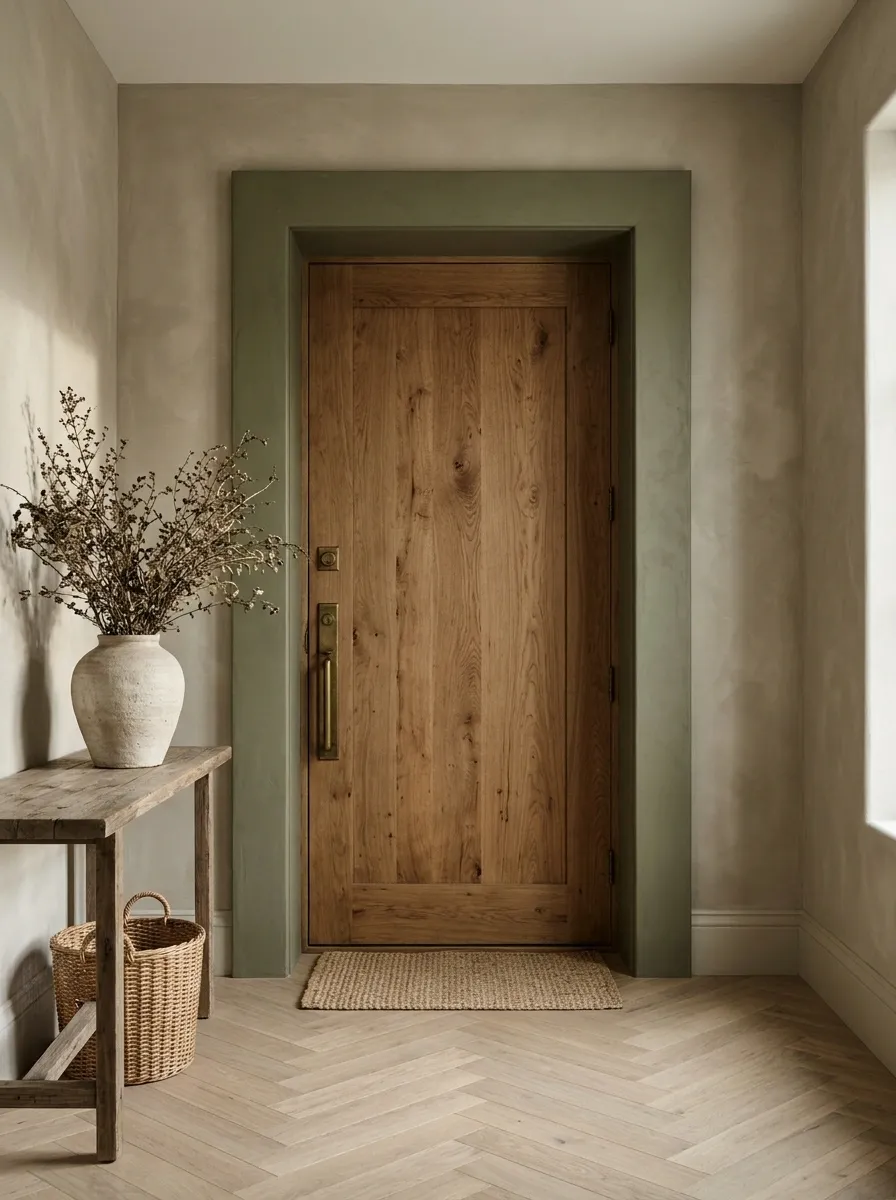
A timber door can become a focal point when its surround supplies a calmer painted edge.
Choose the color against the wood’s actual undertone. Olive, deep brown, and muted blue can all work, but a sample is more useful than a generic rule. Keep attractive grain visible and avoid painting a good wooden door simply because the frame needs refreshing.
Let the materials differ: paint defines the outline; the door provides grain and warmth.
Small Color Changes Within the Opening
A Bright Inner Reveal With a Quiet Outer Frame
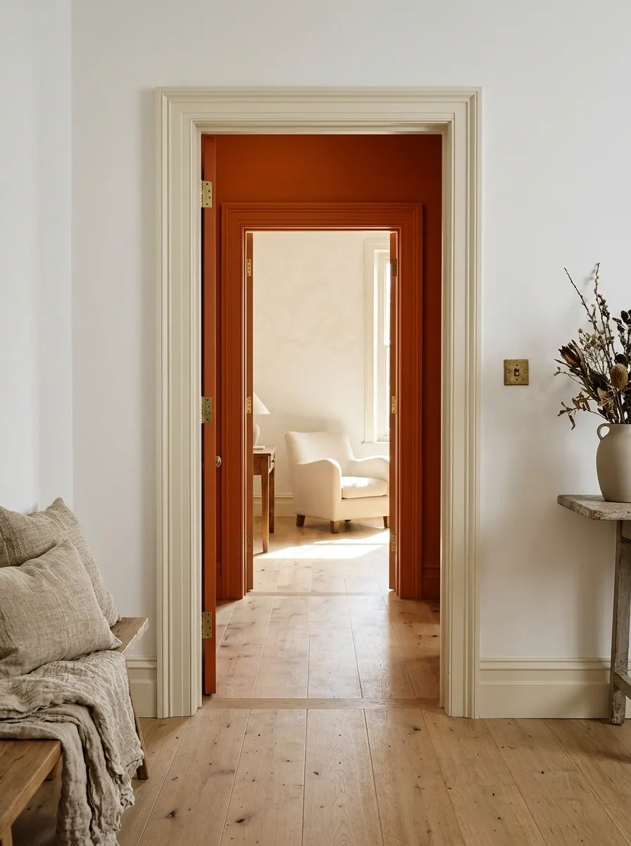
The inner reveal is the surface you see as you pass through the opening. Giving it color creates a small surprise while the outer casing stays restrained.
Try rust, blue, or green inside a pale frame. Plan the stopping lines carefully so the color looks intentional from both directions. Keep stops, seals, and functional hardware appropriately treated; decoration should not make the door harder to use.
A quiet face, a colored reveal
A Reveal That Borrows the Next Room’s Color
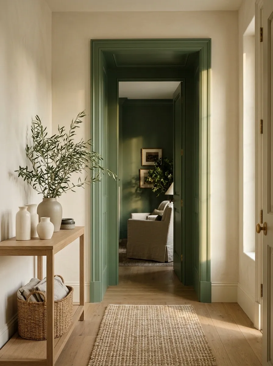
Bring a color from the room beyond into the opening itself.
A green sitting room can lend green to the reveal seen from a cream hall. This makes the transition feel connected rather than introducing a third unrelated accent. Check the view with the door open and closed, since the colored surface may become more or less visible depending on the position.
| Hall | Opening | Next room |
|---|---|---|
| Quiet neutral | Borrowed color | The same color in a larger surface |
A Narrow Painted Line Around the Casing
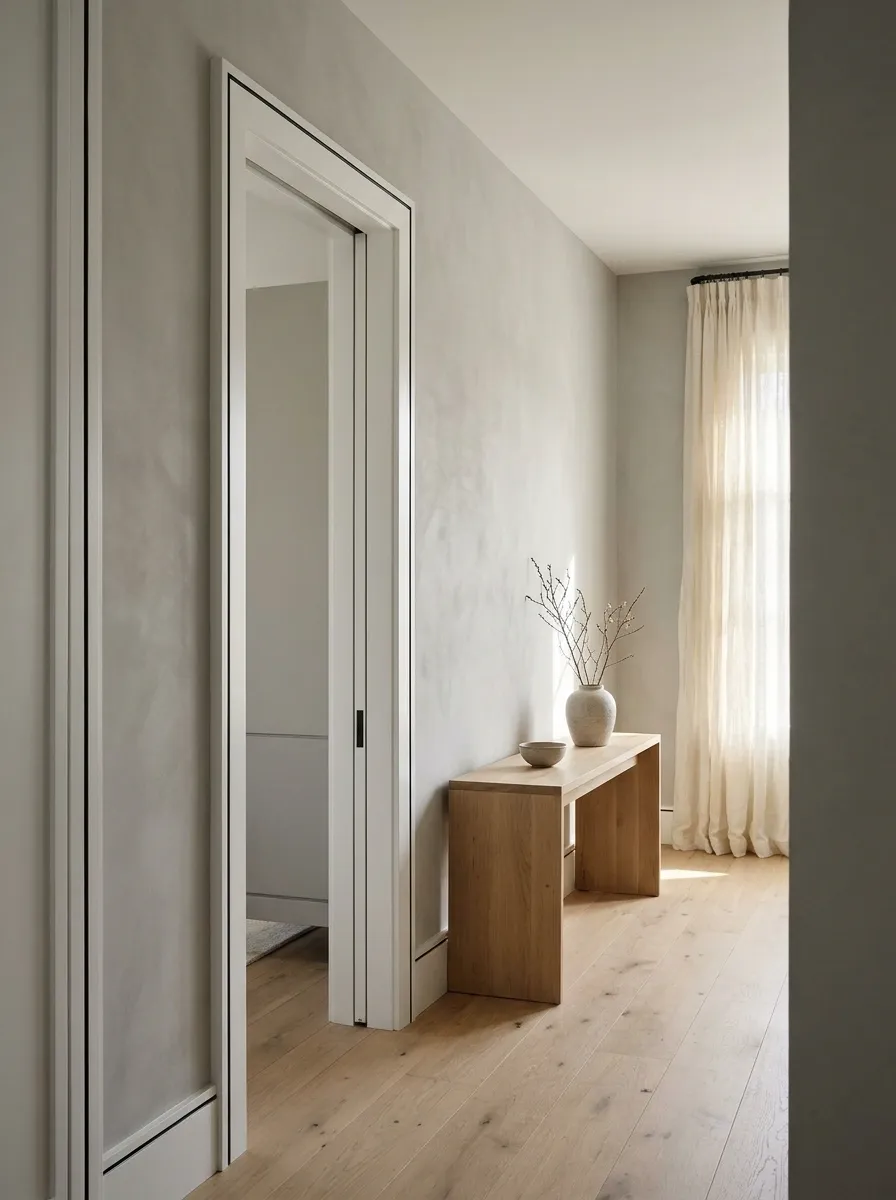
A fine contrasting line can emphasize a simple frame without making the whole surround dark.
Use it only where the profile and surface condition support a crisp edge. Make a mock-up first and keep the line consistent through corners. This detail suits an interior with restrained graphic elements; beside elaborate molding and busy wallpaper, it may simply become another thing to look at.
The preparation matters: a thin line draws attention to its edges, including the ones you hoped nobody would notice.
Different Colors on the Two Room-Facing Sides
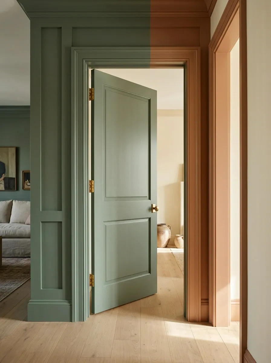
A doorway belongs to two rooms. Its two faces do not have to share the same color.
Let each side relate to its own room, with a deliberate transition within the opening. Agree on the paint boundary before starting. This is especially helpful when adjoining rooms have very different palettes and a single trim color would look right in only one of them.
Each face belongs to its room
Plan where the colors meet within the opening.
A Colored Head Casing Above Quiet Side Trim
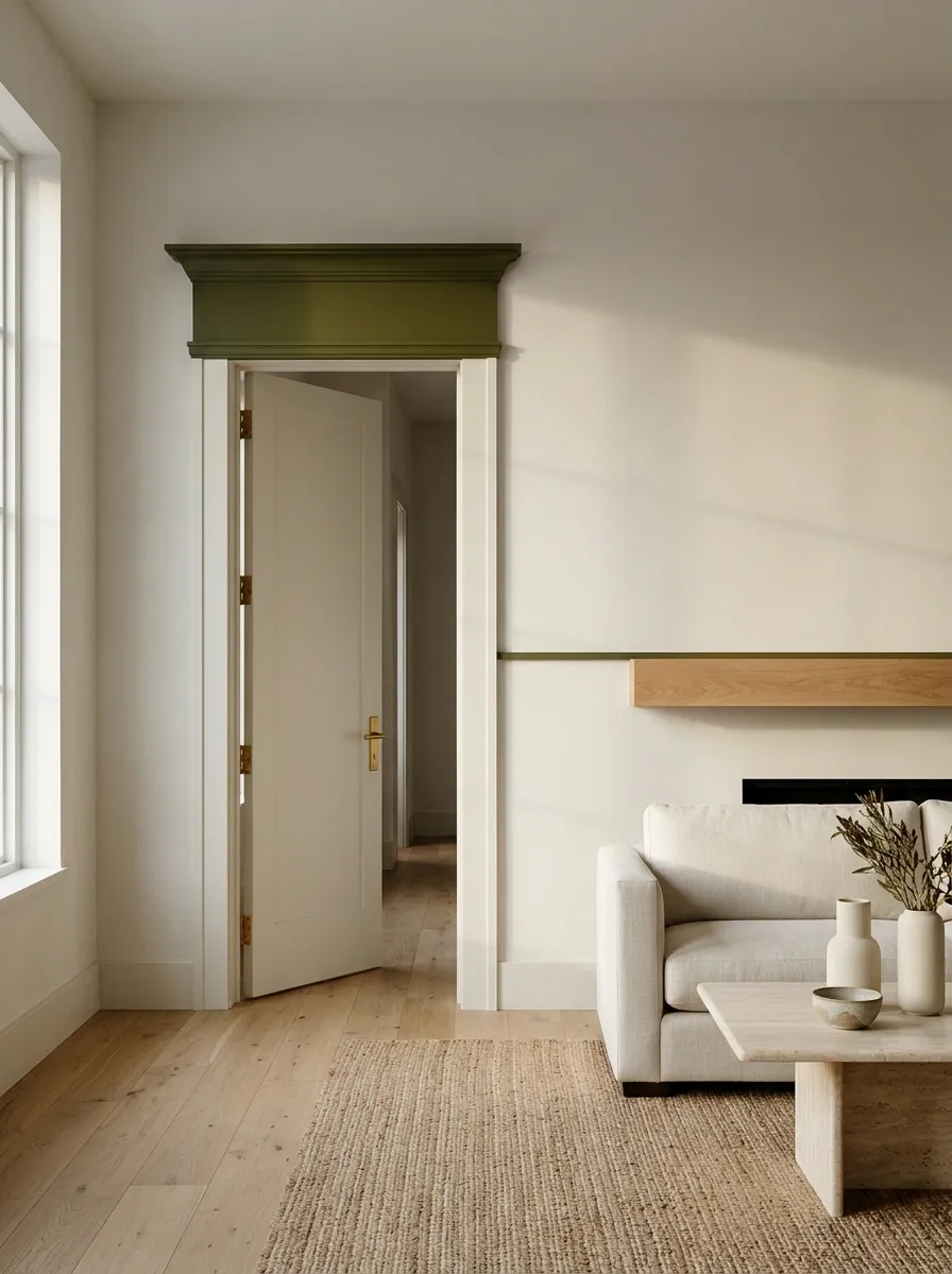
On a simple frame, the top section can supply the accent while the vertical pieces stay pale.
Treat this as a deliberate graphic choice. It works best when the head casing has enough substance to register and the room contains another horizontal feature. Avoid the look if it merely resembles an unfinished painting job; the distinction is mostly in the proportions and the clarity of the edges.
Try first: a paper strip in the proposed color across the top.
Use the Frame to Connect the Room
A Repeated Frame Color Along a Hallway
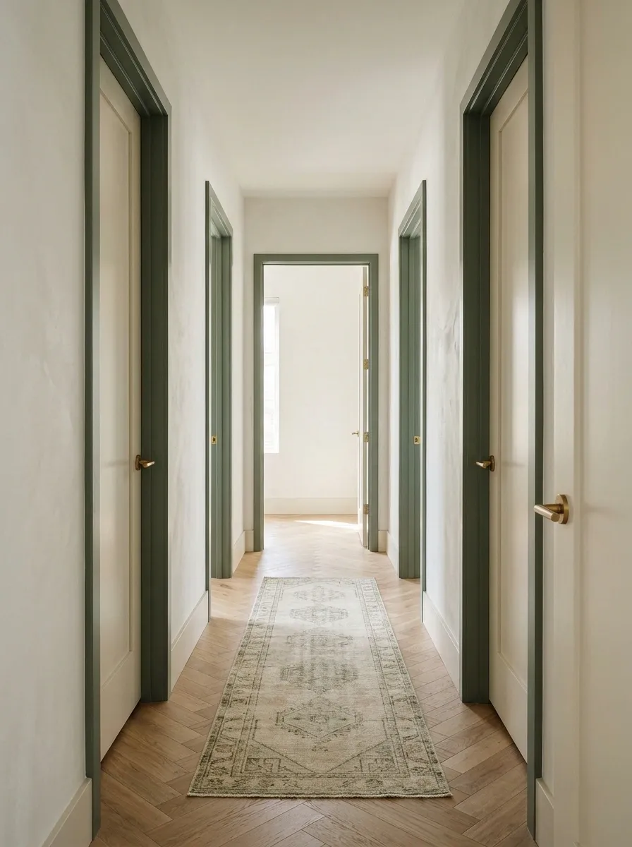
Repeating one color across several frames can make a hallway feel coherent.
Choose a tone that works beside every adjoining surface, then keep the walls or doors relatively quiet. This approach is useful when the hallway has many openings and an assortment of unrelated trim finishes. Test the rhythm from both ends before committing; repeated contrast can become quite strong in a narrow corridor.
One repeated outline can organize several doors
A Kitchen Frame That Echoes the Cabinetry

Repeat the cabinet color around the kitchen entrance to connect the room with the space outside it.
This can be especially effective when the cabinets are visible through the opening. Keep the connection selective: the frame can repeat the color without requiring matching skirting throughout the house. Choose suitable paint products for the different surfaces rather than assuming cabinet paint belongs everywhere.
| Repeat | Leave flexible |
|---|---|
| Cabinet color at the opening | Adjacent room’s wall color |
| A related metal finish | Furniture and textiles beyond |
A Bedroom Frame That Picks Up the Textiles
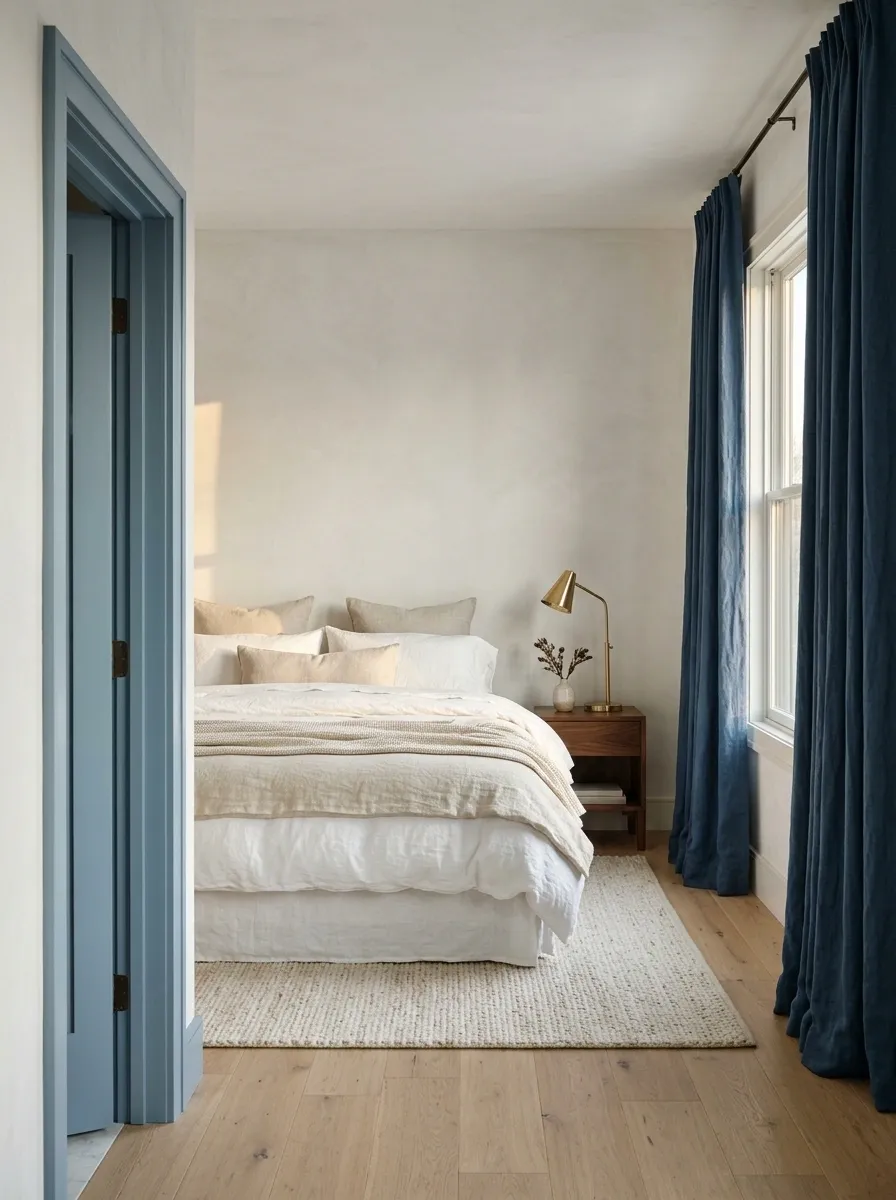
Borrow a deeper color from curtains or bedding and use it on the frame.
Choose the textile you expect to keep rather than a seasonal cushion with a brief career in your home. A muted blue frame can connect to blue curtains while the walls remain neutral. Keep the door pale if you want the bedroom to stay visually light.
Start with the durable choice: a curtain, rug, or upholstered piece is a better anchor than a small accessory you frequently replace.
A Jewel-Toned Powder-Room Entrance

A rich frame can hint at a more expressive room beyond.
Berry, petrol blue, or deep green can look particularly good against a quieter hallway. Let the powder room contain the richer pattern or color and give the entrance a related outline. Keep the hall side restrained enough that the doorway feels like an invitation rather than a bright advertisement for the downstairs loo.
A small preview of the room beyond
A Dark Study Frame Beside Books and Timber
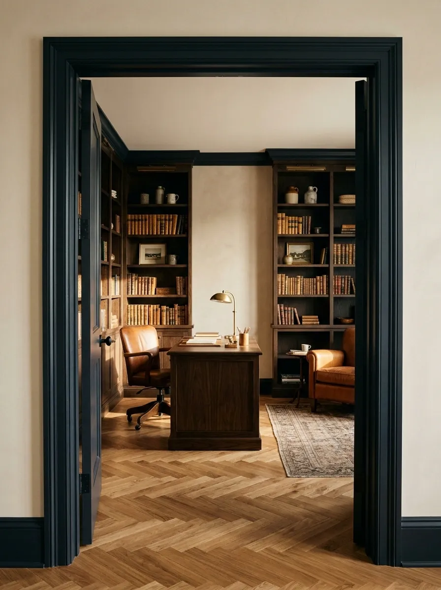
Deep brown or ink-colored trim can give a study entrance a settled, substantial feel.
Connect the tone with a desk, shelving, or a darker element in the room. Use warm neutrals around it so the opening remains legible. This is a good way to acknowledge a study’s different atmosphere without making every room in the house adopt its palette.
Material balance: dark painted edge, visible timber, pale wall, and the ordinary color variation of books.
Work With the Opening You Have
A Painted Pocket-Door Surround
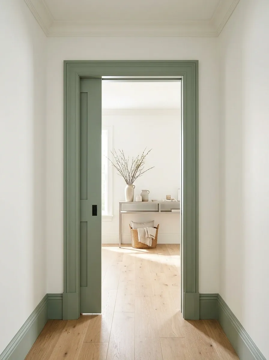
A pocket door leaves its surround visible even when the door disappears. That makes the trim an especially useful place for color.
Keep the paint boundary away from moving components and follow the door system’s requirements. Choose a color that suits the opening when it is both empty and closed. The frame can connect the spaces without relying on a visible door leaf to complete the composition.
Make the opening feel complete without the door
An Actual Arched Frame in One Continuous Color

If the opening is genuinely arched, let one uninterrupted color trace its shape.
Avoid breaking the curve into several accents unless a particular architectural detail calls for it. A continuous outline is often enough. Compare the frame against the wall from a distance; the curve should remain clear rather than disappear into a nearly matching shade by accident.
| Stronger effect | Softer effect |
|---|---|
| Deep frame, pale wall | Related midtones |
| Clearly defined profile | Tonal color with visible shadow |
A Transom and Door Frame Treated as One Unit
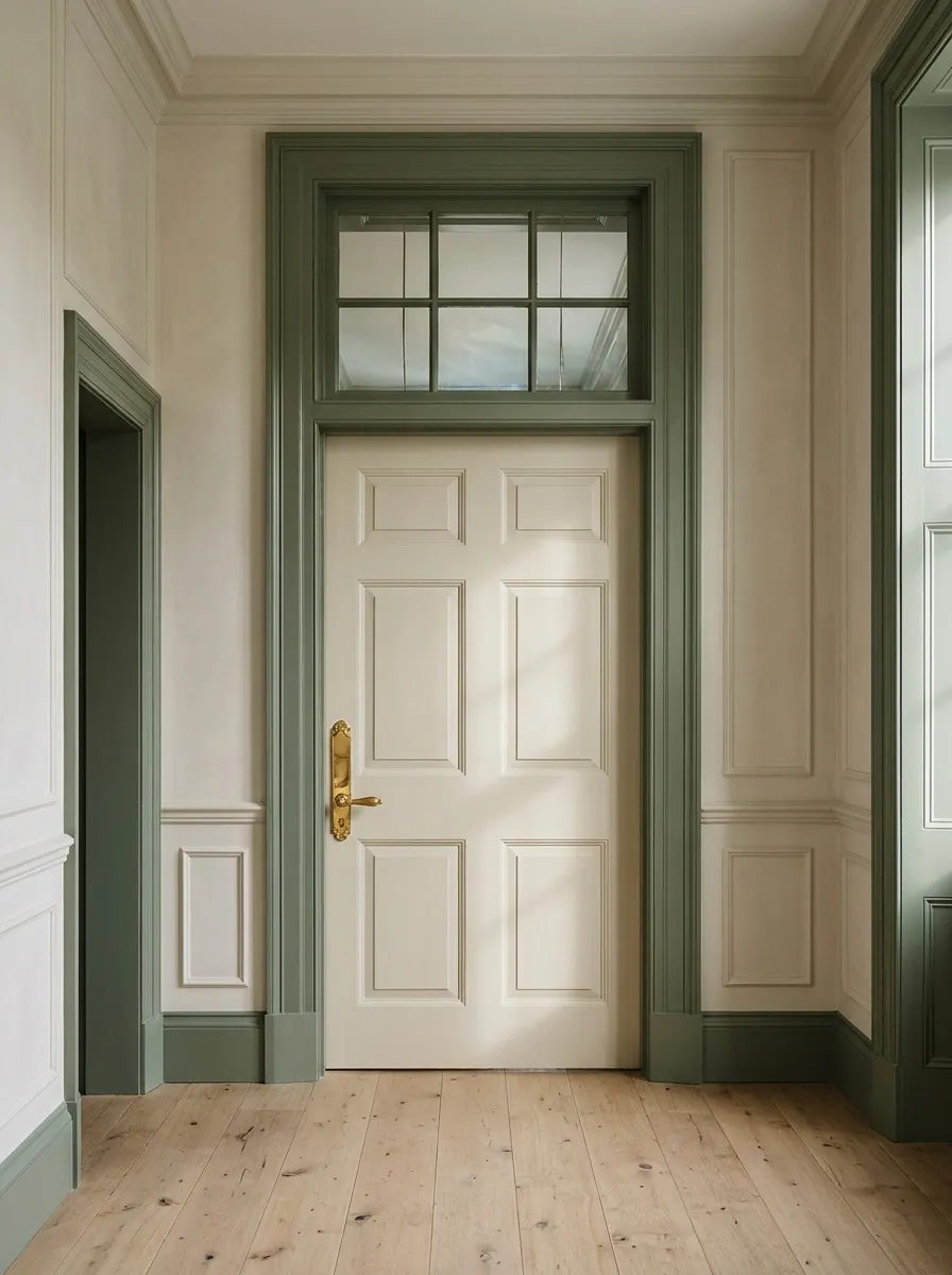
Where a transom sits above the door, painting the connected trim together can make the assembly feel more coherent.
Keep glazing, seals, ventilation elements, and hardware clear as required. The unified color draws attention to the full height of the opening. Use a quieter door color if the upper framework is already detailed, allowing the whole structure to register without becoming busy.
Connect the upper and lower framework
One trim color lets the transom belong to the doorway below.
One Accent Frame on a Busy Landing
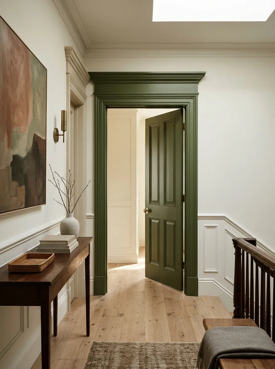
You do not have to paint every frame to make one doorway interesting.
Choose a particular opening as the accent and keep neighboring doors tonal. This works when the landing needs a focal point rather than a repeating pattern. Relate the accent to something visible beyond the door so it has a reason to be different. A selective choice can feel more thoughtful than compulsory matching.
Before the final coat: check the view from the stairs and every adjoining room.
The frame does not need to announce the entire decorating scheme. Sometimes a precise line of color is the part that makes the rest of the room feel deliberate.