
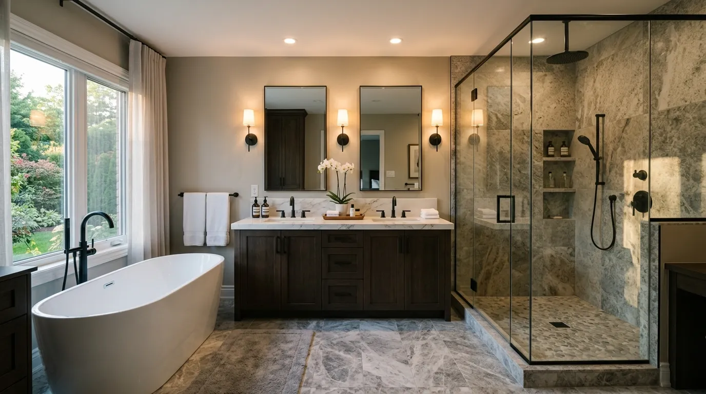
Most primary bathrooms don’t look expensive because they’re missing expensive materials. They look underwhelming because the room has too many unrelated choices fighting for attention. A busy floor, tiny mirror, weak lighting, builder-grade vanity, and random hardware can make even a large bathroom feel unfinished.
The fix isn’t buying more stuff. It’s making the major pieces work together.
These primary bathroom ideas focus on the moves that actually change how the room feels, from choosing the right focal wall to hiding clutter inside the vanity. Some cost more than others, but every idea has a clear job. That’s what matters.
You’ll also notice a pattern: the best bathrooms usually have fewer visual decisions, not more. One strong material gets repeated. Lighting has a purpose. Storage is planned around real routines. Even the smallest details look intentional instead of added at the last minute.
Before you start shopping, get the structure right. That’s where the biggest difference happens.
What Makes a Primary Bathroom Actually Feel Expensive
The layout matters more than the size
A large bathroom can still feel awkward when everything is pushed against random walls. A smaller room can feel calm and generous when the vanity, shower, tub, and walking path have clear relationships.
Start with movement. You shouldn’t have to squeeze around an open door or dodge another person’s cabinet drawer every morning. The strongest layouts create obvious zones without making the room feel chopped up.
The rule: plan the daily path before choosing finishes.
That single decision will save you from a lot of expensive mistakes later.
Why matching every finish usually falls flat
Matching isn’t the same as coordinating. When the vanity, tile, countertop, hardware, mirror frame, and lighting all look like they came from one set, the room loses depth.
A better bathroom repeats a few visual qualities while allowing materials to differ. Warm wood can sit beside stone. A dark metal fixture can repeat on the mirror and cabinet pulls. A soft tile can balance a harder countertop.
That’s what makes the room feel collected instead of showroom-perfect.
The small details that make a bathroom look custom
Custom-looking bathrooms aren’t filled with complicated details. They’re filled with details that were chosen on purpose.
Think about the height of the mirror, the placement of the sconces, the size of the shower niche, the thickness of the countertop edge, and where towels land when you step out of the shower.
Those details are easy to ignore during planning because they’re small. Once the room is finished, they’re exactly what your eye notices.
Good design is often just better placement.
Primary Bathroom Ideas
Ambient Lighting Over Clutter
Dimming the lights isn’t just for atmosphere; it’s a strategic move to hide the fact that you haven’t wiped down the vanity since Tuesday. If you insist on filling every corner with candles and house plants, just accept that your cleaning routine is now ten times harder.
Candlelight is the ultimate distractor for a bathroom that would otherwise look like a cluttered greenhouse. Placing candles everywhere creates a mood, but be warned: someone is definitely going to knock one over while trying to reach for a towel.
Keep the plants if you must, but don’t act surprised when the humidity turns them into a science project. A dark, moody space is perfect for hiding your bathroom sins, as long as you’re okay with playing a high-stakes game of don’t-set-the-curtains-on-fire.
Frame the Freestanding Tub With a Strong Focal Wall
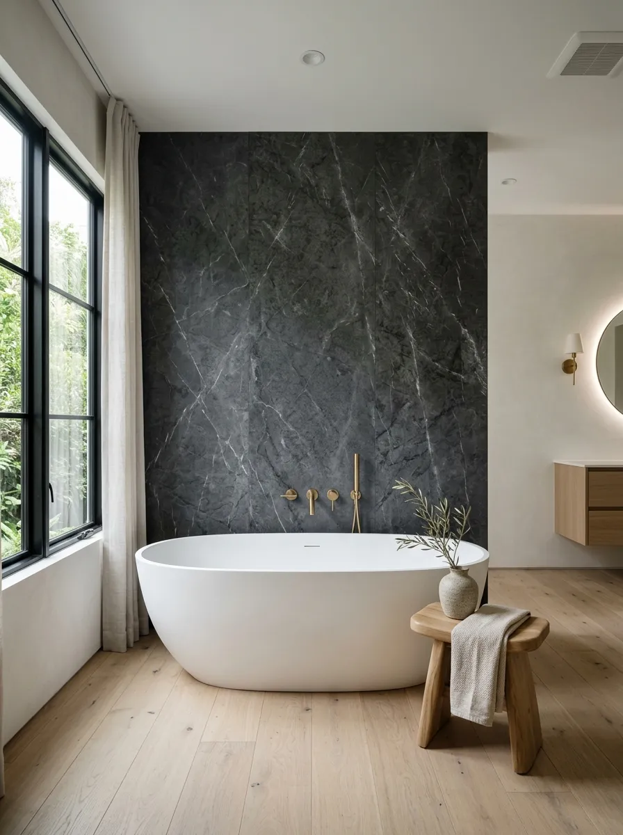
A freestanding tub shouldn’t float in the middle of a blank room. Give it a wall that makes the whole bathing area feel intentional.
Use a darker tile, warm stone, limewash-inspired finish, or a restrained slab look behind the tub. Keep the surrounding surfaces quieter so the wall does the visual work.
A simple tub suddenly feels like the centerpiece instead of a large object taking up floor space.
Best move: keep the wall finish strong, then repeat one small detail from it somewhere else.
Archways for Dramatic Souls
Nothing screams ‘I watched too much HGTV’ quite like forcing an arched entryway into a room that clearly doesn’t need one. It creates a nice focal point, assuming you don’t mind the inevitable headache of trying to tile around a curved corner.
Installing an archway makes the shower area feel like a private portal, which is a very poetic way of saying you’ve added a difficult-to-clean ledge that will eventually grow soap scum. It looks expensive, which is the only reason people bother with the extra labor.
Use the arch to frame the shower so it doesn’t look like a leftover afterthought. Just try not to get too attached to the shape when you eventually realize that your perfectly square glass shower door no longer fits the vibe.
Run Large-Format Tile From Floor to Ceiling
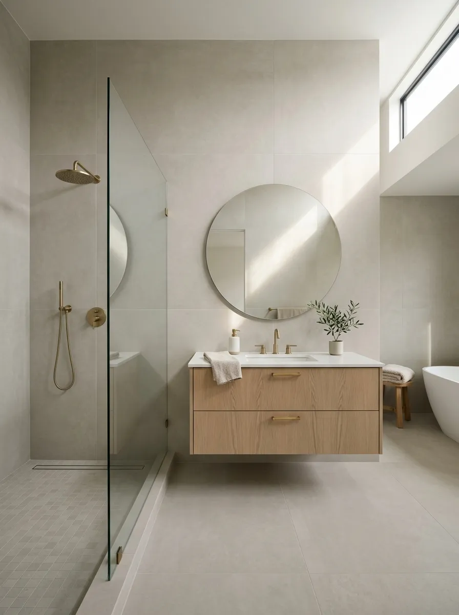
Tiny tile can make a bathroom feel visually chopped up, especially when grout lines run across every wall. Large-format tile gives the eye fewer stops and makes the room feel cleaner.
That doesn’t mean every surface needs giant slabs. Use larger pieces on the shower walls or main bathroom walls, then let a smaller tile handle the shower floor where extra texture helps.
Keep the grout close to the tile color.
A strong contrast between tile and grout makes every joint more noticeable. Matching tones create a quieter backdrop and let the vanity, mirror, and lighting stand out.
Use this approach when: your bathroom has lots of short walls or several competing surfaces.
Moody Tiled Shower Niches
Adding a recessed niche with internal lighting is essentially just creating a stage for your cheapest plastic shampoo bottles. If you’re going to build a spotlight for your shower products, at least buy a soap dispenser that doesn’t look like it came from a gas station.
Backlighting the tiles makes the shower look like a high-end spa, provided you keep it spotless. The second you get hard water stains on that dark tile, your luxury accent wall is going to look like a neglected aquarium.
Install the lighting at the top of the niche if you want to highlight the tiles, or at the bottom if you want to highlight how much mess you actually have in there. It’s a great way to add depth to an otherwise boring box of glass and water.
Build a Double Vanity Around How Two People Actually Use It
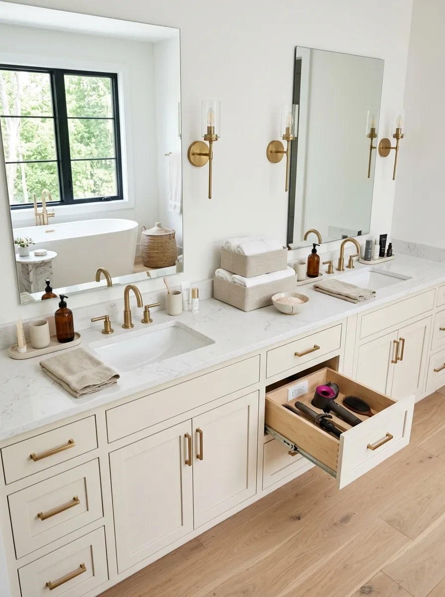
A double vanity isn’t automatically functional. Two sinks can still mean one crowded countertop, nowhere to put a hair dryer, and drawers that open into each other.
Start with your routines instead. Give each person a clear landing zone for daily items. Put shared products in a central drawer or cabinet. Use drawers for the things you reach for constantly and reserve deeper cabinets for backups.
This layout feels better every morning because it removes small arguments before they start.
The smartest upgrade isn’t another sink. It’s better personal territory.
The Compromise Shower Tub
The kidney-shaped tub is the classic ‘we couldn’t decide between a shower and a bath’ solution. It satisfies the desire for a soaking tub while forcing you to deal with the inherent awkwardness of standing in a curved basin to wash your hair.
Glass shower screens look cleaner than a curtain until you realize you have to squeegee them every single time you rinse off. If you’re lazy, that glass will look like a roadmap of your own water usage in about forty-eight hours.
Don’t bother adding a wooden stool unless you enjoy the scent of damp, rotting oak in your bathroom. It’s a cute place to put a towel, right until you accidentally drop it in the tub while getting out.
Use One Oversized Mirror Instead of Two Small Ones
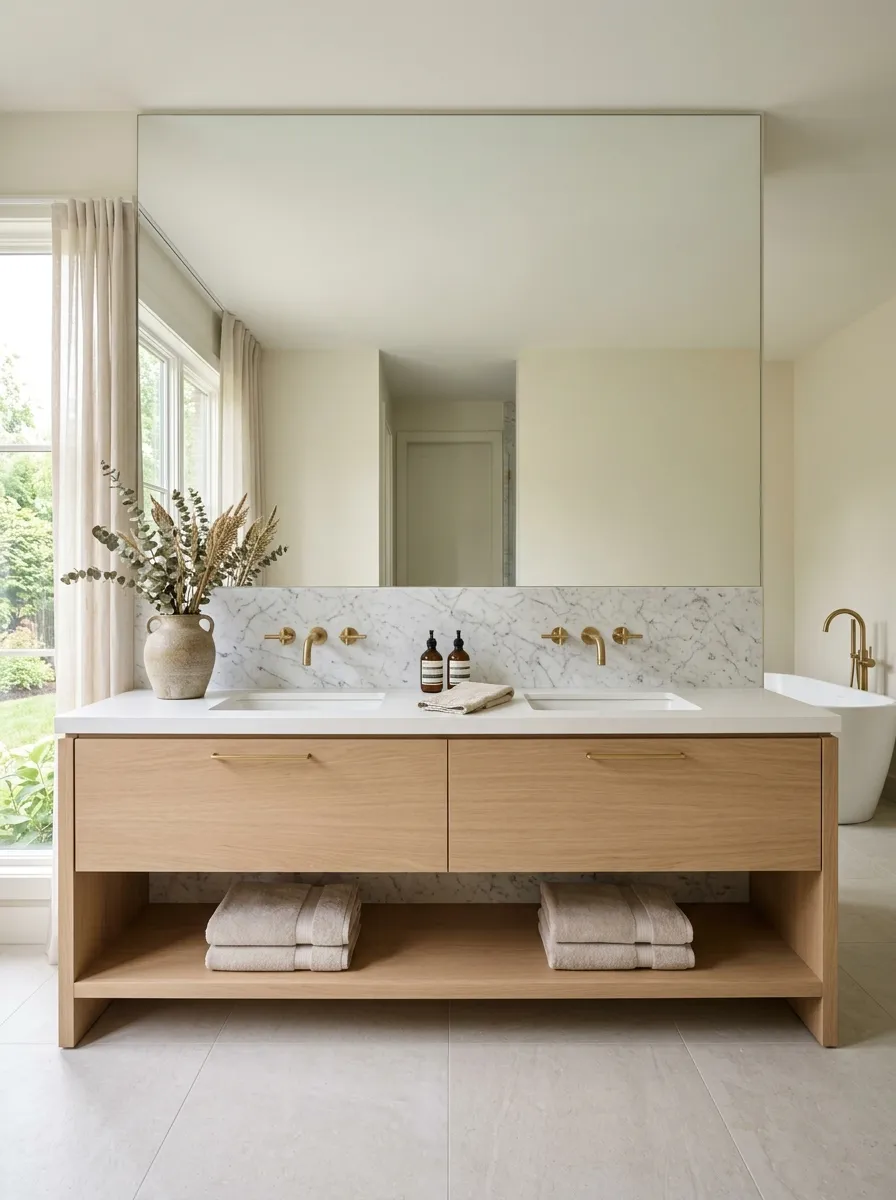
Two mirrors aren’t always better just because there are two sinks. Small mirrors can leave a wide vanity looking strangely fragmented.
One oversized mirror creates a broader visual plane and usually reflects more light. It also gives the bathroom a cleaner architectural feel.
This works especially well with a long vanity where the countertop already reads as one continuous piece.
Quick rule: the mirror should feel proportionate to the vanity, not simply sized to each sink.
Choose a frame only when the room needs another strong material. A frameless or thin-edged mirror works better when the vanity, tile, or lighting already has plenty going on.
Add a Warm Wood Vanity to Break Up Hard Surfaces
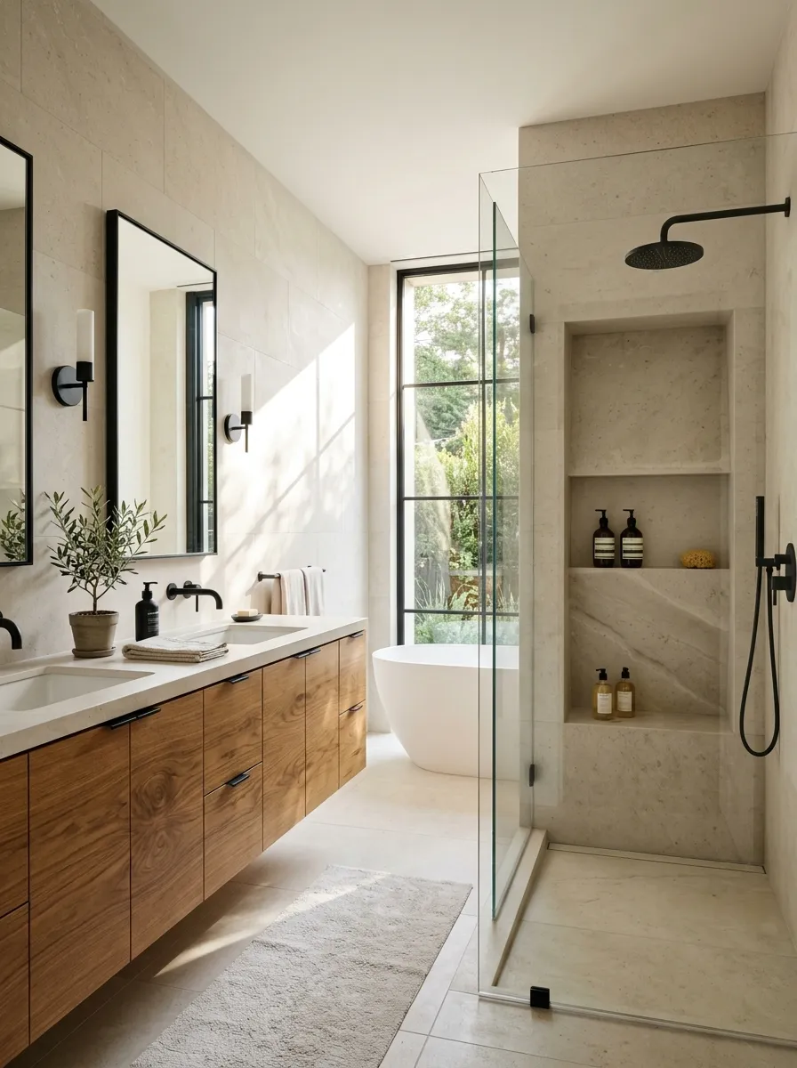
Bathrooms can become cold fast. Tile, stone, glass, porcelain, and metal are all hard surfaces, so adding one warmer material changes the balance immediately.
Wood works because it brings in texture and a softer color without needing decorative clutter. Choose a vanity with a simple front and let the grain do the work.
Don’t overcomplicate it with several wood tones. One finish is enough.
Best pairing: warm wood + pale stone + restrained metal hardware.
That combination gives the bathroom some visual warmth while keeping the room crisp. It’s especially useful when the floor and shower are already heavy on stone or tile.
Swap Generic Lighting for Layered Vanity Illumination
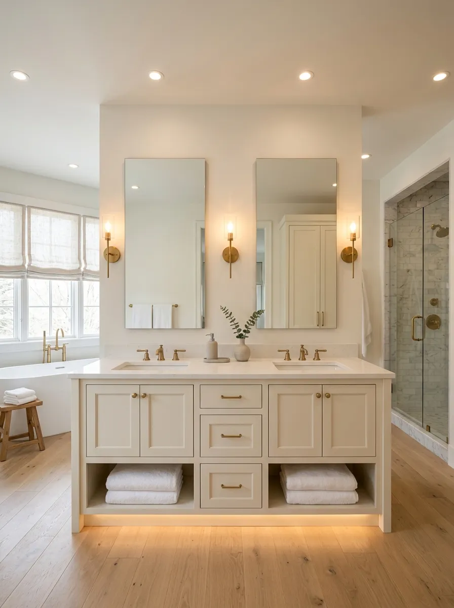
A single ceiling fixture can’t do every lighting job in a primary bathroom.
You need general light for moving through the room, focused light around the vanity, and softer illumination for early mornings or late nights. That’s what makes the bathroom feel usable instead of harsh.
Put the main vanity lighting near face level rather than relying on one light directly above your head.
The biggest mistake: placing one bright fixture overhead and calling the job finished.
Use a few intentional sources instead. The bathroom will look better in the mirror and feel much better at 6 a.m.
Carry the Countertop Material Up the Backsplash
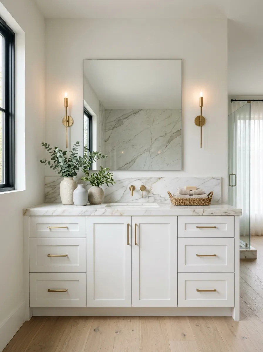
A countertop that stops abruptly at the wall can make a vanity feel unfinished. Carrying the same material a short distance up the wall creates a stronger visual connection between the counter and mirror.
This is especially effective when the countertop has natural variation. The backsplash gives that pattern another place to register instead of making the slab feel isolated.
You don’t need to cover every wall.
Keep the backsplash focused on the vanity zone. Let the shower or painted walls use their own finish so the room still has contrast.
This move is simple, but it gives a basic vanity a much more built-in appearance.
Use it when: your vanity is clean-lined and you want the countertop to carry more visual weight.
Use Brass or Black Hardware as a Repeating Accent
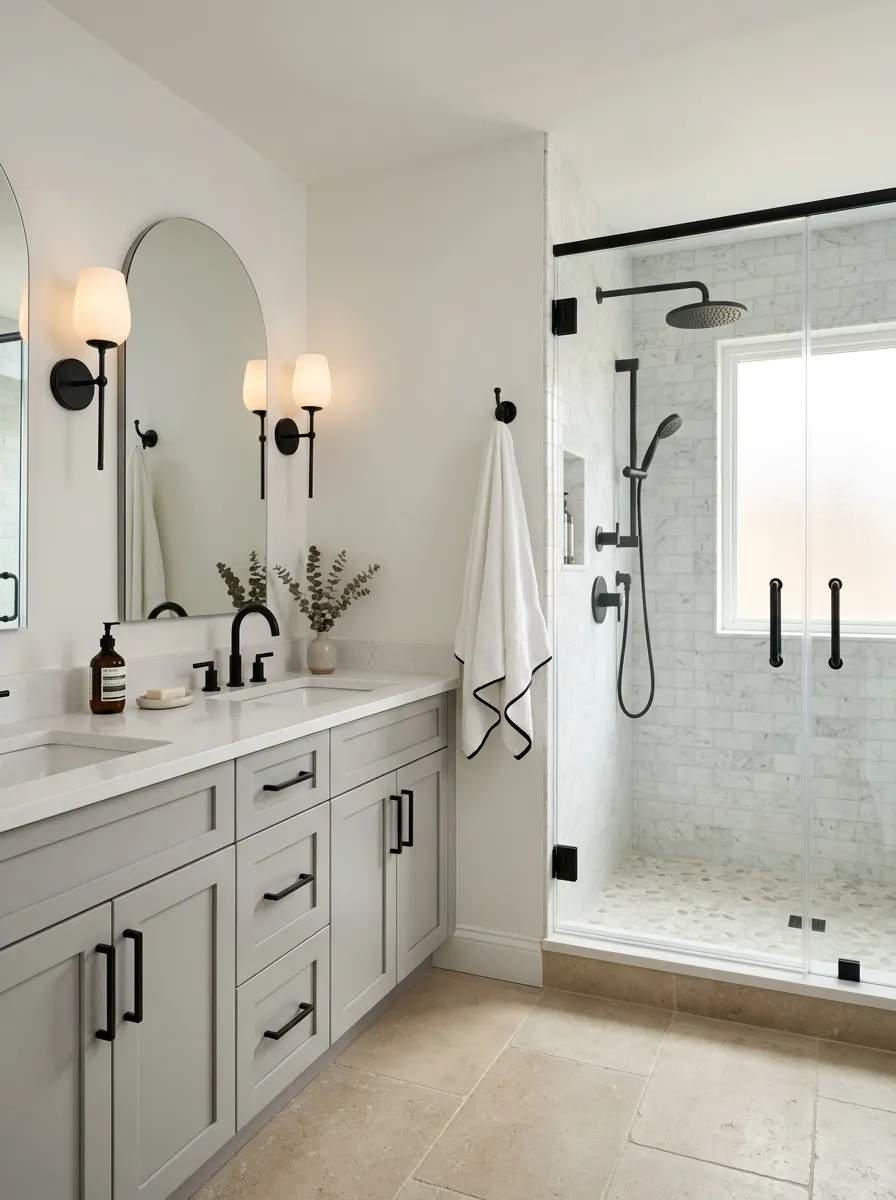
Hardware shouldn’t be a collection of unrelated little decisions.
Choose one metal and repeat it on the faucet, cabinet pulls, shower controls, towel hooks, and lighting where it makes sense. Repetition creates order without forcing everything in the bathroom to match.
Black gives stronger contrast. Brass brings warmth. Neither is automatically better.
The trick is consistency.
Don’t use one metal because it came with the faucet and another because the light fixture looked good on its own. Those small mismatches add up fast.
A repeated finish gives the room a visual thread that makes different materials feel connected.
Make the Shower Glass as Visually Quiet as Possible
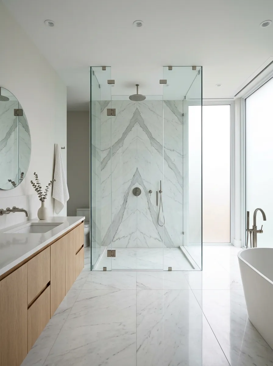
Shower glass takes up a surprising amount of visual space. Heavy framing and lots of dark hardware can make the center of the bathroom look broken into sections.
A cleaner enclosure keeps your tile visible and makes the shower feel more open.
That’s why minimalist glass works so well in bathrooms with strong tile, stone, or a dramatic shower wall.
Warning: don’t choose the enclosure hardware before deciding what the rest of the bathroom needs visually.
If the room already has dark accents everywhere, adding a heavy black-framed enclosure can push it too far. Let the shower support the design instead of becoming another focal point.
Add a Bench Where It Solves a Real Shower Problem
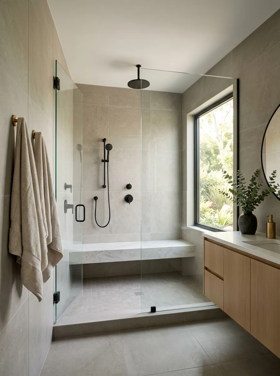
A shower bench shouldn’t exist just because luxury bathrooms have one. It needs to earn the space.
Place it where you’ll actually sit to shave, wash your feet, or set something down for a moment. A floating bench keeps the floor visually open, while a solid stone slab makes the shower feel more substantial.
Keep the surface easy to wipe and avoid creating a deep ledge that turns into a bottle collection.
The smart version: make the bench useful first and attractive second. When those two goals line up, it becomes one of the best details in the room.
Choose a Statement Floor With a Quiet Wall Treatment
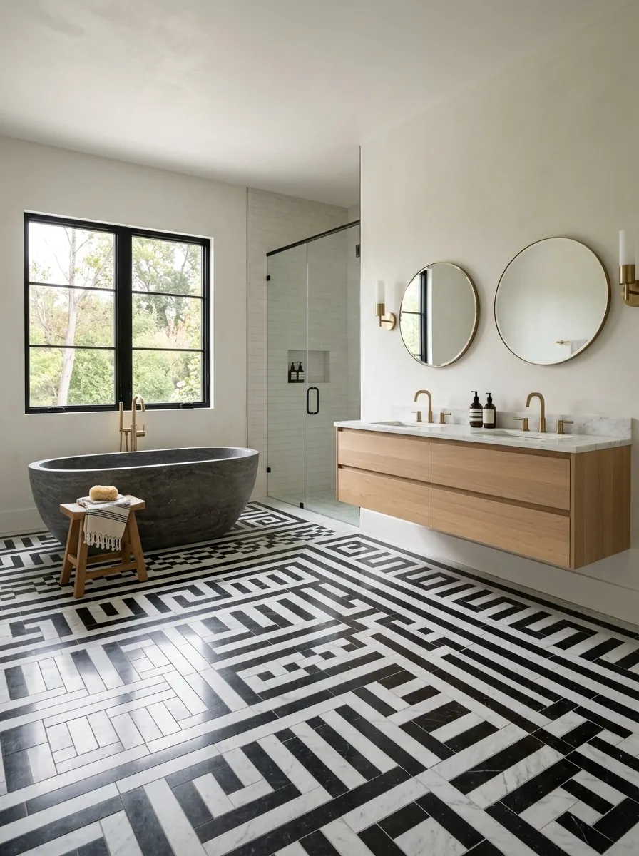
Your bathroom doesn’t need a bold floor and bold walls competing at the same time.
Pick one surface to carry the pattern or visual drama, then make the other surfaces quieter. A geometric floor can work beautifully with plain walls. A highly veined stone wall needs a calmer floor.
This keeps the eye moving without making the bathroom feel visually noisy.
Use the floor as the personality piece when: the walls already have plumbing fixtures, mirrors, niches, and other interruptions.
And don’t forget scale. A small repeating pattern can feel busy across a large room, while a larger pattern often reads more cleanly.
Hide Everyday Clutter Inside Vanity Drawers
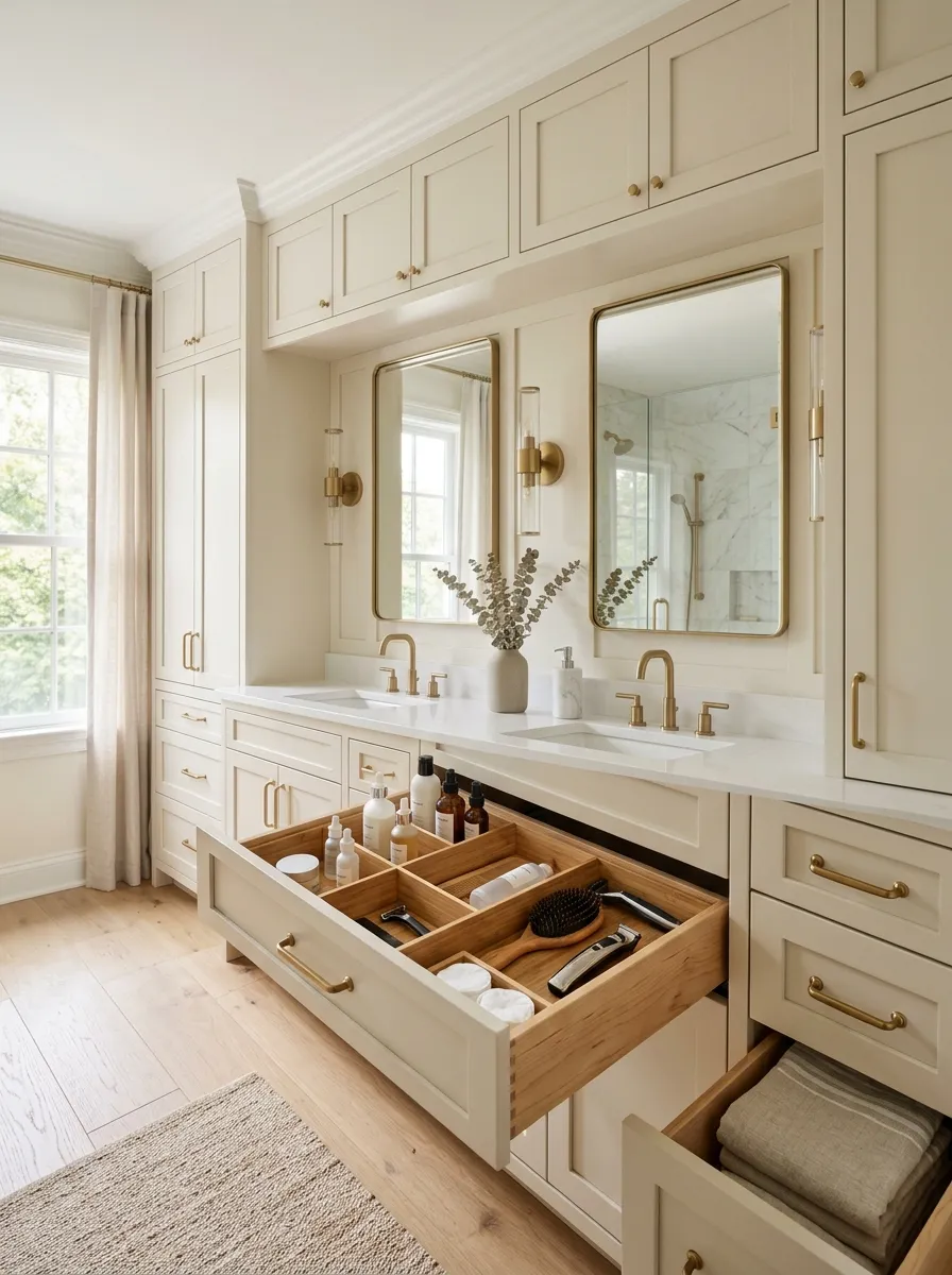
A beautiful bathroom can look messy in seconds when bottles, cords, brushes, and skincare are sitting everywhere.
The answer isn’t another countertop tray. Give the vanity enough internal organization that the counter stays mostly clear.
Put everyday items in the top drawers. Use deeper drawers for towels and larger tools. Keep backups together so you’re not opening three cabinets every time something runs out.
Think in routines, not categories.
The drawer nearest your dominant hand should hold the things you reach for first. That’s far more useful than arranging products by brand or color.
Create a Dedicated Makeup or Getting-Ready Zone
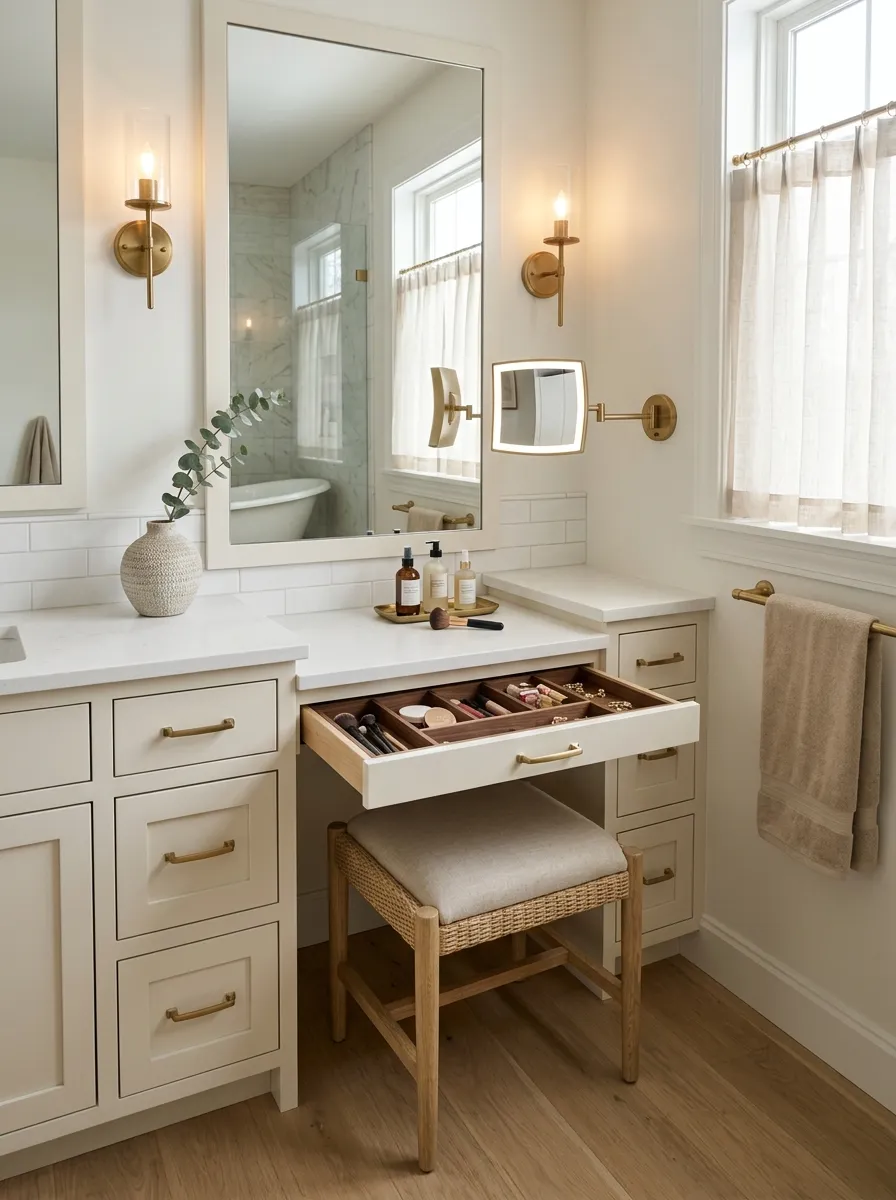
If getting ready happens at the bathroom vanity, don’t make every inch of the counter serve every purpose.
Create one defined spot for makeup, skincare, jewelry, or hair tools. It can be as simple as a drawer with built-in organizers and a mirror with good task lighting.
The point is separation.
When one part of the vanity is assigned to getting ready, the rest of the counter stays easier to use for washing, shaving, and other morning routines.
One practical detail matters: include a nearby outlet that doesn’t require a cord stretching across the sink area.
A dedicated zone makes a busy bathroom feel far more organized.
Use Wall-Mounted Fixtures to Make the Vanity Feel Lighter
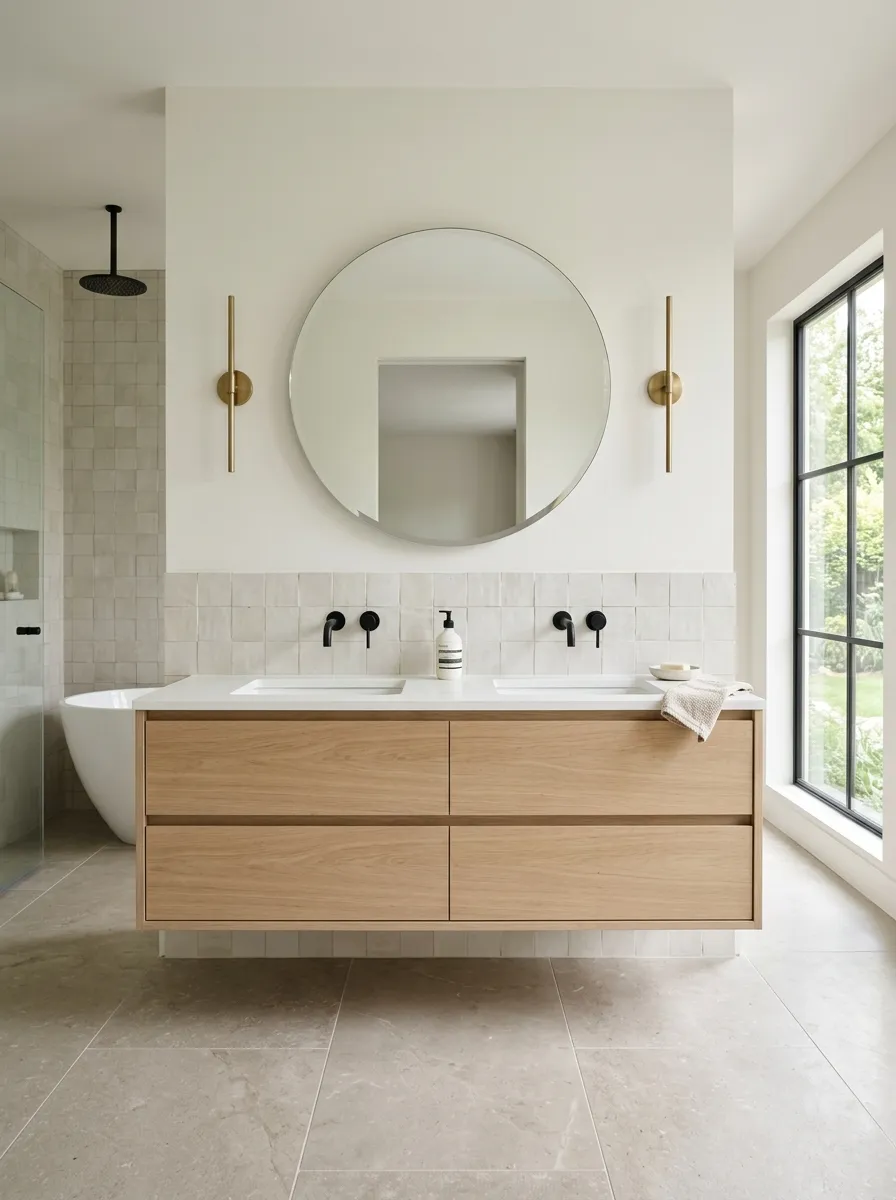
A vanity can look visually heavy when every fixture sits directly on the countertop.
Wall-mounted faucets, sconces, and even floating cabinetry can open up that sightline. You see more of the counter and more of the wall, which makes the whole vanity feel less bulky.
This works especially well in bathrooms with smaller footprints.
Quick rule: don’t wall-mount something just to make the bathroom look modern. Do it because the cleaner wall and countertop relationship improves the room.
Keep the arrangement symmetrical when the vanity itself is symmetrical. That little bit of order keeps the wall from feeling randomly decorated.
Turn an Empty Wall Into Useful Vertical Storage
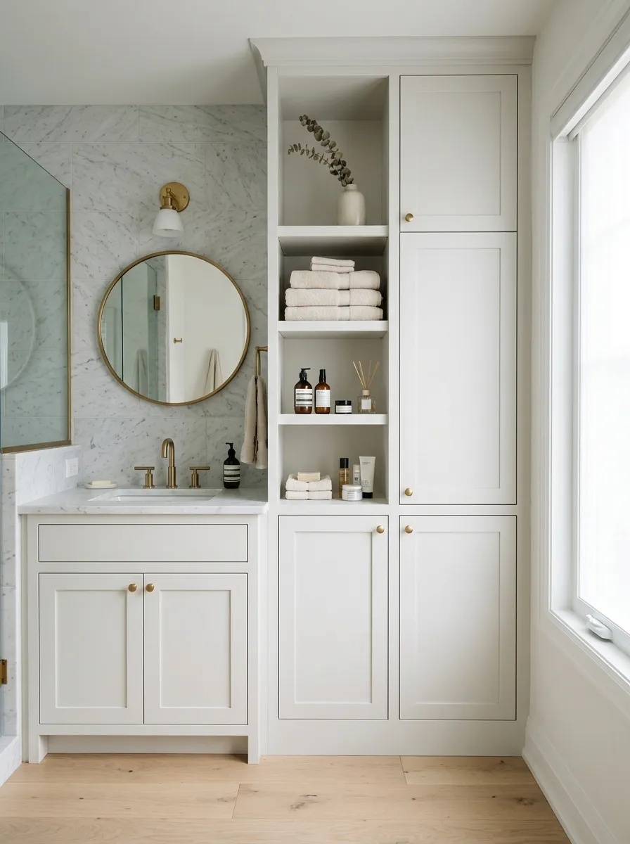
An empty bathroom wall is wasted space when the room already struggles with storage.
You don’t need a giant cabinet. A slim tower, recessed shelves, or a narrow wall-mounted unit can hold towels, toilet paper, skincare backups, or the things you don’t want sitting beside the sink.
The key is to go upward instead of outward.
Keep the deepest storage at the bottom. Use eye-level shelves for things you reach often, then reserve the highest shelf for backup supplies.
This approach is especially useful when a freestanding cabinet would make the walking path feel cramped.
Best detail: match the storage finish to the vanity so it reads as part of the same bathroom instead of another piece of furniture.
Mix Stone With Wood Instead of Making Everything Match
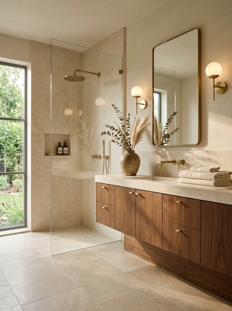
A bathroom made from one material can feel flat, even when that material is expensive.
Stone gives the room visual weight. Wood brings warmth. When they sit together, each one looks stronger.
Use wood for the vanity or a storage element and let stone handle the countertop, shower wall, or floor. You don’t need a third material competing for attention.
Keep the undertones compatible.
Warm wood looks better with stone that has a warm or balanced base. Cool gray stone paired with very orange wood can feel accidental instead of designed.
The goal isn’t perfect matching. It’s making the materials look like they belong in the same room.
Install a Heated Towel Solution Where You’ll Actually Reach It
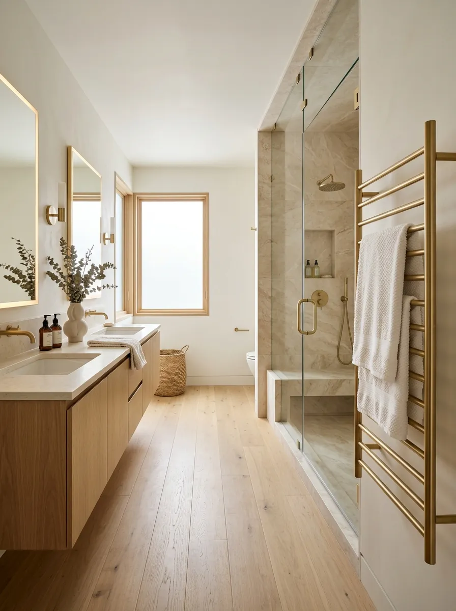
Cold towels are a small annoyance, but towel placement is a much bigger bathroom design issue.
A heated towel rail works best when it’s close to the shower or tub and doesn’t force you to cross the room dripping water. That’s the part people often miss.
Treat towel storage as part of the layout, not an afterthought.
Check the reach first: step out of the shower and look at where your hand naturally lands. That’s where the towel should go.
A warmer towel is nice. A towel you can grab instantly is useful.
Choose a rail or warming solution that suits the wall area and keeps the rest of the room visually clean.
Use Curtains, Shades, or Frosted Glass Without Sacrificing Light
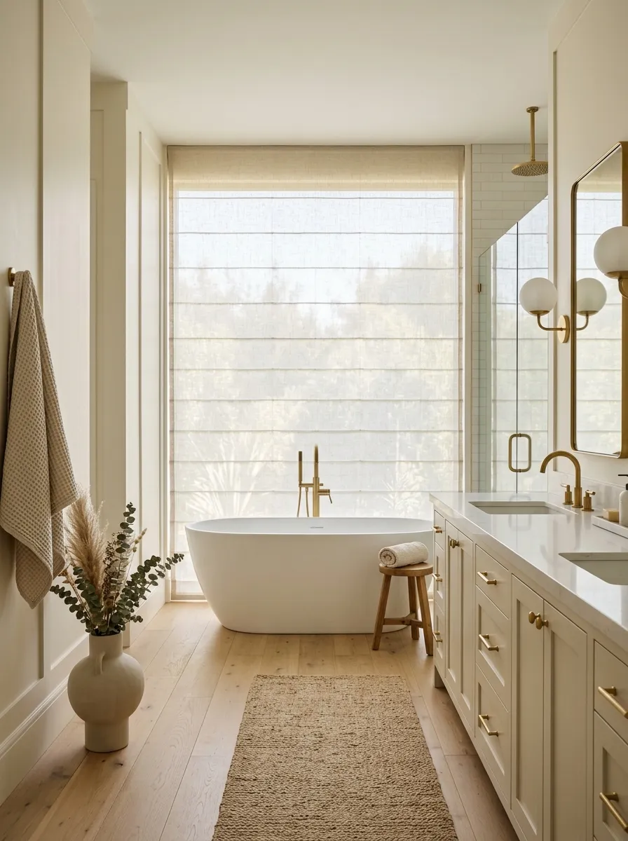
Bathroom privacy doesn’t mean you have to make the room dark.
The right solution depends on the window position. A high window may need very little treatment. A large window facing a neighboring property needs more control.
Choose the light-filtering option that fits the actual privacy problem instead of covering every window by default.
For a softer look: use a moisture-friendly fabric treatment suited to the space.
For a cleaner architectural look: use frosted or obscured glass.
For flexible control: use a shade that lets daylight in while blocking direct views.
The best choice is the one that protects privacy without turning your bathroom into a cave.
Give the Toilet Area Enough Privacy Without Building a Cave
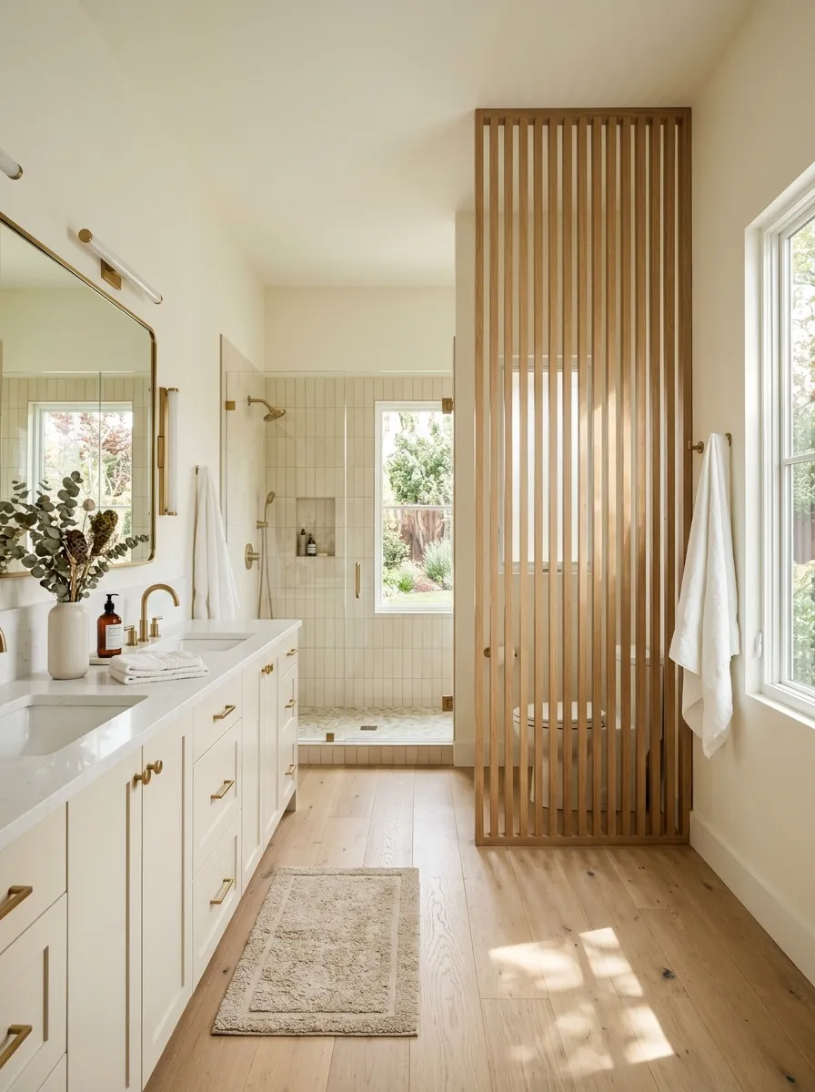
A toilet tucked into an open bathroom can make the entire room feel less comfortable. But enclosing it behind a bulky wall can create a dark, cramped corner.
The better move is subtle separation.
A short partition, half wall, slatted divider, carefully placed cabinet, or frosted panel can block the direct sightline without completely disconnecting the toilet from the rest of the bathroom.
Block the view, not the light.
Think about what someone sees when they first enter the room. The toilet doesn’t need to be the first thing that catches the eye.
A small amount of visual screening can make the entire bathroom feel more thoughtfully planned without sacrificing openness.
Use Recessed Lighting to Fix Dark Bathroom Corners
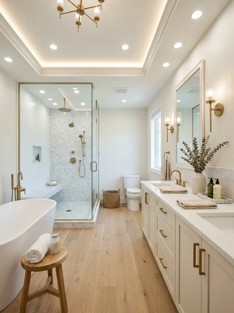
A bathroom can have plenty of fixtures and still feel dark in the places that matter.
Corners behind a tall cabinet, beside the shower, or near the toilet often lose light because the main fixture sits in the center of the room. Recessed lighting can fill those dead zones without adding another bulky fixture to the ceiling.
The goal isn’t to make the room blindingly bright.
Aim for even coverage. You want the vanity, shower, storage, and circulation areas to feel connected instead of having one bright center surrounded by dim edges.
Keep the placement deliberate. Light should solve a dark spot, not simply occupy an empty ceiling position.
Choose One Strong Material and Repeat It Three Ways
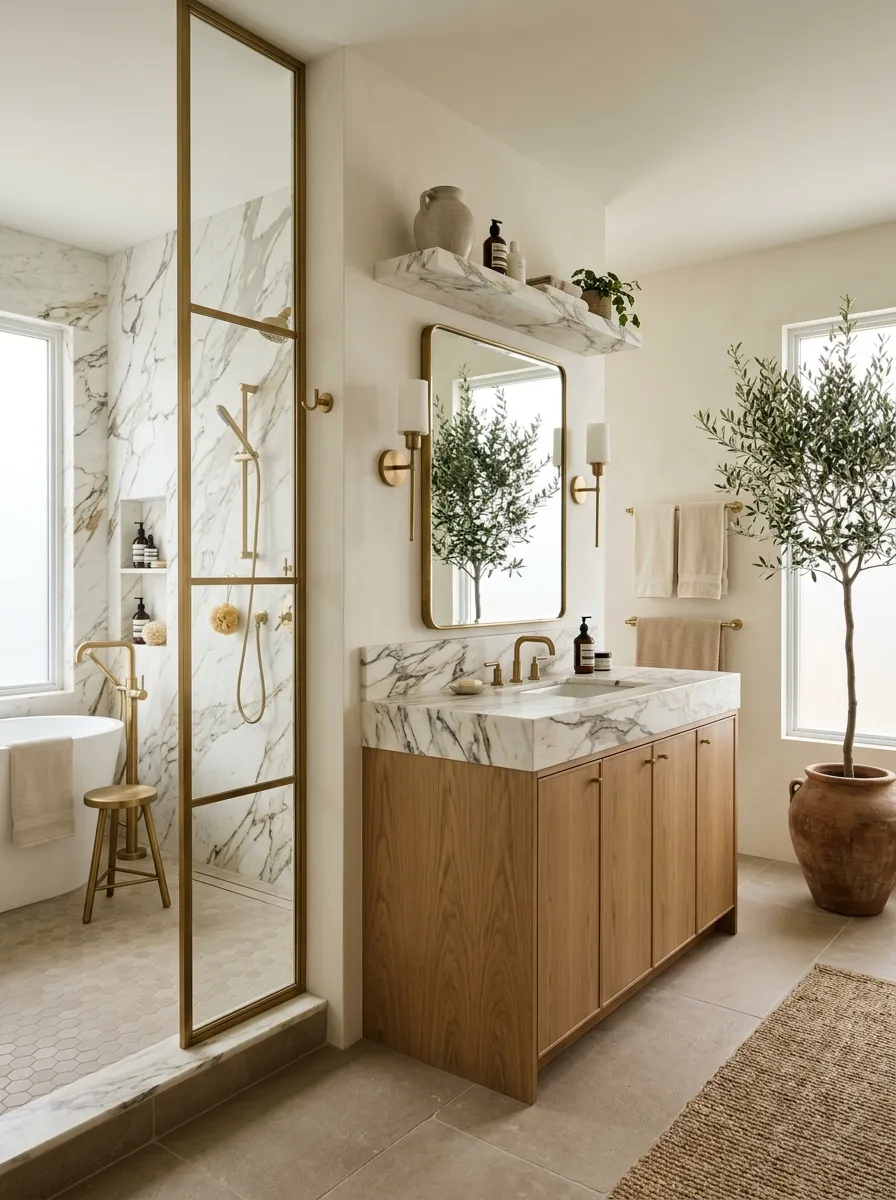
The easiest way to make a bathroom feel cohesive is to stop choosing every finish independently.
Pick one material with enough personality to anchor the room. It could be a veined stone, warm wood, handmade-look tile, or another finish that fits the space.
Then repeat that material in three places that make sense.
Keep the repetitions spaced out. A countertop, shower niche, and small shelf can create a visual thread without turning the room into a matching set.
The trick is repetition with restraint.
When the same material appears across different functions, the bathroom starts to feel designed as one room rather than assembled one purchase at a time.
Finish the Room With Small Details That Look Deliberate
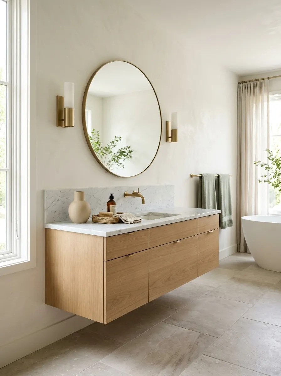
The final layer isn’t about filling empty surfaces. It’s about fixing the few places that still feel unfinished.
Choose one towel color that works with the room. Keep countertop items grouped instead of scattered. Put frequently used products into containers that don’t fight the design. Give the mirror wall one clear focal point.
Then stop.
A finished bathroom needs restraint. Once the large decisions are right, adding more decoration usually makes the room less convincing.
Walk through the bathroom like you do every morning. Check what you reach for, what gets left out, where water collects, what feels awkward, and what catches your eye for the wrong reason.
Those observations tell you what still needs attention.
The Bathroom Should Look Good Because It Works Well
Start with the layout. Give the vanity enough storage. Make lighting work around real faces and real routines. Let one material lead, then repeat it with restraint. Keep the shower practical, the towels within reach, and the countertop clear.
That’s how a primary bathroom starts feeling custom instead of assembled.
You don’t need to copy every idea here. Pick the changes that solve the things that annoy you every morning, then build the room around those fixes.
Save this list for your next bathroom remodel so you can come back to the ideas when you’re choosing tile, fixtures, storage, and those final details.