
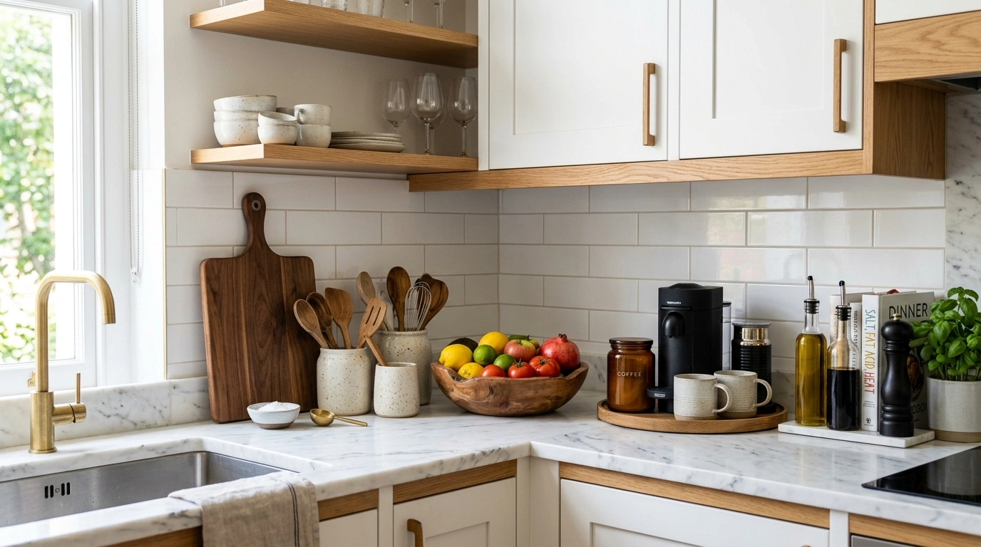
A small kitchen can have perfectly good cabinets and still feel frustrating every day.
The counter may technically be large enough, yet the sink, coffee maker, cutting boards, appliances, and random everyday items leave almost no useful surface left.
Then there is the visual problem. When every section of the kitchen demands attention, the whole room can feel smaller than it really is.
The better approach is to look at the counter as part of the entire kitchen composition.
Its shape, material, relationship to the cabinets, position beside the appliances, and connection to the backsplash all affect how the finished space feels.
That is why the best small kitchen counter ideas are easier to understand when you see complete rooms rather than isolated decorating tricks.
These designs take different approaches to layout, storage, color, lighting, materials, and everyday use.
Some make a narrow kitchen feel longer. Some create a useful breakfast spot. Others keep the surface remarkably clear without making the room feel sterile.
Small Kitchen Counter Styles at a Glance
| Counter direction | Visual effect | Main approach | Overall feel |
|---|---|---|---|
| Long continuous counter | Makes the room feel more open | One uninterrupted work zone | Clean and streamlined |
| Light counter with dark cabinets | Creates strong horizontal contrast | Bright surface against darker cabinetry | Dramatic and modern |
| Wood counter with cream cabinets | Adds visual warmth | Defined wood prep section | Soft and welcoming |
| Counter with breakfast ledge | Combines two functions | Prep surface plus casual dining | Practical and compact |
| Matching stone counter and backsplash | Creates visual continuity | Counter flows into wall finish | Refined and architectural |
| One-wall counter layout | Maximizes a narrow footprint | Everything aligned on one wall | Minimal and efficient |
| L-shaped counter | Makes corners useful | Two connected work surfaces | Flexible and functional |
| U-shaped counter | Maximizes workspace | Three-sided work zone | Compact and hardworking |
| Hidden-appliance counter | Keeps the surface visually clear | Appliances integrated into storage | Calm and minimal |
| Tall storage with shorter counter zone | Protects usable workspace | Vertical storage takes the load | Organized and efficient |
Small Kitchen Counter Designs Worth Saving Ideas
Cozy Corner Sink With Ambient Lighting
Transforming a functional sink area into an atmospheric nook requires just a few thoughtful lighting layers.
Here, a pleated fabric lamp sits directly on the counter beside a deep white basin, casting a warm glow over a simple bowl of fruit.
Tucked behind the fixtures, a textured black vase holds leafy stems that soften the surrounding tile backsplash without cluttering the workspace.
The cabinetry features glass doors with light wood interiors, echoing the gentle tones found throughout the compact setup.
Every element works together to turn an ordinary chore space into a quiet evening retreat.
Textured Tray Styling for Compact Counters
Small countertops benefit greatly from curated vignettes that gather everyday decorative objects into one intentional zone.
A beaded dark wood tray anchors two gleaming brass candleholders, elevating simple faux candles into a striking focal point.
Behind them, a small framed botanical print and a rustic cream vase filled with greenery add depth and height to the arrangement.
The crisp white tile backsplash provides a bright backdrop, allowing the metallic finishes and warm tones to stand out.
This approach keeps scattered items contained while making a tight corner feel finished and deliberate.
Oak-and-Cream Kitchen With a Deep Window Counter
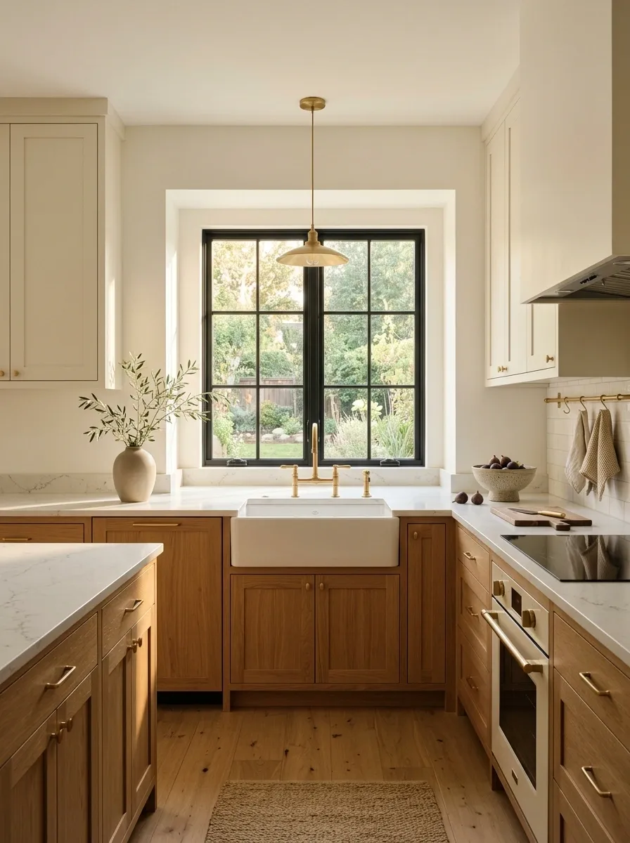
This compact kitchen makes the window part of the counter composition instead of treating it as an awkward interruption.
Cream cabinetry keeps the room light, while warm oak lowers introduce enough contrast to make the space feel grounded.
The counter beneath the window is slightly deeper than the surrounding surface.
That creates a generous prep area where sunlight becomes part of the design.
Upper storage is intentionally limited around the window.
That decision gives the counter and wall a little breathing room and makes the kitchen feel less enclosed.
The strongest detail here is the relationship between natural light and surface depth.
The counter feels substantial without making the whole room feel heavy.
Warm Wood and Glow in a Micro Kitchen
Making a tiny kitchen feel expansive is entirely about embracing vertical space and continuous warm illumination.
Under-cabinet LED strips wash the tiled walls in a golden light, while a woven pendant drops down to define the prep zone.
The sleek white lower cabinets keep the footprint looking clean, paired seamlessly with a matching light-toned countertop.
A slim breakfast bar folds out neatly from the wall, proving that tight layouts can accommodate dining without crowding the floor.
This design succeeds by letting warm wood accents and soft lighting do the heavy lifting.
Charcoal Small Kitchen With a Light Stone Counter
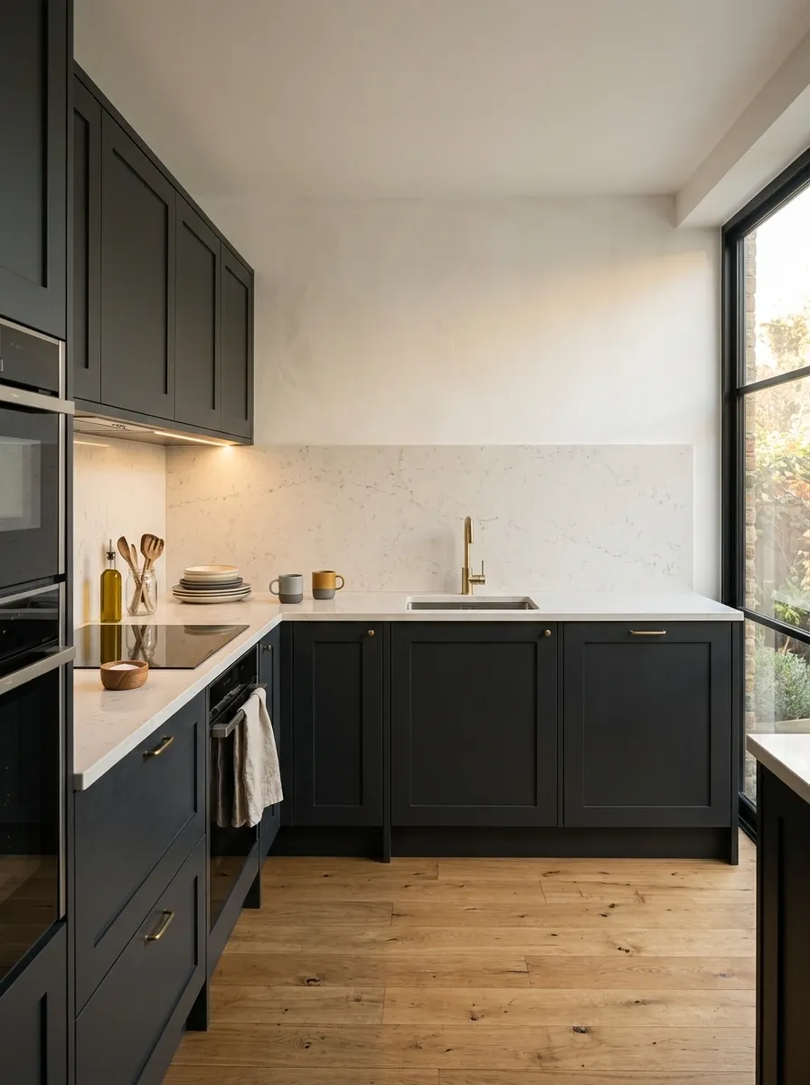
Dark cabinetry can work beautifully in a small kitchen when the counter provides enough visual relief.
Here, deep charcoal cabinets create a strong architectural frame while a pale stone countertop cuts across the room as a bright horizontal band.
Warm wood flooring softens the contrast, and natural light keeps the darker finishes from becoming too dense.
The counter is kept almost completely open except for a few daily-use items, so the pale surface remains visible.
That uninterrupted stretch is what keeps the composition from feeling crowded.
This is a strong choice when you want a compact kitchen to feel intentional and sophisticated rather than simply small.
Scandinavian Corner Kitchen With a Folded-In Breakfast Space
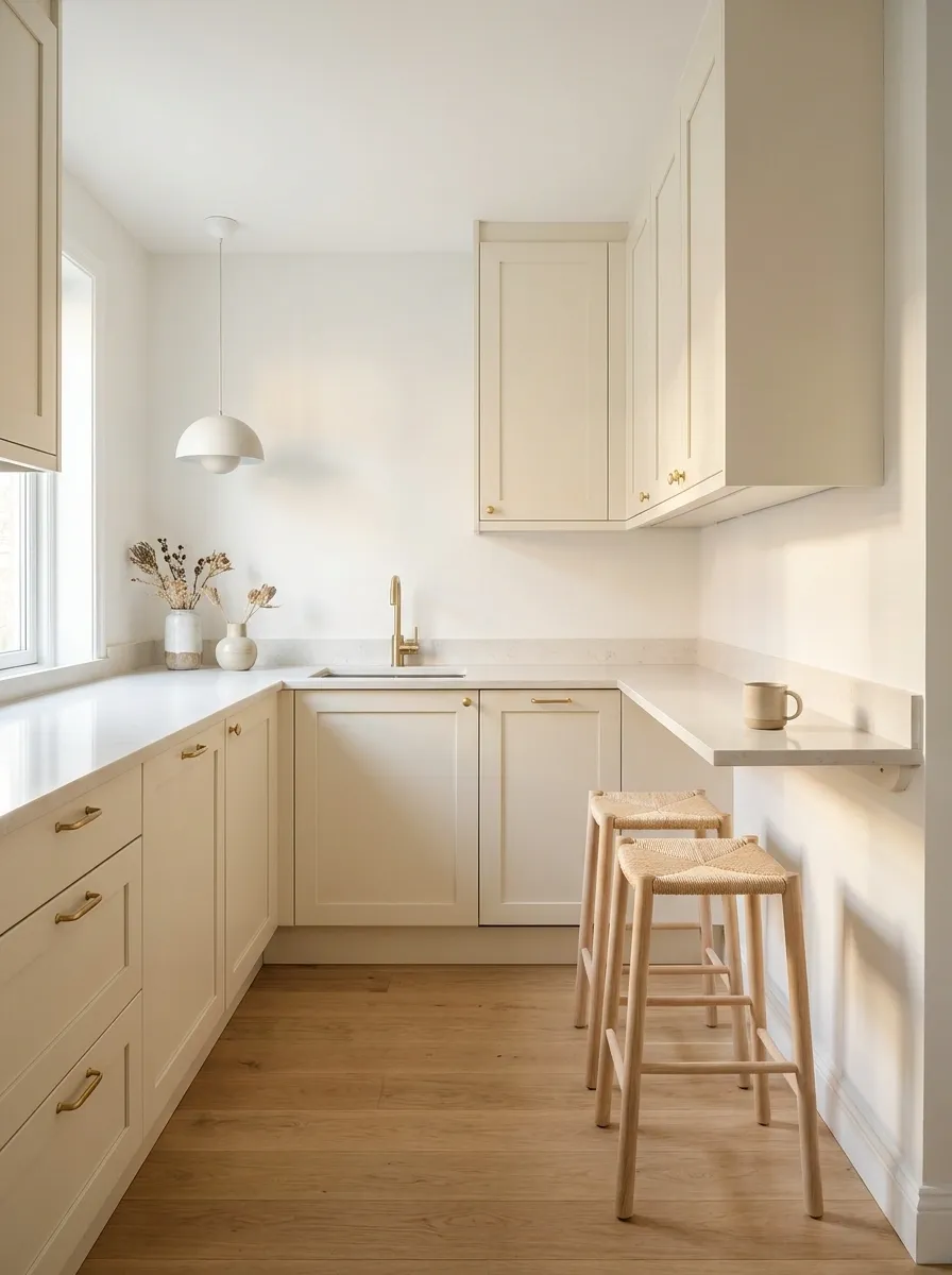
A compact L-shaped kitchen becomes much more useful when one short counter run is allowed to become a tiny dining surface.
This Scandinavian-inspired design uses pale cabinetry, natural wood, a light worktop, and a simple pendant to keep the composition visually quiet.
At the end of the counter, a slim overhang creates room for two stools without introducing a separate table.
The important part is that the dining area doesn’t look like an afterthought.
It shares the same countertop material and sits naturally within the cabinet layout.
Use this direction when every square foot needs to work twice.
The rest of the room can then stay almost completely free of furniture.
Hanging Rail Styling for Kitchen Walls
When counter space is at a premium, a sturdy black hanging rail transforms bare walls into a functional display.
A natural wood cutting board featuring bold typography shares the rod with a tiny green wreath and decorative chalkboard signs.
Wooden utensils stand neatly in a ceramic crock on the counter below, keeping essential tools within arm’s reach.
A vintage coffee grinder and a glass pitcher rest nearby on a light wooden base, completing the cozy beverage station.
This setup utilizes vertical storage to keep the work surface clear while infusing the room with personal character.
Small Green Kitchen With Warm Brass and Butcher-Block Counter
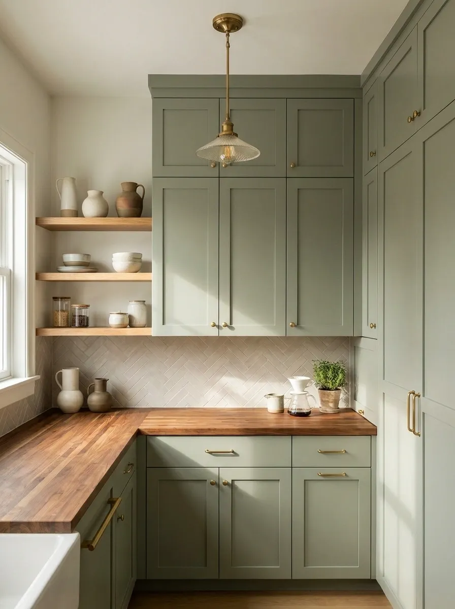
Muted green cabinetry gives this compact kitchen a stronger sense of personality without requiring a busy layout.
The counter uses warm butcher block through the main prep section, while the backsplash stays quiet so the wood remains the most noticeable material contrast.
Small brass details and a vintage-style pendant add warmth rather than becoming competing focal points.
The cabinetry reaches upward, which allows the counter itself to stay fairly clear.
Open shelving is limited to one short section, giving the room some display space without sacrificing too much visual order.
What makes this combination work is the material hierarchy.
Green carries the room, wood warms it, and brass only appears at the edges.
Apartment Kitchen With a Counter Running Into the Entryway
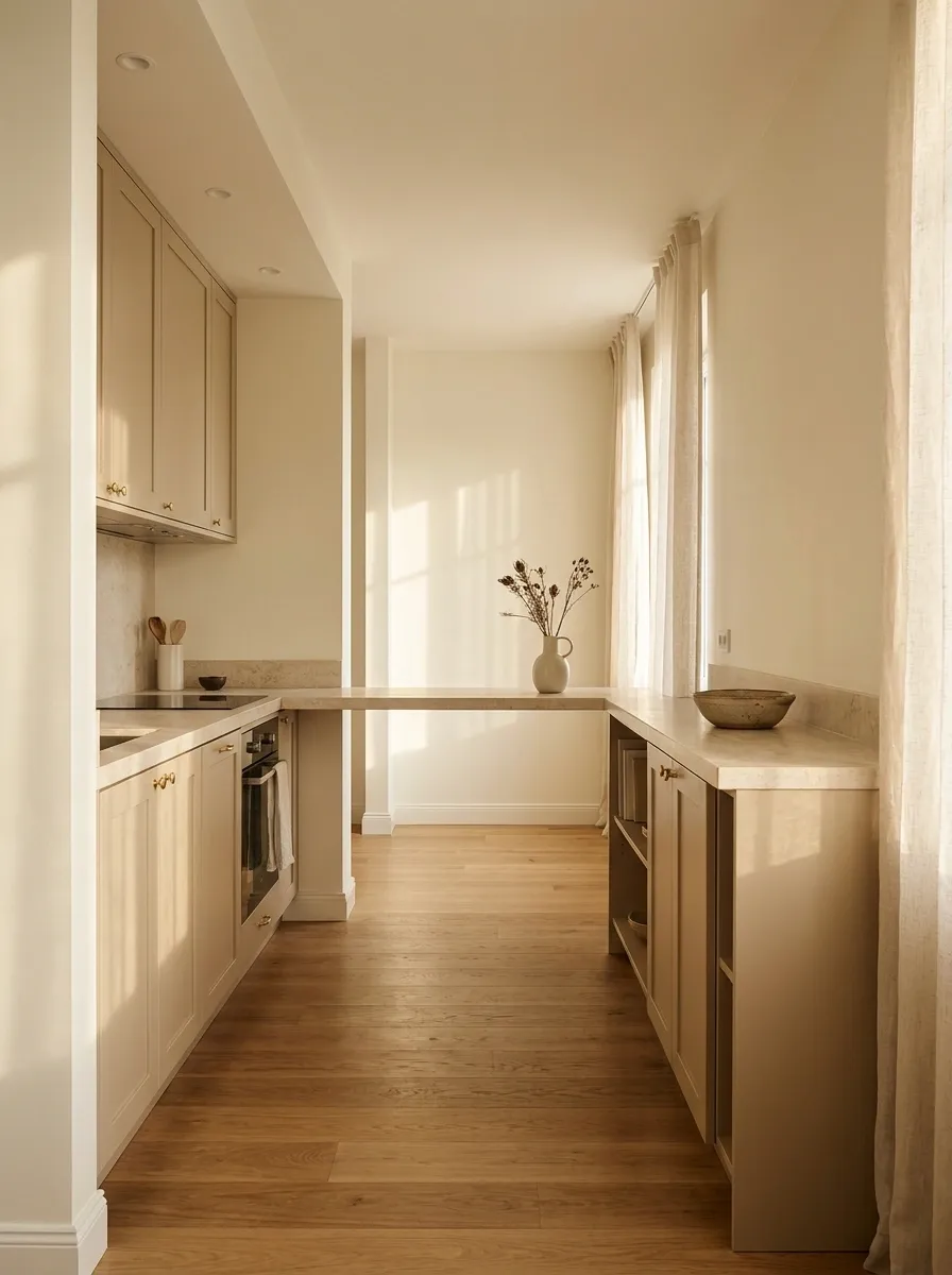
An open-plan apartment kitchen can feel disconnected when the counter simply stops at the edge of the cooking zone.
This design uses the countertop as a visual bridge into the entry area.
Compact base cabinets continue along one wall, while the counter terminates beside a narrow storage cabinet that blends into the entry.
The kitchen itself stays simple, with warm beige cabinetry, a pale stone surface, and medium oak flooring.
Because the same floor carries into the adjacent space, the counter feels like part of a larger composition rather than a separate kitchen box.
I’d keep the entry furnishings slim here.
A bulky console would compete with the useful transition created by the counter.
Soft Taupe Kitchen With a Full-Height Backsplash and Floating Shelves
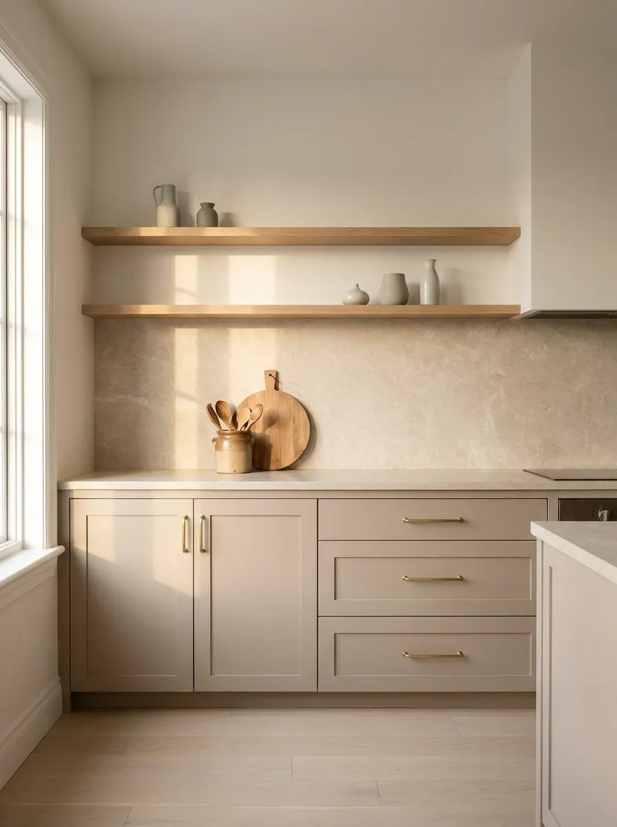
A restrained taupe palette gives this small kitchen a quiet, substantial look.
The counter and backsplash use closely related stone tones, creating a nearly seamless vertical transition behind the work surface.
Instead of filling every wall with upper cabinets, two slim oak shelves occupy one section and leave the rest open.
That openness matters.
The countertop gets enough visual breathing room that the kitchen doesn’t feel boxed in, even though storage remains practical.
The best way to copy this look is to keep the shelf styling disciplined.
A few useful pieces are enough.
Too many objects would immediately weaken the calm material continuity.
Black-and-Oak Kitchen With a Bright Prep Corner
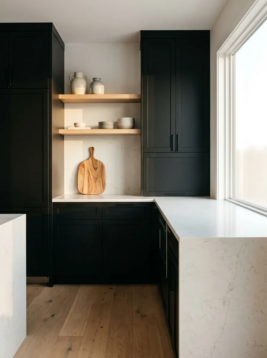
This compact kitchen uses contrast strategically.
Deep black cabinetry creates the main architectural frame, while pale oak and a light stone surface keep the room from becoming visually heavy.
Instead of spreading the brightest material everywhere, the design concentrates it around one prep corner near the window.
That makes the prep area feel almost like a destination within the kitchen.
The rest of the cabinetry can stay darker because there is a clear, naturally bright focal point.
Keep accessories away from that corner.
Its strength comes from the clean relationship between daylight, pale stone, and wood.
Tiny U-Shaped Kitchen With Corner Counter Storage
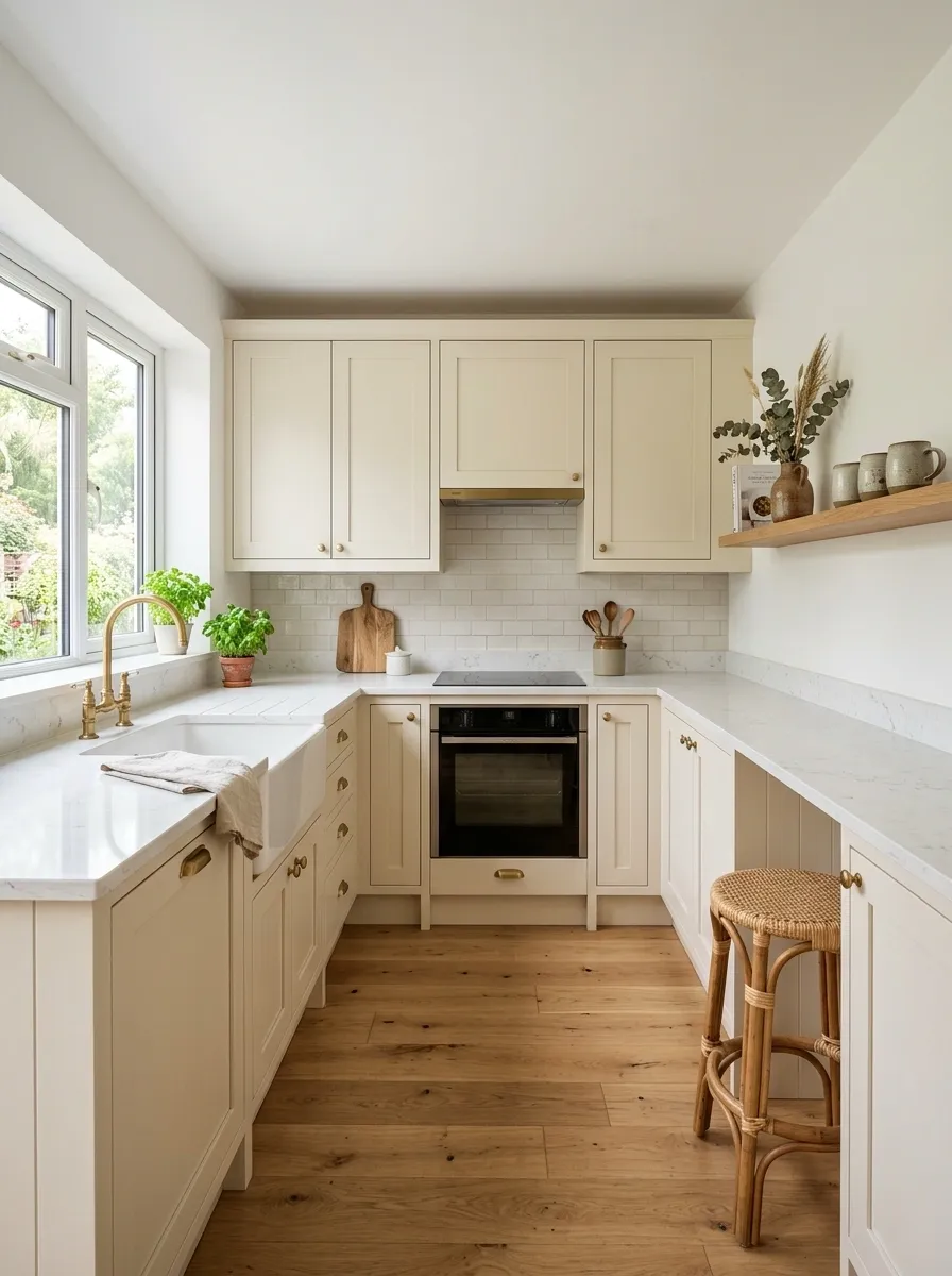
A U-shaped kitchen can provide plenty of usable work surface even when the footprint is tiny.
That only works when the corners are treated as part of the plan.
This version uses pale cabinetry and a continuous light counter, with corner storage integrated beneath the worktop instead of leaving those areas awkwardly empty.
The sink sits toward one side, while the opposite run gets the main prep space.
A small amount of open wall above the corner prevents the three-sided layout from feeling too enclosed.
The biggest mistake would be filling every corner with countertop appliances.
The layout already provides plenty of visual activity through its shape.
Classic Cream Kitchen With a Marble-Look Counter and Quiet Hardware
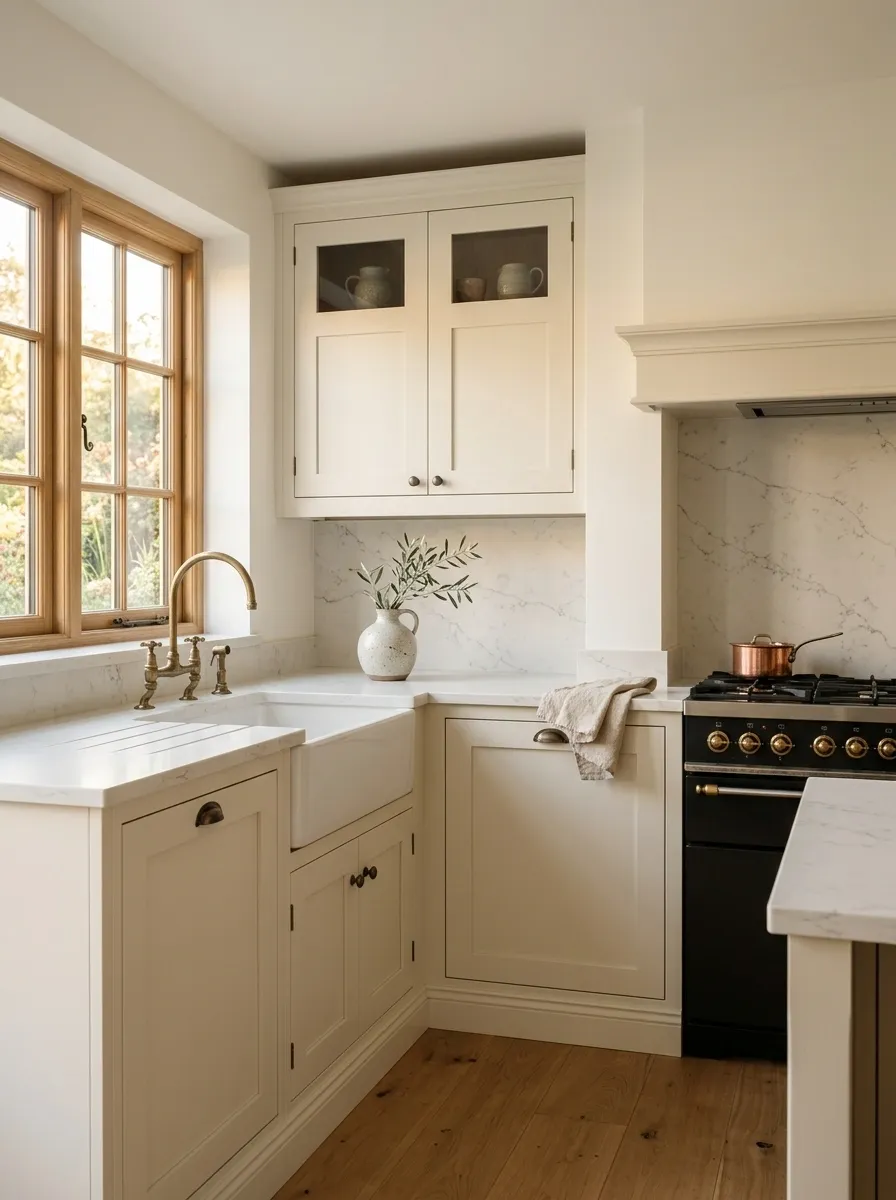
A small traditional kitchen doesn’t need elaborate cabinetry to feel classic.
This design keeps the cabinet profiles simple, then gives the counter and backsplash a soft marble-look finish that carries enough movement to add character.
Cream cabinetry surrounds it, while small dark or aged-metal hardware stays deliberately quiet.
The result feels refined without becoming fussy.
There is no need for a large collection of decorative objects because the counter material already provides the visual interest.
This approach works best when the stone pattern remains relatively controlled.
A very dramatic slab can dominate such a small room and make the cabinetry feel secondary.
Modern Blue Kitchen With a Slim Floating Counter Extension
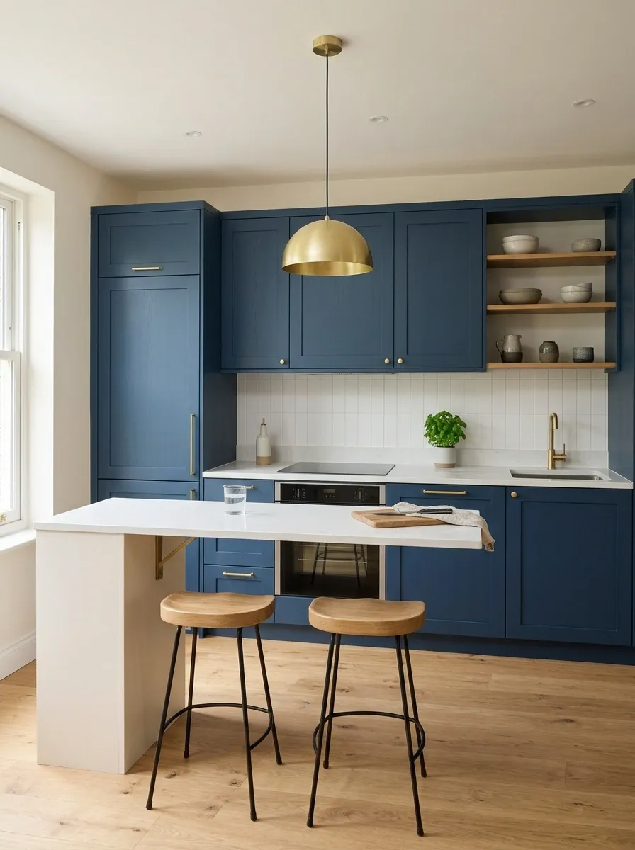
Deep blue cabinetry gives this compact kitchen a strong visual identity, while the pale counter keeps the room from feeling enclosed.
At one end, the countertop extends slightly beyond the base cabinets to create a slim spot for two stools.
It functions as a breakfast perch without introducing another piece of furniture into the room.
The rest of the kitchen stays clean and architectural.
Integrated appliances disappear into the cabinetry, while a simple pendant defines the small eating area.
The strongest part of this layout is the double-duty counter.
Keep the extension visually light.
A bulky island-style structure would defeat the purpose of the compact design.
Small Kitchen With a Stone-Wrapped Counter and Open End Panel
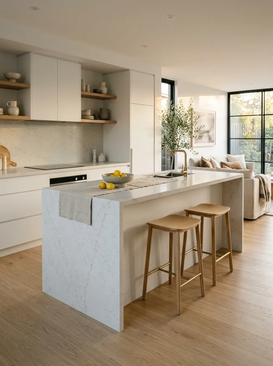
This compact contemporary kitchen treats the counter almost like a piece of architecture.
A pale stone-look material continues across the worktop and down the exposed end panel, giving the entire run a substantial, monolithic appearance.
Flat cabinetry underneath remains understated so the material continuity gets the attention.
One end stays open rather than being closed in with another cabinet.
That small decision gives the kitchen a lighter edge and helps the counter feel less bulky.
This composition is especially effective in an open-plan home where the exposed side of the kitchen can be seen from the living area.
Vintage-Inspired Kitchen With a Narrow Baking Counter
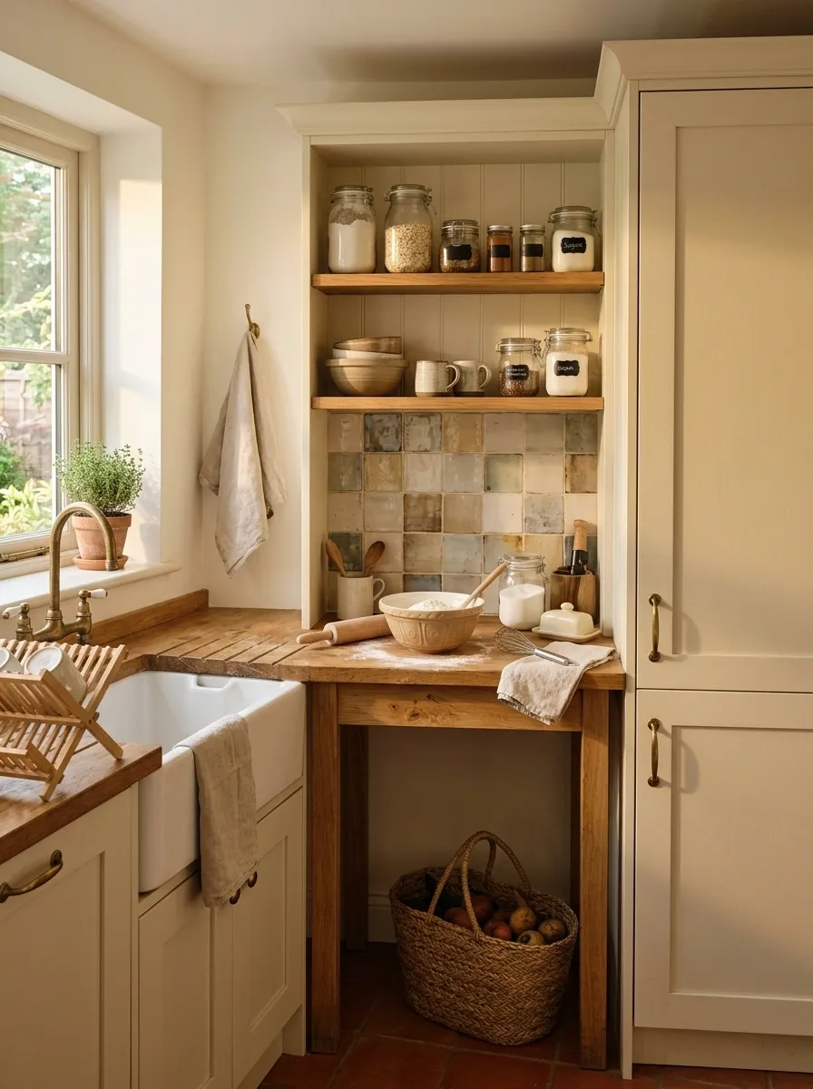
A small kitchen can have a dedicated baking area without needing a large island.
This design places a narrow section of warm wood counter between the sink and a tall pantry cabinet, creating a natural workstation.
Cream cabinetry, aged-looking hardware, and simple open shelving give it a relaxed vintage character.
The baking section is visually distinct but still connected to the rest of the kitchen through the cabinet color and backsplash.
A few frequently used ingredients can sit on the shelf above, while heavier equipment remains tucked away below.
The trick is to keep the baking zone purposeful.
Too much open storage would turn the warm vintage look into visual clutter.
storage
counter
storage
Rental-Friendly Small Kitchen With Warm Wood Styling
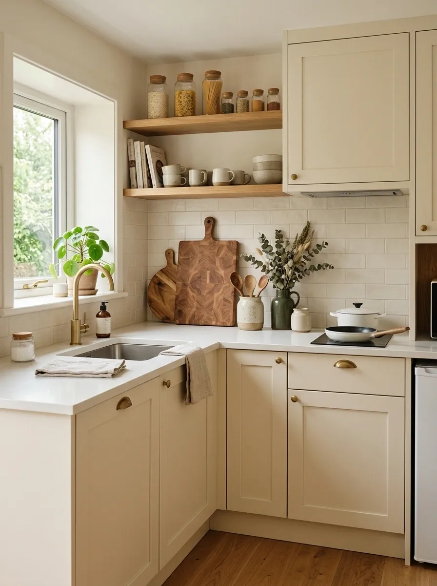
Not every small kitchen needs a renovation.
This design works with an existing compact layout, using warm wood accessories, removable-looking accents, coordinated containers, and carefully chosen countertop pieces to give an ordinary kitchen a more intentional finish.
The cabinets remain visually simple, while one section of the counter gets a stronger styling moment around a cutting board, ceramic vessels, and a small plant.
The rest stays open so the surface doesn’t become crowded.
The important distinction is that the design changes the look without depending on structural work.
That makes it useful for renters or anyone who wants a refreshed kitchen without committing to permanent changes.
Small Black Kitchen With Warm Under-Counter Lighting
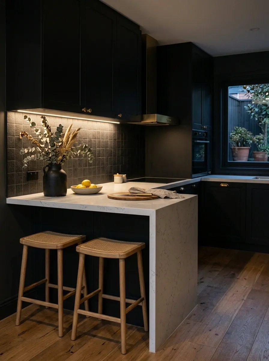
A compact black kitchen can feel surprisingly intimate when the lighting is treated as part of the counter design.
Here, matte black cabinetry creates a dark architectural base, while a pale stone worktop keeps the main working surface visible.
Warm lighting sits beneath the upper cabinets, washing the backsplash and counter with a soft glow.
The floor stays lighter, and a small amount of natural wood appears through stools and accessories.
This keeps the dark cabinetry from swallowing the room visually.
The lighting should remain focused on the work surface.
Too many bright fixtures would destroy the quiet evening character that makes this design distinctive.
Soft Pink-White Kitchen With a Butcher-Block Work Zone
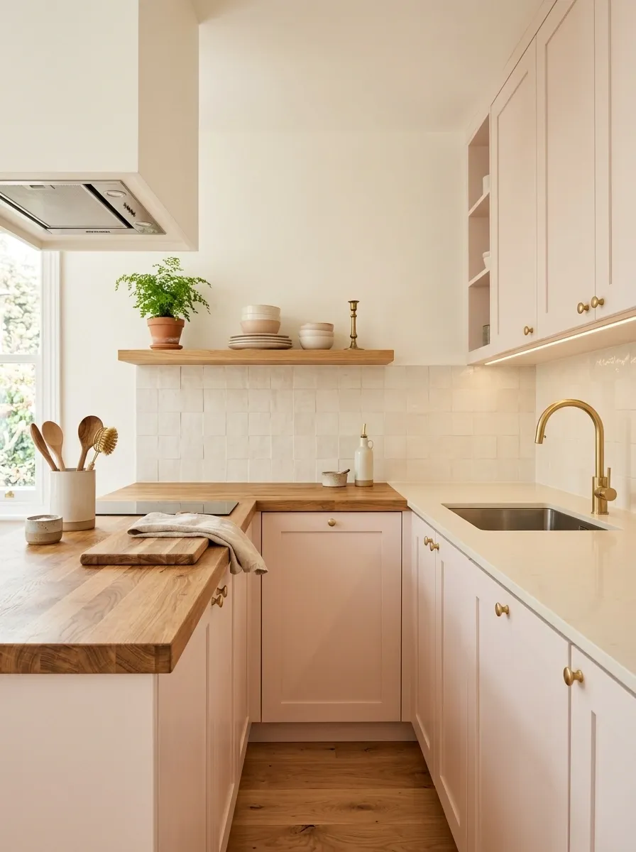
Soft blush cabinetry gives this small kitchen a warm personality without turning it sugary.
The cabinets stay close to a pale pink-white tone, while one substantial butcher-block counter section introduces natural wood and creates a clear prep zone.
The backsplash remains quiet, allowing the wood to become the main textural contrast.
Small brass fittings and warm lighting reinforce the palette without competing with it.
The strongest part of this design is the balance between color and material.
The cabinetry provides the mood, while the wood gives the counter a practical visual anchor.
Keep the rest of the countertop relatively sparse.
The wood zone already provides enough character.
Industrial Compact Kitchen With Concrete-Look Counter and Warm Wood
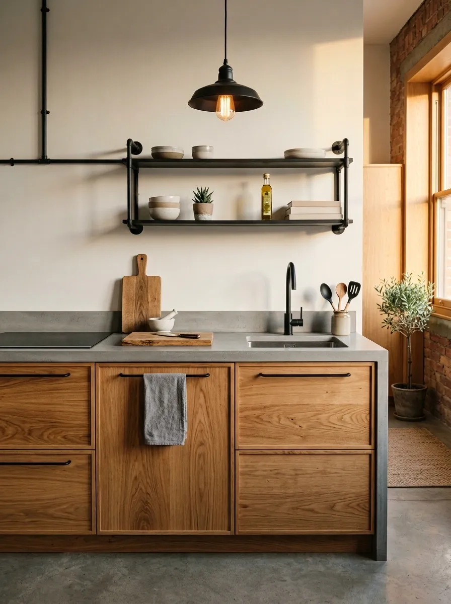
A concrete-look countertop can give a small kitchen an industrial edge without making the whole room feel cold.
This design pairs the hard gray surface with warm oak cabinetry and slim black details.
The cabinet fronts stay simple, allowing the counter texture and timber grain to provide most of the visual interest.
An exposed-style pendant hangs above the main work area, while open wall space keeps the compact room from becoming overly dense.
The contrast works because the materials play different roles.
Concrete brings structure, wood brings warmth, and black metal sharpens the composition.
Don’t add too many industrial accessories.
The material combination already carries the theme.
counter
cabinetry
metal
Coastal Small Kitchen With Pale Blue Cabinets and a Bright Stone Surface
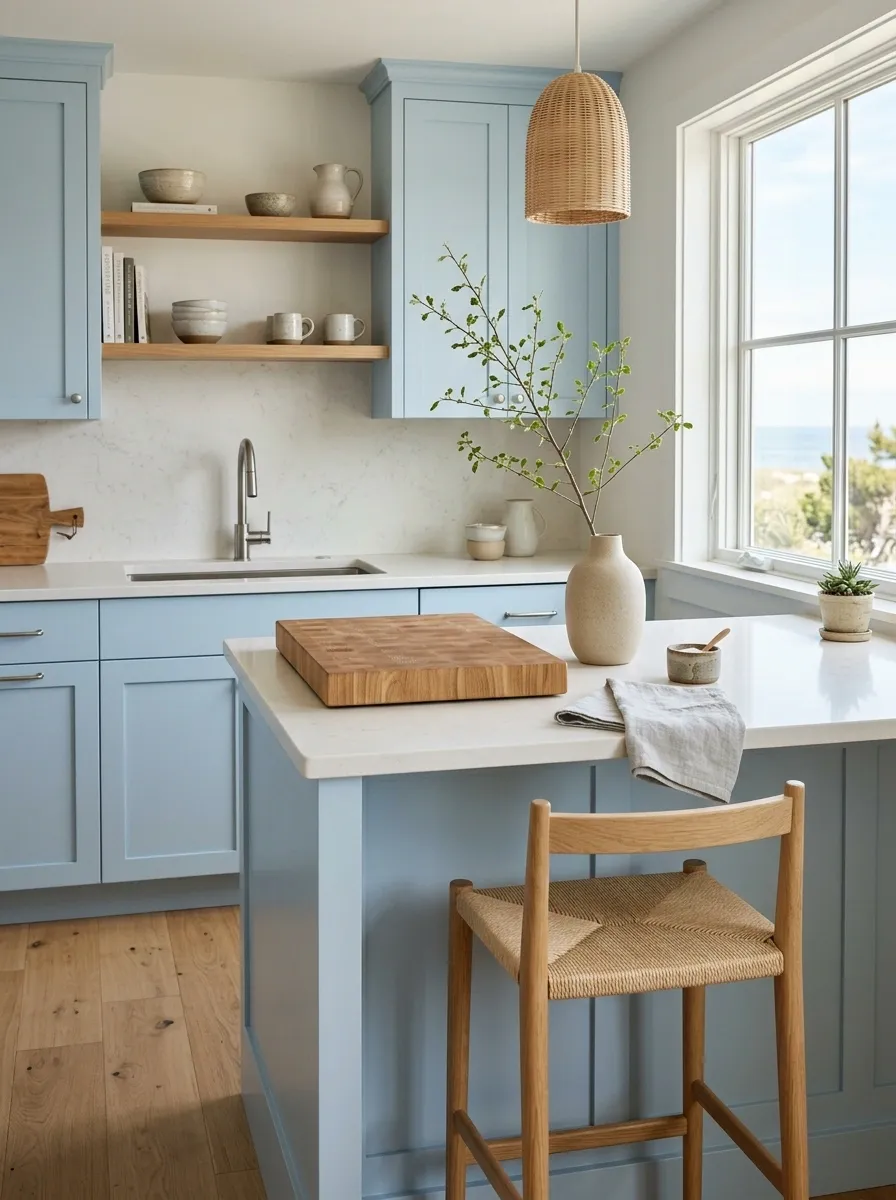
A coastal kitchen doesn’t need obvious nautical decorations.
This version gets the feeling from a restrained palette instead.
Pale blue cabinetry surrounds a bright stone counter, while natural wood appears through a stool, cutting board, and small architectural details.
The counter remains visually clean, with the backsplash and worktop forming a light backdrop for the soft blue cabinets.
Large daylight from one side of the room gives the entire composition an airy quality.
What makes this version stronger than a themed coastal kitchen is its restraint.
There are no ropes, shells, or obvious seaside motifs competing with the actual design.
Cabinet field
Counter and walls
Small accents
One-Wall Kitchen With a Visually Enlarging Continuous Backsplash
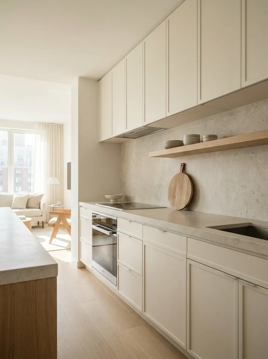
When a kitchen occupies one wall, every horizontal line becomes important.
This design uses a pale stone counter and closely matched backsplash that continue almost uninterrupted from one end to the other.
Slim cabinetry above and below keeps the composition clean, while integrated appliances prevent the counter from being broken into too many competing sections.
The matching surfaces make the kitchen read as one long architectural plane rather than a collection of separate cabinets.
A small amount of oak adds warmth without interrupting the visual flow.
This is especially effective in apartments where the kitchen shares a wall with a living or dining area.
Keep the backsplash pattern quiet so continuity remains the main feature.
Small Kitchen With a Built-In Coffee and Breakfast Counter
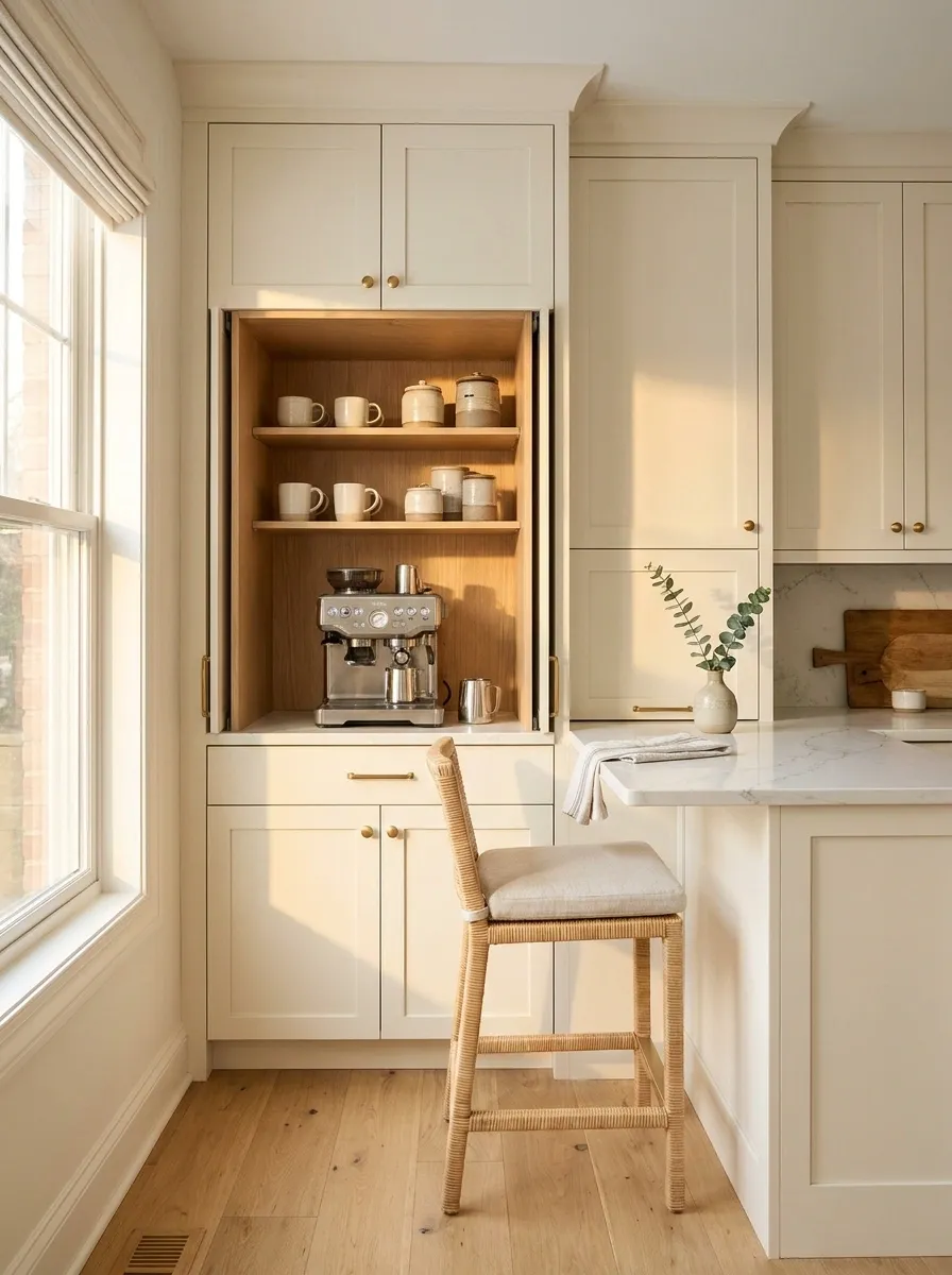
This design gives one section of the kitchen a distinct morning purpose without creating a separate coffee station that takes over the room.
A compact counter runs beside a built-in coffee niche, with a small overhang providing just enough room for one or two stools.
The cabinetry is warm white with a light oak interior around the coffee area, giving that section a little more visual depth.
The primary prep counter remains available for cooking because mugs, beans, and small equipment have a dedicated home nearby.
The arrangement works because the coffee zone is integrated into the architecture.
It feels like part of the kitchen rather than another countertop collection.
Modern Farmhouse Kitchen With a Compact Wood Prep Counter
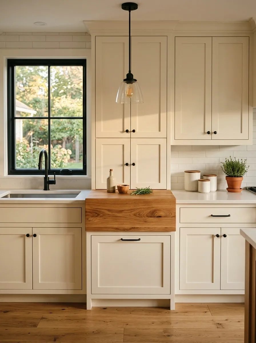
This modern farmhouse kitchen keeps the familiar combination of cream cabinetry, black accents, and natural wood, but uses the materials in a much tighter composition.
Most of the counter stays pale and visually quiet, while one compact wood section marks the main preparation area.
Simple cabinet fronts prevent the room from feeling overly rustic.
A black faucet and small pendant provide definition, while the wood brings enough texture to keep the cream cabinetry from appearing flat.
The charm comes from the contrast between clean lines and natural material.
Avoid adding too many farmhouse accessories.
Let the counter and cabinetry establish the character.
Luxury Small Kitchen With Full-Height Cabinetry and Calacatta-Look Counter
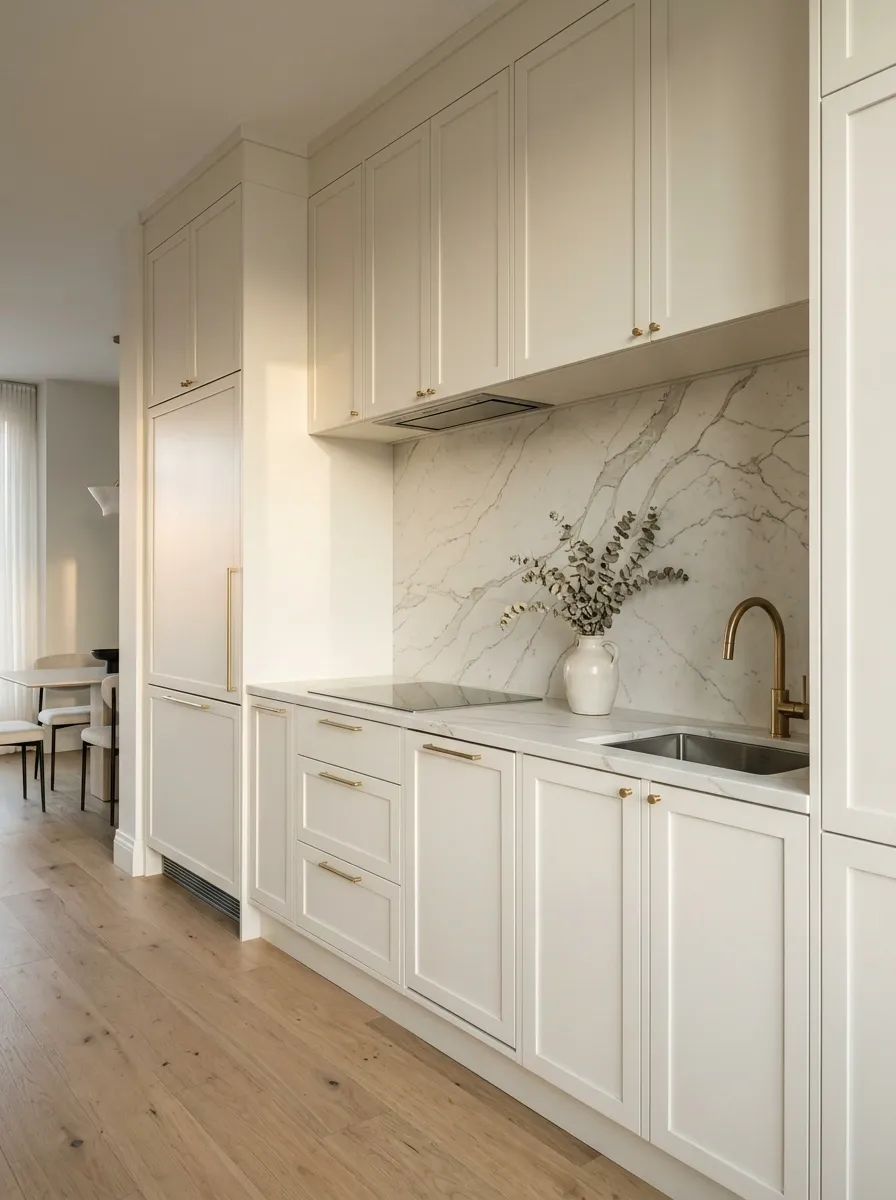
A compact kitchen can feel luxurious without becoming visually overloaded.
This design uses full-height cabinetry to create a clean architectural shell, while a pale Calacatta-look stone counter and matching backsplash provide the main focal surface.
Integrated appliances disappear into the tall cabinetry, leaving the lower counter run visually uninterrupted.
Slim brass hardware adds a warm accent, but it stays secondary to the stone.
The floor and walls remain quiet, giving the high-contrast veining enough room to read clearly.
Scale is the key here.
Tall cabinetry makes the compact room feel deliberate, while a restrained number of finishes keeps it from looking busy.
Organic Modern Kitchen With Warm Limestone, Oak, and Soft Lighting
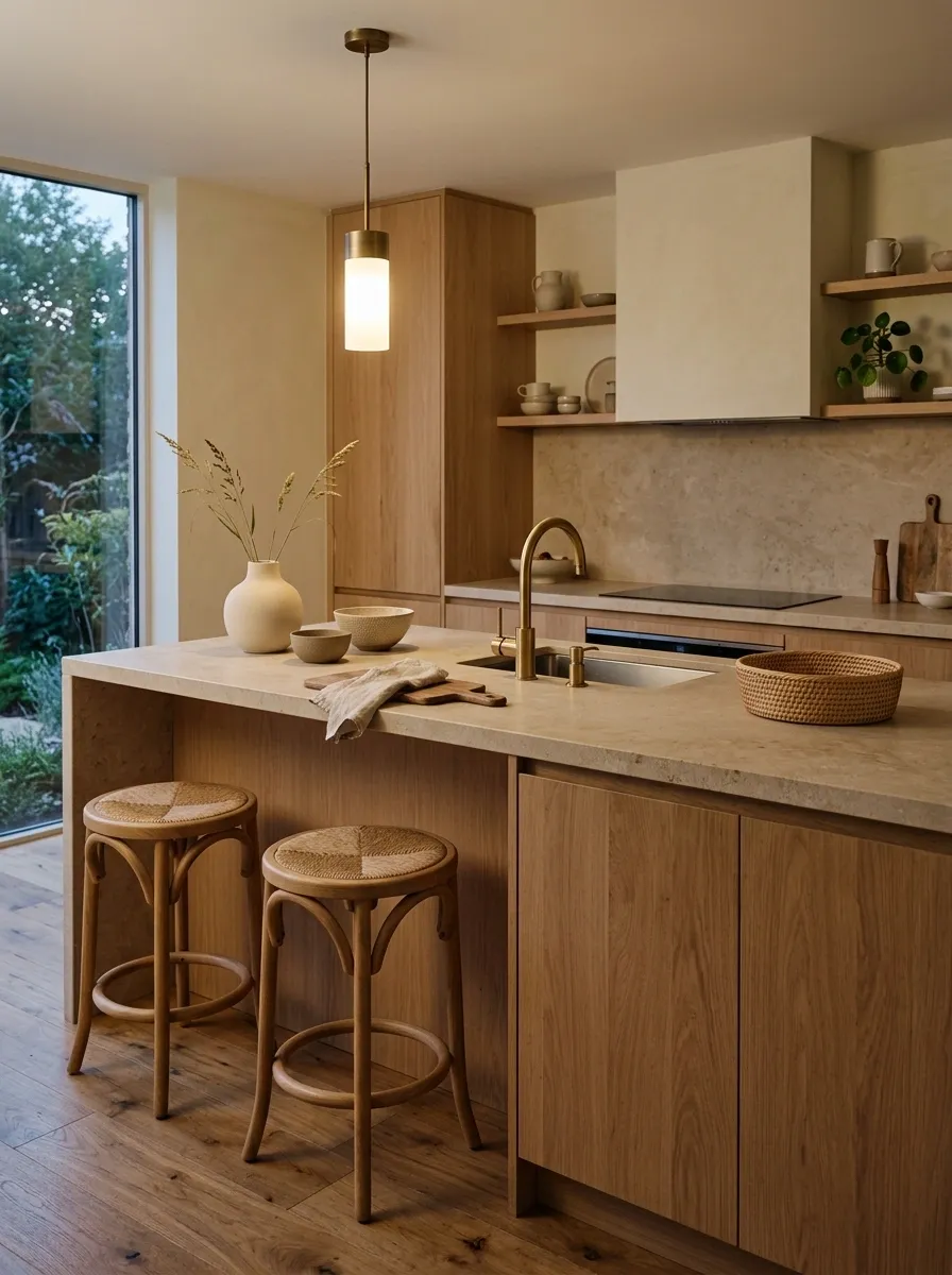
The final concept takes a softer organic-modern approach, combining warm limestone tones, natural oak cabinetry, and gentle evening lighting.
The counter has a subtly textured stone appearance, while rounded stools and softly shaped accessories keep the compact kitchen from feeling overly rigid.
Instead of filling the counter with decorative objects, the design leaves generous open areas around the sink and prep zone.
A simple pendant provides a focal point above the counter, while warm illumination brings out the grain of the oak after dark.
The strongest quality here is material balance.
Stone provides visual weight, oak softens it, and muted lighting ties the composition together.
visual weight
warmth and texture
evening atmosphere
Bringing the Look Together
A compact kitchen doesn’t need every useful idea at once.
In fact, the strongest spaces usually make one or two decisions very clearly and let everything else support them.
Start with the part of your counter that matters most.
Maybe it’s the long prep run, the corner beside the window, the space where breakfast happens, or the section that keeps getting buried under appliances.
Build the surrounding design around that area.
Choose a countertop material that relates to the cabinets, decide where the visual weight should sit, and give everyday items a sensible place to live.
Once those relationships are right, the kitchen tends to feel more intentional without needing more stuff.
Save the designs that match your kitchen’s layout, and use them as visual references when you’re ready to rethink your counters.