
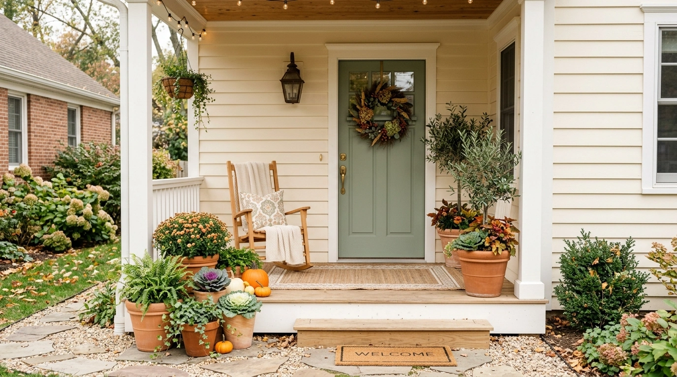
A small porch doesn’t need more decoration to feel finished. Quite often, it needs fewer competing colors. When the siding, trim, front door, furniture, planters, and flooring all pull in different directions, even a carefully furnished entrance can look scattered.
Color becomes much more useful when it is treated as a complete composition rather than a paint choice made in isolation. A warm white porch changes completely when natural oak and terracotta enter the picture. Sage feels different beside weathered wood than it does beside black metal. A dark exterior can feel dramatic or cramped depending on what happens at floor level.
The most useful small porch color palette ideas show the entire relationship. They reveal how architecture, furniture, materials, planting, and small accents work together in one finished setting. The designs below take that approach, moving through light neutrals, softened greens, muted blues, deep architectural colors, warm earth tones, and more unusual combinations that give a compact entrance its own identity.
Small Porch Color Palette Ideas
Warm White Porch With Natural Wood and Terracotta
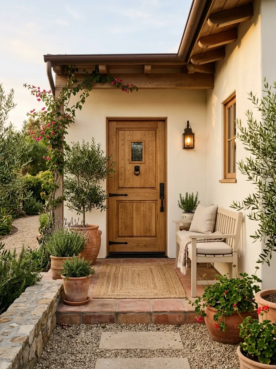
Warm white creates breathing room on a compact porch, but it needs warmer materials around it to keep the space from looking flat. This version pairs creamy ivory walls with a natural oak door, pale beige seating, woven textures, and terracotta planters. The clay color appears in small doses, giving the neutral background a grounded Mediterranean feel.
The important relationship is between the pale architecture and the warmer materials below eye level. Natural wood gives the entry some depth, while terracotta brings enough color to stop the porch from disappearing into one large cream-colored surface. Keep the furniture simple and let the door and planters carry most of the visual character.
Soft Sage Porch With Cream Trim and Weathered Wood
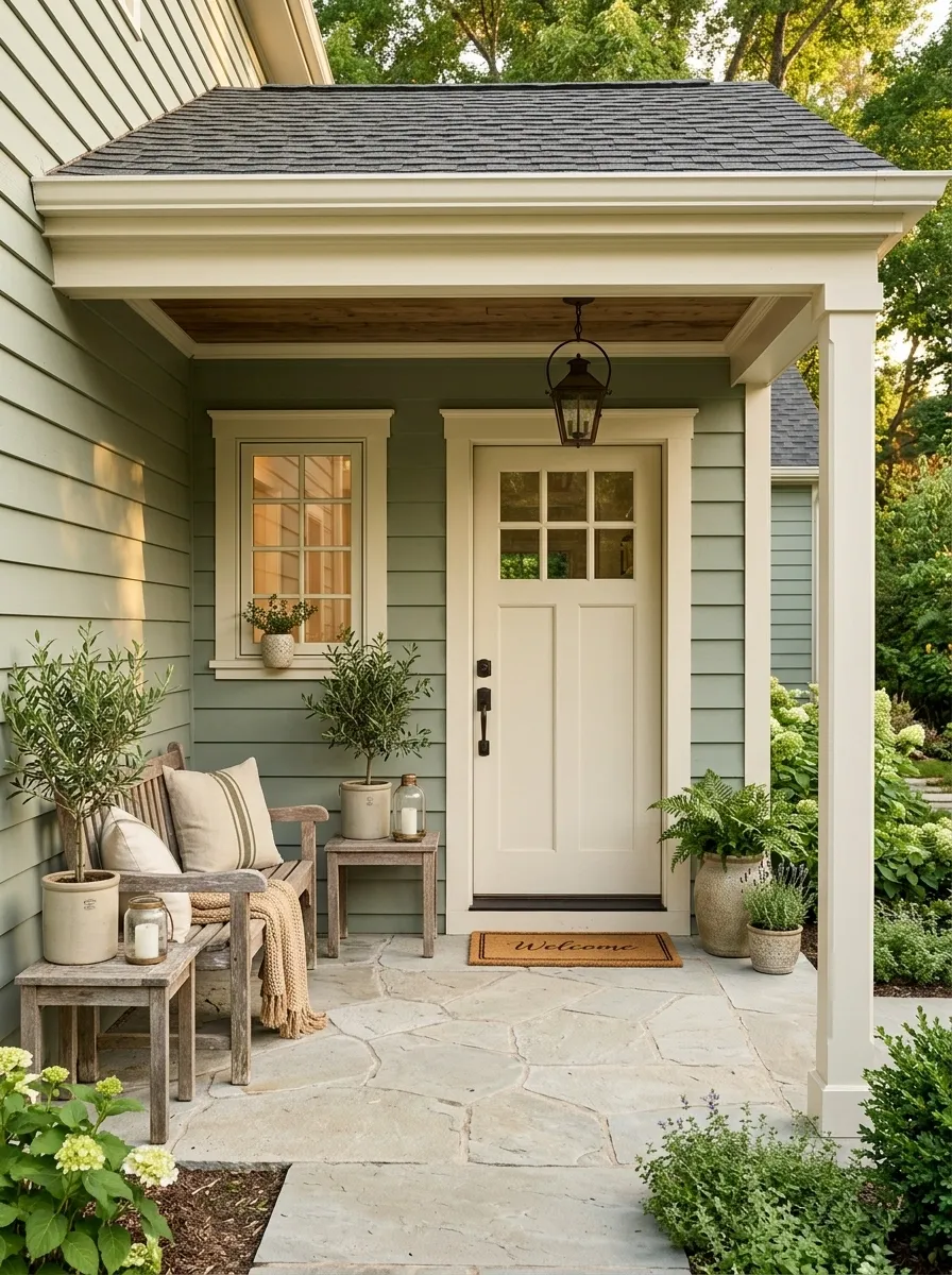
Soft sage gives a small porch more color without making the architecture feel heavy. Here, muted green covers the main exterior while creamy trim outlines the windows, door frame, and roofline. Weathered wood furniture adds a faded, natural layer, and olive-toned planting echoes the wall color instead of competing with it.
The palette works because the green is allowed to occupy a large surface while the brighter cream is reserved for architectural edges. That creates definition without introducing a harsh black-and-white contrast. Pale stone underfoot keeps the composition grounded. A few woven pieces complete the look without making the small footprint feel crowded.
Charcoal Porch With Cedar and Muted Greenery
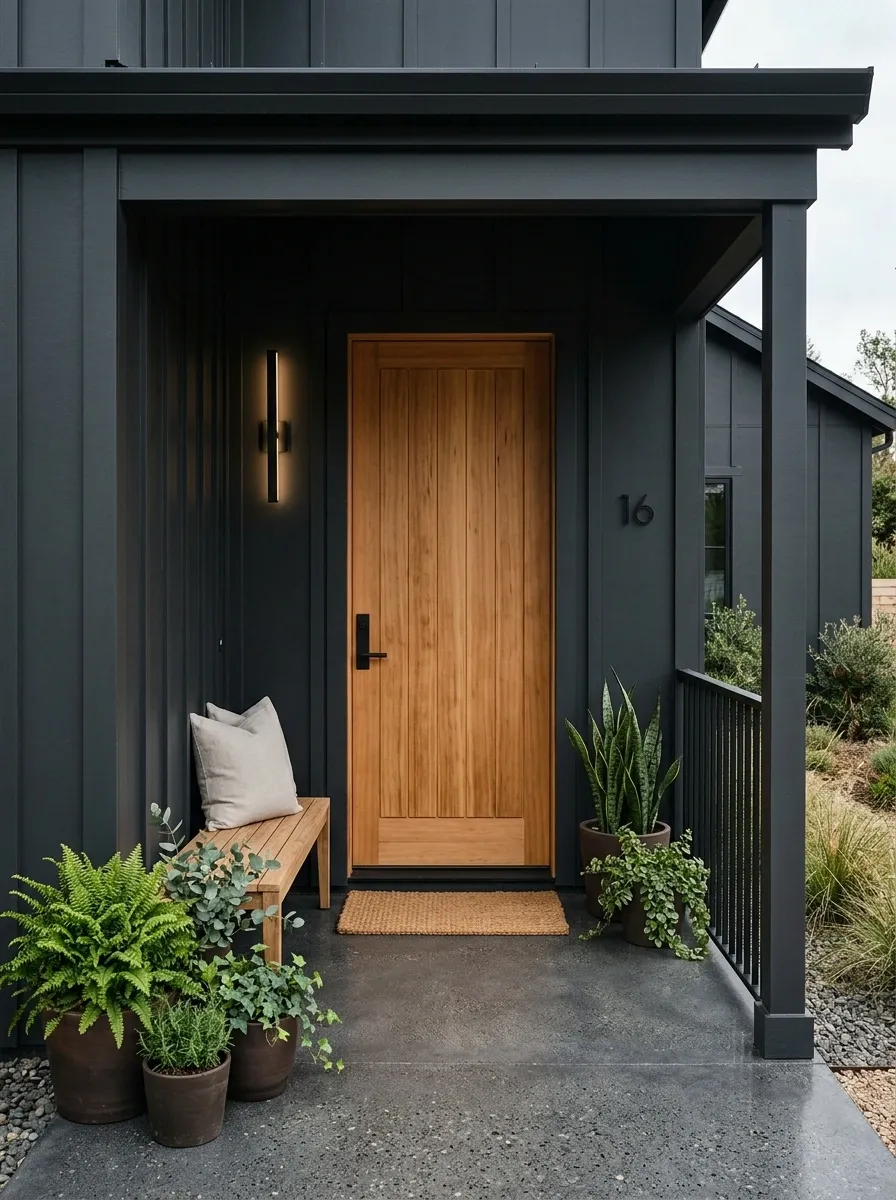
A charcoal porch makes a small entrance feel architectural rather than merely decorative. The dark exterior becomes the backdrop for a warm cedar door, slim black metal details, mossy green planting, and simple natural-texture seating. The cedar is especially important because it breaks up the dark surfaces with a warmer, more tactile material.
The strongest version keeps the rest of the porch restrained. Pale cushions can work, but bright white accessories would change the mood too sharply. Muted greenery is a better bridge between the charcoal architecture and orange-brown cedar. This composition is especially convincing when the porch already has strong structural lines, such as narrow posts, a simple roofline, or a framed entry.
Dusty Blue Porch With Warm White and Brass Details
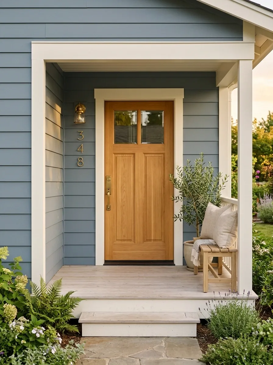
Dusty blue is especially useful when a small porch needs personality without a heavy visual presence. This composition uses a muted blue exterior with warm white trim, a honey-toned wood door, aged brass lighting, and pale outdoor cushions. The colors feel collected rather than matched because each one occupies a different visual role.
The blue should stay slightly gray rather than leaning bright or saturated. That keeps the porch sophisticated and lets the warmer materials stand out. Brass works best in small touches, such as a lantern, door hardware, or house numbers. With a compact footprint, keeping the floor and larger furniture pieces light helps the blue remain the main color without making the porch feel closed in.
Cream and Black Porch With Graphic Architectural Lines
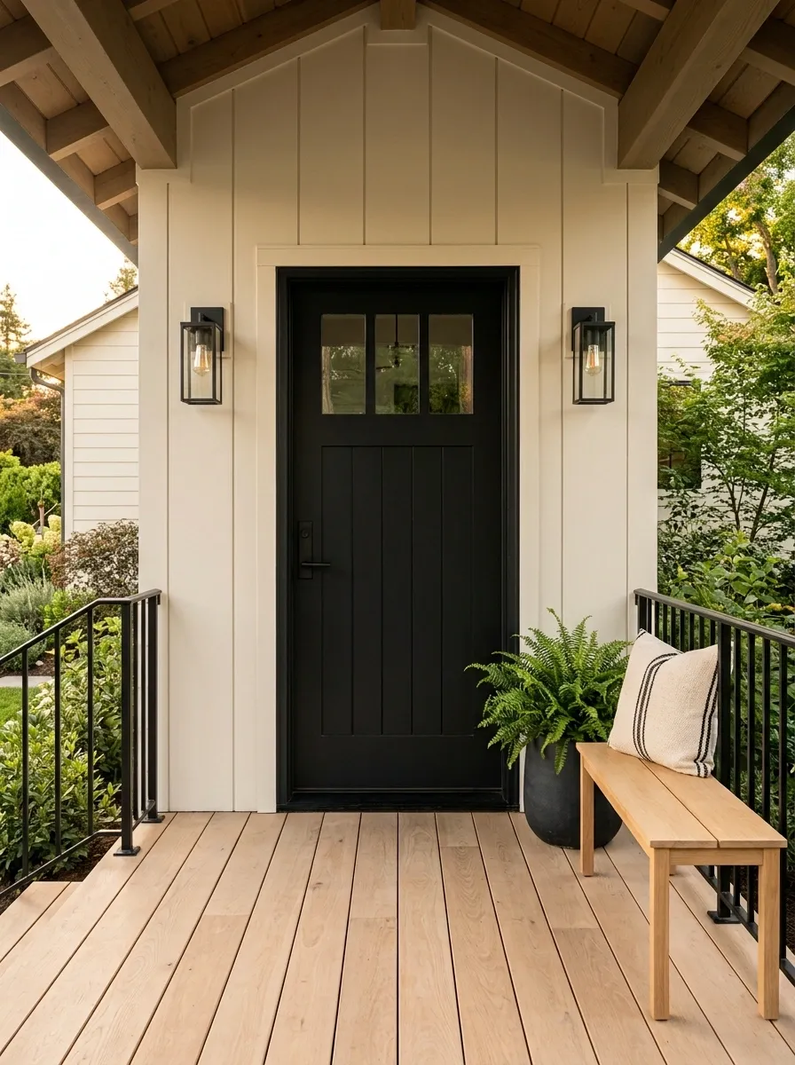
Cream and black can make a small porch feel sharply defined without relying on lots of decoration. The architecture stays warm and light, while a matte black door, slim railing, dark planters, and simple lighting establish the stronger lines. A restrained stripe in an outdoor cushion introduces pattern without adding another major color.
This palette works because black is concentrated around the areas that naturally deserve attention. The door, railing, and lighting create a visual frame, while the cream surfaces keep the overall porch open. Pale wood is useful here as a soft transition between the two extremes. Too many black accessories would flatten the hierarchy, so the darkest elements should remain limited and deliberate.
Muted Terracotta Porch With Sand and Olive Accents
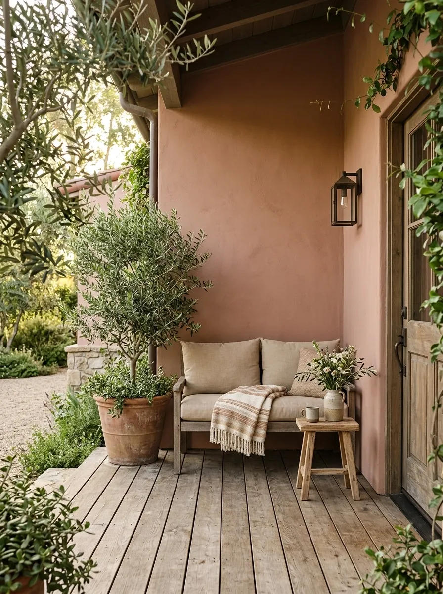
Muted terracotta gives a small porch an earthy identity without the intensity of a bright red or orange. Here, the walls carry a dusty clay tone while sandy beige cushions, olive greenery, aged wood, and handmade-looking pottery build the rest of the composition. Nothing competes with the architecture.
The key is keeping the terracotta soft and slightly dusty. A saturated orange would make the space feel much louder. Pale seating and natural wood create visual pauses, while olive planting introduces a cooler note that keeps the warm palette from becoming monotonous. This works especially well on porches surrounded by greenery, warm masonry, or other natural materials.
Deep Olive Porch With Natural Stone and Linen
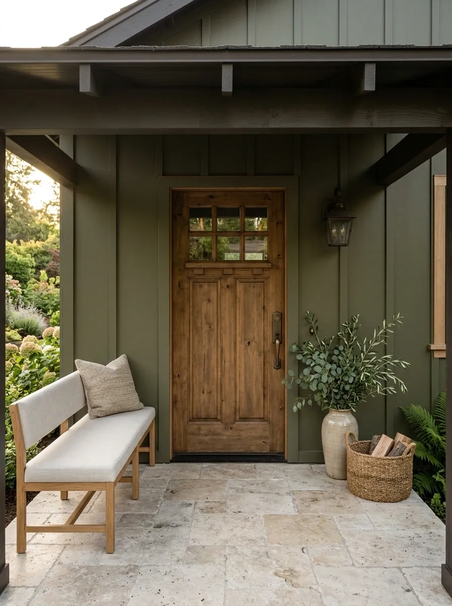
Deep olive changes the character of a small porch immediately, giving the architecture a richer and more grounded presence. This version combines olive-green walls with limestone flooring, pale linen seating, aged bronze hardware, and leafy planting. The lighter materials are essential because they prevent the dark wall color from swallowing the limited space.
The contrast feels natural because every supporting color comes from an earthy family. Limestone introduces pale variation underfoot, linen softens the furniture, and bronze adds just enough depth around the door and lighting. Keep decorative accessories sparse here. The combination of saturated green and natural materials already creates plenty of visual interest.
Pale Greige Porch With Walnut and Soft Black
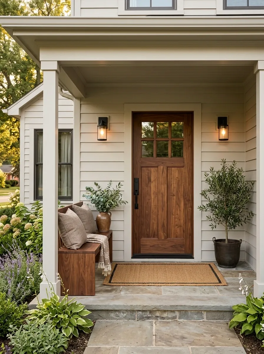
A pale greige porch creates a quiet backdrop for richer materials. Walnut furniture and a walnut-toned door supply warmth, while soft black appears only in the lighting and a few structural details. Taupe cushions and restrained greenery bridge the two extremes.
This composition is less about obvious color and more about tonal layering. The greige should be warm enough to sit comfortably beside walnut rather than pulling toward icy gray. Soft black then sharpens the architecture without becoming the dominant feature. It suits compact porches where a large number of contrasting colors would make the space feel visually fragmented.
Blush Beige Porch With Dark Wood and Terracotta Pots
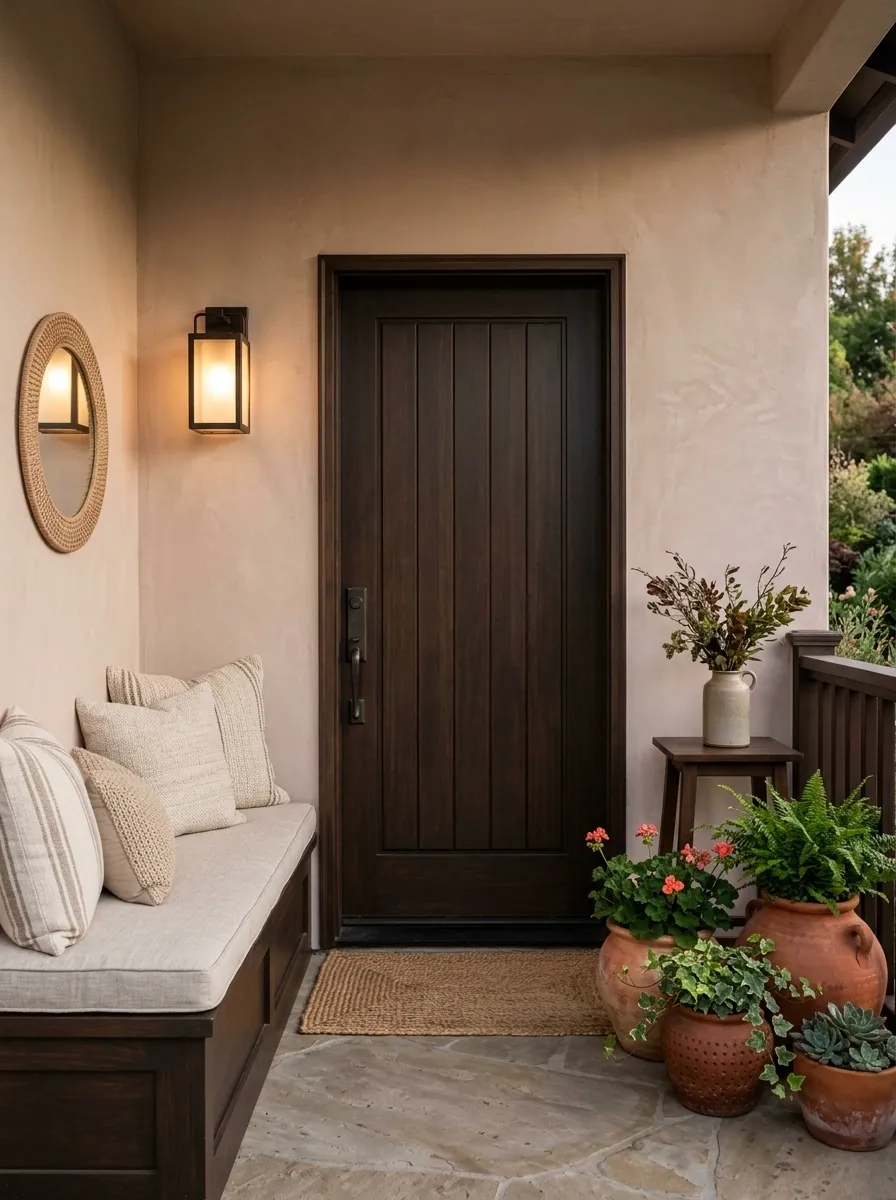
Blush beige works beautifully when the color is muted enough to read as a warm architectural neutral rather than obvious pink. This porch pairs that dusty wall color with espresso-toned wood, cream cushions, terracotta pots, and warm evening lighting. The result feels intimate without relying on heavy decoration.
The dark wood gives the pale pink-beige background enough contrast to look intentional. Terracotta then repeats the warm undertone in a more saturated form, creating a connection between the architecture and accessories. Keep the textiles close to cream and oatmeal rather than bright white. That small adjustment preserves the softness of the palette.
Navy Porch With Crisp Trim and Warm Wood
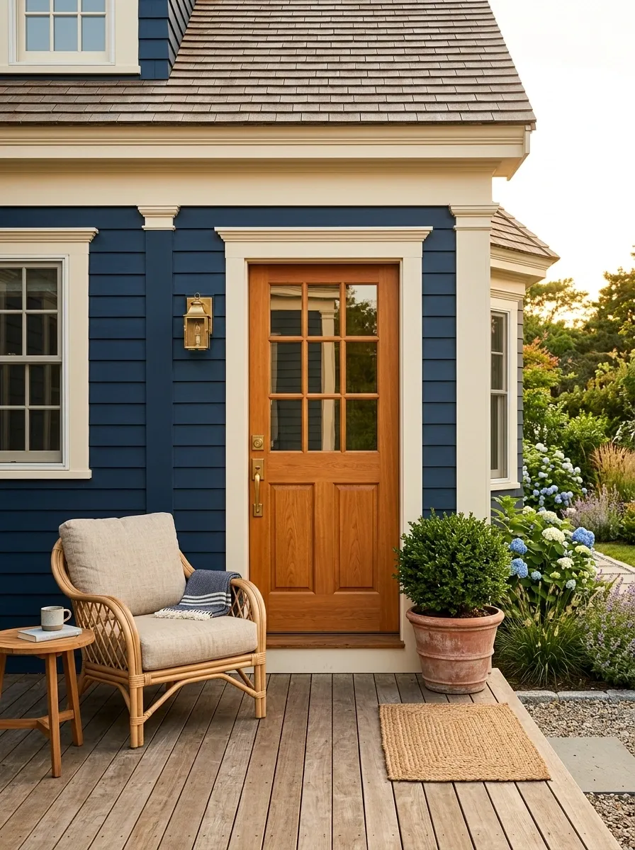
Navy gives a small porch a strong visual anchor, but crisp trim keeps the color from becoming too heavy. This version places deep navy on the main architecture, then uses warm cream around the trim, a medium-tone wood door, woven seating, and restrained greenery to introduce contrast.
The wood is doing more work than a collection of colorful accessories would. Its warm orange-brown undertone breaks the coolness of the navy while remaining substantial enough to feel architectural. Keep the cream trim slightly warm rather than stark white. That makes the overall composition feel more residential and less graphic.
Mushroom Taupe Porch With Antique White and Bronze
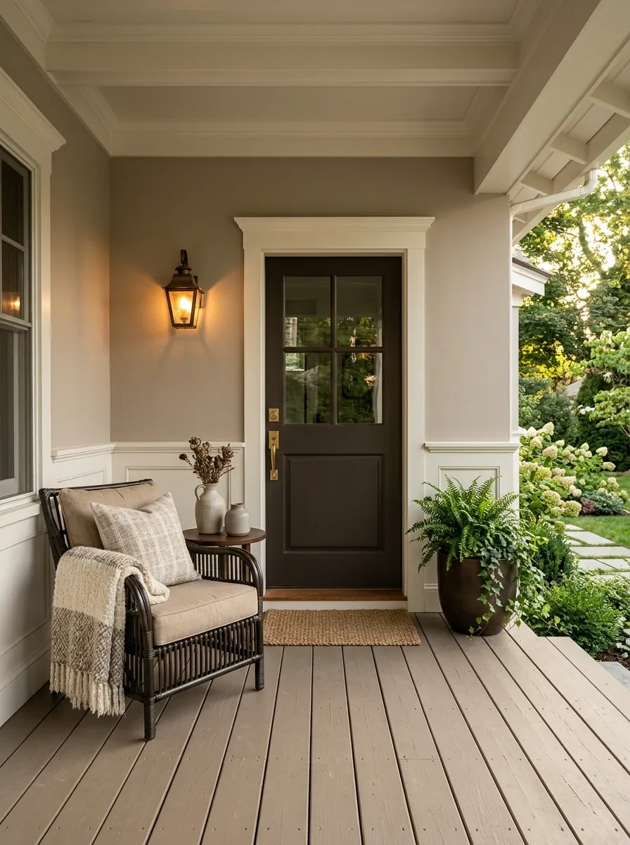
Mushroom taupe sits between beige and gray, which makes it unusually flexible on a small porch. This version gives the walls a soft mushroom tone, then adds antique white trim, aged bronze lighting, dark woven furniture, and warm natural textiles. The palette has enough contrast to define the architecture without making the entrance feel busy.
The bronze matters because pure black would create a much sharper result. Here, the warmer metal keeps the darker elements connected to the taupe background. Antique white also works better than brilliant white because it maintains the slightly weathered character of the palette. A narrow porch benefits from keeping the floor close to the wall color so the visual boundaries don’t become chopped up.
Pale Clay Porch With Natural Rattan and Cream
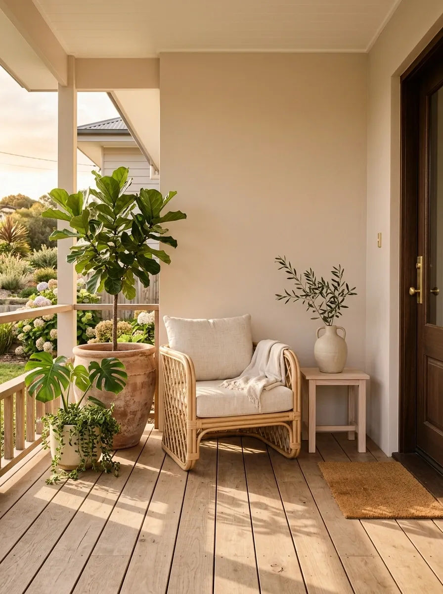
Pale clay gives this porch a soft sun-washed quality while keeping the architecture noticeably warmer than a standard beige. Rattan furniture, cream cushions, pale timber, and oversized leafy planters create a relaxed composition with very little visual clutter. The color stays subtle enough for a narrow entry to retain a sense of space.
Texture becomes especially important because the palette itself is restrained. Smooth painted walls sit beside woven rattan, softly textured cushions, ceramic pots, and natural wood. Those material changes keep the monochromatic color family from feeling unfinished. Avoid introducing multiple bright colors here. The strength of the design comes from letting texture provide the variation.
Forest Green Porch With Warm Oak and Limestone
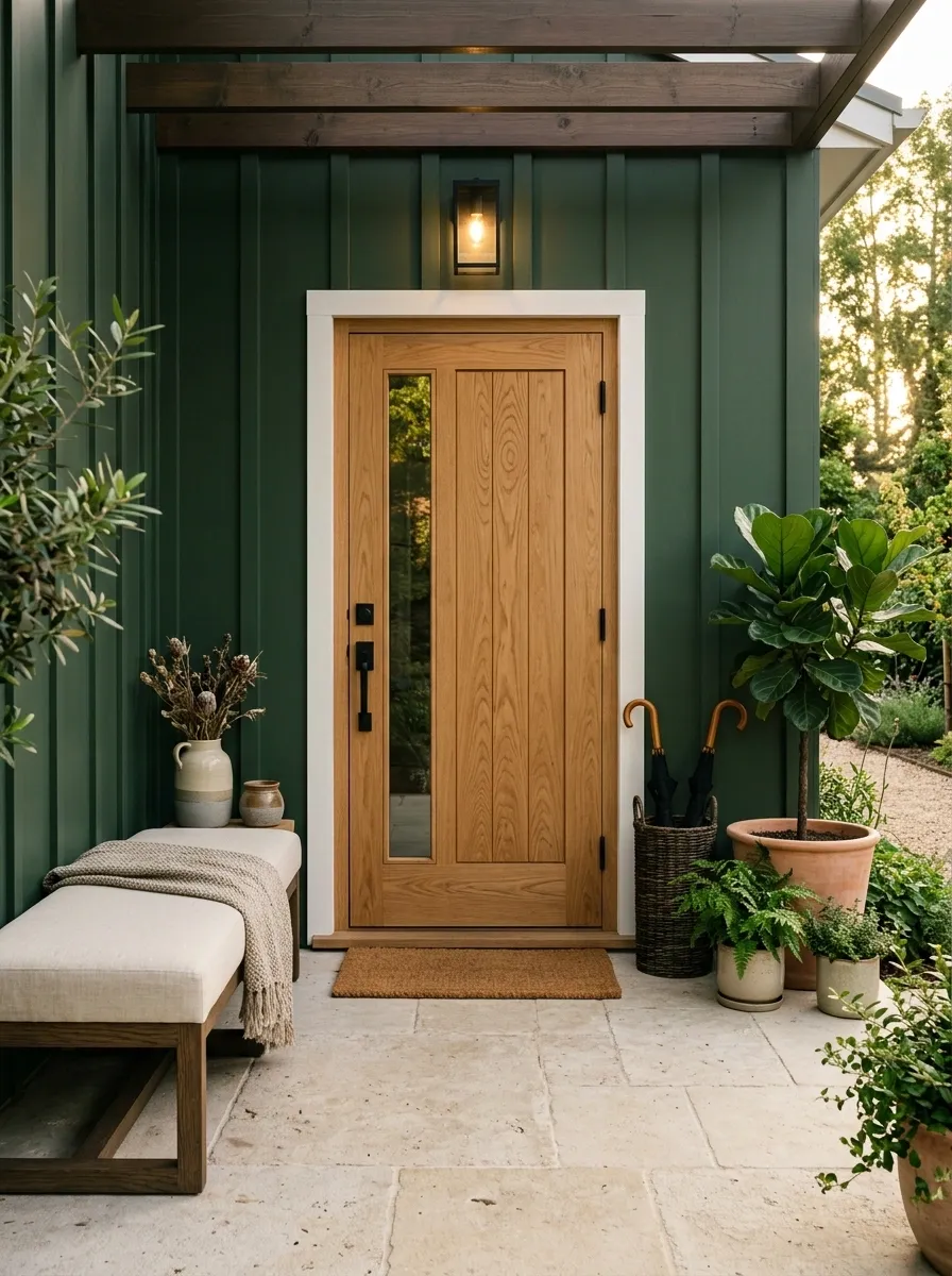
Forest green gives a small porch a strong connection to surrounding planting, but the composition stays inviting because warm oak and pale limestone carry much of the contrast. The door is oak rather than another dark surface, while cream seating and restrained black hardware complete the arrangement.
This palette is strongest when the green reads rich rather than bright. Limestone introduces a large light surface at floor level, which helps the darker wall color feel less enclosed. Warm oak then becomes the visual bridge between the architecture and furniture. Keep decorative greenery varied in shape but close in color so the porch feels layered without becoming visually scattered.
Warm Gray Porch With Cedar Door and Rust Accents
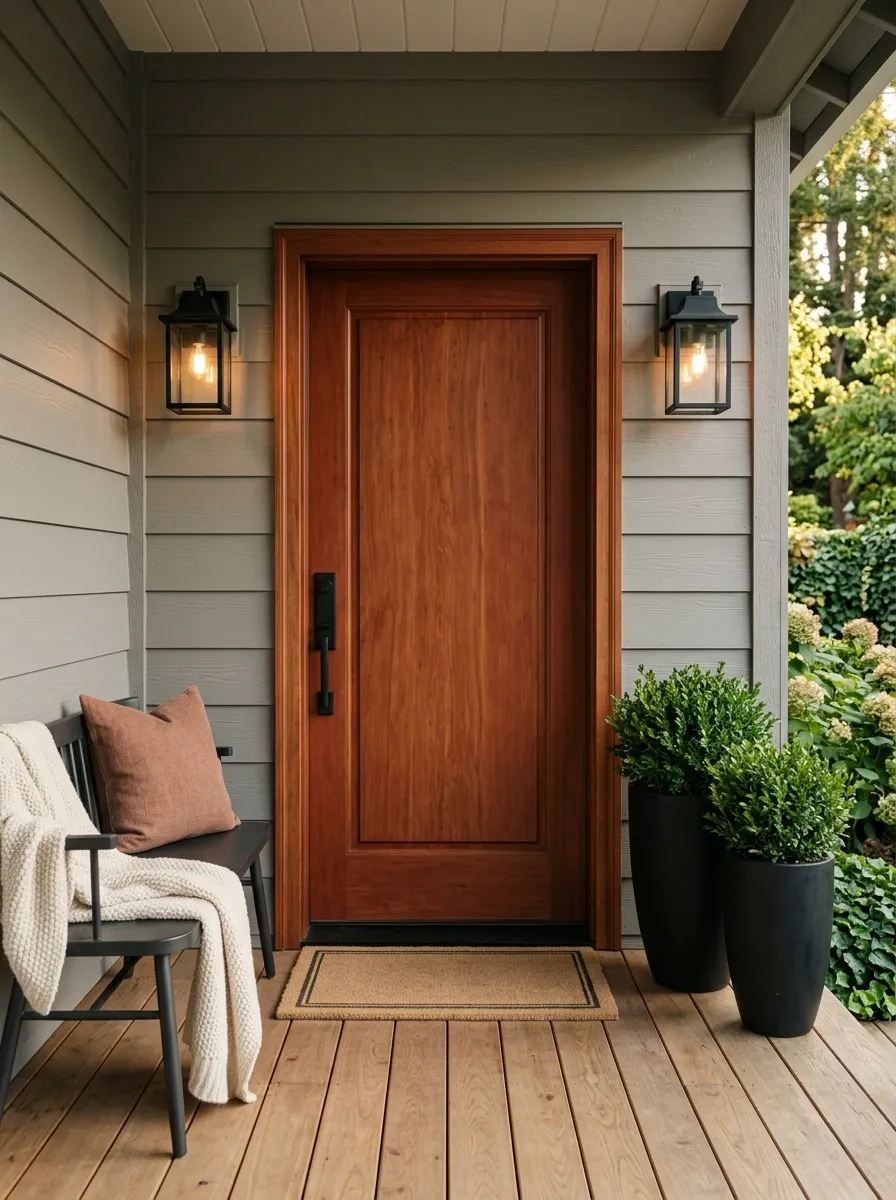
Warm gray becomes far more interesting when paired with cedar and a restrained rust accent. This porch uses the gray as the main architectural color, then introduces a red-brown cedar door, muted rust cushions, black lanterns, and evergreen planting. The result feels grounded and slightly rustic without becoming overly traditional.
The rust should stay secondary to the cedar. Repeating it in several large accessories would make the porch feel orange-brown rather than balanced. Instead, one cushion or narrow textile accent is enough to connect the warm door to the rest of the composition. The gray architecture provides the calm base that allows those warmer details to stand out.
Rust punctuates.
Buttercream Porch With Soft Brown and Sage
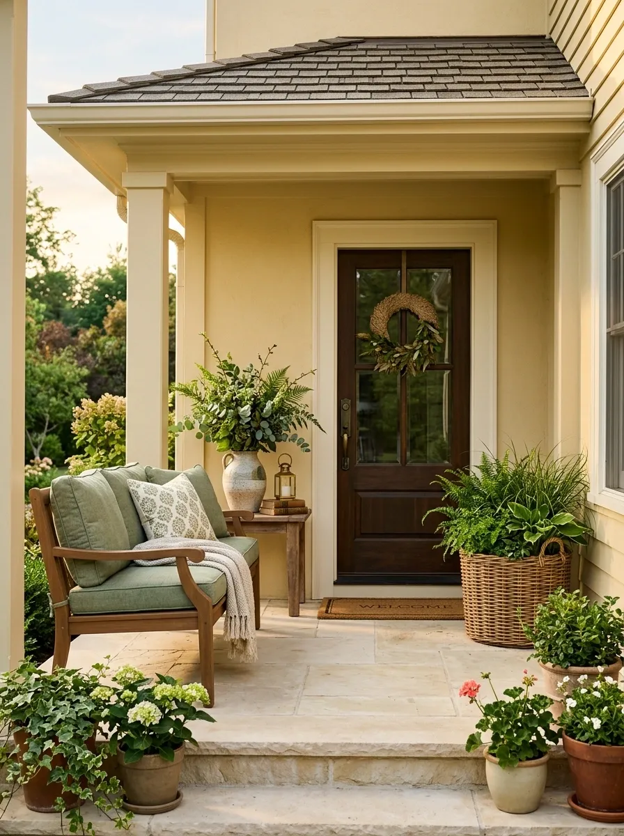
Buttercream adds a gentle sunny quality to a small porch without the sharpness of bright yellow. This design uses the warm cream-yellow architecture as the backdrop for medium brown wood, sage cushions, pale stone, and abundant green planting. The result is cheerful but grounded, with the sage preventing the warm palette from becoming overly sweet.
The trick is choosing a buttercream with a dusty undertone rather than a saturated golden yellow. Medium brown furniture reinforces the warmth while adding enough visual weight to the pale walls. Sage then functions as the cooling note. Keep the hardware subdued so the porch retains its soft, relaxed character instead of drifting toward a high-contrast farmhouse look.
Blackened Green Porch With Cream Furniture and Stone
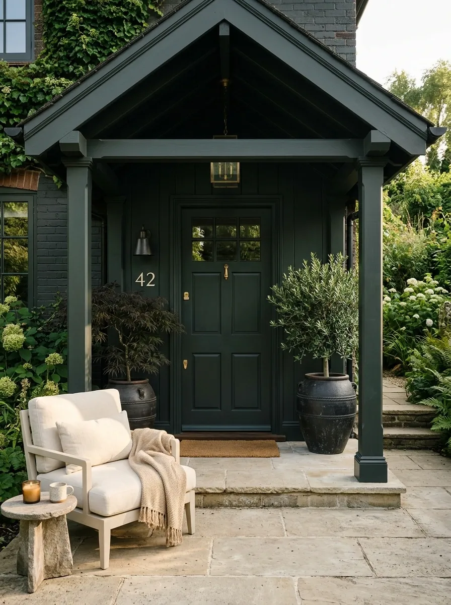
Blackened green sits close to charcoal but has a softer relationship with natural surroundings. On this porch, the deep green covers the main architecture while cream furniture, pale stone flooring, dark planters, and sculptural greenery create the supporting layers. The result is dramatic without making the small entrance feel visually cramped.
The light furniture is the key balancing element. Against such a deep wall color, pale upholstery catches daylight and creates a clear break in the darker mass. Stone does the same job at floor level. Keep the door close to the wall color so the architecture reads as one strong frame rather than several competing dark rectangles.
Sandstone Porch With Whitewashed Wood and Olive
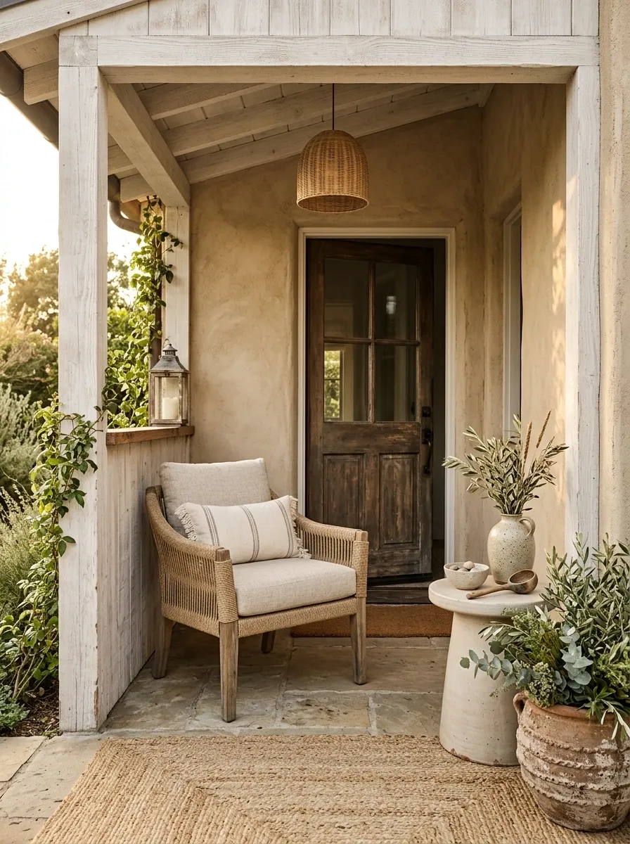
A sandy neutral makes a small porch feel naturally connected to warm stone, pale masonry, and sunlit outdoor surroundings. This composition uses sandstone-beige walls, whitewashed timber, olive foliage, rope furniture, and pale ceramic planters. The colors stay close together, while the different finishes prevent the space from becoming visually bland.
Whitewashed wood gives the porch a faded quality without introducing the starkness of bright painted furniture. Olive foliage adds a muted green note that feels connected to the natural palette. The strongest version uses texture instead of extra colors: woven rope, rough ceramic, lightly weathered timber, and stone-like surfaces provide enough variation to make the restrained scheme feel complete.
Muted Plum-Brown Porch With Camel and Brass
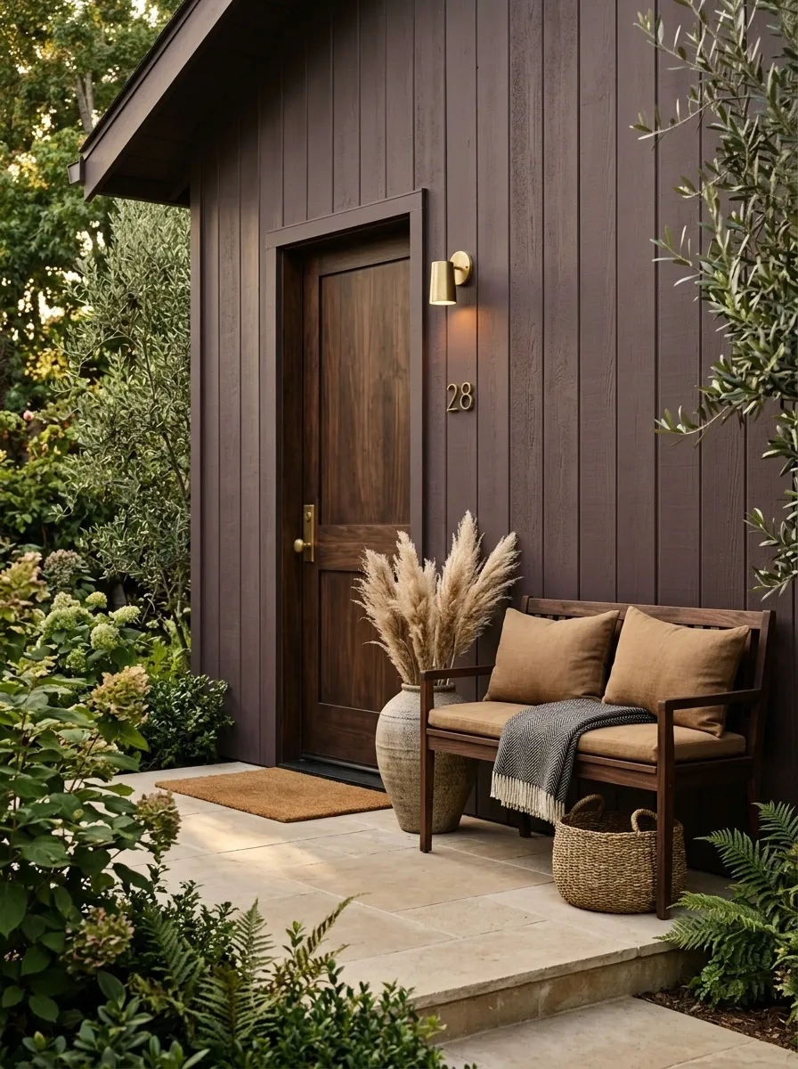
Muted plum-brown brings a deeper, more unusual color into the porch while keeping the overall scheme earthy. The walls carry the plum-brown tone, while camel cushions, dark walnut, antique brass, and warm neutral flooring add layers around it. The result feels moody, mature, and distinctly different from the usual gray or white porch palette.
The color works because its purple undertone is restrained. A brighter plum would dominate the small space. Camel is especially useful because it sits between the deep wall color and dark wood, preventing the palette from becoming too heavy. Brass should remain small and warm, appearing in the light fixture, door hardware, or house numbers rather than across every accessory.
Pale Gray-Blue Porch With Driftwood and Cream
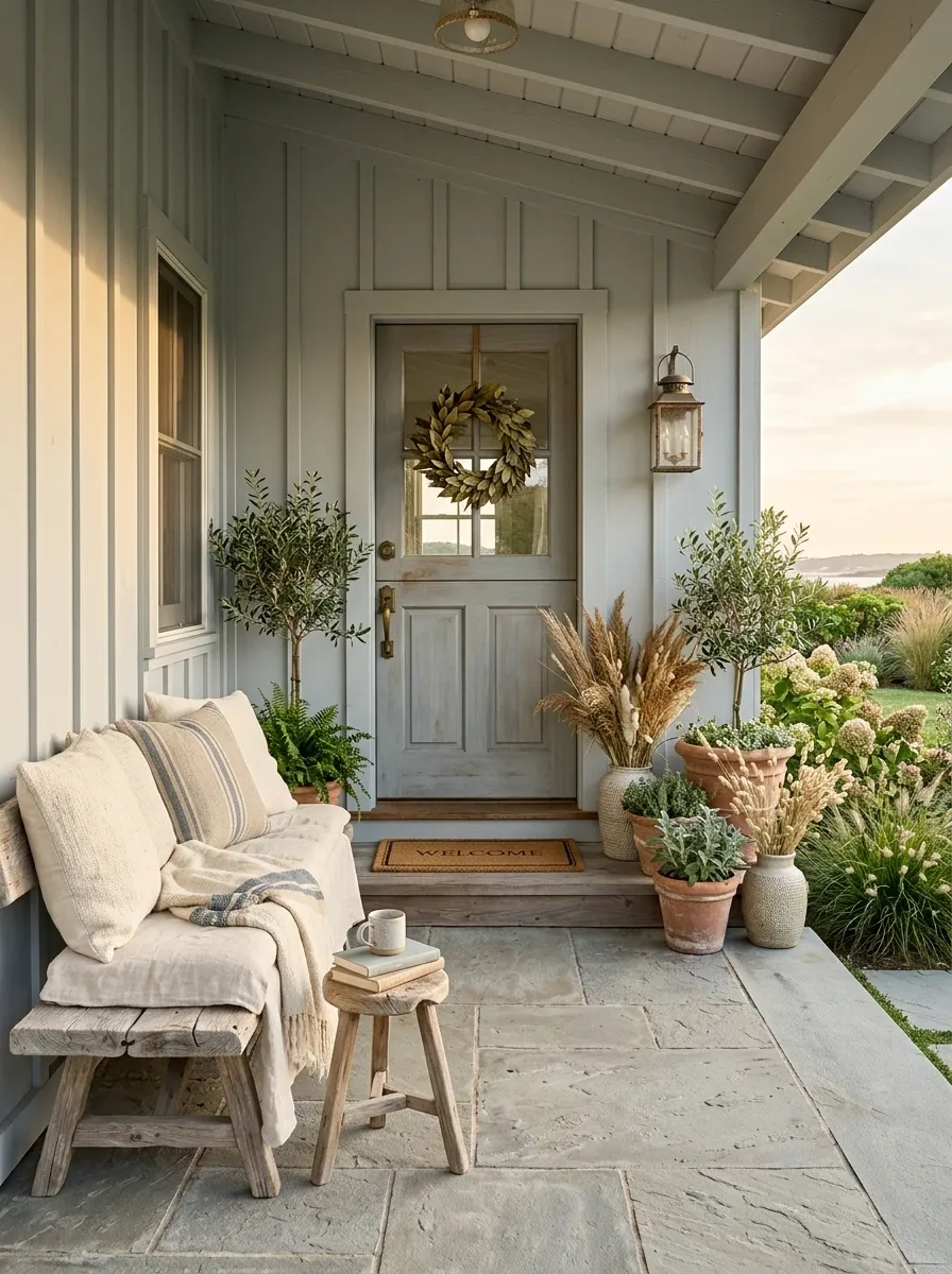
Pale gray-blue gives a compact porch a calm coastal character without relying on obvious nautical decoration. The walls use a softened blue-gray, while weathered wood furniture, cream textiles, faded stone, and understated greenery create the rest of the composition. Everything feels lightly sun-worn rather than freshly matched.
Driftwood tones are important because they warm the cooler architecture without introducing a strong competing color. Cream is preferable to bright white for the seating because it keeps the overall palette gentle. Let the floor stay close to the wall in value as well. Strong floor contrast would visually divide the small footprint into too many separate sections.
Olive and Terracotta Porch With Old Brick
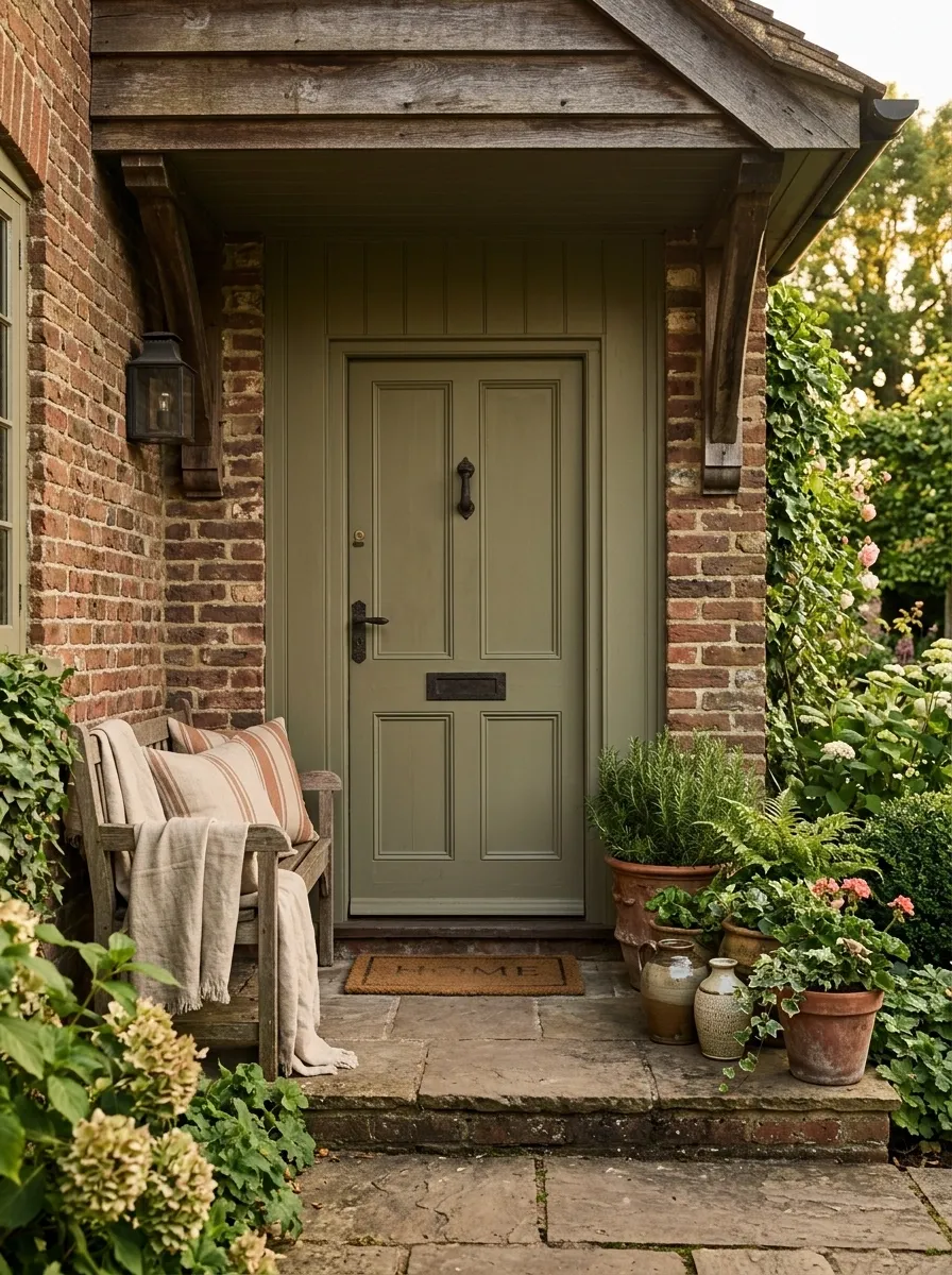
Old brick changes the rules of a porch palette because the masonry already carries a strong reddish-brown color. Instead of competing with it, this design builds around it with olive-painted surfaces, terracotta planters, warm wood, linen seating, and restrained dark hardware. The colors feel connected because both the brick and terracotta belong to the same earthy family.
Olive is particularly effective here because it cools the warm masonry without creating a sharp contrast. The wall color should be muted enough to let the brick remain visible as part of the composition. Avoid adding another strong warm hue. The existing brick is already doing that job.
Warm White Porch With Black Door and Natural Greenery
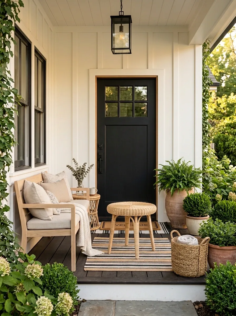
Warm white keeps a small porch visually open, while a black front door gives the composition one unmistakable anchor. Pale wood furniture, leafy planters, woven textures, and neutral cushions fill the remaining space without competing for attention. The finished look feels crisp, but the warm undertone keeps it from becoming stark.
The black door should be the darkest element by a clear margin. That creates an easy focal point as soon as someone approaches the entrance. Natural greenery then softens the strong architectural contrast. Keep the furniture light in both color and visual weight. Bulky dark seating would pull too much attention away from the doorway and make the porch feel smaller.
Taupe Porch With Rust Door and Dark Bronze
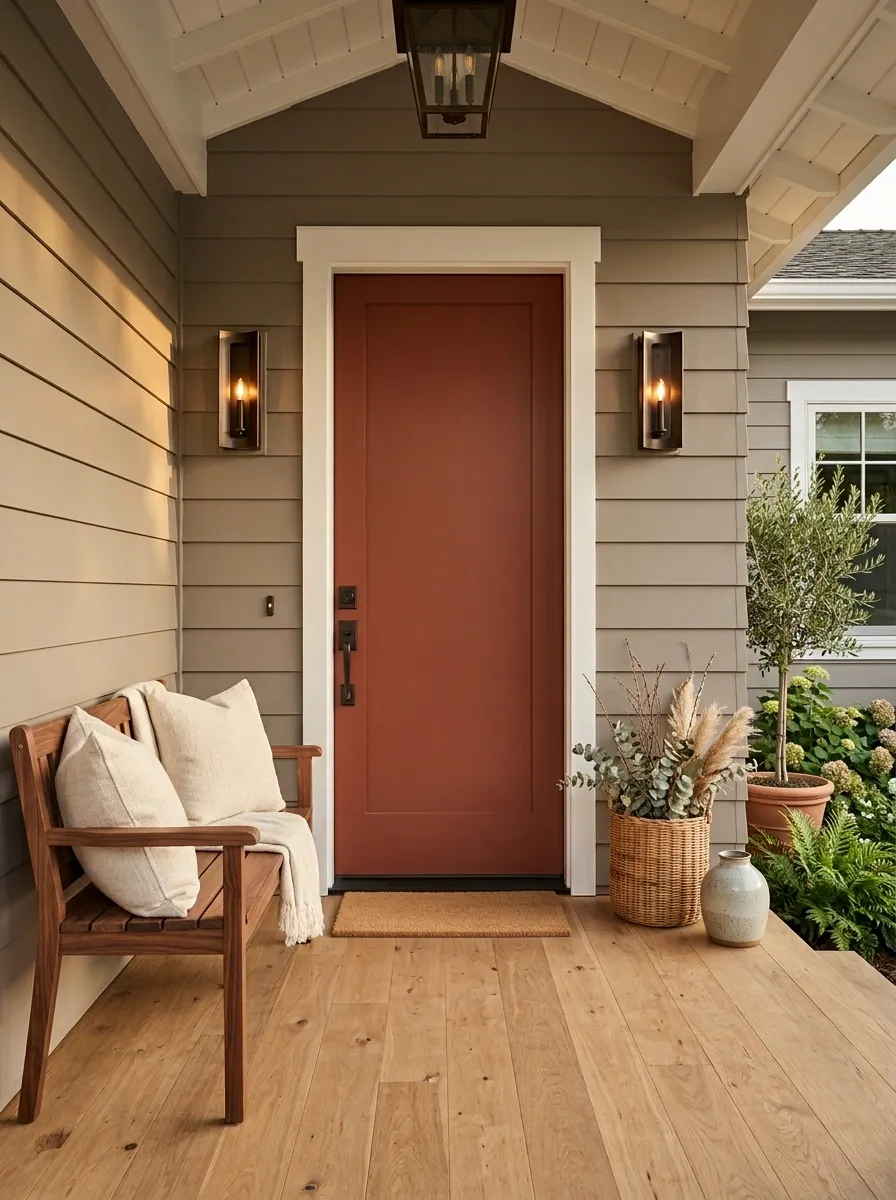
Taupe becomes much more distinctive when the entry door carries a muted rust color. This porch combines mid-tone taupe walls with a red-brown door, dark bronze fixtures, walnut furniture, and cream cushions. The result has warmth and contrast without the brighter, more decorative feel of a conventional colorful entrance.
The rust door acts as the transition between the neutral architecture and the warmer furniture. Because it already has visual weight, the surrounding accessories need to stay controlled. Dark bronze works better than shiny black because its brown undertone relates naturally to the door and walnut. Keep the cream seating relatively large and visually simple so the porch doesn’t become a collection of competing accent colors.
Soft Ochre Porch With Walnut and Deep Green
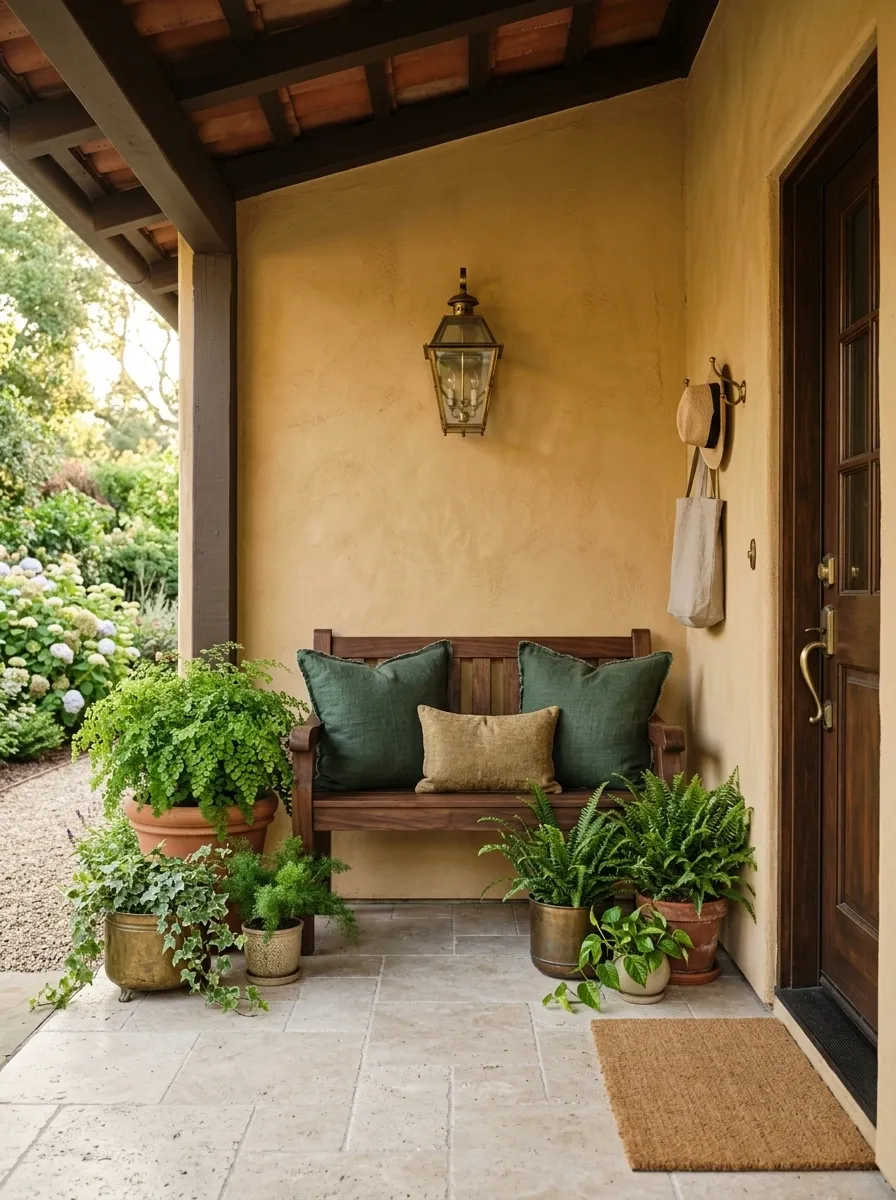
Soft ochre brings more personality to a small porch than beige without becoming aggressively bright. Here, dusty ochre walls frame dark walnut furniture, deep green cushions, aged metal, and abundant planting. The result has a warm, slightly vintage character while still feeling clean and contemporary.
The ochre should stay muted enough to sit comfortably beside the walnut. Deep green then provides the cooler counterweight, appearing in both textiles and planting so it feels integrated rather than decorative. Aged metal is a useful supporting finish because it adds a darker note without introducing the hard contrast of polished black. Keep the floor light enough to give the lower half of the porch some breathing room.
Blackened Green Porch With Cream Furniture and Stone
Blackened green sits close to charcoal but has a softer relationship with natural surroundings. On this porch, the deep green covers the main architecture while cream furniture, pale stone flooring, dark planters, and sculptural greenery create the supporting layers. The result is dramatic without making the small entrance feel visually cramped.
The light furniture is the key balancing element. Against such a deep wall color, pale upholstery catches daylight and creates a clear break in the darker mass. Stone does the same job at floor level. Keep the door close to the wall color so the architecture reads as one strong frame rather than several competing dark rectangles.
Sandstone Porch With Whitewashed Wood and Olive
A sandy neutral makes a small porch feel naturally connected to warm stone, pale masonry, and sunlit outdoor surroundings. This composition uses sandstone-beige walls, whitewashed timber, olive foliage, rope furniture, and pale ceramic planters. The colors stay close together, while the different finishes prevent the space from becoming visually bland.
Whitewashed wood gives the porch a faded quality without introducing the starkness of bright painted furniture. Olive foliage adds a muted green note that feels connected to the natural palette. The strongest version uses texture instead of extra colors: woven rope, rough ceramic, lightly weathered timber, and stone-like surfaces provide enough variation to make the restrained scheme feel complete.
Muted Plum-Brown Porch With Camel and Brass
Muted plum-brown brings a deeper, more unusual color into the porch while keeping the overall scheme earthy. The walls carry the plum-brown tone, while camel cushions, dark walnut, antique brass, and warm neutral flooring add layers around it. The result feels moody, mature, and distinctly different from the usual gray or white porch palette.
The color works because its purple undertone is restrained. A brighter plum would dominate the small space. Camel is especially useful because it sits between the deep wall color and dark wood, preventing the palette from becoming too heavy. Brass should remain small and warm, appearing in the light fixture, door hardware, or house numbers rather than across every accessory.
Pale Gray-Blue Porch With Driftwood and Cream
Pale gray-blue gives a compact porch a calm coastal character without relying on obvious nautical decoration. The walls use a softened blue-gray, while weathered wood furniture, cream textiles, faded stone, and understated greenery create the rest of the composition. Everything feels lightly sun-worn rather than freshly matched.
Driftwood tones are important because they warm the cooler architecture without introducing a strong competing color. Cream is preferable to bright white for the seating because it keeps the overall palette gentle. Let the floor stay close to the wall in value as well. Strong floor contrast would visually divide the small footprint into too many separate sections.
Olive and Terracotta Porch With Old Brick
Old brick changes the rules of a porch palette because the masonry already carries a strong reddish-brown color. Instead of competing with it, this design builds around it with olive-painted surfaces, terracotta planters, warm wood, linen seating, and restrained dark hardware. The colors feel connected because both the brick and terracotta belong to the same earthy family.
Olive is particularly effective here because it cools the warm masonry without creating a sharp contrast. The wall color should be muted enough to let the brick remain visible as part of the composition. Avoid adding another strong warm hue. The existing brick is already doing that job.
Warm White Porch With Black Door and Natural Greenery
Warm white keeps a small porch visually open, while a black front door gives the composition one unmistakable anchor. Pale wood furniture, leafy planters, woven textures, and neutral cushions fill the remaining space without competing for attention. The finished look feels crisp, but the warm undertone keeps it from becoming stark.
The black door should be the darkest element by a clear margin. That creates an easy focal point as soon as someone approaches the entrance. Natural greenery then softens the strong architectural contrast. Keep the furniture light in both color and visual weight. Bulky dark seating would pull too much attention away from the doorway and make the porch feel smaller.
Taupe Porch With Rust Door and Dark Bronze
Taupe becomes much more distinctive when the entry door carries a muted rust color. This porch combines mid-tone taupe walls with a red-brown door, dark bronze fixtures, walnut furniture, and cream cushions. The result has warmth and contrast without the brighter, more decorative feel of a conventional colorful entrance.
The rust door acts as the transition between the neutral architecture and the warmer furniture. Because it already has visual weight, the surrounding accessories need to stay controlled. Dark bronze works better than shiny black because its brown undertone relates naturally to the door and walnut. Keep the cream seating relatively large and visually simple so the porch doesn’t become a collection of competing accent colors.
Soft Ochre Porch With Walnut and Deep Green
Soft ochre brings more personality to a small porch than beige without becoming aggressively bright. Here, dusty ochre walls frame dark walnut furniture, deep green cushions, aged metal, and abundant planting. The result has a warm, slightly vintage character while still feeling clean and contemporary.
The ochre should stay muted enough to sit comfortably beside the walnut. Deep green then provides the cooler counterweight, appearing in both textiles and planting so it feels integrated rather than decorative. Aged metal is a useful supporting finish because it adds a darker note without introducing the hard contrast of polished black. Keep the floor light enough to give the lower half of the porch some breathing room.
Blackened Green Porch With Cream Furniture and Stone
Blackened green sits close to charcoal but has a softer relationship with natural surroundings. On this porch, the deep green covers the main architecture while cream furniture, pale stone flooring, dark planters, and sculptural greenery create the supporting layers. The result is dramatic without making the small entrance feel visually cramped.
The light furniture is the key balancing element. Against such a deep wall color, pale upholstery catches daylight and creates a clear break in the darker mass. Stone does the same job at floor level. Keep the door close to the wall color so the architecture reads as one strong frame rather than several competing dark rectangles.
Sandstone Porch With Whitewashed Wood and Olive
A sandy neutral makes a small porch feel naturally connected to warm stone, pale masonry, and sunlit outdoor surroundings. This composition uses sandstone-beige walls, whitewashed timber, olive foliage, rope furniture, and pale ceramic planters. The colors stay close together, while the different finishes prevent the space from becoming visually bland.
Whitewashed wood gives the porch a faded quality without introducing the starkness of bright painted furniture. Olive foliage adds a muted green note that feels connected to the natural palette. The strongest version uses texture instead of extra colors: woven rope, rough ceramic, lightly weathered timber, and stone-like surfaces provide enough variation to make the restrained scheme feel complete.
Muted Plum-Brown Porch With Camel and Brass
Muted plum-brown brings a deeper, more unusual color into the porch while keeping the overall scheme earthy. The walls carry the plum-brown tone, while camel cushions, dark walnut, antique brass, and warm neutral flooring add layers around it. The result feels moody, mature, and distinctly different from the usual gray or white porch palette.
The color works because its purple undertone is restrained. A brighter plum would dominate the small space. Camel is especially useful because it sits between the deep wall color and dark wood, preventing the palette from becoming too heavy. Brass should remain small and warm, appearing in the light fixture, door hardware, or house numbers rather than across every accessory.
Pale Gray-Blue Porch With Driftwood and Cream
Pale gray-blue gives a compact porch a calm coastal character without relying on obvious nautical decoration. The walls use a softened blue-gray, while weathered wood furniture, cream textiles, faded stone, and understated greenery create the rest of the composition. Everything feels lightly sun-worn rather than freshly matched.
Driftwood tones are important because they warm the cooler architecture without introducing a strong competing color. Cream is preferable to bright white for the seating because it keeps the overall palette gentle. Let the floor stay close to the wall in value as well. Strong floor contrast would visually divide the small footprint into too many separate sections.
Olive and Terracotta Porch With Old Brick
Old brick changes the rules of a porch palette because the masonry already carries a strong reddish-brown color. Instead of competing with it, this design builds around it with olive-painted surfaces, terracotta planters, warm wood, linen seating, and restrained dark hardware. The colors feel connected because both the brick and terracotta belong to the same earthy family.
Olive is particularly effective here because it cools the warm masonry without creating a sharp contrast. The wall color should be muted enough to let the brick remain visible as part of the composition. Avoid adding another strong warm hue. The existing brick is already doing that job.
Warm White Porch With Black Door and Natural Greenery
Warm white keeps a small porch visually open, while a black front door gives the composition one unmistakable anchor. Pale wood furniture, leafy planters, woven textures, and neutral cushions fill the remaining space without competing for attention. The finished look feels crisp, but the warm undertone keeps it from becoming stark.
The black door should be the darkest element by a clear margin. That creates an easy focal point as soon as someone approaches the entrance. Natural greenery then softens the strong architectural contrast. Keep the furniture light in both color and visual weight. Bulky dark seating would pull too much attention away from the doorway and make the porch feel smaller.
Taupe Porch With Rust Door and Dark Bronze
Taupe becomes much more distinctive when the entry door carries a muted rust color. This porch combines mid-tone taupe walls with a red-brown door, dark bronze fixtures, walnut furniture, and cream cushions. The result has warmth and contrast without the brighter, more decorative feel of a conventional colorful entrance.
The rust door acts as the transition between the neutral architecture and the warmer furniture. Because it already has visual weight, the surrounding accessories need to stay controlled. Dark bronze works better than shiny black because its brown undertone relates naturally to the door and walnut. Keep the cream seating relatively large and visually simple so the porch doesn’t become a collection of competing accent colors.
Soft Ochre Porch With Walnut and Deep Green
Soft ochre brings more personality to a small porch than beige without becoming aggressively bright. Here, dusty ochre walls frame dark walnut furniture, deep green cushions, aged metal, and abundant planting. The result has a warm, slightly vintage character while still feeling clean and contemporary.
The ochre should stay muted enough to sit comfortably beside the walnut. Deep green then provides the cooler counterweight, appearing in both textiles and planting so it feels integrated rather than decorative. Aged metal is a useful supporting finish because it adds a darker note without introducing the hard contrast of polished black. Keep the floor light enough to give the lower half of the porch some breathing room.
Cool White Porch With Pale Oak and Blue-Gray Accents
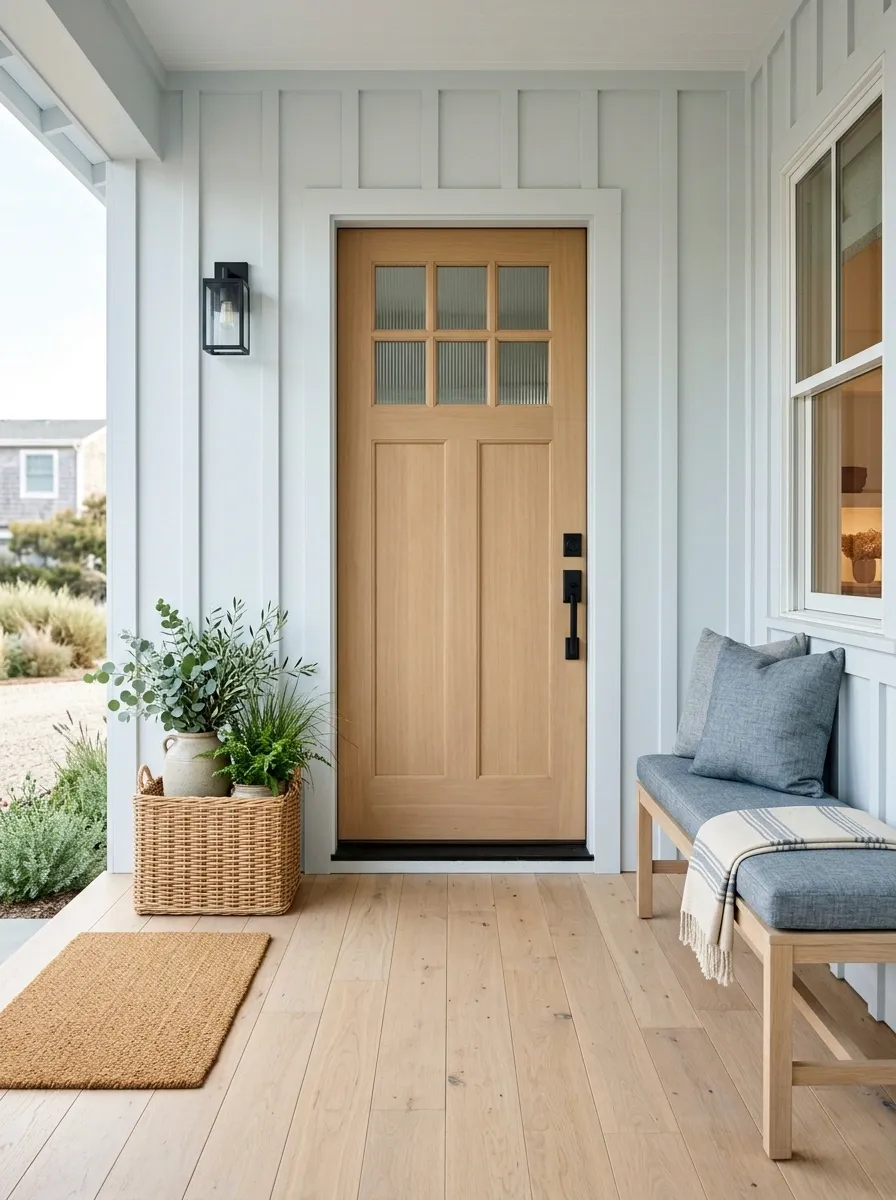
Cool white can work on a small porch when it is softened with pale oak and blue-gray rather than paired with stark black. This version uses lightly cool white architecture, a pale oak door and furniture, blue-gray cushions, natural baskets, and restrained greenery. The result feels fresh without becoming overly crisp.
The difference between successful cool white and sterile white is the supporting material. Pale oak adds enough warmth to keep the architecture approachable, while blue-gray introduces color without creating a dramatic focal point. Use the same blue-gray family sparingly across cushions or a small rug so the accent reads as intentional. Natural baskets and greenery then add texture without breaking the restrained palette.
Earthy Modern Porch With Clay, Espresso, and Cream
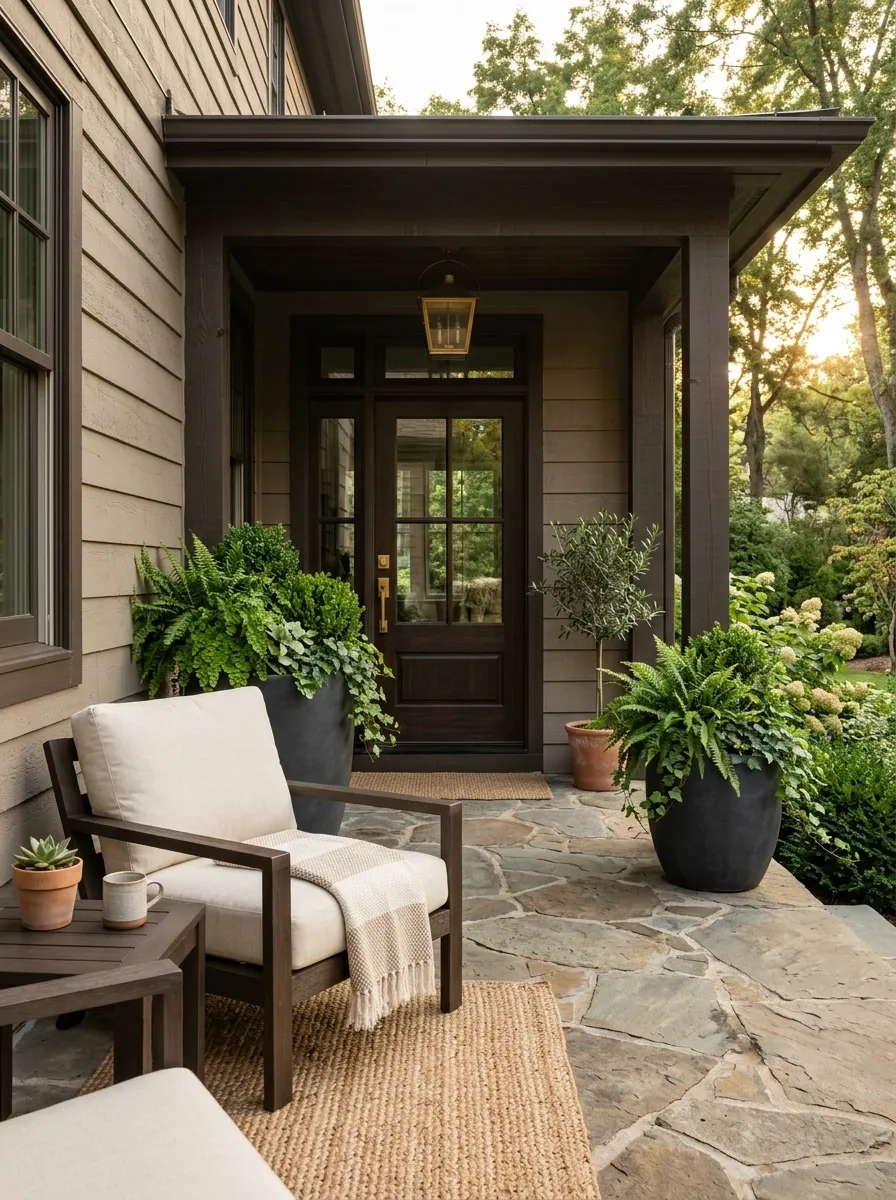
Clay, espresso, and cream create one of the richest combinations in the collection. The architecture carries a muted clay tone, while espresso furniture, cream upholstery, dark planters, textured stone, and layered greenery give the porch a modern but distinctly earthy character.
The palette succeeds because each major color has a clear job. Clay warms the architecture, espresso adds structural weight, and cream keeps the furniture from disappearing against the darker elements. Stone introduces another natural surface without adding a new color family. Greenery should remain abundant but controlled in shape, allowing the plants to soften the strong architectural tones without turning the porch into a garden display.
Choosing the Palette That Fits the Porch
A small porch doesn’t need to follow the same color logic as a large outdoor room. The strongest palette is usually the one that makes the architecture, entrance, and limited floor area read as one connected composition.
Light palettes are useful when the porch already feels visually tight. Deeper colors can work just as well when pale materials, warm wood, or stone create enough contrast around them. Existing brick, stone, roofing, or permanent flooring should also influence the decision because those surfaces become part of the palette whether they were planned that way or not.
The best starting point is the element that cannot easily change. Build the other colors around it, then let the front door, furniture, planting, and smaller accents establish the final hierarchy.
A porch doesn’t need every color to match. It needs the colors to belong together.
Save the palettes that feel closest to the architecture and keep them nearby when choosing paint, furniture, or exterior finishes. The right reference can make the entire porch come together much faster.