
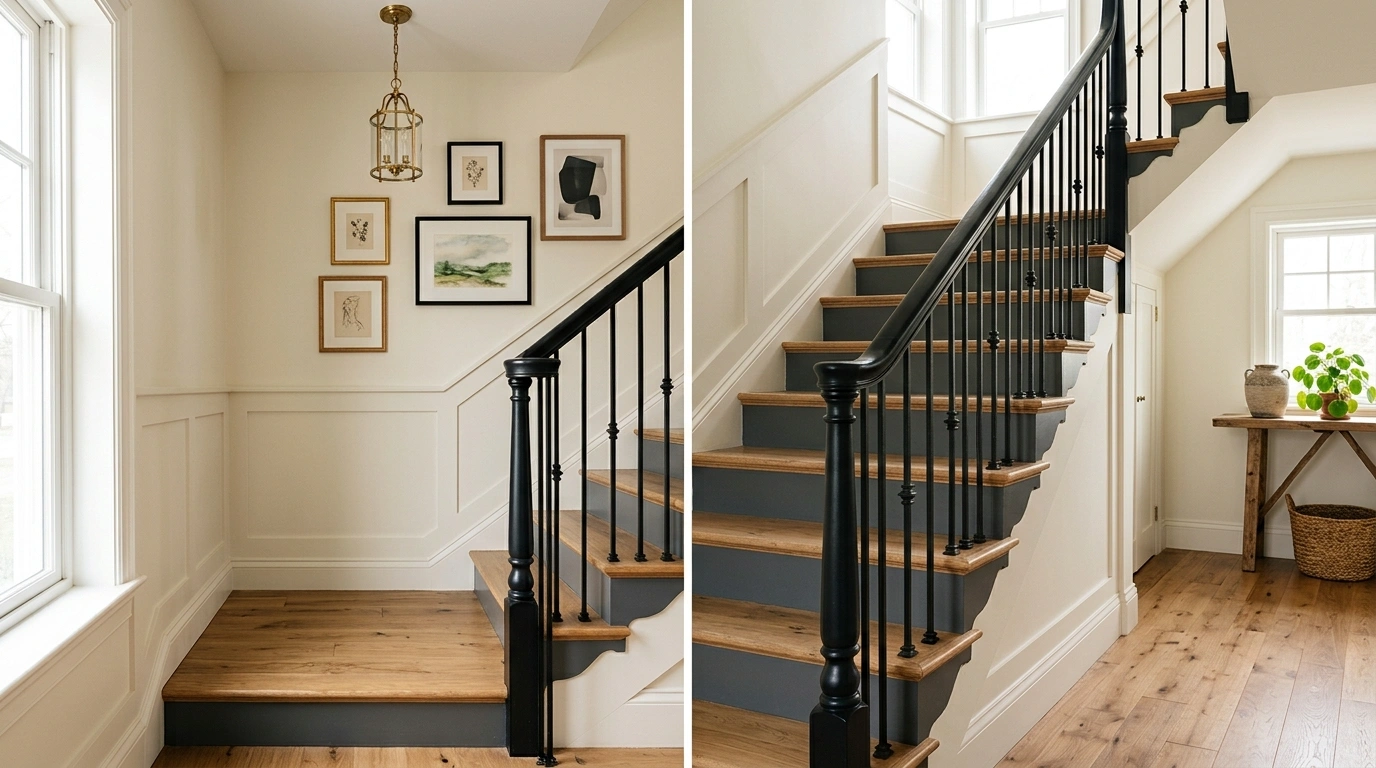
A staircase can be freshly painted and still look unfinished.
That usually happens when the color is chosen for the stairs alone instead of the entire space around them. A crisp white riser can clash with a warm hallway. A dark staircase can make a narrow landing feel smaller. Even a beautiful paint color can fall flat when the railing, flooring, walls, lighting, and nearby furniture are pulling in different directions.
The better approach is to treat the staircase as part of the architecture.
Staircase Painting Ideas
Soft White Staircase With Warm Greige Walls and Oak Treads
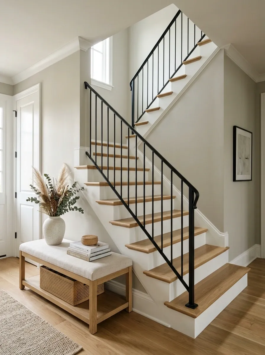
This is the kind of staircase that makes an entire hallway feel settled. The risers, trim, and stair stringers stay a warm white, while the surrounding walls move into a soft greige that takes the edge off a bright, high-contrast scheme. Natural oak treads add enough warmth to keep the staircase from feeling overly painted.
A slim black railing gives the composition definition without becoming the main feature. Nearby furniture should stay relatively simple, with pale upholstery, natural wood, or woven texture carrying the same quiet warmth.
The important detail is the relationship between the painted stair surfaces and the oak. The white creates clarity, while the wood gives the eye somewhere warmer to land.
Muted Sage Staircase With Natural Wood and Cream Walls
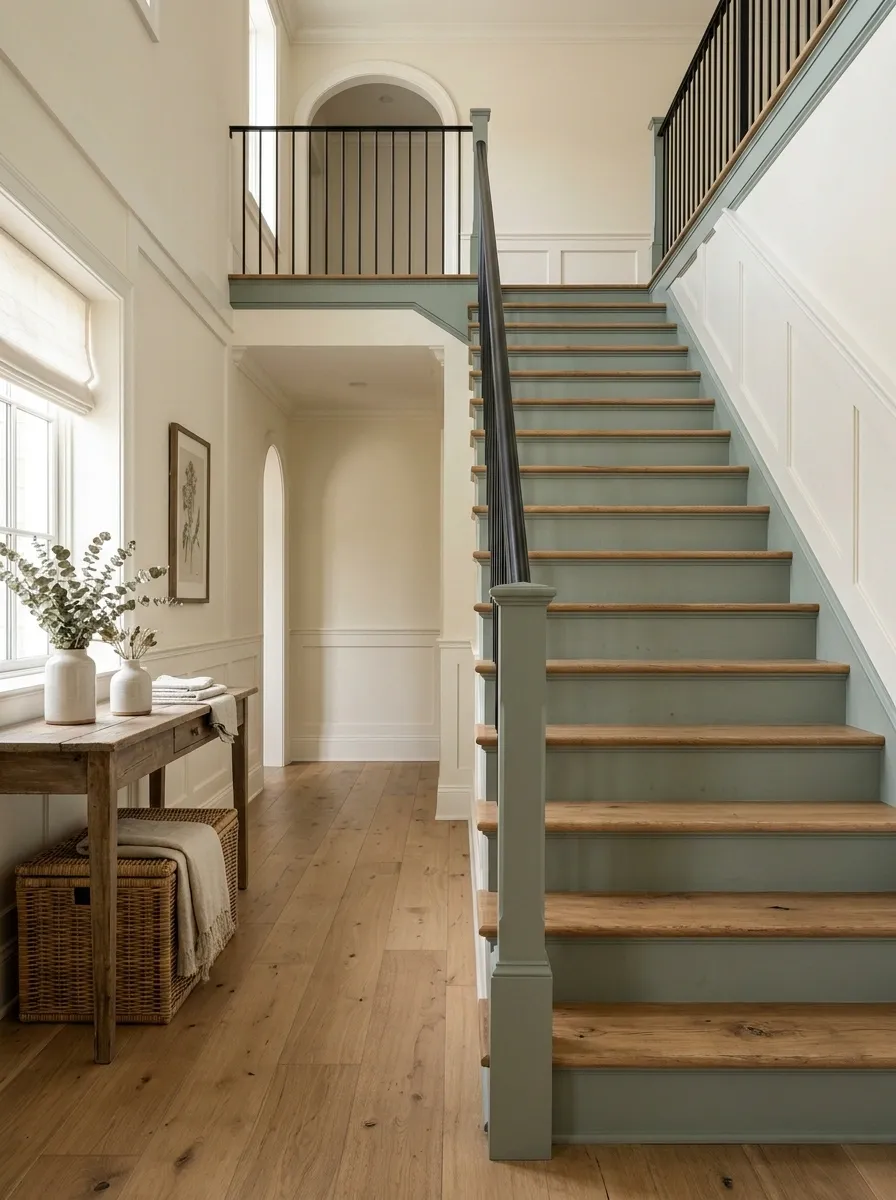
Muted sage changes the staircase without making the color feel overly decorative. The stair risers and selected trim carry the green, while creamy walls soften the transition into the rest of the home. Natural oak treads bring in a warmer note that keeps the palette connected to the floor and nearby furniture.
The result has a relaxed, organic character, but the composition still feels structured. The key is keeping the sage dusty rather than intensely saturated. Linen upholstery, aged wood, woven baskets, and simple ceramics can reinforce the natural direction without turning the staircase into a themed space.
A little contrast helps here. A dark metal railing or small dark light fixture gives the softer palette enough definition to avoid looking washed out.
painted focal field
warm visual anchor
light surrounding field
Moody Navy Staircase With Brass Lighting and Walnut Details
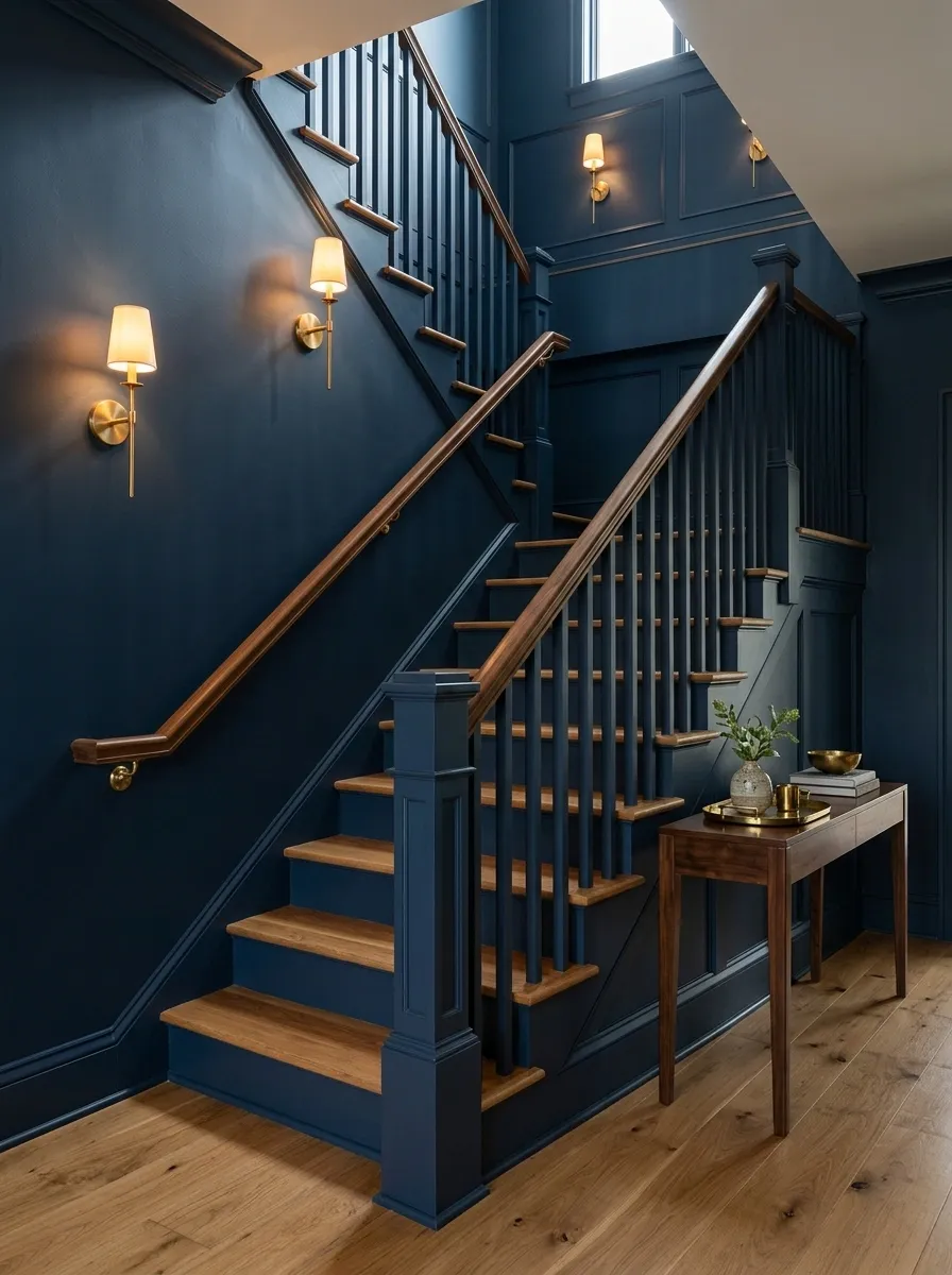
Navy gives a staircase a completely different personality. This version is richer and more enclosed, with deep navy painted across the stair walls and selected woodwork. Walnut appears on the handrail, console, or nearby furniture, creating a warm counterpoint to the cool paint.
Small brass fixtures work better than large metallic statements here. A pair of wall sconces or one carefully placed pendant can catch the light against the navy and add a little glow without disrupting the darker mood.
The balance comes from keeping the floor and a few large surrounding surfaces lighter. Too much dark wood would compete with the navy. The strongest version lets the paint carry the drama while the walnut and brass provide warmth in controlled doses.
Black Staircase Risers With Pale Wood Treads
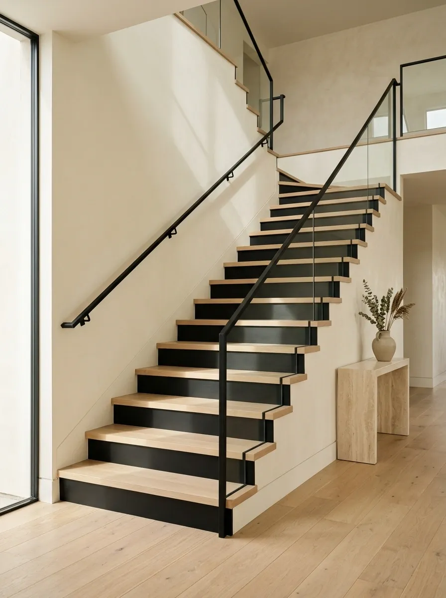
The alternating rhythm of black risers and pale wood treads turns the staircase into a graphic architectural feature. Instead of painting everything dark, the composition reserves the heavier color for the vertical surfaces while the horizontal treads stay visually light.
That distinction matters. The eye reads the staircase as a sequence of crisp bands, which gives even a fairly simple stair structure more personality. White or warm ivory walls provide the breathing room around it, while a slim dark railing reinforces the repeated black elements.
Keep the surrounding decor restrained. One pale console or sculptural light is enough. Too many competing patterns would weaken the clean stepped rhythm that makes this concept memorable.
Dusty Blue Staircase in a Classic Cottage Hallway
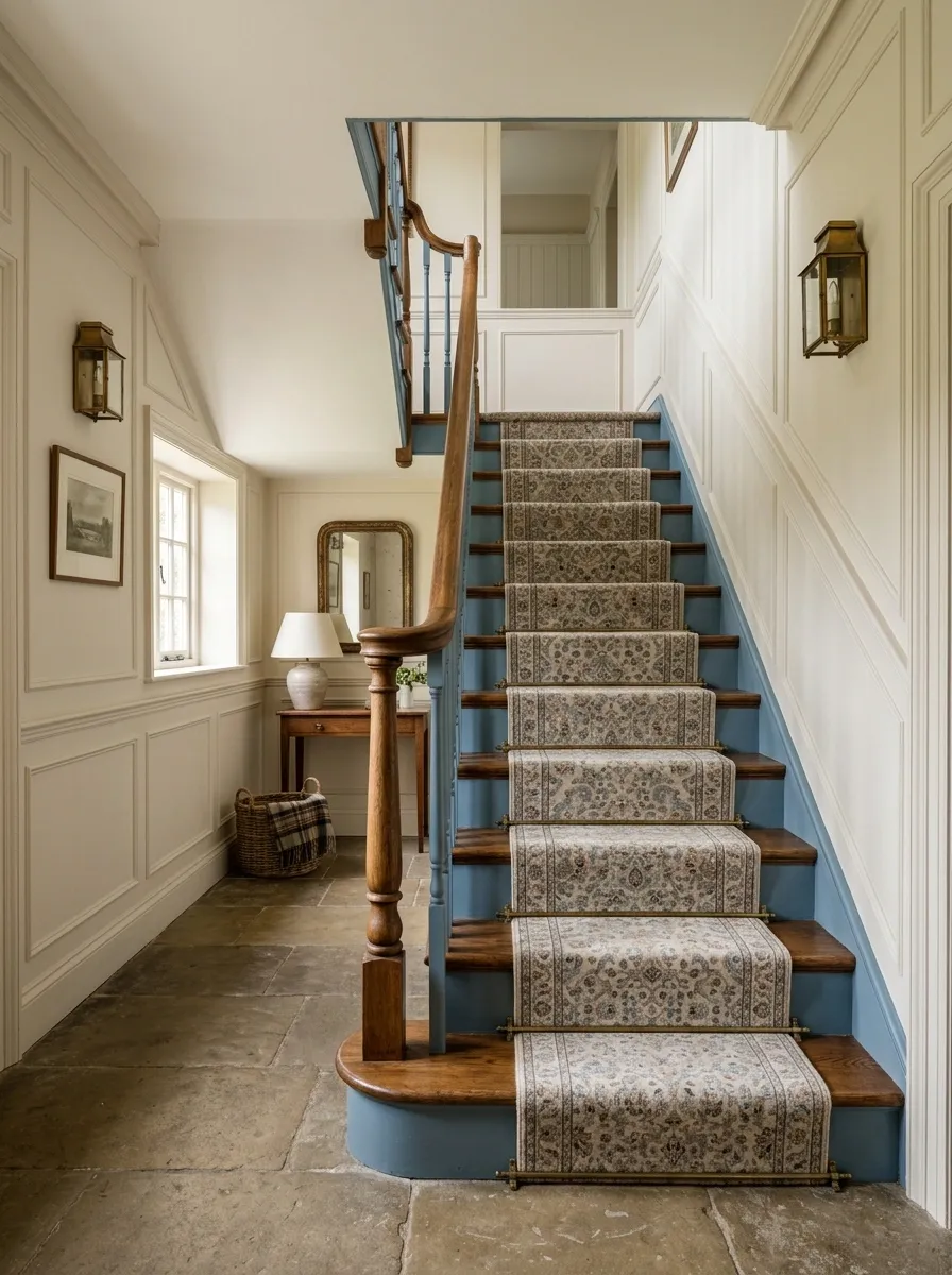
Dusty blue gives a traditional staircase character without pushing it into overly formal territory. The painted risers and selected trim carry the color, while the walls remain a warm off-white. A natural wood handrail, patterned runner, and classic molding complete the composition.
The restrained blue works because it occupies a defined architectural zone. It does not need to spread across every wall to make an impression. Keeping the larger wall surfaces pale also lets the molding and stair details remain visible.
A runner with small-scale pattern works particularly well here. It introduces another layer of interest without competing with the blue. The finished space feels established, practical, and distinctly traditional.
Warm White Staircase With Terracotta Runner and Natural Oak
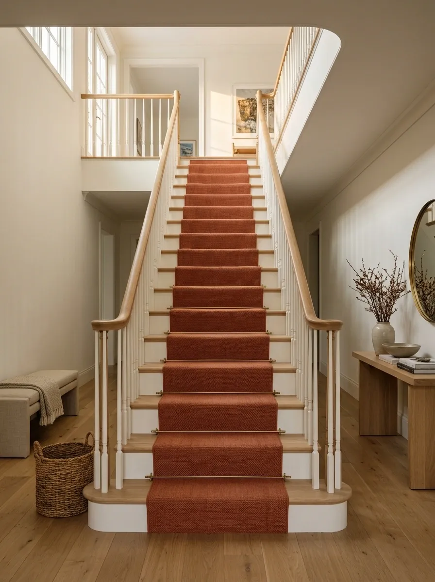
Here the paint acts as the quiet background rather than the main event. Warm white covers the stairs, trim, and nearby architectural surfaces, while a terracotta runner introduces a strong vertical line through the composition. Natural oak treads and handrails bring the same earthy warmth into the structure.
The runner is what gives the staircase its personality. Because the walls and painted surfaces stay calm, the richer textile does not need to be repeated everywhere else.
Woven baskets, linen seating, and warm wood furniture continue the palette without making the hallway feel overly coordinated. The result is relaxed but still visually organized.
Olive Green Staircase With Dark Wood and Antique Brass
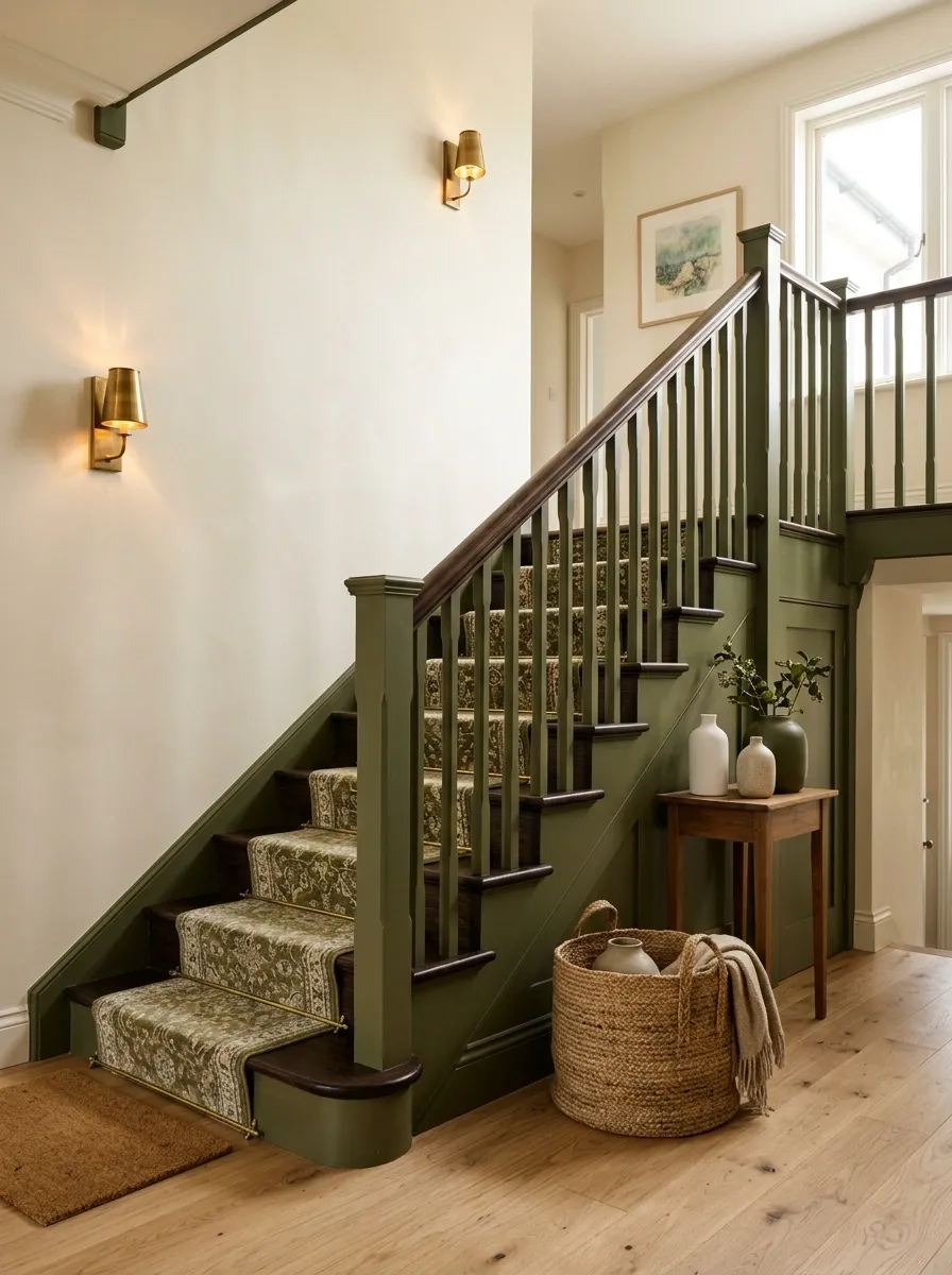
Olive green gives this staircase a deeper, more traditional character. The painted stair enclosure becomes the largest color field, while dark wood on the handrail or nearby furniture adds weight and antique brass lighting introduces a small amount of reflected warmth.
The combination works because each material has a different job. Olive supplies the color, dark wood anchors the composition, and brass catches the light. None of them needs to dominate every surface.
Keep the walls and flooring relatively quiet. Soft cream, muted stone, or lightly grained timber will give the green enough space to feel rich without making the hallway visually dense.
Light Gray Staircase With Black Trim in a Contemporary Home
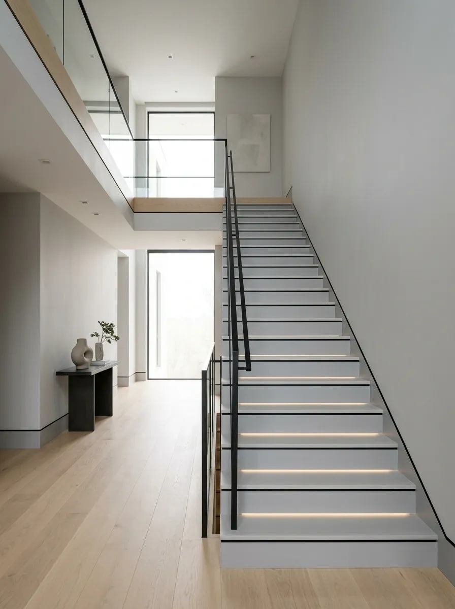
Light gray creates a clean base for this contemporary staircase, but the narrow black trim is what gives the design its precision. Rather than turning the entire stairway dark, black appears only along selected edges, the railing, and a few architectural lines.
That restraint keeps the staircase crisp instead of heavy. Pale flooring and simple white or gray walls extend the quiet palette, while modern lighting adds another layer of definition after sunset.
The strongest version keeps the black elements thin and intentional. Once too many dark details enter the space, the composition loses the sharp, almost drawn quality that makes this staircase interesting.
Chocolate Brown Staircase With Soft Ivory Walls
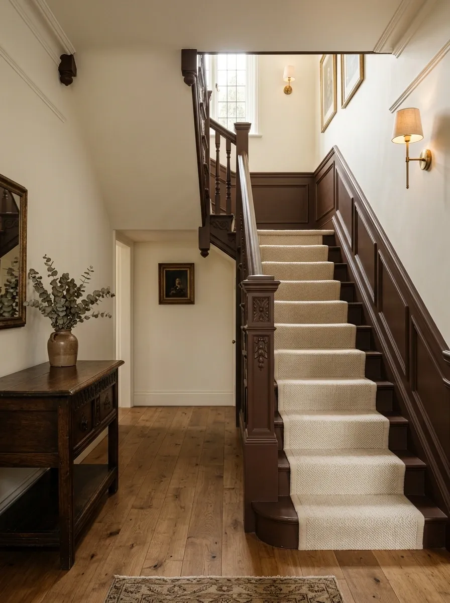
This staircase takes a much richer route, using chocolate brown on the architectural elements while leaving the surrounding walls a soft ivory. The strong color gives the staircase presence, especially when paired with medium or dark timber flooring nearby.
The trick is to give the ivory plenty of visual area. It acts as a large field of light around the darker staircase, keeping the room from feeling enclosed. A woven runner or cream textile can soften the transition between the two tones.
This concept suits homes with traditional molding, heavier wood furniture, or warmer lighting. The brown should read as a deep architectural color, not glossy furniture paint.
Pale Pink Staircase With Burgundy Accents and Natural Wood
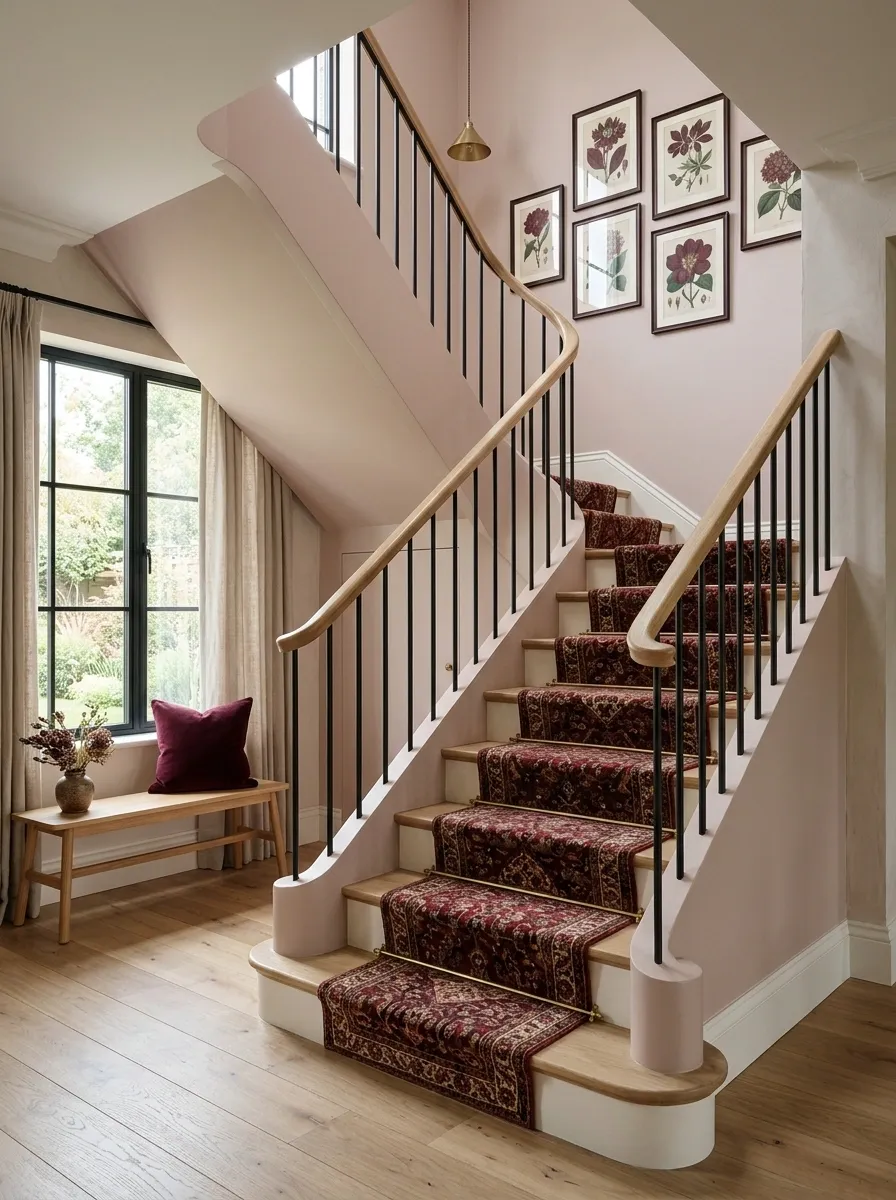
Pale pink can look sophisticated on a staircase when the color is dusty and architectural rather than sugary. This design places a muted blush across the stair enclosure and pairs it with pale natural wood and small burgundy accents.
The burgundy belongs in controlled areas: perhaps a runner, a cushion on a nearby bench, or artwork in the landing. Repeating it across every surface would make the composition feel overly coordinated.
Warm white trim helps separate the pink from neighboring rooms, while natural wood keeps the palette grounded. The overall effect is unusual without becoming difficult to live with.
Greige Staircase With Stone Walls and Matte Black Railing
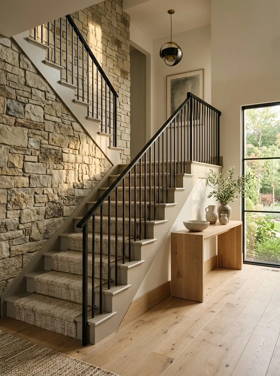
Greige sits comfortably between warm and cool, which makes it useful when several different materials meet around the staircase. Here, the painted stair surfaces are paired with textured stone, pale timber, and a matte black railing.
The paint acts as the bridge. It is softer than the black metal and quieter than the stone, allowing those stronger materials to coexist without creating a chaotic palette.
A slightly textured wall finish can reinforce the organic quality, while simple timber furniture keeps the landing approachable. This is a good direction for an interior that already mixes natural materials and wants the staircase to connect them rather than compete with them.
Forest Green Staircase With Light Oak and Linen Walls
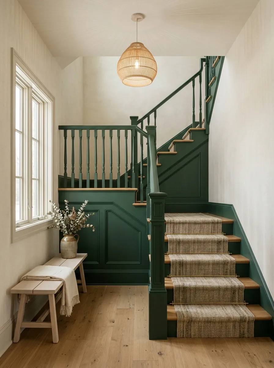
Forest green turns the staircase into the visual anchor of the hallway without requiring ornate architecture. The deep green covers the stair enclosure and selected trim, while light oak treads introduce a much brighter horizontal element.
Linen-colored walls soften the transition between the green and the rest of the home. A pale bench, woven runner, or natural fiber pendant can continue that lighter feeling around the landing.
The strongest balance comes from allowing the green to occupy a defined architectural zone. It should feel like a deliberate focal point rather than a color that has spread randomly around the house. Warm wood and soft textiles give the darker paint enough contrast to remain inviting.
Warm Gray Staircase With Patterned Runner and Brass Sconces
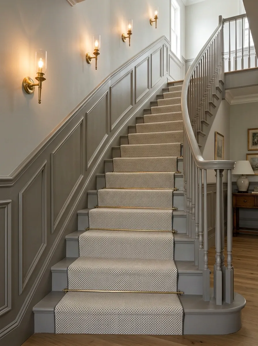
Warm gray gives this staircase a quiet architectural base, allowing the runner and lighting to provide the personality. The stairs, trim, and surrounding lower walls stay within a muted gray range, while a patterned runner introduces movement through the center.
Brass sconces add warmth at eye level and become especially effective in the evening, when their light catches the gray surface. Classic molding keeps the composition from feeling too contemporary.
The pattern should remain relatively contained. A smaller-scale motif keeps the stairs visually interesting without turning the entire hallway into one large graphic statement. The result feels traditional, layered, and comfortable without relying on excessive decoration.
Black-and-Cream Staircase With Checkerboard Floor
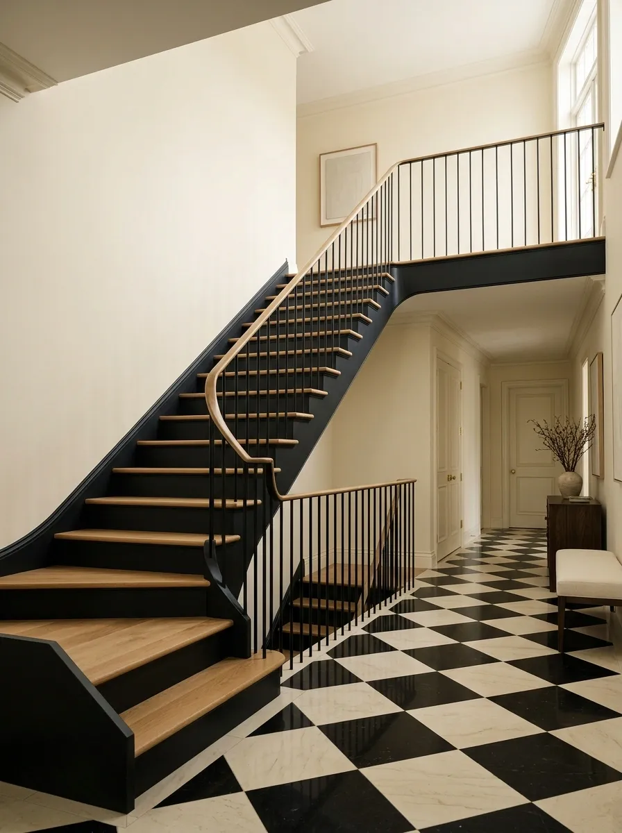
This staircase takes a graphic approach by linking the painted stairs to a checkerboard floor at the bottom or landing. Black appears on selected stair surfaces and architectural trim, while cream keeps the composition from becoming severe.
The repeated color connection is what makes the design feel deliberate. The floor and staircase speak to each other without needing identical patterns. A simple black railing reinforces the geometry, while cream walls provide a large area of visual relief.
Keep additional patterns to a minimum. The checkerboard already supplies strong movement, so surrounding furniture should have simple silhouettes and mostly solid upholstery.
Warm Taupe Staircase With Curved Railing and Soft Lighting
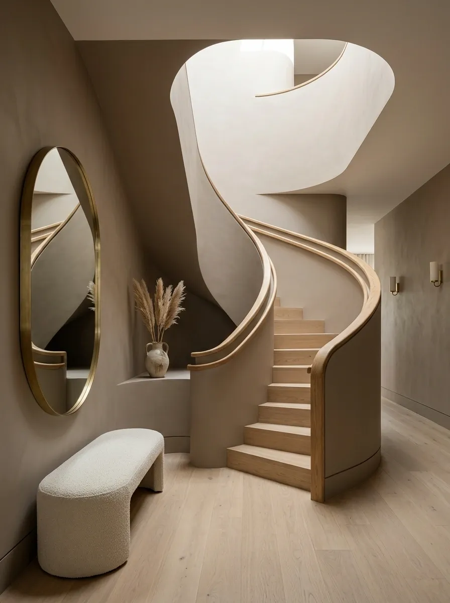
Warm taupe is particularly effective when the staircase has curved walls, rounded landings, or a sculptural railing. Instead of competing with those shapes, the muted paint allows them to remain the focus.
A curved timber handrail introduces a gentle organic line, while soft wall lighting creates gradual shadows across the taupe surface. Pale flooring gives the stair enclosure enough contrast to remain visible without creating a hard division between spaces.
Furniture should echo the softer geometry. Rounded benches, oval mirrors, or softly shaped lighting can reinforce the architectural language, but there is no need to repeat every curve. The staircase already provides the main sculptural moment.
Teal Staircase With Crisp White Trim in a Creative Entryway
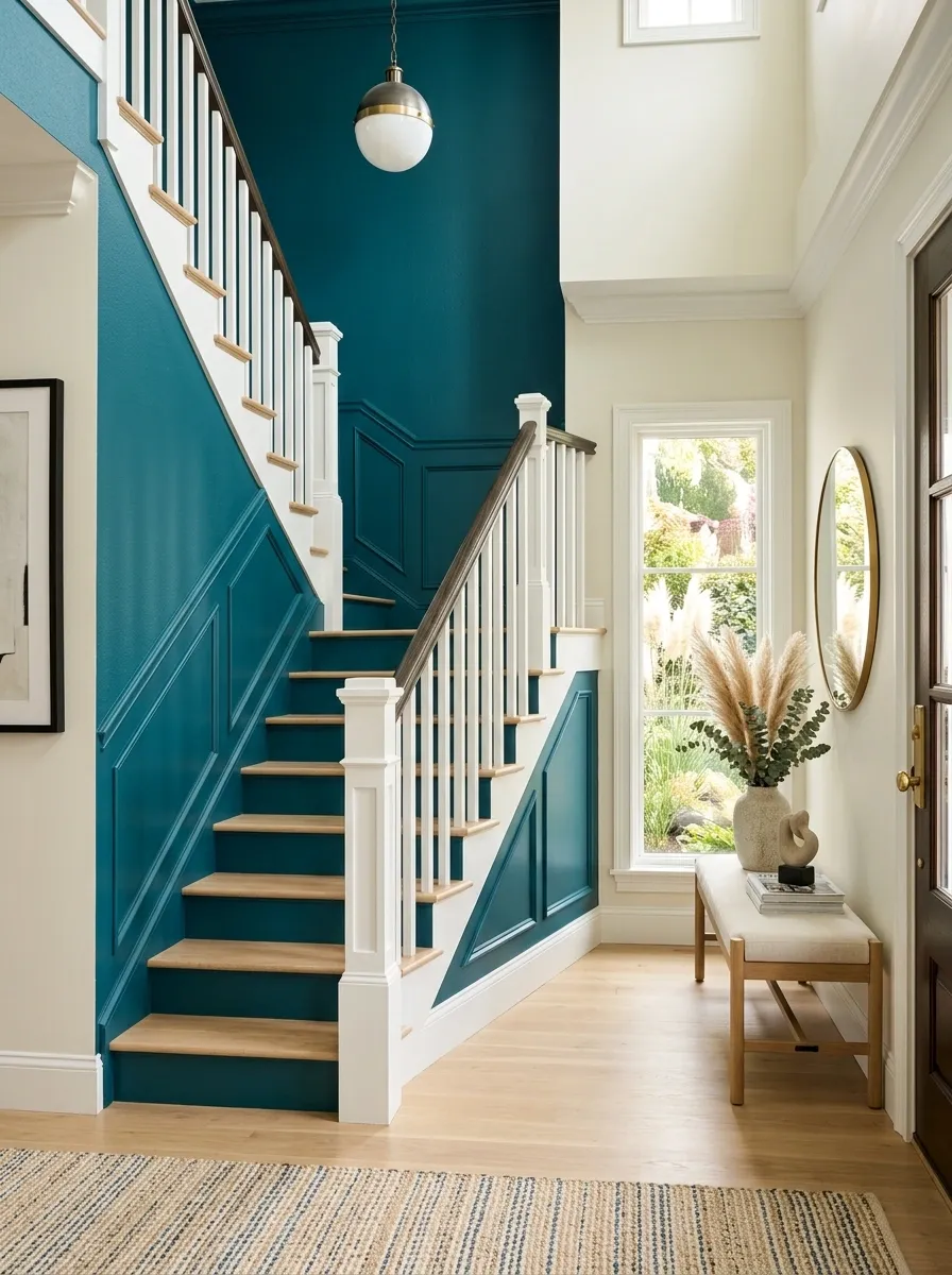
Teal gives a staircase instant character, but the white trim keeps the saturated color under control. Here, teal occupies the main stair walls and risers while bright white outlines the architecture and visually separates the staircase from the surrounding entry.
The floor should remain pale or neutral so the color has a clear stage. Simple furniture with light wood, cream upholstery, or black accents can sit nearby without introducing another strong hue.
This concept works best when the staircase is allowed to be the main color statement. The white trim isn’t just decorative; it gives the saturated paint a crisp boundary, making the entire stairway look deliberately designed rather than simply painted a bold color.
Putty-Colored Staircase With Natural Stone and Blackened Steel
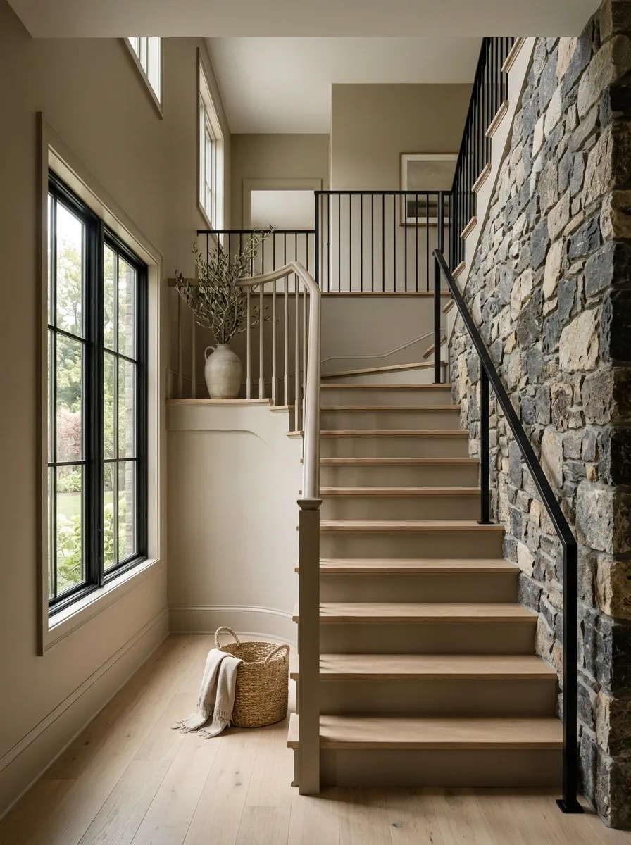
Putty paint gives this staircase a softer connection between rough stone and darker metal. The stairs and surrounding walls stay within a muted earthy range, while natural stone introduces irregular texture and blackened steel adds a sharper architectural edge.
The color works as a bridge between those materials. It is warm enough to sit comfortably beside stone and timber, but neutral enough to keep the metal from feeling disconnected. Pale oak or reclaimed wood can add another layer around the landing without competing for attention.
This design benefits from restraint. The stone should provide texture, the steel should provide definition, and the putty paint should quietly tie the entire arrangement together.
Soft Black Staircase With Warm Walnut and Cream Textiles
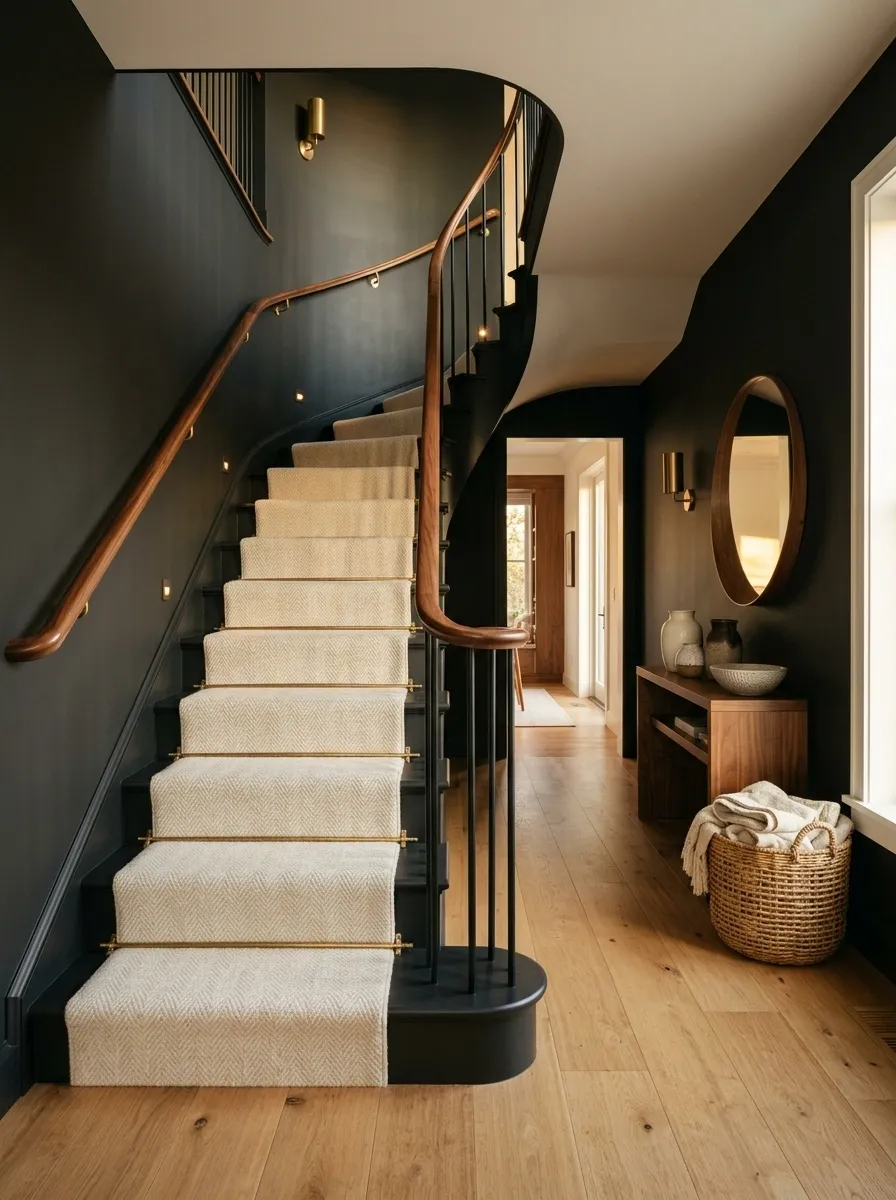
Soft black makes the staircase feel sophisticated without the severe effect of a pure, high-contrast black-and-white scheme. The painted stair enclosure becomes the darker architectural mass, while warm walnut furniture and cream textiles bring the surrounding space back toward warmth.
A cream runner can soften the stairs themselves, while a walnut handrail or console connects the staircase to the rest of the room. Warm lighting is important because it gives the dark paint depth and prevents the surfaces from looking flat.
The composition works through contrast in material rather than contrast in color alone. Matte paint, visible wood grain, and soft fabric create three distinctly different surfaces within a restrained palette.
Pale Green Staircase With Botanical Wallpaper and Brass Details
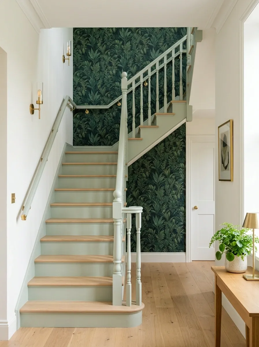
Pale green and botanical pattern make a natural pairing, but the wallpaper is kept to a defined architectural area rather than covering the entire hallway. The staircase itself uses the softer green on its painted surfaces, while a botanical panel introduces darker leaves and a little visual movement.
Light timber treads keep the stairs fresh. Small brass fixtures add warmth, particularly where natural daylight is limited. The surrounding walls can remain warm white so the botanical pattern has space to breathe.
The strongest version keeps the pattern and paint related but not identical. The green should act as the quiet link between the two rather than trying to match every shade appearing in the wallpaper.
Monochrome White Staircase With Sculptural Lighting and Pale Stone
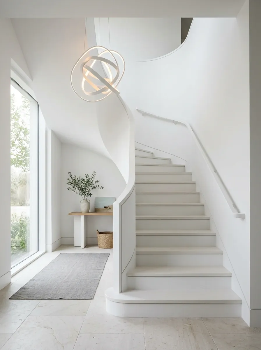
A white staircase does not have to look flat. This composition uses several warm and cool white surfaces, pale stone flooring, and a sculptural light fixture to create depth without introducing a strong color.
The distinction comes from shadow, texture, and small changes in tone. Stone gives the floor a subtle grain, while the stair surfaces remain smoother and cleaner. A sculptural pendant or wall light becomes more noticeable against the pale background because there is very little competing color.
This direction suits interiors with strong natural light and clean architectural lines. The goal isn’t absolute sameness. The most successful monochrome spaces use neighboring whites that reveal the structure through gentle tonal differences.
Smoky Blue Staircase With Warm Oak and Vintage-Inspired Details
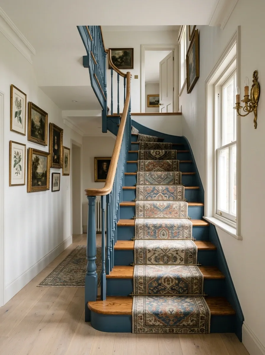
Smoky blue gives this final design enough color to make the staircase memorable while staying grounded in traditional materials. The painted enclosure carries the blue, warm oak defines the treads and handrail, and aged brass appears in lighting or small architectural hardware.
A vintage-inspired runner adds another layer, especially when its colors echo the blue and warm timber without copying them exactly. Framed artwork on the landing can continue the collected feeling, but it should remain secondary to the staircase itself.
The combination feels especially cohesive because every element brings something different. Blue supplies the mood, oak supplies warmth, brass catches the light, and the runner adds pattern. None needs to perform all four jobs.
Making the Staircase Feel Like Part of the House
The best staircase paint choices don’t exist in isolation. They settle into the architecture around them.
A dark stairway needs enough lighter space to prevent the hallway from becoming visually heavy. A saturated color benefits from quiet flooring and trim. Warm wood can soften cool paint, while stone and metal can add enough texture to keep a neutral staircase from feeling bland.
Start with the complete view of the stair zone rather than a tiny paint sample. Look at the walls, flooring, railing, landing, nearby furniture, and natural light together. Then decide which surface should lead the composition and which ones should support it.
Save the combinations that feel closest to the architecture already in the home, then use those references when choosing paint, finishes, and the final styling around the stairs.