
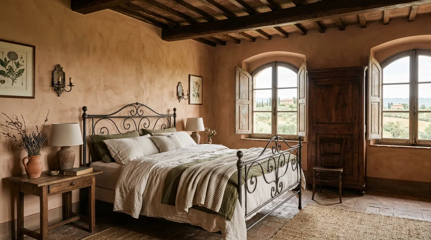
Nobody needs another mood board full of oatmeal linen and a single eucalyptus stem. That’s not a bedroom. That’s a waiting room with better lighting.
Tuscany never had this problem. The rooms that actually exist in the Italian countryside are colored like something happened there — rust, sage, wine, the deep charcoal of a room that’s seen a hundred winters. They don’t apologize for the color. They don’t explain it. They just commit.
The mistake most people make when they say they want a “Tuscan bedroom” is picturing beige with extra pillows. That’s not Tuscan. That’s a hotel lobby in Ohio wearing a costume.
Tuscan Bedroom Ideas
Painted Tree Mural Wall
Skip wallpaper. A hand-painted mural, faded and monochrome like an old fresco, does something wallpaper never quite manages — it looks like it’s been there for decades, not applied last spring.
Work with a muted, almost grey-green palette rather than full color. A landscape scene in near-monochrome reads as aged and architectural. The same scene in full color reads as a kid’s room.
Hire a decorative painter or use a large-format mural panel with a matte, slightly textured finish rather than glossy vinyl. The texture is what sells the illusion that it’s painted directly onto plaster.
Keep the bedding simple and tonal — raw linen in ochre or clay — so the mural stays the obvious focal point. A patterned duvet in front of a painted scene turns the wall into background noise.
Leave the rest of the wall bare. No shelf, no sconce, nothing mounted over the painting. It needs the entire wall to itself to read as a room feature instead of oversized art.
Fireplace Beside Leather Headboard
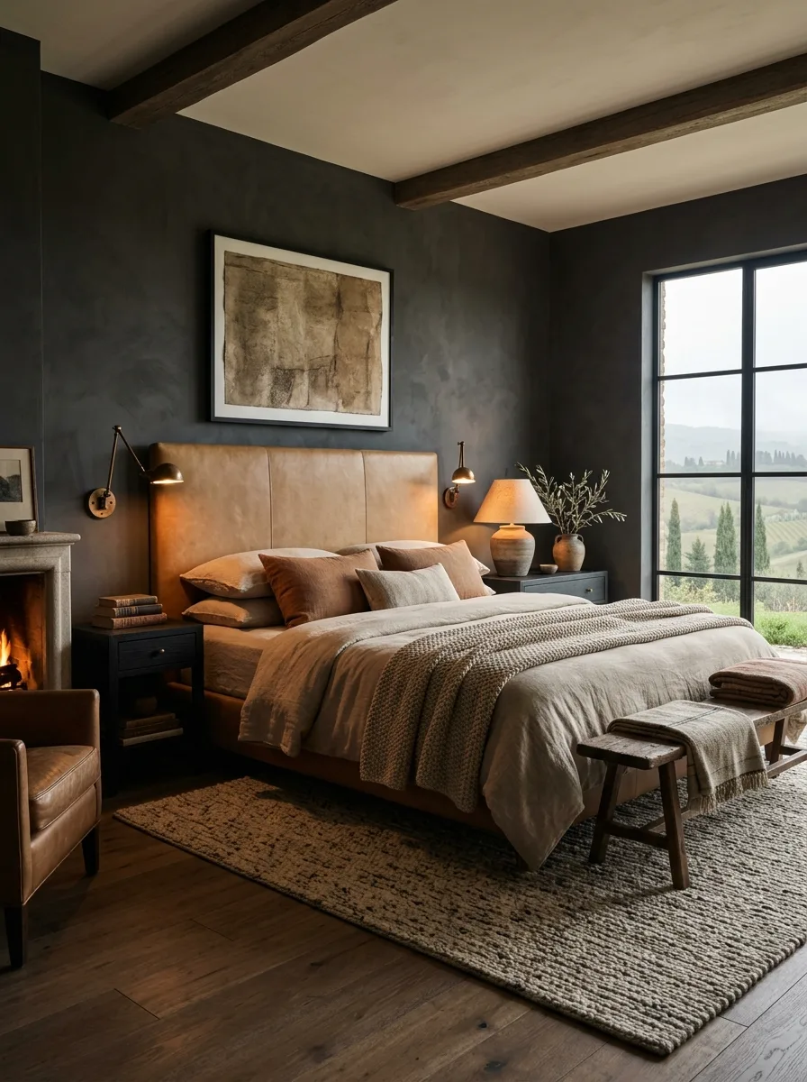
Position the bed close enough to a working fireplace that both can be seen and felt from under the covers. The point of this layout is proximity, not just having a fireplace somewhere in the room.
Choose a camel or cognac leather headboard rather than a neutral fabric one. Against charcoal walls, the leather’s warmth does the job that firelight would otherwise have to do alone.
Add a single leather armchair near the fireplace, angled toward the flames rather than the bed. It signals that this room is meant to be occupied, not just slept in.
Layer a chunky, hand-knotted wool rug rather than a flat weave. The texture holds up better against dark, smooth walls and gives bare feet something substantial to land on getting out of bed.
Keep the art above the mantle abstract or textural rather than a clear landscape. A room this saturated in color and material doesn’t need a literal scene competing for attention.
Suspended Fabric Bed Canopy
Build or buy a four-post frame first — the canopy is only as good as the structure holding it up. Solid wood posts, ideally reclaimed or hand-finished rather than new-looking, give the whole thing weight.
Use a lightweight, semi-sheer linen for the canopy top and side panels rather than a heavy fabric. Heavy fabric sags and traps heat. Sheer linen lets light filter through and moves with any breeze from an open window.
Tie the side panels back at each post rather than leaving them to hang loose across the bed. Tied-back panels keep the bed accessible and stop the whole structure from feeling like a tent.
Hang a single statement light fixture through the canopy opening rather than relying on lamps alone. A carved lantern or pierced-metal pendant, glimpsed through the sheer fabric above the bed, becomes its own quiet detail.
Pick a wood tone for the posts that’s darker than the surrounding furniture. The frame needs to visually anchor the room, and a pale wood frame tends to recede instead of holding the space together.
Forest Green Built-In Wall
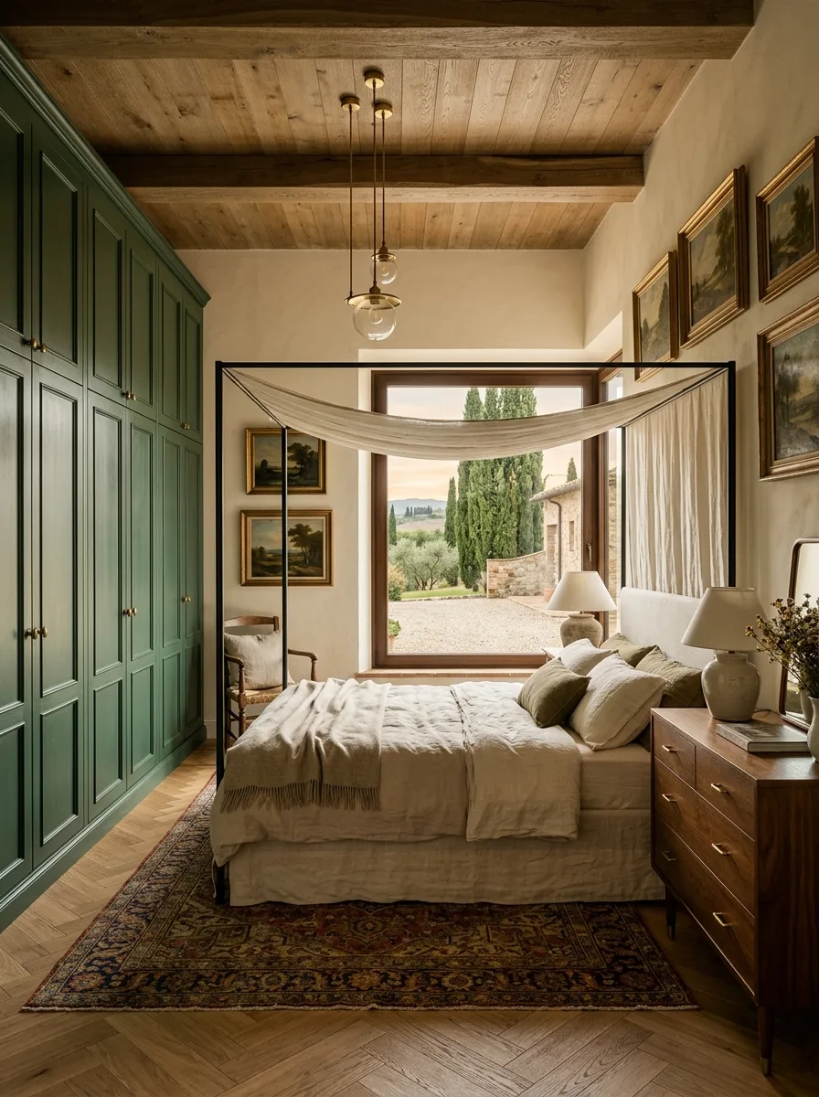
Build floor-to-ceiling cabinetry in a single saturated color rather than leaving it white or natural wood. Forest green with brass or unlacquered hardware turns a storage wall into the room’s second focal point, after the bed.
Pair the green cabinetry with warm walnut furniture elsewhere in the room rather than anything painted or pale. The green needs a grounding, honest material nearby or it can start to feel like a showroom finish.
Choose a black iron bed frame with minimal ornamentation so it doesn’t compete with either the cabinetry or a gallery wall of landscape paintings on the opposite side. Something has to stay quiet in a room this bold, and the frame is the right candidate.
Add a vintage Persian or Oushak rug rather than anything geometric or modern. The rug’s faded, complex pattern bridges the gap between the saturated green wall and the warm wood tones everywhere else.
Skip closed drawers for at least one section of the built-in and leave it open for baskets or folded textiles. A wall this large needs at least one spot where the eye can rest on texture instead of a flat painted door.
Oval Carved Antique Headboard
Find a genuinely old, carved wood headboard rather than a reproduction — the softened edges and slightly uneven finish of real age can’t be faked convincingly. Estate sales and antique dealers are the honest route here, not a furniture showroom.
An oval shape with an upholstered center panel does more than a rectangular one. The curve softens a headboard that could otherwise look heavy against a plain wall.
Don’t match the bedding to the headboard’s formality. The strongest version of this look pairs an ornate antique frame with a bold, almost folk-pattern quilt, which keeps the whole thing from feeling like a museum piece.
Leave the wall around the headboard mostly bare except for one or two small, weathered objects placed high, like a model boat or an old painting propped on a ledge. The empty wall space lets the carving stay the focal point.
Choose a small-scale bedside lamp with a simple shade. A large or ornate lamp will compete with the headboard’s detail instead of supporting it.
Charcoal Headboard Lime Wall
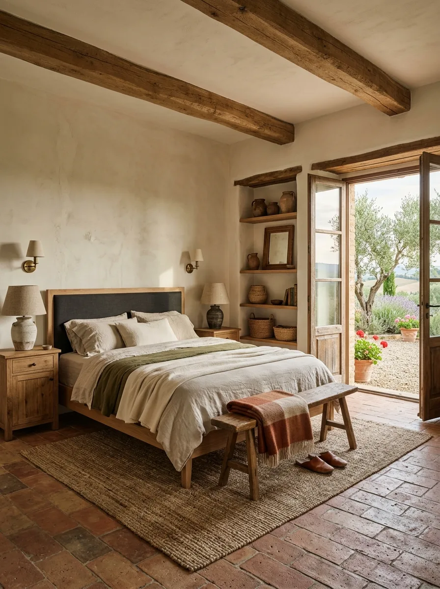
Pick one dark, saturated color for the headboard and let the wall behind it stay pale. The contrast between a charcoal upholstered headboard and a soft lime-washed wall is what gives this bed its presence.
Choose a simple rectangular headboard shape with minimal tufting or piping. The color is already doing the work, so an elaborate silhouette becomes visual clutter on top of it.
Build in open shelving nearby rather than closed cabinets, and style it sparsely — a few ceramic vessels, some books stacked flat, nothing crowded. Open shelving keeps a small, pale room from feeling boxed in.
Bring the outside in through the door rather than the window. A pair of French doors left open to a terracotta courtyard does more for the room’s warmth than any amount of styling indoors.
Finish the floor in a warm terracotta brick rather than wood. Against a lime-washed wall and charcoal headboard, the floor needs to bring in the one truly warm element in the room.
Rough Stone Feature Wall
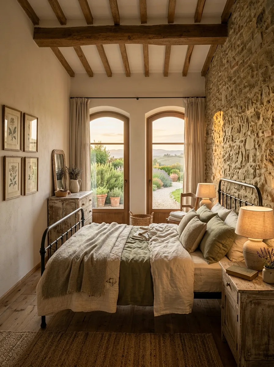
One wall of exposed, unfinished stone is enough. Every other surface in the room should stay smooth and plastered so the texture reads as a deliberate feature, not an unfinished renovation.
Keep furniture away from direct contact with the stone wall where possible. A few inches of breathing room lets the irregular surface stay visible instead of getting obscured by a headboard pushed flush against it.
Warm the room with wood-toned nightstands and pendant lighting rather than anything metal or glossy. Stone next to chrome reads industrial. Stone next to reclaimed wood reads like a farmhouse that’s stood for centuries.
Hang botanical or landscape prints in simple frames on the opposite wall, never on the stone itself. The stone doesn’t need decoration, and drilling into it for art usually isn’t worth the trouble anyway.
Let arched windows nearby do double duty, framing both the outdoor view and enough natural light to catch the texture of the stone as the sun moves through the day.
Layered Rugs Gallery Wall
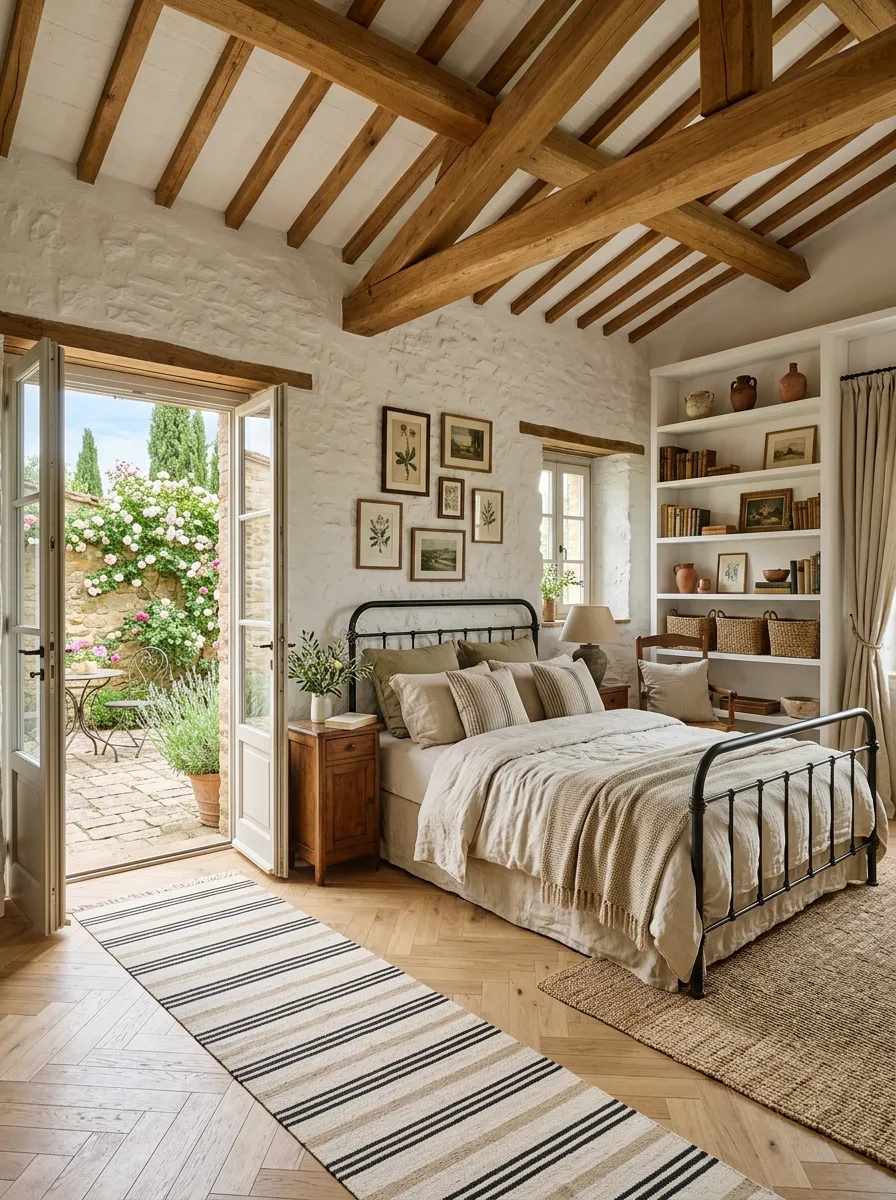
Two rugs, not one. Set a natural jute rug as the base layer across most of the floor, then add a smaller flat-weave striped rug on top, offset rather than perfectly centered.
Build a symmetrical gallery wall of small botanical or landscape prints in matching thin wood frames. Symmetry here is what keeps a room full of texture — stone, jute, iron, linen — from feeling chaotic.
Choose black iron for the bed frame specifically because it’s the darkest, thinnest line in the room. Against a white lime-washed wall and layered neutral rugs, that dark outline is what keeps the whole space from blurring together.
Leave French doors open whenever weather allows, and let a climbing rose or wisteria just outside be visible through them. The gallery wall handles the art indoors. The doorway handles it outdoors.
Style the built-in shelving with a mix of heights and a few negative-space gaps. Fully packed shelves read as storage. Shelving with room to breathe reads as curated.
Corner-Wrapped Arched Window
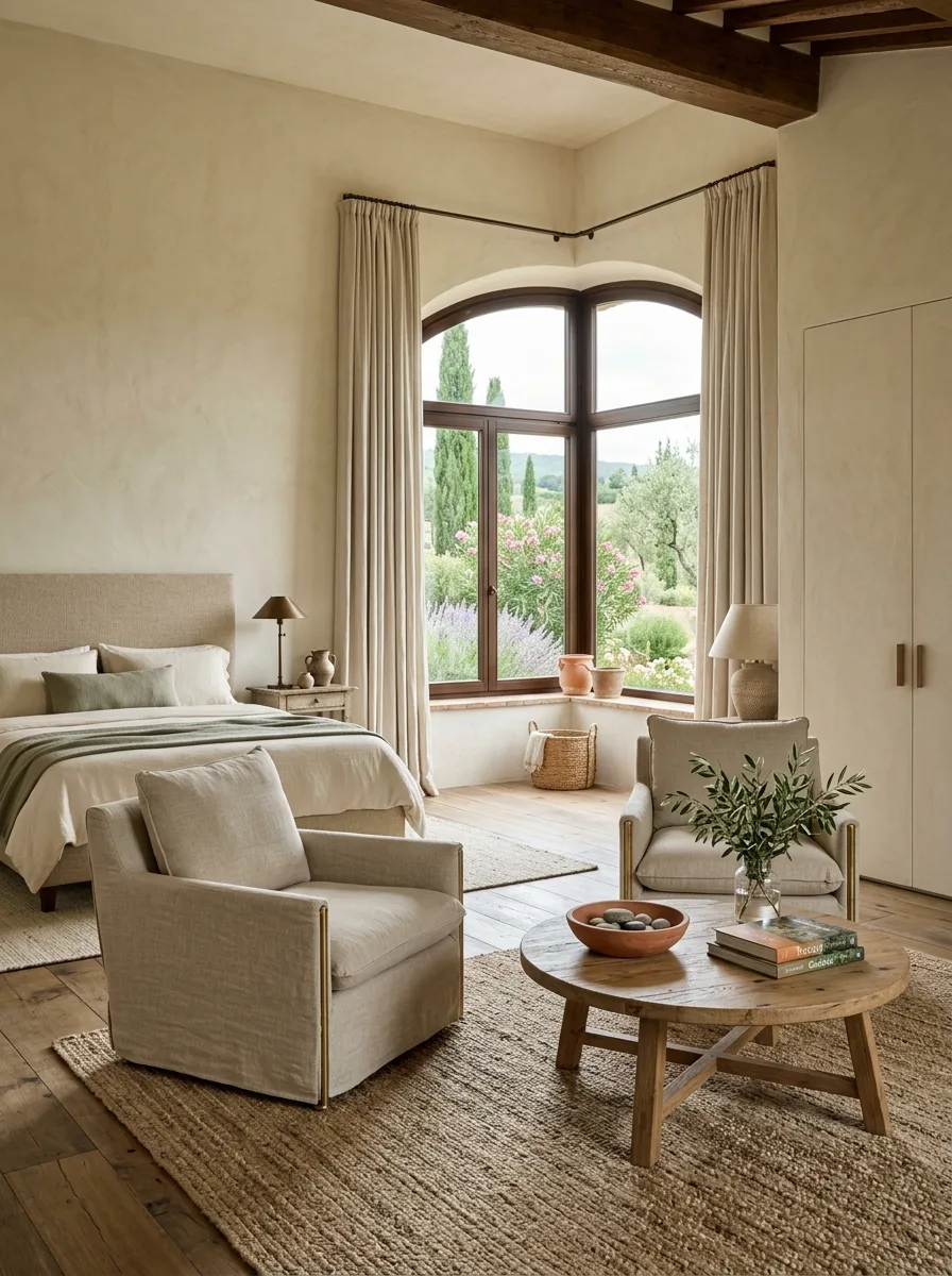
Find or build a window that wraps an actual corner rather than sitting on a single wall. The architectural drama comes from the window turning with the room, not just from its size.
Skip the bed as the focal point entirely in this layout. Build a small sitting area instead — two matching chairs and a round low table positioned to face the glass directly.
Choose chairs with a simple silhouette and a metal or brass leg detail rather than anything overstuffed. The window is the main event, and the seating needs to stay visually light so it doesn’t block the view from the rest of the room.
Hang curtains from a rod bent to follow the corner’s angle rather than two separate straight rods. It’s a small detail, but it’s the difference between a window treatment that looks custom and one that looks like an afterthought.
Add one low bowl of stones or a small potted olive on the table. The styling should be minimal enough that nobody’s eye stops on the table before it reaches the window.
Woven Leather Herringbone Headboard
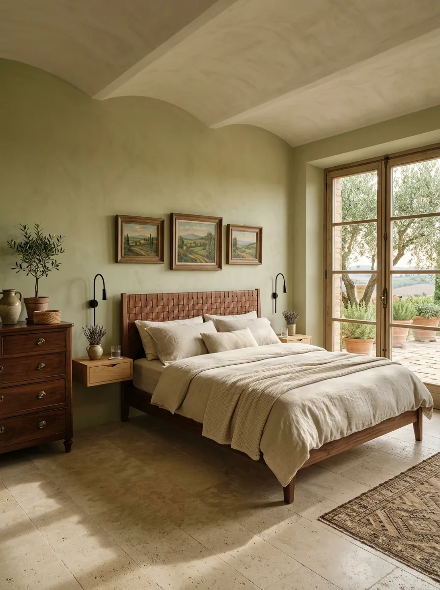
Source a headboard with strips of leather woven in a herringbone or basket pattern rather than a single upholstered panel. The weave adds enough texture that the piece doesn’t need any other embellishment.
Mount nightstands directly to the wall on either side instead of using freestanding pieces. Floating nightstands keep the floor visually clear beneath a headboard this detailed, so the eye isn’t split between two competing focal points.
Choose wall-mounted, articulating sconces over table lamps. They free up the floating nightstand’s small surface for a single object — a plant, a glass of water — instead of a lamp base taking up the whole thing.
Pick a wall color with some depth, like a muted sage or olive, rather than white. A woven leather headboard this textural needs a background with a little weight of its own, or it reads as flat.
Keep the bedding entirely in undyed linen and let the headboard carry the only real color in the room.
Terracotta Plaster Sunflower View
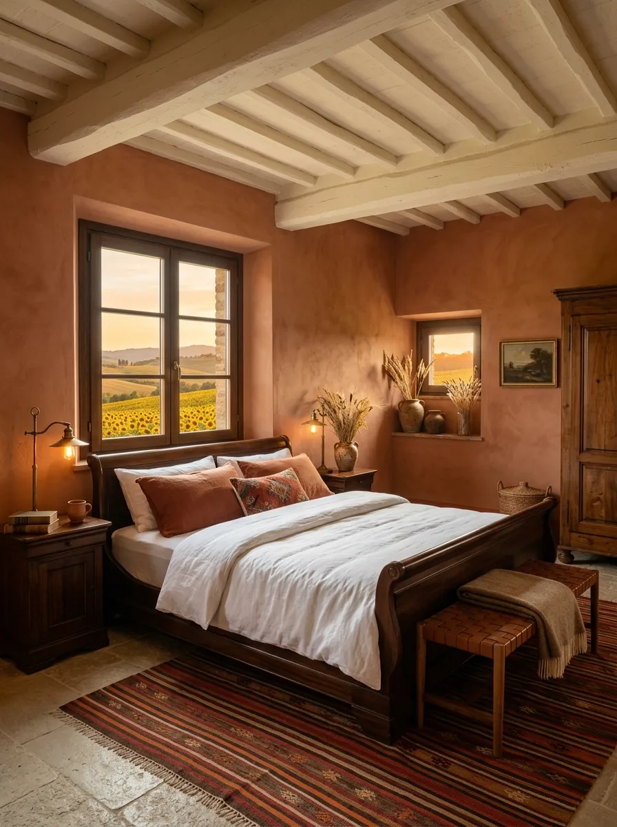
Commit to a single saturated wall color across the entire room, not just an accent wall. Deep terracotta plaster covering every surface is what makes a room feel enveloping rather than decorated.
Contrast the walls with a whitewashed, exposed-beam ceiling. Painting the beams themselves in a pale tone against dark walls keeps the ceiling from disappearing into the same heavy color as everything below it.
Choose a dark wood sleigh-style bed frame rather than anything upholstered. Carved wood against saturated plaster has enough contrast on its own without adding another textile layer to compete with the walls.
Mount reading lights on flexible swing arms rather than fixed sconces, positioned close enough to actually read by. In a room this dark and warm, functional lighting placed with intention matters more than a single statement fixture.
Let a window with an unglamorous but honest view — a working field, not a manicured garden — do the framing. The color of the room and the color outside it should echo each other.
Arched Shutters Stone Hearth
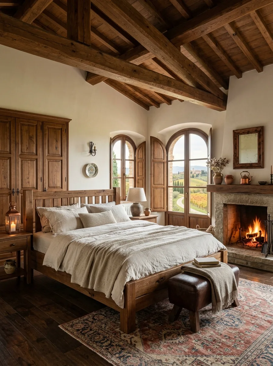
Build a stone fireplace with a heavy reclaimed wood mantle as the room’s anchor, positioned so it’s visible from the bed. A working hearth changes how a bedroom functions, not just how it looks.
Choose twin arched windows with wood shutters that actually open and close, rather than fixed glass. Functioning shutters read as authentic in a way that decorative ones never quite manage.
Hang a single decorative plate or piece of folk pottery on the wall between the windows. One object, chosen well, does more here than a full gallery wall would against this much architectural detail already competing for attention.
Pick a wood bed frame with simple slatted detailing rather than upholstery. With a stone hearth, exposed beams, and arched windows already in the room, the bed frame’s job is to stay honest and unfussy.
Add a leather bench at the foot of the bed for folded throws. It’s a practical addition, but it also breaks up the wall of linen bedding with one more material in the mix.
Gilt Mirror Spindle Bed
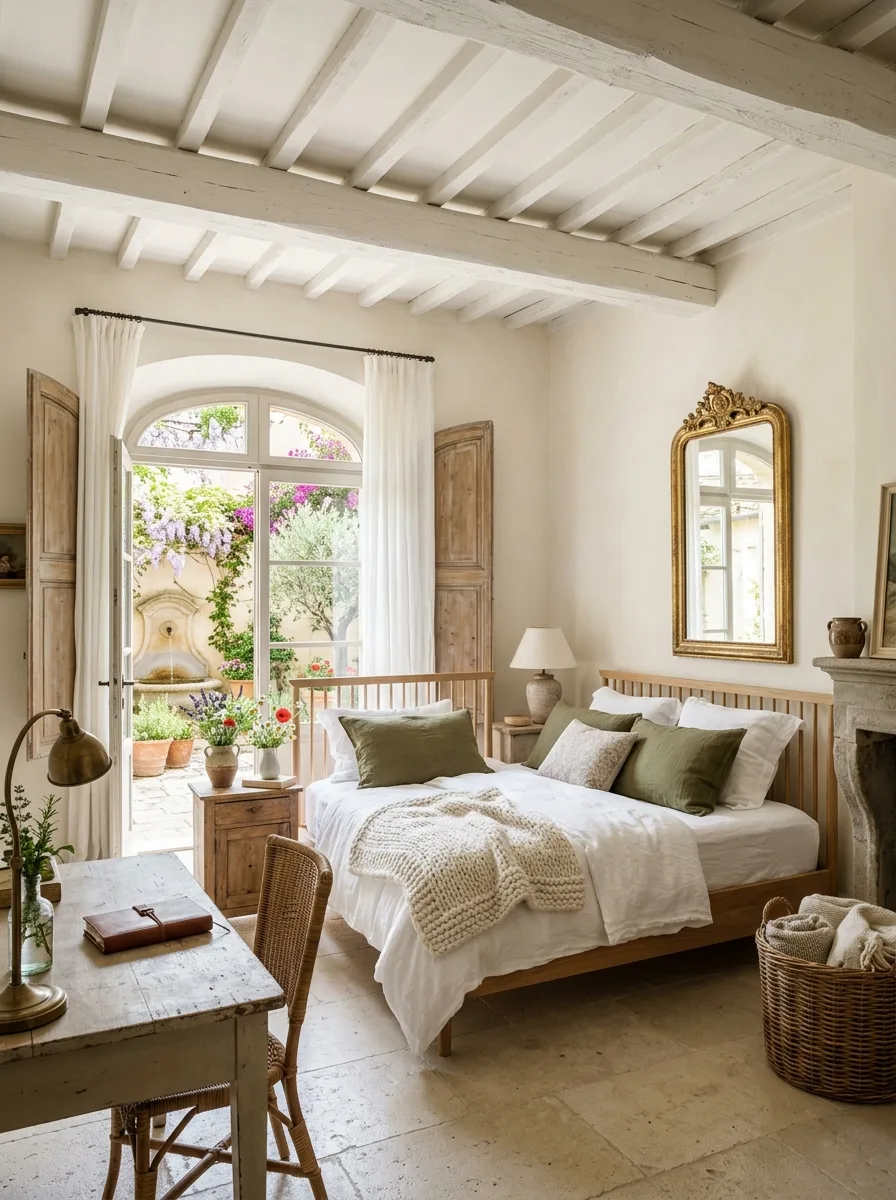
Hang an ornate gold-framed mirror directly above a stone or plaster mantle, even in a room that’s otherwise stripped back to natural wood and white walls. One gilded object against a lime-washed room reads as inherited, not purchased.
Choose a bed frame with simple vertical spindles in a pale, natural wood rather than anything dark or upholstered. The mirror needs to be the room’s one ornate note, and a plain frame lets it stay that way.
Set up a small writing desk near a window with French doors rather than pushing it against a blank wall. The desk becomes a second reason to be in the room besides sleeping, and the light from the doors makes it usable in the morning.
Keep the color palette down to white, natural wood, and a single muted green in the pillows. Restraint elsewhere is what makes the one gilt mirror feel intentional instead of random.
Leave the fireplace, if there is one, unlit and styled simply — a small vase, nothing elaborate — so it doesn’t pull focus from the mirror above it.
Navy Velvet Nailhead Headboard
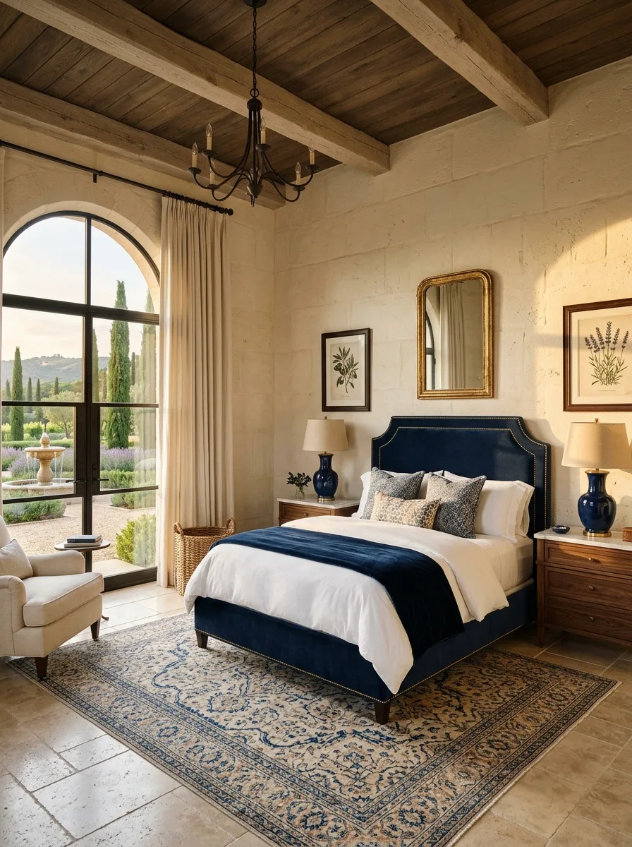
Choose a deep navy for the headboard and repeat that exact color in at least two other spots — a lamp base, a rug border — so it reads as a planned palette rather than one bold piece dropped into a neutral room.
Add nailhead trim along the headboard’s edge rather than leaving it plain. The small detail gives a solid-color upholstered piece enough visual interest to hold its own against a patterned rug.
Set the bed against a pale limestone or plaster wall so the navy has maximum contrast to work with. This color gets muddy against anything warm-toned or already busy.
Choose a rug with a dense, traditional medallion pattern in blues and creams rather than anything abstract. The pattern needs to be complex enough to stand up to a saturated headboard without looking like it was picked separately.
Bring in a wrought iron arched window nearby if the layout allows it. The dark iron lines echo the navy without introducing a second competing color.
Bare Bulb Pendant Lighting
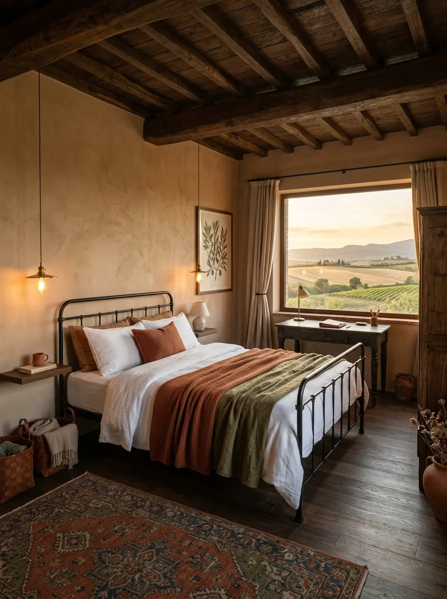
Skip table lamps entirely and hang two bare or lightly shaded bulbs from the ceiling on simple black cords, one on each side of the bed. It’s a smaller gesture than most bedside lighting, and that’s exactly the point.
Choose a wrought iron bed frame with a low profile rather than a tall upholstered one, since the pendants need visual room above the bed to read clearly rather than getting lost against a tall headboard.
Position a small writing desk under a window rather than centering the room entirely on the bed. The pendant lights free up the nightstand surfaces, and that extra function elsewhere makes the room feel used, not staged.
Pick warm, low-wattage bulbs rather than bright white ones. The whole point of a pendant this exposed is the warm glow it throws, not clean illumination.
Layer two rugs of different textures at the foot of the bed rather than one large rug under the whole frame. It adds warmth exactly where feet land first each morning.
Channel-Tufted Fluted Headboard
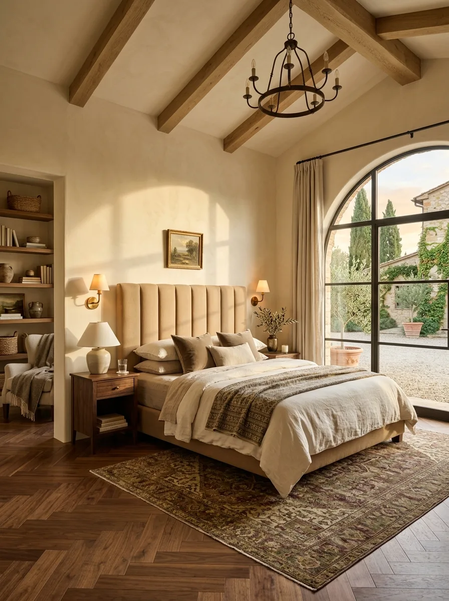
Choose a tall headboard with vertical channel tufting in a warm neutral like camel or oatmeal rather than a flat panel. The fluted texture catches light differently across its width, which gives a single-color headboard real depth without adding pattern.
Frame a large steel-and-glass door or window nearby rather than a traditional wood-framed one. The thin black lines of a steel frame contrast sharply with the soft, rounded texture of the tufting, and that contrast is doing a lot of the room’s visual work.
Add a round wrought iron chandelier overhead instead of a flush-mount fixture. The circular shape softens a room built mostly from straight lines and vertical channels.
Keep the flanking sconces simple and warm-toned rather than statement pieces. With this much going on in the headboard already, the lighting on either side should support the reading experience, not draw attention to itself.
Choose a vintage-style patterned rug in muted burgundy and gold tones rather than anything neutral. The headboard is quiet enough in color that the floor can afford to carry more pattern.
Terracotta Urn Olive Branches
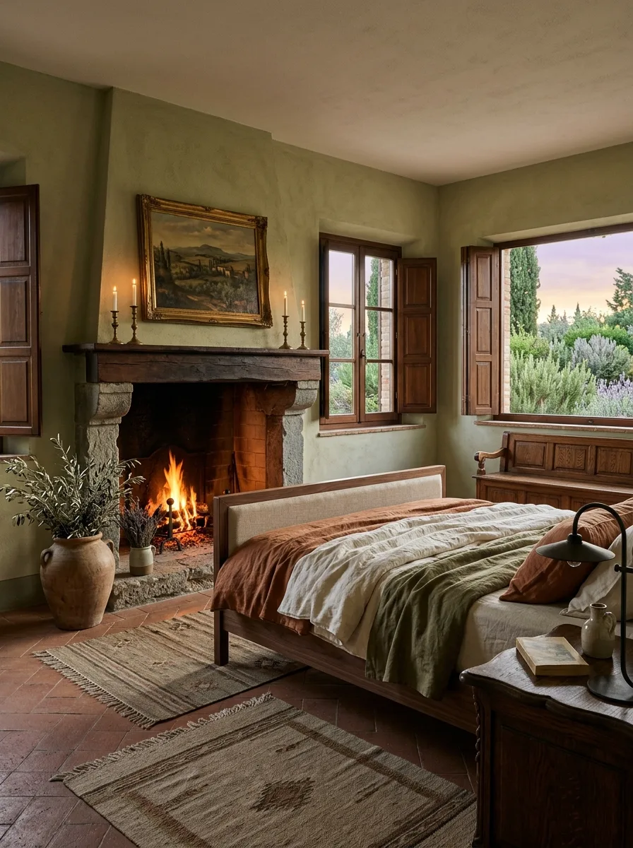
Set a large, unglazed terracotta urn directly on the floor and fill it with olive branches or dried herbs rather than a formal floral arrangement. The scale and roughness of the urn matter more than anything precise about what’s in it.
Build the room around a working stone fireplace with a rough timber mantle, and keep the mantle styling to just a few candlesticks and one painting. A fireplace this textural doesn’t need much help.
Choose sage or olive green plaster for the walls to echo the branches in the urn, so the color scheme feels sourced from the room’s own materials rather than assembled from a palette.
Open the wood shutters fully rather than leaving them decorative, and let evening light spill directly onto the bed. This look depends on real daylight, not staged lamp lighting, to feel authentic.
Layer two smaller kilim rugs rather than one large rug, placed at slight angles to each other. The imperfection in their placement matters as much as the pattern itself.
Boucle Chair Dusty Blue
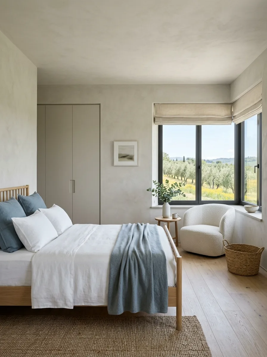
Introduce exactly one cool color into an otherwise warm, neutral room — a dusty blue throw and matching pillows against all-white linen bedding does the job without tipping the whole space cold.
Choose a rounded boucle swivel chair over anything with sharp lines or dark upholstery. The soft, textured shape keeps a minimalist room from feeling stark, especially next to plain plastered walls.
Use a simple oak spindle bed frame in a pale, natural finish. This look depends on restraint everywhere except the one blue accent, so the frame needs to stay quiet.
Hang a roman shade instead of curtains on windows facing an olive grove or open field. The clean horizontal lines of a roman shade suit a pared-back room better than gathered fabric would.
Add one woven seagrass basket near the chair for actual storage, and resist the urge to add anything else. A room this minimal earns its calm by stopping at exactly enough.
Basket Wall Gallery Display
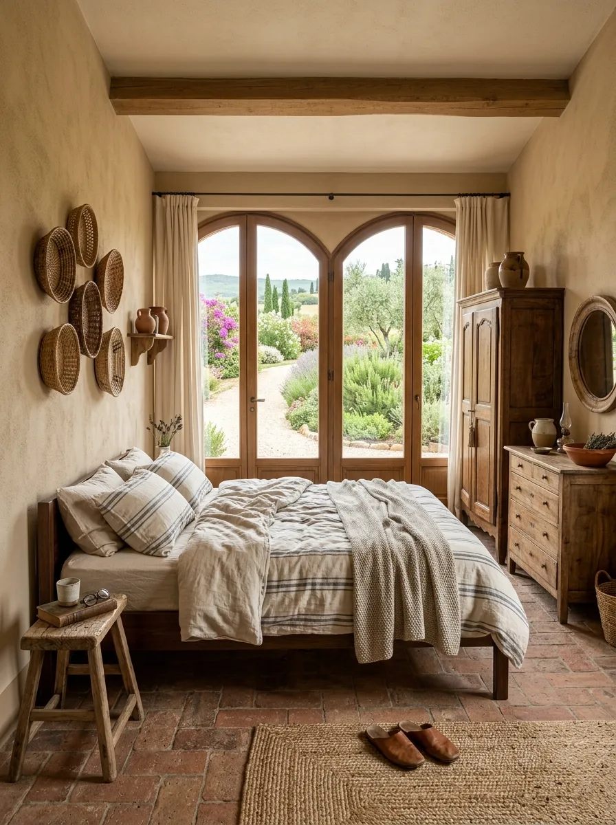
Arrange a collection of wicker and rattan baskets directly on the wall in varying sizes, mixing round and oval shapes rather than choosing a uniform set. The irregularity is what makes it read as gathered over time instead of bought as a matching kit.
Pair the basket wall with warm ochre or honey-toned plaster rather than white, so the natural fiber texture doesn’t disappear against too pale a background.
Choose double arched wood doors as the room’s main architectural feature, framing a garden path outside rather than a blank wall or fence. The doors need somewhere worth looking at once they’re open.
Use a small, low wood stool as a nightstand instead of a proper piece of furniture. It keeps the room’s materials consistent — wicker, wood, linen — without introducing anything polished or new-looking.
Leave a pair of leather slippers by the bed, unstaged, rather than tucking them away. Small, lived-in details like this do more for the room’s warmth than another decorative object would.
Wood Slat Wine Wall
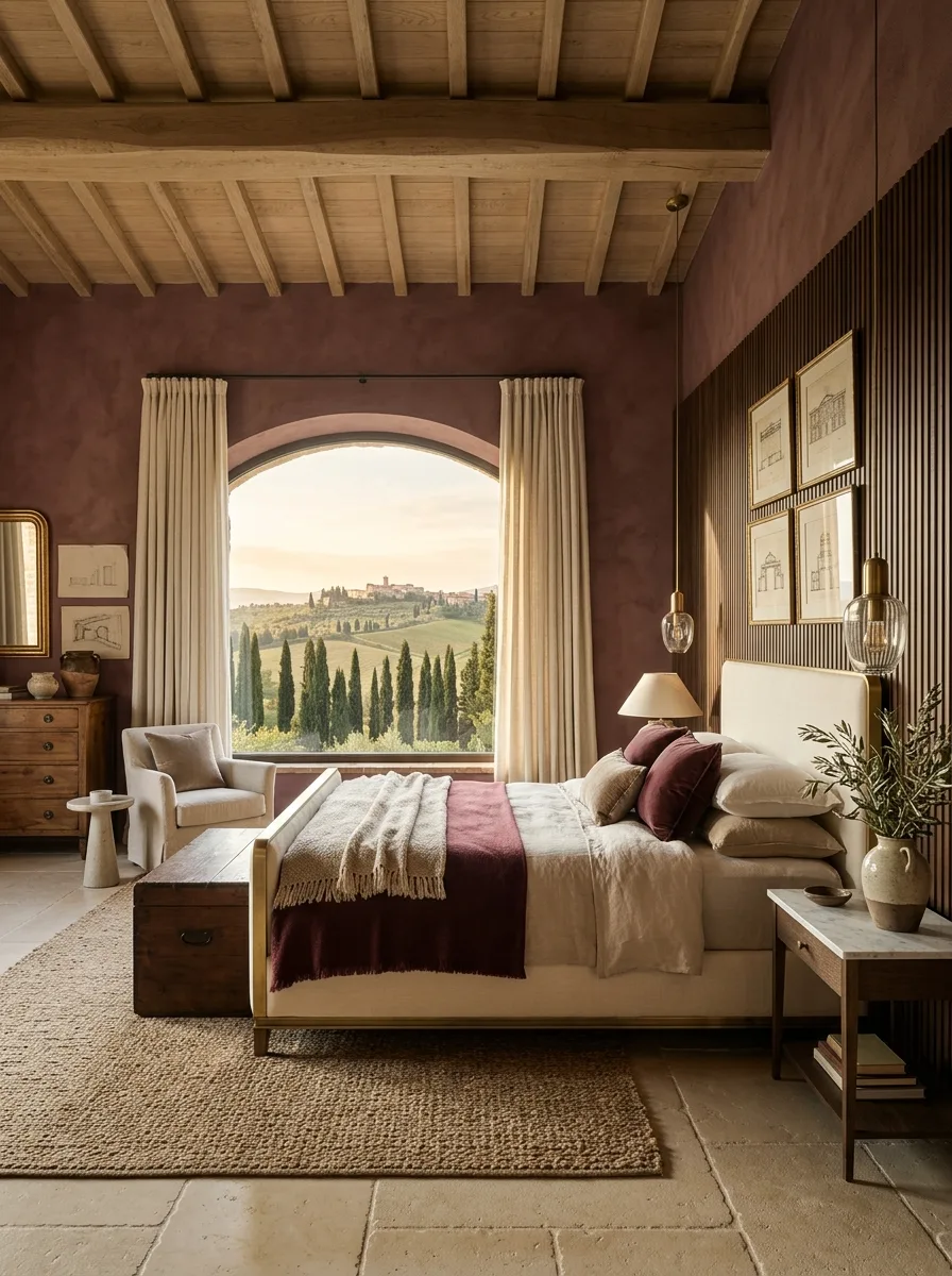
Choose a deep burgundy or wine-toned plaster for one wall and pair it directly with a vertical wood slat or fluted panel on the wall beside it. The two textures next to each other keep the saturated color from feeling flat.
Frame a large arched window with a view worth building the whole room around, and leave it uncovered by day, using curtains only for evening privacy. This color depends on daylight to keep it from reading too heavy.
Choose an off-white upholstered bed frame rather than a wine-colored or dark one. The bed needs to be the visual break in a room built from two intense materials already.
Add small architectural sketches or line drawings in thin frames rather than full-color art. Anything busier will compete with the wall treatment instead of complementing it.
Finish with a single glass globe pendant light on a long drop cord next to the bed. The transparency of the glass keeps the fixture from adding yet another solid, saturated element to an already rich room.
Final Thoughts
None of these rooms are actually about Tuscany. They’re about a house that’s willing to commit to a color, a texture, a single strange decision, and then leave it alone.
That’s the part most bedrooms get wrong. Not the lack of good taste — the lack of nerve. A safe neutral palette isn’t a design choice. It’s the absence of one.
Every room here has at least one thing that couldn’t be returned to the store without an argument. A hand-painted mural. A wall of forest green cabinetry. A terracotta plaster mixed specifically to move with the light. That’s what a bedroom with an actual point of view costs.
Paint the wall. Buy the strange headboard. Leave the door open to whatever’s outside it, even if what’s outside is just a fire escape and not a Tuscan hillside. The commitment is the whole design.