
Walk into ten kitchens and you’ll see ten identical refrigerators. Stainless steel, or maybe a safe matte black if someone was feeling brave that week. Nobody comments on them. Nobody remembers them. They’re the visual equivalent of a beige rental car.
Meanwhile you’ve spent actual money on a tile backsplash, agonized over cabinet hardware finishes, and debated paint swatches for a wall that’s mostly covered by a couch. And then you let the single largest object in your kitchen sit there in factory default, contributing nothing.
Fridge wallpaper fixes this. It’s removable, it’s commitment-free, and it turns the biggest piece of furniture in the room into the thing people actually look at. The catch is that most people do it badly, picking a pattern because it looked nice on a phone screen for four seconds.
Let’s talk about how to not do that.
Why Most Fridge Wallpaper Looks Like a Mistake
Pattern Scale Nobody Thought Through
A pattern that looks charming on a paint swatch becomes something else entirely at six feet tall. Tiny ditsy florals turn into static. Medium prints that seemed bold on screen disappear into mush from across the room.
Before committing, print a section at actual size. Tape it to the fridge door and walk to the other side of the kitchen. If it reads as a blur or a smear of color, the scale is wrong, not the pattern.
Generally, larger surfaces want larger-scale motifs. A French door fridge has enormous flat panels. Treat them like the canvas they are, not like a sample book.
Ignoring the Kitchen That’s Already There
A wallpapered fridge doesn’t exist in isolation. It sits inside a kitchen with its own colors, materials, and era. Drop a hyper-modern geometric pattern into a kitchen full of warm wood and shaker cabinets and the fridge will look like it teleported in from a different house.
The strongest results pull from what’s already in the room. A botanical print in a kitchen with green cabinetry and brass hardware feels inevitable. The same print in a stark white minimalist kitchen feels like a costume.
Look at your cabinet color, your hardware finish, your flooring. The wallpaper should feel like it was always part of the plan, not bolted on afterward.
Treating It Like a Sticker Instead of a Surface
A fridge has doors, handles, a freezer drawer, sometimes a water dispenser, and visible side panels if it’s not built in. Wallpaper applied without accounting for all of that looks like a half-finished craft project — pattern stopping abruptly at a seam, handles awkwardly interrupting a motif, sides left bare while the front gets all the attention.
Plan the application as a single continuous surface. Order enough material to wrap the sides if they’re visible. Work out where seams will fall before you start, ideally somewhere the pattern can hide a break — along a handle line, at a panel edge, anywhere the eye won’t be hunting for symmetry.
Fridge Wallpaper Ideas Worth Stealing
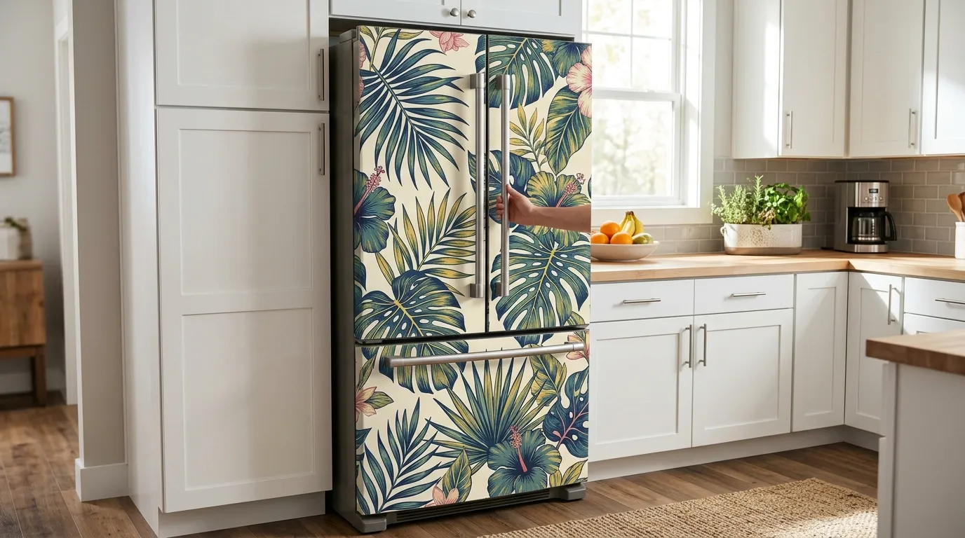
Oversized Monstera Jungle Wrap
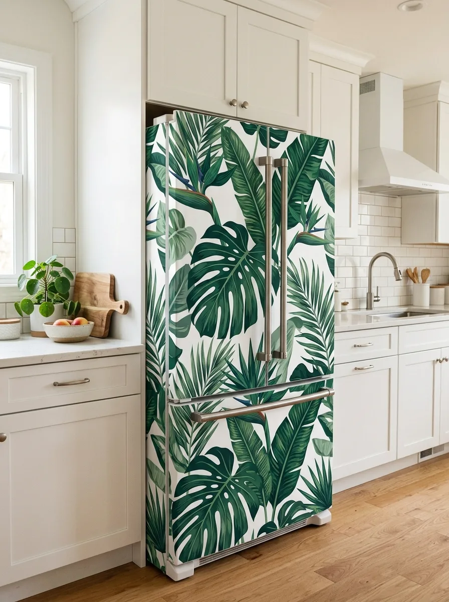
Source a large-scale tropical botanical print featuring monstera, banana leaf, and bird of paradise motifs, scaled so single leaves span well over a foot. Order it as one continuous panel covering both doors and the freezer drawer so the leaves flow across the seam without restarting.
Keep cabinetry plain and white so the print carries all the visual weight. A real potted plant on the counter nearby — something leafy and unfussy — pulls the wallpaper into the actual room instead of leaving it looking pasted on.
Apply as a single piece rather than cutting the pattern into separate panels. The mistake to avoid is a busy floral instead of leaves; leaf shapes have a natural large-scale rhythm that florals lose at this size.
Blue Toile Pastoral Wrap
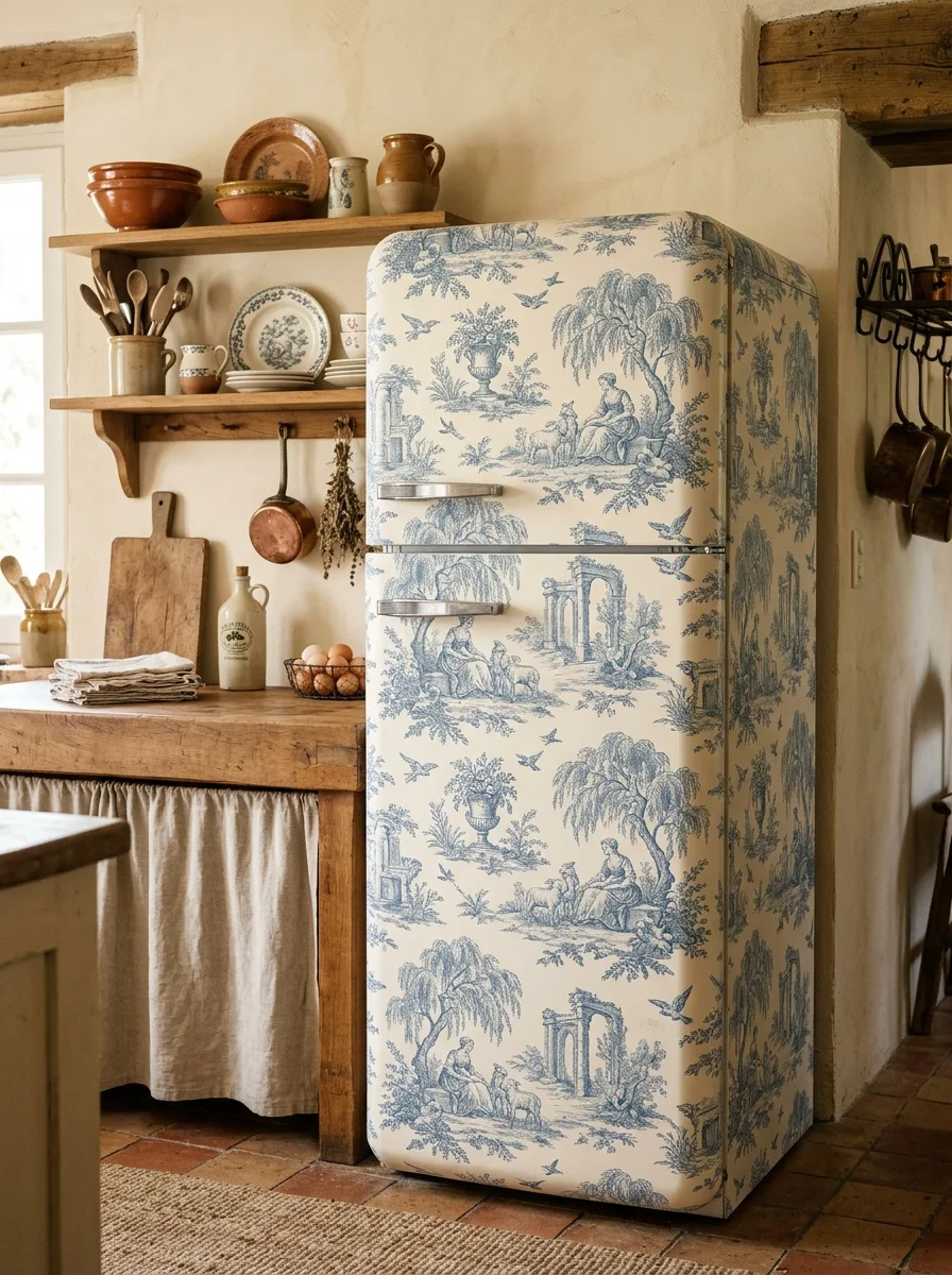
Find a single-color toile print — pastoral garden scenes, willow trees, figures with sheep, classical ruins — in blue ink on a cream ground. Wrap the entire fridge, including any visible side panel, as one continuous scene rather than separate front-and-side patches.
This pairs naturally with a farmhouse or cottage kitchen already built around worn wood, open shelving, and ceramic crockery. Don’t introduce anything sleek or modern nearby; let the fridge read as if it always belonged.
The single-color scheme is what keeps this from looking busy. A multi-color toile at this scale loses that calm. Choose a version with clearly visible scene elements rather than anything too fine-lined to read at distance.
Navy and Gold Chinoiserie Pagoda Wrap
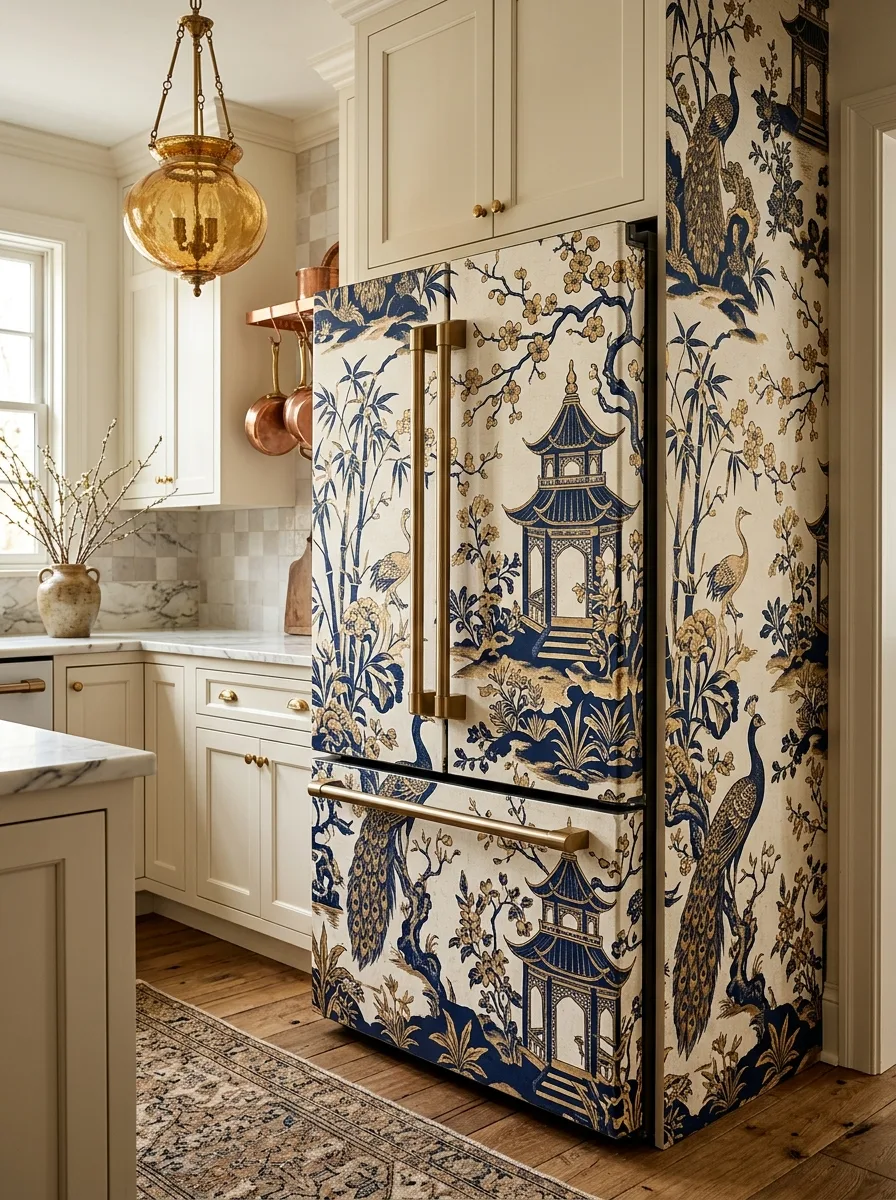
Look for a chinoiserie print with pagodas, peacocks, bamboo, and flowering branches rendered in navy and gold on cream. Choose a fridge with a visible side panel so the scene can wrap around the corner continuously, branches and birds extending from the front onto the side.
Position the largest motif — the pagoda — on the main door front at eye level. Gold or brass hardware on the fridge becomes part of the design since the print’s metallics echo it directly.
Keep surrounding tones warm. This print needs cream and gold around it, not cool grey, or the warmth of the ground color fights the room.
Oversized Rose and Peony Bouquet Wrap
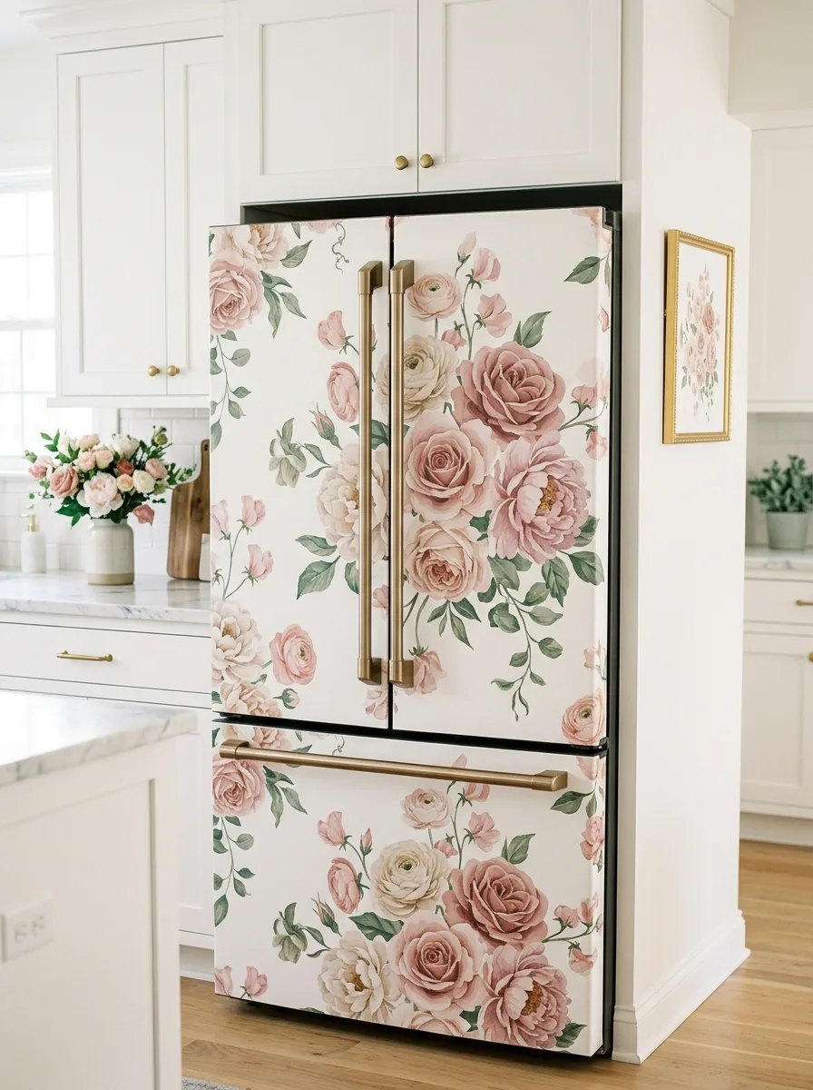
Choose a watercolor floral print with large rose and peony clusters, blooms big enough that one flower could be the size of a dinner plate. Apply across both doors and the drawer as one continuous arrangement, positioning the biggest blooms at eye level on the main doors.
Brass hardware reads beautifully against pink and cream florals. If the fridge already has gold handles, this pairing does itself; if not, weigh whether a hardware swap is worth it.
Limit other patterns nearby to one framed botanical print at most. More than that and the florals start competing with themselves.
Vintage Botanical Specimen Plate Wrap
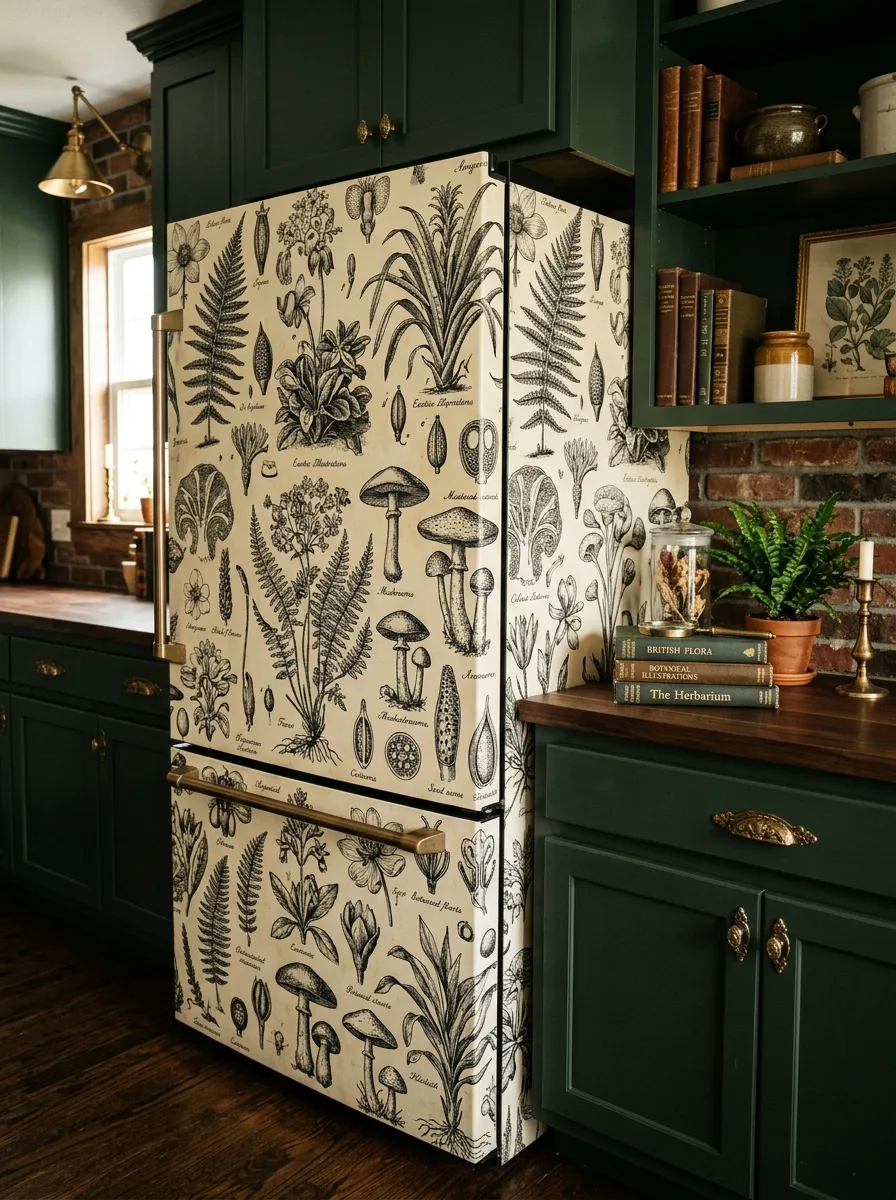
Find a black-and-white botanical illustration print — labeled plant specimens, ferns, mushrooms, seed pods, laid out like a vintage scientific plate. Density is the point: dozens of distinct illustrations should cover the surface.
This works best in a dark, moody kitchen — deep green cabinetry, brass hardware, exposed brick — where the cream background lifts against the dark surfaces. Style the counter with real ferns in terracotta pots, stacked vintage books, and a brass candlestick so the styling matches the print’s world.
Resist adding color anywhere near this fridge. The black-and-white restraint is what makes the density feel intentional.
Pale Cherry Blossom Branch Wrap
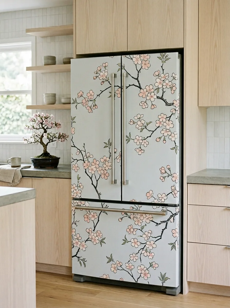
Source a cherry blossom branch print on a soft grey-blue ground, with branches running diagonally rather than in a tight repeating grid. Position the print so branches appear to grow upward from the bottom of the fridge, mimicking how a real tree would be oriented.
Pair with light wood cabinetry and minimal hardware. A small potted branch or bonsai nearby, echoing the print’s branches, completes the effect without much else needed.
Avoid busy multi-color blossom prints here. The restrained palette is what lets the branch shapes read clearly from across the room.
Pastel Terrazzo Confetti Wrap
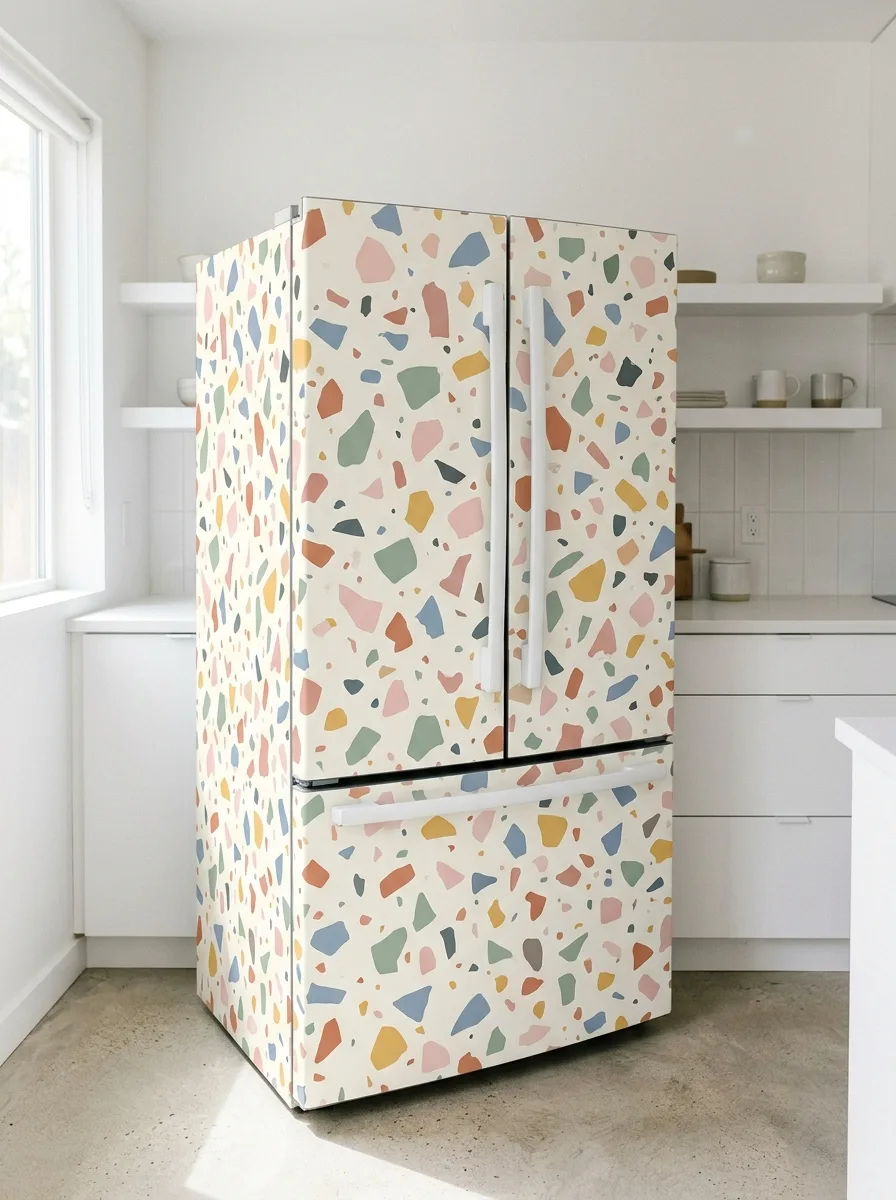
Find a terrazzo-style print with scattered color chips — pink, blue, green, mustard, terracotta — on a cream ground, with chip sizes that vary noticeably. Uniform chips look like a texture sample; varied sizes look like terrazzo.
Because this print is genuinely busy, everything else needs to go quiet — white cabinetry, plain floors, minimal counter clutter. The fridge becomes the only colorful object in the room.
Don’t add colorful accessories elsewhere “to match.” The terrazzo already contains every color the room needs.
Retro Fruit Diner Wrap
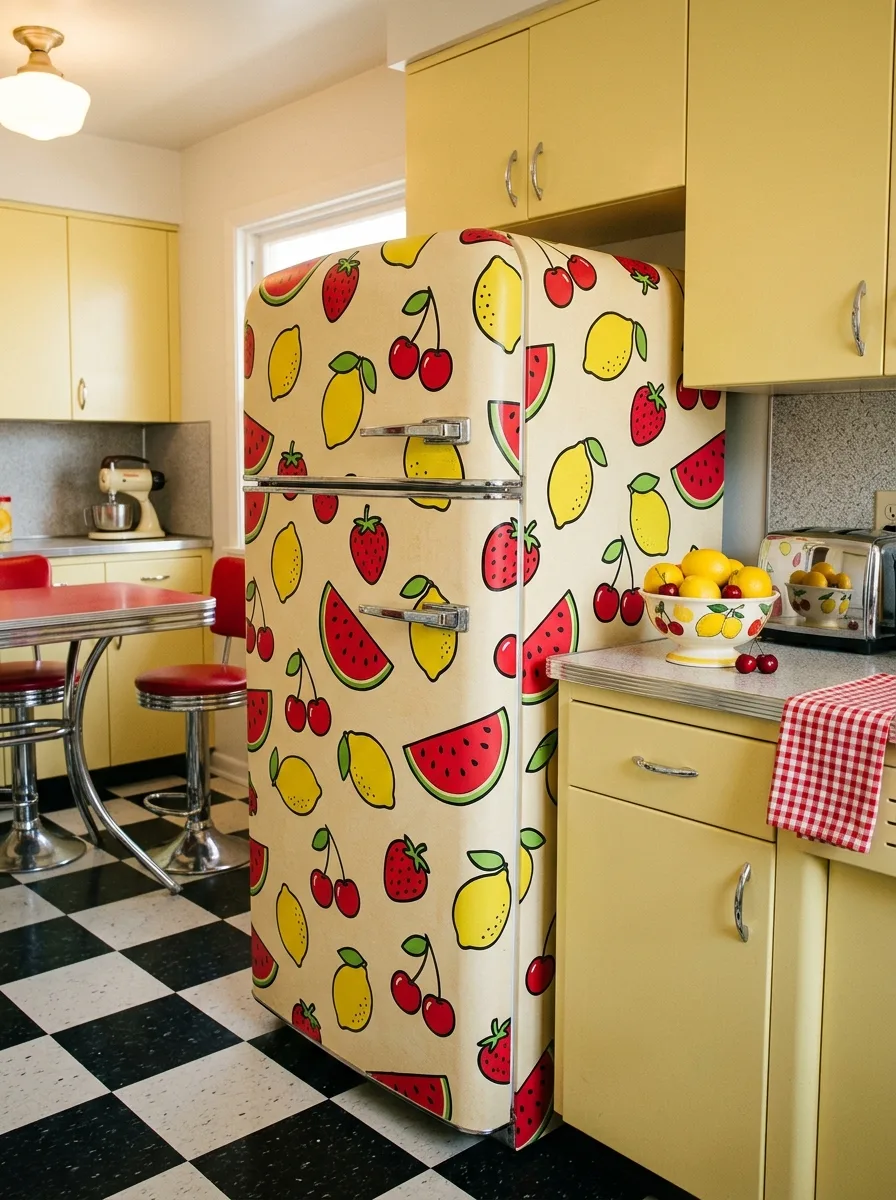
Source a retro fruit print — strawberries, lemons, cherries, watermelon slices in a bold cartoonish style with thick outlines, scattered on a pale ground. This print commits to a specific era and won’t compromise on it.
It only works as part of a full mid-century diner aesthetic — checkerboard floors, chrome-edged furniture, vinyl seating, pastel cabinetry. Pull the exact red and yellow tones from the print into textiles and small appliances so the fridge anchors the room’s palette rather than sitting apart from it.
Half-committing is the failure mode. A retro fruit fridge in an otherwise neutral kitchen looks like a leftover prop.
Warm Abstract Watercolor Wrap
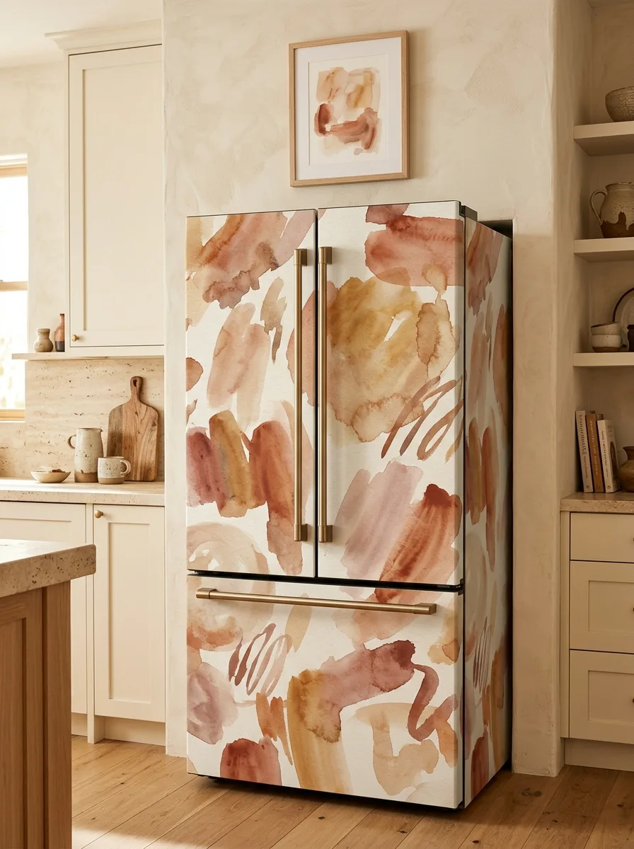
Choose an abstract watercolor print with broad brushstroke shapes in warm terracotta, blush, and ochre tones on a white ground. The brushstrokes should be large and loose, not small repeating marks.
Apply across both doors and the drawer as one continuous composition, letting strokes flow across the seam rather than stopping abruptly at it. A warm, plaster-toned kitchen with travertine or limewash walls is the natural setting — the print’s tones should echo what’s already on the walls.
Keep the rest of the kitchen restrained. One small framed piece in a complementary palette is enough; more competes with the wrap itself.
Sage Arts and Crafts Floral Vine Wrap
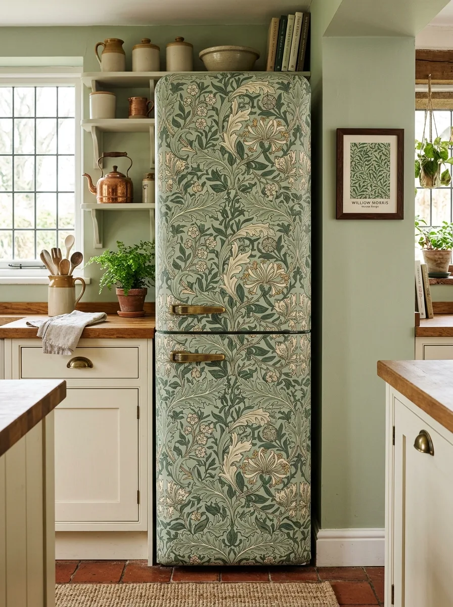
Find a dense, intricately layered floral and vine print in muted sage, olive, and cream — the kind of intertwined leaf and bloom pattern associated with classic Arts and Crafts textile design. The density and layering are what make this read as heirloom rather than generic floral.
Wrap the full front of a tall, narrow fridge as one continuous pattern top to bottom, since this style of print is designed to repeat seamlessly without an obvious focal point. Sage green walls and brass hardware nearby let the print’s tones bleed naturally into the room.
A small framed print from the same pattern family on an adjacent wall reinforces the connection without needing anything else.
Black and White Zebra Stripe Wrap
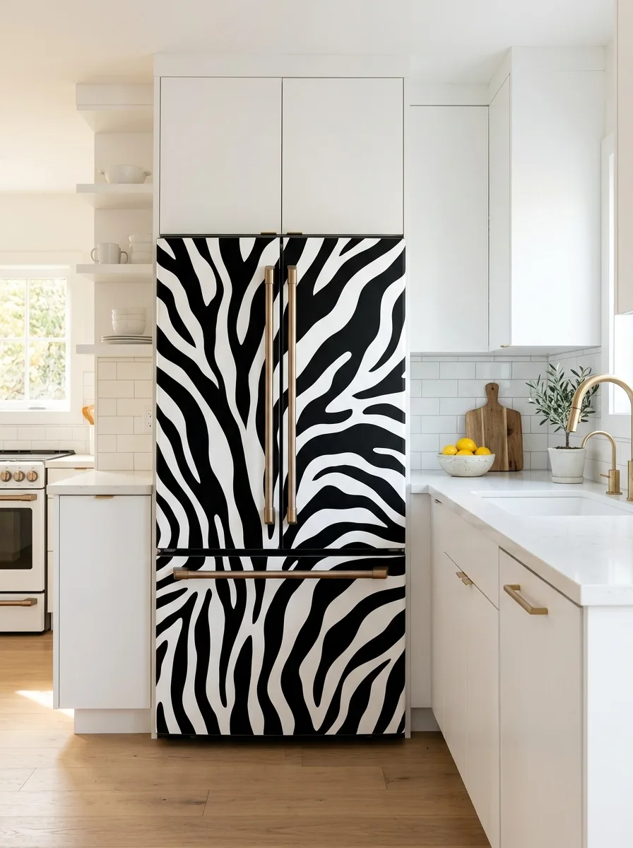
Find a high-contrast animal print with irregular, organic stripe lines — true zebra-style stripes work better than anything too regular, since irregularity reads as graphic rather than novelty. Apply to the main doors only, letting stripes flow diagonally across the seam so both halves look like one continuous hide rather than mirrored sections.
This is the clearest proof that contrast beats matching. A pristine white kitchen with gold or brass hardware turns the striped fridge into a single dramatic object the room doesn’t need to coordinate with.
The only failure here is hesitation — choosing a muted grey version instead of true black-and-white. Diluting the contrast just makes the fridge look unwell.
Pastel Rainbow Stripe Wrap
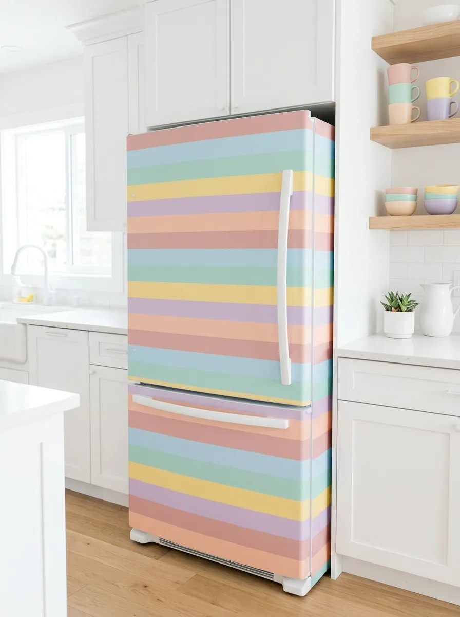
Source a horizontal stripe print in soft pastels — peach, blue, green, yellow, lavender — with stripes wide enough to read as deliberate blocks of color rather than thin ribbons. Apply horizontally across the whole fridge, aligning stripes so they continue unbroken across the door seam and onto the freezer drawer.
This is one of the few prints that brightens an all-white kitchen without any other changes needed. Pull two or three of the pastel tones into a handful of small accessories — mugs, a planter — to tie the fridge into the room without overdoing it.
Stripe alignment across the seam is the single point of failure. If continuous alignment isn’t achievable, pick a different pattern rather than live with a visible jump.
Gold Celestial Constellation Wrap
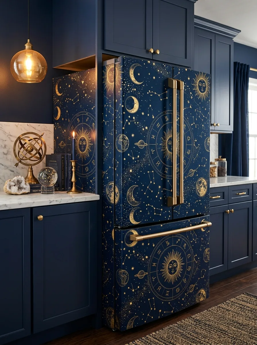
Look for a celestial print combining zodiac wheels, constellations, moon phases, and planets in metallic gold on deep navy. This density of imagery is one of the few patterns that can wrap an entire fridge, sides included, without losing coherence.
Wrap continuously across all visible panels so the star map reads as one unbroken sky, with the major motifs landing roughly at eye level on the main doors. This only works in a kitchen already committed to dark, saturated cabinetry with brass or gold hardware — the fridge needs to disappear into that darkness as a feature, not stand apart from it.
Lean into the theme nearby with an armillary sphere or geode, but keep additions sparse. The fridge is already doing the heavy lifting.
Antique World Map Wrap
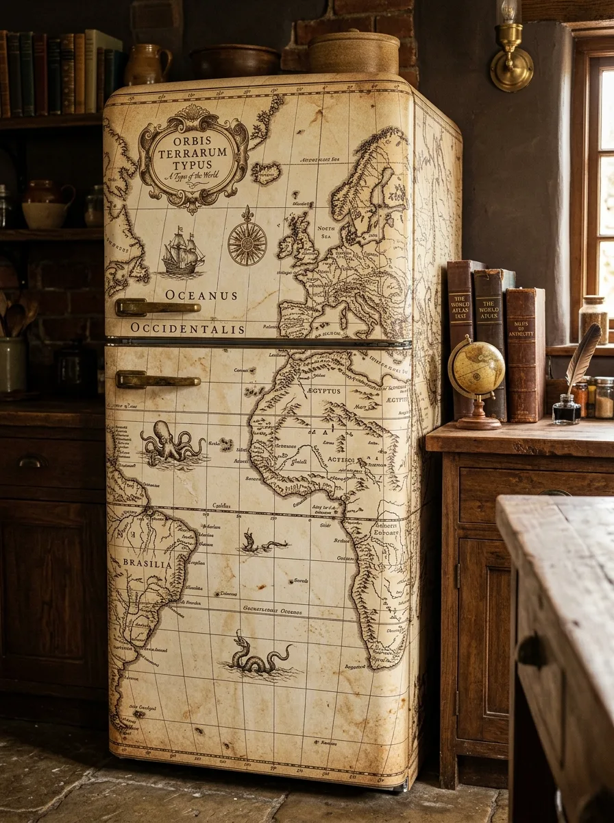
Source an antique-style world map print — aged parchment tones, ornate cartouches, sailing ships, sea monsters, compass roses, and old-world place names. The aging and detail are the point; a clean modern map print won’t read the same way.
Wrap the full front of a tall fridge as one continuous map, treating the door seam as a natural break point between map regions rather than something to disguise. This belongs in a kitchen already built around dark wood, exposed brick, and old books — let the parchment tones echo what’s already in the room.
Style the counter with leather-bound books, a small globe, and brass instruments to extend the theme. Don’t pair this with anything bright or modern; the aged tones need an equally aged setting.
Sage Eucalyptus Trailing Vine Wrap
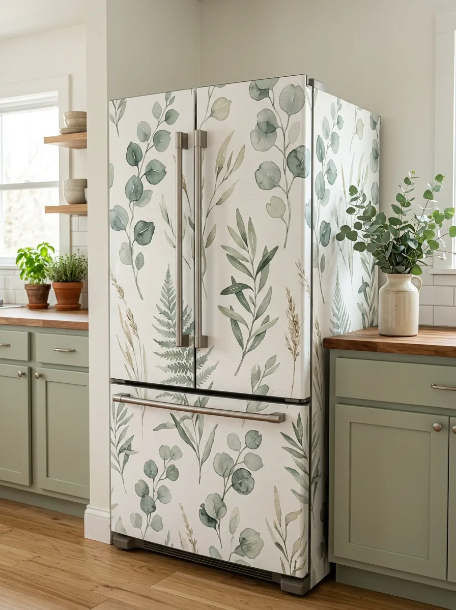
Choose a watercolor eucalyptus and fern print with trailing, vine-like branches on a white ground in soft sage and grey-green. The trailing quality matters — branches should cascade rather than sit in a static grid.
Apply across the full front and any visible side, letting branches trail from top to bottom as if climbing or draping naturally down the fridge. Vertical orientation reinforces this far better than a horizontal layout.
Sage green cabinetry makes this feel coordinated rather than matched, since the print’s greens echo the cabinets without being identical. Real potted herbs or eucalyptus stems nearby extend the print into living plants — but if the kitchen runs very bright, consider a slightly more saturated version of the print so it doesn’t wash out.
Memphis-Style Confetti Shape Wrap
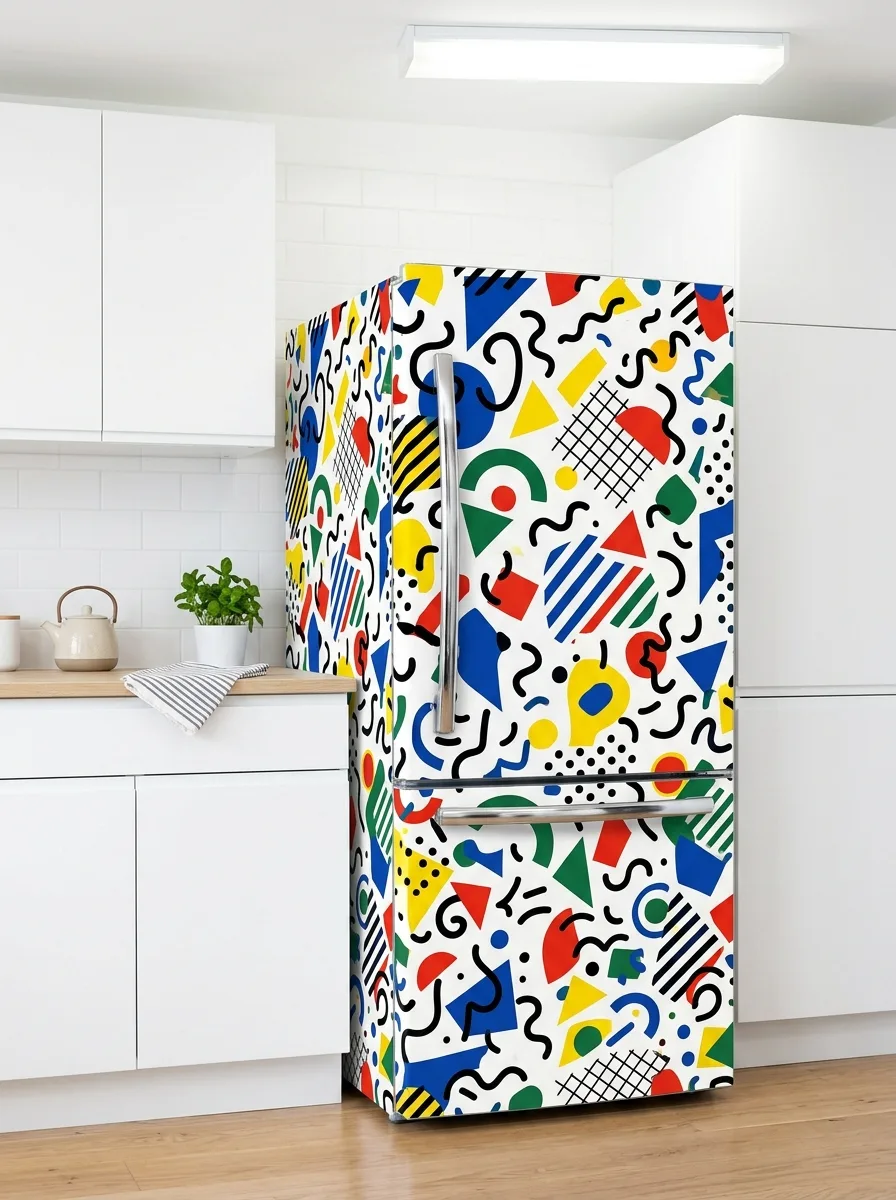
Find a Memphis Design-inspired print — primary-colored geometric shapes, squiggles, triangles, and dots in deliberately uneven, energetic placement on white. Avoid anything with a visible repeating grid; the apparent randomness is what gives it energy.
Wrap the visible front and side as one continuous field of shapes rather than stopping the pattern at a panel edge, which would break the sense of chaos the print depends on. This wants an equally stark white kitchen with chrome or simple hardware that doesn’t add another competing element.
This is a genuinely loud choice and works best in kitchens that get used hard — family kitchens, kids’ spaces — where the playful energy matches how the room functions. In a quiet, formal kitchen it will feel like it’s shouting at no one.
Faux Marble Slab Wrap
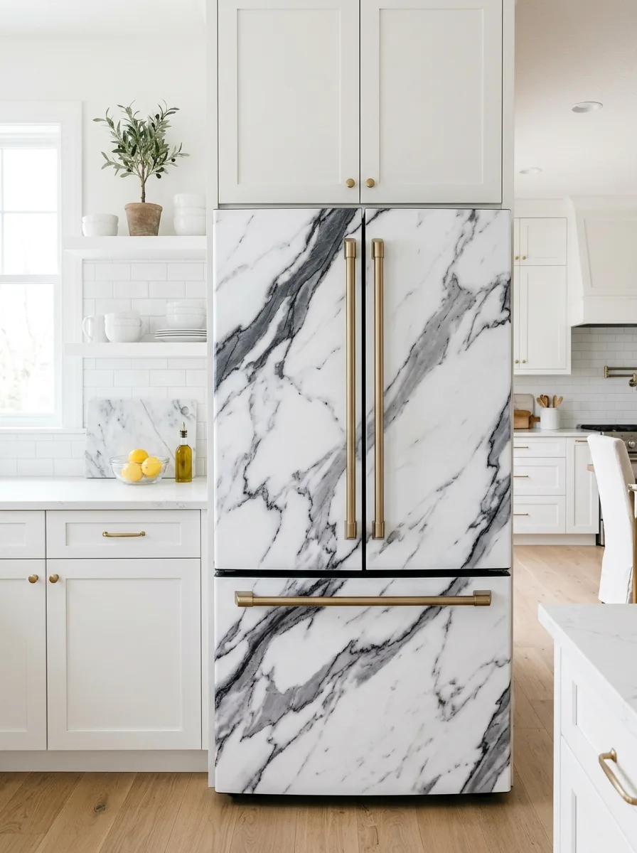
Source a high-resolution marble print — white with grey veining, large-format so veins run in long continuous diagonals rather than small repeating chunks. The veining needs to flow continuously across the door seam and onto the freezer drawer, matched so it doesn’t look like two slabs awkwardly abutting.
Brass or gold hardware against white-and-grey marble looks expensive and intentional; standard chrome will read as a missed opportunity. This works in almost any white or cream kitchen, which is exactly why it’s overused.
If you go this route, alignment quality is everything. Get it wrong and the illusion collapses instantly.
Woodland Mushroom and Foliage Wrap
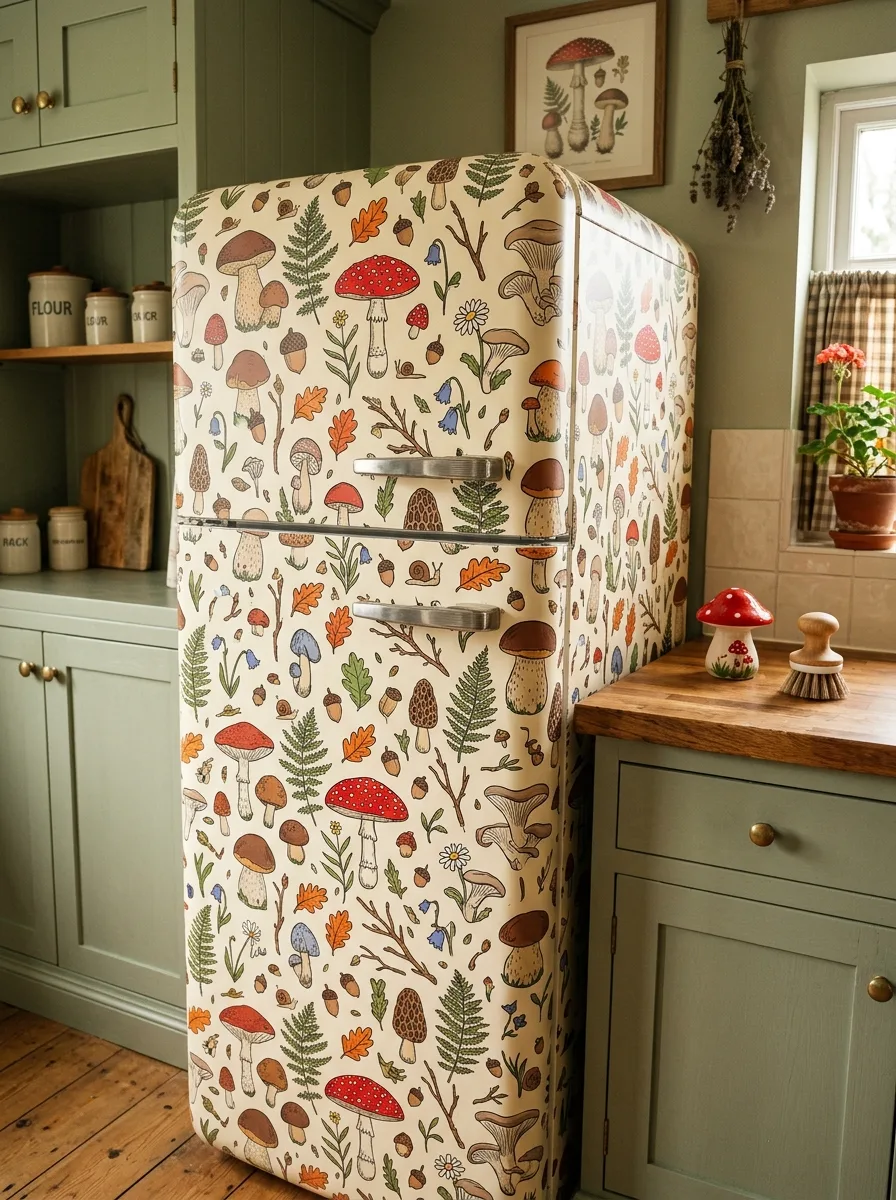
Find a densely illustrated print combining mushrooms, ferns, acorns, oak leaves, and small woodland details in a warm, slightly faded color palette on cream. Density is the appeal — dozens of small illustrations scattered across the surface, not a repeating grid of identical motifs.
This belongs in a kitchen already leaning cottage or cabin — sage or olive cabinetry, worn wooden floors, gingham textiles. Style the counter with small ceramic mushroom figurines, dried botanicals, and a wooden cutting board to extend the theme into the room.
Keep the palette consistent with the print’s warm, muted tones elsewhere in the kitchen. Introducing anything bright or modern breaks the foraged-cottage mood this print depends on.
Raw Linen Herringbone Texture Wrap
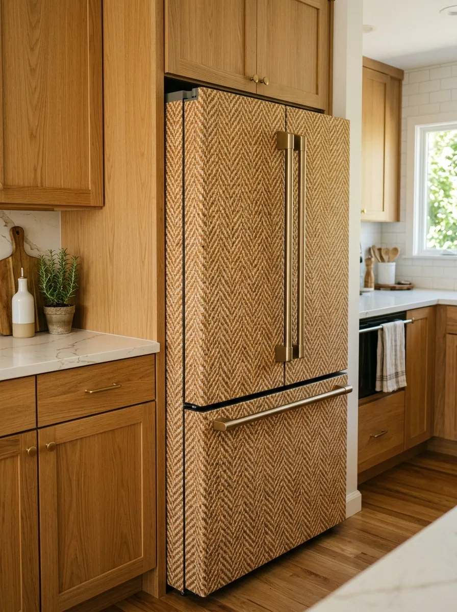
Source a textured wallpaper printed to mimic woven herringbone fabric in warm tan and cream tones. Unlike the other prints here, this reads as texture rather than imagery, making it the quietest option of the set.
Apply across the full fridge as a single continuous weave, keeping the herringbone direction consistent across panels and the door seam — a direction change at the seam looks like two different fabric pieces stitched together. This works specifically in warm wood kitchens, where the woven texture echoes the cabinetry’s grain without competing with it.
Brass hardware continues the warm-metal theme already present in the wood. The trade-off is that this sacrifices drama for cohesion — if the goal is for the fridge to disappear into the room as texture rather than stand out as a statement, this is the entry built for that.
Navy and Blush Floral Mural Wrap
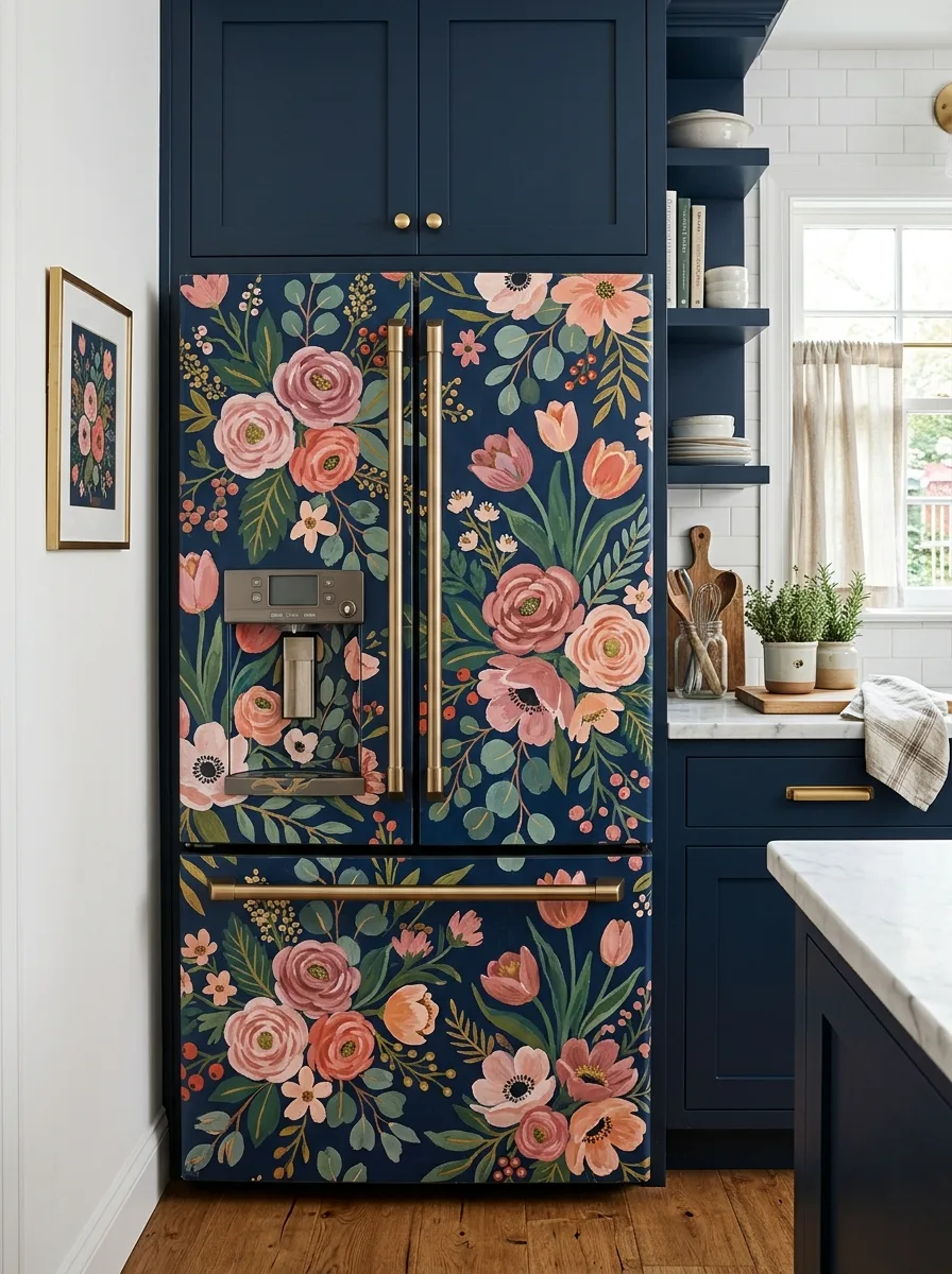
Choose a hand-painted-style floral mural print — loose, painterly roses, tulips, and anemones in pink and coral against a deep navy ground, with green foliage threading throughout. The painterly, slightly imperfect brushwork is what separates this from a flat repeating floral.
Apply across both doors and the drawer as one continuous mural, working around any ice or water dispenser by treating it as a clearing within the floral composition rather than something to disguise. Gold or brass hardware against navy and blush reads as rich rather than mismatched.
This belongs in a kitchen already committed to deep navy cabinetry. A single framed floral print nearby in the same palette reinforces the connection, but the fridge mural should remain the focal point — don’t compete with it.
Final Thoughts
Every print on this list does the same fundamental thing: it asks you to stop treating the fridge as an appliance and start treating it as architecture. Once you make that shift, the rest of the decisions get easier, because you’re no longer asking “what pattern do I like” in isolation. You’re asking what this surface should be doing for the room.
The kitchens that get this right all share one trait — the fridge stops being the thing you have to work around and becomes the thing the room is organized in relation to. Cabinetry color, hardware finish, even the rug on the floor start answering to the fridge instead of the other way around.
That’s a strange amount of influence for an appliance to have. But it makes sense once you remember that the fridge was always the biggest object in the room. It was just dressed like it wasn’t.
The only real risk in any of this is half-measures — a print that’s almost bold enough, a wrap that almost covers the visible panels, a color choice that almost contrasts. Commit to the surface fully or leave it alone entirely. The in-between is where fridge wallpaper goes to look like a mistake.