
You painted your living room “greige” in 2019 and you’ve been quietly dying inside ever since.
Every design show told you neutral was safe. Neutral was timeless. Neutral would never date.
What they didn’t mention is that neutral also never makes you feel anything. You walk into your own living room and feel nothing. Not peace, not joy, not even mild irritation. Just nothing.
This is a blog about rooms that make you feel something. Some are loud. Some are moody. Some are gentle but specific. None of them are nothing.
Why Your Colorful Room Looks Like a Toddler’s Art Project
One Accent Wall Isn’t Commitment, It’s a Compromise
Most people’s idea of “adding color” is one wall in a slightly different shade of the same beige they already had. That’s not color. That’s a rounding error.
Real color commitment means the color touches multiple surfaces. Walls, trim, ceiling if you’re brave. Look at how a deep navy can wrap a whole room and still feel calm rather than chaotic, simply because every surface agrees with every other surface.
The accent wall trend exists because people are scared. They want the Instagram photo without the daily reality of living inside a bold choice. But a single wall against three beige walls just looks like an unfinished paint job, not a design decision.
Matching Everything to the Sofa Is a Trap
The second mistake is treating one piece of furniture as the color authority for the entire room. The sofa is pink, so the cushions are pink, the throw is pink, the rug has pink in it, and suddenly the room looks like it’s wearing a uniform.
Color works because of contrast and relationship, not repetition. A pink sofa needs a sage wall to argue with it a little. A blue room needs warm rust accents to stop it going cold.
When everything matches, your eye has nowhere to land. It just slides off the whole room.
Buying One “Statement Piece” and Hoping It Carries the Room
You bought the rug. The wild, multicolored, abstract rug that cost more than your sofa. You assumed it would do all the work.
It can’t. A loud rug surrounded by beige walls and a beige sofa just looks like something fell out of the sky. The statement piece needs friends.
Color needs distribution. If the boldest thing in your room is the floor covering, your eyes spend the whole time trying to make sense of why nothing else got the memo.
Colorful Living Room Ideas
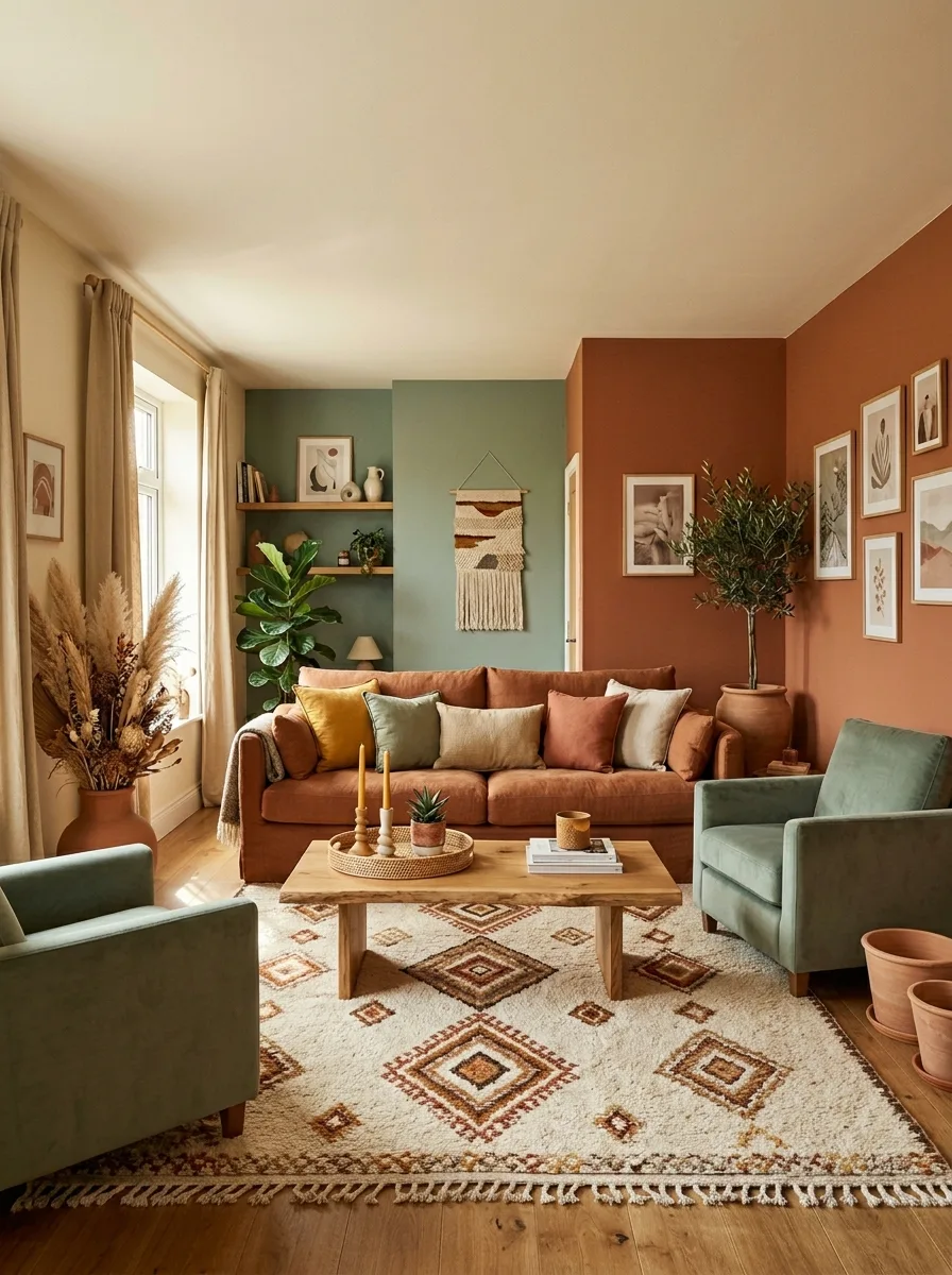
Plaster Terracotta With Sage Chairs
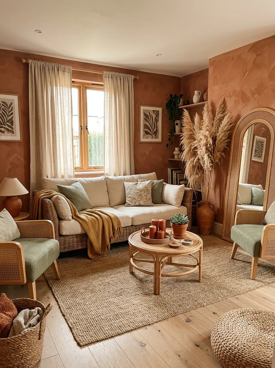
Go for a textured, almost plastered terracotta finish on your walls rather than flat paint — the texture catches light and stops the color feeling like a solid block. Keep your sofa neutral so it acts as a canvas.
Bring sage green in through cushions and a couple of accent chairs. The green against warm orange creates a complementary pairing that feels earthy rather than clashing.
Add an arched rattan mirror as a focal point — the warm wood ties into the terracotta while the shape softens the room’s straight lines. Pampas grass in a tall vase fills awkward corners without needing maintenance.
Keep your rug texture-based rather than pattern-heavy here. A woven jute rug lets the wall color stay the star.
Mustard and Navy Color Block
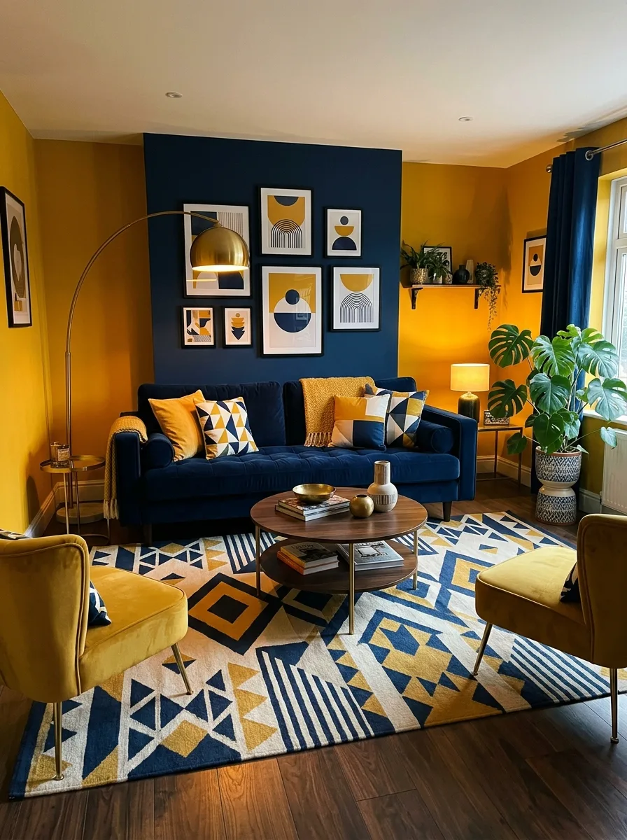
Pick one wall, or one architectural alcove, and paint it navy while the rest of the room goes mustard yellow. The contrast needs to be sharp — don’t blend the two with a transition color.
Hang a gallery wall of geometric prints on the navy section. Keep frames thin and white so the art shapes do the talking against the dark background.
Bring navy back into the room through your sofa, then let mustard return through chairs and a patterned rug containing both colors plus white. The rug ties the two halves of the room together.
Add a single arc floor lamp in brass — the warm metal softens the high contrast between the two main colors.
Floor-to-Ceiling Vintage Florals
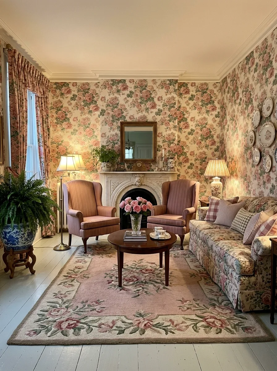
Choose a busy, dated-feeling floral wallpaper and commit to it on every wall, no exceptions. Full coverage is the trick — one feature wall of busy floral looks like a mistake, but a whole room of it looks deliberate and romantic.
Keep furniture upholstery in coordinating but smaller-scale patterns. Stripes and checks in the same color family let the big floral breathe without competing florals everywhere.
Add a floral rug that pulls the same palette down onto the floor. This grounds the wallpaper instead of letting it float above a disconnected room.
Bring in a collection of patterned plates on the wall as extra texture. Group them irregularly rather than in a grid — the slight chaos matches the maximalist energy.
Rainbow Cushions Against All-White
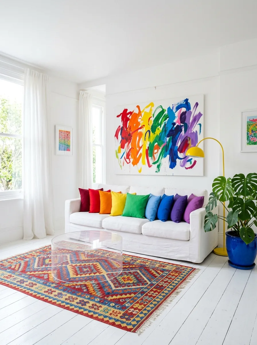
Paint everything — walls, floor, ceiling, trim — in the same bright white. This isn’t the easy option, it’s the hard reset that makes everything else possible.
Source a full set of cushions in every primary and secondary color, evenly spaced along your sofa like a rainbow. Don’t cluster similar colors together — alternate them so your eye keeps moving.
Hang one large abstract piece of art containing all the same colors as your cushions, scaled up into brushstrokes. This ties the cushion rainbow to the wall.
Add a yellow arc floor lamp and a patterned kilim rug in warm reds and blues. The rug grounds the white room in something with history, stopping it feeling clinical.
Dusty Pink and Sage Pairing
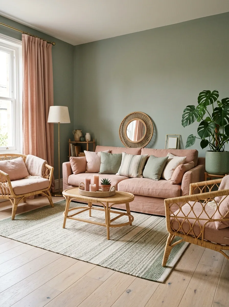
Paint your walls in a muted sage green — soft enough to feel calming, not so bright it reads as kitchen-cabinet green. Choose a dusty pink sofa as your anchor piece.
Bring the pink up to the curtains so it frames the window and creates a vertical line of color. Add sage cushions onto the pink sofa so the two colors physically meet on the same surface.
Use a round rattan coffee table and rattan accent chairs to introduce warm wood tones. The natural material stops the pastel pairing feeling too sweet.
Finish with a large monstera in a green pot that matches the wall — this makes the plant look intentional rather than just “a plant we have.”
Maximalist Coral and Lilac Clash
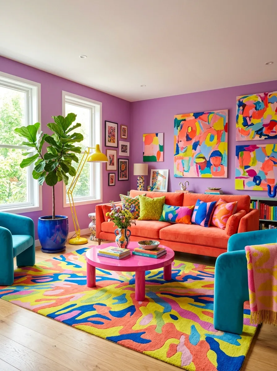
Choose a saturated lilac or violet for your walls, then bring in a coral or burnt-orange sofa as the loudest single object in the room. This pairing works because both colors are warm-leaning, even though they read as totally different hues.
Add a hot pink coffee table as a secondary anchor — pick a shape with rounded edges so it doesn’t compete with the straight lines of the sofa.
Layer an abstract rug containing every color in the room plus a few extras — yellow, blue, green — so the rug acts as the Rosetta Stone that makes all the other choices look planned.
Fill remaining wall space with abstract art in the same palette, hung salon-style without matching frames. Unmatched frames signal a collected look, not a coordinated one.
Whitewashed Walls With Blue Velvet
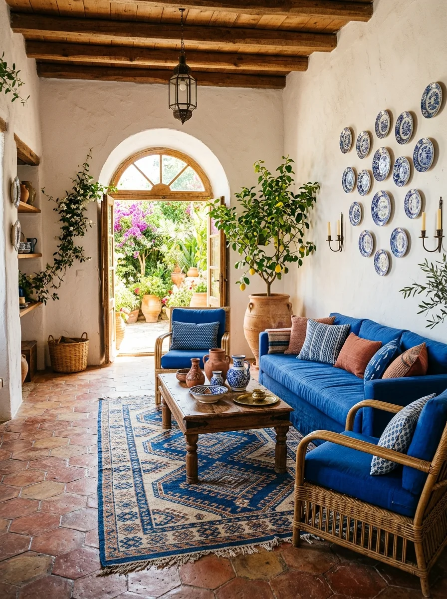
Keep your walls and beams white or whitewashed, then bring in a deep cobalt velvet sofa as the anchor against all that pale stonework. The contrast between rustic texture and saturated velvet is what makes this work.
Hang a dense cluster of blue-and-white patterned plates on the wall, filling the space the way a gallery wall would but with ceramics instead of frames. The repetition of blue-and-white across many plates reads as collected over years, not bought in a set.
Layer a large patterned rug in matching blues and rust tones over terracotta tile, letting the rug’s pattern echo the geometry of the plate wall.
Bring in a large potted citrus tree as your green element — the warm terracotta pot ties back to the floor tiles and softens all the hard surfaces.
Macrame Wall in Rust and Mustard
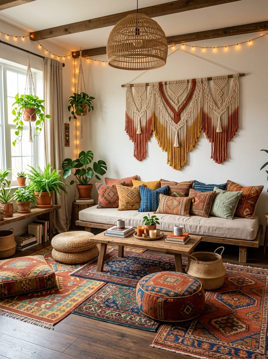
Hang an oversized macrame or woven wall piece in a rust-to-mustard ombre as the room’s focal point. Choose one with visible fringe and texture — flat prints won’t have the same effect.
Layer multiple Persian-style rugs on the floor, overlapping their edges rather than choosing one. The overlapping pattern density mirrors the texture of the macrame above.
Cluster plants on every available surface — windowsills, side tables, hanging planters from the ceiling beams. The green should feel like it’s spreading rather than placed.
Add warm string lights along any exposed beams. The soft glow at night turns the rust and mustard tones golden, tying the whole palette together after dark.
Dusty Rose With Gold Mirror
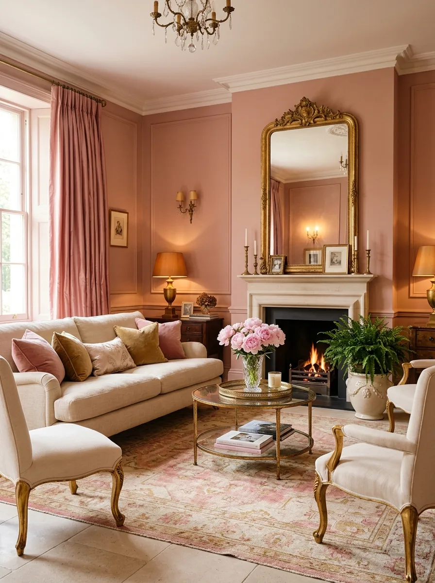
Paint your walls in a warm dusty pink that leans more terracotta than baby pink — this keeps it sophisticated rather than nursery-toned. Pair it with cream or ivory upholstery so the wall color stays dominant.
Hang an oversized gold ornate mirror above the fireplace as the room’s centerpiece. The gold against the pink wall creates warmth without needing another color family.
Bring fresh pink and cream flowers into the room in a glass vase on the coffee table — real flowers in a room this considered stop it feeling like a showroom.
Add gold candlesticks and a patterned pink-and-cream rug to layer texture at floor level, echoing the wall color without repeating it exactly.
Cobalt Geometric Statement
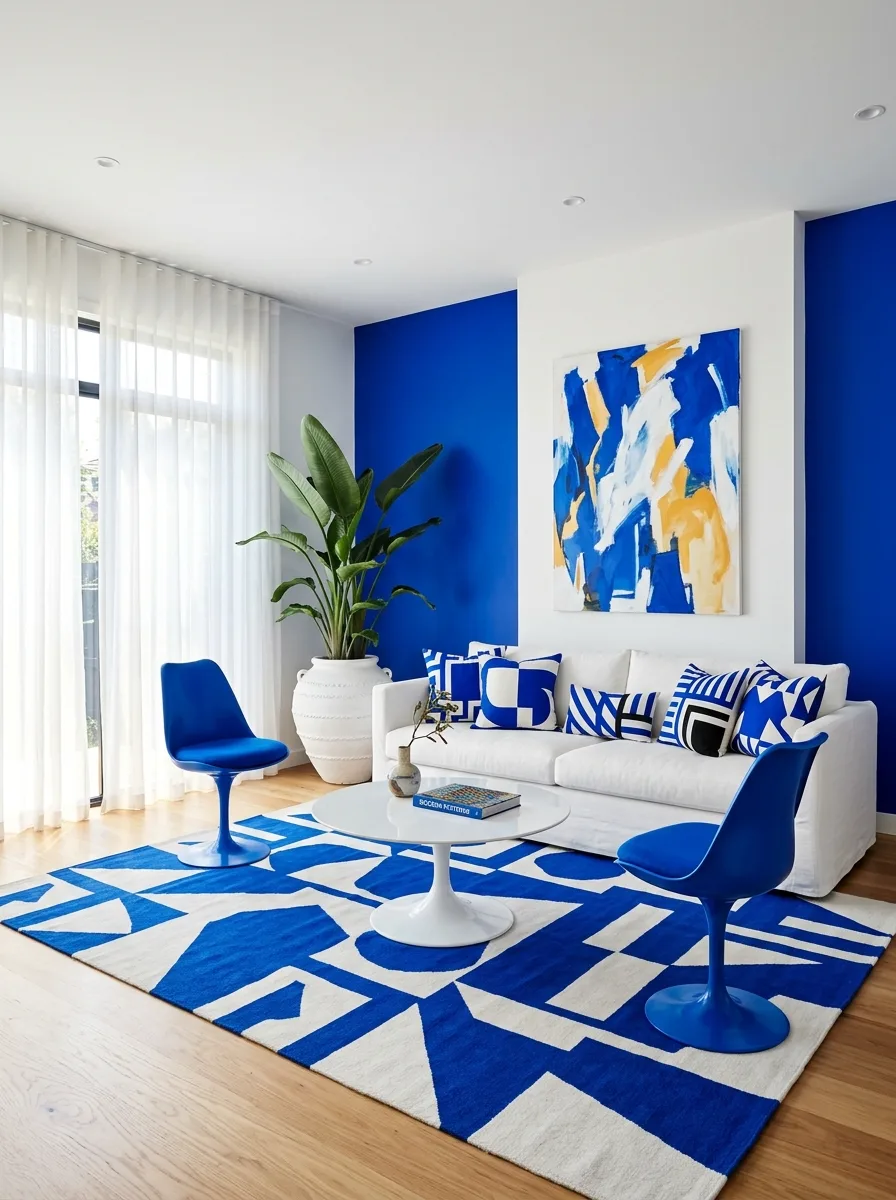
Paint two adjoining walls in a single, saturated cobalt blue, letting it wrap a corner so it reads as one continuous block of color rather than two separate decisions. Keep your sofa and main furniture pure white.
Choose a geometric rug in the same cobalt and white — the pattern should feel architectural, not decorative. Bring in cushions that pick up the same geometric language in cobalt, black, and white only.
Add one piece of abstract art that introduces a single additional color — mustard or ochre works well against cobalt — as the only departure from the two-tone scheme.
Keep accessories minimal. This look depends on restraint everywhere except the two big color decisions: the walls and the rug.
Forest Green With Botanical Layering
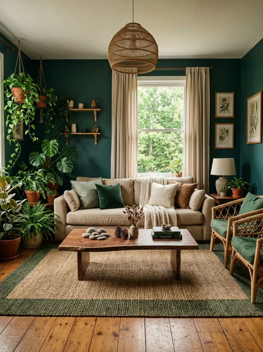
Paint your walls in a deep forest or bottle green, then bring in as many plants as your windowsills and floor space can physically hold. This look depends on the green walls and the green plants blurring into each other.
Keep your sofa in a warm neutral linen or cotton, then add cushions in olive, rust, and cream to bridge the wall color and the neutral furniture.
Choose a jute or sisal rug with a green border to echo the wall color at floor level without introducing a new shade.
Hang botanical prints in simple wood frames — the illustrations should reference plants you can’t easily grow indoors, giving you the variety your actual plant collection can’t.
Lavender Floral With Gold Velvet
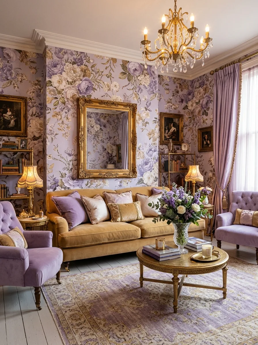
Choose a soft lavender-purple as your wallpaper base, then layer a large-scale floral print over the entire wall in deeper purples and creams. Let the pattern run continuously across multiple walls so there’s no obvious “feature wall” moment.
Bring in a mustard-gold velvet sofa as your contrast piece. Gold against purple is the unexpected pairing that makes the room feel rich rather than twee.
Add a crystal chandelier as your central light fixture — the sparkle plays beautifully against the matte wallpaper and ties into any gold detailing on furniture or frames.
Layer lilac velvet accent chairs around the sofa, then bring fresh purple and white florals into the room in a tall vase. Real flowers in a maximalist room stop it feeling like a museum.
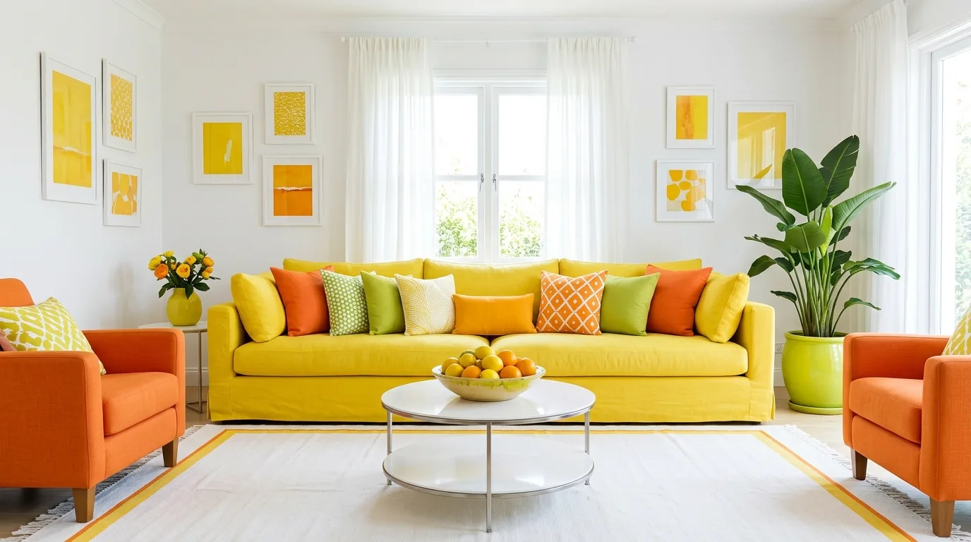
Citrus Brights on White
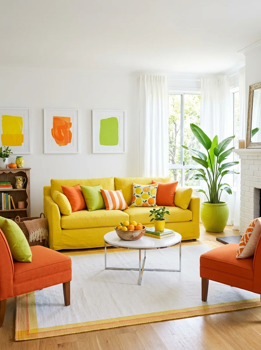
Keep your walls and main furniture white, then bring in a sunshine-yellow sofa as the dominant color statement. The white walls give the yellow room to breathe instead of competing with it.
Layer cushions in orange and lime green, treating them like sections of a fruit — each color gets its own block rather than a mixed pattern. A striped cushion in the same palette ties the solid colors together.
Add small abstract art pieces in matching yellow, orange, and lime blocks, hung in a simple row above the sofa. The repetition of the same three colors across art and cushions makes the room feel coordinated rather than random.
Finish with a large potted plant in a lime-green pot and a bowl of actual citrus fruit on the coffee table — the real oranges are doing more design work than you’d think.
Aubergine and Navy With Brass
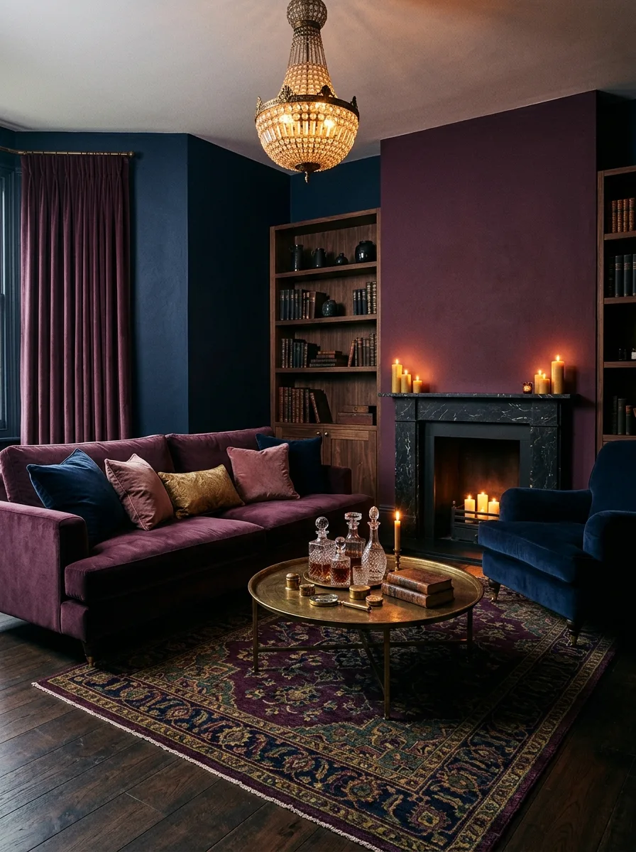
Paint one wall in a deep aubergine and the adjoining walls in dark navy, letting the two dark tones meet without a transition strip. Choose a plum velvet sofa to sit against the aubergine wall.
Add a navy velvet armchair on the opposite side, then bring brass back through a round cocktail table and a crystal chandelier overhead. The brass and crystal are what stop two dark colors from reading as simply “no color.”
Layer a richly patterned rug in matching plum, navy, and gold tones, with enough pattern density to fill the dark floor space without looking empty.
Light the fireplace wall with a row of pillar candles at varying heights — the warm flicker against the cool dark walls is what makes this look feel inhabited rather than staged.
Primary Color Pop Art
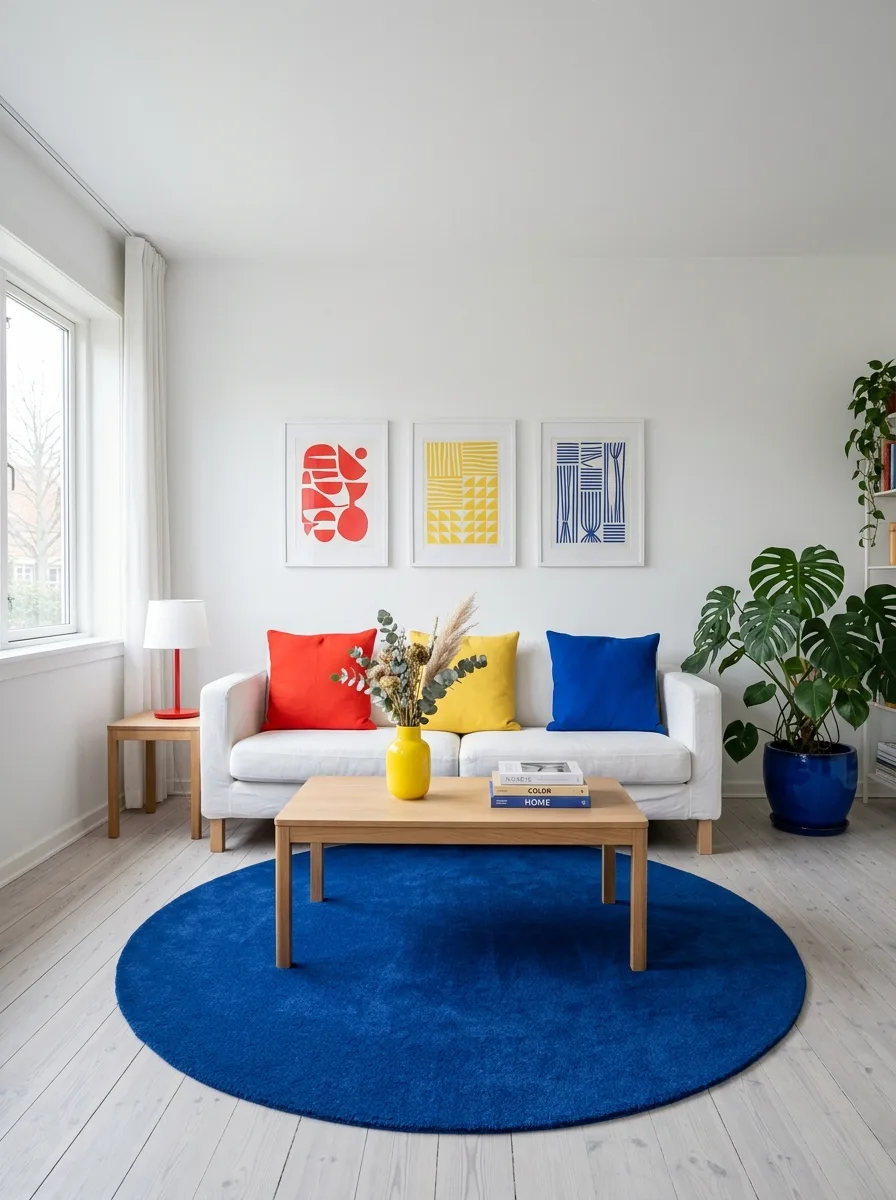
Keep your walls and floors white, then introduce primary-colored cushions — one red, one yellow, one blue — directly onto a white sofa. Resist the urge to add more than three colors at this stage.
Hang simple geometric art prints above the sofa, each print using just one of your three primary colors. The art should echo the cushions exactly, creating a clear visual rhyme.
Add a single oversized round rug in one of your three colors — a deep blue works well as it grounds the lighter tones without overpowering them.
Bring in one yellow vase with dried foliage as your only “extra” color note. The restraint is what makes the three primaries feel curated rather than like leftover cushion stock.
Color-Coded Earth Tones
Divide your walls into distinct color zones — a sage alcove, a terracotta wall, a deep rust corner — using architectural breaks like alcoves or door frames as natural dividing lines. Each zone gets its own solid color rather than blending.
Choose a rust-colored sofa as your anchor piece, positioned where it touches multiple color zones at once. This stops the room feeling like separate rooms stitched together.
Layer cushions in mustard, sage, and cream across the sofa, pulling colors from each wall zone so every wall feels represented in the seating.
Add a patterned rug in cream with rust and terracotta diamond motifs — the pattern should be busy enough to visually connect all the different wall colors at floor level.
Primary Playroom Brights
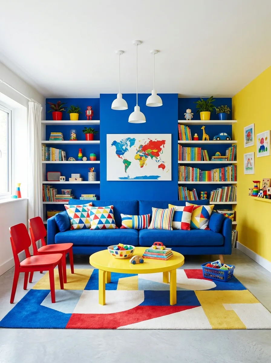
Paint one wall in saturated cobalt blue and the adjoining wall in bright yellow, letting the two colors meet at a corner with no transition. Choose a blue sofa to anchor the room against the blue wall.
Add red dining chairs or accent seating as your third primary color — red, blue, and yellow together only work if each gets a substantial amount of space, not just a cushion’s worth.
Bring in open shelving in white so it reads as a neutral frame for whatever colorful objects — books, toys, plants — get stored on it. The shelving itself shouldn’t compete with the wall colors.
Finish with a geometric rug containing all three primary colors plus white, in large rather than small-scale shapes. Small patterns in a room this bold will just look busy.
Moroccan Lantern Glow
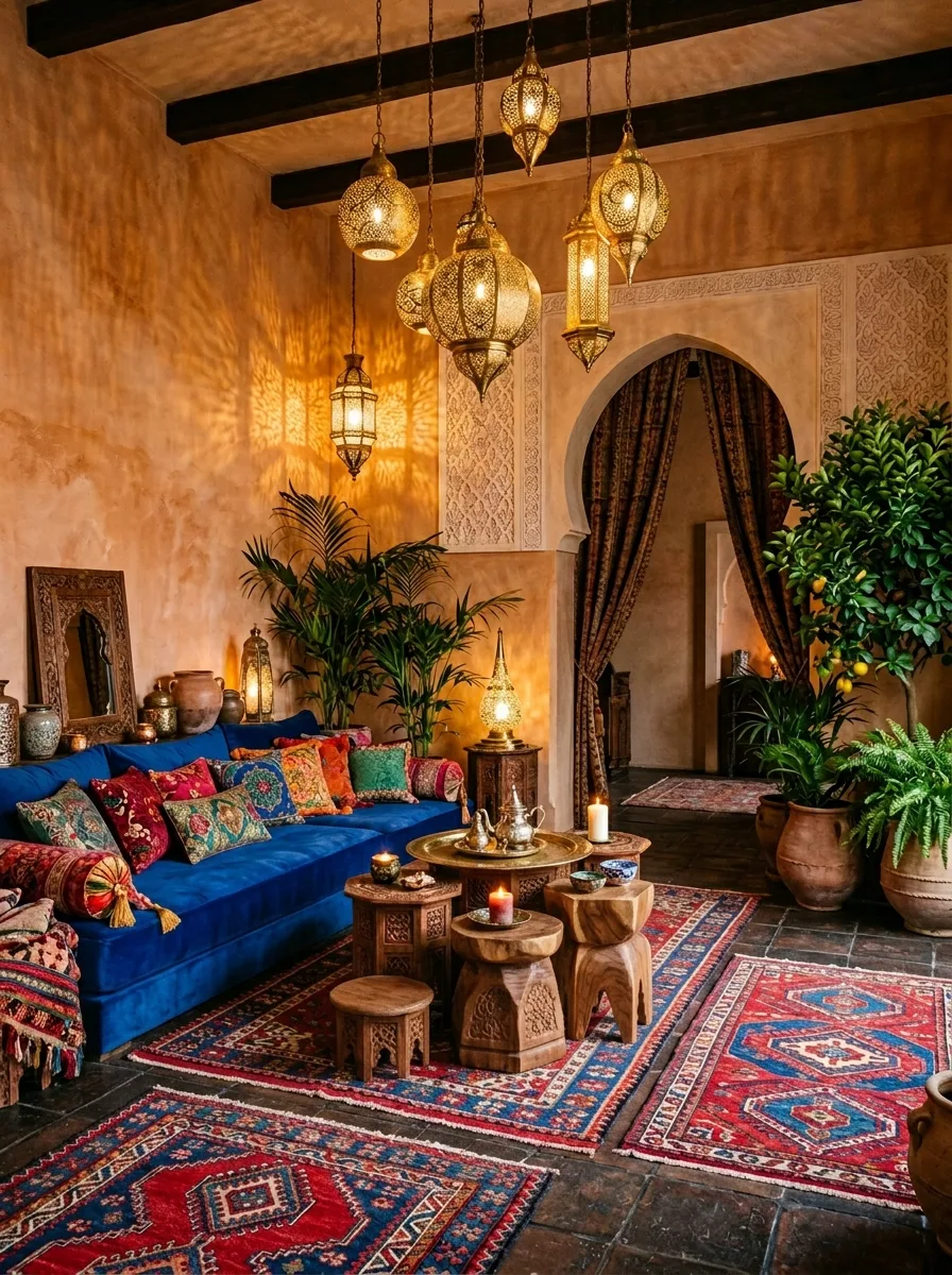
Choose a warm ochre or sandy plaster finish for your walls — the texture matters here as much as the color, since it’ll catch light from any lanterns or candles you add. Bring in a cobalt blue velvet sofa as your main seating.
Layer multiple Persian or kilim-style rugs on top of each other rather than choosing one. The overlapping rugs in reds, blues, and golds create depth that a single rug can’t achieve.
Hang multiple pierced metal lanterns at varying heights from the ceiling — the pattern they throw onto the walls becomes part of the room’s decoration after dark.
Bring in low wooden stools and side tables in carved, dark wood, and use them to hold candles, drinks, and small bowls. The low furniture height keeps the eye moving around the room rather than settling on one focal point.
Cobalt Walls With Terracotta Rug
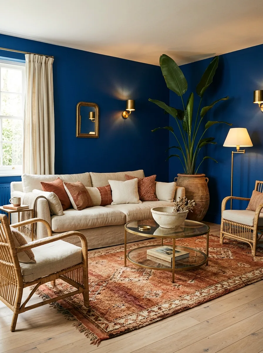
Paint your walls in a deep, almost-navy cobalt and let it wrap the corner so it reads as a backdrop, not a single wall. Keep your sofa in warm neutral linen so it doesn’t disappear into the dark.
Bring rust and dusty pink in through cushions and a vintage-style faded rug. The warmth stops the cobalt feeling cold.
Add brass fittings everywhere you can — wall lights, mirror frames, a lamp base. Brass against deep blue makes the whole thing look expensive, not just dark.
Layer in one oversized plant in a terracotta urn. A bird of paradise breaks up the wall and adds life against the flat color.
Final Thoughts
What every one of these rooms has in common isn’t a specific color. It’s commitment.
The rooms that work are the ones where someone made a decision and then followed it through every surface, every accessory, every corner. The rooms that fail are the ones where someone got halfway through a decision and lost their nerve.
Color isn’t risky because it’s loud. It’s risky because it requires you to actually choose something and live with it, rather than hedging with beige and calling it timeless.
Your living room doesn’t need permission to feel like something. It just needs you to stop apologizing for it before you’ve even started.