
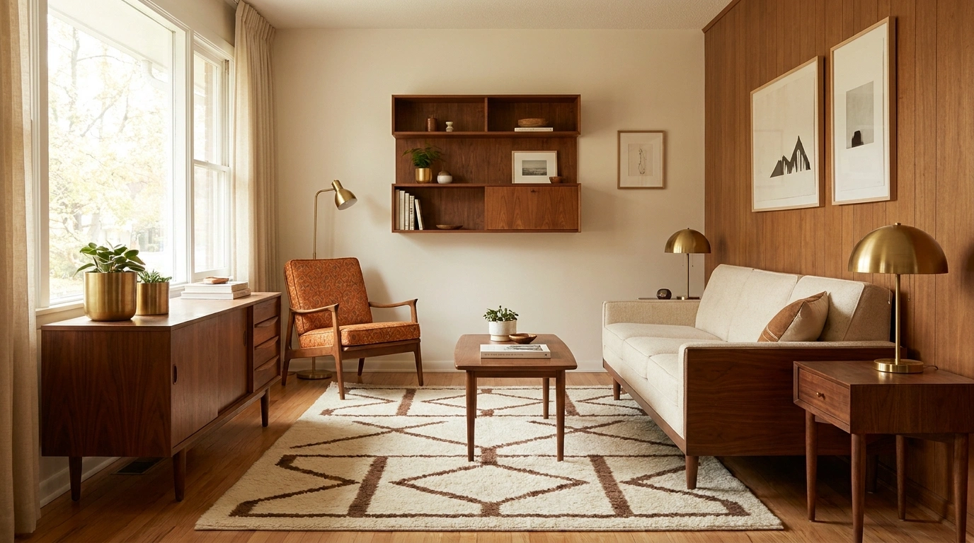
Small rooms tend to expose every awkward decorating decision. A sofa that is only slightly too large can close off the walkway. Too many wooden pieces can make the room feel visually heavy. A collection of great-looking mid-century furniture can even make a small home feel more crowded instead of more considered.
The solution is not to strip the character out of the style. It is to build the room as one complete composition.
Mid-century modern interiors work especially well in compact homes when low furniture, warm wood, open floor space, restrained color, and purposeful storage are treated as parts of the same design. Instead of choosing individual pieces and hoping they work together later, the finished room becomes the starting point.
These spaces take different approaches to the same challenge. Some rely on walnut and warm neutrals. Others use stronger color, integrated storage, flexible furniture, architectural dividers, or lighter Scandinavian influences. What connects them is a clear visual idea that makes the entire room feel intentional.
The Small-Home Mid-Century Formula
A successful small mid-century interior usually comes down to four visual decisions: low, open, warm, and focused. Low furniture keeps sightlines clear. Open floor area prevents the room from feeling packed. Warm wood gives the space character, while a focused focal point stops every object from competing for attention.
Mid-Century Modern Styling for a Small Home
Maximalist Retro Living Room
A bold palette anchors this vibrant living room, featuring a low-profile olive green velvet sofa paired with a caramel leather lounge chair and a uniquely shaped wooden coffee table. Retro prints and warm lighting amplify the layered mid-century atmosphere without making the compact space feel overwhelmed.
The secret lies in balancing saturated colors with plenty of breathing room. The patterned vintage rug unites the seating group, while visible floor space around the furniture keeps the room feeling light, open, and intentionally styled rather than cluttered.
Warm wood tones and brass accents tie the entire composition together. From the media console to the sculptural lighting, every detail supports the rich, cohesive visual rhythm characteristic of timeless retro design.
Warm Walnut Living Room With a Compact Sculptural Sofa
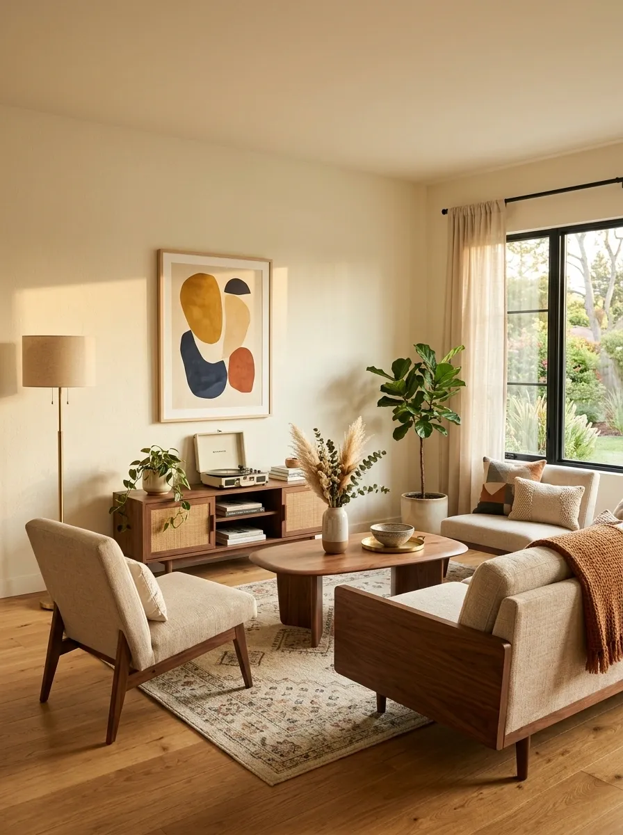
This living room starts with a low walnut-framed sofa in warm oatmeal upholstery, then builds outward with a tapered-leg lounge chair, a rounded coffee table, and a slim floor lamp. Warm ivory walls keep the architecture quiet while a patterned vintage-style rug introduces enough contrast to define the seating area.
The strongest detail is the amount of floor left visible around the furniture. Nothing sits oversized against the walls, and the coffee table stays compact enough to preserve an easy route through the room. A single large art piece provides the visual anchor instead of a crowded gallery wall.
The design works because the wood is repeated, not scattered. Walnut appears in the sofa base, side table, and media furniture, giving the small room a connected visual rhythm.
Earthy Green Bedroom Sanctuary
This cozy bedroom leans into tranquility with an olive green accent wall, a warm wooden bed frame, and crisp white linens layered with terracotta textiles. A classic bubble pendant light casts a soft glow, perfectly complementing the organic color story and retro artwork.
The wooden furniture pieces are scaled just right for the room, ensuring the pathways around the bed remain clear and uninterrupted. A statement abstract art piece above the headboard draws the eye upward, celebrating the vertical space without requiring heavy decor.
Natural textures take center stage here, from the fiddle-leaf fig to the plush patterned rug beneath the bed. The result is a calm, finished sleeping space that feels grounded in mid-century charm and effortless comfort.
Cream and Teak Studio Living Area With a Built-In Media Wall
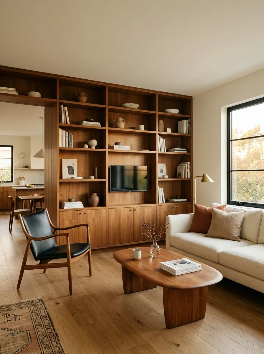
A compact studio feels more coherent when the same material language carries through several functions. Here, teak-toned cabinetry forms a continuous media wall with integrated shelving, while a cream sofa, oval coffee table, and slim lounge chair keep the center of the room visually open.
The built-in storage matters as much as the furniture. Because books, ceramics, and electronics are contained within one architectural zone, the rest of the room doesn’t need extra cabinets competing for attention. The shelving is deliberately edited, with enough empty space between objects to keep the composition light.
An oval table softens the stronger horizontal lines of the cabinetry. The contrast between long storage, curved furniture, and open floor creates the layered look associated with mid-century interiors without turning the studio into a museum of vintage shapes.
Retro Teal Kitchen Nook
A retro-inspired kitchen comes alive with a glossy teal refrigerator, vertical turquoise wall tiles, and warm wooden vertical slats above the open shelving. These elements blend function and style, creating an energetic yet organized culinary corner that feels completely bespoke.
The layout maximizes efficiency by keeping countertops streamlined and appliances thoughtfully integrated. Warm metallic hardware and playful circular accents on the cabinetry introduce subtle contrast against the crisp white surfaces and rich teal tones.
Every decorative touch serves a purpose, from the trailing green vine adding natural movement to the graphic wall art mirroring the room’s color palette. It is a masterclass in infusing vintage personality into a small, highly functional cooking space.
Olive Green Mid-Century Living Room With Caramel Leather Seating
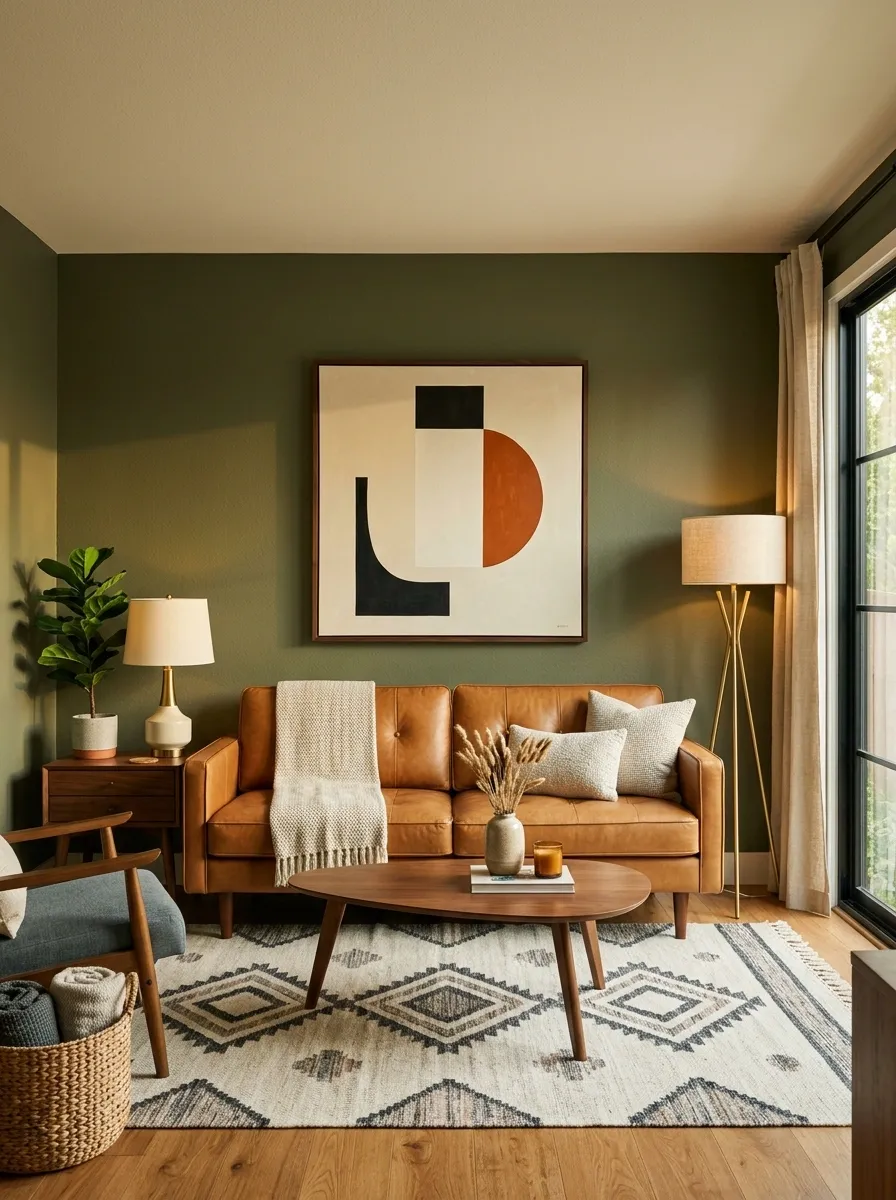
A deeper palette gives this small living room a more dramatic character without relying on oversized furniture. Muted olive walls form the backdrop for a compact caramel leather sofa, walnut tables, a geometric rug, and a sculptural floor lamp with a warm metal finish.
The room feels rich because the colors belong to the same warm family. Olive supplies depth, caramel adds contrast, and walnut bridges the two. The cream ceiling and lighter rug stop the darker wall color from visually closing in the room.
The artwork is intentionally limited to one substantial piece above the sofa. More wall decoration would compete with the wall color itself. This composition suits a small room that needs personality more than visual brightness.
Mid-Century Dining Nook With a Round Tulip-Inspired Table
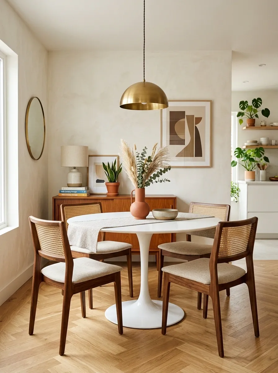
A compact dining area benefits from a shape that doesn’t fight the surrounding circulation. This nook centers on a round pedestal table surrounded by four slim wooden chairs, with a warm pendant directly above the table and a narrow side cabinet against the wall.
The round tabletop is the defining move. Its curved perimeter removes the sharp corners that often create awkward pinch points in small dining areas, while the central pedestal keeps the space beneath the table visually clean. A patterned runner and framed artwork add character without filling the perimeter.
The palette stays restrained: warm wood, creamy walls, muted textiles, and a small amount of terracotta. The result feels distinctly mid-century without turning the dining nook into a themed replica of another era.
Narrow Galley Kitchen With Walnut Cabinetry and Soft White Tile
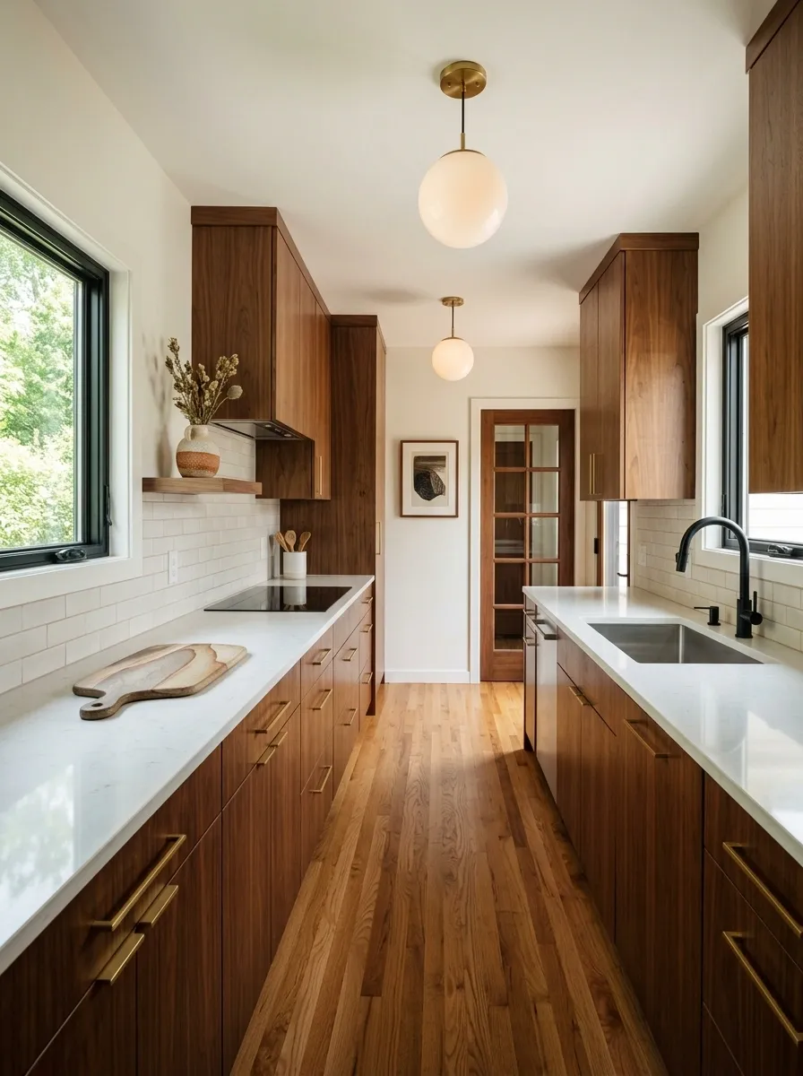
This compact galley kitchen leans into the clean horizontal lines that make mid-century interiors so recognizable. Flat-front walnut cabinetry runs along both sides, while soft white tile, pale counters, and slim black-framed windows keep the narrow footprint from becoming visually dense.
The cabinetry does most of the visual talking, so the counter surfaces stay almost completely clear. A pair of simple pendant lights introduces a little architectural rhythm without dropping too low into the walkway. Warm wood is repeated in a small cutting board and one open shelf rather than scattered through every surface.
The strongest detail is the contrast between the long walnut runs and the pale backsplash. The darker cabinetry feels substantial, but the lighter center keeps the kitchen from reading as a tunnel.
Small Kitchen With Two-Tone Cabinets and a Compact Dining Ledge
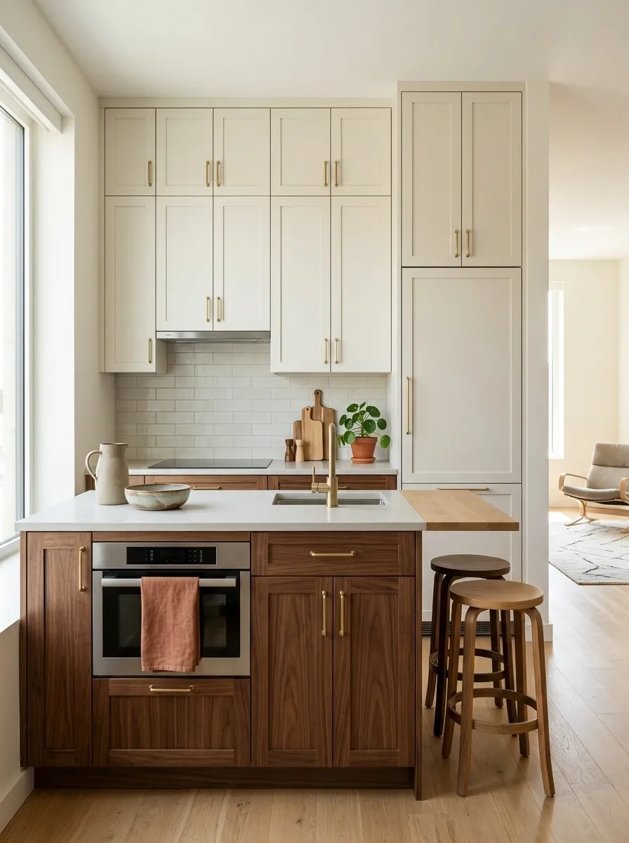
A small kitchen can carry more personality when the cabinetry is divided into two deliberate layers. Warm walnut bases ground this composition, while muted cream upper cabinets visually recede toward the ceiling. A narrow wood ledge extends from one end of the kitchen to create a breakfast spot without consuming the footprint of a separate table.
Three simple stools slide almost completely beneath the ledge when not in use. This keeps the main route through the kitchen clear. Slim globe lighting, a restrained ceramic backsplash, and one terracotta-toned textile introduce just enough softness to keep the cabinetry from feeling overly architectural.
The distinction between upper and lower storage also makes the kitchen feel taller. The darker wood stays close to the floor while the lighter cabinetry almost disappears into the wall.
Compact Entryway With a Teak Console and Statement Mirror
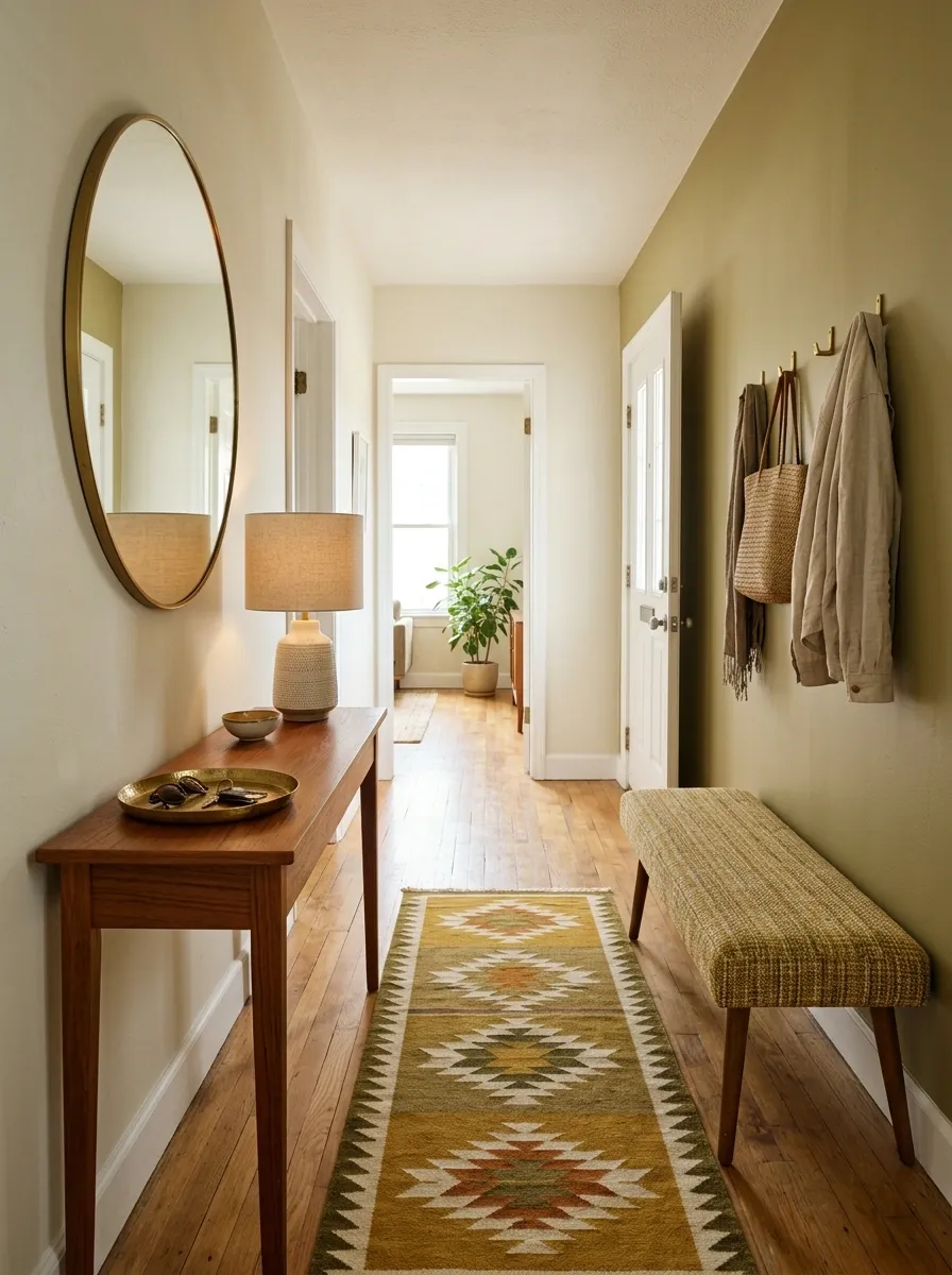
The entry becomes a complete mid-century composition rather than a leftover strip of hallway. A slim teak console sits beneath a large rounded mirror, while a narrow upholstered bench occupies the opposite wall. A patterned runner visually connects the two sides and gives the small entrance a sense of length.
The console is kept intentionally narrow, with a single ceramic lamp and one low tray instead of a collection of accessories. Hooks near the door handle practical everyday storage, while the mirror catches light from the adjacent room.
The rounded mirror is what keeps this space from becoming a collection of rigid rectangles. Its curved shape breaks up the console and door geometry while maintaining the restrained mid-century character.
Small Bedroom With a Low Walnut Platform Bed
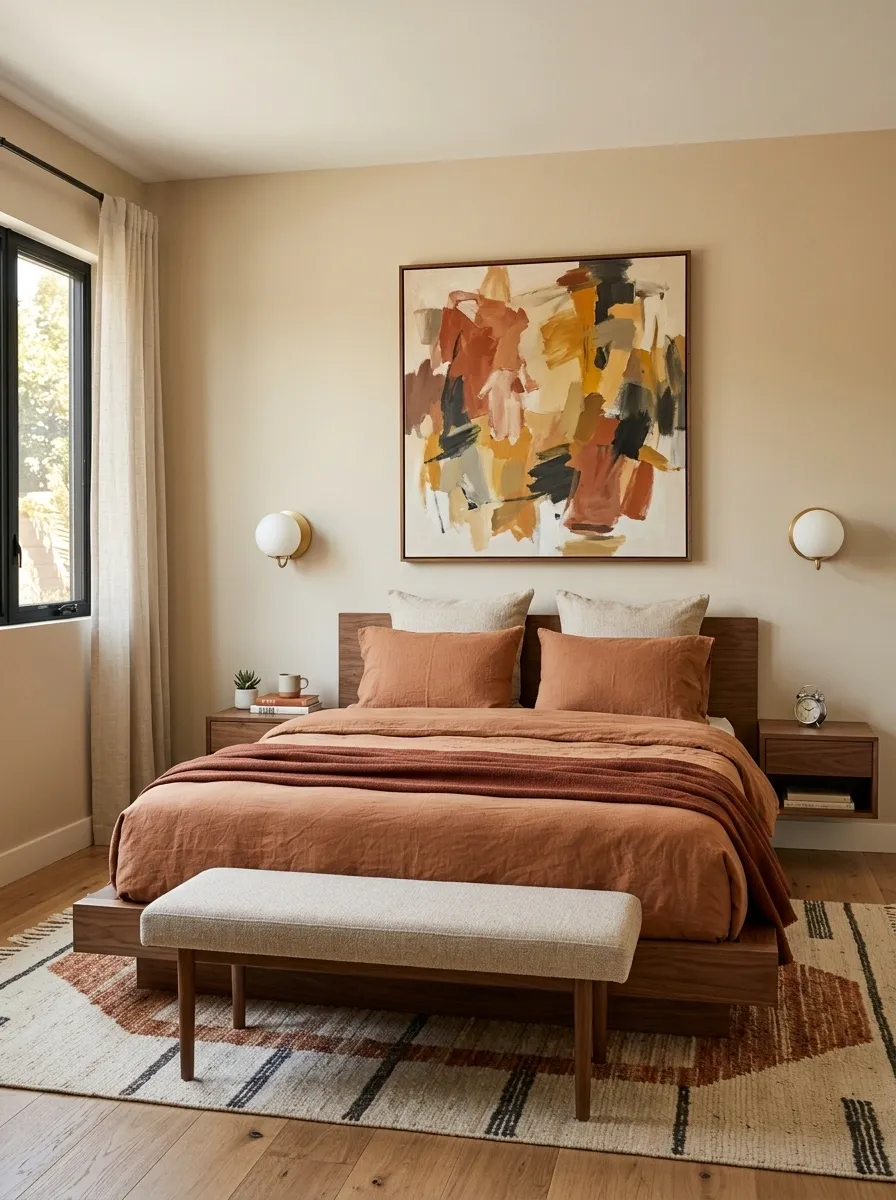
Low furniture gives this bedroom its strongest visual advantage. A walnut platform bed sits close to the floor with compact integrated nightstands, while warm beige walls, soft rust bedding, and a narrow upholstered bench bring in color without overwhelming the modest footprint.
The bed remains centered visually, but the artwork above it is slightly offset. That small asymmetry keeps the composition from feeling overly formal. Simple globe lamps replace bulky bedside fixtures, leaving more room around the sleeping area.
The palette moves from pale beige to walnut to muted rust, creating a warm progression from wall to furniture to textiles. Because the bed is low and the nightstands are compact, the upper half of the room remains unusually open.
Dusty Blue Bedroom With Walnut Furniture and a Compact Desk
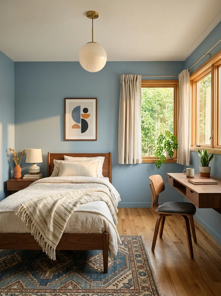
This bedroom combines sleeping and working zones without letting either one dominate. A walnut bed occupies the quieter side of the room, while a floating desk and compact chair tuck beneath a dusty blue wall on the opposite side.
The desk floats instead of standing on four legs, which keeps the floor visually continuous and makes the work zone feel lighter. A woven rug connects both areas, while globe lighting and a simple graphic print reinforce the mid-century language.
The color is intentionally cooler than the earlier bedrooms. Dusty blue gives the walls a soft architectural presence, while the walnut furniture supplies enough warmth to prevent the room from feeling flat or overly contemporary.
Small Bedroom With a Built-In Wardrobe and Open Nightstand Arrangement
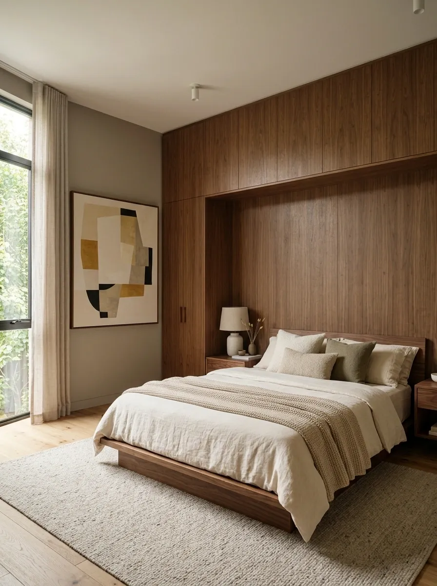
The strongest feature in this bedroom is the storage wall. A floor-to-ceiling wardrobe runs across one side of the room, absorbing clothing storage into a single architectural volume instead of introducing several freestanding pieces.
A low walnut bed sits opposite it, flanked by tiny open-base nightstands that barely interrupt the floor line. Warm ivory bedding, mushroom-colored walls, and one oversized abstract print keep the room from feeling overly furnished.
The asymmetrical artwork placement adds a little tension to an otherwise orderly composition. It also prevents the storage wall and bed from creating a rigid mirror-image arrangement.
The important lesson here is visual mass. Large storage is easier to live with when it forms one uninterrupted plane rather than several smaller cabinets scattered around the room.
Mid-Century Home Office With a Wall-Mounted Desk
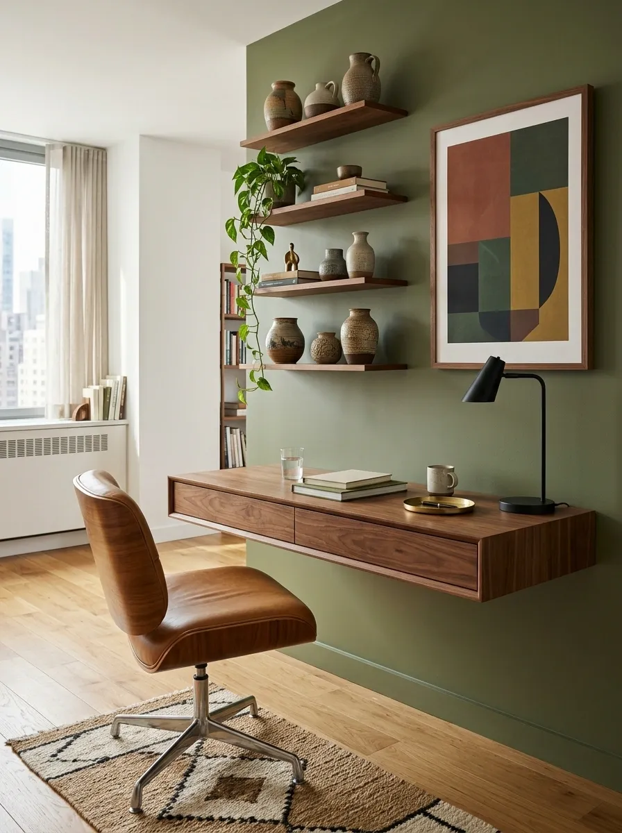
This compact office is built around a floating walnut desk beneath a muted olive wall. A slim leather chair, small task lamp, narrow shelving, and one oversized piece of graphic art provide everything the room needs without creating a forest of furniture legs.
The wall carries much of the visual responsibility. Shelving rises vertically while the desk remains horizontal and light, creating a useful contrast between storage and workspace.
A small woven rug defines the working area without enclosing it. The chair is slightly offset rather than pushed squarely against the desk, giving the room a more relaxed residential quality.
The result feels like part of the home rather than a miniature corporate office. That distinction matters in a small room where every visible object contributes to the overall atmosphere.
Open-Plan Small Home With One Continuous Wood Furniture Language
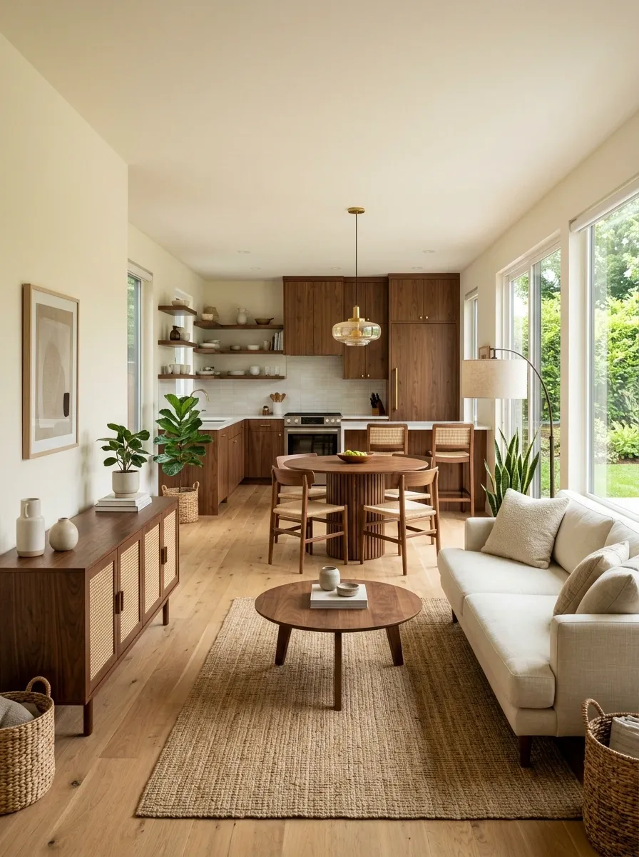
This open-plan home avoids the disconnected look that can happen when every zone gets its own style. The living room, dining area, and kitchen share a consistent walnut tone, while cream upholstery and warm ivory walls create a quiet background throughout.
A walnut credenza in the living area echoes the dining table and kitchen cabinetry without matching them exactly. That repetition gives the open floor plan a continuous visual thread.
The furniture layouts remain distinct. The sofa faces its own focal wall, the dining table occupies the transition between kitchen and living, and the kitchen stays visually simpler. The materials connect the rooms while the furniture arrangement keeps their functions separate.
This is especially effective in a small home because fewer visual changes mean fewer perceived boundaries.
Color-Blocked Small Living Room With Rust, Ochre, and Cream
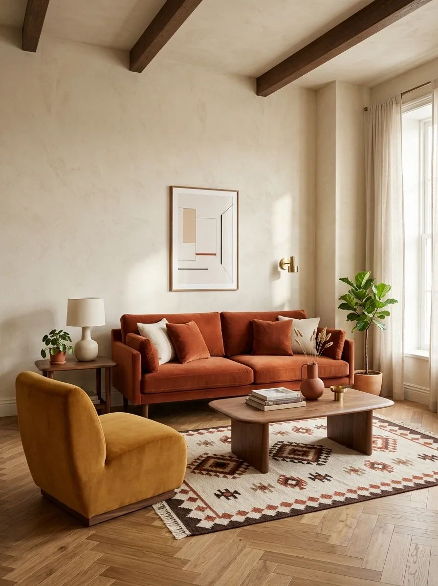
This is the more expressive direction in the collection. A warm cream base provides the backdrop for a rust-colored sofa, ochre accent chair, walnut tables, and a geometric rug with small hits of darker brown.
The color is strong, but its placement is disciplined. Rust occupies the largest upholstered element, ochre appears on a single chair, and the warm cream remains the dominant surrounding field. Walnut visually links the furniture to the richer textiles.
The room does not need colorful artwork because the furniture already provides the visual drama. A simple framed print and understated ceramic objects are enough to finish the composition.
This approach suits small spaces that need personality but cannot accommodate large collections of objects. Color carries the interest instead.
Soft Minimal Mid-Century Bedroom With Mushroom Walls
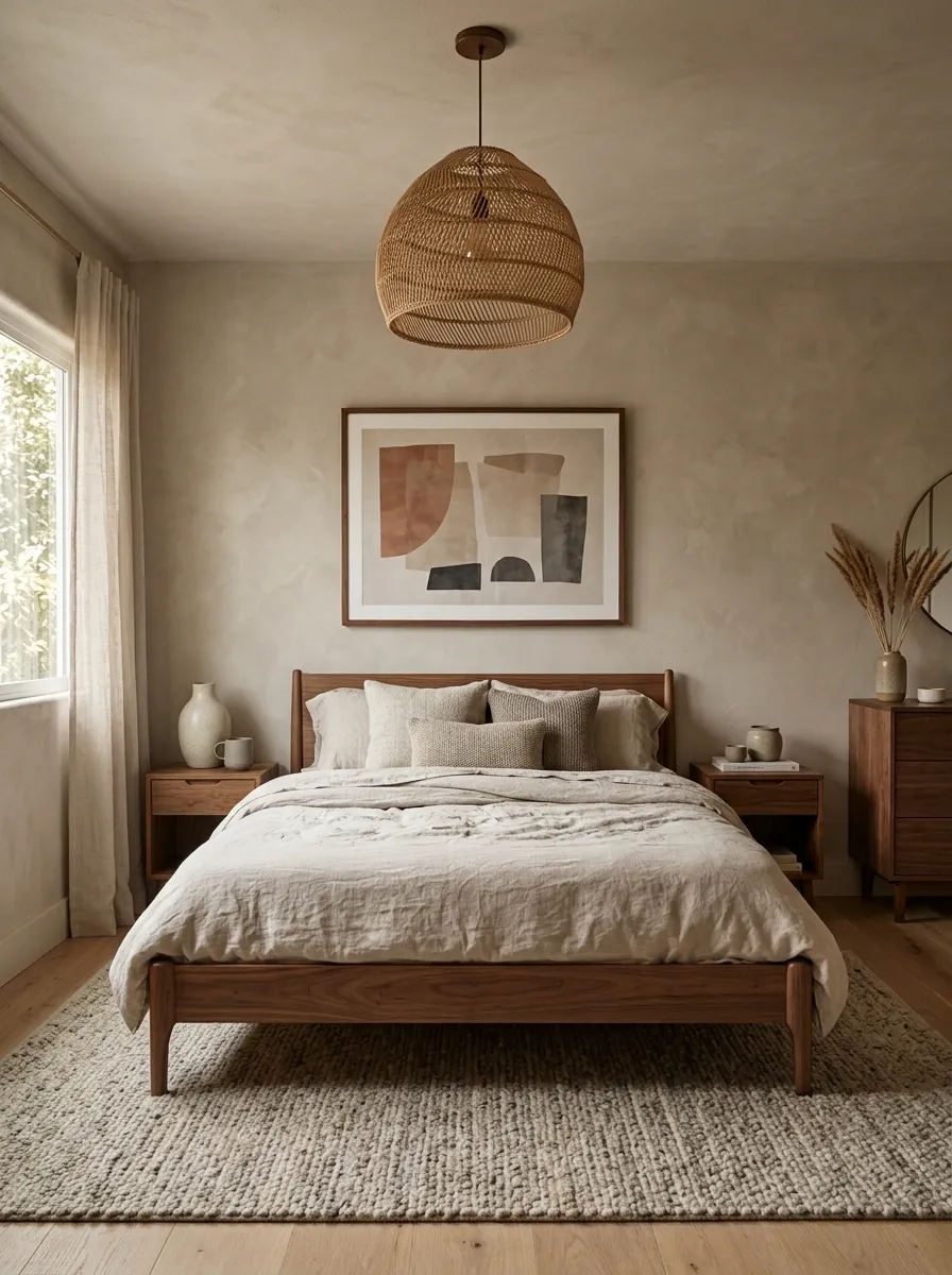
Mushroom-toned walls give this bedroom a soft architectural envelope, while a natural walnut bed introduces the unmistakable warmth of mid-century furniture. Oatmeal bedding, a woven pendant, textured rug, and one oversized print complete the room.
There is very little decorative clutter here. Texture creates the interest instead. The bedding, rug, plaster-like wall finish, and wood grain offer subtle differences that become more noticeable because the color palette is restrained.
Rounded forms keep the composition gentle. The pendant, bedside tables, and bed frame all use softened edges rather than sharp geometric silhouettes.
This room demonstrates how a small bedroom can feel layered without being full. The richness comes from material contrast rather than quantity.
Retro-Inspired Small Dining Room With Sculptural Lighting
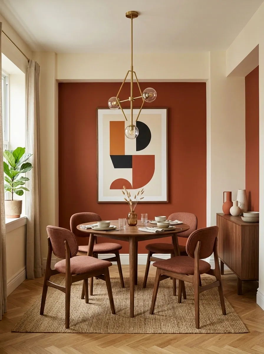
This dining room takes the mid-century vocabulary in a more playful direction. A compact walnut table sits beneath a sculptural pendant, surrounded by curved wooden chairs with muted rust upholstery. A terracotta-toned wall creates a warm backdrop for one large graphic artwork, while a narrow sideboard keeps serving pieces contained.
The room has stronger personality than the earlier dining nook, but the footprint remains disciplined. The table is the only large horizontal element, while the pendant provides most of the vertical drama.
The artwork and lighting are deliberately grouped around the same visual axis. That creates one memorable focal area instead of scattering attention across the walls.
The result feels distinctly retro without relying on novelty furniture or excessive period decoration.
Small Living Room With a Compact Sectional and Vintage Lounge Chair
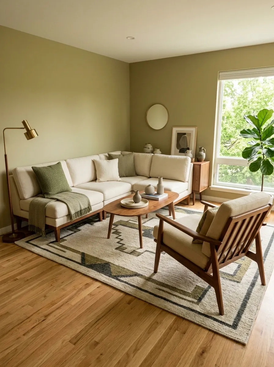
A sectional can work in a small home when it is scaled carefully and treated as one compact mass. This living room pairs a low cream sectional with a vintage-inspired walnut lounge chair, oval coffee table, and slim sideboard.
The sectional occupies one corner rather than floating in the center, leaving the opposite side open for circulation. The lounge chair sits diagonally across from it, creating a conversation zone without requiring another large sofa.
A geometric rug visually gathers the seating pieces, while the furniture bases remain exposed so the floor continues beneath them. Warm wood and cream upholstery provide the familiar mid-century contrast, with olive textiles supplying a quiet accent.
The layout feels comfortable without turning the whole room into seating furniture.
Small Home With Sliding Wood Room Dividers
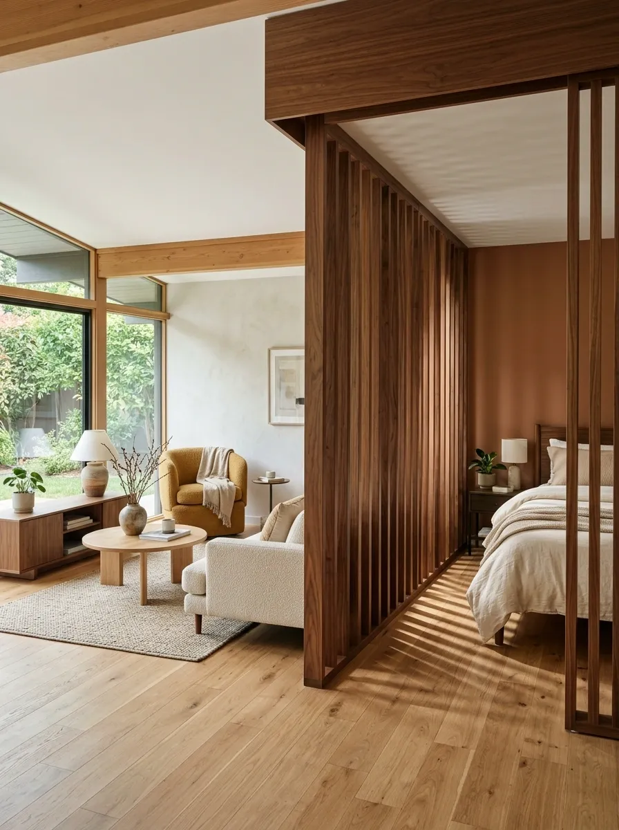
Open-plan living isn’t always the right answer for a compact home. This design uses a warm wood sliding divider to give the sleeping area privacy without permanently closing it off from the living room.
The divider has vertical slats that repeat the walnut tones used in the low media cabinet and dining furniture. When positioned partly open, it creates a filtered view between spaces while allowing daylight to travel through.
The living zone stays deliberately simple, with a compact sofa, round table, and single lounge chair. Because the divider itself provides architectural interest, the rest of the room doesn’t need a busy collection of decorative pieces.
This approach is especially useful where one small room has to handle several functions but still needs moments of separation.
Small Mid-Century Bathroom With Walnut Vanity and Geometric Tile
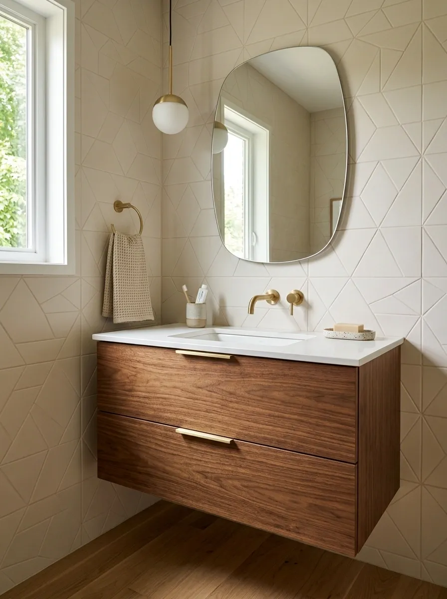
This bathroom uses the same warm wood language as the living spaces but scales it down to suit a tighter footprint. A floating walnut vanity sits beneath a rounded mirror, while warm off-white geometric tile covers the walls and a brushed metal finish adds a restrained metallic note.
The floating vanity creates a visible strip of flooring beneath the cabinet, which keeps the compact room from feeling boxed in. The rounded mirror counters the stronger geometry of the tile and cabinetry.
Only a few objects sit on the counter: a simple vessel, hand towel, and small tray. The patterned wall already provides enough visual interest.
The key is consistency. The wood tone feels connected to the rest of the home instead of making the bathroom look like a completely separate design.
Mid-Century Laundry Corner Hidden Inside a Compact Utility Space
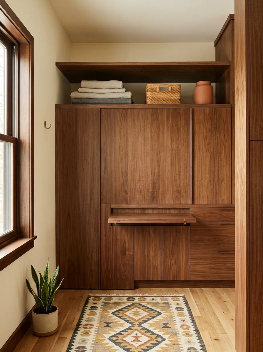
A utility area doesn’t have to break the visual rhythm of a small home. This compact laundry zone hides the appliances behind warm walnut-toned cabinetry, with one open shelf above and a slim folding surface built into the composition.
The cabinetry reaches upward instead of spreading across the room, preserving as much floor area as possible. A patterned runner introduces personality while keeping the work surface visually separate from the rest of the home.
The open shelf is limited to useful items such as folded linens, a small basket, and one ceramic container. Everything else disappears behind the cabinet fronts.
This is a more practical interpretation of mid-century styling, where clean lines serve a real storage problem rather than simply recreating an old-fashioned appearance.
Small Home With a Sunroom-Style Reading Corner
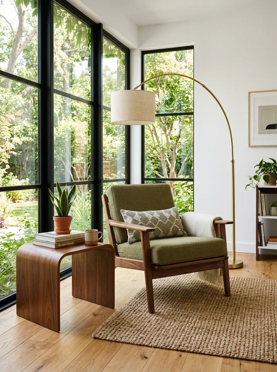
A sunny corner can become a complete destination without needing an entire room. This composition places a low walnut lounge chair beside a curved side table, with a tall floor lamp, woven rug, and a small stack of books defining the area as a dedicated reading zone.
Large windows provide the architectural backdrop, so the furniture stays deliberately compact. The chair faces the light rather than the rest of the room, creating a subtle change in orientation that makes the corner feel separate without walls.
The color palette is quiet, built around warm ivory, walnut, muted olive, and natural woven texture. A patterned cushion introduces just enough contrast.
The important detail is concentration. Everything needed for the corner is gathered within one small footprint, leaving the surrounding floor open.
Dark Walnut Small Living Room With Cream Bouclé Seating
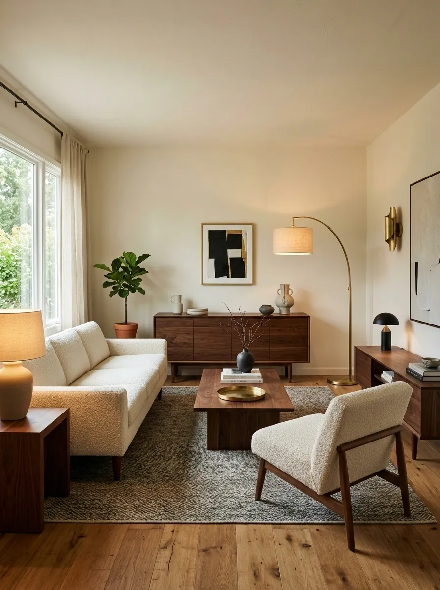
For a moodier interpretation, the room centers on dark walnut cabinetry and furniture against warm ivory walls. A cream bouclé sofa and matching lounge chair provide the strongest contrast, while charcoal accents and a muted patterned rug deepen the palette.
The darker wood appears in large but controlled areas: the media console, coffee table, and sideboard. Because the walls and upholstery remain light, the room never becomes one continuous dark mass.
Lighting is especially important here. A sculptural floor lamp and warm table lamp create pools of light around the furniture instead of flooding the entire room uniformly.
This composition suits a small room that needs more drama. The trick is keeping the darkest tones low in the visual field, where they ground the furniture without making the walls appear smaller.
Small Apartment With a Mid-Century Murphy Bed Wall
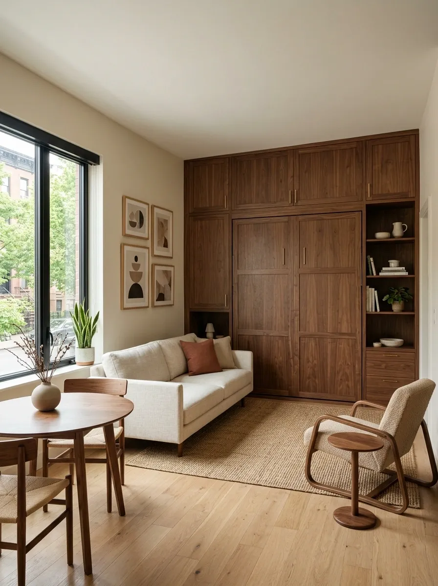
A studio apartment needs furniture to change jobs, and this design makes that flexibility part of the architecture. A walnut-toned wall combines a fold-down bed with concealed storage, leaving the main floor free for a compact cream sofa, round dining table, and slim lounge chair during the day.
The cabinetry creates one strong architectural backdrop instead of filling the studio with separate wardrobes and shelving. When the bed is closed, the wall reads as a large wood composition. When it opens, the sleeping zone becomes the room’s temporary focal point.
The living furniture stays intentionally light because the storage wall already carries substantial visual weight. Rounded furniture softens the long cabinetry and keeps circulation paths clear.
This is one of the strongest small-home solutions in the collection because the architecture itself handles the changing function.
Warm Scandinavian-Mid-Century Small Home With Pale Oak
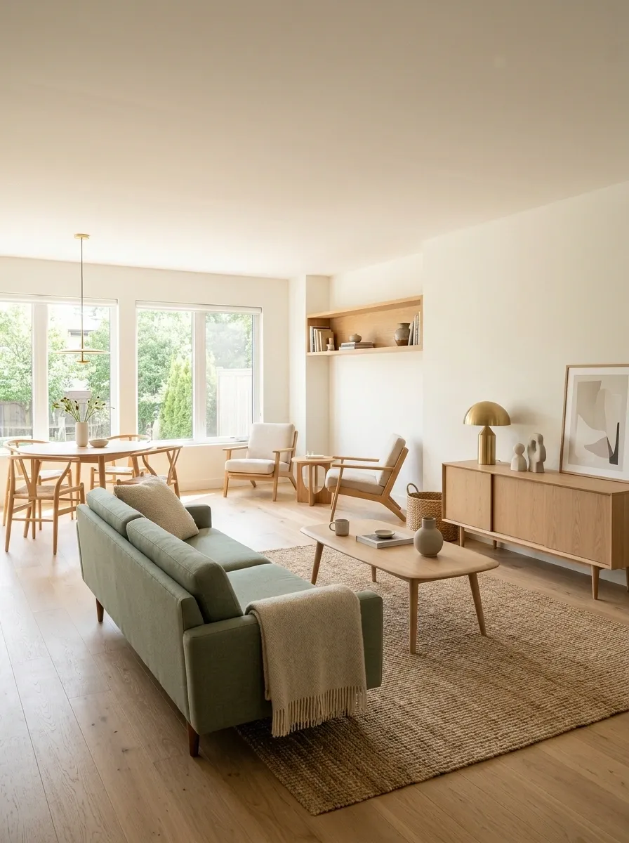
This design softens traditional mid-century shapes with a Scandinavian palette. Pale oak furniture replaces darker walnut, while warm white walls, muted sage upholstery, woven textiles, and rounded silhouettes keep the rooms feeling light.
The living room, dining area, and entry share the same pale wood tone, creating continuity across the compact home. Instead of relying on strong color, the design builds interest through texture: boucle, linen, woven baskets, matte ceramics, and lightly grained timber.
The mid-century influence remains visible in tapered legs, low furniture, sculptural lighting, and organic curves. The Scandinavian influence comes through in the quieter palette and emphasis on natural materials.
The combination works because neither style is allowed to dominate. The result feels warmer than strict minimalism and lighter than a heavily retro interior.
Collected Small Home With Vintage Mid-Century Pieces and Modern Architecture
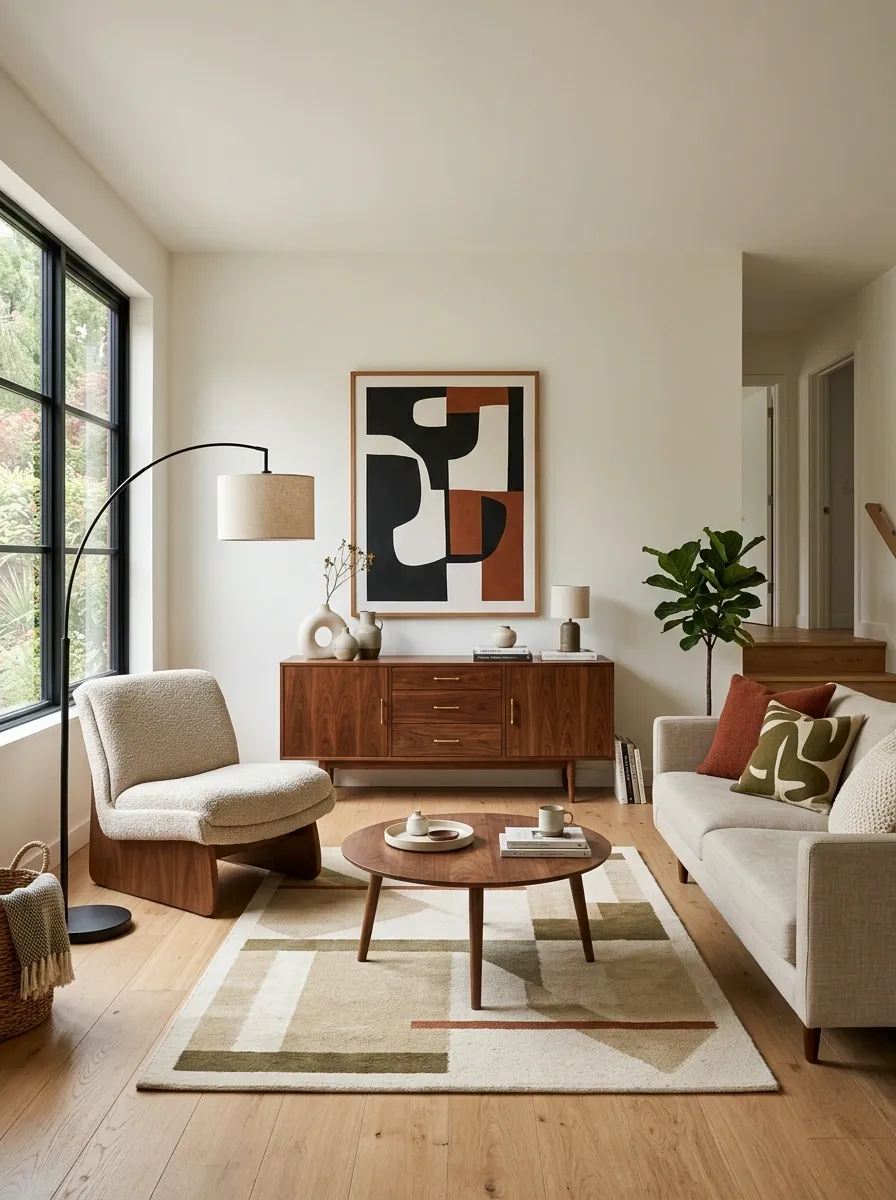
The final design deliberately avoids making the home feel like a period set. A clean contemporary shell provides the backdrop for carefully selected vintage-inspired walnut furniture, a sculptural lounge chair, graphic artwork, textured textiles, and modern lighting.
The contrast is most successful in the living room. The architecture stays simple and pale while the furniture carries more character. An older-looking sideboard sits beneath contemporary artwork, and a classic lounge chair shares space with a modern floor lamp.
Nothing is matched too closely. The wood tones relate, but the silhouettes vary. Art feels collected rather than coordinated, and the lighting is contemporary enough to keep the room from becoming nostalgic.
That tension is what makes the composition memorable. Mid-century influence becomes part of a layered home rather than the theme of the entire home.
Let the Whole Room Make the Decision
The hardest part of decorating a small home is rarely finding one attractive piece. It is deciding what the room should feel like when every major piece is finally in place.
A compact space has very little room for visual indecision. Furniture scale, storage, wall color, lighting, and circulation all become part of the same picture. That makes a complete design direction much more useful than collecting individual ideas that may not belong together.
Some rooms need the warmth of walnut. Others benefit from pale oak, stronger color, architectural storage, or a flexible piece that changes function throughout the day. The best choice is the one that fits the actual room, the available light, and the way the space is used.
Save the designs that feel closest to the home already, then use that visual direction as the filter for every furniture, finish, and decorating decision that follows.