
A fall entry table can look cluttered long before it looks festive. The usual problem is not having too little decor. It is having too many pieces competing for attention without a clear relationship between them. A pumpkin, vase, sign, candle, and basket may all look good individually, yet together they can create a display that feels random.
The strongest fall entry table decor starts with the finished scene rather than a shopping list. The furniture, wall, mirror or artwork, lighting, materials, colors, and seasonal pieces should read as one composition. Height needs somewhere to go, heavier objects need visual grounding, and the table still needs enough open space to function as an entryway.
Finished Fall Entry Table Decor
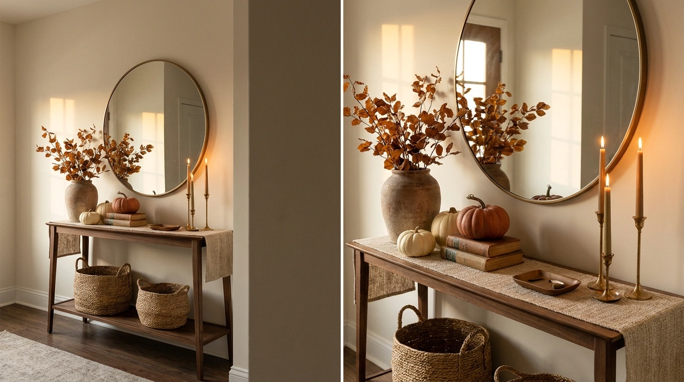
Welcoming Fall Entry With Terracotta and Rustic Textures
This inviting autumn entryway blends rich textures and earthy tones to greet guests with seasonal warmth. A weathered wooden console table anchors the space, topped with a large terracotta vase overflowing with rust-colored foliage that mirrors the outdoor landscape. A glowing table lamp and framed artwork add intimate layers, while layered textiles and a woven runner guide the eye through the hallway.
The real secret to this display lies in the thoughtful balance of warm neutrals and muted autumnal hues. Rich amber glass, soft cream pumpkins, and woven baskets work together to create depth without making the tabletop feel cluttered or overwhelming.
Keep the arrangement feeling natural by varying heights and grouping items organically. Stacking a few books beneath a small pumpkin or letting a cozy throw drape casually over the edge gives the entire entryway a lived-in, effortless charm.
Warm Harvest Entry With Terracotta, Amber Glass, and Aged Wood
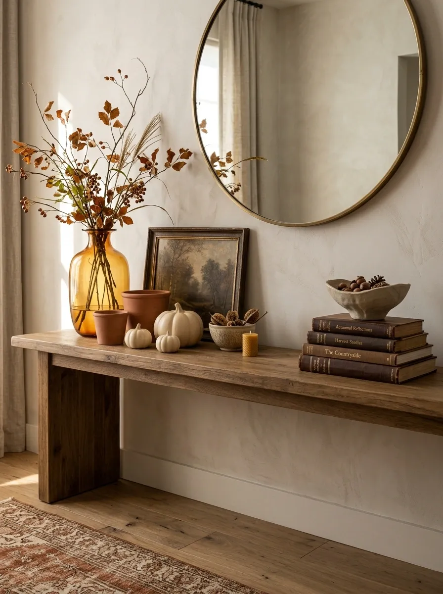
The easiest way to make an autumn entry feel rich is to let the materials carry the season. A warm oak or medium-toned wood console sets the foundation, while a tall amber glass vessel filled with loose branches creates the main vertical line. Terracotta pottery, cream pumpkins, an aged frame, and a few dark brown accents fill the lower levels without crowding the tabletop.
The important detail is the color relationship. Orange appears in several muted forms, while wood and ivory keep it grounded. Amber glass adds another warm note without looking matchy-matchy.
Keep the arrangement slightly asymmetrical. A heavy cluster on one side and a quieter section on the other makes the display feel collected rather than arranged with a ruler.
Glowing Autumn Hallway With Lanterns and Pampas Grass
Transforming an entryway into a cozy autumn sanctuary is all about maximizing ambient lighting and natural textures. A simple wooden bench acts as the anchor, flanked by tall glass lanterns glowing from within and large plumes of feathery pampas grass that add incredible height and softness to the stairwell.
Creating this magical evening atmosphere relies heavily on layering different light sources and seasonal elements. White and cream pumpkins nestled among the lanterns and baskets provide a subtle contrast against the warm glow, keeping the display sophisticated rather than overwhelming.
Embrace a monochromatic palette of creams, tans, and warm wood tones to maintain a serene atmosphere. By focusing on lighting and texture rather than bright orange colors, the space feels peaceful and deeply welcoming.
Moody Autumn Entry With Charcoal Walls and Oxidized Brass
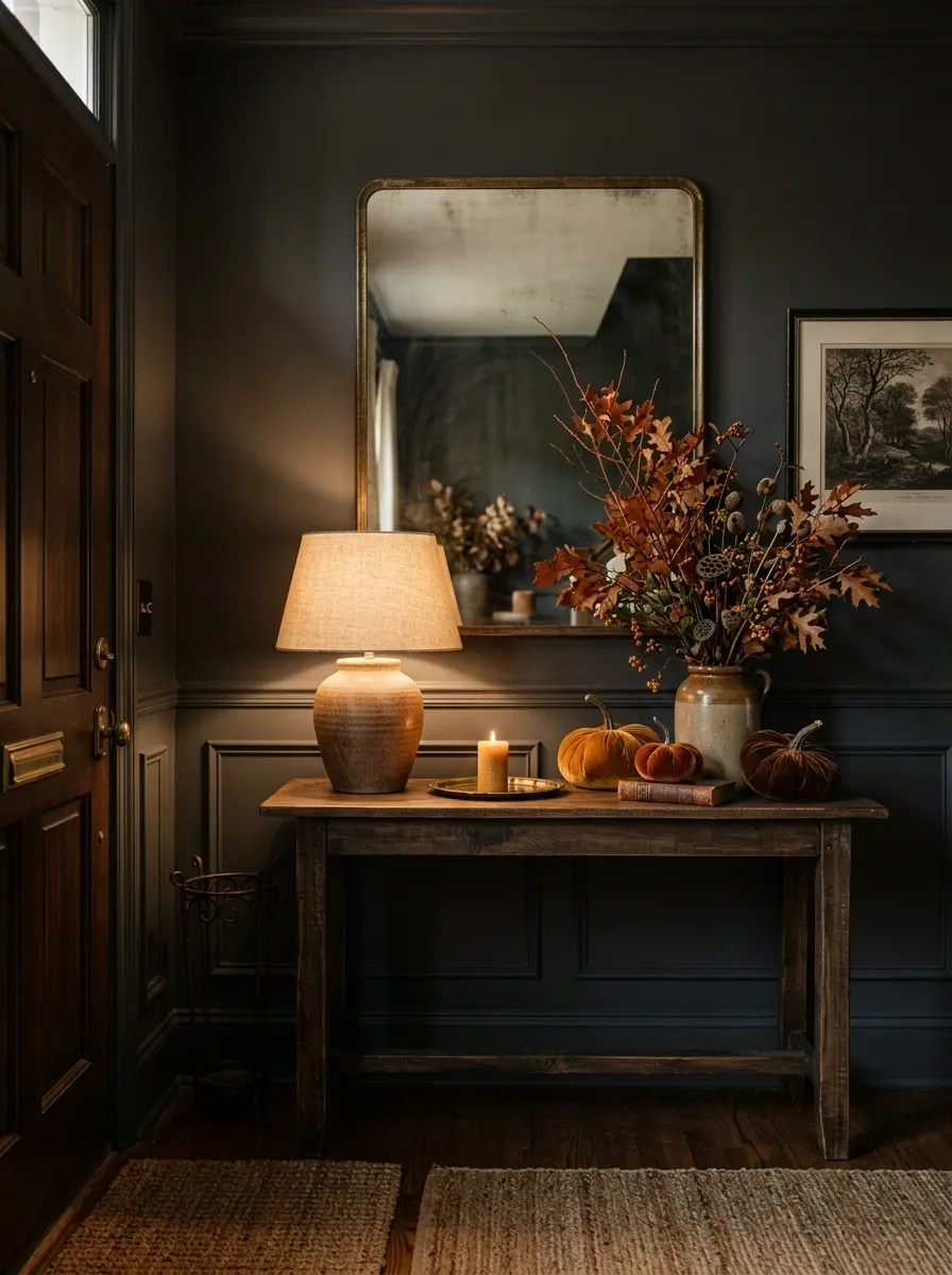
A deep charcoal or muted olive wall changes the entire character of an autumn entry. Against it, a dark console, aged brass mirror, and warm lamp create a layered, evening-like composition even during daylight hours. Rust-colored stems and a few ochre or brown pumpkins supply the seasonal color without turning the space into an orange display.
This design works because the background is doing much of the visual work. The darker wall gives the lighter objects definition, while oxidized brass adds warmth without the shine of bright gold.
Use matte or softly aged finishes here. Highly polished metals can make the arrangement feel too formal, while the slightly worn surfaces give the scene more depth.
Minimalist Autumn Console With Moody Landscape Art
A restrained approach to fall decorating can often have the most striking visual impact. A sleek wooden console table stands beneath a moody vintage landscape painting, featuring a dark ceramic vase filled with muted golden foliage, tall slender taper candles, and a few carefully chosen gourds.
The success of this minimal design comes from its strict adherence to a sophisticated color story and clean composition. Deep charcoal and rich ochre tones pull inspiration from the artwork, creating a cohesive vignette that feels intentional and refined.
Allow negative space to do the heavy lifting in this setup. Leaving sections of the console bare ensures that each carefully curated object receives the attention it deserves, resulting in a calm and elegant autumn display.
Soft Neutral Fall Entry With Cream Pumpkins and Natural Linen
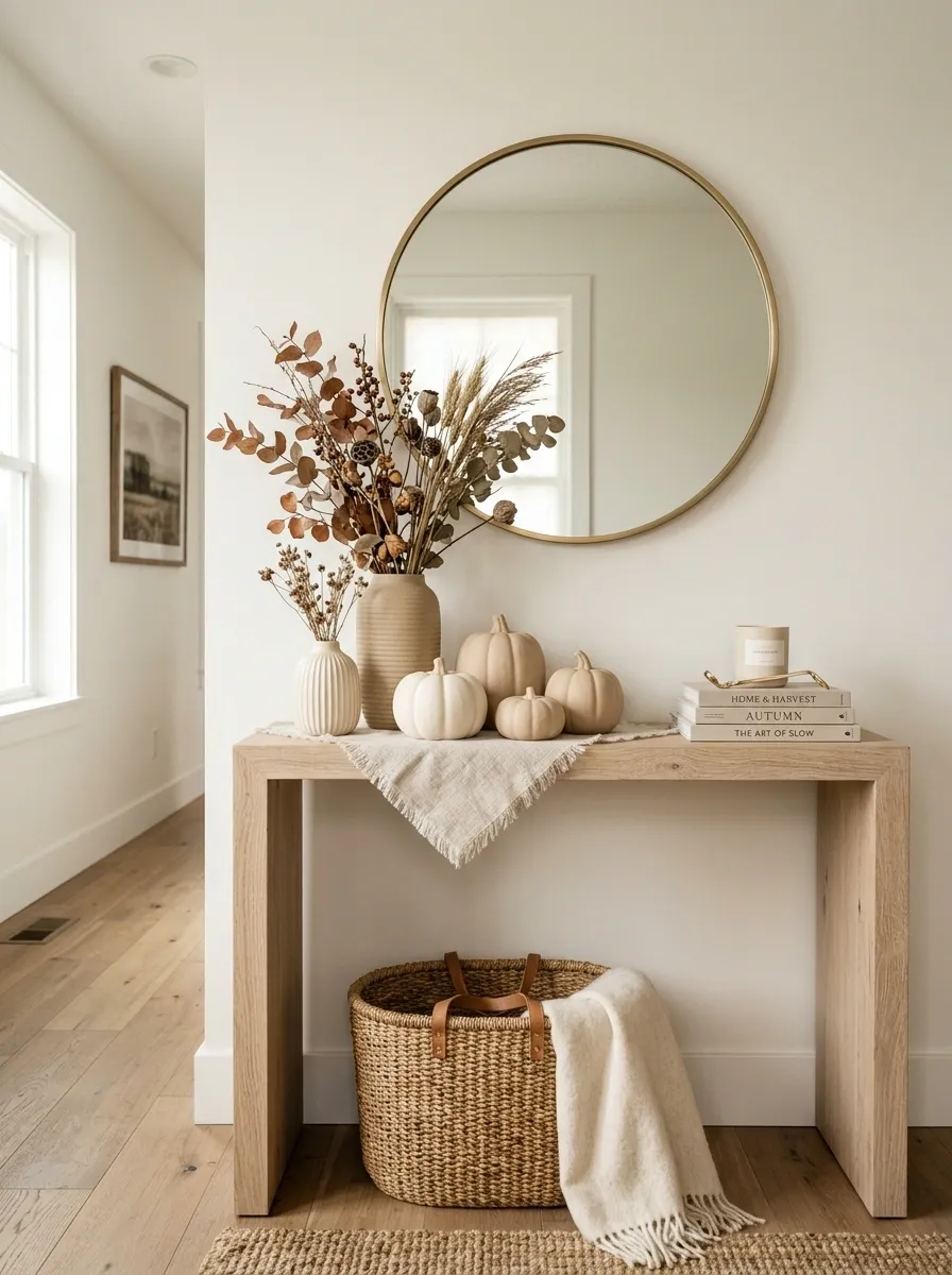
Fall can read clearly without a bright orange pumpkin anywhere in sight. This entry uses warm white walls, pale oak, oatmeal linen, woven texture, cream pumpkins, and loose dried stems to create a quieter interpretation of the season. A simple rounded mirror or soft-edged artwork keeps the background from feeling too rigid.
The palette matters more than the number of seasonal objects. Cream, flax, sand, and pale wood create enough warmth that even a few small pumpkins feel intentional.
Use texture to keep the neutral colors from becoming flat. Linen, ribbed ceramics, woven baskets, and raw wood each catch light differently, giving the arrangement depth while maintaining a calm visual field.
Fluted Wood Console With Soft Ambient Sconces
A modern fluted wooden console brings beautiful architectural detail to this warmly lit transitional entryway. Framed by symmetrical brass wall sconces and a serene abstract landscape painting, the surface features a textured vase of rust-colored branches and artisanal ceramic vessels that introduce organic curves.
The magic of this display is in the interplay of vertical lines and soft lighting. The vertical channeling of the console echoes the warm glow of the sconces, casting gentle shadows that highlight the natural materials throughout the vignette.
Maintain a restrained accessory count to let the high-end finishes shine. By choosing a few statement pieces with varied heights and tactile surfaces, the entryway remains functional while fully embracing the cozy spirit of the season.
Collected Cottage Entry With Vintage Frames and Miniature Gourds
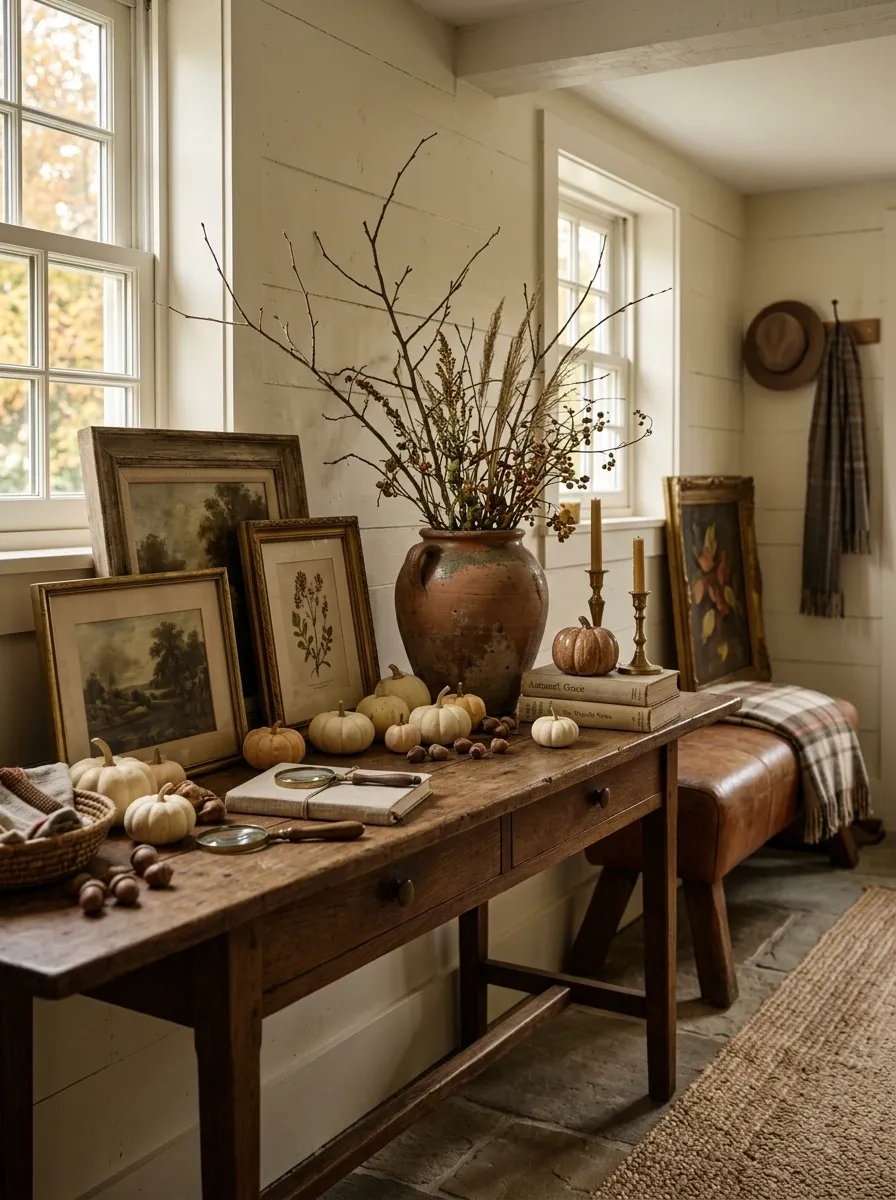
A cottage-style entry should look as though the pieces accumulated over time, even when the styling is newly assembled. A medium or dark wood console anchors the arrangement, while vintage-looking frames, an old ceramic vessel, stacked books, miniature gourds, and loose branches create the feeling of a small collected still life.
The key is variation. The frames shouldn’t all match, the ceramics shouldn’t come from one set, and the seasonal pieces should be scattered through the composition rather than grouped into one obvious fall corner.
A little imperfection makes this design work. Straightening every object to the same angle can erase the relaxed character that gives cottage interiors their appeal.
Modern Organic Entry With Travertine, Walnut, and Dried Foliage
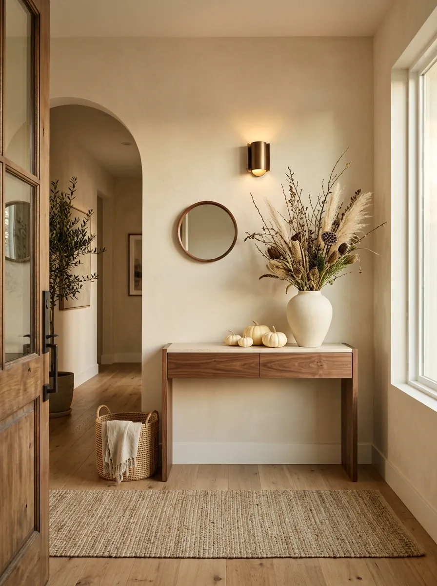
This version has a cleaner architectural feel. A walnut console provides warmth against a pale wall, while a travertine or limestone surface introduces a quiet stone texture. A sculptural ceramic vessel holds tall dried foliage, and a few cream pumpkins sit low enough that the tabletop still feels spacious.
The strongest feature is the material balance. Wood keeps the space from feeling cold, stone gives it structure, and dried foliage adds an organic shape without introducing a busy floral arrangement.
Keep the accessory count low. The visual impact comes from the scale of the materials and the contrast between soft organic lines and the clean furniture silhouette. Small objects should support that relationship rather than compete with it.
Rustic Farmhouse Entry With Weathered Wood and Copper Accents
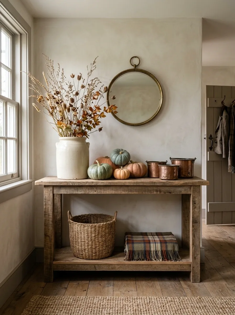
A weathered wood console gives this autumn entry its strongest character before a single seasonal object is added. From there, a large ceramic crock filled with dried branches rises behind a loose grouping of muted pumpkins, woven baskets, and a few copper-toned pieces. A folded plaid throw can sit on a nearby bench or lower shelf, tying the tabletop into the rest of the entry.
The combination works because each material has a different visual texture. Rough wood feels dry and substantial, copper catches the light, woven fiber softens the harder surfaces, and foliage supplies movement.
Keep the copper aged rather than shiny. Too much polished metal would push the composition toward a formal look instead of the relaxed farmhouse direction.
Small Entry Table With One Tall Arrangement and Low Fall Layers
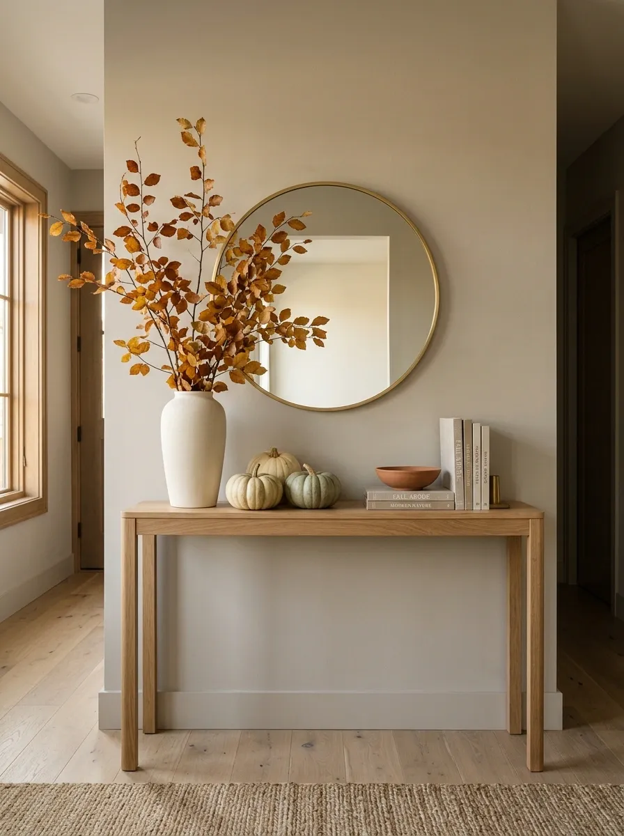
A narrow console doesn’t need a miniature version of a large seasonal display. It needs a different composition. Here, one tall ceramic vase filled with branching stems provides the height, while three or four low pumpkins, a shallow bowl, and a slim stack of books create a grounded base.
The open space between those two levels is what makes the arrangement work. Nothing spills toward the edge of the table, so the entry still feels easy to move through. A mirror or narrow artwork above the console can extend the vertical line without requiring more tabletop pieces.
The smartest choice is restraint. Once the tall arrangement is doing its job, extra height usually makes a small console feel crowded.
Traditional Autumn Entry With Plaid, Mahogany, and Muted Orange
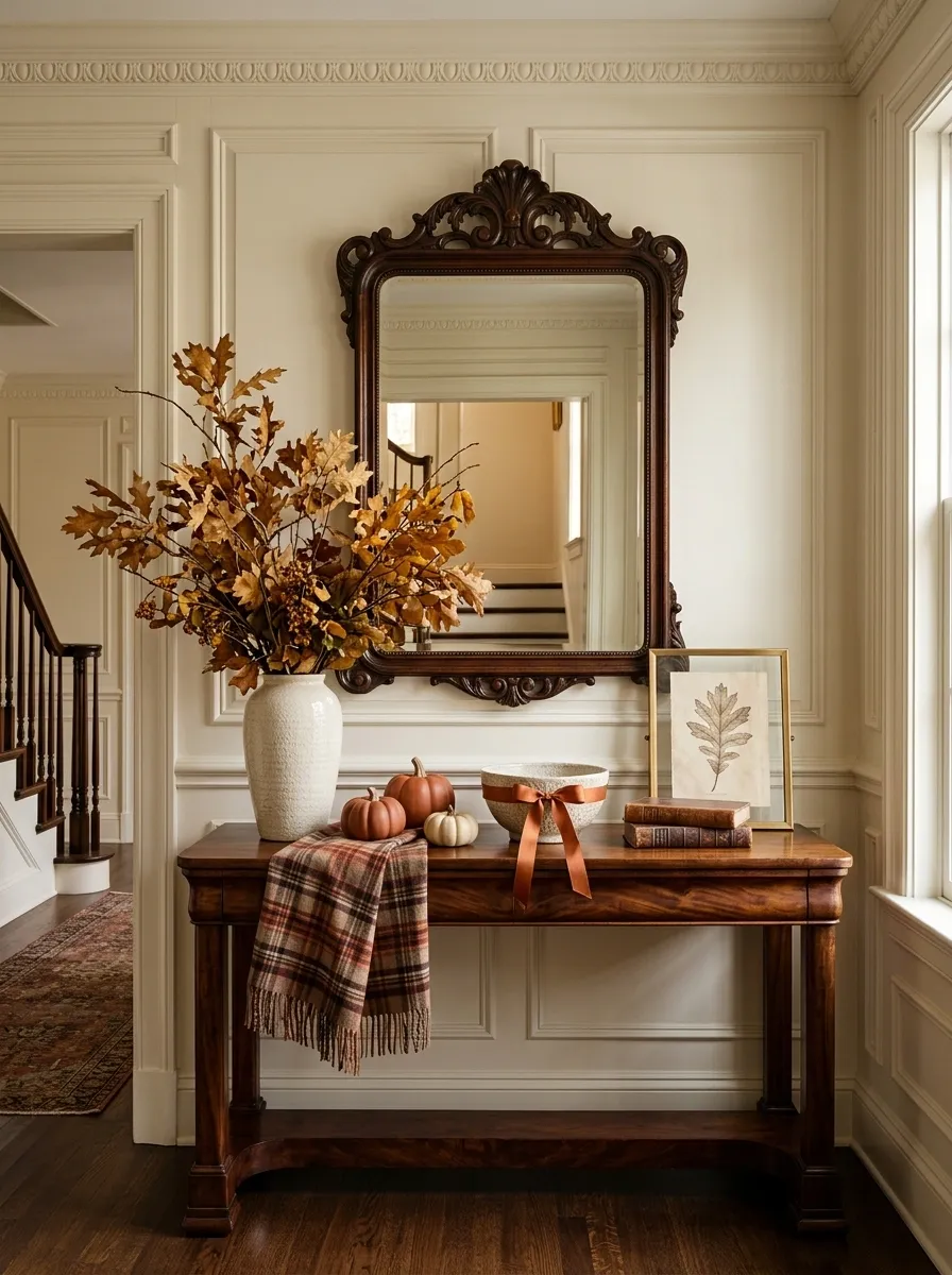
This richer composition suits an entry with traditional millwork, a substantial wood console, or an antique-style mirror. Mahogany tones establish the base, while a muted plaid textile introduces pattern and a generous arrangement of leafy branches brings height. Burnt orange appears in smaller places, such as pumpkins, ribbon, ceramics, or a textile edge.
The palette feels distinctly autumnal without becoming overly bright because the orange is softened by deep wood and warm cream. Brass can appear in a lamp or frame, but it should remain secondary to the mahogany.
Pattern needs breathing room here. A single plaid element has more impact when the surrounding objects are mostly solid colors.
Scandinavian Fall Entry With Pale Oak and Rust Accents
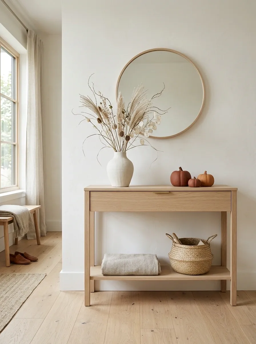
A Scandinavian-inspired autumn entry has very little visual noise. Pale oak, warm white walls, simple ceramics, and a clean-lined mirror create an almost blank canvas, then a handful of rust-colored accents bring the season into focus. Dried grasses or delicate branches provide the main organic shape.
Nothing needs to shout. The autumn character comes from the contrast between the pale foundation and the earthy rust notes.
This style is especially convincing when the furniture is simple and the accessories are edited carefully. Avoid filling the tabletop with small seasonal objects. One ceramic vessel, a few pumpkins, and a soft textile can carry the entire story.
Elegant Black Console With Soft Ivory and Burnt Sienna
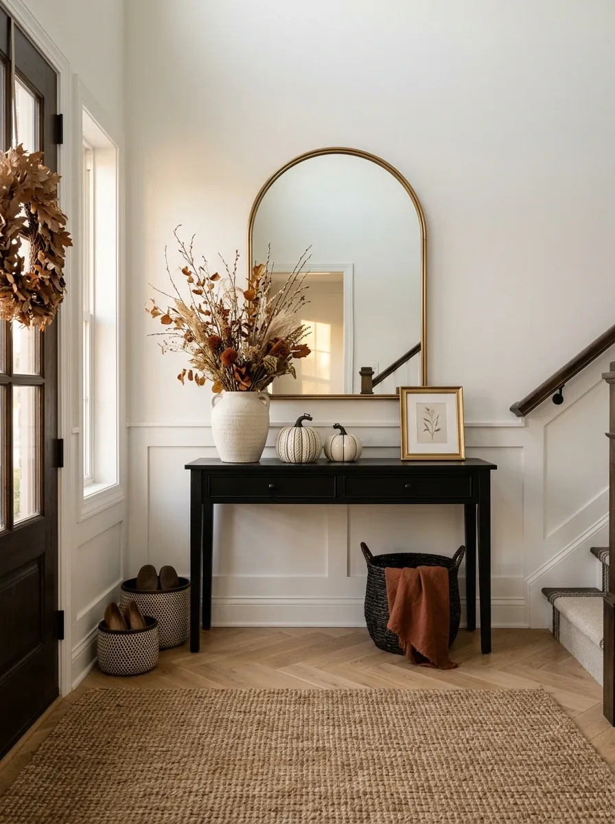
For a sharper autumn look, pair a black console with an oversized mirror or artwork and build the rest of the entry in ivory, warm wood, and burnt sienna. Cream pumpkins become graphic objects against the dark furniture, while dried branches soften the harder lines.
The high contrast gives even a simple arrangement a strong presence. The trick is not to keep adding black. Once the console establishes the dark foundation, ivory can provide most of the visual relief while burnt sienna supplies the seasonal color.
A small lamp or brass frame can introduce another warm note, but it should remain subtle. The composition is strongest when black, ivory, and sienna remain the clear visual conversation.
Vintage-Inspired Entry With Brass Lamp and Autumn Still Life
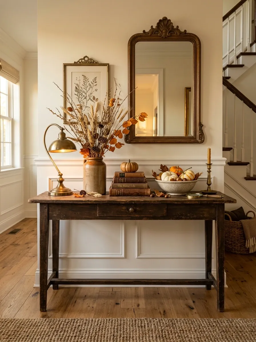
A vintage autumn entry works best when the tabletop feels more like a small still life than a seasonal display. A brass lamp provides a warm pool of light beside stacked books, an old-looking frame, a ceramic fruit bowl, and a tall vessel of dried stems. Small pumpkins and dried leaves appear almost incidentally, woven into the arrangement rather than placed in a row.
The layered heights are what make the composition feel established. The lamp and branches create the tallest points, books occupy the middle, and the smallest seasonal pieces sit close to the tabletop.
Choose pieces with slightly different shapes and finishes. Too many matching objects would remove the relaxed, collected character.
Earthy Southwestern Entry With Clay, Leather, and Dried Grasses
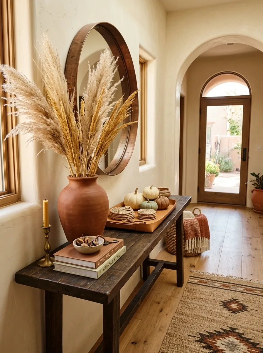
Warm clay pottery, dark wood, leather, woven fiber, and tall dried grasses give this entry a grounded Southwestern character. Instead of traditional orange pumpkins dominating the table, the autumn palette comes through dusty rust, sand, cinnamon, cream, and deep brown.
A wide ceramic vessel can anchor one side of the console while long grasses rise above it. Opposite that, a low leather tray, a few small pumpkins, and woven pieces create visual weight without competing with the foliage.
The material mix is more important than adding lots of seasonal decorations. Rough clay against smooth leather and fibrous grasses creates enough texture to make a relatively simple tabletop feel substantial.
Moody Green Entry With Walnut Console and Ochre Accents
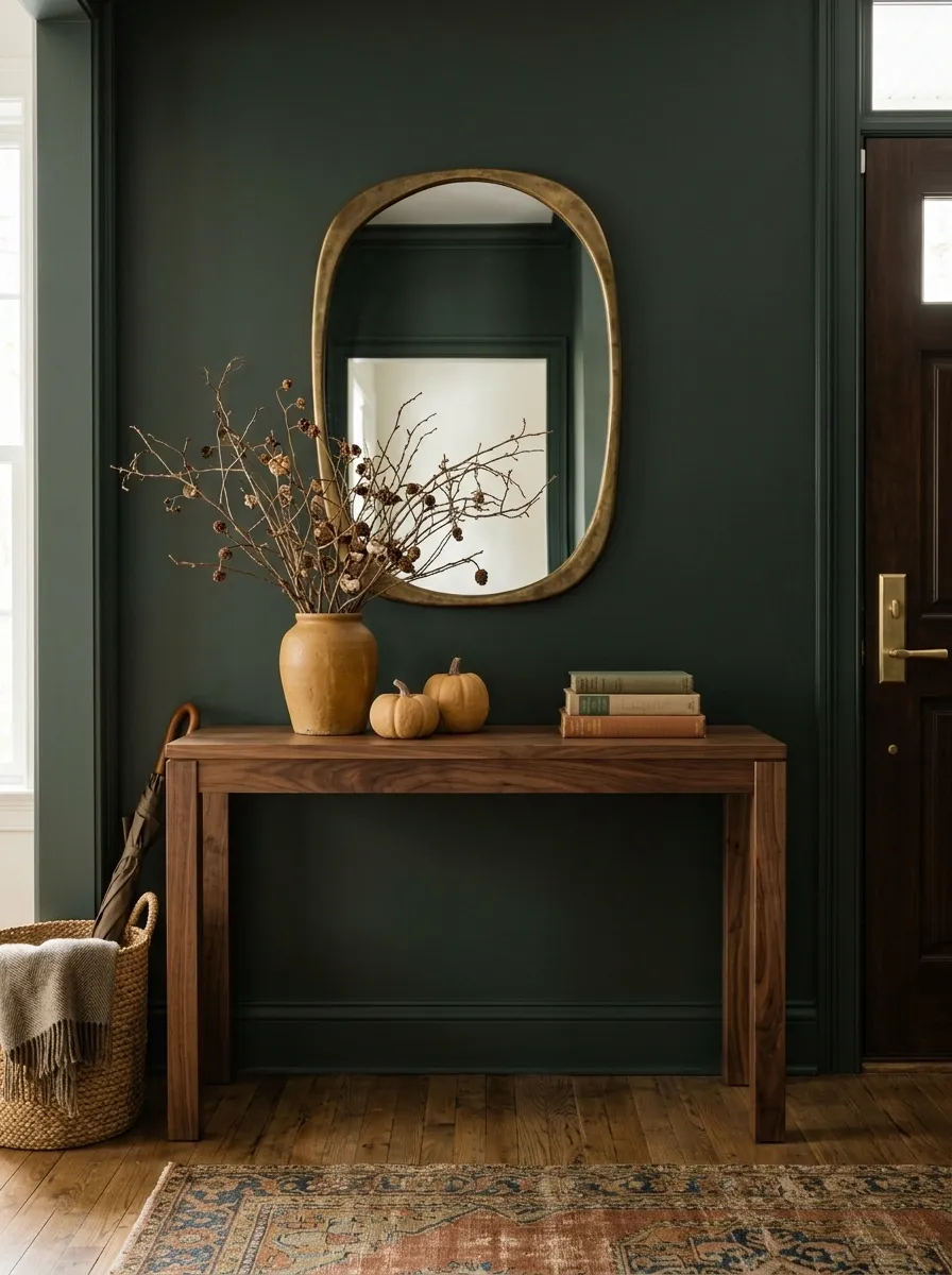
Deep muted green walls create a rich backdrop for a walnut console, aged brass details, ochre ceramics, and dried branches. The result feels distinctly autumnal without using a large amount of traditional seasonal decor.
The walnut console should remain visually substantial but simple. Above it, a rounded or irregular mirror breaks up the darker wall, while the tabletop arrangement stays relatively low apart from one branch-filled vessel. A handful of ochre pumpkins or ceramics connect the warm wood to the cooler green background.
This palette is strongest when the green is allowed to occupy most of the visual field. Adding too many rust and orange objects would flatten the contrast that makes the design memorable.
Airy Coastal Fall Entry With Sand, Cream, and Weathered Texture
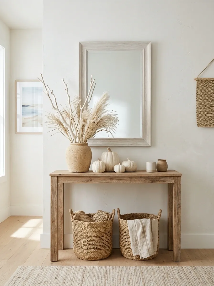
This interpretation keeps the feeling of autumn while borrowing the relaxed palette of a coastal home. A weathered wood console pairs with a pale mirror, sandy ceramics, cream pumpkins, linen, and loose grasses. Nothing is strongly orange, and that is precisely what keeps the arrangement fresh.
The seasonal cue comes from the shapes and textures rather than obvious fall symbols. A rough ceramic vessel, bleached branches, woven fiber, and softly weathered wood give the entry a natural character that works especially well with pale walls and abundant daylight.
Avoid dark contrast here. Deep brown or black accents would shift the composition away from the soft coastal direction.
Dramatic Stone Entry With Oversized Branches and Sculptural Pumpkins
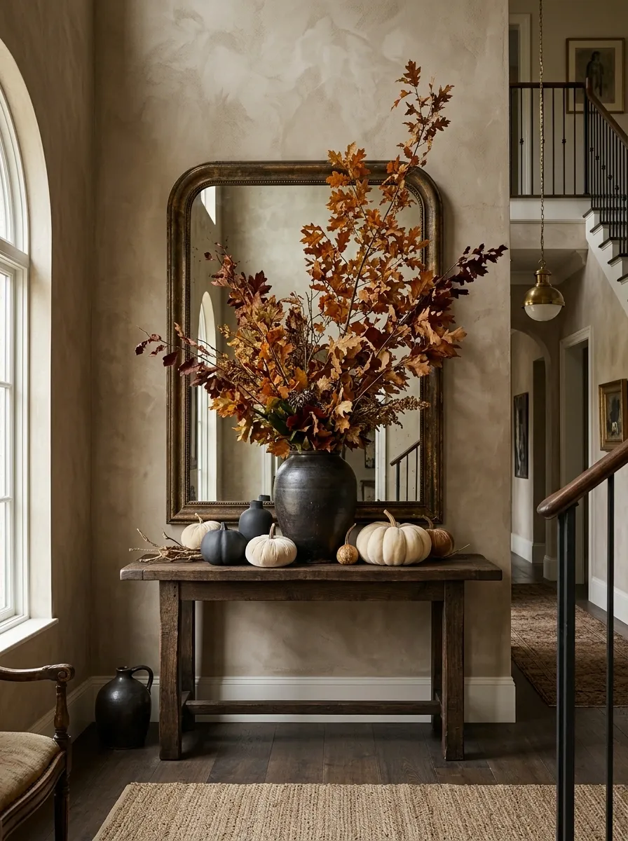
A dramatic stone, plaster, or limewashed wall gives this entry a gallery-like quality. A substantial console sits beneath an oversized mirror while one large vessel sends branches high above the tabletop. Sculptural cream pumpkins and dark ceramic forms are clustered low, creating a strong contrast between the tall organic shape and the heavy base.
This design is about scale. The branches should be noticeably taller than the tabletop objects, and the central backdrop should have enough visual presence to support that height. Small decorative pieces are intentionally limited.
The composition becomes weaker when every object tries to be a focal point. One oversized gesture is enough.
Cozy English Cottage Entry With Florals, Books, and Antique Brass
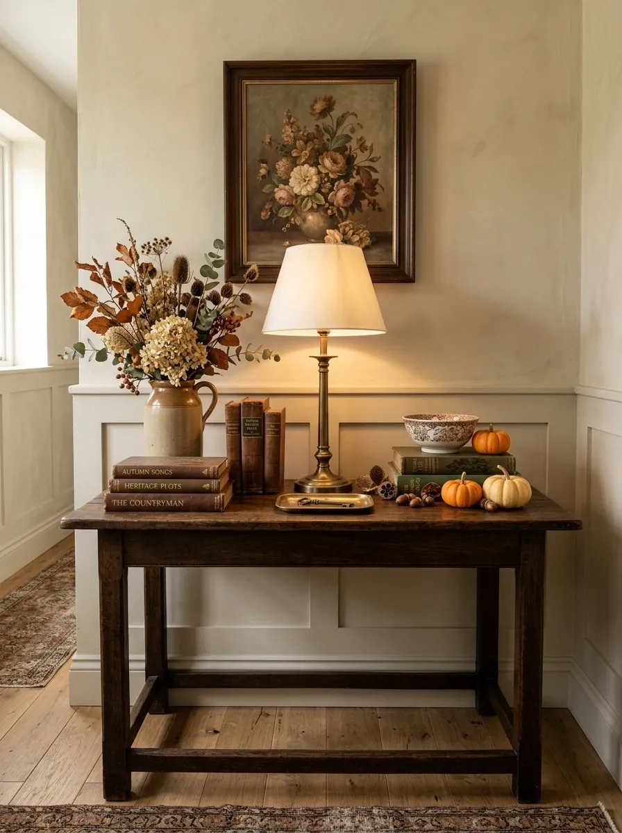
An English cottage-inspired entry feels softer when the autumn details are woven into an existing layer of florals, books, and old-looking materials. A deep wood console supports a brass lamp, stacked books, a patterned ceramic vessel, and loose stems in faded cream, brown, and rust.
Rather than building a holiday display, the arrangement reads as an everyday cottage still life that has shifted slightly for autumn. Floral artwork above the console reinforces that feeling, especially when its colors echo the tabletop without matching it exactly.
Keep the seasonal accents small. A few miniature pumpkins or dried seed heads are enough when the surrounding pieces already provide plenty of visual interest.
Contemporary Entry With Concrete, Oak, and Rust-Colored Ceramics
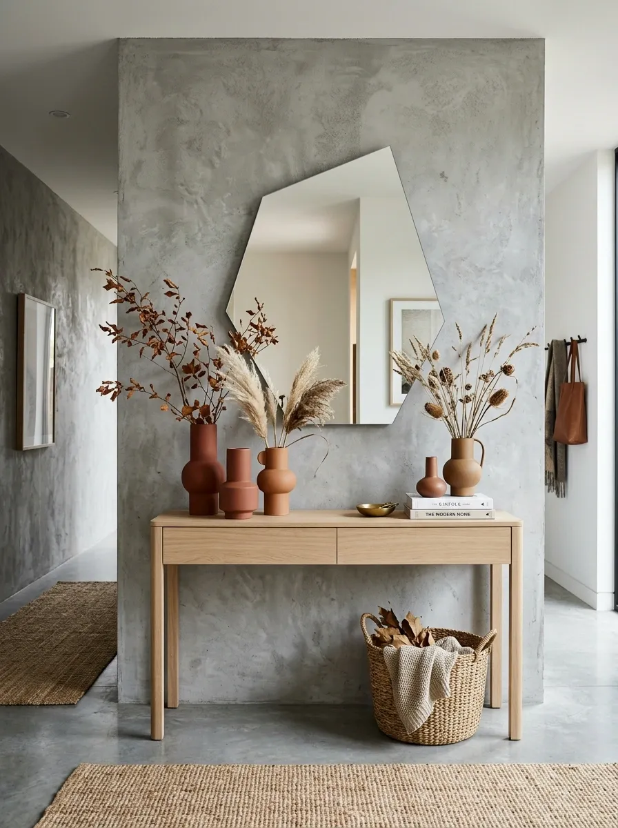
Concrete texture makes autumn color look more deliberate. In this contemporary entry, pale oak furniture softens a concrete or plaster backdrop, while rust-colored ceramics become the main seasonal statement. A large abstract mirror provides a broad shape above the console, and sparse dried branches add just enough organic movement.
The design relies on clean geometry. The console stays uncluttered, the ceramics are sculptural rather than ornate, and the foliage is loose and directional.
Rust works especially well here because it bridges the coolness of concrete and the warmth of oak. Avoid adding several unrelated accent colors. The simplicity is what gives the composition its modern edge.
Maximalist Autumn Entry With Layered Art and Abundant Foliage
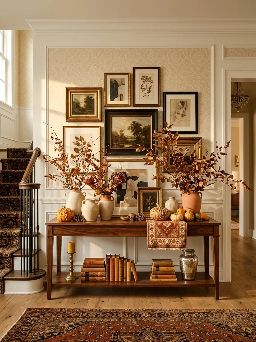
For a maximalist entry, more can work, but only when the colors repeat enough to hold everything together. A long console carries overlapping artwork, several vessels, stacked books, abundant branches, patterned textiles, and small pumpkins. The arrangement has plenty of objects, yet the repeated rust, cream, walnut, and muted orange tones make the display feel intentional.
The artwork should overlap slightly instead of sitting in a perfect row. Vessels can vary in height, and foliage can extend outside the main silhouette to keep the arrangement energetic.
The safest way to avoid visual chaos is to repeat materials and colors rather than shapes. Variety belongs in the objects. Cohesion comes from the palette.
Minimal Fall Entry With One Branch, Three Pumpkins, and Empty Space
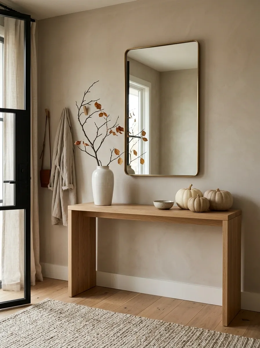
Minimal autumn styling depends as much on what is missing as what is present. A simple console supports one tall sculptural vase with a few branches, three pumpkins in different sizes, and perhaps one low ceramic bowl. Most of the tabletop remains completely open.
That empty space gives every chosen piece more visual weight. The branches become a clear focal point, while the pumpkins form a quiet counterweight below. A large mirror or single piece of artwork completes the wall without introducing another collection of small objects.
The restraint is intentional. Adding more seasonal pieces may make the display look fuller, but it also removes the quiet quality that defines this direction.
Warm Modern Entry With Fluted Console and Burnished Brass
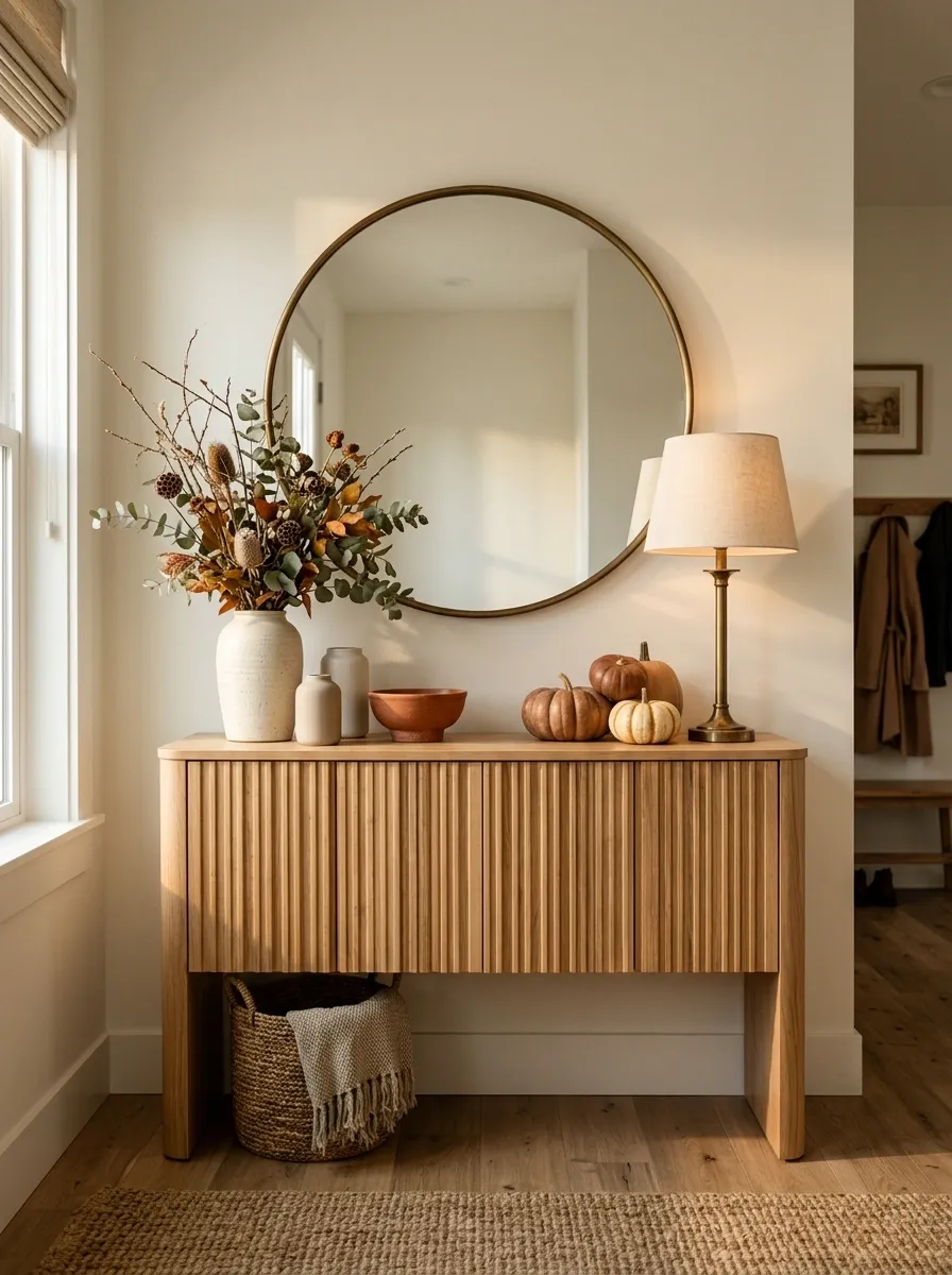
A fluted console brings enough pattern to a modern entry that the rest of the styling can stay restrained. Pair it with a rounded mirror, a burnished brass lamp, creamy ceramics, warm wood tones, and a loose arrangement of dried branches. A few caramel or muted rust pumpkins connect the display to autumn without making the table look themed.
The visual interest comes from contrasting shapes. Repeated vertical fluting gives the furniture rhythm, the rounded mirror softens those lines, and the irregular branches break the geometry naturally.
Keep the brass warm and slightly aged rather than highly reflective. A softer finish fits the relaxed palette and prevents the entry from feeling overly polished.
Fall Entry With a Gallery Wall and Low Layered Styling
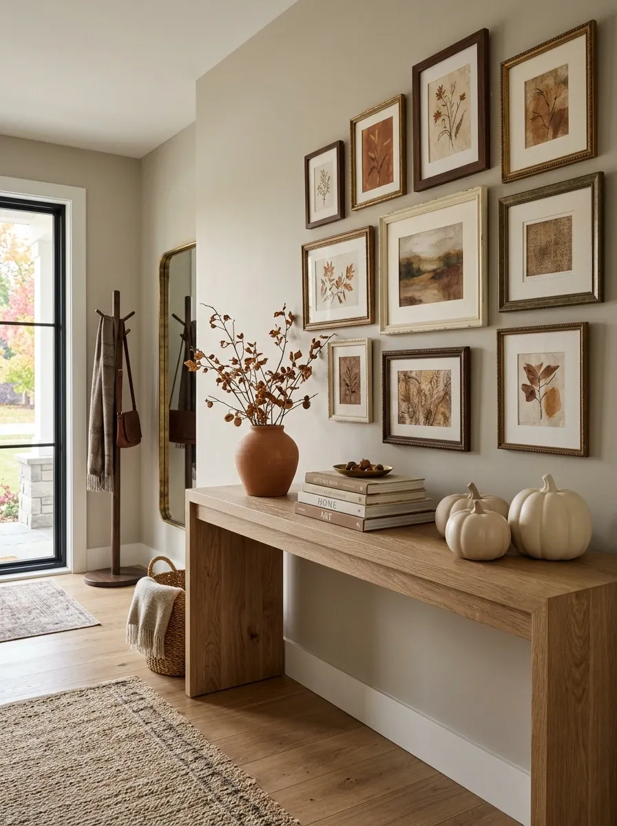
A long console beneath a gallery wall creates a completely different fall entry from the usual single-mirror arrangement. Several autumn-toned artworks overlap slightly above the table, while the styling below stays low with pottery, books, pumpkins, and a few horizontal branches.
The gallery wall provides the height, so the console doesn’t need tall objects competing with it. That leaves more of the tabletop visible and creates a strong horizontal rhythm across the entry.
Choose artwork that shares a small range of colors rather than matching every frame. Muted rust, cream, walnut, and dusty brown can repeat across different pieces and make the wall feel connected to the seasonal styling below.
French Country Entry With Linen, Ceramics, and Soft Rust
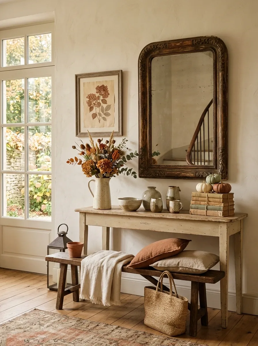
A pale painted console, aged mirror, linen-covered stool, ceramic pitchers, and faded floral branches create a softer French country version of fall decorating. The seasonal palette stays dusty rather than bright, using muted rust, cream, warm beige, and weathered brown.
A tall ceramic pitcher or vessel can anchor one side of the console while a low grouping of books and pumpkins balances the other. A floral or botanical artwork above the table can repeat the rust and green tones without looking like a dedicated seasonal print.
The finish should feel slightly imperfect. Uneven ceramics, aged surfaces, and loosely arranged stems help the room retain the relaxed character associated with French country interiors.
Black-and-Cream Entry With Graphic Fall Styling
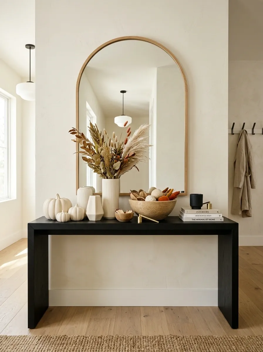
A black console against a warm cream wall creates a crisp foundation for a graphic autumn composition. Ivory pumpkins, dark ceramic vessels, warm wood, and a few rust-colored accents keep the palette simple while giving the entry plenty of contrast.
The design has a more contemporary feel because the objects are treated almost like shapes in a poster. A rounded mirror can soften the geometry, while one vertical branch arrangement prevents the tabletop from becoming too horizontal.
Resist adding several bright colors. The appeal comes from the disciplined contrast between black and cream, with warm wood and dusty rust acting as the bridge.
Layered Family Entry With Practical Storage and Seasonal Decor
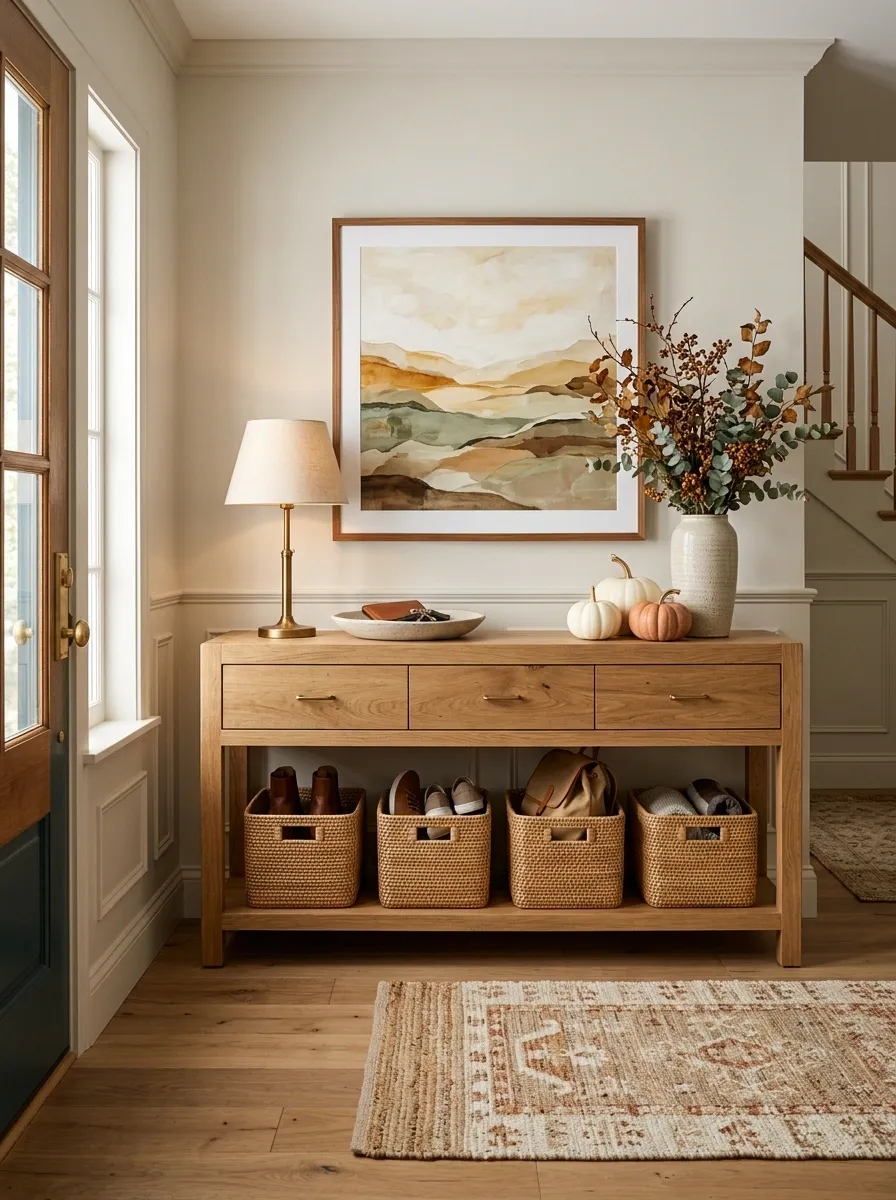
A family entry needs the seasonal display to coexist with bags, shoes, keys, and everyday traffic. This design uses a console with drawers, baskets, or a lower shelf for daily essentials while reserving the upper surface for a contained fall arrangement. Warm wood, framed art, one lamp, branches, and a few pumpkins provide the decorative layer.
The important visual move is separating everyday function from decoration. Storage stays below or inside the furniture, while the seasonal pieces remain at eye level and above.
Keep the tabletop clear around the spots where keys and small daily items naturally land. A pretty entry stops being useful when every inch of the surface becomes untouchable.
Warm Apartment Entry With Narrow Console and Vertical Mirror
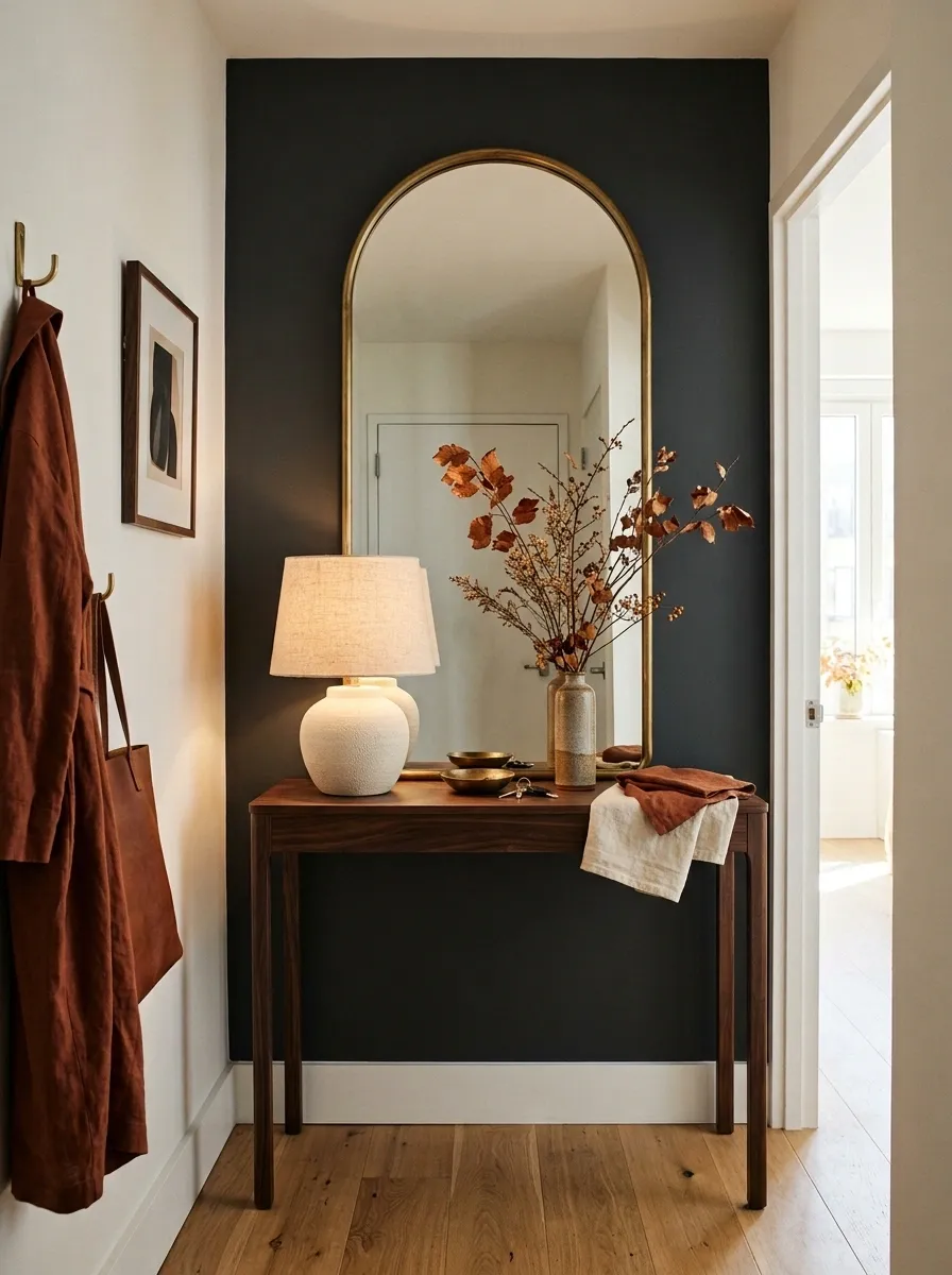
A small apartment entry can still have a strong seasonal identity when the design works upward instead of outward. A narrow console sits beneath a tall mirror, with a compact lamp, one slim branch arrangement, a small bowl, and a few cream and rust accents providing the finish.
The mirror carries most of the visual height, which means the tabletop doesn’t need a large arrangement. A narrow vase and a few low objects are enough to establish the autumn palette.
Keep the walking path open around the furniture. In a narrow entry, depth matters just as much as width, so shallow pieces and vertically oriented accessories will usually create a cleaner result than bulky decorative objects.
Sophisticated Fall Entry With Burgundy, Walnut, and Antique Gold
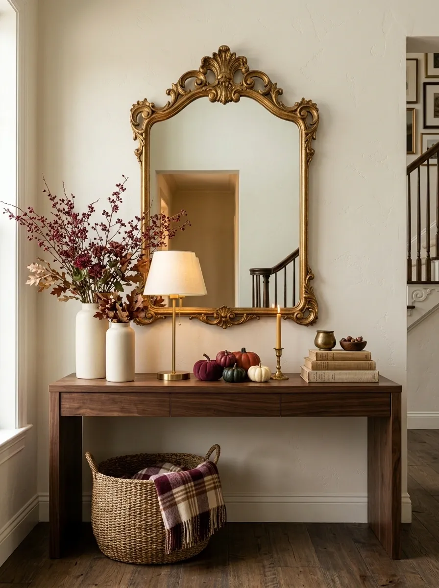
Burgundy gives an autumn entry a deeper, more sophisticated direction. A walnut console, antique gold frame, burgundy branches or flowers, cream ceramics, and a few dark pumpkins create a palette that feels richer than the standard orange-and-brown combination.
A large mirror or artwork keeps the burgundy from becoming too heavy, while cream objects provide visual relief across the darker furniture. Antique gold appears in small amounts, usually through a frame, lamp, or decorative vessel.
Keep the burgundy concentrated. Repeating the shade in several small areas is more effective than covering the entire console in one strong color.
Vintage European Entry With Distressed Console, Candles, and Dried Leaves
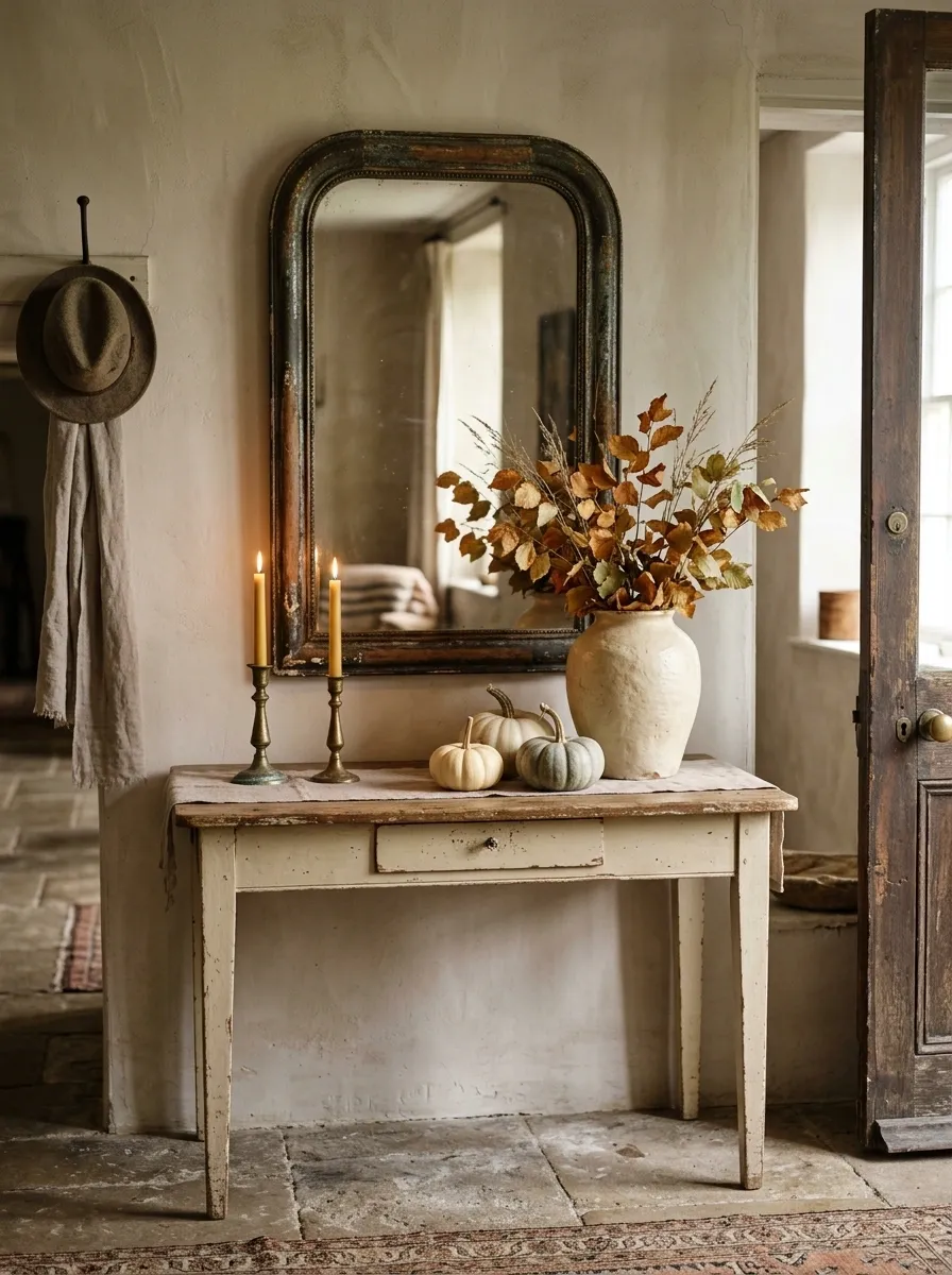
A distressed painted console can give an autumn entry a quieter old-world character when paired with a weathered mirror, tapered candleholders, ceramic vessels, dried leaves, and a few pale pumpkins. The furniture becomes part of the decorative story instead of acting as a neutral surface.
Use faded finishes rather than crisp new ones. Soft cream paint, worn wood, aged metal, and parchment-colored ceramics allow the fall accents to blend naturally into the composition.
A low arrangement of candles and pottery works especially well beneath a larger mirror because the reflective surface keeps the tabletop from feeling too heavy.
Layered Textile Entry With Warm Wood Console and Fall Bench
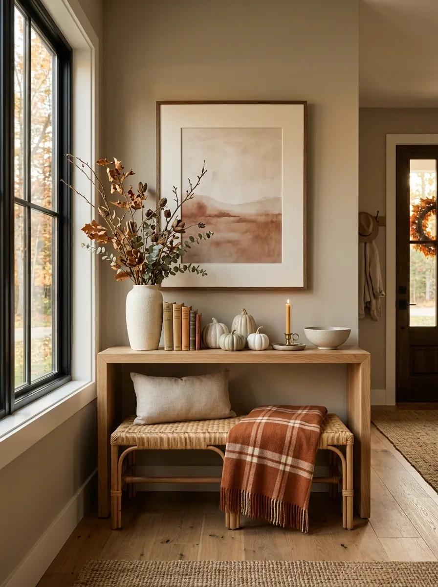
A bench beneath the entry table can make the whole fall arrangement feel more connected to the room. This version pairs a warm wood console with a low upholstered or woven bench, a soft plaid or rust-colored throw, and a tabletop arrangement of branches, ceramic vessels, books, and cream pumpkins. The wall above can stay simple with one large framed piece.
The bench adds a horizontal layer below the console, while the taller branches create movement above it. That three-level composition gives the entry a finished feeling without requiring a large number of tabletop objects.
Choose one textile pattern and let the rest of the fabrics remain quiet. Too many patterns would compete with the seasonal arrangement.
Warm Amber Entry With Sunlit Glass and Honey-Toned Wood
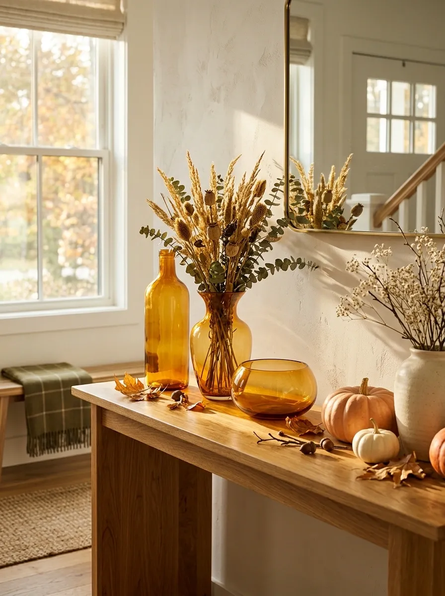
Some autumn displays are strongest in daylight, especially when the entry receives afternoon sun. A honey-toned wood console, large amber glass vessels, creamy ceramics, dried golden foliage, and softly orange pumpkins create a warm, glowing composition without relying on heavy decoration.
The glass is the key visual feature. Sunlight passing through amber tones gives the display variation throughout the day, while the pale ceramics keep the arrangement from becoming visually dense.
Use different glass heights instead of several matching vessels. A tall bottle, low bowl, and medium vase create a more natural still-life silhouette and let the light move through the display.
Organic Rustic Entry With Olive Branches, Stoneware, and Olive Green
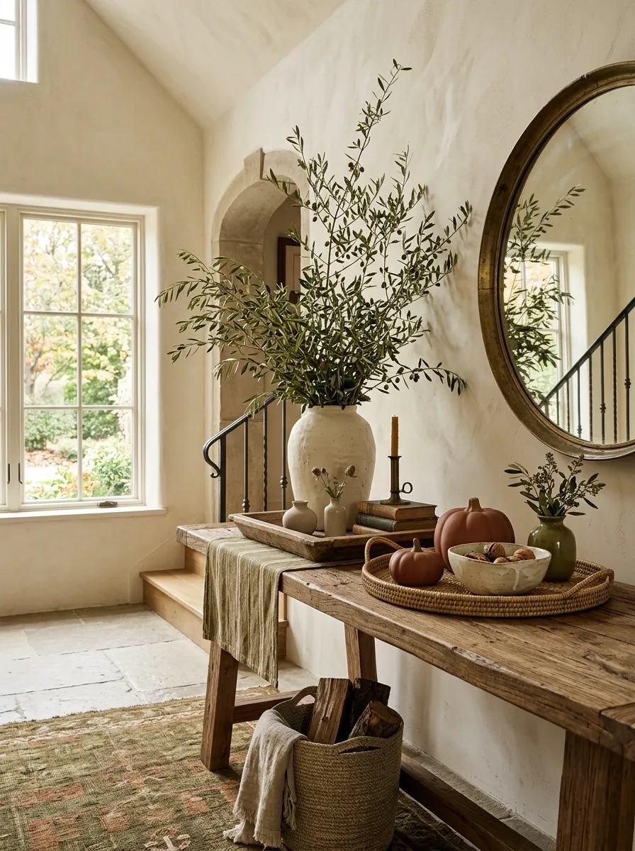
For a softer rustic look, swap the usual bright autumn palette for olive green, warm cream, stoneware, and muted rust. A rough ceramic vessel filled with branching foliage becomes the tallest element above a thick wood console, while low stoneware bowls, small pumpkins, and a woven tray fill the foreground.
The olive branches create a useful bridge between the architecture and the seasonal objects. They keep the display from reading as a dedicated fall vignette and instead make it feel like a natural extension of the room.
Choose stoneware with visible variation in shape or finish. Perfectly matched ceramics would make the composition feel more formal than rustic.
Sophisticated Fall Entry With Burgundy, Walnut, and Antique Gold
Burgundy gives an autumn entry a deeper, more sophisticated direction. A walnut console, antique gold frame, burgundy branches or flowers, cream ceramics, and a few dark pumpkins create a palette that feels richer than the standard orange-and-brown combination.
A large mirror or artwork keeps the burgundy from becoming too heavy, while cream objects provide visual relief across the darker furniture. Antique gold appears in small amounts, usually through a frame, lamp, or decorative vessel.
Keep the burgundy concentrated. Repeating the shade in several small areas is more effective than covering the entire console in one strong color.
Compact Hallway Entry With Floating Shelf Styling
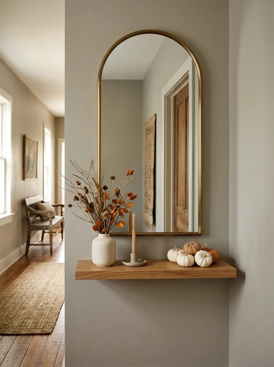
A full console isn’t always possible in a narrow hallway. This design replaces it with a slim floating shelf beneath a vertical mirror, creating a compact fall composition that stays close to the wall. A small ceramic vase, one candle-like decorative object, a tiny pumpkin cluster, and a narrow branch arrangement are enough to establish the season.
The shelf should remain visually light. The mirror carries the height, while the shelf provides just enough horizontal space for a few carefully chosen objects.
This approach works best when the surrounding wall is relatively quiet. Busy wallpaper or many nearby frames could compete with the small-scale arrangement.
Fall Entry With a Gallery Wall and Low Layered Styling
A gallery wall changes the balance of a fall entry because the vertical interest is already established above the console. Instead of filling the tabletop with tall decorations, the lower arrangement can stay deliberately low. Several autumn-toned artworks overlap above a long console, while pottery, books, cream pumpkins, and small branches create a horizontal layer underneath.
The frames don’t need to match. Repeating a few colors, such as walnut, cream, faded rust, and warm brown, is enough to connect pieces that have different shapes or subjects.
This approach works particularly well on long walls. The artwork gives the entry width, while the restrained tabletop prevents the entire wall from feeling overloaded.
French Country Entry With Linen, Ceramics, and Soft Rust
A pale painted console, aged mirror, linen-covered bench, and irregular ceramic vessels give this entry a softer autumn character. The seasonal palette stays faded, using warm cream, linen, dusty rust, and weathered wood instead of strong orange.
Place a tall ceramic pitcher or vessel on one side of the console and balance it with a low grouping of books and pumpkins on the other. A floral or botanical artwork above the table can repeat the rust and green tones without looking like a dedicated seasonal print.
The finish should feel slightly imperfect. Uneven ceramics, aged surfaces, and loosely arranged stems help the room retain the relaxed character associated with French country interiors.
Black-and-Cream Entry With Graphic Fall Styling
Black and cream give autumn decor a sharper, more graphic direction. A black console anchors the room, while a large cream mirror or framed artwork opens the wall above it. Ivory pumpkins, dark ceramic vessels, warm wood, and a few muted rust accents complete the arrangement.
The contrast is what makes the display memorable. Cream objects stand out clearly against the dark furniture, while the warm wood and rust notes prevent the palette from becoming stark.
Keep the seasonal objects sculptural and simple. This isn’t the place for a collection of tiny signs, labels, and decorative sayings. Strong shapes have much more impact against the restrained palette.
Layered Family Entry With Practical Storage and Seasonal Decor
A family entry needs to look finished without sacrificing the surface people use every day. This arrangement solves that problem with a substantial wood console that provides drawers, baskets, or lower storage while the upper surface carries the seasonal styling. A framed artwork or mirror sits above the furniture, with a lamp, branches, and a few pumpkins forming the decorative layer.
The separation between storage and styling is what keeps the room functional. Everyday bags, shoes, and small items stay contained below while the seasonal pieces remain visually prominent above.
Leave a clear landing area for keys and other daily necessities. A display that blocks the only practical drop zone will quickly become frustrating.
Warm Apartment Entry With Narrow Console and Vertical Mirror
A narrow apartment entry benefits from a composition that stretches upward rather than outward. A slim console leaves circulation open, while a tall mirror increases the visual height of the area. A compact lamp, one narrow vase of branches, a small bowl, and a few cream and rust accents finish the tabletop without consuming its depth.
The proportions matter more than the amount of decoration. Keeping the arrangement vertically oriented makes the small entry feel intentional instead of crowded.
A shallow console is also easier to live with in a tight passage. Keep large baskets, oversized vessels, and wide decorative objects away from the walking route.
Choosing the Right Fall Direction for the Entry
A convincing seasonal entry isn’t built by collecting the most fall-colored objects. It comes from deciding what the entire composition should feel like before the smaller pieces are chosen.
A dark console and deep wall can handle stronger contrast and aged metals. A pale space usually benefits from softer autumn tones, natural materials, and more open tabletop space. A narrow hallway needs vertical emphasis, while a long console can support artwork spread across the wall. Family entries need the display to coexist with storage and daily traffic.
The best reference is the one that solves the actual character of the room. Start with the furniture and architecture, then choose the seasonal palette, the main vertical element, and the lower layer. Once those relationships are clear, the individual decor pieces become much easier to select.
Make the Furniture Part of the Seasonal Story
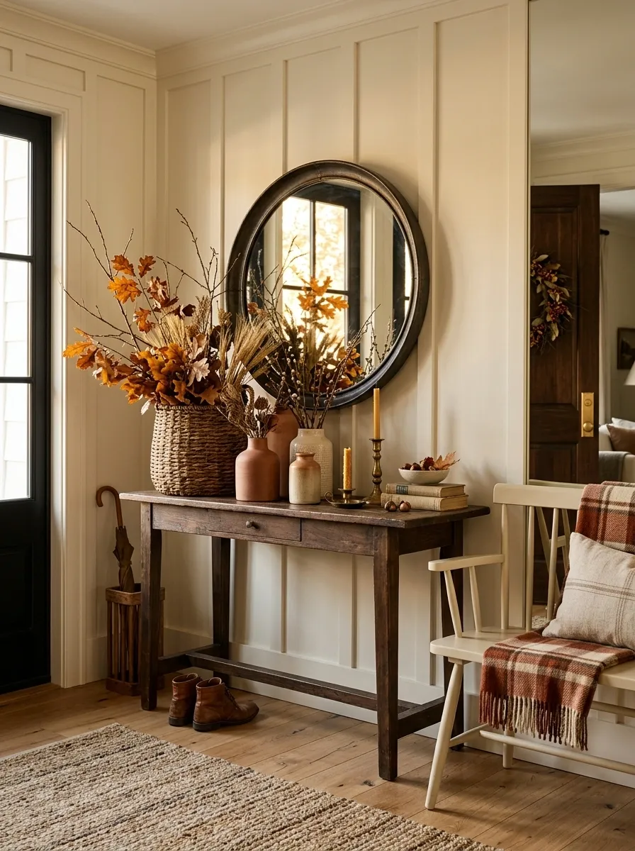
A weathered console, dark walnut table, pale painted cabinet, or sculptural modern piece can completely change how autumn accents read. Treat the furniture as part of the composition instead of a blank platform.
Let the Wall Carry Some of the Weight
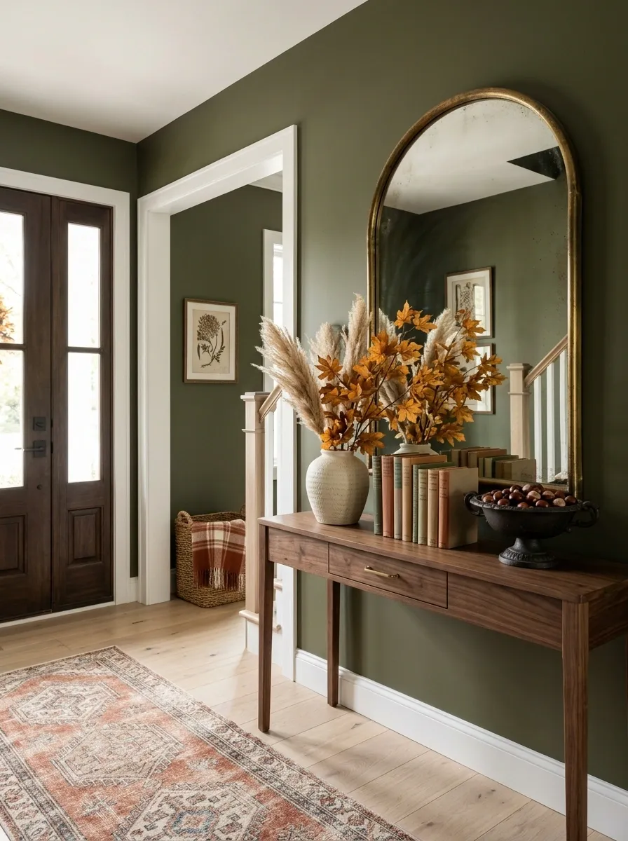
A mirror, gallery wall, oversized artwork, or richly colored wall can provide height and visual interest before the tabletop is styled. This often produces a more sophisticated result than simply adding taller decor.
Protect the Entry’s Working Space
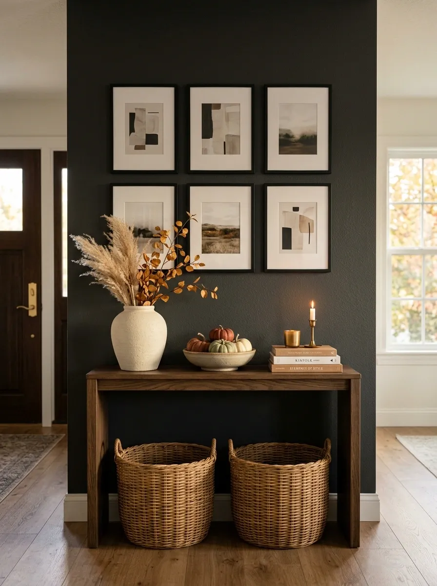
The best-looking arrangement still has to function. Keep the walking route open, leave useful landing areas clear, and avoid pushing bulky objects toward the edge of a narrow console. Seasonal styling should make the entry feel finished, not harder to use.