

Pull up the average living room on any given Tuesday and you’ll find the same crime scene repeated in homes across the country: a sofa that was chosen because the delivery timeline was acceptable, a coffee table that has no relationship with anything else in the room, walls decorated with whatever came in a three-piece set from the same retailer, and a rug that’s approximately fourteen inches too small for the space it’s pretending to anchor. Nobody made these choices because they were bad at design. They made them because they were moving fast, buying in a panic, and treating the living room like a logistics problem rather than the room they’ll spend more waking hours in than any other.
The budget is almost never the actual obstacle. Living rooms that look genuinely put-together — the kind that make guests settle in and stop looking at their phones — aren’t usually expensive. They’re just deliberate. They have a sofa that was chosen for color and proportion rather than price point alone, a rug that’s the right size, a light source that creates atmosphere instead of just illuminating the ceiling, and at least one element that signals a human being with actual taste made decisions here. That’s not a money requirement. It’s a slowdown requirement, and slowing down is free.
The living rooms on this list range from moody and maximal to calm and neutral, and every single one of them proves that the gap between a living room that looks put-together and one that looks like it just happened to you has nothing to do with what you spent.
The Mistakes That Keep Budget Living Rooms Looking Budget
There are recurring errors that show up in living rooms across every price point, and understanding them is more useful than any shopping list.
The rug is too small and it’s ruining everything — An undersized rug makes a seating arrangement look like furniture placed on a postage stamp. The standard rule — all front legs on the rug at minimum, all four legs on the rug ideally — exists because it’s the difference between a seating zone that looks designed and one that looks accidental. A larger cheap rug outperforms a smaller expensive one every single time.
There’s no layering and the room looks flat because of it — Rooms that look finished have layers: a base layer of larger furniture, a middle layer of smaller accent pieces, and a top layer of objects, plants, and textiles that create visual depth. Rooms that look unfinished have the first layer and nothing else — just furniture sitting in a room, waiting for someone to do something about it.
The lighting is doing the bare minimum — An overhead light and nothing else is not a lighting plan, it’s a surrender. Floor lamps, table lamps, wall sconces, and candles cost very little relative to what they do for a room’s atmosphere, and a living room without layered lighting looks the same at 8pm as it does at 2pm, which is not how rooms that feel good to be in work.
What Budget Living Rooms Get Right When They’re Getting It Right
The rooms that punch above their budget weight class are following principles that have nothing to do with price tags.
One genuinely interesting thing beats ten safe things — A room with a mustard yellow tufted sofa and basic everything else is more interesting than a room with ten perfectly coordinated mediocre pieces. The willingness to make one bold decision and let it be the room’s personality is the move that separates living rooms with character from living rooms that simply contain furniture.
Plants do the work of three decorative objects simultaneously — Scale, color, texture, and life — a large tree plant in a basket, a collection of trailing pothos on floating shelves, or a single monstera in a corner handles all of those at once, costs less than most decorative objects, and makes a room feel genuinely inhabited rather than staged. Rooms with good plants look like someone actually lives in them, which is the whole point.
The wall above the sofa is not optional — The expanse of wall above a sofa is the living room’s primary display surface, and leaving it empty reads as unfinished rather than minimal. A gallery wall of inexpensive prints, a triptych of botanical art, or a single large painting creates the visual anchor that makes the seating arrangement feel grounded — without it, the sofa floats and the room never quite resolves.
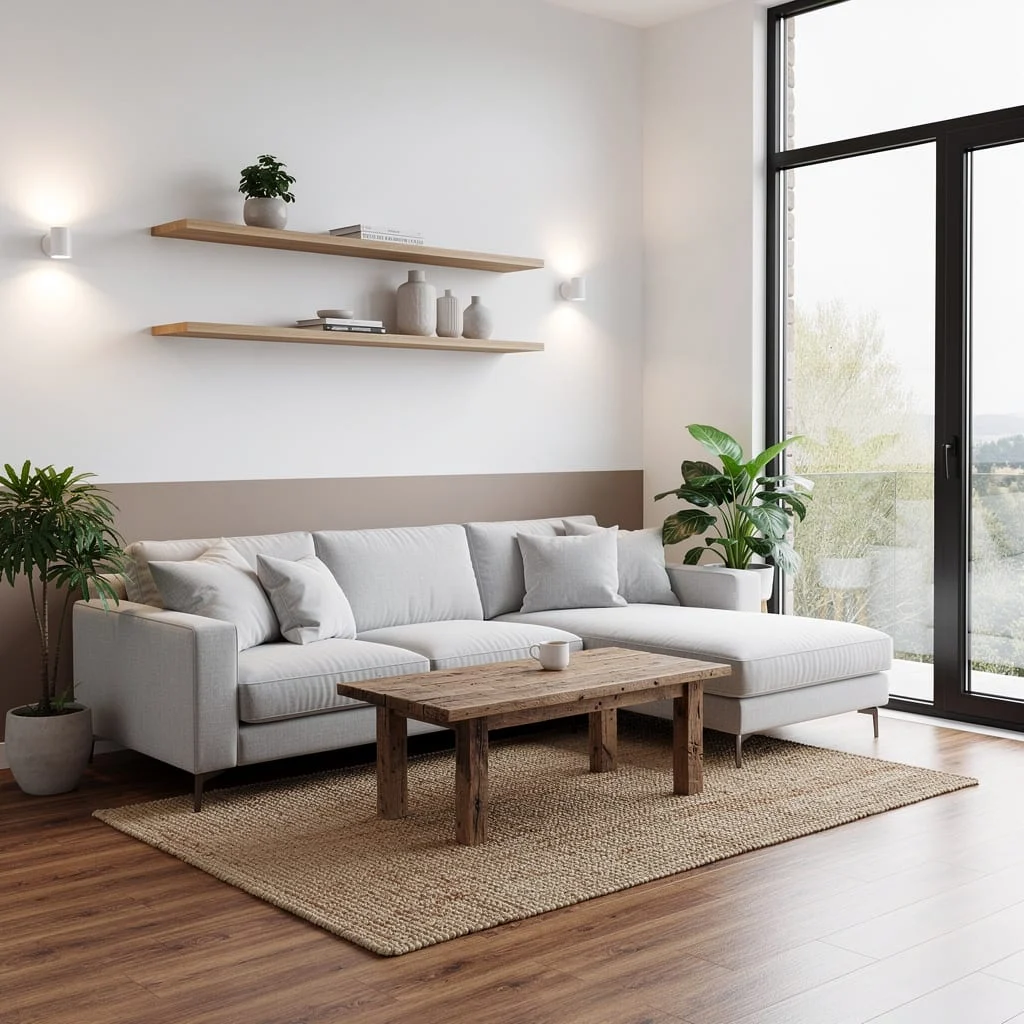
Living Room Decor Ideas on a Budget That Don’t Look It
The Cream and Leather Pouf Collector’s Room:
My final living room design – selling as is so no more updates after a lot of advice from this sub!
by u/impamiizgraa in interiordecorating
A cream-walled living room anchored by a Moroccan-style white shaggy rug, a cream roll-arm sofa, a tufted leather pouf as secondary seating, and a dark carved wood sideboard looks expensive because it looks inherited — and assembled-over-time always reads as more valuable than bought-all-at-once, regardless of what either actually cost. The gallery wall of identically framed botanical and landscape prints arranged asymmetrically on both sides of the large window is the element that transforms this from a nicely furnished room into a room with genuine visual character, and the framing consistency — all the same slim dark frame — is what stops a mixed print collection from looking chaotic rather than curated. The leather Moroccan pouf is the specific personality piece that makes the whole room feel like a decision was made here rather than just furniture placed: it introduces a different seating height, a different material, and a different cultural reference than anything else in the room, which is exactly the kind of mix that makes a space feel collected. The balcony visible through the large window essentially becomes the room’s best piece of art, which is the kind of free design asset that deserves framing properly — and wide white curtains that don’t obstruct the view are doing exactly that.
The Grey Sectional Maximalist Comfort Room:
Committing fully to the grey-white-soft-texture combination — a large U-shaped grey sectional, layered white and grey throw pillows, a fluffy faux fur throw draped casually across the chaise, a grey patterned area rug, and two round wire-frame nesting tables — is a setup that succeeds because it commits completely rather than hedging with color. Every material in this room is soft, matte, or woven, which creates the kind of tactile consistency that makes people immediately want to sit down and not get up, and that physical experience is the living room’s actual job. The two oversized industrial lanterns mounted as wall sconces flanking the quote print are the detail that most people attempting this look would skip — they introduce a material contrast (metallic, structural) that stops the room from reading as entirely cloud-like and formless, which is the functional edit that keeps all that softness from collapsing into a visual fog. The wire-frame nesting tables are the furniture equivalent of a side note that earns its place: their open, geometric structure introduces negative space at coffee table level that keeps the seating arrangement’s considerable physical mass from feeling too heavy.
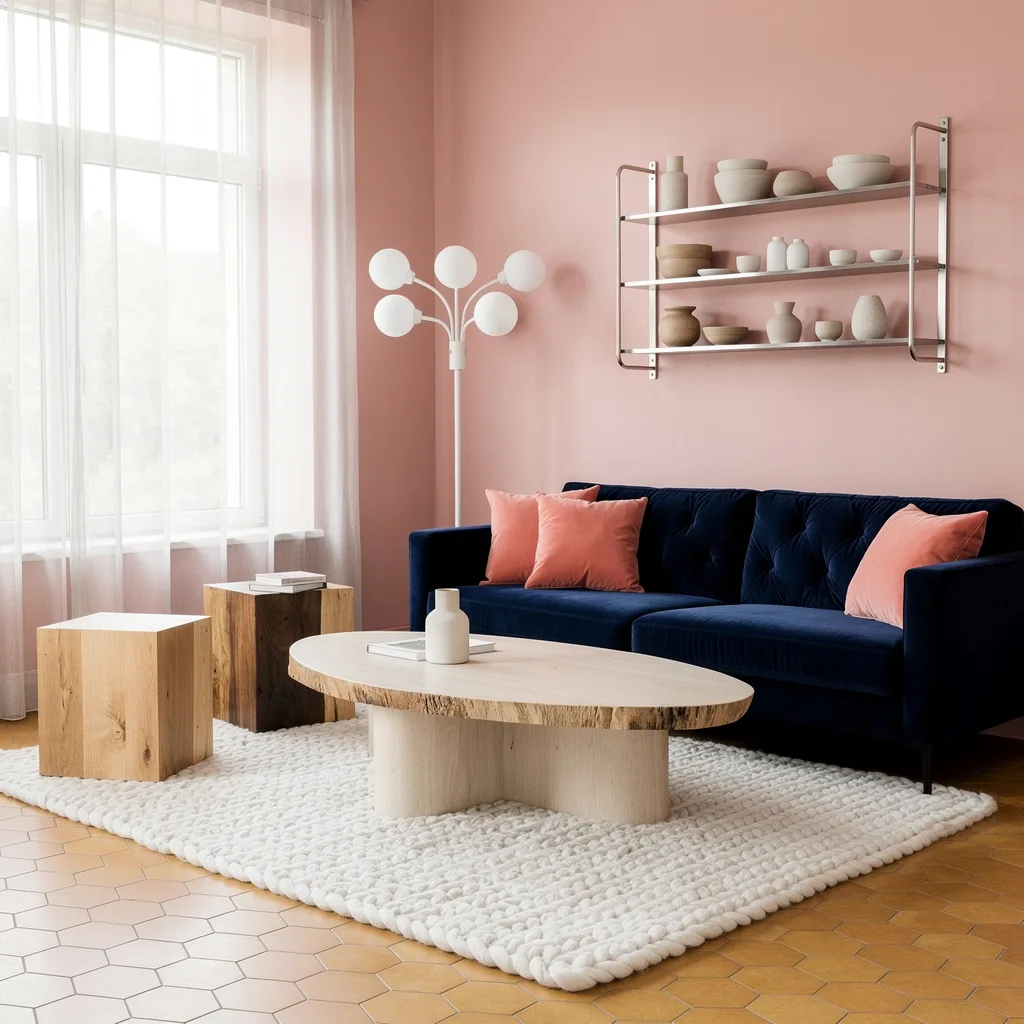
The Mustard Sofa and Navy Wall Room:
Placing a deep-buttoned mustard yellow velvet tufted sofa against near-black navy walls, hanging an oversized vintage-style botanical oil painting above a dark fireplace, layering teal, coral, and botanical print cushions on the sofa, and finishing with a Persian rug in terracotta and blue is a series of decisions that collectively dare the room to be forgettable — and it cannot be, which is the entire point. The painting is the critical element that makes the whole composition work: scaled large enough to fill the fireplace wall with genuine visual authority, its warm ochre background pulls the mustard sofa tone upward and creates a color echo between the two most dominant elements in the room that makes the pairing feel deliberately orchestrated rather than accidentally brave. The dark walls are worth unpacking because this is the choice that intimidates most budget decorators out of attempting it — dark walls make every warm color in front of them glow, which is why the mustard sofa looks richer in this room than it would against white or grey, and why the coral and teal cushions read at full saturation rather than washing out. The stacked books on the floor beside the sofa is the detail that makes the room feel genuinely lived in rather than staged, and genuinely lived in is the finish line that all the expensive staging in the world is trying to reach.
The Oak Floating Shelf Plant Gallery:
Three oak floating shelves arranged at varying heights on a neutral wall, styled with a mix of trailing pothos, small cacti, a framed botanical print and a smaller abstract print, stacked books in warm tones, and a teal ceramic pot, is a shelf arrangement that looks considerably more expensive and designed than its component parts individually justify — and the reason is composition. The prints are hung between and around the shelves rather than exclusively on them, which treats the entire wall section as a single display surface rather than a shelf with some art nearby, and that integration is what makes it read as a gallery installation rather than a wall with furniture attached to it. The trailing vines spilling off the top shelf are doing structural work in the composition: they soften the hard horizontal lines of the shelves and create organic movement that draws the eye downward through the arrangement rather than stopping at each shelf level. The colour palette of the books — oranges, blues, earthy browns — was clearly edited before display, and that editing is the skill that most people either don’t think to apply or don’t have the patience to execute: pulling books from their actual shelves and rearranging them by spine color is free, takes twenty minutes, and makes a shelf look like a styled prop rather than actual books someone owns.
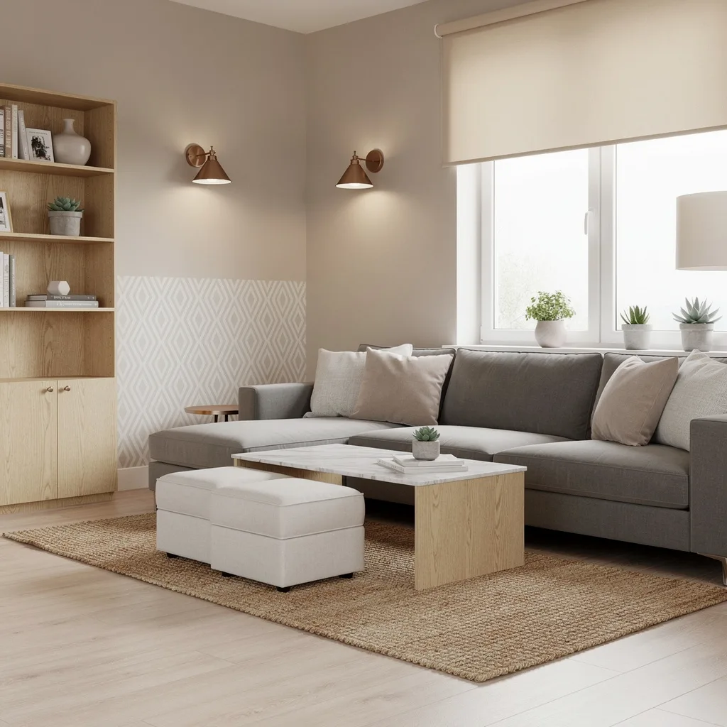
The Warm Neutral Sectional and Botanical Triptych Room:
Beige as a living room palette choice gets a bad reputation primarily because most beige rooms are beige by default rather than beige by decision, and the difference is visible from across the room. This setup is beige by decision — every element is warm, textural, and layered with enough variation in tone and material that the palette reads as considered rather than cautious. The cream linen sectional is the right scale for the room and the right shade of warm white that picks up the honey tones in the oak coffee table and the woven sisal rug, creating the kind of tonal consistency that feels expensive even when none of the individual pieces are. The botanical triptych above the sofa — three prints in matching warm oak frames showing botanical illustrations in muted brown and grey-green — is the wall moment that resolves the room and gives the sofa something to sit beneath with genuine purpose. The rust terracotta throw draped over the corner of the sofa is the color decision that stops the room from disappearing entirely into its own neutrality — one saturated warm note dropped casually into an otherwise quiet palette is the technique that makes neutral rooms feel warm rather than timid. The large tree plant in a woven basket and the wicker basket ottoman on the floor introduce two organic materials at floor level that ground the entire composition without requiring anything precious or expensive.
Go Crisp With White Walls and Mix Up Your Textures
Chase that high-end, magazine-ready look by keeping your walls bright white—instant space amplifier and cheap mood booster. Toss a tough, light grey linen sofa into the mix so your pets and friends can’t destroy it in one Netflix binge session. Drop in a reclaimed wood coffee table to show you know what “character” means. Let in all that precious daylight by going for those drama-filled matte black window frames. Don’t waste your money on stuffy built-ins—install floating oak shelves and keep them almost empty so you don’t look like a hoarder. Finish with a jute rug (because bare laminate is not a flex), and plug in a pair of wall sconces to look extra sophisticated. Pro tip: Leave at least two shelves with negative space. Space equals luxury, and your sanity.
Thrift Like a Boss: Repurpose With Sage Walls and Gold Touches

If you’re not buying at least half your stuff secondhand, what are you even doing? Paint your walls a chill pale sage for that ‘I’m creative but rent’s due tomorrow’ energy. Snap up a thrifted emerald velvet sofa for the main seat—bonus points for MCM legs. Repurpose a random steamer trunk as storage—grandma chic is IN. Go cheap on a paper lantern pendant and pretend it’s from Paris. Use geometric rugs and gold-rimmed glass tables for the wow factor. Pro tip: Color block your throw blankets and gallery wall so it feels curated, not chaotic.
Layer Up Textures for ‘Faux Luxe’ Results

Want your guests to think you blew your tax refund on your living room? Go nuts with layered textures. Pick soft taupe walls and a plush chenille sectional. Go stackable with that wood coffee table (so you can eat off one and style the other). Matte herringbone vinyl gives you rich vibes with zero cash drop. Sheer sandy curtains keep it airy. Top it all off with cove LED lighting—yes, even your ceilings deserve a glow up. Pro tip: Always use at least three contrasting textures on the sofa. It makes IKEA look custom.
Do Good, Look Good: All Sustainable, All Class
Ready to flex your eco-warrior badge? Plaster your walls in smooth white, then snag modular sofas with washable cotton covers. If your furniture looks like kids’ Lego but feels luxe, you win. Plop in a birch plywood coffee table and bamboo stools you can stack or scatter. Cork flooring is fashion AND function. Limit your décor to a few vintage glass vases for maximum snob points. Pro tip: Refuse clutter. Leave at least 50% of your shelves empty and your friends will assume you have a trust fund.
Live Large in a Tiny Space (With Big Color Plays)

Tiny place? Don’t whine—shine. Stone-grey walls keep everything feeling intentional, while a yellow velvet loveseat screams, ‘I’m the main character!’ Use nesting tables so you can play furniture Tetris during board game nights. Fake built-in storage with vertical bookshelves and baskets—toss anything ugly in there. Throw down a geometric rug that matches literally nothing else in the building. Under-sofa LED strips? They’ll make dust bunnies look curated. Pro tip: Buy roller blinds and curtains in white and layer them. Your window = instant light show.
Bold, Budget, and a Little Moody: Go Charcoal and Corduroy

Ready for your villain origin story? Paint it charcoal and swap out your basic beige for a dark green corduroy couch—yes, corduroy is back and it slaps. Get a minimalist black steel coffee table and clusters of black stools to sneak in more seats for your freeloading friends. Lay down terrazzo for unexpected texture and drama. Float those oak ledges staggered, minimalist, and unapologetic. Pro tip: Break up all-dark drama with a huge white drum shade lamp—otherwise, you’ll spend all winter bumping into furniture.
Turn Up the Cozy With Repurposed and Layered Staples
Think cozy isn’t affordable? Wrong. Vanilla walls say, ‘I’m gentle yet secretly unhinged.’ Nab a tufted sofa and coffee table made from painted wood pallets, then call everyone who mocked your DIY phase. Install white shutters on a bay window—extra sunlight without the prying eyes. Layer neutral throws because ‘soft’ never goes out of style. Use glass shelves with ceramics and lantern pendant lights for a little old-world charm. Pro tip: A huge round ottoman can footrest, coffee table, or seat—triple threat.
Color-Blocking Magic: How to Steal the Show Without Bleeding Cash

If you’re being basic, stop. Splash pale blue and white across your walls, then slap a burnt orange sofa in front. Pick a coffee table that’s round and painted—because straight lines are for boomers. Cloud-shaped ceiling light? Absolutely. Stack your wall shelves in wild colors but keep it tidy—nobody wants rainbow chaos. Invest in a geometric rug that clashes on purpose. Pro tip: Mount art in odd numbers above the sofa, low and tight. Makes everything look more expensive than your lease.
Classic Minimal Does Not Mean Boring
Craving the ‘I read Kinfolk once’ vibe? Keep everything white but avoid the scary hospital look by introducing a slim grey cotton sofa and a black coffee table—chill, not clinical. Slim birch laminate floors boost Scandinavian cool. A floating media shelf is your best friend; wires just scream ‘I gave up.’ A single oversized plant keeps your mother-in-law quiet. Pro tip: Ditch clutter for function by mounting wall hooks for your bag/jacket where everyone can see them—as very intentional ‘art’.
Texture Clash: Soft Blush and Bougie Blues
Crush that dusty-pink plus navy velvet combo. Blush walls keep it playful, the navy-blue sofa brings drama—hello, depth! Go with raw-edge pale wood for the coffee table, then amp the contrast with chrome window frames and chunky white knit rugs. Stack your décor on tiered silver shelves, but keep your palette simple. Bring in a multi-arm floor lamp (white, always) for max light bounce. Pro tip: Mix woods when adding accent seating. All matching? All boring.
Slay Neutrals by Layering and Faking Designer Storage
No one said neutrals have to mean snoozefest. Paint your walls misty, pick a sectional in stone-grey microfiber (because, life) and drop in a marble-effect laminate table for that ‘I’m sophisticated’ hustle. Use bronze sconces—they’re like jewelry for your walls. Throw down a jute rug and hide your junk in nested ottomans. Break up the box with a geometric accent wall. Pro tip: Cluster succulents together on open plywood shelves. Looks intentional, costs pennies.
Curate, Upcycle, Brag: The High-Low Game Plan
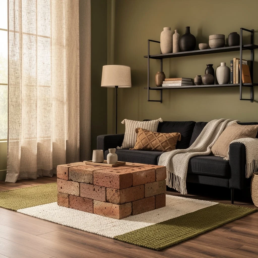
If you actually want people to compliment your room, start with soft olive walls and a charcoal recycled-fabric sofa. Stack bricks (err, terracotta tiles) for a one-of-a-kind coffee table—everyone will assume you went to art school. Go wild with layered budget finds on floating black shelves, but edit ruthlessly. Use earthy, two-toned rugs to fake designer pedigree. Flood the place in natural light with simple linen panels. Pro tip: Combine textured blankets in similar shades—mix too many colors, and it reads as thrift store explosion.
Final Thoughts
Budget living rooms look budget when the money was distributed in the wrong places — spent on things that don’t move the needle while the rug stays small, the lighting stays single-source, and the wall above the sofa stays empty. They look genuinely good when someone made a short list of what actually matters in a living room and pointed the money there before touching anything else.
The sofa, the rug size, the lighting after dark, and one element with genuine personality — those four things determine whether a living room looks designed or merely furnished. Everything beyond them is supporting cast, and supporting cast can come from almost anywhere when the leads are doing their jobs properly. Decide what your room is for, buy what delivers that experience, and stop spending on things that don’t change how the room feels to be in. That’s the whole strategy, and it works at every budget level without exception.