
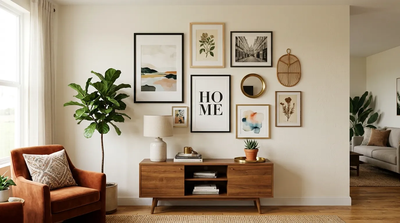
Nobody warns you that a blank wall is a moral test. You move in. You unpack the kitchen in a day. The wall stays white for eight months.
That’s not procrastination. That’s fear dressed up as “I’m still figuring out my style.” A wall is permanent-feeling even when it isn’t, and most renters treat it like a museum exhibit they’re not allowed to touch.
Here’s the part nobody says out loud: the wall was never the obstacle. The idea that decorating requires drills, deposits, and a five-year plan is the obstacle. Half the best walls in existence are held up by clip hangers and stubbornness.
So forget the idea that a rental has to look like a waiting room. What follows is how actual walls got actually good — the reasoning behind them, and then exactly how to steal each one.
Rented Walls Have Rules. Ignore Most of Them
Every renter gets told the same three things: don’t paint, don’t drill, don’t get attached. Two of those are negotiable and the third is bad advice.
The walls that get remembered aren’t the ones that played it safest. They’re the ones that found the loophole — command strips instead of nails, a leaning frame instead of a mounted one, a piece of furniture doing the work a renovation used to do.
The lease doesn’t own your wall
A security deposit covers holes, not personality. Command strips, adhesive hooks, and leaning furniture all solve the same problem: how to make a wall feel finished without touching the drywall.
The trick is picking decor that was never designed to be permanent in the first place. Leaning art, clipped textiles, and freestanding shelving units all look intentional precisely because they don’t pretend to be built-in.
Landlords inspect for damage, not ambition. A wall covered in artfully arranged, fully removable objects reads as care, not risk.
Temporary can still look expensive
The cheapest-looking rentals aren’t the ones with the least stuff on the walls. They’re the ones where everything on the wall looks like it’s about to fall off.
Weight and scale fix that instantly. One oversized leaning mirror does more for a room than six small framed prints ever will, and it takes zero tools to install.
Commit to fewer, larger gestures. A giant mirror, a floor-to-ceiling plant, a single substantial textile — these read as deliberate even when they took an afternoon and a step stool.
Build it so the next apartment gets it too
The best renter trick is designing decor that migrates. A leaning console with stacked frames on top packs into a box. A cork board memo wall unpins in minutes.
Anything mounted with clips, ledges, or lean rather than screws survives a move intact. That’s not a compromise — it’s a system that outlasts any single address.
Treat your current wall like a draft, not a final. The good stuff should be able to follow you.
Apartment Wall Decor Ideas
Eclectic Pink Gallery Cluster
Start with a single anchor piece that sets the palette, then build outward with mismatched black frames at varying sizes. Mix printed quotes, illustrations, and a single bold heart or graphic print so the eye has more than one thing to land on.
Add texture that isn’t a frame at all. A macrame or fringe hanging tucked between two prints breaks up the grid and stops the wall from feeling like a spreadsheet.
Fairy lights strung loosely along the top edge give the whole arrangement a soft glow without needing an electrician. Let them drape unevenly — a taut, symmetrical string looks like an afterthought, not a feature.
Finish with a small desk pushed against the wall so the gallery has something to visually rest on. A vanity mirror or lamp on that surface pulls the eye down and keeps the wall from feeling top-heavy.
Wire Grid Memo Wall
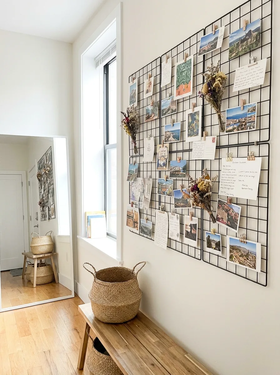
Hang two or three wire grid panels together to form one continuous surface rather than scattering single small grids. The unbroken grid is what gives the wall its structure.
Clip photos and notes on using a mix of binder clips, mini clothespins, and ribbon rather than one uniform clip style. The hardware becomes part of the visual texture, not just a functional afterthought.
Weave in one or two dried flower bundles directly into the grid squares. A dried bouquet threaded through wire reads completely differently than one sitting in a vase — it becomes part of the structure instead of decor propped in front of it.
Place a woven basket or bench underneath the grid to give the eye somewhere to land at the bottom. Without a grounded piece below it, a wire grid wall floats awkwardly above empty floor.
Floating Shelf Plant Jungle
Install two or three floating shelves at staggered heights rather than one long row. Stagger means the eye travels up and down the wall instead of sweeping straight across it.
Fill each shelf with a mix of trailing vines and upright foliage, never all one type. The trailing plants need room to hang well past the shelf edge — cramped vines just look like they’re trying to escape.
Tuck one or two framed botanical prints between the plants rather than around them. The prints should feel discovered, not displayed, so let leaves partially overlap the frame edges.
Warm, directional lighting mounted above the shelves does more than a lamp ever could. Aim it down across the leaves so the shadows fall naturally onto the wall below, and the greenery reads as lit rather than just present.
Pegboard Home Office Wall
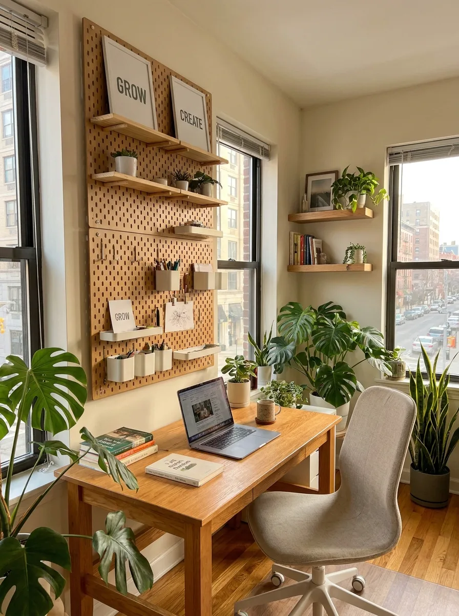
Install a full pegboard panel rather than a small section — this only reads as intentional storage-as-decor when it’s substantial enough to organise an entire workflow, not just hold three hooks.
Mix small floating shelves into the pegboard holes alongside hooks and bins. The shelves are what let the pegboard hold framed prints and books, not just cords and scissors.
Keep the colour palette of everything mounted on the pegboard tight — two or three tones max. A pegboard with rainbow-colored bins looks like a supply closet; one with matched wood and cream tones looks like furniture.
Position the desk directly beneath it so the wall and the work surface function as one unit. The pegboard should feel like it grew out of the desk, not like it was added above an unrelated table.
Spiral Salon Frame Wall
Commit to volume from the start. This look only works with dozens of frames, so buy in bulk from thrift stores and flea markets rather than hunting for a matching set.
Arrange the frames in a loose spiral or oval shape rather than a grid, leaving the centre of the shape sparse or empty. That negative space is what keeps a hundred frames from reading as visual noise.
Pick two or three accent frames in a bold colour — a mustard yellow, a deep blue — and place them off-centre within the spiral. These become the resting points for the eye every time it sweeps the wall.
Leave most of the frames empty or filled with plain paper rather than filling every single one with art. An entirely full wall of frames reads as busy. A wall where a few frames are deliberately bare reads as intentional.
Minimalist Wall Paneling Frame
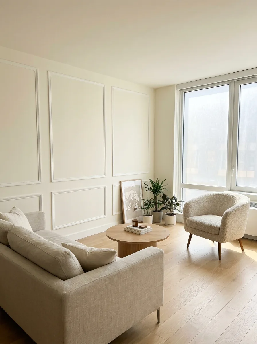
Install thin picture-frame moulding directly onto the wall in a grid of rectangles, painted the exact colour of the wall itself. The panels should read as shadow and shape, not as a separate colour block.
Keep the spacing between panels consistent and generous. Cramped moulding reads as busy trim; evenly spaced moulding reads as architecture that was always there.
Leave the paneled wall almost entirely bare of hung art. One small leaning frame propped on the floor against the panels is enough — the moulding itself is the decoration.
Pair the wall with soft, low furniture in a similar tone. A moulded wall works because of restraint everywhere else in the room; loud furniture undoes it instantly.
Boho Woven Plate Cluster
Source a mix of round woven trays, baskets, and shallow bowls in varying diameters. The variation in size is what sells the look — a wall of identically sized plates reads as a display case, not a collection.
Hang the largest pieces first as anchors, spacing them unevenly across the wall. Fill the gaps between them with smaller pieces, letting some edges nearly touch and others sit further apart.
Introduce colour through a few painted or dyed baskets mixed into the natural woven ones. Two or three saturated pieces are enough — more than that and the natural texture stops reading as the main material.
Let a hanging planter or macrame piece drape down from above the cluster on either side. The vertical drop softens the rigid circularity of the plates and keeps the whole wall from feeling like a target.
Circular LED Shelf Display
Build the display around a single circular frame or ring as the structural spine. Everything else — small shelves, a framed print, a hanging plant — gets arranged to interact with that circle rather than sit apart from it.
Install slim LED strip lighting along the inside edge of the ring before adding any decor. The light needs to be a structural layer, not an afterthought clipped on at the end.
Layer in a mix of heights: a taller vase with dried stems on one side, a low candle or trinket on the other. Uneven heights inside a symmetrical circle create the tension that keeps the eye moving.
Add a single word or short phrase as a small wood or metal cutout tucked into the lower portion of the arrangement. Keep it small — the shape and the light are the display, the word is a signature, not the headline.
Hexagon Acoustic Headboard Panels
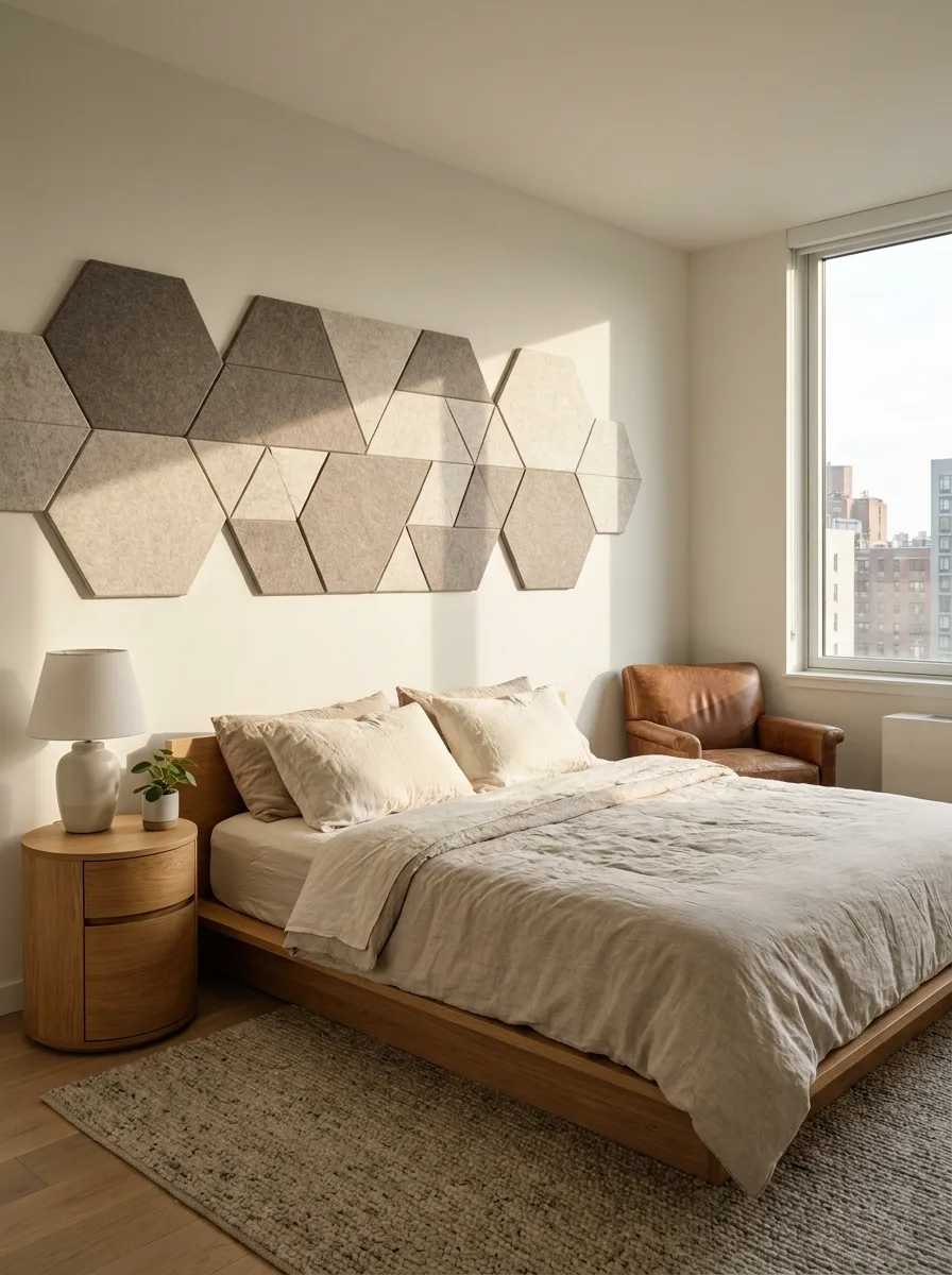
Choose upholstered or felt hexagon panels in two or three closely related neutral tones rather than one flat colour. The tonal variation is what makes a geometric pattern read as intentional instead of like leftover tile samples.
Plan the layout on paper before mounting anything. Hexagons interlock, so a single miscalculated panel throws off every panel after it — sketch the full shape first.
Mount the panels so they extend well past the width of the bed itself, not just directly behind it. The oversized footprint is what turns a headboard into a wall feature instead of a bed accessory.
Keep the bedding and furniture around the panels simple and monochrome. The hexagon texture is doing all the visual work; matching throw pillows or patterned linens would compete with it instead of supporting it.
Illustrated Botanical Wallpaper Mural
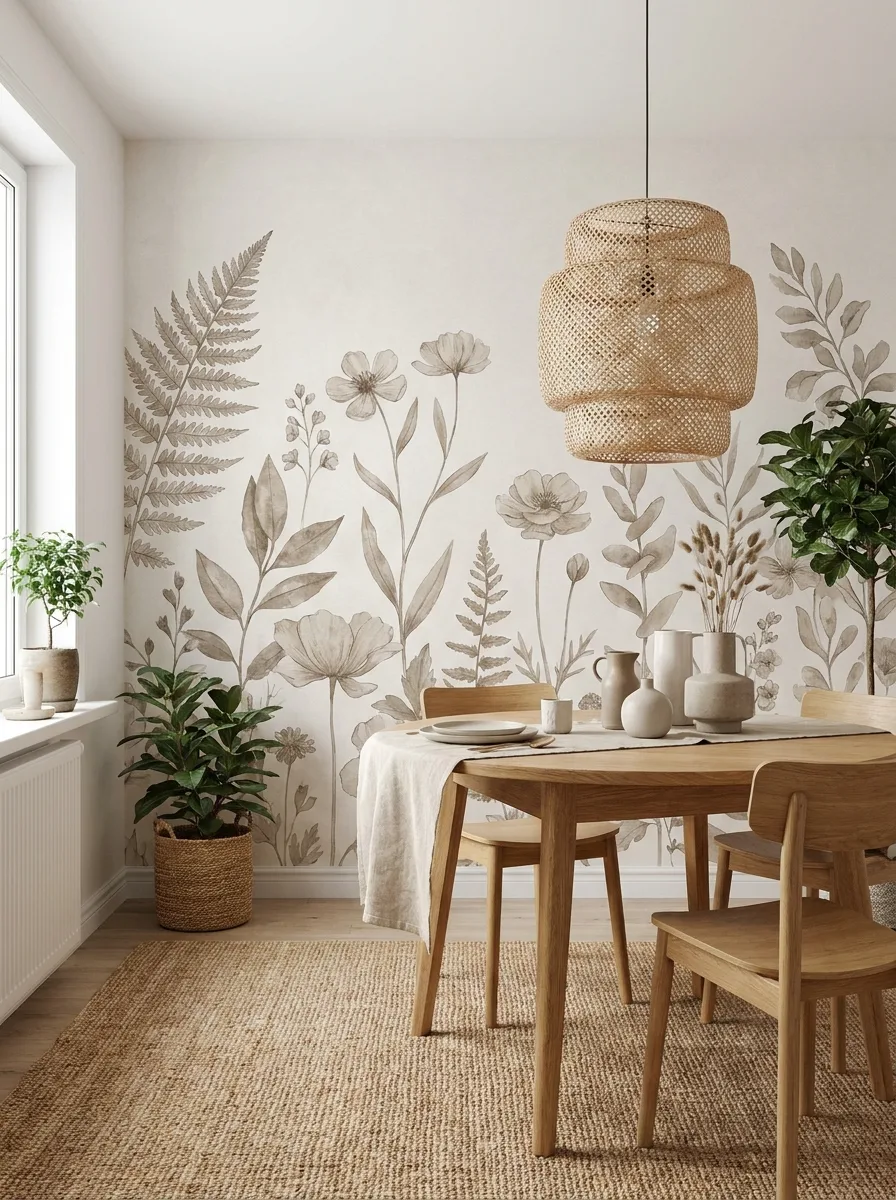
Choose a mural with a limited, muted colour palette — sepia, sage, soft grey — rather than a bold multicolour print. A quiet palette lets the mural cover an entire wall without overwhelming the room.
Apply it as a single accent wall rather than wrapping the whole room. One wall gives the eye somewhere to rest; four walls of the same illustration turns a dining nook into wallpaper you can’t escape.
Keep every piece of furniture placed against that wall in natural, unfinished materials — light wood, woven baskets, linen. Anything glossy or brightly coloured will fight visually with the illustration instead of sitting inside it.
Add one real plant near the base of the mural so the illustrated botanicals and the living one blur together. It’s a small trick, but it makes the whole wall feel grown rather than printed.
Framed Woven Fiber Tapestry
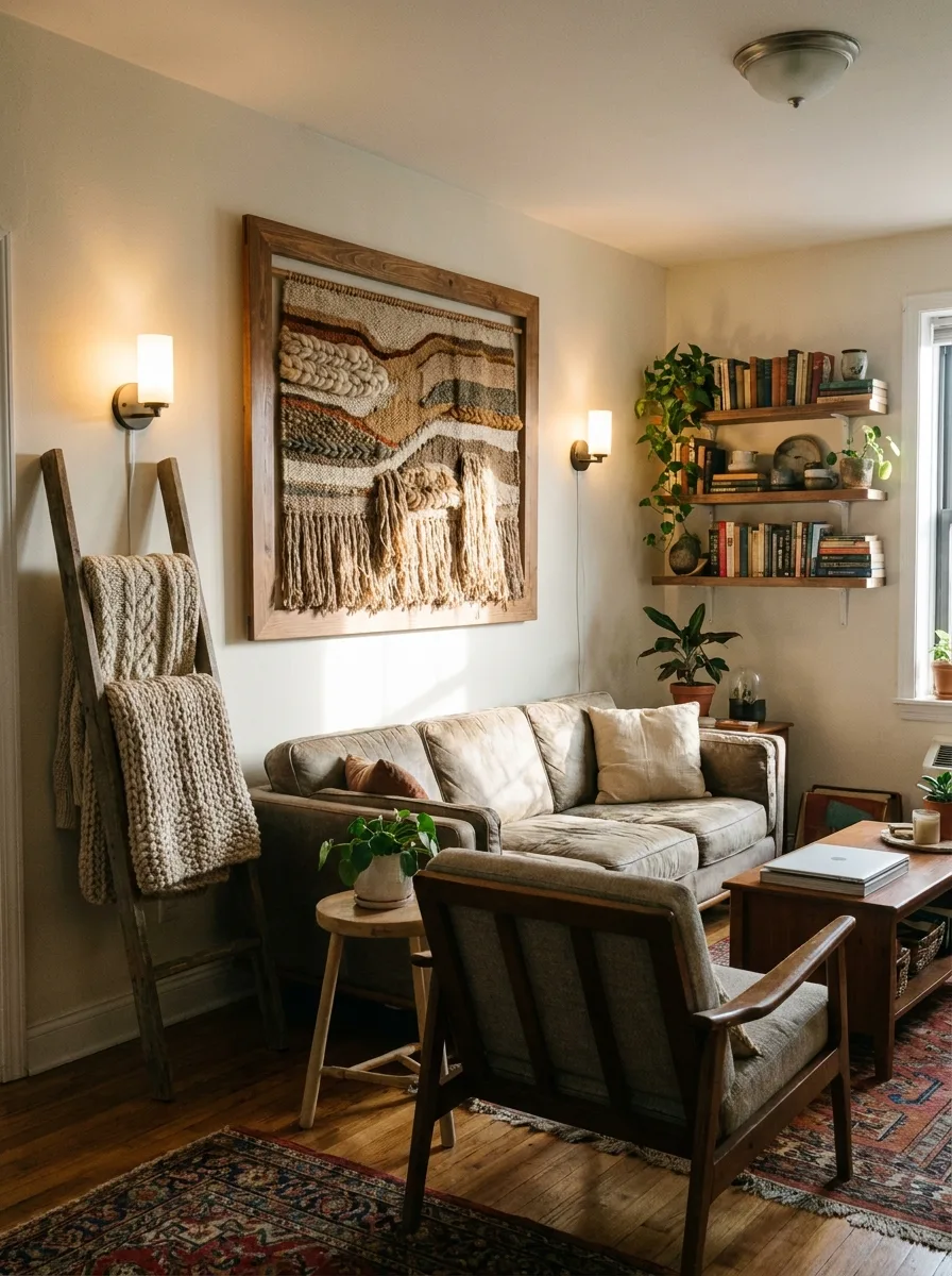
Commission or source a large-format woven textile piece with visible texture — braids, loops, varied yarn weights — rather than a flat woven pattern. The texture is the entire point; a smooth weave will just look like a blanket on the wall.
Frame it in raw or lightly finished wood rather than a polished frame. A rustic frame lets the fibers read as art rather than as laundry that hasn’t been put away yet.
Mount it as the singular focal point on an otherwise quiet wall. This piece has enough visual weight to carry a wall alone — surrounding it with other art dilutes it.
Flank the piece with warm, low sconce lighting rather than overhead light. Directional warm light catches the texture of the fibers in a way flat ceiling light never will.
Cork Board Travel Memory Wall
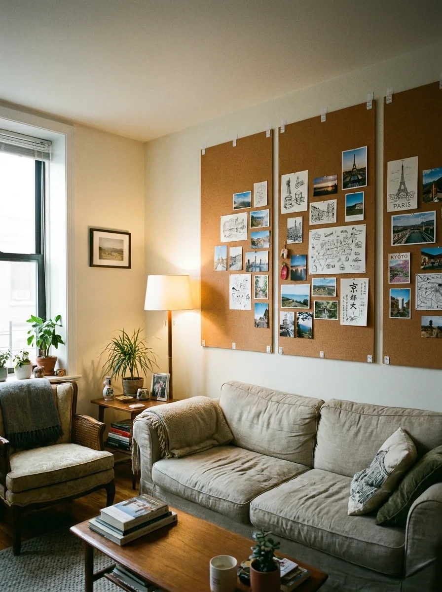
Mount two or three large cork panels edge to edge rather than one small board. Scale matters here — a single small cork square looks like a leftover school project, while a full panel wall looks like an actual archive.
Organise the pins loosely by theme or trip rather than by strict grid. Group photos, sketches, and ticket stubs from the same place together so the eye can find a narrative inside the chaos.
Leave visible cork showing between clusters rather than covering every inch. The bare cork functions the same way negative space does in a gallery wall — without it, the whole board reads as clutter.
Use a mix of pin types — thumbtacks, small clips, ribbon — rather than uniform pins. The variation in how things are attached adds another layer of texture to look at.
Round Basket Dining Wall
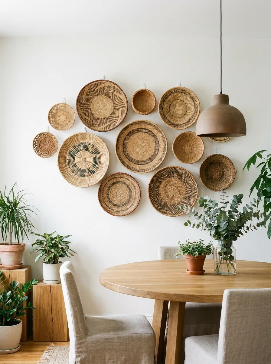
Cluster woven baskets and trays of varying diameters into a loose, organic shape rather than a strict grid — think cloud, not checkerboard. The irregular outline is what separates this from looking like kitchenware storage.
Overlap a few of the largest pieces slightly rather than spacing everything with equal gaps. Overlap creates depth; even spacing flattens the whole arrangement.
Position the cluster directly above a dining table so the circular shapes echo the round tabletop below. That repetition ties the wall to the furniture instead of leaving it floating independently above the room.
Add a single pendant light positioned just to the side of the cluster rather than centred above the table. An off-centre light source lets its shadow fall across part of the basket wall, adding depth the baskets can’t create on their own.
Layered Ledge Art with Sconces
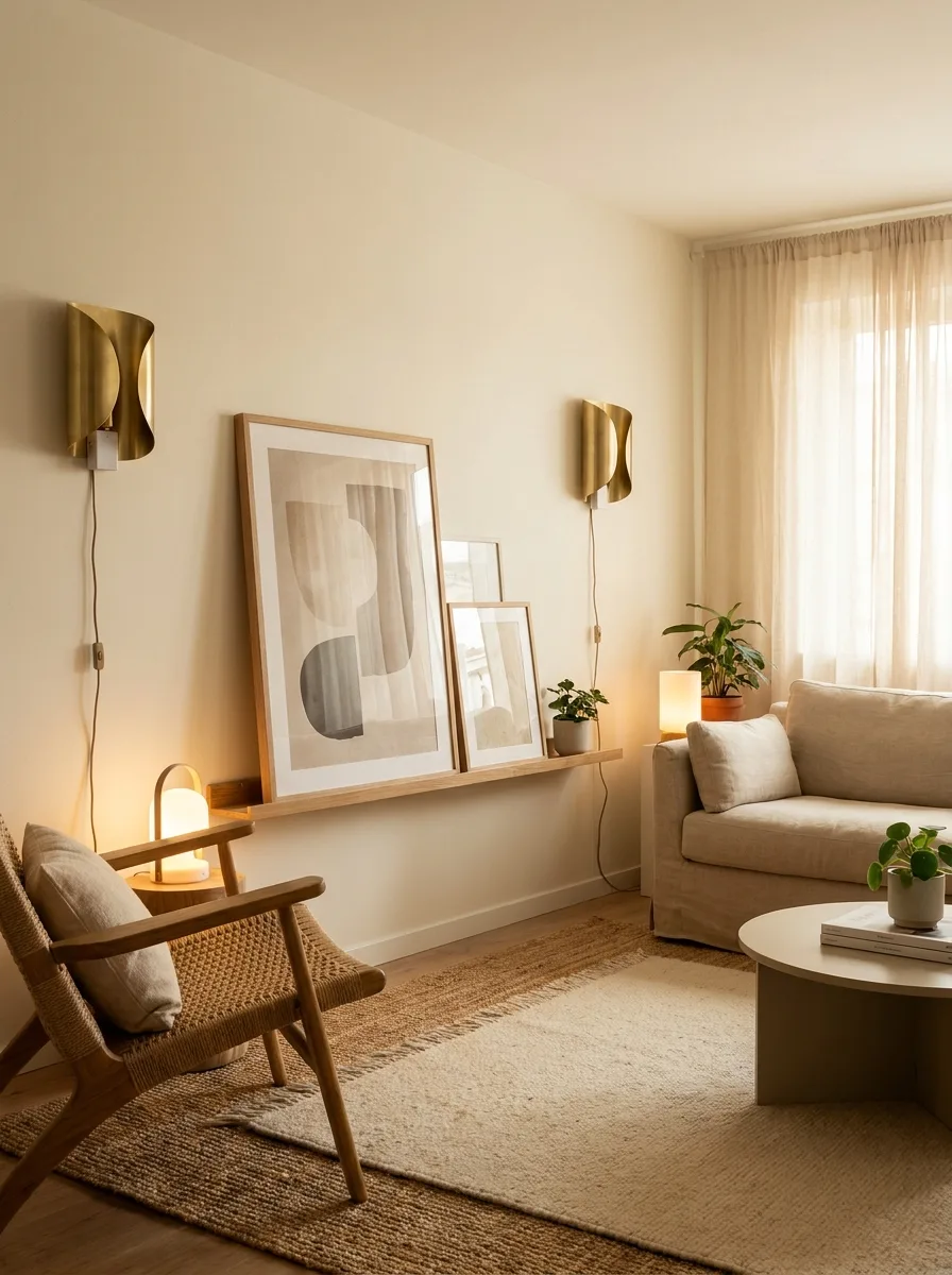
Mount a single floating ledge rather than hanging frames directly on the wall. The ledge is what allows the layering trick to work at all — frames hung flat can’t overlap each other.
Lean three or four frames against the wall on the ledge, overlapping the front edges of each other by a few inches. Vary the frame sizes so the layering creates a visible staircase effect rather than a flat stack.
Flank the ledge with a pair of matching wall sconces rather than a single lamp. Symmetrical lighting on either side of an asymmetrical art arrangement is the tension that makes the whole wall work.
Add one small plant or object at the base of the ledge, tucked in front of the lowest frame. It roots the arrangement to the ledge itself instead of letting the frames feel like they’re floating.
Clothespin Hung Woven Rug

Hang a substantial woven rug or textile horizontally using exposed wooden clothespins along the top edge rather than a hidden rod. The visible hardware is part of the look — hiding it would make the piece feel like a mistake instead of a choice.
Choose a piece with a bold central motif, like a diamond or medallion, so it reads clearly from across the room. A busy all-over pattern gets lost at this scale; a single strong motif doesn’t.
Position it directly above the bed, sized wide enough to extend past the width of the headboard on both sides. Undersized textile art above a bed just looks like it shrank in the wash.
Flank the piece with warm bedside lighting rather than overhead light. The nubby texture of the weave catches lamp light in a way flat ceiling light flattens out completely.
Textured Wallpaper Art Duo
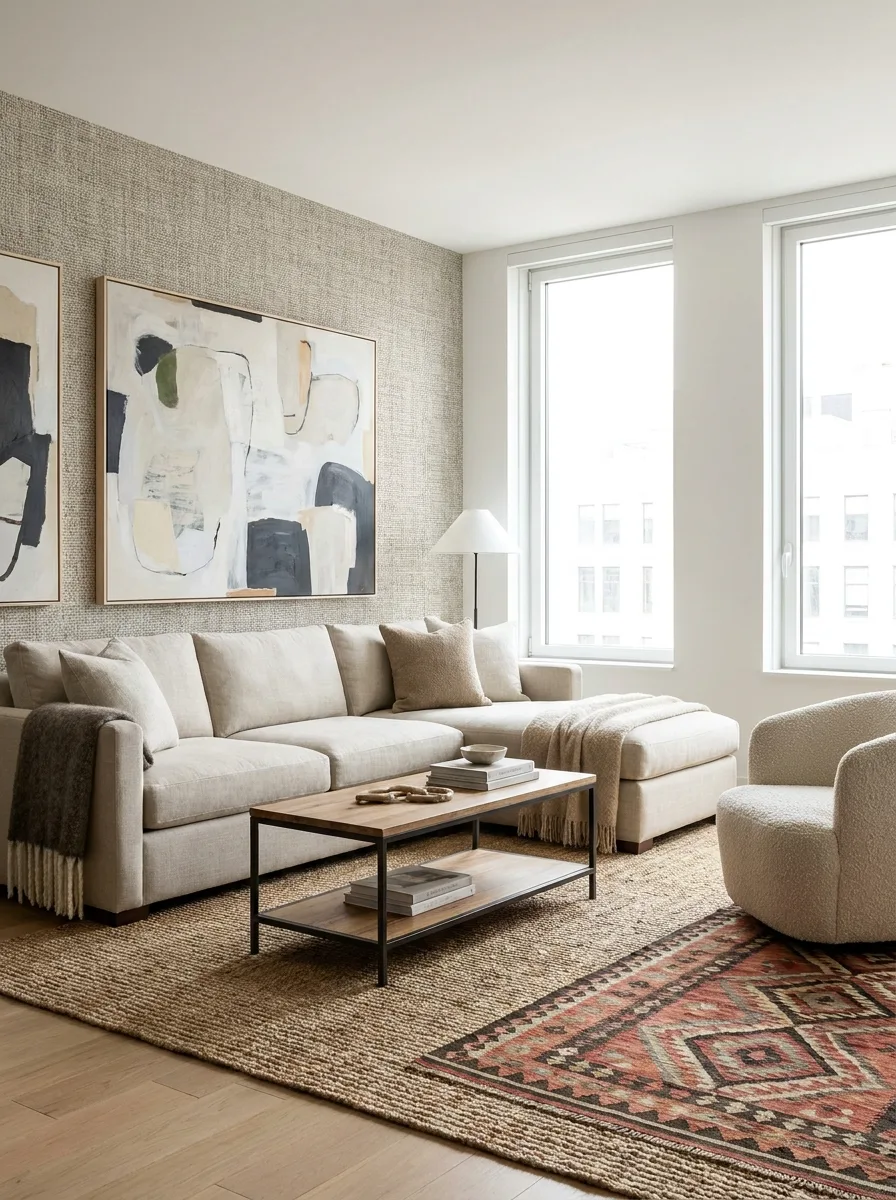
Choose a grasscloth or heavily textured wallpaper in a warm neutral tone as the backdrop before hanging anything on it. The texture needs to exist first — art hung on a flat wall doesn’t get the same depth.
Hang two large-format abstract pieces close together rather than spacing them evenly across the wall. The tight grouping reads as one considered gesture instead of two separate purchases.
Choose frames in a warm wood tone that echoes the wallpaper’s undertone rather than a stark black or white frame. Matching warmth keeps the wallpaper and the art from visually competing.
Keep the furniture facing the wall low-profile so nothing blocks the view of the texture from across the room. This wall wants to be seen in full, not peeked at over a tall armchair.
Oversized Leaning Mirror Corner
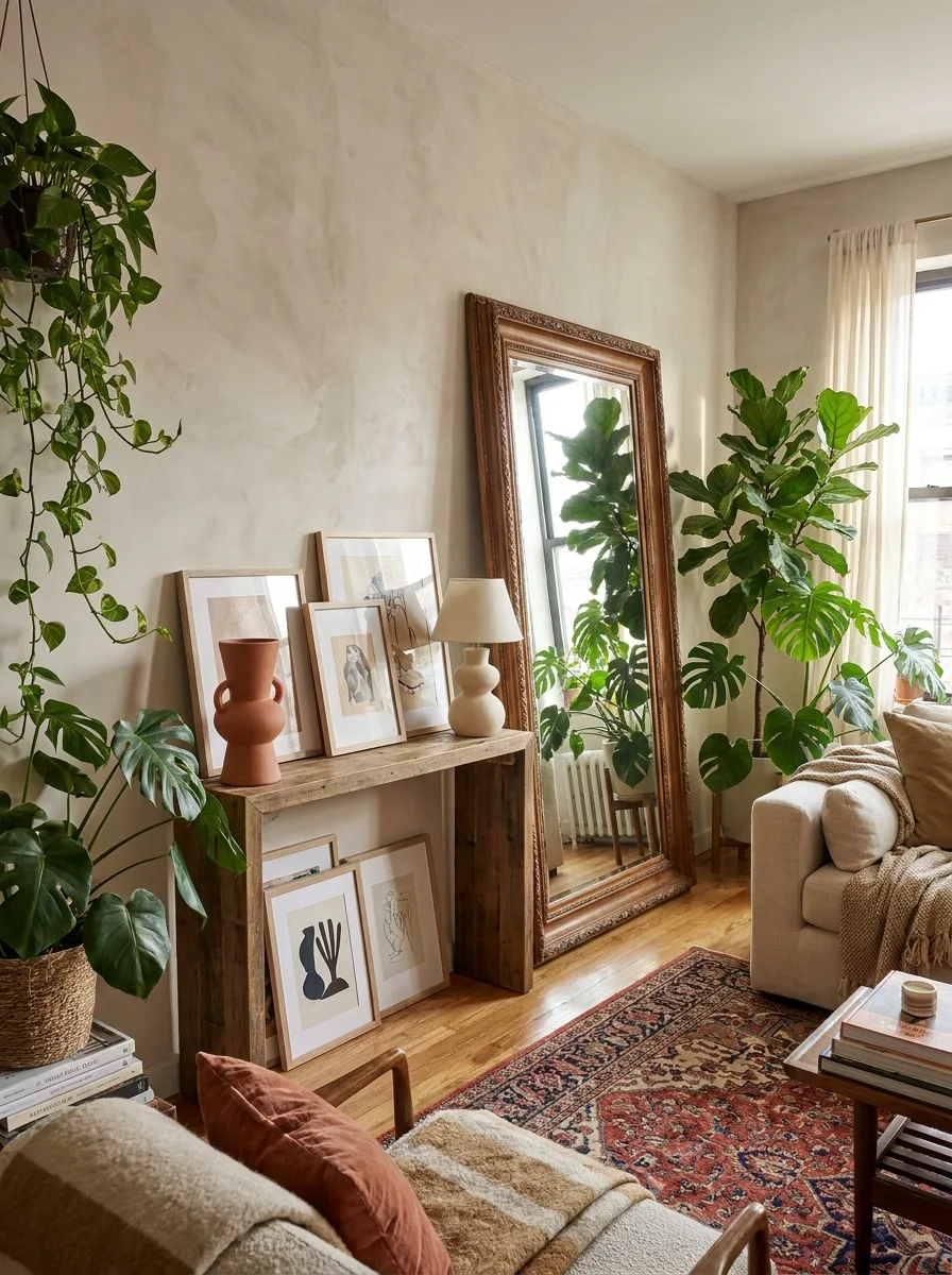
Source the largest mirror the space can physically fit, framed in an ornate or substantial wood finish. Undersized mirrors in this style just look like they’re waiting to be hung properly — full commitment to the scale is what sells it.
Lean it directly against the wall at a slight backward angle rather than mounting it. The lean is structural to the look — a flush-mounted oversized mirror in an ornate frame reads as traditional, while a leaned one reads as curated.
Build a low console or stack of frames in front of the mirror’s base, letting the reflection double the visual density of everything nearby. The mirror should be doing double duty as both object and amplifier.
Surround the corner with floor plants at varying heights so the mirror reflects greenery rather than empty wall. An oversized mirror reflecting nothing just draws attention to how empty the rest of the room is.
Triple Picture Ledge Reading Nook
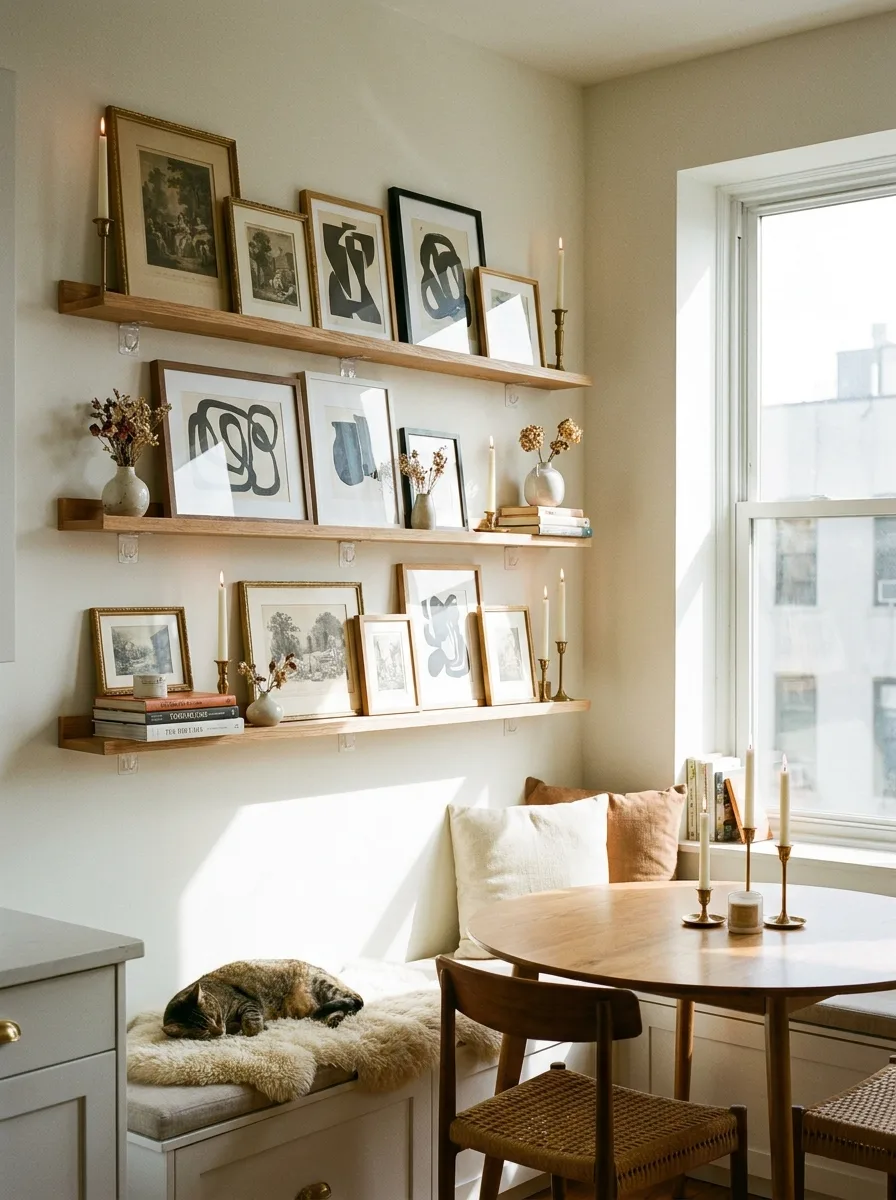
Install three floating ledges stacked with even vertical spacing above a built-in bench or window seat. The stacking is what turns a single shelf of frames into an actual gallery moment.
Lean frames rather than hang them, overlapping slightly and mixing horizontal and vertical orientations across the three shelves. Uniform orientation on every shelf reads as a catalogue page, not a collection.
Add small objects between the frames — a vase, a stack of books, a candlestick — on every shelf rather than just the bottom one. Objects on all three levels keep the eye traveling the full height of the wall instead of settling on just one row.
Place candles or a small lamp at each shelf’s end so the nook has warm light at every level come evening. A reading nook that only lights the bottom shelf leaves the top two in shadow the moment the sun goes down.
Painted Arch Headboard Trio
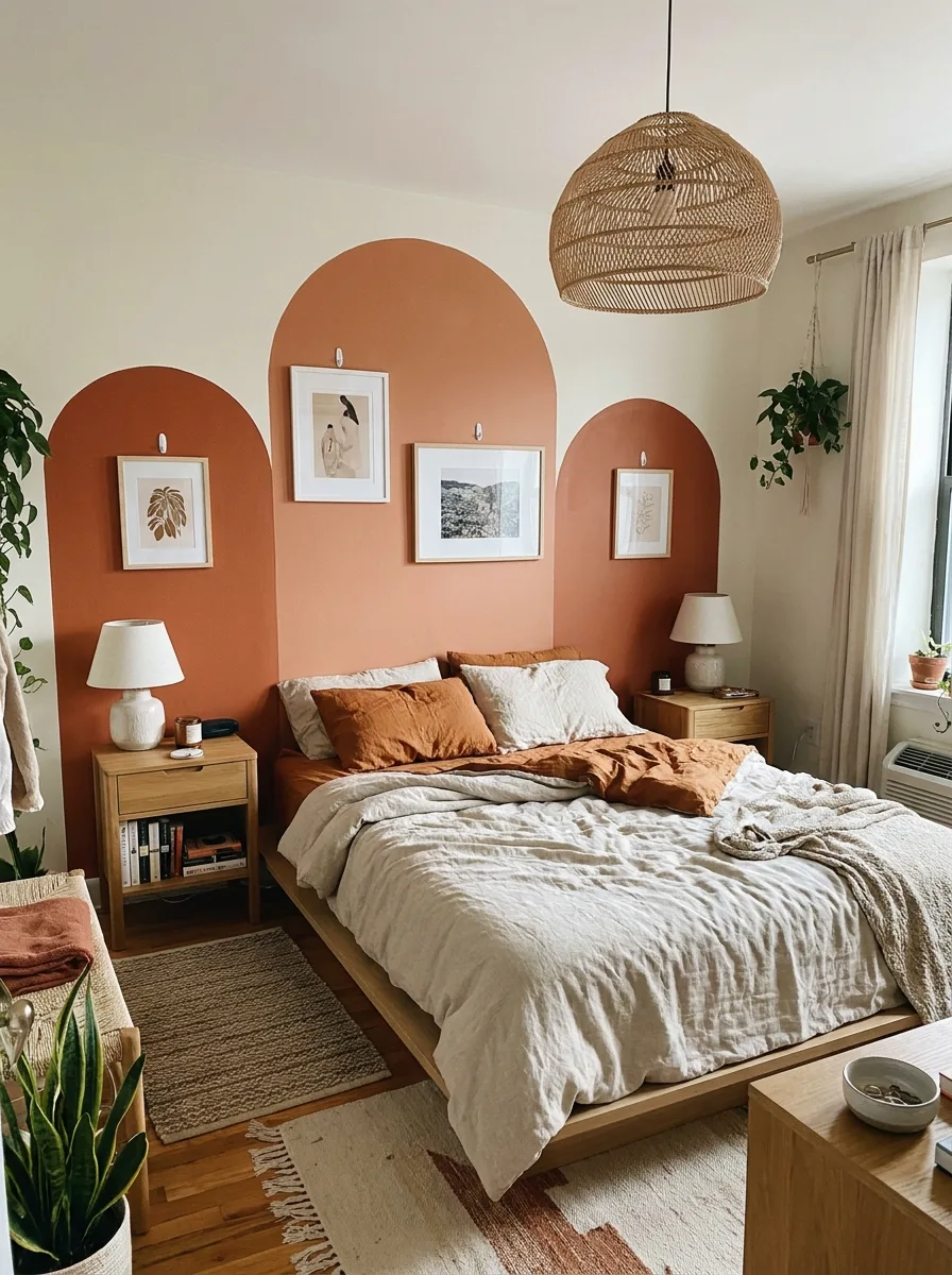
Paint three connected arch shapes directly onto the wall behind the bed in a warm terracotta or clay tone, using painter’s tape to get crisp, even edges. The arches need to be large enough to genuinely frame the headboard, not just decorate around it.
Centre one small framed print inside each arch, hung with a single visible hook rather than a hidden mount. The visible hardware reads as intentional against a bold painted shape in a way it wouldn’t against a plain wall.
Keep the prints inside the arches thematically loose but tonally connected — botanical, figurative, landscape — so each arch feels like its own moment rather than a repeated template.
Balance the boldness of the arches with a neutral, textural bed layering underneath. Linen in warm creams and rusts lets the wall stay the loudest element in the room instead of competing with a patterned duvet.
Final Thoughts
None of this required a landlord’s permission or a weekend with a contractor. Every wall here started with the same blank surface everyone gets handed on move-in day.
What separates the walls that work from the walls that don’t isn’t budget. It’s whether someone made an actual decision — a rule to build around, a shape to commit to, a piece of furniture willing to anchor the chaos.
A blank wall isn’t neutral. It’s a choice being postponed. Every arrangement here is just proof that the postponement was never necessary in the first place.
Pick a wall. Pick a rule. Stop treating your own apartment like someone else’s museum.