
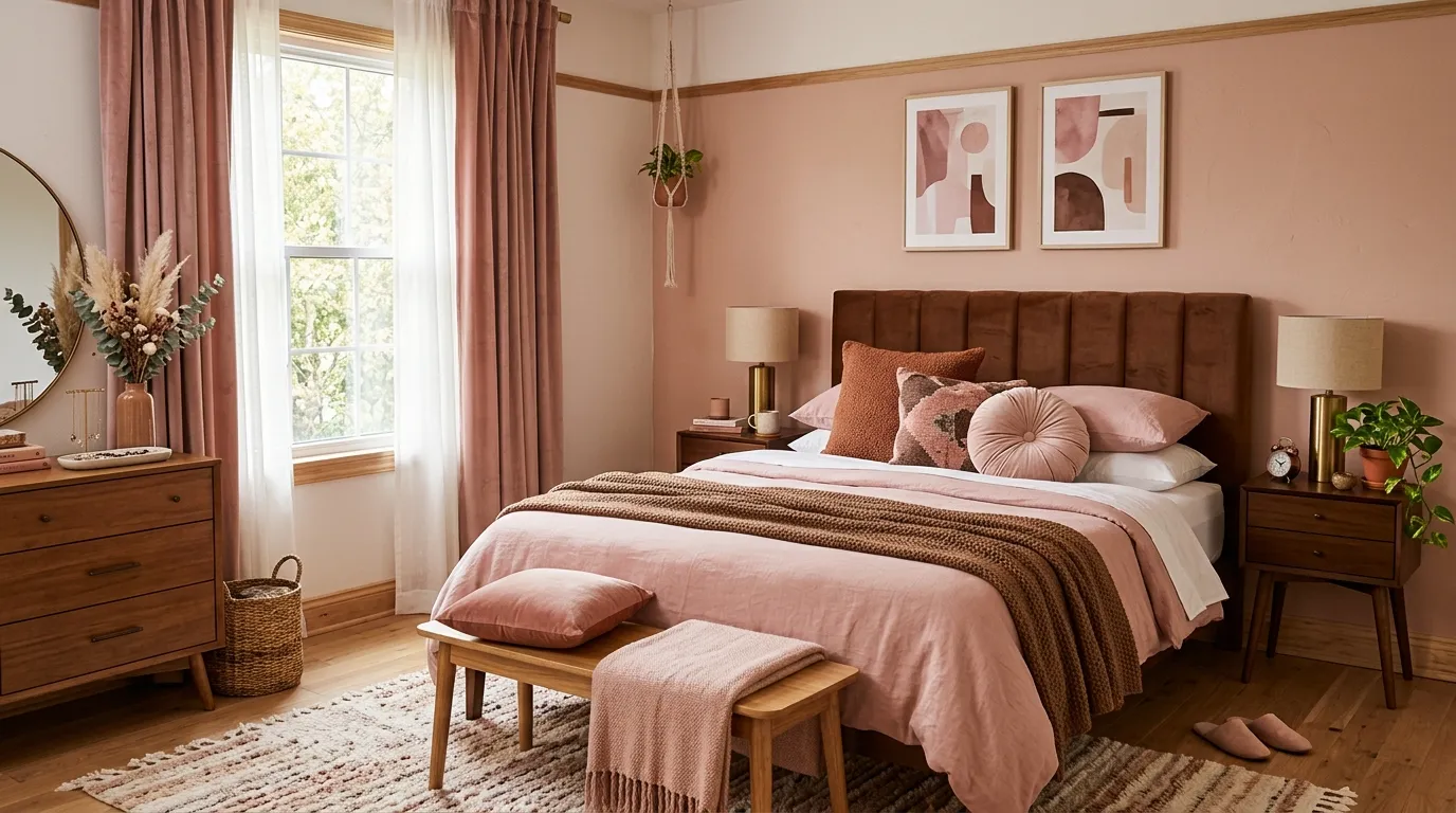
Pink gets a bad reputation it didn’t earn. On its own, sure, it can tip into cotton candy territory fast. Paired with the right brown, it stops being a color and starts being a mood.
Brown has the opposite problem. Alone, it reads as safe to the point of forgettable — a rental-beige cousin nobody invited to the party. Paired with pink, it suddenly has somewhere to put all that warmth.
Neither color was the problem. They were just waiting for their other half to show up.
What follows is the actual mechanics of why this combination works in a bedroom specifically, and twenty different ways someone already proved it.
Pink and Brown Only Work Together If One of Them Backs Down
The rooms that get this palette wrong usually made both colors compete for the lead role. The ones that get it right picked a dominant and a supporting act before a single swatch went on the wall.
Decide who’s driving before you buy anything
A room where pink covers the walls and brown shows up only in furniture reads completely differently than a room where brown owns the walls and pink is the accent. Both work. Picking neither, and letting the two colors fight for equal territory, is what produces the rooms that feel unresolved.
The furniture usually decides this for you. A dark wood bed frame with real presence wants to anchor the room, which means the walls should lean pink and let the wood stand out against them. A pale or upholstered bed frame can disappear into a pink wall, so the wood needs to come from somewhere louder — a full accent wall, a canopy frame, a paneled headboard.
Pick the anchor first. Everything else in the room gets chosen to support it, not to compete with it.
The ratio changes the entire personality
A room that’s eighty percent pink and twenty percent brown feels soft, feminine, almost powdery. Flip that ratio and the same two colors produce something moody and grounded instead. Neither ratio is more correct — they’re just different rooms wearing the same two colors.
Mid-tone splits, somewhere closer to even, tend to read as the most sophisticated version of the pairing, because neither color gets to dominate long enough to feel like the “theme.” That’s harder to pull off than it sounds, since a fifty-fifty split needs a third neutral — cream, black, brass — to keep the eye from bouncing between the two evenly matched tones.
Test the ratio with fabric before committing to paint. Pin bedding, curtain samples, and a paint chip to the same wall and step back — the ratio that feels right in miniature is the one to scale up.
Warm undertones save this pairing every time
Pink and brown fail when either one drifts cool. A dusty, blue-leaning pink next to a cold grey-brown reads as murky rather than warm, no matter how good the individual colors looked on their own swatches.
Chase warmth in both directions instead. A pink with a peach or terracotta undertone, paired with a brown that leans toward chestnut or walnut rather than grey-taupe, is what gives this combination its glow instead of a muddy compromise.
Check undertones in the room’s actual light, not the paint store’s. The same two chips can look warm under one bulb and flat under another, and a bedroom’s evening lamp light will show the truth faster than any daylight swatch test.
Pink and Brown Bedroom Ideas
Rust Linen Layered Bedding
Choose linen bedding in two adjacent warm tones — a deep rust duvet over a rose-pink fitted sheet — rather than matching everything to one shade. The slight color shift between layers is what gives simple linen its depth.
Let the linen wrinkle naturally rather than pressing it flat. Crisp, ironed linen looks like a hotel; loosely tossed linen with visible texture looks like the room actually gets used.
Pair the bedding with plastered, sun-warmed walls in a neutral tone rather than a saturated pink or brown. When the bedding itself is carrying two rich colors, the walls need to step back and let the fabric be the star.
Add one small built-in or floating shelf nook nearby for a few simple ceramics and books. A quiet display spot gives the eye somewhere to land besides the bed, without introducing any new color to manage.
Art Deco Pink and Black Glam
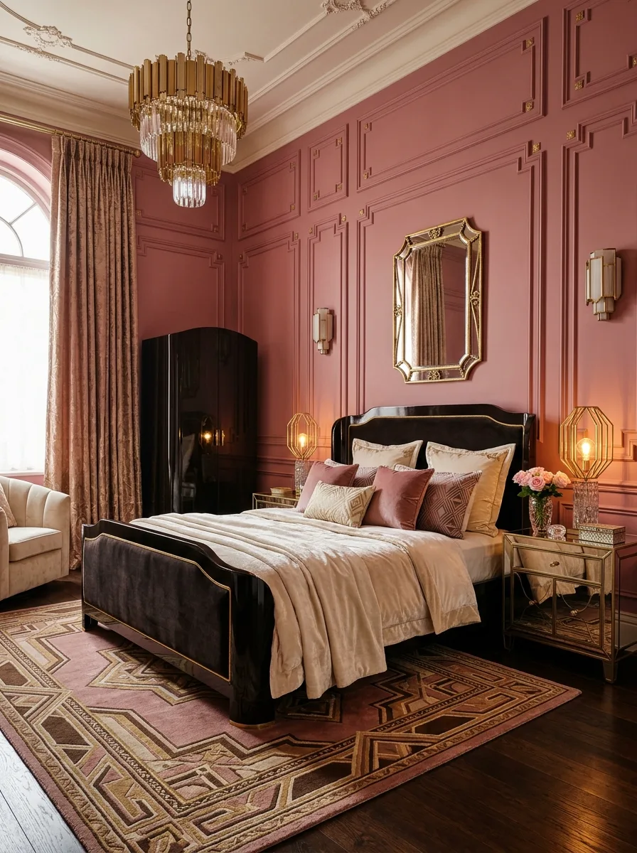
Commit fully to panel moulding across every wall, painted a rich dusty rose, and treat it as the architectural backbone of the entire room. Deco depends on that structured, repeating geometry to feel authentic rather than decorative.
Choose a glossy black lacquer bed frame with gold trim detailing along every edge. The lacquer’s reflectivity is essential here — a matte black frame would read as modern rather than deco.
Hang a tiered crystal chandelier as the room’s single largest fixture, sized to command the ceiling rather than blend into it. Deco chandeliers are meant to be seen from across the room, not just to provide light.
Add a mirrored nightstand alongside patterned art deco rugs in matching pink and gold tones. The mirror multiplies the chandelier’s sparkle, while the rug’s geometric pattern reinforces the era’s love of repetition and symmetry.
Blush Velvet Channel Headboard
Choose a channel-tufted headboard in a dusty mauve velvet, sized wide enough to stand alone as the room’s focal wall feature. The vertical channels catch light in ridges, giving a single flat color visible texture without needing a pattern.
Hang a crystal or beaded chandelier as the room’s one high-drama lighting moment. In a palette this soft, one sparkling fixture does more to elevate the room than several smaller lights would.
Layer the bed with a faux fur or heavily textured throw in the same blush family as the headboard. Matching the throw’s tone to the headboard rather than contrasting it keeps the whole bed reading as one soft, cohesive mass.
Finish with a marbled area rug in warm greys and blush veining underfoot. The rug’s subtle pattern grounds the room without introducing a third competing color.
Curved Rust Bed with Slat Wall
Install a wide wood slat panel behind the bed, running the full width and height of the headboard zone. The vertical ribbing creates texture and warmth before any furniture is even placed in front of it.
Choose a bed frame with a rounded, arched silhouette in a rich rust velvet. The soft curve of the frame contrasts intentionally with the straight vertical lines of the slat wall behind it.
Flank the bed with matching stone-based lamps in a cool marble finish. The stone’s coolness is a small, deliberate contrast against all the surrounding warmth, keeping the palette from tipping into monotony.
Hang a pair of small abstract art pieces to one side of the slat wall rather than centred above the bed. Off-centre art acknowledges the slat wall as the true focal point instead of competing with it for attention.
Flower Pendant Mauve Bedroom
Paint the walls a muted mauve-brown that sits right at the border between the two colors this palette is built on. A single wall color that already blends pink and brown does half the work before any furniture arrives.
Hang a soft, petal-shaped fabric pendant light as the room’s sculptural centrepiece. The organic shape softens a room that could otherwise feel flat under a plain fixture.
Choose a curved brown velvet headboard rather than a straight one, echoing the pendant’s rounded silhouette from across the room. Repeating a curve in two separate pieces ties the whole room together without anyone consciously noticing why.
Add ruffled striped pillows in a warm tan and cream as the one patterned element against all that solid color. A single patterned pair of pillows is enough texture variation without overwhelming a room this monochromatic.
Rust Tufted Headboard with Pink Paneling
Install classic panel moulding on the walls, painted the same dusty rose as the rest of the room, so the architecture reads as a single continuous surface rather than a separate decorative layer. Tone-on-tone panelling adds dimension without adding contrast.
Choose a channel-tufted rust velvet headboard as the room’s only saturated color statement. Against subtle panelled walls, one confidently colored piece of furniture is enough to anchor the entire palette.
Add a round, ribbed brass side table rather than a traditional wood nightstand. The metallic ribbing echoes the headboard’s channel tufting in a different material, tying the two pieces together across the room.
Style the nightstand with a single generous stem arrangement in dried or fresh pink blooms. One deliberate floral moment does more than several small decorative objects scattered across the same surface.
Berry Slat Wall with Dark Headboard
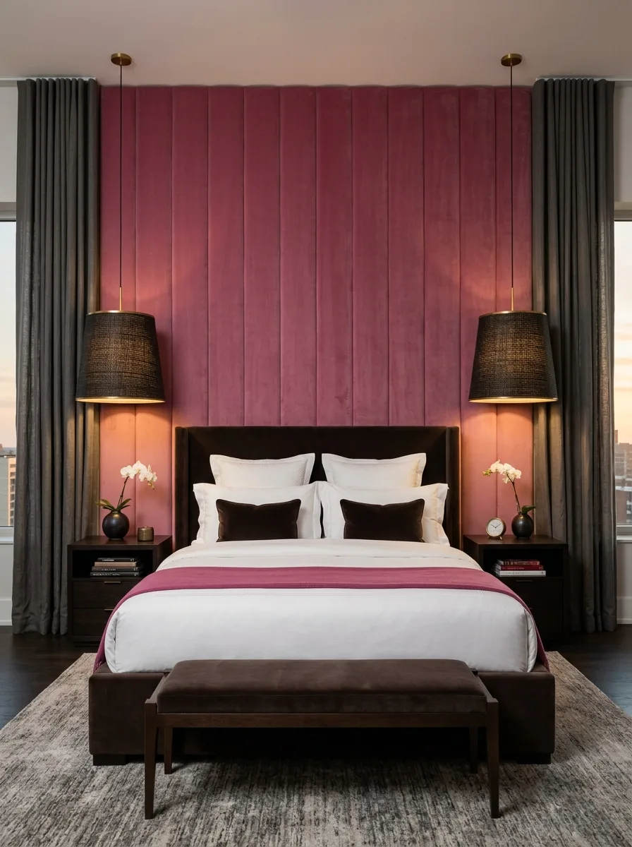
Build a floor-to-ceiling wood slat wall in a deep berry-pink stain, running the full height of the room rather than stopping at headboard level. The oversized scale is what makes this feel architectural instead of decorative.
Pair it with a dark brown velvet headboard in a simple rectangular silhouette, letting the slat wall’s texture provide all the visual complexity the headboard doesn’t need to add.
Hang matching pendant lamps with woven dark shades on either side of the bed rather than table lamps. Pendants free up the nightstand surface and add a second textured material — woven fiber — against all that smooth velvet and stained wood.
Keep the curtains a cool, neutral grey rather than matching the berry tone. The one cool note in an otherwise entirely warm room keeps the berry wall from tipping into overly saturated.
Pink Floral Cottage Bedroom
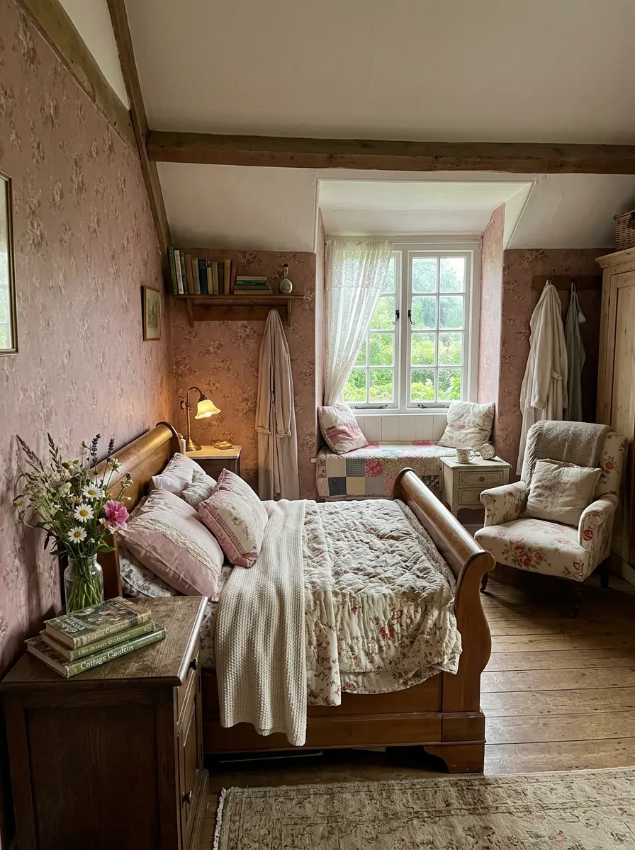
Choose a pink floral wallpaper with a small, dense repeat pattern, applied to every wall rather than as a single accent. Full-room wallpaper is what gives cottage bedrooms their enveloping, storybook quality.
Pair it with a warm wood sleigh bed frame, letting the curved wood footboard and headboard contrast against the busy printed walls. A simple, solid-wood frame is necessary here — anything upholstered would compete with the wallpaper instead of grounding it.
Layer quilted patchwork bedding in coordinating pinks and creams rather than a single solid duvet. The patchwork’s own pattern needs to relate to, but not exactly match, the wallpaper’s print for the room to feel gathered rather than matchy.
Add a floral upholstered armchair in the corner, chosen from a different but complementary print than the wallpaper. Two different florals in the same room work when the color palette stays consistent between them.
Dramatic Fuchsia Curtained Bed
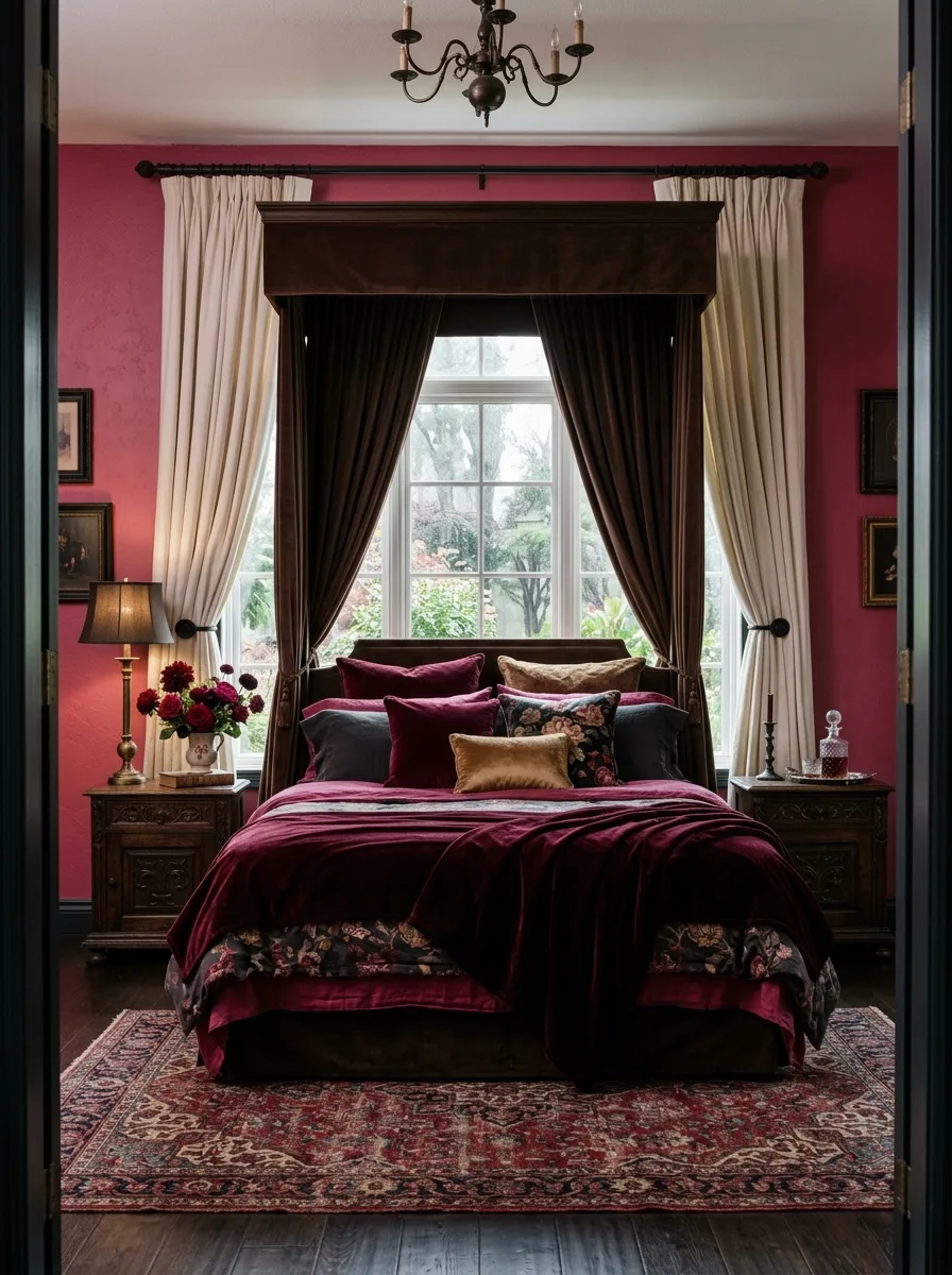
Paint the walls a bold, saturated fuchsia-pink rather than a muted or dusty tone. This look depends on genuine boldness — a pastel version of the same idea would lose all its drama.
Frame the bed in floor-to-ceiling dark wood curtains, hung from a matching wood canopy structure. The curtains should be substantial enough to fully enclose the bed when drawn, turning it into a private room within the room.
Layer burgundy and floral velvet pillows in varied textures across the bedding. Richness comes from variety here — matte velvet next to printed floral next to solid burgundy keeps a small color story from feeling flat.
Add a patterned area rug in matching burgundy and cream tones beneath the bed. The rug’s pattern should echo the drama of the curtained frame above it rather than introducing a plain, quiet surface underfoot.
Rustic Mauve Attic Bedroom
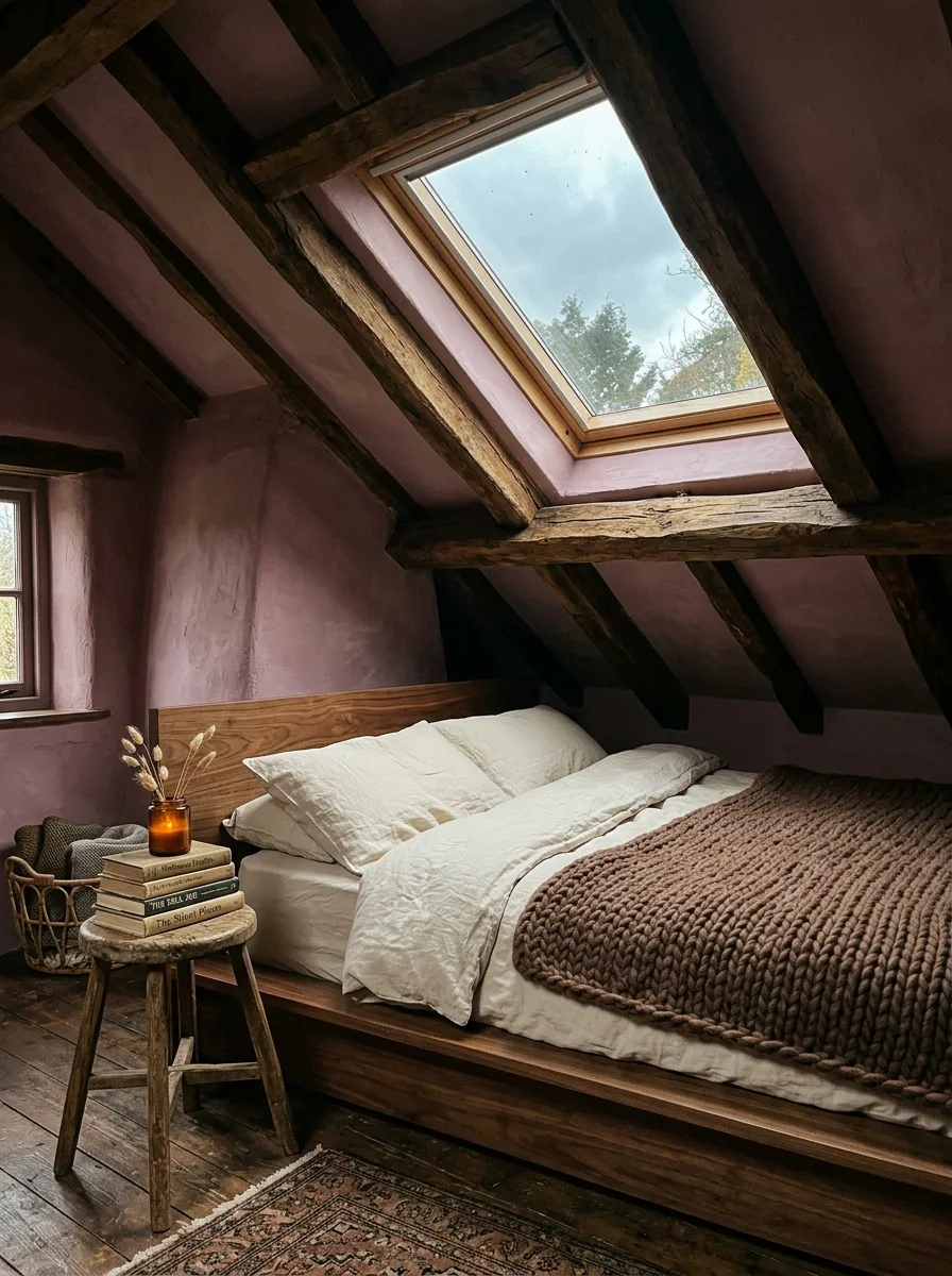
Leave structural wood beams fully exposed against plastered mauve walls, letting the raw timber’s natural grain and knots show completely. In a sloped attic room, the beams aren’t an obstacle to decorate around — they’re the main event.
Choose a simple wood-framed bed with no elaborate headboard, positioned to work with the room’s low ceiling line rather than against it. An oversized headboard would fight the room’s architecture; a low, simple frame respects it.
Layer a chunky knit brown throw over pale linen bedding for textural contrast. The throw’s heavy, hand-knit texture against smooth linen mirrors the room’s own contrast between rough beams and soft plaster.
Use a small stool or crate as an impromptu nightstand, stacked with books and topped with a single candle. Improvised furniture suits a room this rustic far better than anything polished or matched would.
Geometric Patchwork Pink and Brown Bedding
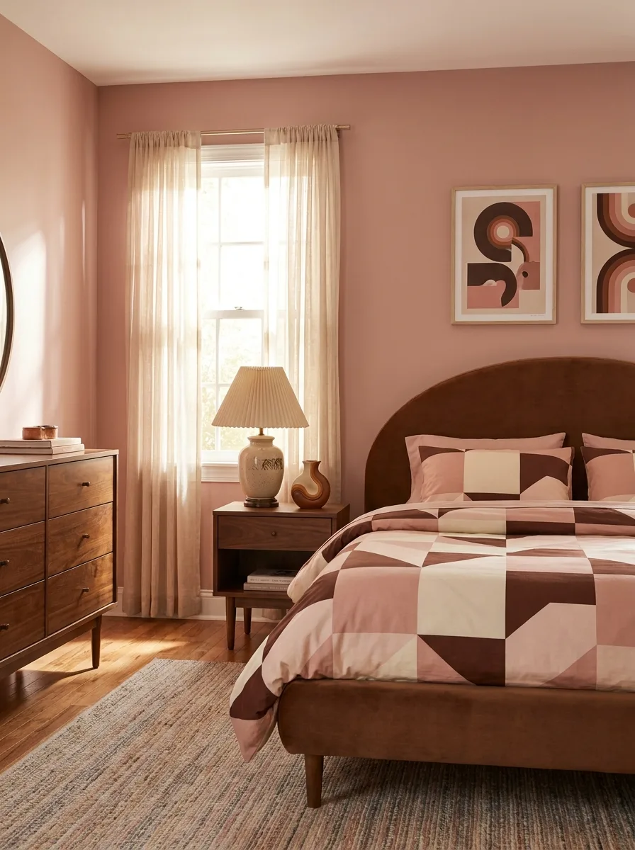
Choose bedding with a bold geometric patchwork print combining pink, cream, and chocolate brown in graphic blocks, rather than a soft floral or solid color. The graphic pattern is what pulls this into mid-century territory instead of cottage.
Pair it with a curved brown velvet headboard in a simple arch shape. The headboard’s soft curve offsets the bedding’s sharp geometric angles, keeping the bed from feeling too rigid overall.
Add a mid-century dresser in warm walnut with tapered legs, positioned where its silhouette is fully visible against the wall. The dresser’s clean lines reinforce the same graphic, uncluttered mood as the bedding.
Choose abstract art in matching geometric shapes for the wall above the bed. Geometric prints, rather than florals or photography, keep every element in the room speaking the same visual language.
Maximalist Floral Wallpaper Bedroom
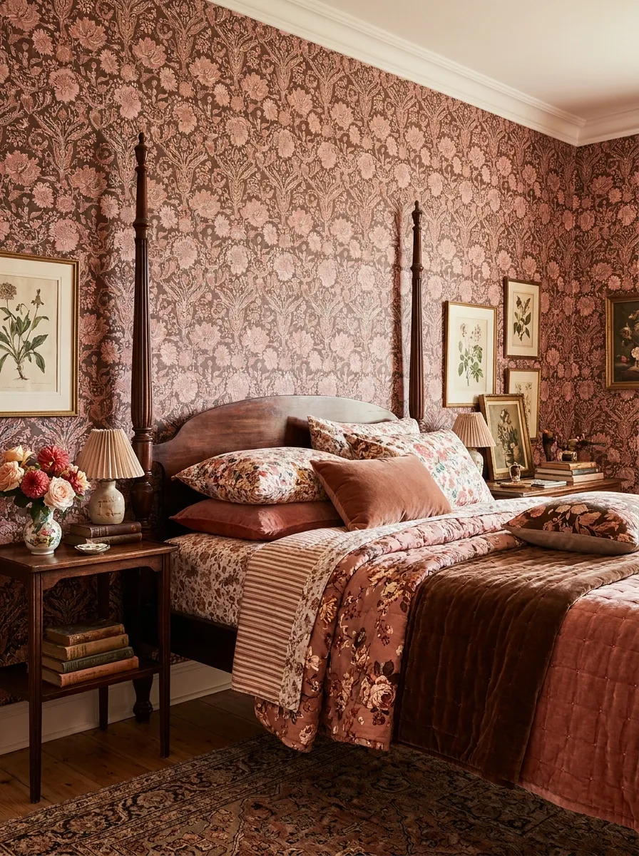
Choose a large-scale floral wallpaper in pink and deep brown, dense enough to read as texture from across the room rather than as individual flowers. Scale matters more than color accuracy here — a small print would read as busy rather than immersive.
Pair the wallpaper with a dark wood four-poster bed frame, letting the tall posts interrupt the pattern rather than blend into it. The posts need enough presence to hold their own against a wall this saturated.
Layer multiple florals in the bedding — a quilted floral coverlet, a striped throw, printed pillowcases — all pulling from the same warm pink-and-brown family as the wallpaper. Committing fully to pattern-on-pattern is what makes this maximalist approach feel intentional rather than accidental.
Group small framed botanical prints in an asymmetrical cluster beside the bed. Botanical illustrations echo the wallpaper’s floral DNA without repeating it exactly, adding depth rather than redundancy.
Boho Macrame Plant Wall Pink and Brown
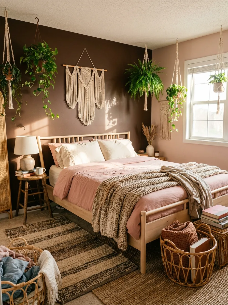
Paint one wall a deep chocolate brown as a backdrop for a cluster of hanging plants and a large macrame wall hanging. The dark wall is essential — pale walls would swallow the visual texture of trailing vines and woven fiber.
Choose pale wood bed furniture with a simple slatted headboard rather than anything upholstered. Natural wood keeps the room’s material palette honest to its boho roots and doesn’t compete with the macrame’s own texture.
Layer pink linen bedding with a chunky knit throw in a warm neutral. The throw’s oversized stitch texture matches the scale of the macrame hanging nearby, so the room’s textures feel related across different surfaces.
Fill the floor around the bed with woven baskets holding throws, books, and loose textiles. Baskets at floor level extend the room’s woven, organic feeling below the bed line, not just on the walls above it.
Soft Pink Rattan Pendant Gallery Wall
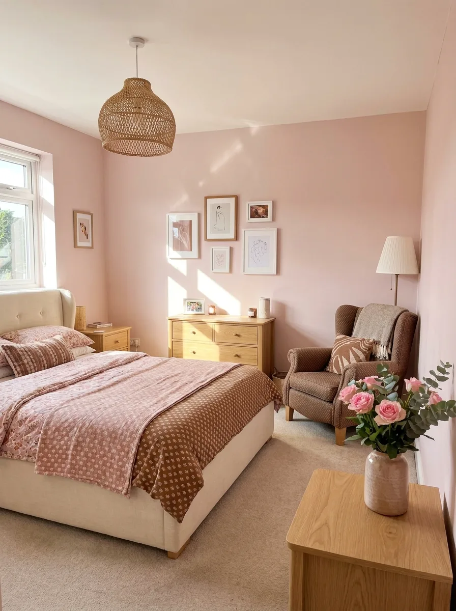
Paint the walls a soft, pale pink and keep the rest of the palette in warm honey oak rather than deep brown. This is the lightest version of the pairing, better suited to a room that wants softness over drama.
Hang a woven rattan pendant light as the room’s main fixture. The natural fiber shade introduces texture and a touch of brown without needing to paint or upholster anything in a darker tone.
Build a small gallery wall of simple line-art prints in mixed frame sizes, positioned above the dresser rather than above the bed. Keeping the gallery off the headboard wall lets the bed stay the visual anchor while still giving the room a personal touch.
Add fresh flowers in a ceramic vase on the nightstand as the one living element in the room. A single vase of real blooms does more to keep a soft palette like this from feeling flat than any additional styled object could.
Espresso Headboard with Cove Lighting
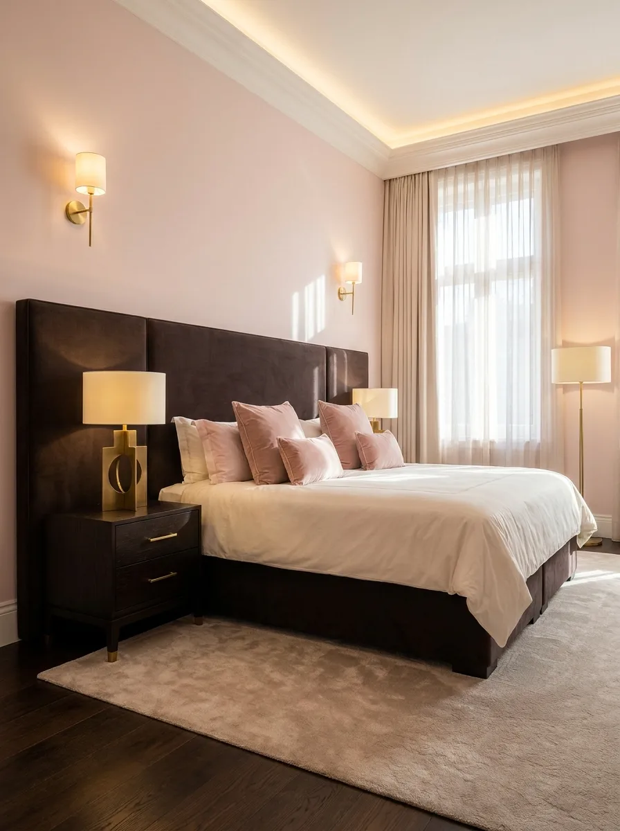
Install a wide, panelled espresso-brown headboard that extends beyond the width of the bed itself. The oversized footprint is what gives a simple upholstered headboard the presence of a full architectural feature.
Add hidden cove lighting along the ceiling perimeter, set to a warm, low glow rather than bright white. Indirect ceiling light softens the contrast between the dark headboard and pale pink walls without needing a single additional lamp.
Choose brass wall sconces flanking the bed rather than table lamps, freeing up the nightstand surface entirely. Sconces also put light at a consistent height, reinforcing the room’s symmetry.
Layer dusty pink velvet pillows against crisp white bedding for the bed’s only real color contrast. Keeping the bedding itself mostly neutral lets the headboard and the pillows carry the entire pink-brown story without overcrowding the bed.
Open Dark Wood Canopy Bed
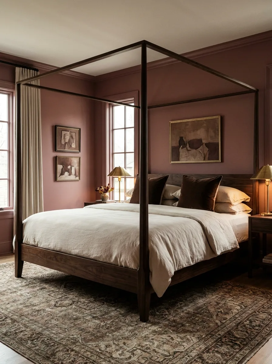
Choose a canopy bed frame left entirely open, with no curtains or drapery hung from the top rail. The exposed geometric frame becomes a piece of line art in its own right, visible against the wall behind it.
Paint the walls a dusty rose-brown that sits close in value to the wood frame itself. Keeping the wall and the frame in a similar tonal range lets the canopy’s geometry read clearly instead of getting lost in high contrast.
Layer simple linen bedding in cream and taupe, letting the canopy frame do all the visual heavy lifting above it. Ornate bedding under a frame this architectural would be one decorative gesture too many.
Add a small gallery of dark, moody artwork on the wall beside the bed rather than centred above the headboard. Off-centre placement keeps the open canopy frame as the room’s clear focal point.
Pink Velvet Draped Canopy Bed
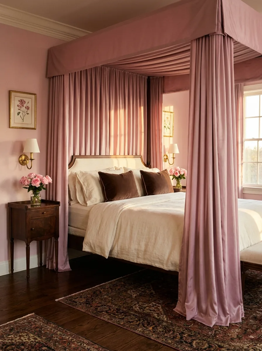
Build a canopy frame and drape it entirely in floor-length pink velvet curtains on all four sides, including a fully upholstered top panel. Full coverage, rather than partial drapery, is what pushes this into true four-poster drama.
Choose an antique wood bed frame with a carved, upholstered headboard peeking through the curtains rather than a plain modern frame. The glimpse of ornate wood between the velvet panels adds a layer of detail that pure fabric alone wouldn’t provide.
Pair the canopy with an antique wood nightstand rather than anything modern or glossy. The nightstand’s age and patina echo the bed frame’s own vintage character.
Finish with fresh roses in a simple glass vase on the nightstand. Real flowers cut through all that heavy velvet drapery with something light and alive, keeping the room from feeling like a stage set.
Vintage Gold Mirror Over Four-Poster
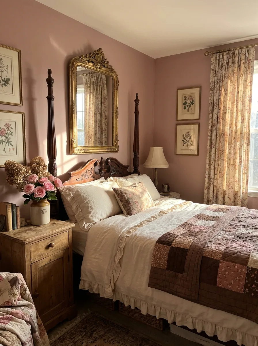
Choose a dark wood four-poster bed frame with turned, carved posts, positioned beneath a large antique gold mirror hung directly above the headboard. The mirror’s ornate frame becomes the de facto headboard art, doing double duty as both function and decoration.
Paint the walls a warm dusty rose and hang a small cluster of botanical prints on either side of the mirror. Symmetrical botanical prints flanking a central mirror is a classic pairing that reads as collected rather than staged.
Layer patchwork quilted bedding with ruffled edges in creams and dusty pinks. The ruffle detailing along the quilt’s edge adds a soft, handmade quality that matches the room’s overall vintage character.
Add floral curtains in a coordinating but not identical print to the bedding. Near-matching rather than exact-matching patterns is what keeps a heavily patterned vintage room from reading as a matched furniture set.
Chocolate Wall with Pink Headboard Contrast
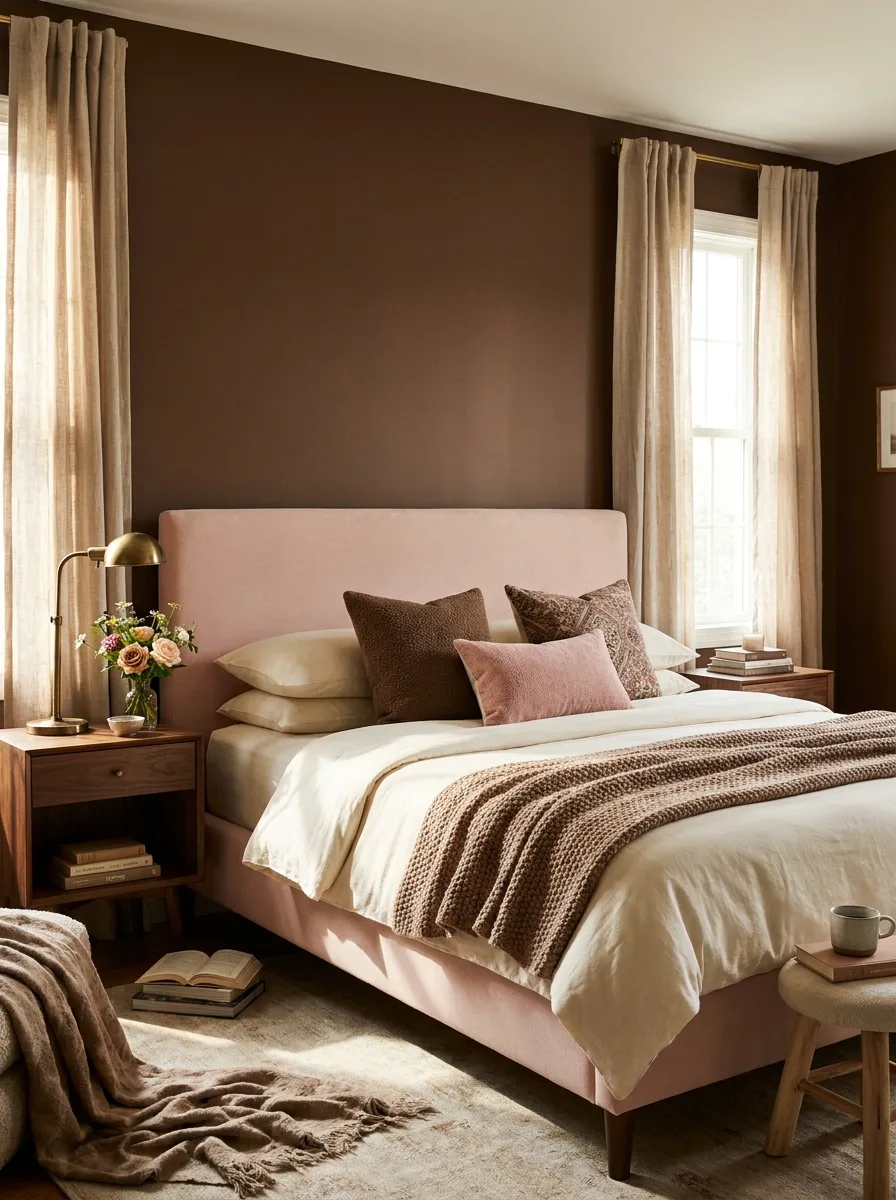
Paint a single wall behind the bed in a deep, near-black chocolate brown, leaving the remaining walls a much lighter neutral. Contained contrast like this reads as a deliberate design choice rather than a full room commitment.
Choose a simple, straight-edged blush pink upholstered headboard to sit directly against the dark wall. The pale headboard against the dark backdrop is the entire visual trick — no additional pattern or texture is needed to make it work.
Add a brass gooseneck task lamp on the nightstand rather than a traditional table lamp. The lamp’s warm metal and slender silhouette keeps the nightstand from adding visual bulk against an already bold accent wall.
Layer mixed-texture pillows — a patterned brown, a solid blush velvet — for the bed’s only additional pattern. Two or three pillows is enough; this look depends on the wall-and-headboard contrast staying the clear focal point.
Mauve Paneled Walls with Gold Floor Lamps
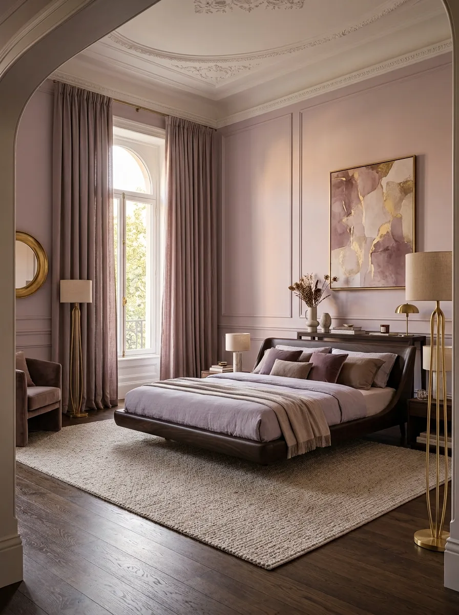
Install classic panel moulding across every wall in a muted mauve, extending the treatment onto the ceiling trim as well for a fully enveloped effect. Full architectural coverage is what elevates this from a painted room to a designed one.
Choose a low-profile dark wood platform bed rather than a tall upholstered frame, letting the panelled walls stay the dominant vertical element in the room. A shorter bed frame keeps the eye traveling up toward the architecture instead of stopping at the headboard.
Add a pair of tall gold arc or slim floor lamps flanking the room rather than table lamps at bedside. Floor lamps at this height echo the room’s tall proportions and panelled walls better than anything sitting low on a nightstand could.
Finish with an abstract gold-and-pink art piece sized generously above the bed. A large-scale abstract work, rather than a small framed print, is necessary to hold its own against walls already this detailed.
Final Thoughts
Pink and brown never needed rescuing from each other. They needed someone to stop treating them as a compromise and start treating them as a genuine partnership.
Every room here made a choice about who’s leading and who’s supporting, then let texture and material do the rest of the convincing. That’s the whole trick, repeated twenty different ways.
The palette isn’t soft by default and it isn’t safe by default either. It’s whatever the ratio, the material, and the era decide to make it.
Stop assuming pink needs brown to tone it down. Sometimes brown is the one that needed pink to warm it up.