
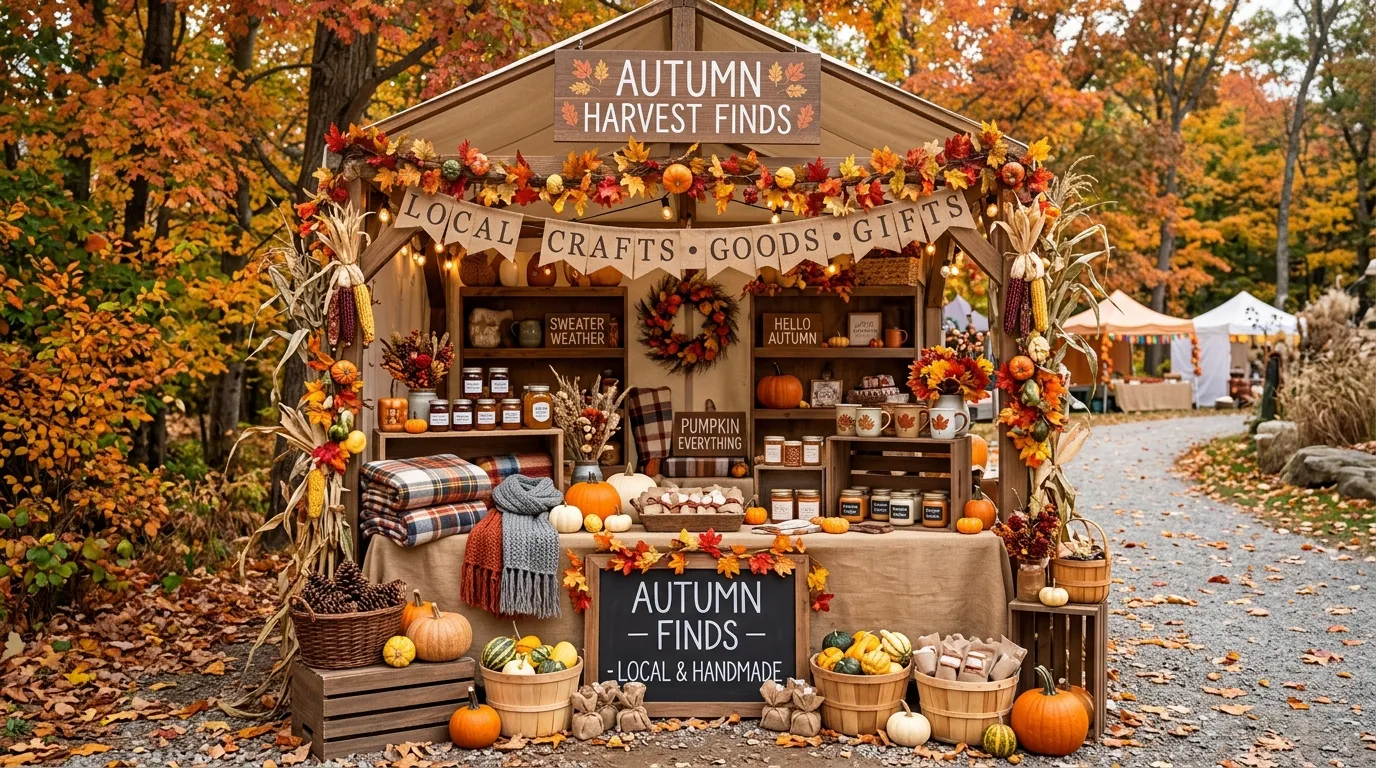
A fall booth starts looking cheap the moment every surface gets covered with orange pumpkins and random autumn signs. Seasonal merchandise isn’t the problem. The lack of a visual story is.
The strongest fall booth displays vintage shoppers remember feel like little places you could actually walk into. An old market stall. A country pantry. A dusty library. A greenhouse at the end of harvest season. The products matter, but the setting gives them meaning.
That’s why isolated decorating tips aren’t especially useful here. A suggestion like “add crates” tells you almost nothing about the finished display. You need to see how the crates, shelving, signage, lighting, merchandise, color, and empty space work together.
The designs below take that approach. Each one is a complete booth direction, with its own materials, palette, architecture, and mood. Some are rustic and familiar. Others are deliberately strange. That variety is the point.
What Makes a Vintage Fall Booth Feel Like a Finished Scene
Let the Booth Have One Visual Story
The best displays have an obvious identity before you notice the individual products. Decide whether the booth feels like a farmstand, pantry, workshop, library, greenhouse, or old shop. Once that choice is clear, the smaller decisions become much easier.
Mix Patina With Autumn Color, Not Random Decorations
Vintage character comes from age, wear, material, and proportion. Autumn color should reinforce that story. Rust, ochre, faded green, cream, copper, tobacco brown, and dusty rose usually feel more convincing than throwing every bright seasonal shade into one corner.
Build Height Before You Add More Stuff
A flat table covered with merchandise still looks flat when you add more merchandise. Create levels with shelving, cabinets, crates, windows, signs, hanging pieces, or tall dried stems first. Then place the products into that structure.
Vintage Fall Booth Displays With a Real Sense of Place
Antique Farmstand in Burnt Orange and Cream
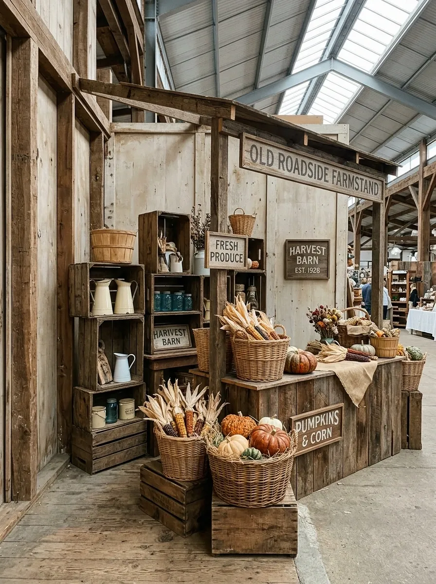
This booth looks like an old roadside produce stand that somehow wandered into an indoor market. Start with a weathered timber stall structure, then build the display around stacked wooden crates, cream enamelware, wicker baskets, dried corn, pumpkins, and small vintage signs. Keep most of the background pale and let burnt orange arrive through the produce and textiles.
The important part is the restraint. Don’t cover every inch with props. Leave some wood visible. Let the age of the materials do some of the decorating.
The result feels agricultural without looking like a Halloween aisle.
Moody Mercantile With Dark Wood and Copper
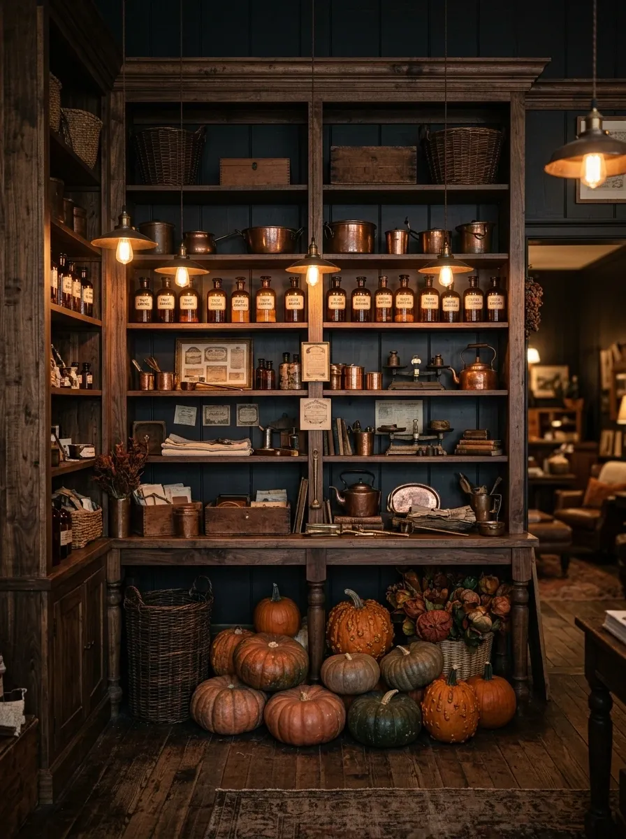
This direction skips the bright farmhouse look entirely. Use deep walnut-toned shelving, aged copper containers, amber glass bottles, old framed labels, dark baskets, and a concentrated cluster of rust-colored pumpkins. The booth should feel like an old general store after the sun has gone down.
Copper gives the darker palette a little warmth without turning shiny or decorative for the sake of it. Keep the signage simple and let the wood carry most of the visual weight.
This one works especially well when the products themselves are small. The shelves create a strong architectural frame around them.
Vintage Pumpkin Market With Layered Wooden Steps
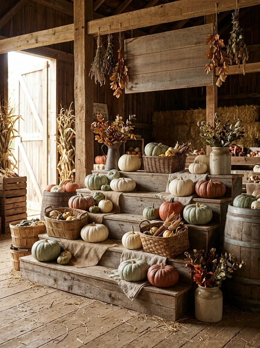
The display gets its visual punch from height rather than decoration. Build several broad wooden steps across the rear and center of the booth, then let pumpkins, baskets, crockery, and merchandise climb gradually upward.
Use different pumpkin sizes so the arrangement doesn’t become a row of identical spheres. Add a few dried stems and one strong sign near the upper third of the composition.
The clever part is that the structure does most of the organizing. You don’t need twenty props when the display itself already creates rhythm.
1970s Harvest Booth With Mustard and Avocado Tones
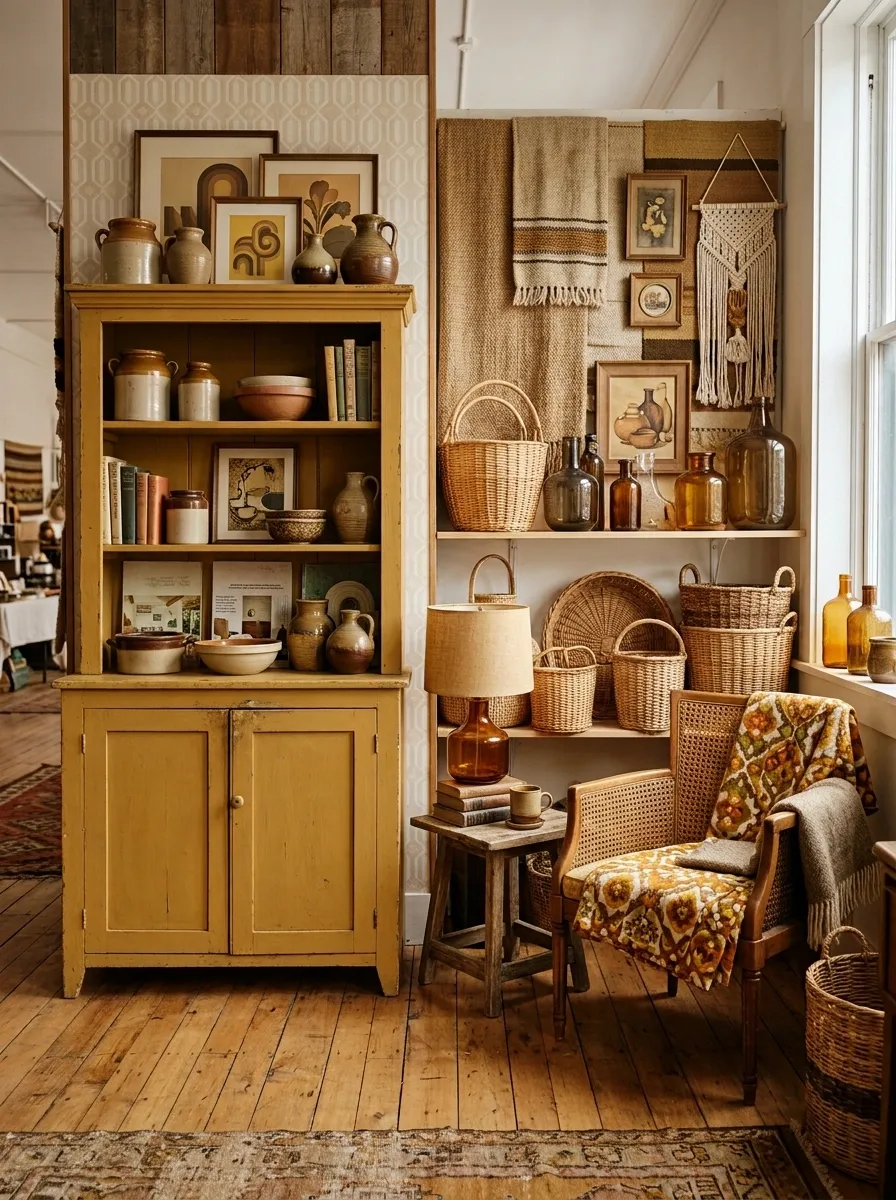
Forget the predictable pumpkin-orange farmhouse formula. This booth leans hard into the 1970s with mustard yellow, muted avocado, ochre, tobacco brown, cane, old ceramics, patterned fabric, and vintage paper graphics.
The merchandise should sit inside that color world rather than interrupt it. A mustard-painted cabinet can anchor one side while woven baskets and amber glass soften the opposite side. Use one or two retro posters, not an entire wall of them.
It feels nostalgic, but not like a costume shop.
French Country Autumn Stall With Linen and Aged Wood
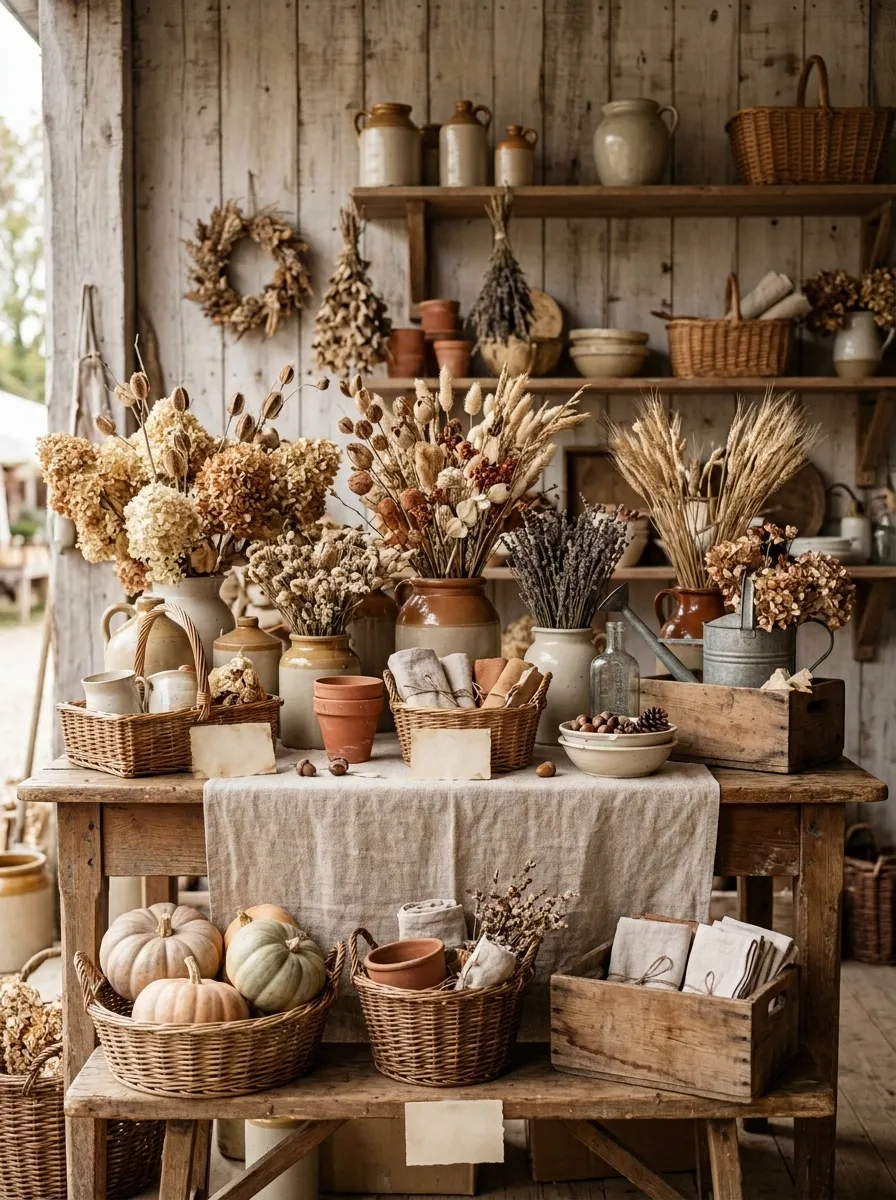
This booth is quieter. Pale weathered wood forms the backdrop, while linen runners, woven baskets, ceramic vessels, dried flowers, muted pumpkins, and understated handwritten signage build the scene.
The palette should stay close to oatmeal, faded terracotta, dusty cream, and soft brown. That’s what keeps the display feeling old rather than aggressively themed.
A few imperfect objects are better than a dozen perfectly matched ones. Let the ceramics differ slightly. Let the baskets have different shapes. The whole point is to make the display feel collected over time.
The concept suits handmade goods particularly well because the booth already gives them a handcrafted context.
Black Iron and Rust Workshop Booth
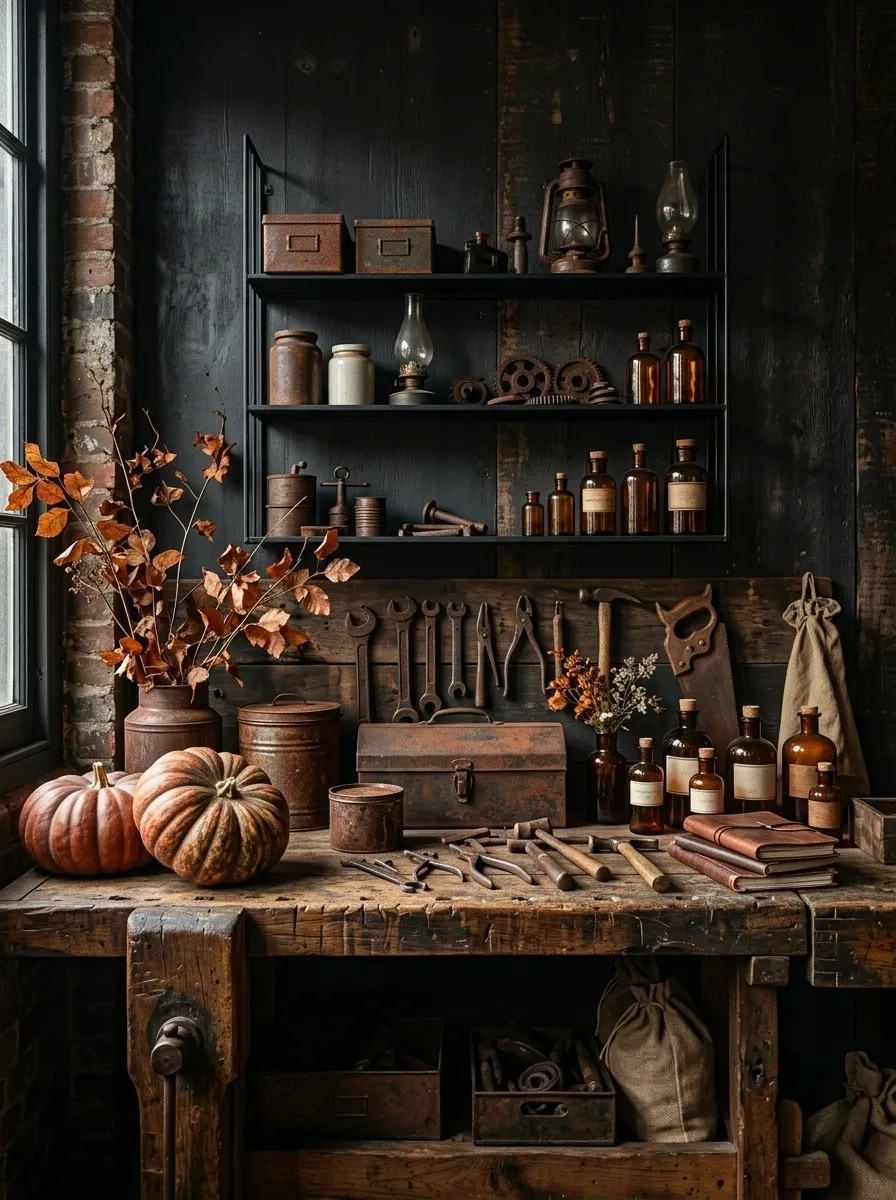
This booth looks less like a seasonal display and more like an old repair shop that happens to be selling autumn goods. Use black iron shelving, reclaimed timber, rusty metal containers, amber bottles, old tools, dried branches, and a few oversized pumpkins.
Keep the background dark and let the rust-colored objects carry the seasonal color. A battered workbench can serve as the main counter, while narrow iron shelves create vertical storage behind it.
The trick is knowing when to stop. Add enough worn metal to establish the workshop story, then leave room around the merchandise. Otherwise, the booth starts looking like a prop closet.
Old Library Harvest Display
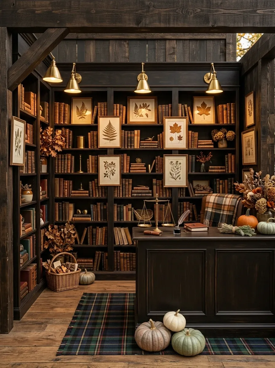
Autumn can look surprisingly good in a library. Build the booth around tall dark bookcases filled with old books, framed botanical prints, brass lamps, dried stems, plaid textiles, and small seasonal merchandise tucked between the shelves.
Use pumpkins sparingly. A few muted ones on the floor and counter are enough to connect the display to fall without turning the library into a pumpkin stand.
The real star is the warm pool of light from the lamps. It gives the darker wood depth and makes the booth feel like an actual room with a history.
Harvest Greenhouse Booth With Botanical Overhead Layers
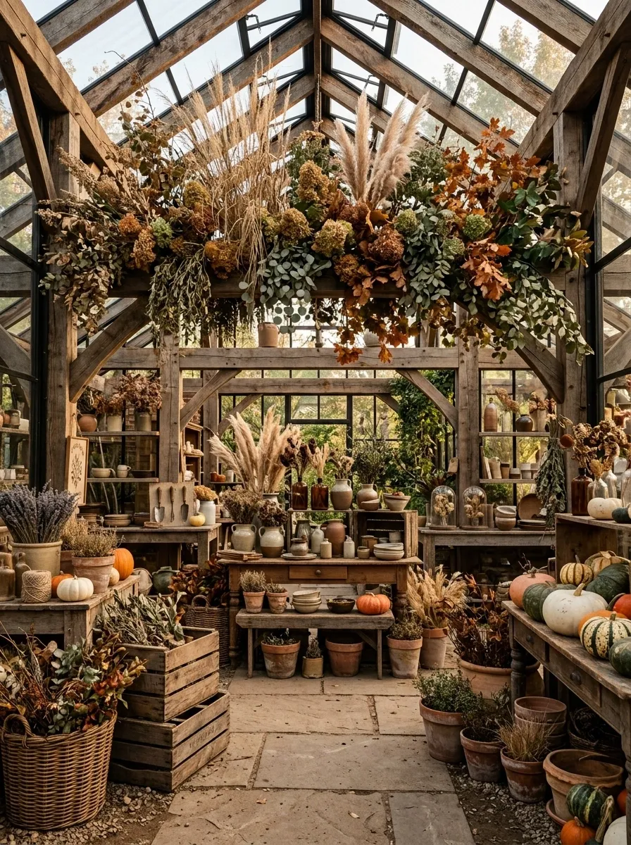
A greenhouse frame changes everything because the ceiling becomes part of the display. Use an aged metal or timber framework with wooden tables below, then bring in terracotta pots, dried stems, pumpkins, botanical signs, baskets, and scattered autumn foliage.
Let some branches and grasses rise above eye level. That creates a layered silhouette when people first see the booth from across the market.
Keep the floor relatively open. The visual density should increase as the eye moves upward, not become a pile of objects underfoot.
This is one of those concepts where the structure itself does half the work.
Rusty Barn Door Backdrop With Pumpkin Clusters
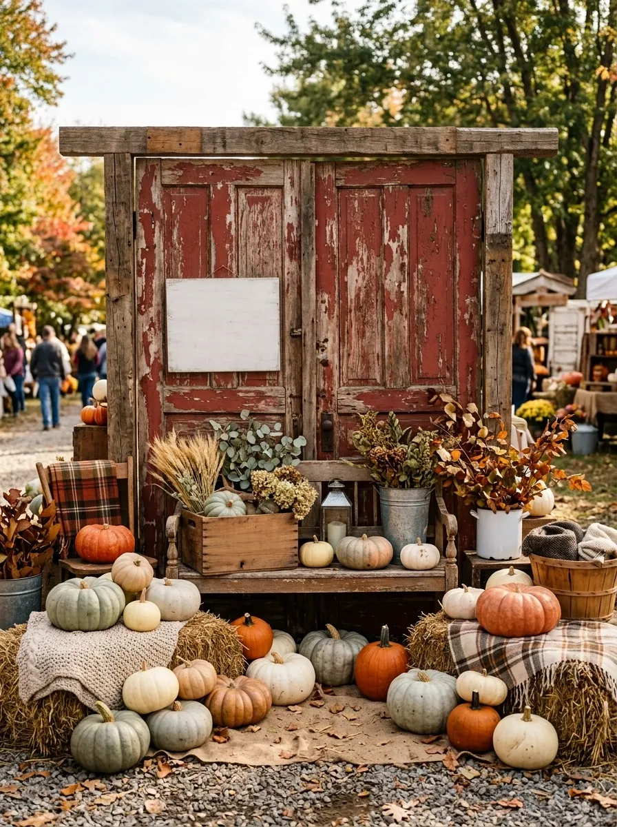
The backdrop carries this booth. Use a pair of weathered barn doors, rough timber framing, galvanized containers, hay-colored textiles, simple vintage signage, and several pumpkin clusters arranged at different heights.
Don’t try to decorate the barn doors themselves with dozens of little objects. Their worn boards already provide enough texture. Place the strongest merchandise in front and allow the backdrop to remain partly visible.
The pumpkins should be grouped, not scattered. A few large ones near the floor, smaller forms on a bench, and one elevated cluster create much more visual rhythm than an even row.
Autumn General Store With Checkerboard Floor
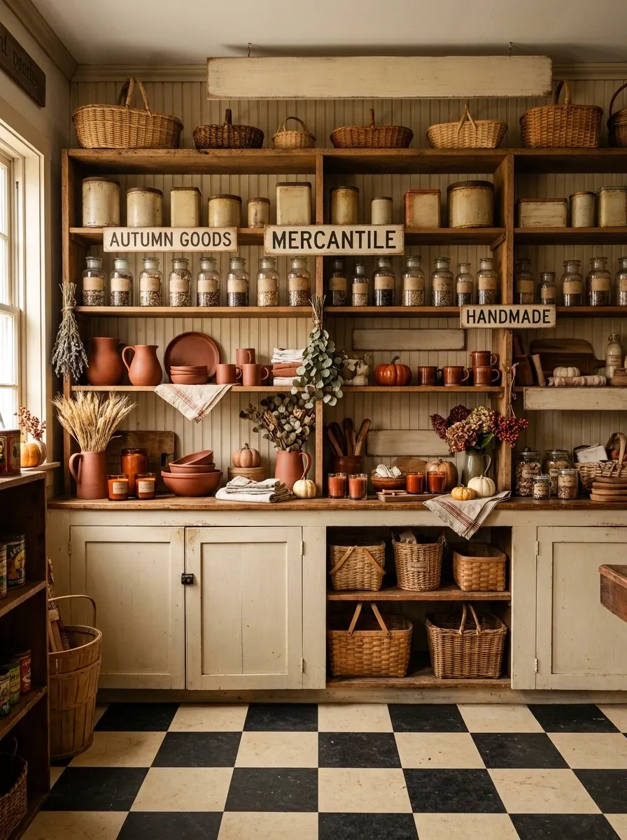
This booth borrows its personality from an old neighborhood general store. A black-and-cream checkerboard floor establishes the setting, while painted cabinetry, open shelving, vintage tins, jars, baskets, wooden signs, and rust-colored seasonal merchandise fill the space.
The floor matters more than it sounds. It gives the booth a strong graphic base, which means the upper half can stay relatively quiet. Use cream walls or aged painted wood behind the shelving, then bring in autumn color through a few concentrated product groups.
The display feels nostalgic without leaning completely into farmhouse styling.
Dusty Rose and Copper Romantic Fall Booth
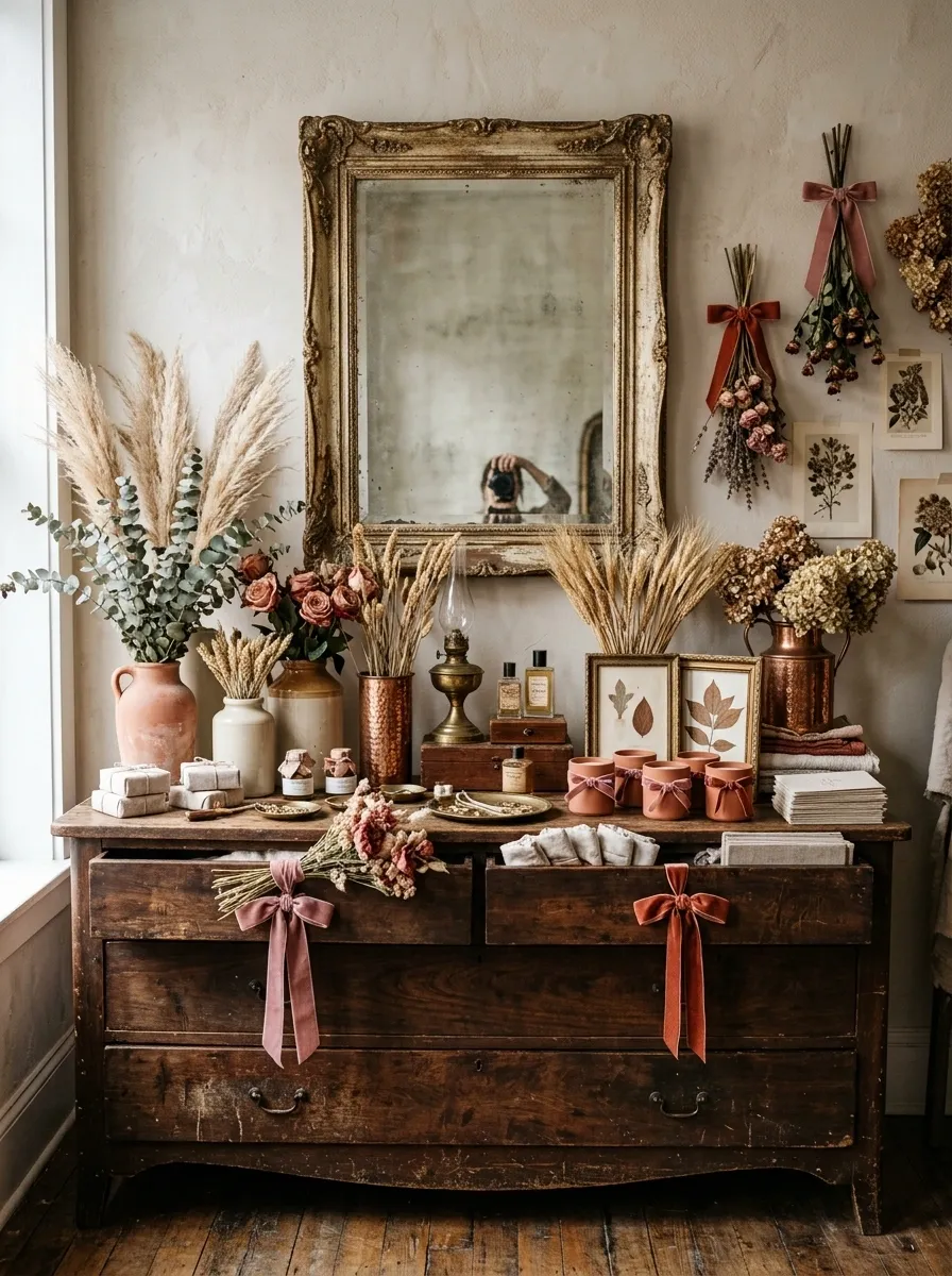
Autumn doesn’t have to be orange everywhere. This booth builds its identity around dusty rose, faded terracotta, copper, old wood, dried flowers, velvet ribbon, and antique frames.
Use a weathered dresser or narrow console as the main display surface. Hang a large vintage frame or old mirror behind it, then group dried flowers and seasonal products in small clusters rather than spreading them evenly across the booth.
The copper works as a warm bridge between the rose tones and the aged wood. It also keeps the palette from feeling too soft.
This is a good direction when the merchandise has a handmade, feminine, or romantic character.
Vintage Suitcase Market Display
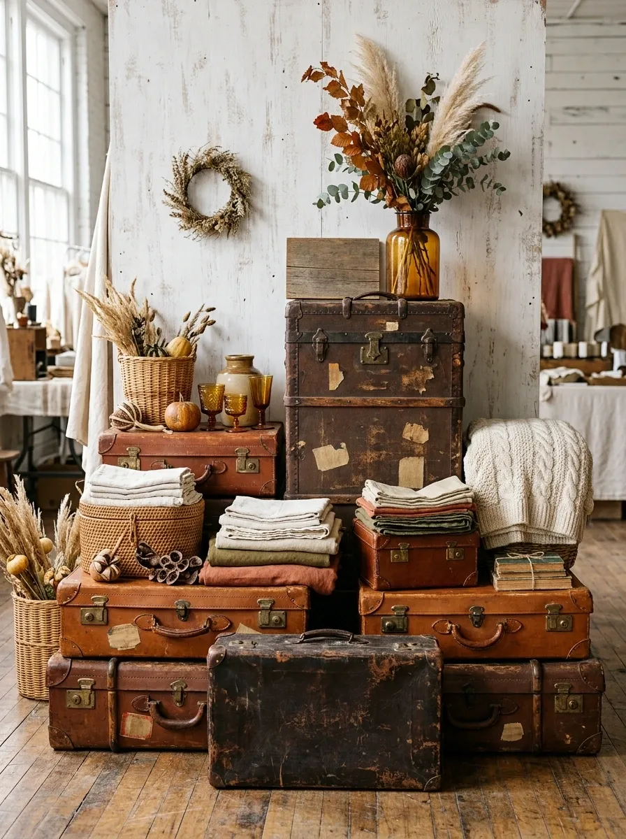
Stacked luggage becomes the architecture here. Use old suitcases and trunks in different sizes to build a stepped display, then fill the openings with folded textiles, baskets, seasonal merchandise, dried foliage, and vintage travel labels.
Keep the tallest luggage slightly off center. Perfect symmetry would make the arrangement look staged in the wrong way.
A worn leather suitcase at floor level gives the display weight, while lighter cases and baskets create the upper layers. A single autumn sign can sit near the highest point and act as the visual punctuation.
The concept works because the storage pieces aren’t random props. They actually organize the merchandise.
Harvest Bakery Window With Warm Amber Lighting
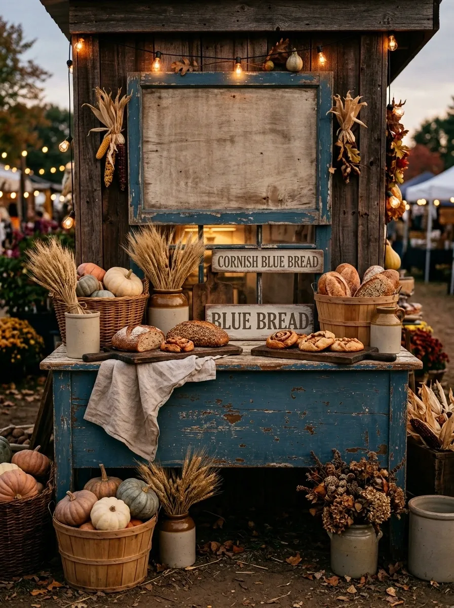
This booth recreates the feeling of an old neighborhood bakery during harvest season. Build a painted wooden counter with an aged window frame behind it, then add bread boards, ceramic crocks, linen, baskets, pumpkins, wheat bundles, and vintage bakery-style signs.
Use warm amber lighting inside the display rather than blasting the whole booth with bright overhead light. That little shift changes the mood immediately.
Keep the color palette around cream, honey, cinnamon, soft brown, and muted orange. The booth should feel warm enough to suggest fresh baking even when the products have nothing to do with food.
Scandinavian Vintage Harvest Market
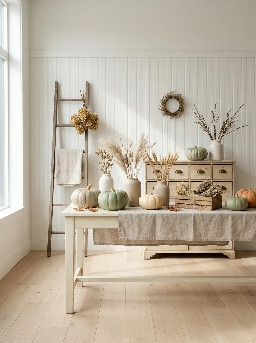
This is the lightest concept in the collection, and that’s exactly why it earns its place. Pale wood, cream-painted furniture, woven baskets, simple ceramics, dried grasses, oatmeal textiles, and muted pumpkins create a quieter autumn setting.
Skip fake distressing and piles of decorative antiques. One genuinely aged cabinet is more convincing than six objects that all look deliberately weathered.
Use an open shelf or narrow ladder at the back for height, then keep the main table relatively uncluttered. The empty space becomes part of the design.
It feels vintage through shape, material, and softness rather than visual overload.
Blue-and-Rust Antique Booth
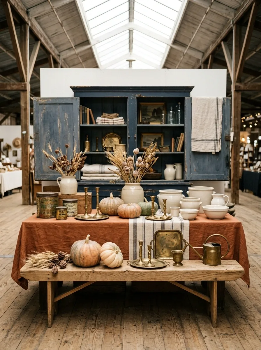
Blue gives this autumn display a completely different starting point. Use faded navy furniture, rusty orange textiles, cream ceramics, aged brass, antique tins, striped fabric, and several muted pumpkins.
A blue-painted cabinet works beautifully as the main backdrop. Build a concentrated rust-colored merchandise group against it, then use cream objects as visual breathing room.
The palette feels collected rather than seasonal because the navy isn’t an obvious fall color. That’s what makes the booth more memorable from across the aisle.
I’d keep the signage neutral here. The color story is already doing enough work.
Wooden Orchard Crate Wall
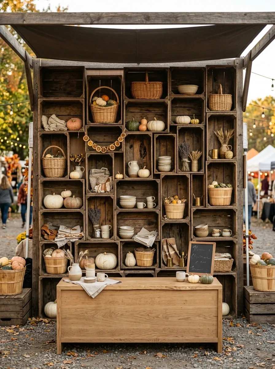
Here, the display structure becomes the star. Arrange reclaimed fruit crates into a full-height wall, but don’t make the grid perfectly uniform. A few crates can project forward while others sit deeper, creating pockets for baskets, ceramics, pumpkins, dried fruit, and small merchandise.
The uneven depth gives the booth a more convincing old-market feel and creates natural shelves without needing much additional furniture.
Use a simple wooden counter in front so the crate wall remains visible from a distance. Otherwise, the whole point of building that texture gets hidden.
Antique Textile Shop in Autumn Colors
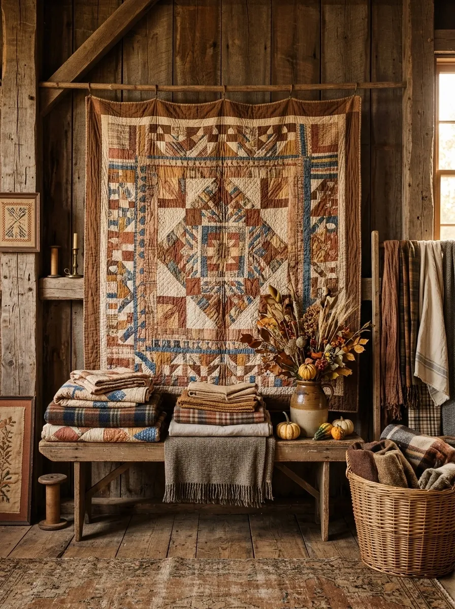
This booth puts fabric at the center of the story. Use old wooden racks, folded quilts, plaid blankets, linen, wool textures, wicker baskets, dried flowers, and a warm palette of tobacco, cream, faded rust, and muted mustard.
Instead of spreading the textiles across every surface, create a few substantial layers. A hanging quilt can form the backdrop, while folded pieces sit on a narrow bench below.
The booth should feel tactile from across the room. People should understand that this is a textile-focused space before they get close enough to read a sign.
Old Schoolhouse Fall Booth
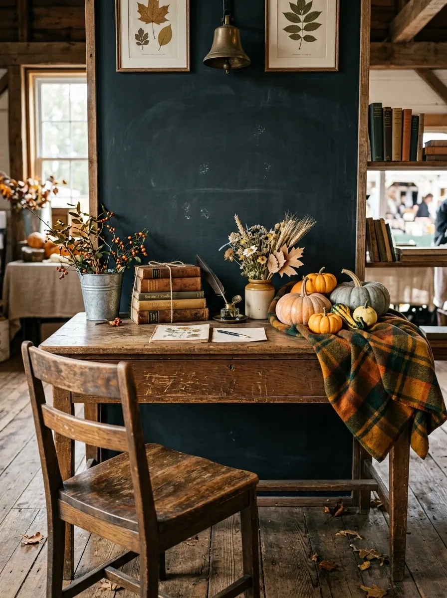
This display borrows the visual language of an old classroom without turning it into a children’s Halloween set. Use a vintage school desk, wooden chair, chalkboard signage, old books, galvanized buckets, paper leaves, plaid fabric, and a few pumpkins.
The desk becomes the main product surface. The chalkboard sits behind it, while the chair and bucket occupy the lower corners to create a believable little room.
Keep the graphics simple. One handwritten-style message on the board is enough. Covering it with quotes and illustrations would make the booth feel themed instead of vintage.
Antique Green Cabinet and Golden Harvest
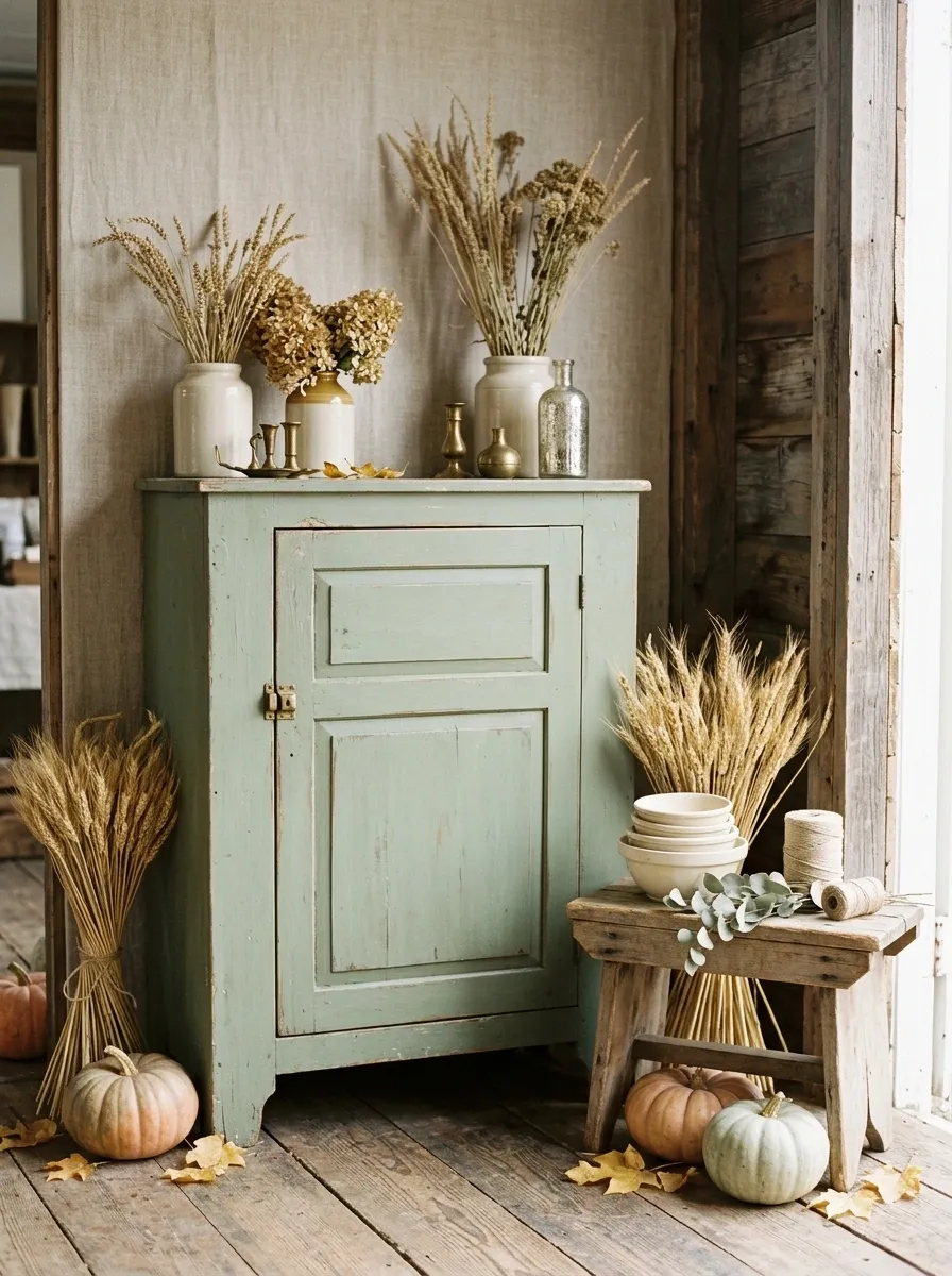
The strongest element here is a faded sage-green cabinet. Everything else supports it: golden leaves, wheat bundles, aged brass, cream ceramics, rough wood, and muted orange pumpkins.
Place the cabinet slightly off center rather than directly against the middle of the booth. Build one merchandise cluster on top, then use the floor and a nearby wooden stool to create a second level.
The green is what keeps the autumn palette from becoming predictable. It also gives the display a botanical, heritage-shop character.
Don’t crowd the cabinet with signs. Let its color and shape remain obvious from a distance.
Rustic Candlelit Autumn Tavern
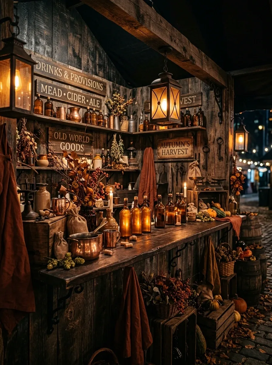
This concept pushes the mood much darker. Use reclaimed timber walls, wrought iron brackets, amber glass bottles, lantern-style lights, copper vessels, deep rust textiles, dried branches, and a substantial wooden counter.
The lighting should be concentrated rather than evenly spread. A few warm points of light will make the booth read as an intimate old tavern instead of a standard market stand.
Keep the merchandise close to the counter and lower shelves. The upper wall can carry a few pieces of rustic signage and dried branches without becoming packed.
The result feels old-world without requiring elaborate historical props.
Farmhouse Window Display With Layered Curtains
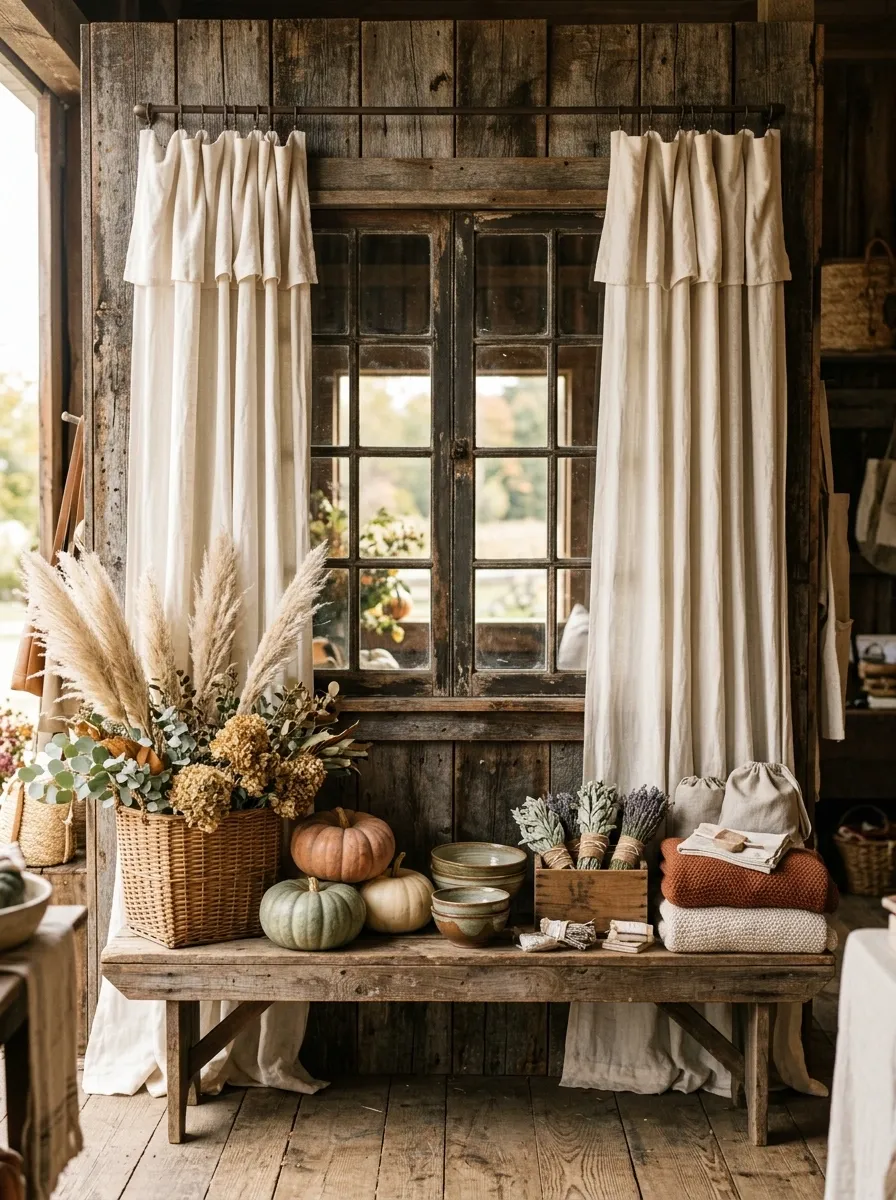
One old window can give a booth more architectural character than a dozen decorative signs. Mount a weathered window into a timber backdrop, add soft curtains, then place a wooden bench underneath with baskets, pumpkins, dried grasses, and seasonal merchandise.
The curtains shouldn’t hang perfectly. A slight overlap or uneven fold keeps the arrangement from looking like a staged furniture catalog.
The window becomes the focal point while the bench handles the merchandise. That separation makes the display much easier to understand from a distance.
It also suggests another room beyond the booth, which gives a relatively simple structure more depth.
Old World Greenhouse Market With Layered Foliage
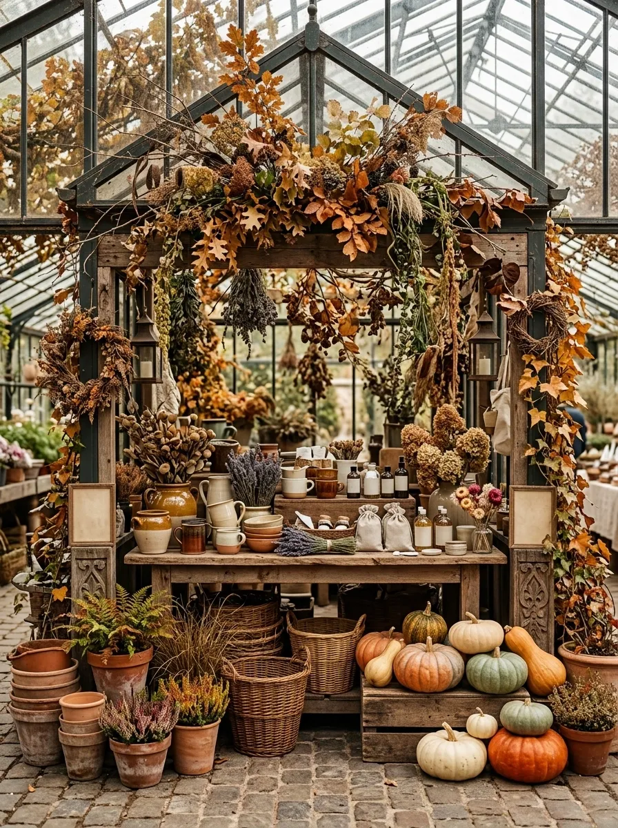
This version turns the booth into a miniature autumn greenhouse. Use an aged wood or painted metal frame, terracotta pots, rough wooden tables, wicker baskets, dried grasses, trailing foliage, pumpkins, and botanical signs.
The important difference from a basic garden display is the overhead structure. Let dried branches and leafy stems extend through the upper frame so the booth has a strong silhouette before anyone notices the products.
Keep the merchandise grouped on two or three substantial tables rather than scattering it across the floor. The structure should remain visible.
Harvest Produce Stand With Striped Awning
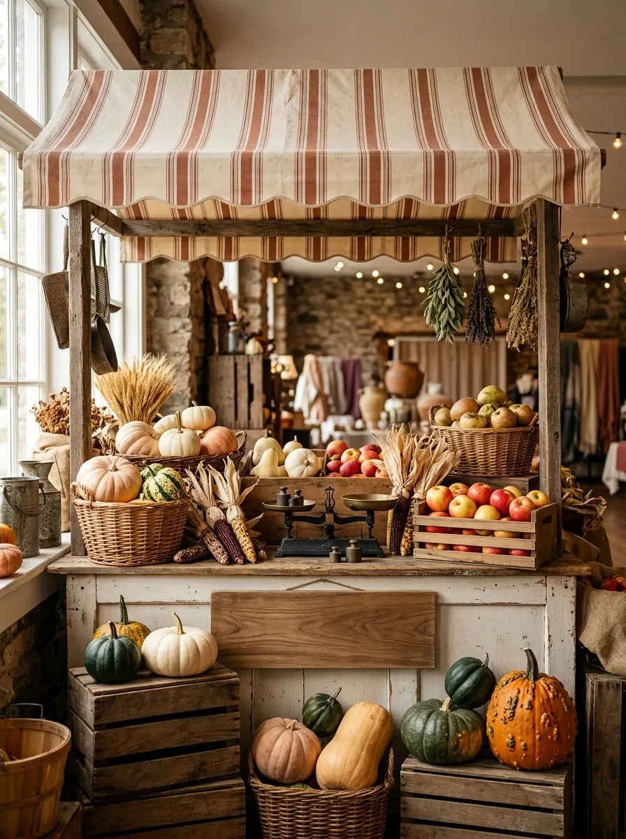
Go full market stall with a faded striped awning, painted timber counter, wooden crates, woven baskets, pumpkins, apples, dried corn, hand-painted signage, and old metal scales.
The awning creates an immediate visual identity from across the room. Use a muted cream and rust stripe rather than a bright carnival combination.
Keep the produce and merchandise arranged in broad color clusters. One basket of pale pumpkins can sit beside darker gourds and warm wood, while a small stack of crates rises toward one side.
The booth should feel busy in a useful way. This is one of the few concepts where abundance is part of the story.
Faded Plum and Brass Autumn Parlour
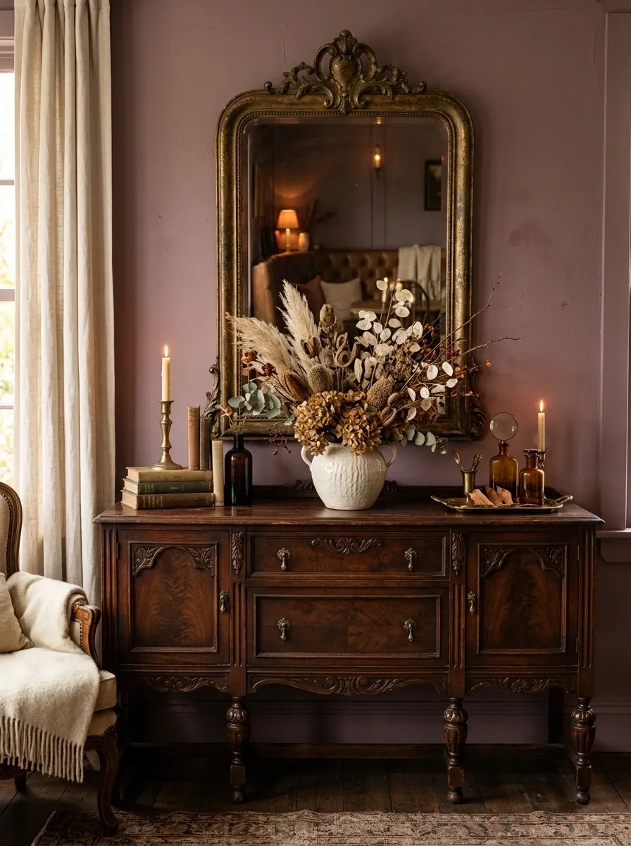
For a completely different fall palette, build the booth around faded plum, dusty mauve, antique brass, dark wood, cream, and muted copper.
Use an old sideboard as the main furniture piece, then add a vintage mirror or framed artwork above it. Dried flowers can spill from a ceramic vessel while seasonal merchandise sits in small, deliberate groups across the surface.
The dark plum should stay concentrated. Too much would make the booth heavy. Cream textiles and brass details keep the composition from disappearing into its own darkness.
This feels romantic without falling into the usual orange, plaid, and burlap routine.
Heritage Farmhouse Booth With Built-In Bench
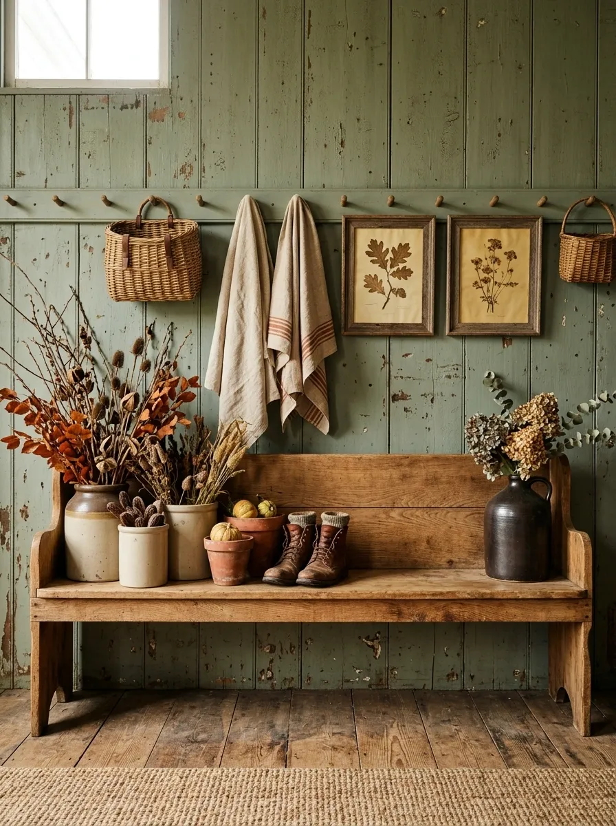
This one feels like a real farmhouse entry rather than a decorated market stand. Build a weathered painted wall with a long wooden bench, pegs, baskets, old framed prints, folded textiles, boots or crocks, dried branches, and a concentrated fall display.
The bench gives you a useful horizontal line and keeps the lower half of the booth grounded. Hang baskets and textiles above it to establish another layer without filling the wall completely.
Place the strongest merchandise near the center and leave the bench ends relatively open. That small amount of negative space makes the whole arrangement look intentional.
The farmhouse character comes from the architecture and furniture first. Autumn is the supporting story.
Maximalist Antique Attic Booth
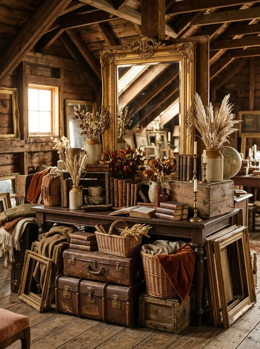
This booth should feel like somebody opened the door to an old attic and found a surprisingly good market display inside. Start with a walnut table, antique trunks, old frames, vintage lamps, books, mirrors, baskets, ceramics, dried botanicals, and layered textiles.
The trick is controlled abundance. Let the objects overlap, but keep the overall palette close to tobacco, cream, walnut, faded rust, and brass. That keeps the display rich without making every object compete for attention.
A large frame or mirror should provide one clear focal point near the center. Everything else can gather around it.
This is the maximalist concept, so don’t sterilize it. It should feel collected.
Conclusion
A convincing vintage fall booth isn’t built by collecting the most autumn decorations. It comes from choosing a world first, then making the furniture, materials, color, signage, merchandise, and lighting agree with it.
That’s why a greenhouse, library, old bakery, farmhouse entry, or antique shop can all feel completely different even when they contain some of the same seasonal products.
Start with the strongest structural element in your booth. It might be an old cabinet, a window, a crate wall, a counter, or a painted backdrop. Build around that rather than covering it up.
Save the concepts that actually fit your brand and your merchandise. A clear reference is much more useful when you’re standing in an empty booth with a few hours left before opening.