
Cheap furniture often looks cheap for a reason that has very little to do with the furniture itself.
A simple dresser can look flat and temporary when it sits against a blank wall with scattered accessories, then look surprisingly polished when the same piece is placed inside a thoughtful composition.
Proportion, color, lighting, surrounding materials, and even the amount of empty space around the furniture can completely change the impression.
That is why adding a few expensive-looking details doesn’t always solve the problem. Swapping hardware or putting a decorative object on top may improve one part of the piece, but the room can still feel disconnected.
A more convincing result comes from treating the furniture as part of a complete visual setting.
Complete Furniture Looks That Make Budget Pieces Feel Custom
A well-chosen affordable piece can become the quiet foundation of a room when the rest of the composition gives it enough visual structure. These designs take very different routes, so the goal isn’t to copy one exact room. It’s to notice which visual decisions give an ordinary piece a stronger presence.
Warm Oak-Look Dresser With Tonal Walls and Linen Styling
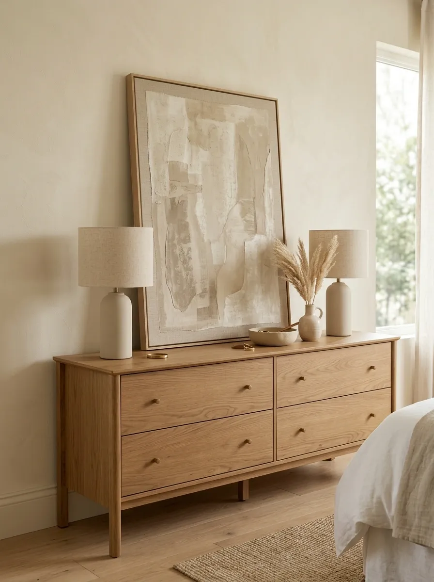
Warm wood instantly gives this basic dresser a stronger visual identity. A medium oak finish sits comfortably against creamy beige walls, while a large linen-covered artwork and simple ceramic lamps keep the composition soft rather than overly decorative.
The important move is the tonal relationship. The dresser doesn’t need elaborate hardware or ornate detailing because the wall, floor, textiles, and accessories all sit close to its color family. That allows the wood grain to become part of the room instead of looking like a standalone budget piece.
A restrained composition works especially well here. Keep the accessories substantial but limited, with one larger artwork carrying more visual weight than a collection of small frames.
Painted Black Nightstand With Brass Details and Cream Bedding
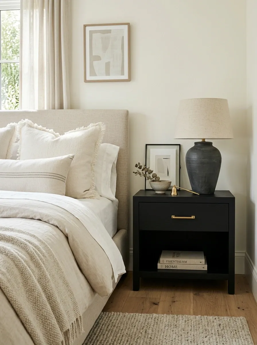
A small black nightstand can look far more intentional when it is treated as part of a larger contrast story. The deep finish works against warm ivory bedding, pale walls, and a softly textured rug, while understated brass hardware provides just enough warmth.
The key is keeping black visible in more than one place. A dark lamp base, picture frame, or slim furniture detail can echo the nightstand without turning the room into a black-and-white scheme.
Because the furniture is compact, scale matters. A substantial lamp and generously sized bedding keep the nightstand from looking undersized. The result feels deliberate because the small piece belongs to a larger visual hierarchy.
Secondhand Dresser With Deep Olive Paint and Vintage-Inspired Styling
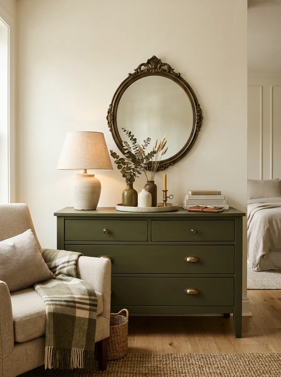
Deep olive gives an inexpensive dresser a completely different character from a standard pale wood finish. Against warm cream walls, the color feels grounded and slightly historic, especially when paired with aged-looking brass hardware, an antique-style mirror, and soft textiles.
The furniture itself doesn’t need to look old for the composition to have vintage character. The surrounding shapes do most of the work. A rounded mirror, traditional lamp silhouette, and softly patterned textile create a layered setting while the dresser remains simple.
The palette should stay restrained. Olive, cream, warm brown, and muted brass are enough. Adding too many decorative colors would weaken the calm, collected quality that makes this concept convincing.
Dominant furniture tone
Visual relief
Grounding layer
Small accent
Flat-Pack Console Styled Like Custom Millwork
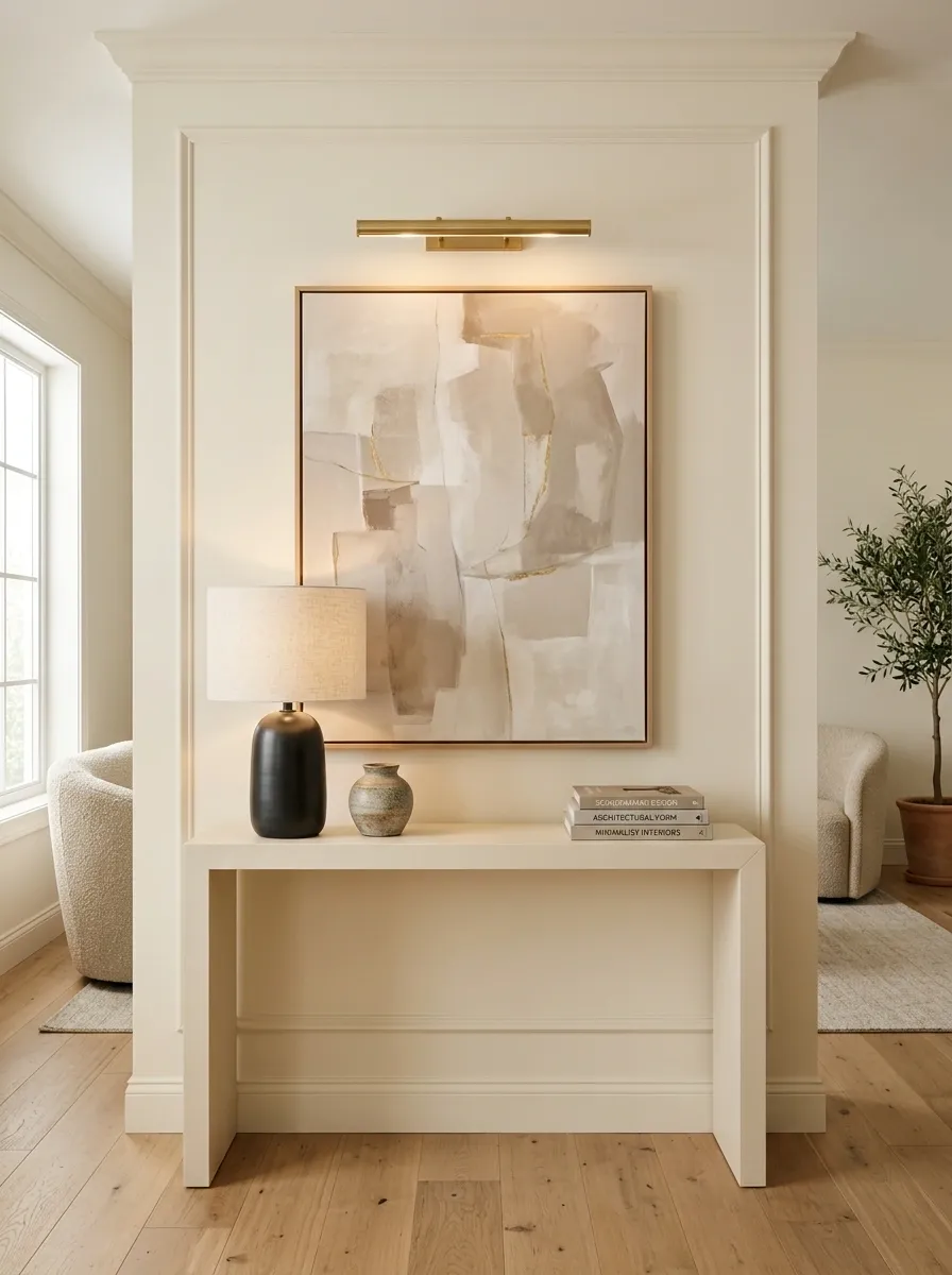
A basic flat-pack console can look surprisingly integrated when the wall behind it is treated as part of the design. Matching or closely related paint, simple trim, oversized artwork, and carefully positioned lighting can make the furniture feel anchored rather than dropped into an empty room.
The strongest feature here is the relationship between the furniture and the architecture. The console should sit comfortably within the wall composition, with enough breathing room around the artwork to avoid a crowded appearance.
Keep the surface styling restrained. One substantial lamp, a small ceramic object, and perhaps a single book stack are enough. The surrounding architecture should do most of the visual work.
Creates the architectural frame.
Console
Becomes part of that frame instead of looking temporary.
Artwork + lighting
Finish the composition without filling every surface.
Budget Media Cabinet With Dark Walnut Tones and Stone-Look Styling
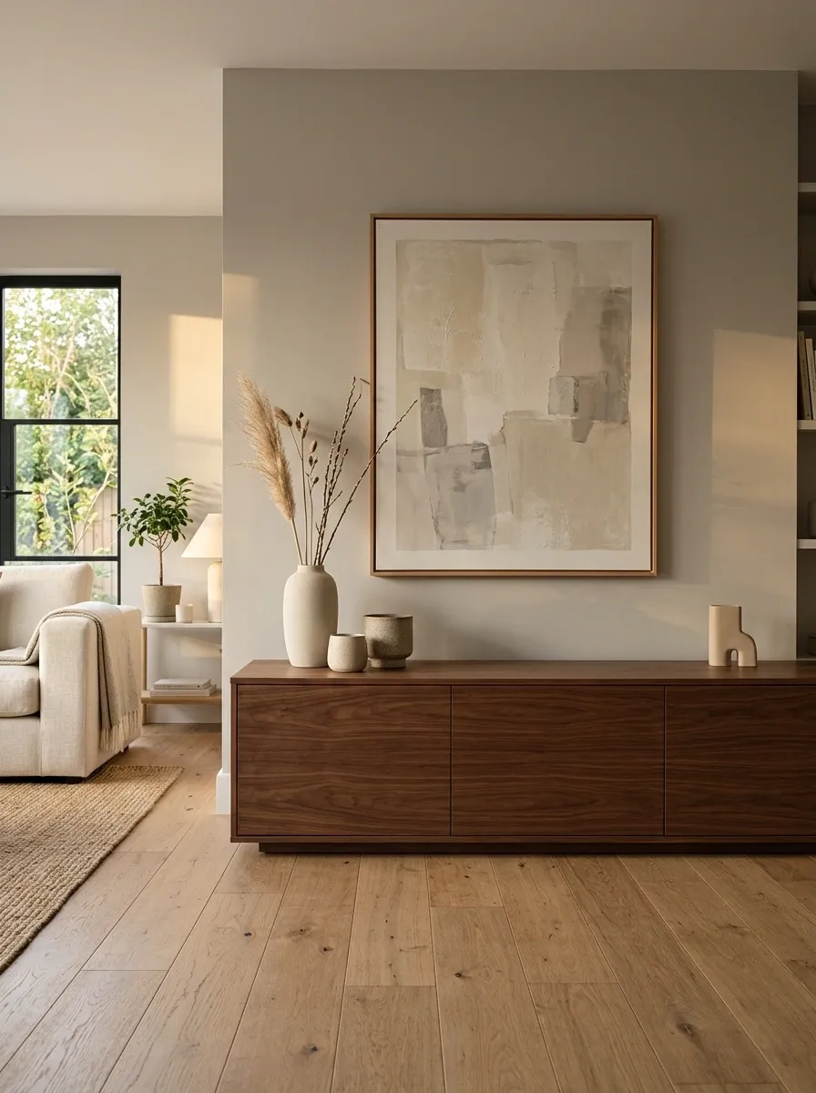
A low-cost media cabinet becomes more substantial when its strongest visual feature is the dark wood rather than a collection of decorative accessories. A rich walnut tone gives the piece weight, while pale stone-colored objects and a large artwork above it keep the upper half of the composition lighter.
The low profile is important. Keeping the furniture close to the floor allows the wall above it to remain relatively open, which makes the entire arrangement feel calmer and more architectural.
Cable clutter should disappear completely from view. The clean surface and controlled background are what allow an inexpensive cabinet to read as part of the room instead of as a separate entertainment unit.
The cabinet supplies the room’s strongest visual mass.
Pale artwork and open wall space keep the composition from feeling heavy.
Sculptural White Cabinet With Oversized Art and Warm Wood
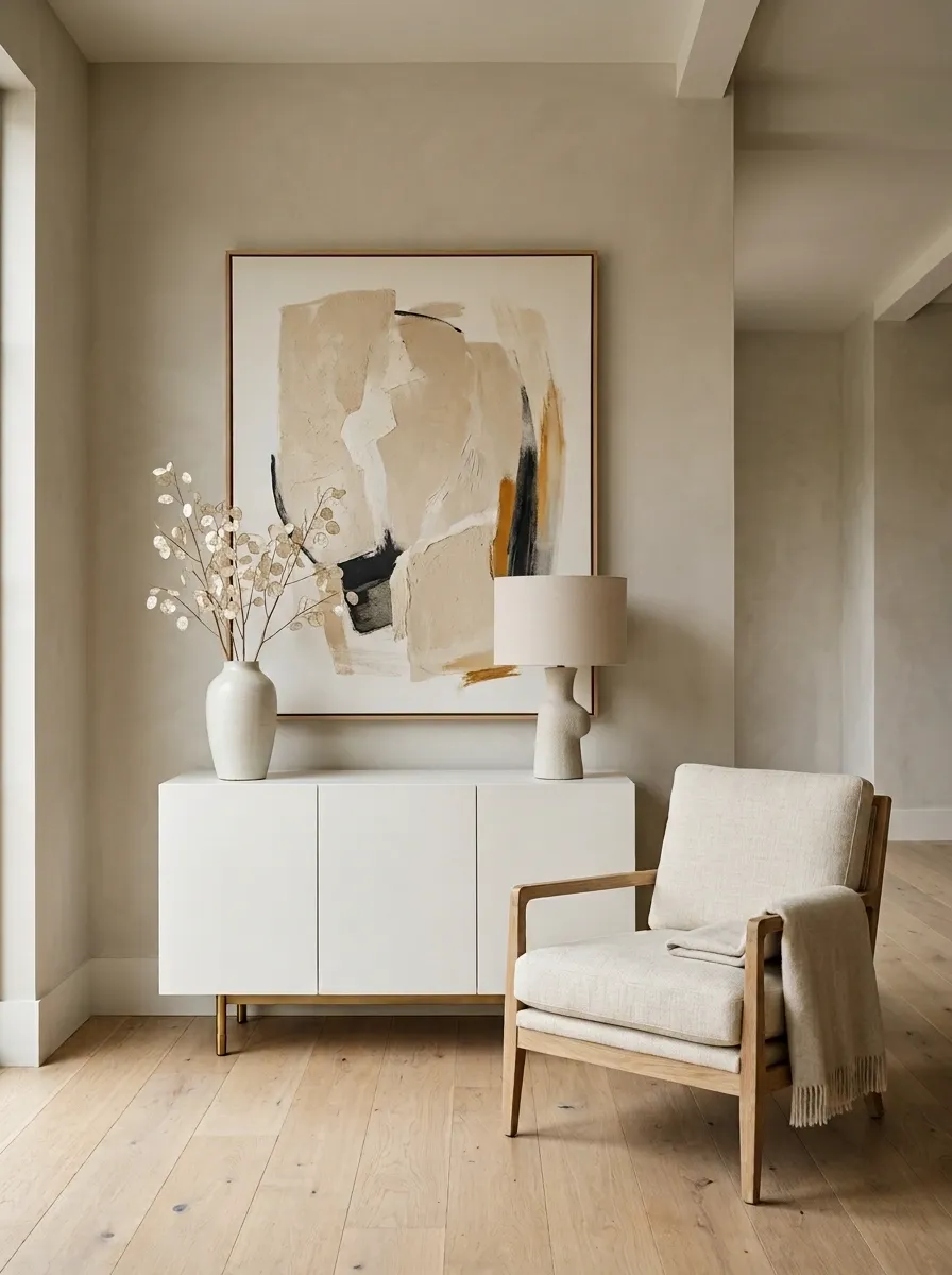
A plain white cabinet can look considerably more refined when the rest of the room gives it strong proportions. Here, the cabinet sits beneath one oversized artwork, with warm oak flooring, a substantial wood-framed chair, and a restrained ceramic lamp creating a quiet, gallery-like composition.
The important move is scale. Instead of filling the cabinet with numerous small objects, the arrangement uses one large piece above it and only a few supporting forms on the surface. That makes the inexpensive furniture feel intentional rather than underdressed.
Keep the surrounding palette warm and limited. Too many bright accessories would break the calm relationship between the white cabinet, natural wood, and artwork.
Creates a stronger focal point than many tiny pieces.
Make the cabinet feel deliberately styled.
Soft Gray Sideboard With Pale Stone and Black Accents
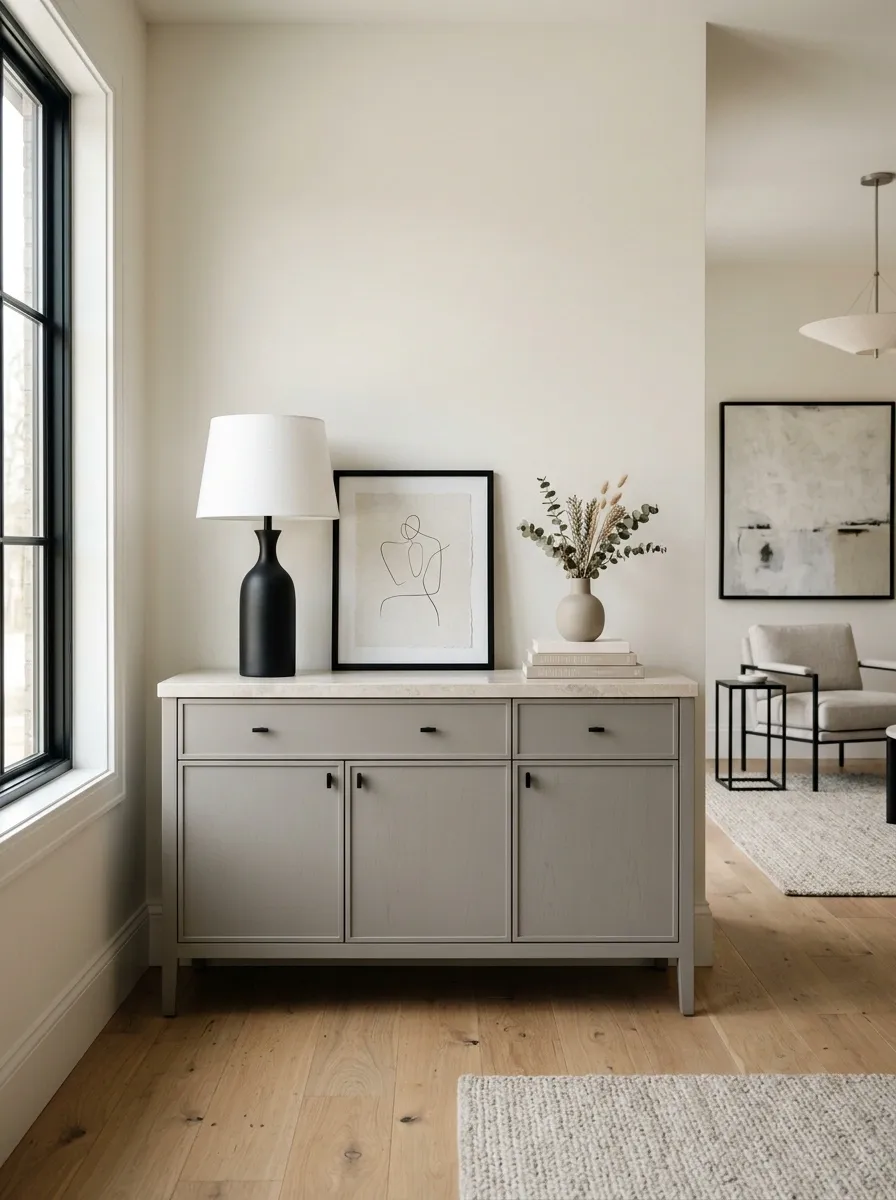
A simple gray sideboard can feel much more expensive when the surrounding materials provide subtle contrast. Pair it with a pale stone-look surface, warm off-white walls, and a few sharply defined black accents such as a picture frame or sculptural lamp.
The gray furniture should remain slightly warmer than the wall so the two don’t visually disappear into one another. Pale stone introduces texture, while black supplies enough contrast to sharpen the otherwise soft palette.
This concept works because the colors remain restrained while the materials vary. The room gets depth from differences in surface and shape rather than from a long list of decorative objects.
Plain Dresser With a Full-Height Fabric Headboard Effect
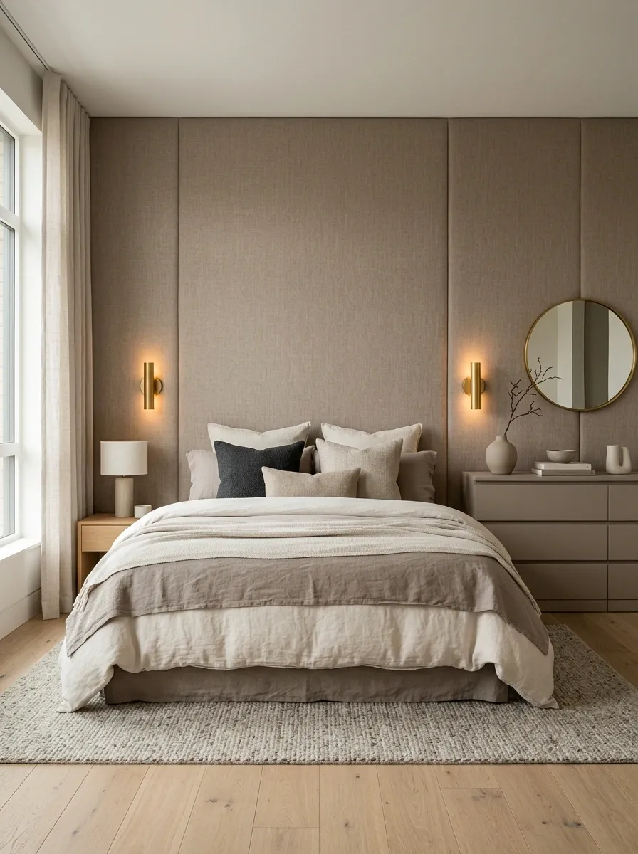
An inexpensive dresser can become part of a much more luxurious-looking bedroom when the surrounding composition is treated with the same care as an upholstered headboard. A large textile-covered wall behind the bed, softly layered bedding, warm bedside lighting, and a matching muted dresser create the impression of a designed suite.
The furniture doesn’t need elaborate detailing. The larger architectural and textile elements establish the room’s character first, allowing the inexpensive storage piece to blend into a cohesive palette.
The strongest result comes from repetition. Repeat one or two tones from the headboard treatment on the dresser, bedding, or rug so the room reads as one composition rather than separate purchases.
Basic Kitchen Cart Recast as a Design Feature
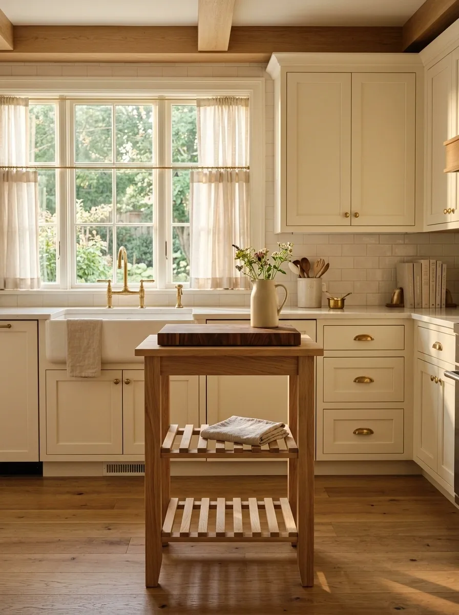
A low-cost kitchen cart doesn’t have to read as temporary storage. Styled with a consistent wood tone, substantial cutting boards, a single ceramic vessel, and carefully controlled open space around it, the piece can become part of a warm kitchen composition.
Placement matters more than decoration here. The cart should sit where its proportions make sense, with enough clearance to move comfortably around it. Keeping the surrounding countertops relatively quiet prevents the small piece from becoming visually cluttered.
The design works especially well when the cart echoes one existing material in the kitchen. Matching or closely related wood tones make the inexpensive piece feel connected to the larger room.
Cheap Bookshelf With Dark Backing and Collected Objects
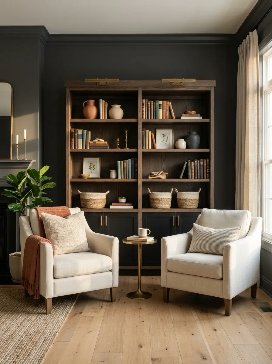
A basic bookshelf becomes much more architectural when its back panel or surrounding wall is given a darker tone. Books, ceramics, framed art, and a few natural textures then appear against the deep background instead of disappearing into a pale wall.
The darker setting creates depth, but the shelves should not be packed from end to end. Leave visible gaps and vary object height so the eye can move across the arrangement without encountering a continuous wall of small items.
This composition is less about disguising inexpensive furniture and more about giving it a strong visual environment. The shelf becomes part of the room’s architecture.
Painted Sideboard With Oversized Mirror and Warm Lighting
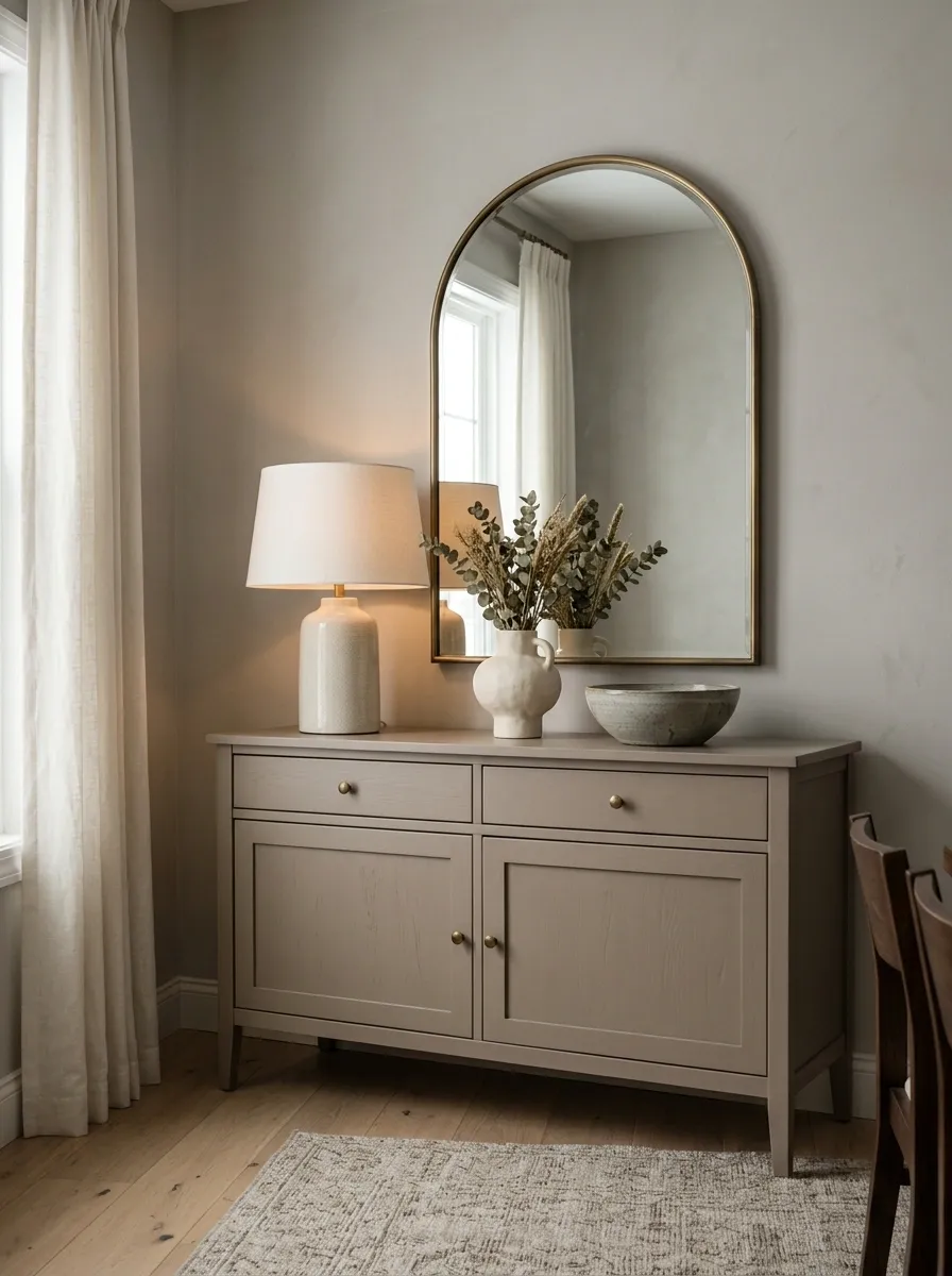
A modest sideboard can become the center of a polished room when the wall above it carries enough visual weight. A generously sized mirror, warm table lamp, muted wall color, and a few substantial ceramic pieces turn the furniture into part of a deliberate composition.
The mirror should feel large enough to relate to the full width of the sideboard rather than floating like a small accessory. Warm lighting then softens the relationship between the painted furniture and the surrounding wall.
Keep the surface mostly open. A sideboard looks more substantial when the eye can clearly read its shape instead of seeing it buried beneath decorations.
Cheap Coffee Table With Heavy Textural Contrast
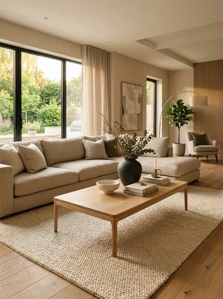
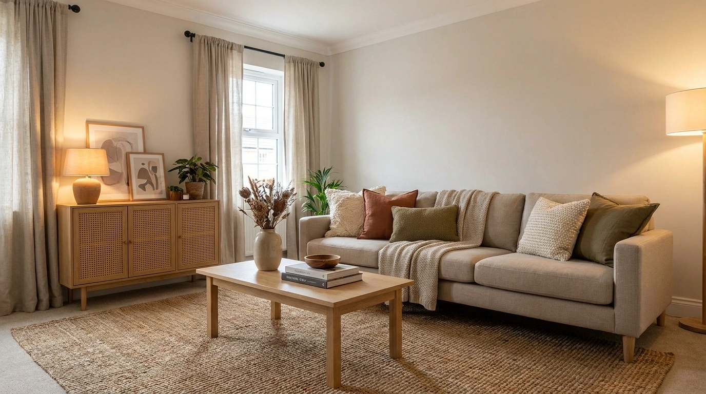
A lightweight-looking coffee table can feel more substantial when it sits inside a room built around texture and scale. A thick woven rug, generously sized sofa, large ceramic objects, and natural fabrics give the simple table enough visual context to feel intentional.
The trick is not to make the table itself visually busier. Its simplicity becomes an advantage when the surrounding materials supply variation. Smooth surfaces, rough textiles, soft upholstery, and natural wood create contrast without requiring complicated decoration.
A table that once looked ordinary can therefore become the quiet center of a much richer composition.
Cane Cabinet Against a Deep Earthy Wall
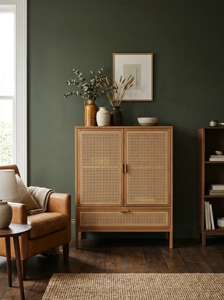
A basic cane-front cabinet gains much more presence when the background becomes deliberately moody. A deep clay, muted brown, or earthy green wall makes the lighter woven texture stand out, while warm lighting and dark flooring give the arrangement enough depth.
The cabinet works because it supplies natural texture without needing additional pattern. Keep the neighboring furniture relatively simple so the cane surface remains the distinctive feature.
This direction is especially effective when the room already has warm materials. Repeating wood, leather, or woven textures elsewhere helps the cabinet feel connected to the space rather than inserted as a decorative statement.
Budget Desk With a Custom-Looking Wall Backdrop
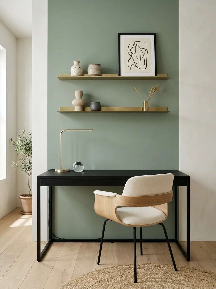
A simple desk becomes far more convincing when the wall behind it is treated as part of the workspace. A painted color block, slim shelving, framed artwork, concealed cables, and a tailored chair can make an inexpensive desk feel integrated rather than temporary.
The main improvement comes from organizing the vertical space. Instead of leaving the desk against a blank wall, use the area above it to establish a clear visual frame. Keep the desktop itself relatively open so the arrangement doesn’t become visually heavy.
Cable management matters just as much as styling here. Even attractive furniture loses some of its polished appearance when loose cords dominate the view.
Artwork or shelving establishes the backdrop.
The desk remains the working anchor.
Clear cables and open floor space preserve visual order.
Inexpensive Armchair With a Layered Reading Corner
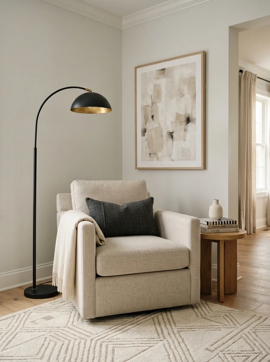
An ordinary armchair can look far more considered when it becomes part of a complete reading corner rather than standing alone. A substantial floor lamp, textured rug, compact side table, framed artwork, and one carefully chosen throw create enough context to make the chair feel intentional.
The surrounding pieces should support the chair without competing with it. A simple silhouette becomes an advantage when stronger shapes, such as an arched lamp or large artwork, establish the visual character of the corner.
The arrangement also benefits from leaving a little breathing room around the chair. Crowding every inch with accessories makes the furniture feel smaller instead of more expensive.
Cheap Bedroom Bench With Hotel-Inspired Styling
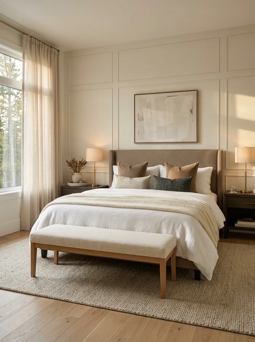
A simple bench at the foot of the bed can look surprisingly polished when the entire bedroom follows a tailored composition. Keep the bench visually quiet, then build around it with crisp bedding, symmetrical bedside lighting, a restrained rug, and one or two substantial textile layers.
The hotel-inspired effect comes from order rather than excessive decoration. Repeated proportions, coordinated colors, and clear spacing make even inexpensive furniture appear deliberate.
The bench should have enough visual presence to balance the bed without competing with it. A larger rug underneath both pieces helps connect them and prevents the bench from looking like a separate addition.
Basic Floating Shelf With Architectural Styling
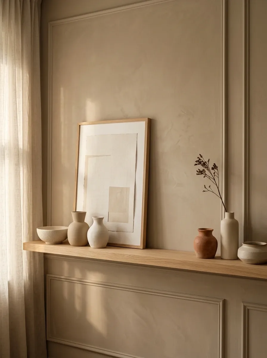
A low-cost floating shelf can look like part of a custom wall treatment when it is given enough surrounding structure. A soft painted backdrop, one large framed piece, a few ceramics, and carefully varied object heights make the shelf feel considered rather than randomly decorated.
Spacing matters more than quantity. Leaving visible sections of the shelf completely empty gives the arrangement room to breathe and makes each object easier to notice.
Choose objects with different silhouettes but a related palette. That creates variation without turning the shelf into a collection of unrelated decorations.
Accent Cabinet With Dramatic Color Blocking
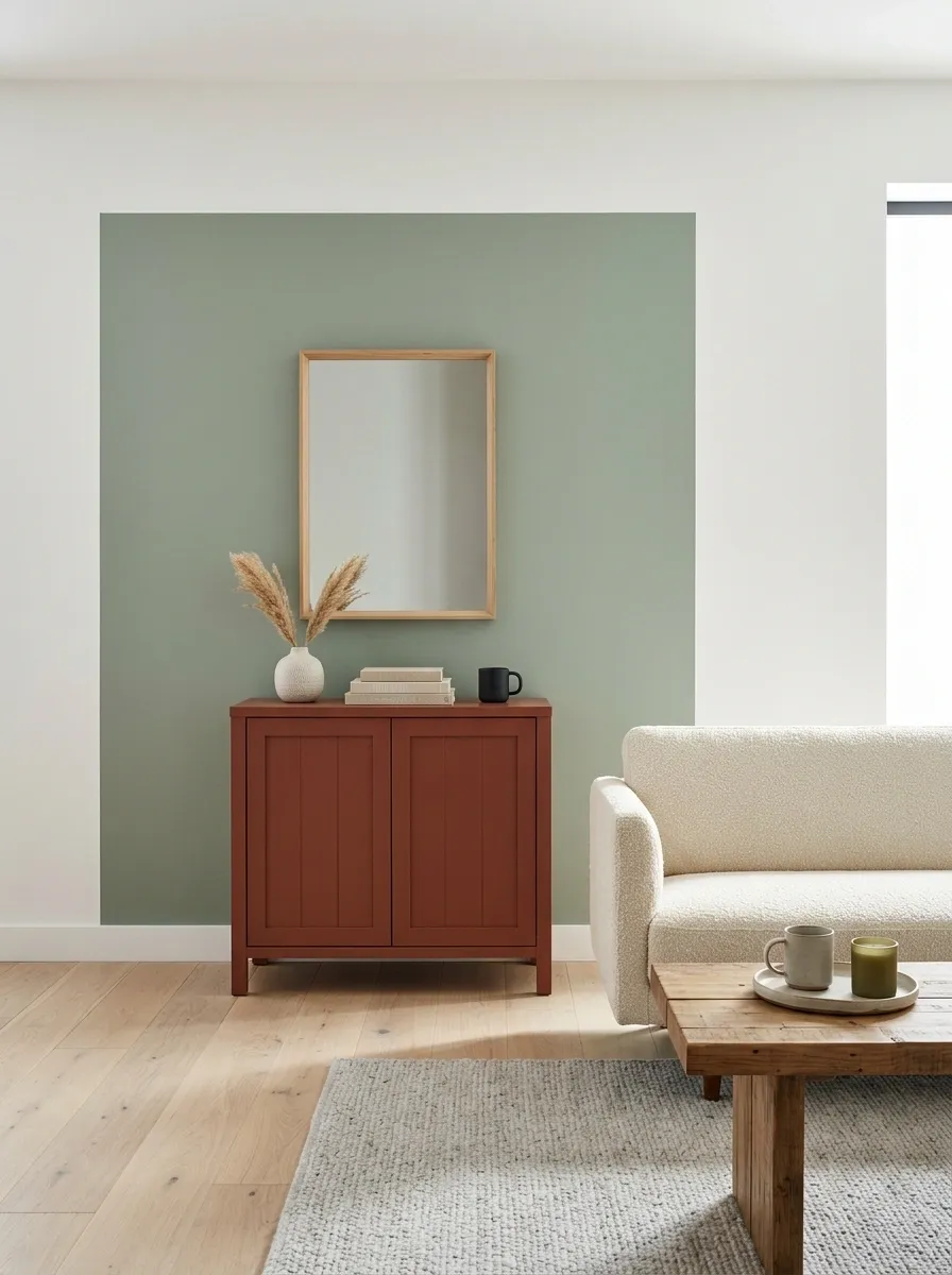
An inexpensive accent cabinet can become the strongest feature in a room when the wall behind it deliberately supports the furniture color. Instead of treating the cabinet as a small decorative object, use a broad section of contrasting or closely related paint to give it an architectural presence.
The furniture can remain simple because the wall does the framing. Keep the surrounding pieces quieter, using only a few materials that reinforce the cabinet without matching it exactly.
This works especially well with deep terracotta, muted blue, olive, charcoal, or warm rust. The key is giving the color enough uninterrupted space to feel intentional.
Simple Open Shelving With Restrained Pottery Styling
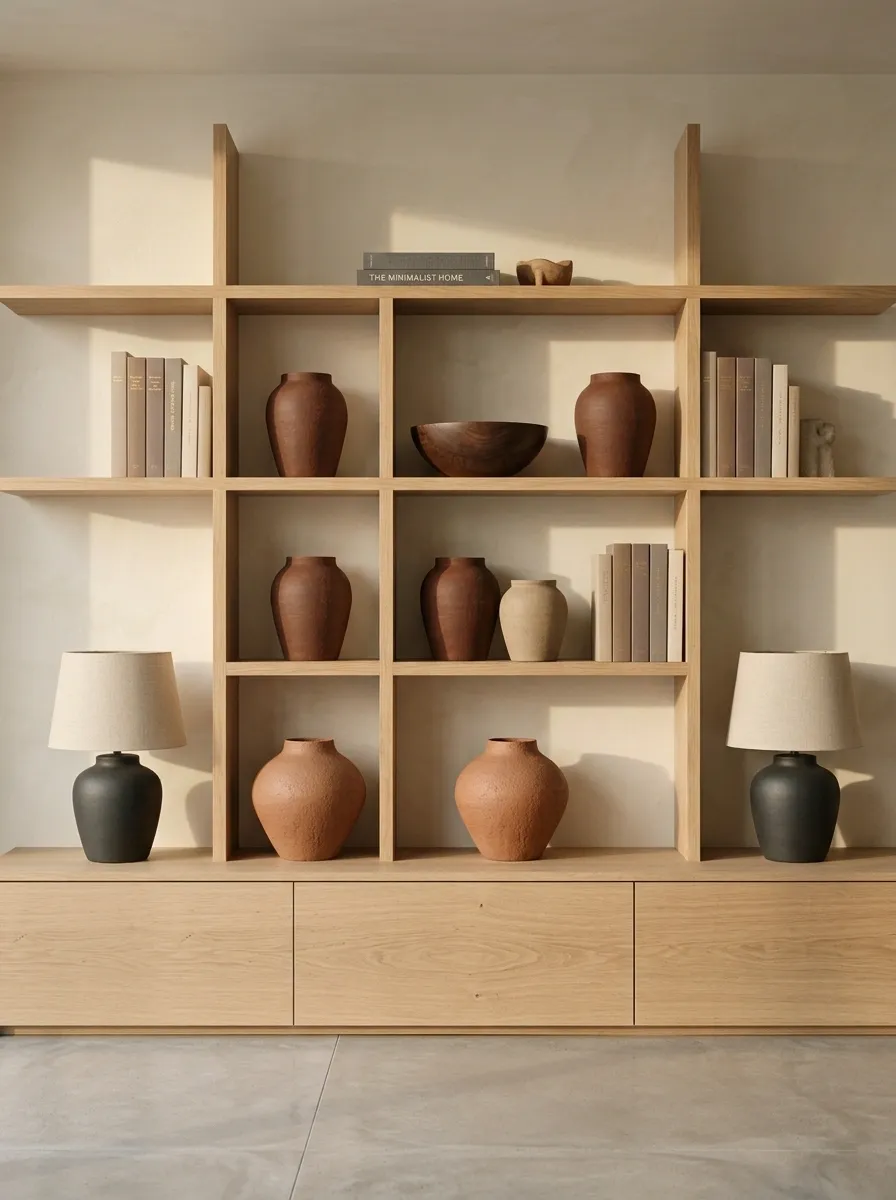
Open shelving can easily make inexpensive furniture look unfinished when every inch is filled. A more elevated composition uses fewer pieces, larger silhouettes, and a controlled palette of pottery, books, wood, and natural materials.
The strongest shelves usually have visible pauses. Leave sections empty, stack objects at different heights, and group items by relationship rather than scattering them evenly.
This approach makes the shelving itself easier to appreciate. Instead of hiding the structure under decoration, the objects create a frame around it.
Large silhouettes, useful objects, visible shelf space.
Rows of tiny accessories filling every gap.
Sofa Table With High-Contrast Accessories and Large-Scale Art
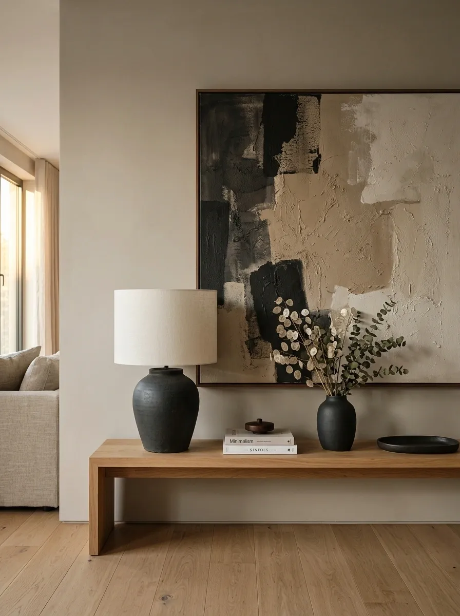
A basic sofa table becomes much more substantial when the wall behind it carries a strong visual element. A large framed artwork, one oversized lamp, dark ceramic accents, and a warm timber finish create a composition where the furniture feels like part of a larger arrangement.
The scale difference is what makes this concept work. A small table paired with several tiny accessories can look temporary. The same table beneath one large artwork and beside a substantial lamp feels deliberate.
Leave some of the tabletop exposed. Showing the surface gives the furniture a stronger silhouette and keeps the styling from becoming cluttered.