
Long, narrow kitchens can look awkward even when the room has plenty of potential. A cabinet run can become too visually heavy, an island can leave barely enough room to move, and a dining table can make the entire space feel like a passageway with appliances along the walls.
The most convincing layouts don’t try to disguise the proportions. They give the length a purpose and use the limited width with discipline.
Cabinetry, lighting, flooring, furniture, color, and the view toward the far end all need to read as parts of one composition.
That changes how kitchen ideas for a long, narrow layout should be judged. A beautiful backsplash by itself doesn’t solve a difficult floor plan. A slim island isn’t useful if it blocks the natural path through the room. A pale color palette can’t rescue a space filled with oversized furniture.
Long, Narrow Kitchen Layouts With a Finished Look
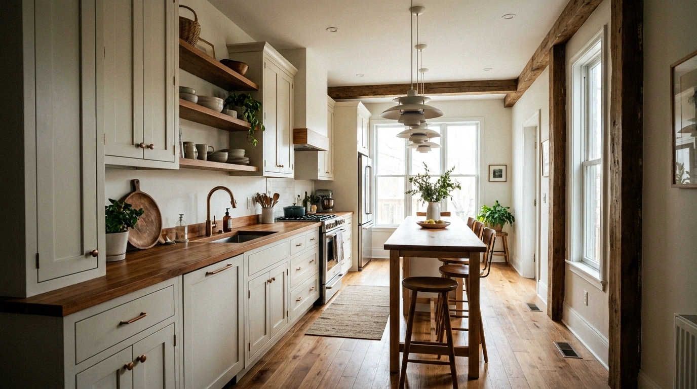
Botanical Galley Kitchen With Open Shelving
A narrow kitchen comes alive with greenery when open wooden shelving and trailing plants draw the eye upward. Crisp white lower cabinets and butcher block counters keep the base of the room feeling light and grounded, while a patterned runner adds a touch of warmth and texture to the corridor.
The abundance of potted herbs and hanging foliage transforms a compact walkway into an indoor garden without sacrificing counter space. Careful placement along the upper ledges ensures that natural light from the end door floods the passage freely.
Every surface works harmoniously to celebrate the cozy proportions. The combination of warm timber, classic white finishes, and vibrant green accents creates an inviting atmosphere that feels entirely intentional and full of life.
Warm Oak Galley Kitchen With a Stone Focal Wall
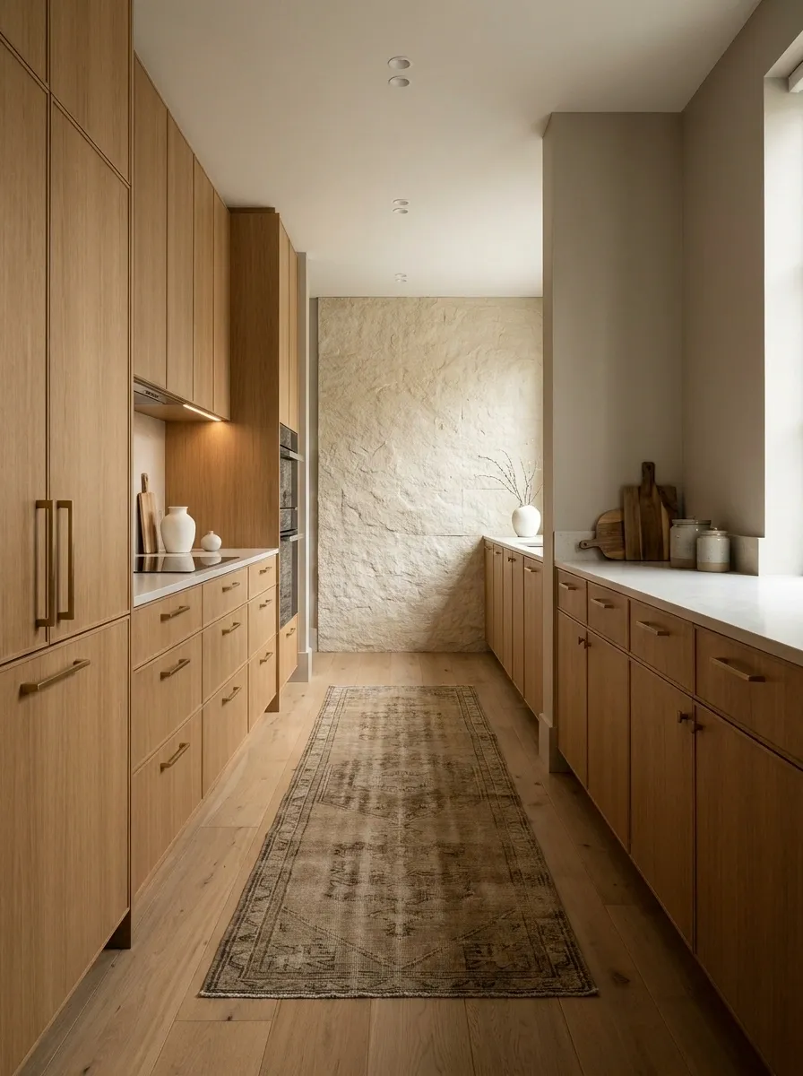
Warm oak cabinetry gives this long galley kitchen an immediate sense of depth and character. One side carries the main run of cabinetry, while the opposite side stays visually restrained with lower storage and open breathing room. Pale stone counters bridge the two sides, while a textured stone wall at the far end creates a strong destination.
The materials work because they aren’t competing for attention. Oak supplies warmth, stone adds weight, and the quieter surrounding finishes keep the long passage readable. A simple runner and understated lighting reinforce the direction of the room without cluttering it.
Sage Green Kitchen With Terracotta Floors
Rich sage green cabinetry brings a sophisticated earthiness to a long galley layout, immediately softening the narrow walls. Paired with warm terracotta hexagonal floor tiles and gleaming brass accents, the space feels deeply rooted in traditional charm while maintaining a fresh perspective.
A classic window dressed with a delicate patterned café curtain frames the far view, drawing natural light deep into the room. Dark countertops frame the workspace neatly, offering a bold contrast to the soothing green tones of the surrounding joinery.
The entire composition thrives on tactile materials and thoughtful color blocking. By choosing an earthy palette and classic hardware, the narrow proportions transform into a cozy, intimate corridor rather than a cramped passage.
Soft White Kitchen With a Dark End Wall
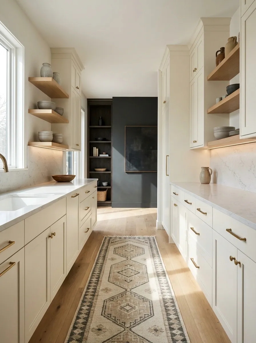
A bright white galley kitchen becomes more architectural when the far wall turns unexpectedly deep. White cabinetry and pale counters keep most of the room visually open, while a charcoal, muted olive, or deep taupe end wall creates depth and gives the eye somewhere to land.
The contrast works best when the dark surface is concentrated rather than repeated throughout the room. A few warm metal details can soften the transition, but the cabinetry should remain clean and quiet. The result is a kitchen that feels longer without making the narrow proportions the first thing noticed.
Compact Black Kitchen With a Dining Nook
Bold black cabinetry gives a tight kitchen layout an unexpectedly chic and modern edge. The dark matte finishes on both the upper and lower storage create a sleek frame, while open wooden shelving breaks up the expanse with everyday utility and warmth.
Tucked neatly into the end of the galley, a small round dining table with minimalist chairs makes clever use of the limited footprint. This purposeful furniture arrangement turns a transitional walkway into a functional eat-in space.
Vertical storage solutions, including a tall matching refrigerator and floating metal racks, maximize every inch of wall space. The monochromatic palette keeps the visual noise to a minimum, ensuring the compact room feels curated rather than crowded.
Long Kitchen With a Slim Central Island
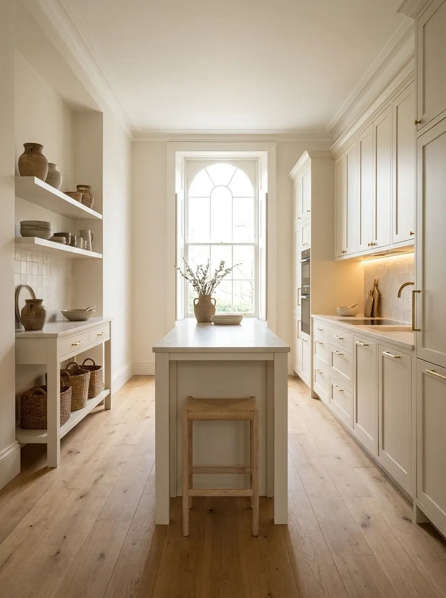
A narrow island can work when it is treated as a deliberate piece of furniture rather than a miniature second kitchen. This version uses a slim central island with simple cabinetry, generous clearance around it, and seating limited to one end. Tall storage and major appliances stay against the wall.
That arrangement preserves the long sightline while still providing a central work surface. The island should remain visually simple because its position already gives it plenty of presence. Pale stone, warm timber, or a single restrained color keeps the composition from becoming crowded.
Vaulted Ceiling Kitchen in Pale Seafoam
A soaring vaulted ceiling instantly changes the geometry of a narrow kitchen, lifting the eye away from the tight corridor dimensions. Soft seafoam cabinetry runs continuously down both sides, reflecting natural light and keeping the narrow corridor feeling exceptionally airy.
Glass-front upper cabinets on one side add a layer of visual lightness, preventing the double run of storage from feeling heavy. A classic French door at the far end acts as a bright focal point, framing outdoor greenery and illuminating the pale quartz countertops.
Subtle details like warm hardwood floors and dark pendant lighting anchor the space without cluttering the sightlines. The result is a thoughtfully proportioned room where architecture and cabinetry work in tandem to celebrate length.
Moody Galley Kitchen With Walnut and Honed Stone
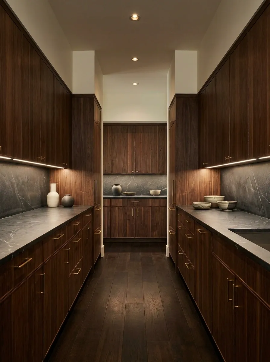
Deep walnut cabinetry turns the long shape into a design feature instead of something to disguise. Honed stone counters, darker flooring, and warm integrated lighting create an intimate palette with enough tonal variation to keep the room from looking flat.
The strongest version of this concept leaves some surfaces lighter, particularly overhead or near windows. That contrast prevents the cabinetry from visually closing in the room. Hardware remains restrained, allowing the grain of the walnut and the softness of the stone to carry the design.
Classic Painted Kitchen With a Furniture-Like Pantry Wall
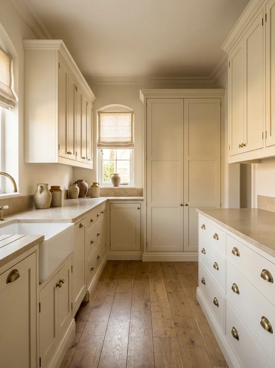
A traditional narrow kitchen can feel collected rather than cramped when tall storage is given a furniture-like treatment. Painted cabinetry, natural stone, a classic sink, and simple hardware establish the main language, while a full-height pantry wall at one end looks more like built-in furniture than a row of standard kitchen units.
A window or carefully placed artwork at the far end gives the long room some relief. The traditional details should stay selective. Too many decorative cabinet elements can make the narrow proportions feel busy, while a restrained palette lets the craftsmanship remain visible.
Narrow Kitchen With a Banquette at the Far End
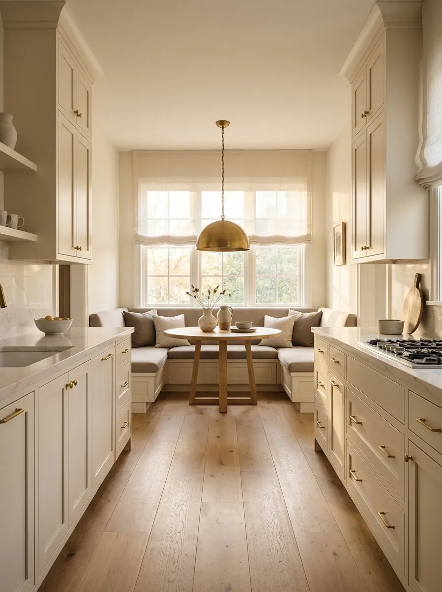
A long kitchen becomes more useful when the far end is treated as a destination instead of simply stopping the cabinetry there. This version uses a built-in banquette, a compact round table, and a single pendant to create a small breakfast area beyond the main work zone.
The seating area adds another layer of function without filling the central passage with chairs. A curved table is especially effective because it softens all the long horizontal lines created by the cabinetry. Keep the banquette upholstery quiet and let the window, wall color, or pendant provide the visual finish.
Scandinavian-Inspired White and Pale Oak Kitchen
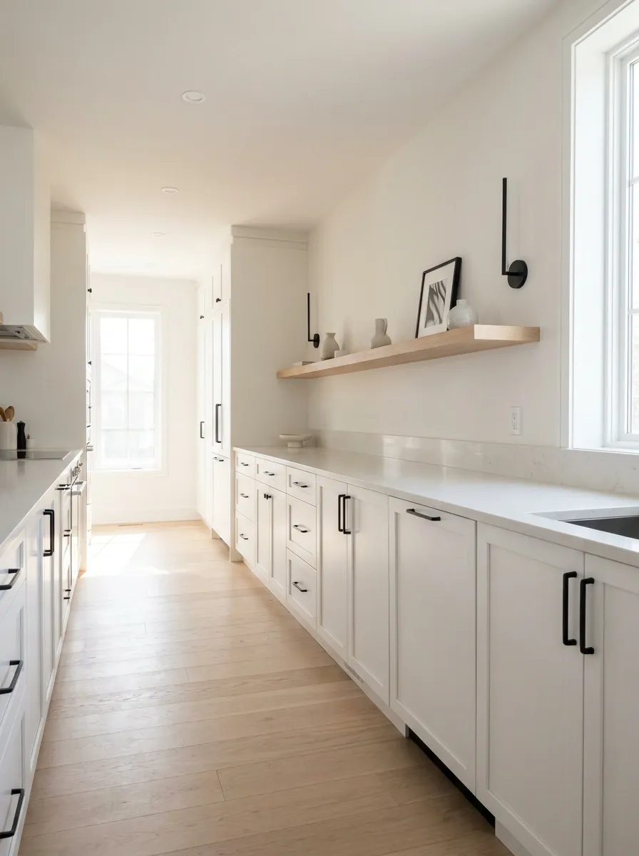
White cabinetry and pale oak create a restrained kitchen that relies on proportion rather than decoration. The main cabinet run stays clean and continuous, while a window, simple shelf, or small artwork provides controlled breaks along the walls.
The pale wood keeps the white palette from becoming cold, while small black details add enough definition to prevent the room from looking washed out. Storage should remain mostly enclosed here. A long, narrow kitchen benefits from visual consistency, and too many exposed objects can quickly interrupt that effect.
Two-Tone Kitchen With Tall Storage at One End
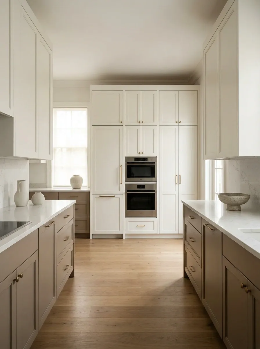
A long kitchen can feel more organized when its visual weight is deliberately distributed. This design uses a warmer color for the lower cabinetry while keeping the upper and tall elements lighter. At one end, the refrigerator, ovens, pantry, and other tall storage are grouped into one composed block.
The arrangement creates a clear vertical anchor without scattering tall cabinetry throughout the room. The opposite end remains visually lighter, making the entire space feel more balanced. Choose colors with enough difference to establish the two-zone effect, but avoid introducing several competing cabinet tones.
Industrial Narrow Kitchen With Brick and Black Steel
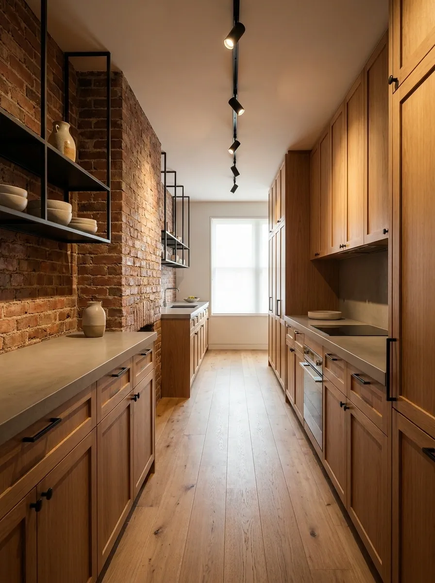
An industrial kitchen can suit a long footprint because the style already works well with strong lines and repeated structural elements. This version combines warm timber cabinetry with brick, concrete-toned surfaces, slim black-framed details, and simple directional lighting.
The important distinction is restraint. Brick, metal, timber, and stone shouldn’t all compete equally. Let one or two materials dominate while the others support them. Keeping the central route relatively open makes the raw finishes feel architectural rather than cluttered.
Window-Focused Galley Kitchen With a Bright End View
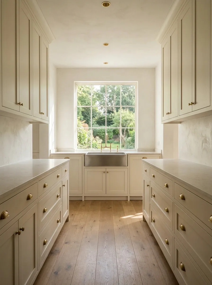
A window at the far end can become the most important feature in a long, narrow kitchen. This composition keeps the cabinet runs relatively quiet so the eye naturally travels toward the window. A sink positioned nearby makes the end of the room useful as well as visually strong.
The rest of the kitchen can stay simple: pale cabinetry, natural stone, modest hardware, and lighting that supports the daylight rather than competing with it. The strongest version avoids surrounding the window with excessive shelving or decorative objects. The view should remain the reward at the end of the room.
Contemporary Kitchen With Full-Height Slab Cabinetry
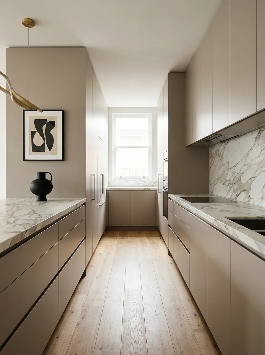
A long, narrow kitchen benefits from uninterrupted surfaces, and this contemporary composition leans into that idea. Full-height slab cabinetry creates one continuous architectural plane, while integrated appliances keep the refrigerator, dishwasher, and other bulky functions visually quiet.
Large-format stone across the counter and backsplash reinforces the sense of continuity. Instead of adding open shelving throughout the room, reserve one small area for a sculptural pendant, artwork, or a single decorative object. The restraint keeps the long walls from becoming visually fragmented.
Compact Narrow Kitchen With a Fold-Down Dining Surface
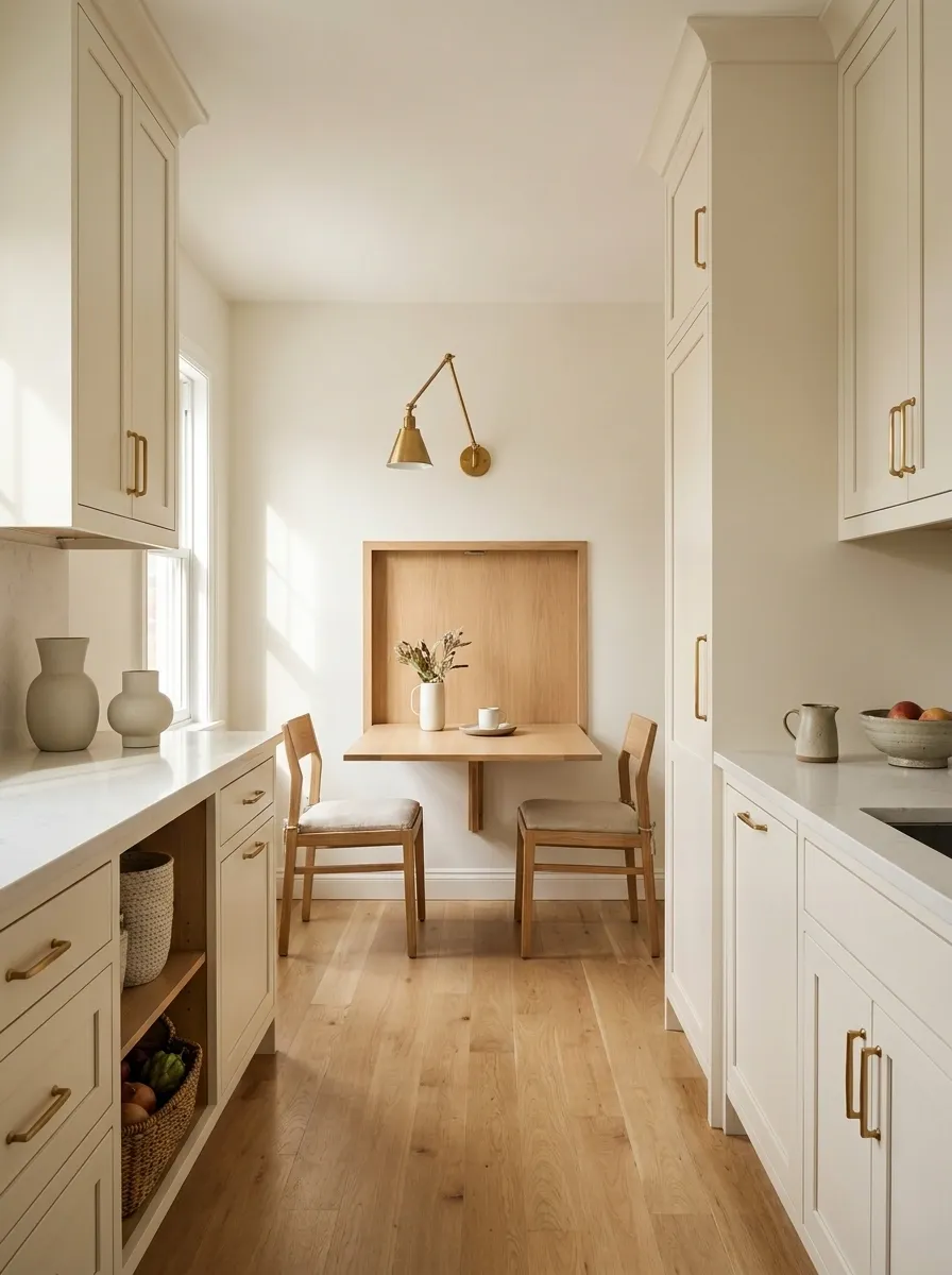
In a particularly tight kitchen, permanent dining furniture can consume the circulation space. This layout keeps the main kitchen streamlined and adds a wall-mounted dining surface near the end of the room. When the table is folded away, the kitchen regains a clean uninterrupted passage.
The furniture should look integrated rather than temporary. Matching the dining surface to the cabinetry creates a stronger visual connection, while a small pendant or wall light helps define the eating area when it is in use.
Warm Transitional Kitchen With Arched Details
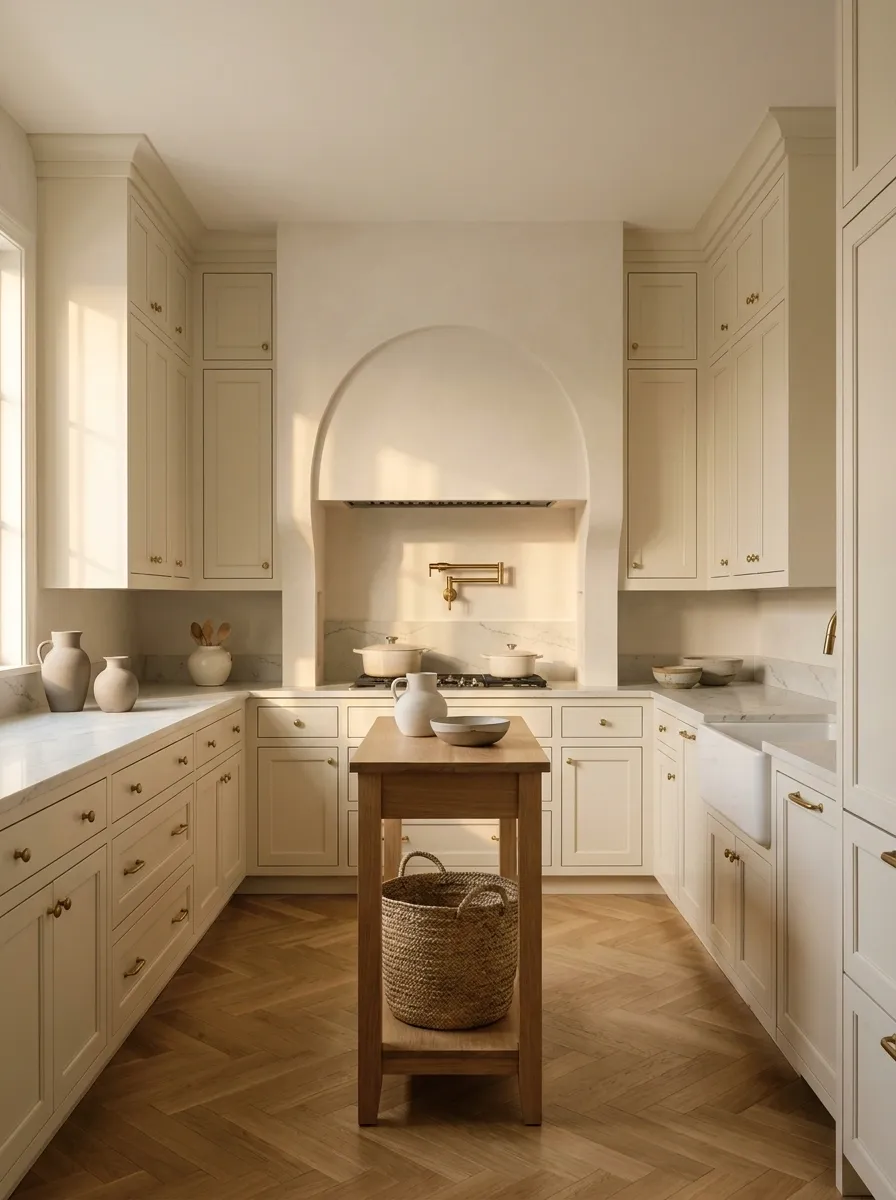
A subtle arch can completely change the visual rhythm of a long kitchen. This transitional design combines painted cabinetry, warm oak flooring, natural stone, and one carefully placed arched opening or hood detail.
The curved shape interrupts the repeated horizontal lines of the cabinetry without making the room feel ornate. Keep the rest of the architecture relatively straight and restrained so the arch remains meaningful. Warm neutrals work especially well because they let the change in shape become the primary point of interest.
Narrow Kitchen With a Statement Range Wall
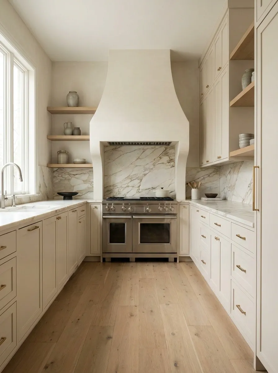
Instead of spreading decorative detail throughout the kitchen, this design concentrates it on the cooking wall. A plaster hood, dramatic slab backsplash, framed stone, or carefully detailed range surround becomes the strongest architectural feature.
The rest of the room stays intentionally quiet. Simple cabinetry, restrained hardware, and minimal open storage allow the range wall to read as a composed focal point rather than one more busy surface. This approach works particularly well when the kitchen has limited width but enough wall length to create one substantial visual moment.
Small Apartment Galley With Integrated Appliances
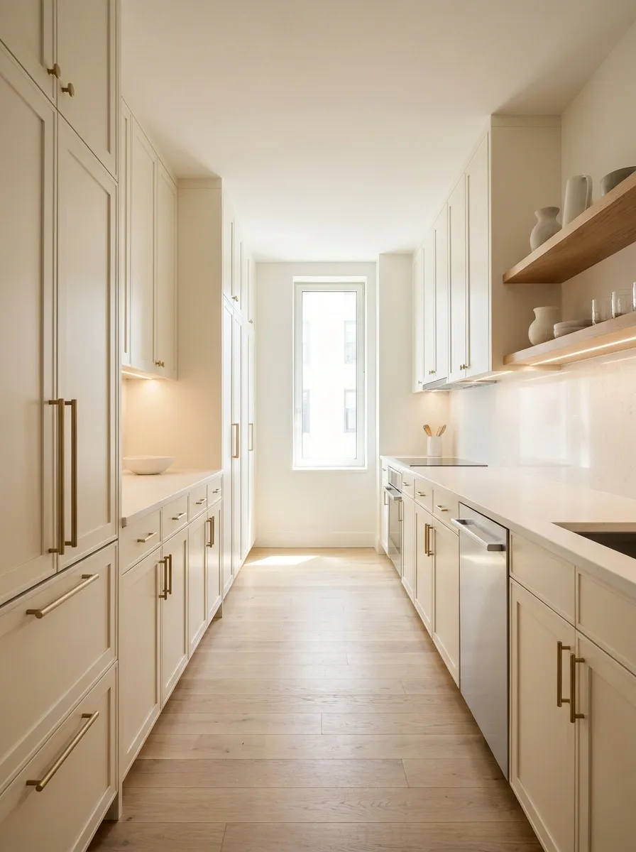
A compact apartment kitchen can look surprisingly substantial when every appliance is absorbed into one continuous composition. Panel-ready refrigeration, an integrated dishwasher, streamlined cabinetry, and a consistent countertop material reduce the visual interruptions that often make small kitchens appear crowded.
A pale palette helps, but proportion matters more. Tall storage should be grouped rather than scattered, and exposed shelving should be limited to items that genuinely contribute to the finished look. The kitchen feels more like a built-in architectural element than a collection of individual appliances.
Dark Green Kitchen With Warm Brass and Natural Wood
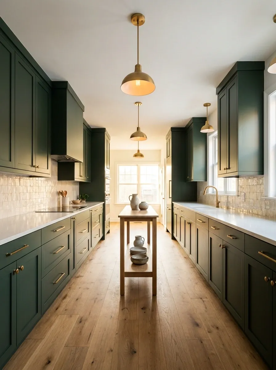
Deep green cabinetry gives a long kitchen a strong architectural identity. Warm natural wood introduces variation across the room, while restrained brass hardware and lighting provide small points of warmth.
The darker cabinetry shouldn’t be repeated on every surface. Keeping the backsplash, ceiling, or far end lighter creates enough contrast to prevent the long room from feeling enclosed. Matte finishes work particularly well because they keep the color rich without creating excessive visual reflection.
Long Kitchen With a Dining Table Instead of an Island
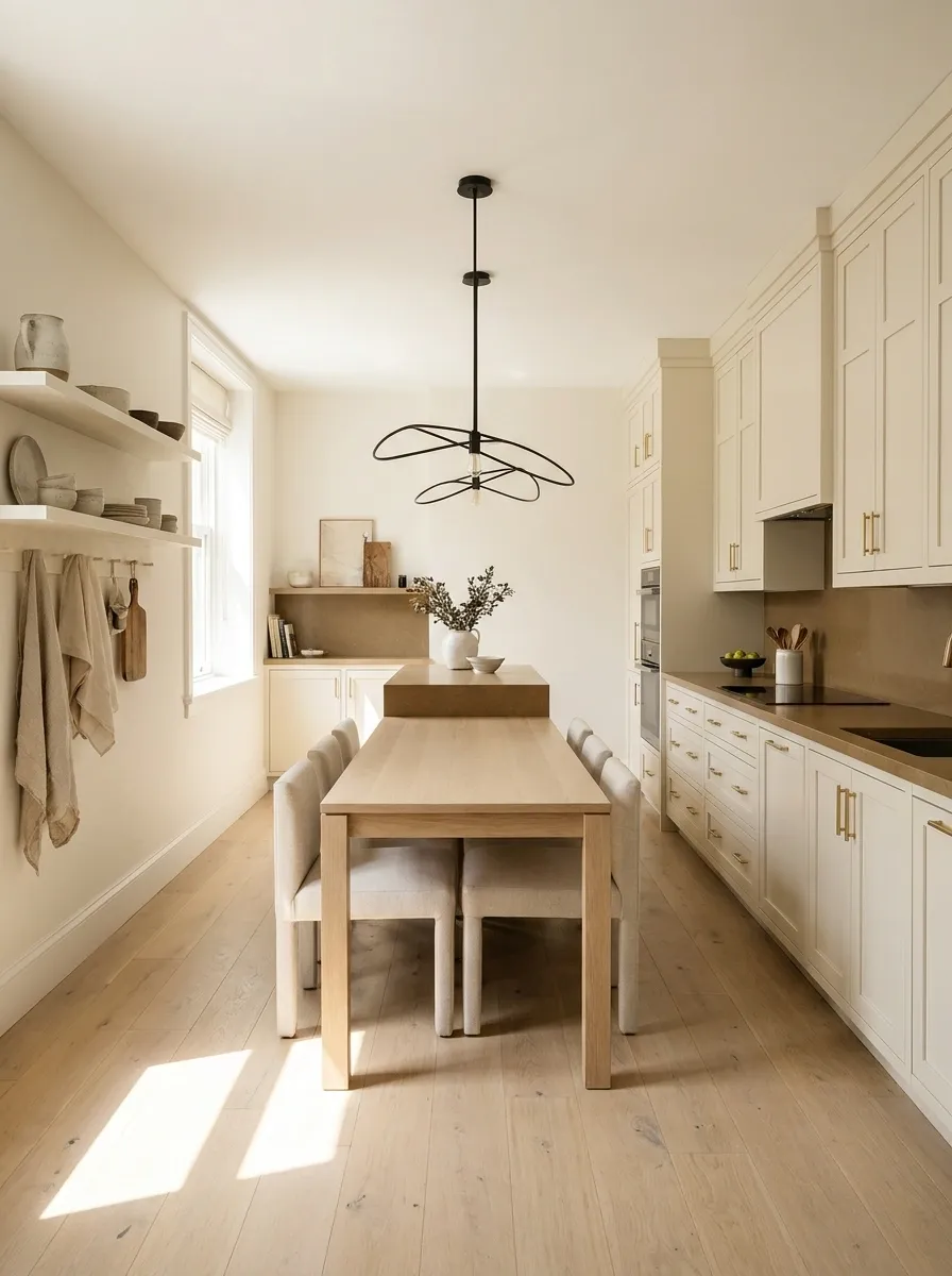
An island isn’t automatically the best use of a long kitchen. This layout uses the room’s length for a slim dining table, leaving the main work area less crowded while creating a clear eating zone.
The table can run parallel to the cabinetry or sit toward one end beneath a simple pendant. Slim chairs maintain the visual openness and can slide fully under the table when not in use. This arrangement makes particular sense when a separate dining room isn’t necessary.
Cottage Kitchen With Open Shelving and a Deep Window
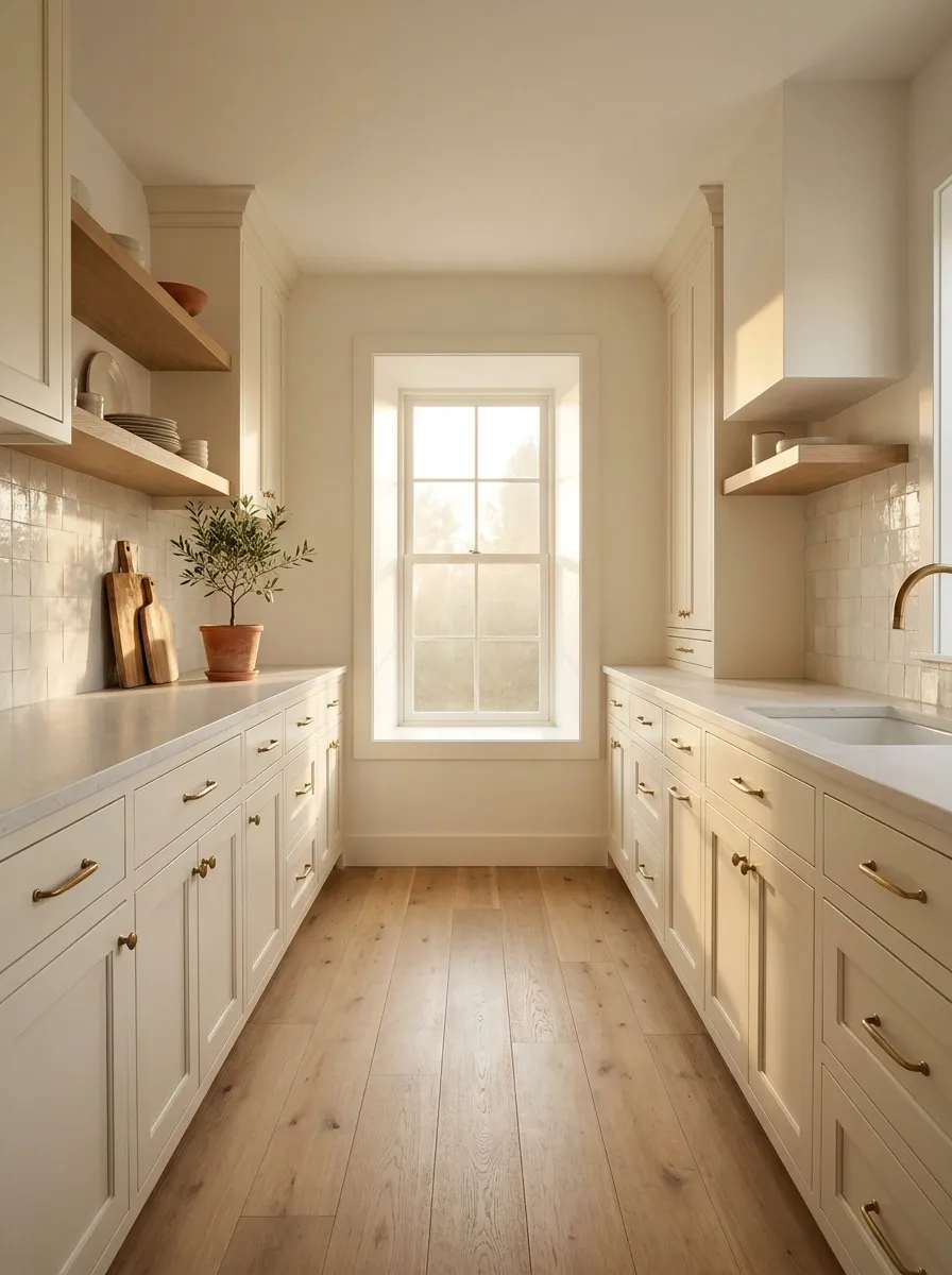
A cottage-inspired narrow kitchen feels most convincing when the relaxed details are balanced by a clear overall structure. Painted cabinets, natural wood, handmade-looking tile, and a few open shelves create the character, while a deep window at the far end brings visual depth.
Open shelving should be edited rather than filled simply because wall space is available. A few everyday dishes, cutting boards, or natural textures provide enough interest. The long room benefits from the informality, but the central passage still needs to remain visually clear.
High-Contrast Black-and-White Kitchen With Warm Flooring
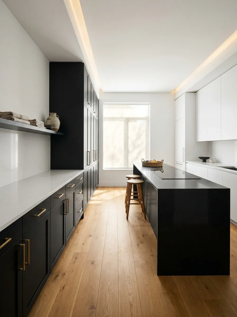
Black and white give a long kitchen a crisp architectural framework, but the high contrast needs one grounding material. Warm timber flooring supplies that missing layer and keeps the room from feeling overly graphic.
Black cabinetry can anchor one side while white walls, counters, or upper cabinetry preserve brightness. The flooring then runs through the full length of the room, visually connecting the separate zones. Keep hardware and accessories restrained because the black-and-white structure already provides strong contrast.
Narrow Kitchen With a Full-Length Window Wall
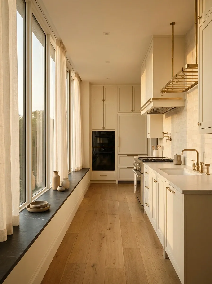
Rather than filling every available wall with cabinetry, this layout gives one side over to windows and natural light. Storage and appliances are concentrated on the opposite wall, creating a deliberate asymmetry that makes the room feel less like a corridor.
The window wall should remain visually clean. Minimal window treatments, low furniture, and a restrained sill keep the light side of the room open. The cabinetry can then carry more of the storage burden without competing with the natural light.
Transitional Kitchen With a Central Runner and Quiet Cabinetry
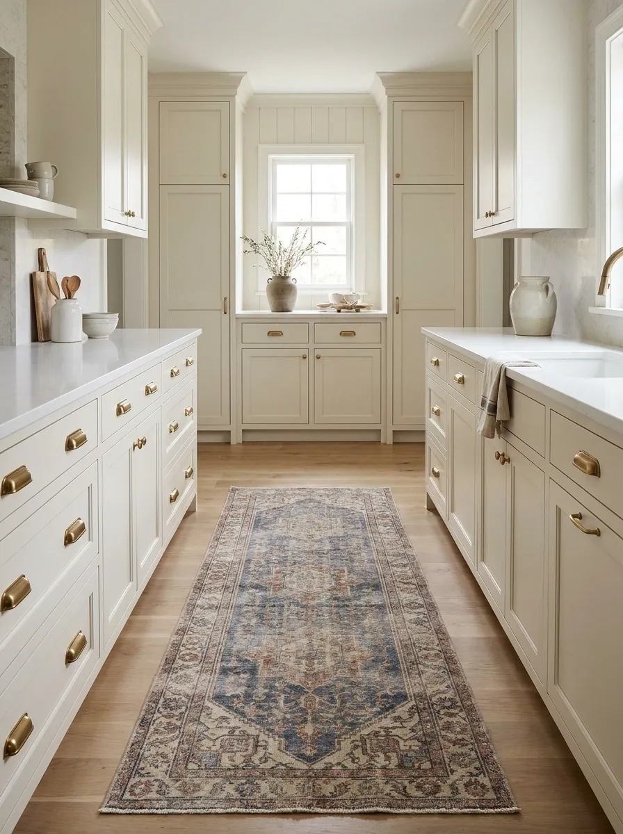
A long runner can become the visual thread that connects a narrow kitchen without adding another permanent architectural feature. This transitional design keeps the cabinetry, counters, and walls relatively restrained, then introduces pattern and color through one substantial runner running through the main work zone.
The floor covering should have enough length and visual presence to establish continuity, while the surrounding finishes stay quiet. Natural wood, soft painted cabinetry, and muted stone keep the room grounded. This approach works especially well when the architecture is already interesting and doesn’t need another major focal point.
simple flooring
runner establishes rhythm
quiet visual finish
Minimal Kitchen With a Dramatic Stone Peninsula
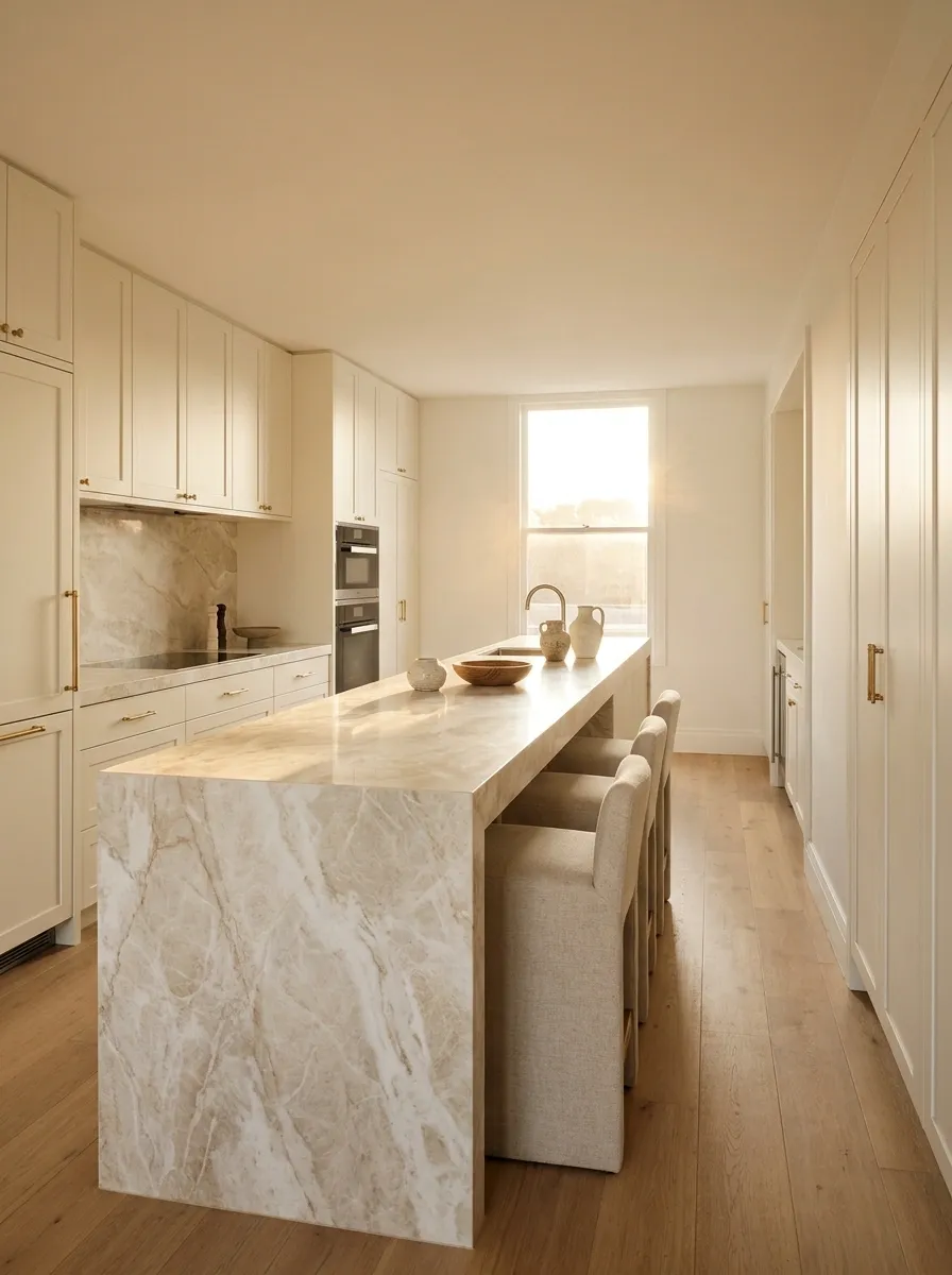
A narrow kitchen doesn’t always have enough width for a conventional island, but a peninsula can provide the same sense of architectural presence without occupying the center of the room. This design extends a substantial stone surface from one wall and allows it to become the main visual anchor.
Tall cabinetry stays quiet and simple behind it. The peninsula can provide prep space, seating, or a clear transition between the kitchen and an adjoining room. Its strong horizontal edge gives the long layout structure, while the open side preserves a better sense of circulation.
Vintage-Inspired Narrow Kitchen With Modern Function
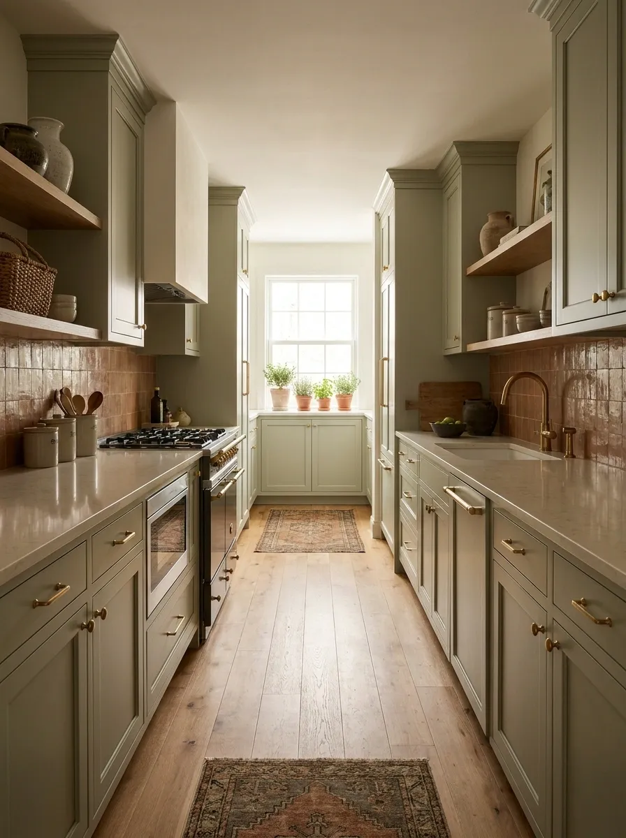
Vintage character can work in a narrow kitchen without turning the room into a period set. Framed painted cabinetry, classic hardware, warm tile, and a range with traditional detailing establish the visual language, while integrated appliances and efficient storage keep the layout practical.
The balance comes from choosing a few recognizable vintage elements instead of reproducing every historical detail. A warm floor and simple countertop provide enough continuity to tie the old and new together. The finished room should feel like a working kitchen with collected character, not a themed replica.
Light Taupe Kitchen With Layered Texture
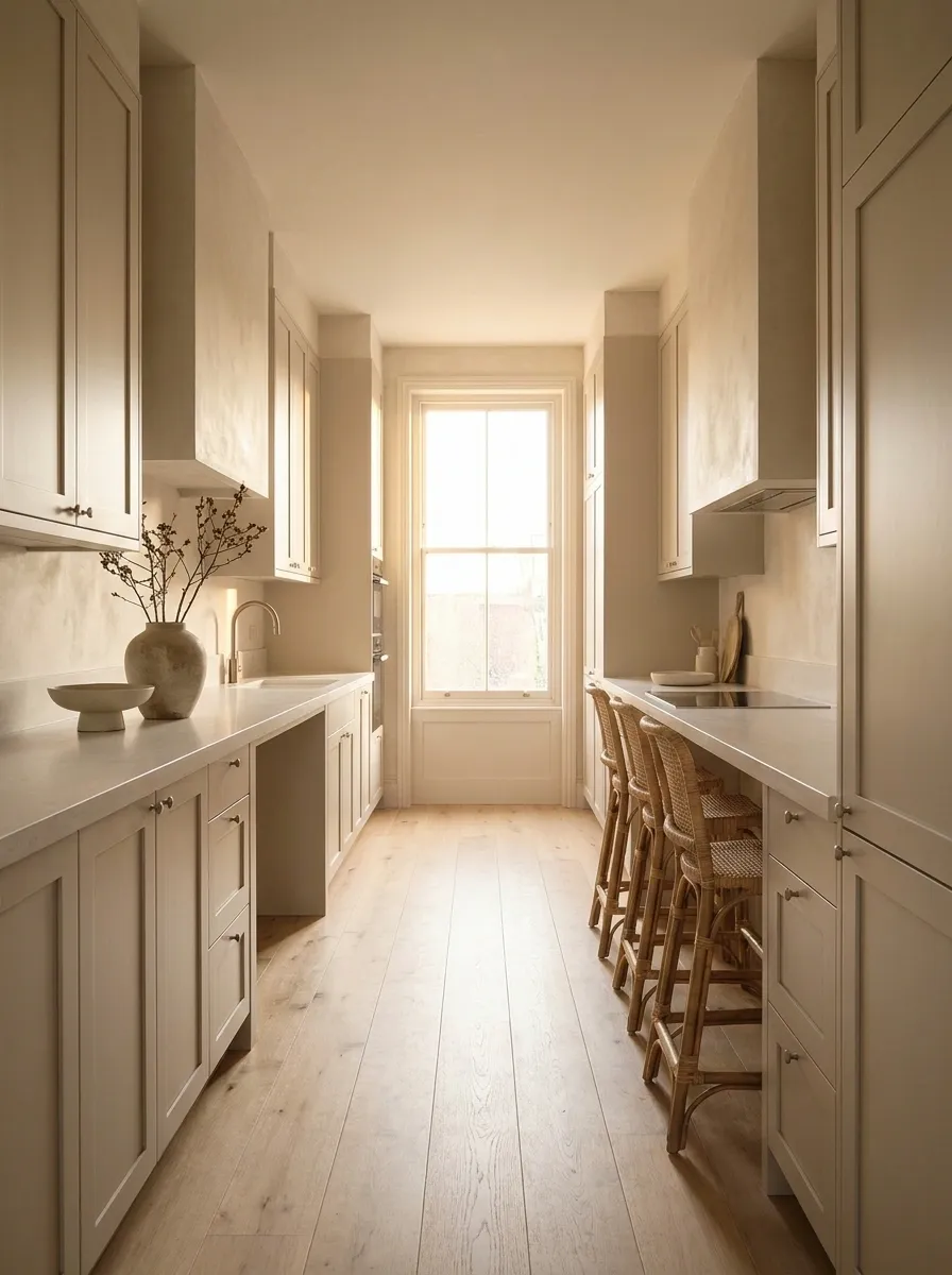
A long narrow kitchen doesn’t need strong color contrast to feel interesting. This softer composition uses taupe cabinetry, pale stone, oak, plaster-like walls, and woven accents so the eye discovers differences through texture rather than dramatic color shifts.
The key is to vary the surface finish while keeping the overall palette close. Smooth cabinetry beside honed stone and visible wood grain gives the room enough depth without breaking the visual continuity. Decorative objects should remain sparse because the materials already provide plenty of detail.
painted fronts
stone surface
oak texture
woven accents
Long Narrow Kitchen With a Built-In Coffee and Breakfast Zone
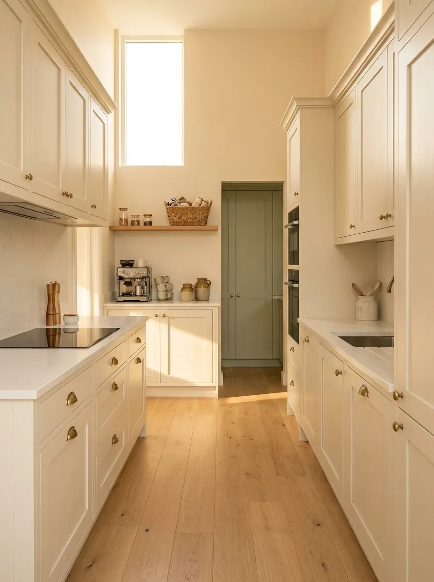
A kitchen with extra length can use that space to create a dedicated morning zone. The main preparation area stays streamlined while one end houses a compact coffee station, breakfast storage, a small worktop, and nearby seating.
Tall cabinetry can conceal appliances and pantry goods, leaving the breakfast area visually calm. Open shelving or a small ledge can hold only the items used every day. The result gives the long room a clear functional sequence instead of treating the extra length as wasted space.