
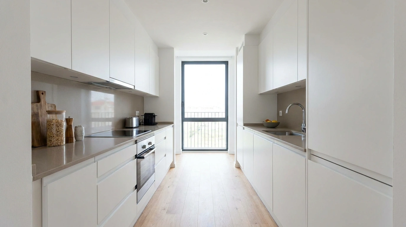
Sometimes the cabinets aren’t the real problem. A kitchen can have perfectly serviceable cabinetry and still feel stuck in an earlier version of the house because the lighting is harsh, the walls feel disconnected, the counters are visually scattered, or every finish seems to belong to a different room.
That is why small kitchen changes can be surprisingly frustrating. Swapping one light fixture or bringing home a new runner may look better on its own, but the room can still feel unfinished because nothing else supports the change.
Change the conversation around them.
Complete Kitchen Refreshes
Whimsical Kitchen Wall Gallery
A bare kitchen wall becomes instantly charming when layered with playful cutting boards, hanging utensils, and sweet seasonal greenery. The dark hanging rail grounds the arrangement while the bead garland and mini wreath add delightful texture without feeling cluttered.
The secret is balancing utilitarian objects with purely decorative details. Wooden spoons nestled in a simple crock keep the display anchored to the countertop, while the glass coffee dispenser brings in a clean, functional element.
This approach works best when keeping the surrounding walls neutral so the curated wall hanging can truly shine. Sticking to a cohesive color palette ensures the vignette feels intentional and stylish rather than overwhelming.
Warm White Kitchen With Natural Wood Accents
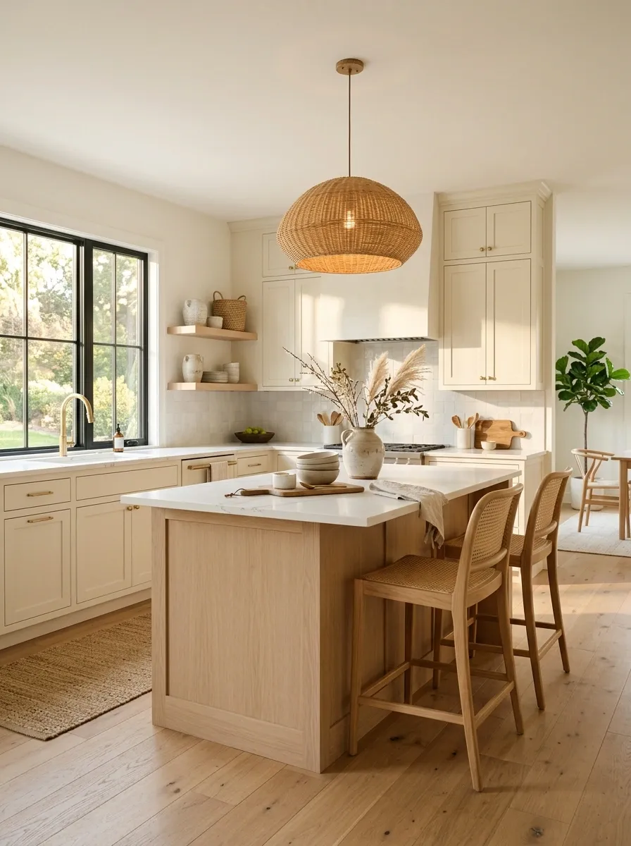
Existing light cabinets become much more intentional when the rest of the kitchen moves toward warmth. Soft white walls, pale oak stools, woven accessories, creamy ceramics, and a warm pendant create a relaxed composition without requiring a cabinet makeover.
The important shift is the relationship between cool and warm surfaces. Natural wood gives the cabinetry something substantial to play against, while woven textures keep the room from looking too polished. Countertops stay mostly clear, with only a few everyday pieces left visible.
This direction works especially well when the kitchen already has decent daylight. The one detail to avoid is introducing too many competing wood tones. Keeping the wood close in color makes the whole room feel considered.
Cozy Botanical Kitchen Corner
Existing white cabinetry takes on an inviting, lived-in charm when surrounded by trailing house plants, rich wood countertops, and open shelving. Floating oak shelves packed with everyday ceramics soften the clean lines of the room while bringing nature right into the workspace.
The key is letting organic textures do the heavy lifting. A classic dot-patterned rug warms up the wooden flooring, and warm pendant lighting creates a welcoming ambiance as evening sets in.
This concept thrives in spaces with abundant natural light, making the greenery feel vibrant and alive. Keeping surfaces relatively uncluttered ensures the kitchen remains entirely practical for everyday cooking.
Moody Kitchen With Deep Green Walls and Brass Details
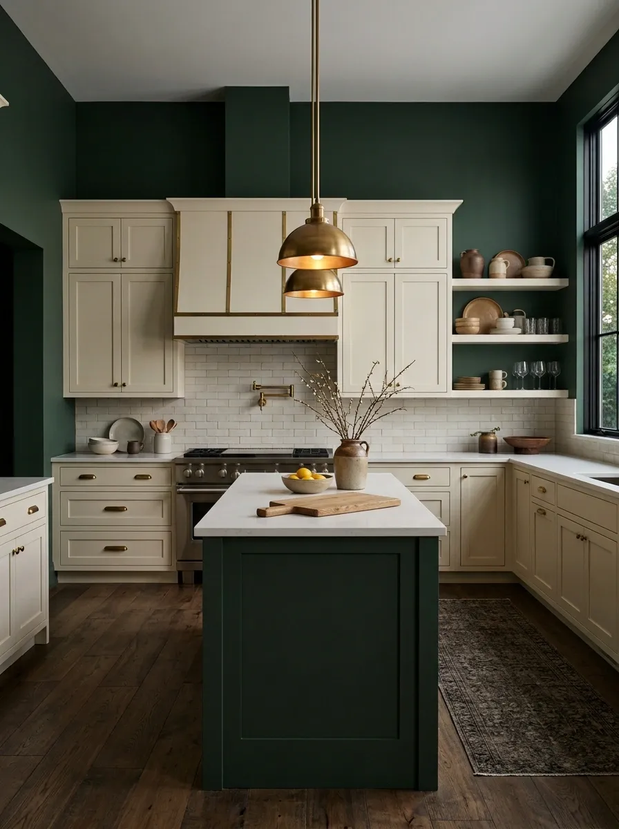
A deep green backdrop can give an ordinary kitchen a completely different identity. Light or medium cabinets become brighter against the darker wall color, while aged brass hardware and warm pendant lighting introduce a softer contrast.
The rest of the composition should stay restrained. A dark runner, one or two wood accents, and a few warm-toned ceramics are enough to connect the colors. Too many decorative objects would compete with the wall treatment and make the kitchen feel busy.
This design has its strongest impact when the darker color extends across a substantial visual area rather than appearing as a small accent. Warm lighting becomes especially important in the evening, when it keeps the green from feeling flat or overly cool.
Playful Message Board Display
Ordinary vertical space transforms into a vibrant focal point through a collection of charmingly illustrated plaques, painted cutting boards, and vintage-inspired signs. The mix of deep blues, warm yellows, and rich reds creates an instantly cheerful atmosphere that feels collected over time.
The trick to mastering this style is varying shapes and sizes while maintaining a unified theme. Round plaques balance out rectangular boards, and a whimsical teapot-shaped sign anchors the lower half of the display with delightful personality.
This layout works wonders for kitchens craving a heavy dose of character and warmth. By distributing colorful accents evenly across the wall, the entire composition stays balanced and visually engaging.
Charming Red Gingham Kitchen
A simple white and wood kitchen gets an instant dose of cottage-core nostalgia with the addition of cheerful red gingham textiles and matching accessories. The ruffled lampshade and coordinating table runner introduce classic pattern and warmth without requiring any permanent renovations.
The success of this look lies in repeating the vibrant red accent throughout the room, from the canisters on the open shelving to the classic polka-dot pitcher on the counter. Clear glass jars filled with red fruit keep the display feeling fresh and accessible.
This styling approach works exceptionally well in neutral spaces that need a pop of playful personality. Sticking to crisp whites and natural wood tones as a base prevents the bold red patterns from overwhelming the room.
Cottage Kitchen With Vintage-Inspired Finishes
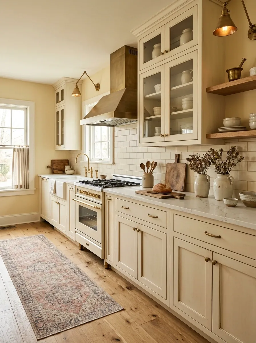
Existing cabinets can take on a more collected cottage character through the surrounding finishes rather than through replacement. Warm wall color, aged-looking hardware, a patterned runner, traditional lighting, wooden accessories, and a few vintage-inspired ceramics create a kitchen that feels established rather than newly staged.
The best version mixes old-fashioned references with clean practical surfaces. That keeps the composition from becoming overly themed. A simple countertop arrangement, natural wood, and slightly imperfect ceramics provide enough character without filling every open space.
This direction works particularly well in kitchens with ordinary cabinet profiles, because the surrounding details create the personality. The strongest visual anchor should be the combination of warm wall color and traditional lighting.
Clean Modern Kitchen With Almost No Countertop Clutter
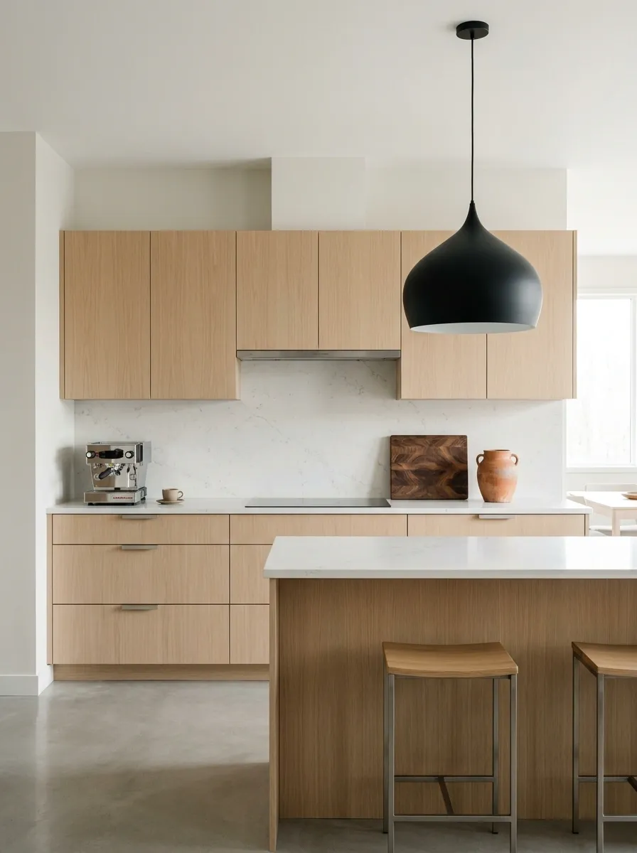
A kitchen doesn’t need more decoration to look more finished. Sometimes the stronger move is removing what doesn’t contribute to the composition. Existing cabinets pair with pale walls, streamlined hardware, one sculptural light fixture, and a deliberately limited countertop arrangement.
The finished look depends on negative space. A coffee maker can stay, a cutting board can remain useful, and one attractive ceramic vessel can add warmth, but everything else earns its place by function or visual value. Matching storage containers can further reduce the scattered look created by mismatched packaging.
This direction works especially well in kitchens with clean cabinet fronts and limited architectural detail. The less visual noise around them, the more intentional the cabinetry appears.
Warm Terracotta Kitchen With Cream Cabinets
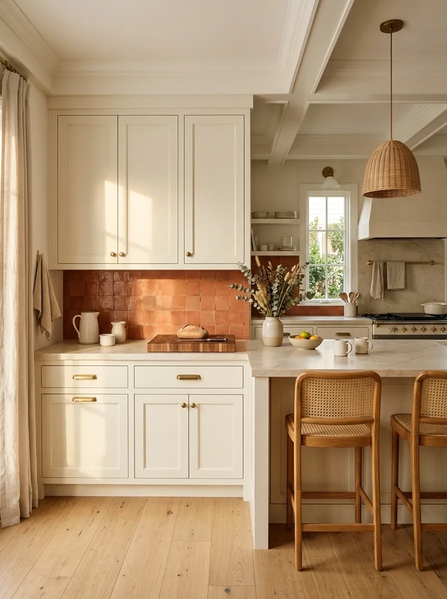
Terracotta brings more personality to a kitchen than another layer of neutral paint. Against cream or warm-white cabinets, the earthy color creates a grounded backdrop that works naturally with wood, aged brass, and soft textiles.
The strongest version uses terracotta across one meaningful visual plane, such as a wall or backsplash, while the remaining surfaces stay quiet. Warm wood stools or a cutting board can repeat the earthy undertone, while simple cream ceramics keep the countertop from becoming too busy.
This design direction is especially effective when the existing cabinetry already has a warm undertone. Cool white cabinets can work too, but the surrounding finishes should then lean toward softened clay and muted cream rather than orange-heavy terracotta.
Bright Galley Kitchen With Continuous Light Tones
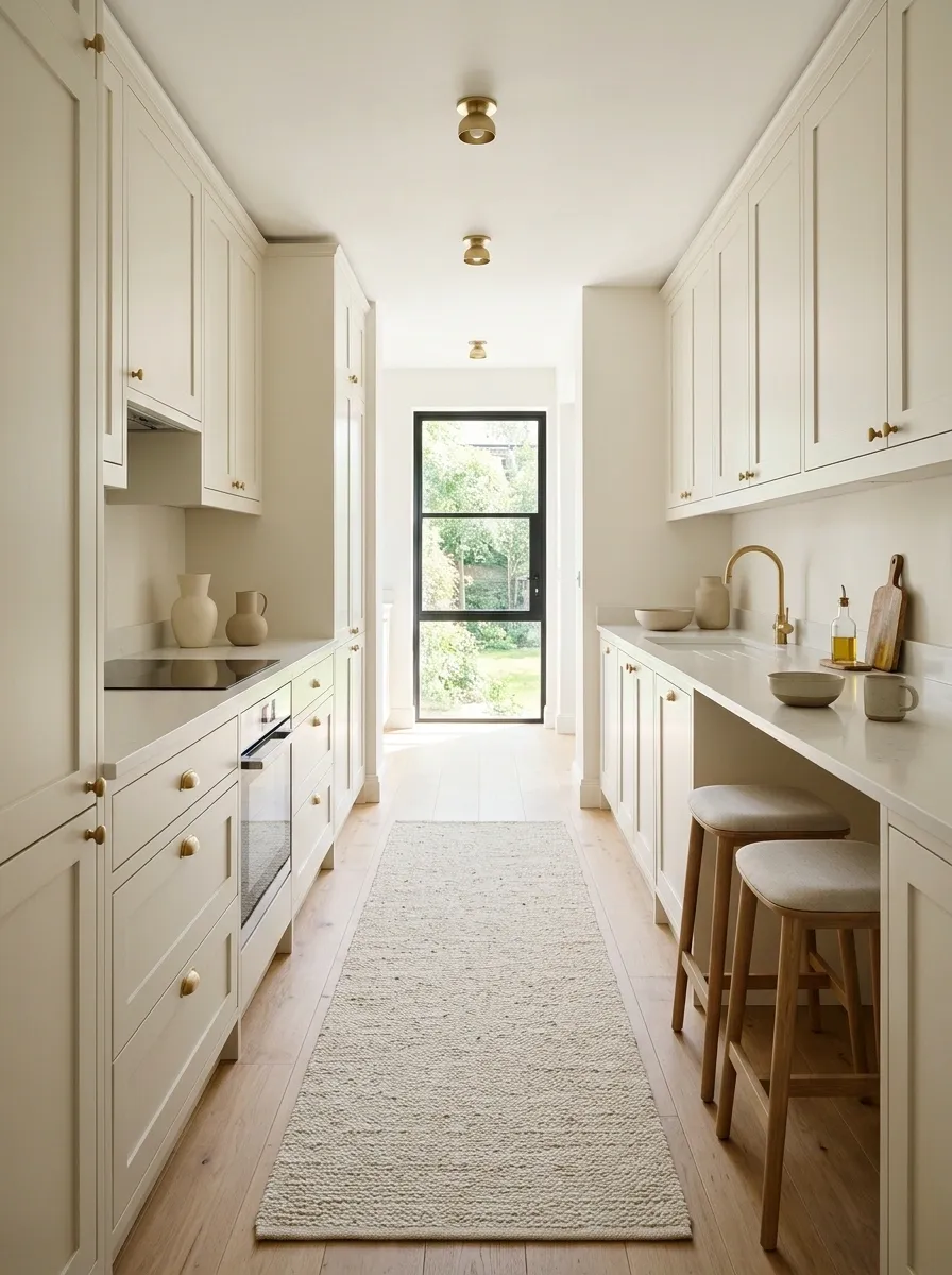
A narrow kitchen benefits from visual continuity more than extra decoration. Existing cabinets can feel substantially less cramped when the walls, major surfaces, textiles, and styling stay within a closely related light palette.
The composition works through repetition. A pale runner follows the length of the room, light walls reduce visual breaks, and simple lighting keeps attention moving from one end of the kitchen to the other. Reflective surfaces can add brightness, but they don’t need to be glossy or dramatic.
Keep the walkways clear and avoid oversized stools, freestanding shelving, or decorative pieces that interrupt the narrow circulation path. The finished effect depends as much on what is left out as what is added.
Black-and-Wood Kitchen With a Strong Contemporary Edge
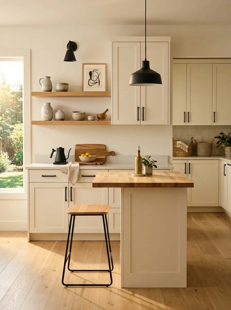
Black accents can give existing cabinetry a sharper architectural character, especially when natural wood is introduced to keep the room from becoming severe. Matte black lighting, dark hardware, framed artwork, and a wood stool or small island surface create a strong two-tone composition.
The contrast should feel deliberate rather than scattered. Black works best when it appears in several positions across the room, while wood provides the warmer counterpoint. A simple neutral wall keeps both materials visible without adding another competing color.
This direction suits kitchens with straightforward cabinet profiles because the surrounding contrast creates enough visual interest. Avoid introducing several unrelated metals. Keeping the finish language controlled makes the room feel substantially more expensive than the weekend project actually is.
Soft Blue Kitchen With Warm Cream Surroundings
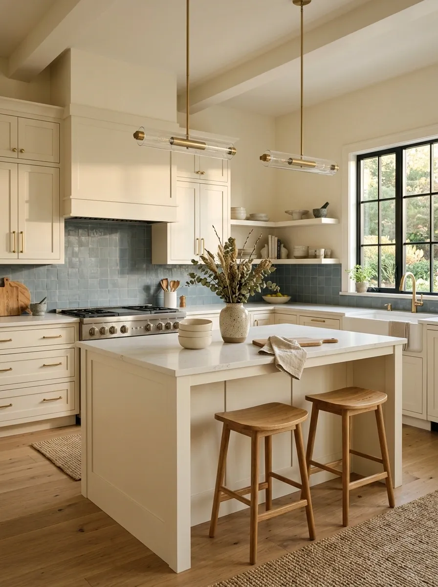
Muted blue can completely change the mood of existing cabinetry without making the kitchen feel overtly colorful. A dusty blue wall or backsplash works with creamy textiles, warm wood, brushed metal, and soft natural light.
The trick is choosing a blue with enough gray or muted warmth to sit comfortably beside the existing finishes. Bright primary blue would create a much stronger statement and could make older cabinet colors look dated. A softened blue keeps the composition calmer.
Warm wood stools, a woven runner, or a small collection of cream ceramics can bridge the blue and cabinetry. The result feels collected and comfortable while still looking distinctly different from a neutral kitchen.
Wood adds warmth.
Metal provides a quiet finish.
Organic Modern Kitchen With Stone and Wood
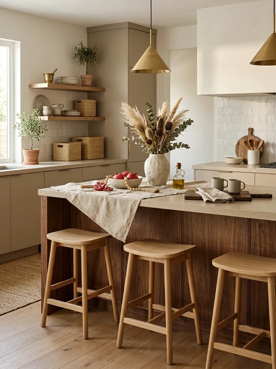
Existing cabinets can feel far more contemporary when the surrounding materials become warmer and more tactile. Stone-look accessories, natural wood seating, woven textures, sculptural ceramics, and earthy neutral walls create an organic modern composition without altering the cabinet layout.
The important relationship is between smooth and textured surfaces. Hard cabinet fronts and counters gain softness from wood grain, linen, woven fibers, and irregular ceramic shapes. The result feels layered without looking heavily decorated.
Keep the color range narrow. Warm white, sand, taupe, wood, and muted stone tones give the materials room to stand out. Too many decorative colors would weaken the calm material-driven character that makes this direction work.
High-Contrast White Kitchen With Dark Counter Styling
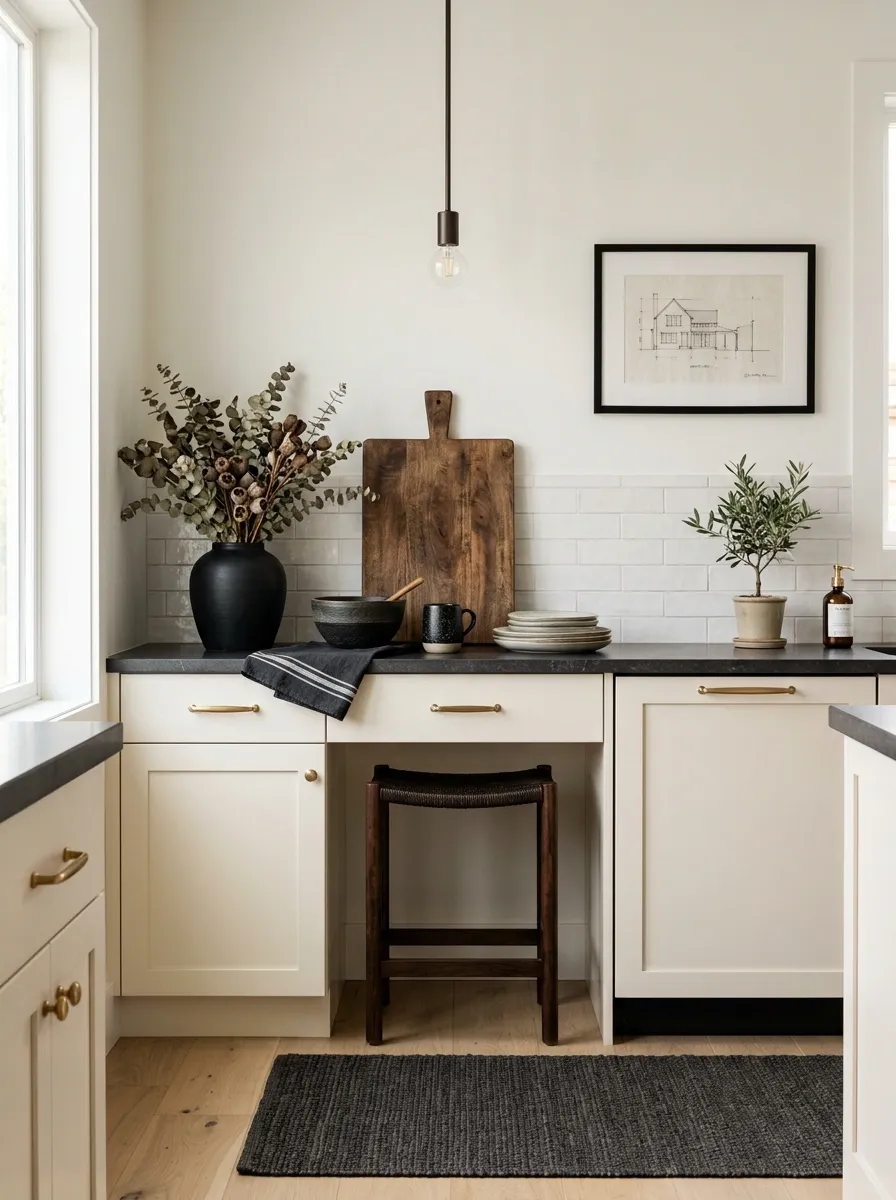
White cabinetry can sometimes disappear into an all-light kitchen. Adding carefully positioned dark accents gives the room structure while keeping the overall space bright.
Black-framed artwork, dark lighting, a charcoal runner, and a few darker countertop objects create a repeating visual thread. The goal isn’t to make black the dominant color. It acts more like punctuation, appearing at different heights so the eye moves through the room.
This composition works especially well when the cabinets and walls already share similar light values. A dark object at the bottom of the room can balance a dark pendant above, creating a more finished vertical relationship. The strongest version uses only a handful of dark elements.
Small Kitchen With a Café-Inspired Breakfast Zone
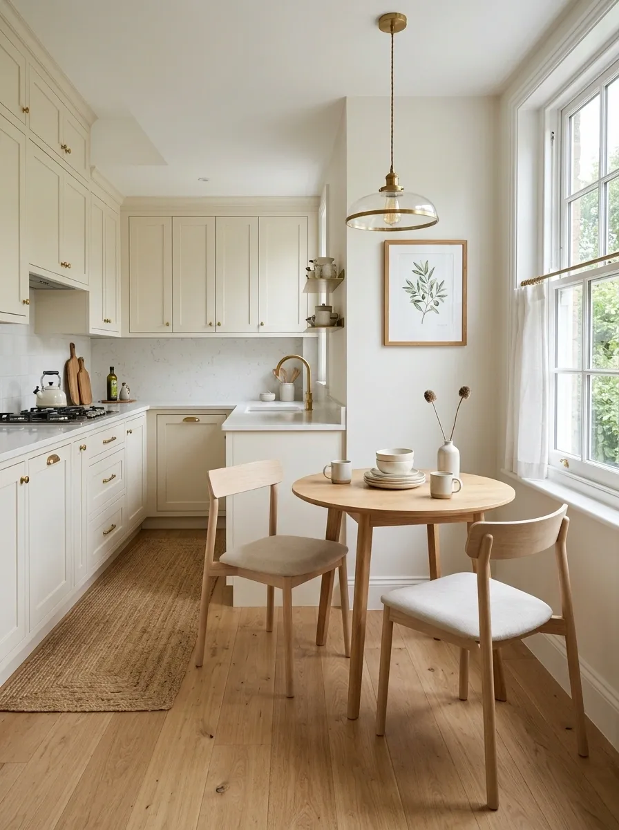
A tiny kitchen can gain a completely different character when a small breakfast area becomes part of the design rather than an afterthought. Existing cabinets stay intact while a round café table, compact seating, warm pendant, simple artwork, and a narrow runner create a secondary focal point.
The furniture should respect the room’s circulation. A compact round table often works visually because it softens the hard lines of cabinets and can make movement around the area feel less constrained.
Keep the seating light and the styling simple. A single vase, small stack of dishes, or framed print is enough. The breakfast area should feel like part of the kitchen’s architecture, not a separate furniture arrangement squeezed into leftover space.
Light-Filled Kitchen With Soft Linen Styling
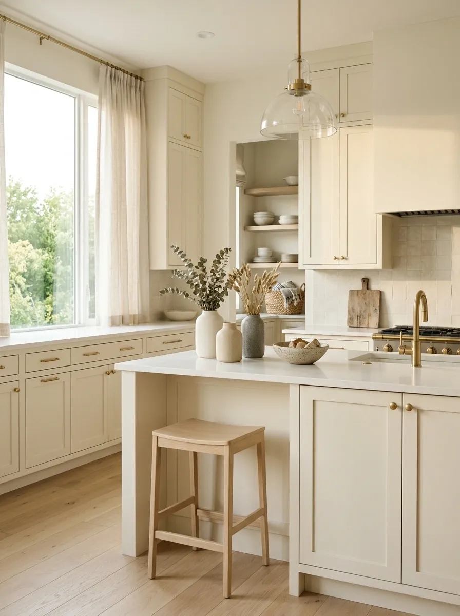
A naturally bright kitchen can become more sophisticated by leaning into the light instead of adding stronger contrast. Existing cabinetry sits within a palette of cream walls, linen window treatments, pale wood, soft woven textiles, and understated ceramics.
The composition feels finished because the materials repeat the quality of the daylight. Matte surfaces and natural fabrics absorb some of the brightness, while pale wood prevents the room from becoming visually cold.
The strongest approach keeps the windows relatively open. Heavy curtains, busy artwork, or dark furniture can interrupt the airy quality that makes the concept distinctive. A simple linen shade and a small wood element are often enough to establish the direction.
filters brightness
adds warmth
reduce glare
Dramatic Charcoal Kitchen With Warm Lighting
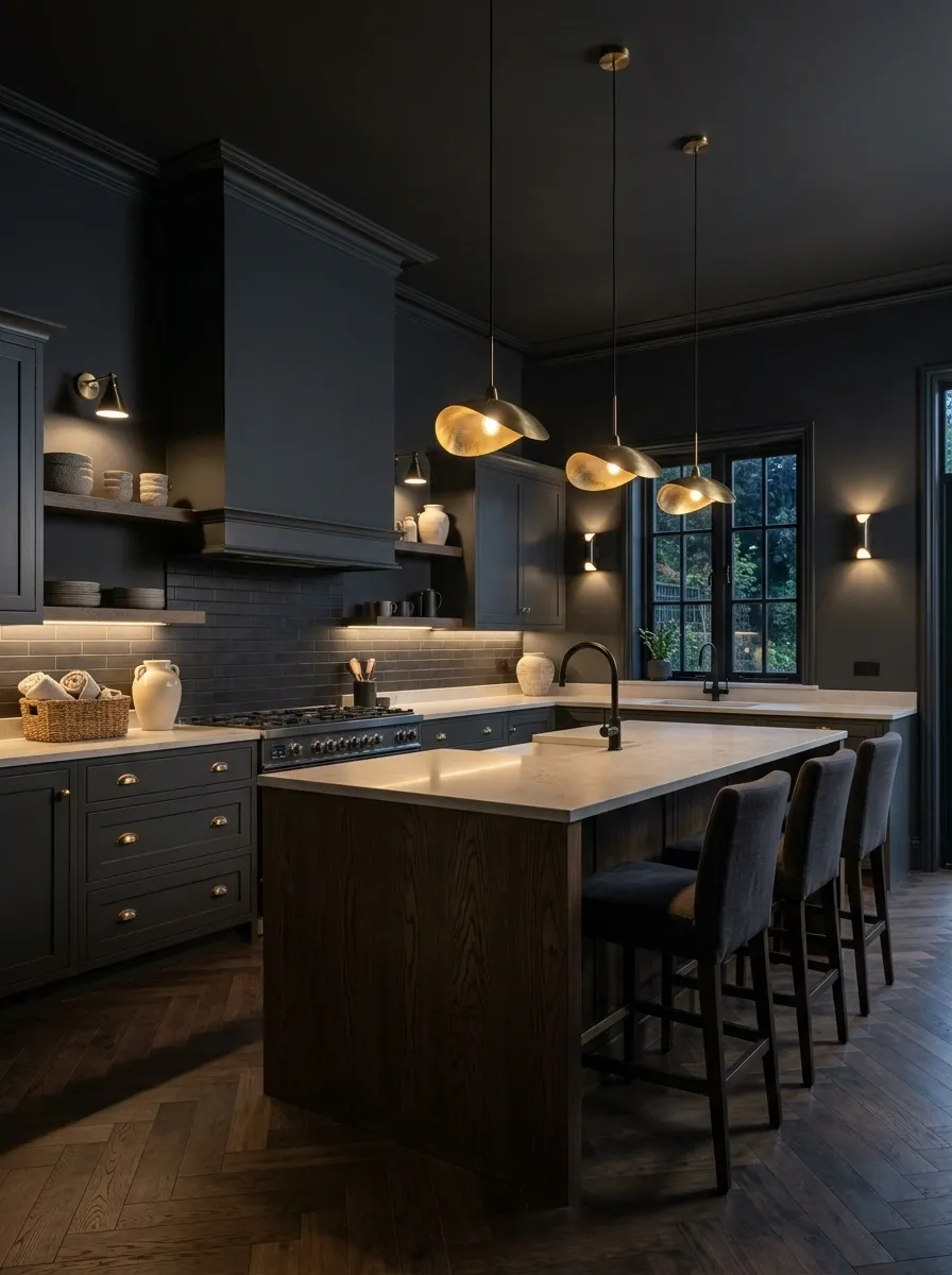
Charcoal can make an ordinary kitchen feel architectural, but the lighting has to carry equal weight. Existing cabinets become part of a darker composition through charcoal walls, black fixtures, warm pendants, deep-toned accessories, and small touches of brass.
The room shouldn’t rely on overhead lighting alone. Warm pendants and under-cabinet illumination create pockets of brightness that keep the darker palette dimensional. A few lighter surfaces, such as pale stone or cream ceramics, provide just enough relief.
This design works particularly well in kitchens with interesting architectural features that deserve emphasis. Too many dark finishes in a low-light room can make the space feel compressed, so the balance between daylight and warm artificial light matters as much as the color choice.
English-Inspired Kitchen With Layered Traditional Details
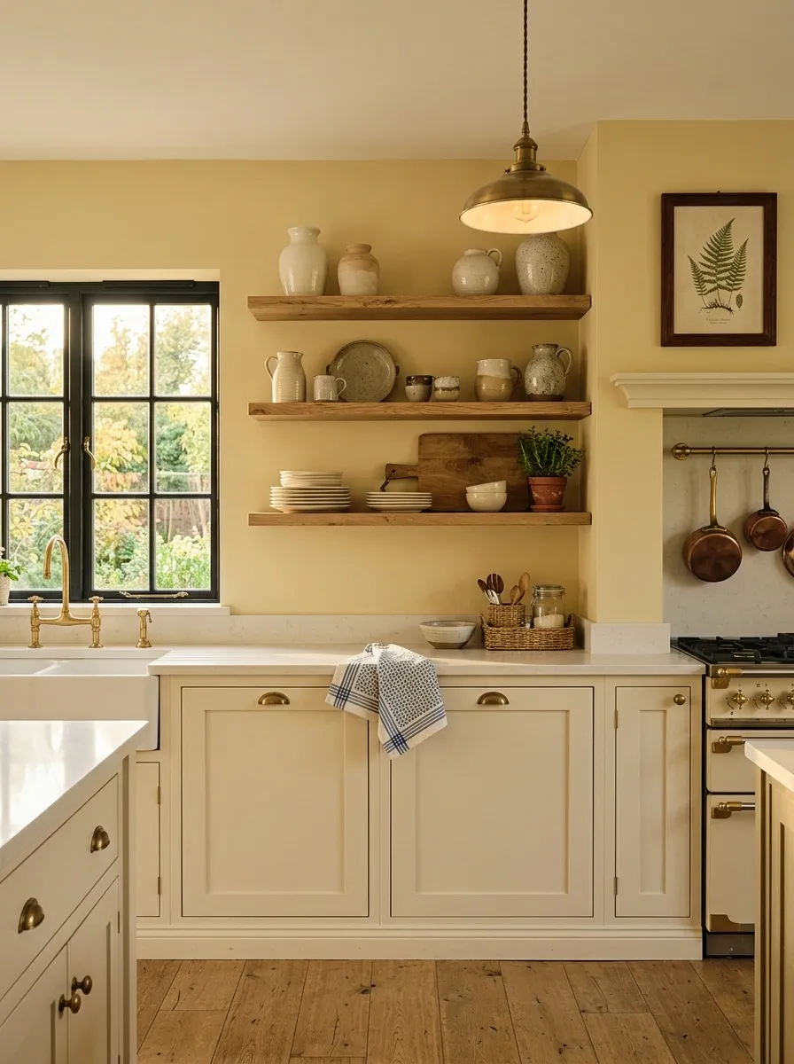
Traditional details can give ordinary cabinets a much stronger sense of character. Warm wall color, classic lighting, framed artwork, patterned textiles, natural wood, and a few brass details create an English-inspired composition without requiring custom cabinetry.
The room works because the decorative elements aren’t treated as separate additions. The lighting relates to the metal, the textiles repeat the wall warmth, and the wood provides a natural counterpoint to painted surfaces. A few open shelves or visible dishes can add personality without turning the kitchen into a display cabinet.
Keep the larger surfaces quiet. The traditional character should come from proportion, material, and a handful of familiar details rather than a room full of themed accessories.
Minimalist Kitchen With a Single Statement Pendant
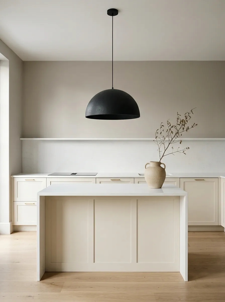
A single strong lighting choice can completely redirect attention in a simple kitchen. Existing cabinets remain quiet while one sculptural pendant provides the main visual event, supported by uncluttered counters, warm neutral walls, and restrained furniture.
The success of this composition depends on giving the pendant room to matter. Competing artwork, decorative lighting, or a crowded countertop would weaken the focal point. The surrounding surfaces should act almost like a backdrop.
This is particularly effective in kitchens where the cabinetry is functional but visually ordinary. Instead of trying to give every surface personality, the composition concentrates attention in one deliberate place and allows the rest of the kitchen to support it.
Earthy Kitchen With Olive, Oak, and Cream
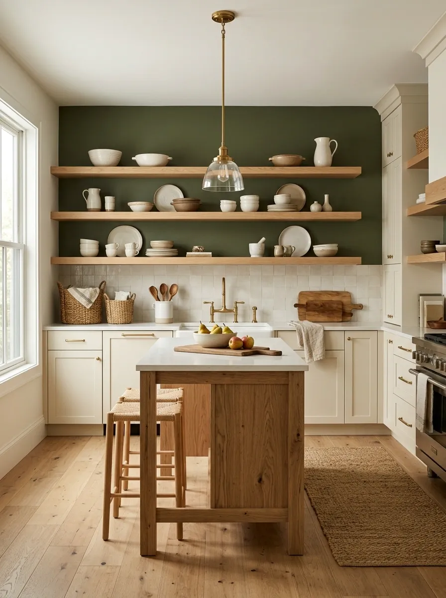
Olive green, natural oak, and warm cream create a grounded palette that can make existing cabinets feel intentionally coordinated. The green establishes the atmosphere, cream keeps the room visually open, and wood introduces a natural element that connects the two.
The strongest version uses olive on a meaningful wall or backsplash area rather than scattering the color through small accessories. Oak stools, cutting boards, or shelving then provide a warmer middle tone. Cream ceramics and textiles prevent the palette from becoming too dense.
This combination suits kitchens that need more personality without a dramatic redesign. It also works particularly well with warm metal finishes, which reinforce the earthy character instead of introducing a sharp modern contrast.
Atmosphere
Breathing room
Warmth
Rental-Friendly Kitchen With Removable Visual Layers
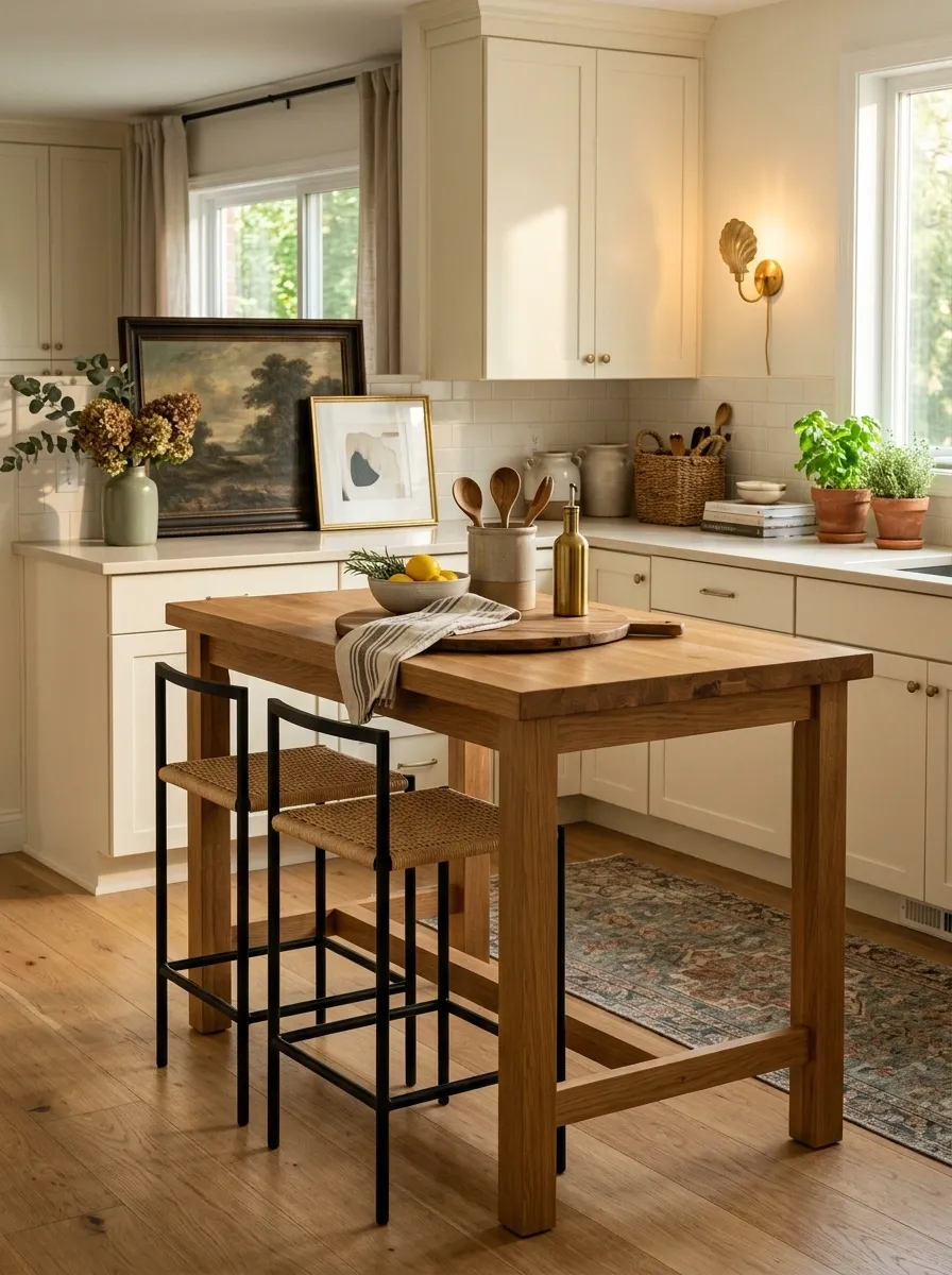
A rented kitchen can still receive a complete visual refresh when the design focuses on changes that don’t alter the cabinetry. Temporary lighting solutions, removable artwork, rugs, countertop organization, freestanding furniture, and carefully chosen textiles can create a surprisingly finished composition.
The design should begin with the existing cabinet color and work outward. A runner can introduce pattern, framed art can provide a focal point, and freestanding wood furniture can add warmth that the fixed kitchen lacks. Removable hooks, organizers, and temporary surface treatments can handle practical needs without permanent alterations.
The strongest rental-friendly kitchens don’t look temporary. They look deliberately styled while keeping the major fixed elements untouched.
Family Kitchen With Practical Warmth
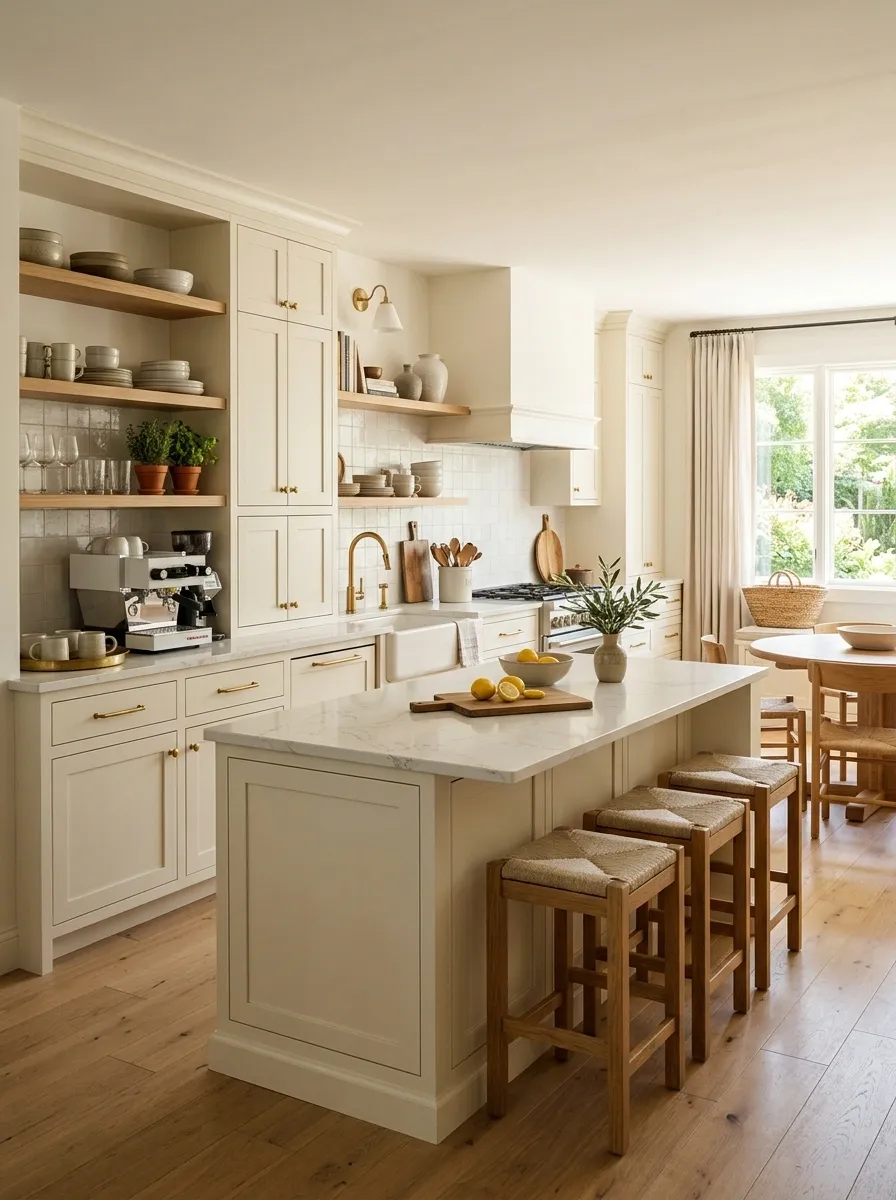
A family kitchen needs to look finished without becoming too precious to use. Existing cabinets can anchor a warm composition built around durable textiles, accessible everyday storage, wood seating, clear landing zones, and simple decor that doesn’t interfere with cooking.
The best visual change comes from organizing the kitchen according to how the room is actually used. A basket near the breakfast area, a defined coffee station, a clear section of prep counter, and easy-to-reach everyday dishes can make the entire room feel more intentional.
Warm wood and natural textiles keep the practical elements from reading as purely functional. The result feels comfortable and organized without demanding that the kitchen remain perfectly styled all day.
Vintage-Modern Kitchen With Checkerboard Floor Energy
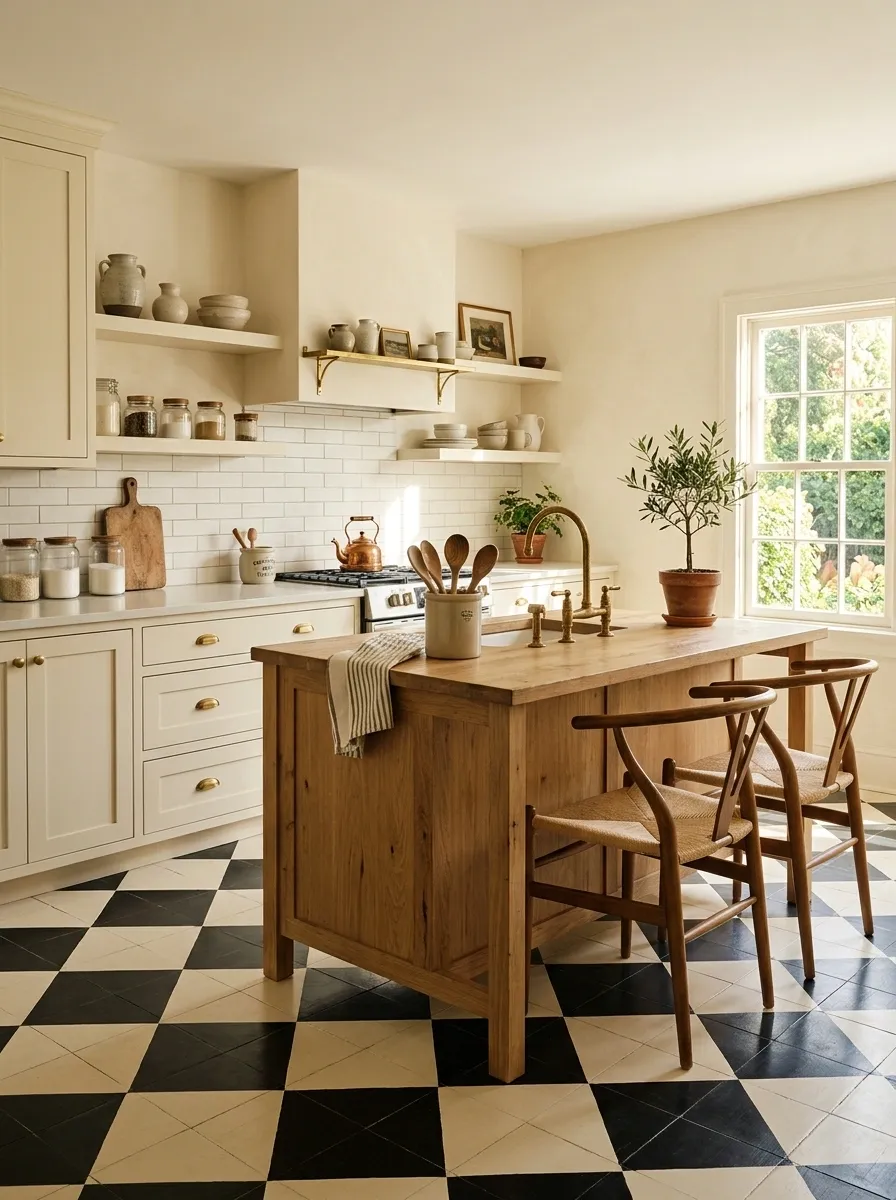
A graphic floor can change the entire personality of a kitchen while leaving the cabinets untouched. A restrained checkerboard pattern, simple pendant lighting, warm neutral walls, and a mix of vintage-inspired and contemporary accessories create a room with much stronger visual definition.
The floor should carry most of the pattern. Keeping the walls, cabinets, and countertop styling relatively quiet prevents the composition from becoming visually fragmented. Black-and-cream checks provide enough contrast on their own, while natural wood and aged metal soften the graphic effect.
This direction works especially well in smaller kitchens because the floor becomes a strong visual foundation rather than relying on many decorative elements. Repeating the floor’s two tones in small accessories helps the room feel connected.
Soft Beige Kitchen With Tonal Layering
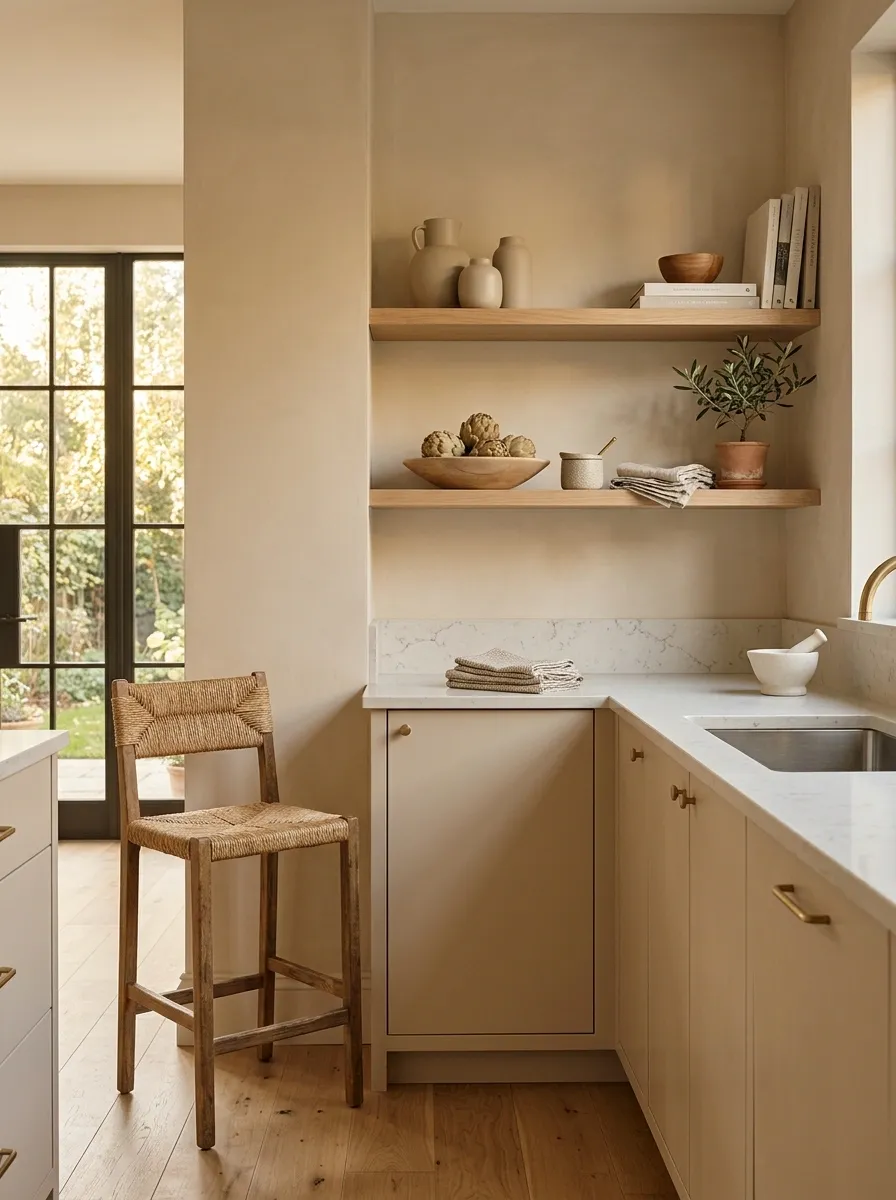
A kitchen can feel sophisticated without strong contrast. Existing cabinets become part of a tonal composition built from warm beige walls, creamy textiles, pale stone, natural wood, and soft metal finishes that sit close together rather than competing.
The visual interest comes from subtle changes in tone and texture. A matte wall beside a lightly veined surface, smooth cabinetry beside wood grain, and woven textiles against hard finishes create depth without introducing another dominant color.
This approach is particularly useful when the existing cabinetry is an awkward shade that doesn’t work well with bright white. Warm beige can act as a bridge, making the original cabinet color feel more deliberate and connected to the rest of the room.
Colorful Kitchen With One Confident Accent Wall
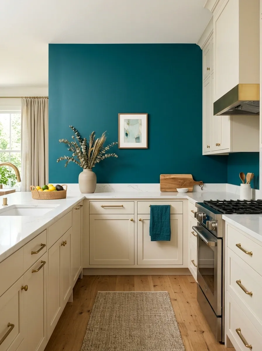
A single saturated wall can give an otherwise ordinary kitchen a strong new identity. Existing cabinets remain the stable element while one confident color creates the room’s focal point, supported by coordinated artwork, textiles, lighting, and a very limited accent palette.
The color should appear in enough places to feel intentional, but not so many that it becomes repetitive. A wall can carry the dominant tone while a small piece of art or a textile quietly echoes it elsewhere.
This is a useful direction when the kitchen lacks architectural interest. Instead of competing with the cabinets, the accent wall gives the room a visual anchor. Keeping the rest of the palette neutral makes the color look purposeful rather than busy.
Cabinets + major surfaces
Modern Farmhouse Kitchen With Better Countertop Composition
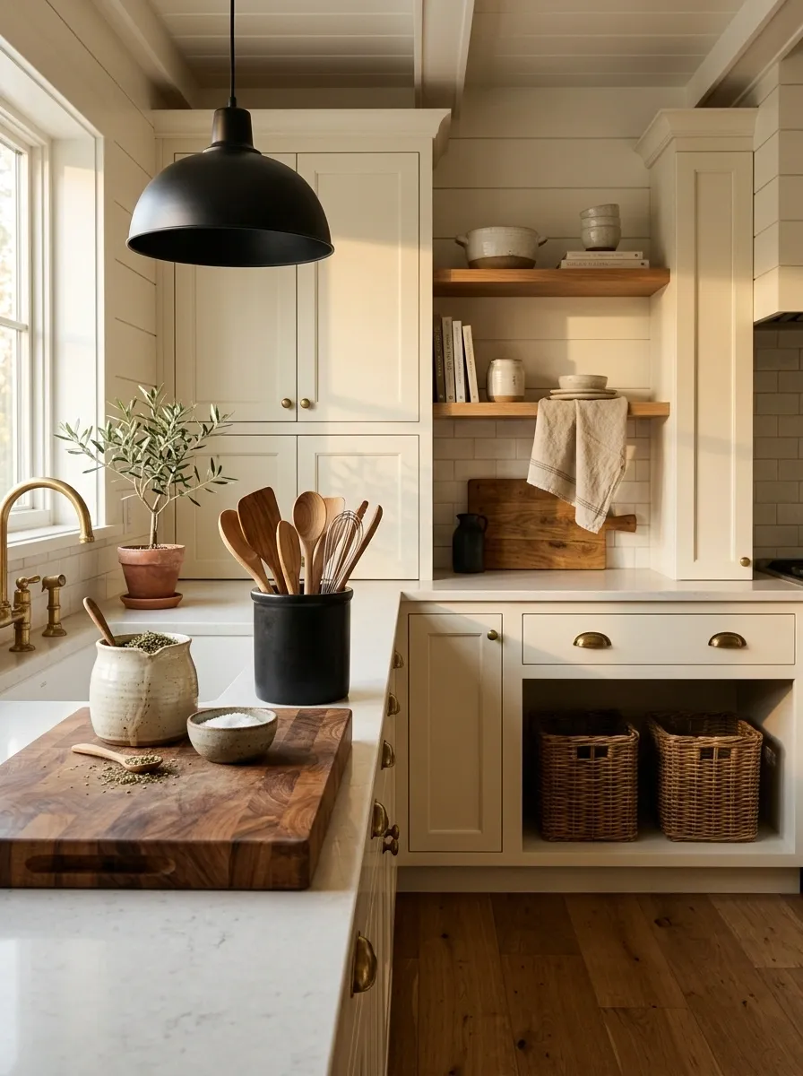
The cabinetry doesn’t have to change for a kitchen to feel more farmhouse-inspired. Warm wood, simple black lighting, practical textiles, handmade-looking ceramics, and a deliberately arranged countertop can create the character through styling and material contrast.
The countertop is especially important here. Instead of spreading objects across the entire surface, group useful pieces into small zones. A wooden board with a ceramic vessel can form one arrangement, while everyday cooking tools remain close to the prep area.
Black lighting provides enough contrast to keep the warm materials from feeling overly rustic. The final look should feel practical first, with farmhouse character coming through the combination of texture, shape, and restrained decoration.
Apartment Kitchen With a Strong Vertical Focus
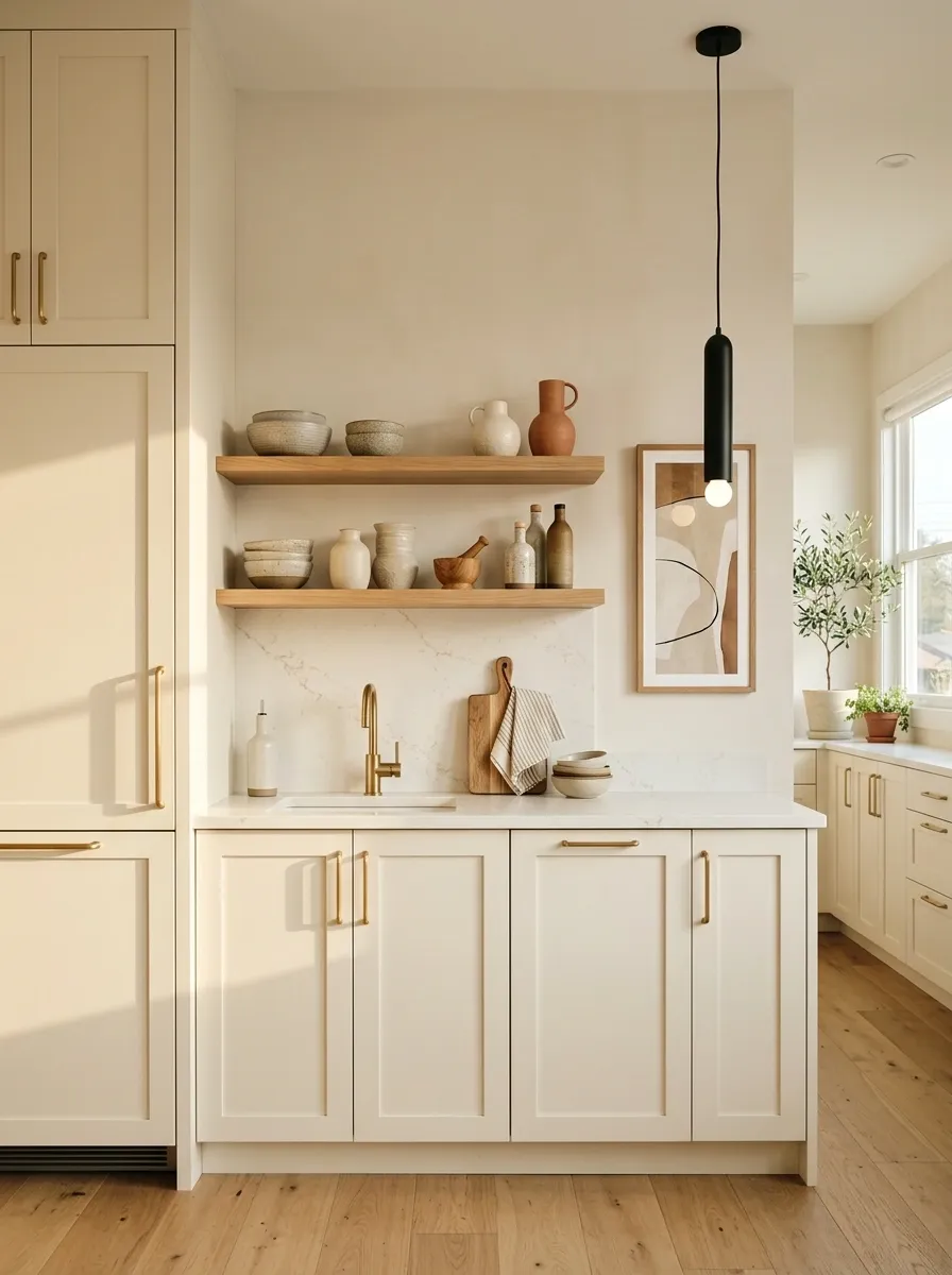
Small apartment kitchens often feel visually compressed because most elements run horizontally. A stronger vertical composition can change that perception without changing the cabinets. Tall artwork, vertically oriented lighting, narrow open shelving, elongated decor, and carefully chosen wall treatment draw the eye upward.
The approach is less about adding more objects and more about changing their proportions. A narrow framed print can have more impact than several small pieces scattered across the same wall. A pendant with a longer silhouette can reinforce the same upward movement.
Keep lower surfaces relatively uncluttered. When the eye has a clear path upward, the kitchen can feel more layered without becoming visually crowded.
quiet surfaces below.
Warm Black Kitchen With Light Natural Counter Styling
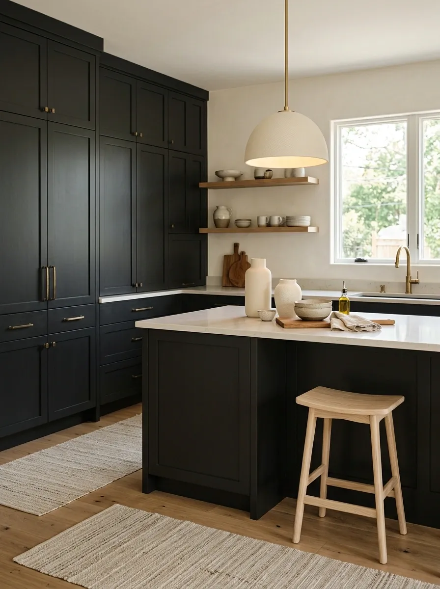
Dark cabinetry can feel heavy when every surrounding surface is equally dark. A stronger composition creates contrast through pale wood, cream ceramics, light textiles, and warm illumination while allowing the deeper cabinet color to remain the foundation.
The lighter pieces should be placed deliberately rather than scattered throughout the room. A pale wood stool, cream pendant shade, light runner, and a small group of ceramic vessels can create several points of relief. Warm lighting then connects those lighter elements after sunset.
The result feels dramatic without becoming gloomy. Keeping the countertop mostly open is especially important because a dark kitchen already has strong visual weight.
Coastal Kitchen Without Nautical Decor
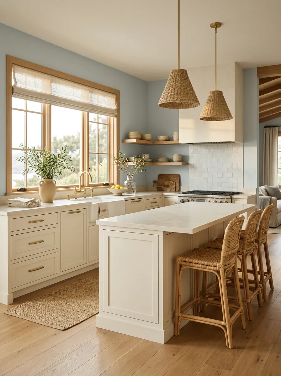
A coastal kitchen doesn’t need rope, anchors, or obvious beach accessories. A more sophisticated version keeps existing cabinets while using pale blue-gray walls, warm white textiles, light wood, woven materials, and plenty of natural daylight.
The palette should stay muted. Soft blue-gray creates the coastal reference, while sandy beige, cream, and pale wood keep the room connected to natural materials. Woven stools or a simple textured runner can reinforce that feeling without turning the space into a themed room.
This direction is especially effective in kitchens with generous daylight. Avoid adding several shades of blue. One carefully chosen blue-gray is enough to establish the atmosphere while allowing the original cabinetry to remain visible.
Eclectic Kitchen With Collected Artwork and Ceramics
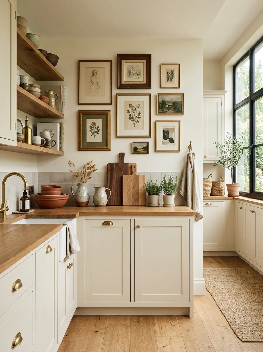
Existing cabinets can become a quiet foundation for a much more personal kitchen. A collection of framed artwork, handmade-looking ceramics, mixed wood tones, distinctive lighting, and carefully chosen everyday objects creates an eclectic composition with plenty of character.
The room needs one visual thread to keep the mix from feeling random. Repeating a warm wood tone, a shared frame color, or one recurring accent shade can connect pieces that are otherwise different.
The strongest version doesn’t fill every wall or counter. Leave some breathing room around the artwork and group ceramics in small arrangements instead of spreading them evenly across the kitchen. The contrast between collected objects and simple cabinetry is what gives the design its personality.
Evening Kitchen With Layered Ambient Lighting
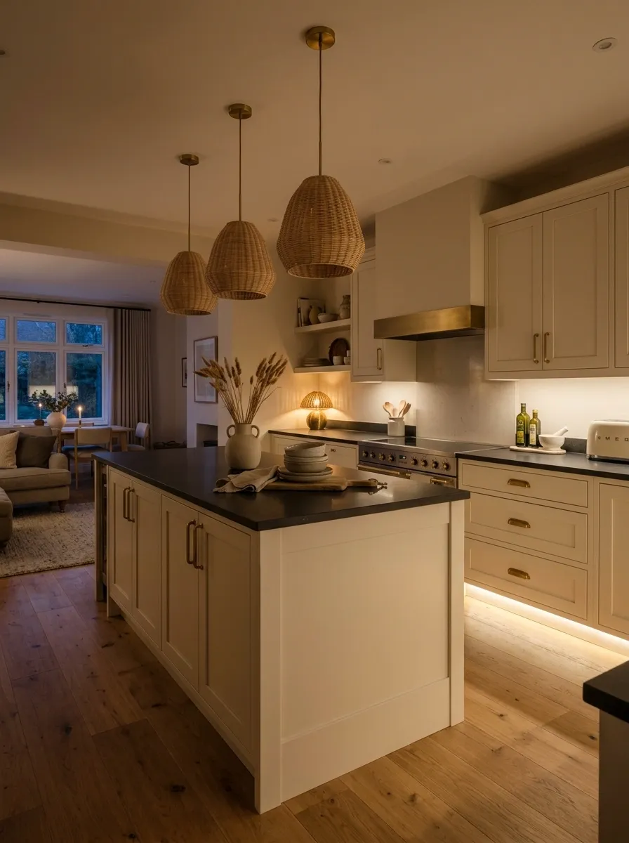
Some kitchens look ordinary during the day and completely different once the lighting changes. Existing cabinets can become the backdrop for a much richer evening composition through warm under-cabinet illumination, pendant lighting, a small lamp, and reduced dependence on harsh overhead fixtures.
Each layer should perform a different visual job. Pendants establish the main focal area, under-cabinet lighting illuminates working surfaces, and softer ambient light fills the darker edges of the room. The cabinetry then becomes part of the atmosphere rather than simply a row of storage.
This direction is especially effective in kitchens that connect directly to dining or living spaces. The warmer lighting helps the kitchen feel like part of the evening environment instead of a brightly lit workspace.
Define the main visual focal point.
Brightens the working surfaces.
Softens the room after dark.
Quiet Luxury Kitchen Built Around Existing Cabinets
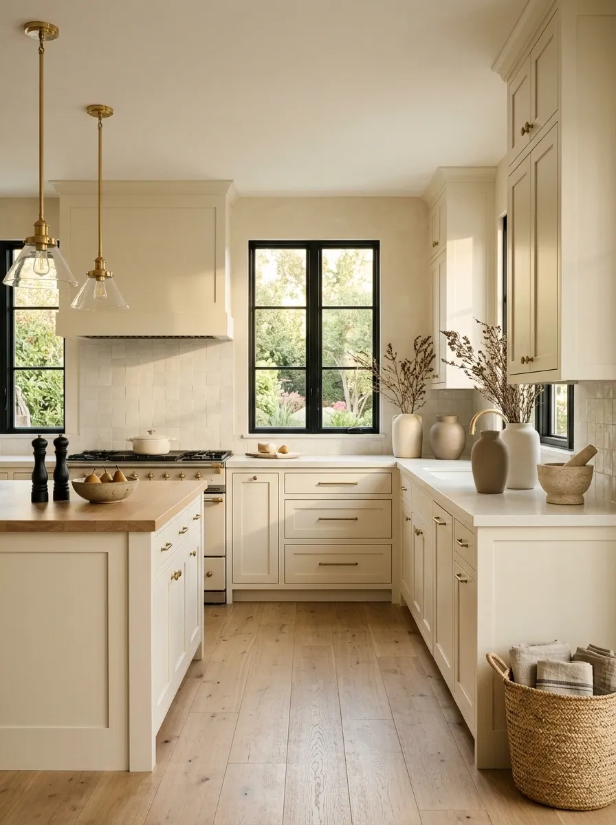
The most refined kitchen refresh may be the least obviously decorated. Existing cabinets become part of a restrained composition built around warm neutral walls, polished lighting, stone-look accessories, tailored textiles, understated hardware, and carefully spaced objects.
Nothing needs to shout for attention. Materials do the work through subtle variation in texture and finish, while the lighting gives ordinary surfaces a more deliberate appearance. Countertops remain mostly clear, with only a few substantial objects visible.
This approach works best when every visible decision supports the same sense of restraint. Avoid excessive open shelving, too many decorative finishes, or a collection of unrelated metals. The finished room should feel calm because every element has a clear visual role.