
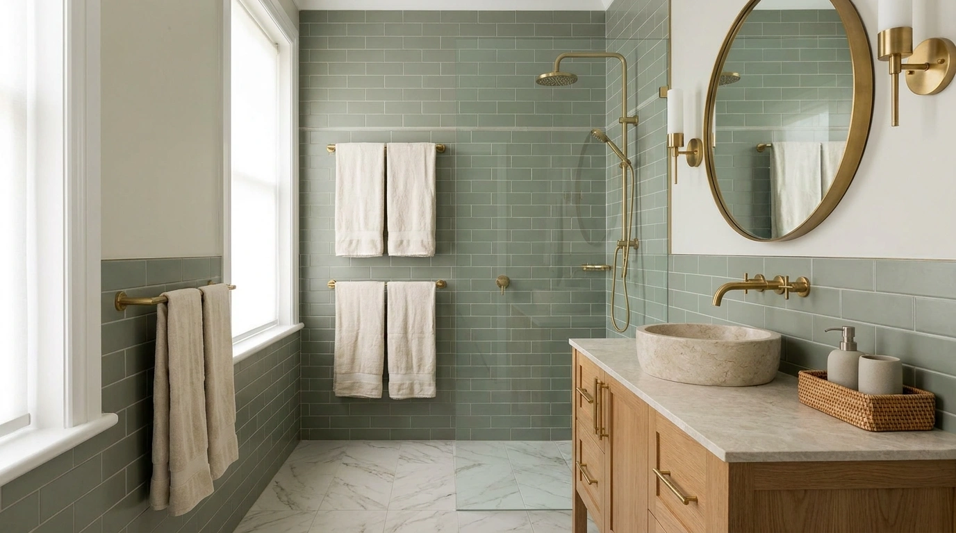
Brass is one of those finishes that can make a bathroom look beautifully considered or leave it looking like every accessory was bought during a gold-themed shopping spree. The difference isn’t the price of the faucet. It’s everything surrounding it.
Creamy tile, natural wood, textured stone, and the right lighting give brass room to stand out. The wrong combination of clashing metals, overly shiny surfaces, and decorative clutter can make even expensive fixtures look out of place.
The good news? A bathroom doesn’t need a complete renovation to get the balance right. Sometimes, changing the cabinet pulls, switching the towels, or repainting the vanity wall does more than replacing half the room.
How to Style a Bathroom With Brass Fixtures
Embrace Monochromatic Moody Tones
Monochromatic rooms make a statement without feeling chaotic. Layering deep taupe walls with matching warm bronze surfaces creates an immersive, high-end sanctuary that wraps the entire space in cozy luxury.
Keep the vanity minimal and let the metallic finishes take center stage. Wall-mounted brass faucets paired with a striking matching basin anchor the look while maintaining clean lines across the room.
Finish the design with subtle lighting and soft textiles. A touch of ambient glow from fluted sconces adds depth, preventing darker walls from feeling heavy while highlighting the rich luster of the brass.
Pair Brass Fixtures With Warm White Tile
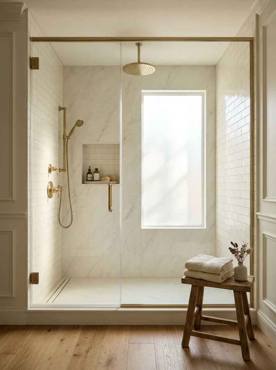
Warm white tile makes brass look richer without competing for attention. The combination feels clean, but it avoids the cold, clinical look that can happen when every surface is bright white.
Choose creamy ceramic tile, ivory subway tile, or softly veined white porcelain. Warm grout can help tie the surfaces together, especially around a brass showerhead or bathtub faucet.
The small detail that matters? Check your tile next to the actual brass finish. A tile that looks creamy in a store can look surprisingly gray at home.
THE MATERIAL PALETTE
Warm whites + brass = less showroom, more thoughtful design.
Creamy white
Softens the metallic shine and keeps the room bright.
Ivory tile
Adds gentle warmth without making the palette look yellow.
Brushed brass
Adds warmth and definition against lighter surfaces.
Design rule: Keep the tile simple when the faucet or shower hardware is the main feature.
Create Softness With Pink Hues
Soft pink tones provide a surprisingly versatile backdrop for warm brass fixtures. The gentle hue takes the edge off the brightness of the metal, creating a balanced and inviting atmosphere.
Incorporate organic shapes to break up the linear details. A sculptural, wave-like stone basin introduces tactile interest, while fluted wall paneling adds architectural depth without overwhelming the compact layout.
Tie the space together with layered textures underfoot. A plush, asymmetrical rug in complementary dusty rose shades grounds the floating vanity and adds an extra layer of warmth to the bathroom floor.
Use Natural Stone to Soften the Shine of Brass
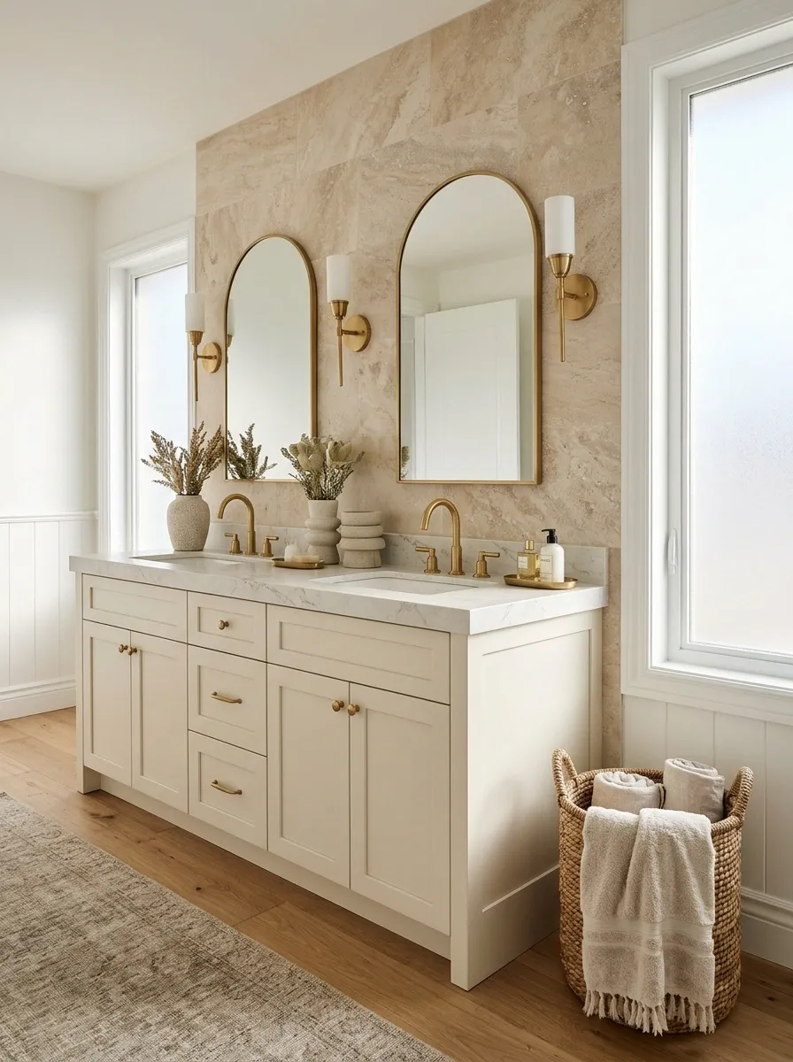
Brass brings the shine. Stone brings the texture. That’s the partnership.
A marble-look countertop, travertine-style tile, or limestone-inspired finish gives the metal a quieter background and stops the room from feeling overly polished. Natural variations in stone also make a bathroom feel less like every surface came from the same catalogue.
Use one main stone finish on the vanity or shower wall, then repeat a related tone elsewhere. There’s no need to cover every surface in dramatic veining. The faucet already has a job.
Choose the stone by the mood you want.
Marble-look surfaces
Best for a refined bathroom with visible veining and a more formal finish.
Travertine-inspired finishes
Best for a relaxed, earthy scheme with cream and sandy tones.
Limestone-inspired finishes
Best for a restrained look with soft texture rather than dramatic patterns.
Small but important: Natural stone and stone-look porcelain have different care needs. Check the material’s cleaning and sealing requirements before buying.
Ground Space With Patterned Tile
Patterned floor tile instantly anchors a bathroom with classic character. A green and white checkerboard floor brings a playful yet sophisticated geometry that naturally draws the eye downward.
Pair the graphic flooring with rich green cabinetry and subtle brass accents to create a cohesive color story. The repetition of green across the walls, tiles, and vanity unites the entire design seamlessly.
Keep surrounding accessories streamlined and purposeful. A framed mirror and simple hardware allow the patterned floor and rich cabinetry to remain the undisputed stars of the space.
Pair Brass With Deep Green Vanity Cabinets
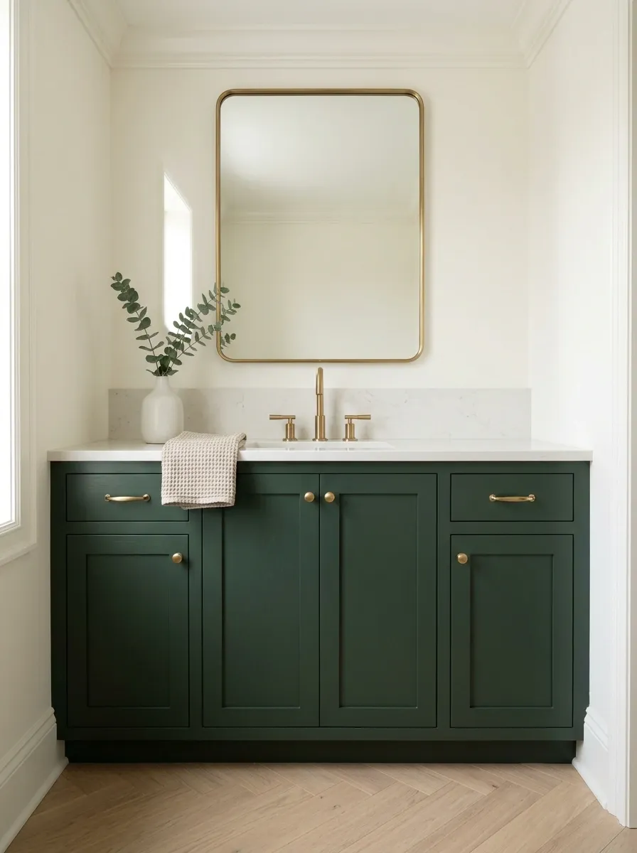
Deep green cabinetry gives brass something to stand against. Forest green feels rich and traditional, while olive and muted sage create a softer, more relaxed effect.
Let the cabinet color do the heavy lifting. Keep the countertop simple, use a restrained backsplash, and choose brass handles that suit the cabinet doors. Otherwise, the bathroom ends up with too many competing statement features and no clear winner.
For a smaller bathroom, use green on the vanity rather than every wall. It’s a strong focal point that leaves the room feeling open.
THE COLOR MATCHUP
Green cabinets don’t need a busy supporting cast.
Forest green
Pair with brushed brass and a pale stone countertop.
Muted sage
Use with creamy tile and understated brass hardware.
Earthy olive
Add warm wood and textured neutral fabrics.
Add Black Accents for Sharper Contrast
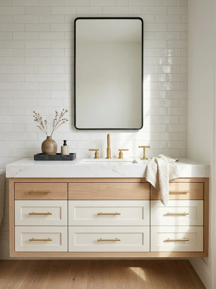
Black gives brass a little edge. A dark-framed shower screen, black artwork frame, or simple charcoal accessory can make warm metallic details stand out without forcing the whole bathroom into a dramatic color scheme.
The common mistake is spreading black across every available surface. Black faucets, black pulls, black shower framing, black towel bars, and black accessories can make the brass feel like an afterthought.
Choose one or two black elements and allow the rest of the room to breathe. This works especially well with white tile, pale stone, and warm wood.
The black-and-brass balance check
✓ KEEP
One strong contrast
Brass faucet, pale tile, and a slim black mirror frame.
✕ SKIP
Competing accents
Black hardware everywhere, gold accessories everywhere else, and no visual hierarchy.
Easy starting point: Choose the faucet finish first. Add black in a frame or another distinct detail, then stop before every accessory gets involved.
Bring in Natural Wood for a Warmer Bathroom
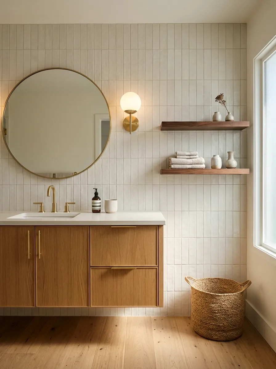
Brass and wood work together because neither has to do all the decorating. Brass adds a reflective detail, while wood brings grain, variation, and a more grounded feel.
An oak vanity is an easy choice, but a walnut shelf, wooden stool, or cabinet with a natural finish can do the job too. Pair these with ivory tile or a pale countertop for a balanced result.
Keep the wood tone deliberate. If the vanity is already a strong honey oak, adding several unrelated orange-toned wood accessories can make the bathroom feel mismatched rather than layered.
Build a material palette, not a furniture showroom.
These materials do different jobs. That’s precisely why they work together.
Natural oak
Use for vanities or shelves to bring in lighter, relaxed warmth.
Deep walnut
Use sparingly for richer contrast against lighter walls and stone.
Warm brass
Repeat on the faucet, cabinet pulls, or lighting for a clear visual link.
The practical move: Choose one main wood tone. A bathroom doesn’t need unrelated timber samples pretending to be a design concept.
Choose a Mirror Frame That Complements the Brass
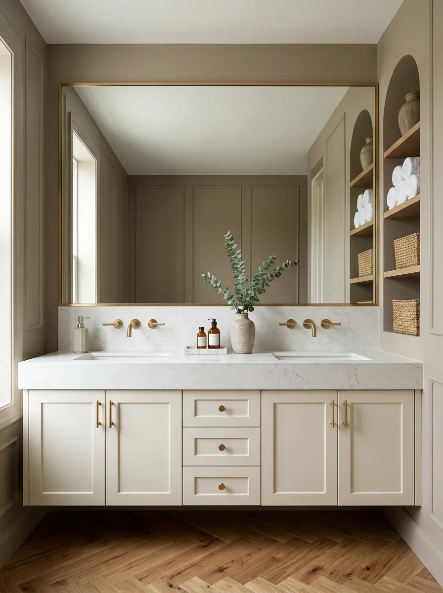
The mirror is one of the biggest visual features in a bathroom, so its frame can either connect the design or create unnecessary competition.
A thin brass frame creates a coordinated look, especially above a matching faucet. A natural wood frame softens the metal, while a frameless mirror keeps the room cleaner and lets the fixtures stand out.
The mistake is choosing a huge, ornate gold mirror when the rest of the bathroom is already full of shiny details. Suddenly, the mirror has main-character energy and the faucet is fighting for screen time.
MIRROR FRAME CHEAT SHEET
Three frames. Different results.
Thin brass frame
Best for a coordinated bathroom where the metal is repeated elsewhere.
Natural wood frame
Best for earthy schemes with wood cabinetry and softer textures.
Frameless mirror
Best for compact bathrooms where a quieter outline keeps the wall from feeling busy.
The rule: Match the frame to the bathroom’s overall style, not just the faucet. Coordination is good. A matching-everything obsession is not.
Let the Brass Faucet Be the Main Metallic Feature
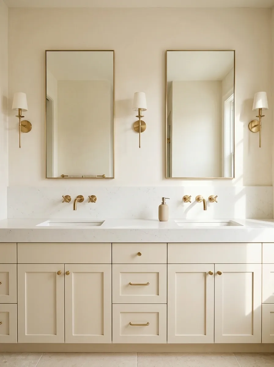
A brass faucet deserves a little breathing room. Give it a clean countertop, an uncluttered backsplash, and a mirror that doesn’t compete with its shape.
This works particularly well with a sculptural faucet, a wall-mounted design, or a warm brushed finish. Keep nearby accessories simple so the faucet reads as a deliberate design choice rather than another shiny object.
The same rule applies to double vanities. Matching brass faucets can create a strong visual rhythm, but piling elaborate mirrors, decorative trays, and oversized lights around them can make the whole wall feel crowded.
THE FOCAL POINT FORMULA
One star. Three supporting details.
THE STAR
Brass faucet
Choose a shape and finish that suit the vanity, then keep surrounding details relatively quiet.
THE SUPPORTING CAST
Quiet countertop
Let the material show instead of covering it.
Simple mirror
Pick a frame that complements the faucet’s shape.
One useful accessory
A soap dispenser is more useful than a countertop full of props.
Mix Brass With Chrome Without Making the Bathroom Look Confused
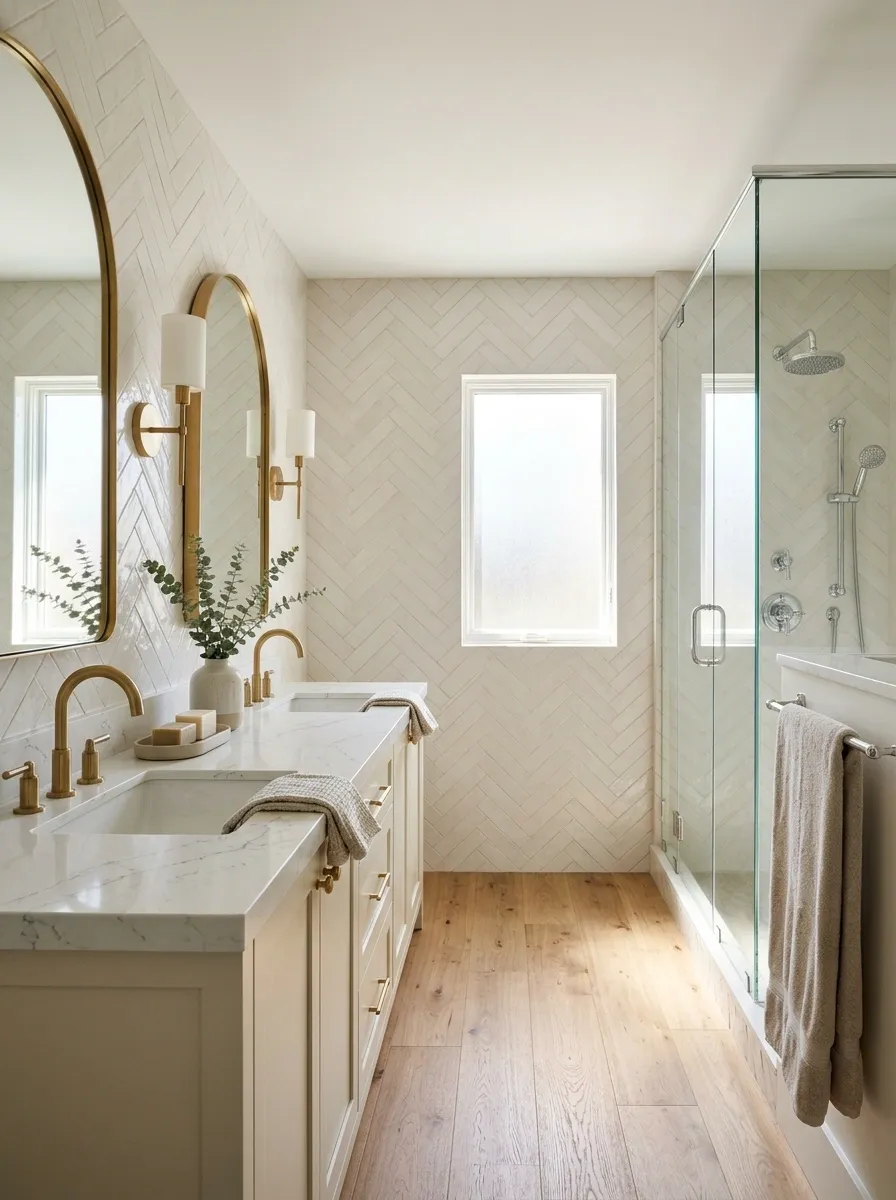
Yes, brass and chrome can share a bathroom. They just need a reason to be there.
Chrome has a cooler, brighter finish, while brass brings warmth. The contrast can look deliberate when one metal dominates and the other appears in a few consistent places. Brass faucets can sit comfortably alongside a chrome-framed shower enclosure if the rest of the scheme connects them through tile, glass, or cabinetry.
What doesn’t work is randomly switching finishes on neighboring fixtures with no visual logic. That’s not eclectic design. That’s indecision with a plumbing bill.
The mixed-metal rulebook
Pick the dominant metal.
Keep brass on the main vanity hardware, then use chrome consistently in the shower area if the fixtures call for it.
Give each finish a clear zone.
A repeated finish within one area looks more intentional than a different metal on every nearby fitting.
Connect them with the materials.
Warm stone, neutral tile, and wood can make the different metals feel like part of the same design.
Worth checking: Compare the finishes in person. Highly polished chrome and very yellow brass create a stronger contrast than softer, brushed versions.
Match the Brass Finish to the Bathroom’s Style
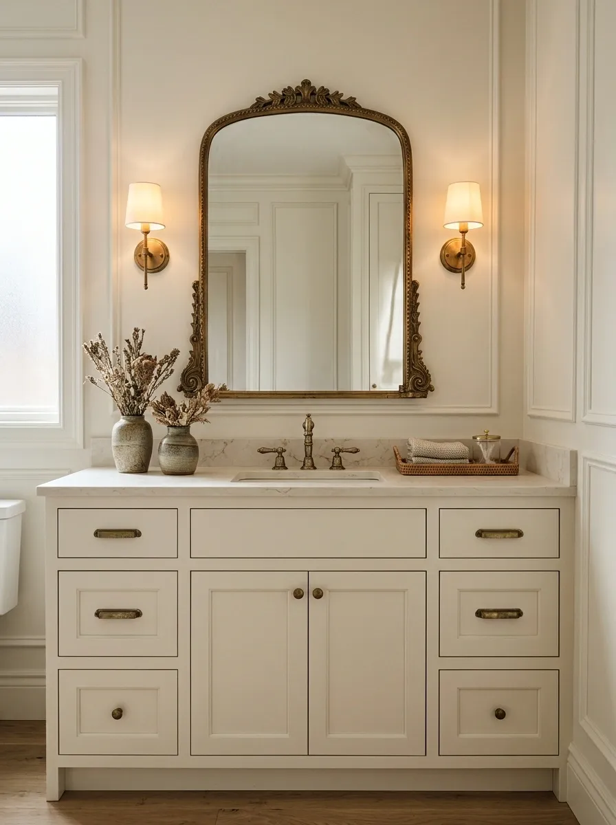
Not all brass looks the same. Polished brass is bright and reflective. Brushed brass has a softer appearance, while aged brass brings darker tones and a more timeworn character.
Choose the finish based on the mood of the room, not just whichever product looks nicest in an online listing. A sleek modern vanity can handle a cleaner brushed finish. A traditional bathroom with detailed cabinetry can carry aged brass without feeling overly formal.
Also check whether the finish is lacquered, living, or designed to develop a patina. Different finishes age and require care differently, so the product details matter.
PICK YOUR BRASS PERSONALITY
Choose the finish before choosing all the accessories.
Refresh a Plain Vanity With Brass Cabinet Pulls
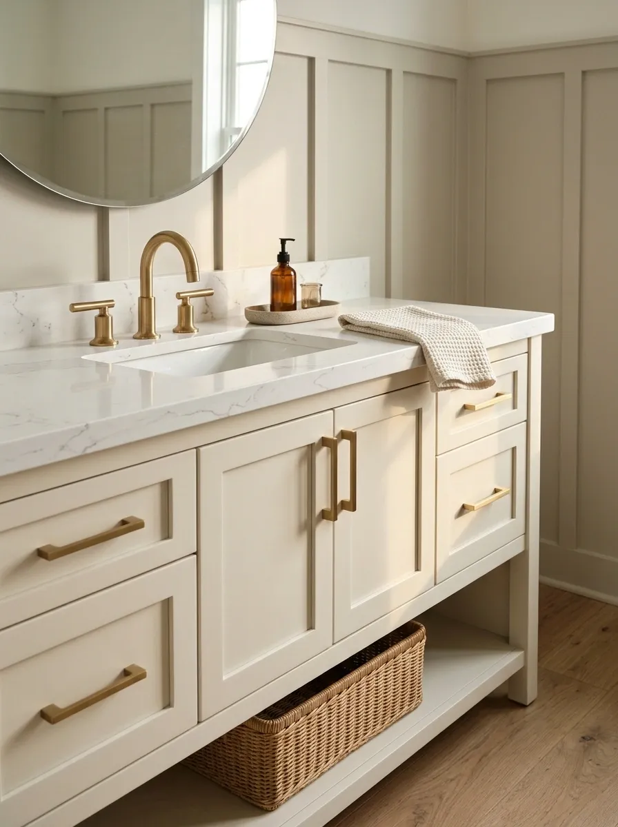
Cabinet pulls are one of the easiest ways to make a plain vanity feel more considered without replacing the entire unit. Straight bar pulls look crisp and modern, while rounded knobs suit simpler, more traditional cabinetry.
Pay attention to scale. Tiny knobs can look lost on wide drawers, while oversized handles can overpower narrow cabinet fronts. Measure the existing holes before shopping if the vanity is staying put. Otherwise, a quick hardware update can turn into a drilling project nobody budgeted for.
Keep the shape consistent across drawers and doors where practical. You don’t need several different handle styles to prove the bathroom has personality.
The cabinet-pull checklist
Before replacing the hardware, check these details. Your drill doesn’t need another unnecessary adventure.
Measure the existing hole spacing.
Check the distance between screw holes before buying replacement bar pulls.
Match the hardware to the cabinet scale.
Use appropriately sized pulls on broad drawers and smaller knobs on compact doors.
Keep the shapes consistent.
Repeat one style across the vanity unless the cabinet layout gives you a clear reason to use different hardware.
Check the finish in real light.
Compare a sample against the faucet so the new pulls don’t introduce a different shade of gold.
Best approach: Replace the vanity hardware first, then decide whether anything else needs changing. A makeover doesn’t have to become a full renovation.
Use Warm-Toned Lighting Around Brass Fixtures
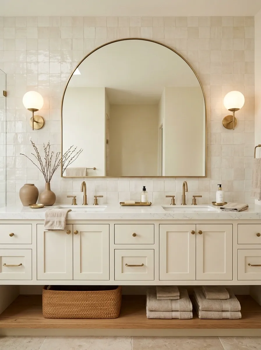
Brass can look golden and inviting in one bathroom and oddly yellow in another. Lighting has a lot to do with it. Cool, harsh light can make warm finishes feel disconnected from creamy tiles and natural wood, while carefully chosen warm white lighting helps the palette feel more connected.
Start with the vanity lights, since that’s where lighting affects both the look of the room and everyday grooming. Side-mounted sconces create a balanced frame around the mirror, while a well-placed overhead fixture can provide general illumination.
Don’t buy bulbs based on packaging alone. Check how the light looks against an actual brass sample. The bathroom deserves better than a lighting decision made by vibes and a blurry online listing.
LIGHTING THAT WORKS WITH BRASS
The bulb matters more than the shopping photo.
Warm white
A natural pairing for creamy tile, warm wood, and golden brass.
BEST FOR A WARM PALETTE
Neutral white
A balanced starting point when the bathroom mixes warm and cooler materials.
BEST FOR MIXED PALETTES
Cool white
Creates a crisper effect but can make warm finishes feel more contrasting.
TEST BEFORE COMMITTING
Lighting rule: Check the bulbs, mirror, tile, and brass together. A beautiful fixture under the wrong light is still a bad design decision.
Use Clear Glass to Keep Brass Shower Hardware Visible
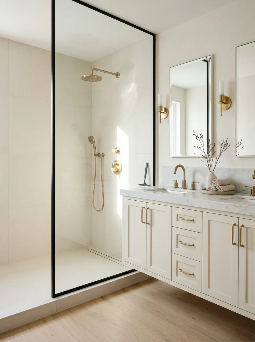
A brass showerhead loses some of its visual impact when it’s hidden behind a heavy shower curtain or a bulky enclosure. Clear glass keeps the shower area connected to the rest of the room and lets the tile and metallic details remain visible.
This is especially useful in smaller bathrooms, where a strong visual barrier can make the room feel more divided. Pair the glass with a restrained tile design and brass shower hardware that complements the faucet.
Of course, clear glass also shows water spots and soap residue. It’s not a magical housekeeping exemption. Choose it for the open look, then keep a glass squeegee nearby if you want it to stay presentable.
SHOWER DESIGN CHECKLIST
Keep the glass simple and the details visible.
Choose a clean glass profile.
A restrained frame lets the shower tile and brass fittings remain part of the overall view.
Keep the tile visually calm.
Let one feature stand out, whether that’s textured tile, a striking showerhead, or a strong brass finish.
Plan for cleaning.
Use a suitable glass cleaner and a squeegee to manage everyday water marks.
Small bathroom bonus: Clear glass preserves sightlines instead of visually dividing the room into smaller pieces.
Add Patterned Wallpaper Without Overwhelming the Brass
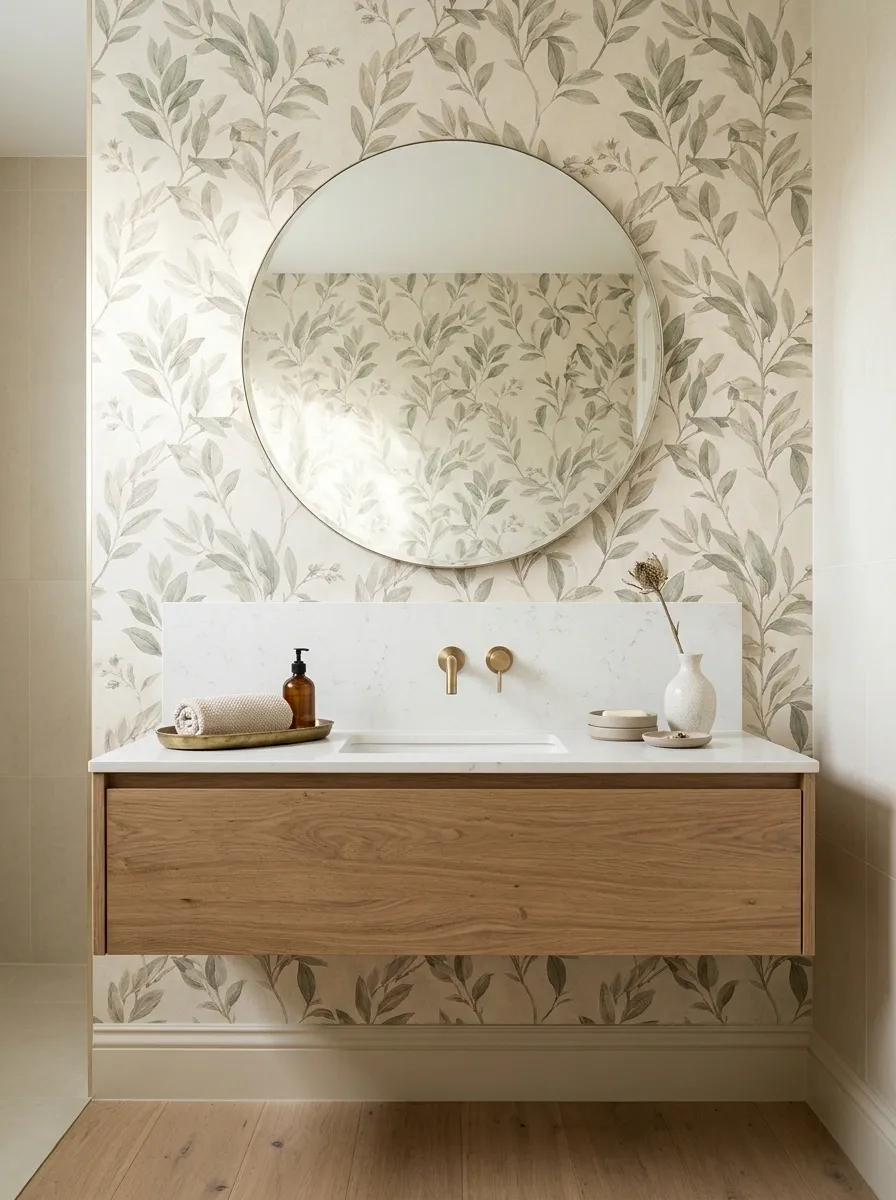
Wallpaper gives brass fixtures a completely different personality. A small botanical print can make the room feel vintage, while a restrained geometric pattern creates a cleaner, more modern look.
The trick is controlling the number of things competing for attention. If the wallpaper has a busy pattern, keep the tile, mirror, and vanity relatively simple. Brass already provides a noticeable metallic detail, so the walls don’t need to audition for the same role.
Use wallpaper rated for the room’s moisture conditions, provide suitable ventilation, and avoid placing ordinary wallpaper in areas exposed to direct shower spray. A powder room or a properly ventilated vanity wall is often a much easier place to start.
WALLPAPER MATCHMAKER
Choose a pattern that knows when to stop.
Soft botanical
Pair muted leaves with brushed brass, cream tile, and natural wood.
FEEL: RELAXED AND VINTAGE
Quiet geometry
Use restrained shapes with simple cabinet fronts and a clean mirror.
FEEL: CLEAN AND MODERN
Heritage print
Combine a traditional pattern with aged brass and understated stone.
FEEL: CLASSIC AND CHARACTERFUL
The practical rule: Pick one wallpaper wall or zone, then let the brass and other materials connect the rest of the room. Confirm moisture suitability before installation.
Choose a Brass Showerhead That Suits the Tile Layout
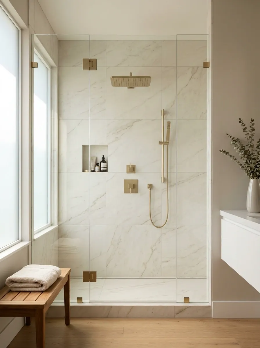
The showerhead shouldn’t look like it was selected in a completely different design meeting from the tile. Its shape, size, and finish all affect how the shower wall comes together.
A simple round showerhead tends to suit classic tile layouts and softer bathroom schemes. A square or angular design usually feels sharper alongside straight lines and modern fittings. Neither shape is automatically better. The right choice is the one that fits the scale of the shower and the style of the other hardware.
Also check the installation requirements before buying a wall-mounted or ceiling-mounted model. A beautiful product isn’t useful if the existing plumbing can’t accommodate it without extra work.
SHOWER FIXTURE PLANNER
Match the silhouette to the setting.
Round showerhead
A natural fit for softer lines, classic tile, and traditional or transitional bathrooms.
Square showerhead
Works well with geometric tile, straight grout lines, and crisp modern fittings.
Wide showerhead
Creates a prominent feature, provided the shower proportions and water system suit it.
BEFORE ORDERING
Check plumbing connections, water-pressure requirements, installation instructions, and finish compatibility. The showerhead still needs to function after winning the design award.
Style the Counter With a Few Useful Accessories
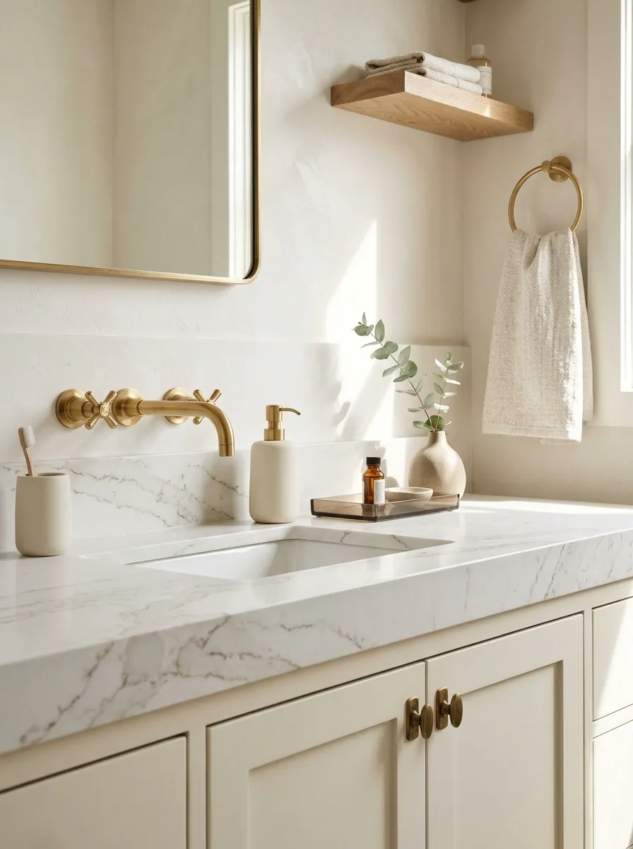
A bathroom counter doesn’t need a collection of decorative bottles to look finished. It needs a few useful objects that look good together and leave enough space to wash your face without moving an entire display.
Start with a soap dispenser, a small tray for daily essentials, and a toothbrush holder if it belongs on the counter. Choose finishes that relate to the brass without forcing every object to be gold. Ceramic, stone, smoked glass, and warm wood all work beautifully.
And please resist buying decorative bottles for products that don’t need new bottles. The bathroom counter is not a luxury hotel reception desk.
THE COUNTERTOP RESET
Keep what earns its place.
One attractive soap dispenser
Choose ceramic, glass, or a muted neutral that works with the faucet.
A small catchall tray
Group everyday items instead of scattering them across the vanity.
Remove the decorative extras
Skip objects that collect dust, block useful space, or require constant rearranging.
Use Open Shelving to Balance Pretty Things and Practical Storage
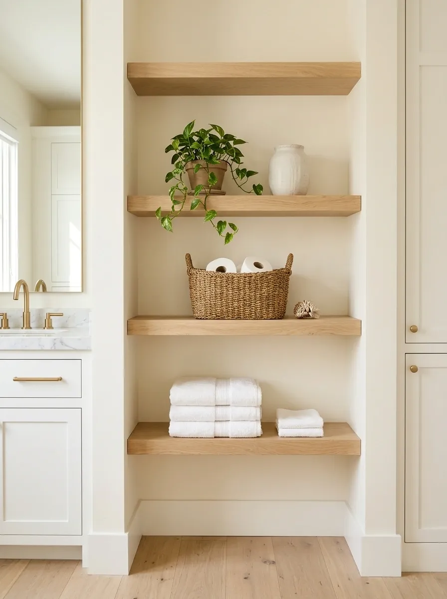
Open shelving gives a bathroom somewhere to display folded towels, spare toilet paper, and a few well-chosen accessories. It also creates opportunities to introduce natural wood, warm finishes, and simple shapes.
The trick is dividing the shelf into useful zones. Keep everyday essentials together, stack towels neatly, and leave some empty space rather than filling every inch. A small plant or ceramic container can finish the arrangement, provided it doesn’t push practical storage out of the way.
Open shelves aren’t a substitute for hidden storage when the bathroom holds a mountain of mismatched toiletries. Some clutter deserves a closed door, not a spotlight.
THE SHELF-STYLING BLUEPRINT
Three shelf zones. Zero storage chaos.
The useful zone
Store spare towels, toilet paper, and everyday supplies in neat stacks or simple baskets.
FUNCTION FIRST
The decorative zone
Add one ceramic vessel, a small plant suited to the light, or a simple object with an interesting texture.
LESS, BUT BETTER
The breathing zone
Leave part of each shelf open. Empty space stops the arrangement from feeling like a stockroom.
SPACE IS A DESIGN CHOICE
Brass connection: Repeat the finish on a nearby cabinet pull or fixture, then let wood, cotton, and ceramic bring balance. The shelves don’t need gold trim to join the conversation.
Choose Towels That Complement the Brass Undertones
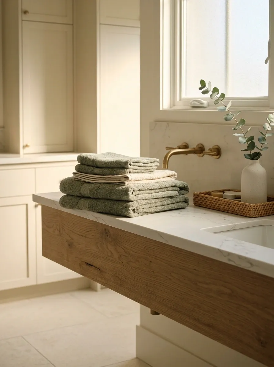
Towels cover a surprisingly large part of a bathroom’s visible color scheme. A good set can connect the brass, cabinetry, tile, and countertop without adding another permanent finish to the room.
Cream and warm white are reliable choices for a soft, clean look. Muted sage works beautifully with brass and natural wood, while clay and rust shades create a warmer, earthier scheme. Charcoal towels offer contrast when the bathroom already has lighter walls and surfaces.
The easiest route is to choose one main towel color and one supporting shade. A stack of competing colors won’t make the bathroom more interesting. It’ll make laundry day look like a fabric-store clearance sale.
THE LINEN COLOR EDIT
Pick towels that finish the palette.
Cream
For warm whites, marble-look surfaces, and calm neutral bathrooms.
Muted sage
For green cabinetry, wood accents, and an earthy color scheme.
Clay
For terracotta accents, beige stone, and a warmer, grounded palette.
Charcoal
For sharper contrast against pale tile and warm metallic fittings.
Place Brass Wall Sconces Beside the Mirror
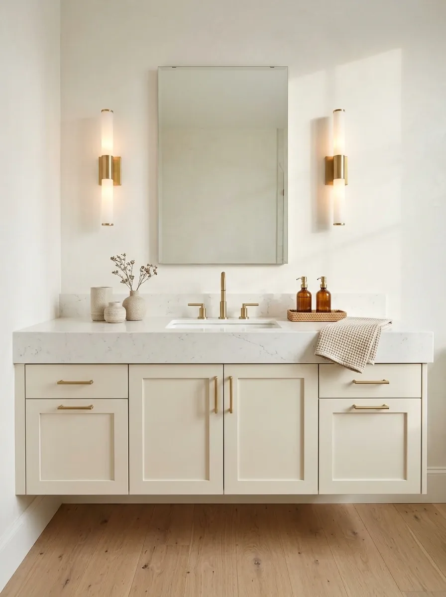
Brass sconces can make the vanity wall feel finished while providing useful light for daily grooming. Positioning fixtures on either side of the mirror often creates a more balanced look than relying on one overhead light alone.
Choose a sconce shape that relates to the mirror and faucet. Slim vertical fixtures work well beside taller mirrors, while compact designs can suit smaller vanity walls. Opal or frosted shades soften the appearance of the light, and clear glass creates a more defined, decorative effect.
Before installation, check the mirror dimensions, electrical position, and fixture clearance. Bathrooms aren’t the place to improvise around electrical safety just because a brass sconce looks good in a photograph.
THE VANITY LIGHTING PLAN
Let the mirror wall work harder.
Balance the sides
When the layout allows, place matching sconces at either side of the mirror for a clear, balanced arrangement.
Choose the right shade
Frosted glass offers a softer look, while clear glass emphasizes the fixture’s decorative shape.
Check the installation
Confirm clearances, wiring requirements, and suitability for the bathroom’s specific location.
Design note: If side sconces won’t fit, a suitable vanity light above the mirror can still work beautifully. Symmetry is useful, not a reason to ignore the room’s actual dimensions.
Choose a Bathroom Rug That Anchors the Color Scheme
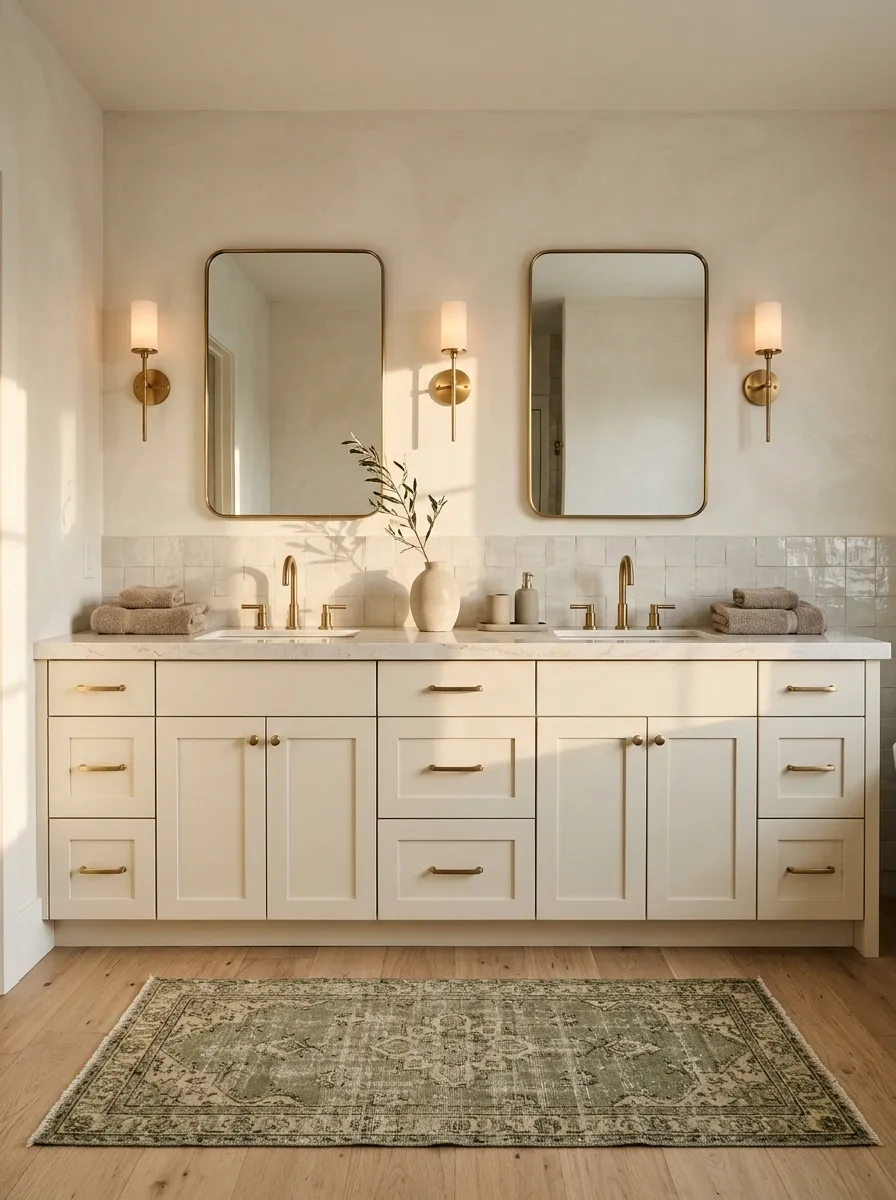
A bathroom rug can pull together the brass, towels, tile, and vanity without requiring another renovation budget. The right one adds softness underfoot and helps the room feel finished. The wrong one looks like a bath mat that wandered into a design magazine by accident.
For a calm palette, choose cream, muted green, warm taupe, or a restrained pattern. In a bathroom with bold wallpaper or textured tile, keep the rug quieter. If the room is mostly neutral, a subtle stripe or vintage-inspired motif can introduce more character.
Get the scale right too. A tiny mat floating in front of a wide double vanity looks lost, while an oversized rug can crowd the walking area.
Things to check before buying a rug.
The rug should support the bathroom, not become a tripping hazard with delusions of grandeur.
Measure the available floor space.
Choose a size that suits the vanity and leaves a clear, comfortable walking path.
Coordinate with the dominant colors.
Repeat a tone from the tile, towels, cabinetry, or wallpaper.
Choose a practical texture.
Look for a material suitable for bathroom moisture and frequent washing.
Check the backing.
Use a suitable nonslip backing or rug pad compatible with the floor finish.
Edit the pattern.
Let the rug be the main pattern or let the wallpaper do the talking. Both don’t need to shout.
Final rule: Comfort, size, and safety come before the pattern. A gorgeous rug that slips across wet tile is a terrible decor decision.
Paint the Walls a Color That Lets Brass Stand Out
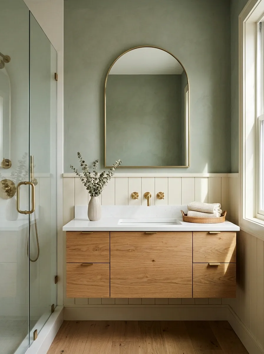
Wall color sets the mood before anyone notices the faucet. Warm white creates a bright, timeless backdrop, sage green makes brass feel earthy, and dusty blue-green introduces a cooler contrast without making the room feel harsh.
For a bolder look, deep charcoal can make brass fixtures pop, especially alongside pale stone or a light countertop. Just be realistic about the room’s natural light. Dark walls can look rich in a well-lit bathroom and gloomy in a windowless box with one tired ceiling bulb.
Choose the wall color after considering the tile, vanity, and actual brass finish. Paint samples are cheaper than repainting an entire room because a tiny swatch looked convincing at the store.
THE WALL COLOR EDIT
Pick the backdrop before buying another gold accessory.
Warm white
Keeps the room bright and pairs naturally with ivory tile, stone, and warm brass.
MOOD: TIMELESS
Muted sage
Adds a gentle earthy tone that works well with oak and brushed brass.
MOOD: NATURAL
Dusty blue-green
Adds contrast without relying on bright color or busy wall patterns.
MOOD: COOL AND CALM
Deep charcoal
Makes brass stand out against a darker backdrop when lighting is sufficient.
MOOD: DRAMATIC
Before painting: Test sample patches near the vanity and check them in morning light, evening light, and under the installed bulbs. The wall color needs to cooperate with the whole bathroom, not just one product photo.
Hang Artwork That Adds Character Without Crowding the Walls
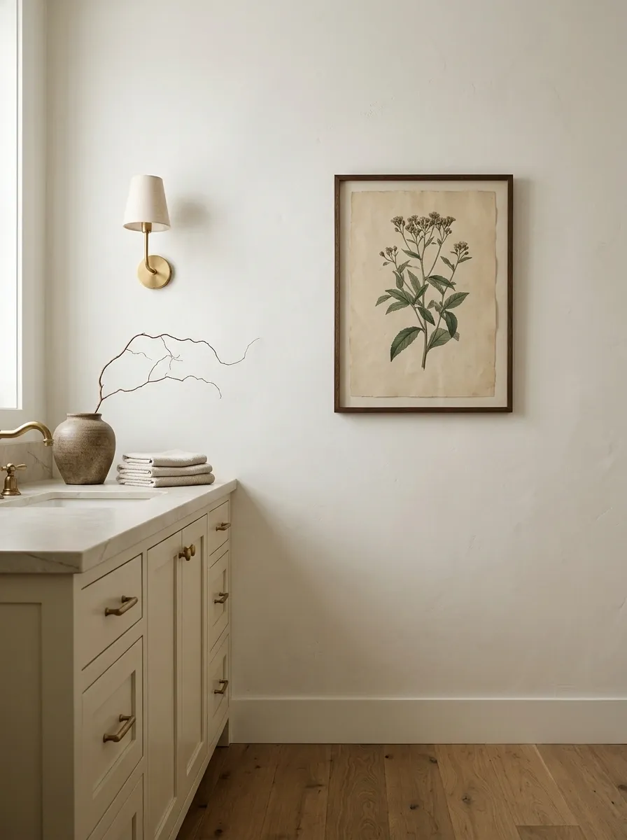
Artwork can make a brass bathroom feel personal instead of looking like a perfectly staged showroom nobody actually uses. A botanical print, a vintage-inspired illustration, or a simple abstract piece can bring personality to an empty wall without another renovation.
Choose frames that relate to the existing finishes. A slim brass frame creates continuity, while dark wood or black adds contrast. You don’t need another gold frame if the mirror and sconces already provide plenty of metallic detail.
Keep artwork away from direct shower spray and choose materials suited to the room’s humidity. A beautiful print that curls at the corners after a few steamy showers isn’t exactly the long-term design plan.
THE WALL FINISHING CHECKLIST
Add character without creating visual clutter.
Choose artwork that suits the wall.
Use one well-sized piece above a suitable stretch of wall rather than several tiny prints scattered around the vanity.
Pick a frame with a clear purpose.
Repeat brass for coordination, or use wood or black for contrast.
Check the moisture exposure.
Use appropriate framing and moisture-resistant materials, and keep ordinary paper artwork away from direct splashes and shower steam.
Designer tip: If the mirror wall already has decorative sconces, a simple print on another wall may be all the extra detail the room needs.
Style a Small Bathroom With a Consistent Brass Finish
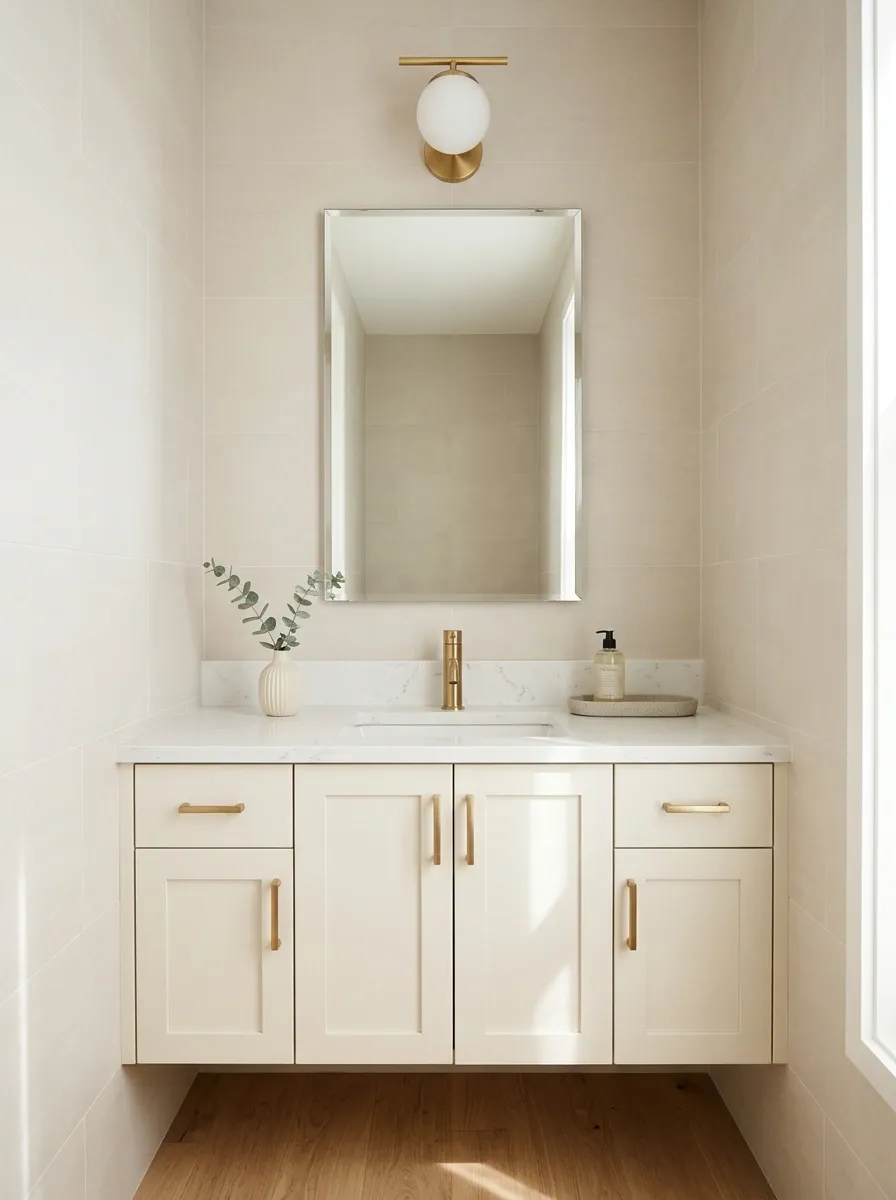
Small bathrooms benefit from a clear visual plan. When the room already has a compact vanity, a narrow walkway, and very little storage, too many competing finishes make everything feel even more crowded.
Start with one main brass finish for the faucet and the most visible hardware. Repeat it thoughtfully on cabinet pulls or a light fixture, then use light tile, a simple mirror, and a limited accessory palette to keep the room visually connected.
A frameless mirror can help maintain an open sightline, while wall-mounted storage keeps the countertop usable. The goal isn’t to make every surface white or remove all personality. It’s to stop the small room from having twelve unrelated design ideas at once.
THE SMALL-BATHROOM GAME PLAN
Fewer competing details. More room to breathe.
Keep the mirror simple
Use a frameless mirror or a slim frame to avoid adding another heavy outline to a tight wall.
Clear the counter
Keep daily essentials together and use wall storage or vanity drawers for everything else.
Limit the finish palette
Repeat brass where it matters, then use quiet materials instead of adding metallic details everywhere.
THE REAL SMALL-ROOM TRICK
Keep the visual layout calm while making the storage practical. A tiny bathroom doesn’t need less personality. It needs fewer objects competing for the available space.
Keep Brass Fixtures Looking Good With the Right Care Routine
Brass looks best when it doesn’t have a layer of water spots, soap residue, and cleaning-product damage competing with its finish. But care depends on the actual product. Lacquered brass, unlacquered brass, and brass-colored coatings don’t all respond to cleaning in the same way.
Use the manufacturer’s care instructions rather than assuming every gold finish can handle the same treatment. A soft cloth and a suitable gentle cleaner are usually a better starting point than abrasive pads or aggressive chemicals.
After showers, wipe away excess water from frequently splashed areas. Avoid experimenting with harsh polishing products, especially on coated finishes. Scrubbing a fixture until its finish changes is not a successful cleaning session.
BRASS CARE THAT MAKES SENSE
Clean the finish. Don’t wage war on it.
Read the manufacturer’s instructions.
Confirm the finish type and the cleaners approved for that specific product.
Use a soft cloth.
Avoid abrasive pads, scouring powders, and unapproved chemicals that can damage a coating.
Wipe away excess water.
A quick wipe can reduce visible water spots around faucets and frequently splashed fittings.
Don’t polish without checking first.
Some living finishes are meant to develop character, while polishing products may damage other finishes.
Important: Follow the care guidance supplied with the fixture. Brass-colored finishes aren’t all solid brass, and the wrong cleaner can permanently damage a coated surface.
Balance Shiny Brass With Matte and Understated Finishes
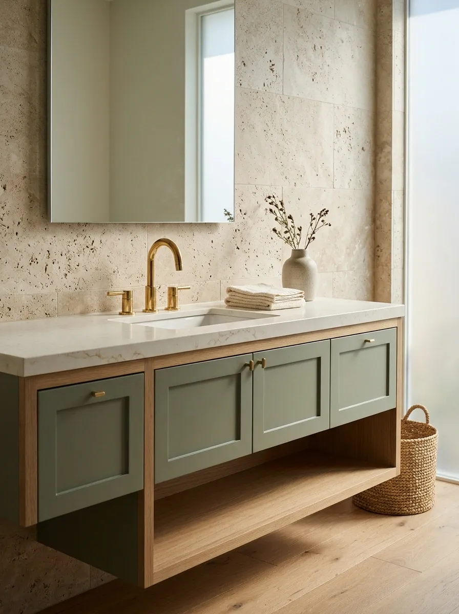
Brass naturally catches the eye, so the surrounding materials need to keep the room balanced. Too many shiny surfaces can make the bathroom feel busy, especially when polished metal sits beside glossy tile, reflective glass, and a high-gloss vanity.
Pair brass with matte paint, textured stone, natural wood, or soft cotton towels. These surfaces create contrast without requiring more color or more accessories. If the faucet is highly polished, a quieter countertop and matte cabinetry can prevent the shine from taking over.
This is also why brushed brass works so well in understated bathrooms. Its softer reflection creates less visual competition, so the surrounding materials can stay simple.
THE FINISH BALANCE FORMULA
Let the metal shine. Let everything else breathe.
Reflective brass
Provides the metallic highlight on faucets, handles, or selected lighting.
THE SHINY ELEMENT
Matte surfaces
Bring restraint through matte cabinetry, understated paint, and low-sheen tile.
THE QUIET BACKDROP
Natural texture
Adds visual depth through wood grain, woven storage, stone, and cotton fabric.
THE TEXTURED ELEMENT
THE FINAL DESIGN TEST
If every surface reflects light, introduce matte finishes. If the room feels flat, add texture. If the palette already works, stop shopping for extra accessories. Restraint is a design skill, not a missed shopping opportunity.
Make Brass the Detail That Pulls the Whole Bathroom Together
A bathroom with brass fixtures doesn’t need an expensive countertop, a designer vanity, and a shopping cart full of gold accessories to look finished. It needs a clear color palette, materials that complement the metal, and enough restraint to let the best details stand out.
Start with the fixtures already in the room. Add warm tile, natural wood, textured surfaces, or a carefully chosen wall color. Update the cabinet pulls or lighting only where they genuinely improve the design.
The best bathrooms feel considered without looking like every purchase came from the same catalogue. Choose details that work together, keep the practical things practical, and leave some empty space.
Save this list on Pinterest for the next time your bathroom needs a refresh, or when you’re tempted to buy another gold accessory that absolutely does not solve the problem.
THE FINAL BATHROOM CHECK
Before buying one more thing…
The brass finish works with the tile, paint, and surrounding materials.
Lighting, mirrors, and hardware support the main design instead of competing with it.
The counter has room for everyday essentials, and the storage works for real life.
Every new purchase has a purpose beyond looking expensive in a product photo.
Remember: Great styling isn’t about adding more. It’s about knowing what deserves to stay.