
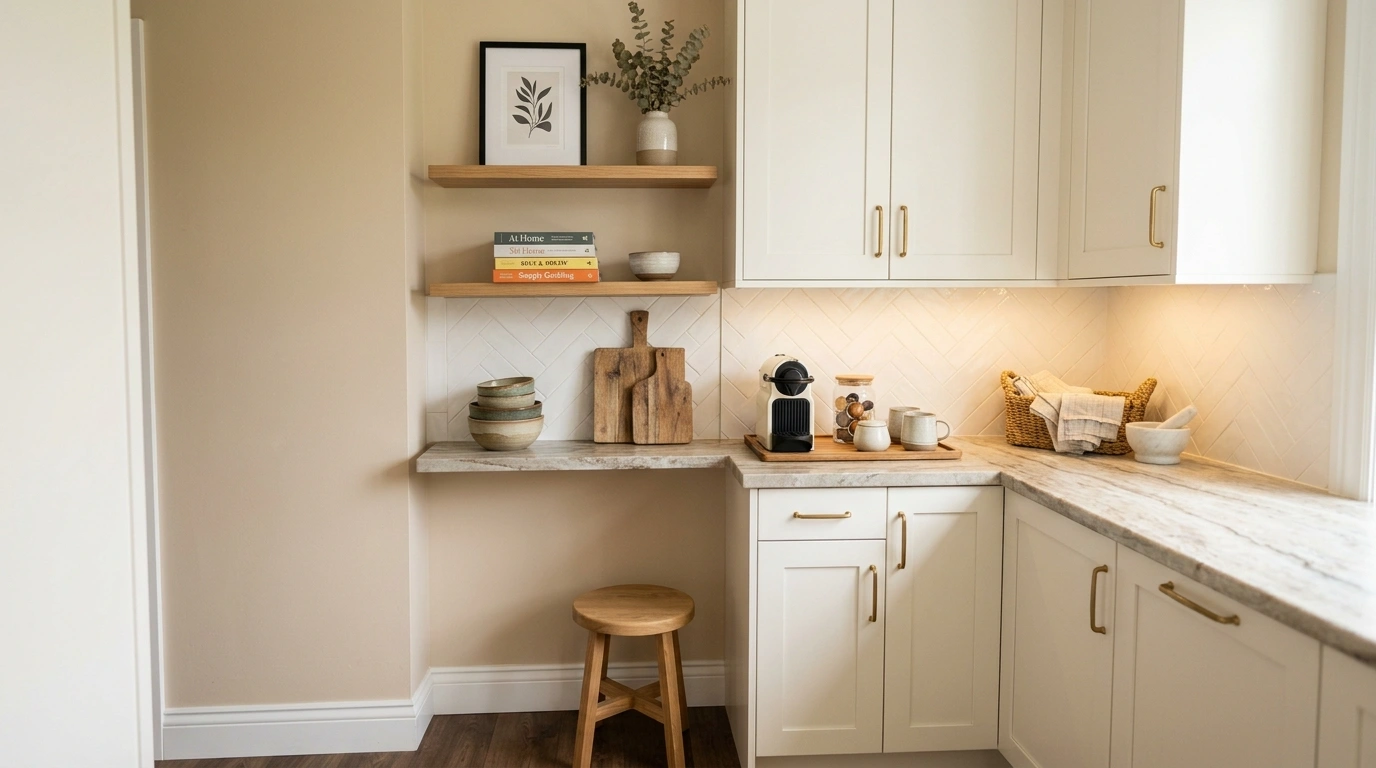
Some of the most awkward parts of a kitchen are also the ones with the most potential. The narrow wall beside a refrigerator, the empty space beneath a window, the unused corner near the dining area, or the gap between two cabinet runs can make an otherwise finished kitchen feel strangely incomplete.
The mistake is treating these areas as leftover space. A corner rarely looks convincing when a random shelf, chair, or decorative object is placed there simply because there was room. The better approach is to decide what the corner should contribute to the entire kitchen, then build the composition around that purpose.
Kitchen Corner Designs
Vertical Mug Display Corner
That tight slice of wall beside the kitchen sink often goes wasted, but a handsome wooden cubby turns it into a functional showcase for everyday mugs. The natural timber finish brings instant warmth against the pale walls while keeping favorite ceramics within arm’s reach of the counter.
A pegboard nearby adds extra utility for hanging larger wooden utensils, making the entire corner work harder without feeling cluttered. Green plants sitting atop the cubby introduce a lively touch of nature to the washing station.
Grouping mugs by color or style inside the compartments transforms simple dishware into art. It turns an overlooked vertical gap into one of the most charming details in the room.
Warm Oak Breakfast Corner With a Built-In Bench
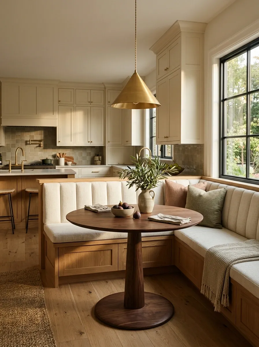
A forgotten corner becomes a genuine destination when a built-in oak bench follows the two walls and makes room for a compact round table. The surrounding kitchen stays relatively quiet, with warm ivory cabinetry, natural oak flooring, and soft linen upholstery tying the nook into the larger room.
The bench should feel architectural rather than like a loose piece of furniture. A simple back cushion, one understated pendant, and a small pedestal table are enough to finish the composition.
The rounded table is an important choice here. It softens the hard cabinet lines and keeps the walkway around the nook comfortable. A large rectangular table would quickly make the corner feel crowded.
Trailing Plant Fridge Corner
The awkward gap beside the refrigerator usually feels like dead space, but a cascading houseplant draped along the tall appliance completely changes the energy. A simple wooden step stool and a woven basket ground the vignette, making the transition between the kitchen and the walkway feel intentional.
A round jute rug on the floor below softens the hard lines of the surrounding cabinetry and defines the zone naturally. The warm lighting from the pendant fixture pulls the whole corner together into a cozy, lived-in scene.
Keeping the styling simple lets the greenery take center stage. It proves that even the most utilitarian kitchen appliances can become part of a thoughtfully decorated layout.
Sage Green Display Nook
A forgotten corner next to a window transforms into a breathtaking destination when built-in sage green cabinetry wraps the walls. Glass-front doors showcase a gorgeous collection of white ceramics, turning everyday dishware into a stunning architectural feature.
A curved banquet seating upholstered in a subtle floral pattern pairs seamlessly with a classic round pedestal table. This layout maximizes every inch of the corner while keeping the center of the room light and open.
The rich green paint color ties the entire composition together, giving the dining nook a serene and established character. It turns an awkward corner into the coziest spot in the entire home.
Floor-to-Ceiling Pantry Corner With Painted Cabinetry
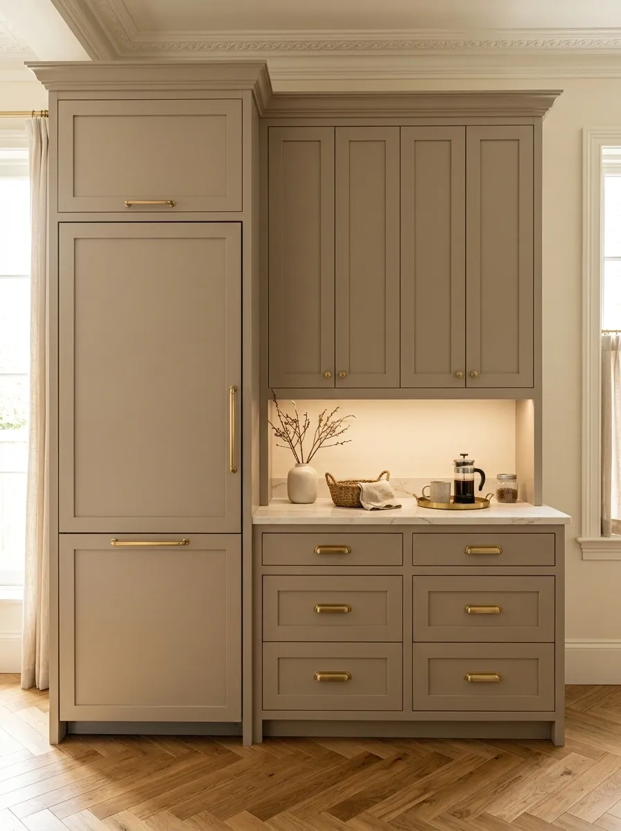
That awkward vertical corner beside the refrigerator can become a strong storage wall instead of an afterthought. Here, painted cabinetry rises from floor to ceiling, creating a continuous block that gives the kitchen a more architectural finish.
The lower section carries the everyday work, with a shallow counter for sorting groceries or preparing a quick drink. Above it, closed cabinets keep less attractive storage out of sight. The same paint color continues across the full height, which makes the corner read as one calm plane.
The visual payoff comes from the uninterrupted height. Rather than breaking the wall into scattered shelves and small cabinets, the design gives the entire corner one clear proportion.
Tower Coffee Station Corner
A narrow post between doorways can be challenging to furnish, but a tall wooden shelving unit turns it into an exceptional coffee corner. The open timber structure houses a sleek espresso machine and neat rows of mugs, creating a dedicated cafe station right where you need it.
The upper shelves hold carefully curated essentials while leaving enough breathing room to keep the display feeling light and airy. A woven basket on the lower tier hides smaller accessories, keeping the setup tidy and functional.
This vertical approach makes brilliant use of tight footprints. It gives an forgotten corner a clear purpose without encroaching on the surrounding kitchen walkways.
Soft Breakfast Nook With Curved Banquette
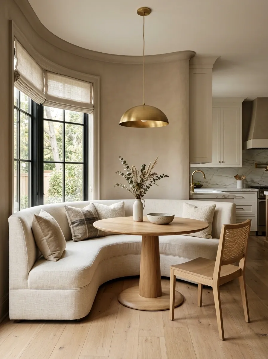
Hard cabinet lines can make a small kitchen corner feel overly rigid. A curved banquette changes that immediately, wrapping around the walls and giving the dining area a softer silhouette.
The complete composition works best with an oval or compact round table, low-profile pendant, pale upholstery, and a warm wall color that separates the nook gently from the main kitchen. The curve should remain the hero. Other shapes need to stay relatively simple.
A pedestal table is especially useful because it leaves the floor visually open beneath it. That makes the seating area feel lighter and easier to move around, even when the actual footprint is modest.
Dark Moody Corner With Walnut Shelving
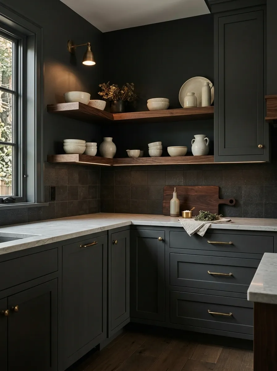
A dark kitchen corner can carry much more visual weight than an empty pale wall. This composition combines charcoal cabinetry, rich walnut shelving, warm aged-metal details, and a concentrated pool of light to make the forgotten edge feel intentional.
The lower portion remains practical, while the open shelving introduces warmth and depth above the counter. A few ceramics in soft ivory tones keep the shelves from disappearing into the darker background.
Lighting matters more here than decoration. The corner needs a warm, localized glow rather than bright overhead illumination washing across every surface. That contrast gives the walnut and dark cabinetry their depth and makes the corner read as a deliberate focal point.
Open Shelving Corner With Butcher Block Worktop
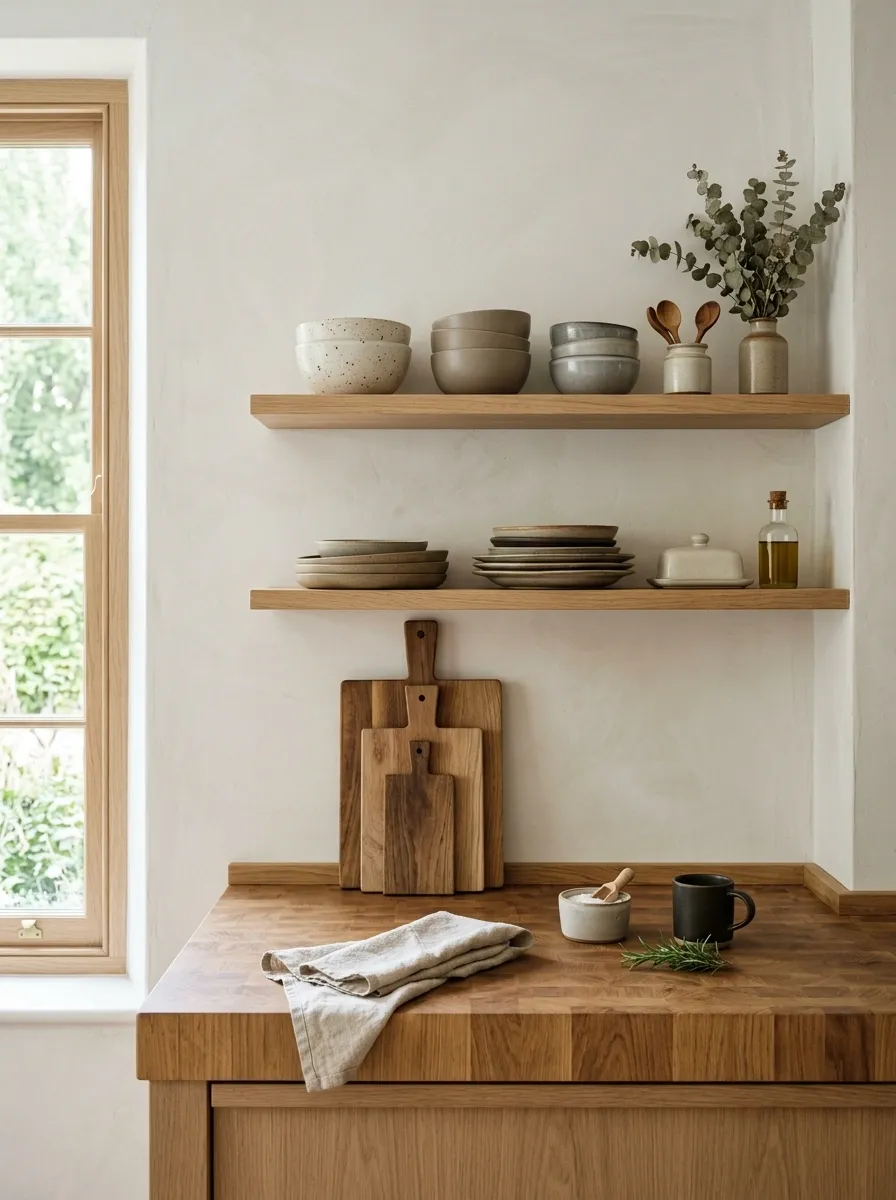
This corner feels less like storage and more like part of the kitchen’s working rhythm. A thick butcher block counter runs into the neglected junction, while simple oak shelves rise above it with everyday bowls, cutting boards, and a few pieces of pottery.
The materials do most of the styling. Warm timber against a pale wall creates enough contrast without introducing another cabinet color. The lower worktop also gives the corner a genuine job, making the open shelving feel useful rather than decorative filler.
The strongest version keeps the shelves only moderately full. Too many objects would erase the quiet horizontal lines that make this arrangement work.
European-Inspired Corner With a Freestanding Wooden Hutch
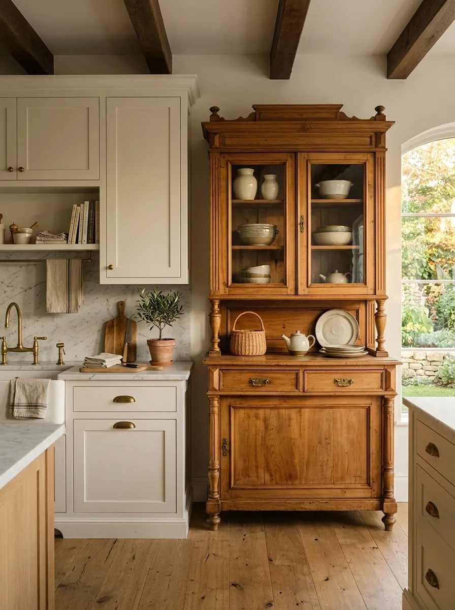
Built-in cabinetry isn’t the only way to make a difficult corner feel finished. A freestanding wooden hutch can give a kitchen a collected European character while introducing a completely different vertical rhythm from the surrounding cabinets.
This version pairs honey-toned timber with soft painted cabinetry, a stone counter, aged hardware, and a few carefully displayed ceramics. The hutch should look substantial enough to anchor the corner, but its legs and framed doors keep it from becoming one heavy block.
The contrast is what makes the composition memorable. Instead of hiding the difference between fitted and freestanding furniture, the design makes that difference part of the room’s character.
Window Corner With a Low Reading Bench
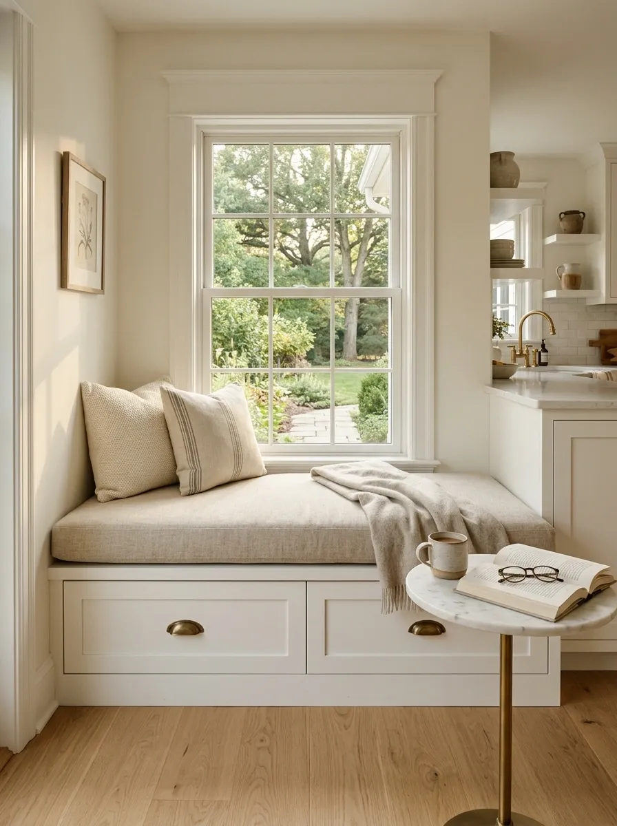
A kitchen window often creates an awkward leftover strip that furniture designers ignore. A low built-in bench makes that space useful without competing with the view or flooding the room with bulky furniture.
The finished version uses a simple upholstered seat beneath the window, shallow drawers beneath it, and a small round side table that can hold a mug or book. The bench remains visually low, while the surrounding cabinetry and trim stay simple.
Natural light is the defining feature. The corner should feel open from across the kitchen, so tall shelves, heavy curtains, and oversized furniture would work against the design.
Black-and-Oak Corner With a Sculptural Pendant
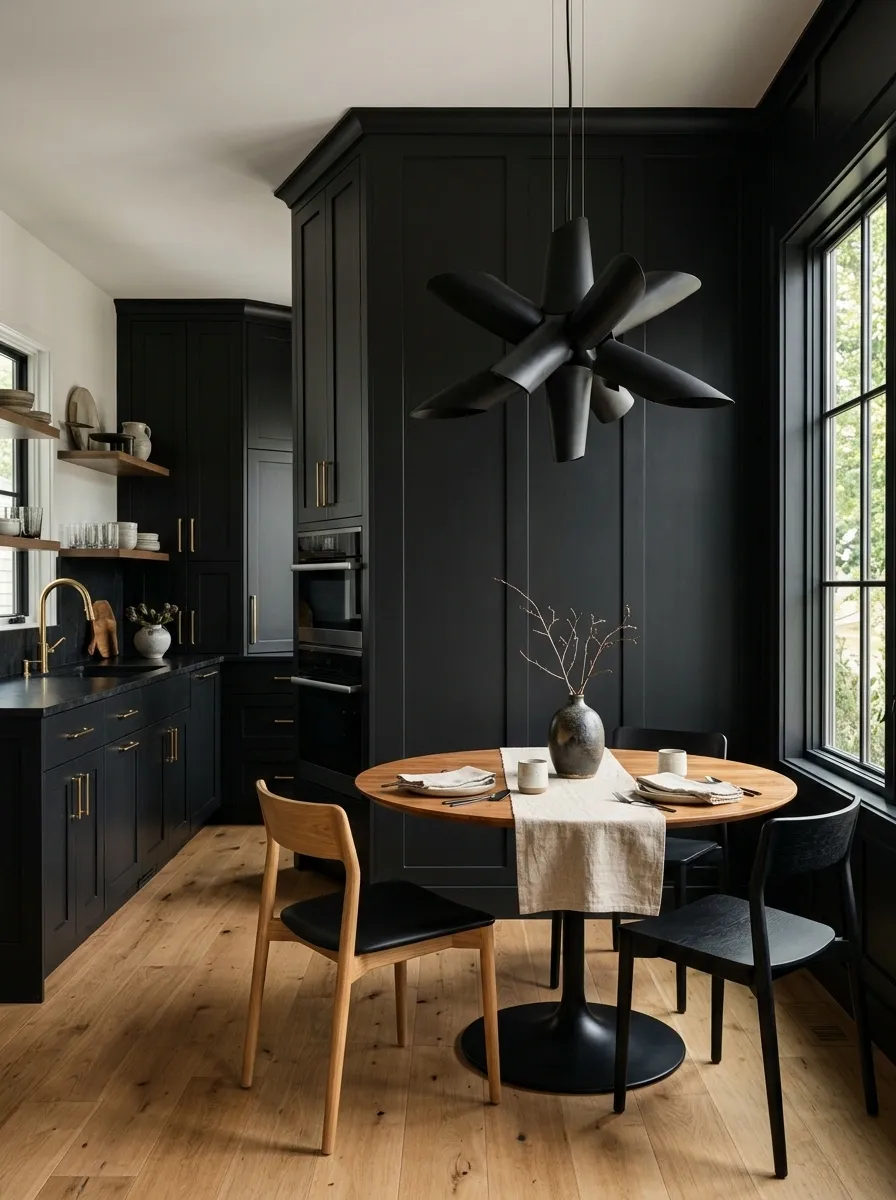
A forgotten dining corner can become the visual punctuation of a kitchen when black cabinetry and warm oak are paired with one expressive pendant. The rest of the room stays controlled, allowing the lighting fixture to provide the sculptural moment.
A compact table sits beneath the pendant, with oak flooring carrying warmth through the lower half of the room. Black appears in larger architectural areas rather than scattered accessories, which keeps the palette intentional.
The pendant should have enough presence to read from across the kitchen. Tiny decorative lighting would disappear against the darker cabinetry and weaken the composition.
PENDANT
Narrow Corner Bar With Glass-Front Cabinets
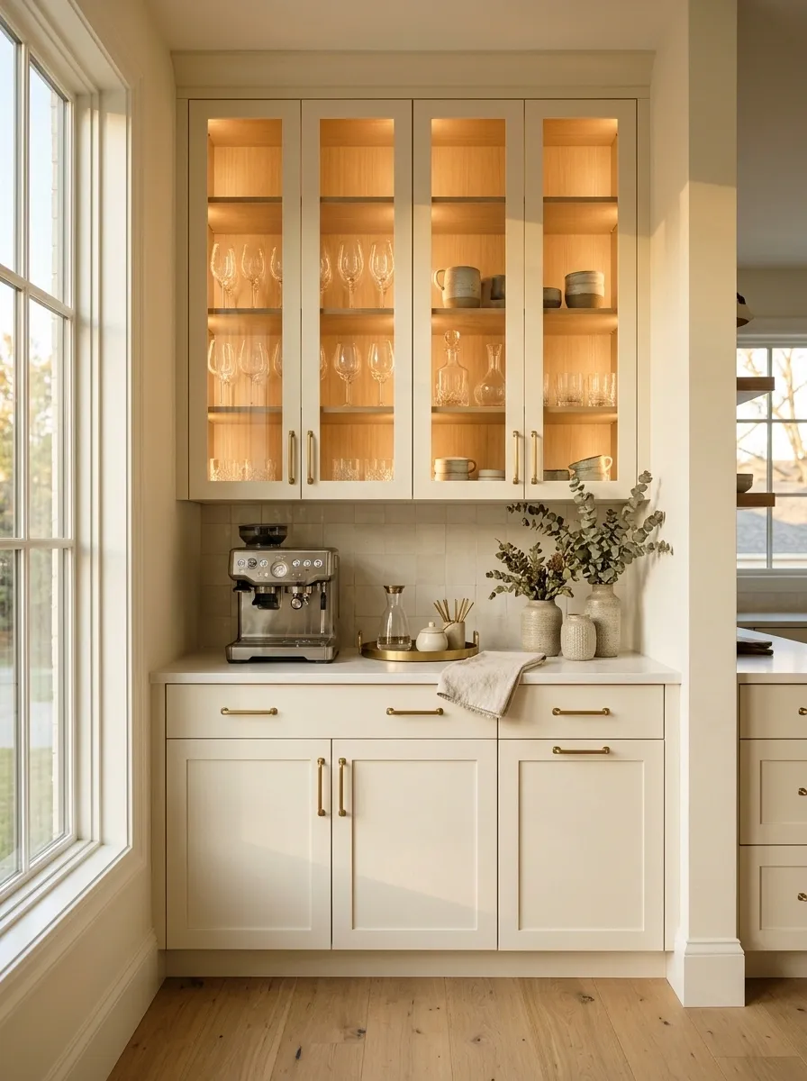
The unused edge of a kitchen can support a surprisingly elegant beverage zone when every part of the composition is kept shallow and deliberate. A stone counter runs beneath glass-front cabinets, while warm interior lighting highlights neatly arranged glassware.
The cabinetry should relate closely to the main kitchen, but the glass introduces enough transparency to distinguish the corner. A narrow counter leaves space for a small tray, coffee equipment, or serving pieces without turning the area into a second full kitchen.
The lighting needs to stay warm and localized. That glow gives the glass doors depth and prevents the corner from looking like ordinary upper cabinetry.
White Kitchen Corner With a Warm Plaster Alcove
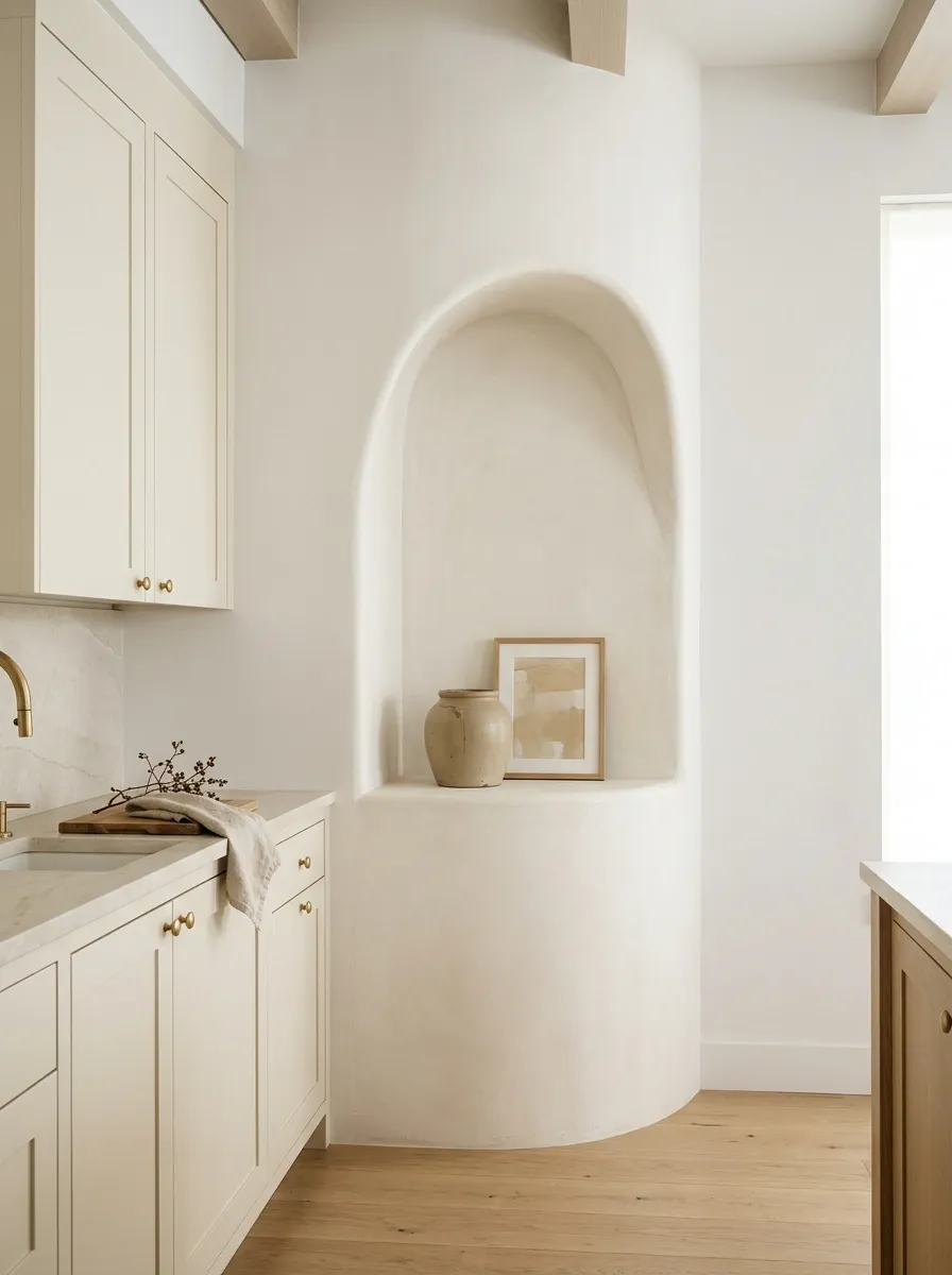
A completely white kitchen can leave corner junctions looking flat, especially when the cabinetry and walls share nearly the same tone. A softly shaped plaster alcove gives one overlooked section a stronger architectural identity without introducing another major material.
The alcove sits between clean cabinetry and contains only a few carefully chosen pieces, such as a ceramic vessel, framed artwork, or a small sculptural object. Warm plaster adds enough tonal variation to separate the recess from the rest of the kitchen while keeping the overall palette light.
The shape is what makes this concept distinctive. A curved opening breaks up the straight cabinet lines and creates a quiet focal point without filling the corner with furniture.
Family Kitchen Corner With a Compact Homework Station
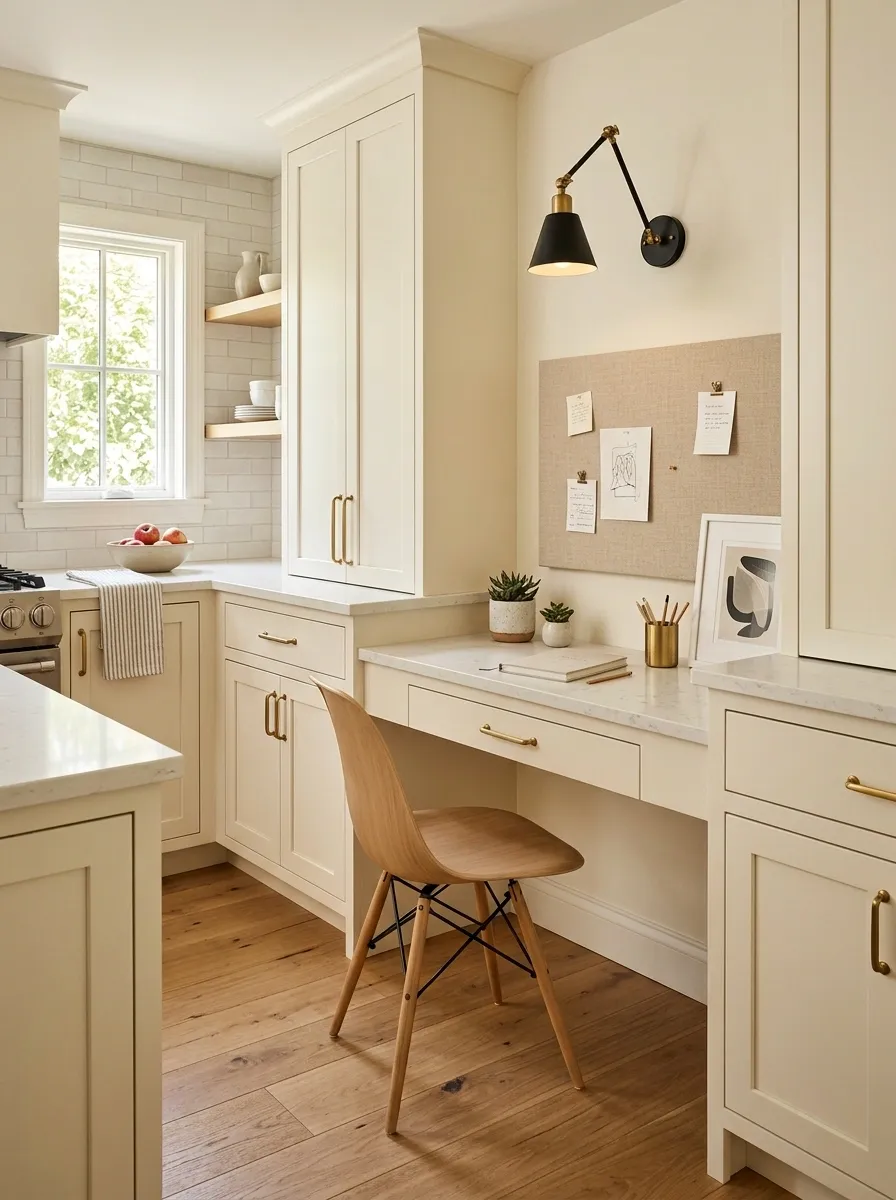
One of the most useful forgotten corners is the one that sits just outside the main cooking zone. A slim desk can turn that leftover area into a family work station without making the kitchen feel like an office.
The finished composition uses a narrow oak desktop, simple drawers underneath, a wall-mounted pinboard, and one attractive task light. The materials echo the surrounding kitchen so the workspace feels integrated rather than attached.
Keeping the desk visually light is important. Heavy furniture would interrupt circulation, while a shallow surface preserves a clear path through the kitchen. The best version feels like a natural extension of the cabinetry.
Rustic Corner With Reclaimed Wood and Natural Stone
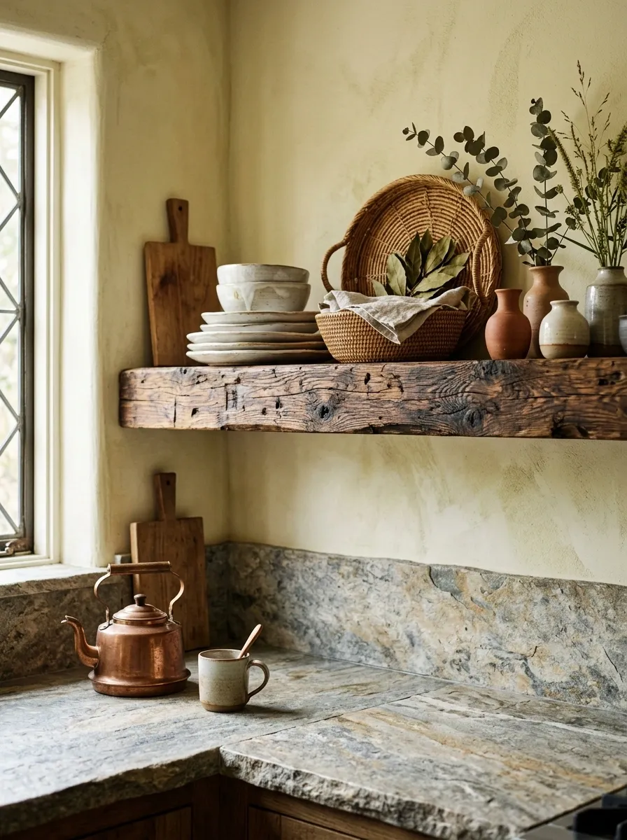
A rustic kitchen corner benefits from honest material contrast. Rough reclaimed timber above a naturally varied stone counter creates a tactile composition that feels connected to the architecture rather than simply decorated.
The shelving can hold everyday dishes, woven baskets, and a handful of ceramics, while the stone provides a durable visual base beneath it. Warm, uneven wood grain adds character that polished cabinetry often lacks.
The trick is to stop before the materials become too busy. One dominant wood tone and one stone finish are enough. Extra patterns, ornate hardware, and too many accessories would dilute the strong material relationship.
Minimal Corner With One Oversized Art Piece
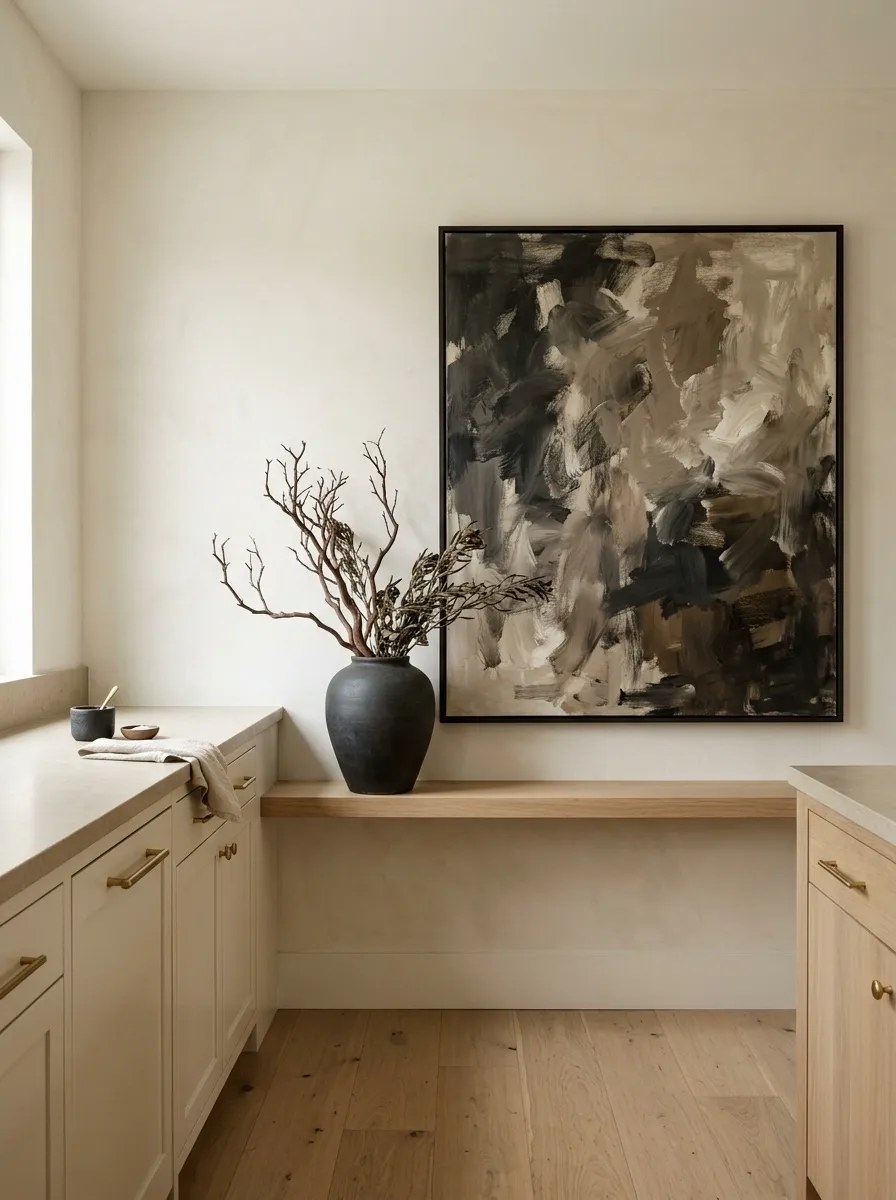
Not every kitchen corner needs shelves, storage, or a collection of objects. Sometimes the strongest composition comes from leaving almost everything out.
This version places one oversized artwork against a quiet wall, with a slim console or narrow ledge beneath it. The surrounding kitchen uses simple cabinetry, restrained hardware, and warm neutral surfaces so the artwork has enough visual breathing room.
Scale does the work here. A tiny frame would make the corner look accidental, while one substantial piece establishes a deliberate focal point. The empty wall around it becomes part of the composition.
This approach also suits kitchens where additional furniture would interfere with circulation.
Built-In Corner Hutch With Glass Doors
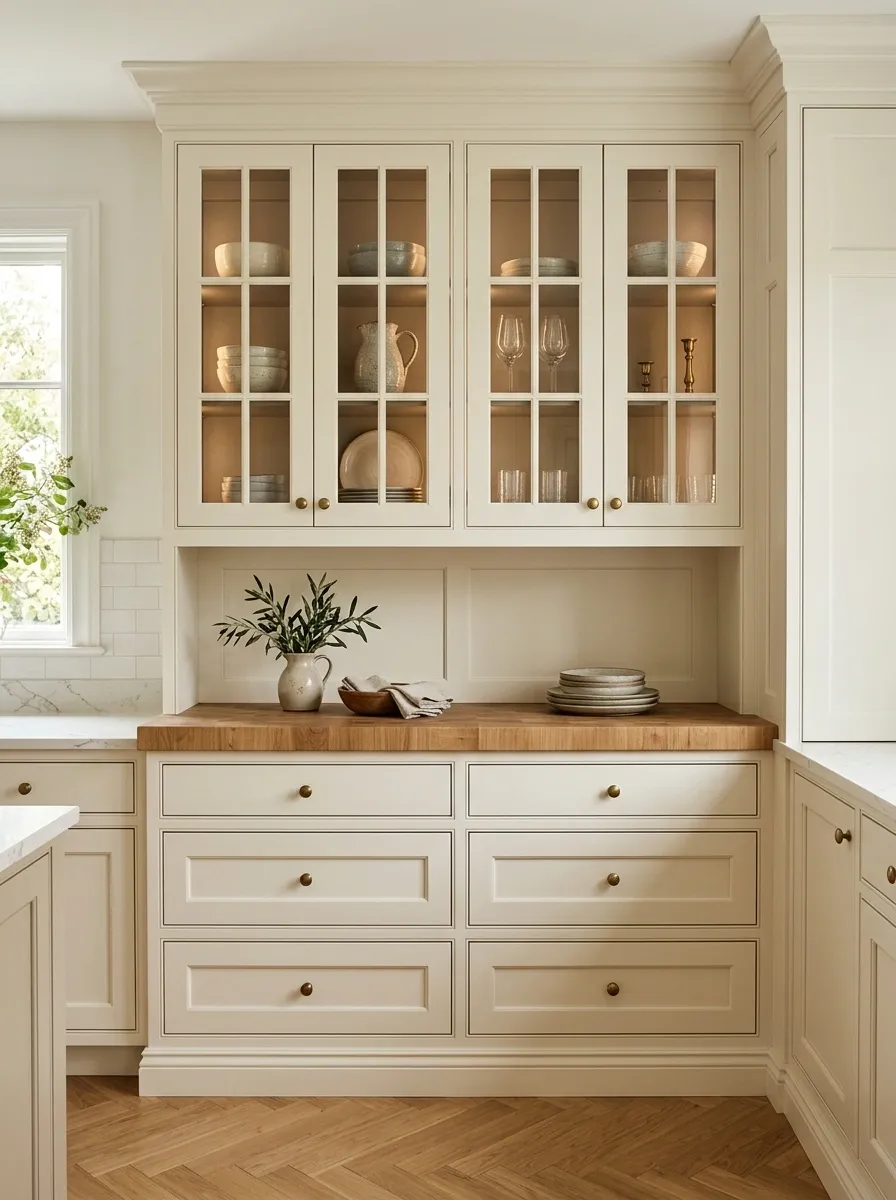
A built-in hutch can completely change the appearance of a dead kitchen corner by giving the area both vertical structure and storage. This version combines lower drawers, a usable counter, and glass-front cabinets above, creating a piece that feels halfway between cabinetry and furniture.
Interior lighting gives the glass doors a soft glow in the evening, while the lower section stays visually quiet. Ceramics and glassware add interest without requiring the entire hutch to be filled.
The design works especially well when the hutch shares one key finish with the main kitchen but introduces a slightly different detail, such as fluted glass, a contrasting interior color, or traditional trim.
Terracotta Corner With Curved Details
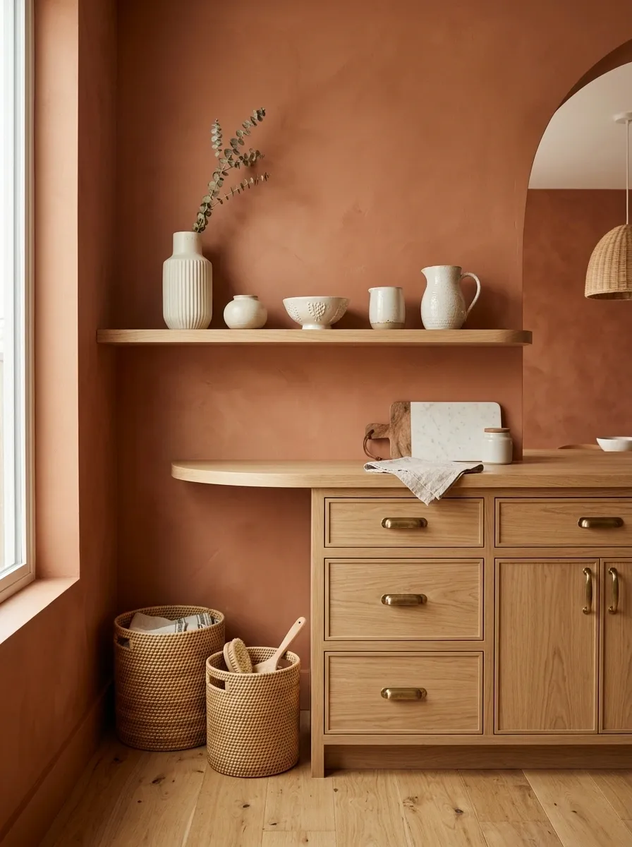
Terracotta brings warmth into a kitchen corner without relying on a large collection of accessories. In this composition, the walls carry a muted clay tone while natural oak cabinetry, curved shelving, and woven details keep the stronger color grounded.
The corner feels especially cohesive because the curves appear in more than one place. A rounded shelf edge echoes a softly shaped doorway or furniture profile, creating a visual thread through the space. Simple cream ceramics prevent the terracotta from becoming too dominant.
The strongest version keeps the rest of the kitchen relatively quiet. Too many additional warm colors would compete with the clay backdrop.
Small Corner With a Floating Wood Counter
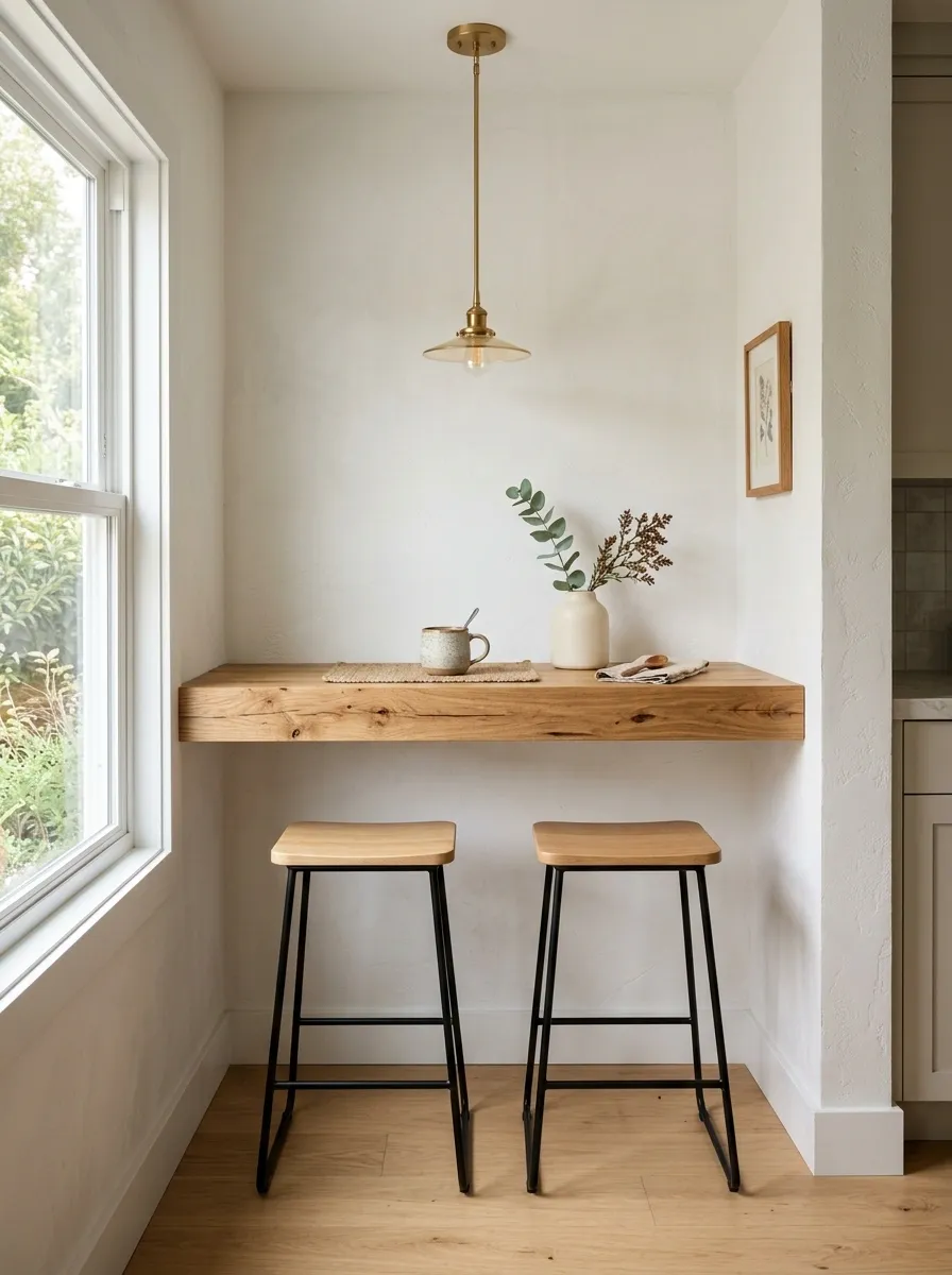
A narrow kitchen corner doesn’t need a full cabinet run to become useful. A floating wood counter creates a slim perch for breakfast, serving, laptop work, or morning coffee while leaving most of the floor beneath it completely open.
The finished scene uses one substantial timber surface, two lightweight stools, a quiet wall treatment, and a small pendant or wall light above. Lower storage is omitted deliberately, giving the corner an airy appearance.
The visual strength comes from the gap beneath the counter. Keeping that area clear prevents a practical feature from becoming another bulky furniture zone.
Black Window Seat Corner With Textured Cushions
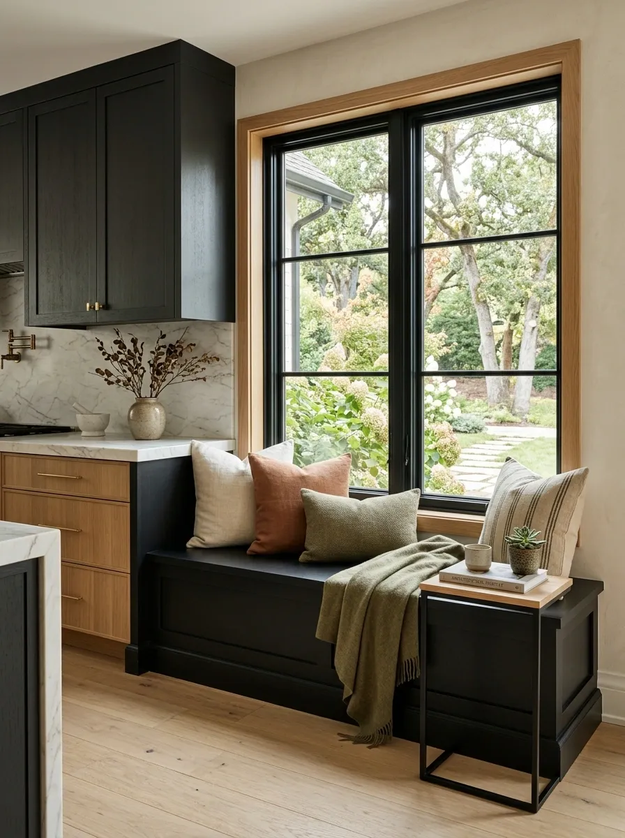
A black built-in window seat gives an overlooked kitchen edge a strong architectural silhouette. The darker base anchors the window, while layered cushions in cream, clay, and muted olive soften the composition.
A narrow side table keeps the seat practical without interrupting the view. Wood trim or a warm timber countertop elsewhere in the kitchen prevents the black from feeling isolated.
Texture matters more than pattern in this design. Linen, woven fabric, natural wood, and a lightly textured wall create depth while keeping the palette restrained. The result feels substantial without becoming visually heavy.
Tall Utility Corner With Hidden Cleaning Storage
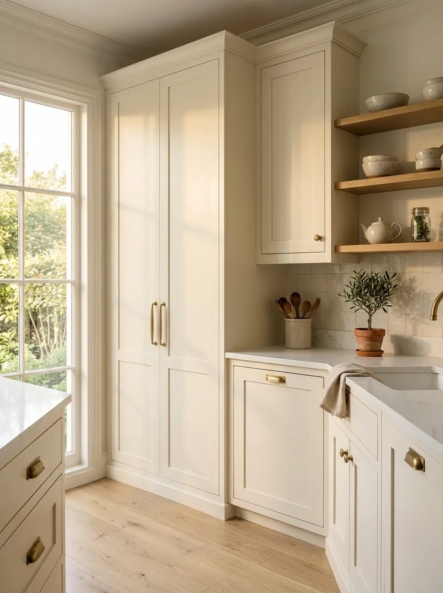
A tall cabinet tucked into an overlooked corner can solve a practical problem while preserving the visual calm of the kitchen. The doors match the surrounding cabinetry, hiding cleaning tools, household supplies, and less attractive everyday equipment behind one uninterrupted surface.
The interior is divided by purpose, with frequently reached supplies positioned at a comfortable height and bulkier items lower down. A shallow worktop beside or above part of the storage can create a useful transition into the main kitchen.
From across the room, however, the corner should simply read as another clean architectural plane.
Collected Corner With Ceramics, Art, and Open Storage
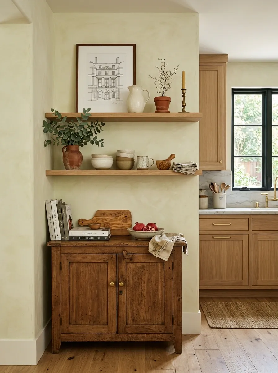
The final approach is less about creating one dedicated function and more about making the corner feel connected to the personality of the home. Open shelves, a small wooden cabinet, framed artwork, handmade ceramics, and a few everyday objects create a composition that looks accumulated rather than staged.
The trick is to establish hierarchy. Artwork provides the strongest visual statement, furniture supplies weight below it, and the shelves carry smaller pieces around those anchors. Repeating one or two materials from the rest of the kitchen ties everything together.
Nothing needs to be perfectly symmetrical. Slight differences in object height and spacing give the arrangement the relaxed character of a real home.
Hidden Corner Bar With Fluted Glass Doors
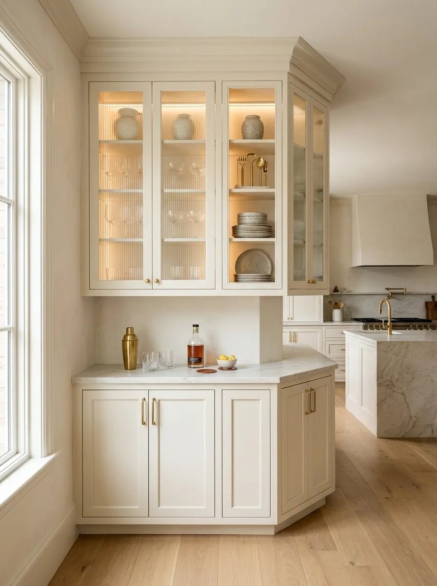
A kitchen corner can take on a furniture-like quality when storage is given a more decorative face. Here, fluted glass doors sit above a compact stone counter, creating a small display zone for glassware, serving pieces, and everyday items.
The lower cabinetry stays simple and substantial, while the textured glass breaks up the solid wall of cupboards. Warm interior lighting catches the vertical glass texture after sunset and gives the corner a softer presence than standard closed cabinetry.
A narrow countertop keeps the footprint practical. The design works because the upper section feels lighter than the base, creating a gradual visual transition from floor to ceiling.
Soft Blue Corner With an Antique Farmhouse Table
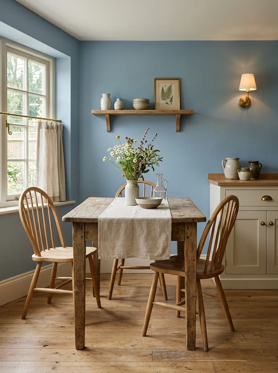
A forgotten kitchen corner can feel much more personal when a freestanding table becomes the anchor. This version pairs a softly painted blue kitchen with an antique-style wooden table, spindle-back chairs, warm brass lighting, and simple linen textiles.
The table introduces a furniture scale that differs from the cabinetry. That contrast prevents the corner from blending into one long run of built-ins.
A small piece of artwork or an understated shelf above the table completes the wall without competing with the wood. The combination works best when the blue remains muted and the timber carries most of the visual warmth.
Sculptural Stone Corner With a Floating Display Ledge
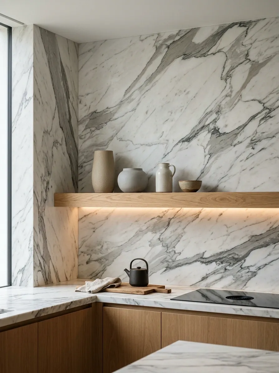
Rather than filling a forgotten corner with lots of small items, this design gives the wall one substantial material feature. A large-format natural stone surface runs through the corner, paired with a single floating wood ledge and understated lighting.
The stone carries the visual weight from wall to wall, making the corner feel connected to the architecture. The floating ledge then adds warmth without interrupting the stone’s broad surface.
Only a handful of objects sit on the ledge. Their restrained arrangement allows the stone pattern to remain visible, which is essential to the composition.
Narrow Corner With a Built-In Cookbook Library
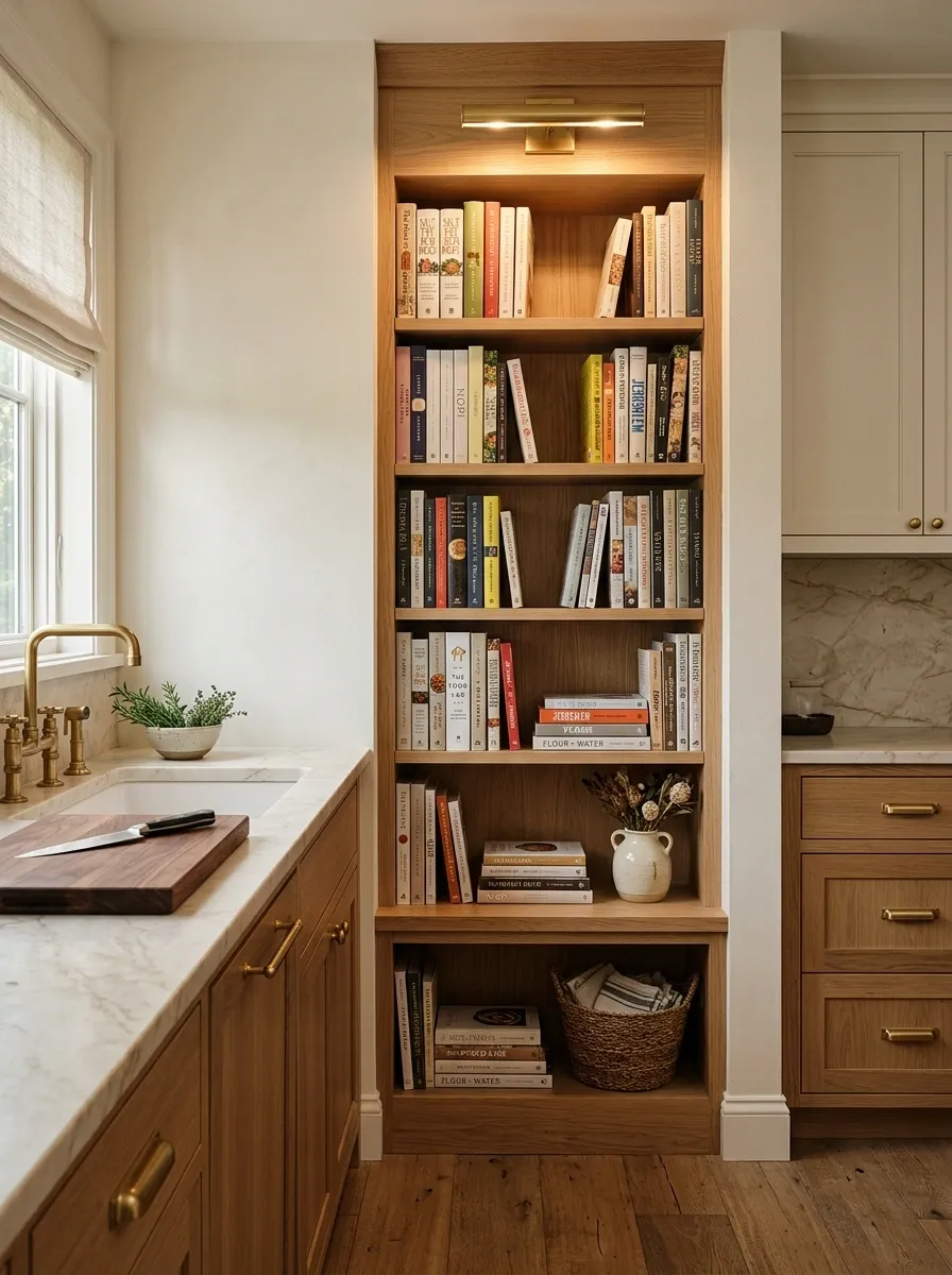
An overlooked wall beside a prep area can become a compact cookbook library without taking over the kitchen. Floor-to-counter shelving fills the corner, with a deeper ledge at the base for the books used most often.
The shelves are deliberately shallow, allowing the surrounding walkway to remain clear. Warm timber against an ivory wall keeps the collection visually connected to the kitchen rather than making it feel like a separate bookcase.
A small picture light or concealed strip above the shelves brings attention to the vertical wall after dark. The books themselves provide color, but the surrounding palette remains restrained so the display doesn’t become visually noisy.
Warm Minimal Corner With a Monolithic Oak Cabinet
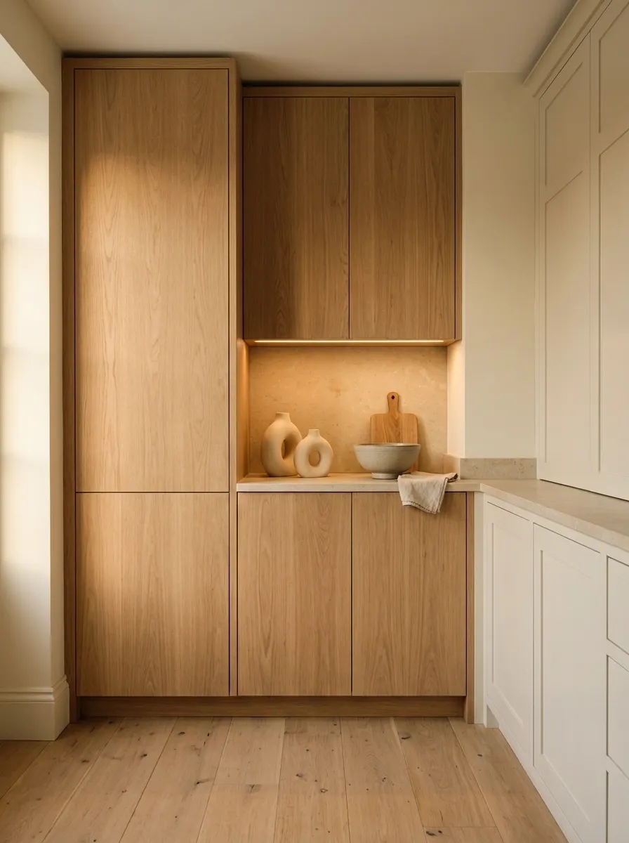
A small kitchen corner can feel exceptionally polished when the design is reduced to one substantial piece. This concept uses a tall oak cabinet with clean slab doors, a stone worktop, and a single integrated light.
There are no open shelves and almost no decoration. The cabinet provides enough visual mass to anchor the corner while the surrounding ivory kitchen keeps the composition light.
The contrast between the broad oak surface and the quieter cabinetry creates the interest. A few carefully chosen ceramic pieces on the counter are enough to keep the space from feeling sterile.
Mediterranean Corner With Open Shelves and a Built-In Bench
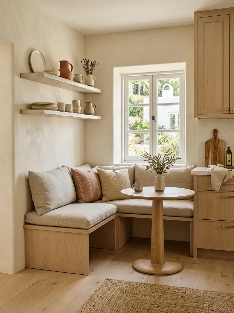
A neglected corner can become the warmest part of the kitchen when Mediterranean materials are allowed to shape the entire composition. This design combines creamy plaster-toned walls, pale oak cabinetry, handmade-looking ceramic shelves, and a built-in bench tucked beneath a small window.
The seating stays simple, with loose linen cushions and a compact pedestal table. Above it, open shelving carries a restrained collection of pottery in ivory, sand, and muted terracotta.
The beauty comes from the material relationship. Slight variation in the ceramics and timber keeps the scene from feeling overly polished, while the pale palette allows sunlight to remain a major part of the design.
Dramatic Corner With a Full-Height Arched Cabinet
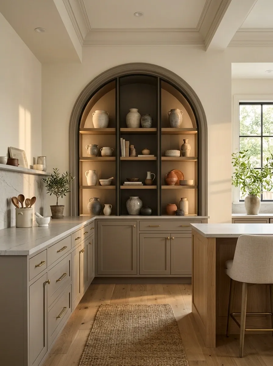
A forgotten corner can become a genuine architectural feature when the cabinetry itself introduces a strong shape. This kitchen uses a tall arched cabinet that rises almost to the ceiling, breaking up a long run of straight cabinetry.
The cabinet has a warm painted exterior, softly illuminated shelving inside, and lower concealed storage. Its curved top echoes a nearby doorway or architectural opening, making the shape feel intentional rather than decorative.
Everything around it stays relatively restrained. A quiet stone counter and simple hardware allow the arch to carry the visual interest. The result is especially effective in kitchens where long, straight cabinet walls need a stronger focal point.
Compact Corner With a Built-In Wine and Serving Cabinet
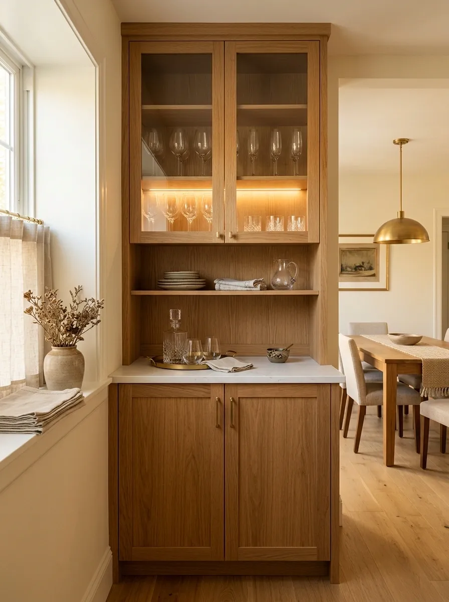
A narrow corner beside a dining area can become a polished serving station when storage is planned vertically. This version uses a low oak cabinet with stone top, glass-front upper storage, and a small open section for serving pieces.
The cabinet feels more like furniture than ordinary kitchen storage. Its proportions are intentionally compact, leaving enough breathing room around it while creating a clear transition between the kitchen and dining zone.
Warm lighting beneath the upper shelves highlights glassware after dark. The lower doors remain solid and calm, hiding less attractive supplies while preserving the clean appearance of the room.
Soft Olive Corner With a Curved Dining Booth
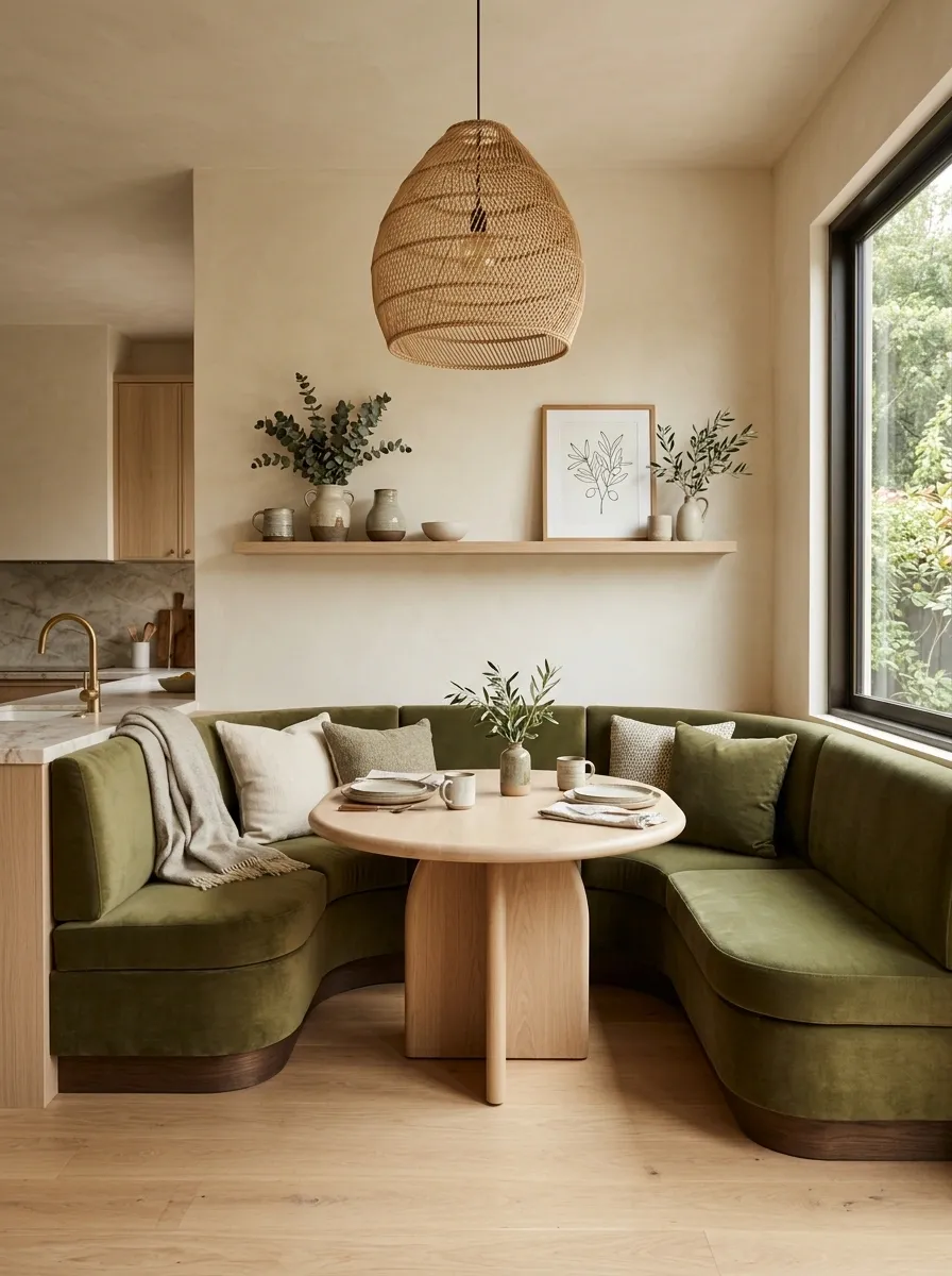
A softer alternative to a conventional dining nook, this design wraps an olive-green banquette around the corner while keeping the table small and sculptural. Cream walls, pale timber flooring, and woven pendant lighting keep the darker upholstery from overwhelming the room.
The booth gives the corner a clear identity, but the rounded table prevents the seating from feeling boxed in. A narrow wall shelf carries a few ceramics and framed artwork, adding personality without turning the corner into a storage wall.
The olive tone is strongest near the seating, while warmer timber and ivory surfaces provide visual relief around it.
Gallery-Style Kitchen Corner With Art and a Slim Console
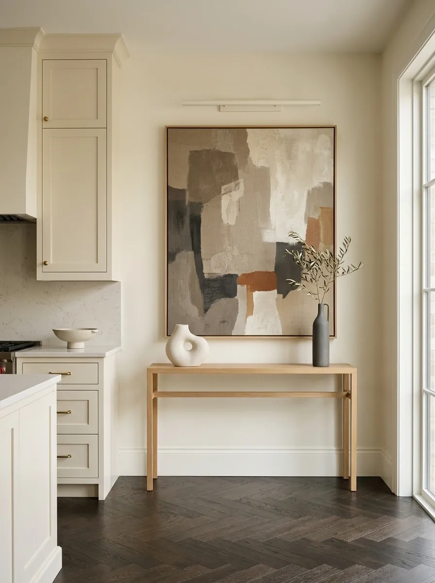
Some kitchens have an empty corner that doesn’t need another functional zone at all. This concept treats the wall as a small gallery, using a slim console, oversized artwork, architectural lighting, and one carefully selected sculptural object.
The kitchen itself remains restrained, with warm ivory cabinetry and dark wood flooring. Against that calm backdrop, the artwork becomes the visual anchor and gives the forgotten wall a reason to draw attention.
The console should remain shallow enough to preserve circulation. Its purpose is to establish a horizontal line beneath the artwork, not to become another storage-heavy piece of furniture.
Conclusion
A kitchen corner doesn’t become successful simply because something occupies it. The strongest ones have a clear visual role. A bench can create a dining destination, a tall cabinet can solve an awkward vertical gap, stone can give a blank wall architectural weight, and a single artwork can sometimes do more than an entire collection of small decorations.
Before filling an empty corner, look at what the rest of the kitchen is already doing. Notice the dominant materials, the available light, the walking path, and the scale of nearby furniture. Then choose a complete composition that strengthens those elements instead of fighting them.
The overlooked parts of a kitchen often become the details that make the finished room feel considered. Save the designs that fit the character of the space and return to them when the next kitchen project begins.