
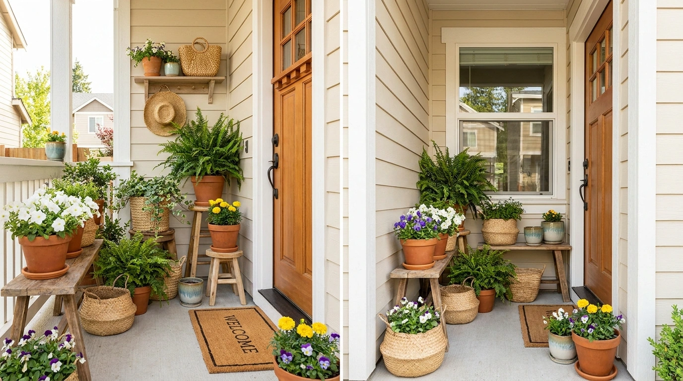
Small front porches have a nasty habit of exposing bad decorating decisions. A planter that looks charming at the garden center can suddenly make the doorway feel cramped, block the walking path, or leave the whole entrance looking strangely unfinished.
And small doesn’t mean boring. A narrow porch can handle strong color, tall planting, rustic materials, seasonal changes, or a very polished modern composition. It just needs decisions that respect the space.
Small Front Porch Planter Designs
Built-in Lamp Post Planters
This idea makes hard-working porch furniture earn its keep by combining a lighted fixture with a heavy-duty wooden container.
Position a substantial square planter box right beside the garage or entry door, letting the built-in lamp post anchor the corner while cascading vibrant blooms hang gracefully from the bracket. Fill the base with compact greenery and hardy trailing annuals to keep the wood frame feeling grounded and intentional.
Skip the extra clutter on the surrounding concrete, since the combination of warm lighting and fresh foliage already creates an impressive welcoming statement.
The result is a clever space-saving feature that illuminates the walkway and adds instant curb appeal without crowding the footprint.
Oversized Terracotta Urns With Soft Greenery
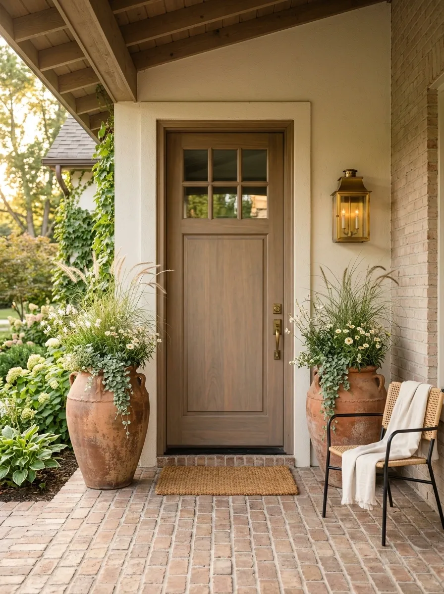
The trick here is restraint. Two tall terracotta urns frame a muted wood front door, giving the small entry a strong vertical structure without filling every available inch.
Plant them with airy ornamental grasses, soft trailing greenery, and a few cream-colored flowers rather than a crowded mix. The warm clay works naturally with brick or warm-toned flooring, while the pale flowers keep the composition from feeling too heavy.
I’d leave the rest of the porch quiet. A simple doormat, warm wall light, and maybe one understated chair are enough. The urns already give the doorway a focal point, and adding a pile of seasonal decor would only dilute it.
The result feels established rather than decorated for the sake of decorating.
Tall Dark Containers and Wreaths
This setup proves that dark finishes can anchor a bright white facade without looking harsh or heavy-handed.
Place two tall tapering black containers on either side of the front door, and fill them with tall ornamental grasses, cascading vines, and vibrant purple blooms that soften the sharp edges of the pots. Hang a matching green wreath on the door glass to tie the entire botanical palette together effortlessly.
Keep the flooring around the entry minimal with a simple natural doormat and let the dramatic height of the planters do the heavy lifting.
This approach works wonders for small porches because the vertical lines draw the eye upward, making the entire entryway feel much grander than it actually is.
Black Planters With White Flowers
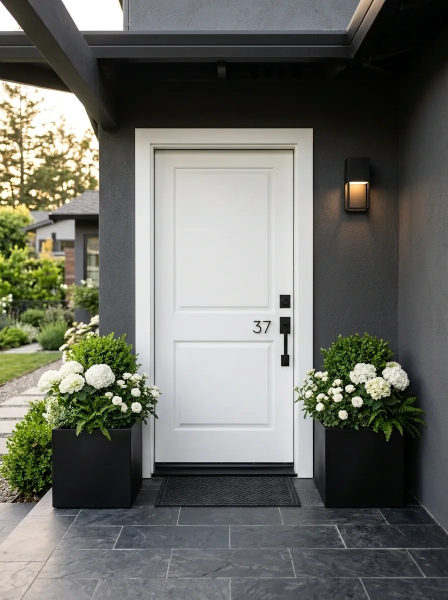
Black containers can make a tiny porch look sharper without adding more stuff.
Here, two matte-black square planters sit close to a bright white front door. Their straight edges echo the door trim and create a clean architectural frame. Fill them with rounded white blooms and rich green leaves so the planting softens the geometry instead of copying it.
Keep the steps and surrounding finishes simple. Charcoal flooring, black hardware, and one restrained outdoor light are enough to connect the composition. There’s no need to scatter little black accessories everywhere just to repeat the color.
This works especially well when the house already has crisp lines. The planters give the entrance weight, while the white flowers keep the contrast from becoming severe.
Patterned Urns and Pastels
This playful approach embraces distinctive patterns without overwhelming a compact porch layout.
Arrange three statement-making decorative urns in coordinating pastel stripes, filling each one with a mix of lavender, pink blooms, and rich textural greenery. The distinct shapes and whimsical colors bring personality right to the doorstep while keeping the overall footprint compact.
Keep the background architecture and hardware simple so the decorative containers remain the star of the show.
It is a joyful way to inject some color and charm into a small space without resorting to a chaotic collection of seasonal decorations.
Tiered Planters for a Narrow Step
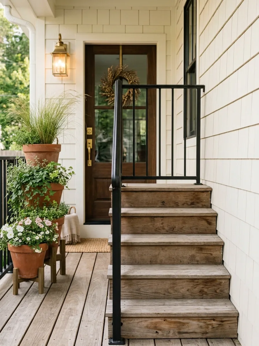
A narrow porch doesn’t need to surrender its entire edge to containers. This arrangement works by stacking visual height instead of taking up more floor space.
Place three planters along one side of the steps, moving from tall at the back to medium and low toward the front. Use airy grasses in the tallest container, trailing greenery in the middle one, and compact flowering plants in the lowest.
The group reads almost like one layered planting composition instead of three unrelated pots. More importantly, the other half of the entry stays open, so people can move through the porch without weaving around containers.
This is the kind of solution that actually respects a small footprint. It adds plenty of planting without pretending the porch is bigger than it is.
Modern Black Groupings
Sometimes the best way to handle a tiny porch is to cluster your containers for maximum visual impact.
Group three fluted black planters of varying heights near the corner, filling the largest with pale trailing caladiums and ferns, the medium with a feathery fern, and the smallest with tight white blossoms. The monochromatic containers unify the different plant heights into a single cohesive arrangement.
Leave the adjacent wall and floor space wonderfully uncluttered to let the lush green foliage pop against the white siding.
This method adds plenty of organic texture to the entry while leaving the main walking path completely open and accessible.
Warm Wood Porch With Olive Trees
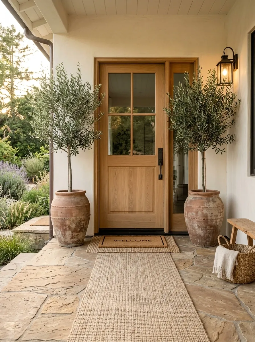
This one leans into the porch itself instead of fighting it.
Two weathered clay containers hold slender olive trees beside a natural wood front door. The trees bring height without creating a bulky silhouette, and the muted foliage sits comfortably against warm timber, stone, or pale stucco.
A woven doormat and a simple natural-fiber runner add enough texture to keep the entrance from feeling flat. That’s really all the styling it needs.
The mistake here would be overcommitting to the theme. Skip the pile of faux Mediterranean accessories. The clay, wood, and silvery-green foliage already tell the story.
What makes this composition especially useful on a small porch is the narrow vertical shape of the trees. You get a strong frame around the entry without eating up the walking area.
Saddle Railing Flower Boxes
A railing planter is the ultimate trick for small porches that lack floor space entirely.
Mount a sturdy sage-green saddle box securely over a white porch railing and fill it densely with bright pink impatiens and trailing vines. The muted green tone blends seamlessly with outdoor surroundings while the vibrant flowers provide a cheerful punch of color right at eye level.
Keep the rest of the porch decking completely clear to maintain an open, breezy feel that invites guests right up to the door.
It is a brilliantly practical solution for maximizing floral display areas without sacrificing a single square inch of walking room.
Symmetrical White Planters and Boxwood
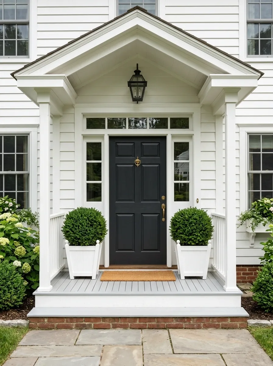
Sometimes the strongest small-porch design is the one that refuses to fill the space.
Two crisp white tapered planters frame a traditional front door, each holding compact rounded boxwood. The matching pair creates instant order, especially when the doorway has strong trim, columns, or a centered porch layout.
Keep everything around them deliberately quiet. A clean doormat, a restrained wall lantern, and enough empty flooring are part of the design. The negative space matters just as much as the greenery.
This composition works because the planters don’t ask to become the main event. They reinforce the symmetry already built into the house.
And that’s the part worth copying. On a small porch, you don’t always need more personality. Sometimes you need fewer competing shapes so the architecture can finally do some of the talking.
Farmhouse Galvanized Tubs With Wild Flowers
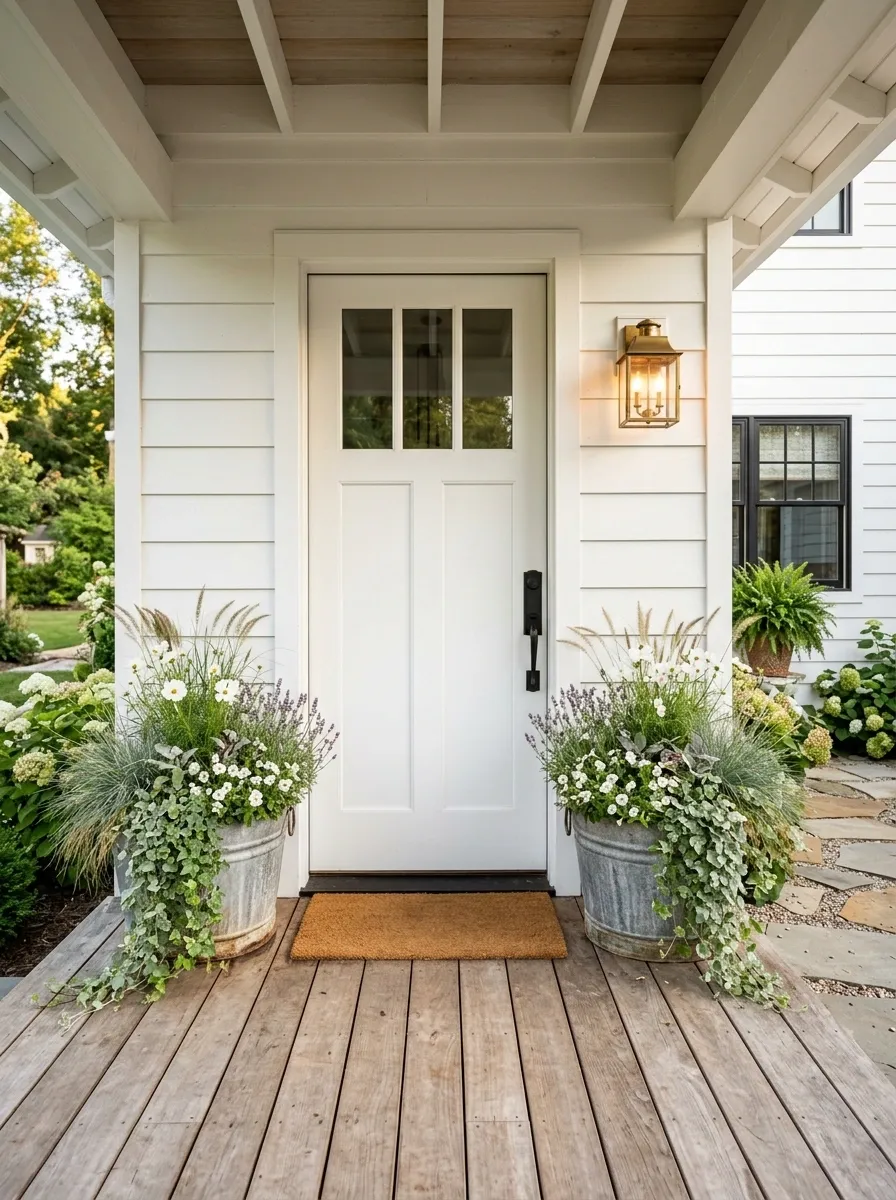
Galvanized tubs bring a little roughness to a porch that might otherwise feel too polished. Set two compact tubs near a white farmhouse door and fill them with loose grasses, white flowers, muted purple blooms, and trailing greenery.
The planting should look slightly relaxed, not clipped into perfect shapes. That softness works against the harder metal container and the straight lines of farmhouse siding.
A reclaimed wood accent, warm lantern, and simple coir doormat are enough to finish the entry. Don’t pile on more rustic decor just because the tub is galvanized. One strong material reference is better than six themed accessories.
The finished porch feels collected and practical, with enough texture to be interesting without making the doorway feel crowded.
Deep Green Pots With Rustic Brick
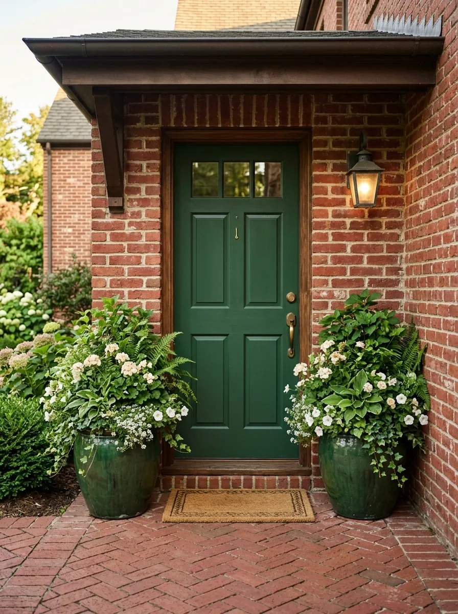
Deep green planters almost disappear into the architecture here, which is exactly why they work.
Place them against a red-brick porch and repeat the same green on the front door or trim. Fill the containers with layered foliage and pale flowers so the planting stands out without competing with the brick’s strong texture.
The important relationship is between the dark green and the warm brick. Everything else should stay quieter. A natural doormat and simple black or aged-metal lighting are enough to finish the scene.
This composition feels grounded because the planter color connects two visual zones, the greenery and the architecture. Nothing looks randomly added.
I’d avoid bright decorative pots in this setup. The porch already has plenty of visual information from the masonry. The deeper green gives it structure instead of another competing accent.
One Statement Planter Beside the Door
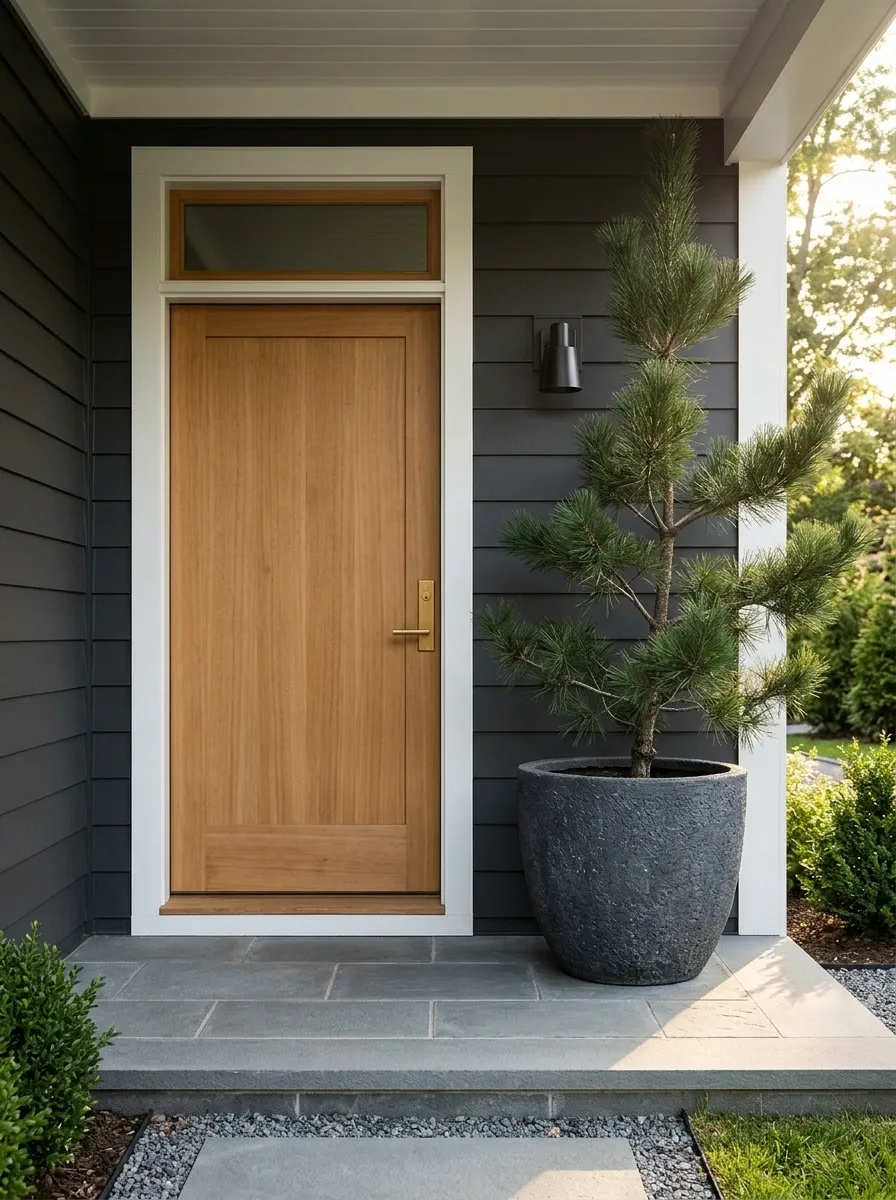
Not every small porch needs a matching pair.
This design uses one substantial planter on the widest side of the entry and deliberately leaves the opposite side open. A tall branching plant or sculptural evergreen gives the doorway vertical interest while the empty space keeps circulation clear.
That imbalance is what makes the composition feel modern. The planter becomes a visual counterweight rather than a mirror image.
Use a container with enough mass to hold the corner visually, then keep its planting fairly simple. A complicated mix would turn the single focal point into visual noise.
This is especially useful on porches where one side of the door is narrower than the other. Instead of forcing symmetry that the architecture doesn’t have, work with the space you actually have.
Layered Porch Corner With Three Container Heights
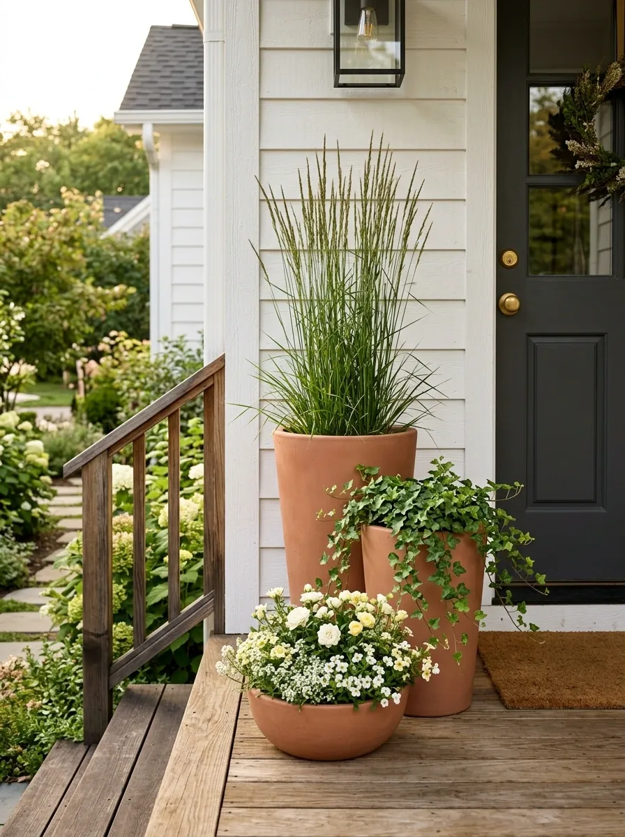
A little corner can become the most interesting part of the porch when the planters have different heights.
Start with one tall container at the back, add a medium pot slightly forward, then finish with a low bowl or compact vessel. Use plants with different forms so the layers are easy to read. Upright grasses, trailing greenery, and low flowers give you three separate movements without demanding a large footprint.
Keep the pots in the same general color family so the planting remains the focus. The goal is a controlled cluster, not a collection of everything you happened to find at the garden center.
This arrangement works particularly well beside steps or under a porch light where the changing heights catch attention from different angles.
Cobalt Blue Pots With Lime Green Foliage
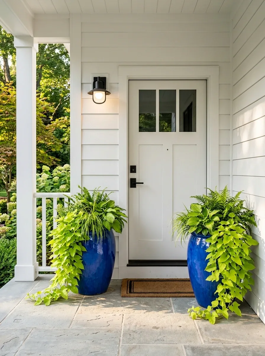
A pale porch gives you room to be louder.
Use rich cobalt-blue ceramic containers against white or very light siding, then fill them with bright leafy plants instead of a busy flower mix. The green foliage picks up the energy of the blue without introducing another dominant color.
Keep the door simple, the flooring light, and the hardware restrained. The containers are the accent, so let them be the accent.
This approach works particularly well when the porch needs personality but doesn’t have enough room for furniture or larger decorative pieces. Color can do the work.
And because the planting stays mostly green, the composition remains crisp rather than turning into a rainbow of container-garden colors.
Rustic Stone Planters With Lavender
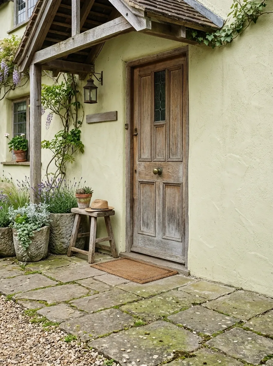
Stone containers make a small porch feel settled without demanding much attention. Here, short weathered planters line one side of a cottage-style entrance, filled with lavender, silvery foliage, and soft ornamental grasses.
The stone gives the composition weight, while the loose planting keeps it from becoming too formal. A pale plaster wall, weathered wood door, and simple timber stool complete the setting without competing with the plants.
What makes this work isn’t the number of containers. It’s the repetition of one rough material against softer planting.
I’d keep the flowers in the same muted family. Bright pinks or several unrelated colors would break the calm relationship between the stone and foliage.
Black Window-Box Style Planters Around a Door
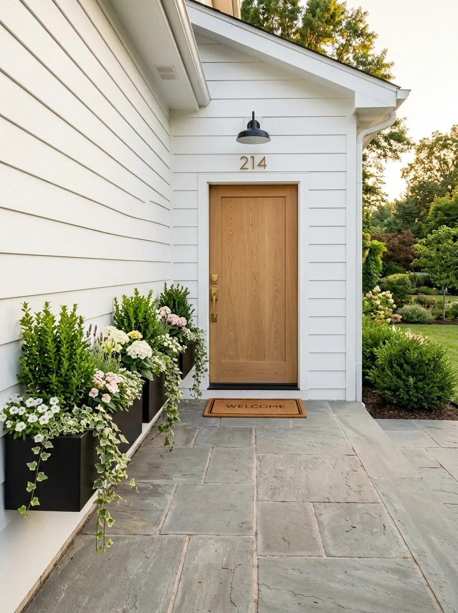
Instead of scattering pots around a narrow entry, create one continuous planting line.
Slim black rectangular planters sit along the base of the porch wall, visually connecting the areas around the doorway. Fill them with upright greenery, compact flowers, and a little trailing foliage so the planting moves horizontally across the space.
That horizontal line makes the porch feel longer. It also keeps the floor clearer because the containers hug the edge instead of projecting into the walking zone.
A natural wood door works especially well here because its warmth breaks up the black and green combination. Keep the rest of the entry simple.
This is a good example of using the shape of the planter as part of the spatial design. The container isn’t just holding plants. It’s helping organize the porch.
Autumn Porch With Copper-Colored Containers
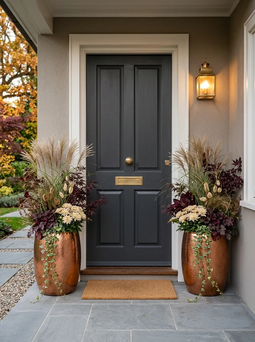
The seasonal color lives in the planters here, not in a pile of decorations around the door.
Use copper-toned containers filled with ornamental grasses, burgundy foliage, pale chrysanthemums, and trailing vines. Place them beside a dark wood or charcoal door so the warm autumn tones have something deep to sit against.
A single small doormat and one warm porch light are enough to complete the scene. Skip the collection of pumpkins, signs, lanterns, and faux leaves that usually turns a small fall porch into visual traffic.
The copper containers already provide the seasonal cue. Because the colors stay within earthy orange, brown, burgundy, and cream, the whole arrangement feels intentional rather than themed.
Scandinavian Entry With Pale Concrete Planters
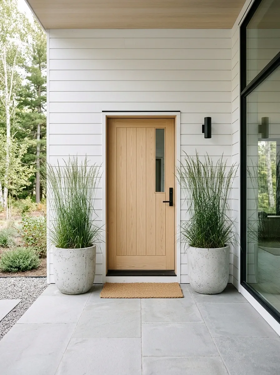
This porch doesn’t need much decoration because the materials are doing enough already.
Two pale concrete planters sit beside a light wood door, each filled with sculptural grasses. White or pale-gray siding, light stone underfoot, and thin black hardware give the entrance a quiet Nordic character without making it feel cold.
The important part is the empty space between the planters and the doorway. Don’t fill it just because you have room.
A soft woven mat can add texture, but keep the accessories limited. This look depends on clean proportions and a small number of strong shapes.
The concrete brings a little visual seriousness to the soft wood and grasses. That’s what keeps the porch from becoming bland.
Vintage Ceramic Pots With Cottage Flowers
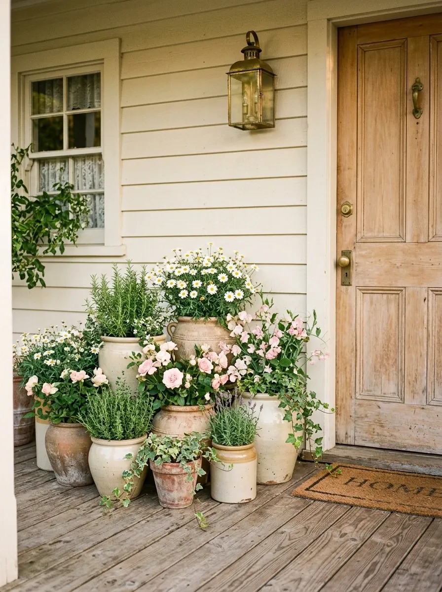
Matching isn’t the goal here.
A small collection of vintage ceramic pots gathers along one side of a cottage porch, with each container holding daisies, trailing greenery, soft pink flowers, or simple herbs. The shapes and finishes are related, but not identical.
That difference gives the entry its charm. It looks like the planting grew into the porch over time rather than arriving as a perfectly coordinated set.
Keep the background quiet. A worn wood door, pale siding, and a simple outdoor light are enough. The containers should supply the visual history.
The trick is choosing variation with boundaries. A dozen completely unrelated pots would look messy. A small group with similar softness, scale, and color undertones feels collected instead.
Tall Rectangular Planters for a Modern Townhouse
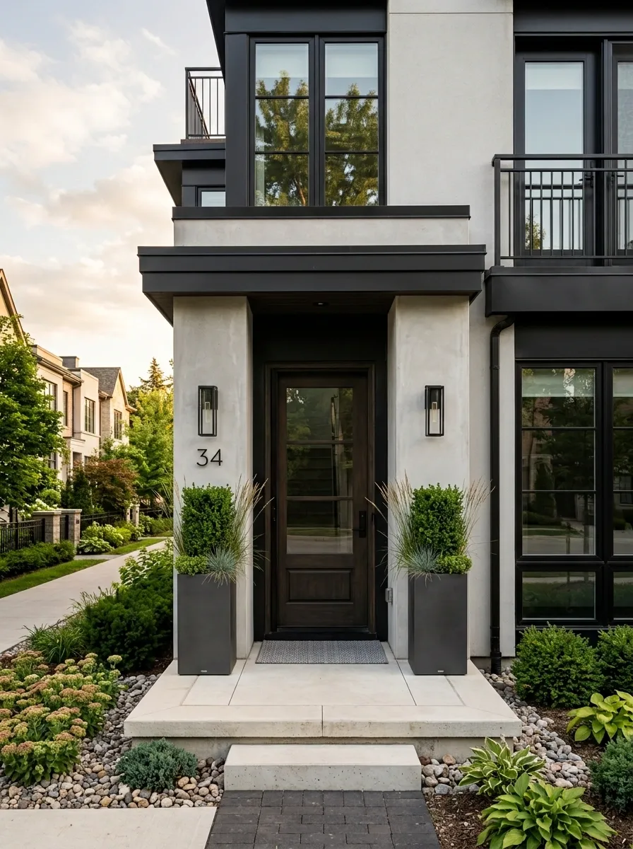
A narrow townhouse entrance benefits from height, not bulk. Use two slim charcoal rectangular planters beside the doorway and fill them with clipped evergreens or upright ornamental grasses.
Their tall shape echoes the vertical lines of the architecture, making the entrance feel more deliberate without widening the footprint. Pale concrete walls, black trim, and a simple modern light keep the palette clean.
The key is proportion. The containers should feel tall enough to balance the doorway but narrow enough that they don’t turn the threshold into an obstacle course.
This is one of those cases where a boring round pot would actually weaken the design. The architecture has strong geometry, so the planters should speak the same visual language.
Rustic Basket Planters With Trailing Greenery
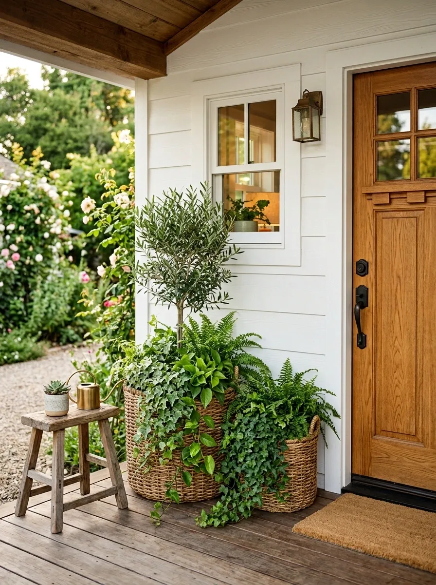
This is the softer answer to a small porch full of hard lines.
Use woven basket-style containers beside a white or cream exterior and a natural wood door. Fill them with trailing greenery that spills gently toward the floor, then add one upright plant in each container to keep the composition from becoming too flat.
A compact bench or wooden stool can sit nearby, but don’t try to turn the porch into a full outdoor room. The baskets and plants already provide texture.
What makes this composition interesting is the direction of movement. The greenery rises, then falls. The woven containers add another layer of texture without introducing a loud color.
It’s relaxed without looking unfinished.
Soft Pink Pots With Green and White Planting
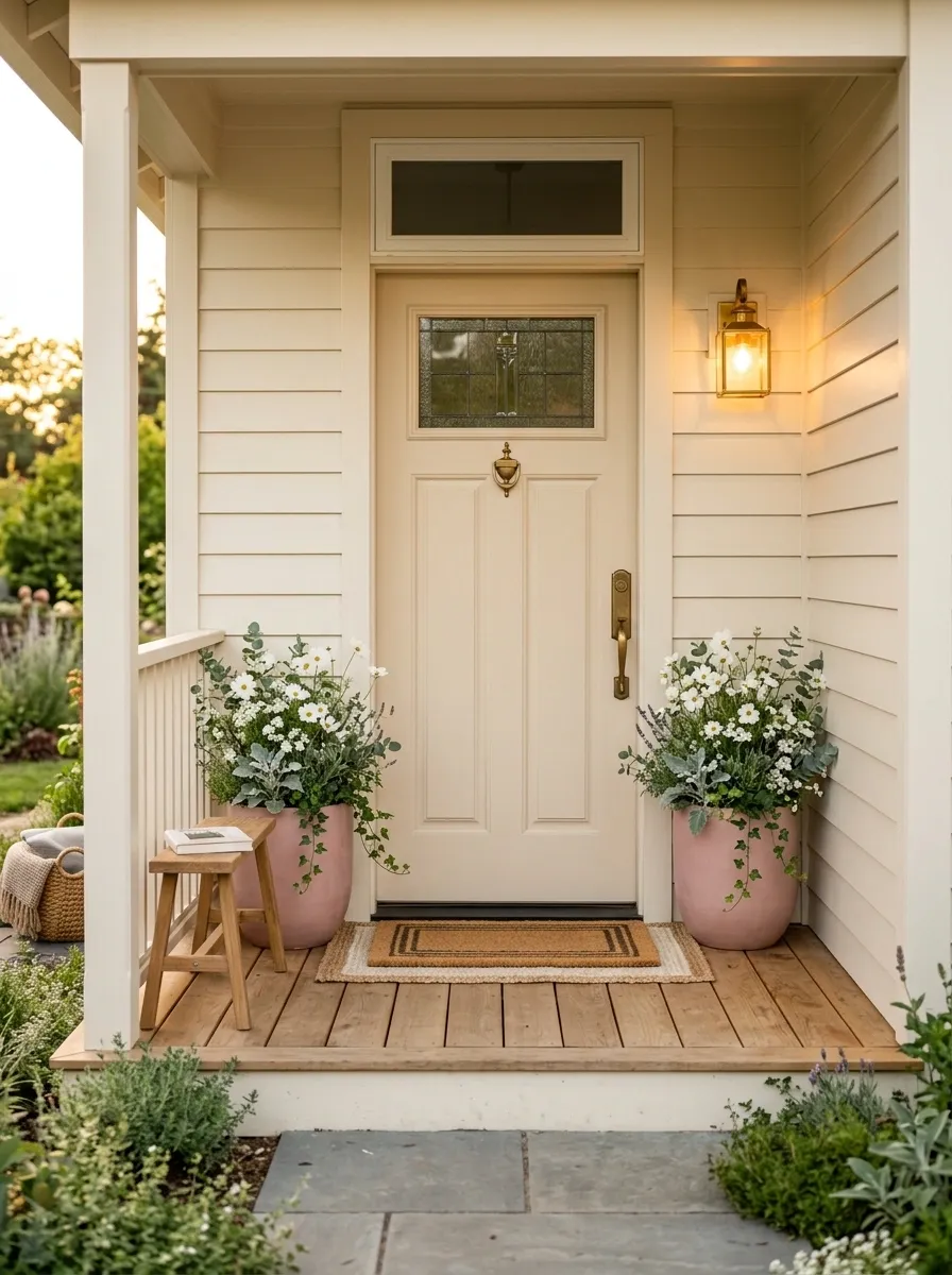
Soft pink can work beautifully on a small porch when the rest of the palette stays disciplined.
Place dusty pink ceramic pots against warm cream siding and a light-colored door. Fill them with white flowers, silver-green foliage, and compact leafy plants so the container color gets a chance to speak.
The combination feels gentle without becoming overly sweet because the greenery and neutral architecture break up the pink.
A woven mat and warm metal wall light finish the setting. Avoid adding another strong accent color. You don’t need blue, yellow, purple, and pink all competing for attention.
The best part of this design is how little space it needs to establish a personality. Two well-sized containers can do more than a dozen tiny decorative objects.
Full-Height Grasses for a Low Porch Wall
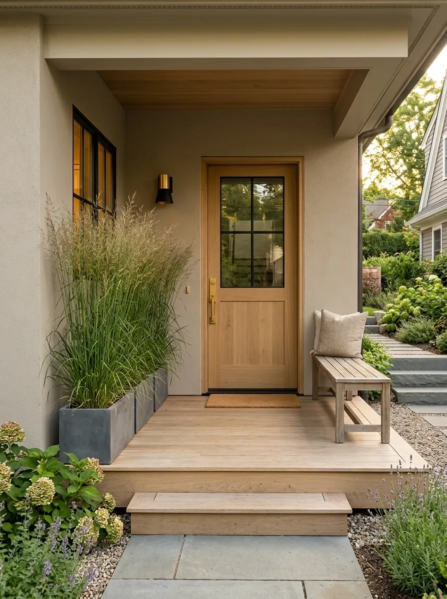
A low porch wall can leave the entrance feeling exposed. Instead of adding furniture, use tall planting to give the edge some vertical structure.
Long grasses in narrow containers rise above the wall while keeping their footprint close to the boundary. The result creates privacy and visual height without closing the porch in.
Use a muted stucco exterior, natural wood door, and one simple bench so the grasses remain the main supporting element. Choose a restrained planting style rather than mixing several flower colors.
The important thing is transparency. The grasses should soften the edge, not form a solid wall.
This is a smarter solution than filling the porch with bulky screens or furniture when the real problem is simply that the space needs height.
Deep Burgundy Planters With Evergreen Structure
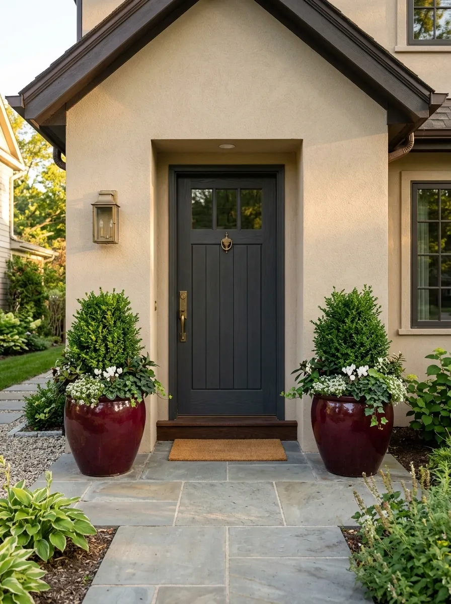
Burgundy containers bring depth to a pale porch without relying on black.
Place them against light stone or warm beige walls and a charcoal or deep wood door. Use compact evergreen shrubs as the main structure, then tuck in seasonal flowers for smaller flashes of color.
The important relationship is between the deep planter, pale architecture, and green planting. Together, they create enough contrast that the porch doesn’t need decorative clutter.
A simple brass or aged-metal light can add warmth, but keep it understated. The dark containers already give the lower part of the composition plenty of visual weight.
This direction works particularly well when you want a porch to feel richer and more grounded without making the whole entrance dramatically dark.
Cottage Entry With One Curved Planter Group
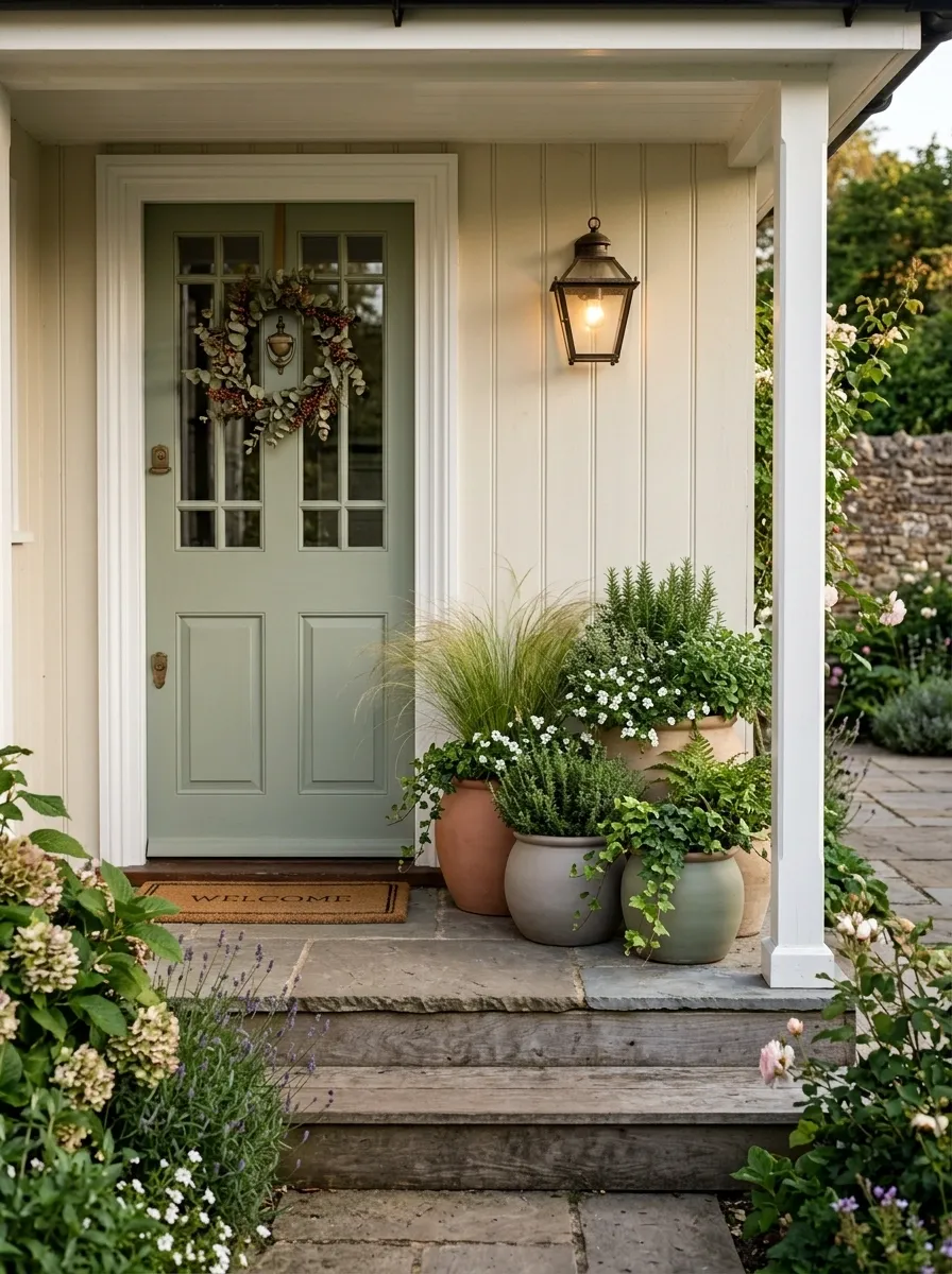
Straight edges are doing plenty of work around a front door, so a little softness can help.
Group several rounded ceramic pots beneath the porch light, keeping them close together so they read as one composition. Fill the containers with soft grasses, compact herbs, trailing greenery, and a few small flowers.
The curved pot shapes interrupt the straight lines of the steps, siding, and door trim without making the porch feel overly decorated. Keep the containers within one muted color family so the varied shapes still feel connected.
This is especially useful on a cottage-style entrance where a perfectly matched pair of square planters would feel too formal. The arrangement should look relaxed, but not accidental.
Minimal Black-and-Green Container Garden
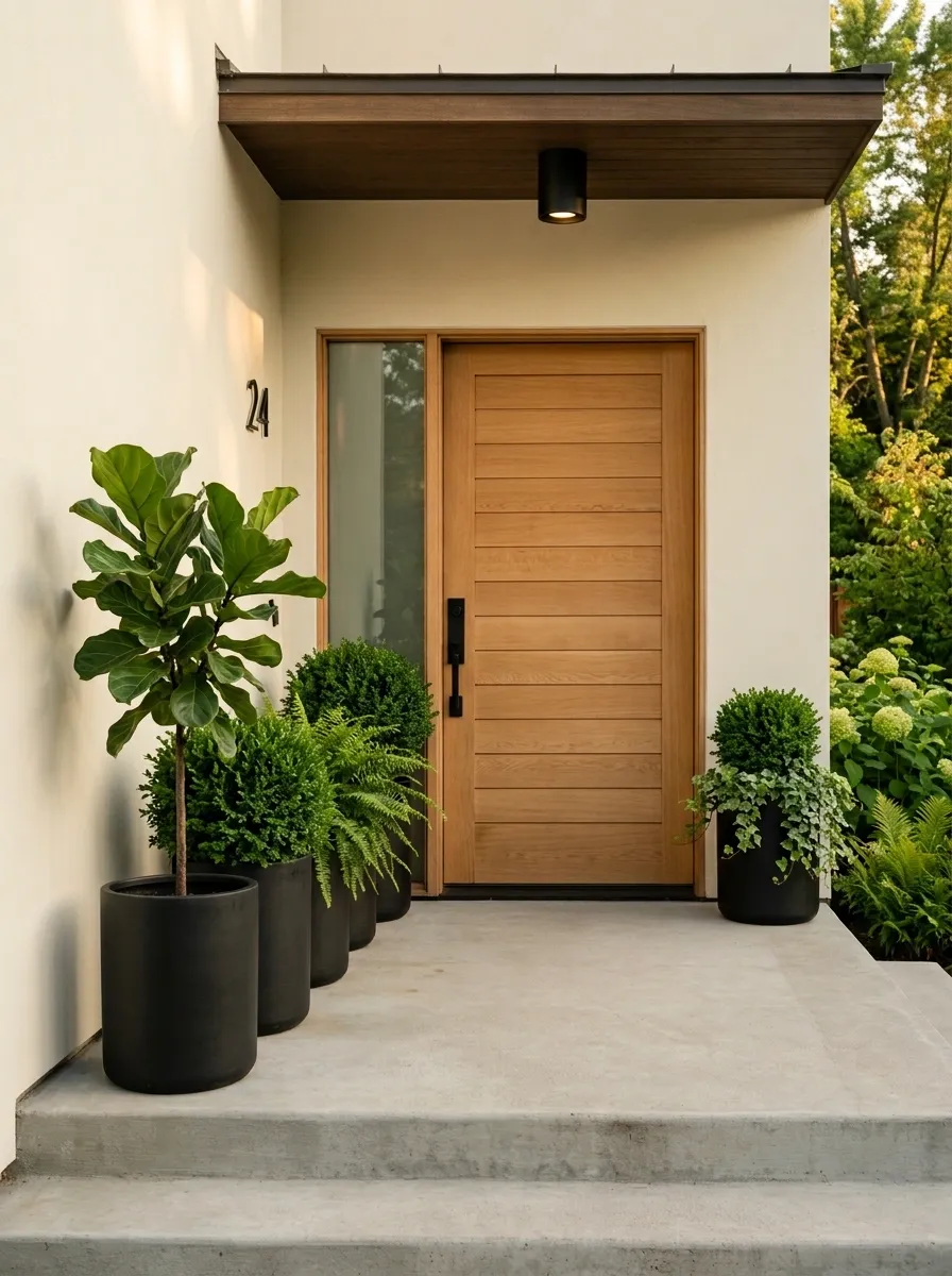
Repetition can make a very small porch look more organized.
Use several identical matte-black cylindrical planters along one edge of a contemporary entrance. Keep the containers consistent, but vary the foliage inside them. One can hold a tall leafy plant, another a rounded shrub, and another a softer trailing variety.
That small difference in planting keeps the repeated containers from feeling sterile. The black finish creates a quiet visual rhythm against a pale wall or warm wood door.
This works best when the architecture is already simple. Don’t add patterned rugs, colorful accessories, and several decorative objects just because the planters are plain. The repetition is the design.
The porch gets structure from consistency, then personality from the plants.
Blue-and-White Coastal Porch Planters
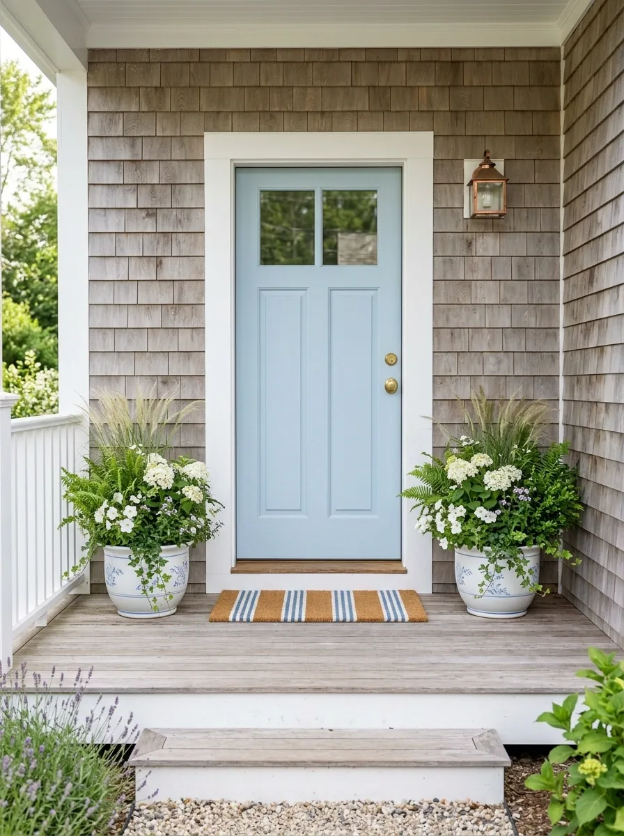
A coastal porch doesn’t need an anchor-shaped sign to prove the point.
Use white ceramic containers with understated blue detailing around a pale blue front door. Fill them with soft grasses, white flowers, and leafy greenery, then let weathered wood and a simple striped mat provide the remaining texture.
The palette does most of the work. Blue, white, green, and natural wood already create a clear coastal direction, so extra nautical accessories would only make it feel themed.
Keep the containers low to medium in height if the porch is especially narrow. That preserves the view of the door and keeps the planting from visually swallowing the entrance.
The finished look feels fresh because the palette is specific without being loud.
Fall Planters With Muted Pumpkin Tones
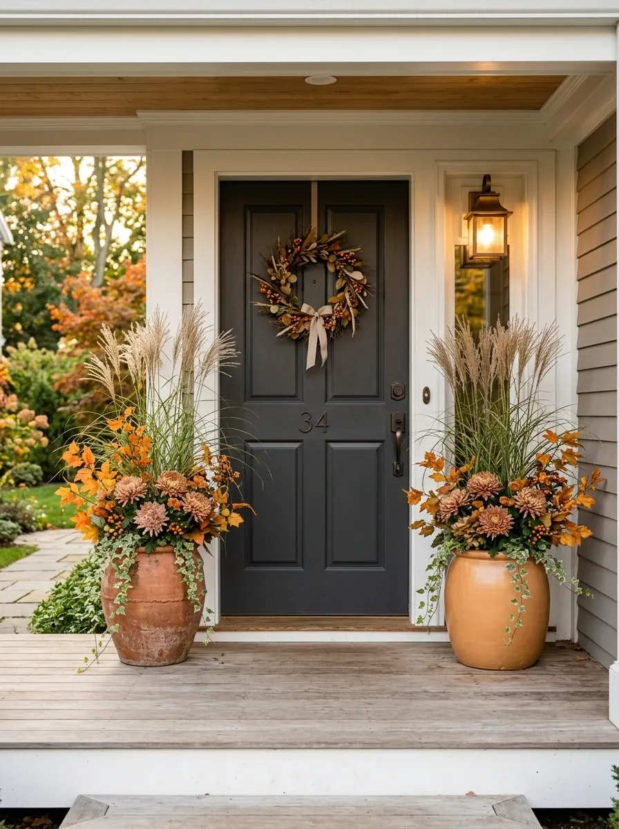
Autumn color can make a small porch feel warm without covering every surface in seasonal decor.
Use terracotta and muted pumpkin-colored containers beside a warm wood or charcoal door. Fill them with ornamental grasses, dusty mums, orange-toned foliage, and a little trailing greenery.
The seasonal colors should stay concentrated in the planting and containers. Leave the steps and door area mostly open so the entrance still feels usable.
This design is stronger than a typical fall display because the planters are doing the seasonal work. You don’t need a separate sign, crate, basket, pumpkin tower, and pile of faux leaves competing for attention.
The colors feel autumnal because they belong together, not because there are more of them.
Built-In Looking Planter Arrangement for a Tiny Entry
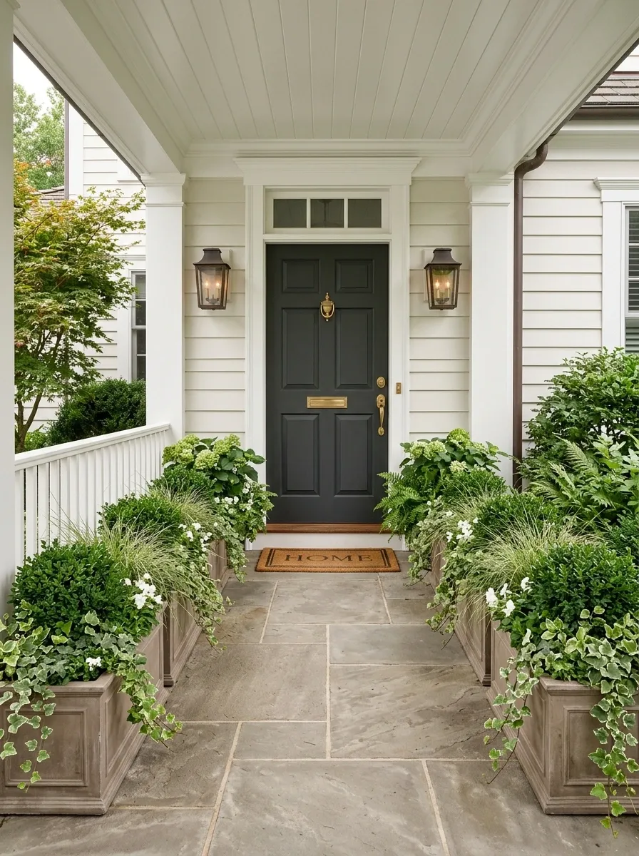
The smartest small porch planter can stop looking like a planter at all.
Use several matching low rectangular containers along the outer edge of the porch, close enough together that they read as one continuous planting border. Fill them with compact evergreens, grasses, and trailing greenery in a controlled mix.
The effect is closer to a built-in garden bed than a collection of pots. That gives the porch stronger architectural definition while preserving a clear path to the door.
Keep the arrangement low enough to avoid blocking the entrance and consistent enough that the individual containers visually disappear into the larger composition.
This is the most architectural solution in the collection, and it works because the planting follows the shape of the porch instead of fighting it.
The Finished Porch Matters More Than the Container
A planter is easy to shop for. A convincing porch composition is harder.
That’s why the strongest ideas above don’t depend on one magical pot or one trendy plant. They depend on relationships. Tall against low. Dark against pale. Rough against smooth. Repetition against variation. Full against empty.
That is also what makes a small entrance easier to design. Instead of asking what else you can squeeze beside the door, decide what the porch already needs. Height, symmetry, softness, color, privacy, or simply a stronger edge.
Start with the architecture, choose the visual weight, then add the planting. The container should look like it belongs there from the beginning.
Save the porch designs that feel closest to your own home before you start shopping. A clear visual direction will save you from buying a collection of random pots and trying to make them cooperate later.