
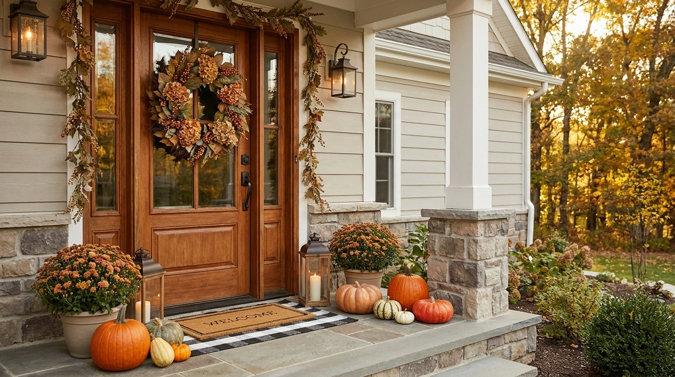
Some front doors look worse after they get decorated. The wreath is too small, the pumpkins are scattered around like leftovers, and suddenly every inch of the porch is fighting for attention.
That is especially important from the street. A front entrance is seen as a whole before anyone notices the little details. Scale matters. Color matters. Empty space matters. A dozen small decorations won’t fix an entrance that lacks a strong visual structure.
What Makes a Fall Front Door Look Finished Instead of Decorated
Let the Door and Ground-Level Decor Share the Job
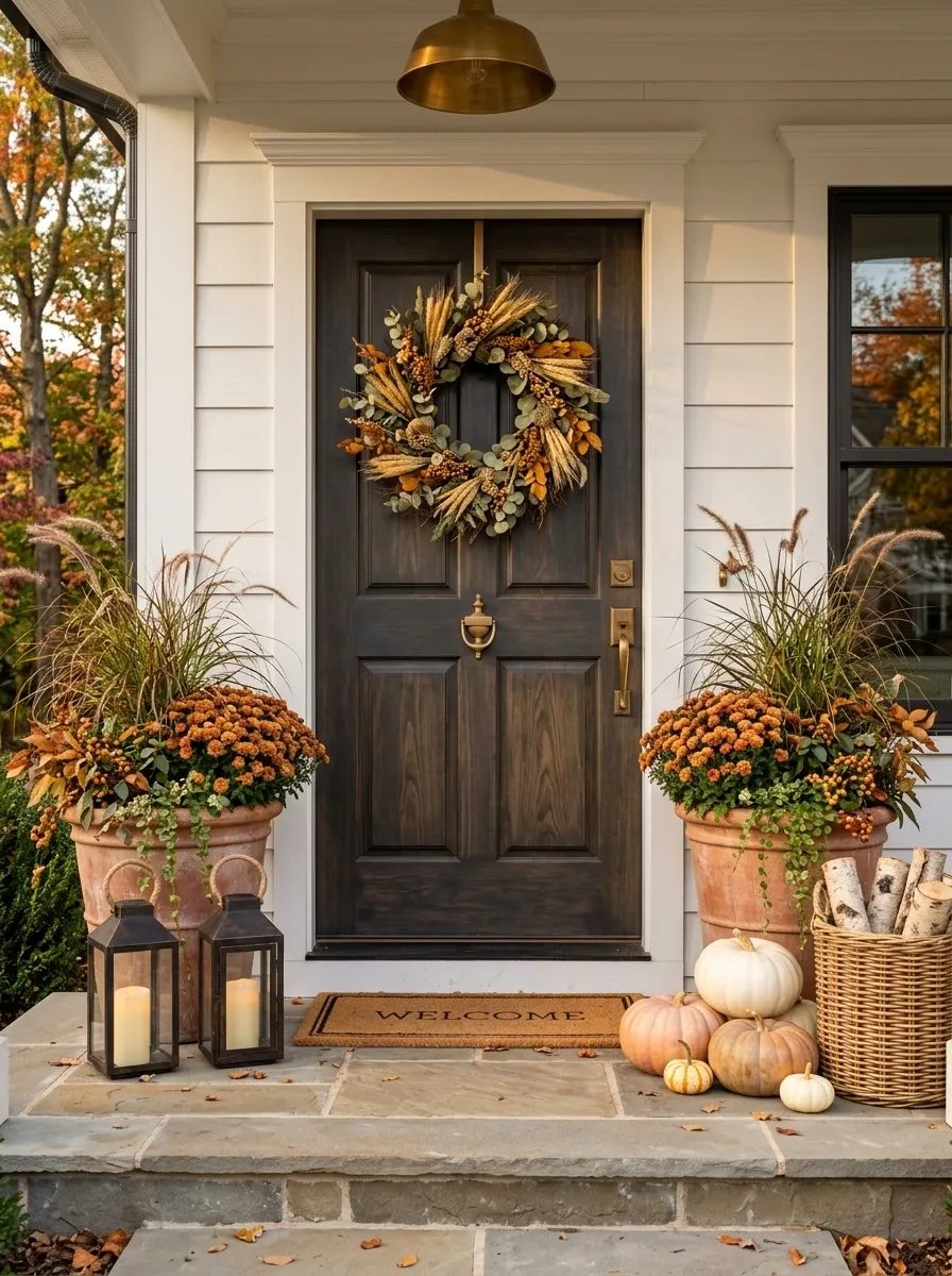
A wreath controls the upper half of the composition, while planters, pumpkins, baskets, and lanterns establish the visual weight near the ground. When those areas relate, the entrance feels balanced.
Use a Palette Before You Add More Pieces
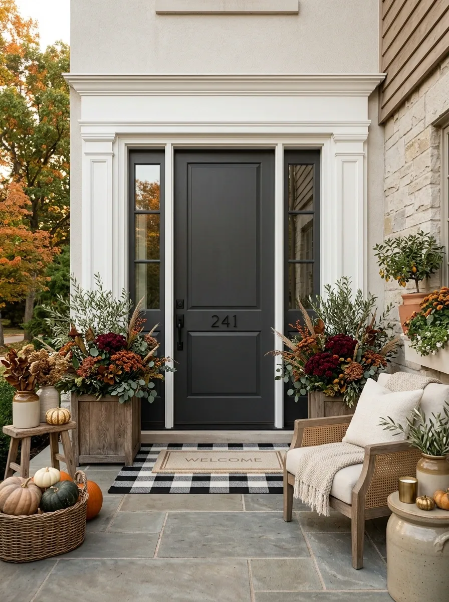
Orange is useful, but it doesn’t need to run the entire show. Olive, burgundy, cream, brown, black, and weathered wood can all make fall feel obvious without turning the doorway into an orange display.
Scale Beats Quantity
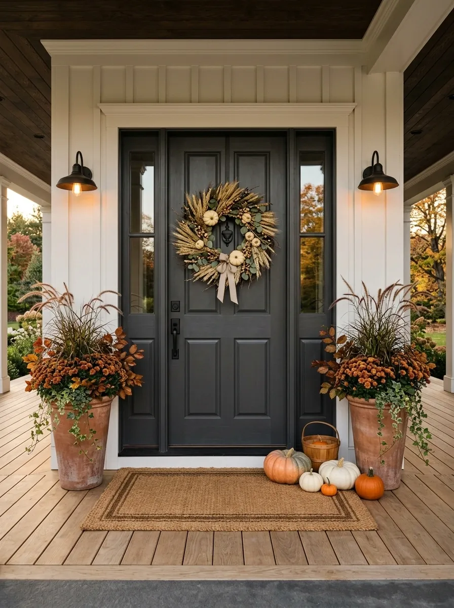
A few substantial pieces usually read better than a dozen small ones. One large wreath and two strong planters can have more impact than a collection of tiny decorations scattered across the porch.
Complete Fall Front Door Designs
Cozy Moody Fall Entryway
This moody entry takes a darker door and wraps it in natural textures that feel entirely intentional. A rich leaf wreath hangs centrally, while woven baskets packed with textured pampas grass flank the steps to create serious height.
Down below, a scattering of ivory pumpkins breaks up the deep tones without adding unnecessary visual clutter. Lanterns with glowing candles illuminate the stone steps, giving the entire composition a warm, welcoming evening ambiance.
The secret here is restraint. Sticking to a neutral palette of whites, creams, and natural wood keeps the dramatic dark backdrop from feeling heavy or unapproachable.
Burnt Orange, Olive, and Cedar Farmhouse Entry
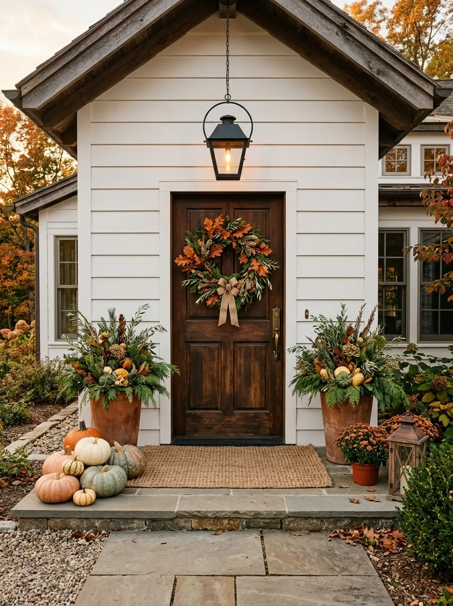
This is the kind of farmhouse fall entrance that feels warm without looking like a seasonal aisle exploded across the porch. The door sits behind a full wreath of burnt orange leaves, olive foliage, and cedar accents, while tall planters repeat the greenery at ground level.
Use pumpkins in a mix of muted orange, cream, and dusty green rather than lining them up in identical rows. A wide woven mat gives the bottom of the composition some weight, and simple lanterns bring in a warm evening glow.
The trick is letting the cedar and olive tones interrupt all that orange. Without them, the scene gets loud very quickly. The natural wood and woven textures keep it grounded.
Warm Autumn Porch Styling
Classic autumn charm gets a streamlined update here with a simple stacked porch design. A vibrant fall leaf wreath matches the warm tones of the decorative sign and side floral arrangements, creating a cohesive color story from top to bottom.
White pumpkins nestled near the door and a friendly welcome mat soften the look. The single lantern provides a classic focal point, casting a soft glow across the stoop as daylight starts to fade.
It proves that you do not need an overwhelming amount of decor to make an entrance feel complete. A few well-chosen pieces do all the heavy lifting.
Black Door With Ivory Pumpkins and Burgundy Foliage
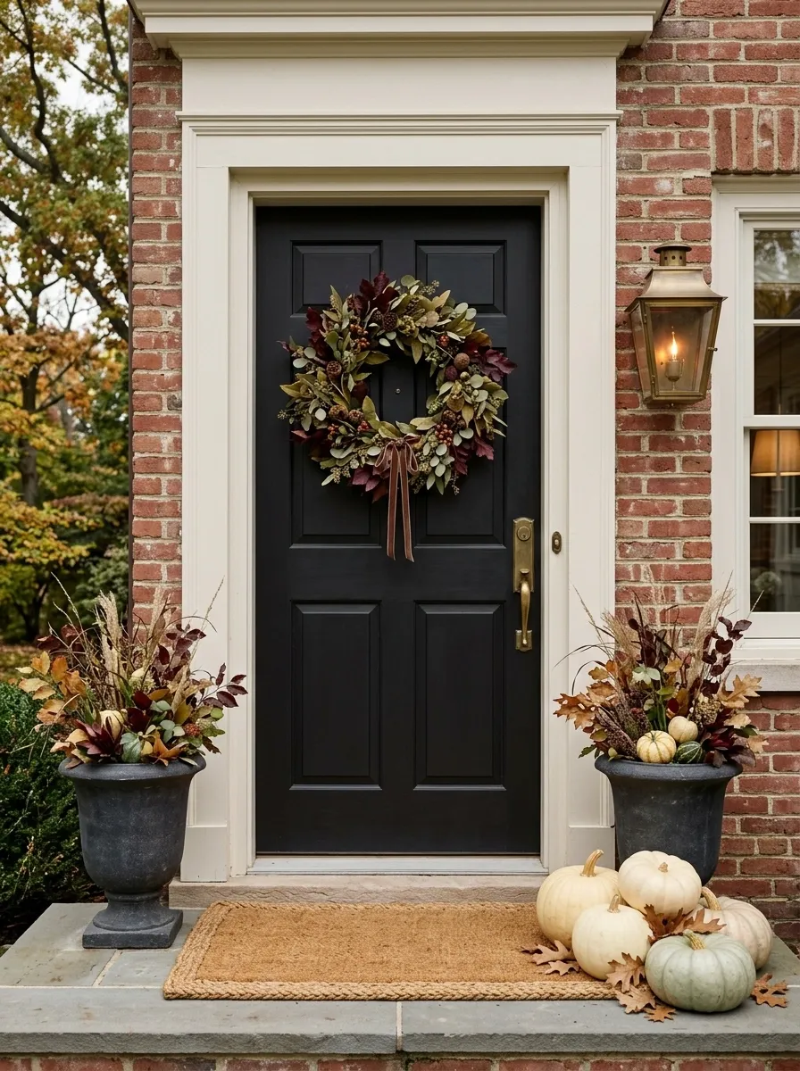
The black door does most of the heavy lifting here, which is exactly why the seasonal styling can stay controlled. A full wreath brings in burgundy foliage and muted greenery, while ivory pumpkins create a cleaner base along the doorway.
Dark planters help the composition feel anchored instead of top-heavy. Add a substantial natural-fiber mat and warm lantern lighting, then stop.
That last part matters. The contrast is already strong. Throwing bright orange pumpkins, plaid signs, and extra garlands into the same scene would flatten the whole idea.
Traditional Fall Door Decor
Symmetry and classic autumn hues take center stage in this welcoming front step arrangement. Matching black urns filled with fiery orange branches frame the dark doorway, echoing the rich colors of the wreath above.
Heirloom pumpkins and gourds are grouped neatly around the base of the planters, grounding the vignette. A textured coir mat and glowing lanterns finish the scene with layers of warmth and texture.
This approach works wonderfully for traditional homes because it relies on balanced proportions. Everything feels anchored, polished, and effortlessly ready for the season.
Symmetrical Fall Entry With Tall Copper Planters
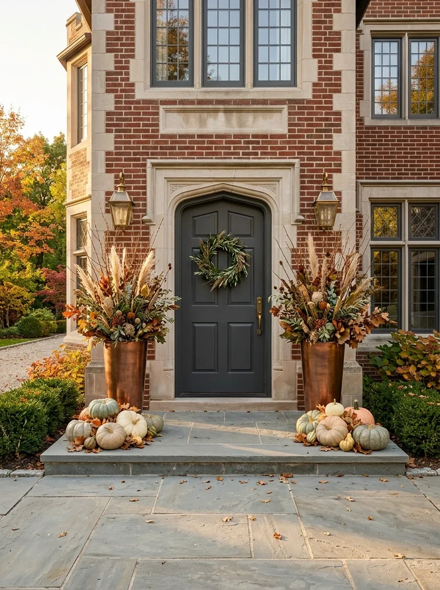
This version is more polished and architectural. Matching tall copper or bronze planters stand on either side of the doorway, filled with autumn branches, dried grasses, and muted foliage that rise above the pumpkin clusters below.
Keep the door itself relatively quiet. A restrained wreath or even a simple greenery arrangement is enough because the symmetry is doing the visual work.
The result feels composed from a distance. That’s the advantage of repetition. Your eye reads the matching containers first, then moves toward the door, then down into the smaller seasonal details. Nothing has to be excessive.
For a formal house, this direction makes far more sense than piling pumpkins onto every available step.
Rustic Wheat and Grasses
Swapping out traditional leaves for textural elements makes this fall entry stand out in the best way possible. A dramatic pampas wreath anchors the dark door, complemented by tall dried corn stalks and cascading grasses in rustic planters.
Deep burgundy mums and scattered pumpkins add rich autumnal color to the base of the stairs, while weathered lanterns bring in that essential flickering glow.
It has a collected, organic feel that looks like it stepped right out of a countryside magazine. The secret is letting natural, dried elements bring movement and height to the space.
Soft Neutral Fall Door With Wheat and Cream Pumpkins
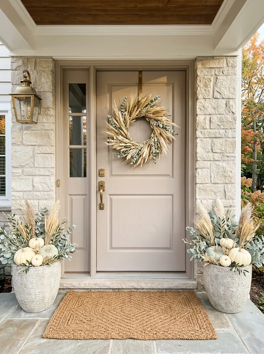
Fall doesn’t have to mean bright orange. This softer composition uses a cream, taupe, pale wood, or muted painted door as the backdrop for dried wheat, pale grasses, cream pumpkins, and a simple woven mat.
The wreath should feel airy rather than dense. Let the wheat and grasses create movement, then repeat those pale natural tones in the planters and containers below. A little muted green keeps the whole thing from becoming one continuous beige block.
This direction works especially well when the house already has light siding, stone, or pale wood. The seasonal styling becomes part of the architecture instead of looking pasted onto it.
And yes, beige can work. Beige with texture, shape, and contrast works. Beige with nothing else happening just looks unfinished.
Lit Maple Leaf Canopy
If you want your entryway to feel like an enchanted autumn forest, this is the blueprint. A dense canopy of illuminated faux maple leaves frames the entire porch, casting a warm, magical glow over the dark front door.
A matching lit wreath centers the door, while glowing lanterns and white pumpkins punctuate the floorboards below. The overhead lighting is truly the star of the show here.
It is bold, atmospheric, and entirely immersive. When the sun goes down, this porch completely transforms into the coziest spot on the block.
Layered Rustic Porch With Vintage Crates and Heirloom Pumpkins
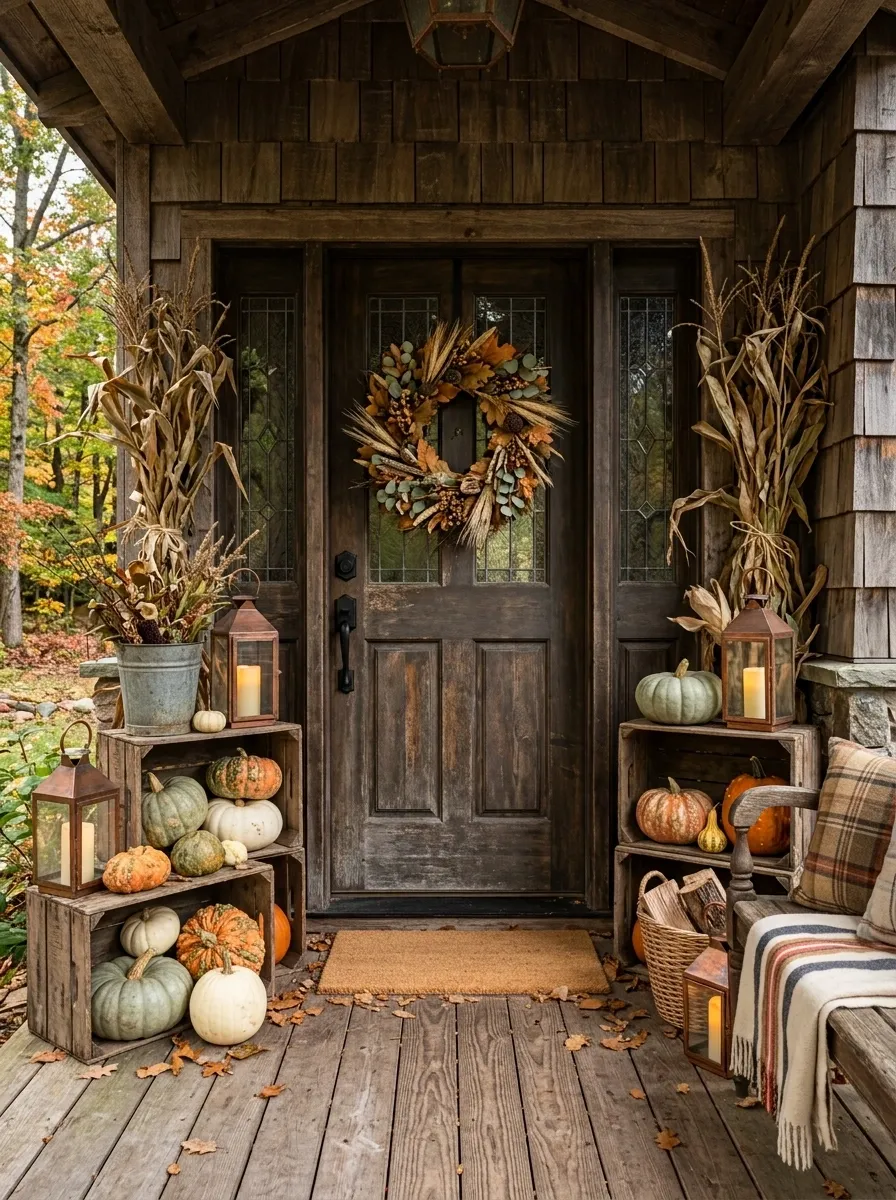
This one should look collected rather than coordinated. Start with a weathered door or simple painted entry, then build the porch around old wooden crates, heirloom pumpkins, dried corn stalks, aged lanterns, and a loose foliage wreath.
Use different pumpkin shapes and colors instead of buying a matching set. A squat green pumpkin beside a tall cream one creates more interest than six identical orange pumpkins lined up like traffic cones.
The old wood is what keeps the whole composition from feeling too polished. Let some pieces look slightly worn. That’s part of the design, not a flaw.
Modern Charcoal Door With Sculptural Dried Grasses
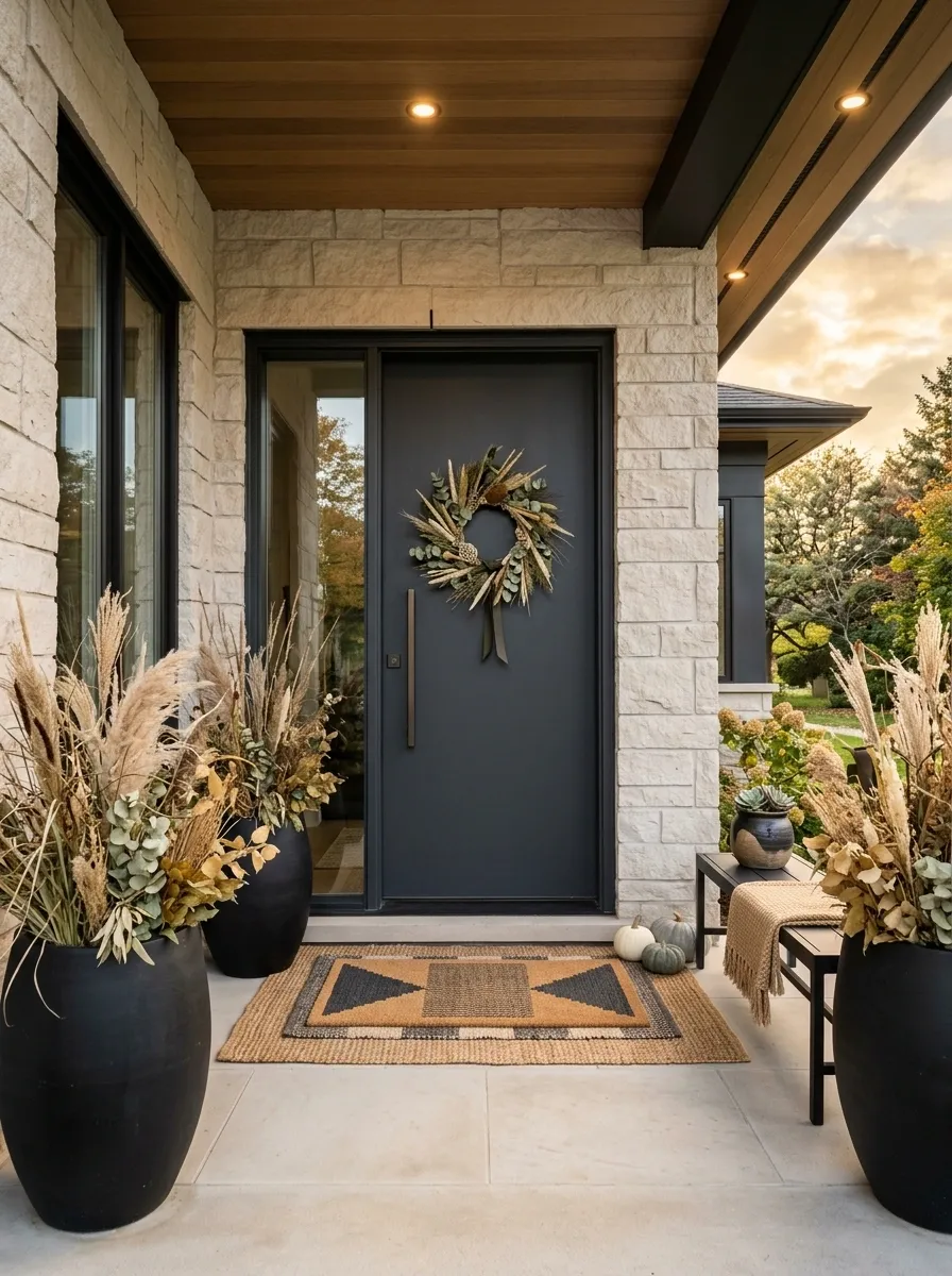
This version takes fall in a much cleaner direction. A charcoal or deep gray door becomes the backdrop for a simple wreath, tall dried grasses, matte planters, and a geometric natural-fiber mat.
Instead of filling the entry with pumpkins, use one or two oversized forms near the base. The taller grasses create vertical movement while the dark door gives the whole composition some edge.
Keep the surrounding architecture quiet. Pale stone, warm wood, or soft gray siding works particularly well because it gives the darker entry room to breathe.
The seasonal feeling comes from texture, shape, and earthy color rather than obvious fall symbols. It feels current without trying too hard.
Burgundy Door With Copper, Rust, and Deep Green
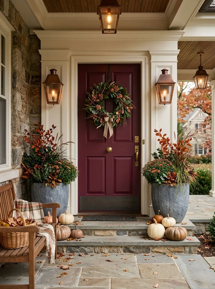
A burgundy door gives the entire entrance a richer starting point. Build around it with a wreath filled with rust-colored leaves and deep green foliage, then repeat those tones in substantial planters below.
Copper or aged-bronze lanterns add warmth without making the scene too shiny. Use pumpkins sparingly, preferably in muted orange, cream, or brown so they support the deeper palette.
This is a good direction for traditional homes where a stronger color feels natural. The important part is keeping the undertones warm. Cool gray accessories would work against the whole composition.
The door is already the dramatic element. Let it have that job.
Tiny Porch Fall Entry That Uses Vertical Layers
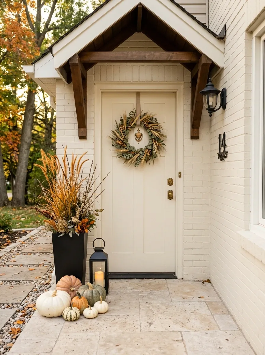
Small porches need a different strategy. Trying to fit a large wreath, several floor baskets, pumpkins, signs, and oversized planters into a narrow entrance usually makes the walkway feel even smaller.
This composition uses height instead. A narrow wreath sits above a tall planter filled with upright branches or grasses. A slim lantern and compact pumpkin grouping finish the lower section without spreading across the full width.
The eye travels upward, so the entrance feels layered without becoming crowded.
That is the whole point here. You don’t need less personality. You need a better use of space.
Classic White Door With Black Lanterns and Orange Pumpkins
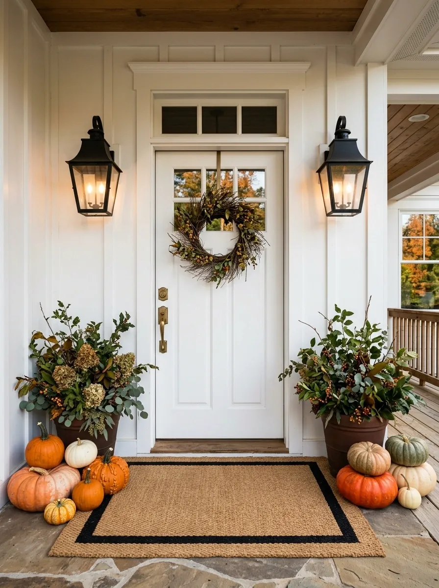
Sometimes the familiar combination is familiar for a reason. A crisp white door creates a clean background for black lanterns, warm orange pumpkins, dark foliage, and a wide woven mat.
The important move is grouping. Place the pumpkins in loose clusters rather than distributing single pumpkins evenly across the entire porch. Repeat the black finish in the lanterns, door hardware, planter rims, or mat border so it feels intentional.
This is a classic farmhouse direction, but the composition doesn’t need farmhouse signs or decorative wording to prove the point. The contrast already does the work.
Keep the foliage slightly loose. Perfectly clipped arrangements can make the entry feel more like a display window than a home.
Moody Autumn Entry With Evergreen, Plum, and Weathered Wood
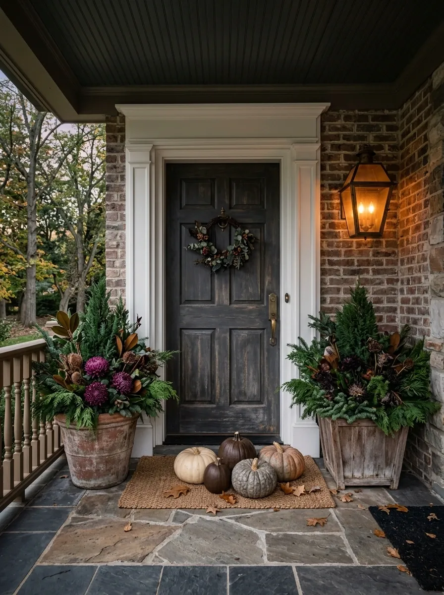
For a later-season look, move away from bright orange and let darker colors take over. A charcoal or weathered wood door anchors the composition while evergreen foliage, plum accents, aged wood containers, and warm lantern light create a quieter autumn palette.
Use just a handful of pumpkins, preferably in brown, cream, or faded orange. Their job is to suggest the season, not dominate it.
The combination feels especially good in shaded entrances, where deep greens and warm lighting can add dimension without making the doorway gloomy.
This is autumn with the volume turned down. The result is still seasonal, but it doesn’t scream October from halfway down the street.
Country Cottage Door With Wildflower Fall Wreath
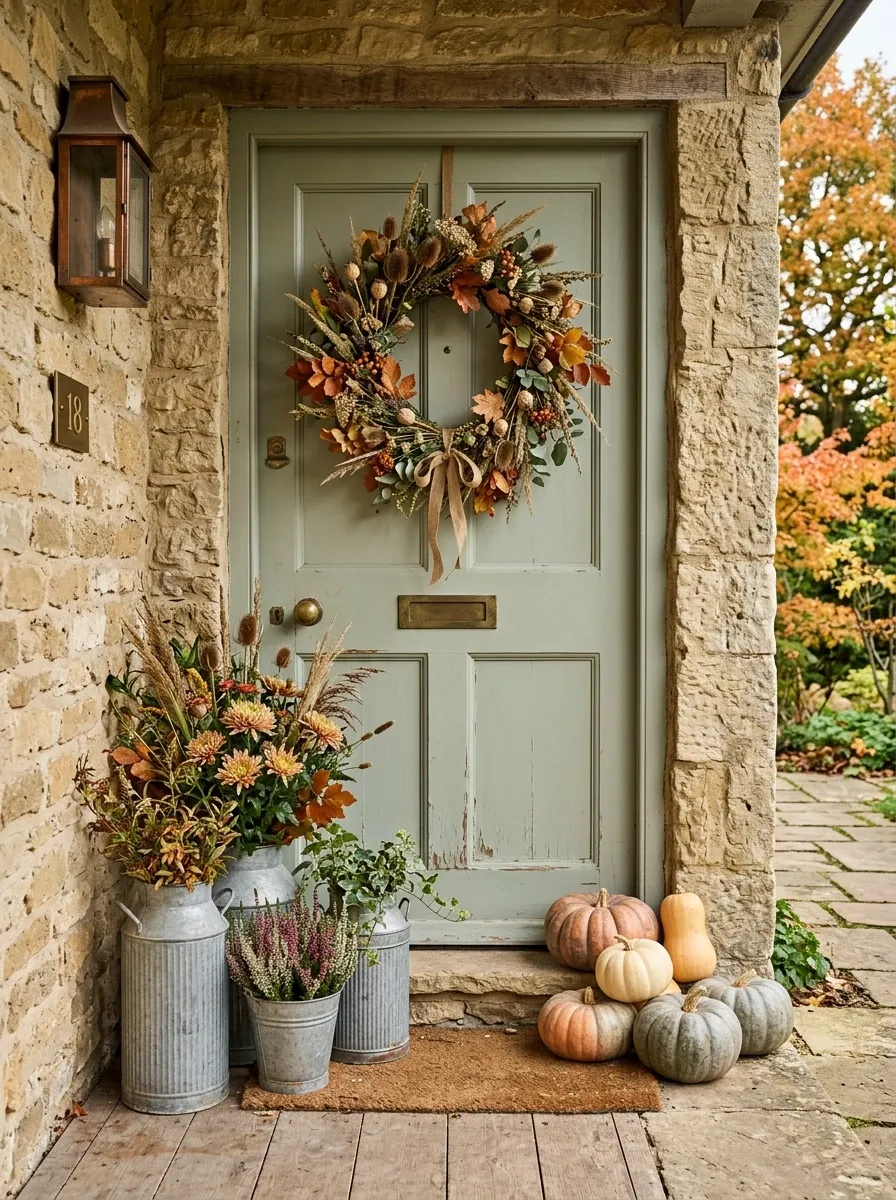
This entry feels relaxed rather than arranged with a ruler. A painted cottage-style door sits behind a loose wreath filled with dried wildflowers, seed heads, faded leaves, and a little greenery. Below it, galvanized containers hold seasonal plants while a few muted pumpkins gather near the threshold.
The colors stay soft: dusty orange, faded green, cream, and weathered gray. That keeps the arrangement connected to the casual architecture instead of making it look overly polished.
Skip matching containers here. A little variation in height and finish makes the composition feel collected. Just keep the color family consistent so the freedom doesn’t turn into visual noise.
Elegant Fall Door With Muted Rust and Dusty Rose
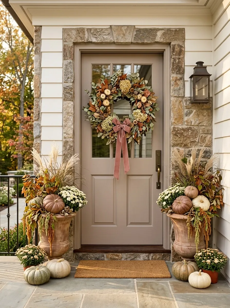
For a softer take on autumn, work with faded rust, dusty rose, taupe, cream, and muted green. A fuller wreath brings those colors together while coordinated planters repeat the tones below the door.
The door itself should stay quiet. A warm white, taupe, light wood, or soft gray background gives the wreath room to read as the focal point.
The key is avoiding too many pastel details. This isn’t spring wearing a pumpkin hat. Keep the forms substantial and the colors earthy so it still reads clearly as fall.
A small amount of dusty rose is enough to make the palette feel less predictable.
Colonial-Inspired Entry With Balanced Topiary and Pumpkins
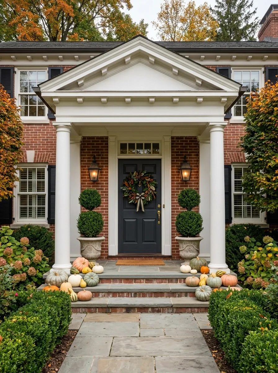
This composition follows the architecture instead of trying to turn a formal entrance into a rustic pumpkin patch. Matching topiary forms frame the door, while a classic wreath, traditional lanterns, and neatly grouped pumpkins add the autumn layer.
The symmetry should be obvious from the street. Keep the left and right sides balanced in height and visual weight, even if the individual pumpkin groupings aren’t identical.
This works especially well on houses with columns, centered doors, brick facades, or other traditional details. The seasonal decor becomes part of the existing architectural language.
The lesson here is simple: formal architecture usually wants formal repetition.
Matching topiary or tall containers.
Classic wreath and quiet door.
Grouped pumpkins and warm lanterns.
Natural Wood Door With Fern, Moss, and Muted Pumpkin Tones
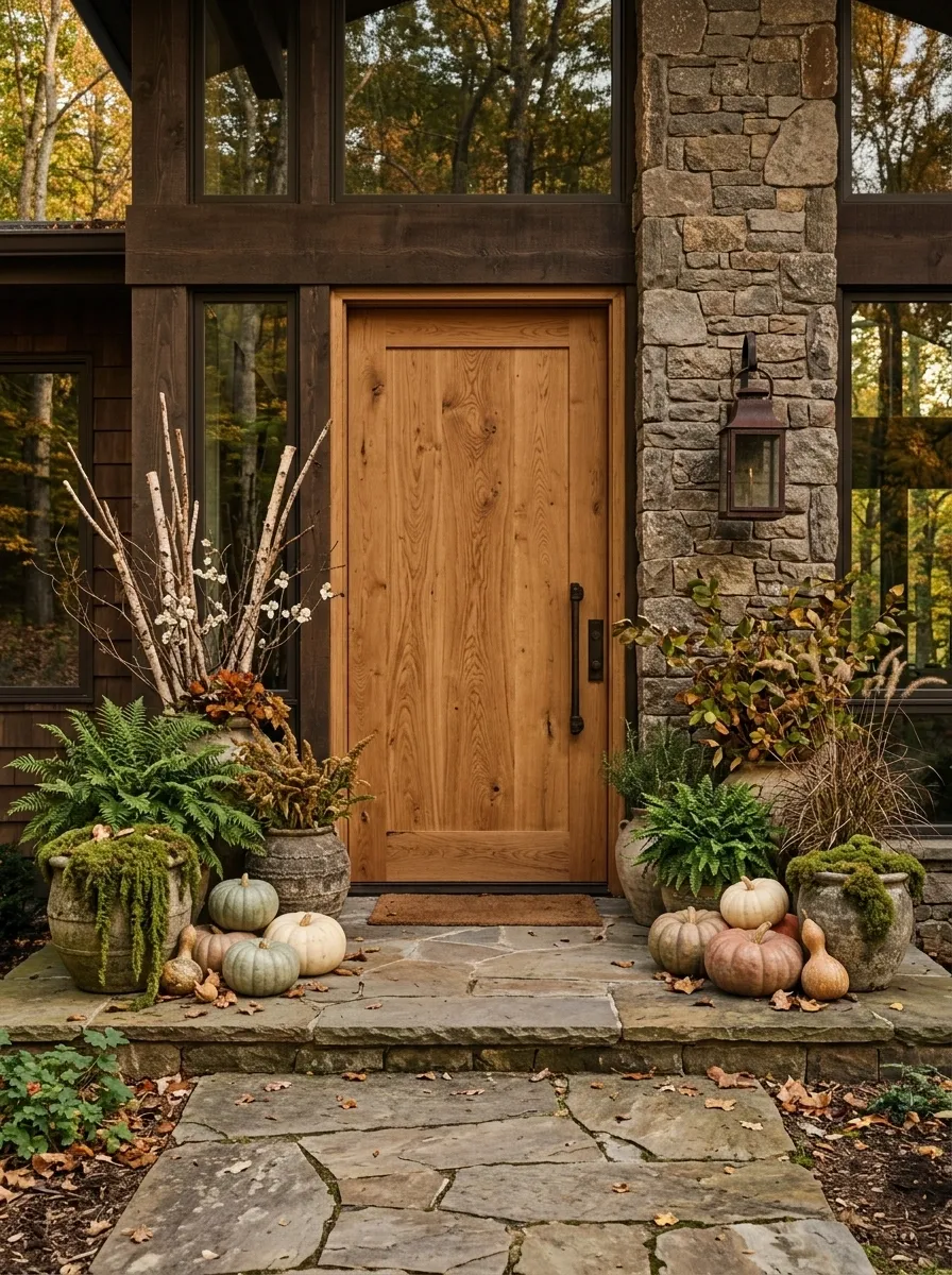
A natural wood door gives this autumn entry a warmer, more organic starting point. Build around it with mossy greens, fern-like foliage, dried branches, muted pumpkins, and stone or ceramic containers.
The palette is intentionally earthy. Think olive, moss, faded orange, brown, and warm stone rather than saturated seasonal colors.
Let the wood remain visible. Covering a beautiful natural door with excessive garland would be a waste. The grain is already part of the composition, and it gives all those softer organic colors a believable background.
This direction suits homes surrounded by trees, gardens, stone paths, or other natural landscape elements especially well.
Orange Door With Cream and Green Layering
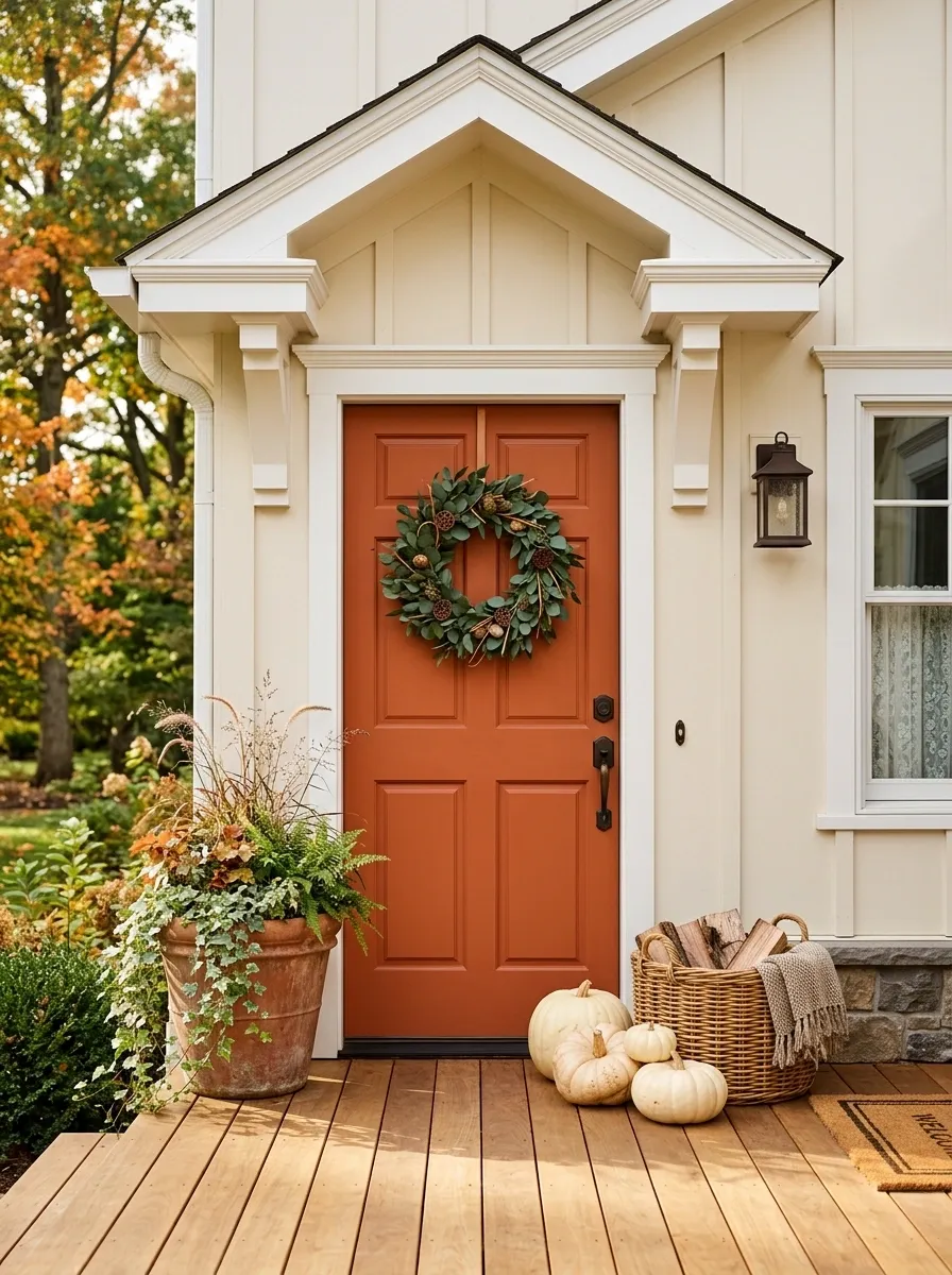
An orange or terracotta door can be fantastic for fall, but only when the rest of the entry knows when to stop. Use cream pumpkins, soft green foliage, natural baskets, and warm wood to calm the saturated door.
A simple wreath with mostly greenery and a few warm accents keeps the upper portion from becoming one giant orange circle. Below, group cream pumpkins in different shapes and sizes around a planter rather than spreading them across every available step.
This composition is cheerful without becoming cartoonish. The trick is simple: let the door own the orange.
Vintage-Inspired Entry With Old Metal Buckets and Mums
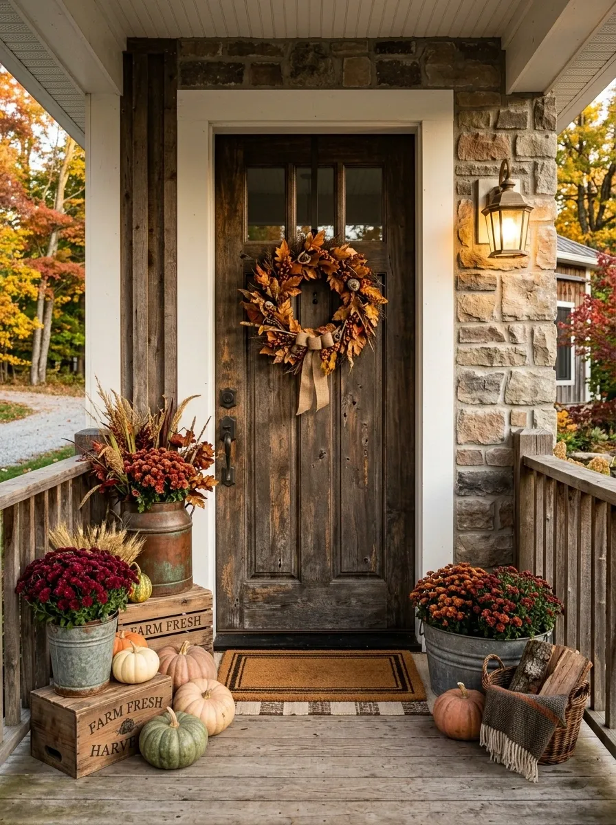
This entry leans into the nostalgic side of fall. A vintage-style door or weathered backdrop is paired with aged metal buckets overflowing with burgundy or rust-colored mums, old wooden crates, simple pumpkins, and a slightly worn wreath.
The containers should have some visual age. New galvanized buckets that all look identical won’t create the same effect. Mix a few finishes and shapes while keeping the colors related.
Add a warm lantern or old-fashioned light fixture, then resist the urge to add seasonal signs everywhere. The vintage character comes from the materials and forms. It doesn’t need a slogan.
Black-and-White Fall Entry With One Rust Accent
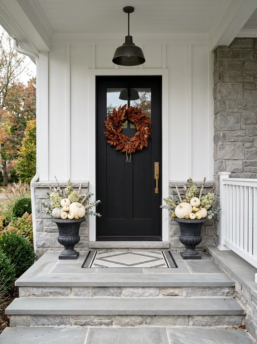
This one is almost entirely neutral. A black door, white or cream pumpkins, pale foliage, dark containers, and a simple black-and-white mat create the base. Then one rust-colored element, perhaps the wreath or a small grouping near the steps, provides the seasonal spark.
The narrow palette makes the entry feel more architectural and less decorative. It also gives you a useful way to use traditional fall color without drowning the entire doorway in it.
The rust accent should be noticeable but limited. Once you add several more warm colors, you’ve lost the point.
Layered Stair Entry With Pumpkin Clusters and Oversized Lanterns
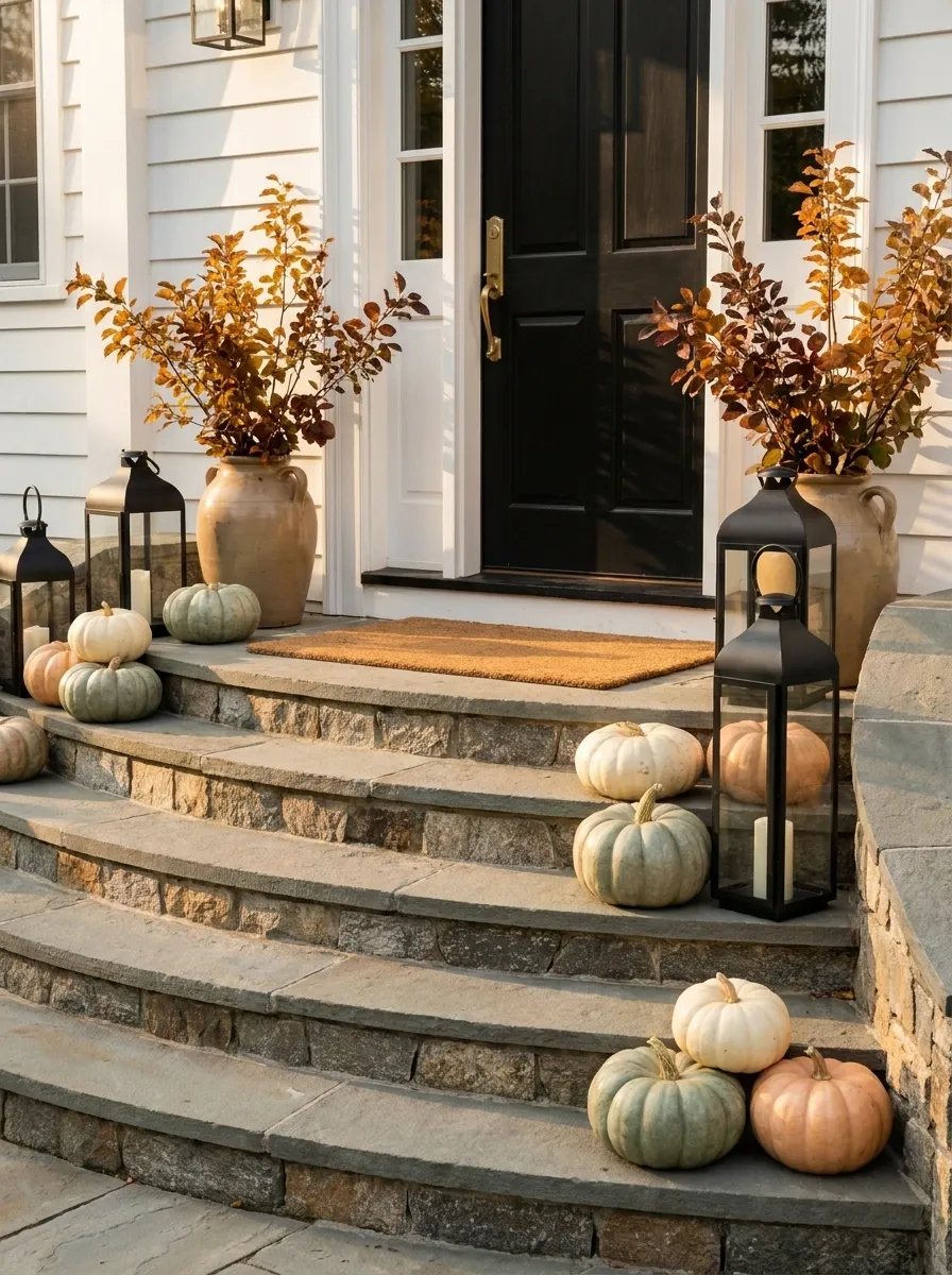
Homes with visible front steps give you another design opportunity: use the staircase itself as part of the composition. Instead of placing one pumpkin on every step, build a few deliberate clusters that follow the line of the stairs.
Oversized lanterns add vertical weight beside those groups, while tall foliage softens the edges. The doorway above can remain relatively simple because the staircase is already acting as a long visual lead-in.
Use repetition, but not identical repetition. Three related clusters with different shapes and heights look more natural than fifteen matching pumpkins evenly spaced across every stair.
The stair line should guide the eye toward the door, not disappear beneath decoration.
Deep Green Door With Brass Lanterns and Warm Harvest Tones
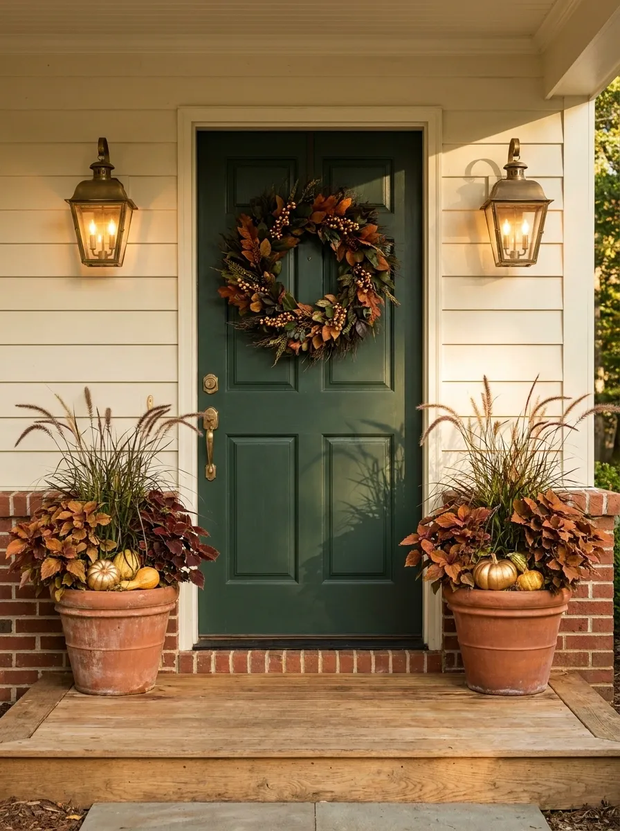
A deep green door gives this entry a quieter alternative to black without losing contrast. Pair it with aged brass or bronze lanterns, warm brown planters, coppery foliage, and a few golden pumpkins.
The wreath can lean heavily on greenery with just enough rust and gold to make the season obvious. Below, use containers with substantial shapes rather than a collection of little pots.
The aged metal matters here. Bright polished brass would make the composition feel dressier than necessary. A softer finish lets the green door and warm foliage stay in charge.
This direction works particularly well against brick, cream siding, warm stone, or natural wood.
Scandinavian-Inspired Fall Entry With Pale Wood and Dried Grass
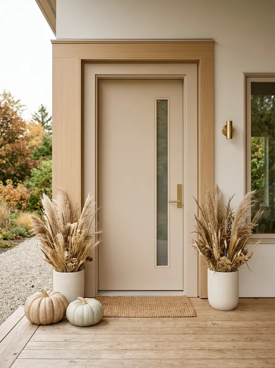
This entry takes a much lighter approach. Pale wood, soft beige, dried grasses, simple ceramic planters, and a few muted pumpkins create an autumn composition without piling on traditional seasonal decorations.
The door and surrounding architecture should stay visually quiet. The interest comes from texture and proportion, especially the contrast between smooth painted surfaces, pale wood, rough dried grass, and simple ceramics.
Keep the pumpkin count low. One or two larger pieces will read better than a dozen little ones.
There is nothing wrong with a fall entrance that doesn’t look aggressively autumnal. Sometimes the restraint is what makes it memorable.
Grand Front Door With Oversized Garland and Layered Containers
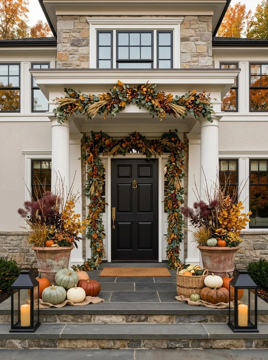
Large entrances need larger seasonal elements. A small wreath and three tiny pumpkins can disappear completely on a wide facade, especially when the doorway has tall columns, broad steps, or a substantial porch.
Here, the seasonal treatment matches the architecture. A generous garland frames the entrance, while oversized containers hold tall branches and foliage. Large pumpkins sit in layered groups near the base, and substantial lanterns reinforce the scale.
The key is proportion. Don’t copy a tiny cottage arrangement and simply spread it across a larger house. The pieces themselves need enough visual weight to belong there.
This is where going bigger actually makes the design feel calmer.
Cozy Cottage Entry With Plaid, Wood, and Soft Orange
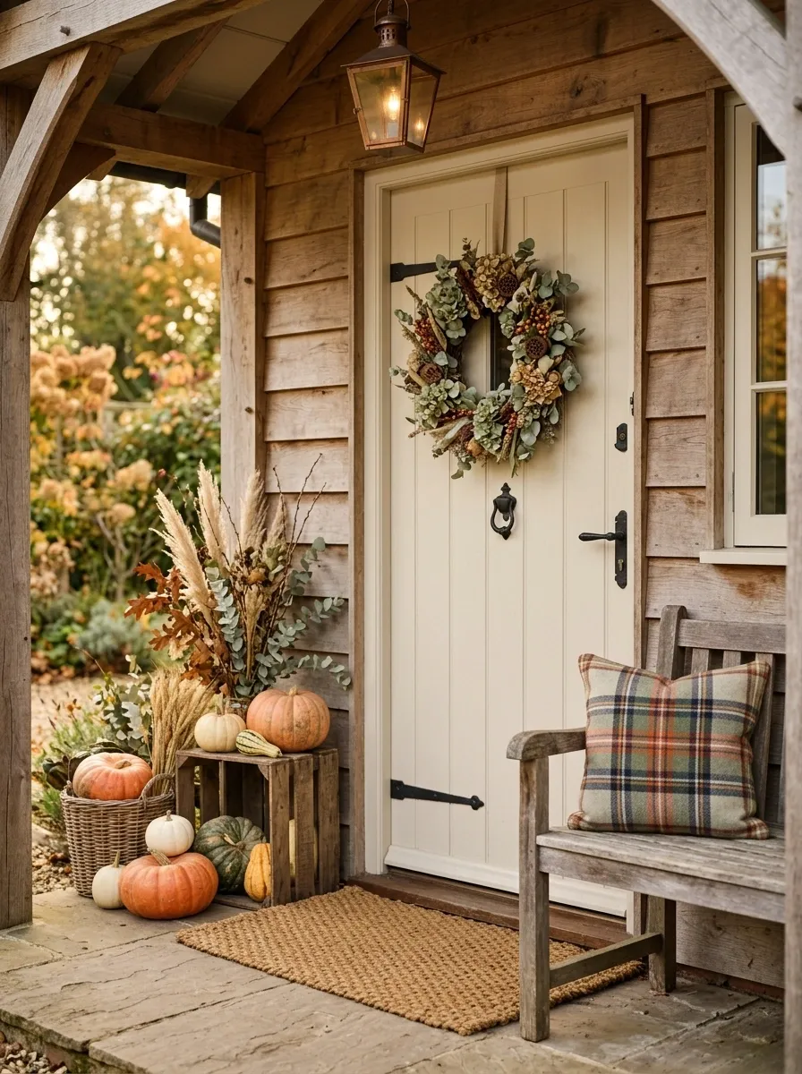
This is the warmer, more relaxed cottage version. A soft wreath sits above a layered entry of wood containers, faded orange pumpkins, dried foliage, and one restrained plaid accent.
The plaid should appear once or twice, perhaps on a cushion, ribbon, or small textile detail. Covering the entire entry in plaid quickly turns charm into theme park decor.
Natural wood keeps the orange from looking too bright, while the foliage adds enough green to break up the warmer tones. A textured doormat finishes the lower edge without stealing attention.
The best part of this direction is that it feels personal. It doesn’t look like every seasonal purchase came from the same shelf.
Restrained Late-Fall Entry With Bare Branches and Fewer Pumpkins
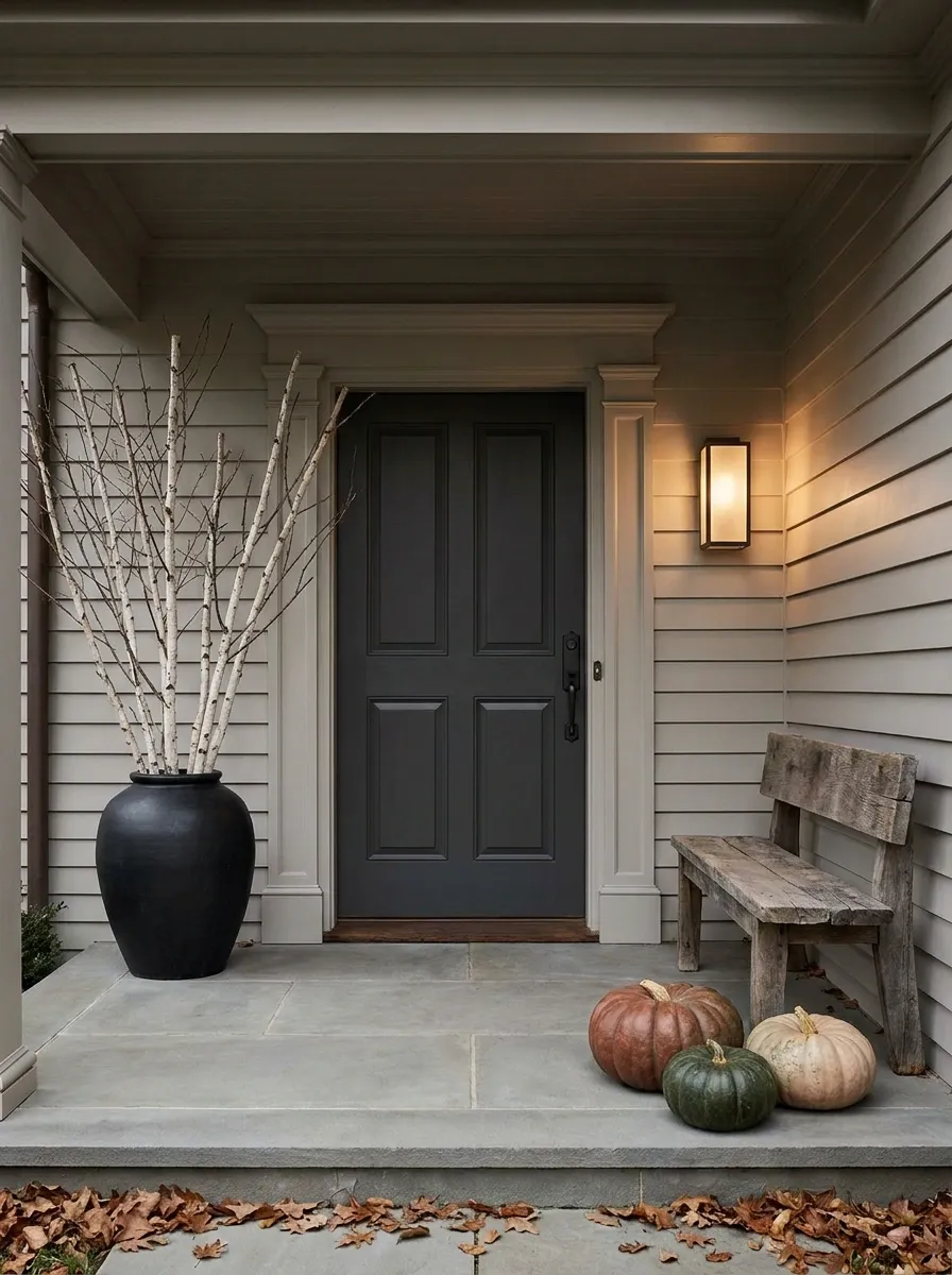
The final concept steps away from peak harvest season and into that quieter period when the leaves are fading and the porch doesn’t need to look like October forever.
A sculptural wreath or arrangement of bare branches provides the main shape. Dark planters, weathered wood, warm lighting, and only a few larger pumpkins create the seasonal layer.
The palette can be charcoal, brown, faded cream, muted rust, and deep green. There is more empty space than in the earlier designs, and that’s deliberate.
A restrained entry can look sophisticated, but only when the large elements have enough presence. Sparse isn’t automatically stylish. The forms still need to feel chosen.
A Better Way to Plan Your Own Fall Entry
Before buying anything else, step back from the door and look at the entrance as a single picture.
Ask yourself what is already doing the visual work. Is it the color of the door? The architecture? A staircase? A pair of planters? The surrounding landscape? That answer should determine where the seasonal styling goes.
Then choose one dominant direction. Warm farmhouse. Dark and moody. Soft neutral. Formal and symmetrical. Natural and woodland. Modern and restrained. Once the direction is clear, shopping becomes much easier because you’re no longer grabbing individual decorations and hoping they’ll somehow become a design.
A front door doesn’t need more stuff. It needs a composition.
That is also why scale is worth thinking about before color. A tiny wreath on a large door will still look tiny no matter how pretty the foliage is. A handful of small pumpkins won’t visually balance a broad staircase. Start with the big shapes, then fill in the smaller details.
And leave something quiet.
The empty space around the door is part of the design too.