
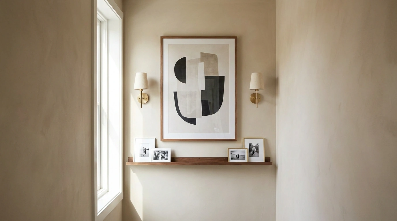
A narrow empty wall can make an otherwise finished room feel strangely incomplete. The problem is usually scale. A console that works beautifully on a wide wall can steal too much walking space here. A gallery wall can become cramped. Several small decorations can leave the wall looking busier without ever making it feel intentional.
The answer isn’t to fill every inch.
The strongest small narrow empty wall decor ideas treat the entire wall as one composition. The artwork, lighting, furniture, wall finish, color, and open space around everything need to work together. A narrow wall often looks better with one strong idea than with several unrelated decorating decisions.
The Small-Wall Design Map
There are four especially useful directions for a narrow wall: go vertical, build shallow layers, make the architecture do the work, or embrace visual quiet. The right choice depends on what surrounds the wall, how much floor space is available, and whether the wall needs decoration, storage, texture, or simply a stronger sense of completion.
Small Narrow Empty Wall Decor Ideas
Slat Panel Wall With Floating Oak Shelves
A partial vertical wood slat panel instantly anchors a narrow wall, creating an intentional backdrop for floating display shelves. The rich wood tone contrasts sharply with the plain white wall, adding depth without encroaching on floor space.
Staggered oak shelves hold a curated mix of textured ceramics, a framed botanical sketch, and dark sculptural accents. The varied heights keep the arrangement engaging and tailored to a tight corridor.
Keep the surrounding decor minimal to let the rich wood grain and clean shelving lines stand out. The careful balance of open space and decorative elements makes the narrow passage feel completely resolved.
Backlit Mirror and Black Display Shelves
A full-length vertical mirror paired with integrated backlighting turns a cramped wall into a functional and luminous display zone. Slim black shelves mounted right onto the dark paneling provide ample room for everyday essentials and decorative objects.
Warm LED lighting glows from behind the structure, casting a soft halo that visually expands the narrow entryway. The dark finishes give the composition an editorial, high-end feel while keeping a remarkably shallow footprint.
Let the illuminated panel act as the primary light source in the area to create a moody, welcoming ambiance. Restrain the clutter on the shelves so the sleek vertical lines remain uninterrupted.
Tall Arched Mirror With a Narrow Stone Shelf
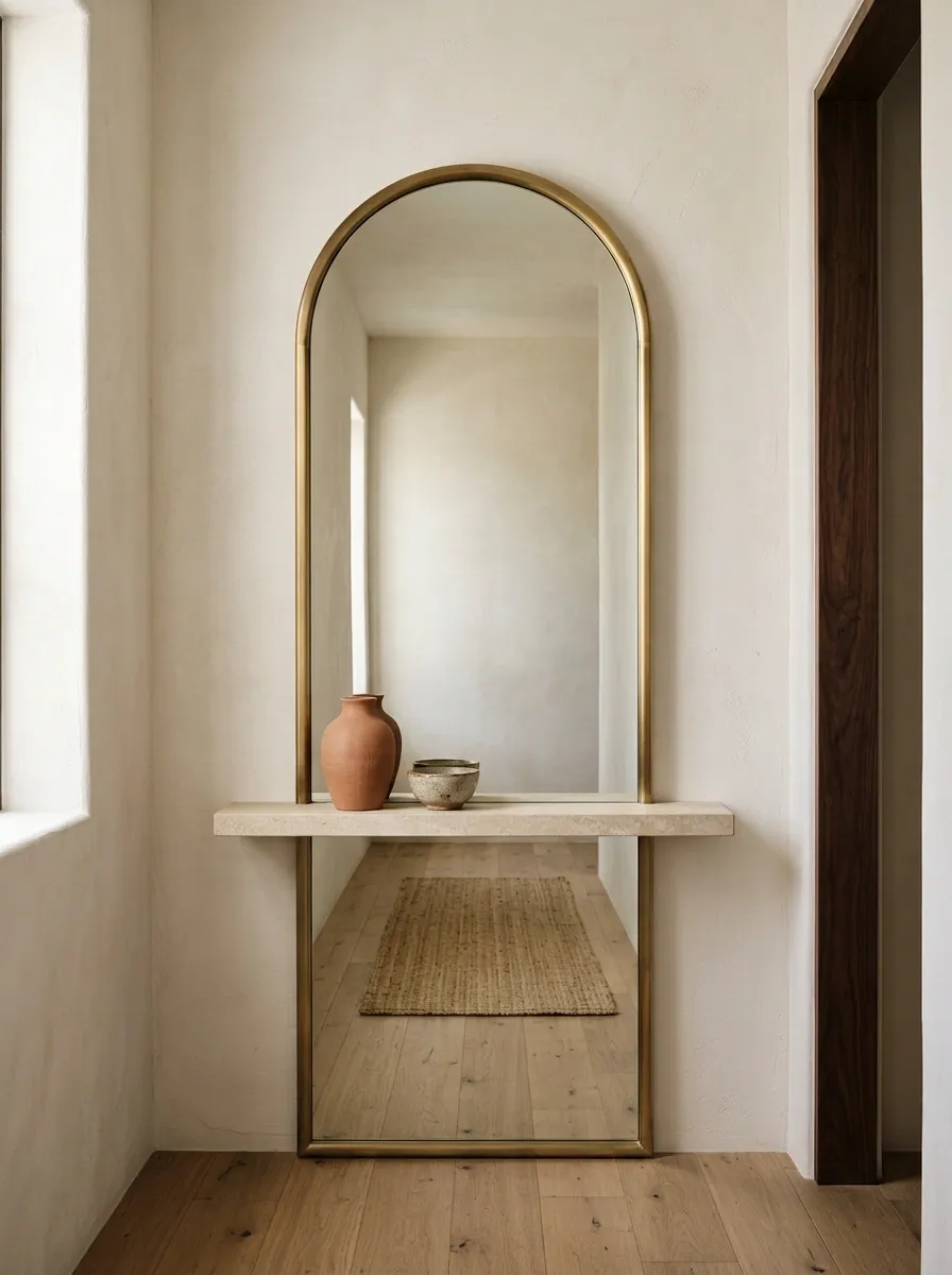
A tall arched mirror gives a narrow wall one unmistakable focal point without requiring much width. This version places the mirror almost from floor level to above eye height, with a slim limestone shelf tucked underneath and just two small objects on the ledge.
The warm white wall and pale stone create a quiet Mediterranean-modern backdrop. Dark wood elsewhere in the room provides enough contrast to keep the arrangement from becoming washed out.
The mirror should remain the dominant shape. A deeper console or several extra accessories would take away from the clean vertical effect.
Textured Backlit Panel With Slender Branches
A textured taupe wall panel backed by soft perimeter lighting transforms a forgotten corner into a striking design feature. A pale ribbed wood accent overlay adds subtle dimension, while a single floating shelf anchors the entire composition.
Tall, delicate branches in a white ceramic vase draw the eye upward, emphasizing the verticality of the tight space. The warm backlighting highlights the textured surfaces, creating a soothing play of shadow and light.
Opt for organic elements like branching stems to soften the geometric lines of the paneling. The restrained color palette ensures the wall feels serene rather than overly busy.
Gallery-Style Vertical Art Stack in Black Frames
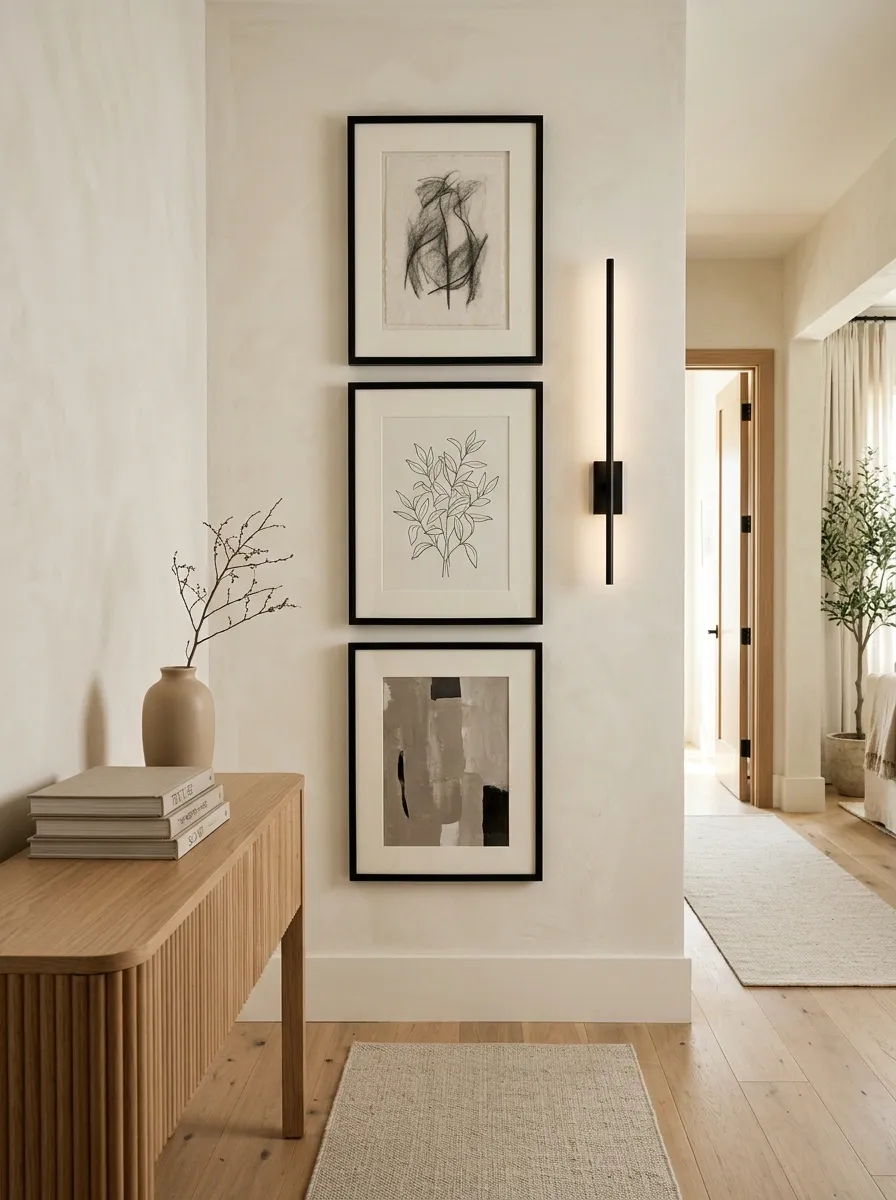
A narrow wall doesn’t need a wide gallery grid. Three vertically stacked pieces create a taller composition while keeping the overall footprint compact. Black frames unify the collection, but the artwork itself changes enough to keep the wall interesting.
A slim black wall light runs beside the stack instead of interrupting it. That small shift makes the wall feel more editorial and gives the eye a clear vertical path.
The surrounding furniture should stay understated. The gallery already provides the strongest graphic element in the room.
Charcoal Slat Wall and Textured Stone Ledges
Dark vertical slats paired with a rough-hewn white stone panel create a dramatic contrast on a narrow transition wall. Floating charcoal ledges bridge the two distinct textures, offering clever display space without adding bulk.
Tall white ceramic vessels filled with delicate dried stems stand out brilliantly against the moody charcoal backdrop. The rough stone texture lit from the side introduces a rich tactile quality that elevates the entire vignette.
Keep the accessories monochromatic to let the interplay of dark wood and textured stone take center stage. The balanced asymmetry of the floating shelves gives the tight space a modern, architectural finish.
Moody Green Wall With a Walnut Picture Ledge
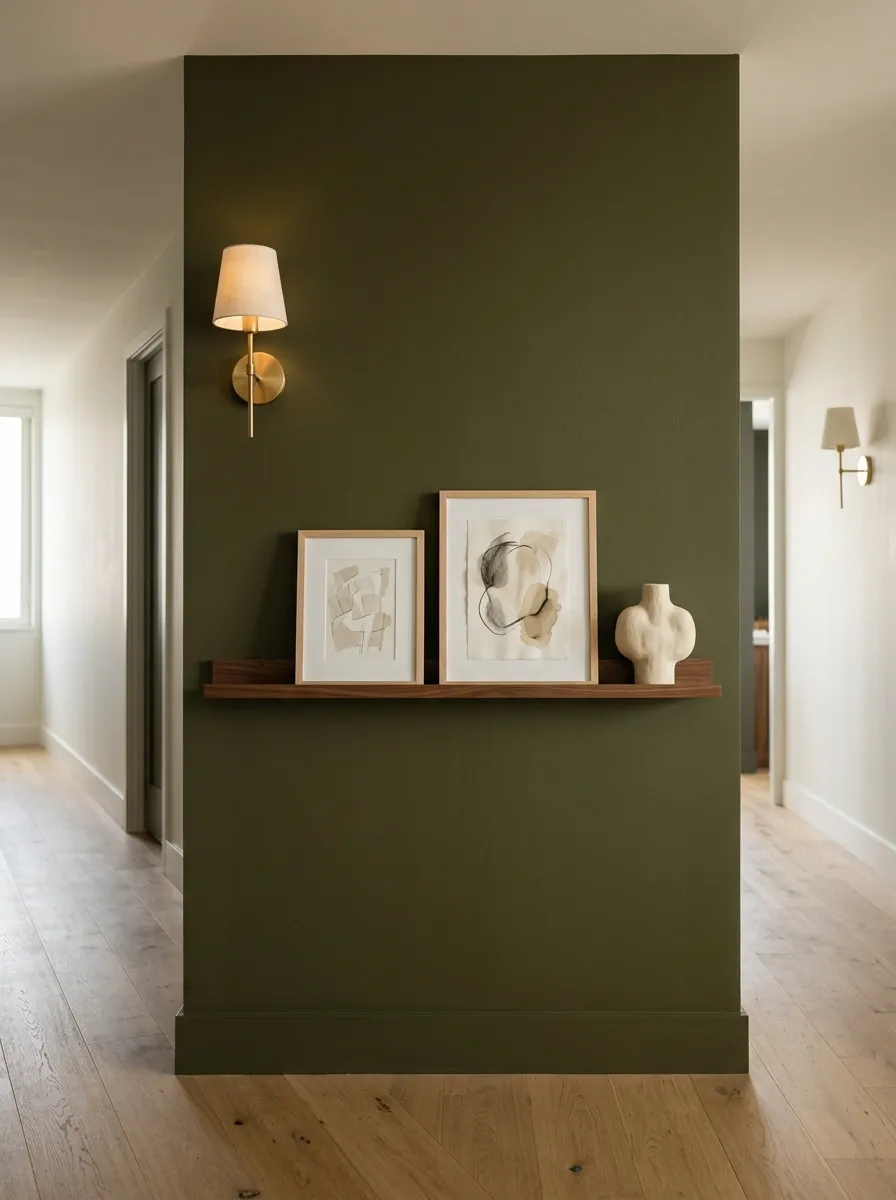
A deep olive wall provides enough visual character that the decoration can stay controlled. A walnut picture ledge holds two artworks, one smaller sketch, and a single sculptural object, all within a narrow horizontal band.
The empty olive space around the arrangement is just as important as the objects. It acts as a large background field and keeps the wall from feeling crowded.
Warm walnut works naturally with the olive. Pale artwork creates the contrast needed to keep the composition readable.
Narrow Entry Nook With Floating Drawer Storage
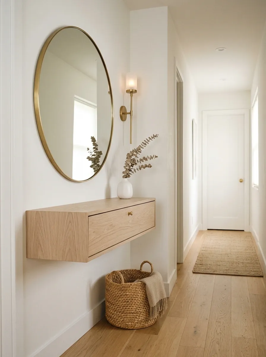
A narrow entry wall can combine decoration and function without becoming bulky. This composition uses a shallow floating drawer unit beneath a round mirror, with a slim wall light and one woven basket tucked close to the floor.
The floating furniture keeps more floor visible, which matters in a passage. The round mirror softens the straight lines of the storage and gives the upper half of the wall a clear focal point.
Pale oak and warm white finishes make the whole arrangement feel built in rather than assembled from unrelated pieces.
Oversized Vertical Botanical Print With Natural Wood Bench
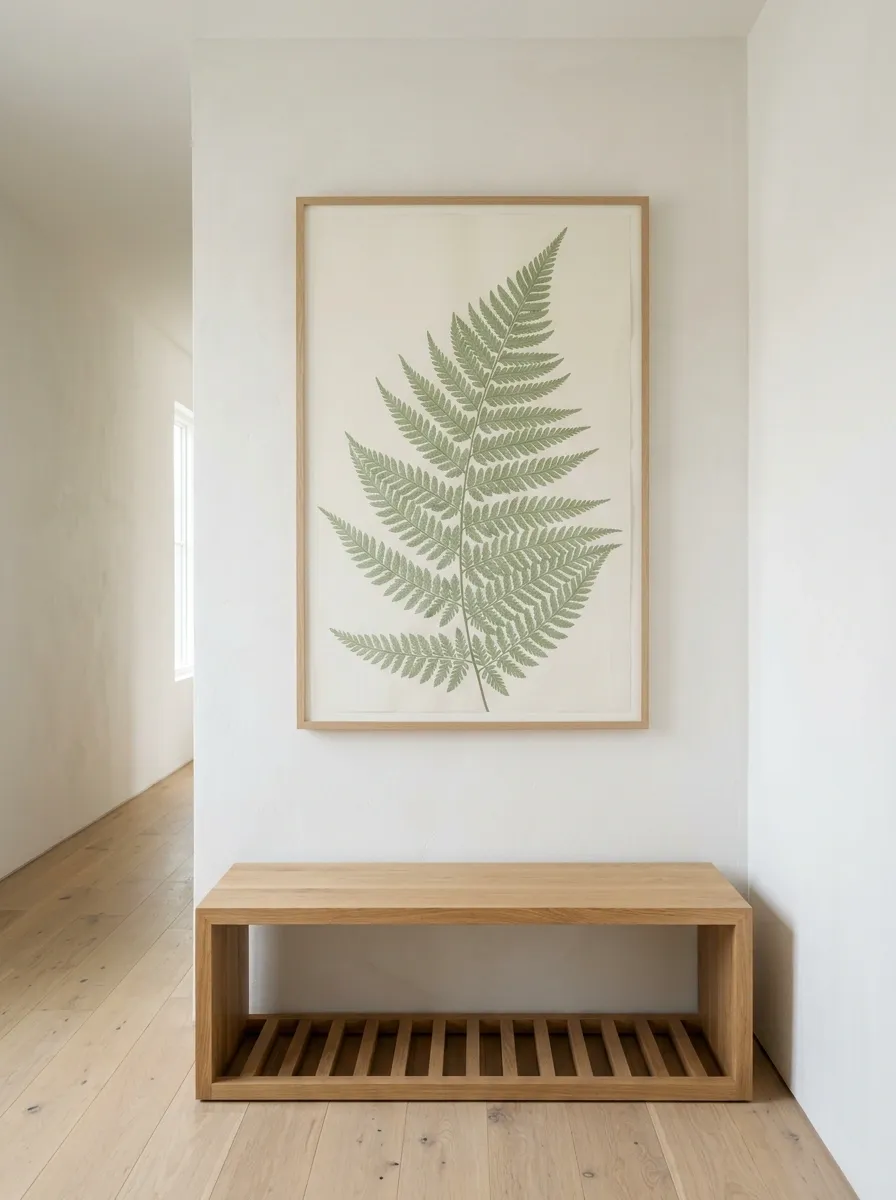
One tall botanical print can carry a narrow wall almost by itself. This arrangement places a vertical artwork above a simple natural wood bench, leaving plenty of wall around both pieces.
The artwork supplies height and color, while the bench gives the lower section enough weight to feel grounded. Because the bench has an open base, the floor remains visible beneath it.
Soft greens and warm wood create an organic palette without needing a gallery wall or several accessories. The open space around the composition is what keeps it elegant.
Built-In Niche With Soft Lighting and Ceramic Styling
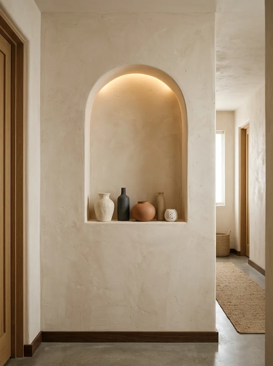
A narrow wall becomes much more memorable when the architecture itself becomes the decoration. This design uses a shallow recessed niche with a few integrated shelves, warm concealed lighting, and a sparse collection of ceramics.
The surrounding wall stays almost completely bare. That restraint gives the niche room to read as an architectural feature rather than another display shelf.
Pale plaster and stone create a calm backdrop, while the warmer interior lighting adds depth and keeps the ceramics from looking flat.
Black-and-Cream Checkerboard Art Column
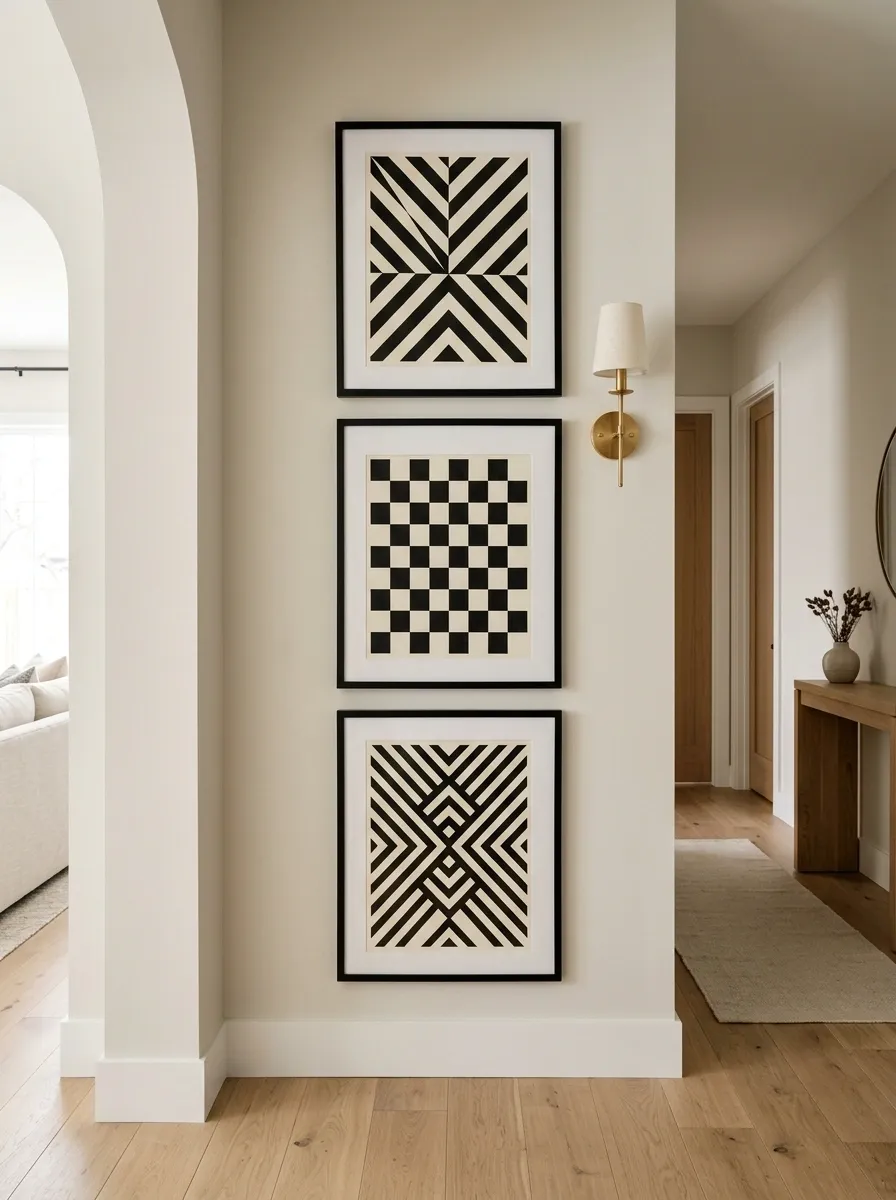
A narrow wall can handle a stronger graphic treatment when the arrangement is tall rather than wide. Three vertically stacked artworks use black frames and related geometric patterns to form one cohesive column.
A small wall light runs beside the frames, reinforcing the vertical direction. The room around it should stay quieter so the checkerboard effect remains the main visual statement.
The contrast works particularly well in a hallway because the graphic composition can be appreciated from a distance.
Slim Ribbed Cabinet With Oversized Round Artwork
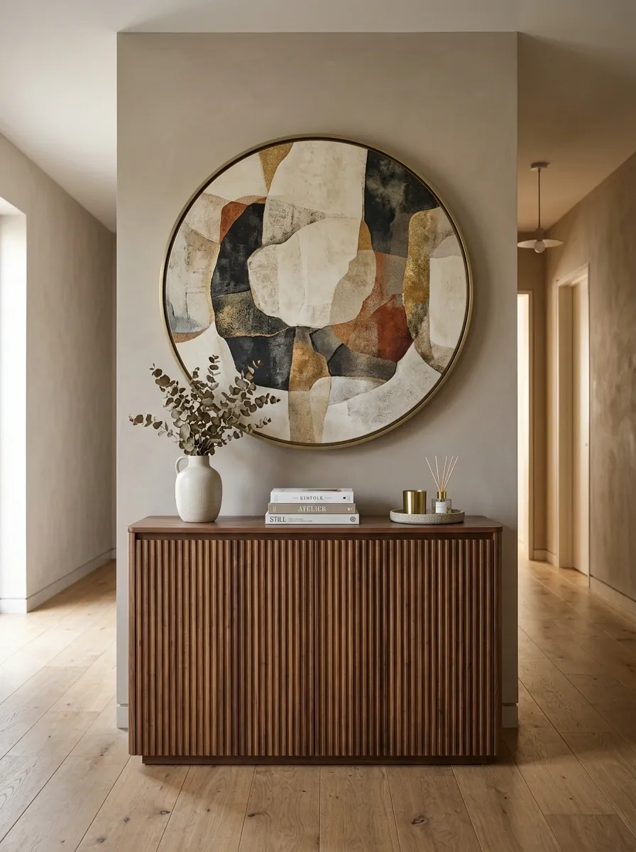
A narrow wall can handle furniture when the piece is shallow and visually disciplined. This arrangement puts a slim ribbed cabinet below a large round artwork, giving the wall both storage and a strong focal shape.
The cabinet creates direction through its vertical ribbing, while the circular art introduces softness. Walnut, taupe, and muted brass keep the composition warm.
The two major elements do different jobs, which is why they don’t compete. The lower section feels structured, while the upper section provides visual pause.
Floor-to-Ceiling Linen Curtain Wall
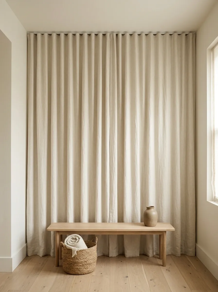
Some narrow walls are better softened than filled. This concept uses a full-height linen curtain beside a window or vertical opening, creating one continuous material from ceiling to floor.
The fabric adds texture and height while barely projecting into the room. A small bench or basket can sit below it, but the curtain remains the main visual element.
This is especially effective in rooms that already contain plenty of furniture. Instead of adding another object, the wall becomes a quiet vertical counterweight.
Soft Plaster Wall With One Dark Sculptural Sconce
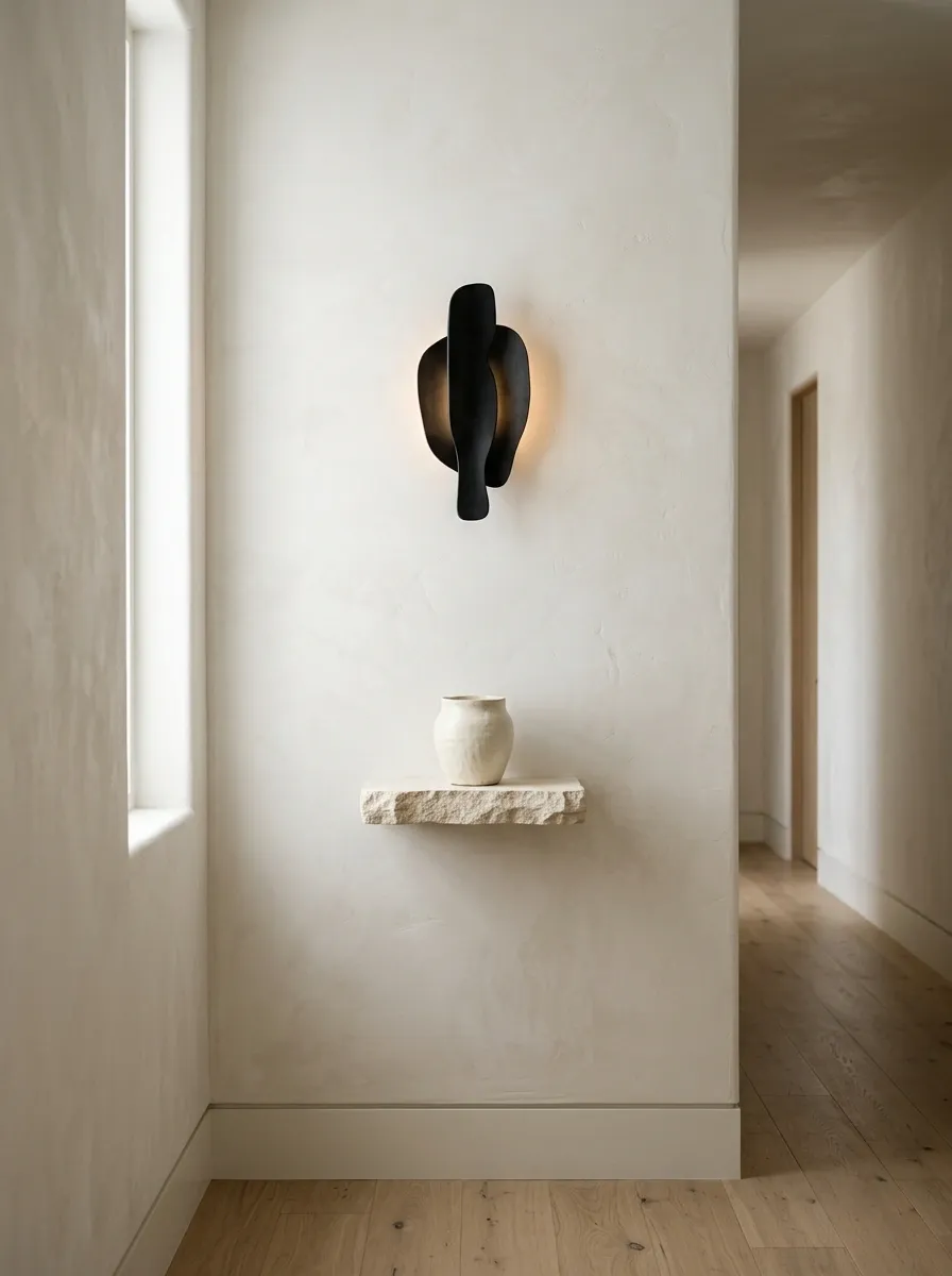
A narrow wall can become a focal point without any artwork at all. Soft plaster texture provides the background here, while one sculptural black sconce creates a strong silhouette. A tiny stone ledge sits below with one ceramic object, but most of the wall remains open.
The contrast between pale plaster and dark metal creates architectural weight without requiring width. The restrained approach works especially well when the room already has artwork elsewhere.
Vertical Wood Paneling With a Built-In Reading Seat
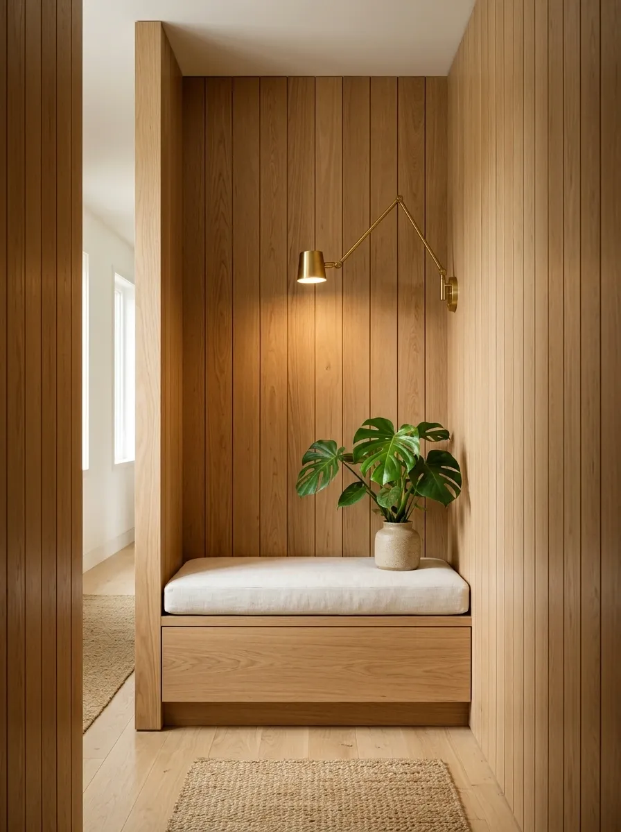
An awkward narrow wall can become a small reading corner when the architecture, seating, and lighting are designed together. Vertical oak paneling gives the wall height, while a built-in bench occupies the lower section.
A soft cushion, directional light, and one leafy plant add function and warmth without making the area feel crowded. The bench creates a clear purpose for the wall rather than simply filling it.
This works particularly well beside windows, stair landings, and unused corners where a full chair would take up too much room.
Petite Console With Layered Vintage Artwork
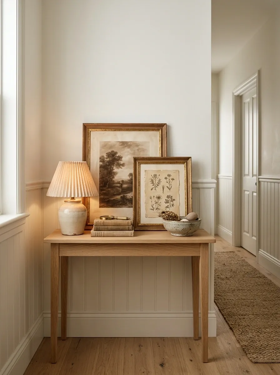
A shallow console can give a narrow wall character without requiring a wide gallery. Two vintage-inspired artworks lean against the wall while a small ceramic lamp and low bowl create a foreground layer.
The artworks overlap slightly, which produces depth without increasing the wall footprint. Warm wood and aged paper tones give the arrangement a relaxed collected quality.
The tabletop should remain fairly sparse. The artwork already provides most of the visual density.
Soft Blue Wall With a Tall Linen-Shaded Lamp
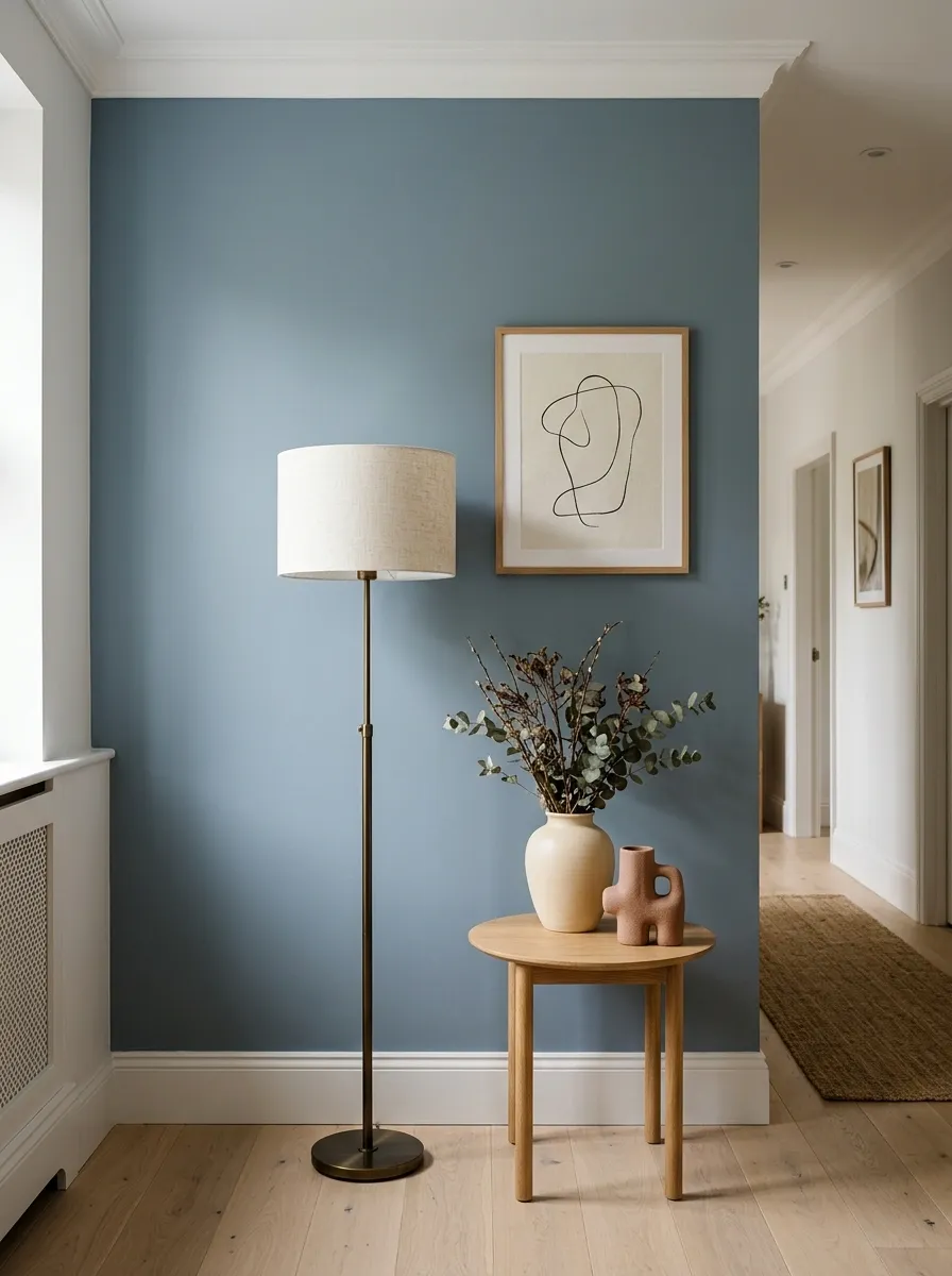
A narrow wall can feel complete through a simple vertical chain of elements. This composition uses a muted dusty-blue wall, one framed artwork, a tall linen-shaded floor lamp, and a small side table.
The lamp provides height while the artwork adds visual interest. Pale oak flooring and cream furniture nearby soften the cooler wall color.
The arrangement is intentionally a little asymmetrical. The slight shift keeps the composition relaxed rather than overly formal.
Architectural Wall With Narrow Vertical Molding
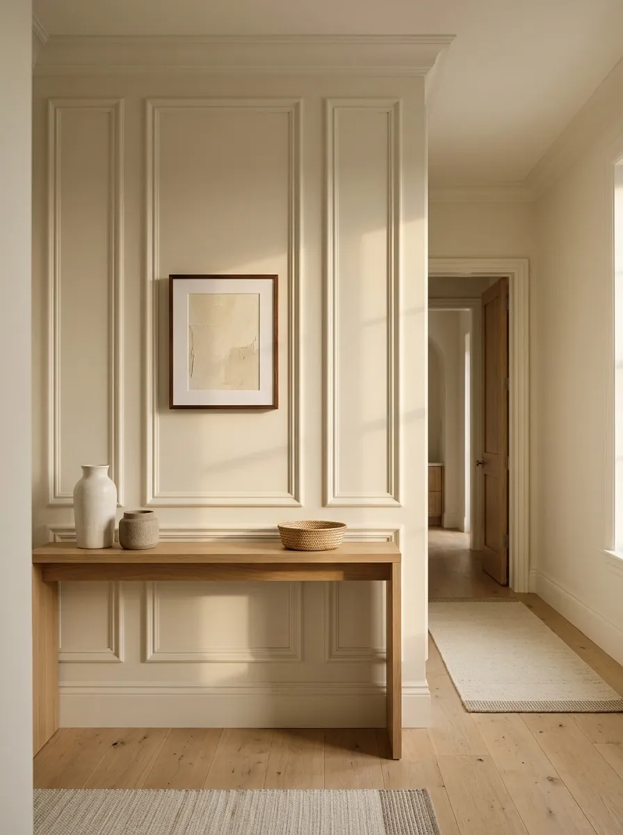
When a wall is too narrow for furniture but too plain to leave untouched, architectural molding can provide the structure. This version uses three tall panels in a soft ivory finish, with one artwork occupying the center.
A shallow console anchors the bottom without fighting the paneling. Because the molding and wall share the same color, the visual effect comes from shadow, proportion, and repetition rather than contrast.
It is a strong choice for homes where the surrounding architecture already has a formal or transitional character.
Terracotta Accent Wall With a Floating Walnut Ledge
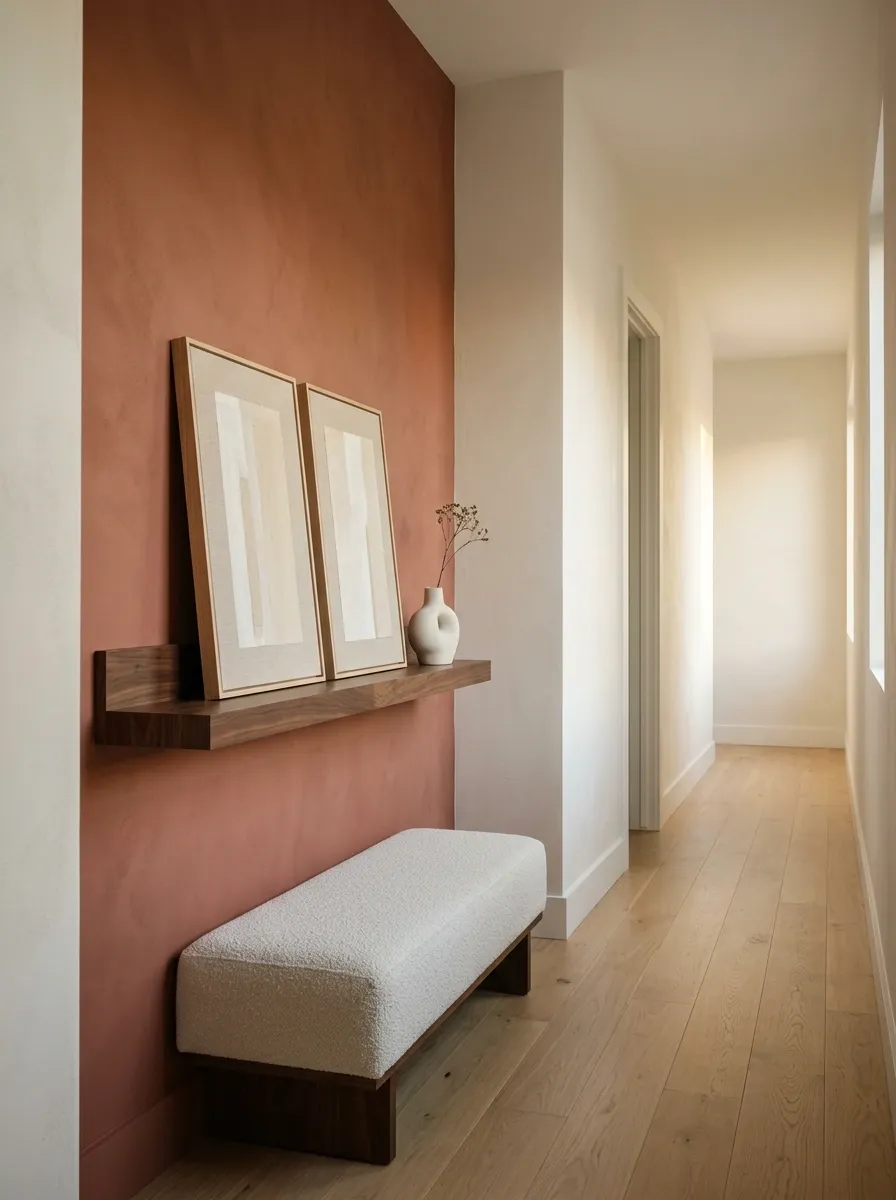
A muted terracotta wall can provide so much visual character that very little decoration is required. This composition uses a shallow walnut ledge, two leaning artworks, and a small sculptural vase.
The ledge occupies only part of the wall, leaving a generous field of terracotta around it. That empty color becomes part of the design.
Walnut introduces a horizontal line, while the artwork brings vertical shapes back into the composition. Pale furniture and flooring keep the warmer color from visually closing in the space.
Slim Black Console With Oversized Linen Artwork
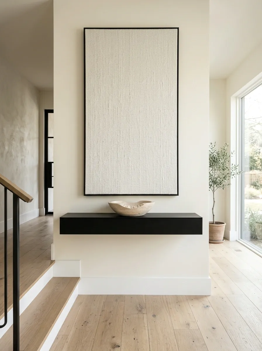
A narrow wall can carry one large piece of artwork when the furniture below remains visually crisp. This version uses a matte black floating console beneath an oversized linen-textured piece.
The artwork is the pale focal plane and the console becomes the dark lower anchor. One stone bowl is enough to connect the two.
The contrast creates a contemporary look without requiring a gallery wall. It works particularly well in modern entries and dining transitions.
Layered Neutral Wall With a Tall Linen Artwork and Sculptural Stool
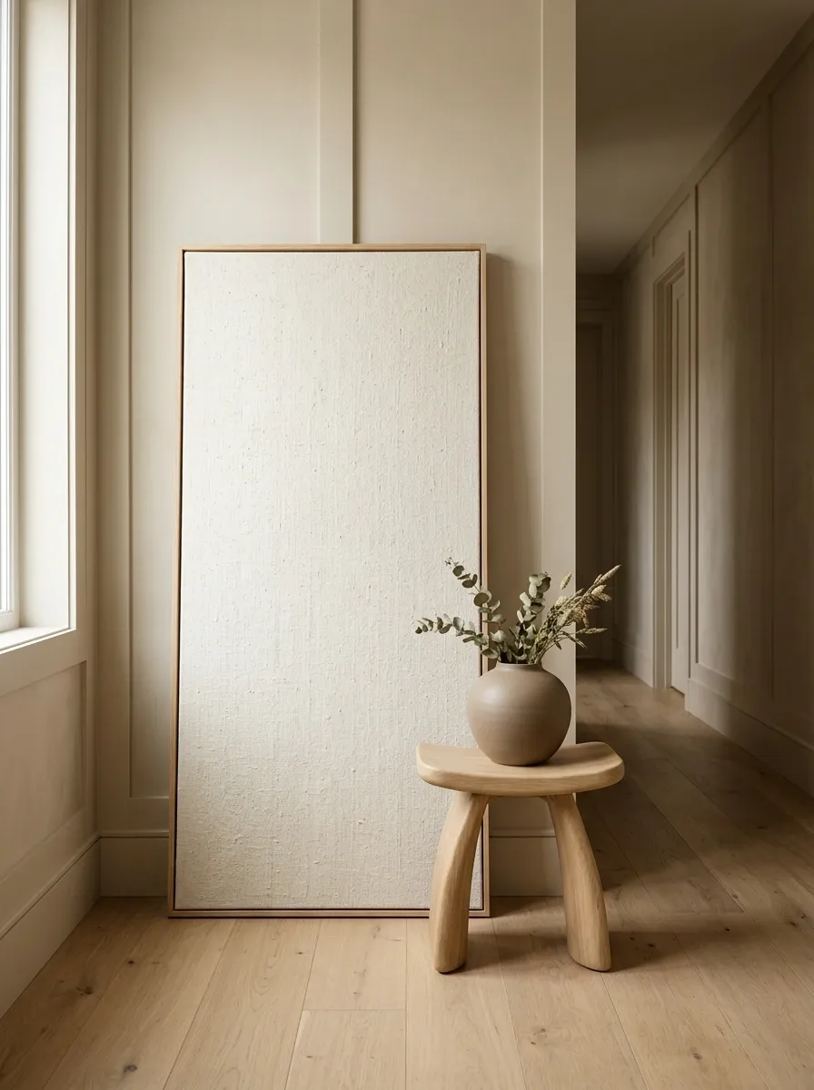
A quiet wall can still feel layered when the forms are varied. Here, a tall linen artwork leans against the wall while a sculptural stool and low ceramic form sit nearby.
The palette stays within beige, cream, taupe, and light wood, so the interest comes from shape and texture rather than strong color contrast.
The rectangular artwork, rounded stool, and curved ceramic piece create enough visual rhythm to make the composition feel finished without covering much of the wall.
Softly Layered Stair Landing Wall
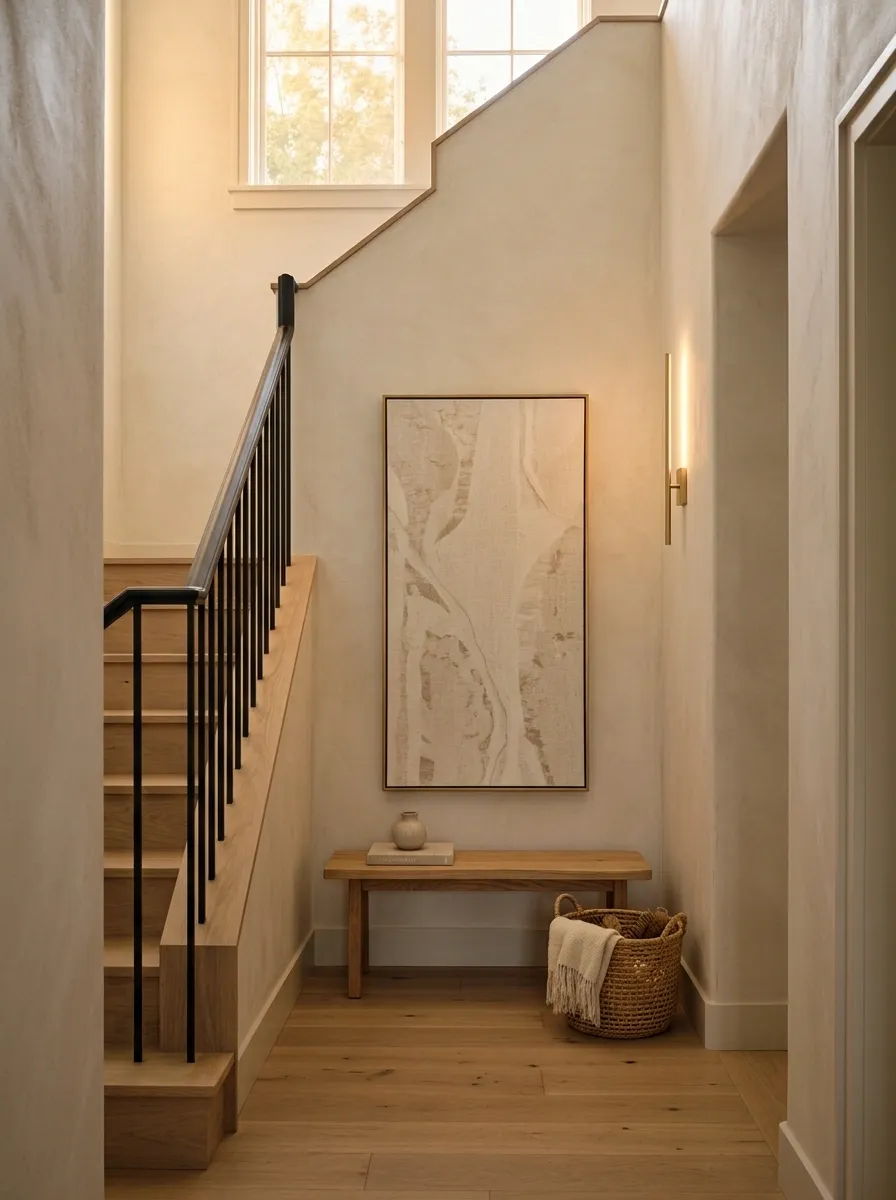
A staircase landing often leaves a strip of wall that is too narrow for traditional furniture. This composition follows the architecture instead of fighting it. A tall artwork rises vertically, a compact bench creates the lower horizontal line, and a woven basket stays close to the floor.
A slim wall light adds height without occupying floor space. The shapes echo the staircase’s own direction, making the arrangement feel connected to the architecture.
The design is especially effective where circulation matters because the wall gets personality without turning the walking path into a furniture zone.
Japandi Wall With Floating Oak Peg Shelf
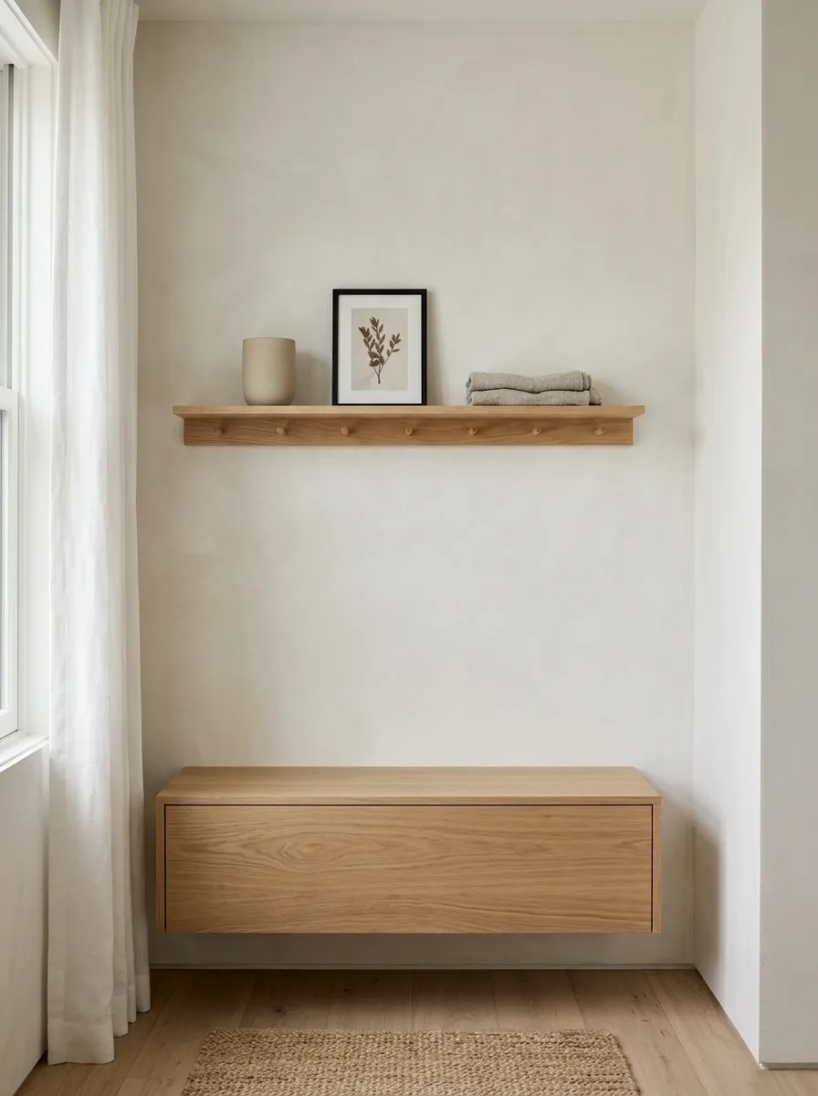
A narrow wall can feel complete with very few objects when the spacing is intentional. This Japandi-inspired composition uses a pale oak peg shelf, one ceramic vessel, a small framed artwork, and a folded textile.
A low floating cabinet repeats the wood tone below. There are generous gaps between the objects, which creates the sense of calm.
Nothing on the shelf needs to be oversized. The restraint is what makes the arrangement feel finished.
Dark Charcoal Wall With Brass Picture Lights
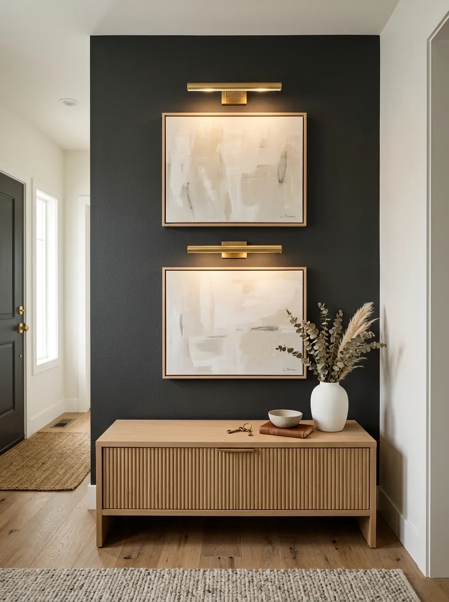
A narrow charcoal wall can become a dramatic gallery without needing many pieces. Two tonal artworks stack vertically, each with a slim brass picture light above it.
The dark wall helps the pale artwork and warm brass stand forward. The repeated lights create rhythm without turning the composition into a rigid grid.
Keep nearby furniture lighter so the charcoal wall remains the strongest visual element.
Narrow Mediterranean Hall With Textured Plaster and Wood Stool
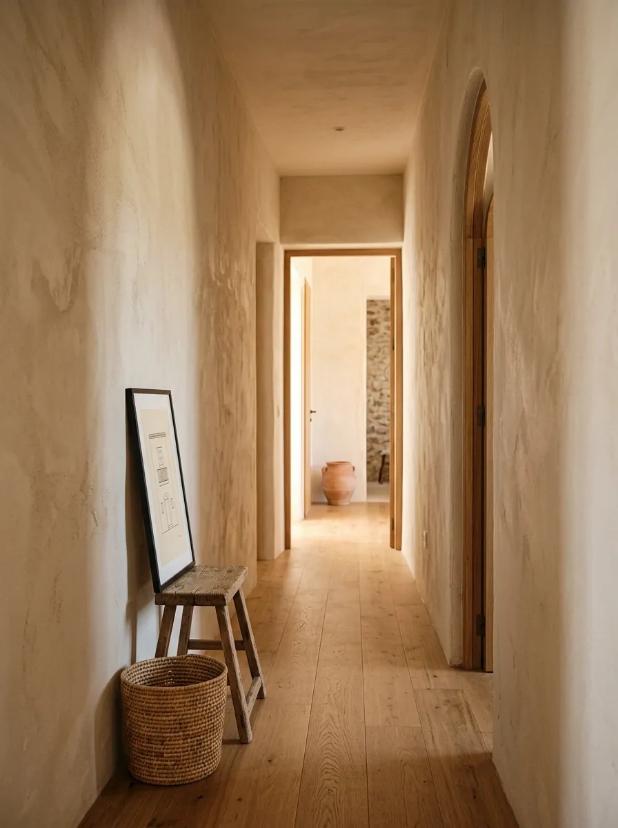
Texture becomes the decoration in this Mediterranean-inspired hallway. A softly irregular plaster wall provides the backdrop, while a small wood stool, woven basket, and framed architectural print sit close to the floor.
Nothing projects deeply into the passage. The wall texture does most of the decorative work, while the stool and basket provide just enough grounding near the floor.
Sand, cream, faded terracotta, and natural wood keep the entire composition warm without introducing visual clutter.
Long Vertical Mirror With a Petite Marble Pedestal
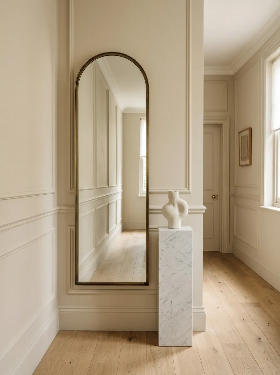
A tall mirror can make an unusually narrow wall feel purposeful without covering it with decoration. This design uses a floor-length mirror and a tiny marble pedestal with one sculptural object.
The mirror creates the height. The pedestal supplies a small amount of physical weight near the floor. Together they keep the wall from feeling top-heavy or unfinished.
Warm beige walls and pale stone maintain the airy quality of the space.
Modern Picture Rail Composition With Tonal Artwork
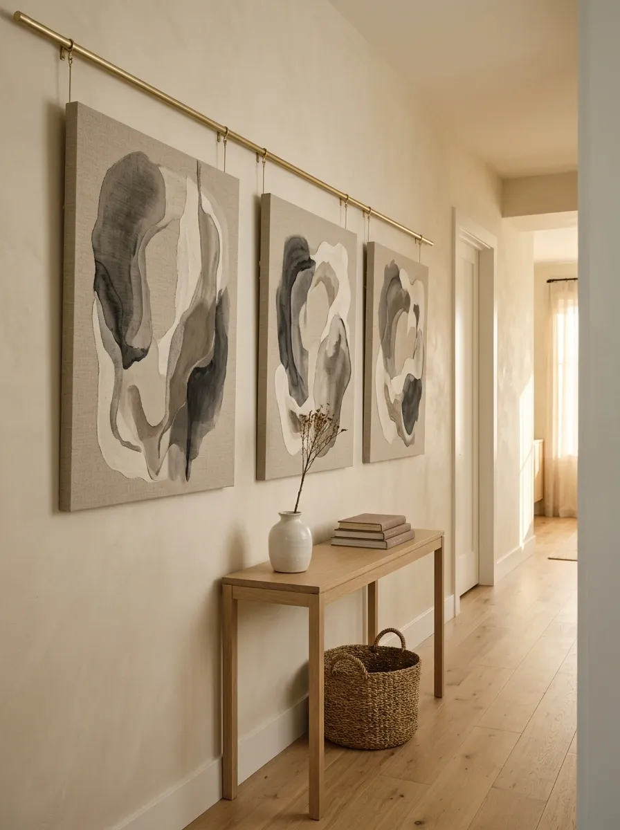
A picture rail offers a more relaxed alternative to a traditional gallery wall. Three large tonal artworks hang at slightly different heights, creating movement along the wall without spreading a large collection across it.
The palette stays within warm gray, parchment, cream, and faded brown. Because the tones relate, the variation in height feels intentional instead of chaotic.
This arrangement works particularly well in long entries and dining transitions where a narrow wall benefits from movement across its length.
Soft Pink Wall With Curved Walnut Bench and Ceramic Art
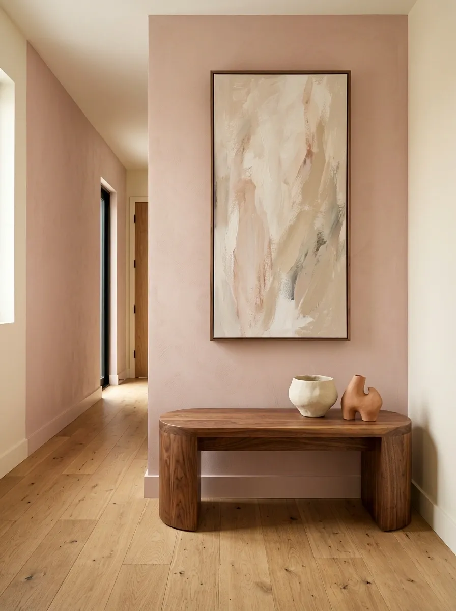
A narrow wall can feel softer when a curved bench replaces the usual rectangular console. This composition combines a dusty blush wall with a curved walnut bench, one tall artwork, and two low sculptural ceramics.
The bench breaks up the straight architecture while the artwork restores vertical emphasis. The ceramics stay low so they don’t compete with either major shape.
Warm walnut, soft pink, cream, and muted clay create enough contrast to make the wall memorable without pushing the room into overly sweet territory.
Final Thoughts
A narrow empty wall doesn’t need more objects simply because it looks bare. It needs a clear relationship with the room around it.
Sometimes the answer is height, with a mirror or tall artwork pulling the eye upward. Sometimes the strongest solution is architectural, using paneling, plaster, molding, or a built-in niche so the wall itself becomes the feature. In other spaces, a floating console or shallow ledge adds useful function without taking over the walkway.
The most successful compositions leave something out. They let a wall color remain visible. They give artwork room around it. They preserve the floor line. They allow one material, shape, or architectural gesture to carry the visual weight.
Look at the wall from the doorway and from the normal walking path, not just while standing directly in front of it. Then choose the complete composition that makes the whole room feel more connected.
Save the designs that fit your space and return to them when you’re ready to choose artwork, furniture, finishes, or lighting.