
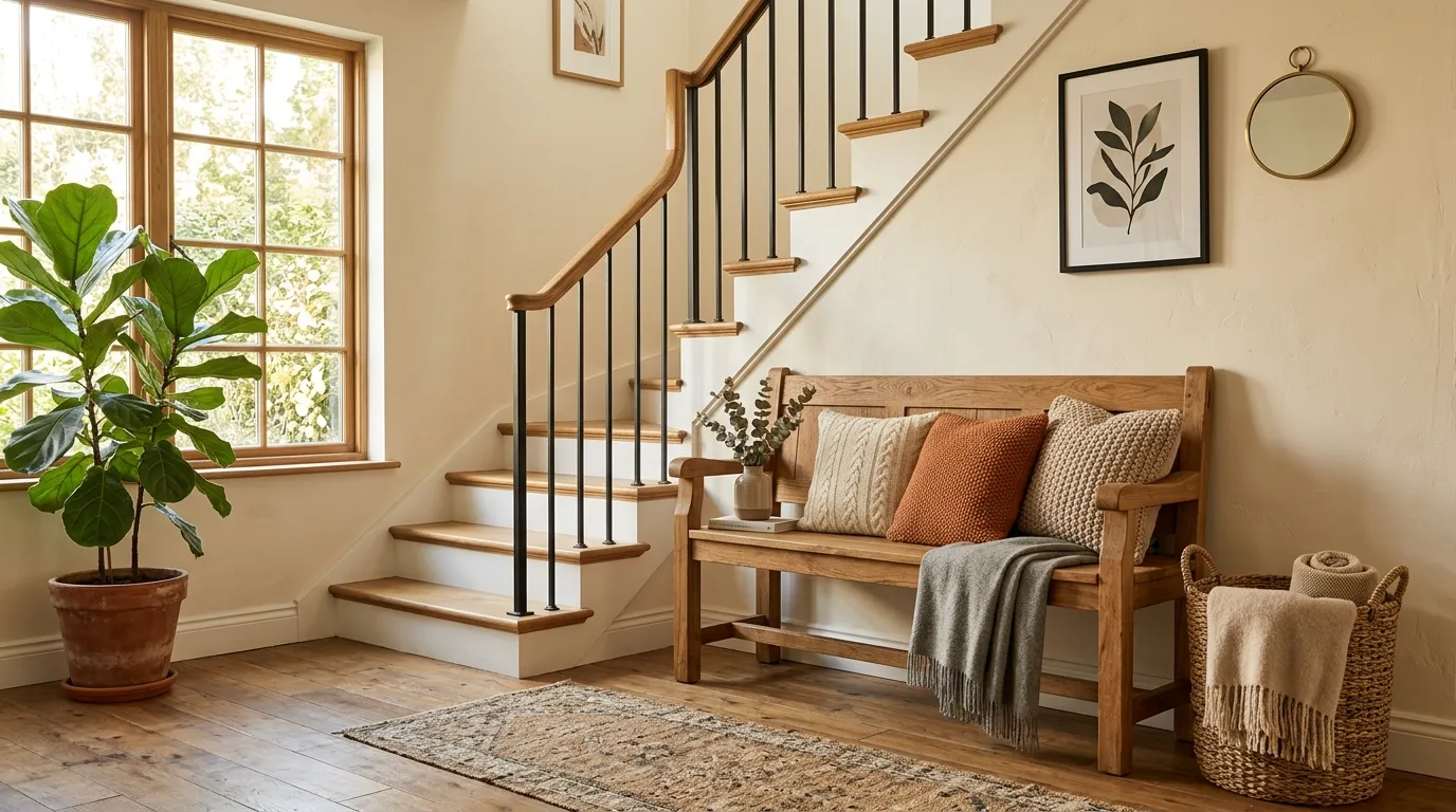
Most staircase landings don’t need more stuff. They need a better decision. A landing can look strangely unfinished even when you’ve added art, furniture, and decor because the pieces aren’t solving what the space actually lacks.
Some landings are too narrow for furniture. Others have plenty of room but no obvious purpose. Then there are those awkward corners that collect random baskets, forgotten bags, and whatever didn’t have a home downstairs. That’s where good staircase landing ideas need to do more than look pretty. They need to make the space feel intentional without turning a walkway into a furniture showroom.
The fix is usually smaller than people think. One well-scaled piece can do more than five decorative objects scattered around the walls. A tall artwork can fill an empty vertical wall. A slim bench can give a wide landing a reason to exist. Even leaving one corner completely empty can make the whole area look more finished.
Start with what your landing is missing, then choose the idea that actually fixes it.
First, Figure Out What Your Staircase Landing Actually Needs
Staircase Landing Ideas
Layer Mirrors to Expand a Tight Landing
A cramped corner near the top of the stairs can easily feel like a dead end. Doubling up on mirrors bounces light around and tricks the eye into seeing a much larger footprint.
Keep the frames simple and dark so they anchor the wall without feeling heavy. Pairing them with a slender console table keeps the traffic flow completely unobstructed.
Let the accessories do the heavy lifting. A single textured vase or a tiny framed photo gives the vignette personality without cluttering the walking path.
Build a Slim Picture Ledge Instead of a Bulky Gallery Wall
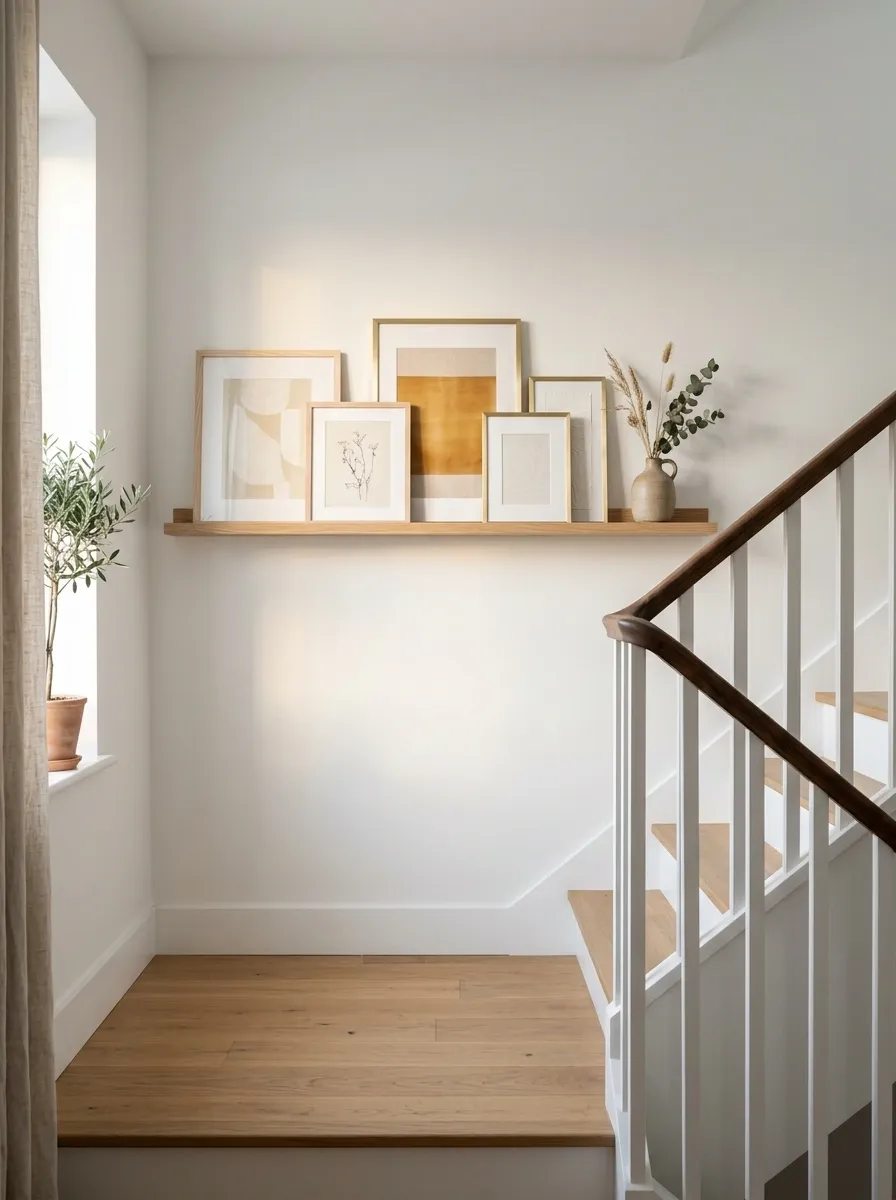
A narrow landing wall doesn’t need ten frames fighting for attention. A picture ledge gives you the layered look without eating up the walkway.
Keep the ledge shallow and let the artwork do the work.
The trick is restraint. A crowded staircase already has plenty of visual movement, so your wall shouldn’t compete with it.
Add Warmth with Soft Lighting and Florals
Landing spaces often end up feeling like forgotten transition zones. Introducing a glowing wall sconce and a scattering of candles instantly turns the hallway into a welcoming destination.
Tall stems in a rustic floor vase draw the gaze upward and soften the hard lines of the staircase railing. It adds organic movement that makes the whole area feel lived-in and loved.
Keep textiles cozy nearby with a casually draped throw blanket on the banister. It invites you to linger just a moment longer before heading down the steps.
Use a Small Bench to Turn the Landing Into a Useful Pause Point
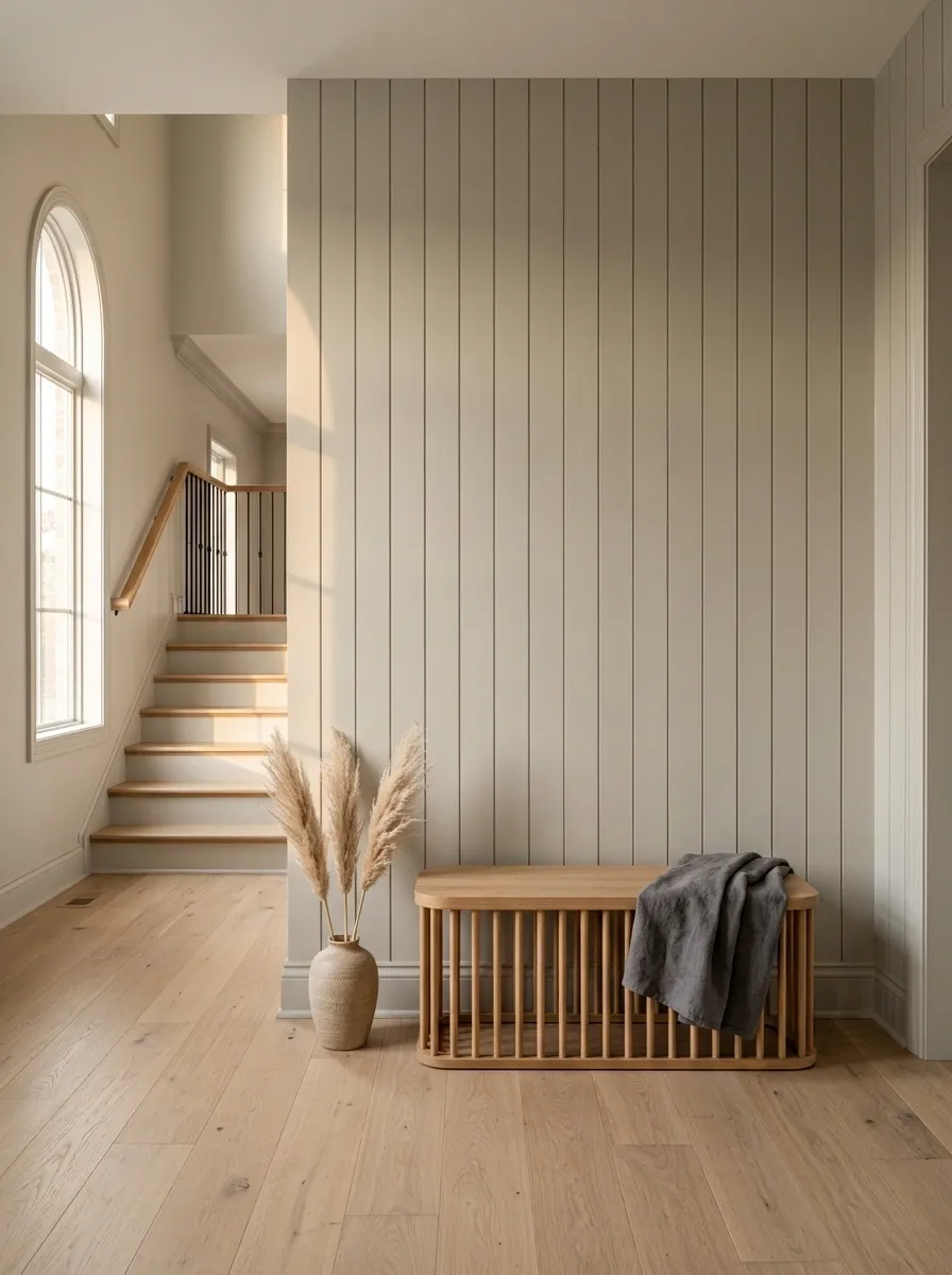
A bench earns its space. It gives you somewhere to sit while pulling on shoes, setting down a laundry basket, or helping a child with a jacket.
Choose one with a compact footprint and a visually light base. Upholstered benches are useful, but a simple wood seat often looks less bulky.
Bench checklist
- Keep the walking path clear.
- Choose a seat that doesn’t dominate the wall.
- Leave the floor underneath mostly open.
- Skip oversized cushions that spill into the walkway.
A bench works best when it feels like part of the architecture, not a piece of furniture someone happened to park upstairs.
Anchor an Empty Corner with Plant Life
Awkward structural corners usually beg for a piece of furniture that never quite fits. Skip the bulky items and drop a gorgeous potted olive tree or leafy green into the dead space instead.
Crisp plantation shutters filter the natural light into soft, beautiful patterns across the floor. The space feels bright, airy, and entirely intentional.
Simplicity is your best friend here. A bare landing corner lets the natural architecture and the lush greenery shine without any visual competition.
Create a Tall Art Moment on an Empty Stair Wall
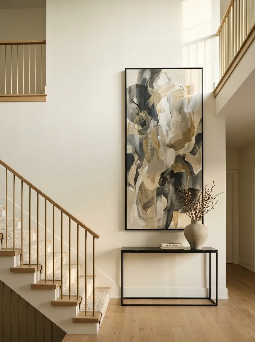
The staircase naturally pulls the eye upward. A small horizontal print on a tall wall fights that movement. Go vertical instead.
Choose one substantial artwork with enough height to hold the wall visually.
You don’t need a gallery wall here. One strong piece often looks more expensive because the eye knows exactly where to land.
Style the Base of the Stairs
The bottom of the staircase is prime real estate for a welcoming moment. A rustic wooden stool topped with a lush floral arrangement sets a charming tone the second you walk through the door.
Black metal lanterns tucked against the risers add instant architectural contrast and a cozy evening glow. They guide the eye upward toward the framed art waiting on the wall above.
Keep the proportions balanced and human-scale. A sturdy little stool feels friendly and grounded, giving the staircase a polished, designer finish without taking up precious floor space.
Put a Narrow Console Where the Landing Has Real Walking Room
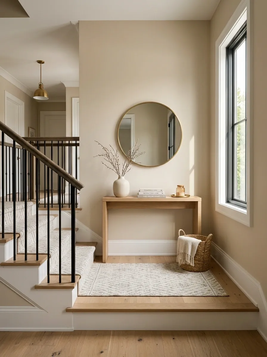
A console only works when the landing can spare the depth. Cram one beside a staircase and the whole area starts feeling like a hallway with furniture stuck in it.
Measure the circulation first. Then choose the shallowest console that still gives you useful surface space.
Choose by function
- Keys and mail: slim top with one drawer.
- Decor: open surface with minimal storage.
- Family clutter: closed cabinet doors are better.
- Very tight landing: skip the console entirely.
The best console isn’t the prettiest one in the store. It’s the one you stop noticing because nobody has to squeeze around it.
Treat a Window Landing Like a Tiny Reading Nook
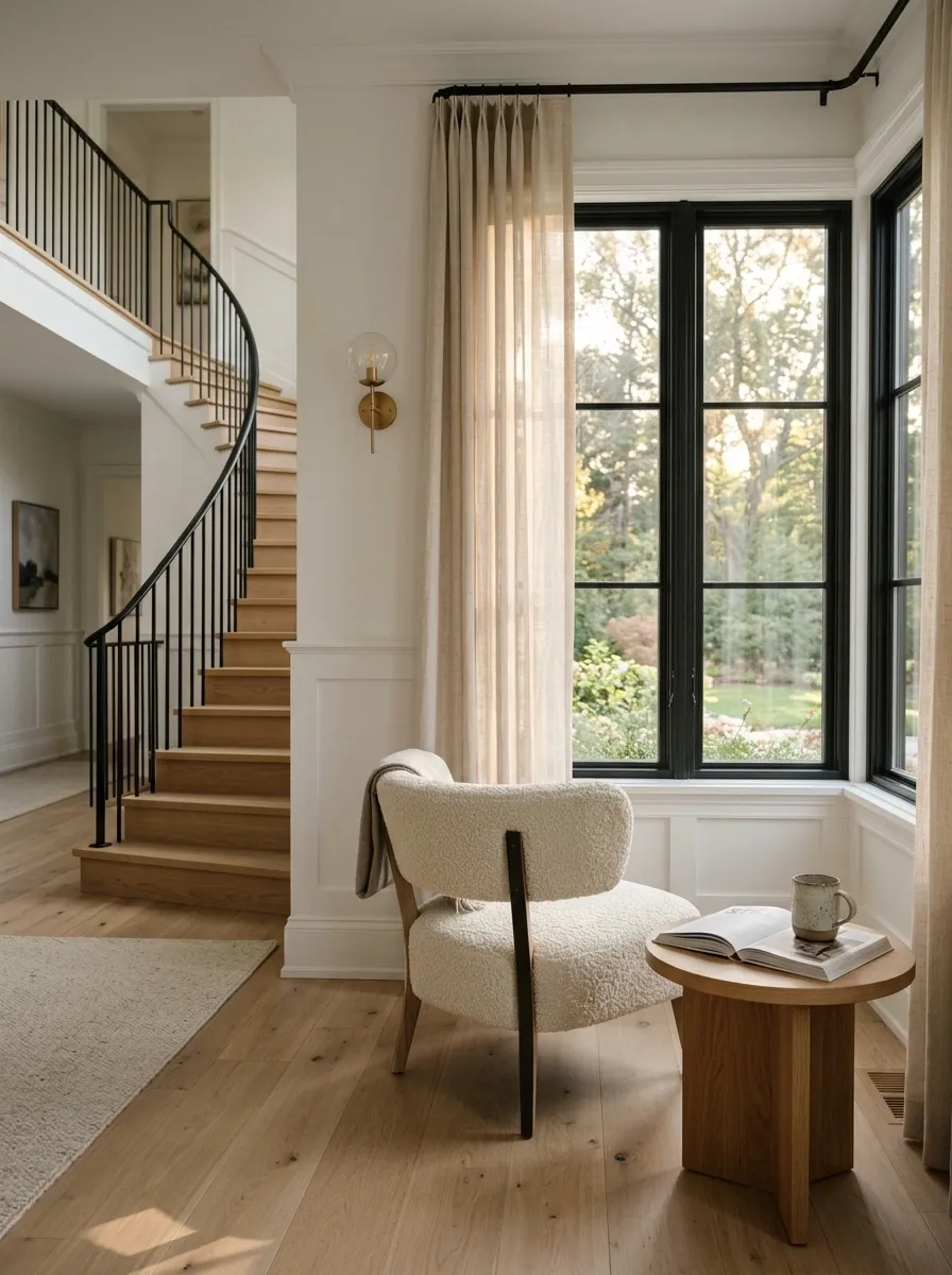
A landing with natural light already has the hardest part solved. Don’t cover the window with unnecessary furniture. Build around it.
A compact chair can turn an overlooked landing into a quiet spot for reading, waiting, or simply sitting for a few minutes.
Skip the matching furniture set. One chair, one small table, and a little breathing room are enough. The window should still feel like the star of the space.
Use One Oversized Mirror to Bounce Light Around the Landing
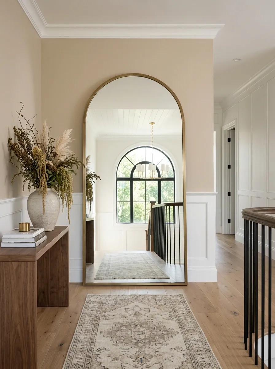
A mirror works best on a landing when it has a clear job. Don’t hang a tiny decorative mirror in the middle of a huge wall and expect it to make the space feel finished.
Go bigger, especially when the landing is dim or visually narrow.
The frame matters, too. A slim wood or metal frame usually keeps the landing looking intentional instead of making the mirror feel like a random bathroom leftover.
Turn an Awkward Corner Into a Built-In Storage Drop Zone
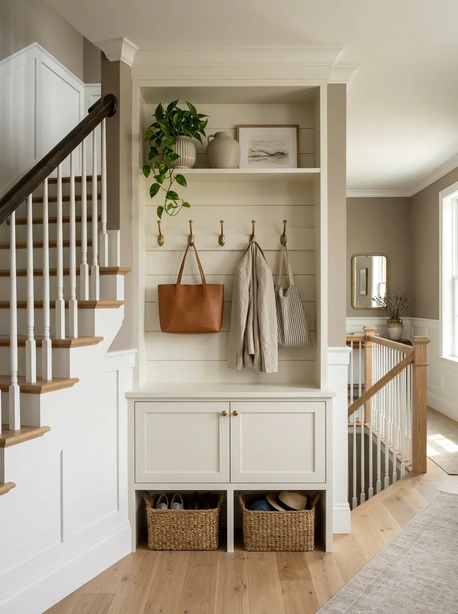
That weird corner at the top of the stairs is usually where clutter wins. Fix that by giving the corner one specific job.
A shallow built-in can handle baskets, bags, blankets, or everyday items without pushing furniture into the walking path.
This is especially useful in family homes where the landing has become a dumping ground. Give the clutter a home and the rest of the landing suddenly gets much easier to style.
Add a Runner Only When the Staircase Actually Needs One
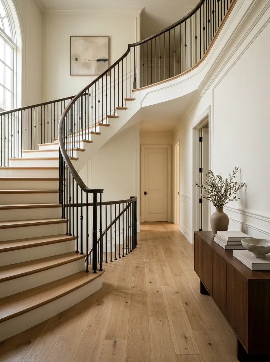
A runner can connect the staircase to the landing, but don’t install one just because the stairs feel bare.
The landing should guide the decision.
Use this quick test:
- Is the floor visually disconnected from the stairs? A runner can create continuity.
- Does the landing already have a strong rug or pattern? Skip another competing surface.
- Is the walkway tight? Keep the floor visually simple.
- Does the staircase have strong architectural detail? Let the wood, tile, or stone show.
A runner should support the staircase, not become the first thing you notice when you reach the top.
Make a Collection Wall Feel Intentional With One Strong Anchor Piece
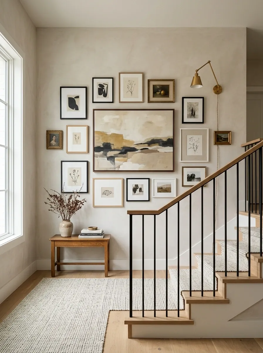
A collection wall gets messy when every frame has equal visual importance. Your eye needs one clear starting point.
Put the strongest artwork near the center, then let the smaller pieces support it instead of competing with it.
The other important move is spacing. Don’t squeeze frames together just to fill more wall. A collection needs room to read as a collection.
Use a Floating Shelf for Small Decor Without Stealing Floor Space
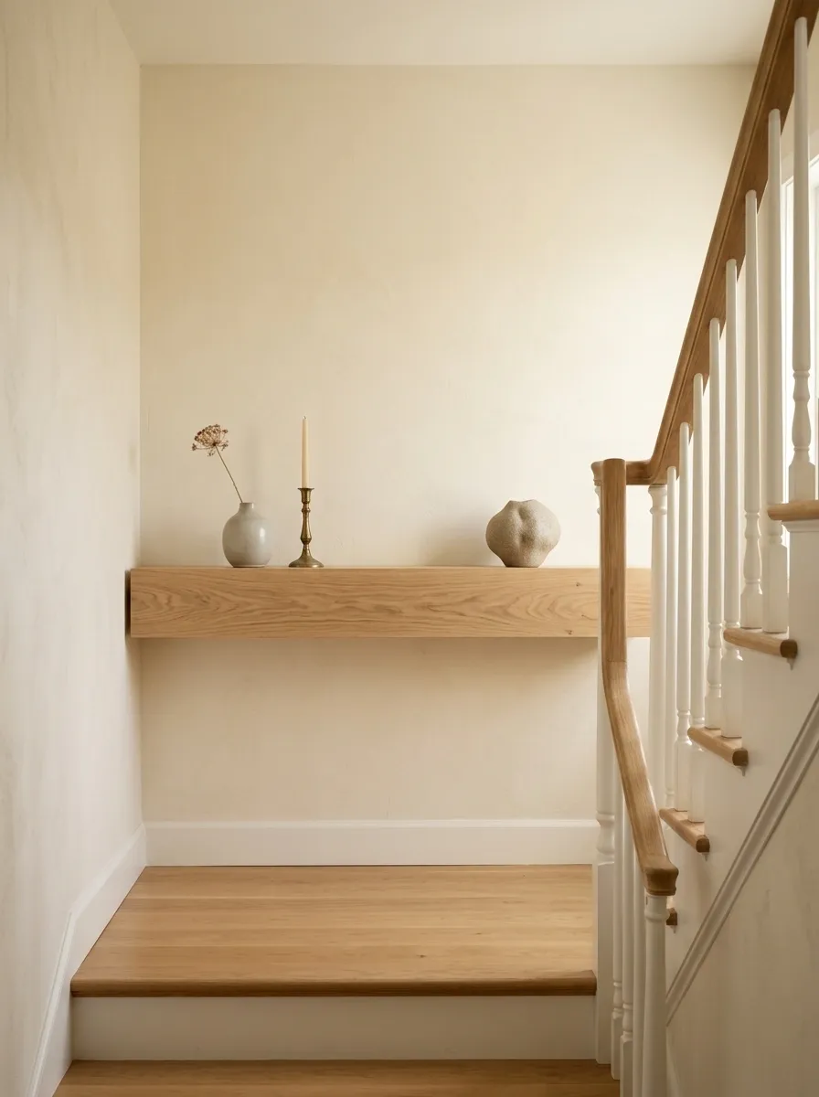
Floor space is precious on a staircase landing, especially when people already have to turn, pause, or pass one another there.
A floating shelf solves the display problem without introducing another piece of furniture.
Keep the shelf edited:
- one small plant
- one framed piece
- one meaningful object
- a short stack of books
That’s enough.
A shelf is especially effective when the landing wall looks unfinished but the floor can’t handle another piece of furniture.
Give a Dead Landing Corner a Tall Plant With Room to Breathe
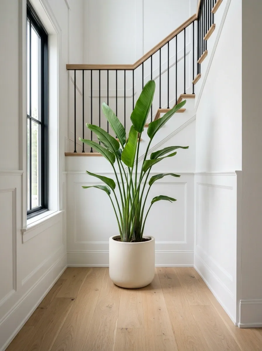
A forgotten corner doesn’t need a cabinet just because it’s empty. A tall plant can give that space height, softness, and a reason to exist without eating much floor area.
Choose a plant with an upright shape rather than one that spreads across the walkway.
Keeps leaves away from the walking route.
A giant planter overwhelms a small landing.
Don’t surround the plant with extra objects.
The pot should stay visually quiet. The plant is the feature, and the corner needs enough empty space around it to keep the staircase feeling open.
Style a Staircase Landing Around One Useful Chair
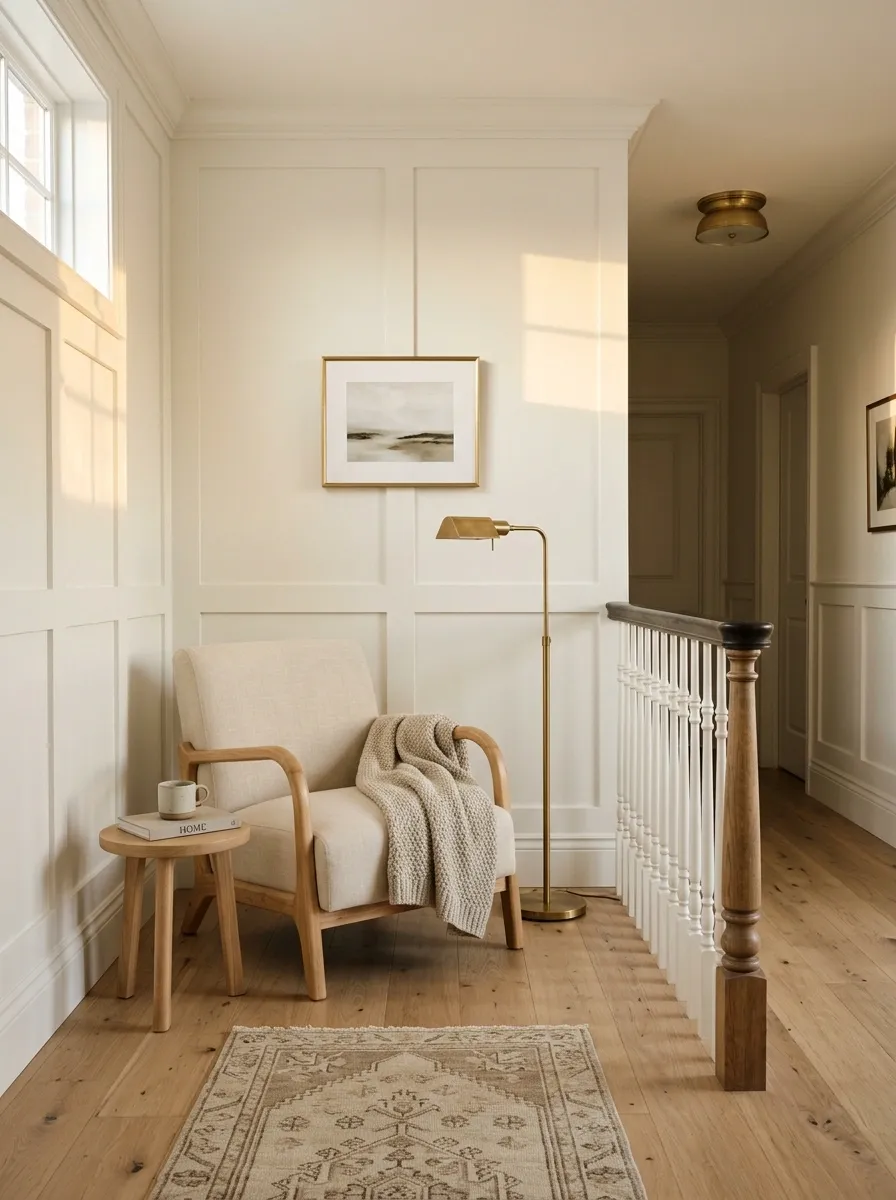
A chair can make a large landing feel intentional without forcing you to build an entire seating area.
The trick is choosing one that actually earns its place. A compact upholstered chair, wooden chair, or simple accent chair can provide a comfortable spot without creating a furniture traffic jam.
This works especially well on wide upstairs landings where an empty patch of floor feels awkward. One useful chair gives the space purpose without making it look staged.
Use Matching Frames to Make a Narrow Landing Feel Calmer
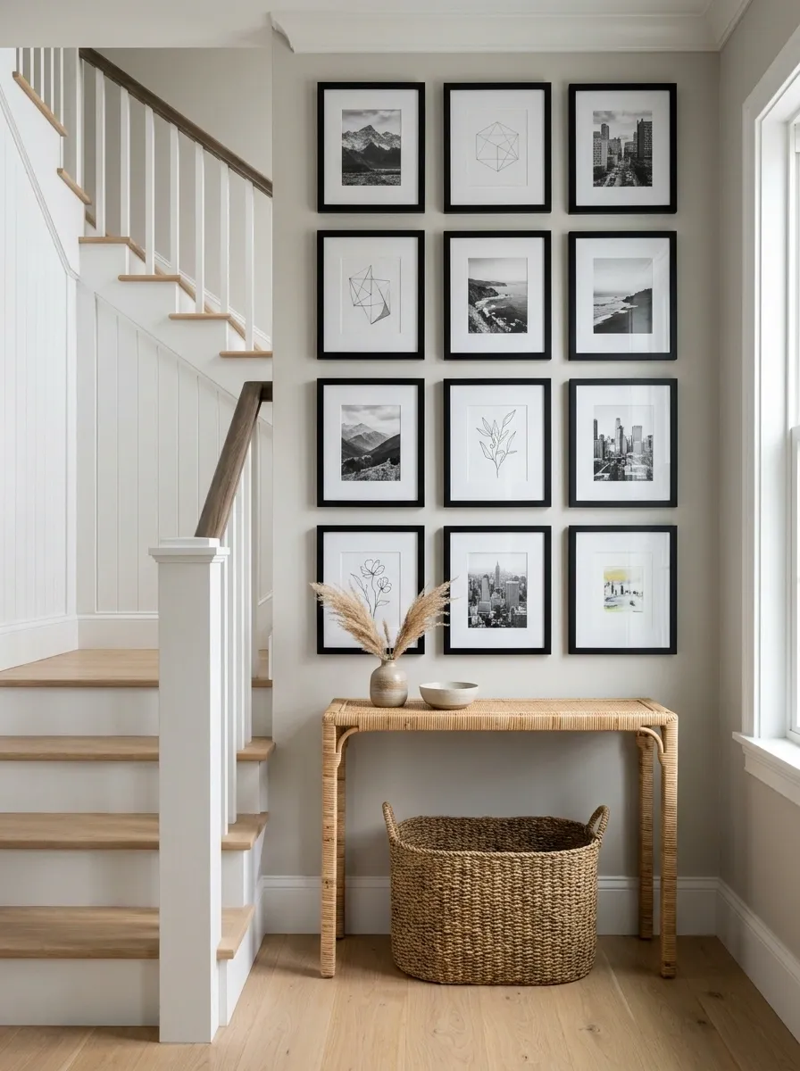
Too many frame finishes make a tight staircase wall look busier than it actually is. Matching frames fix that immediately.
You don’t need identical artwork. The repetition belongs in the frames, while the pictures can carry some personality.
A simple frame rule
- Pick one frame finish.
- Keep the artwork varied within the same general mood.
- Align the outer edges rather than obsessing over every inside gap.
- Repeat the same frame finish somewhere else nearby when possible.
This works because the eye reads repetition as structure. The result feels organized without looking like every piece came in the same package.
Create a Mini Book Display Instead of Random Shelf Decor
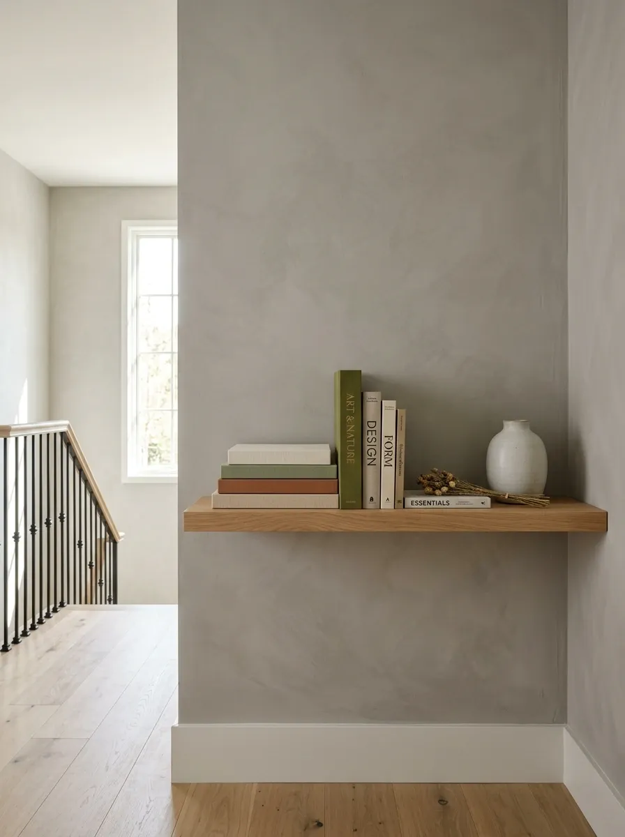
Books have more personality than a shelf full of generic objects, especially on a staircase landing that connects different parts of the house.
Don’t build a miniature library. Pick a small group with covers, colors, or subjects that make sense together.
A landing isn’t a retail display. A few books that someone might actually pick up will always feel better than a shelf packed with decorative filler.
Use the Ceiling Height to Make the Landing Look More Impressive
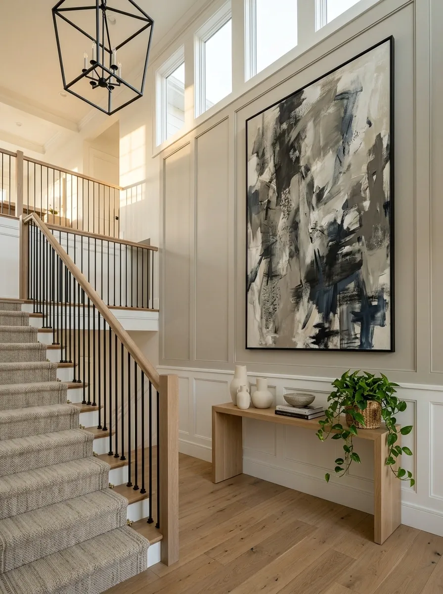
Tall ceilings are free design space. Don’t waste them by decorating only at eye level.
A staircase landing with extra height can handle one dramatic vertical element much better than a collection of small objects scattered across the wall.
Use the architecture you’re already paying for. A staircase landing with impressive height should feel intentional from floor to ceiling, not decorated in one horizontal strip.
Put Lighting Exactly Where the Landing Feels Flat
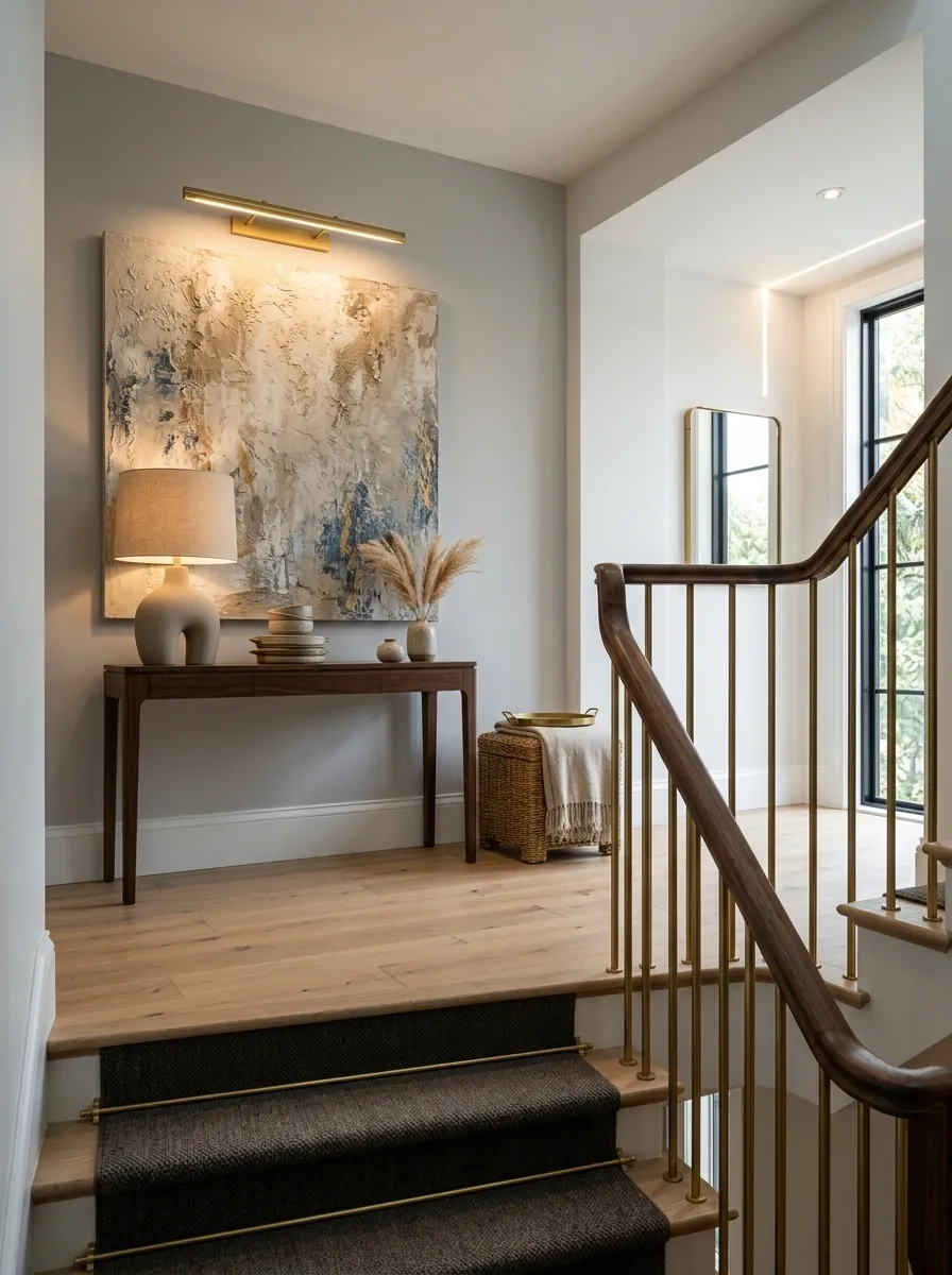
A staircase landing can have plenty of decor and still look dull because the light is wrong. Don’t add another mirror or frame until you’ve fixed the dark patch.
Walk up the stairs in the evening and notice where your eye loses definition. That’s the spot that needs attention.
A good landing light should make the area easier to read at night, not simply make it brighter. That’s a much more useful goal.
Hide the Awkward Wall With One Wide Textile or Tapestry
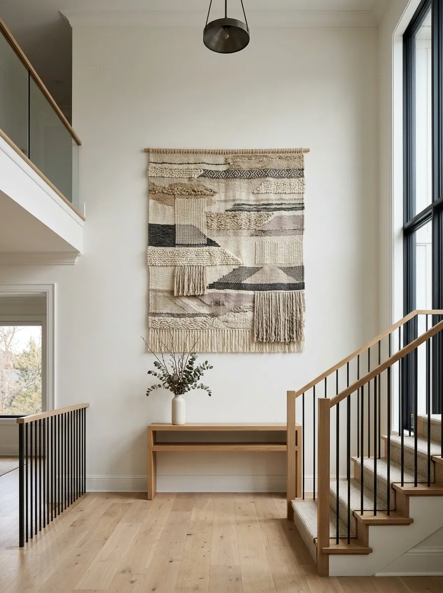
Some staircase walls are simply too large to solve with a handful of frames. A wide textile can fill that scale without making the wall look like a commercial gallery.
Choose something with enough visual weight to hold its own against the staircase.
This is a strong move for homes where the landing already has enough architectural interest. Texture fills the wall without introducing another pile of hard-edged objects.
Make a Small Landing Feel Bigger With Lower Visual Furniture
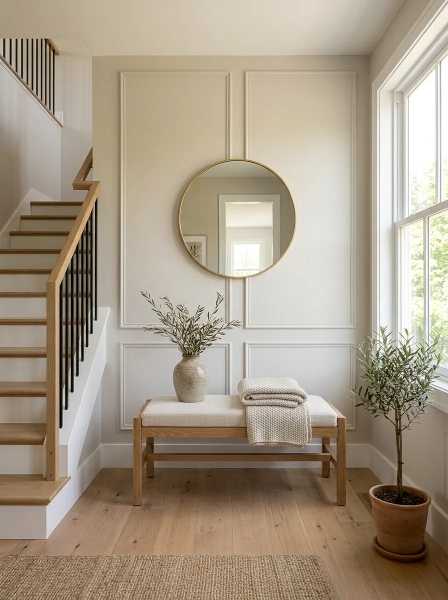
Furniture height changes how much wall and floor your eye sees. That’s why a low piece can make a cramped landing feel more open than a taller cabinet with the same basic footprint.
The difference is subtle, but you notice it the second you walk into the space.
| Furniture choice | Visual effect | Best use |
|---|---|---|
| Low bench | Leaves more wall and sightline open | Seating with minimal visual weight |
| Low console | Creates a long horizontal line | Display space on a wider landing |
| Tall cabinet | Adds stronger vertical mass | Storage when the landing has enough breathing room |
For a narrow or busy landing, low furniture usually wins. It keeps the eye moving instead of creating another tall obstacle to process.
Create a Quiet Family Photo Spot Without Covering Every Wall
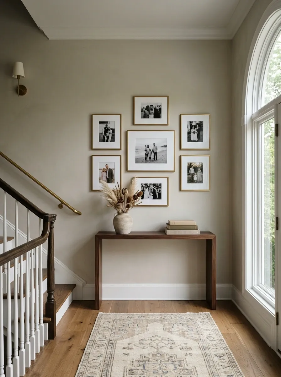
Family photos belong in a staircase landing because the location already feels personal and transitional. The mistake is turning the entire wall into a photo archive.
Pick a small group and give it a clear shape.
Don’t chase chronological order. A visual story is more interesting than a timeline, and the landing doesn’t need to explain the family’s entire history.
Use a Small Cabinet When the Landing Needs Hidden Storage

Open shelving looks good until you have to look at what you’ve actually put on it. A small cabinet gives a staircase landing storage without turning every object into part of the decor.
This is the move for homes where clutter keeps returning.
Give the cabinet a strict job:
- hide extra blankets
- store pet supplies
- hold board games
- keep seasonal items nearby
- collect the little things that otherwise migrate upstairs
The exterior should stay simple. Clean doors, a restrained finish, and a small amount of decor on top are enough.
A cabinet works because it closes the visual noise. That’s often more valuable than adding another decorative display.
Frame the Stair Opening With Symmetrical Decor
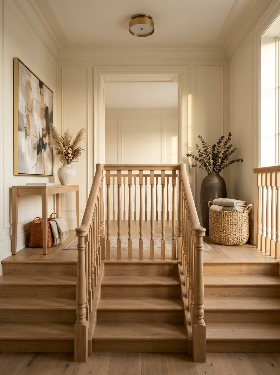
Symmetry is especially useful around a staircase opening because the architecture already gives you a strong center line. Use it instead of fighting it.
You don’t need matching furniture on both sides. Matching visual weight is enough.
This works particularly well when the landing can be seen from the lower floor. The eye catches the balanced shapes before it notices the individual objects.
Use a Tiny Stool for Function Without Making the Landing Busy
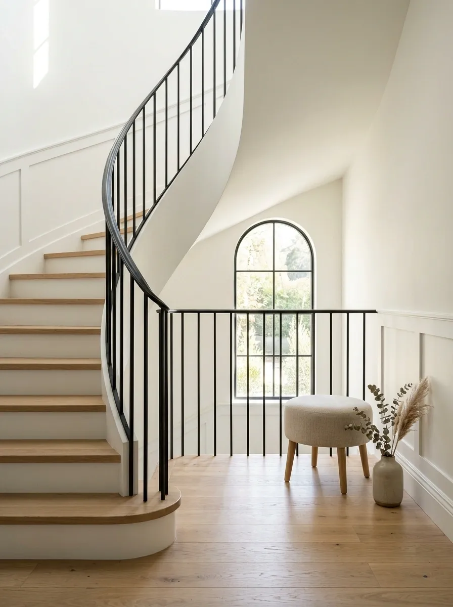
A stool is the underrated piece of staircase furniture. It’s useful when you need somewhere to sit, place a bag, or set down something temporarily, but it doesn’t demand the visual space of a bench or chair.
Use one where the landing needs a little function but can’t handle permanent-looking furniture.
Three smart placements:
- Beside a window where someone occasionally sits.
- Under a console so it disappears when not in use.
- In an unused corner where a bulky chair would block movement.
Keep the stool simple. A small wood or upholstered piece with clean lines is enough.
The point isn’t to decorate the landing with another object. It’s to give an awkward spot a job without making that job obvious.
Build a Moody Art-Focused Landing Instead of Adding More Furniture
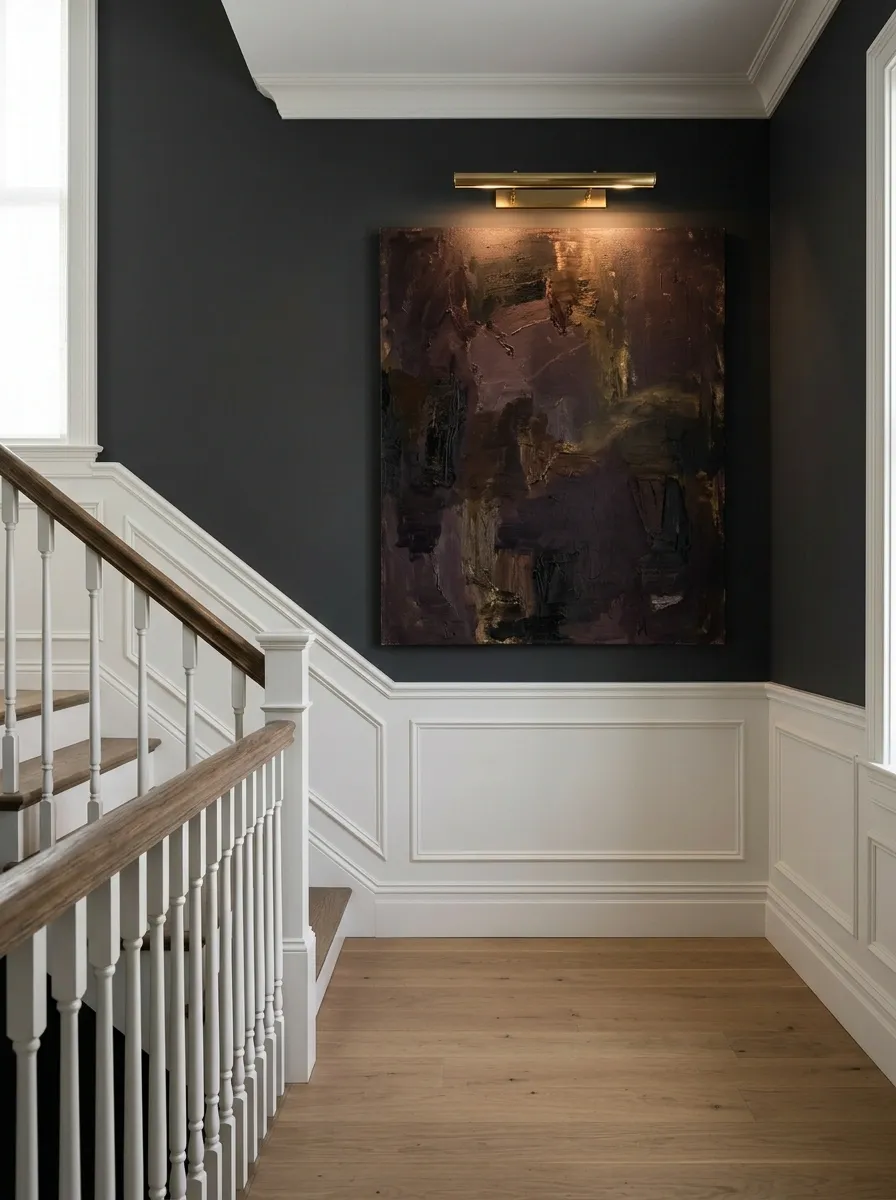
Some landings don’t need furniture at all. They need stronger walls.
A dramatic artwork-focused landing works especially well when the floor area is narrow or the staircase already has beautiful architectural details. Let the wall carry the personality.
This approach feels especially strong in modern and traditional homes that already have interesting trim, railings, or stair geometry. Don’t bury those details under furniture.
Use One Repeated Material to Connect the Landing to the Rest of the House
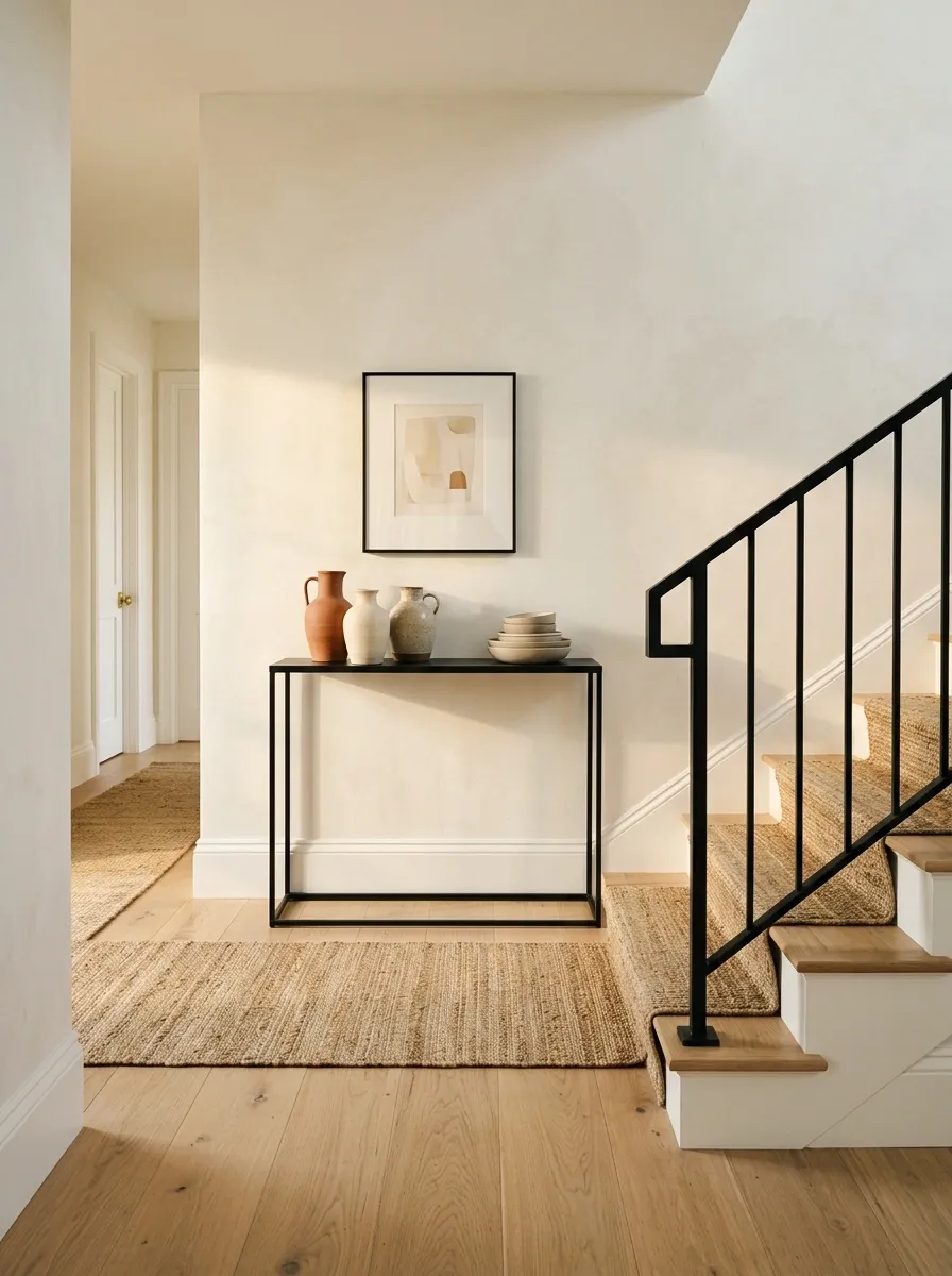
A landing can feel disconnected because it sits between rooms that each have their own decor. Repeating one material fixes that without forcing everything to match.
Pick a detail that already exists elsewhere and bring it upstairs.
Good things to repeat:
- wood tone
- black metal
- woven texture
- stone
- brass
- a particular frame finish
For example, black metal on downstairs lighting can appear again in a picture frame or slim console upstairs. The pieces don’t need to be identical. They just need to speak the same visual language.
A repeated material is one of the easiest ways to make a staircase landing feel like part of the house rather than an isolated hallway.
Leave Part of the Landing Empty on Purpose
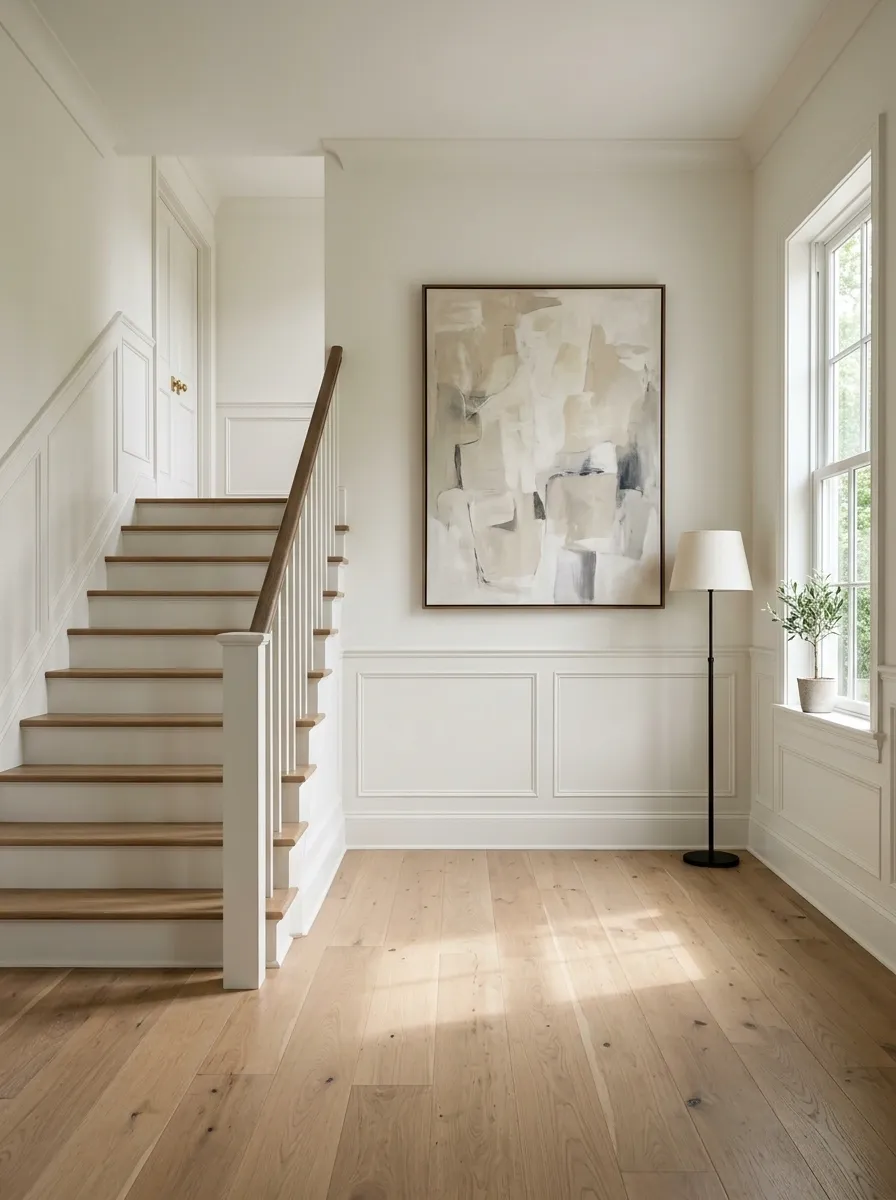
This is the idea people skip because an empty corner feels like a decorating failure. It isn’t.
A staircase landing needs negative space. People are walking through it, turning corners, carrying laundry, moving furniture, and coming upstairs with their hands full. Filling every available surface makes the area work against itself.
The strongest staircase landings usually have one clear focal point, one useful feature when needed, and enough empty space for the architecture to breathe.
The Best Staircase Landing Ideas Know When to Stop
The biggest mistake is adding pieces simply because a corner looks empty. Empty space often makes the things you carefully chose look better.
Pick one strong idea, live with it for a few days, then decide what the space still needs. Staircase landing ideas work best when every piece has a reason to be there.
Save this list for the next time your staircase landing starts looking unfinished, and come back to it before you buy another piece of furniture.