
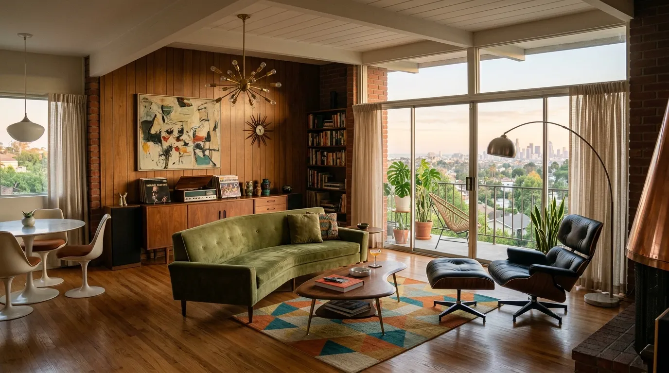
Most people assume they need a 1960s architectural masterpiece to pull off a mid century modern apartment. That’s just an excuse. You don’t need a sunken living room or a stone fireplace to get the look.
What you actually need is discipline. Right now, your space probably feels chaotic because you’re holding onto bulky, square furniture that swallows your floor plan. The common mistake is trying to soften a modern build by throwing a bunch of generic, mass-produced decor at the walls. It doesn’t work.
Instead, you have to lean into the geometry of the era. Mid century design is about lifting things off the ground, embracing natural walnut tones, and letting negative space do the heavy lifting. You can’t fake it with a peel-and-stick wallpaper accent wall. We’re going to strip away the visual clutter and build a layout that feels curated, intentional, and aggressively sharp.
Ways to Build a Mid Century Modern Apartment Without Starting Over
Anchor the Room with a Walnut Credenza
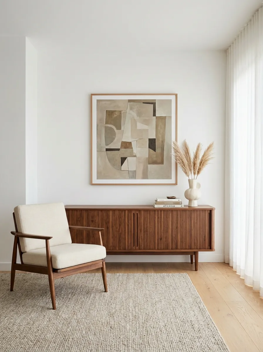
Start by finding a long, low walnut credenza to serve as the visual weight of your living room. Don’t push it against the longest wall just because it fits.
Center it under a focal point, like your main piece of art or the television. The rich, warm tone of the walnut immediately kills the sterile vibe of a white-box apartment.
Plus, it hides all your router cords and random clutter behind sliding tambour doors.
Always match your credenza wood tone to at least one other minor accent in the room to make the layout feel intentional.
Curate A Controlled Mess
Gallery walls are the easiest way to convince visitors you have a personality. Stop stressing over perfect symmetry; mid-century design is about the illusion of effortless placement, so just slap those prints up and call it a day.
Your television is an eyesore, so acknowledge it by burying it in a sea of warm wood, soft cream upholstery, and ambient lighting. If the area looks cozy enough, guests might be too distracted by the rugs and plants to notice you haven’t actually watched anything on that screen in months.
Those floor-to-ceiling shelves are meant for books you haven’t read and plants that are probably struggling to survive. Position them near the light, stand back, and let the warm, sunset-hued lighting do the heavy lifting of making your space look like an editorial feature instead of a dorm room.
Ditch the Boob Light for a Sputnik Chandelier
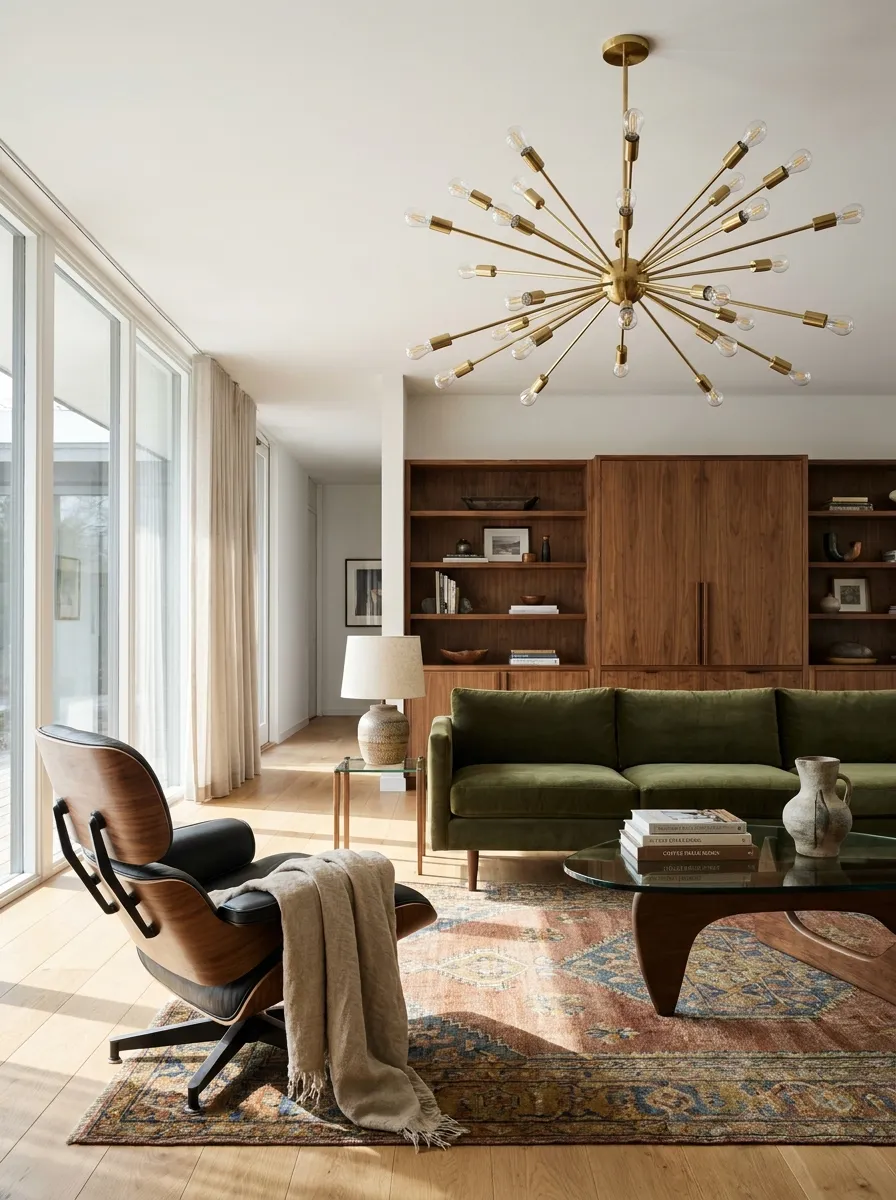
Leaving the factory-standard flush mount light on your ceiling immediately downgrades your entire room. You can’t design around it.
Swap it out for a brass Sputnik chandelier. It’s an easy weekend project, and you can always pack up the original light in a closet to reinstall before you move out.
- Turn off the breaker before you touch any wires.
- Cap the old wires and store the fixture safely.
The spiky, atomic shape gives the room an instant architectural upgrade.
Store the original glass dome and its screws in a labeled bag so you don’t lose your security deposit when your lease ends.
Go Green And Low
If your living room feels like a corporate lobby, you need more texture. A low, curved velvet sofa in a deep, moody green is the perfect way to anchor the room without making it look like you’re trying too hard to achieve a specific era.
Stop pretending you have space for a massive end table. A small, sculptural side table is plenty for your phone and a single candle that you’ll never light. It keeps the area feeling open, even if you’re just creating more room for more houseplants to die in.
The wood-paneled walls are non-negotiable here. If you’re stuck with boring white paint, find a way to incorporate wood tones through furniture or massive artwork, because a room without warmth is just a container for your existential dread.
Lift Furniture Off the Floor with Tapered Legs
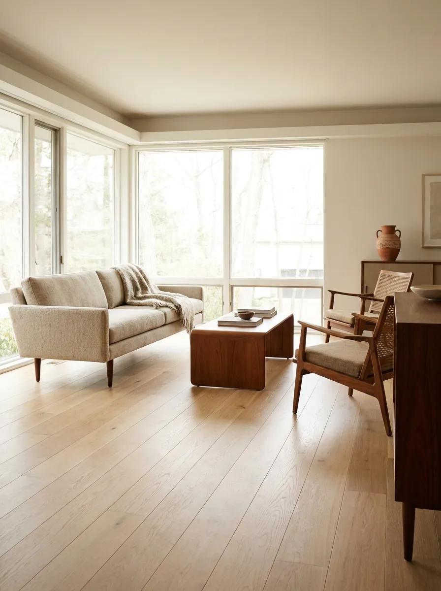
Never buy furniture that sits directly on the carpet.
A heavy, blocky sofa eats up your square footage and makes a small apartment feel suffocating.
Swap it for pieces raised on wooden tapered legs. Seeing the floor continue underneath your furniture tricks the eye into thinking the room is much wider than it actually is.
If a standard stick vacuum can’t fit underneath your sofa, the frame is too heavy for a mid century aesthetic.
Ditch The Ceiling Prison
That paper lantern is doing more work for your aesthetic than your entire furniture collection combined. It’s light, it’s airy, and it doesn’t try to dictate the entire room like some gaudy chandelier. It just hangs there, looking vaguely sophisticated while you scroll on your phone.
Keep your furniture profile low. If you’re sitting on a sofa that’s halfway to the floor, you’re doing it right. It makes your ceilings feel like they’re miles high, a clever trick to distract from the fact that you’re living in a mid-rise unit with zero architectural character.
The setup here is simple: a chair, a rug, and a lamp. If you find yourself wanting to add more, resist. You aren’t building a museum, you’re just trying to survive in style without looking like you bought everything from a big-box retailer’s catalog.
Use Mustard Yellow as Your Power Color
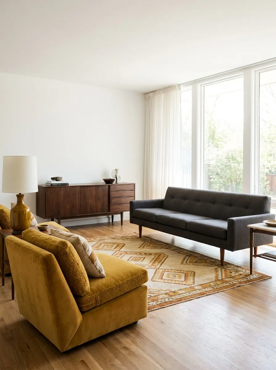
White walls and gray sofas look incredibly bleak without a punch of aggressive color. If your living room feels cold, you need an intervention.
Bring in mustard yellow. It’s the ultimate mid century accent color because it warms up dark walnut woods and cuts through the harshness of modern white paint.
Throw it on an accent chair, a ceramic lamp, or a throw pillow.
-
01
Use on hard ceramics like table lamps.
-
02
Apply to heavily textured velvet pillows.
Warmth Through Intentional Clutter
If you don’t have at least one velvet chair that looks like it belongs in a jazz club, are you even trying? This look relies on the juxtaposition of sharp, modern lines and soft, inviting fabrics. It’s the visual equivalent of wearing a tuxedo with sneakers.
Let the sun do the styling for you. By keeping the color palette restricted to oranges, browns, and ochres, the natural light hits your furniture and makes everything look expensive, even if you spent half a decade hunting for these pieces at thrift stores.
Use your storage effectively. If you have a hutch or shelf, don’t just dump your keys and mail there. Curate it. Put a book on its side. Add a ceramic piece. It’s all about maintaining the facade that you have your life together.
Float Your Sofa Away from the Wall
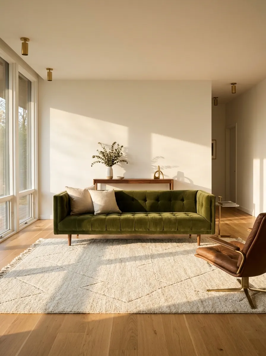
You walk into a room and all the furniture is plastered against the drywall like a doctor’s office. It’s a rookie layout mistake.
Pull your sofa at least twelve inches away from the wall.
It instantly creates a sense of flow and makes the seating area look like a deliberate zone rather than an afterthought. If you have the space, drop a narrow console table directly behind it.
Pushed completely flat against the drywall.
Floating at least 12 inches into the room.
The Art Of Napping
A bedroom should look like a place where you actually sleep, not a staged photo shoot. Start with a neutral base and then throw everything you own onto the bed. If it isn’t covered in blankets and pillows, you’re just asking for a sterile night’s sleep.
Plants in the bedroom are a cliche for a reason—they actually work. They add a layer of organic mess that breaks up the rigid lines of a bed frame and a dresser. Just keep them in the corner so you don’t knock them over when you’re stumbling around in the dark.
Stick to soft, ambient floor lamps. If you ever turn on the main overhead light, you’ve failed. The goal is to make the room feel like a warm, dimly lit cave where the rest of the world can’t find you. If it looks like a sanctuary, you’ve done your job.
Hang Curtains Ceiling to Floor
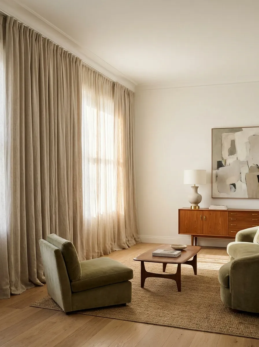
Mount your curtain rod as close to the ceiling as physically possible.
Hanging standard-length drapes directly above the window frame chops your wall in half and makes the ceiling feel violently low. You have to fake architectural height if you don’t naturally have it.
Buy panels that are at least 96 inches long and let the fabric barely kiss the floorboards. This single vertical line draws the eye straight up, making your standard drywall box look like a premium loft.
| The Mistake | The Fix |
|---|---|
| Mounted sitting on the window trim | Mounted exactly 2 inches below the ceiling |
| Curtains floating awkwardly above the floor | Fabric kissing the floorboards |
Swap Clutter for One Massive Snake Plant
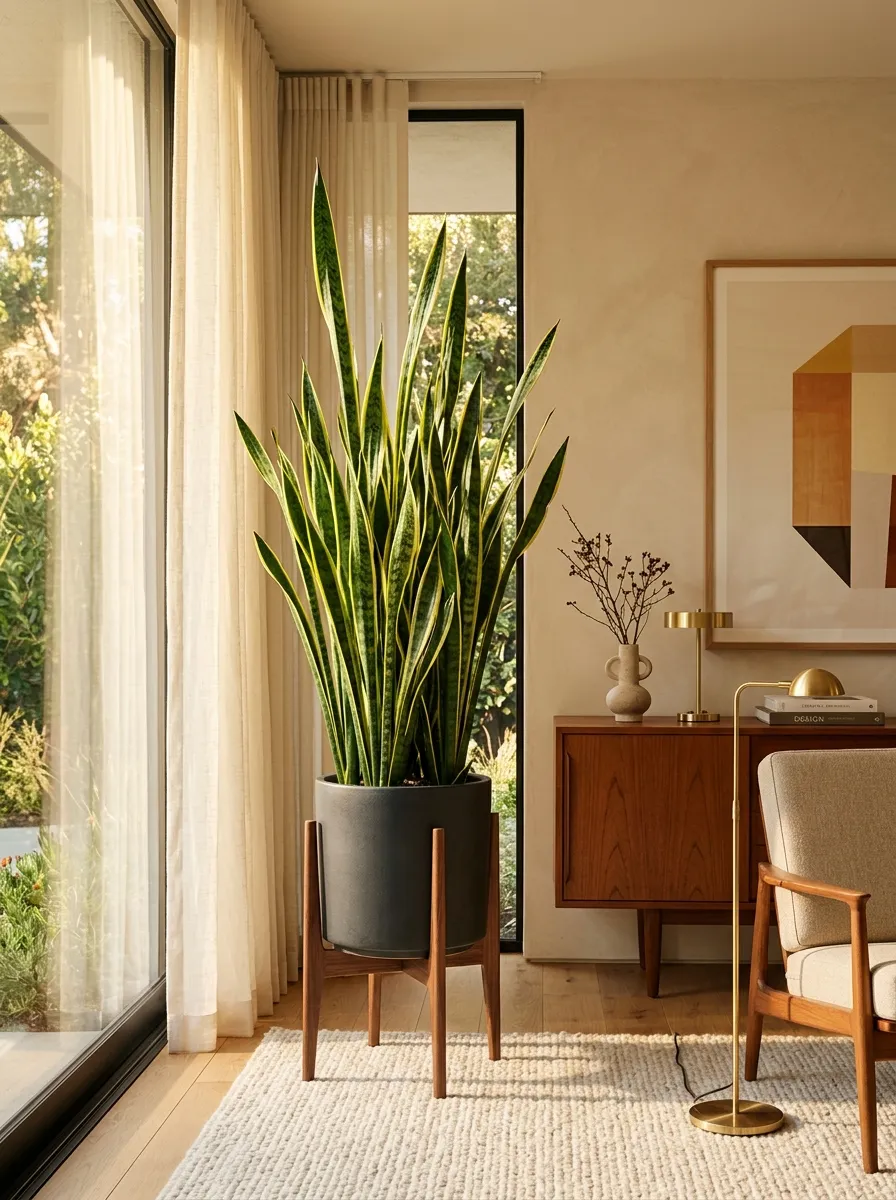
One massive plant beats ten tiny succulents every single time.
A cluster of small pots scattered haphazardly across a windowsill just reads as visual noise. Mid century modern interiors rely on bold, confident structural shapes.
Invest in a mature snake plant or a giant rubber tree. Drop it into a heavy ceramic planter, prop it on a wooden stand, and let it act as living sculpture in a dead corner.
A single large element commands respect. Multiple tiny elements create chaos.
Frame Abstract Geometric Art Instead of Quotes
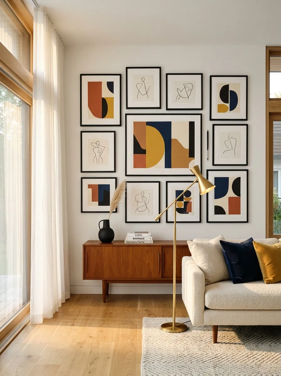
Word art kills the sophistication of a room instantly. No one needs a canvas telling them to “gather” in the dining room.
Hunt down abstract geometric prints or vintage Bauhaus exhibition posters instead.
The bold color blocking and sharp diagonal lines anchor the room without demanding you read them. Stick to simple black or oak gallery frames with thick white mats to make cheaper prints look expensive.
Asymmetrical color blocking in bold hues.
Minimalist, single-stroke line drawings.
Add Texture with a Flokati Rug
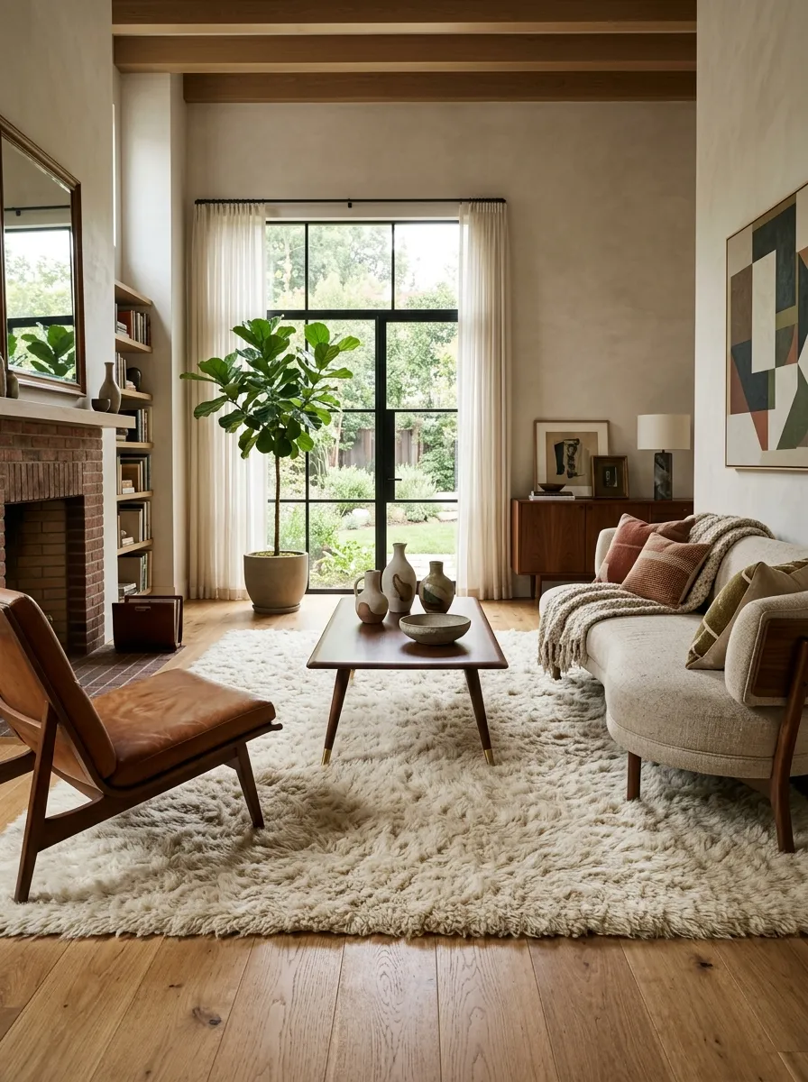
Too much wood and metal leaves a room feeling cold and severe. You have to break up those hard edges with serious texture.
Drop a thick, high-pile Flokati rug right under your coffee table.
The shaggy wool creates a brutalist-but-cozy friction against the sharp, tapered legs of your furniture. It softens the aggressive acoustics of a hardwood apartment and gives the eye a place to rest.
If you knock your knuckles against every surface in the room and it sounds hollow or hard, you desperately need wool or sheepskin.
Trade the Bulky TV Stand for a Low Profile Console
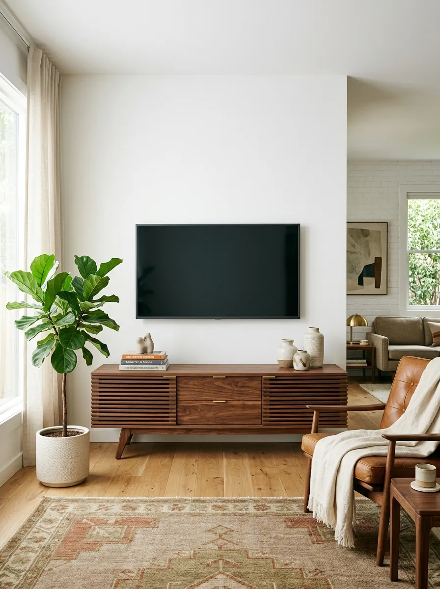
Look at the gap between your television and the top of your media stand. If it’s crammed tight, the proportions are entirely wrong.
Mid century modern design demands negative space. Ditch the chunky media cabinet that takes up half the wall and weighs down the room.
Bring in a low, slatted console. The longer and lower the piece sits, the better the geometry looks against your wall.
Your TV should span no more than two-thirds the width of the console underneath it. Any wider, and the entire setup looks dangerously top-heavy.
Mix Leather and Velvet Textures
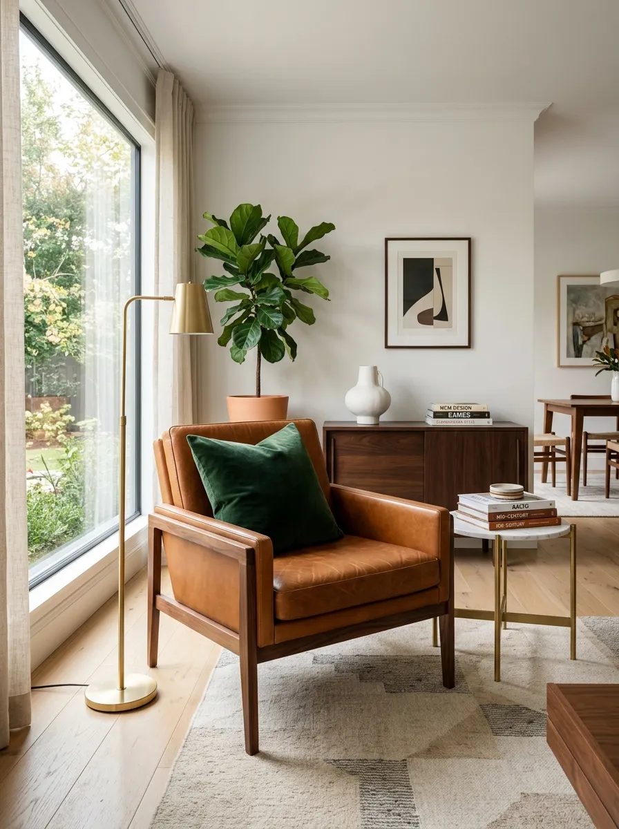
A room with just canvas and cotton feels cheap. You need friction.
Contrast a sharp caramel leather armchair with a soft, deep green velvet pillow. The clash of materials is exactly what makes mid century modern feel expensive and collected.
If every single piece of upholstery in your living room features the exact same linen blend, the space looks incredibly flat. You have to force opposing textures to live right next to each other.
Leather provides structure. Velvet provides luxury. You need both to stop the room from feeling completely sterile.
Stick to Matte Black Metal Finishes
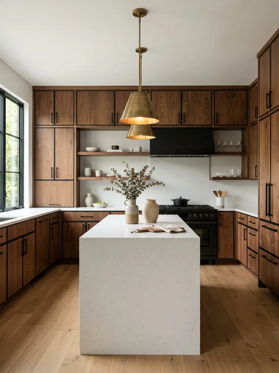
Never mix more than two metal finishes in the same room. Shiny chrome and brushed nickel look terribly dated together.
Pick matte black hardware as your permanent baseline. It grounds the room, acts like thick eyeliner for your furniture, and modernizes vintage wood pieces instantly.
Swap out the cheap silver knobs on your landlord’s cabinets for matte black pulls. It takes twenty minutes and radically changes the kitchen.
-
✓
Matte black cabinet pulls (Primary)
-
✓
Aged brass light fixtures (Accent)
-
✗
Brushed nickel or shiny chrome (Never)
Group Decor in Odd Numbers Only
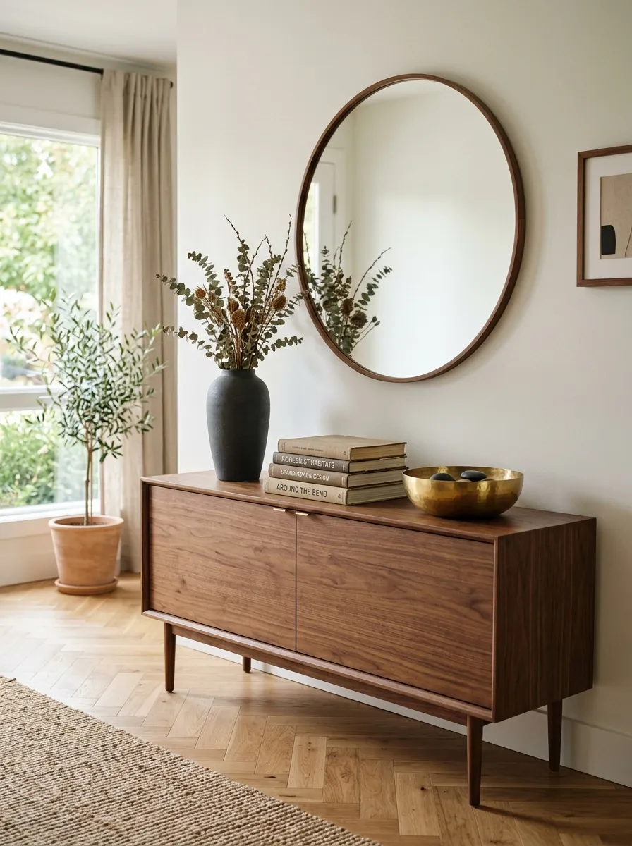
Symmetrical decor looks incredibly stiff. Putting one matching candlestick on each end of a console table is completely boring.
Arrange your objects in clusters of three or five instead.
Vary the heights. A tall ceramic vase, a medium stack of art books, and a low brass bowl create an aggressive, intentional triangle that the eye naturally loves to follow.
The human eye actively searches for the center of an arrangement. Even numbers force the eye to bounce around aimlessly.
Bring in a Teak Room Divider
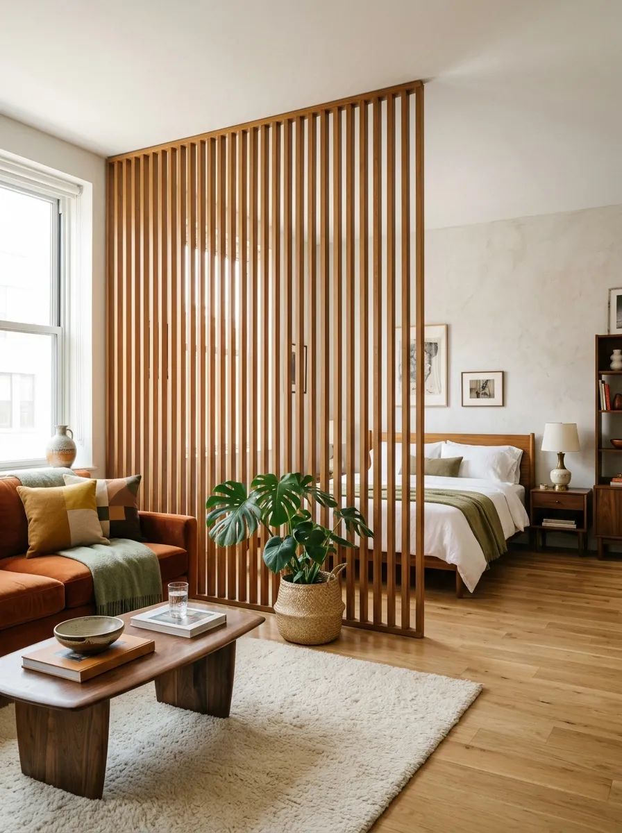
You can absolutely fake separate rooms in a studio apartment without building physical walls.
Open floor plans often look like messy furniture showrooms if you aren’t careful about zoning.
Drop a slatted teak room divider directly between your sleeping and living areas. It breaks up the square footage perfectly while letting the natural window light filter through the wooden slats.
| Solid Bookshelf Divider | Slatted Teak Divider |
|---|---|
| Blocks all natural sunlight | Filters light beautifully |
| Feels like a heavy, claustrophobic wall | Feels like deliberate, custom architecture |
Skip the Sectional for a Streamlined Sofa
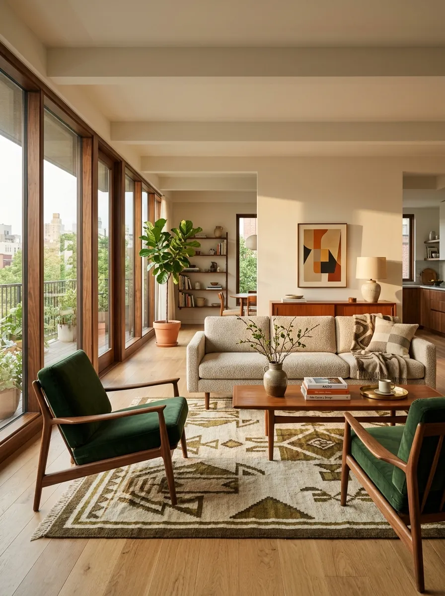
Buy a standard three-seater sofa instead of an L-shaped monster.
Sectionals eat up valuable corners and dictate the entire layout of the room. You become trapped into exactly one furniture arrangement.
A straight sofa gives you the freedom to bring in contrasting lounge chairs. Mixing different seating frames is exactly how you build a credible mid century aesthetic.
A sofa plus two distinct accent chairs creates a conversation circle. A sectional simply forces everyone to stare straight at the television.
Use Tension Pole Shelving for Vertical Storage
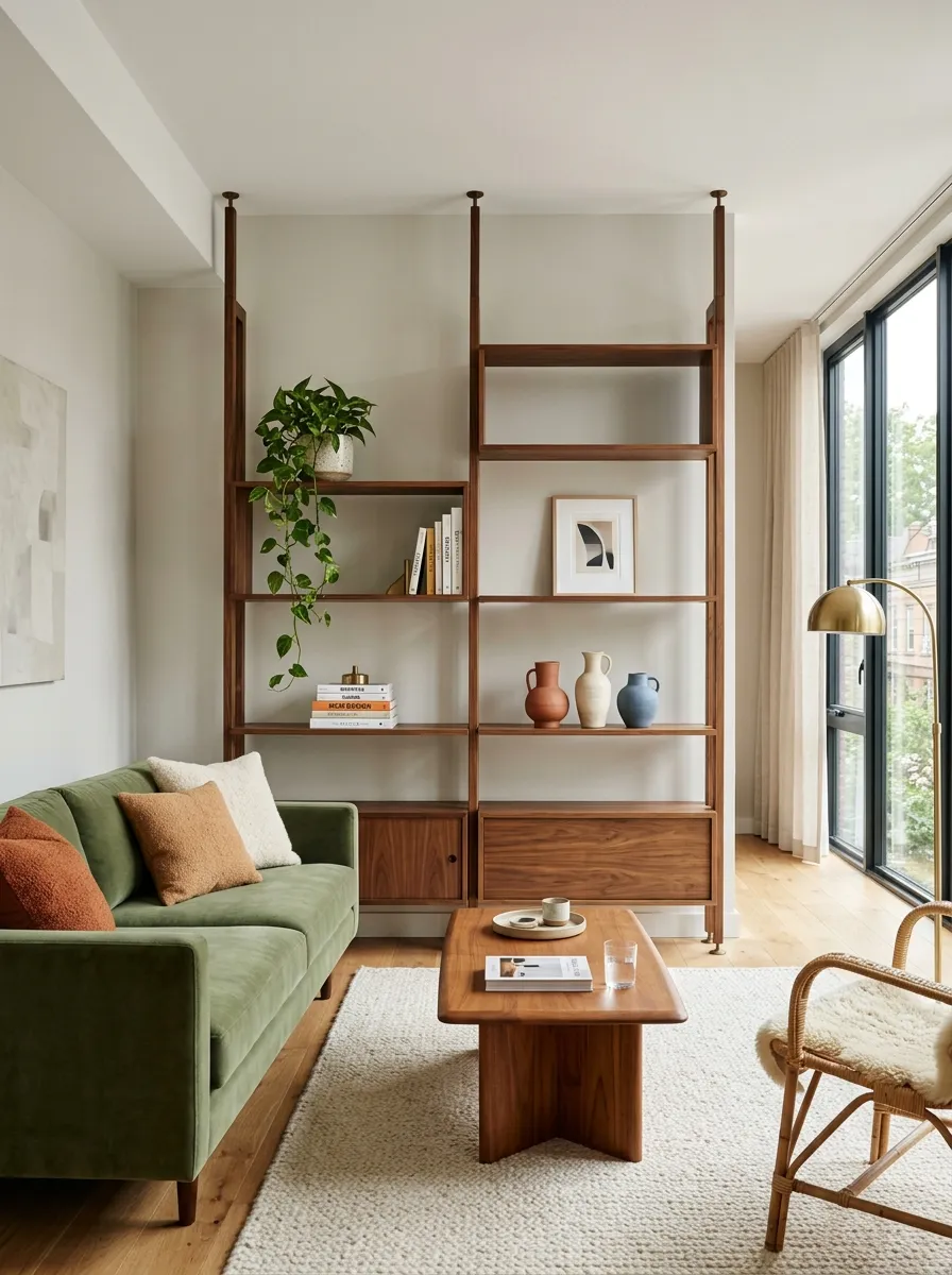
Getting things off the floor is mandatory in a tight layout. Free-standing, solid-backed bookcases eat up precious square footage and look incredibly heavy against a wall.
Instead, install tension pole shelving.
These units brace directly between your floor and ceiling, requiring zero screws or anchors in your apartment walls. The open sides let light pass entirely through the structure, making the whole system feel weightless. It’s the ultimate renter hack for an authentic 1960s modular look without sacrificing your security deposit.
Do not pack these shelves full of books. You must leave at least thirty percent of the shelf space completely empty to maintain the airy, floating effect.
Swap Plastic Blinds for Bamboo Shades
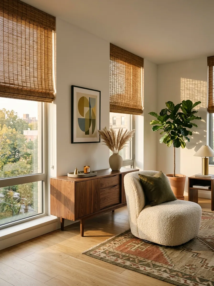
Landlord-issued white plastic blinds completely ruin a well-designed room. You can’t just ignore them. Leaving them pulled down makes the space feel like a cheap corporate office.
Rip them out and store them under your bed.
Hang woven bamboo or rattan Roman shades instead. The natural wood tones filter the harsh afternoon sunlight beautifully and add another necessary layer of organic texture to your walls. When your lease is up, just pop the plastic tracks right back in.
Standard aluminum or plastic blinds create harsh, horizontal shadow lines that clash with the clean geometry of your furniture. Woven shades diffuse the light into a soft, ambient glow.
Layer Lighting with Mushroom Lamps
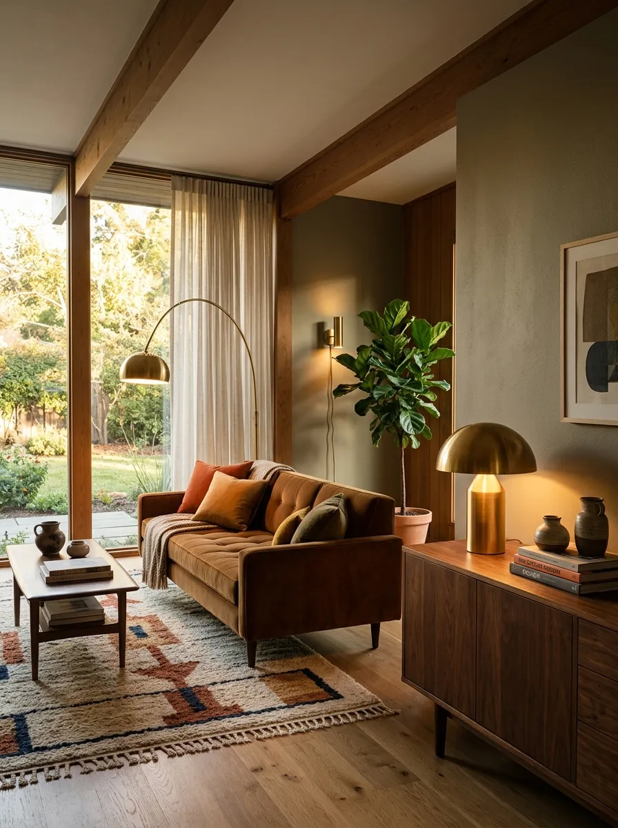
You’re sitting on your sofa at night and the room feels stark. That happens when your main light source sits higher than your eye level.
Bring the light down to the human level. Put a dome-shaped mushroom lamp on your side table or credenza.
The solid metal shade forces the light downward, bouncing a warm glow off the tabletop instead of blinding you directly. It provides exactly the right amount of moody, localized light while bringing a distinct, classic silhouette to the room.
A tall floor lamp near the seating area.
A low mushroom lamp on the credenza.
A plug-in sconce illuminating dark corners.
Hide Every Single TV Cord
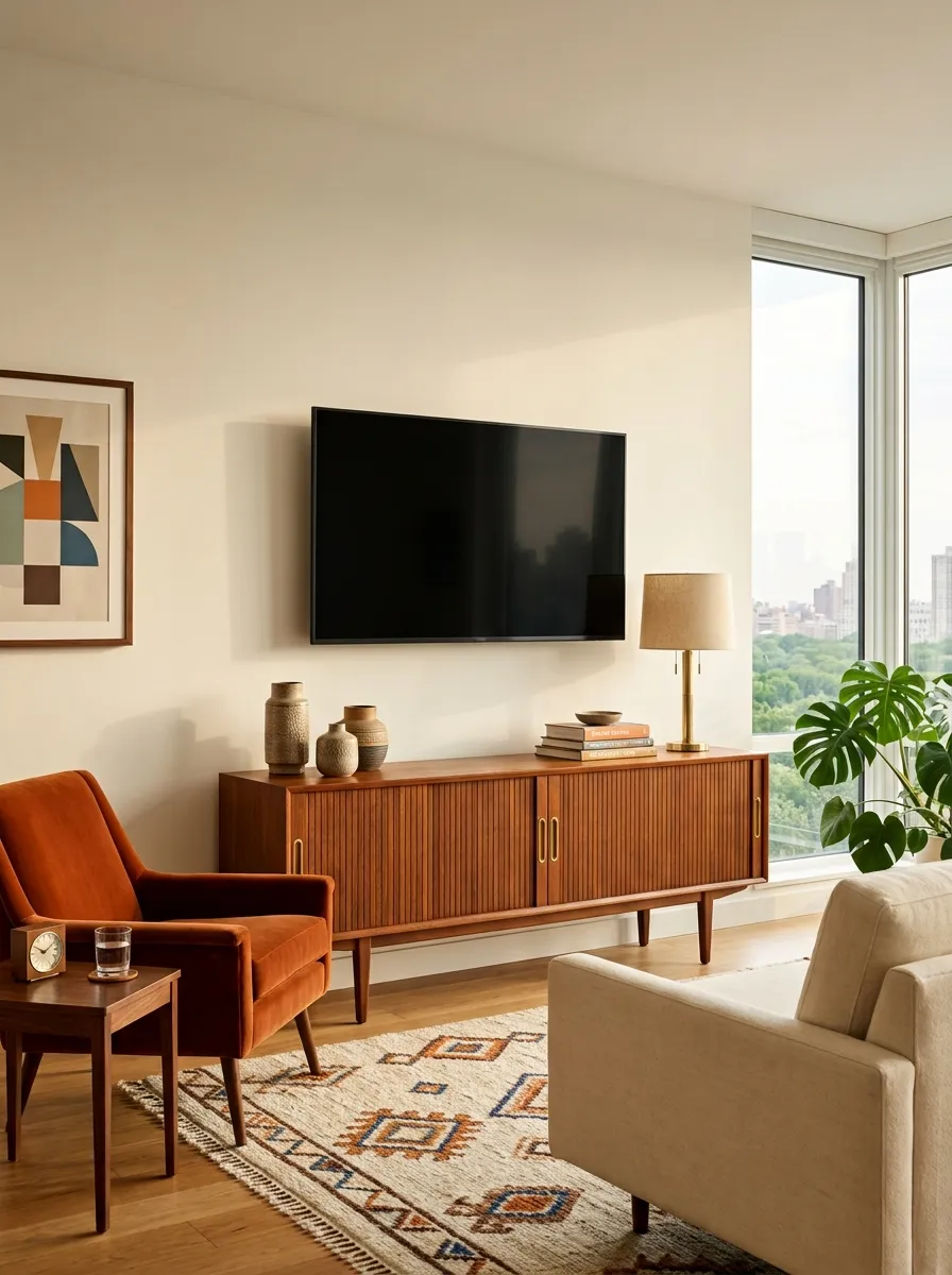
Visible cords destroy the illusion of a premium space instantly. A beautiful teak console means absolutely nothing if a tangled mess of black wires hangs down from the wall-mounted television above it.
You have to hide them.
Run the cables through a cheap, paintable wall channel. It takes ten minutes and makes a basic apartment setup look like custom architectural work. Do not let lazy cable management ruin the visual impact of your expensive furniture.
Exposed wires immediately drag the eye away from your furniture and toward the mess. A $15 cord cover is the cheapest, highest-impact upgrade you can make in a living room.
Choose Warm White Bulbs Only
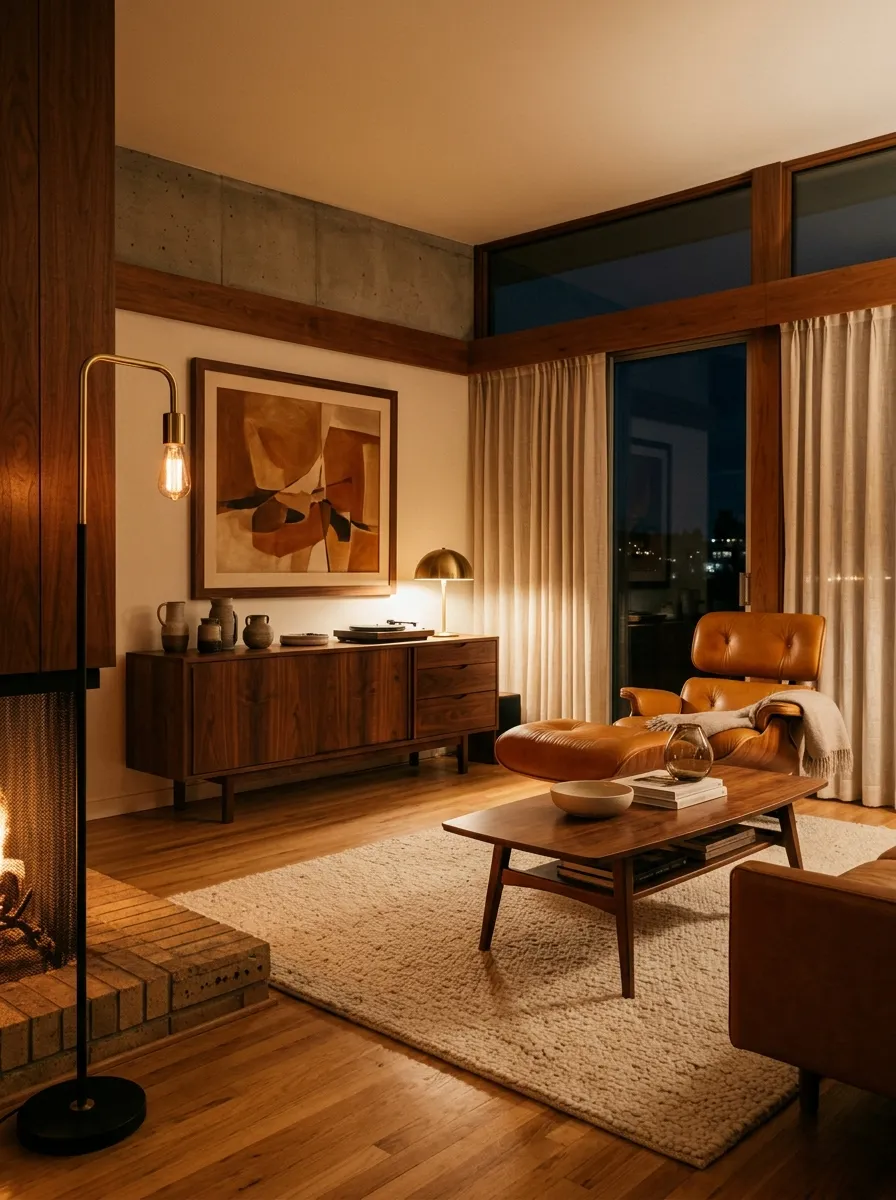
A beautifully styled room looks incredibly cheap the second you flip on a daylight-toned LED bulb.
Blue-toned light belongs in a hospital lobby, not a living room. It washes out the rich walnut woods and makes caramel leather look completely flat.
Buy bulbs rated at exactly 2700K. This specific warm white spectrum mimics late afternoon sunlight. It creates the heavy, moody ambiance that mid century design demands. Go through your apartment and throw out every cool-toned bulb you own right now.
Never buy a bulb simply labeled “Soft White.” Always check the back of the box for the exact number. 2700K is the absolute limit for living spaces.
Prop a Sunburst Mirror Near a Window
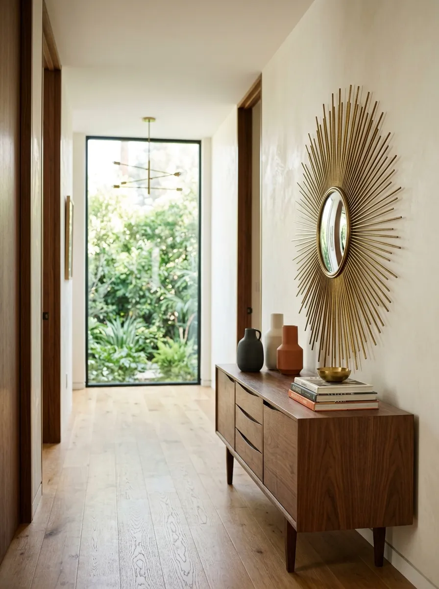
You walk into a narrow apartment hallway and it feels like a cave. Dark corners make even a large room feel claustrophobic. You need to bounce light around without rewiring the walls.
Prop a large sunburst mirror on a console table directly opposite a window.
The spiked brass or wood rays act like architectural sunbeams, catching daylight and throwing it deep into the room. It’s an easy visual trick that breaks up blank drywall and adds that signature atomic-age punch.
Never hang a mirror where it reflects a blank wall. Position it to capture a window view or a statement light fixture.
Introduce Terrazzo Trays for the Coffee Table
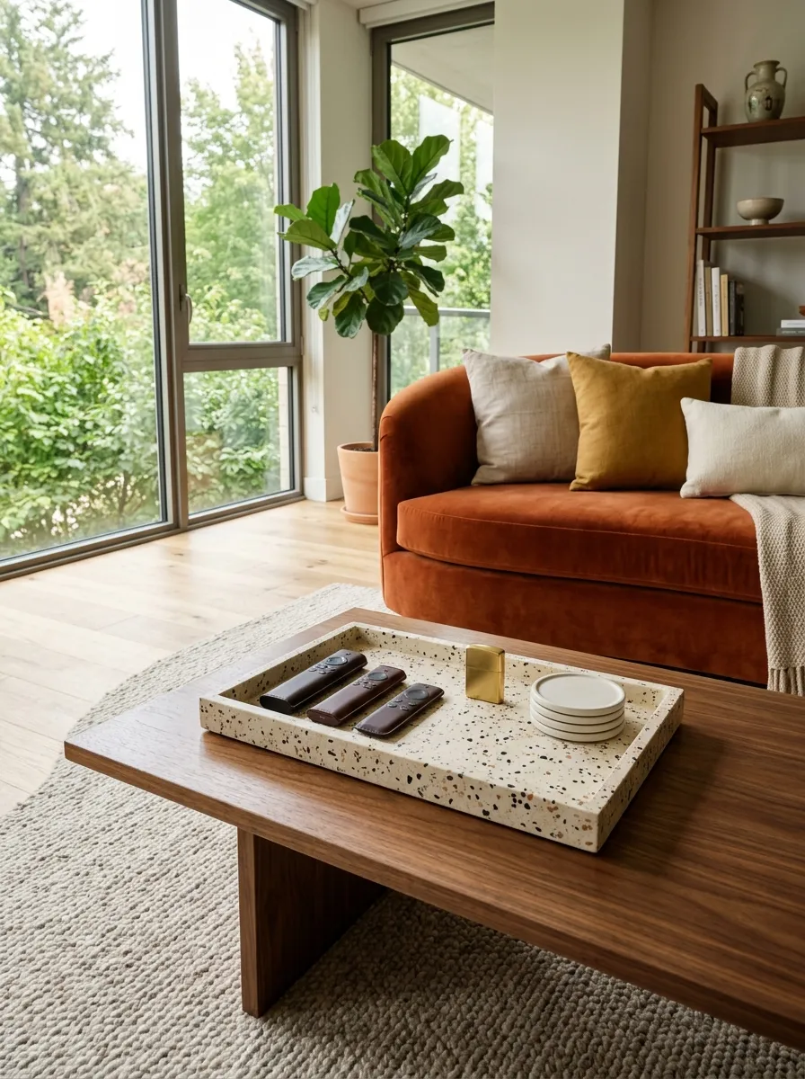
Stop letting your remote controls and coasters float aimlessly across your coffee table. It looks messy in seconds.
Corral your small everyday items inside a heavy terrazzo tray.
The speckled stone pattern brings classic mid century texture to flat wood surfaces. It creates an instant boundary between functional clutter and intentional design. Keep it to one tray per surface so you don’t crowd the room with random rocks and dishes.
-
✓
One terrazzo tray for remotes and lighters.
-
✓
Zero random items floating on bare wood.
Restyle Your Bookshelves by Shape
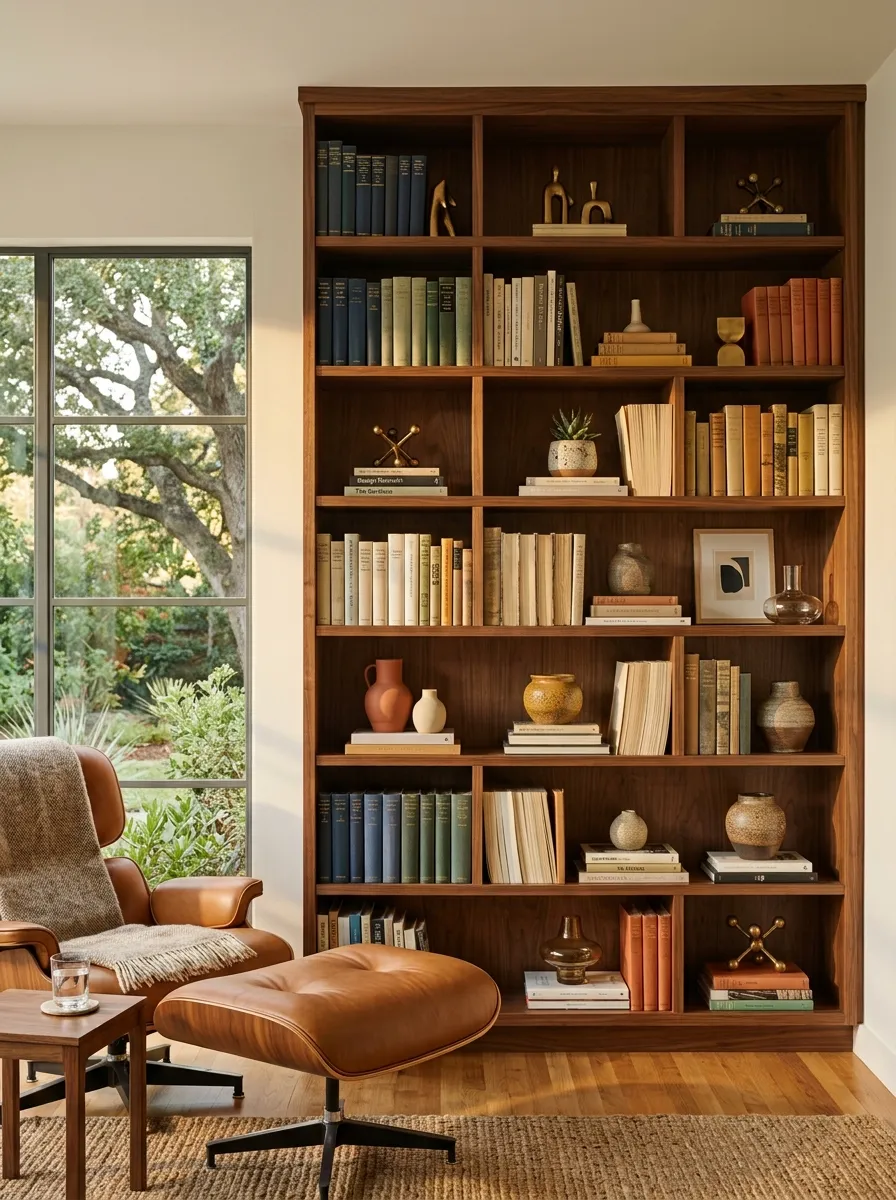
Stacking your novels uniformly vertical across every shelf makes your bookcase look like a suburban school library. Break the monotony immediately.
Turn every third stack sideways so the pages face outward.
Alternate vertical rows with horizontal piles, and nestle small brass objects into the gaps. This asymmetrical arrangement creates visual depth and stops your storage from looking like a flat grid of paper.
Great for structural bookends and fast scanning.
Creates a sturdy base for small ceramic decor items.
Repurpose a Bar Cart as a Plant Stand
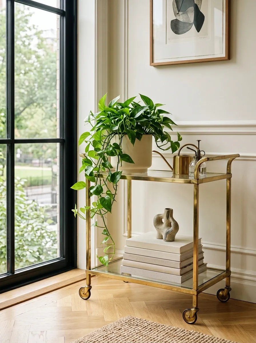
You get dual-tier mobility and instant height variation by rolling a vintage brass bar cart into an unused corner. If you don’t mix cocktails every weekend, don’t let a bar cart sit empty or turn into a liquor graveyard.
Load the top tier with a trailing pothos and the bottom shelf with heavy art books.
The wheeled frame lets you easily pivot your greenery toward the best window light whenever the seasons change.
Never use a bar cart as a permanent storage dump for mail and keys. If it doesn’t hold plants or glassware, clear it off.
Lean Oversized Art Instead of Mounting It
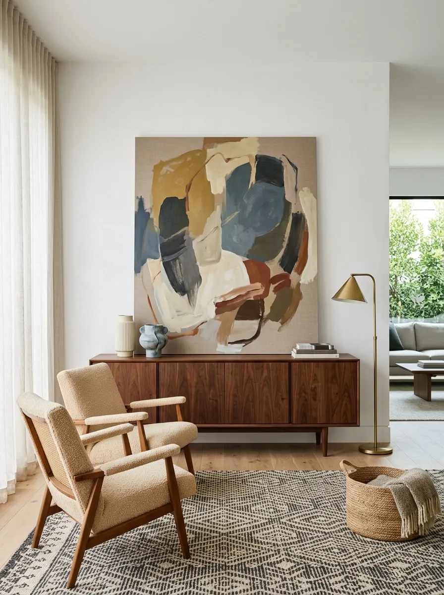
Stop punching holes in your drywall for every single frame.
Lean an oversized, unframed abstract canvas directly on your credenza or the floor. It completely shifts the vibe of the room from formal gallery to relaxed studio.
The relaxed tilt adds a layer of depth that a flush-mounted wall piece can never touch. It’s the ultimate renter-friendly move that screams confidence.
Leaning art creates a casual, lived-in architectural layer that flat wall-hanging misses entirely.
You don’t need a massive budget or a historical home to build a sharp mid century modern apartment. You just need to stop playing it safe with bulky furniture, matching showroom sets, and washed-out lighting. Swap the generic pieces for low-profile lines, warm walnut tones, and aggressive textures. Commit to the geometry, clear out the visual clutter, and let your space finally breathe.
Save this list for the next time you’re ready to overhaul your apartment layout.