
Pink and green have been fighting each other on bedroom mood boards since roughly forever. And most of the time, they lose. You end up with a room that looks like a Valentine’s Day display at a garden centre — neither colour doing anything particularly interesting, both of them just sort of existing in proximity and hoping for the best.
The rooms that actually work have figured out something the moodboards miss. Pink and green aren’t opposites. They’re the same palette operating at different temperatures. Sage and blush are basically the same colour in different lighting. Forest green and hot pink are the same palette with the volume turned all the way up. Once you understand that, the combination stops being a gamble and starts being a system.
What follows is not a list of rooms that are pink and green. It’s a list of rooms that made a decision — about temperature, about tone, about which colour leads and which one follows — and executed it with enough conviction that the result looks deliberate rather than accidental.
That’s the job.
Why Pink and Green Rooms Go Wrong
The combination has a worse track record than it deserves, and most of the failures come down to the same two or three mistakes made over and over.
You Split the Palette Fifty-Fifty
The most common mistake is treating pink and green as equals. One colour on the walls, one colour on the bedding, split right down the middle. The room ends up looking like it couldn’t decide and chose both.
Every strong colour palette has a lead and a supporting role. In most of the rooms that work, one colour takes seventy to eighty percent of the space and the other appears as a counterpoint — in pillows, in a single curtain panel, in a lamp base, in a rug accent. The hierarchy is what gives the eye somewhere to rest and somewhere to go.
Decide which colour leads. Then let it lead.
You Picked the Wrong Version of Each Colour
Pink and green only work together when their undertones are compatible. A warm peachy-pink and a cool blue-green are fighting each other at the molecular level. A cool dusty rose and a grey-leaning sage are the same temperature and they’ll sit quietly next to each other all day.
This is the part nobody talks about when they pin a pink-and-green room and then wonder why their recreation looks wrong. The colours in the original were temperature-matched. The colours in the recreation weren’t.
Before buying anything, hold your swatches together in the actual room’s light. If one looks warm and one looks cool, keep looking. When you find the combination that reads as a single palette operating at two intensities, you have your pair.
You Added Too Many Accent Colours
Pink and green are already doing a lot. They don’t need help from gold, and they definitely don’t need blue, and they absolutely do not need all three.
The rooms in this collection that are most successful use a strict third colour — usually white, cream, or natural wood — and nothing else. White keeps the palette fresh. Cream warms it. Wood grounds it. Any other colour introduced at significant volume starts to compete with the core pair and the whole thing unravels.
Neutrals are not boring. In a pink-and-green room, they are the structure that makes the pink and green readable.
Pink and Green Dorm Room Ideas
Green Ikat Headboard Blue Trim Preppy
This room is the most fully-realised of the collection and also the most expensive to attempt. Most of it requires custom fabric or specialist sourcing. It is included because the principles it demonstrates are applicable at any budget.
The headboards — there are two, for a shared double room — are upholstered in a green-and-white ikat print, with a contrasting trim in periwinkle or cornflower blue applied along the arched profile of each headboard. The arch at the top of the headboard is the silhouette detail that elevates this from a standard upholstered panel to something architectural.
To approximate this without custom work: source a headboard panel in any fabric, then apply ribbon or trim in the contrasting colour along the top edge with fabric glue. The trim takes thirty minutes and transforms a basic upholstered panel into something that looks designed.
Behind the headboards, the wall is covered in a thin stripe wallpaper in white and pale blue-green — the kind of narrow stripe that reads almost as a solid from across the room and only reveals its pattern close up.
The bedding is entirely white — white duvet, white skirt, white pillow cases — so the headboard and wall do all the visual work above the mattress level. Blush pink throw pillows in a bold print (chevron or abstract) and pale blue-green square accent pillows provide the colour at pillow height.
Between the two beds, a white cabinet with a white top surface acts as the shared nightstand. Two blue ceramic lamp bases with white drum shades, one on each side of the cabinet. A small orchid plant at the centre of the cabinet top.
On the floor between the two beds and the window: a large watercolour-style rug with botanicals in pink, green, and soft blue — the room’s supporting colour brought to the floor. Two small green upholstered benches at the foot of each bed.
Green Velvet Hot Pink Stripe Graphic
This room is not interested in being gentle about it.
The headboard is a flat panel in forest green velvet — deep, saturated, slightly shiny in certain light. The kind that photographs dark and reads rich in person. Behind it, the wall stays white because the headboard is already making a significant statement and the wall does not need to compete.
The bedding is the same forest green, in a velvet or microfibre fabric rather than linen. Smooth and glossy rather than textured. On top of the duvet, two pillows in hot pink satin or silk — not blush, not dusty rose, but saturated magenta-pink that reads almost neon next to the forest green. A single cream waffle-knit throw across the foot provides the only neutral in the scheme.
The desk gets a single pink lamp base — a bold ceramic or glass piece in the same hot-pink family as the pillows — with a white fabric shade that keeps the light source from becoming too aggressive.
On the wall above the desk: a simple framed print in black and white. One shelf on the wall opposite the bed: a small green plant in a ceramic pot and two or three books, colour-coordinated in green and pink covers.
The rug runs the length of the room in green and pink stripes — wide stripes, not thin, in the same saturated tones as the bedding. The stripe provides the pattern that the rest of the room — all solid colour — needs. The room looks like it knows exactly what it is and has decided to be it more.
Sage Gingham Twin Botanical Print Country
The room is built around a single textile choice and it gets out of the way after that.
The textile is gingham — a classic check in sage green and cream-white, in a medium-scale pattern that reads as pattern from across the room without being aggressive about it. Source this as a duvet cover and matching pillow shams. The gingham is the defining element. Everything around it is quiet.
The wall above the bed gets two large prints in warm wooden frames — simple pressed botanical or herbarium-style prints, the kind that look like they were lifted from a Victorian field guide. The frames should be oversized relative to the prints, with generous white matting. The prints don’t add colour. They add calm.
Between the two beds (if this is a shared room) or beside the single bed, a pine or reclaimed-wood nightstand in a warm honey tone holds a single white dome lamp and a small ceramic bowl with a plant cutting. A small stack of three books, white and cream spines only.
The duvet in gingham, the white-linen pillow cases underneath, and the blush pink lumbar pillow on top provide the full colour story of the bed zone. The pink appears only in the lumbar pillow. One pillow. That is sufficient.
The rug is jute or natural fibre, large enough to run under both beds if shared, in an undyed neutral that lets the gingham be the pattern moment. Sheer white curtains on the window, floor-length, light-filtering. The room has a particular Sunday-morning quality that is difficult to achieve and impossible to fake.
Sage Duvet Blush Pillow Rattan Glow
Start with an unadorned white cinder block wall and work backward from there. The wall does not need help. What it needs is something in front of it with enough personality to make the blankness look intentional.
A simple white floating shelf above the head of the bed, level and clean, holds three objects: a small white ceramic vase with a single dried rose, a small ceramic bowl in any muted finish, and one smooth stone or sculptural object. That is the entire wall decoration. Nothing else goes up.
The bed itself carries all the palette work. A sage linen duvet — washed, slightly rumpled, the kind that looks lived in from day one — with blush pink pillowcases layered behind a set of standard white pillows. The pink is in the pillowcases, not the duvet. The sage is the lead. A cream waffle-knit throw folded across the lower third of the bed adds texture at a neutral tone.
For the nightstand, use a white-painted wooden crate set on its side. On it: a rattan table lamp with a warm bulb — the woven shade will cast a honeyed glow against the white wall behind it. One small trailing plant in a white pot. Nothing else on the surface.
The curtain panel at the window matches the duvet exactly — sage linen, tab-top or rod-pocket, floor-length if possible. The rug at the foot of the bed is a medallion in sage and dusty pink, sized to extend under the bed’s front legs and toward the desk. The palette is sage-led with a single pink note and it holds together with the discipline of a room that has said no to a lot of things.
Mint Pastel Lofted Storage Pink Glow
Loft the bed as high as the facility will permit. Use the under-bed space as a second room: a desk zone, a storage zone, a place where the work happens while the sleep zone floats above it.
The bedding on the lofted mattress is mint — soft, pale, slightly blue-green — layered with a white waffle-knit throw. Blush pink cube fabric bins fill the storage framework underneath the bed, visible from the room, contributing to the palette even while doing their storage job.
On the wall at desk level, run a strand of warm globe fairy lights along the perimeter where the wall meets the ceiling of the under-bed space. This creates a warm glow at eye level when seated and makes the study space feel intentional rather than improvised.
The desk surface is a simple white or light wood top. On it: a small mint-green ceramic lamp, a pen cup in blush, one small print in a white frame with mint-and-peach abstract shapes, and a macramé wall hanging on the wall beside the desk — natural cotton, small, decorative without dominating.
At the window, pink-hued cube storage bins carry the under-bed palette toward the light source. A seagrass or woven basket hung on the wall beside the window adds organic texture without colour. The rug is mint and blush pink in a geometric pattern, pulled out from under the bed’s footprint to define the floor as one zone.
Cottagecore Pink Floral Lavender Bundles
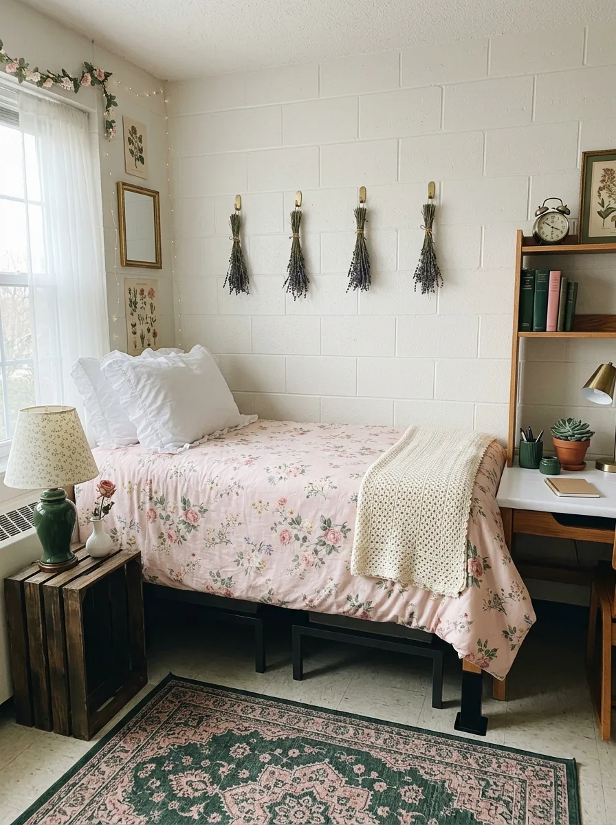
The bed is entirely floral. Find a duvet or comforter in a traditional English-garden rose print — soft pink blooms on a cream or blush ground, with green leaves rendered in a slightly faded botanical-illustration style. This is the room’s central statement and it should be given full authority over the space.
The pillow cases are white with a subtle ruffle or eyelet trim at the edge. Not pink. Not printed. The ruffled white pillow case against a floral duvet is the combination that keeps cottagecore from crossing into kitsch — the white provides just enough restraint.
On the wall above the bed, mount four adhesive hooks in a row at even intervals. From each hook, hang a bundle of dried lavender — not a mixed botanical bundle, just lavender, uniform in variety and colour, stems bound with jute twine and hanging stems-down. The repetition and uniformity of the bundles makes the installation feel considered rather than random.
The nightstand is a dark-stained wooden crate. On it: a vintage-style lamp with a fabric shade in a small floral or ditsy print — the shade pattern should echo the duvet without matching it exactly. A single stem rose in a small white bud vase. Nothing else.
Beside the window, hang a collection of prints in gold frames at different sizes: botanical illustrations, a small mirror in a slightly tarnished gold frame, a framed antique map. All in warm-toned frames, nothing chrome or black.
On the opposite side of the room, a freestanding wooden bookshelf or ladder shelf holds books in green and cream spines, a small alarm clock in brass, a succulent in a terracotta pot, and one small piece of framed botanical art. The rug is a traditional medallion in deep green and dusty pink. The room looks like it was assembled over a long time by someone who likes roses.
Sage Neon Pink LED Edge Room
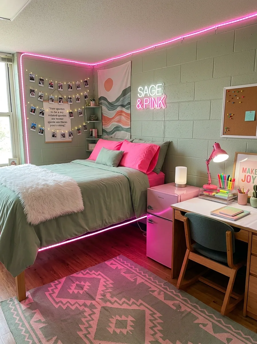
Paint the walls sage green — or, if paint is not permitted, apply sage-green contact paper to the area directly behind the bed from floor to ceiling. The sage is the ground colour. Everything that follows is built on top of it.
Run pink LED strip lights along the ceiling perimeter, tucked into the angle where wall meets ceiling so the strip itself is hidden and only the glow is visible. The glow should be warm-pink rather than magenta — the kind that photographs as rose-gold and reads in person as warm rather than garish. Run a second strip along the underside of the bed frame if the bed is raised, so the floor beneath the bed is softly lit in the same tone.
The bedding is sage — matching the wall closely so the bed reads as part of the architecture rather than a separate object dropped into the room. Hot-pink satin pillowcases on top, three or four of them, creating the saturated colour note that the LED lights are warming. A white faux-fur throw adds texture at a neutral tone.
Install a neon sign or LED light-up letter sign on the wall over the bed — something short, in the white or warm-tone setting rather than in a competing colour. Beside it, a simple fabric tapestry in the sage-and-peach palette.
Photo strings hang on the wall beside the window — polaroids or printed photos clipped to warm-light fairy lights, running in horizontal lines. The mini fridge becomes a side table beside the bed, covered with a small piece of marble contact paper on top to create a functional surface.
The rug is a geometric Aztec-style print in sage and pink, which absorbs and reflects the LED glow and makes the floor itself feel part of the scheme.
Olive Velvet Rose Gold Marble Desk
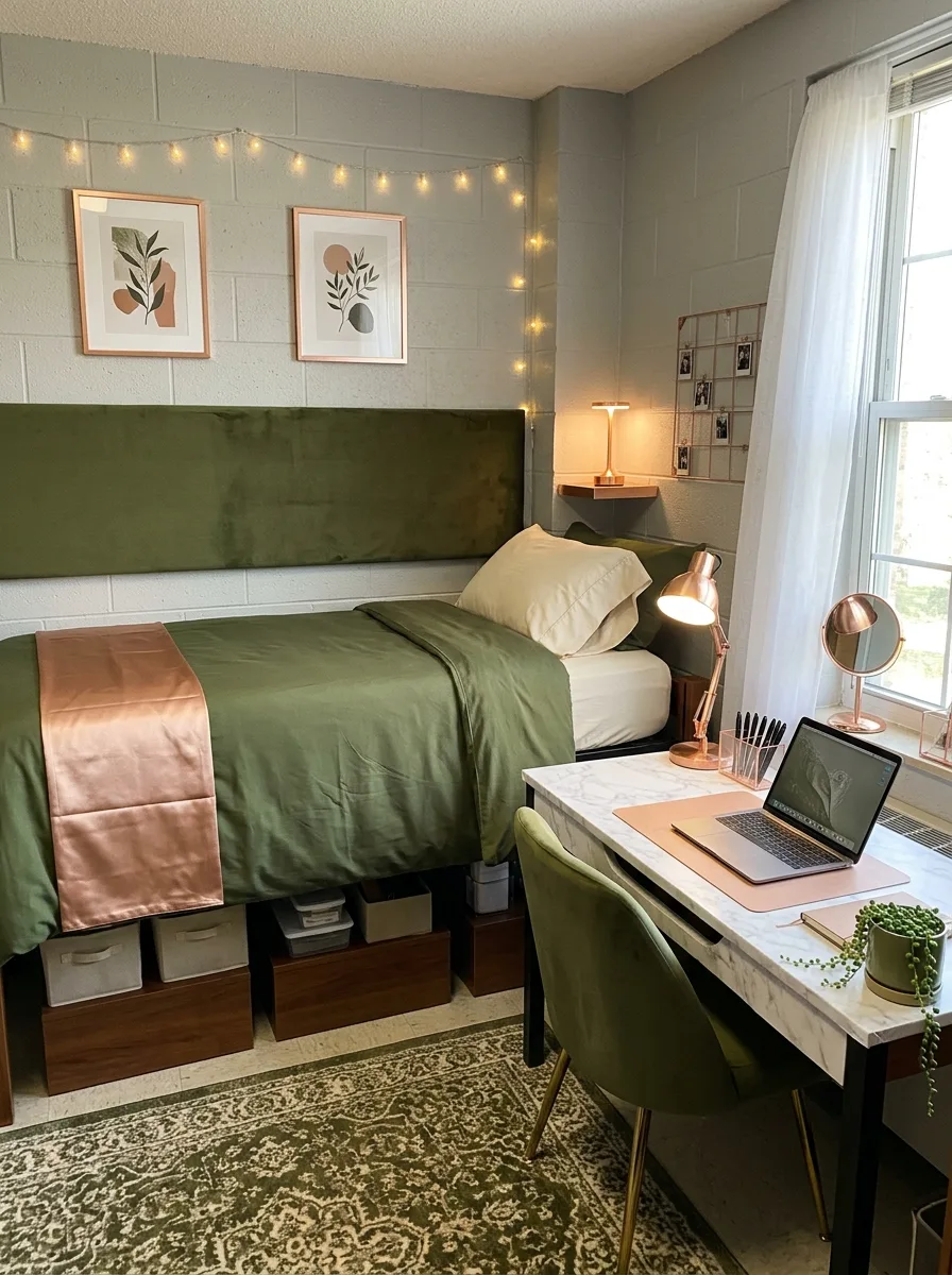
Paint the cinder block walls in a medium grey-green — not sage, not olive, but the colour exactly between them. The undertone is grey and the room will read as sophisticated rather than botanical.
The headboard is an oversized panel in olive or forest velvet, mounted flush against the wall and extending at least six inches on either side of the mattress width. Oversized is the point. A headboard that barely covers the pillow zone reads like an afterthought. A headboard that runs edge-to-edge of the bed zone reads like architecture.
The bedding layers forest green on cream: a dark olive duvet with cream pillow cases, finished with a blush-copper or rose-gold satin runner laid across the lower third of the bed. The satin runner is the pink accent for the bed — not a pillow, but a horizontal band of colour that photographs beautifully and reads as deliberate.
Cover the desk surface with white marble adhesive paper, extended down the front panel if visible. On the desk: a rose-gold or copper desk lamp, angled at the surface. A rose-gold compact mirror. A green velvet desk chair with gold-tipped legs, matching the headboard’s colour family.
Two framed botanical prints in a sage-and-cream palette hang above the bed in matching terracotta-orange frames. On the opposite wall, a small copper wire photo grid at eye level.
The rug is a large traditional medallion in olive and cream. The room earns its sophistication through material quality and palette discipline — the rose gold is only in the metal finishes, never in the fabric.
Cream Minimal Pink Sage Corner
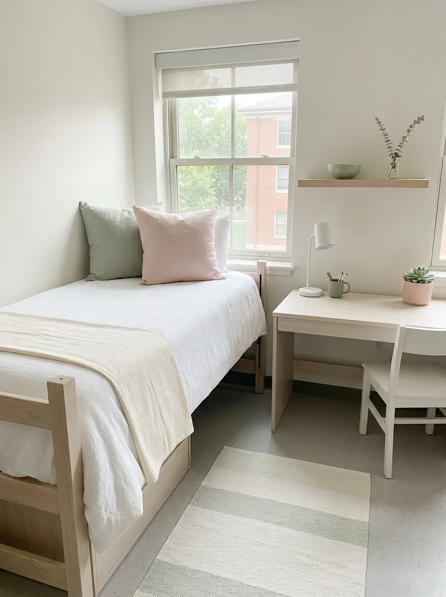
The defining move in this room is doing almost nothing and doing it precisely.
Every piece of furniture is white or bleached-blonde birch. White desk, white chair, blonde wood bed frame. The wall behind the bed stays completely bare. The ceiling gets no treatment. The floor gets one rug and nothing else.
A single floating shelf in blonde wood above the desk holds exactly three things: a small sage ceramic bowl, a glass bud vase with a few sprigs of dried eucalyptus, and one framed print leaned against the wall rather than hung. The lean is intentional. It signals that the room is edited, not empty.
The bed is dressed in white linen — a proper washed linen with visible weave and natural wrinkle — with one sage linen pillow at the back and one blush pink linen pillow in front of it. Two pillows total. The colour comes from the pillows alone.
The desk holds exactly what it needs to hold: a white ceramic lamp with a cylindrical shade, a sage green mug for pens, a small pink ceramic pot with a succulent, and a laptop. Nothing decorative beyond those three items.
The rug on the floor is a simple stripe in pale sage and near-white, flat-weave, the kind that reads as texture rather than pattern. It runs from under the bed toward the desk, claiming the entire floor zone as one.
The window covering is a white roller blind. The room achieves the effect of considerable care through what it has chosen not to include.
Sage Terracotta Macramé Boho Warmth
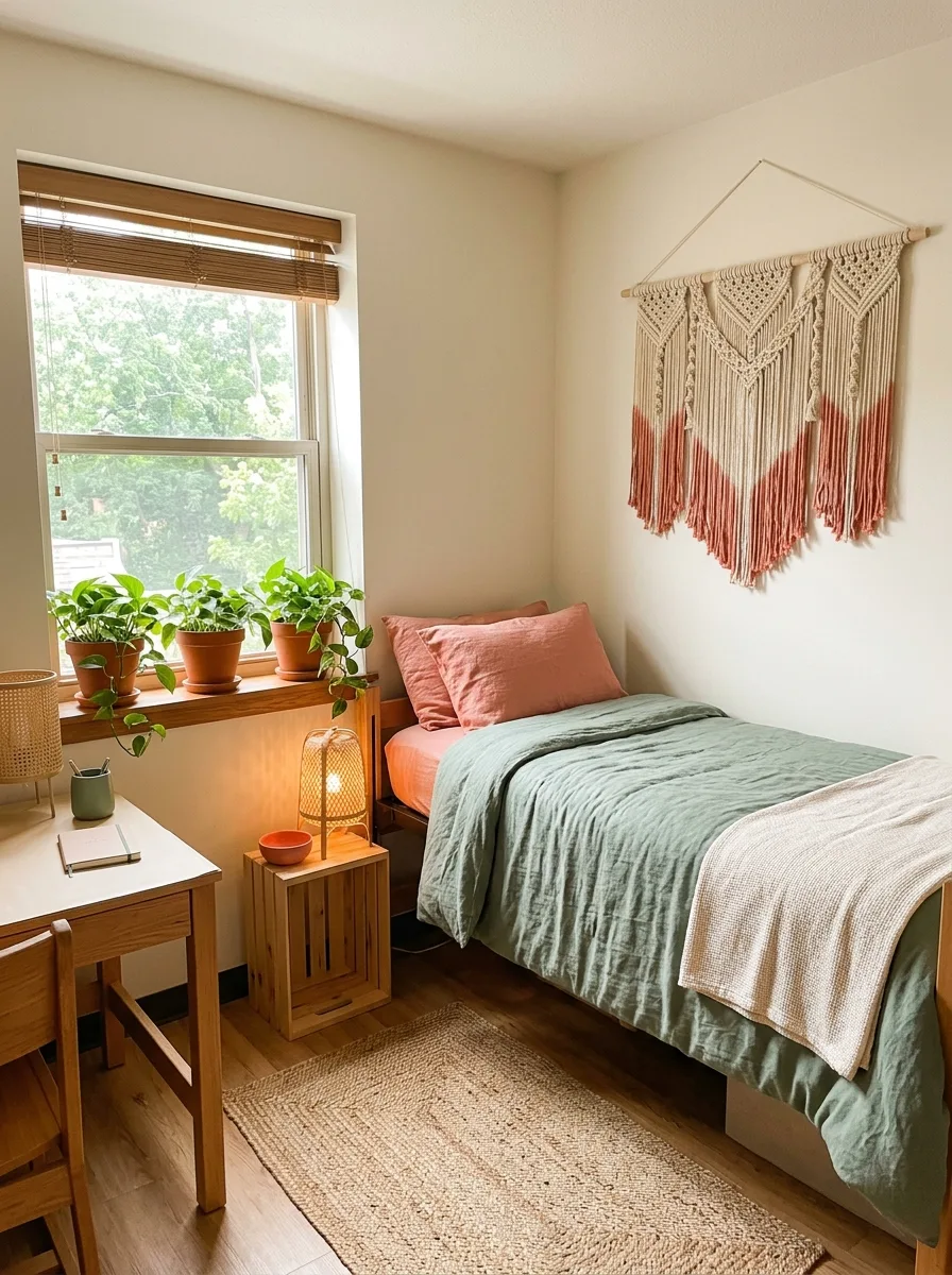
The wall behind the bed gets the largest macramé wall hanging you can find — a statement piece in natural cotton with dip-dyed fringe in a terracotta-orange or rust colour. The bottom of the fringe should hang at roughly pillow height or slightly above, and the piece should span at least two-thirds of the bed’s width.
Mount a bamboo roman blind on the window rather than curtains. The flat horizontal lines of the blind provide a structural counterpoint to the vertical fringe of the macramé.
The bedding is sage-green linen — washed, not crisp — with blush terracotta pillow cases in a similar washed-linen texture. The pillow colour echoes the macramé’s dip-dyed fringe. A cream waffle-knit throw at the foot of the bed keeps the warmth going at a neutral tone.
On the windowsill, place three to five pothos or heartleaf philodendrons in terracotta pots of varying heights. The terracotta pots connect the botanical element of the room to the warm tones in the macramé and the pillow cases. Use a wooden crate nightstand in natural pine — unfinished or lightly sanded — with a small rattan cage lamp on top, the kind with an open-weave shade that casts dappled patterns on the wall.
The desk is light oak or birch. The rug is jute or sisal — natural, textured, undyed — which grounds everything without adding a competing colour. The room is warm enough without any additional heat.
Green Velvet Panel Plaid Pink Prep
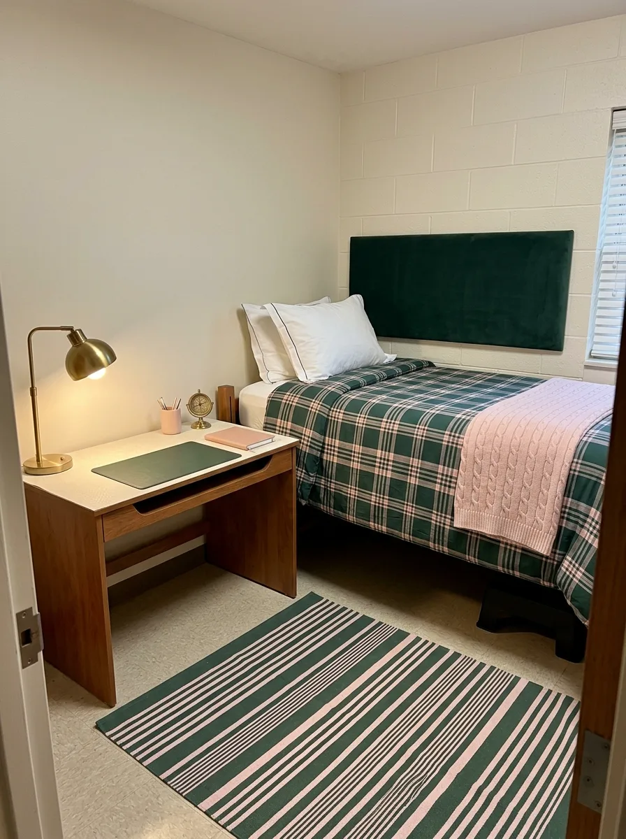
This is essentially the same room as a wood-panelled library, except it’s eighty square feet and contains a bed.
The headboard is a wide, low-profile panel in forest green velvet, leaning against the wall rather than mounted. Wide and low, not tall and narrow — the proportions matter. Wide gives the bed a sense of authority without dominating the small room’s vertical space.
The bedding is green-and-pink plaid — a traditional tartan or windowpane check in forest green, white, and pale pink. The plaid does the colour-mixing for you, so the rest of the room can stay simple. White pillow cases, not printed or coloured. A cable-knit throw in blush or pink draped across the lower corner.
The desk is walnut or dark wood-finish, not oak, not black. A brass desk lamp with a dome shade. A green leather or faux-leather desk pad — the kind with a rolled edge that looks like it belongs on a nineteenth-century writing table. A brass pen cup. A small globe in brass on the desk surface.
The rug on the floor is a striped flat-weave in green, pink, and cream — the horizontal stripe perpendicular to the length of the bed, so the pattern runs across the room rather than toward it.
On the wall: a simple gold-frame piece of art hung at eye-level height. On the wall beside the desk: a vintage-style map or a set of framed antique botanical prints in the same warm-toned frames.
Forest Green Sconce Rose Duvet Moody
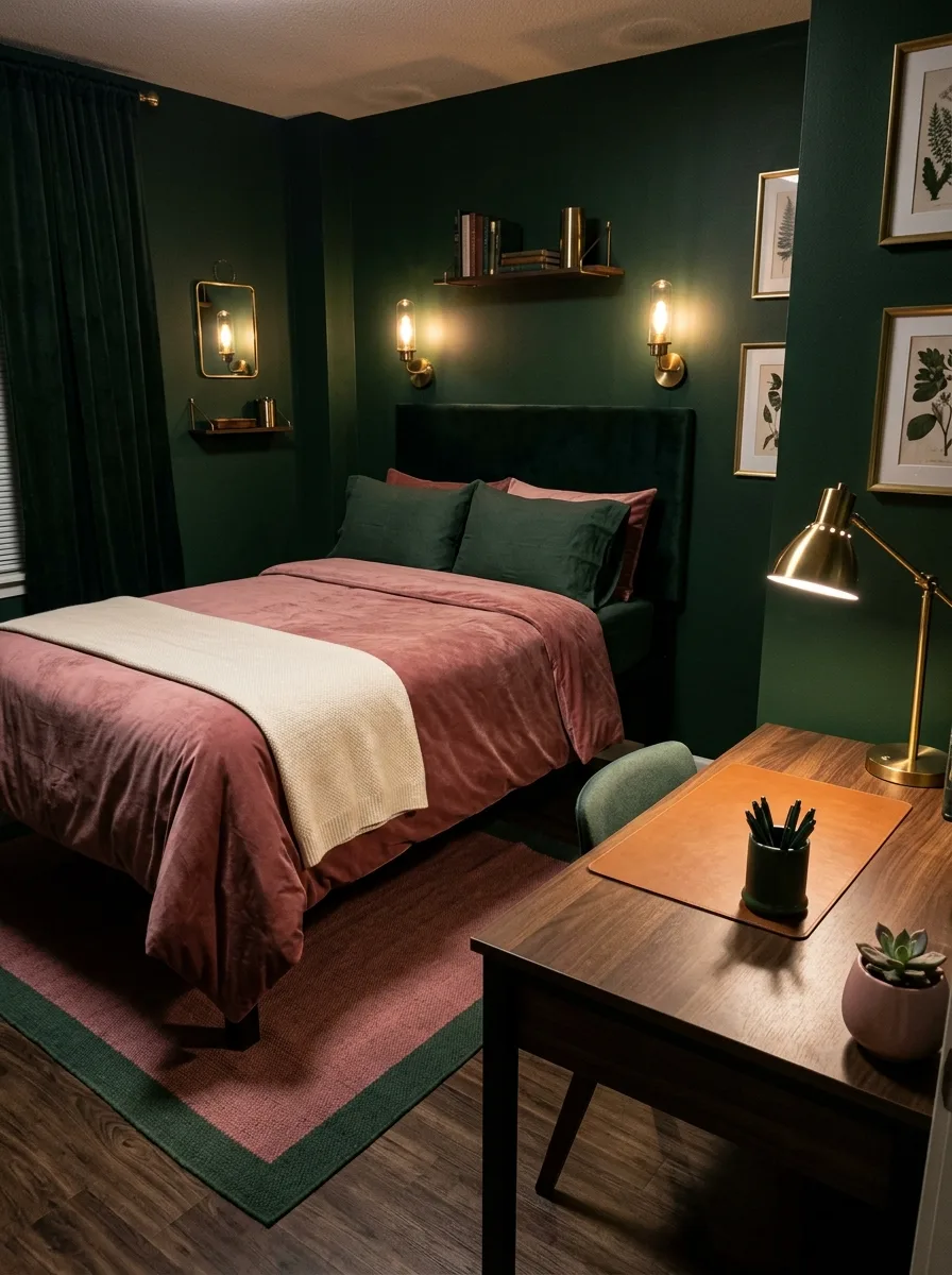
This room is doing something almost no dorm room attempts. It is going for atmosphere rather than decoration.
Paint every wall in the deepest forest green available. If paint is not permitted, apply peel-and-stick wallpaper in a forest green or very dark sage to every wall, ceiling to floor. The effect only works if you commit to all the walls. One feature wall will not achieve this.
Mount two brass plug-in sconces flanking the headboard — the kind with Edison bulbs in vintage-style glass, connected to a standard outlet via a cord run discreetly down the wall. The warm yellow light of the Edison bulb against the deep green wall is the entire reason this room feels like a library rather than a cell.
Install a floating walnut shelf above the bed. On it: three or four books in green and burgundy spines, a small glass or brass-finish lantern candle holder, and a single ceramic vase in a dark finish.
The bedding is rose or dusty-rose velvet — warm, saturated, in contrast with the dark walls. The rose against the forest green is the colour relationship the room is built around. A cream waffle throw across the foot of the bed. Dark pillow cases — hunter green or near-black — so the bed doesn’t get too light against the walls.
The rug layering on the floor is dark: a solid green rug as the base layer, a smaller dusty-pink flat-weave as the top layer, offset so both are visible. The desk is walnut, the chair is a dark olive velvet occasional chair rather than a desk chair, and the brass desk lamp is the only hard light source in the room.
Sage Linen Paper Lantern Jute Minimal
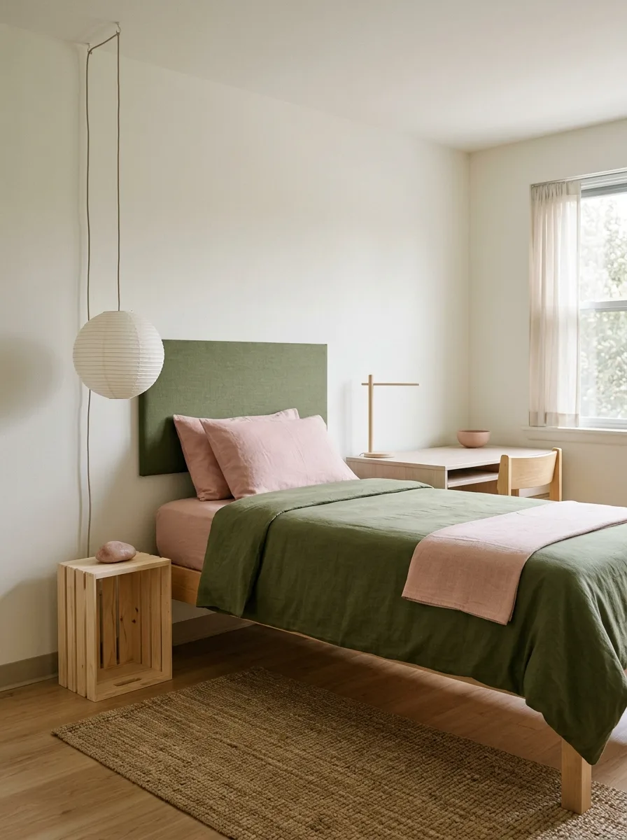
The entire room is built on the principle that nothing should announce itself.
Get a green-upholstered headboard panel in a textured linen or boucle fabric — the green should be a medium sage, not dark, not light, with a slight grey undertone. Mount it against the white wall and let it occupy that zone without asking the wall to do anything else.
Hang a paper lantern pendant light from a ceiling hook directly to one side of the bed — the large, globe-shaped kind in white or natural washi paper, hung from a fabric-covered cord rather than a plastic one. The paper lantern provides ambient light and introduces a sculptural ceiling element at almost no cost.
The bed is dressed in forest or hunter green — a linen or cotton-linen duvet in a solid, saturated green — with blush pink pillow cases. Two pillow cases only. No decorative cushions. The combination of the green headboard, the green duvet, and the pink pillowcases creates the palette without any additional objects.
The nightstand is a raw pine crate, unfinished, set upright to give one shelf and a small surface. On the surface: a single smooth stone and nothing else.
The desk in front of the window is low and clean — a simple white top with a minimal profile. On it: a standing desk lamp in natural wood or pale finish, a small ceramic bowl, and a small succulent. A blush pink ceramic piece sits on the windowsill.
The rug on the floor is a large jute or seagrass piece — natural, undyed, the full width of the room. It provides texture and warmth while refusing to compete with the green and pink above it.
Wildflower Wallpaper Pampas Blush White
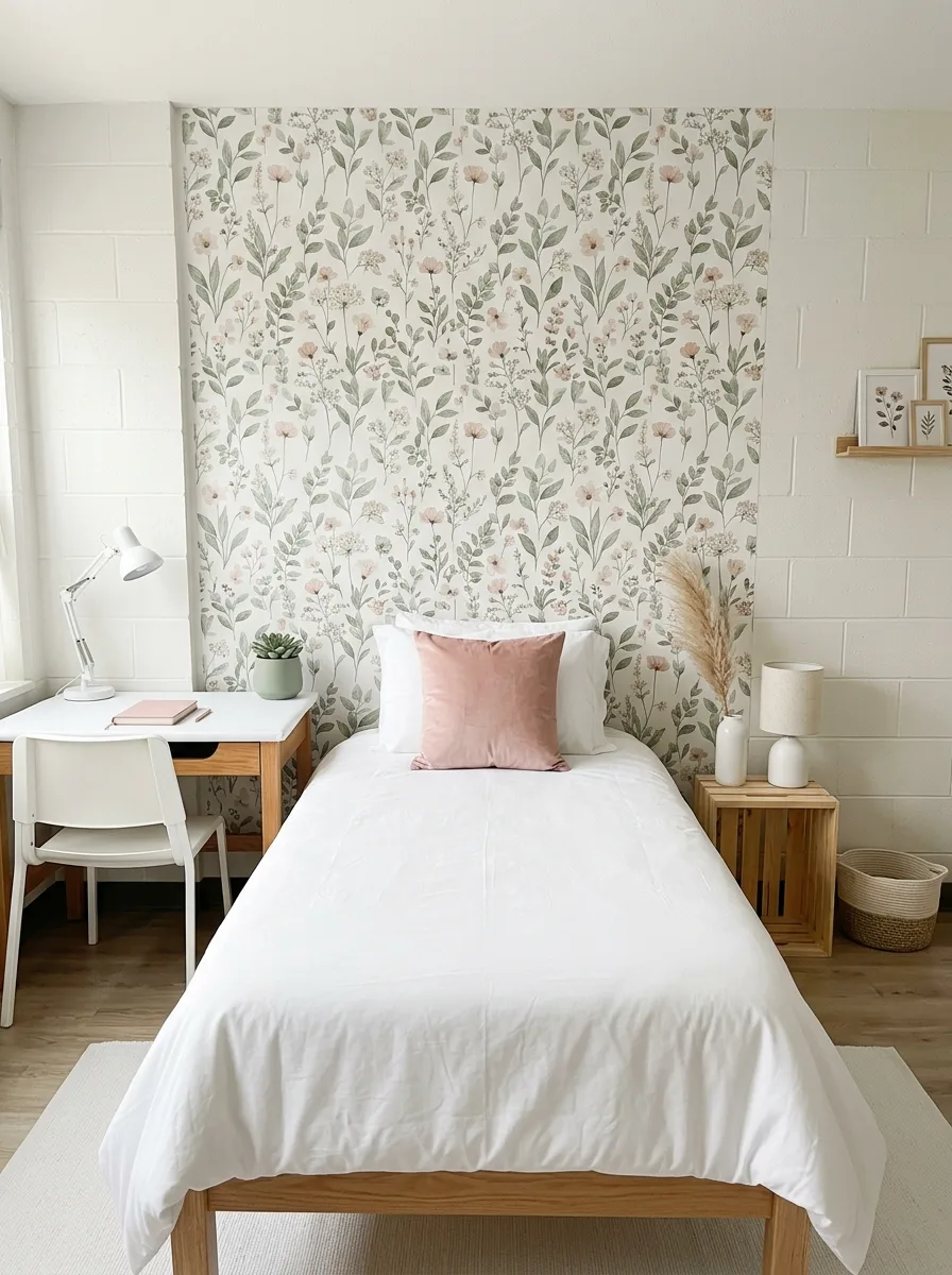
Source a peel-and-stick wallpaper in a wildflower meadow print — the kind with soft watercolour botanicals in sage green, pale pink, and cream on a white or off-white ground. Apply it to the entire wall behind the bed, floor to ceiling. The cinder block behind it needs to be smooth enough for good adhesion; if it isn’t, apply a thin sheet of foam board first and wallpaper over that.
Every other wall stays white. The wallpaper wall is the room’s sole decorative statement, and it is more than sufficient.
The bed is entirely white — white duvet, white fitted sheet, white pillow cases. One single blush pink velvet throw pillow at the centre front. The stark white bedding makes the wallpaper’s colours more vivid by contrast and keeps the room from becoming too busy.
On one side of the bed, a natural wooden crate nightstand holds a white ceramic lamp base with a linen shade and a small trailing pothos. On the other side of the bed, a tall white floor vase with dried pampas grass provides height and movement without colour.
A small wooden picture ledge shelf is mounted on the side wall at eye level when seated, holding two or three framed botanical prints leaned rather than hung. A woven seagrass basket on the floor beside the nightstand holds throw blankets rolled neatly.
The desk is white, the chair is white, the rug on the floor is white and cream. Every decision except the wallpaper says less. The wallpaper says everything.
Teal Coral Geometric Colour Pop
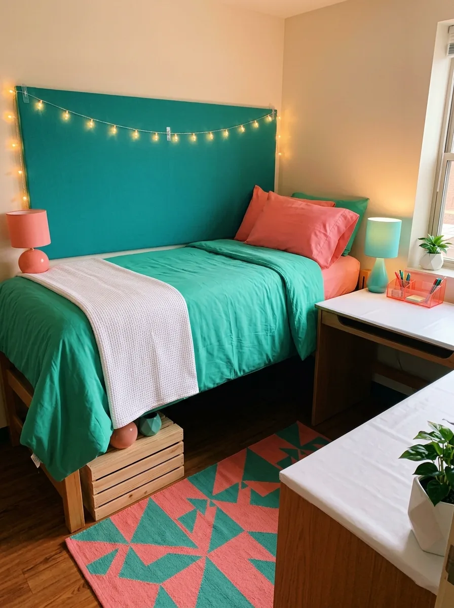
This room is the loudest one on the list and it is unapologetic about it.
The feature wall behind the bed gets a solid teal panel — either paint, contact paper, or a large piece of fabric stretched over the wall and held with removable adhesive. The teal should be saturated, blue-green, closer to peacock than mint. This is not sage. This is teal.
The bedding matches the teal exactly. One solid teal duvet, tightly made. On top of it, blush-coral or terracotta-orange pillow cases — the warm reddish-pink that sits opposite teal on the colour wheel and makes both colours more vivid by comparison. A white waffle-knit throw across the foot of the bed.
Two lamps, both matched: one coral/terracotta on the desk, one teal on the opposite side of the bed. The lamps are colour-coded to the palette so the room reads as symmetric even when the furniture arrangement is not.
The rug is a bold geometric in teal and coral — not a subtle pattern, but a large-scale print with hard edges and clear shapes. Pinwheel, Aztec, or starburst. The scale of the pattern on the floor anchors everything above it and prevents the room from looking like it needs more decoration when it definitely does not.
Wooden crate risers under the bed. A small green plant in a white pot on the desk beside the teal lamp. The walls outside the teal panel stay neutral. The room has found its frequency and is broadcasting on it.
Pink Satin Sconce Sage Curtain Hotel
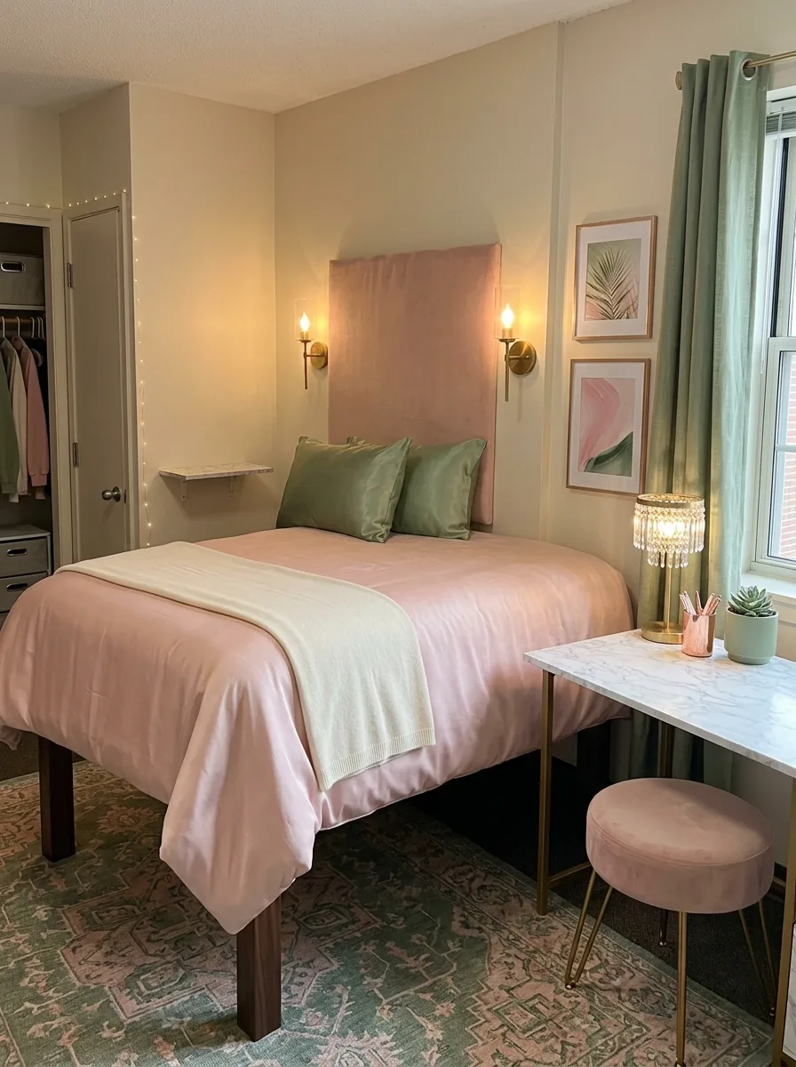
This room made a decision so specific that it should be examined in design school.
The headboard is upholstered in blush pink satin or silk fabric — a full panel, approximately the height of the wall space above the bed, in a cool-toned pink that reads almost mauve in certain light. The satin’s reflectivity means the headboard looks different at different times of day. In morning light it’s pale. Under a warm sconce it’s rosy.
The sconces are brass, plug-in, candelabra-style, mounted one on each side of the headboard panel. The candelabra bulb should be warm — 2700K or lower — so the light it throws onto the satin is gold, not white.
The bedding is entirely blush pink, in the same family as the headboard but in a matte fabric — microfibre or washed cotton — so the bedding’s flatness makes the headboard’s sheen more noticeable. Two sage green silk or satin throw pillows on top of the pink pillowcases. The green is the only green on the bed. It is enough.
The window gets a floor-length panel in sage green — linen or velvet, either works — hung from ceiling height. One panel, not two, positioned to one side so the window stays open and the curtain reads more as a colour element than a functional one.
The rug is a vintage-style medallion in dusty pink and sage, sized to run under the bed and toward the desk. The marble-contact-paper desk holds a crystal chandelier table lamp — the kind with a brass base and crystal pendants — and a small sage succulent in a pink ceramic pot.
Floral Botanical Sage Rose Embroidery Wall
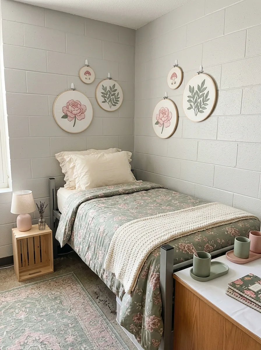
The wall art in this room is made, not purchased.
Source a set of embroidery hoops in varying sizes — four-inch, six-inch, eight-inch, and ten-inch — and fill each one with printed or hand-stitched botanical embroidery designs. Look for printable embroidery-style prints formatted to fit a hoop, or purchase finished embroidery pieces from craft markets. Mount five or six hoops on the wall above and around the bed using adhesive hooks, at slightly varying heights but in an overall arching arrangement.
The embroidery designs should be in the same palette as the room: blush pink florals, sage green botanicals, small red-pink mushroom illustrations. The combination of scales and subjects within the same tight palette reads as a considered gallery rather than a random collection.
The bedding is a sage-green floral print — a small-scale botanical or rose print on a sage ground, or a sage ground with a ditsy floral repeat in dusty pink. Cream pillow cases with a ruffled edge. A cream chunky-knit throw folded across the foot.
The nightstand is a raw pine crate. On it: a small ceramic lamp in blush pink with a linen shade. A single dried lavender stem in a small glass vase. No other objects on the surface.
The rug is a vintage medallion in sage and dusty rose, faded-looking. The desk holds sage and pink stationery kept in ceramic containers of the same colour family. The room’s effect depends on the embroidery wall — without it, it’s a nice floral bedroom. With it, it’s a room that has a signature.
Sage Vanity Mirror Pink Southwest Rug
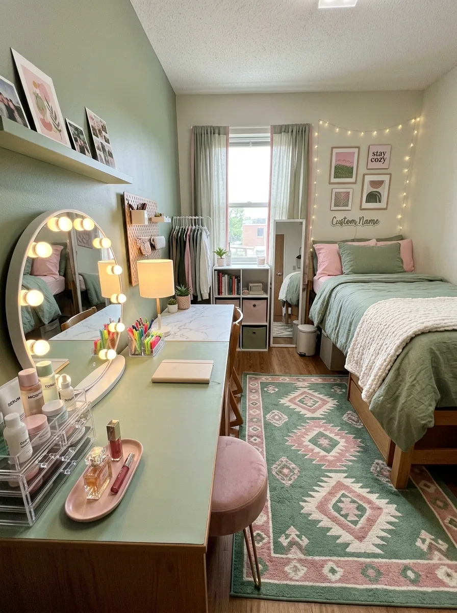
The centrepiece of this room is a sage green vanity desk — either painted in sage yourself or sourced already in a green finish. This is the desk that gets the Hollywood vanity mirror with the round globe bulbs, not the study desk. The two functions are separated: a sage vanity area on one wall for getting ready, and a study setup beside the window for work.
On the vanity desk: the lighted mirror at the back, a clear acrylic makeup organiser to one side, a pink ceramic tray for the daily items, and a standard table lamp on the opposite side of the mirror from the acrylic organiser. The desk surface should be clean enough that the mirror and the lamp read clearly.
Above the vanity side wall, install one floating shelf in sage or white. Lean two or three framed prints against the wall — photographs, botanicals, a fashion print — in matching frames. The shelf below holds the overflow that doesn’t fit on the desk surface.
The bed on the opposite wall is sage-green with blush pink pillows, dressed simply and without extra decorative cushions. The lofted or elevated bed on risers creates under-storage space for the additional seasonal items and desk overflow.
The rug in the centre of the room is the pattern moment: a Southwestern or Aztec-print in sage and pink, sized to anchor both the bed zone and the vanity zone. The room works because the vanity desk is sage rather than white — it connects the desk area to the bed palette and makes the whole room read as a single scheme rather than two separate setups.
Pink Duvet Sage Pillow Crate Mirror
This is the room that proves the combination works in its quietest form.
The wall colour is a cool, slightly dark grey — almost a slate — which gives both the pink and the sage enormous room to operate. Against a grey wall, pink looks more sophisticated. Sage looks deeper. The grey is not a background colour. It is an active participant.
The bedding is soft pink — a washed cotton or linen duvet in a dusty blush — with sage green pillow cases. The reversal of the expected hierarchy (pink dominant, green accented) is what makes this room feel unexpected. Pink as the base colour and green as the pillow colour is the less common arrangement and therefore the more interesting one.
A white crate nightstand on one side, painted white rather than raw wood, creates a contrast against the grey wall. On it: a small white ceramic lamp, one object, nothing else.
On the desk beside the window: a sage green ceramic table lamp, a compact mirror in a simple frame, a small green succulent in a pink ceramic pot, and one notebook. No excess. The desk looks like someone is actively using it, not decorating it.
A white-framed mirror is hung on the wall above or near the desk — large, clean-lined, the kind that makes a small room feel bigger without trying to. The rug on the floor is a sage-and-pink traditional medallion, pale enough to recede. The room’s intelligence is in the grey wall. Everything is easier with a grey wall.
Dried Rose Wicker Basket Sage Pampas
This room is about texture as much as colour.
The defining wall treatment is simple: four adhesive clear hooks in a row above the bed, evenly spaced. From each hook, hang a bundle of dried roses — not lavender, not eucalyptus, specifically roses — tied with cream or ivory ribbon rather than twine. The roses should be in varying states of dryness, from just-dried to fully preserved, in blush and dusty pink. The ribbon ties should be neat and uniform, each bundle roughly the same size.
Beside the window, one tall, slender pink ceramic vase holds a large bunch of dried pampas grass — the feathery, natural-toned plumes that add height and movement without adding colour competition.
The bedding is sage — a washed linen duvet in a soft, muted sage — with blush pink pillow cases in linen. A cream waffle-knit throw at the foot of the bed. A wood crate nightstand beside the bed holds a small pink ribbed ceramic lamp with a drum shade.
Under the bed, wicker or seagrass storage baskets in a warm natural tone replace fabric bins. The wicker connects to the lamp’s ceramic warmth and to the ribbon on the rose bundles — everything in the room is doing a version of the same warm, organic thing.
The desk holds a sage notebook, a pink pen cup, and a small framed botanical print. The rug is a two-tone stripe in sage and blush, flat-weave, positioned to run under the bed and into the room. The room smells faintly like dried roses. That is not accidental.
Final Thoughts
Every room in this collection made the same essential decision: it picked a version of pink and green and then stayed inside that version.
The sage-and-blush rooms didn’t add hot pink. The forest-and-fuchsia rooms didn’t soften into sage. The teal-and-coral room didn’t apologise for being saturated. Each one had internal logic — a set of rules it had established for itself and then followed through on.
That kind of consistency is what separates a room that looks designed from a room that looks decorated. Decorated rooms have nice things. Designed rooms have the right things in the right relationship to each other.
Pink and green is generous. It works at almost any temperature and almost any intensity. The only thing it won’t forgive is indecision.
Make a choice. Keep making the same choice. The room will do the rest.